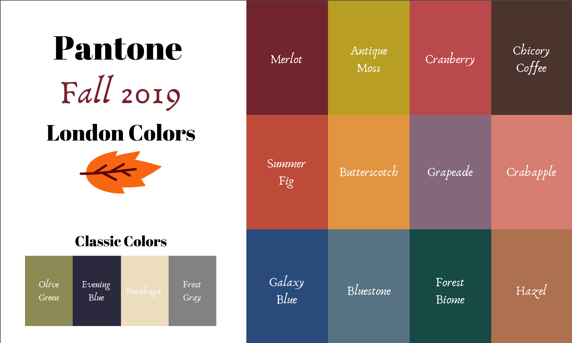
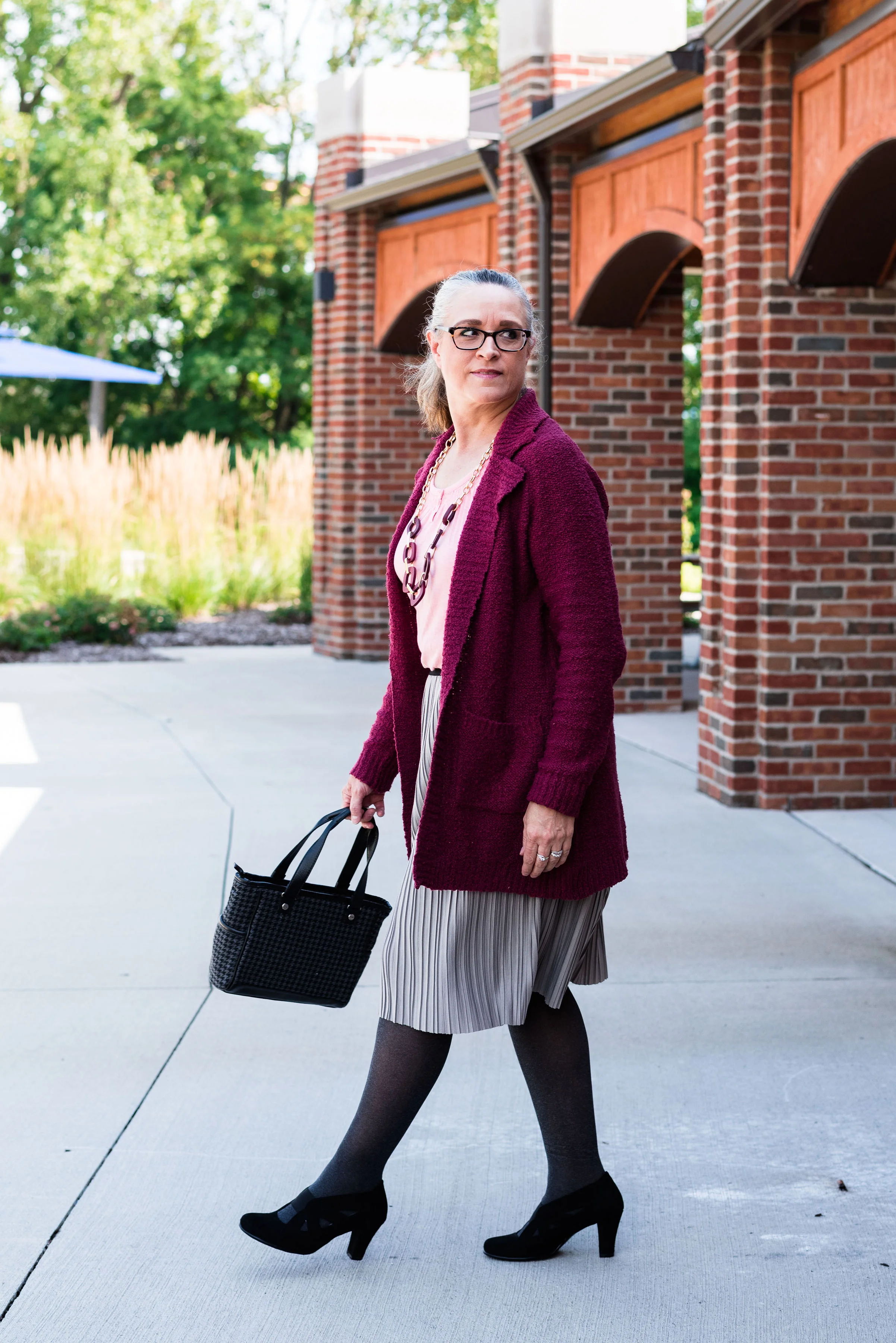
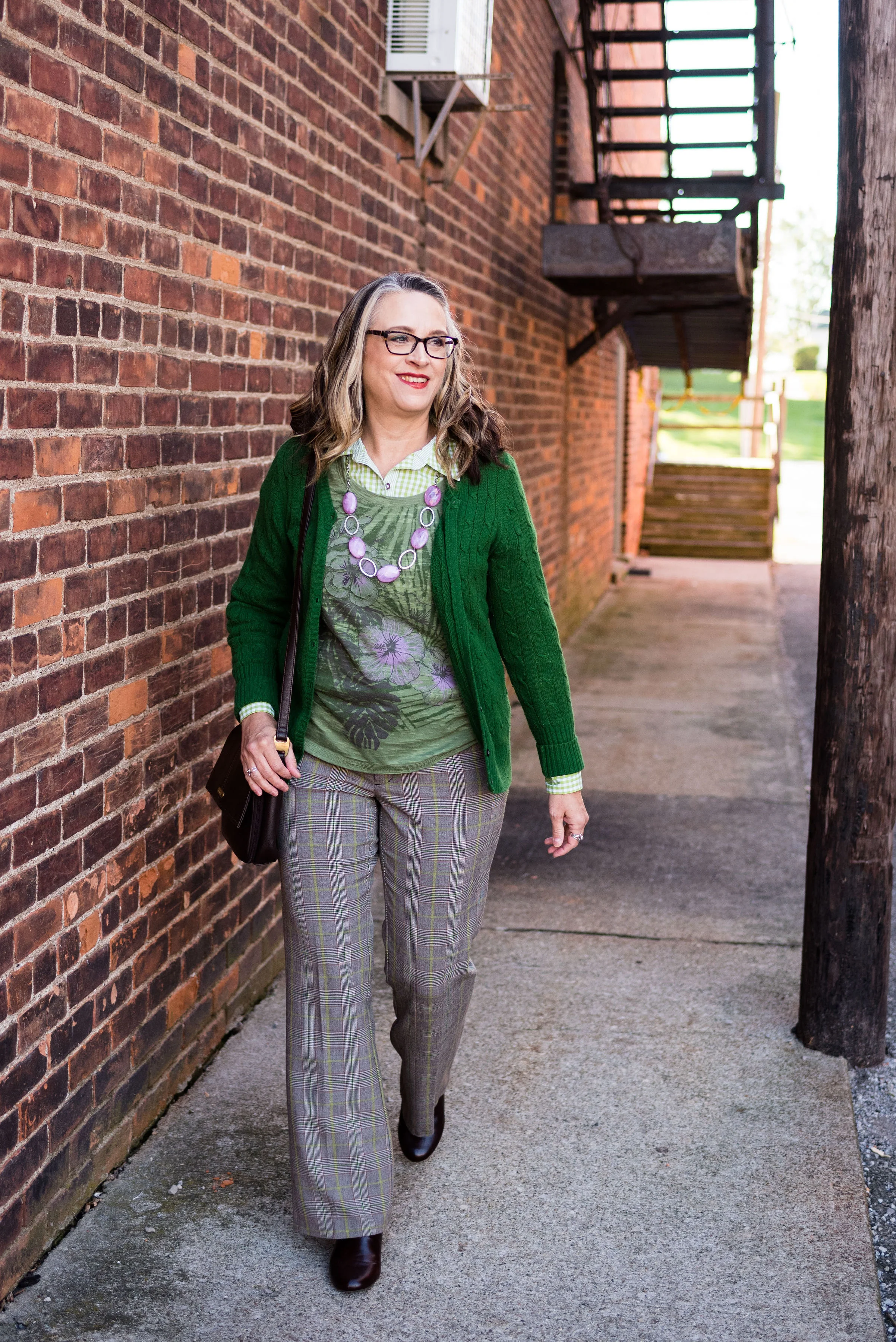
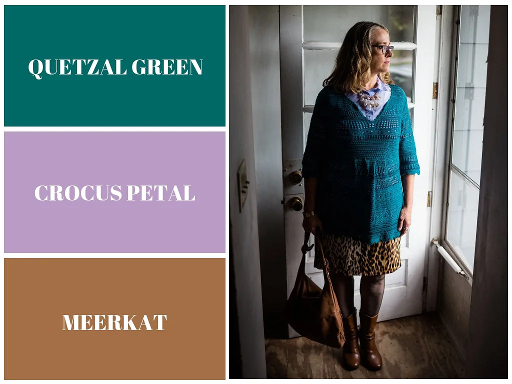
Pantone - Autumn/Winter - 2019 - Merlot and Antique Moss

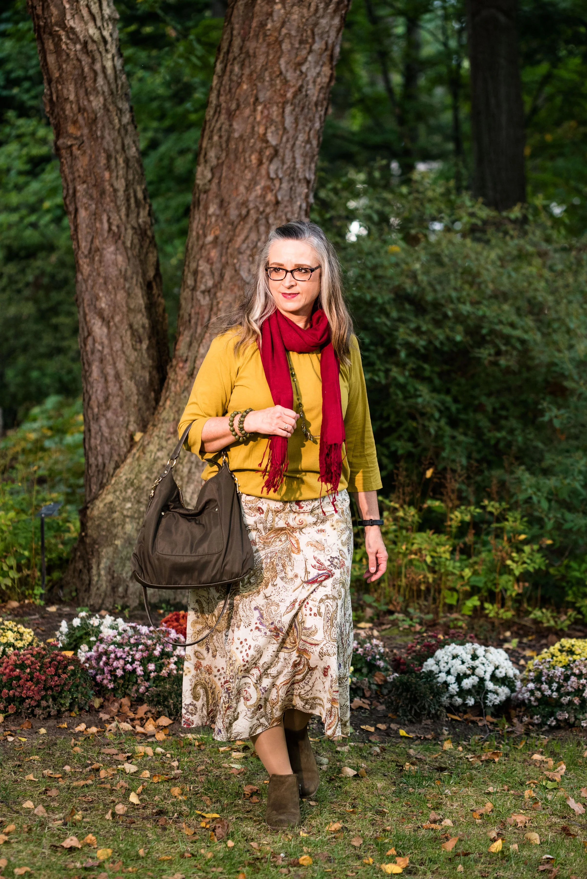
The first two colors from the Pantone - Autumn/Winter - London palette that I am featuring are Merlot and Antique Moss. As you can imagine, Merlot, like the wine is a rich burgundy red, while Antique Moss is a yellowy green. Often when we think of pairing red and yellow, we are concerned we will come out looking like an advertisement for McDonald’s, but let me reassure you these two colors pair in a perfectly un-Ronald like way and I love the combination.

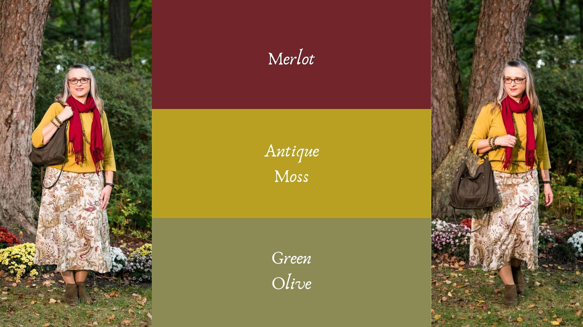
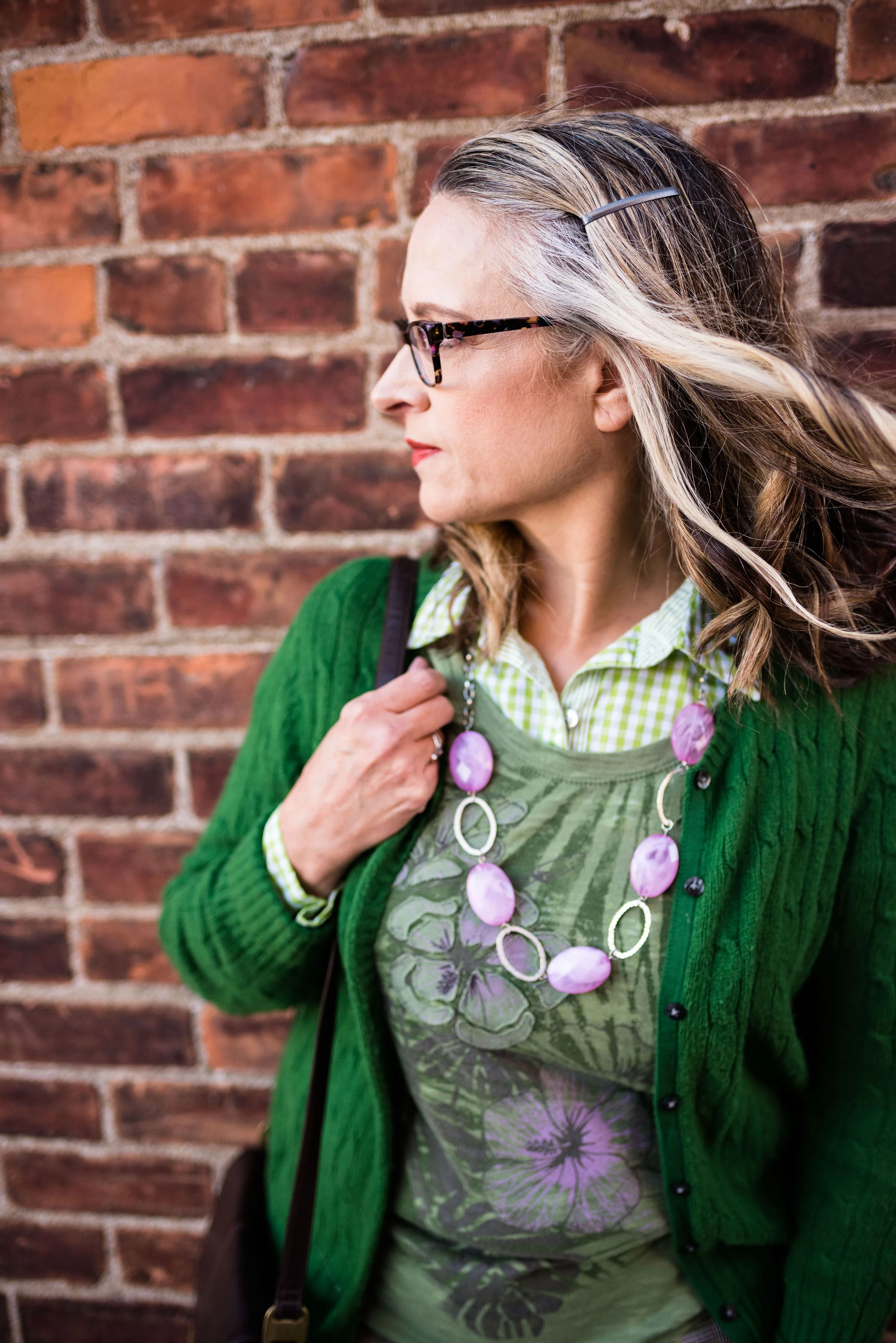
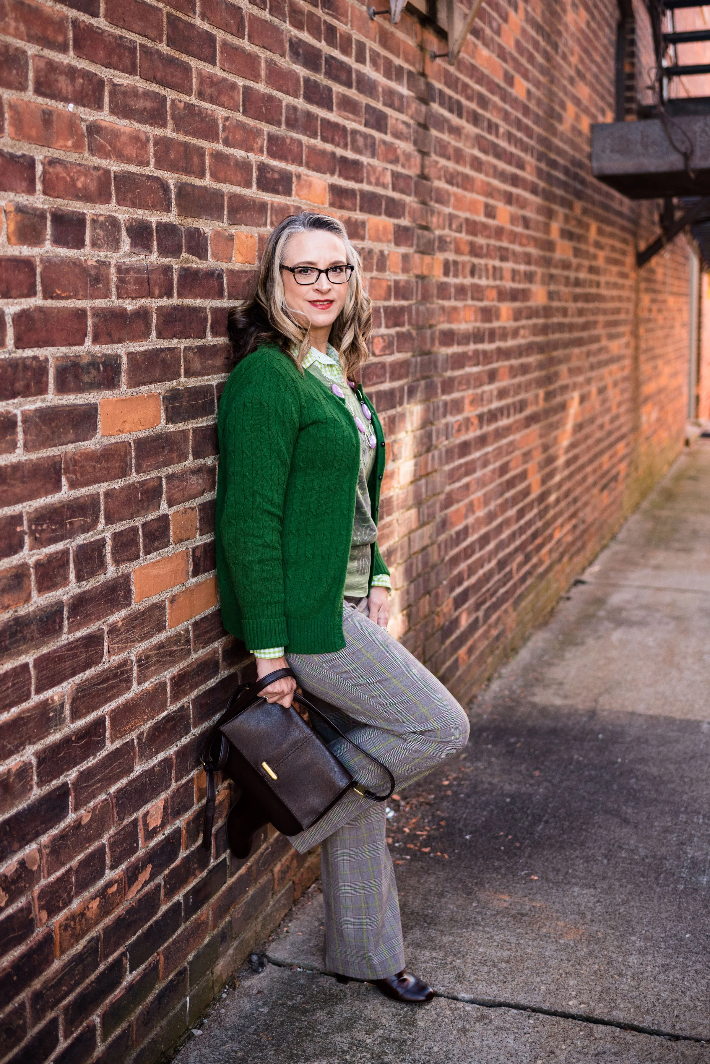
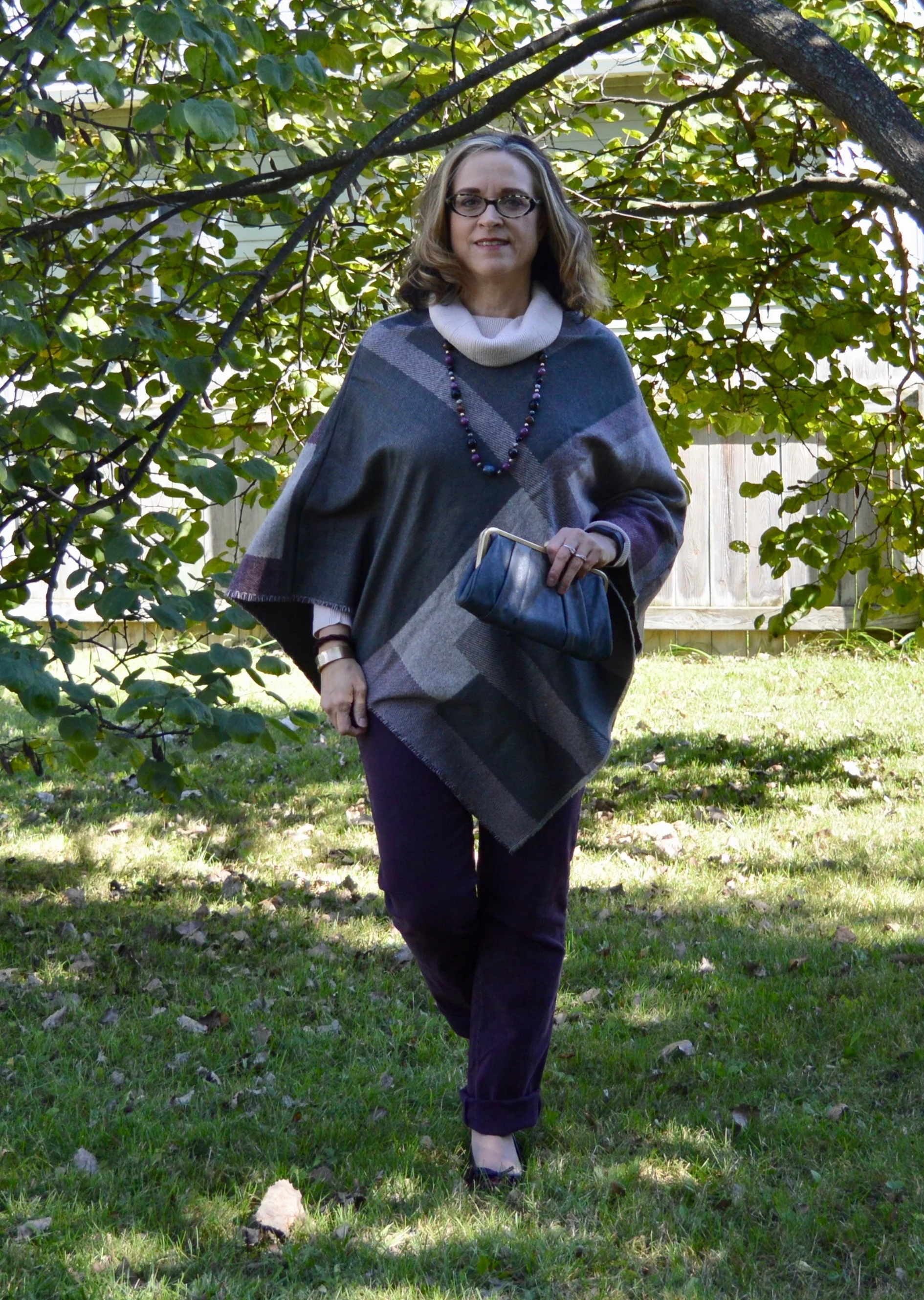
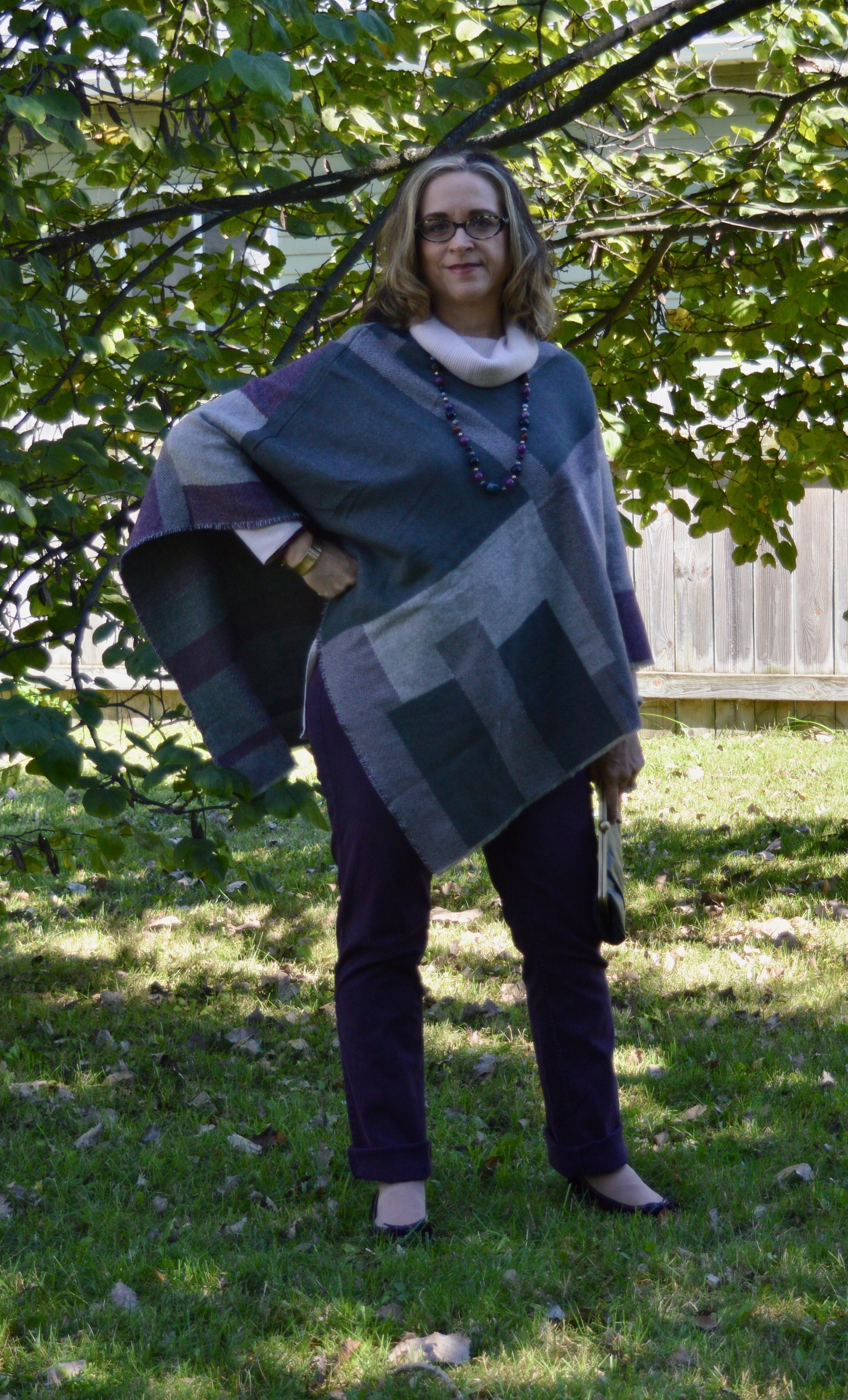
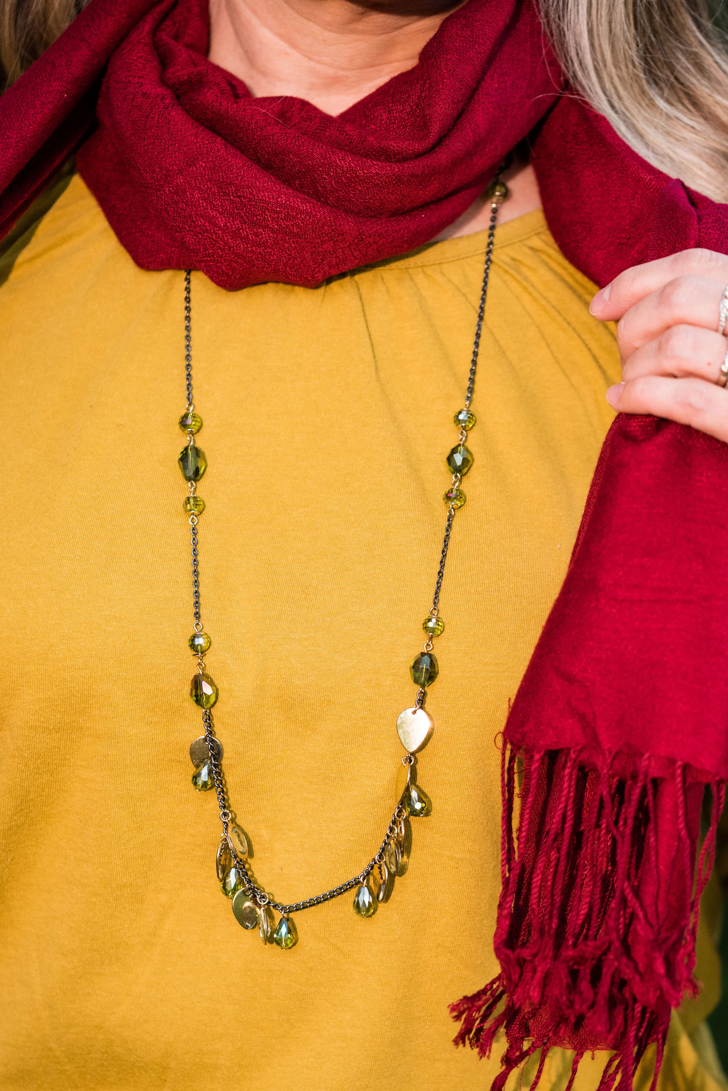
The London color palette classic colors were just a bit different. Green Olive is comparable to Guacamole from the New York palette, with a little more of a gray tinge. My version of olive in my accessories is much darker, but you get the idea.

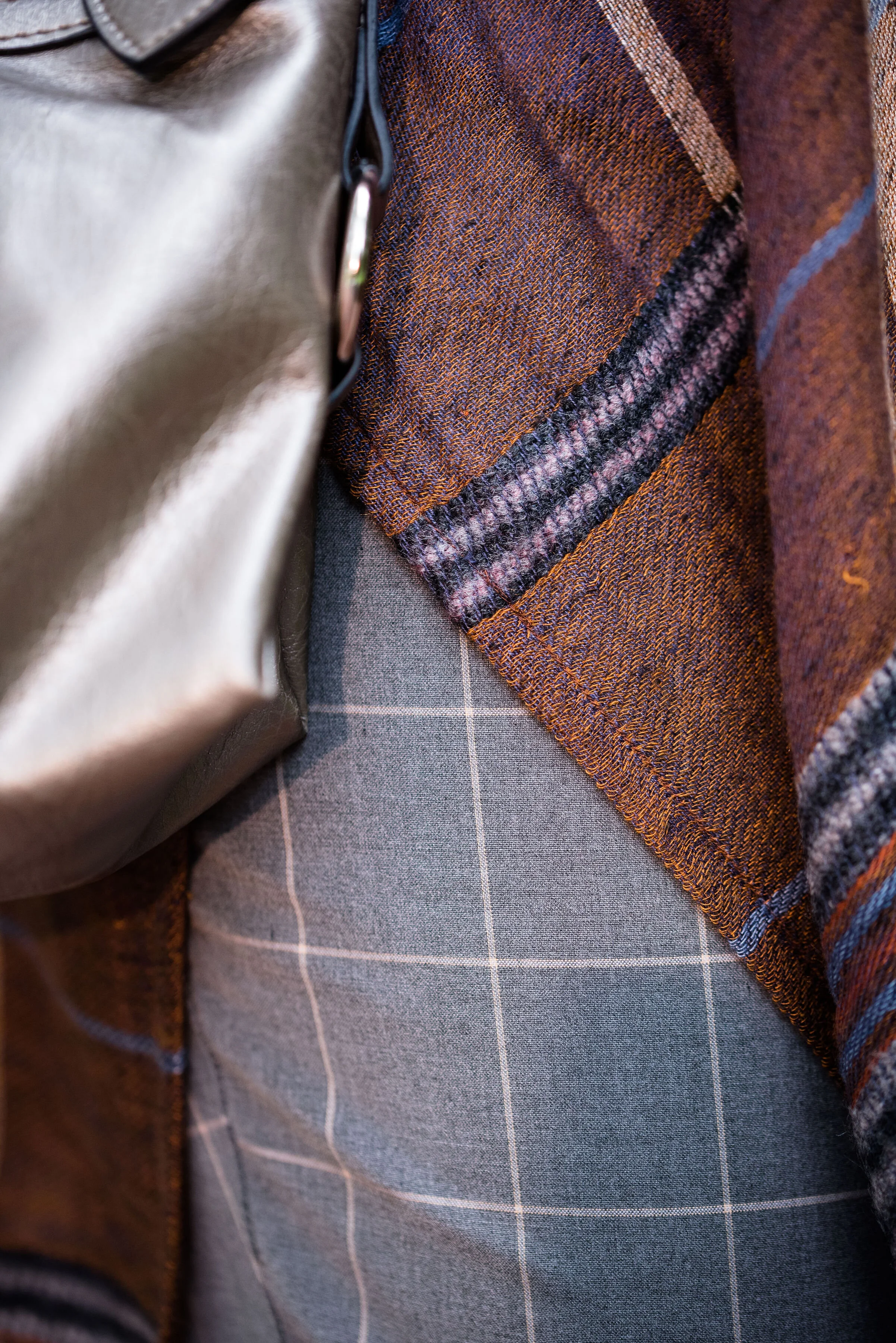
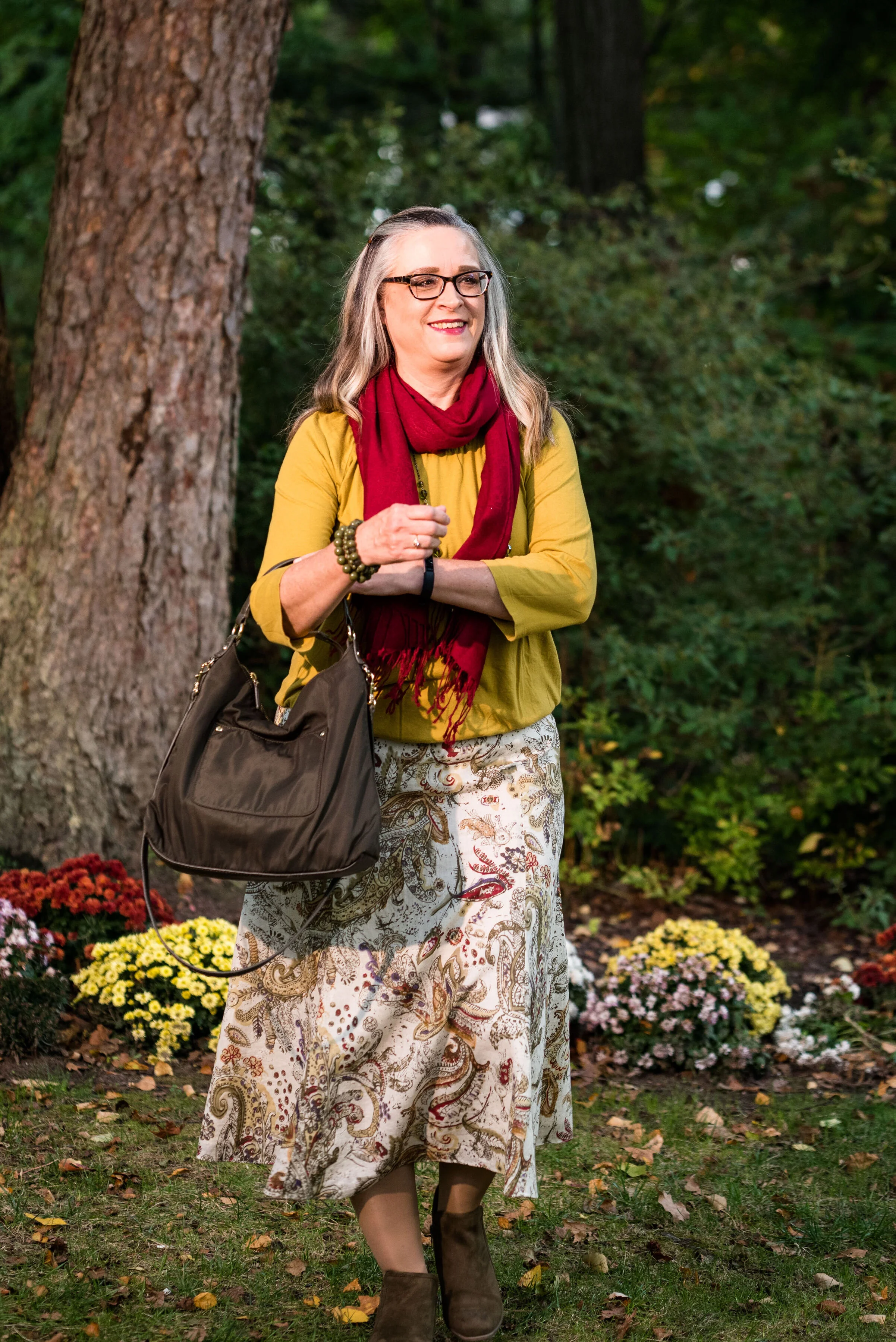
This Jones Wear skirt you’ve seen on the blog before. I styled it for the Pantone Fall 2017 New York Palette in a very similar fashion. I even used the same dark olive bag. Ha, ha. You can see that post here. I also used it this past spring for the Pantone Spring/Summer 2019 colors. You can see that post here. In addition you can see it with a green cardigan, here. I keep coming back to this skirt, because it works so well for these color schemes due to the reds and greens in the print of the skirt. I could easily used this printed skirt for a Christmas outfit as well, so you might see it come up again later this year. I love a versatile piece and when I purchased this skirt, I never knew how often I would use it for the blog.

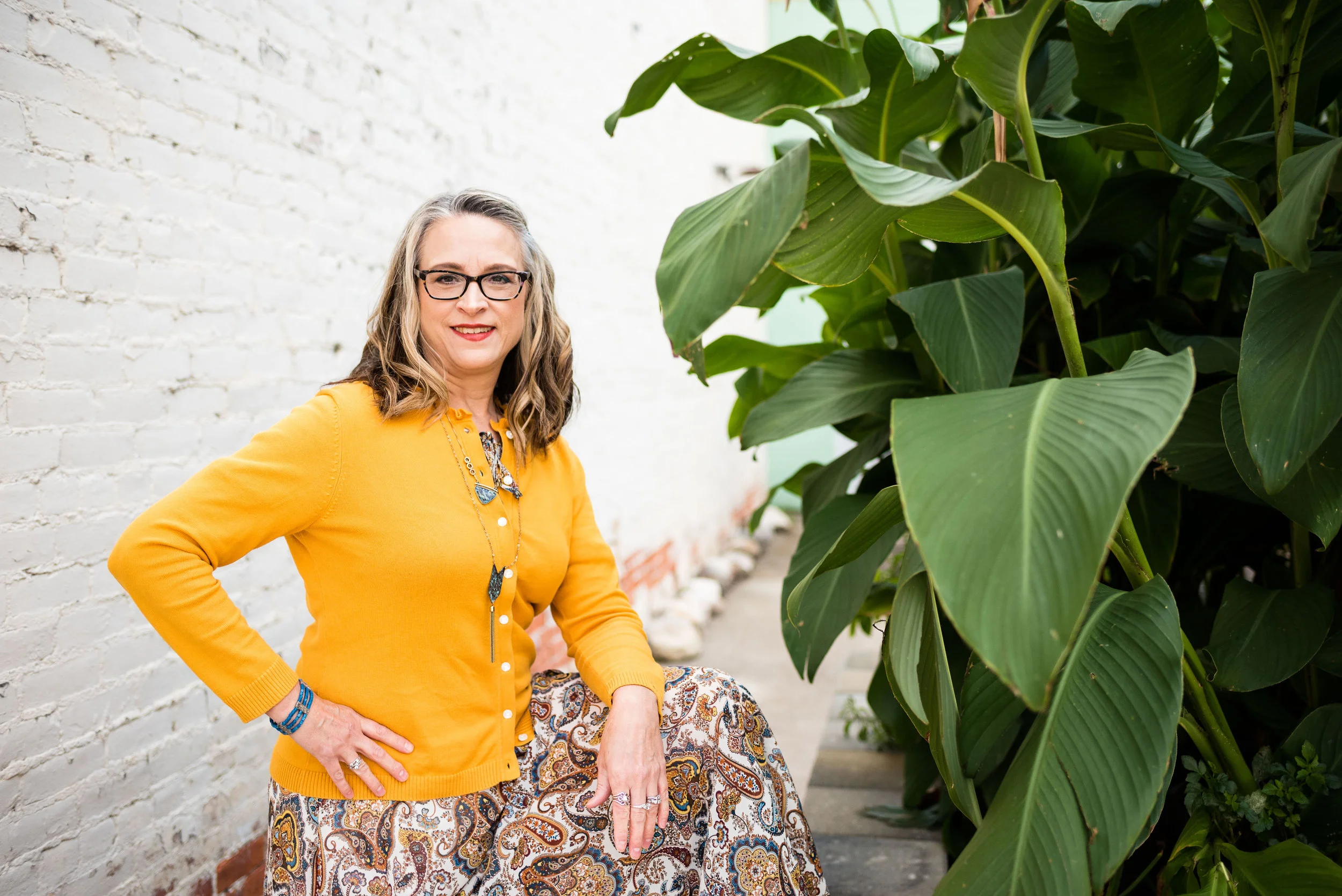
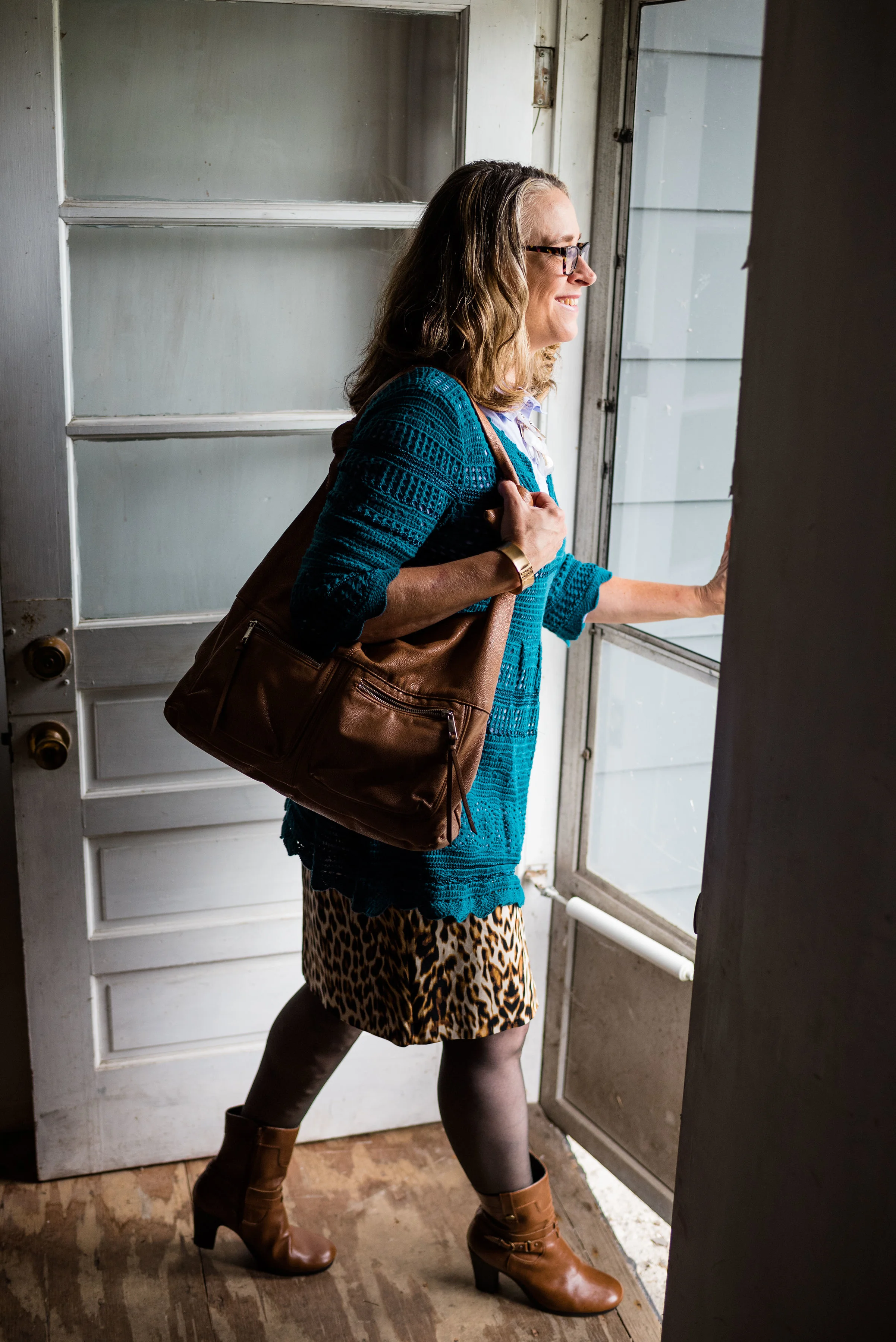
We took the pictures for this series at the Toledo Botanical Gardens, which are just down the street from where my daughter lives. The gardens are beautiful in all seasons and with walking paths through the grounds, it is a lovely place to visit and I don’t do it nearly enough. In the picture below, I am watching several bus loads of kids scramble on to the grounds and thinking, “Oh boy!” Ha, ha.

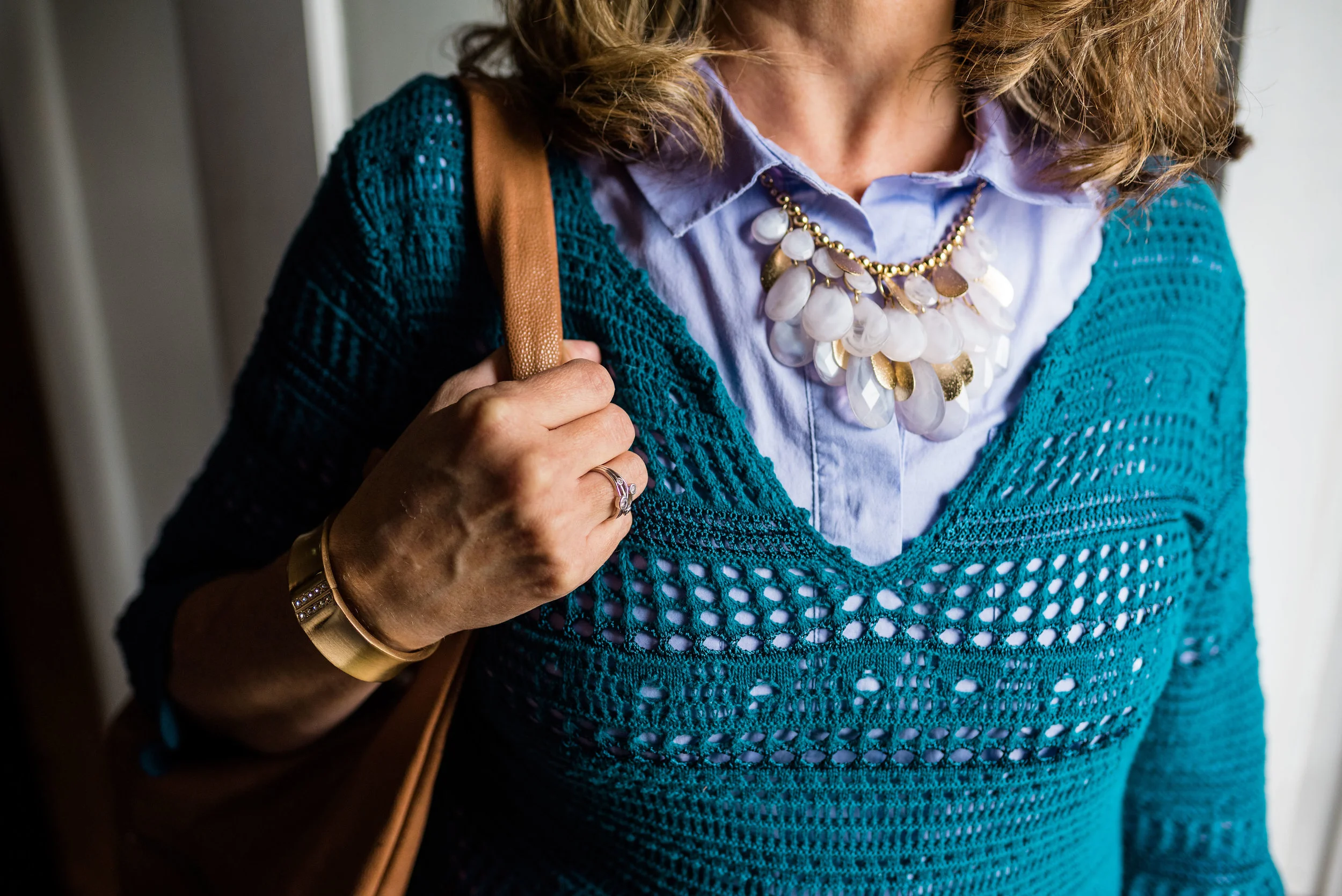
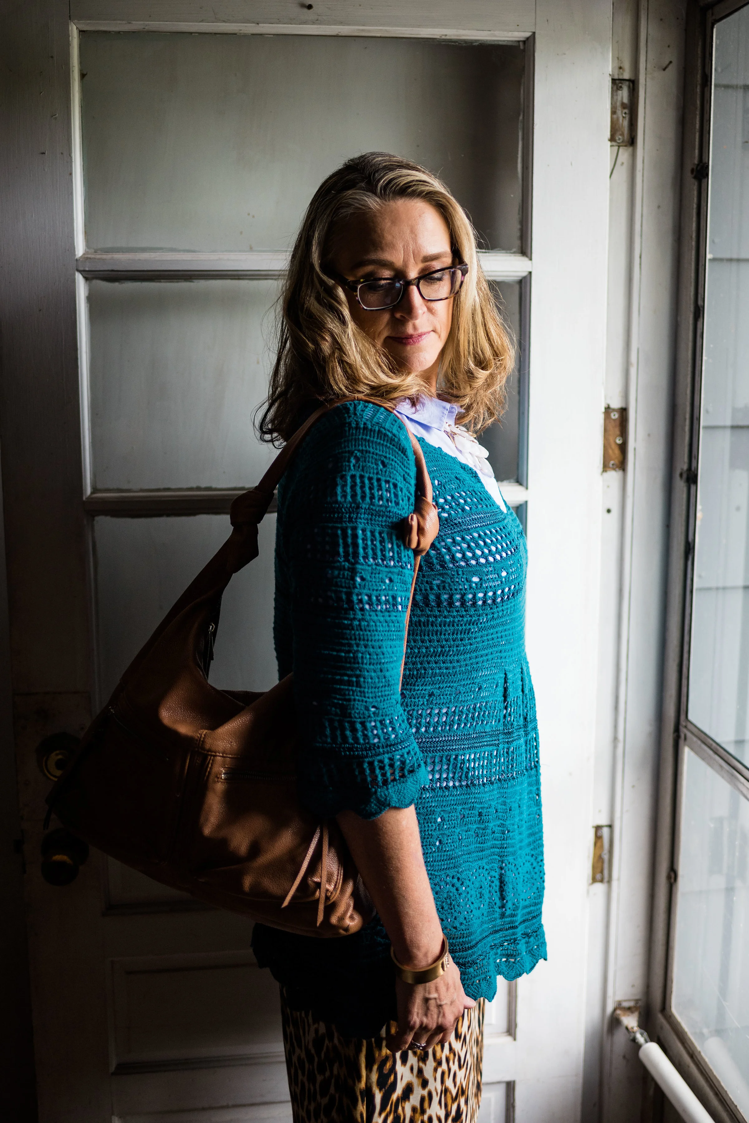
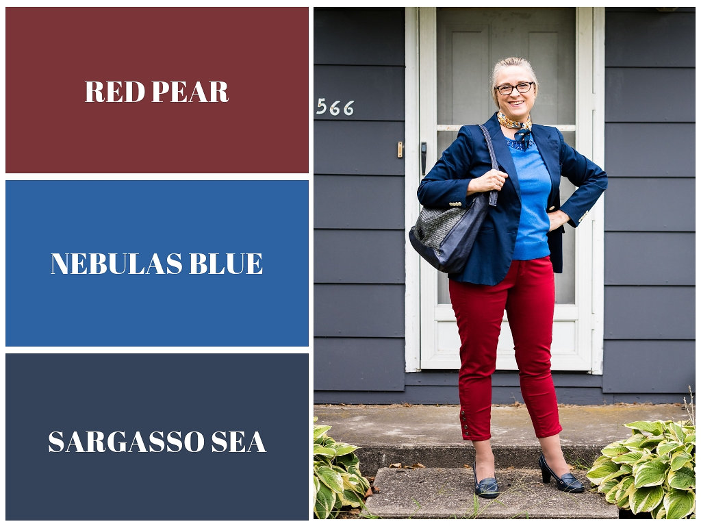
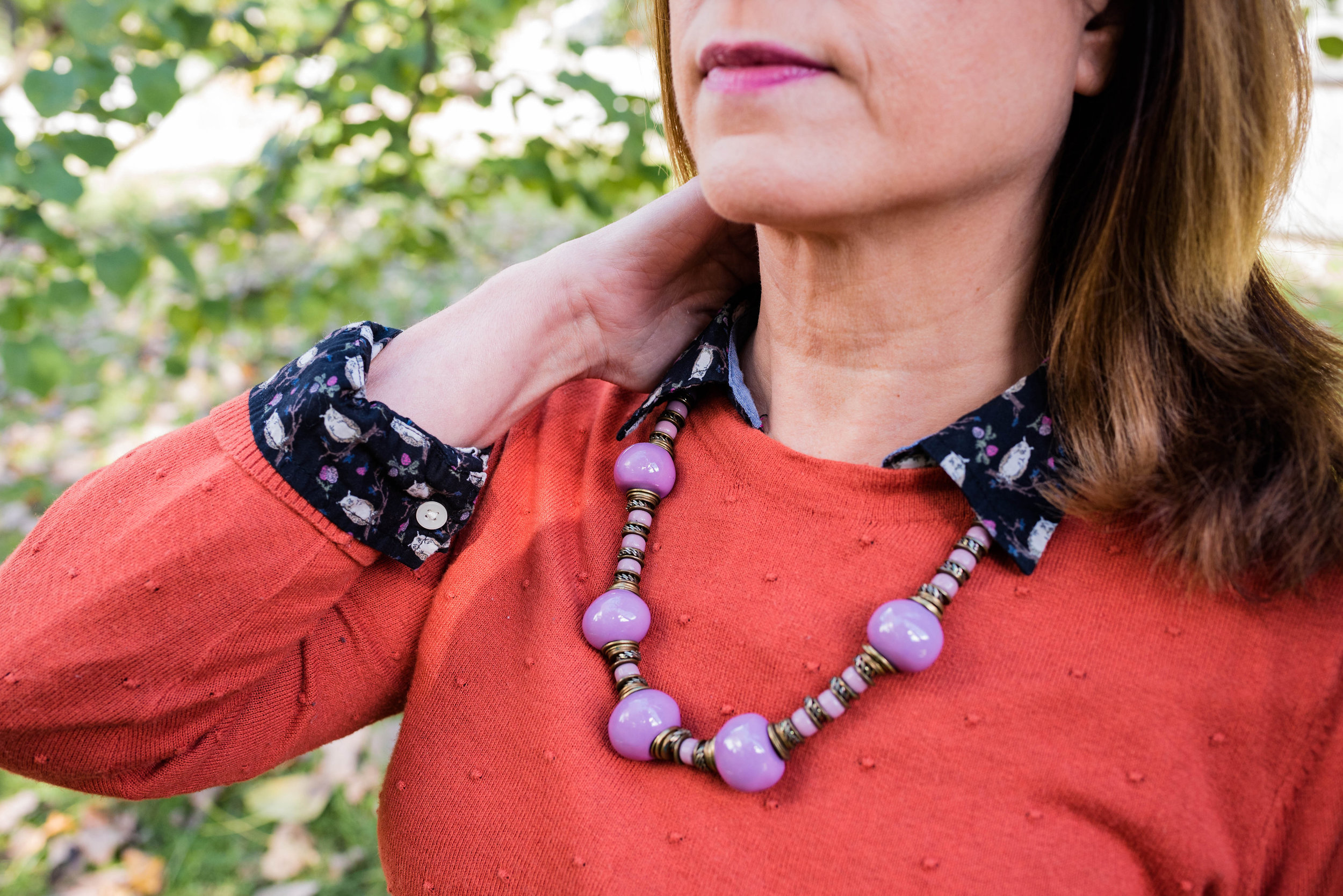
I obtained this red scarf from a friend’s closet. It looked a little more like Merlot, when it was in the low light of my closet, but here it looks much brighter. However, It is not a true red, but more of a burgundy. My 3/4 sleeve tee, I’ve worn on the blog before too. It is a thrifted Sonoma piece and has elastic on the bottom, which allows for freedom of movement and bulge camouflage. Ha, ha. You can see the tee styled with boyfriend jeans and a leopard print skirt here, and with a snakeskin print skirt here.

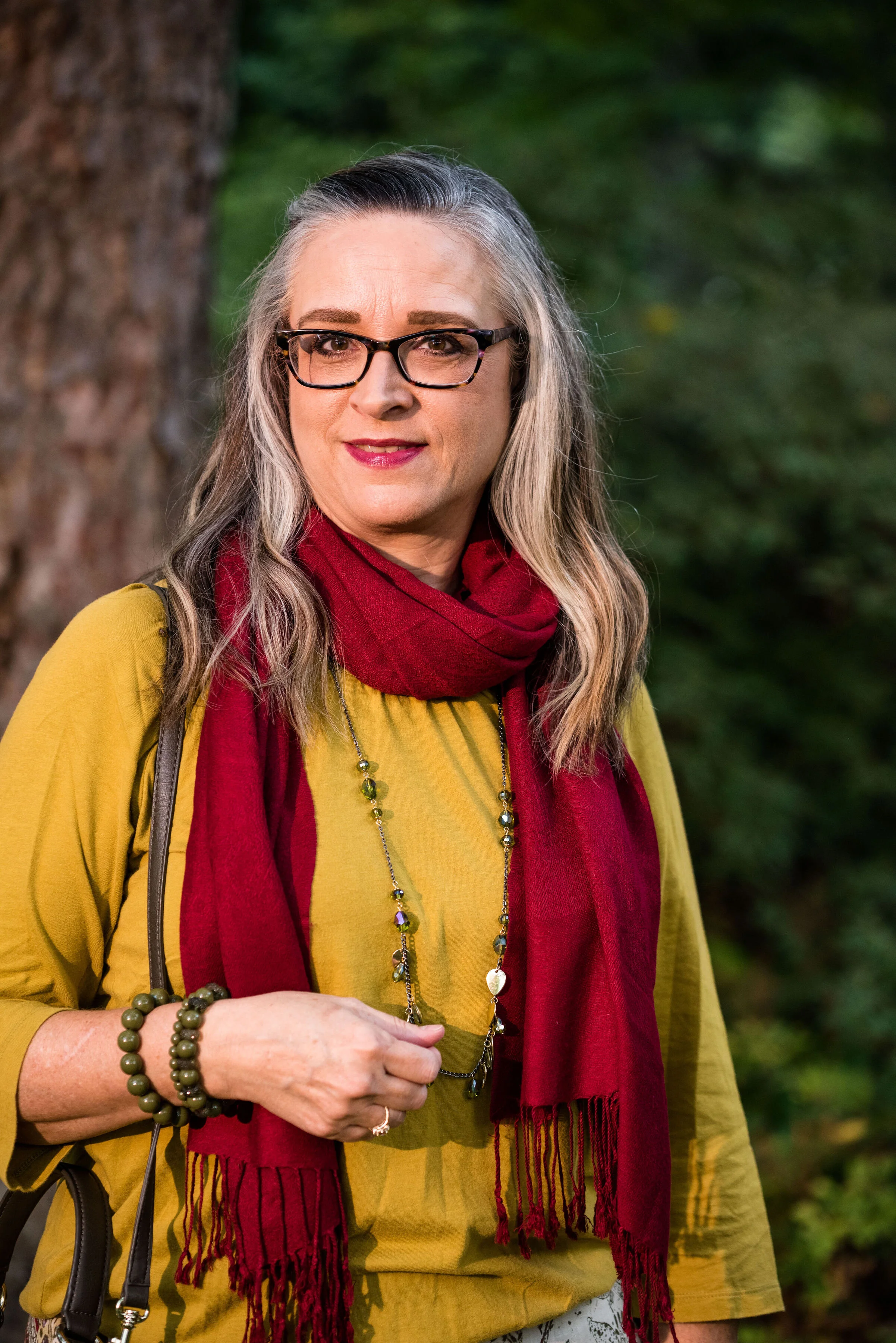
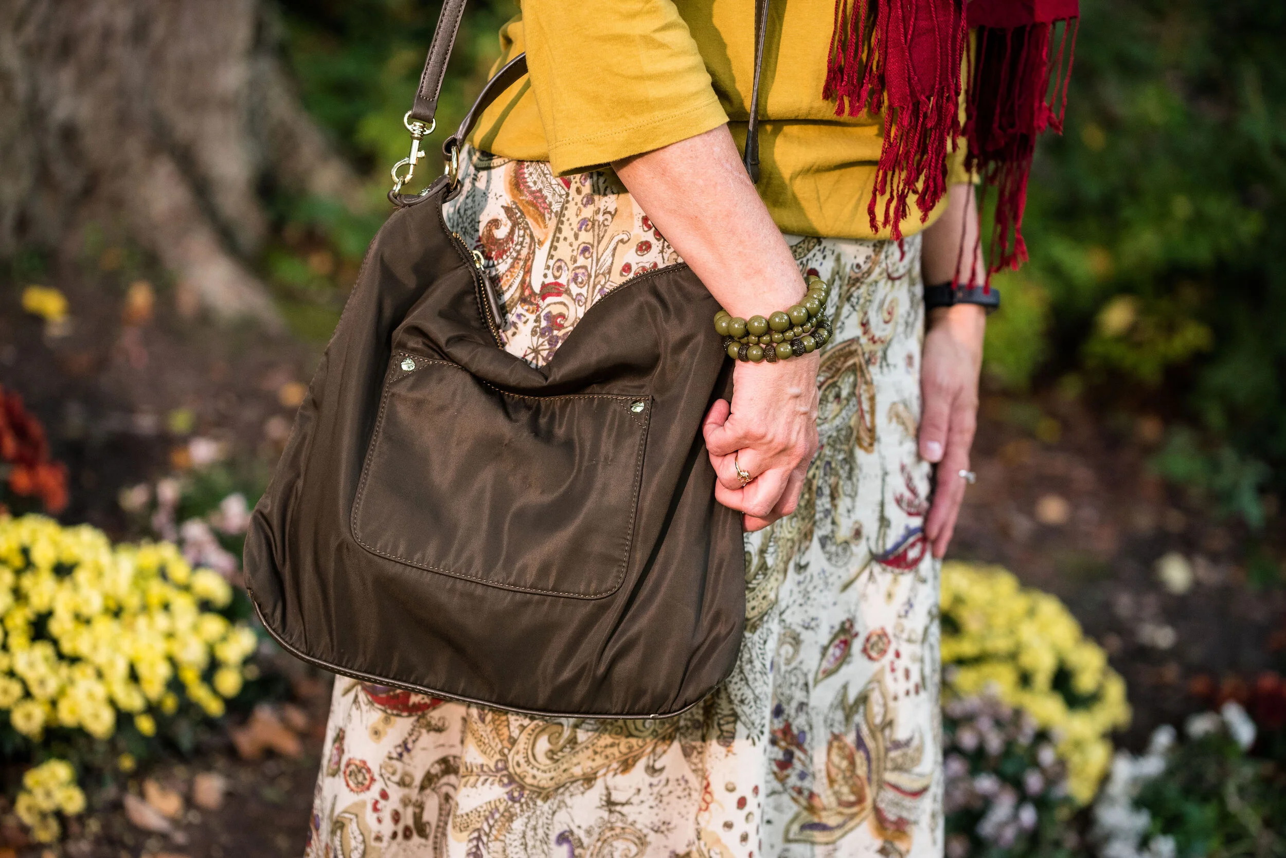
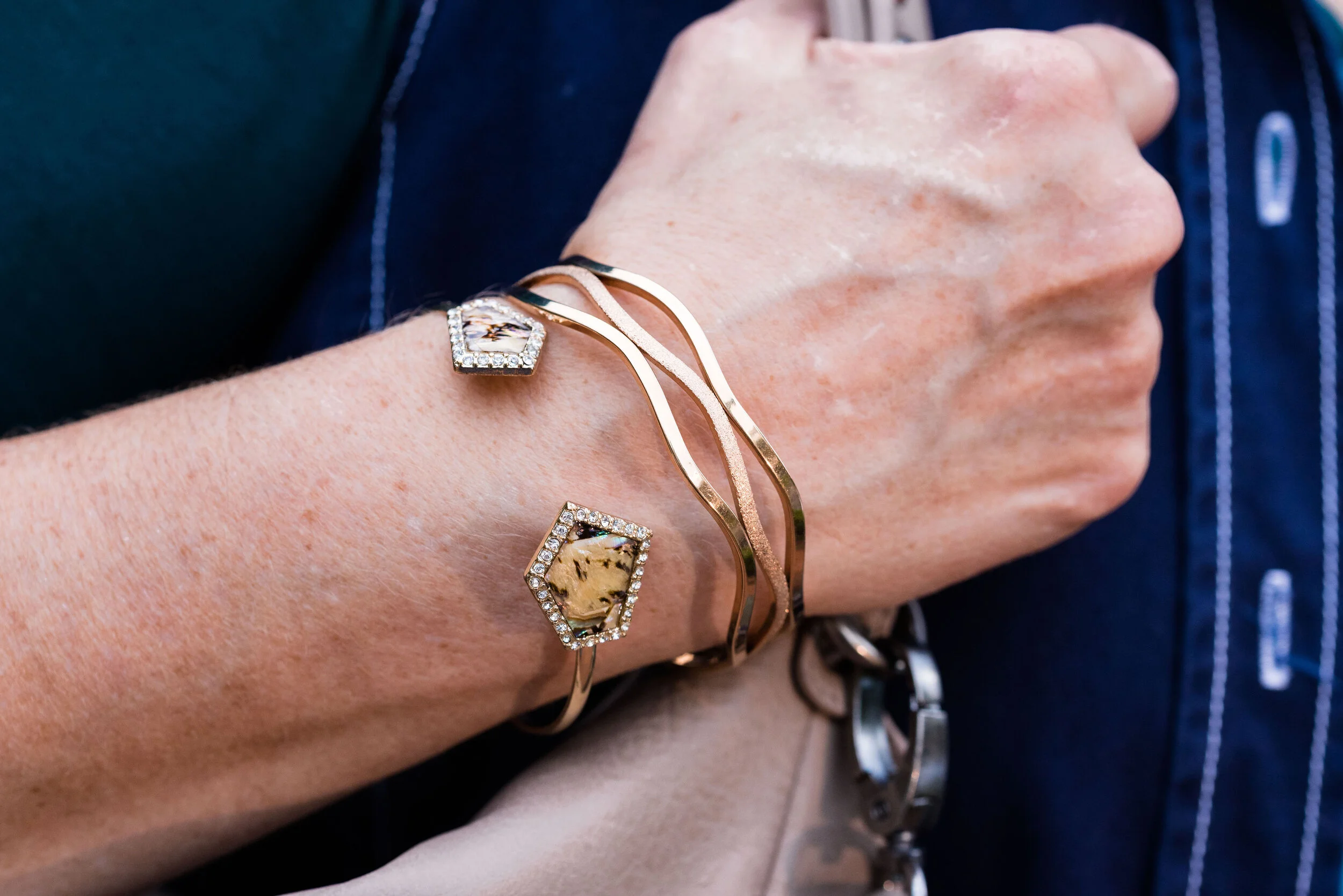
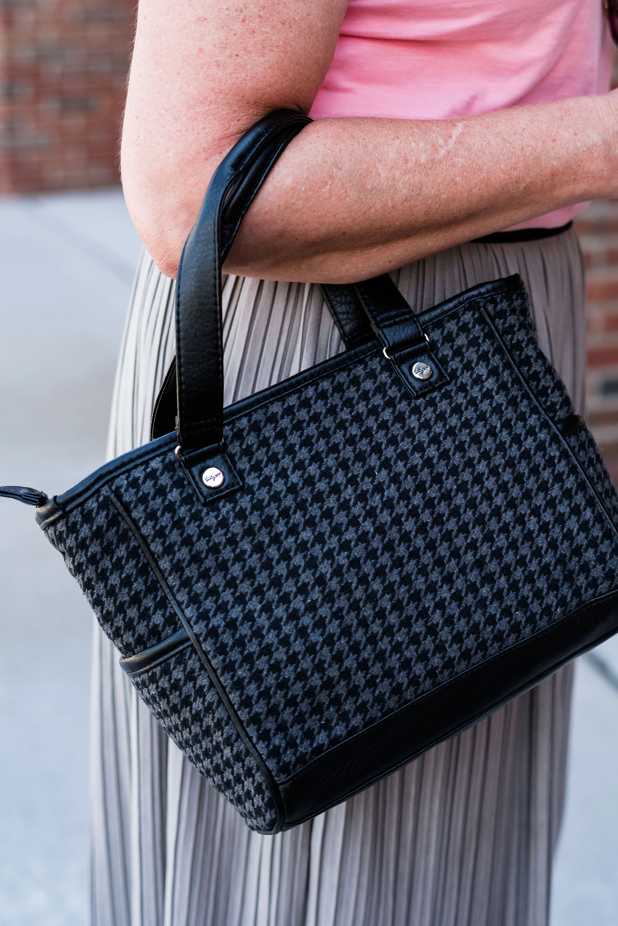
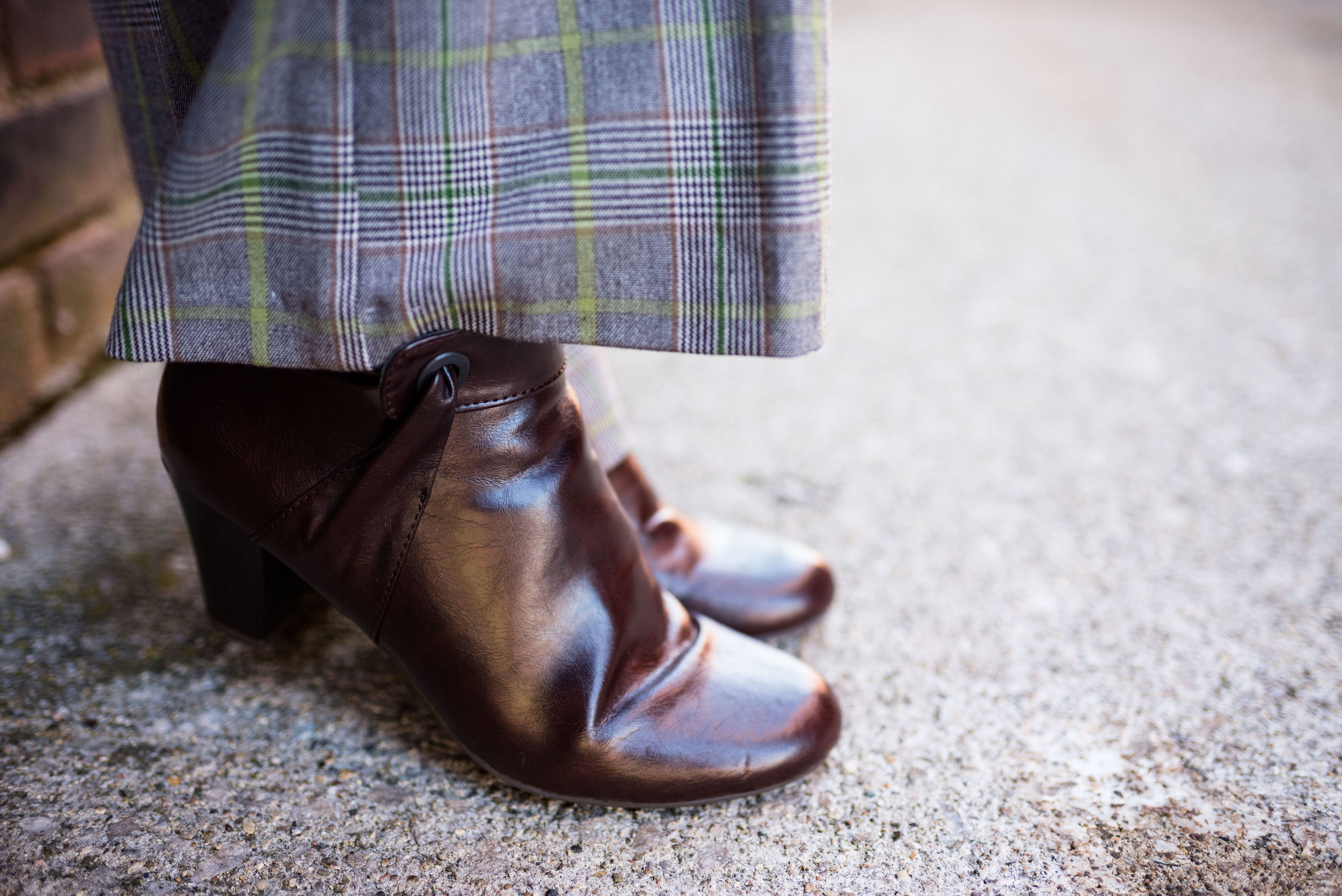
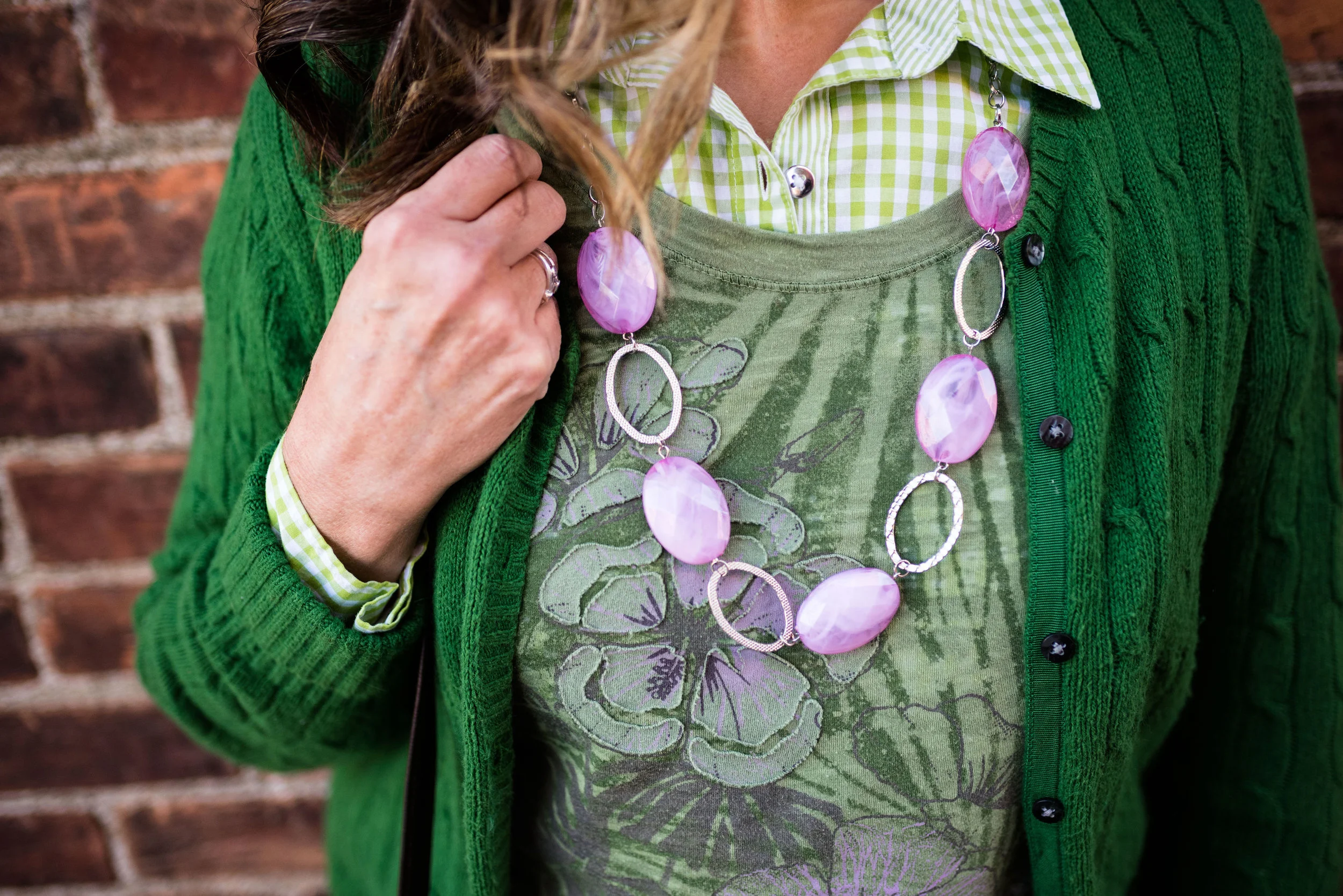
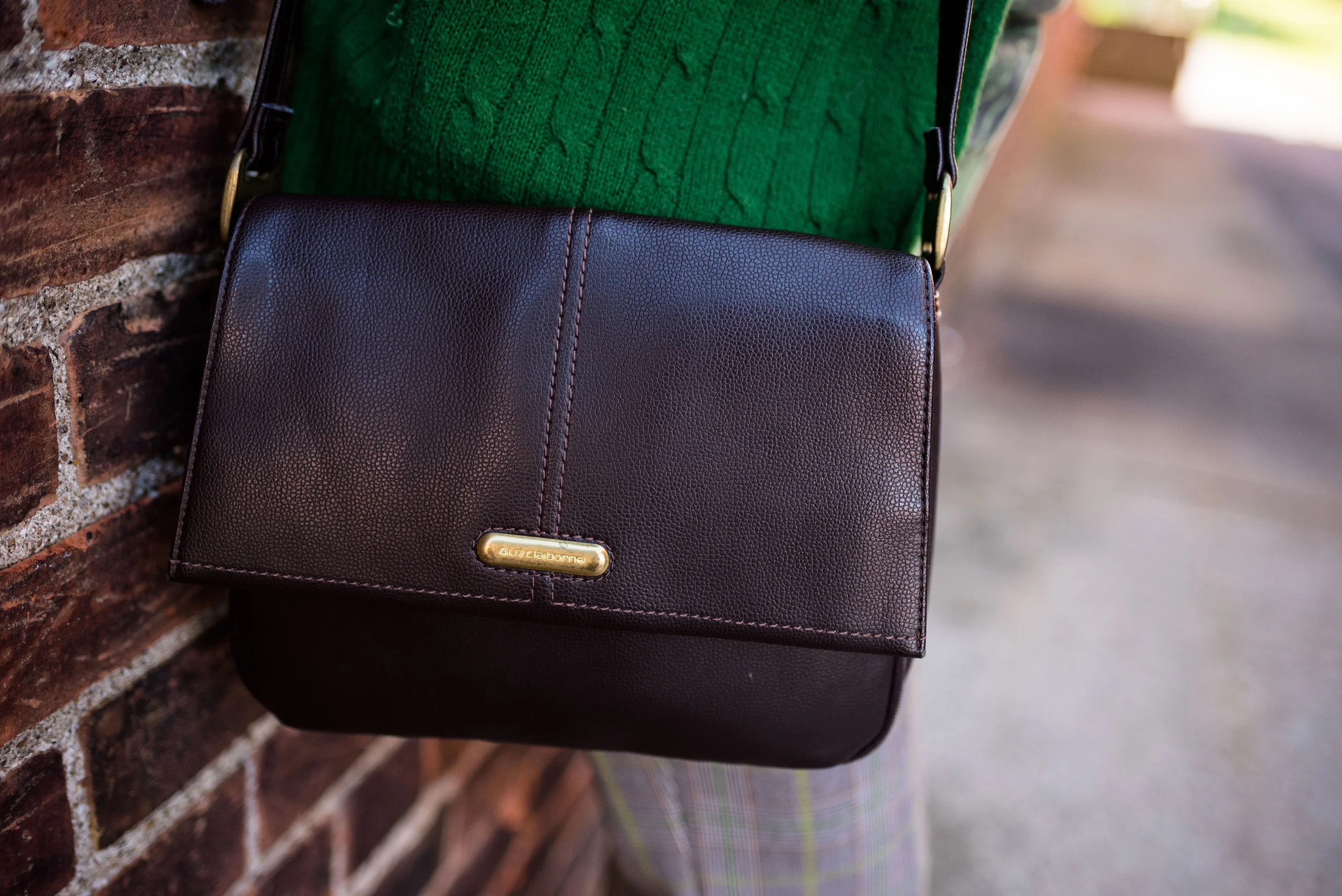
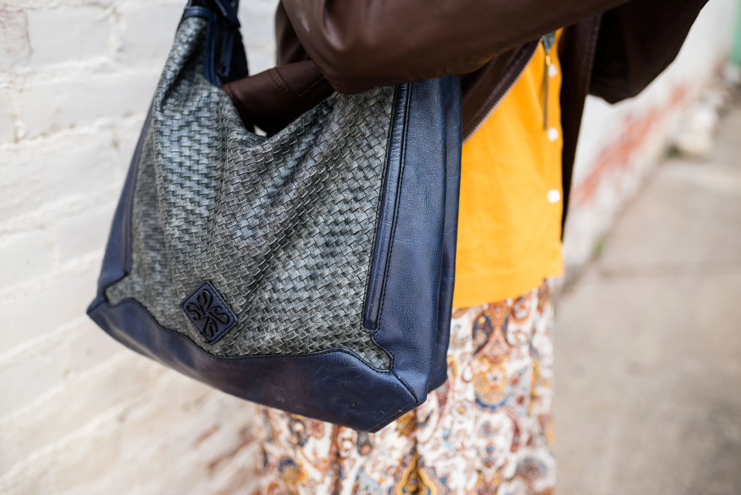
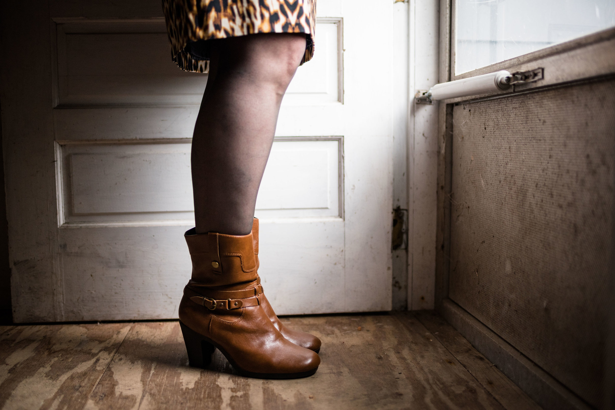
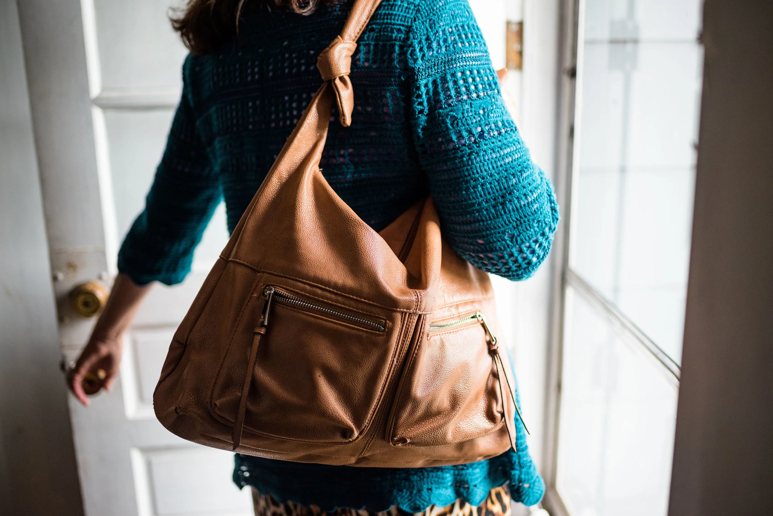
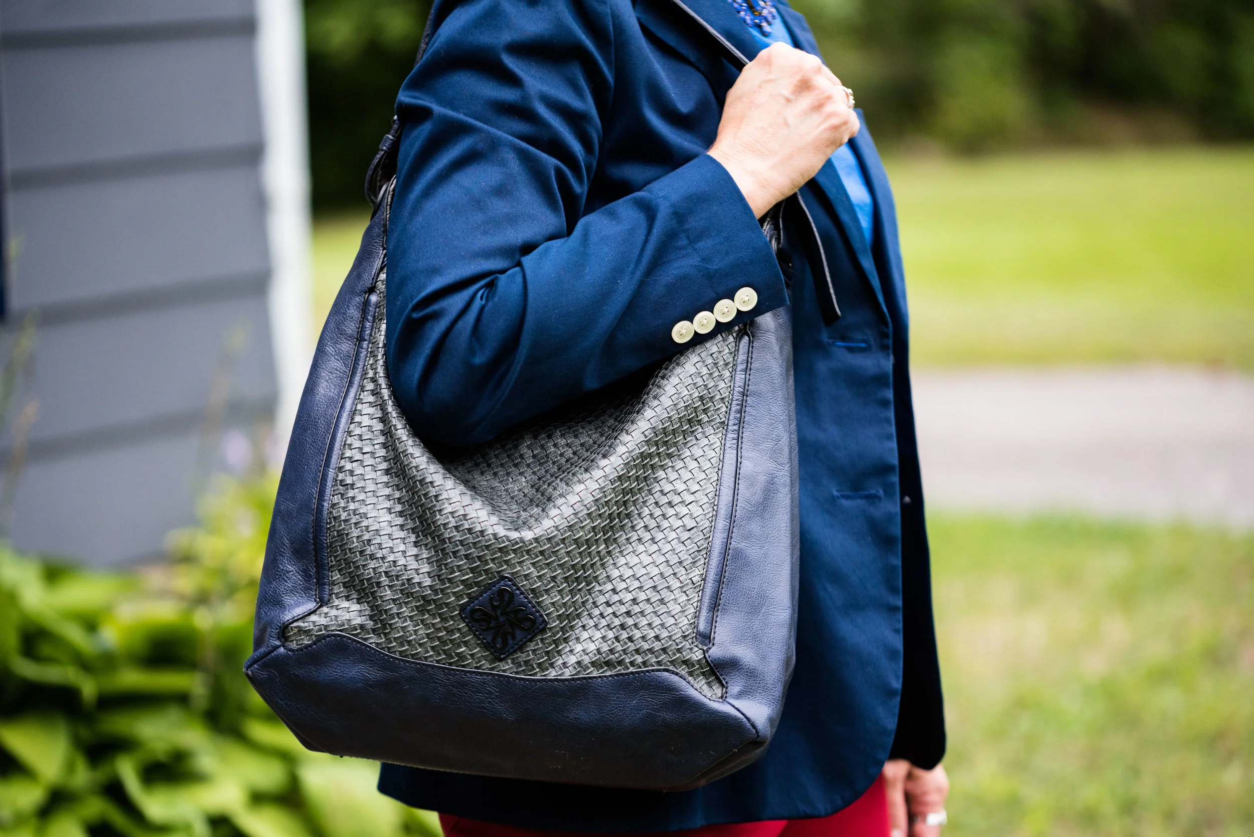
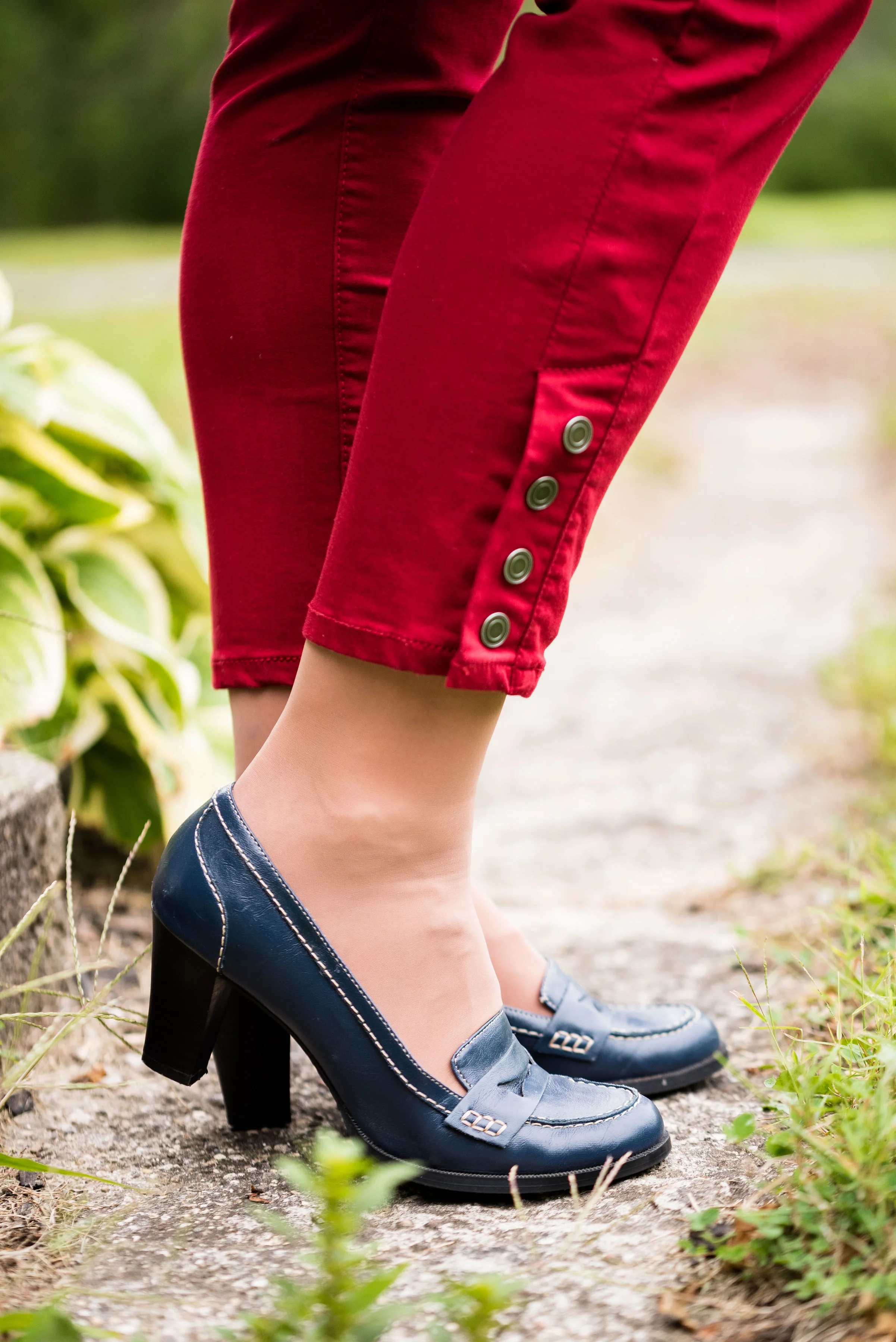
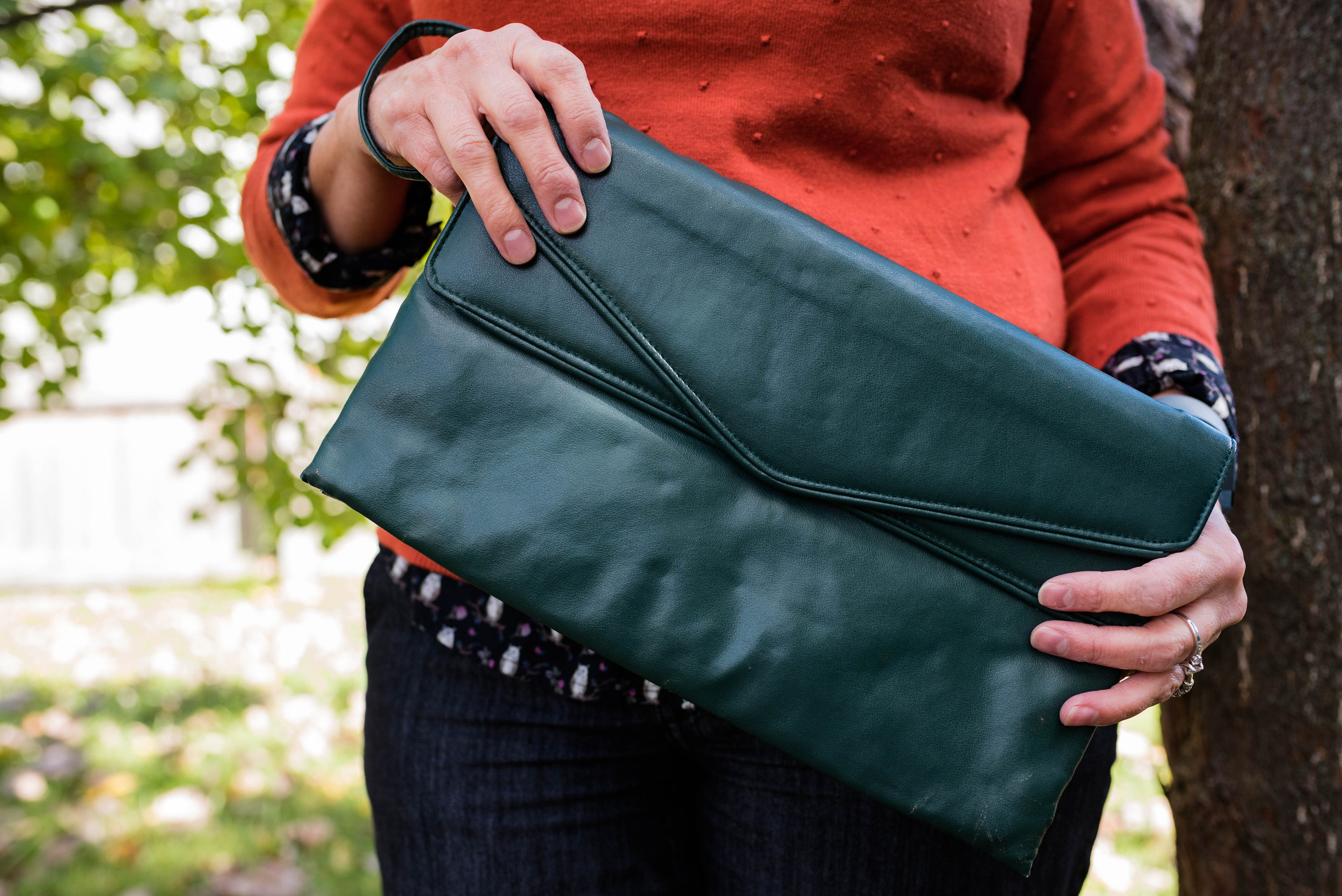
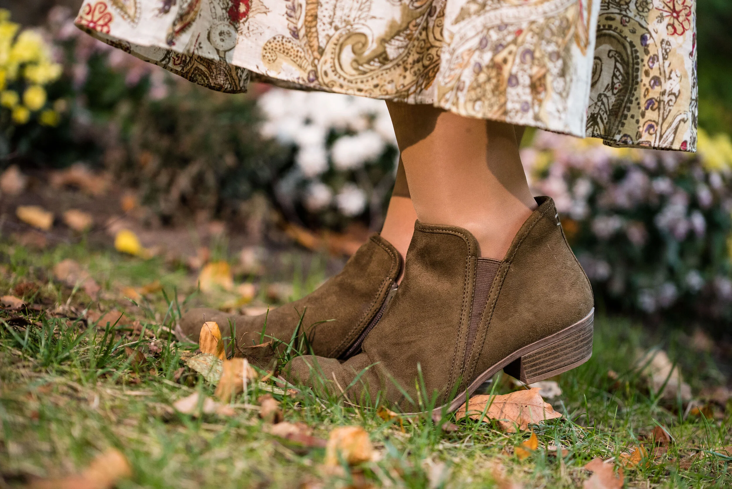
As I said earlier, I opted for olive green accessories which included my necklace, bracelets, thrifted bag and SO booties.

What do you think of these colors? Would you wear either of these? Would you wear them together? I’d love to have your feedback. Your support means a lot to me. I always respond to your comments. Just check back in a few days if you are interested in my reply.

I’m including a few shopping links for Merlot and Antique Moss if those colors got you excited. These are affiliate links, which means I get a few cents when you click on a link. All opinions are my own.

Photo and graphic credit Rebecca Trumbull.


Pantone - Autumn/Winter - 2019 - London Palette - Intro

Past Pantone seasons, I have tried to combine both the New York and the London color palettes into one series. Most of the time there were plenty of overlapping colors, so I was able to take colors from both palettes to make my outfits. This fall there were only two overlapping colors, Galaxy Blue and Bluestone. It was for this reason, that I decided to break the series into two parts. We just finished the New York palette last week. You can see a recap of those outfits here.

Today’s post will introduce you to the London palette and give you a few sneak peeks at the upcoming outfits.

Both the New York and the London palettes included numerous fall yellows, reds and browns. They both included a green, some blues and hues with pink undertones, but the London palette is the only one to include purple, which I thought was interesting since purple is trending right now. Purple has always been one of my favorite colors, so I was excited to see it included on this palette.

In all honesty, I like this palette better than the New York one. I always veer towards richer more saturated colors, rather than pastels and I felt that I had an easier time finding pieces in my wardrobe that better personified the color palette. In this palette we find words like vital, fortifying, robust, delicious, rich, baked, arresting, mellow and distinctive to describe the colors.

I hope you will join me on Thursday as I take a closer look at the London color palette for this fall. Here are a few peeks at what is coming up.

I hope you will join me on Thursday for the start of this series and a look at the first two colors.

Have a great day.

Photo and graphic credit Rebecca Trumbull.


Pantone - Autumn/Winter - 2019 - Peach Pink and Biking Red

These are the last two colors from the Pantone - Autumn/Winter - New York palette. Peach Pink is reminiscent of coral, which never really seemed like a fall color to me, but I must remember that the old rules don’t apply…at least to some things. I know many people buy into the old adage, the rules are meant to be broken, but I don’t always believe that is the best mindset to have, and that mindset trickles down to our children and our grandchildren. As far as rules, I think that many of them are in place for our protection and our benefit. Rules like, look both ways before you cross the street, floss your teeth once a day and eat your fruits and veggies are not bad. Actually, they are for our well being. Rules about color, really no longer apply, so I am okay with wearing white after Labor Day and wearing coral in October. Why not?

The other color in this ensemble is a dark red. It reminds me of the Brick Red from my Crayola Crayon box. How many of you remember those wonderful boxes of crayons? I used to obsess about having all the similar colors arranged by shade in my box. I didn’t want to hunt around for Brick Red, so I put it in the “red” section. Ha, ha.

As you can see, once again, my colors were not perfect matches. You will see I did a little better with the London Palette, which I will be introducing on Thursday.

The heavy gauge sweater is Candies brand from the Koh’s clearance rack at end of last winter’s season. I find this is the best time to shop for those pieces you want for the season, if you don’t want to pay full price. I have found most of my non-thrifted clothing pieces this way.

My Peach Pink tank top was a thrift find from a few years ago. It is Eddie Bauer brand. You’ll be able to see the ruching on the neckline in an upcoming picture.

My Paloma gray pleated skirt was also a Kohl’s clearance find a few years ago and is Apt. 9 brand.

My chunky wood ring necklace is making an appearance again. I love this necklace my daughter gave me for Christmas. It is so handy for making a statement and pulling the colors in an outfit together. A necklace like this works much the same way a scarf will, but without the added heat around your neck.

My little thrifted Houndstooth bag works both as a satchel and a cross body. The shoulder strap is inside the bag, but can easily be taken out and attached so I can wear this for hands free activities.

I really like these black Aerosole heels. They are comfortable and stay on my feet with no slipping or sliding. I decided to add the dark tights at the last minute for two reasons. The first was to keep the leg more monochrome and thus make the legs look longer. The other was to make the outfit seem more ready for fall weather. The day we took these pics it was hot!

What do you think of this outfit? Is this something you would wear? Do you like these Pantone colors? Why or why not? I’d love to hear from you, so leave a comment or two.

I’ve included a few shopping links. These are affiliate links. All opinions are my own.

Photo and graphic credit, Rebecca Trumbull.

Have a great day.

Outfit Inspiration - Plaid Trousers with Green

This outfit is another product of perusing a Christopher & Banks add that I had gotten in the mail. The add contained an outfit consisting of a pair of plaid pants, a cardigan, a short sleeve tee and a button up blouse with a collar. Since I am such a layering fanatic in the winter, due to living in a drafty old house and living in the mid west, I thought this would be a fun and different way to add multiple light layers. This layering not only adds warmth, but creates visual interest and additional texture, for an outfit that is clearly work appropriate, and also date night ready.

Plaid is in again and seems to be a recurring pattern in the fashion realm. Whether it is the light and bright plaids of spring and summer checks or the more expected flannel and buffalo plaids of fall, plaid is a pattern everyone can wear. With plaid shirts, pants, skirts and jackets there are plenty of choices for your closet.

I found this pair of Mossimo brand trousers at a thrift store. I like the wider legs, but it was the plaid pattern and the bright green stripes that had me throwing them in my cart. The picture below was to show off my dark brown Life Stride boots, but it also gives you a close up of the plaid colors.

Seeing as the pants have both a light green and a dark green stripe I was able to draw from several different greens in my closet. The Sonoma tee shirt is fairly old and is often worn during the warmer months as it is relatively light weight. The long sleeve gingham that I am wearing underneath is Jaclyn Smith and was thrifted. The cardigan was also thrifted and is Old Navy.

Because the tee had that touch of purple I added the purple bead and metal necklace for a contrasting splash of color.

I really like these greens with the purple. Even though I typically would associate these colors more with spring or summer I think they work well for fall and brighten things up, which really helps on a dreary day.

This shoulder bag is another thrift store find and is Liz Claiborne brand.

I like when the strap on a bag is long enough that I can use it either as a shoulder bag or a crossbody bag. It’s okay to occasionally have it both ways! Ha, ha.

I hope you enjoyed seeing this outfit. Do you like to wear plaid? What sorts of plaid items do you have in your closet. In addition to my plaid pants I have a few tops that are plaid, including a few flannel ones. How about you? Not all patterns are liked by everyone, but there are other ways to embrace a trend like florals or plaid, just think less is more. Carry a plaid bag, wear a plaid scarf or even a pair of plaid socks and then roll your pant cuffs so the socks are just peeking out.Everyone will think you are so on trend and you didn’t have to make a big investment.

I hope you all have a great weekend! Until next time.

Photo credit Rebecca Trumbull.


Summer Maxi Dress for Fall

I’m sure many of you have heard about transitional dressing. This has to do with taking a clothing piece from one season and changing it up to make it wearable in the next season. With our seasons here in the mid west being so varied, it is essential to have pieces that can be worn for more than one season. Perhaps that is one of the reasons I love jeans. You can wear them any time of year. Ha, ha. However, this is not going to be a post about jeans. You already know how much I love those! This post focuses on a summer maxi dress that was a new purchase from late last spring.

Some of you who regularly follow me might remember this dress from my summer series on maxi dresses. You can see the whole dress and the original post here. This bohemian style maxi boldly stated it wanted to come home with me when I saw it on the rack at Nordstrom Rack this past May. I knew as soon as I tried it on that it would be a versatile piece and would easily take me from summer into fall.

In order to make the light weight dress fall ready I decided I needed layers. I knew I wanted to style it with knee high boots to add warmth on the lower level. While I didn’t wear tights for this photo shoot, I would add them if I was going to have the dress on for a longer period of time.

I do love wearing boots. They are a great way to change up an outfit and add warmth. With so many styles from ankle booties to over the knee types what is not to love. And now there are so many more colors!

Here are a few brown pairs, that I like at decent price points.

To add layers at the top I chose this thrifted sunflower yellow sweater cardigan. The brand name is Callaway. A simple cardigan adds a warm layer without a lot of bulk and they come in so many pretty prints and colors. Here are a few to look at. With Christmas coming, I am sure you need ideas for all those girls on your list. Ha, ha.

In addition to the sweater I also grabbed my thrifted brown moto jacket. I have styled this many times on the blog. It is one of my favorite thrift finds and most often I wear it as an extra layer in the winter time, rather than as an outerwear jacket. For this particular fall day this and the sweater were just the right amount of layers.

Here are a few shopping options.

My accessories are pretty simple. This layered necklace I found somewhere or other on the clearance rack. The nice thing about these types of necklaces is there is no work involved. Some days that is just exactly what I need.

My bag is a navy Vera Wang bag that is also thrifted.

One of the things that I like about fashion blogging is learning new ways to use my clothes. It used to be that we had our summer clothes and our winter clothes. I still go through the process of putting things away and pulling out different things each season, simply because I am a clothes horse and there is no way I could have all my clothes out at the same time. Also, I tend to reach for what is in my comfort zone. In the winter I like to be warm, so I like my heavy sweaters and added layers. In the summer I like less layers and lighter material. However, since I have started blogging I have learned that there are ways to extend the seasonal pieces and get more wear out of them. This outfit is the perfect example.


I hope you enjoyed this post. Leave me some love in the comments. I always like to hear your point of view.

This post contains affiliate links. If you click on a shopping link I get a few cents. If you make a purchase through a link I get a little commission. I appreciate all your clicks.

Have a great day.

Photo credit Rebecca Trumbull. Make up Rachel Christensen.


Pantone Fall 2018 - Quetzal Green, Crocus Petal and Meerkat

I am on my last Pantone Fall 2018 post. I hope you have enjoyed seeing these colors and the way I have managed to put outfits together using the inspiration from the 2018 Fall palette. As in anything where fashion is concerned we can take it our leave it. Fashion is for you. It is about putting together outfits and colors that you like, make you feel confident and that you will enjoy wearing. In some ways what we wear is like our second skin. It provides a covering for a bodies and how we put that cover together can boost our self-image and help us better manage our wardrobes and our pocket books.

I have found, in the fashion realm, just like in cooking, having a source of inspiration really helps. Whether you follow a recipe or cook from memories of you and your mom or grandmother working together to make wonderful creations in the kitchen, you use that inspiration to put food on your table. In the same way inspiration for fashion can come from magazines, bloggers, color palettes or even things out in nature. That is the reason I always like to use the Pantone color palettes as a spring board for creating fun and interesting outfits.

These last two colors, Quetzal Green and Crocus Petal, I decided to pair, once again, with Meerkat. Crocus Petal is a lighter, more spring like color found on the London palette. I feel that pairing it with Quetzal Green and Meerkat was the perfect way to keep the light color grounded and more fall like.

This top is a Kohl’s clearance find and is Dana Buchman brand. It is a button up with 3/4 length sleeves and a longer silhouette. It has some stretch and is more fitted. I opted to wear this bead and metal statement necklace, which incorporates the Crocus Petal color as well. I wore a simple gold cuff on my arm.

I found the open weave sweater thrifting, I love the variations in the knit. I am not a yarn girl, though I would love to be. I think this is crocheted, but it might be knit. Can any of you readers tell? Whatever it is I love the different stitch sizes and open versus more closed aspect to the piece. Here we are talking about texture again and how essential is is to making an outfit more interesting.

I thought these two colors when great with the browns, black and cream of my leopard print pencil skirt. This skirt is another JC Penney find and is Worthington brand.

The boots, Aerosoles and bag, both thrifted were the perfect accessories to pair with this outfit. I think black would have worked well or even a cream colored boot, which are trending right now, but I love the luxe feel of the Meerkat color.

Next week I’ll have a recap of all the Pantone Fall 2018 colors. I hope you’ve enjoyed this series and that it provided you with some inspiration for trying new color combinations. Always shop your closet before going out to purchase what is currently trending. You might already have a leopard print top or the perfect color piece that matches with one of the Pantone seasonal colors.

I’ve included a few shopping links. These are affiliate links. All opinions are my own.

Have a great day.

Photo credit Rebecca Trumbull.

Pantone Fall 2018 - Russet Orange, Ultra Violet and Quiet Gray

This week’s Pantone Fall 2018 colors are a bright pumpkin orange and a deep purple we met last spring, that won Color of the Year. Russet Orange is an easy color on the eye and reminds us of those beautiful Maple trees that boast red, yellow and orange leaves. Ultra Violet might be part of your Halloween decorating. Since the combination of orange and purple has become a less dark and more party friendly Halloween pairing, I thought it would be fun to put these two colors together.

These pants I’ve worn on the blog before, here, here and here. They are Worthington brand from JC Penney. These have a side zipper and sit higher on the waist, so help to create a more smooth silhouette.

My top is an older tee from Christopher & Banks. I love the color of this top. To keep the bright colors from being too overwhelming, I chose the Pantone color Quiet Gray as a topper to polish off the look. This fun piece is from the Kohl’s clearance rack and is a brand called About A Girl. I really like the double breasted look and the feminine detailed ruffles.

I kept my accessories fairly simple. This lovely leaf necklace I found at a shop in Grayling, MI called The Main Branch Gallery. Boasting art work and crafts from local artisans it is a great place to visit if you are ever up that way.

I then finished off the look with my silver clutch and silver SO flats that I recently added to my SO shoe collection from Kohl’s. Here is a link if you are interested in other colors. They are on sale right now for only $21.99, which is a good deal for a fairly comfortable shoe that makes any outfit look a little more dressed up. I normally wear an 8.5 or a 9 and I get these in a 9.

What do you think of these two colors? Would you wear Russet Orange and Ultra Violet together? I’ve included a few shopping links below. These are affiliate links, but all opinions are my own.

Pantone Fall 2018 - Red Pear, Nebulas Blue and Sargasso Sea

Last week, I introduced you to this fall’s Pantone color palette. Now that I am just getting started with my series, I noticed their website already has the color palettes up for Spring 2019. I understand that in the fashion and interior design industries they always need to be one step ahead, or all of a sudden things have gone out of trend and disappeared. That reminds me of a verse from the book of Ecclesiastes which was written by King Solomon.

That which has been is that which will be,
And that which has been done is that which will be done.
So there is nothing new under the sun.
— Ecclesiastes 1:9 (NASB)

Even a man as wise as Solomon, knew there was nothing new under the sun. Look at the movies and books that are currently out. It is pretty much the same story, just written with different characters and a different setting. Heck, how many times have they revisited Spider Man and Predator? Ha, ha. That being said, the color palettes that come out are really nothing new. They call them by different names, make one a little more blue based or yellow based and say they are fresh and new.

However, I do enjoy color and I like to create outfits using color in combinations that may be new or different, at least for me. Following the color palettes that Pantone puts out each season allows me to do just that.

Here are the first of this fall’s palette.

Red Pear and Nebulas Blue are on both the London and New York palettes. Sargasso Sea is one of the classic colors or what I like to refer to as a grounding color. Red Pear borders on a maroon and my pants are really too red, while my version of Nebulas Blue appears spot on. Sargasso Sea is navy by any other name, but even there you can see all the different shades of navy. My Ralph Lauren thrifted blazer is almost too blue, while Sargasso Sea seems to have more gray in it. I think my loafer heels and bag are a little bit closer to the Pantone color.

I added this colorful bandana for a scarf as a way to bring together the red and blue and add a pop of yellow.

The blazer, shoes and bag were all thrifted. The bag is Simply Vera Wang; the blazer is Ralph Lauren and the loafer heels are Relativity. Everything you see in this outfit with the exception of the scarf I have styled on the blog before. It just goes to show that our closets are a great place to look for new color combinations and outfits.

What do you think of these colors? Do you think these colors represent the fall season? Why or why not? I’d love to hear your thoughts.

I have received a few messages that people are having problems commenting on my blog posts. If you an issue, please let me know. I contacted the help team for the platform that I use when I had a problem in the past and they said they couldn’t see any problem on their end. If you have an issue, please shoot me an email, so I can see how widespread the problem is.


I’ve included a few shopping links. These are affiliate links, which means I get a few cents if you click on it. All opinions are my own.

Fun Fall Look - Plaid Poncho

Plaid is all the rage this fall, so when I found this plaid poncho at Charming Charlie, I thought it would be a great addition to my wardrobe. Poncho's are a fun piece that add a layer of warm and an interesting look to many outfits. I have a crocheted poncho which I have styled on the blog before. You can see that post here. While that poncho is more for summer and warm wether, this piece I am styling for you today is perfect for fall and winter. 

Purple, being one of my favorite colors, I was thrilled to find this poncho. Not long after when I was thrifting with my older daughter, i found this purple pair of jeans. The jeans are really long and will look great with heels, but for this outfit, I rolled the pant legs up and wore my purple velvet kitten heels.

A poncho like this can be worn like a light weight jacket or when the weather gets colder it can be used like a blazer or sweater as an over piece for warmth and interest. I am wearing the poncho the traditional way with the point going down the front and back, but the poncho could be turned so that the points go toward the wrists for more of a rectangular appearance. I forgot to take a picture of it that way. 

For my outfit I am wearing the poncho as a layering piece over a light lavender cowl neck sweater.

Wearing the poncho as a layering piece means I have the extra warmth if I want it. I simply pull the necklace outside the poncho to make it look like a finished outfit. 

You can also see I added a few bracelets and a simple gray clutch.

Do you have a poncho? How do you like to wear yours? I've added a few shopping links if you are interested in getting one for yourself. There are a number of styles and colors. 

This post contains affiliate links. All opinions are my own. 

Thank you for stopping by the blog. Have a great weekend!

Color Crash Course - Spooky Color Combo (without being scary)

One of the ways I wanted to challenge myself in this Color Crash Course column, was to come up with color combinations that we usually associate with something else. For instance red and yellow make me think of McDonalds; red and green Christmas; green and yellow the Green Bay Packers (my husband's team) and so on. With Halloween only a few days away, I had to look at colors traditionally associated with this holiday. 

It used to be Halloween colors were restricted to orange and black, but in the more recent decades green and purple have been added to that mix. Images of pumpkins, witches, the Frankenstein monster and ghosts flying through a purply black night sky all come to mind. I decided to take those four colors and combine them into an outfit. 

Black jeans make the color subtle, rather than a stark black pant or skirt. Plus the jeans add texture to the outfit. Remember we have been exploring the idea of texture for making an outfit more interesting. 

This orange sweater was from Christopher and Banks last year. I like that it is light weight so perfect for layering and it has.....texture. The little raised bumps give it a polka dot effect. 

You can see the button up I wore under my sweater is black and has little owls on it. What better for Halloween. With the black background the little tan owls really show up as well as the little bits of purple and green in the pattern. I decided to add the lighter purple necklace so as to not overwhelm with a too Halloween-ish outfit. 

I left the shirt tail out to add some color and dimension between the sweater and the black jeans. 

For my bag I decided on a Lush Meadow clutch (more on that color in a few weeks). My shoes are an older pair I just love. A dark purple velvet kitten heel with sequins. They sound quirky, but I really like the way they fit my foot and the dark purple and sequins remind me of that Halloween sky. 

And, of course, I had to throw in a silly one. For another lovely look at black and orange check out Laurie at Vanity and Me. She shows an orange sweater styled two ways.

What do you think of wearing these colors together? What do you think of this outfit? I'd love to have your input. Just leave a comment below. 

I hope you all have a fantastic weekend. Thanks for hanging out with me on the blog!

Photo credit Rebecca Trumbull.