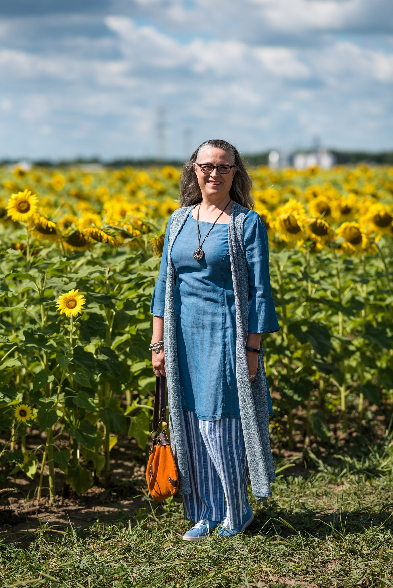
Actual Amy - Layering Up
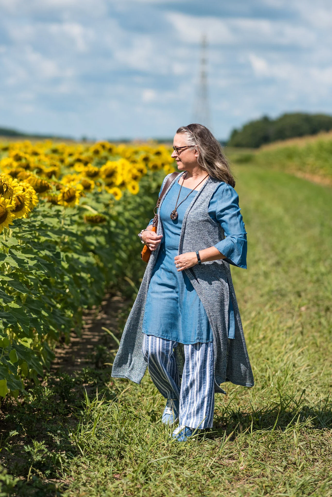
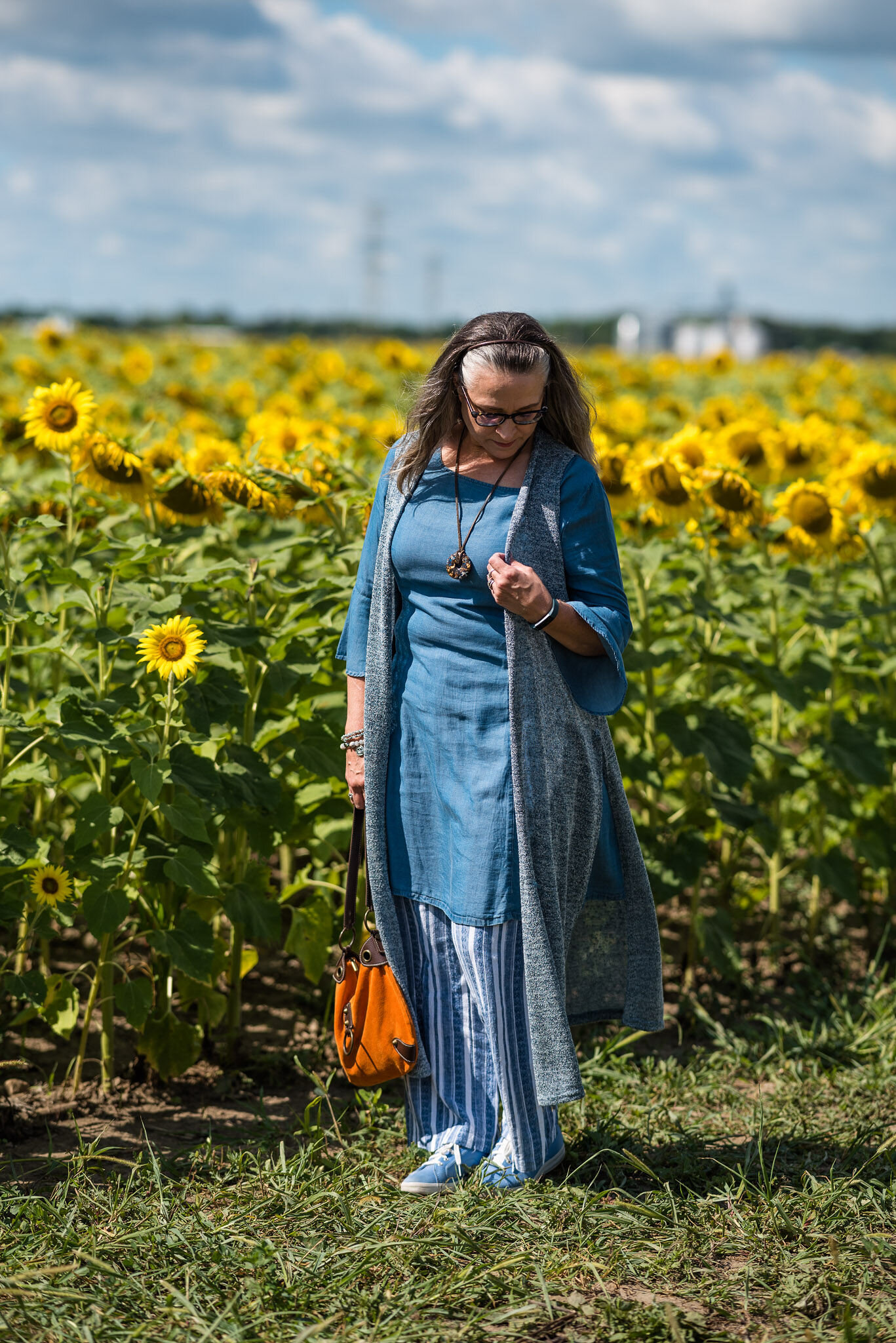
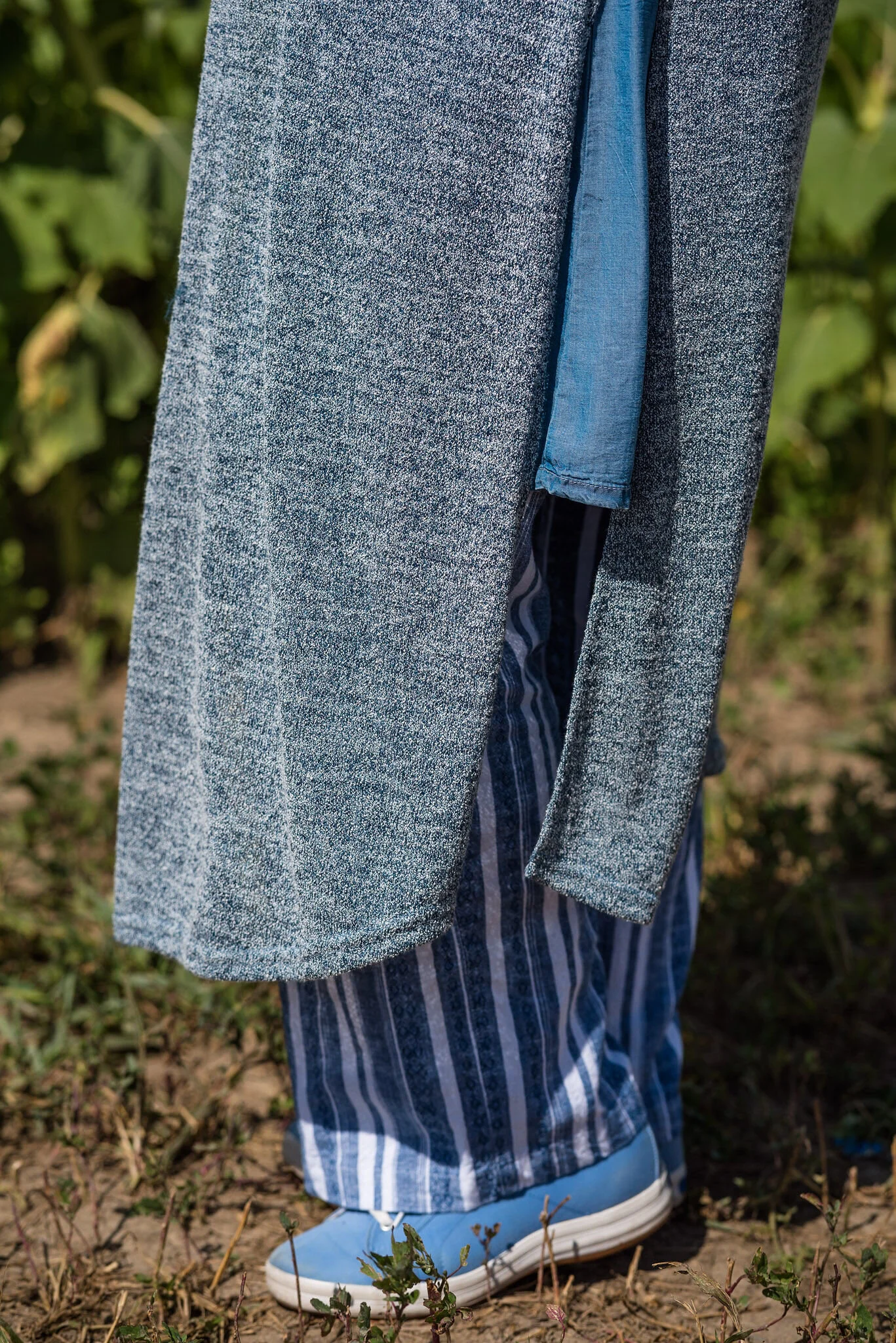
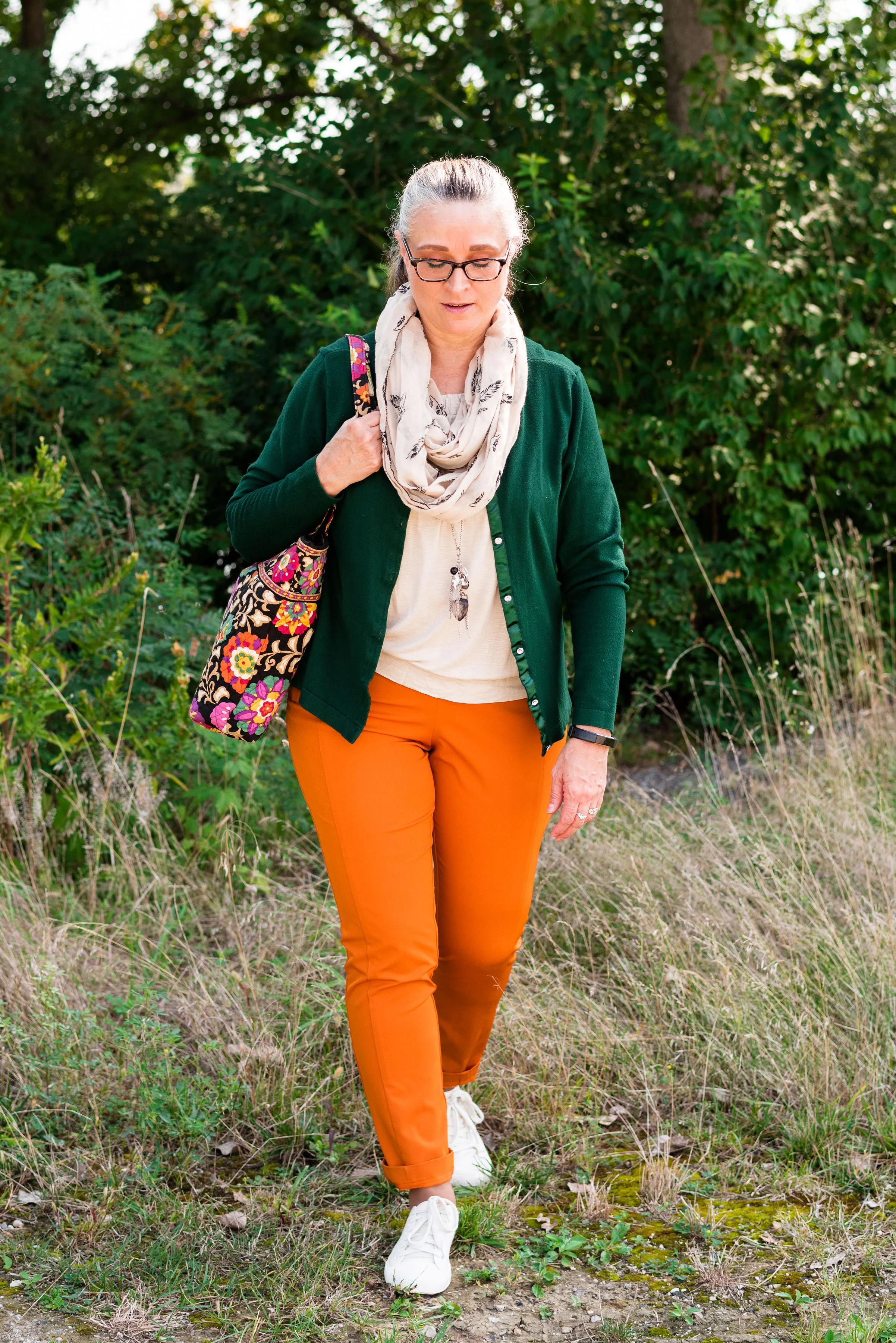
As most of you know, I love layers. Layering in these transitional times, from summer to fall, and fall to winter, gives us the ability to create outfits with even more interest and texture. Easy layering pieces include cardigans, blazers, jackets and scarves. These can all add a fun change to your wardrobe and give you layers to put on or take off as needed with the changing temperatures. We are expecting a warm spell these next few days, followed by falling temps for the beginning of October.
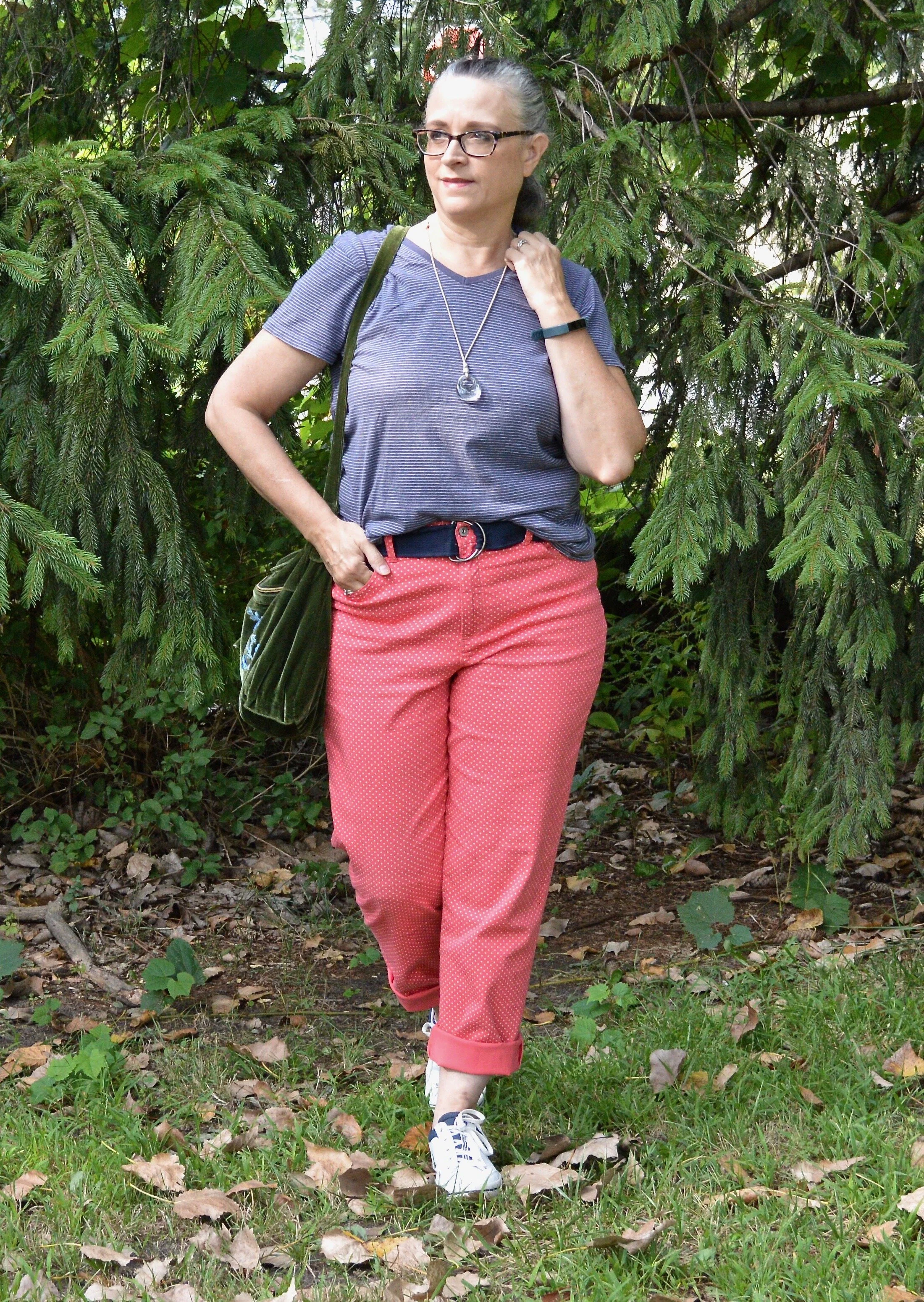
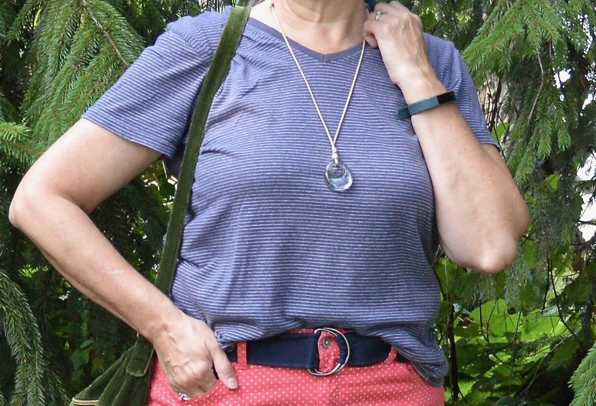
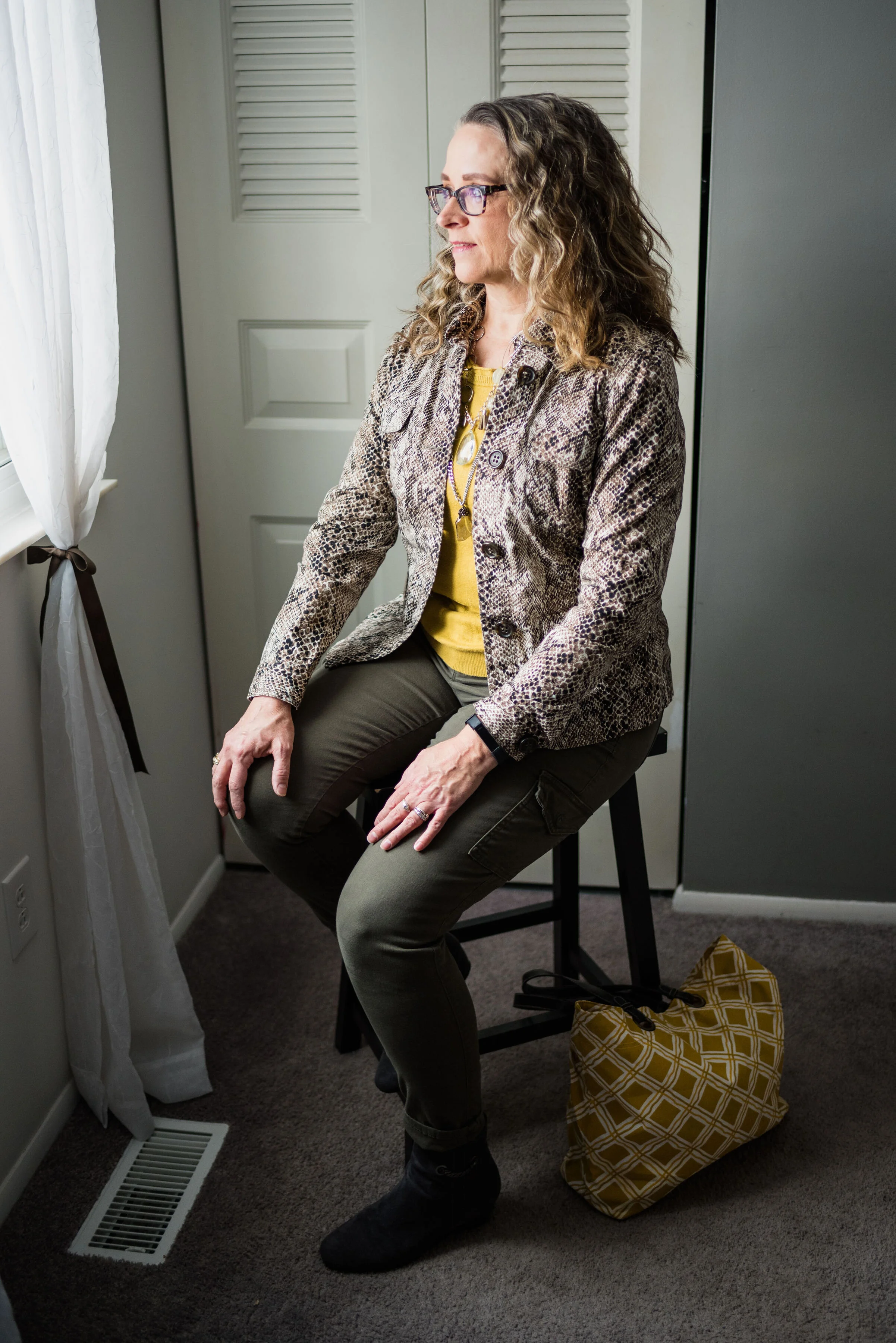
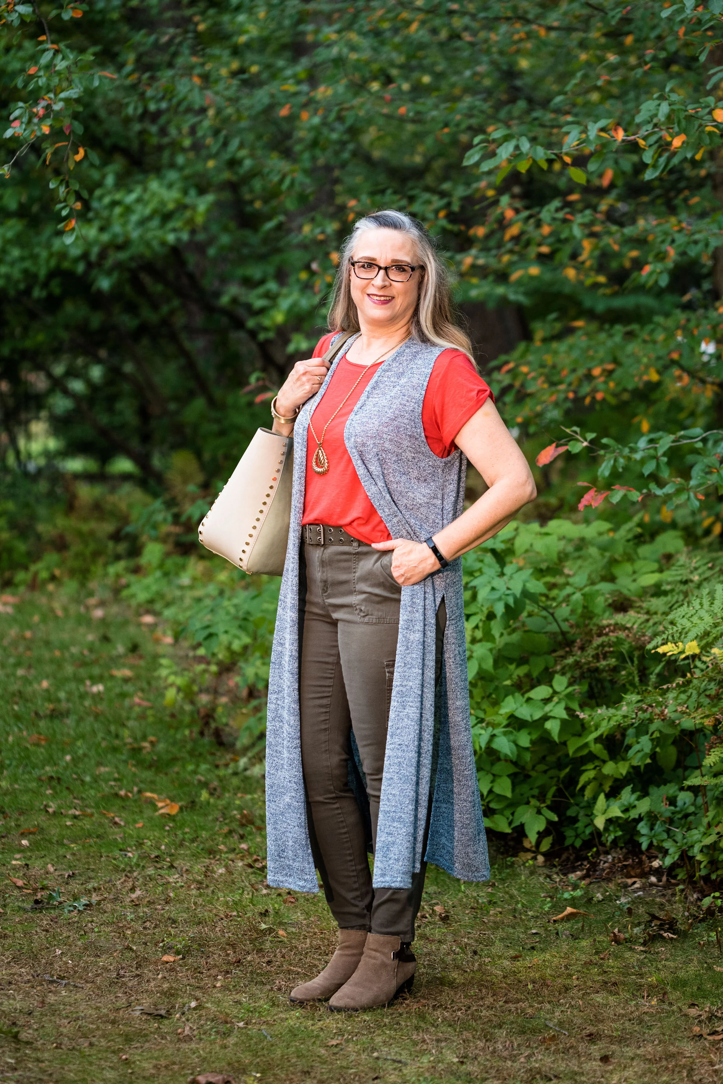
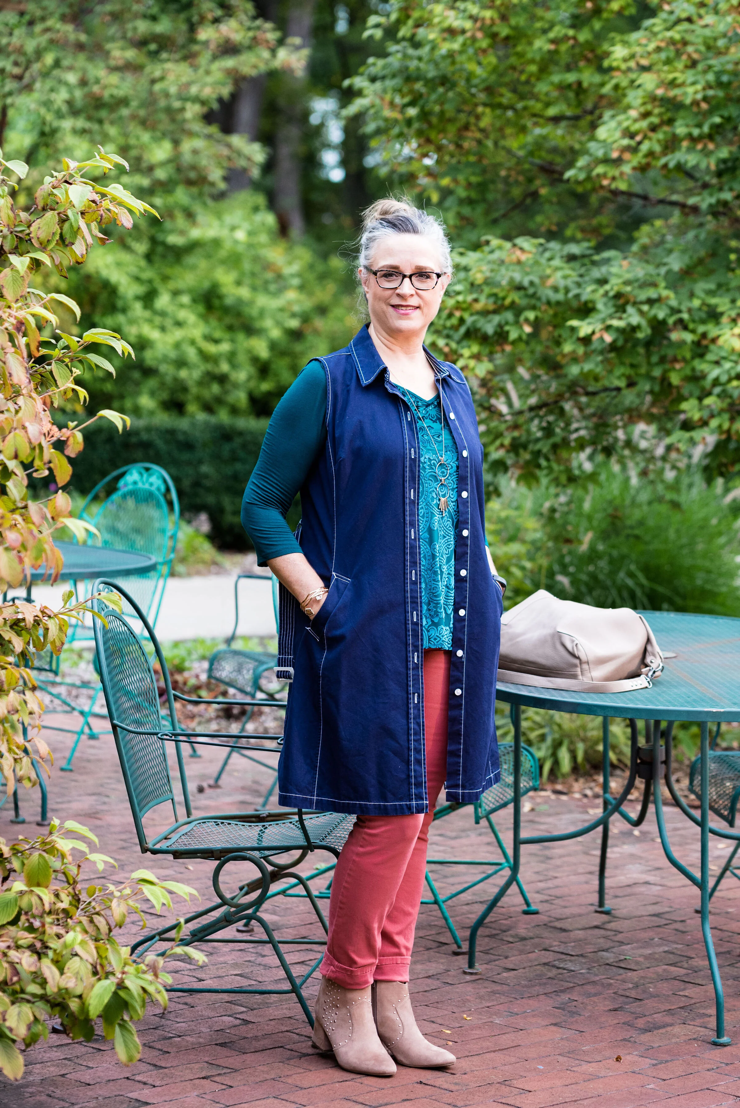
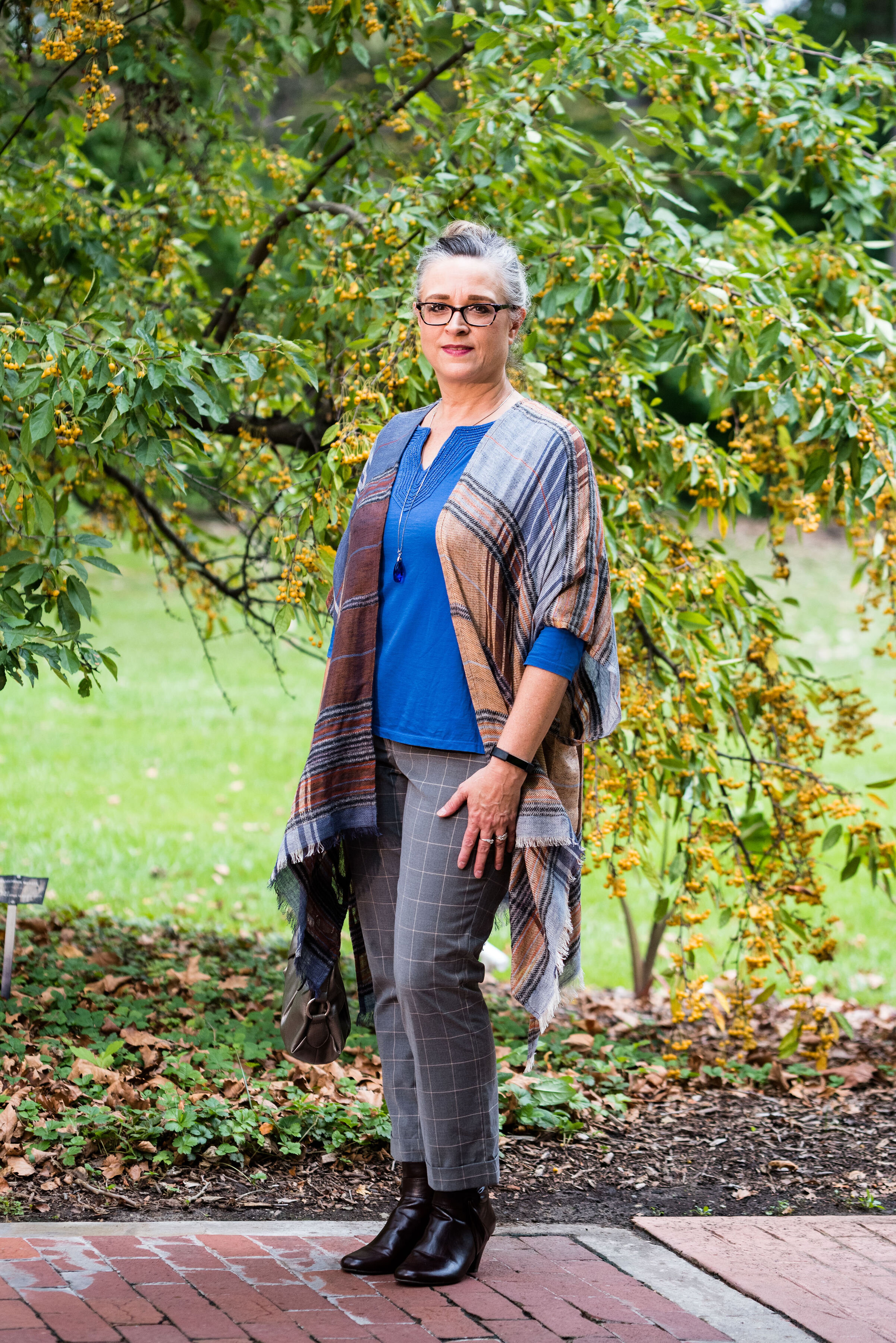
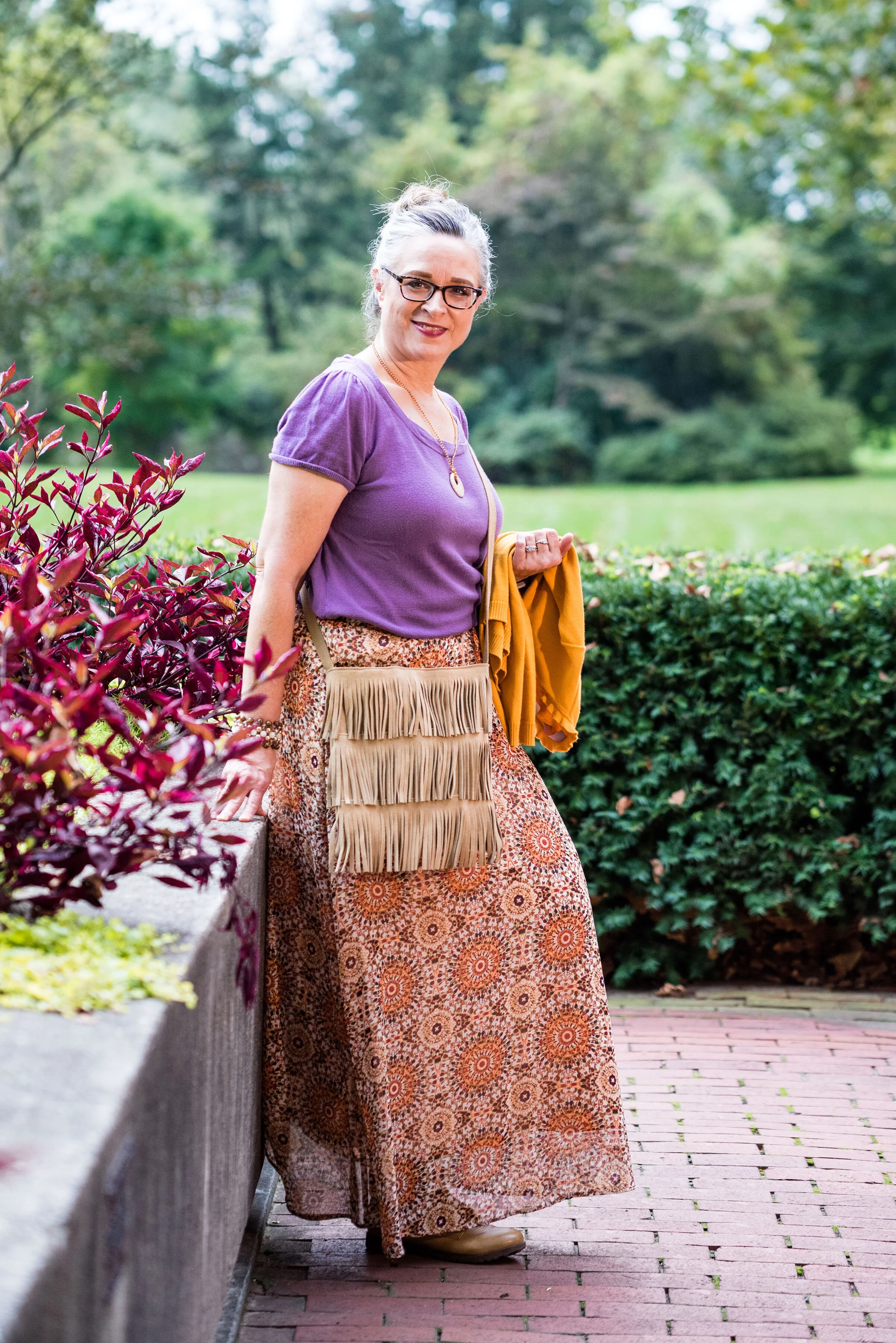
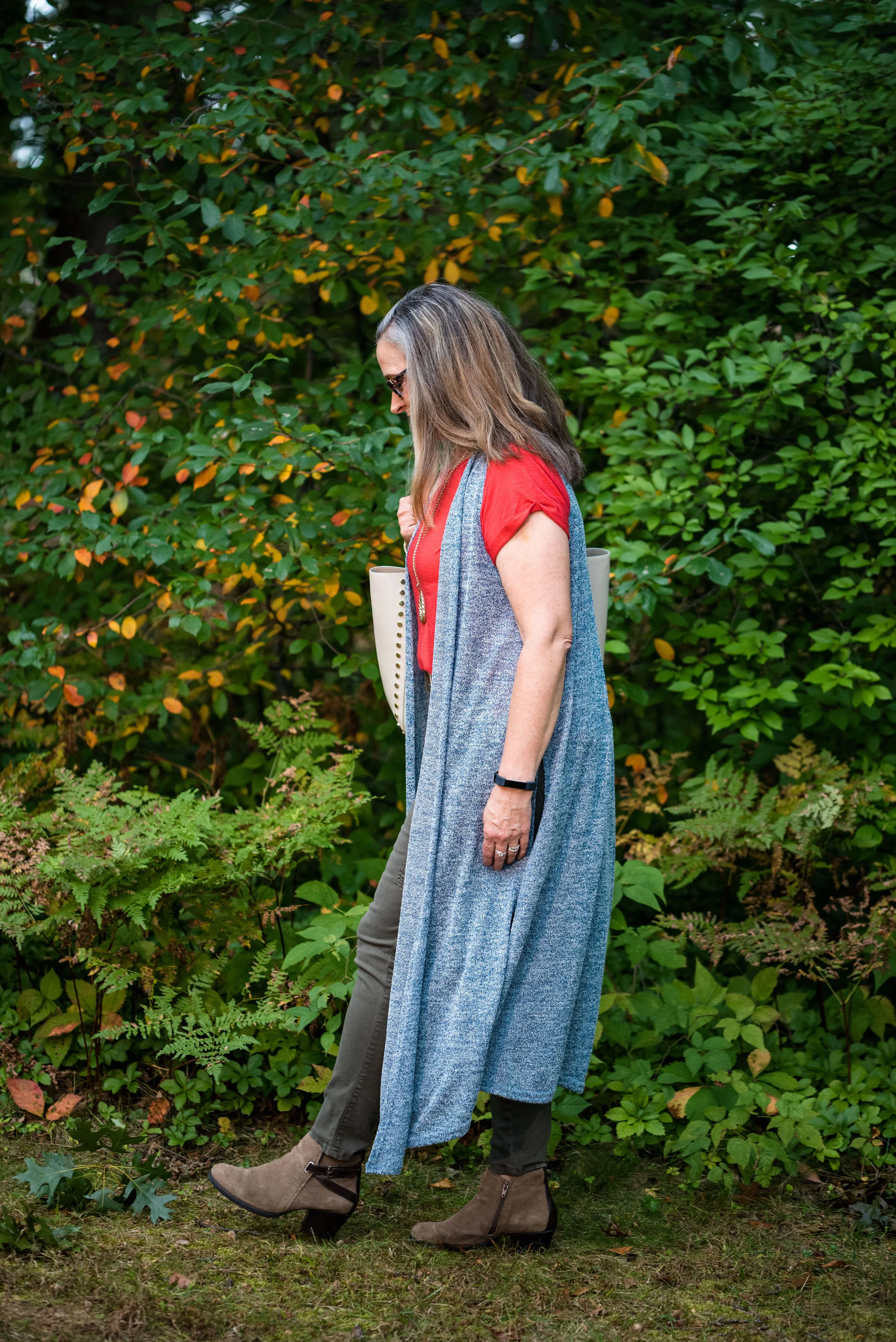
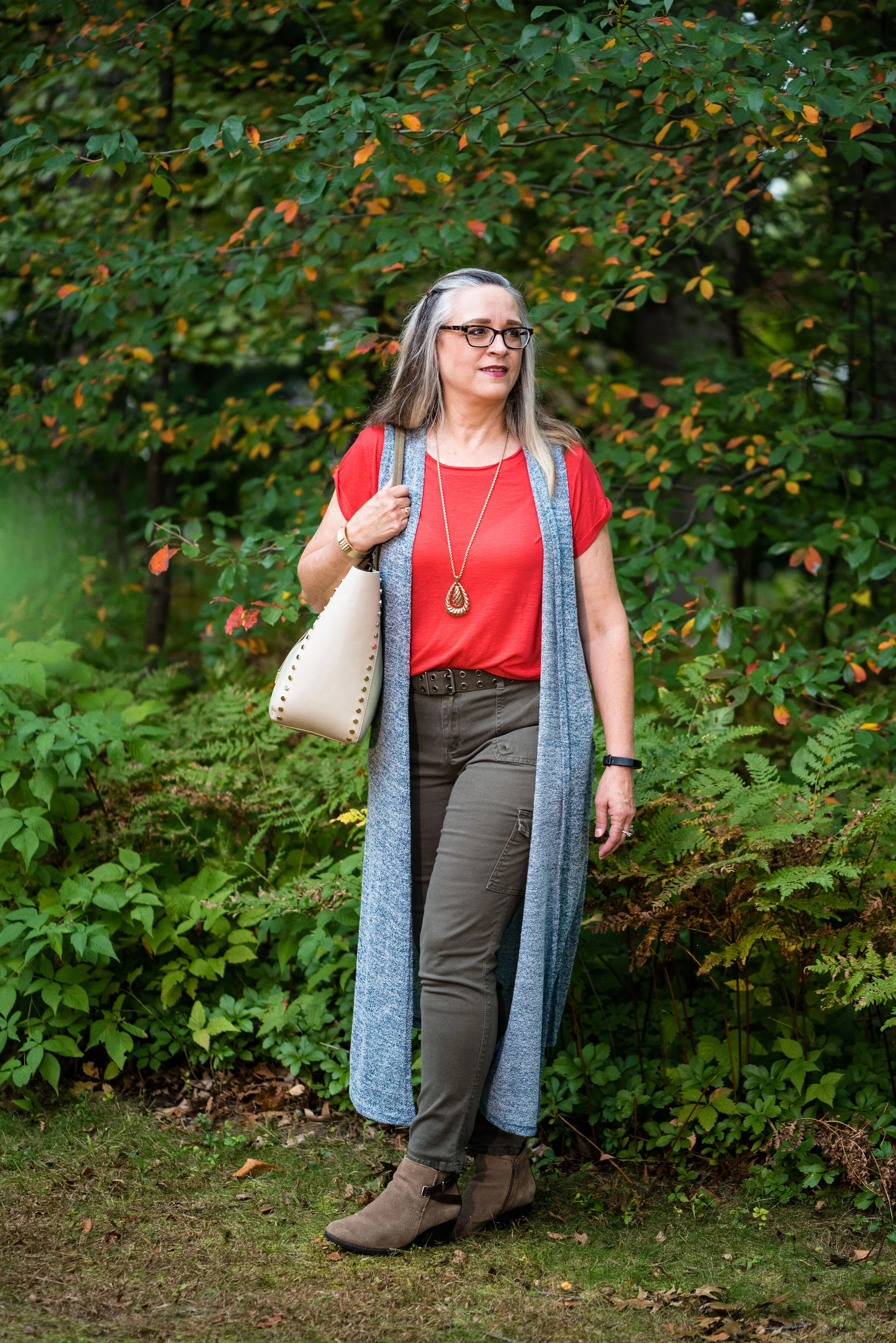
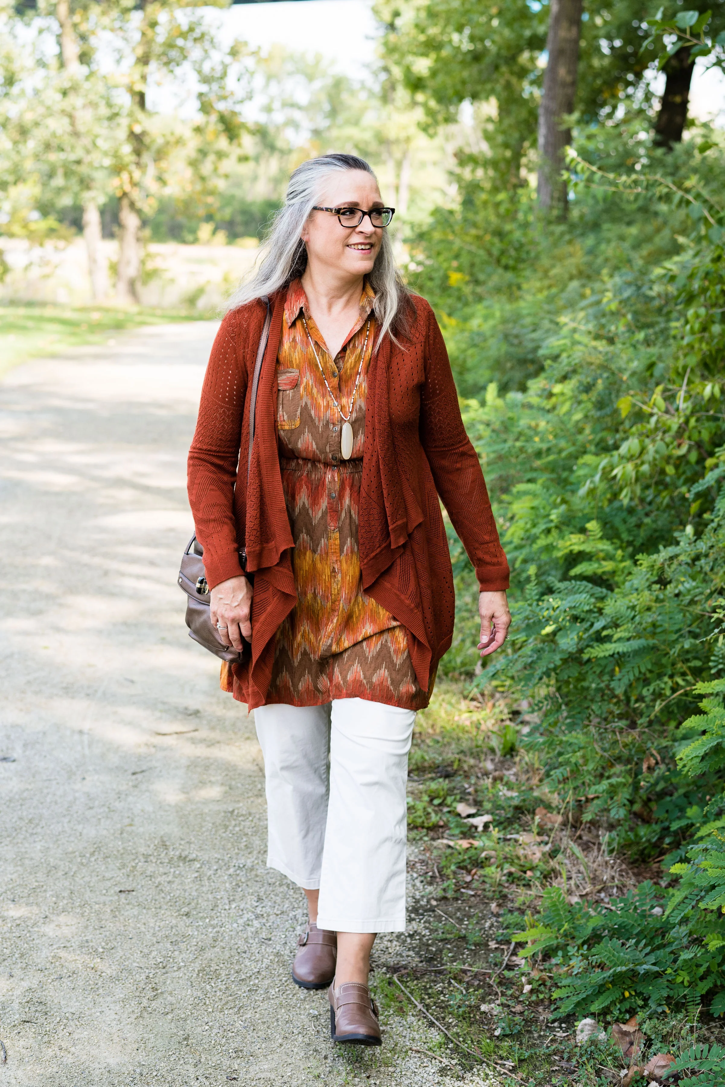
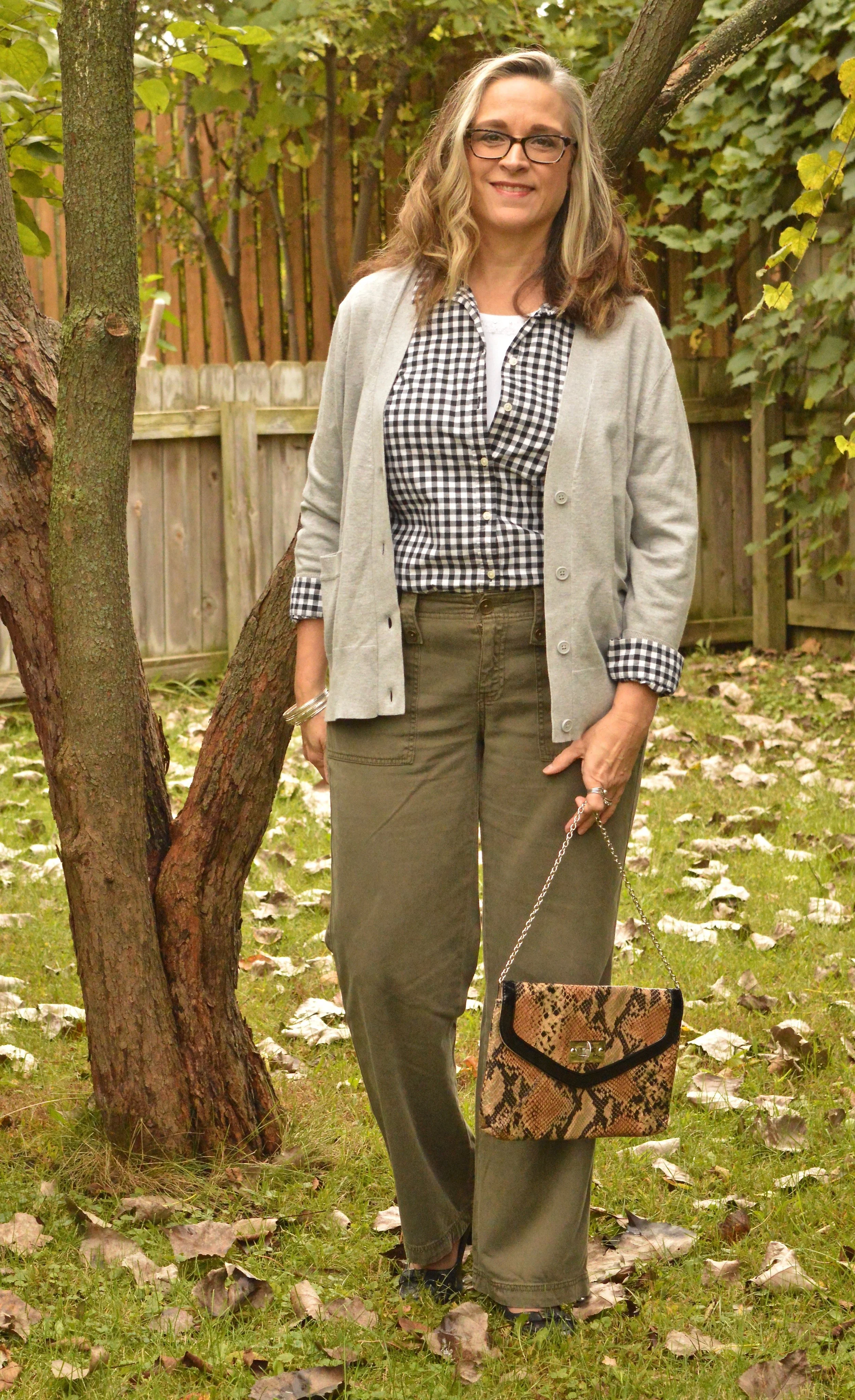
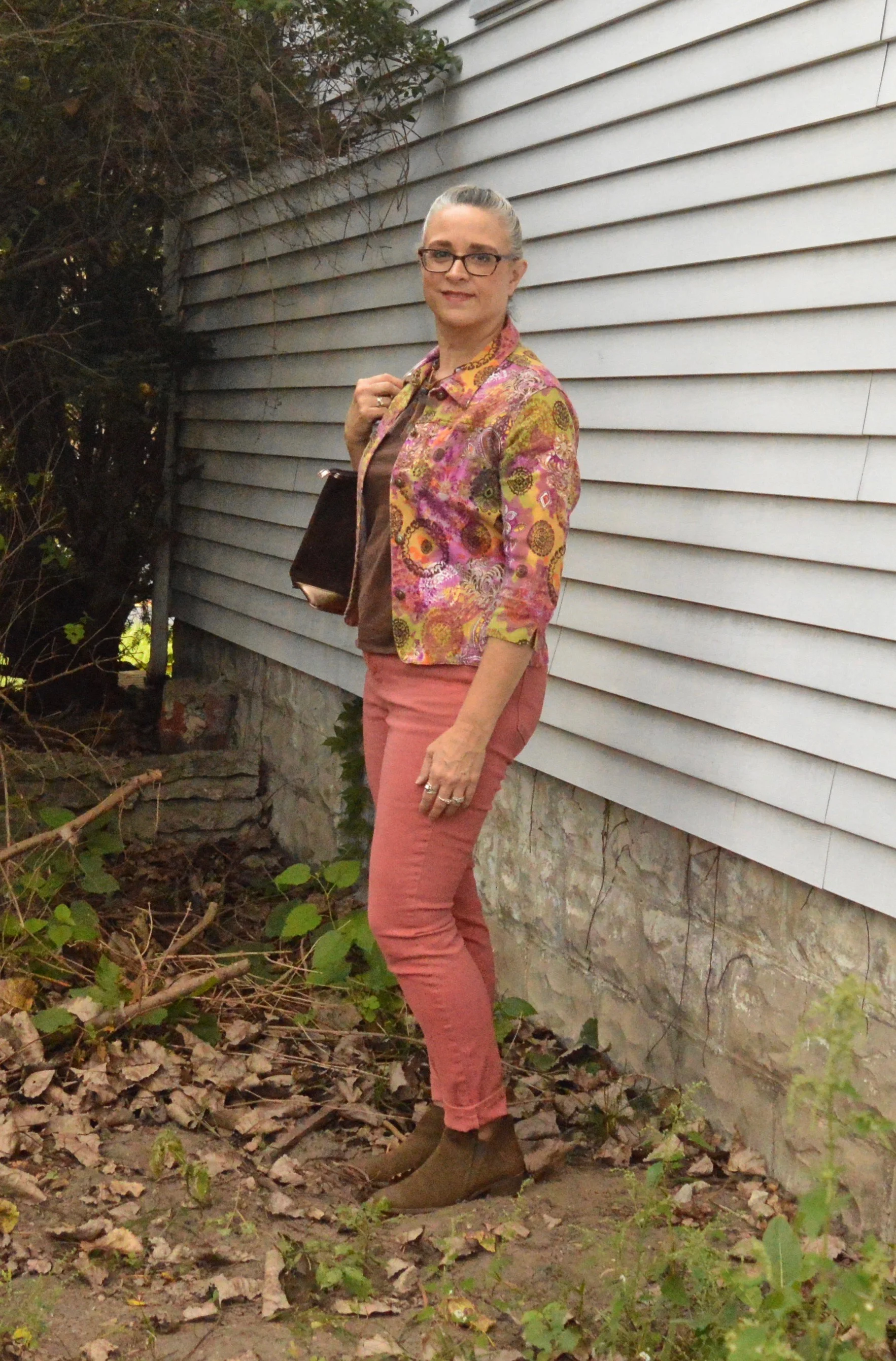
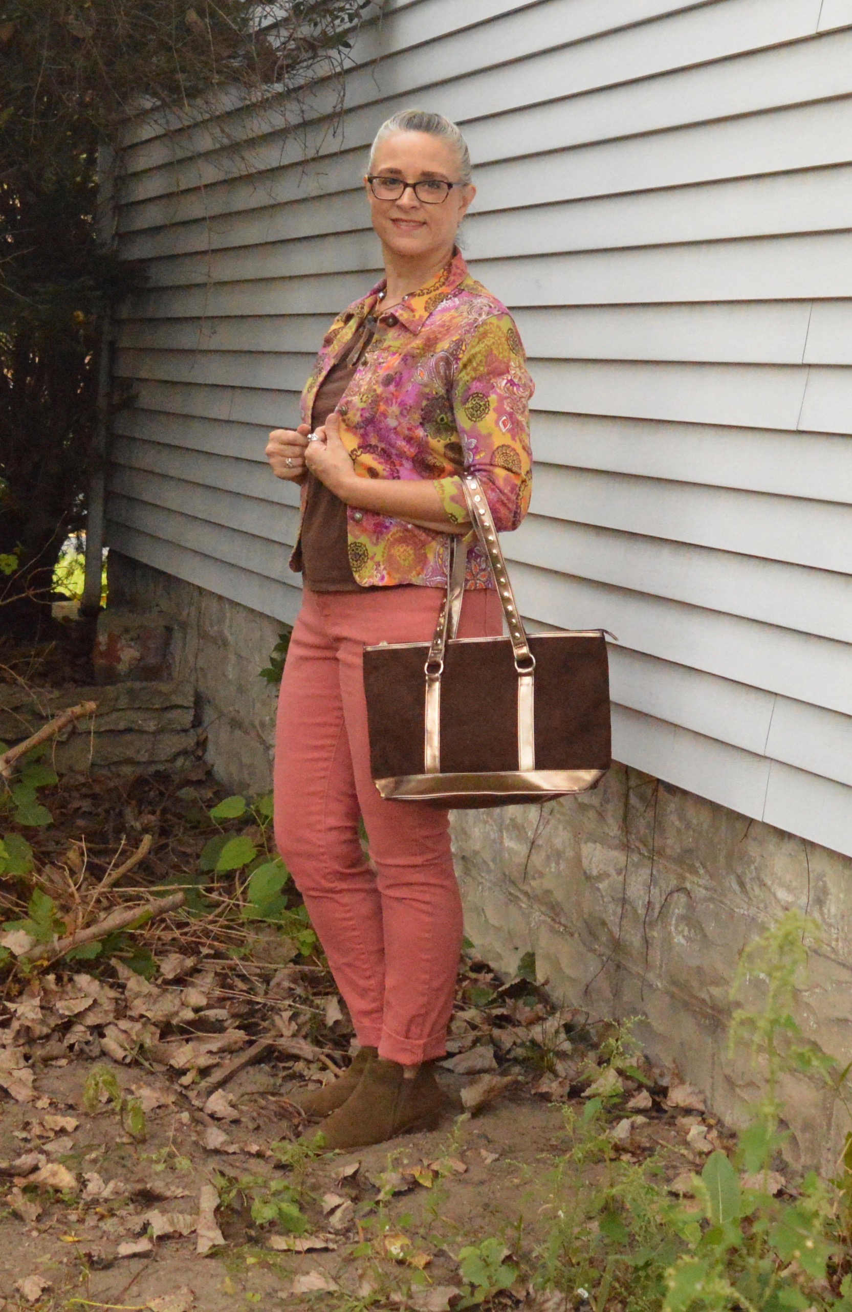
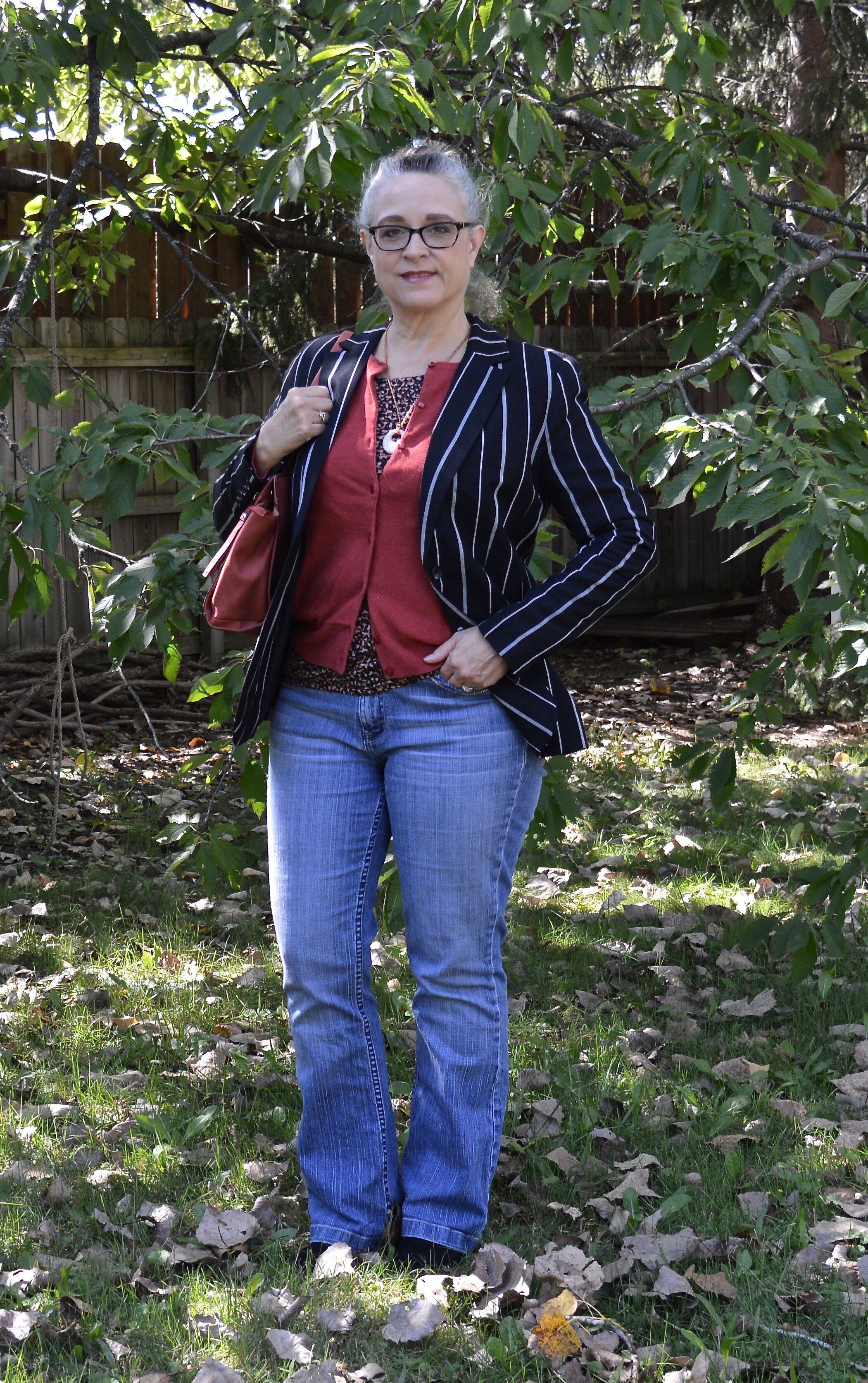
In today’s outfit, the focal point is a recent clearance find from Target. This A New Day striped blazer was uniquely different from my other blazers and jackets being that it is striped, so I knew I had to have it.

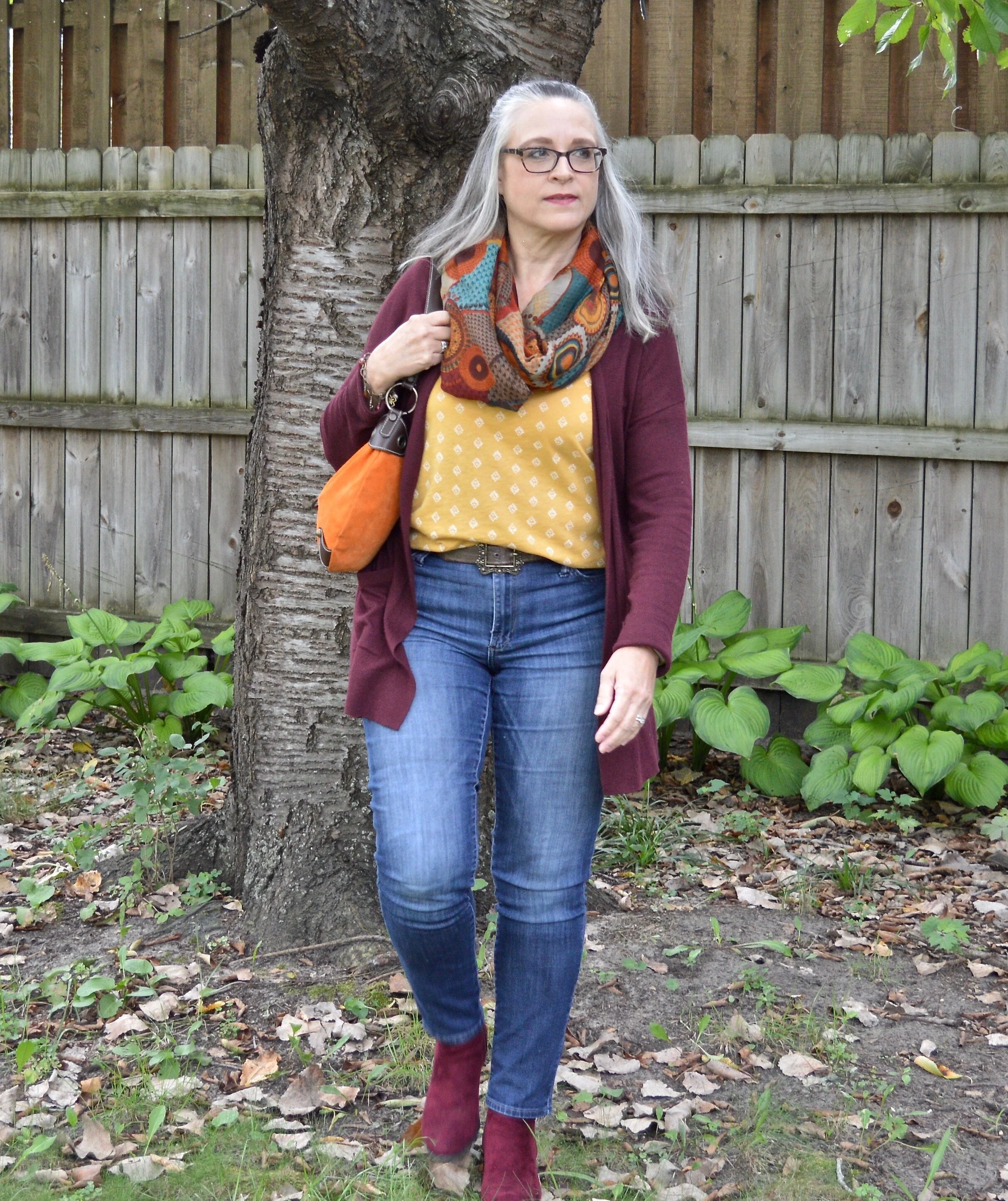
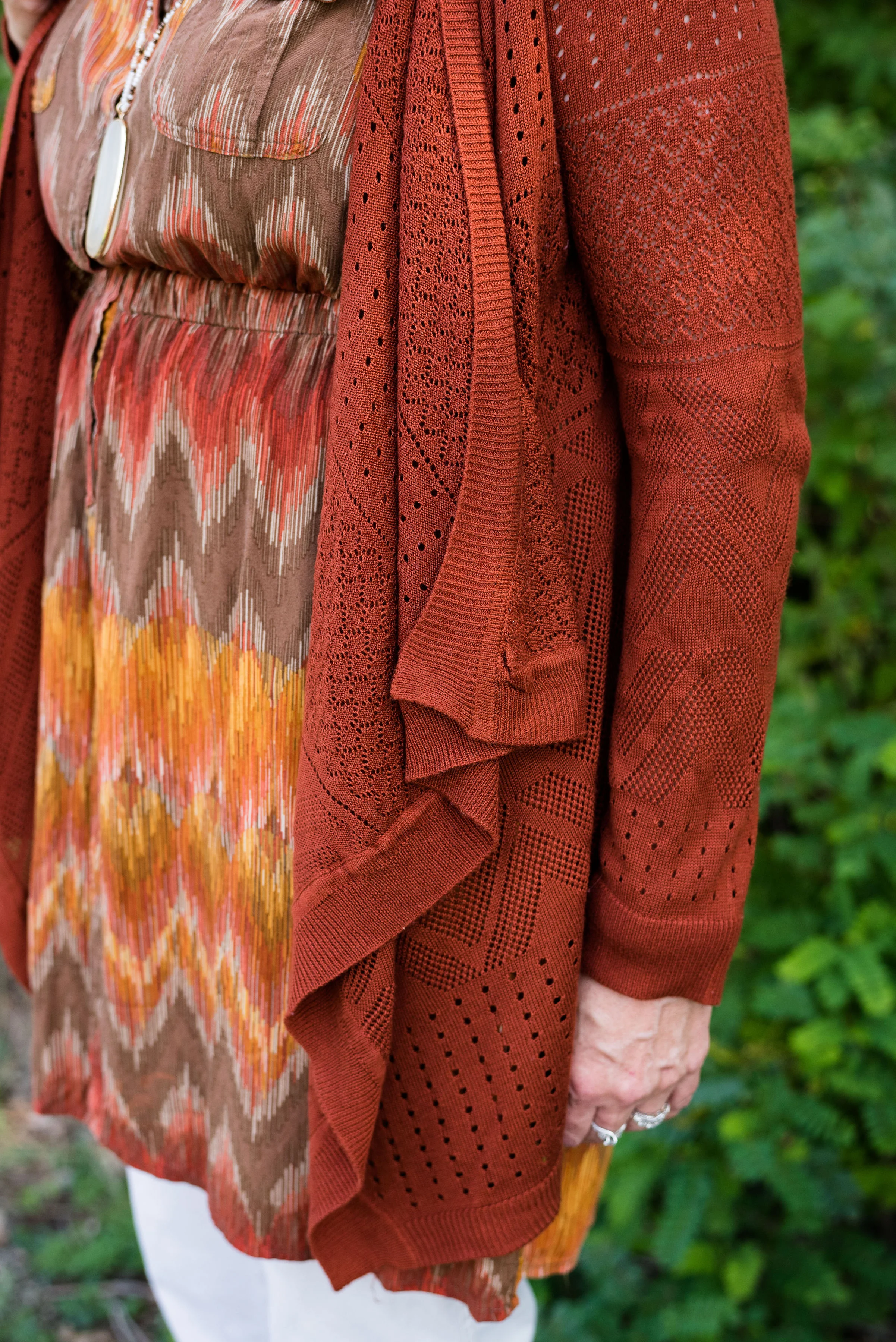
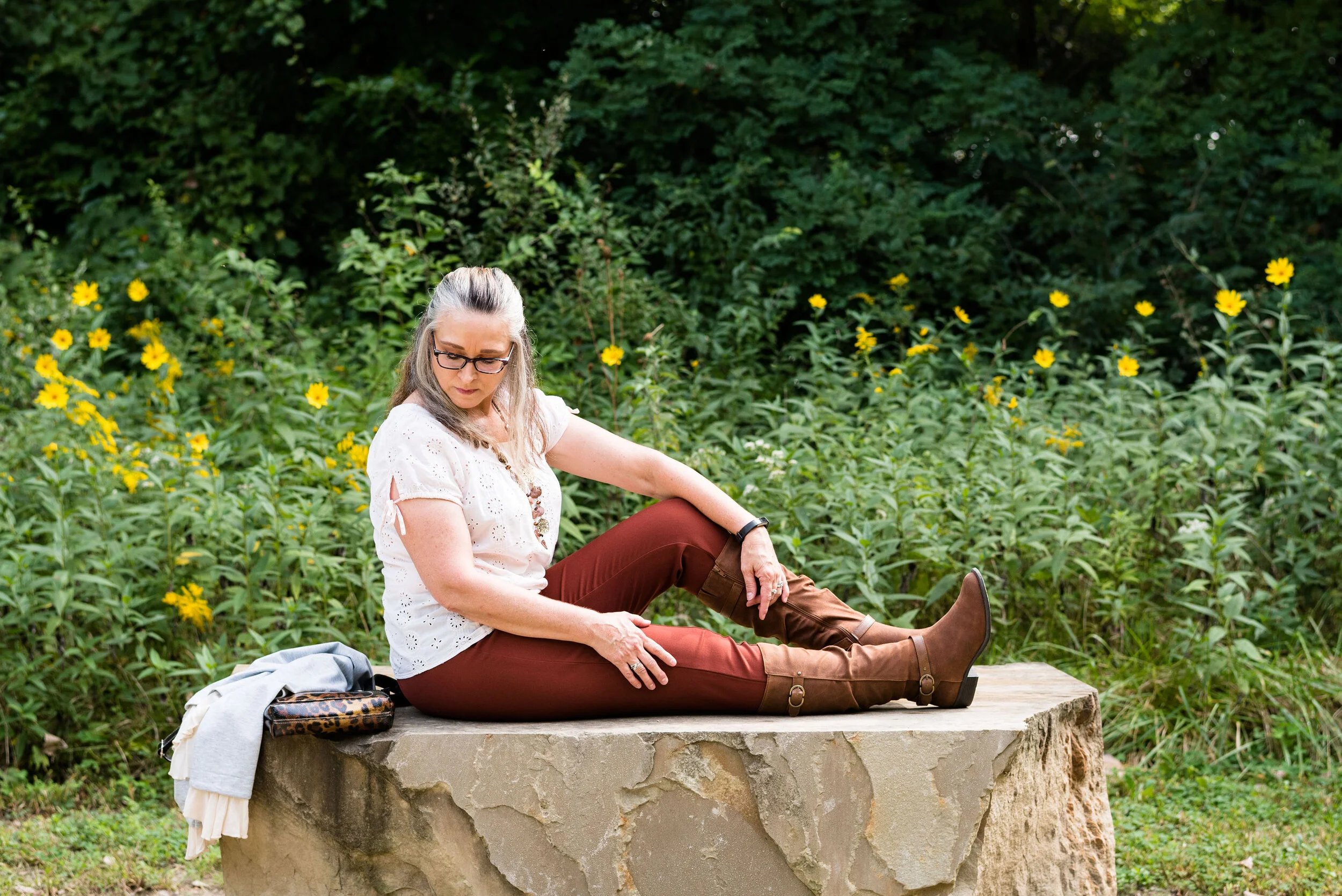
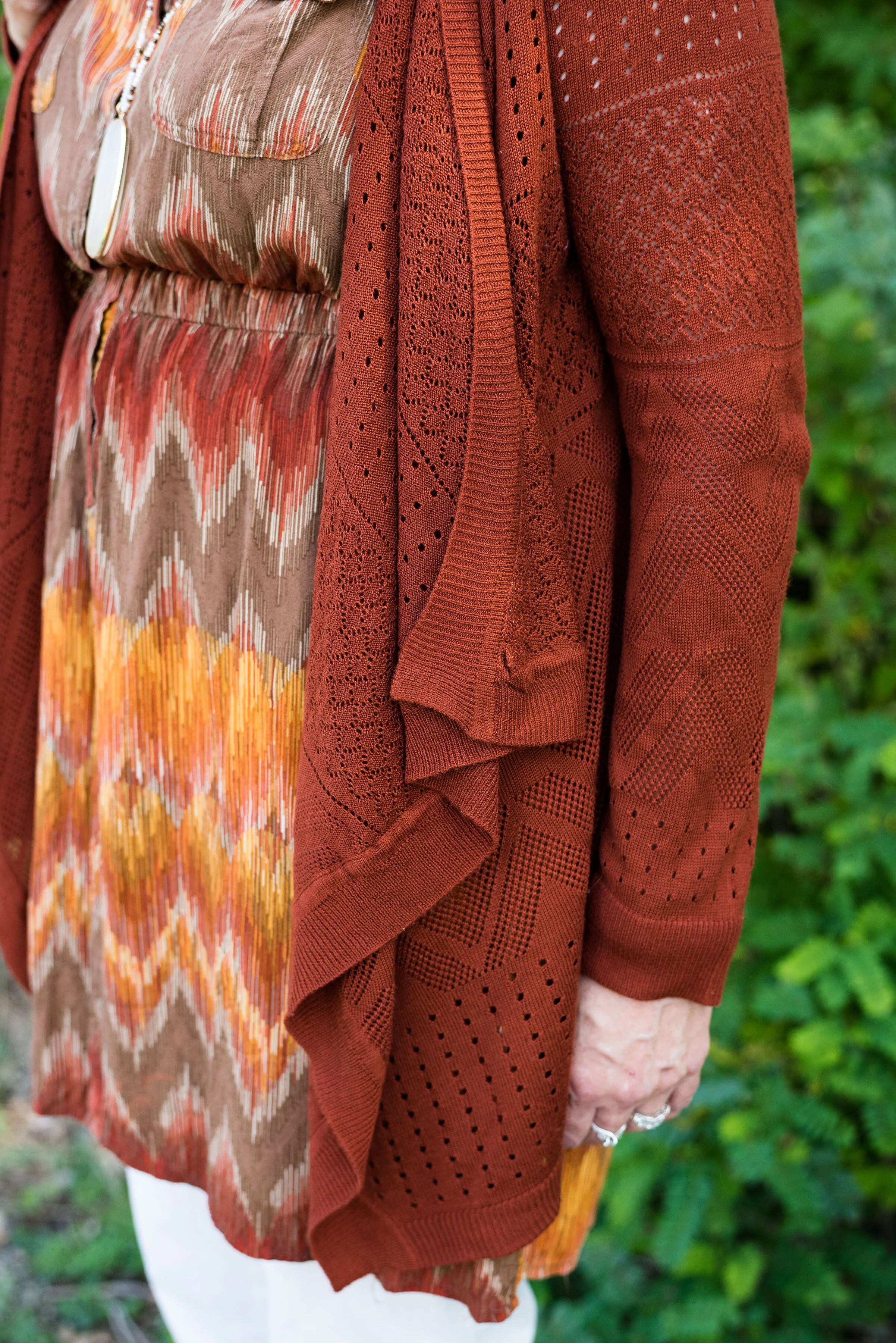
It was a chillier day when I took these pictures, so I already had the fall colored knit top and rust colored cardigan on in the house. We are hoping to make it until October before we turn on the heat. Ha, ha.
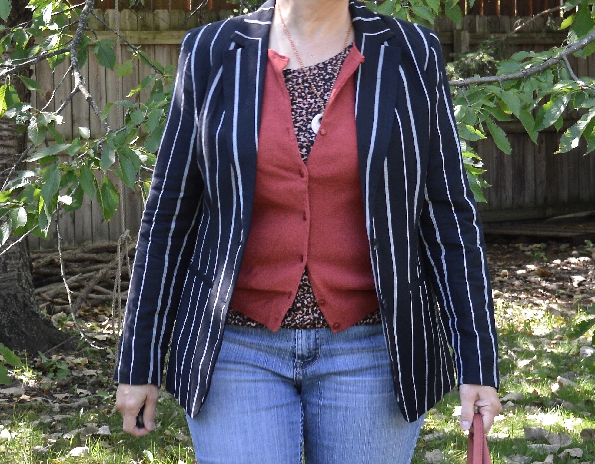
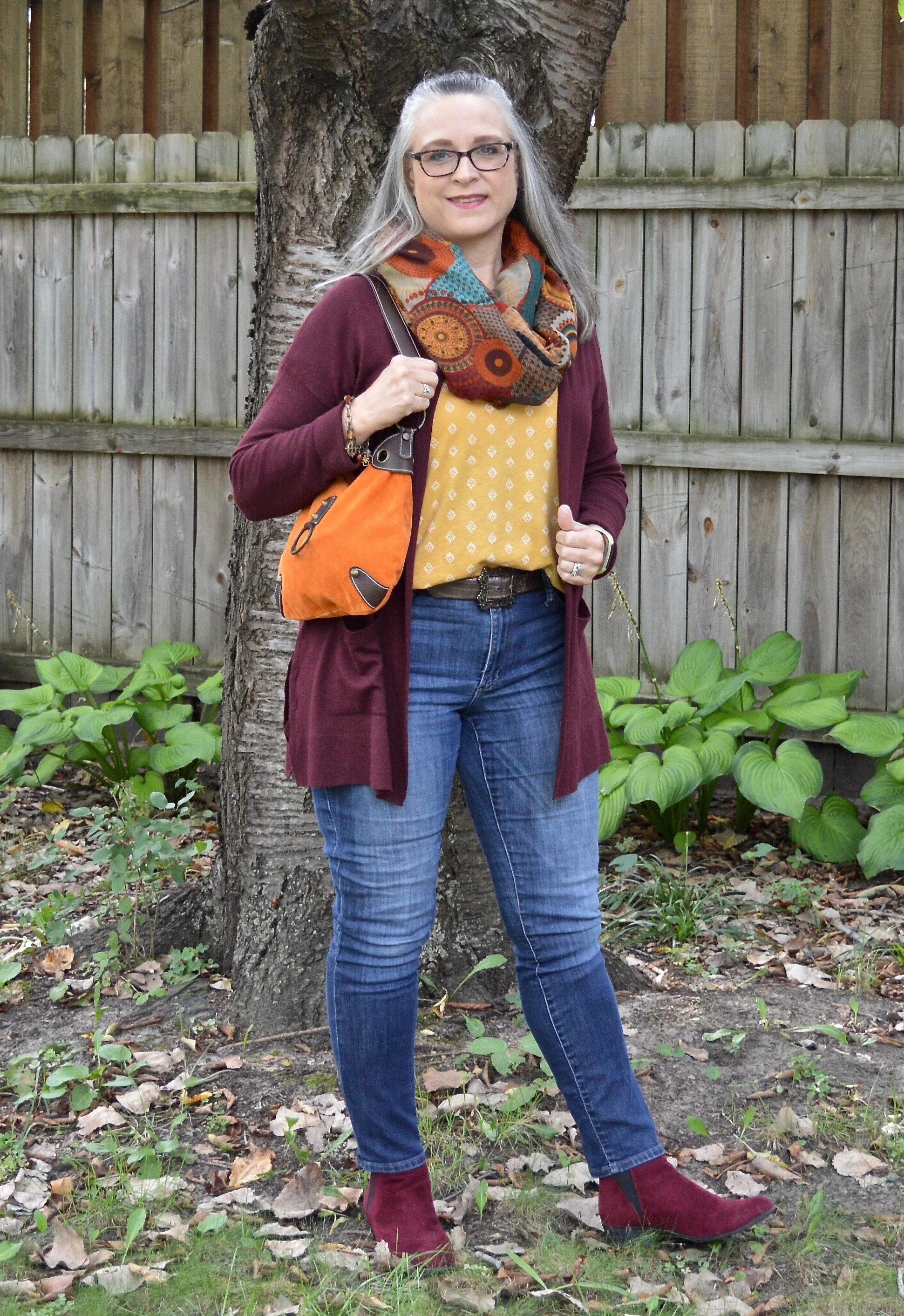
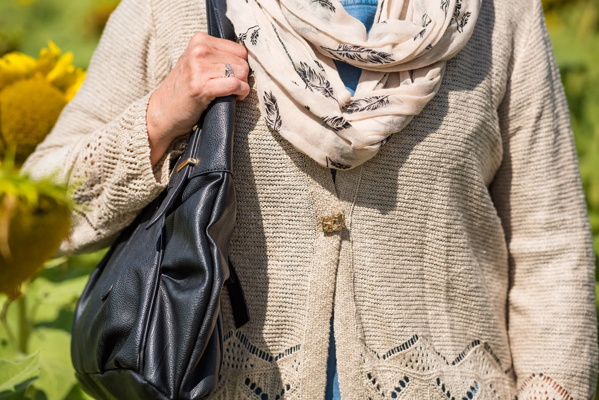
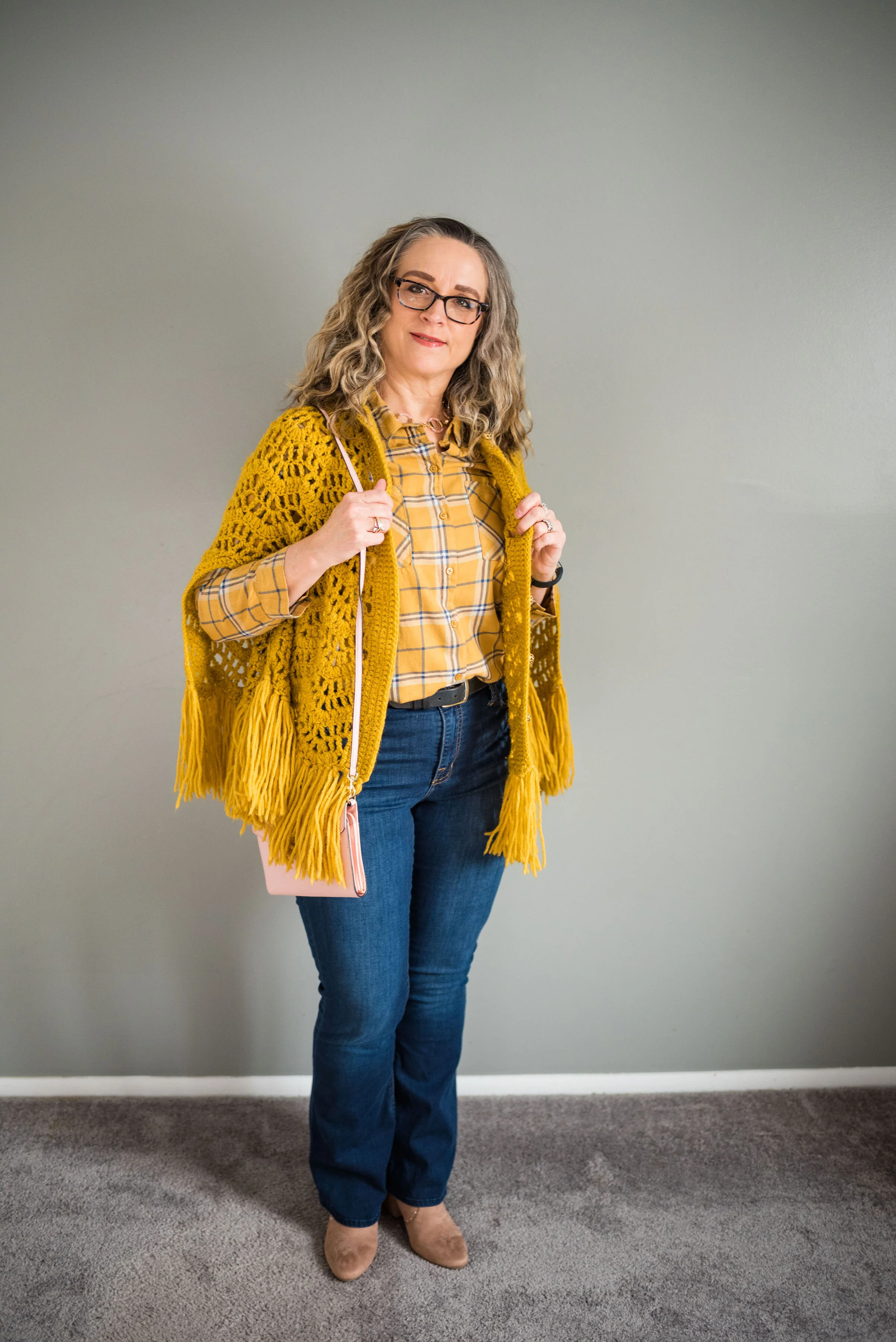
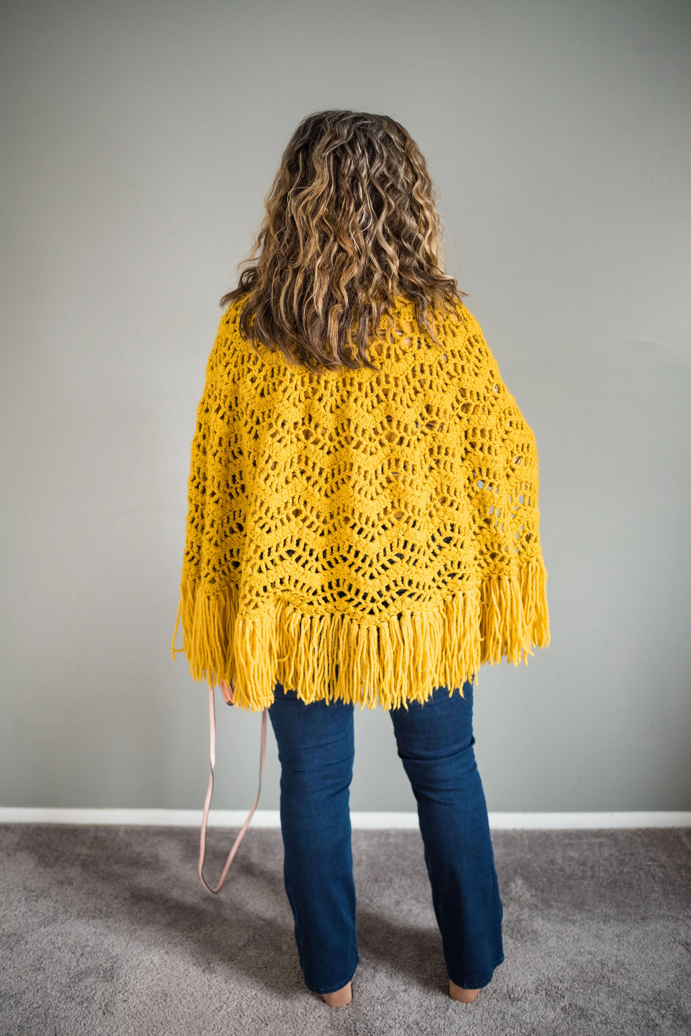
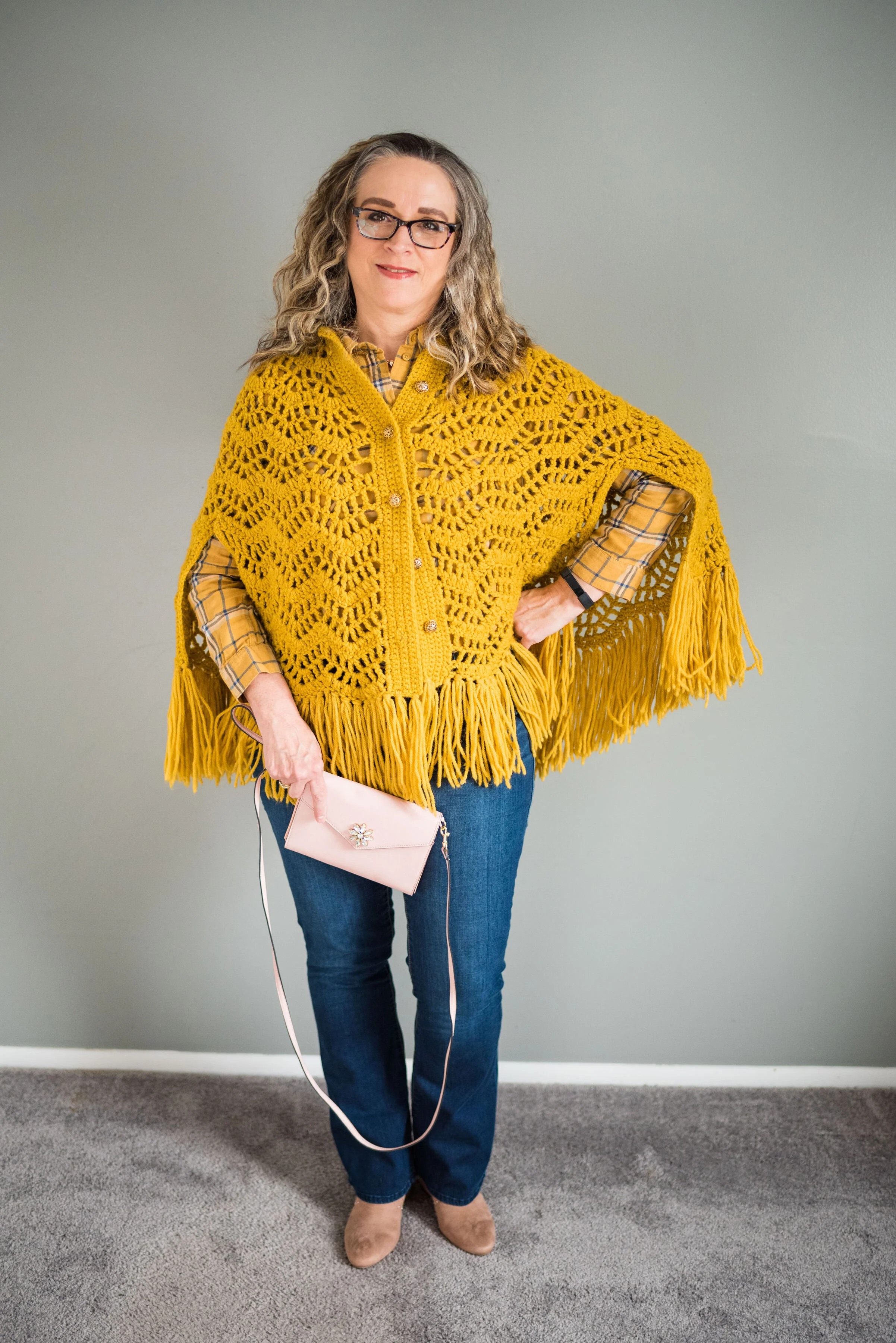
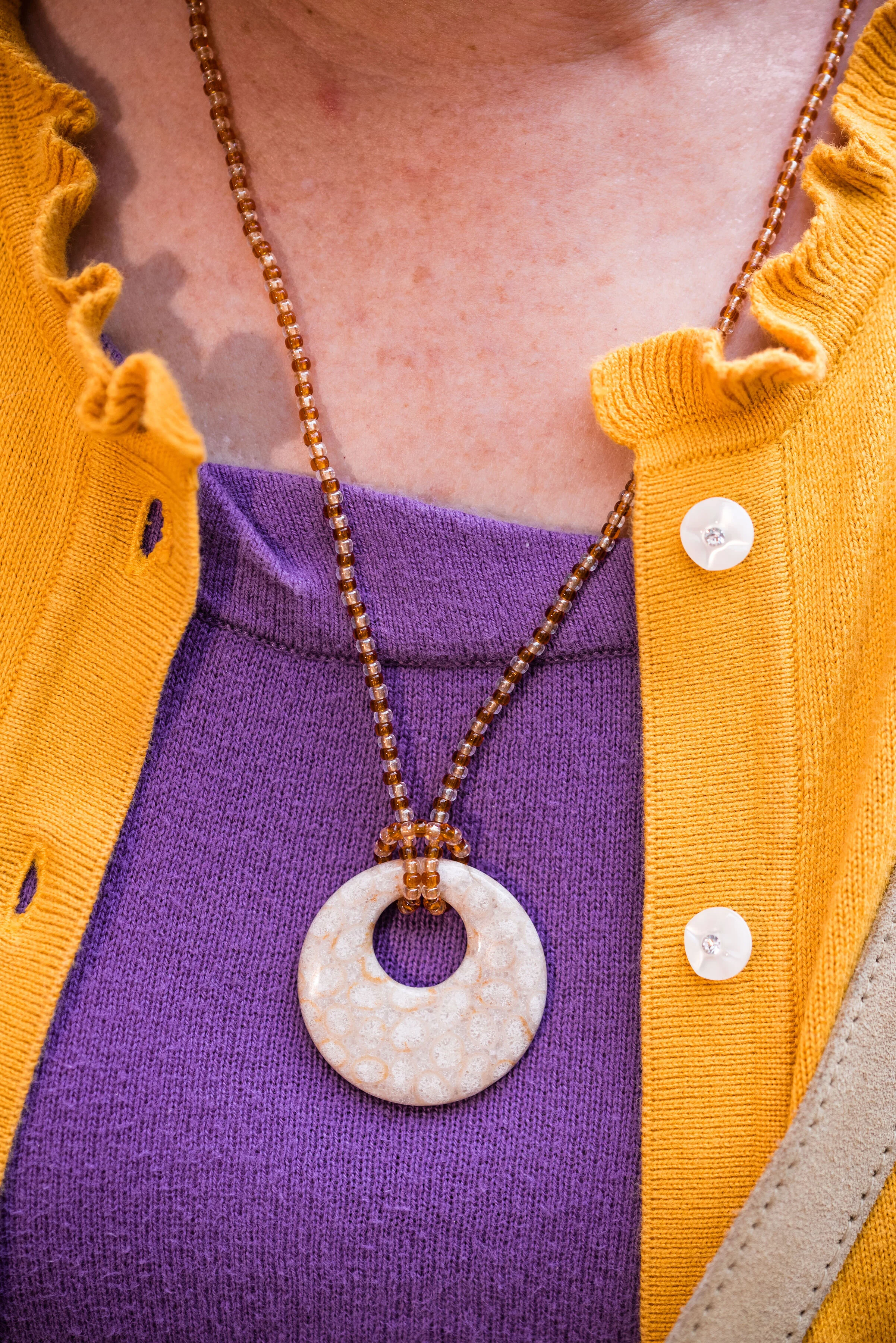
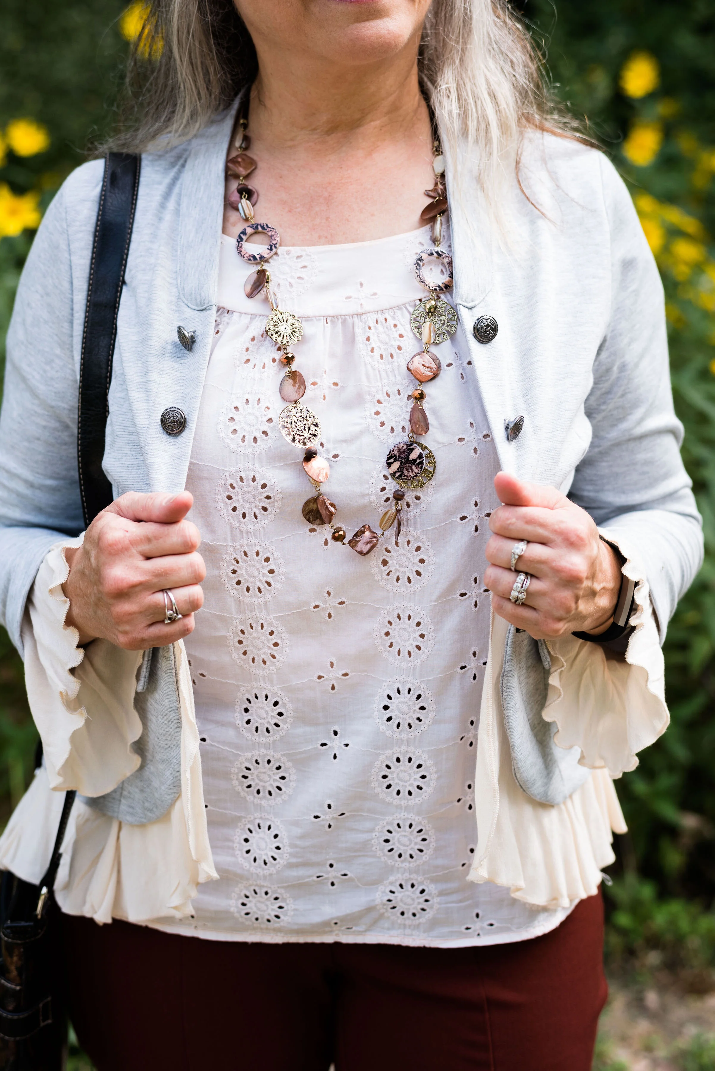
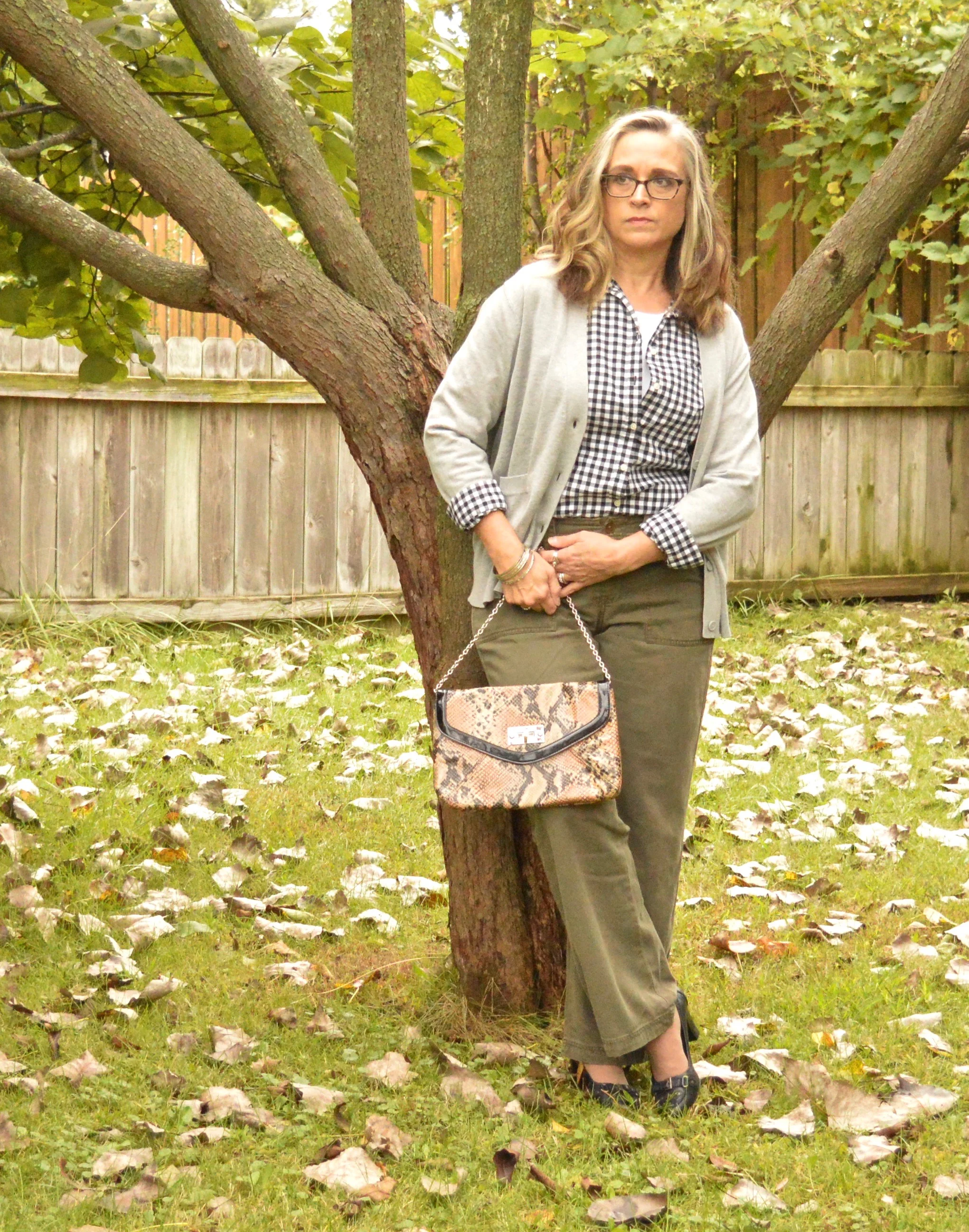
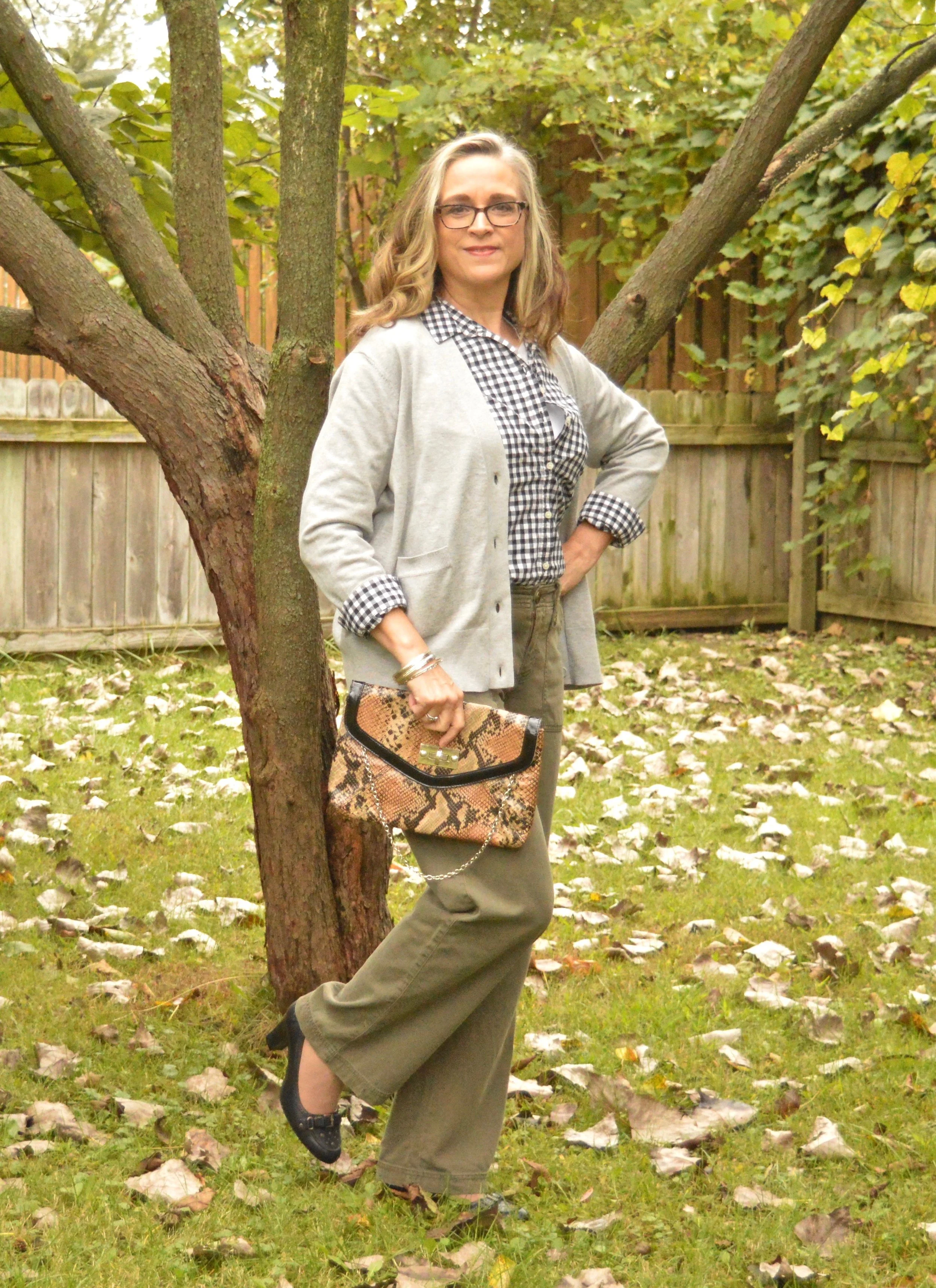
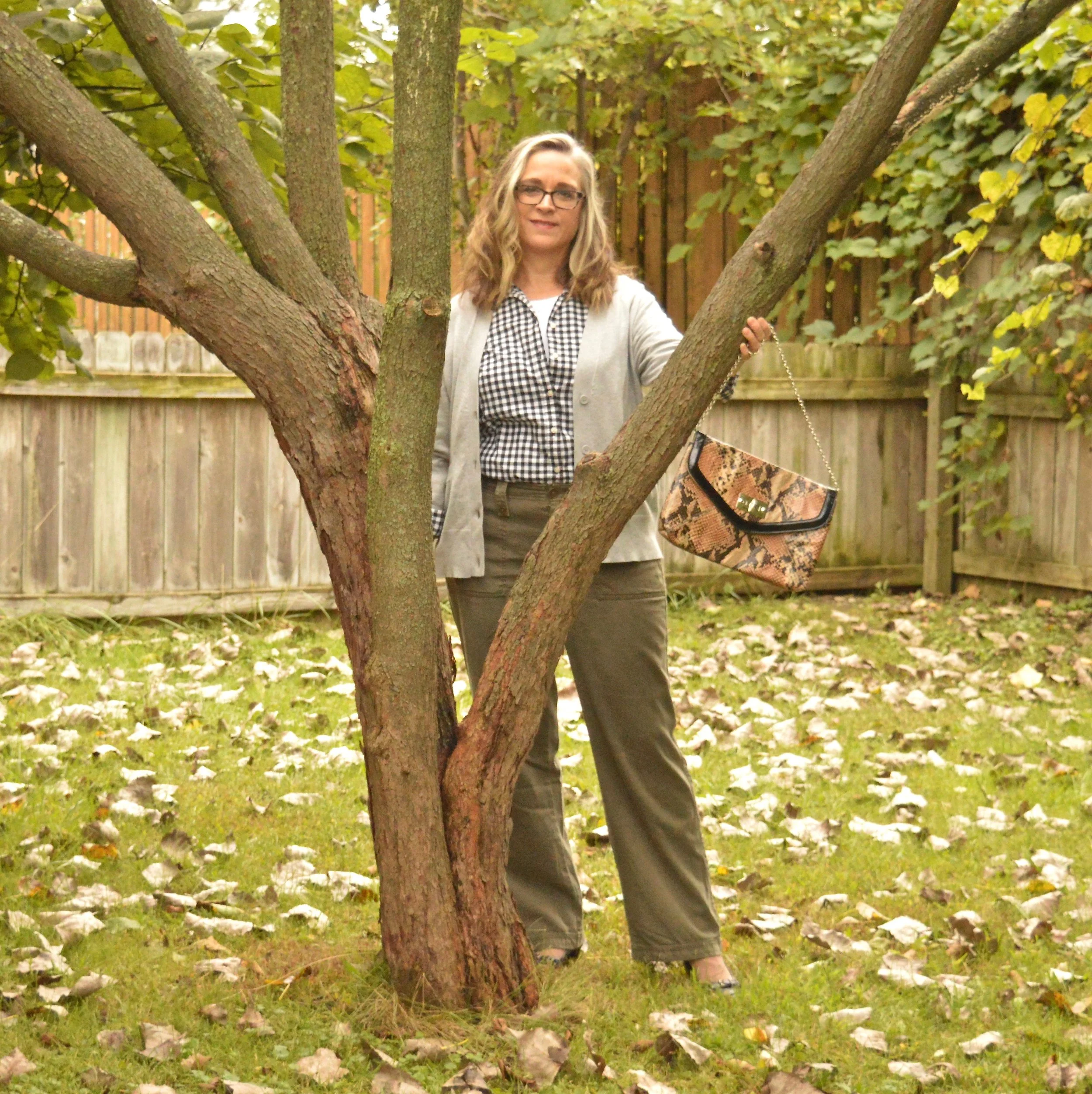
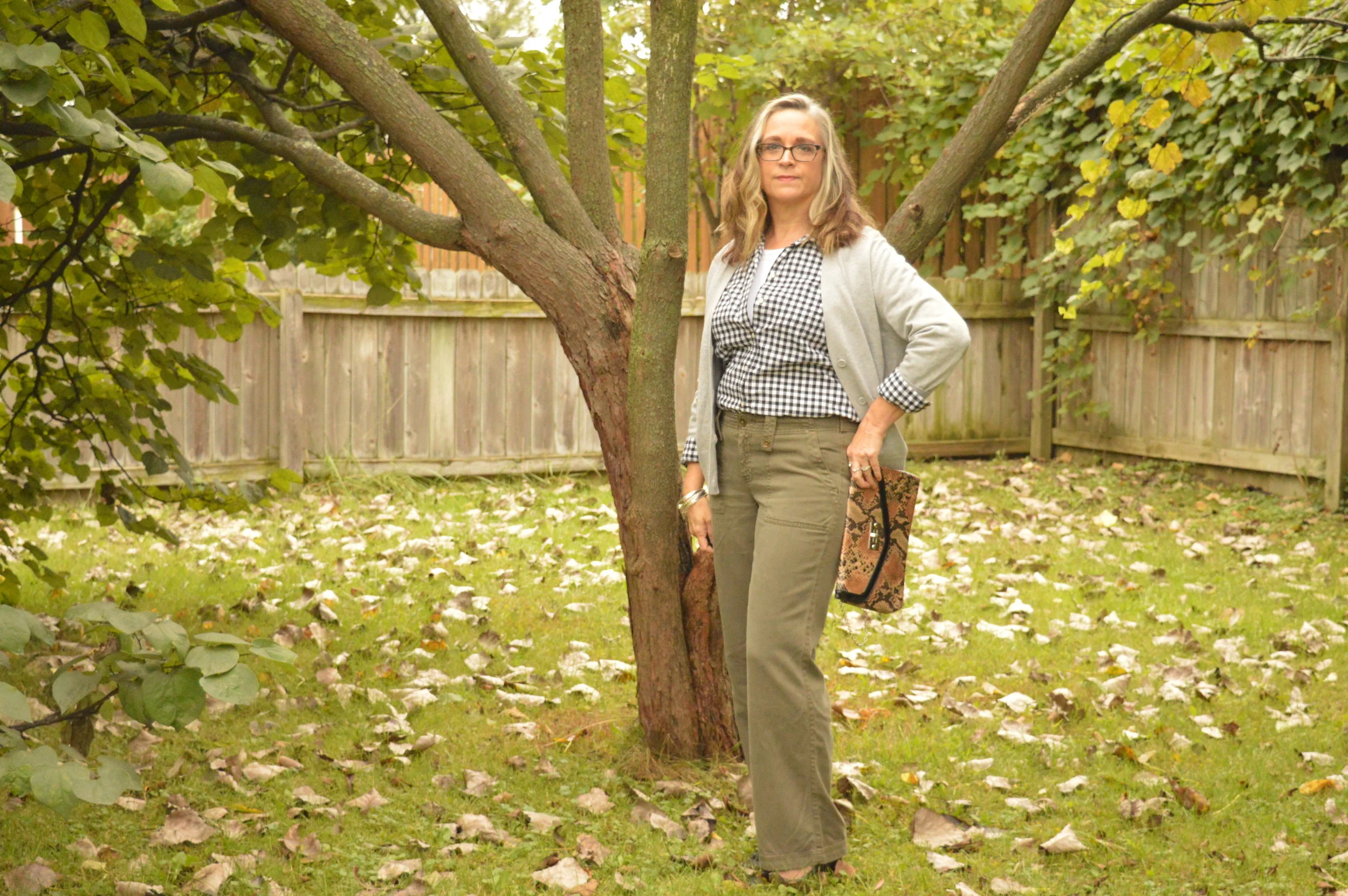
My knit, short sleeve multi-print top is a thrifted Loft piece. The rust colored cardigan is Croft & Barrow brand. There is some subtle print mixing going on here with the multi-print tee and the stripes on the blazer. This is one way to print mix without it being overwhelming. The solid color cardigan provides a border between the two prints, but you still see the mix.
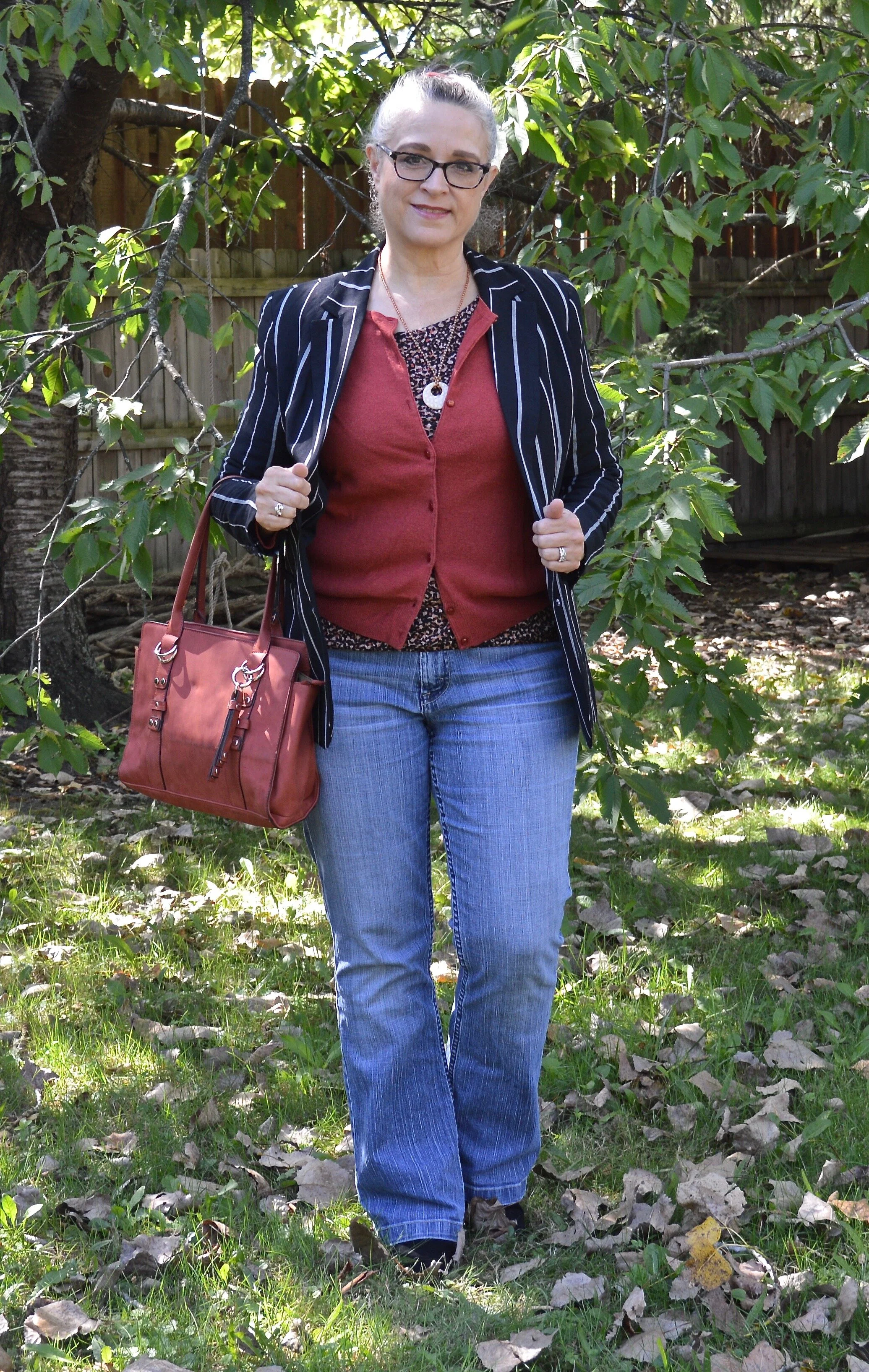
These are my favorite thrifted jeans. This is an older brand called Kikit, which are only available from thrift retailers like Poshmark and Thredup. You can see how I styled these on the blog before with a leopard print blazer.
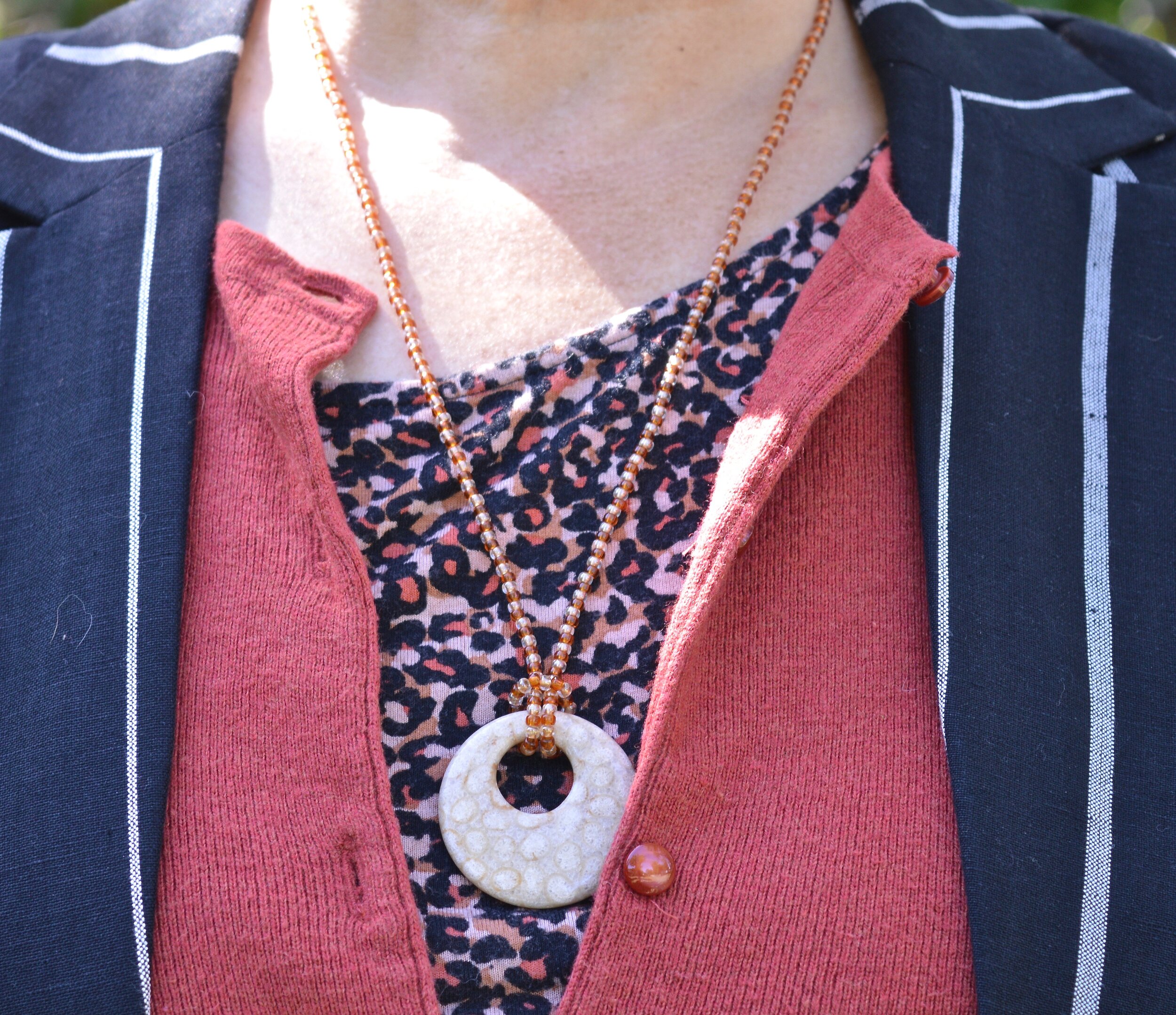
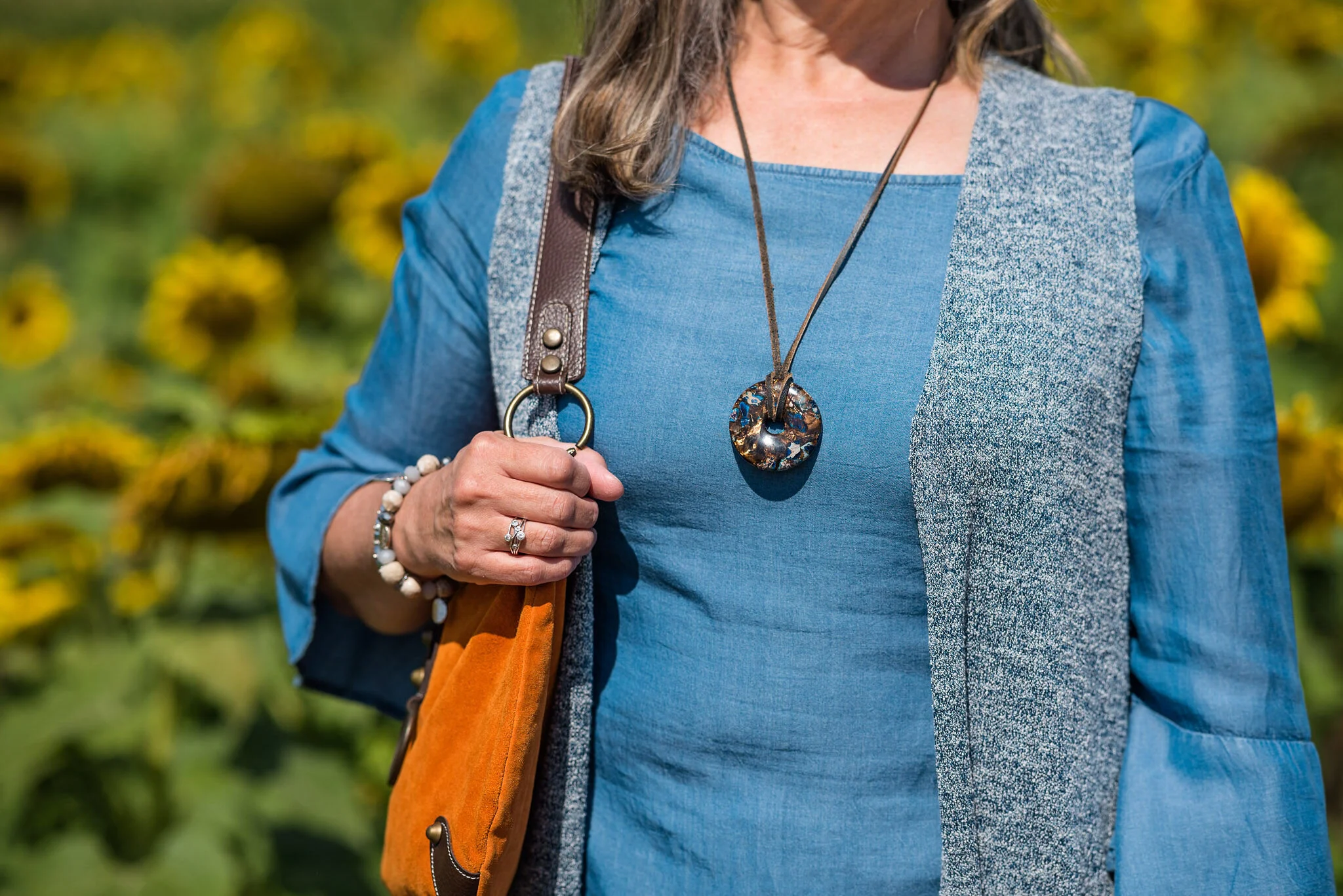
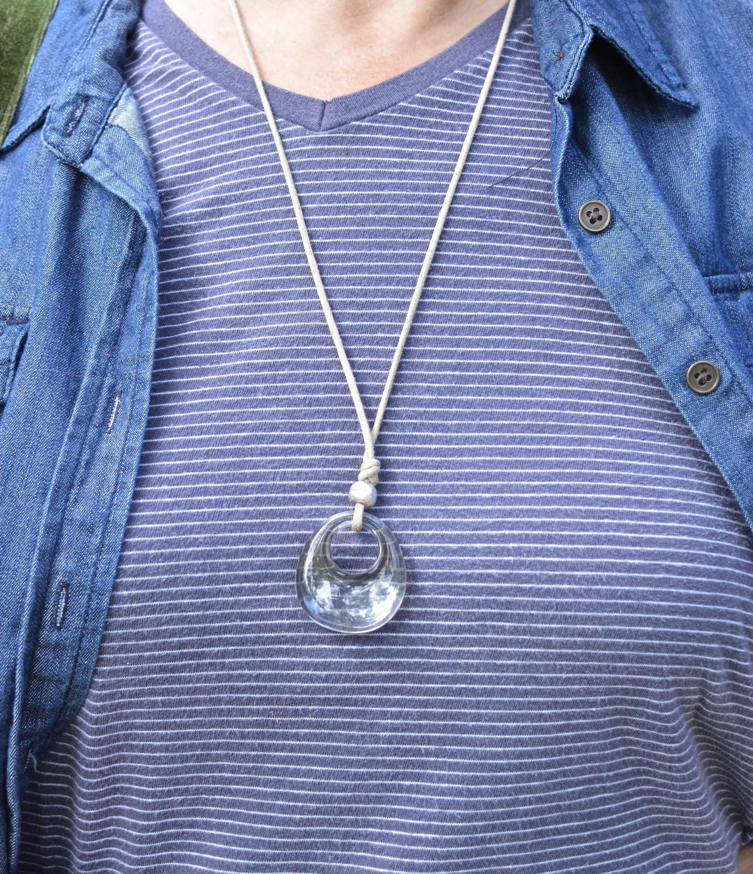
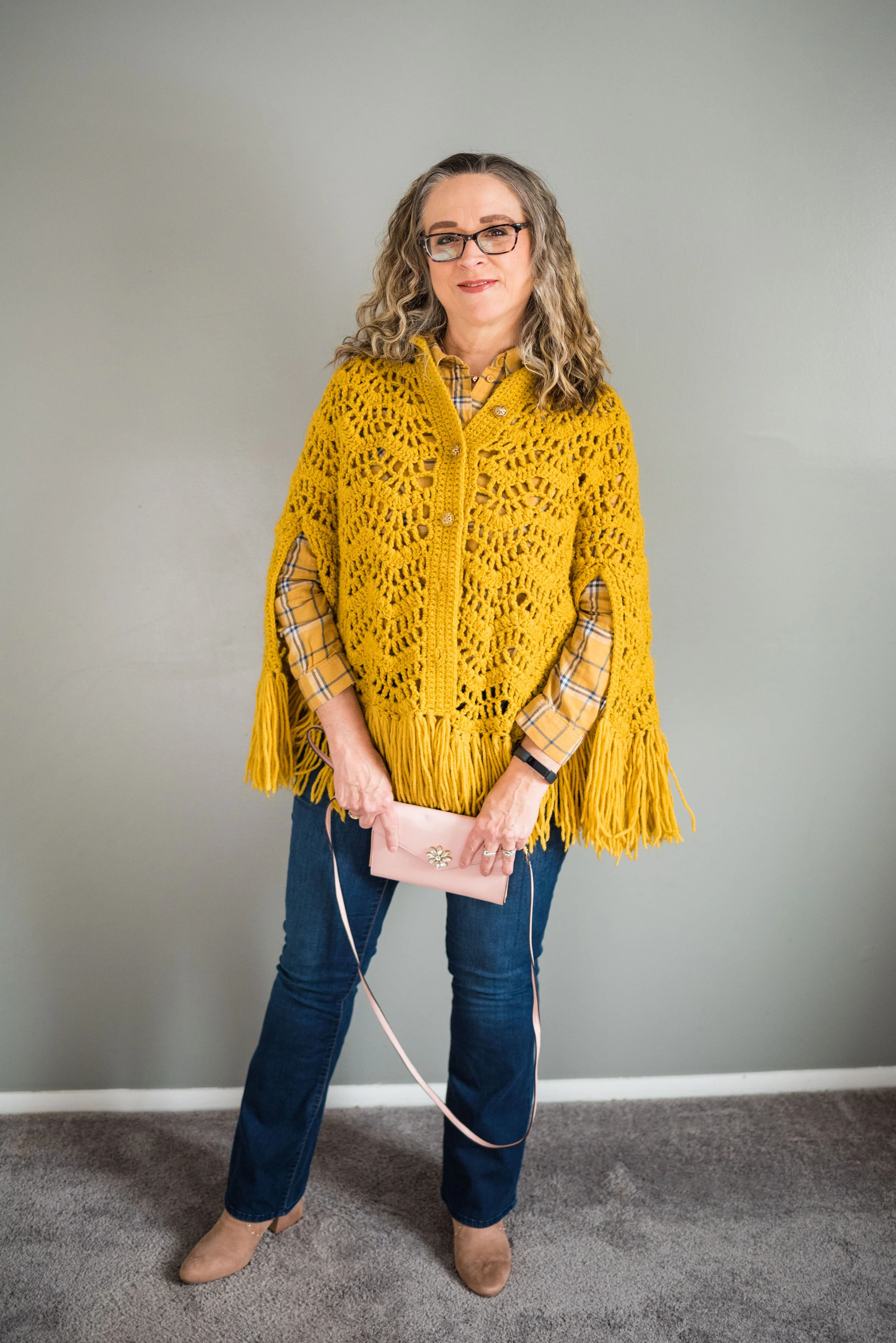
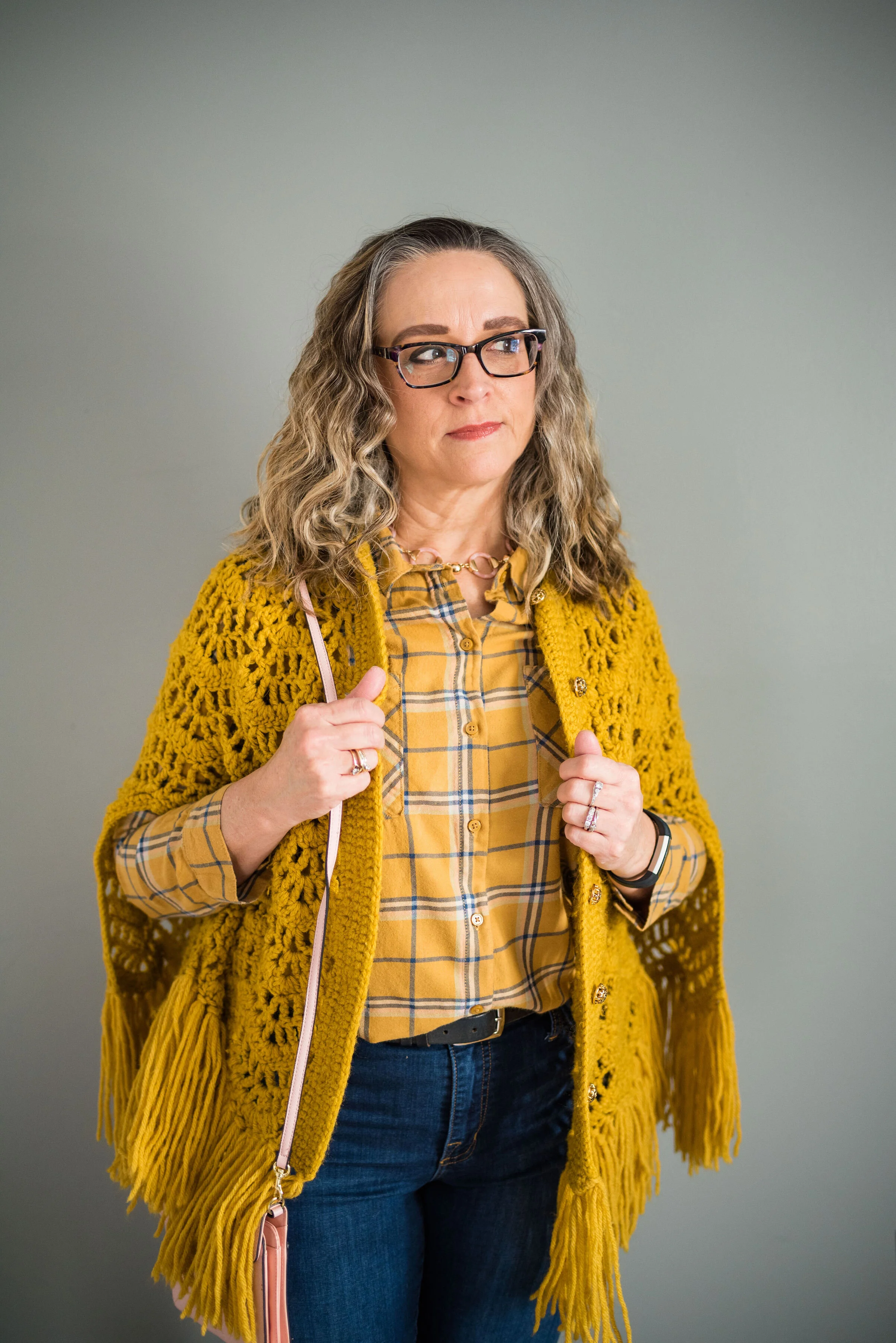
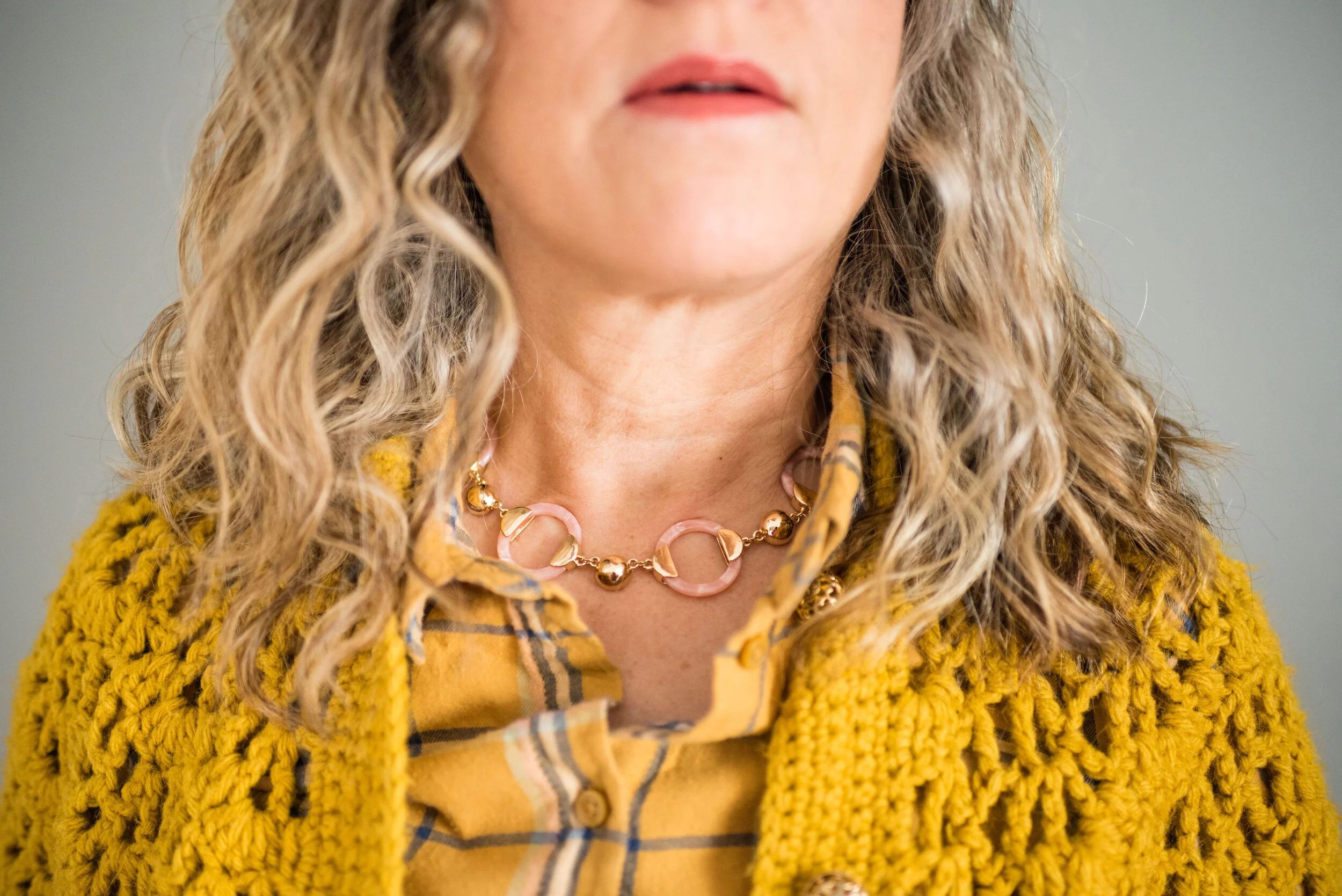
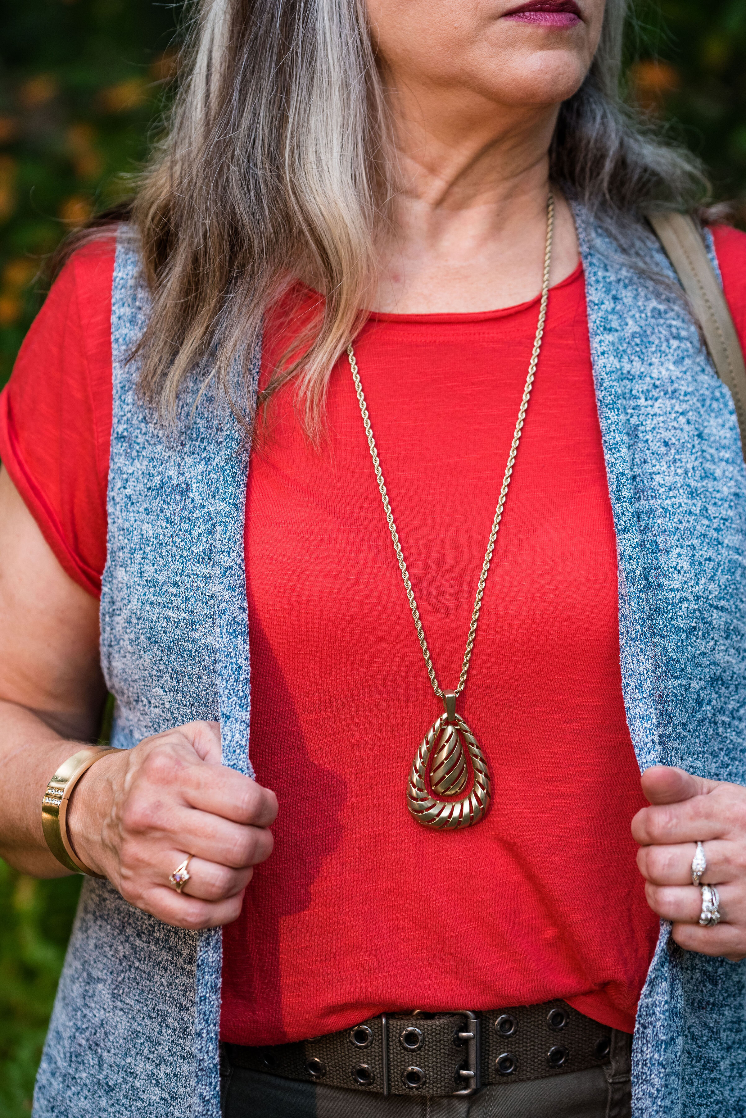
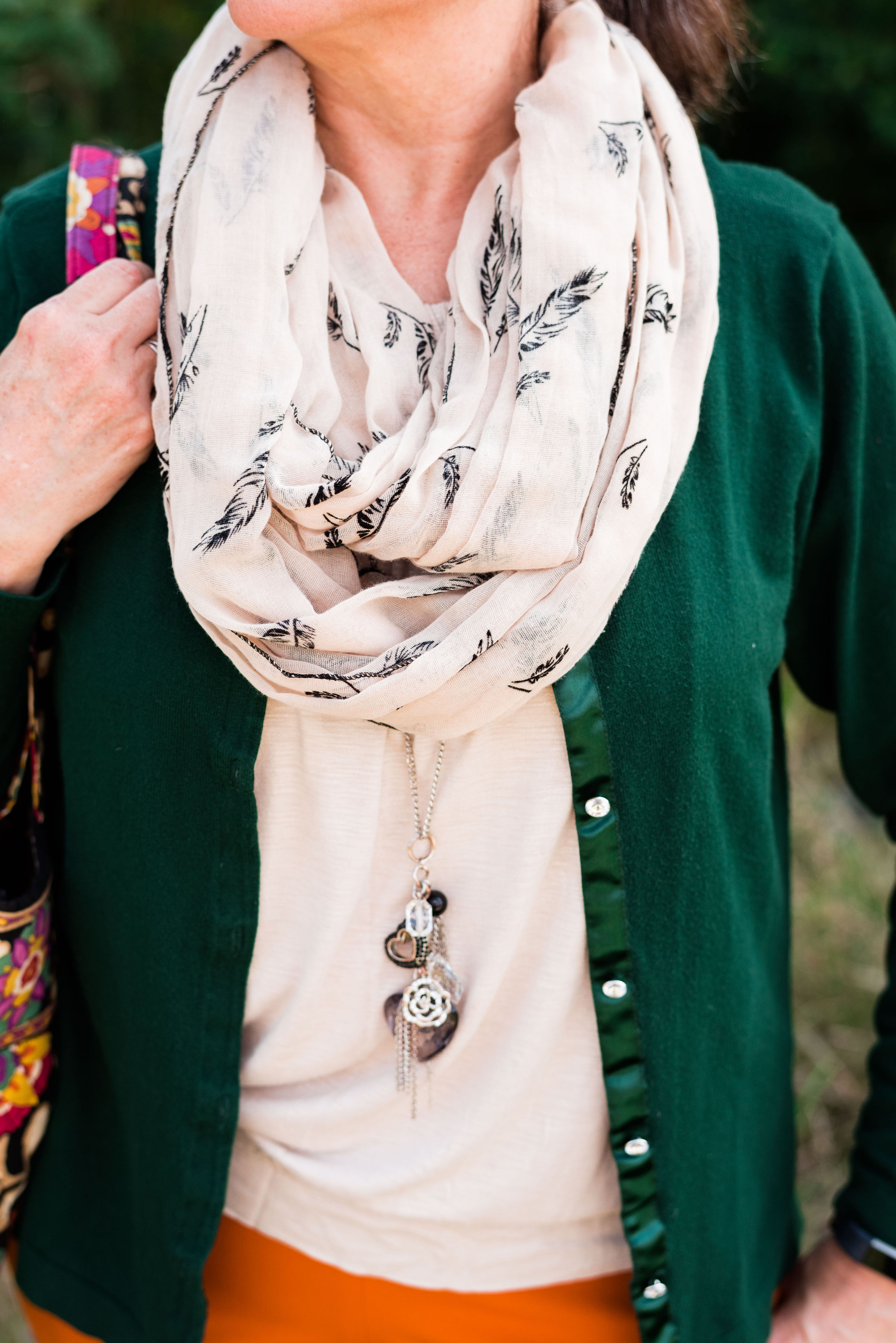
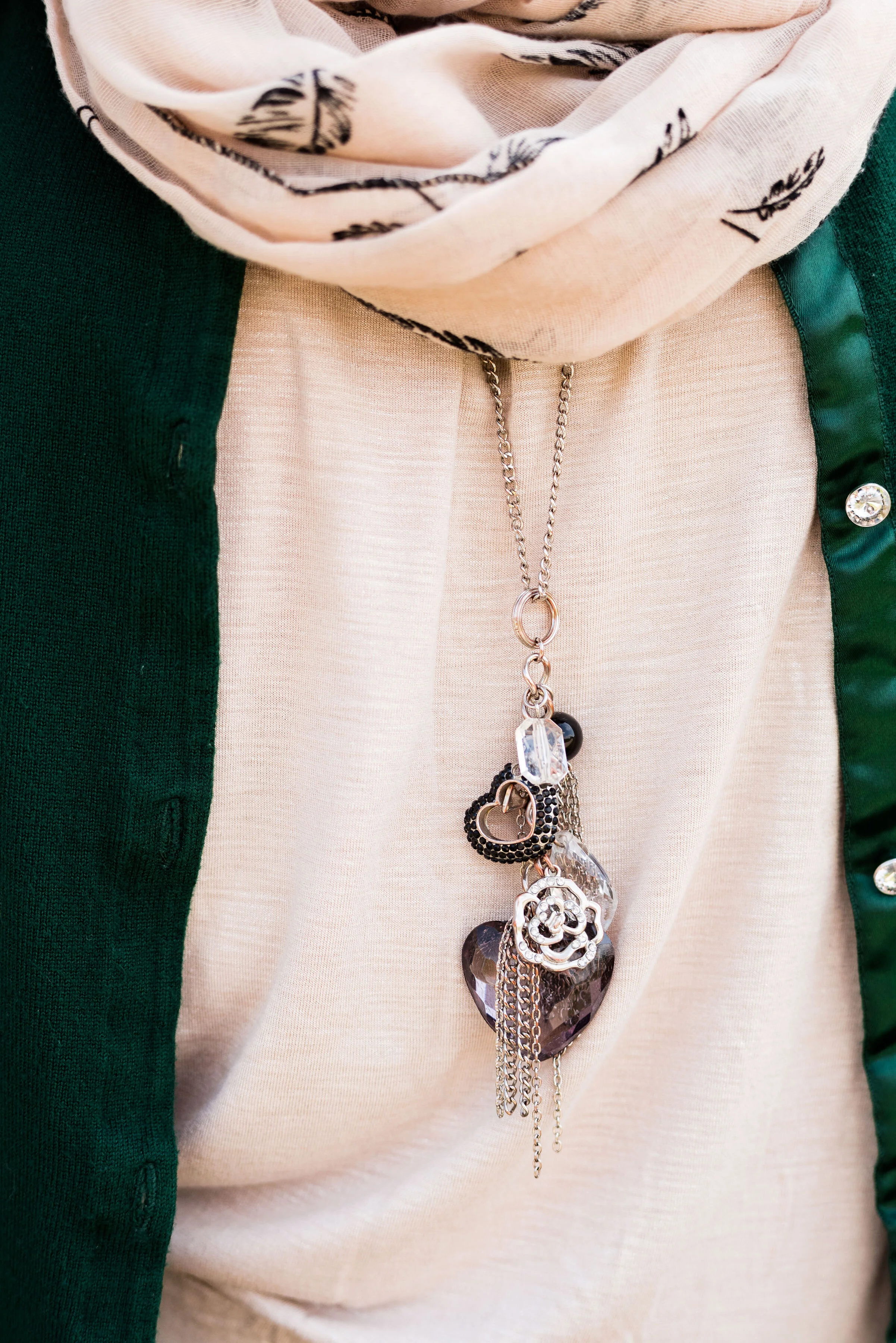
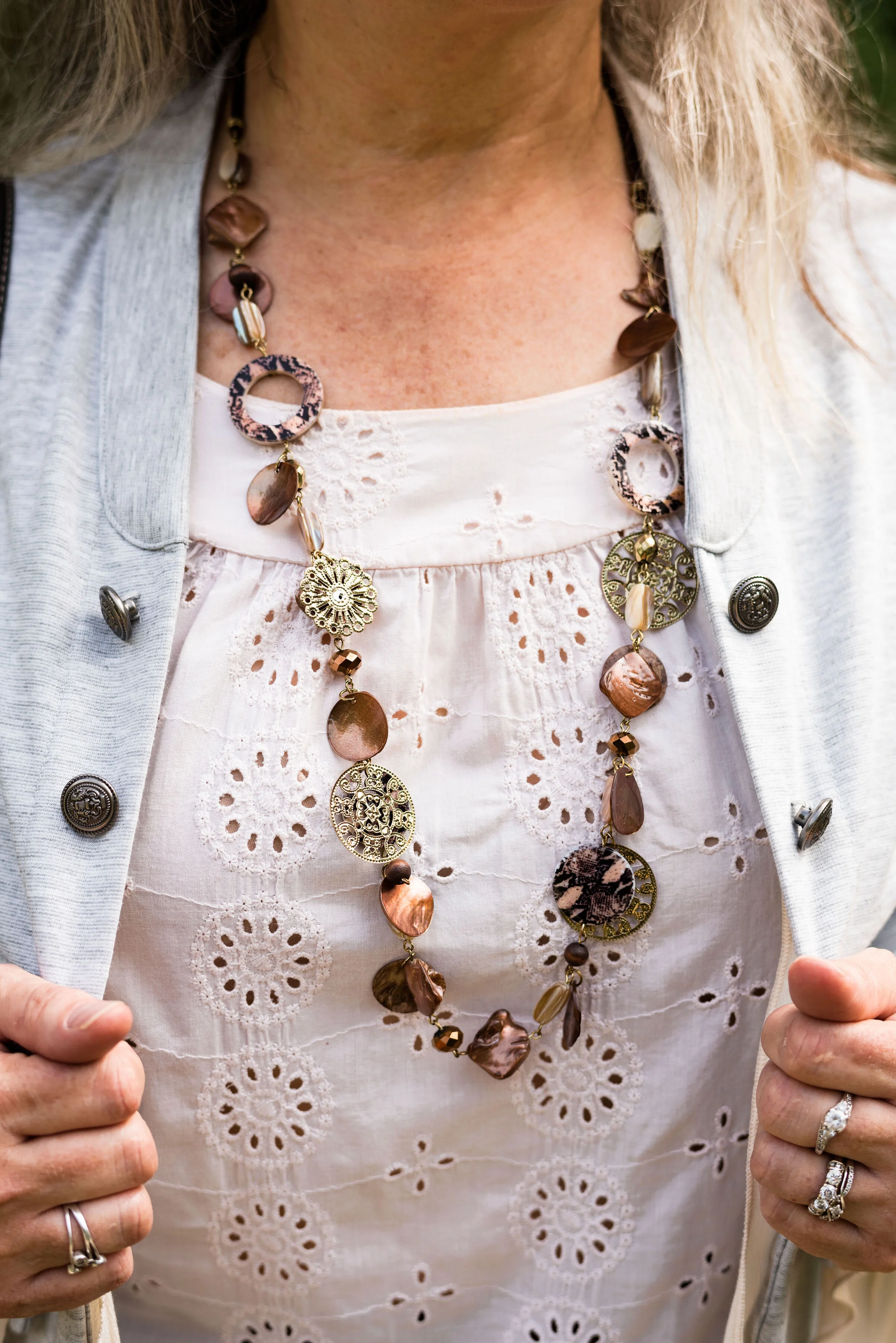
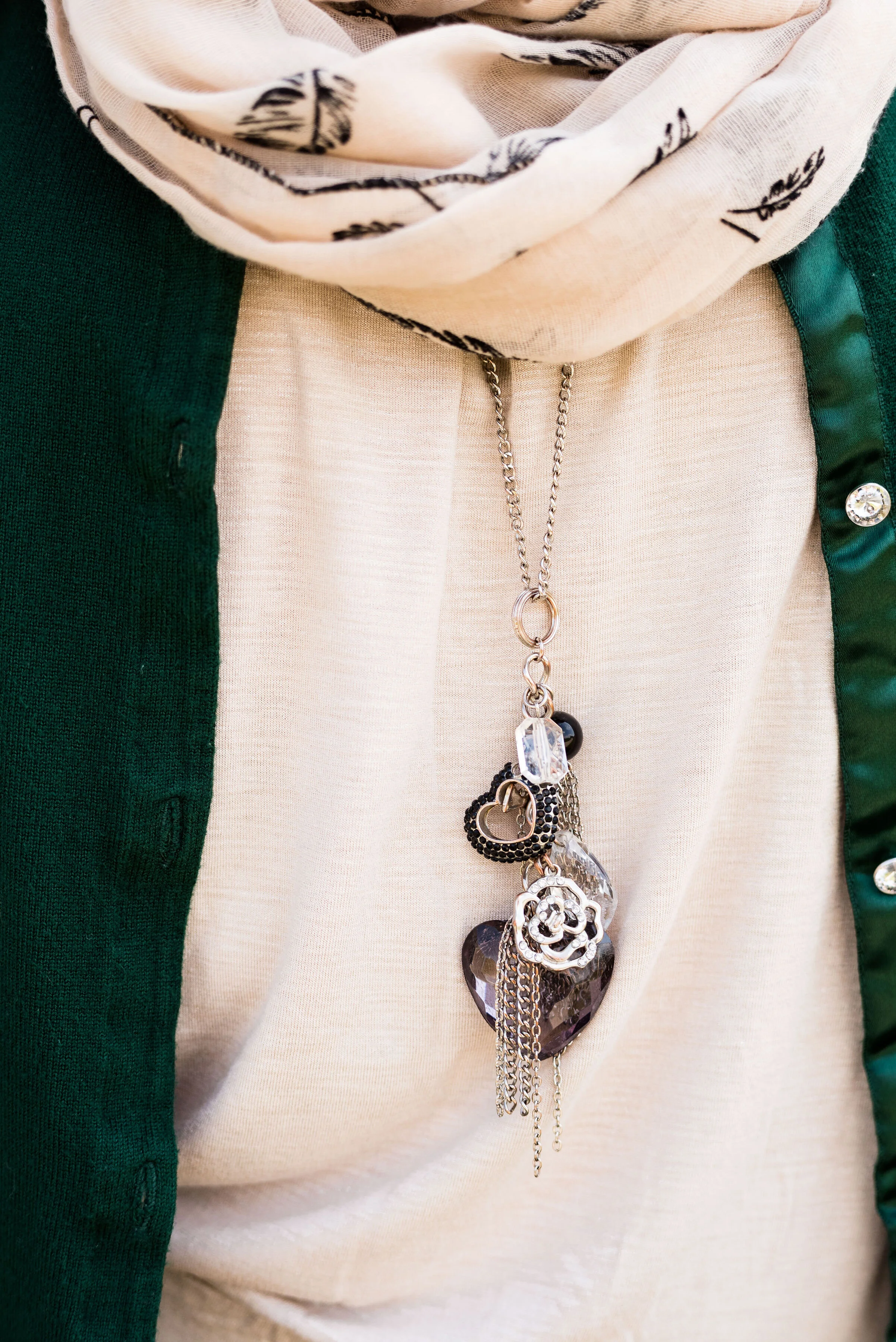
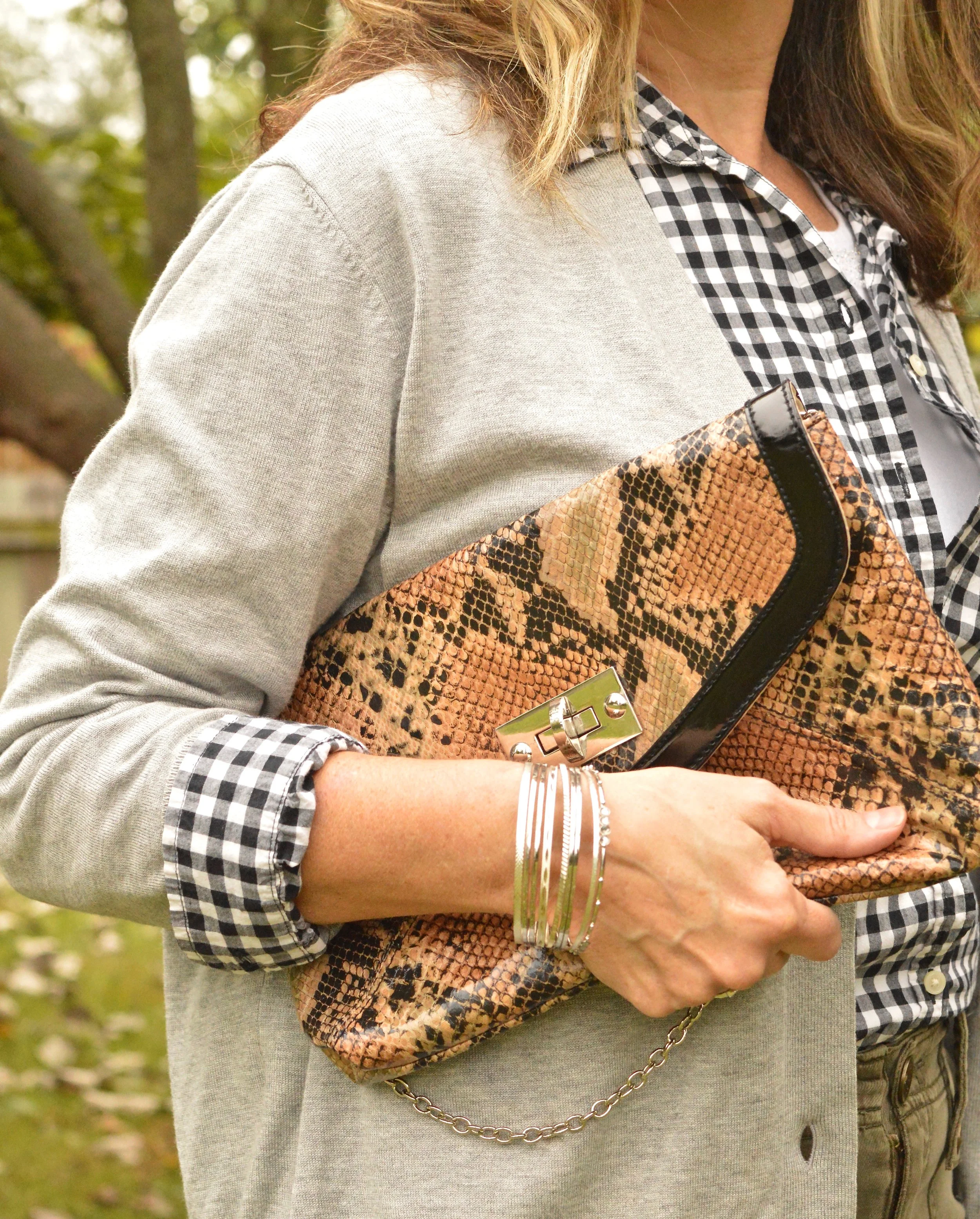
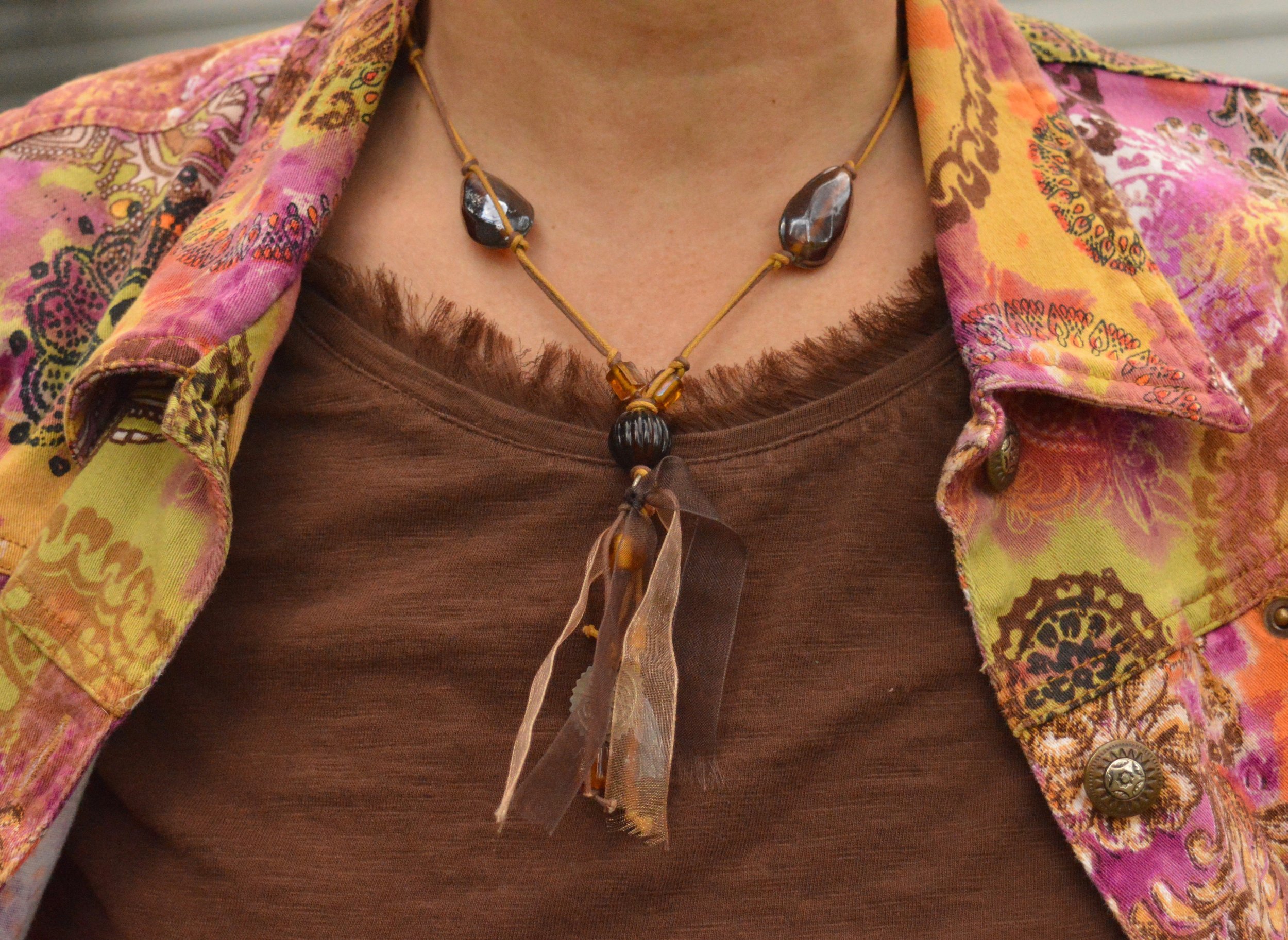
Less is more, when it comes to accessories for an outfit like this. This hand made pendent necklace is a simple piece, but makes just the right statement.
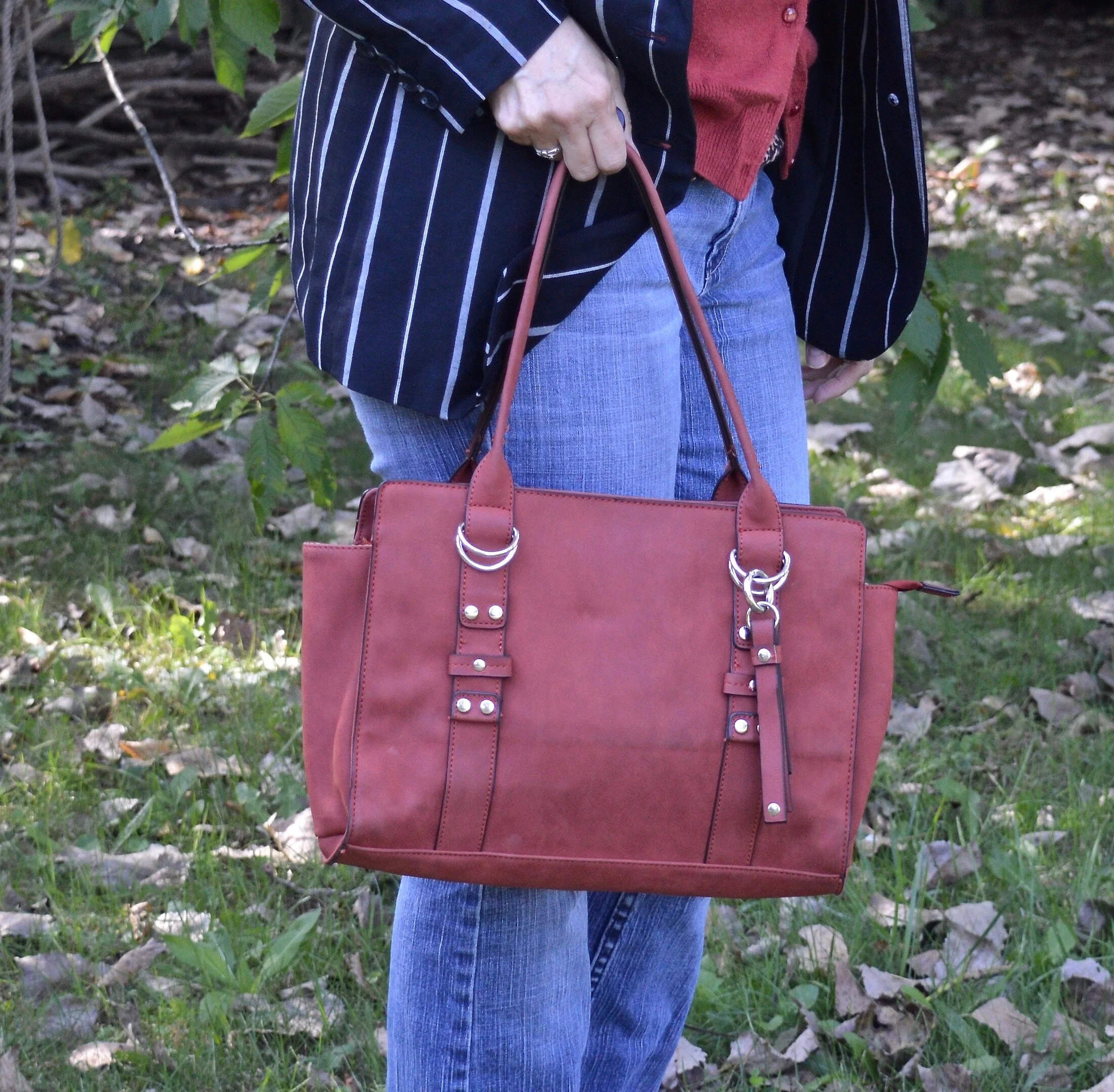
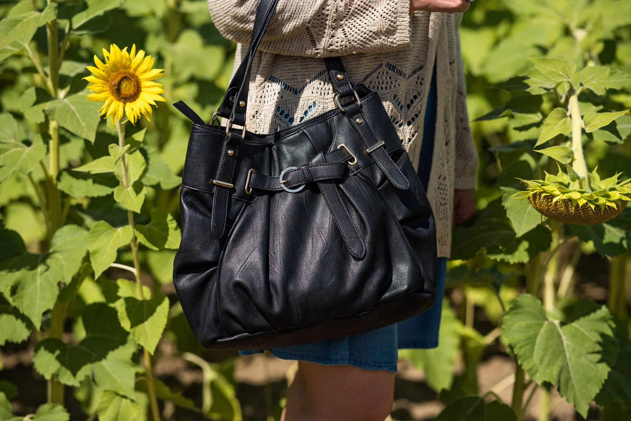
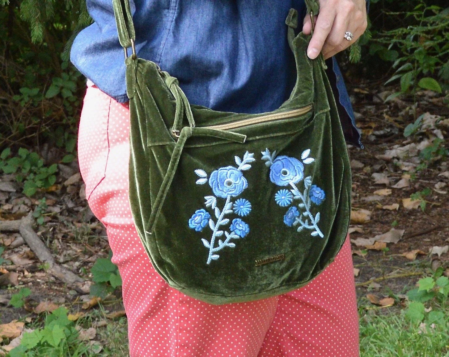
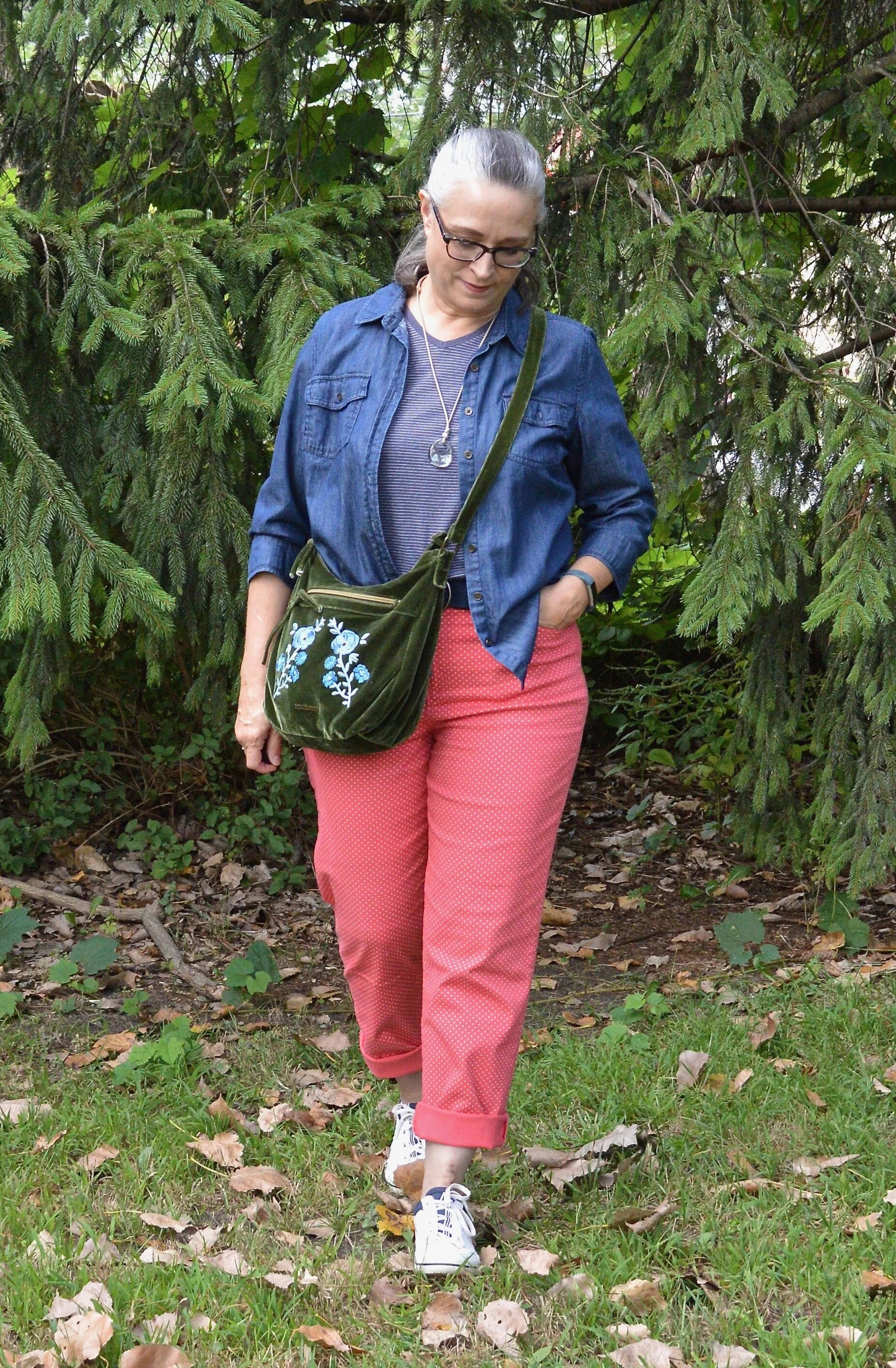
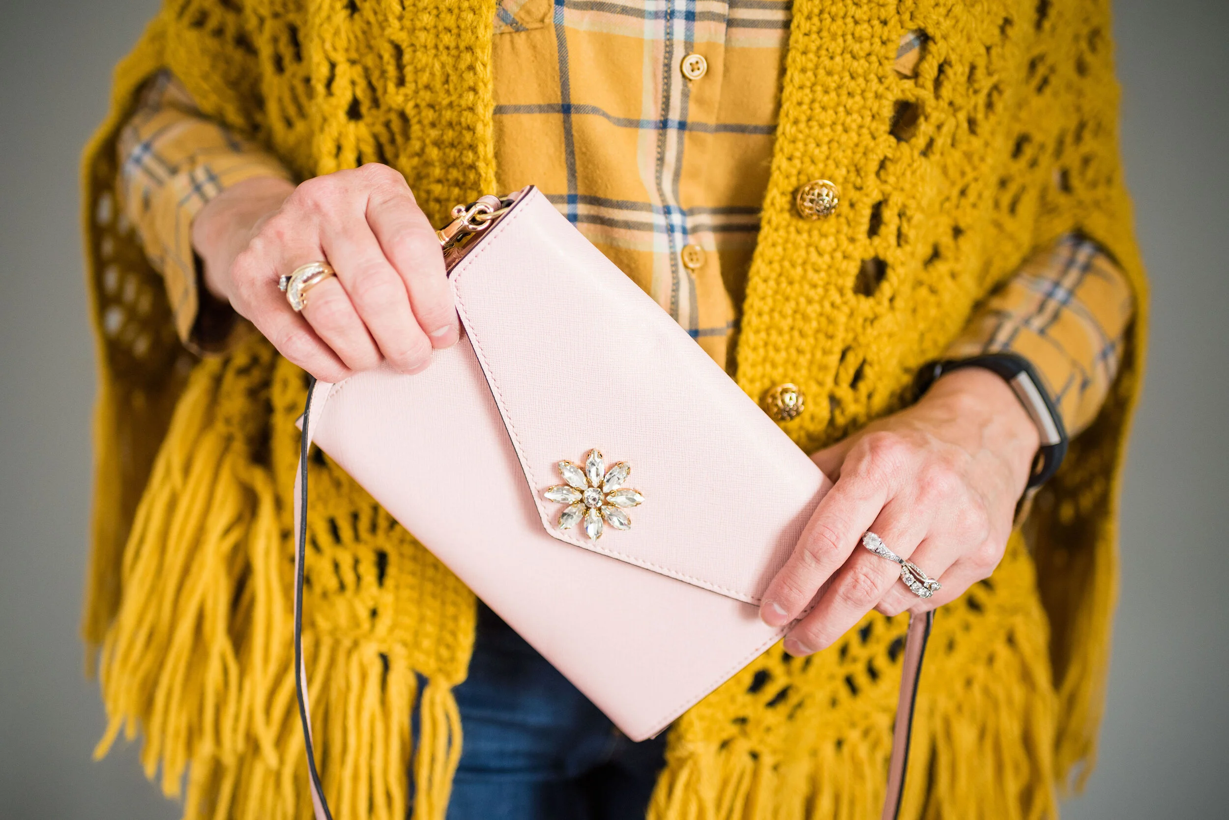
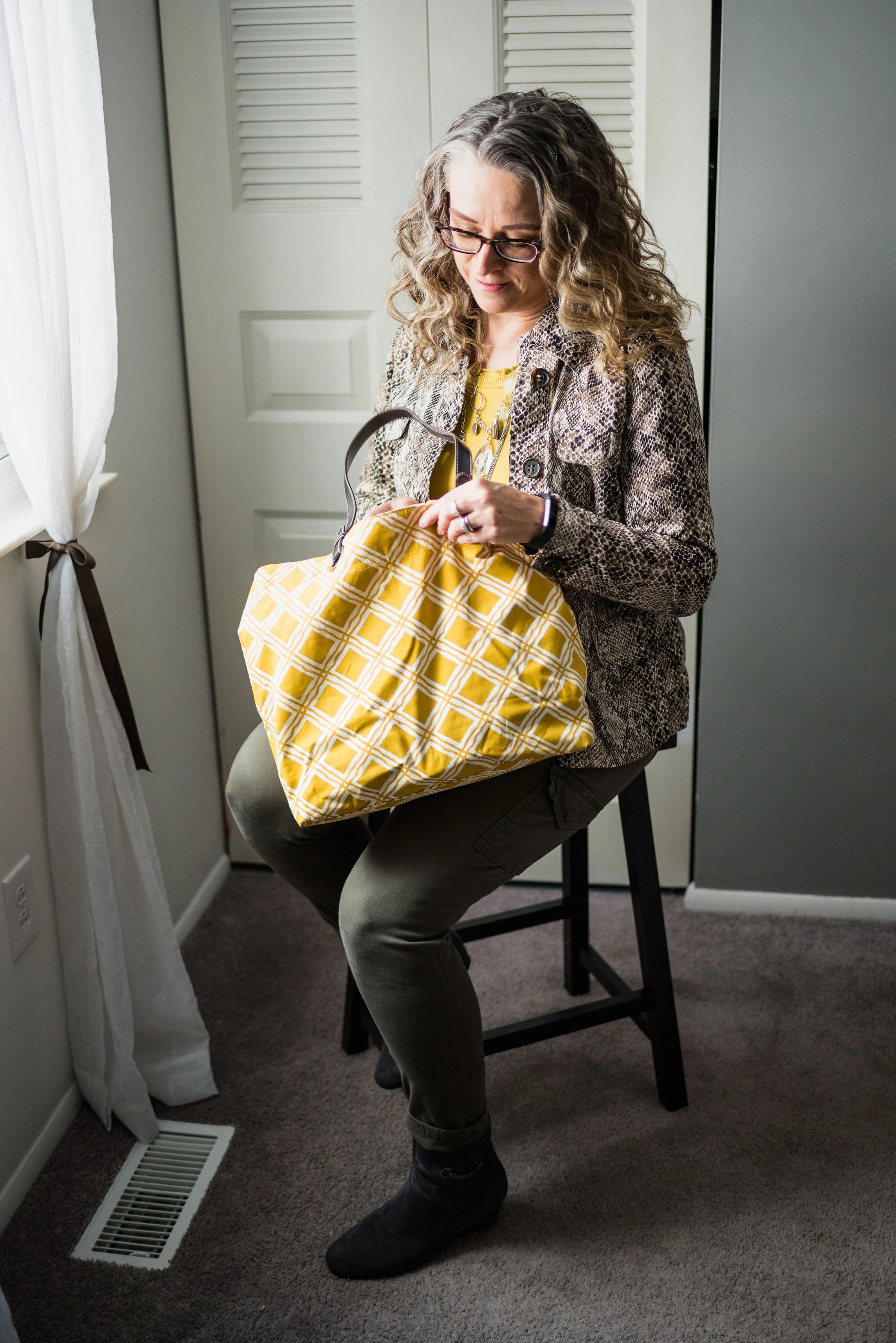
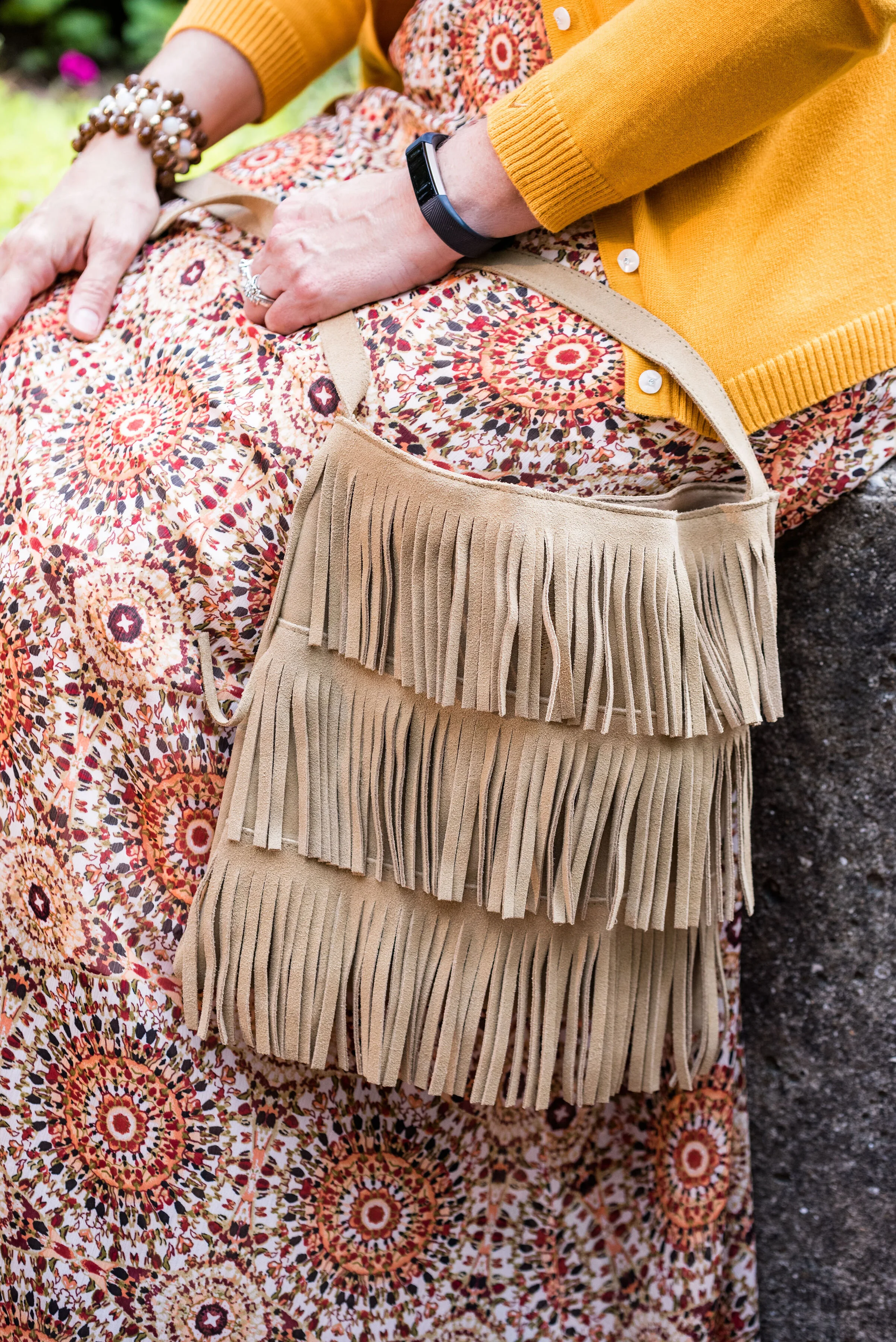
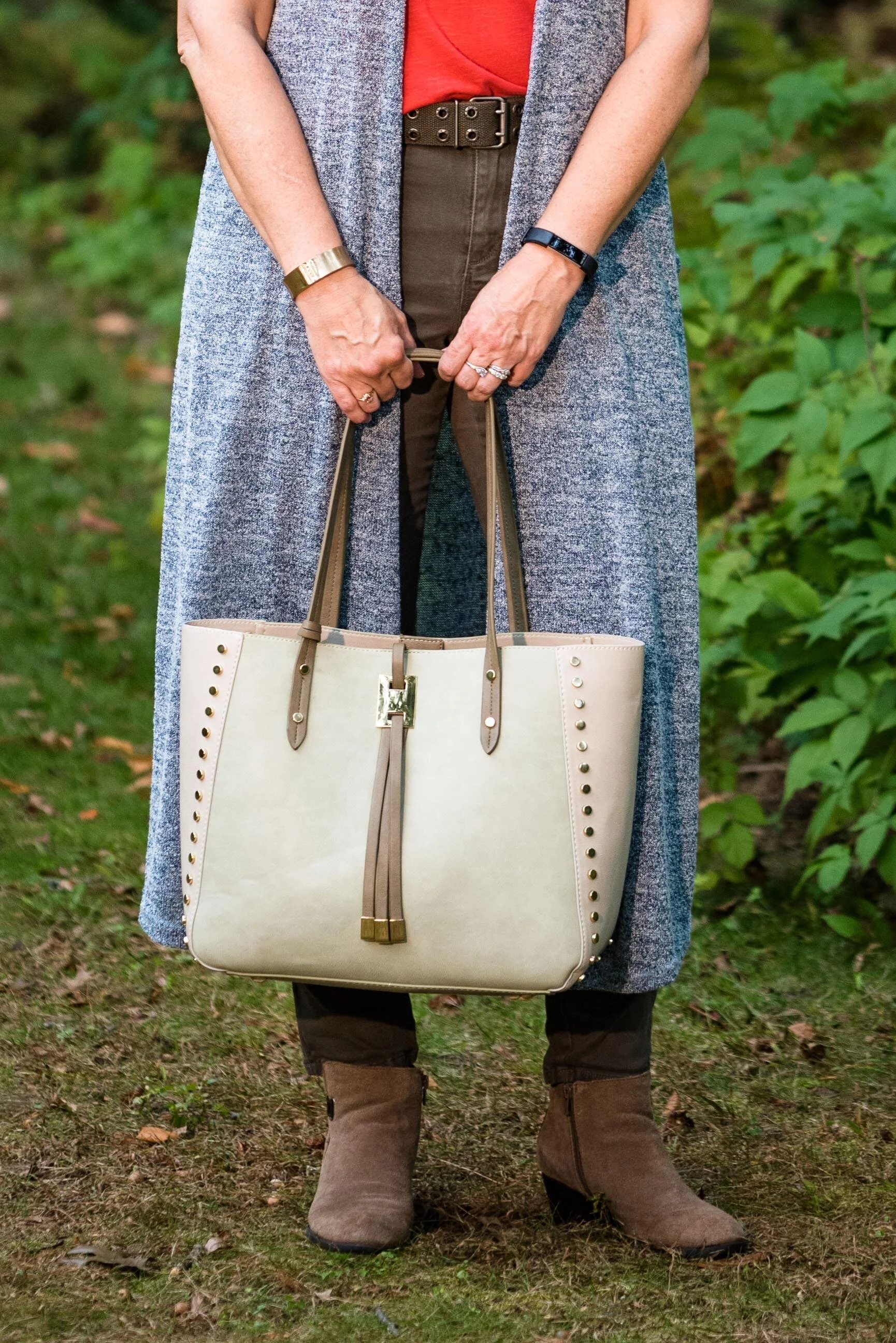
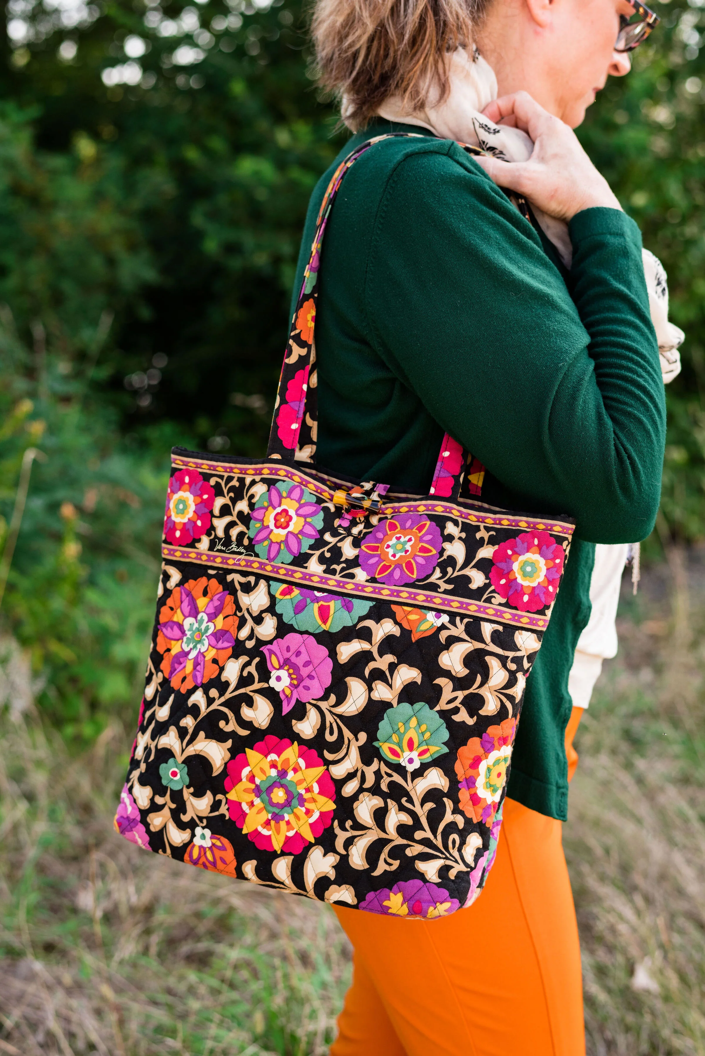
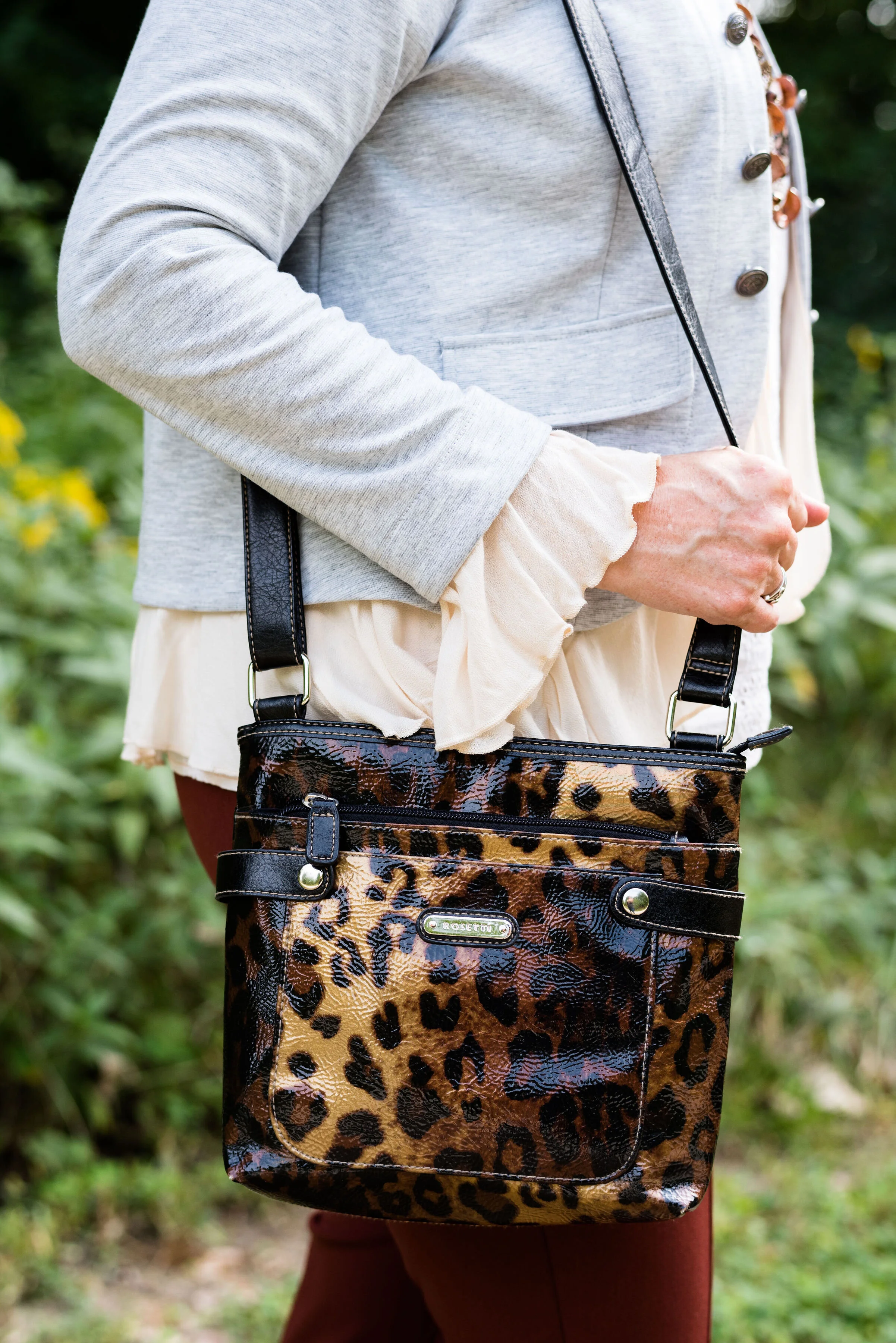
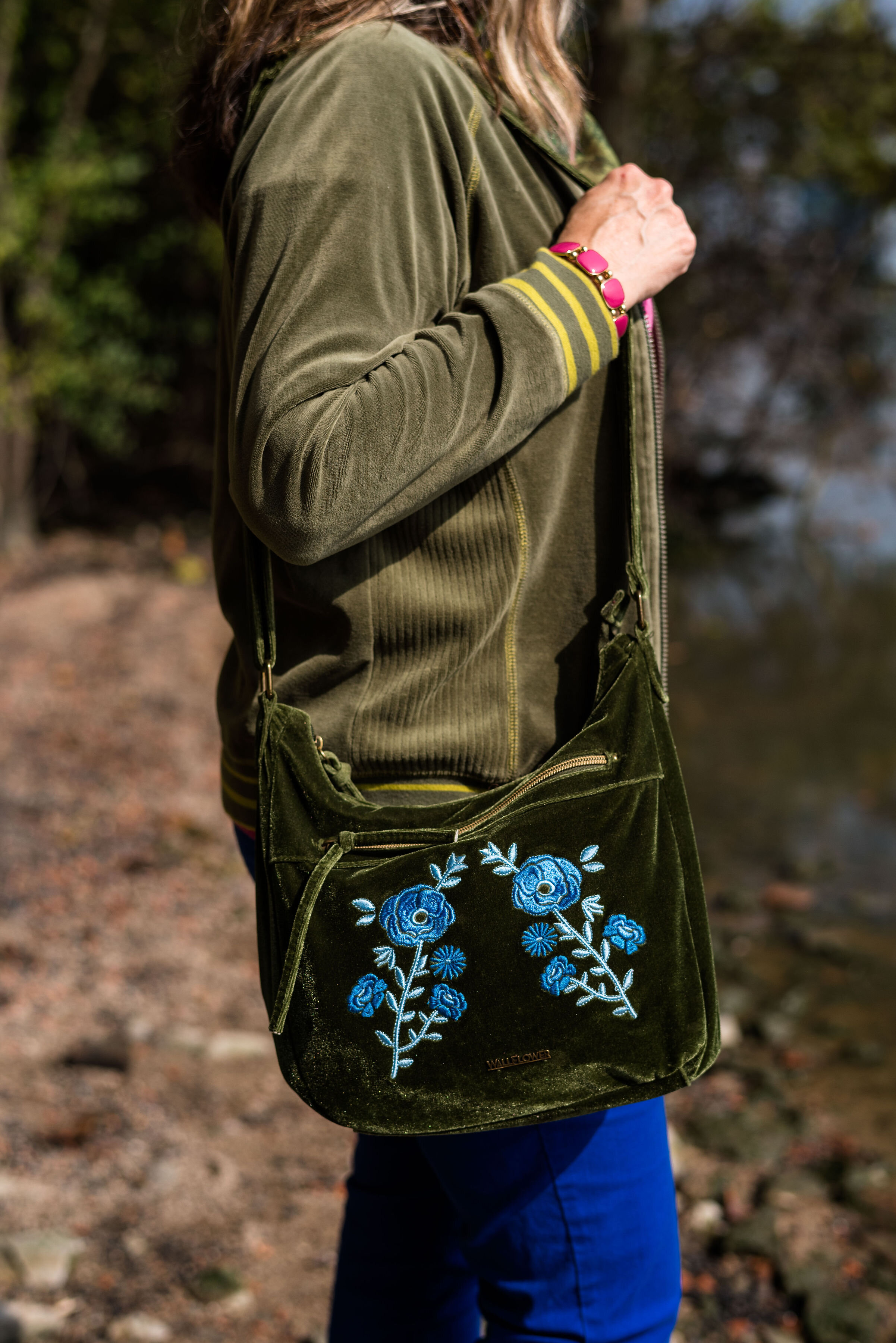
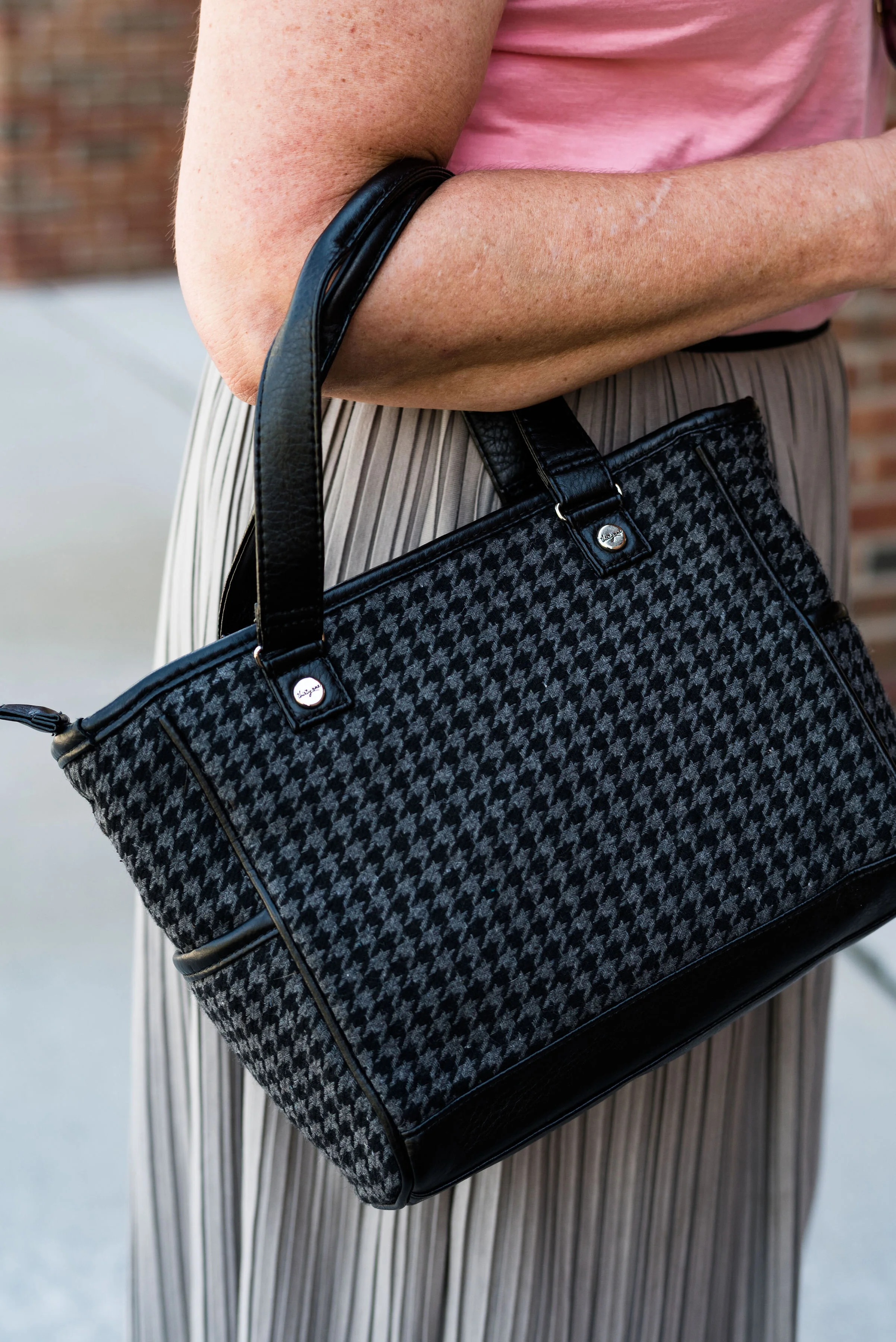
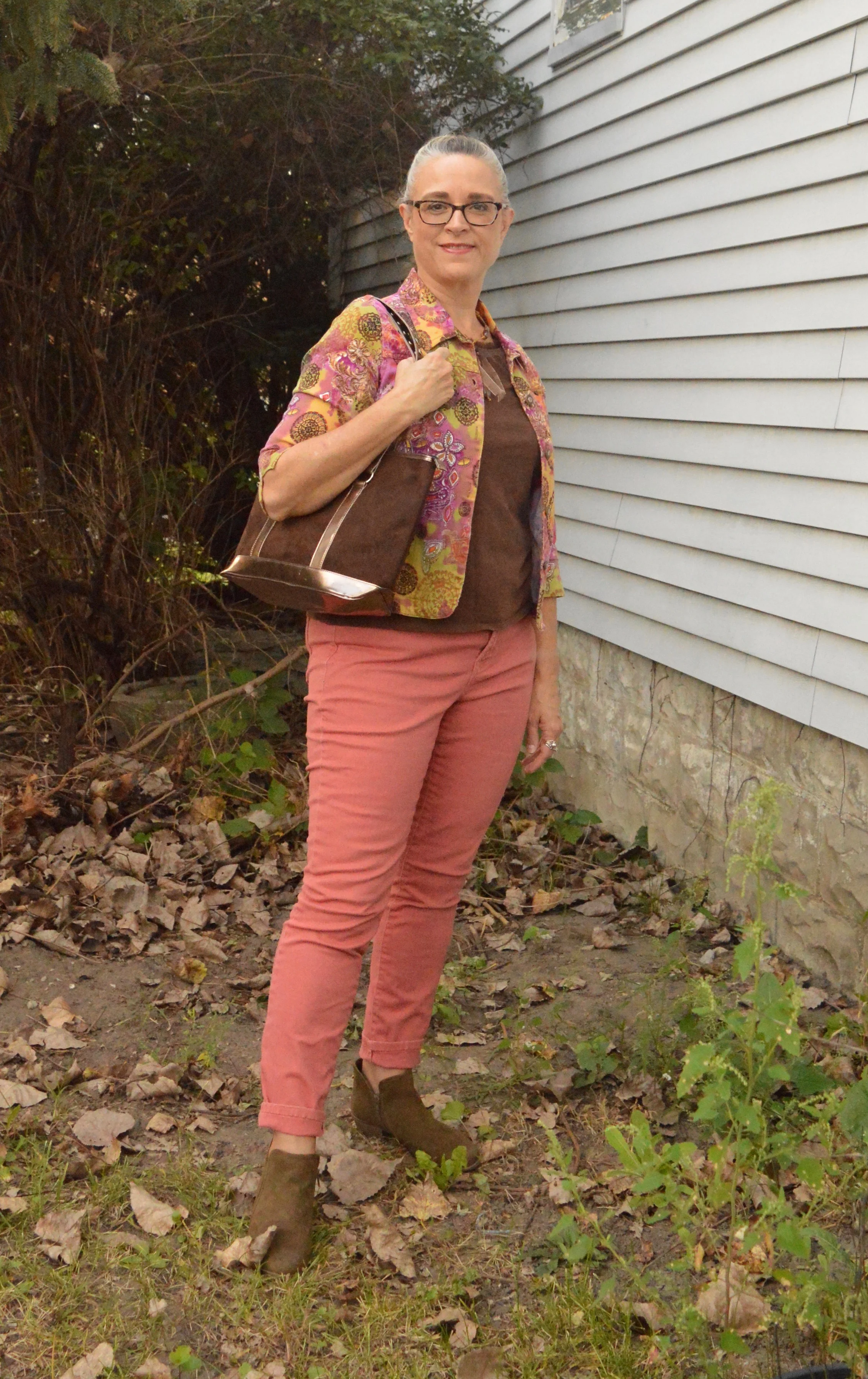
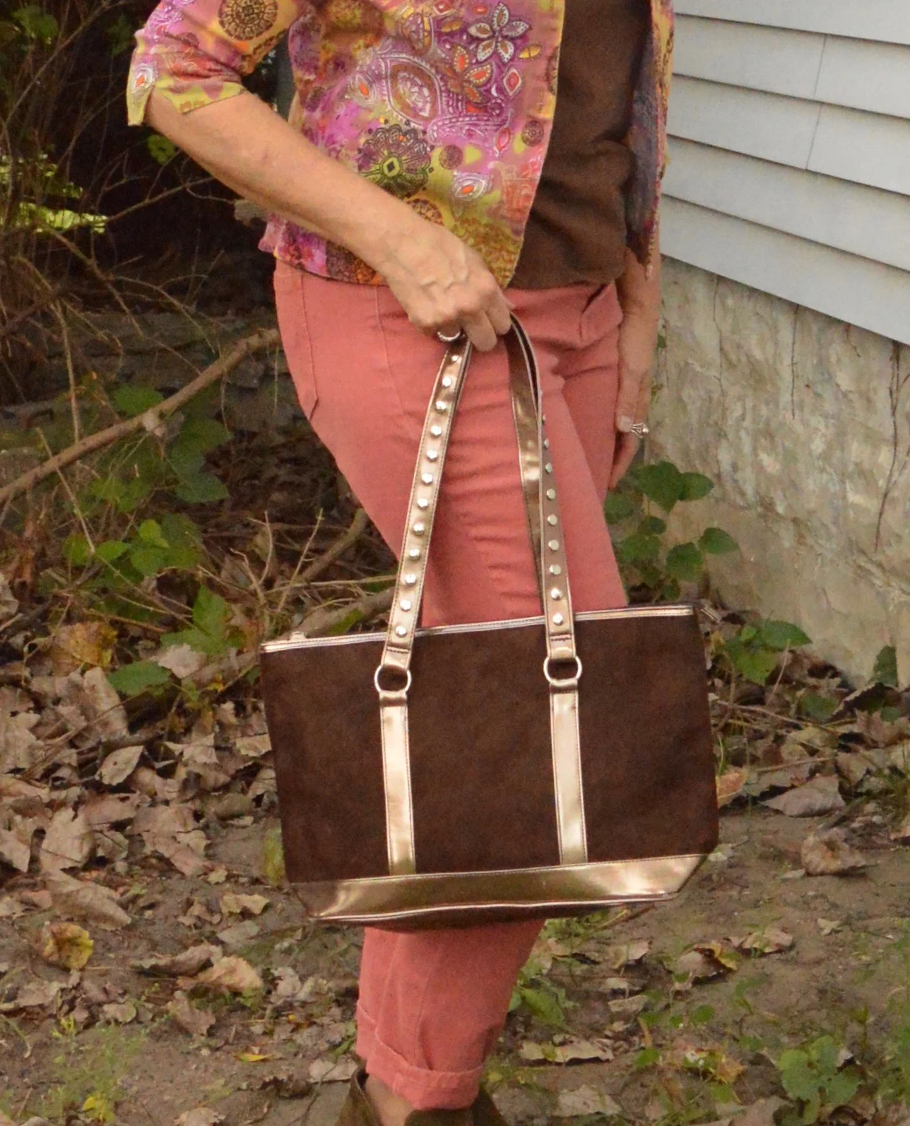
You’ve seen this pretty bag just recently on the blog when I used it with a fall colored fringe kimono.
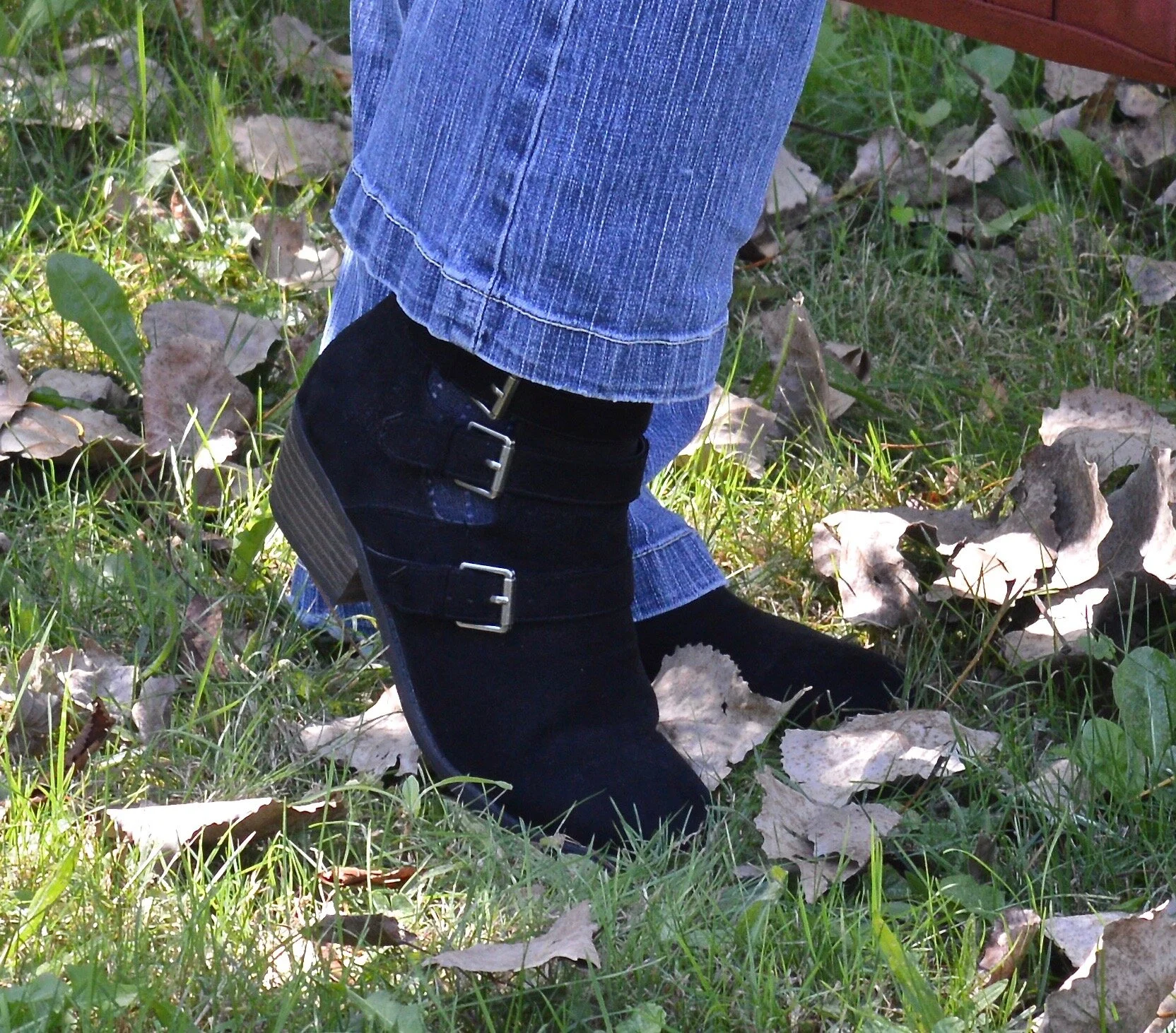
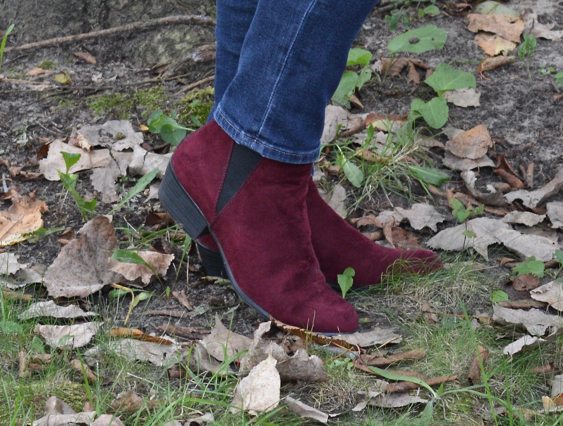
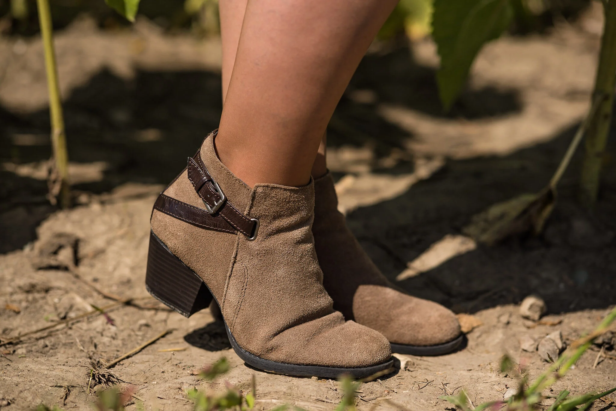
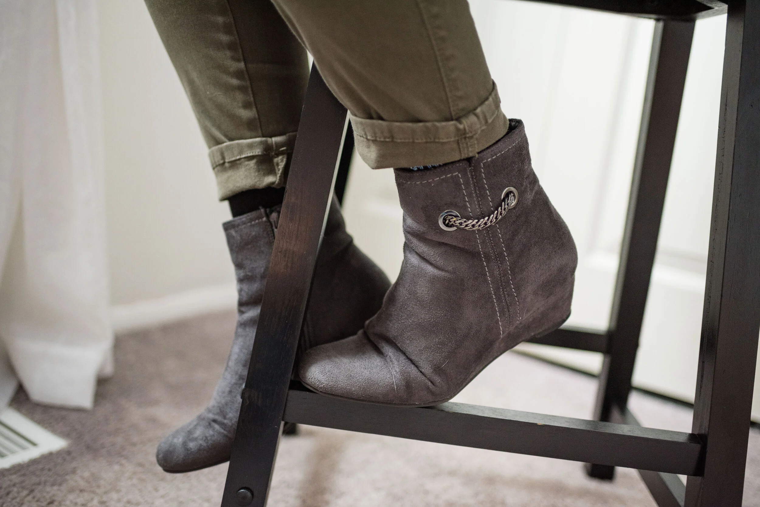
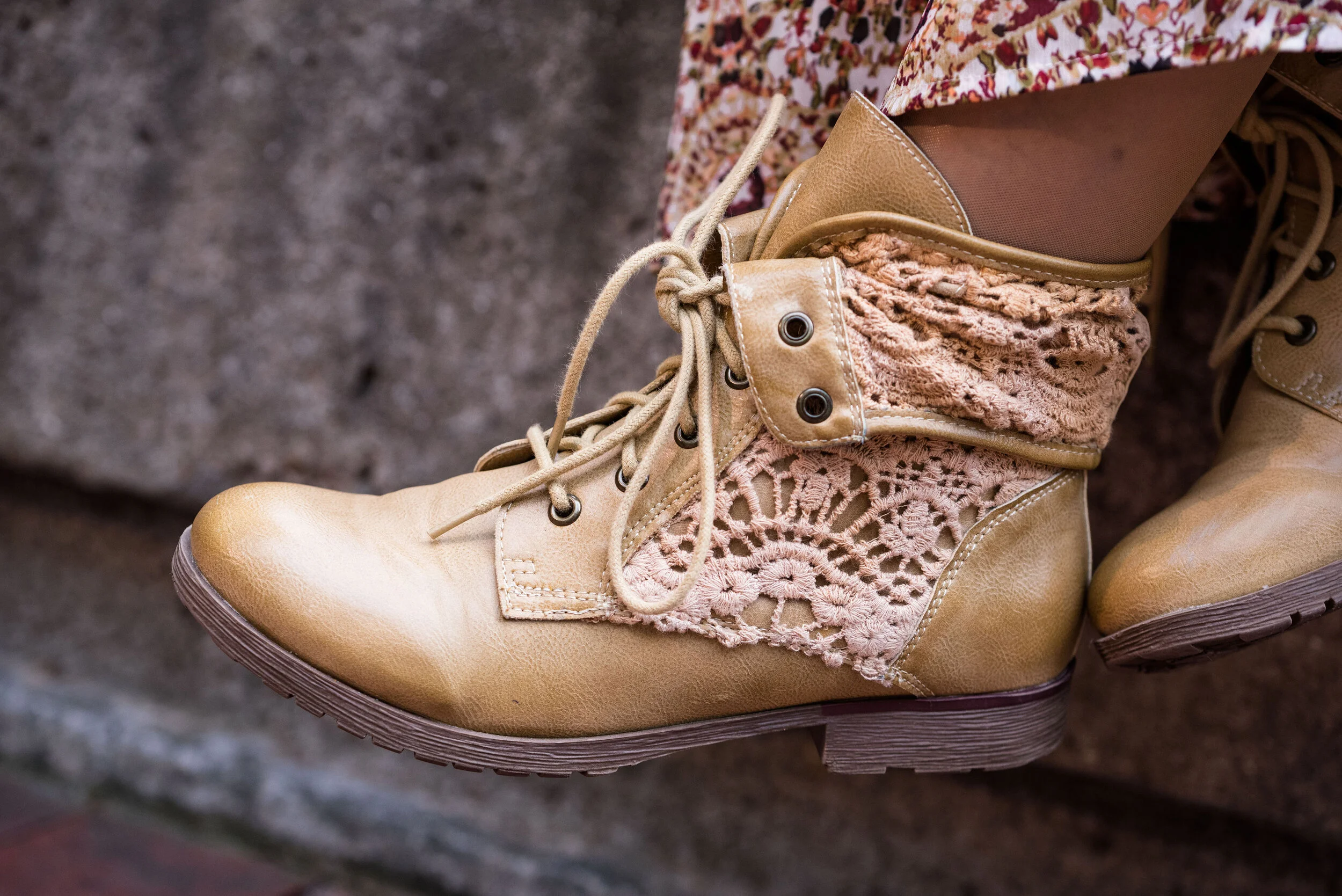
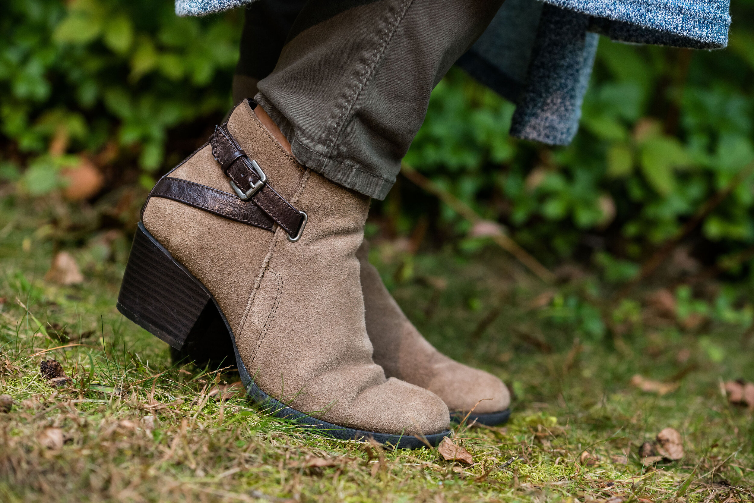
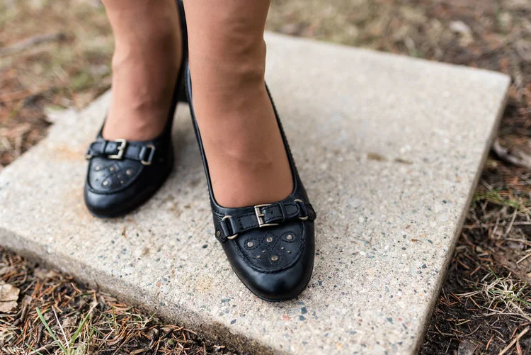
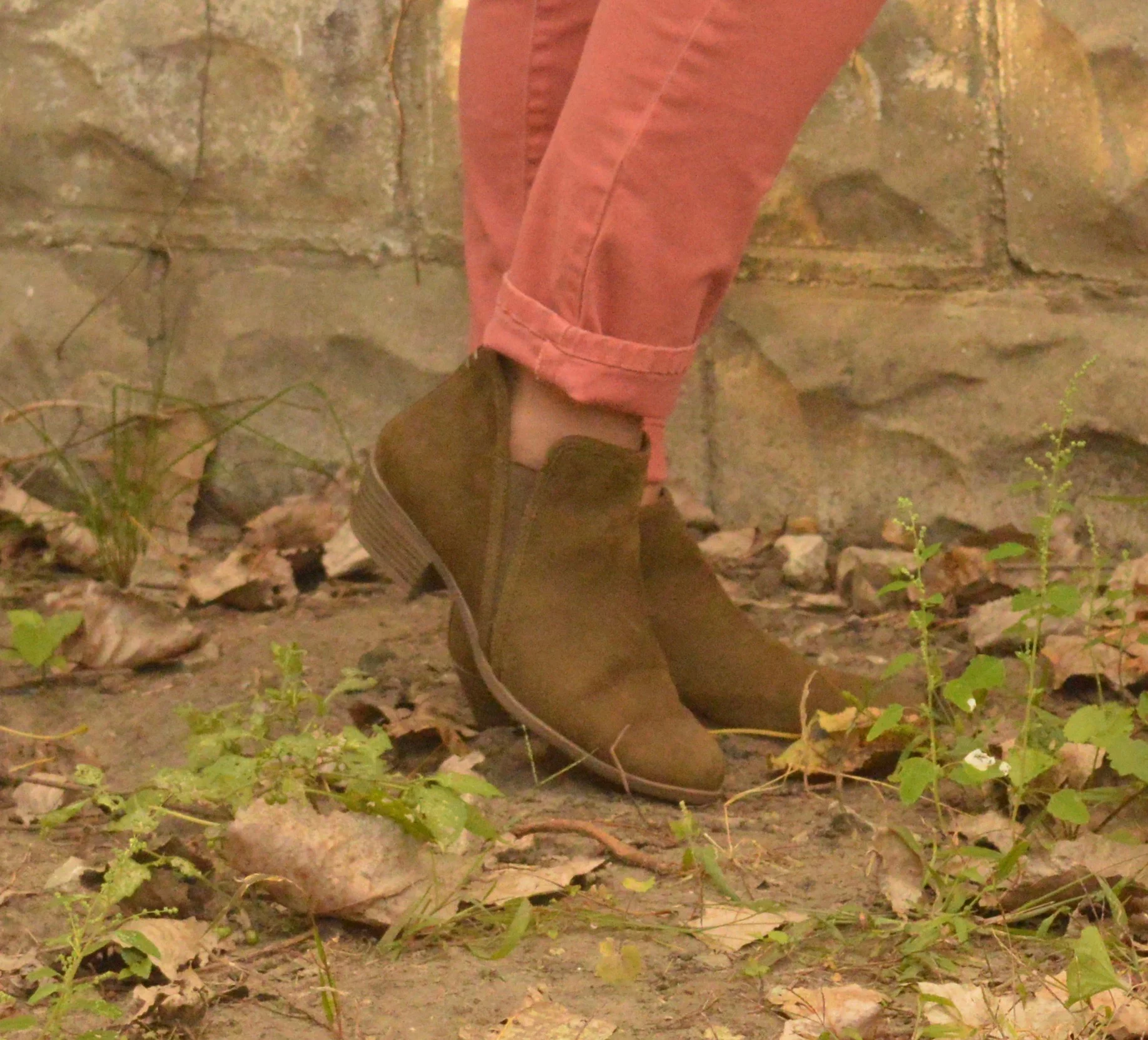
I chose my black faux suede ankle boots. These are Natural Reflections which are a brand Cabela’s carries. My hubby and I go there every so often and usually pass through the shoe department to see what’s on sale. i really love the buckle detailing on these and I use them a lot throughout the cooler seasons.
What do you think of this outfit? Do you wear lots of layers when it gets cooler? How do you like to put your layers together? I love hearing your thoughts so be sure to leave a comment or two.
I’m including a few shopping links, so be sure to stop by. Every time you click on a link I get a few cents. These are affiliate links. All opinions are my own.
Have a great weekend everyone. If you follow my faith posts be sure to stop by tomorrow to see the latest.