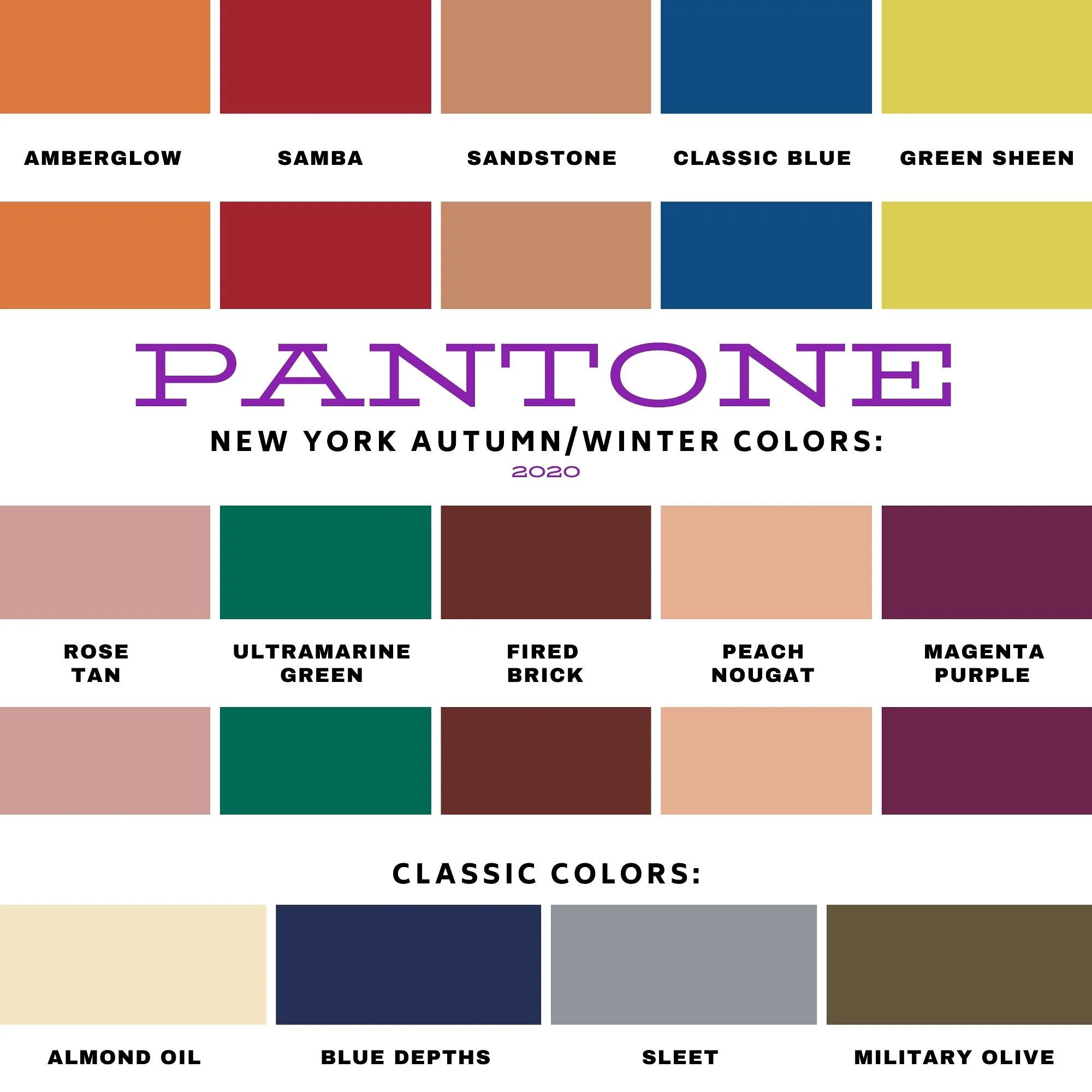
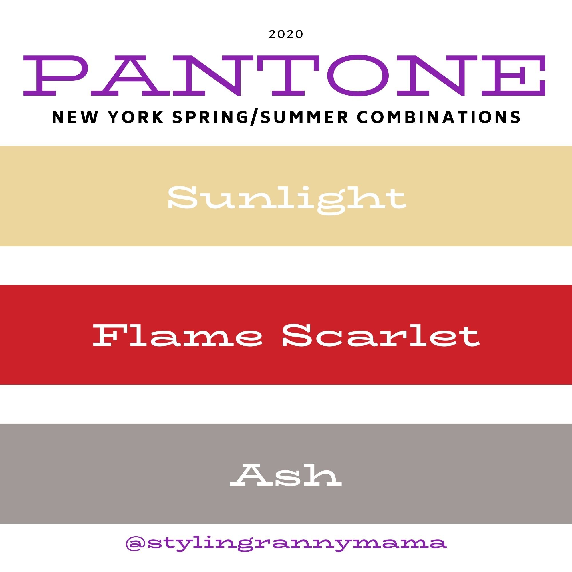
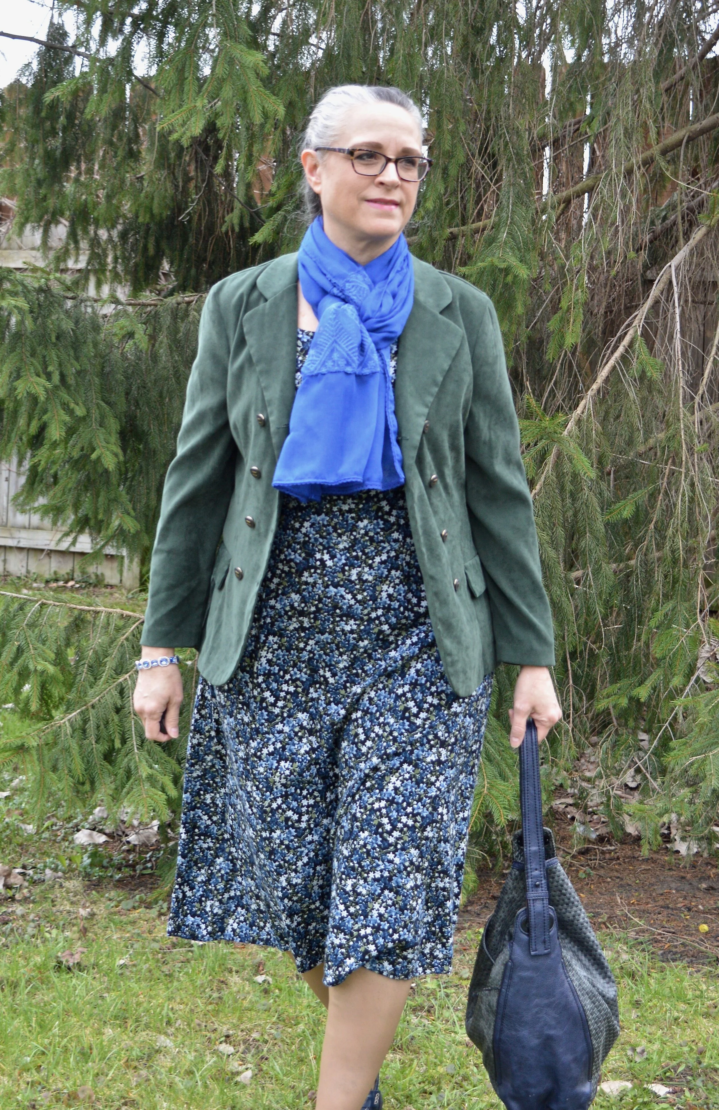
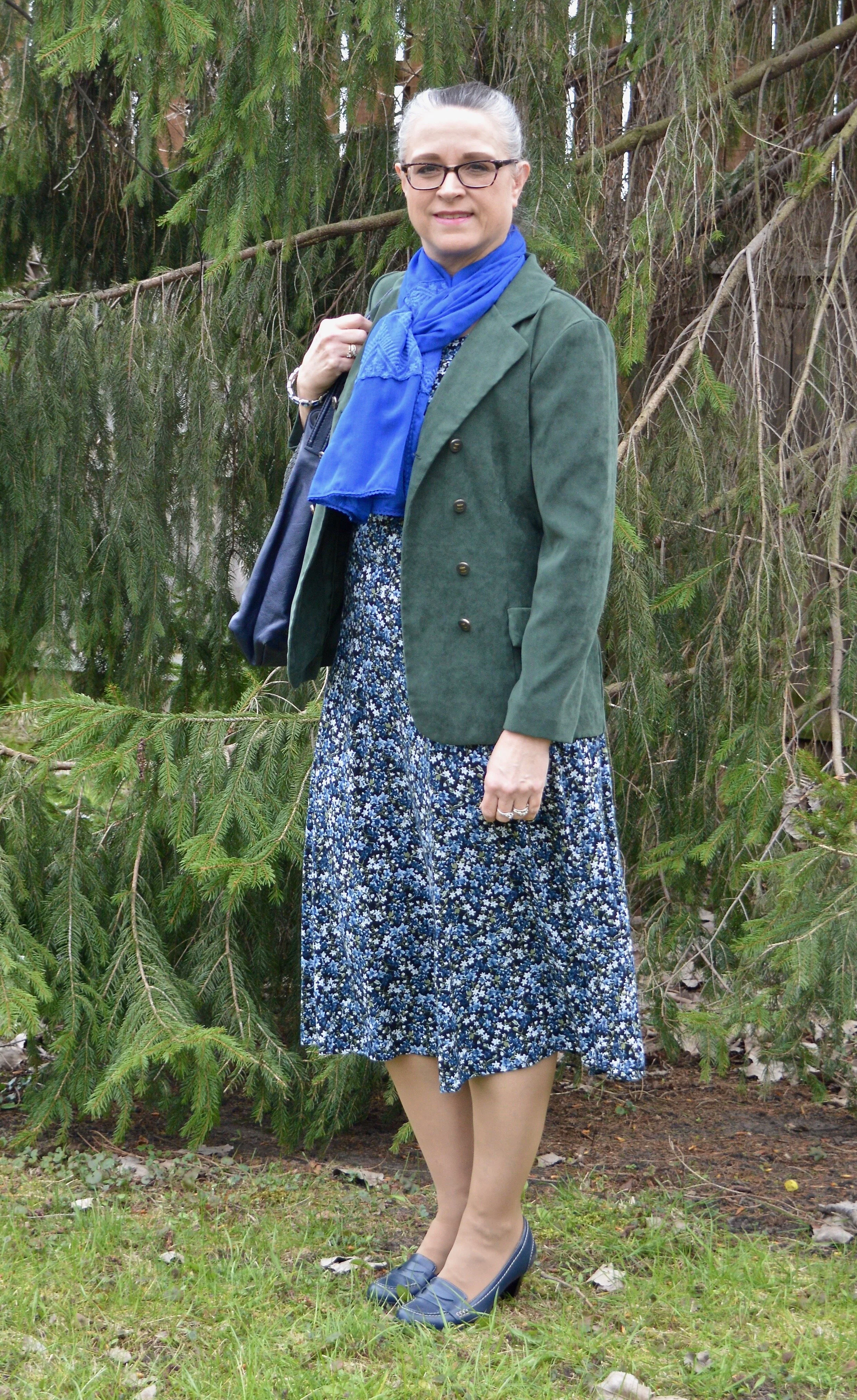
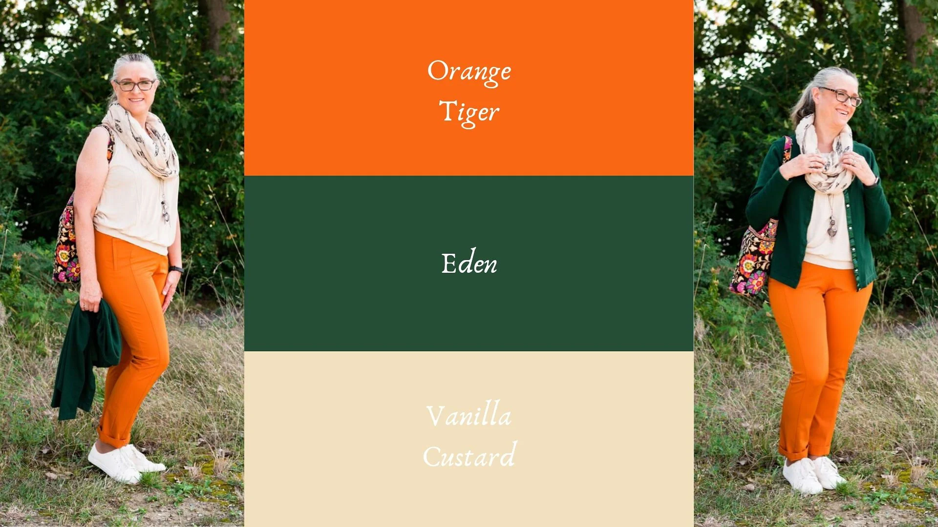
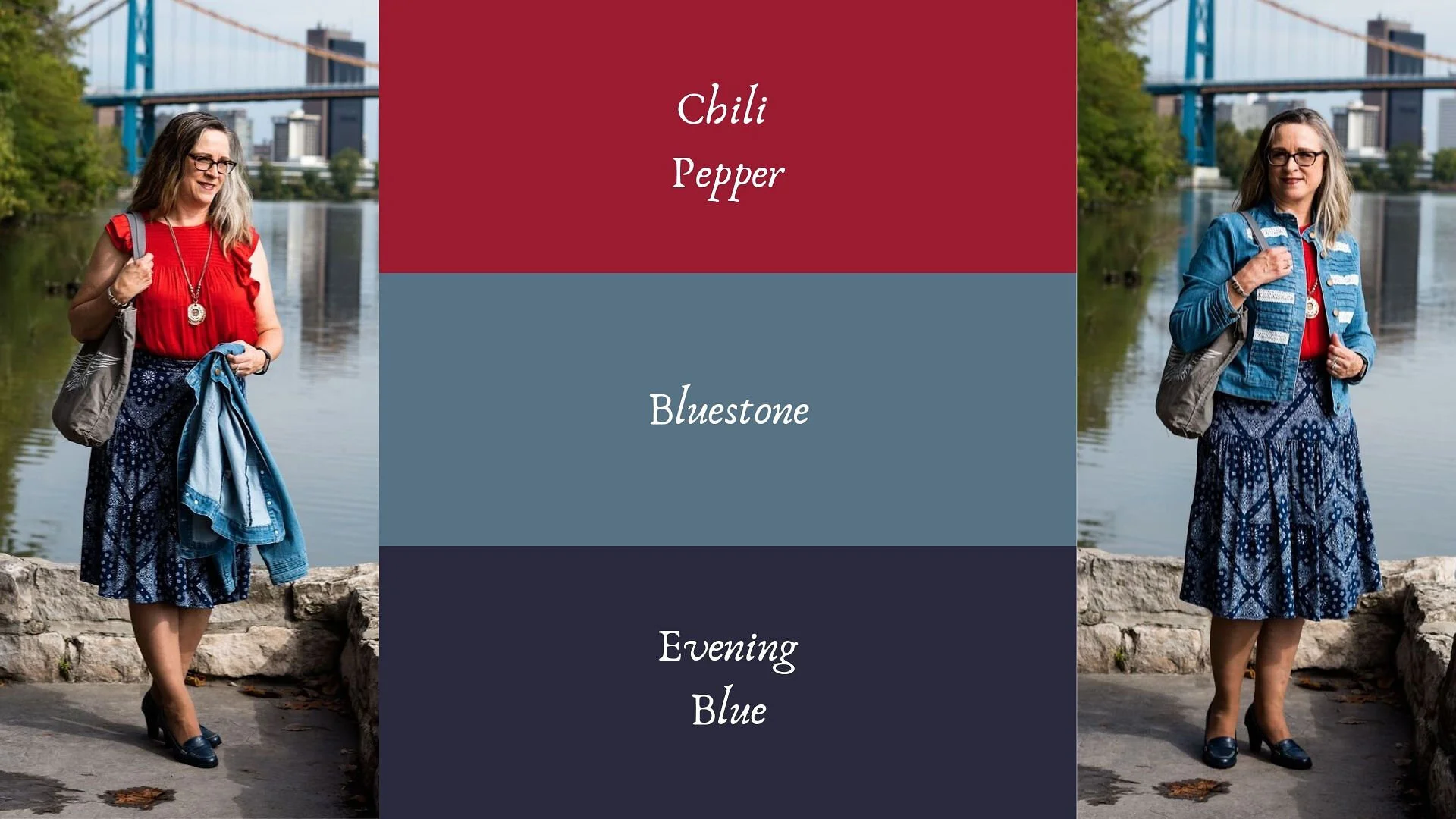
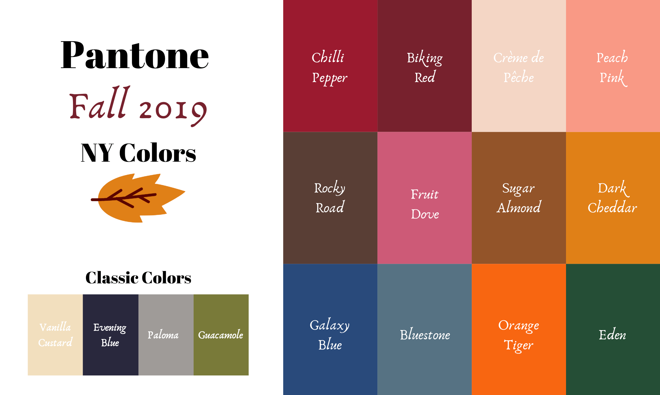
Pantone Fall/Winter 2020 - New York Palette - Classic Blue, Ultramarine Green and Blue Depths
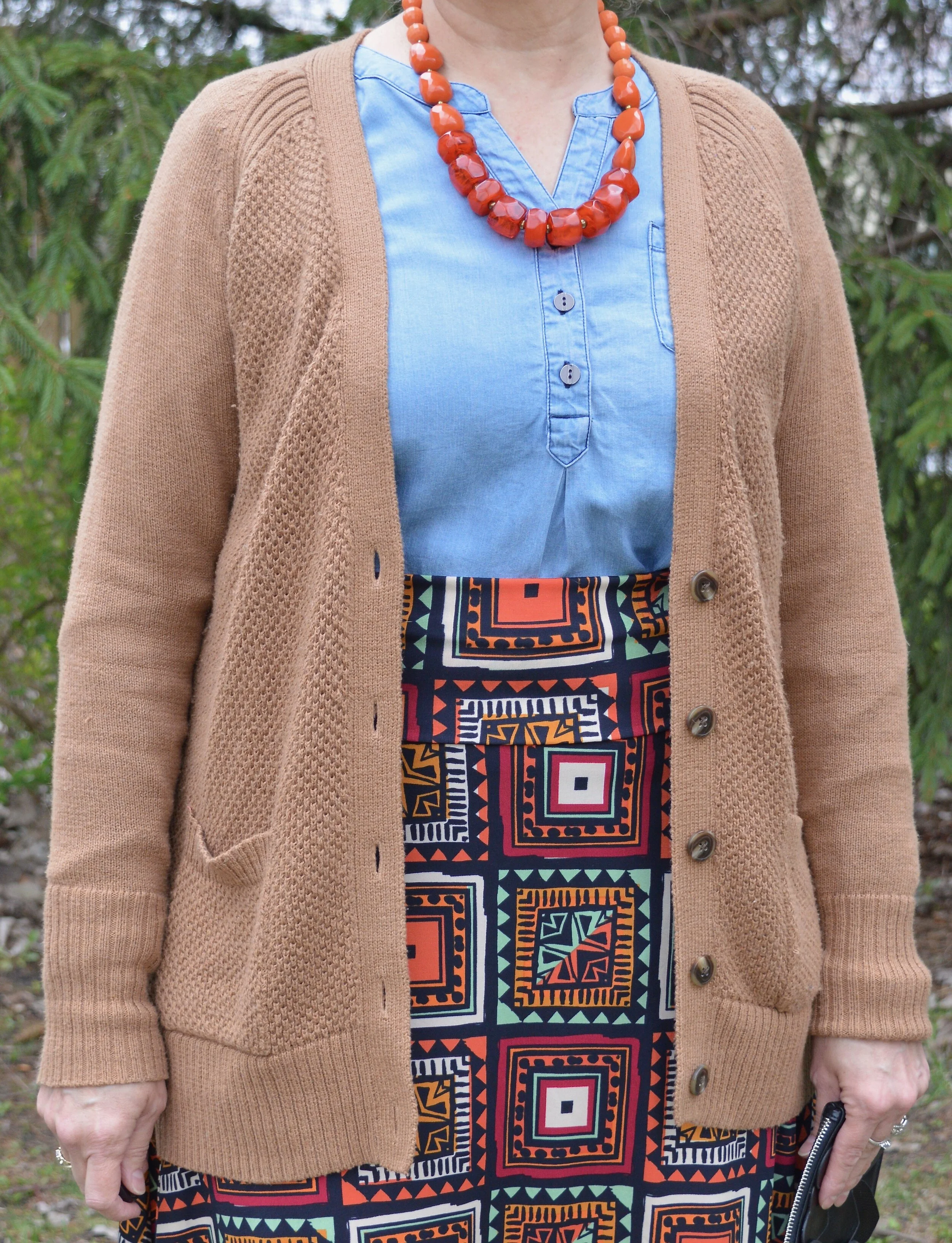
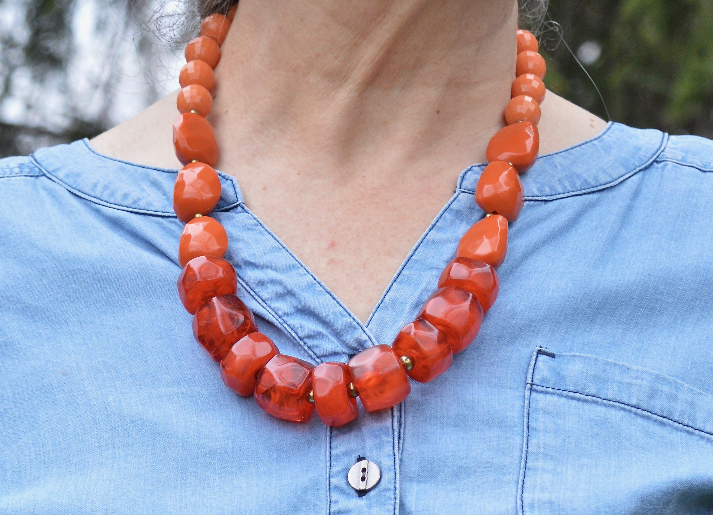
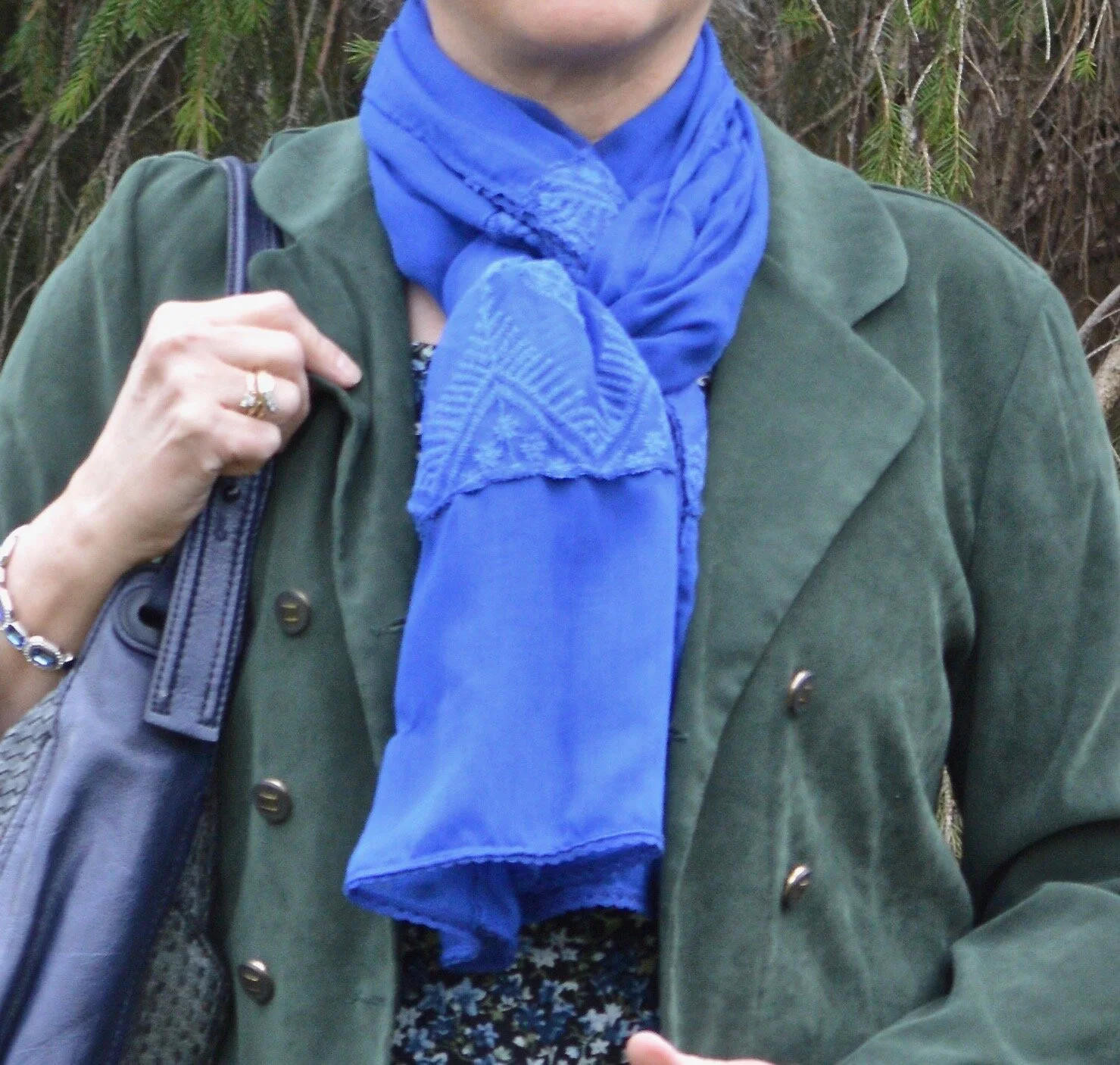
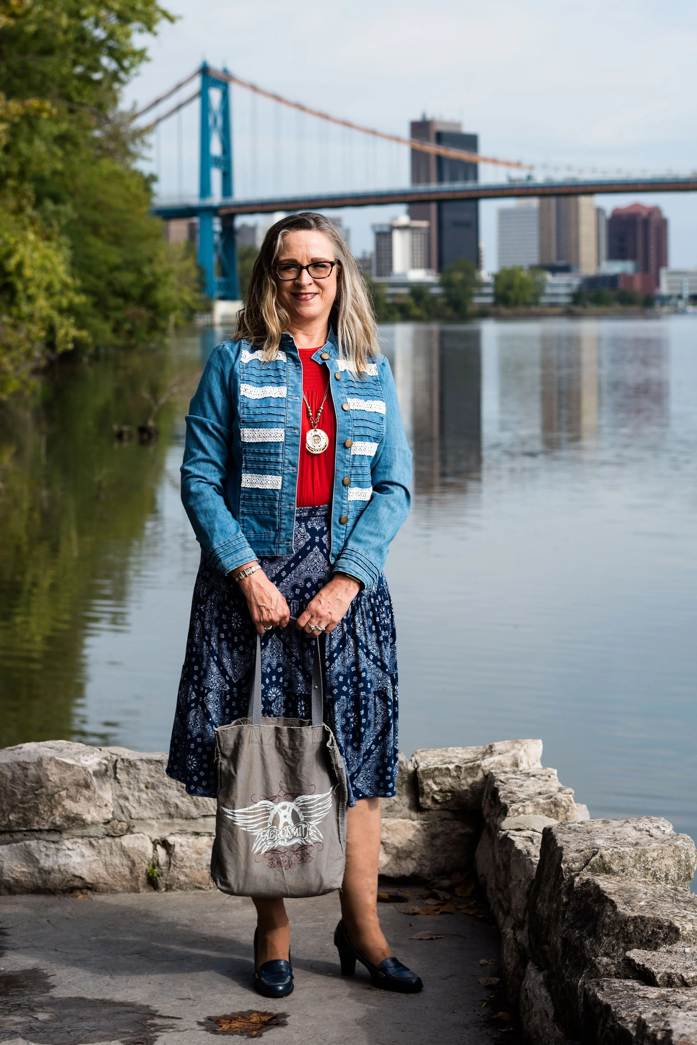
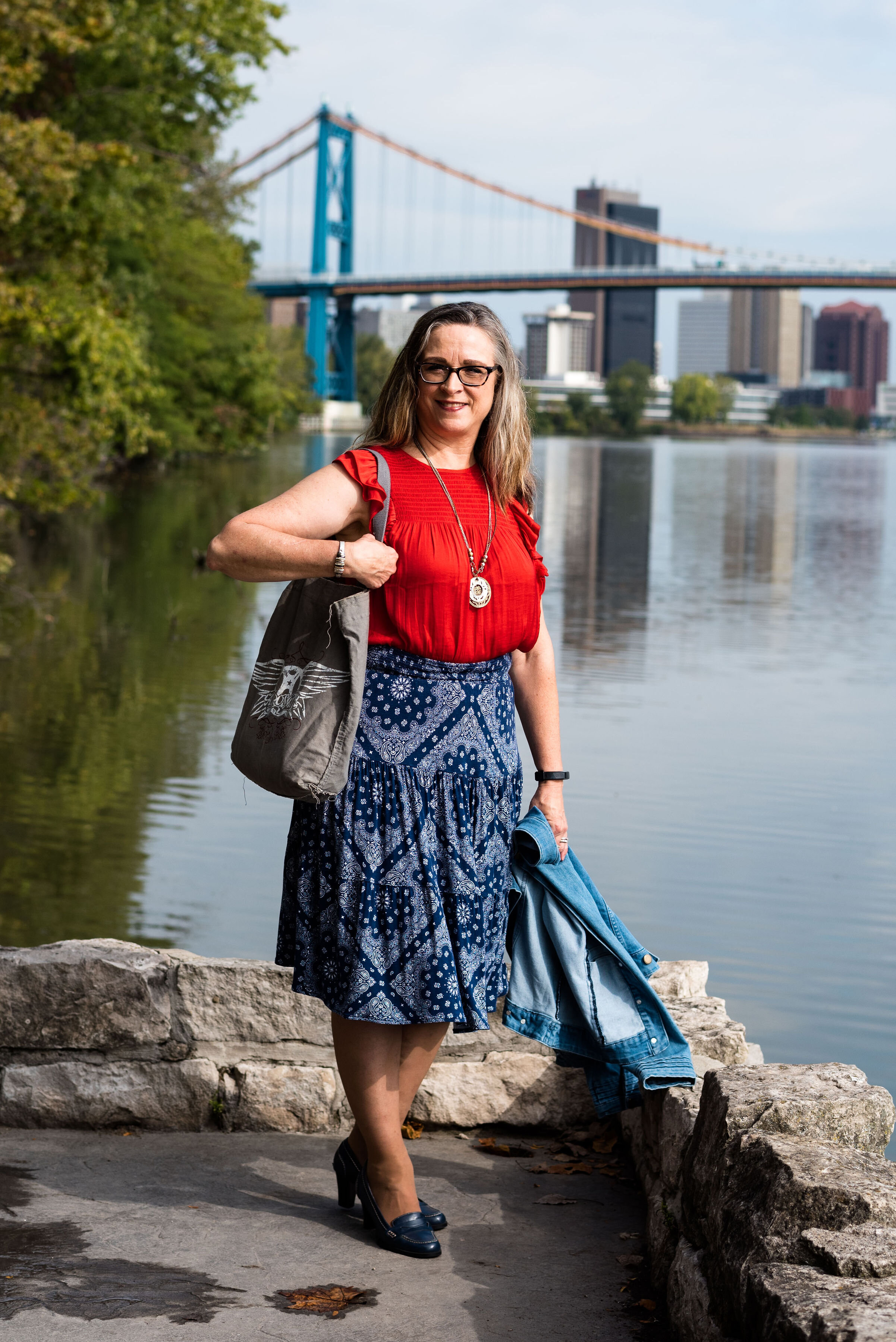
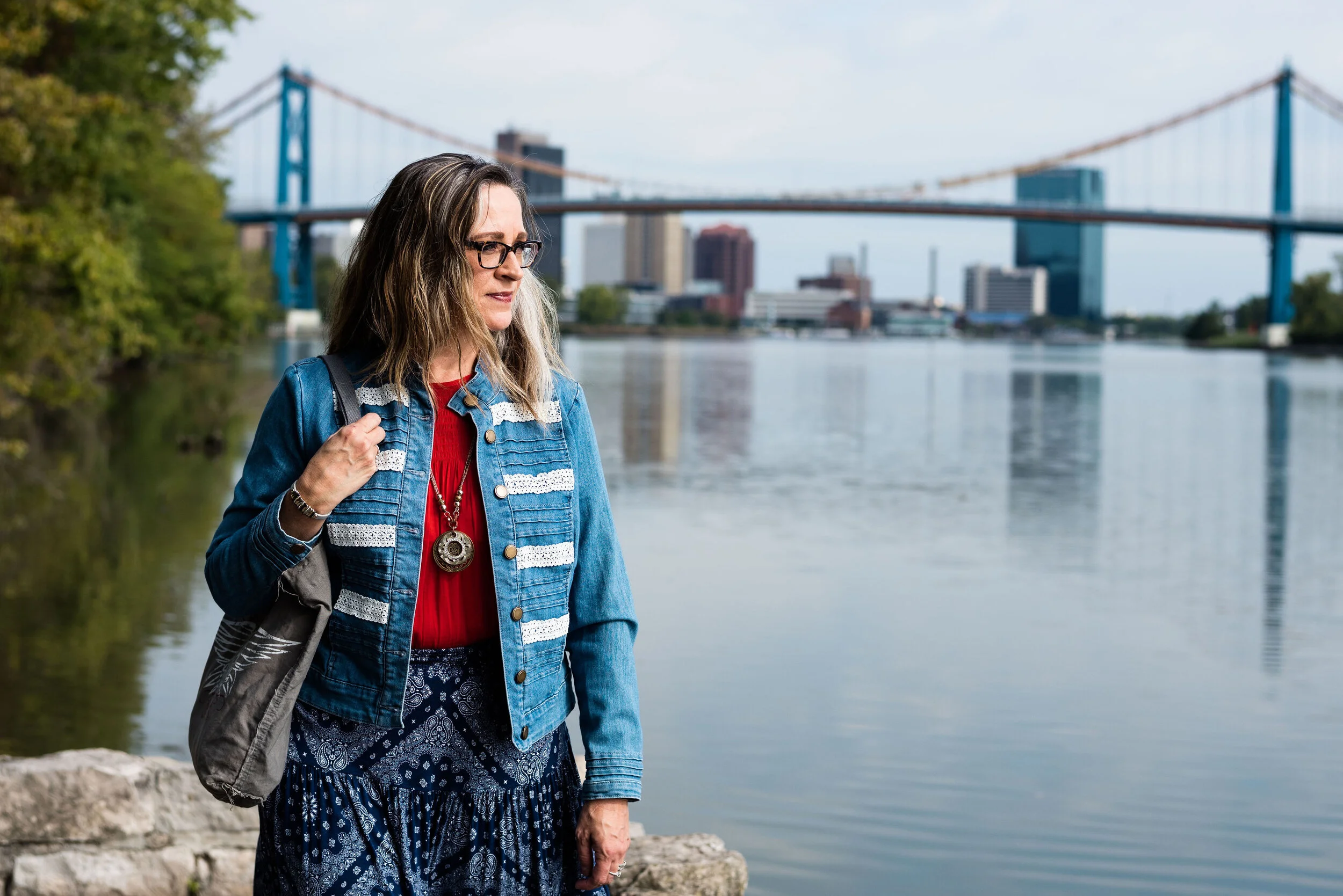
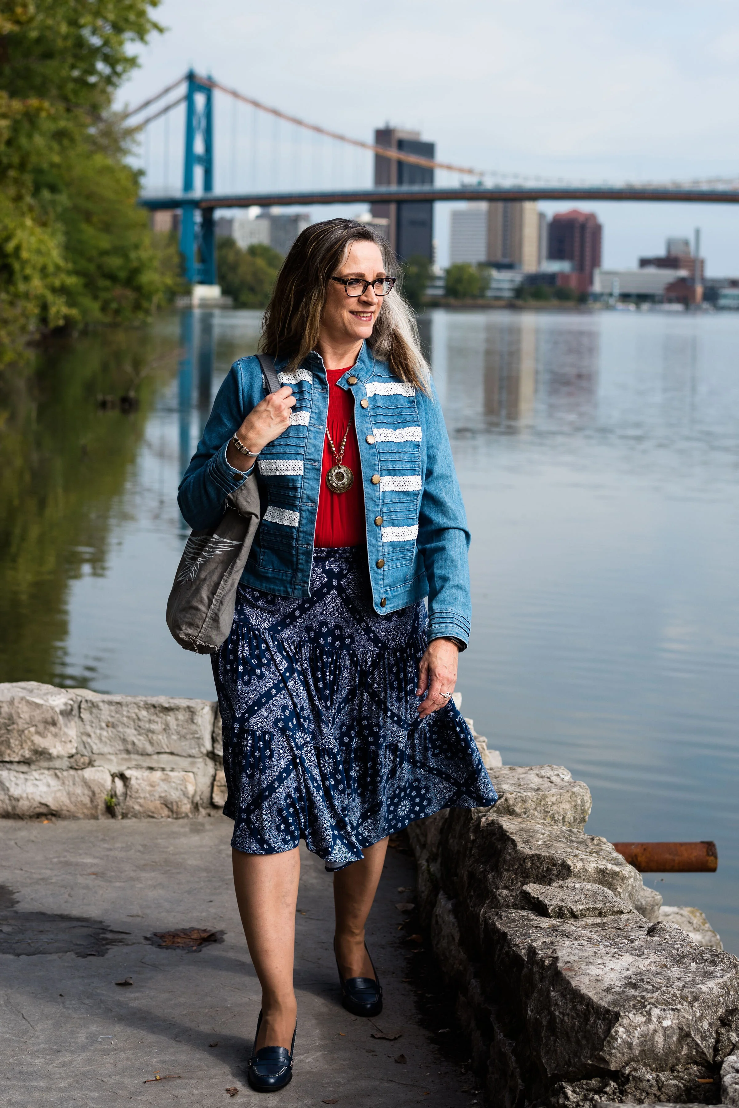
The Pantone Color of the Year is Classic Blue , so once again we are featuring this medium blue color in the Pantone series. Back in January I showed you this color paired with a furry bomber jacket and plaid skirt. You can also see this color with a multi-print midi dress and with a bright pink top. Classic Blue is a blue that just about anyone can wear. If you prefer not to have this pretty blue to close to your face you could carry it in a lovely bag, or wear it as a brooch pinned on your lapel. I’ll provide a few shopping links at the end with various options.
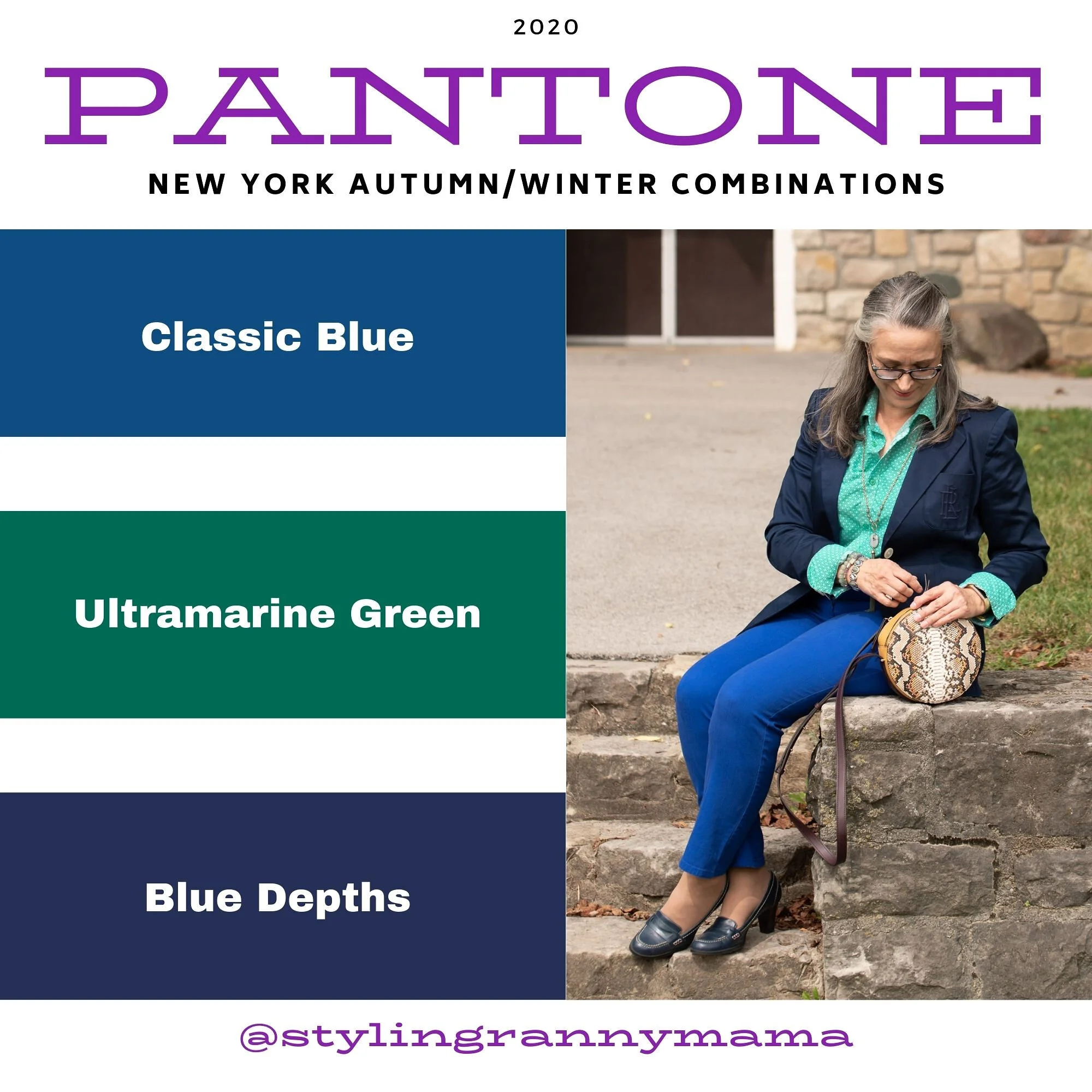
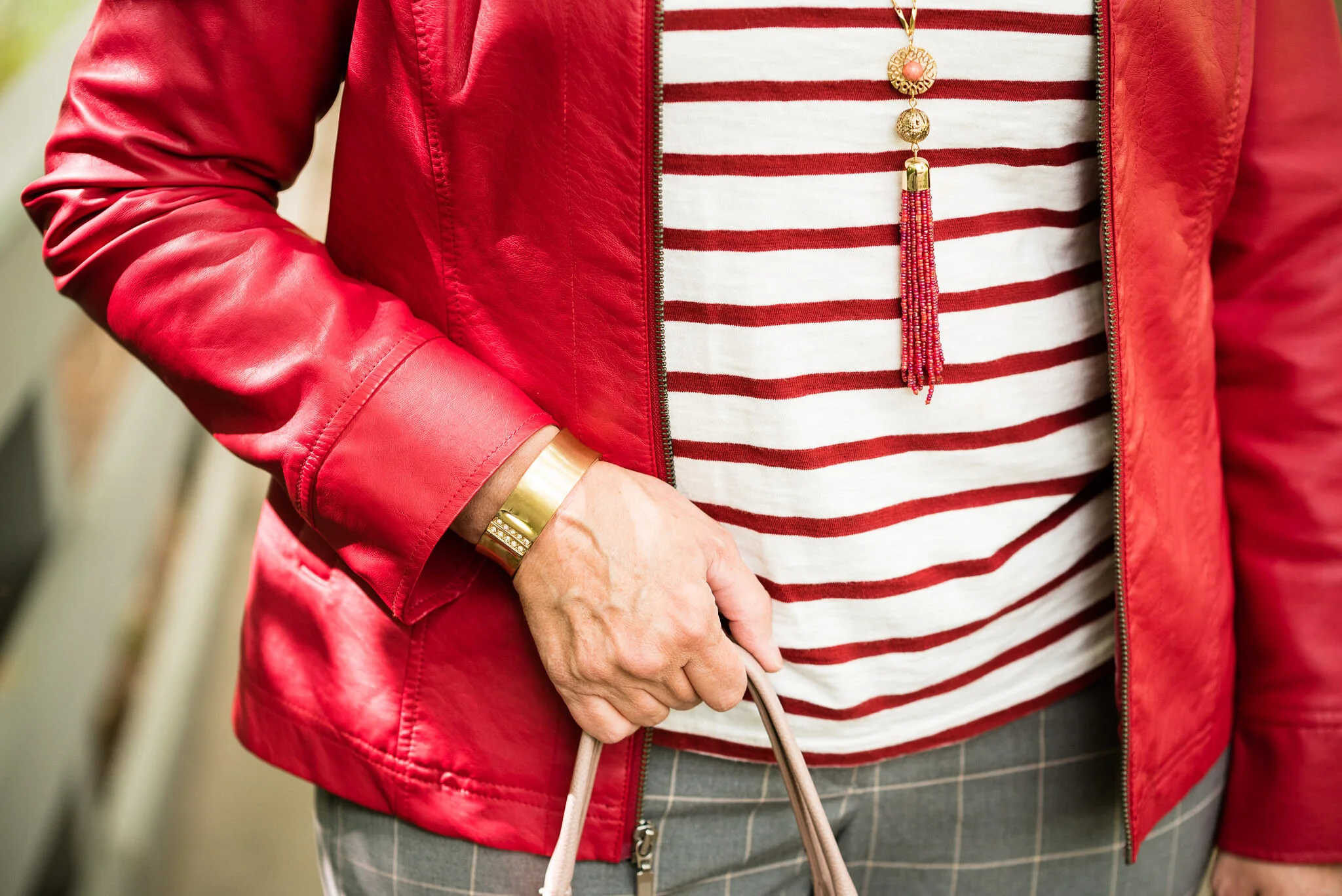
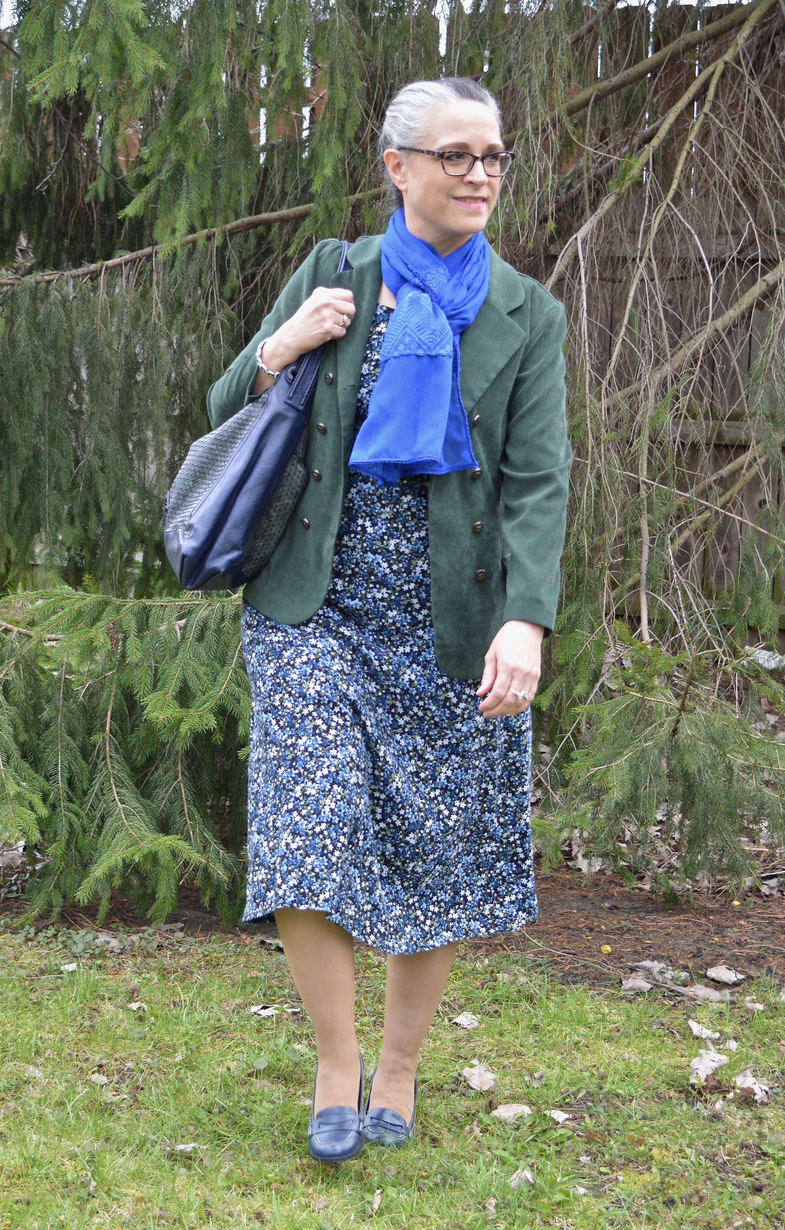
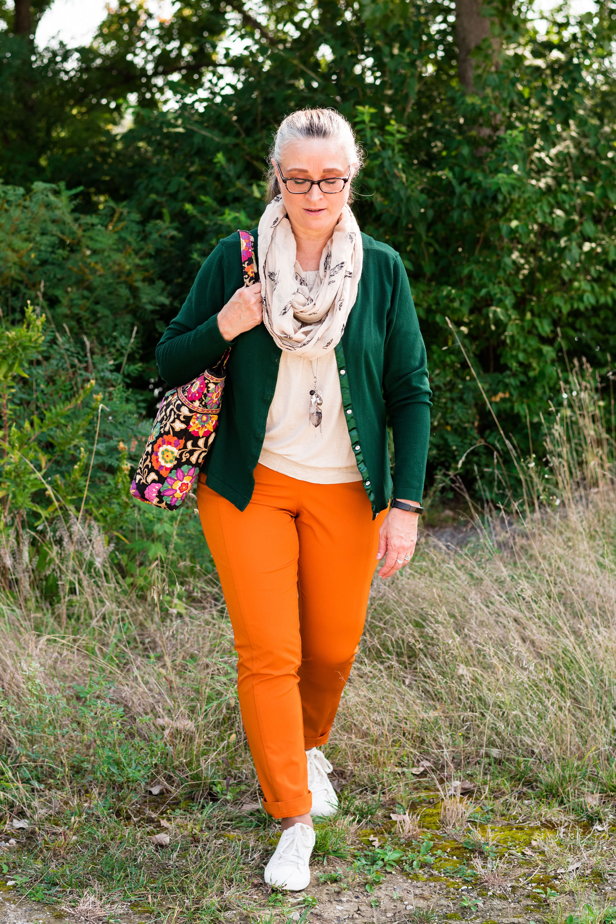
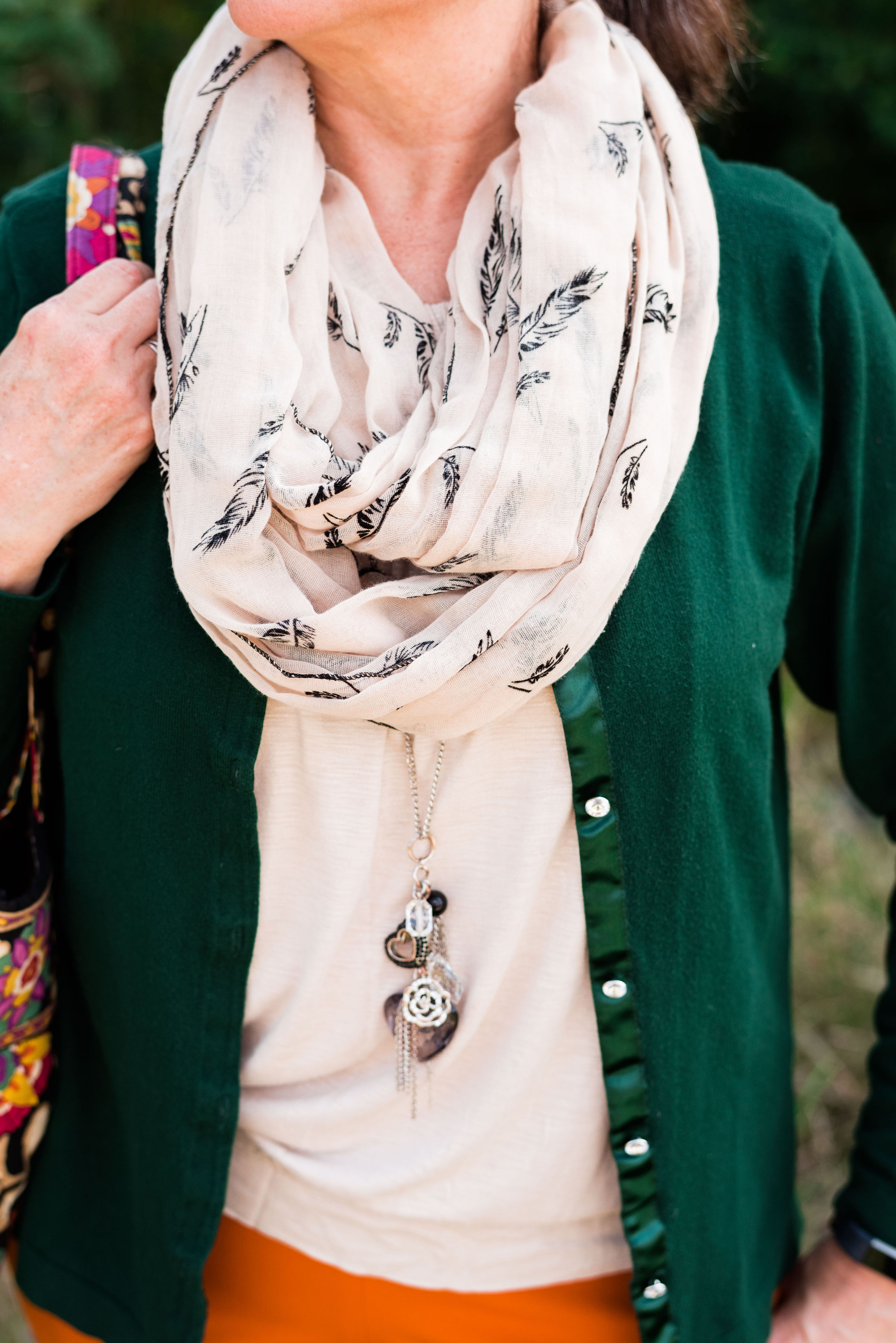
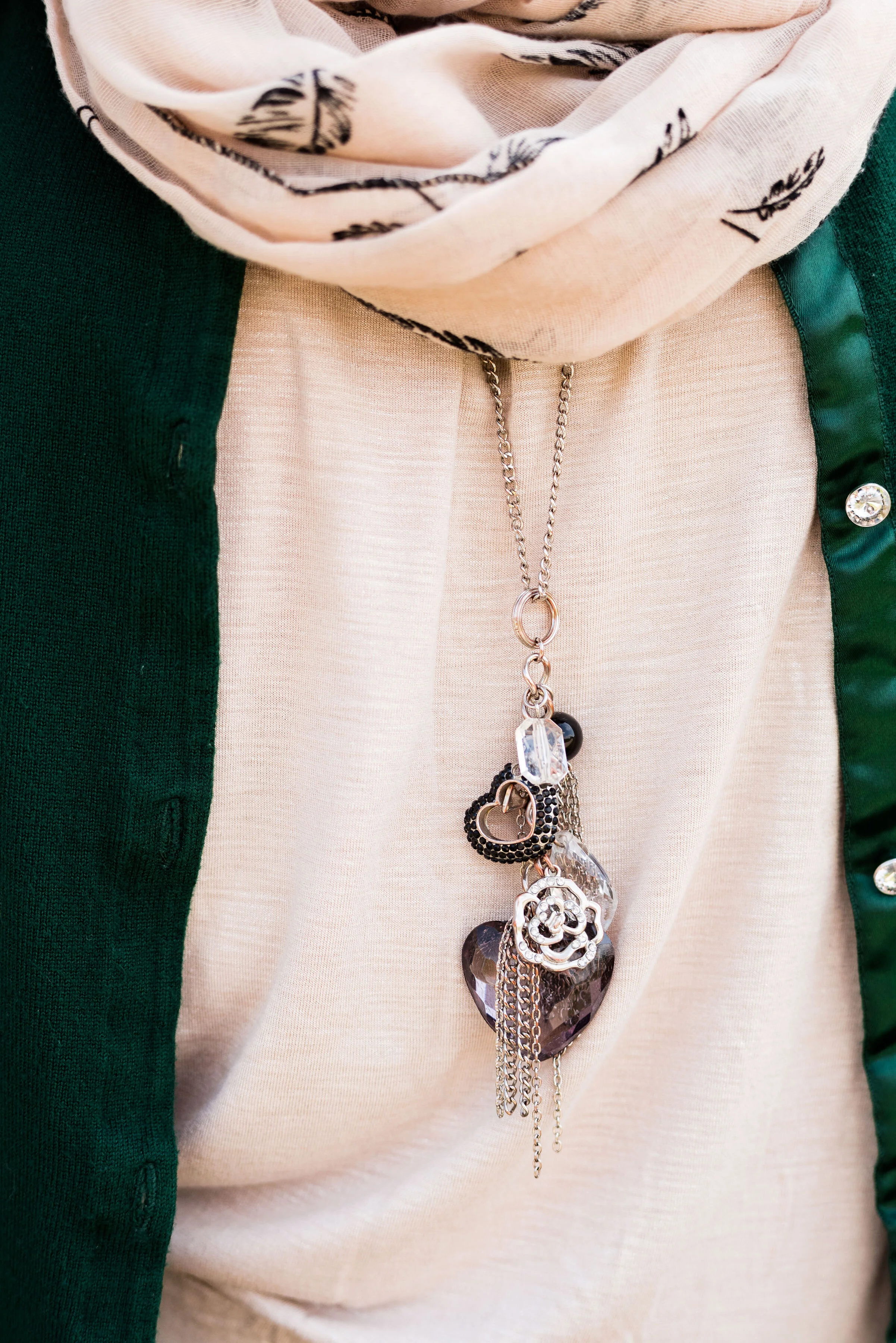
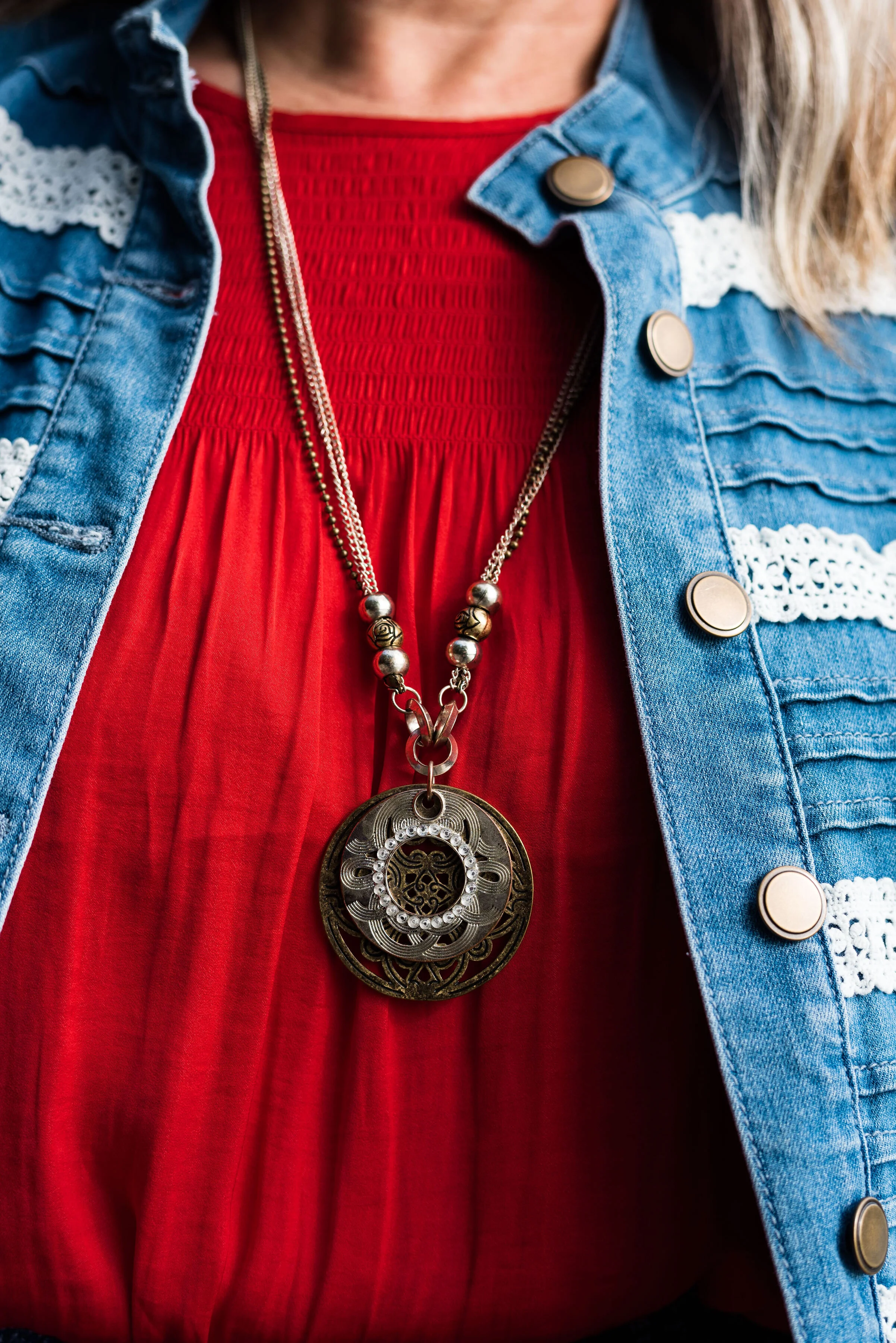
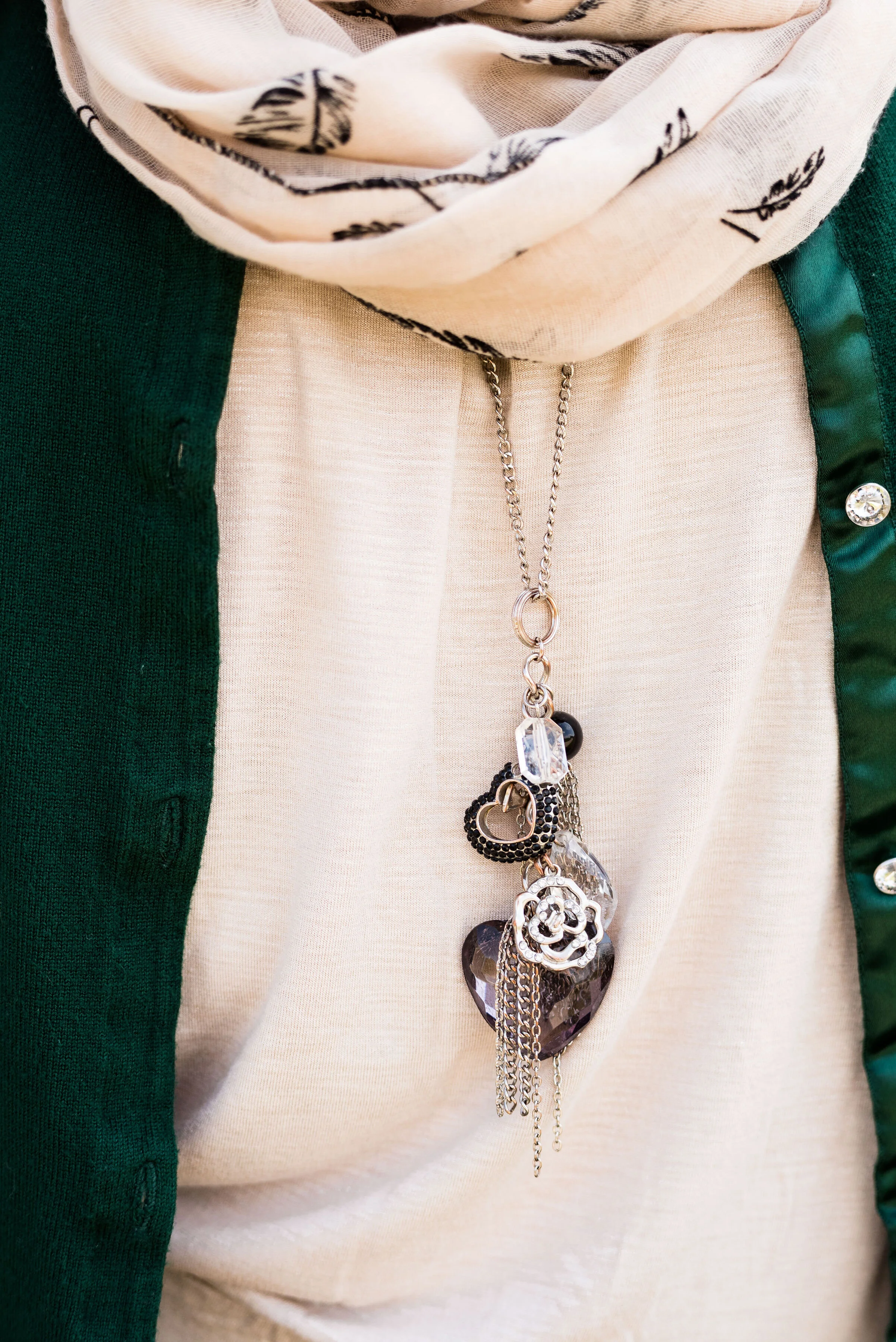
I didn’t really have anything that seemed to perfectly match the Ultramarine Green, at least not until after the fact. My button up is actually a thrifted men’s shirt; a brand called Zylos. It has very small greenish blue print with white and almost has more of an aqua feel to it. Oh well, I have long ago given up on the idea of trying to be perfect. Ha, ha. You can see a closer look at the pattern, and see my thrifted, fringe, pendant necklace. Actually, the necklace is probably a closer match to the Pantone green.

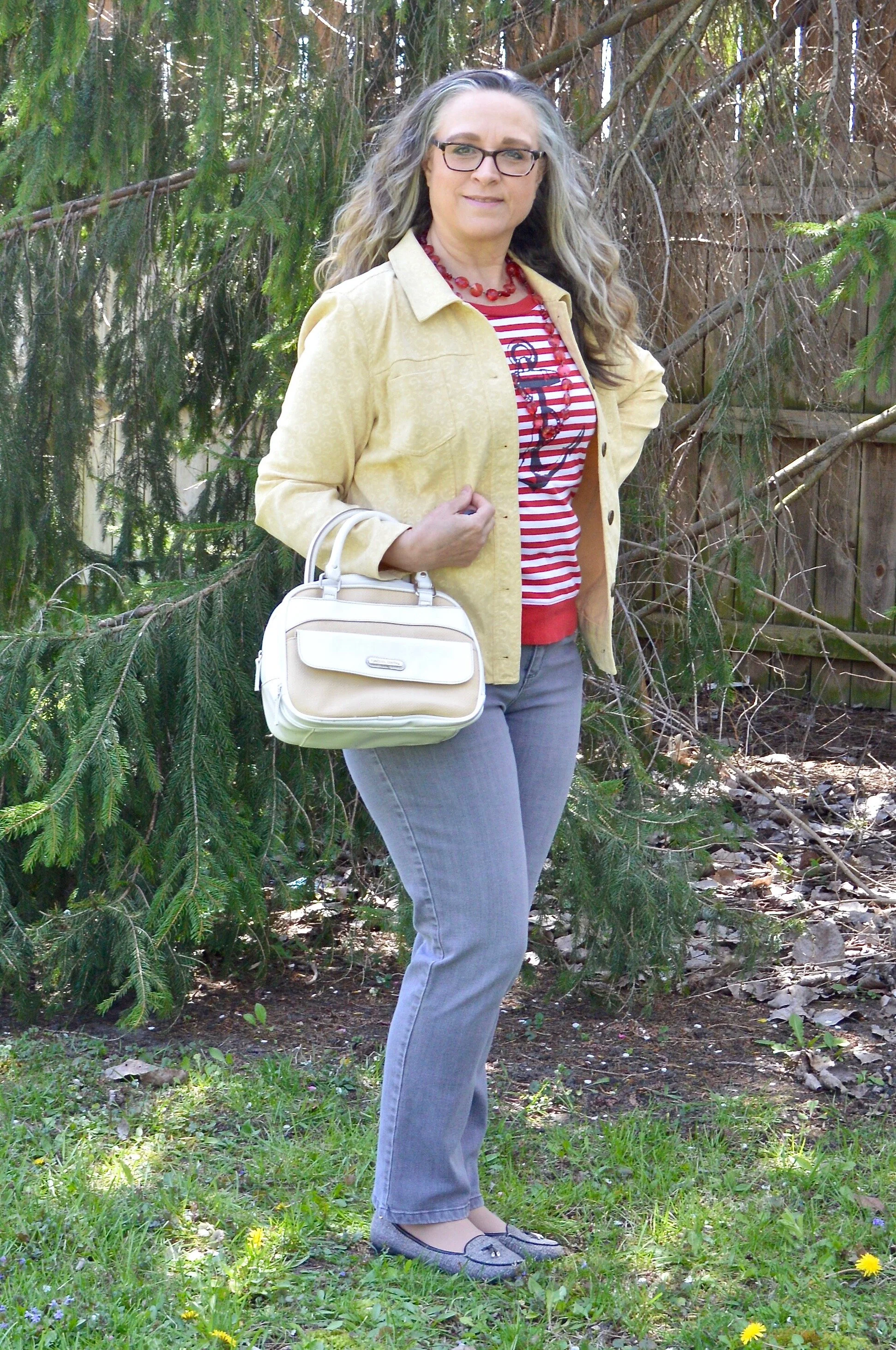
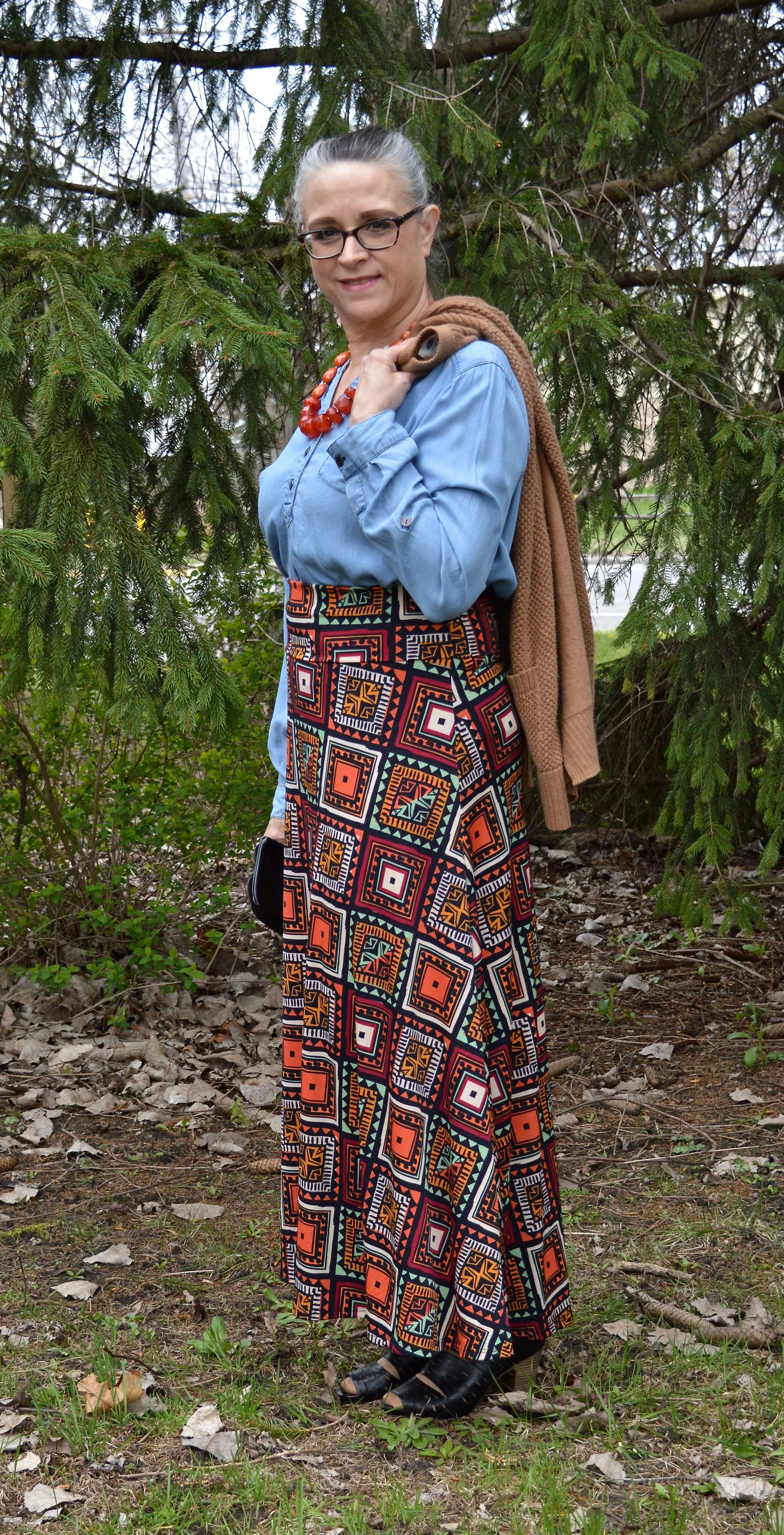
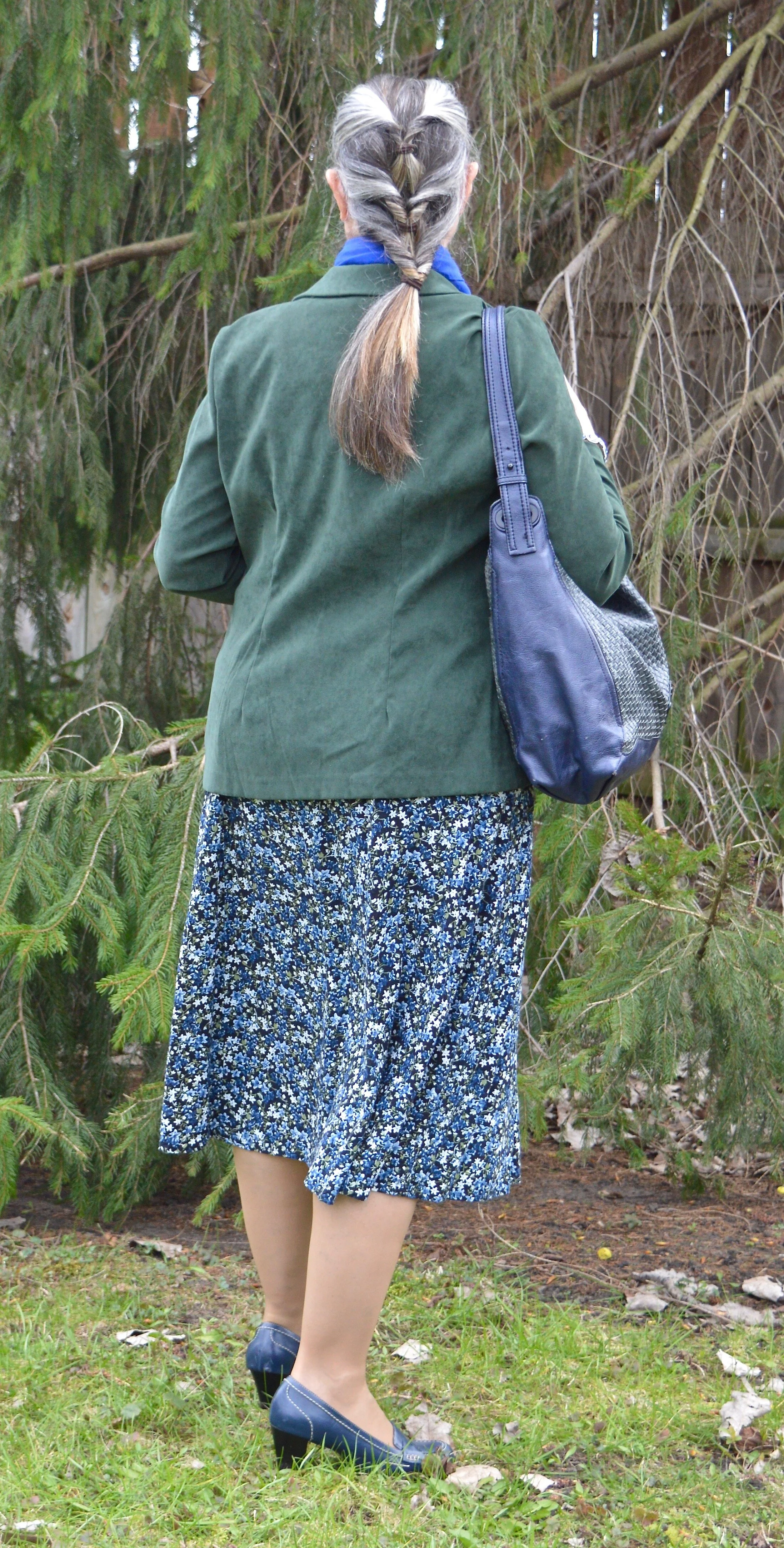
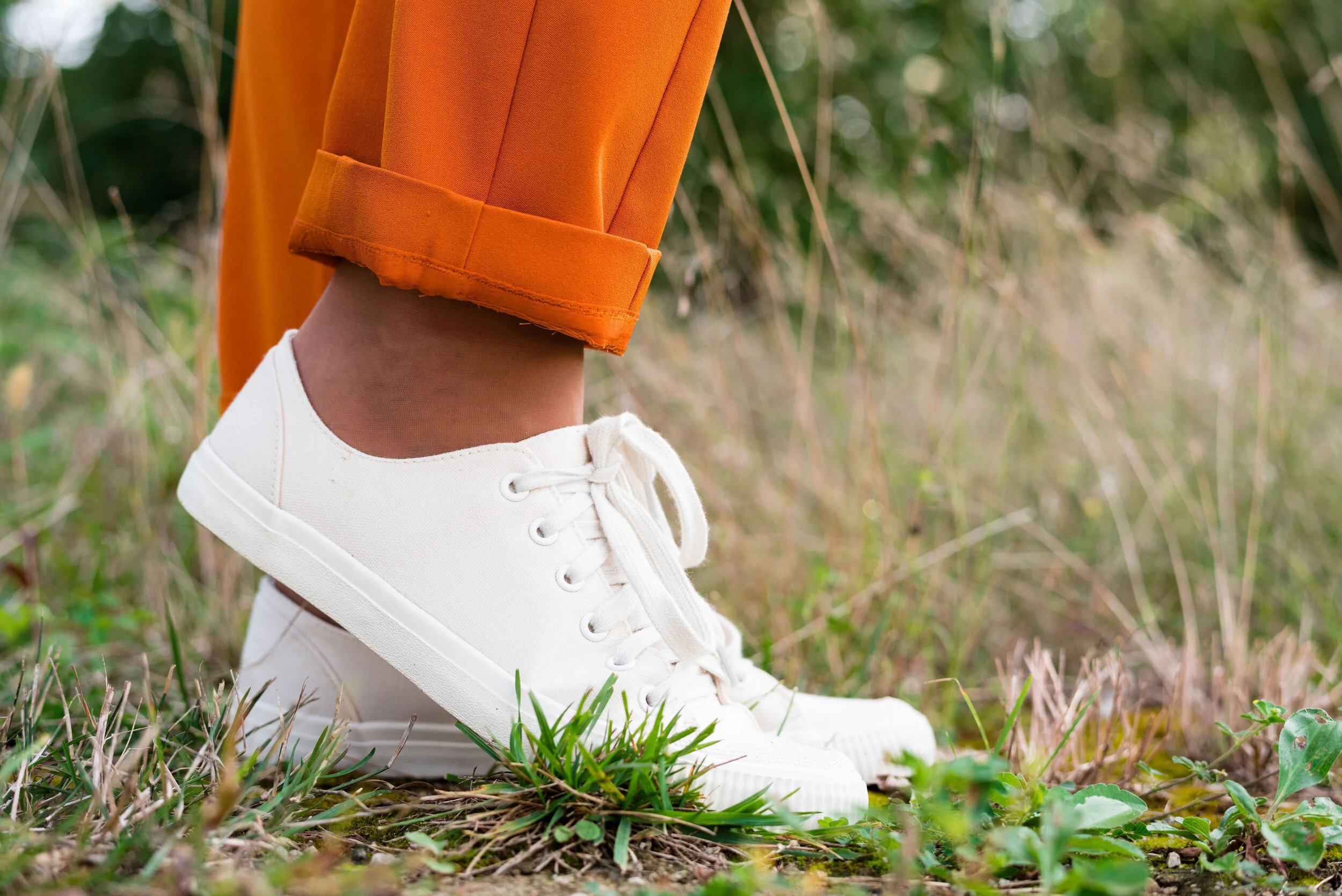
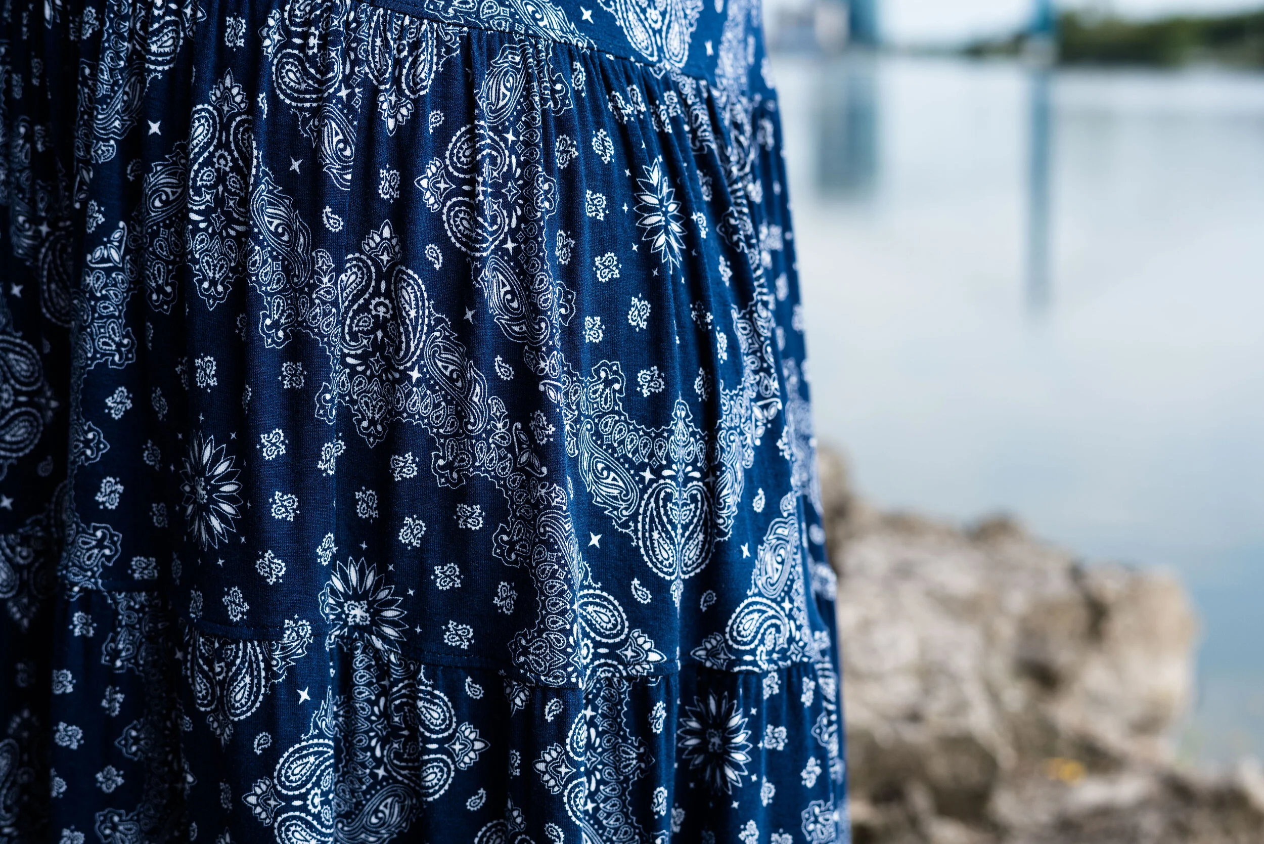
My Classic Blue pants were a thrifted piece from shopping a friend’s closet. They are Ruby Road brand and I have styled them over and over on the blog. You can see them with a light blue sweater and scarf, Beetroot purple top from last spring’s series, an olive velvet jacket, a plaid bomber jacket, and a multi-print kimono.

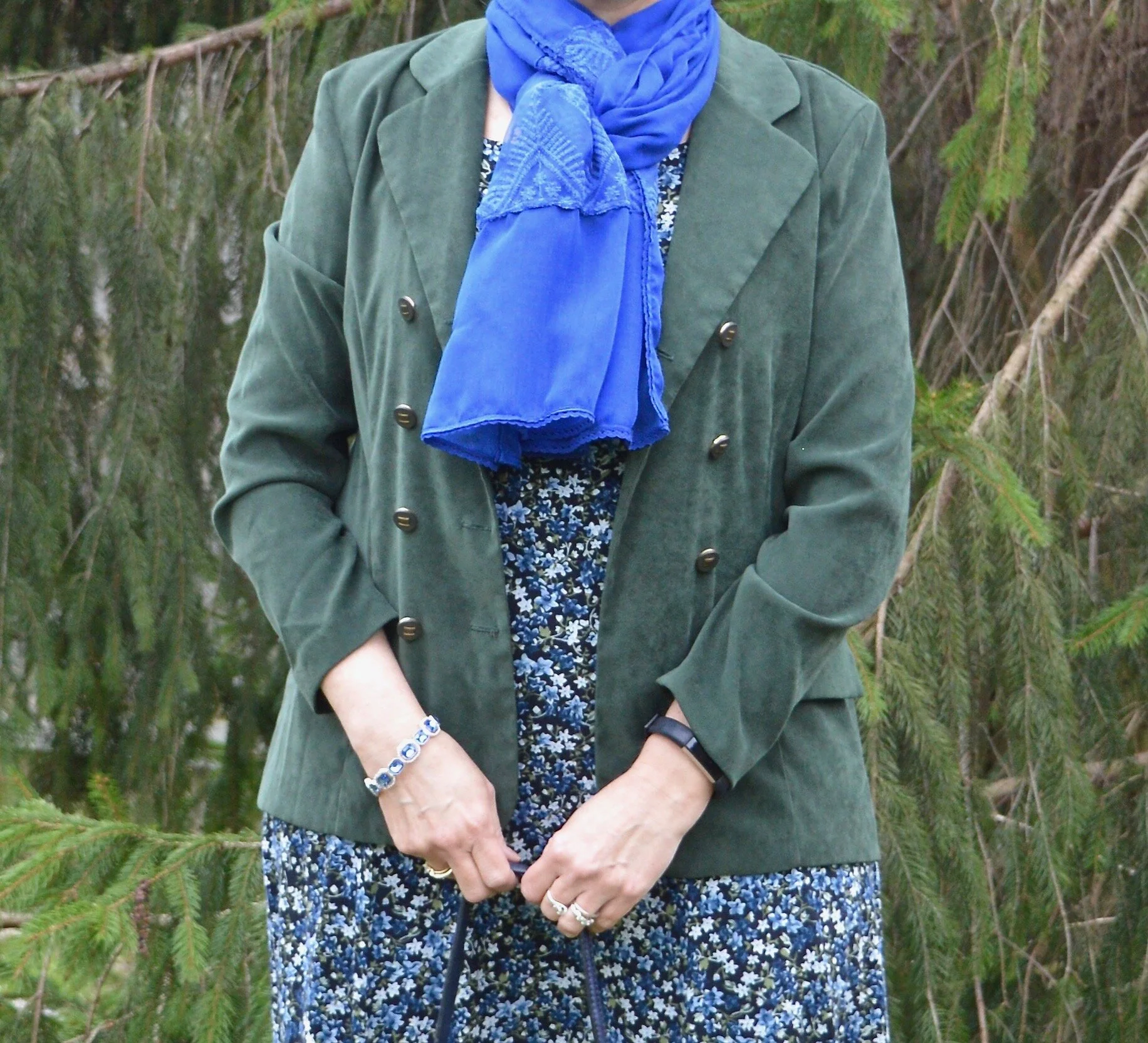
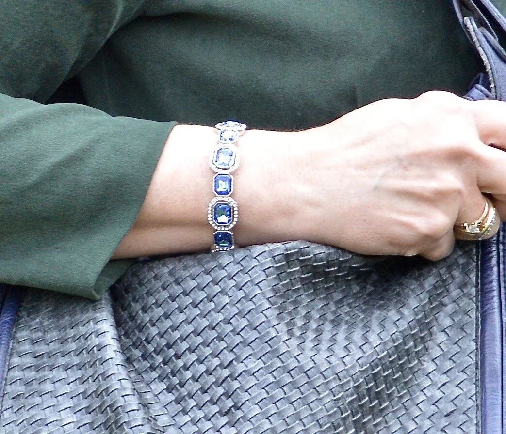
I also threw on a few beaded bracelets, just for fun. Sometimes wearing a scarf or jewelry isn’t so much to help with the outfit as a whole, but just to enjoy something I have. Since I rarely go any where other than the grocery store, I occasionally throw on some bracelets, just because I have them and they are pretty.

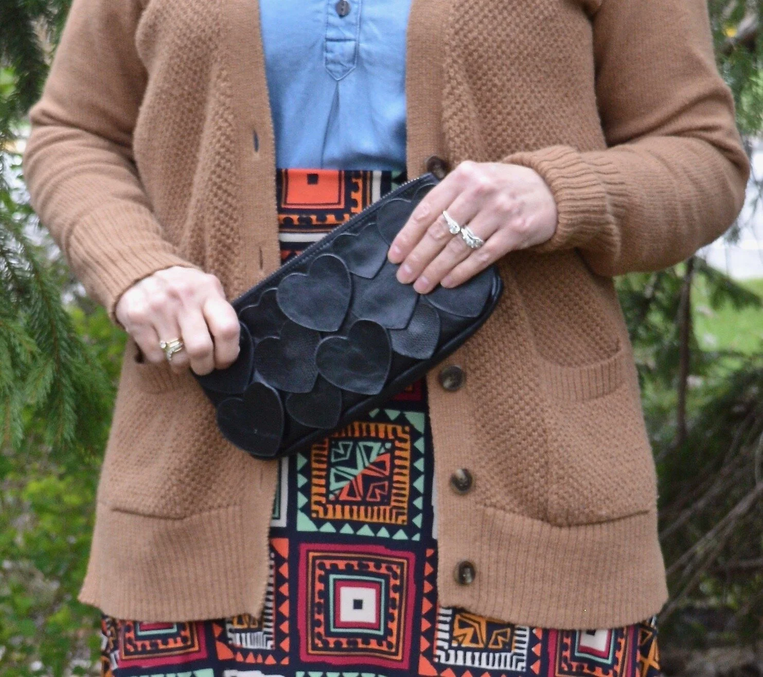
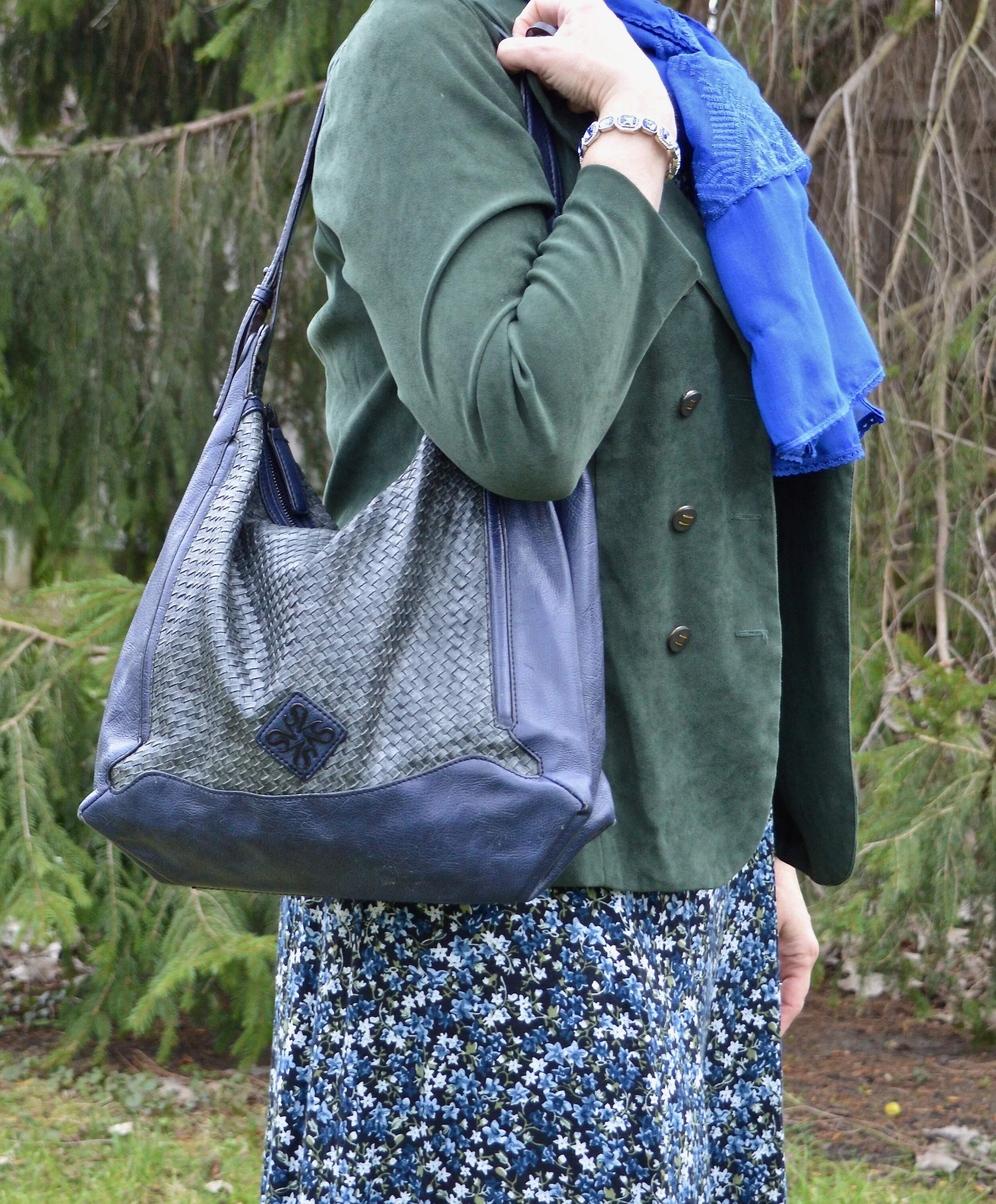
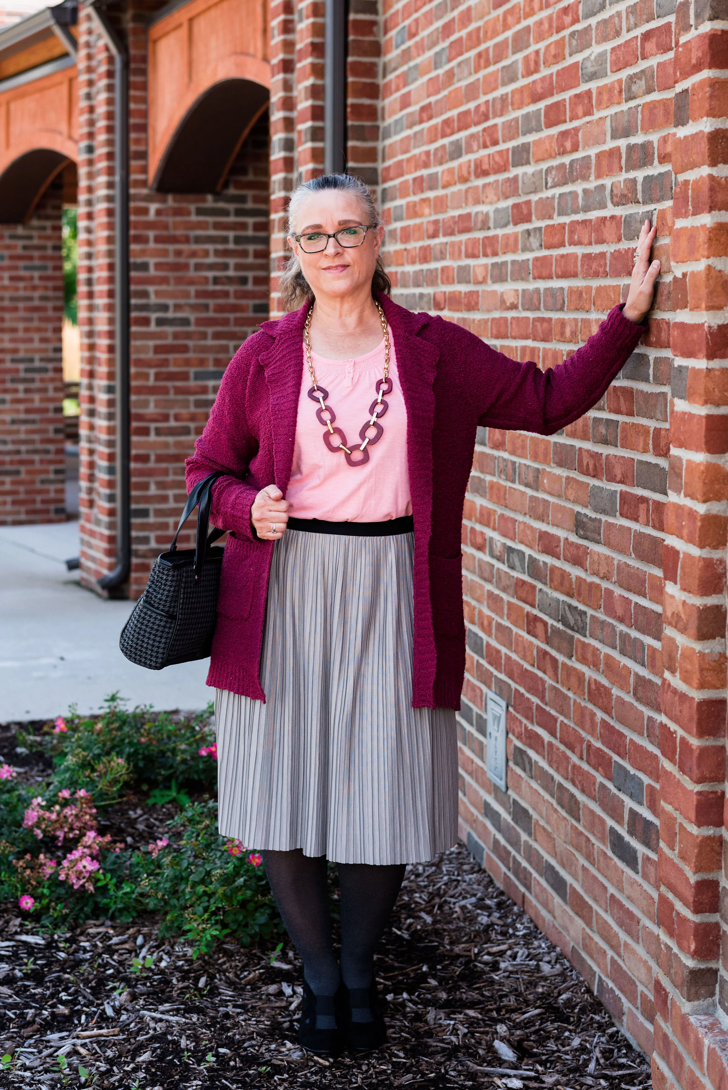
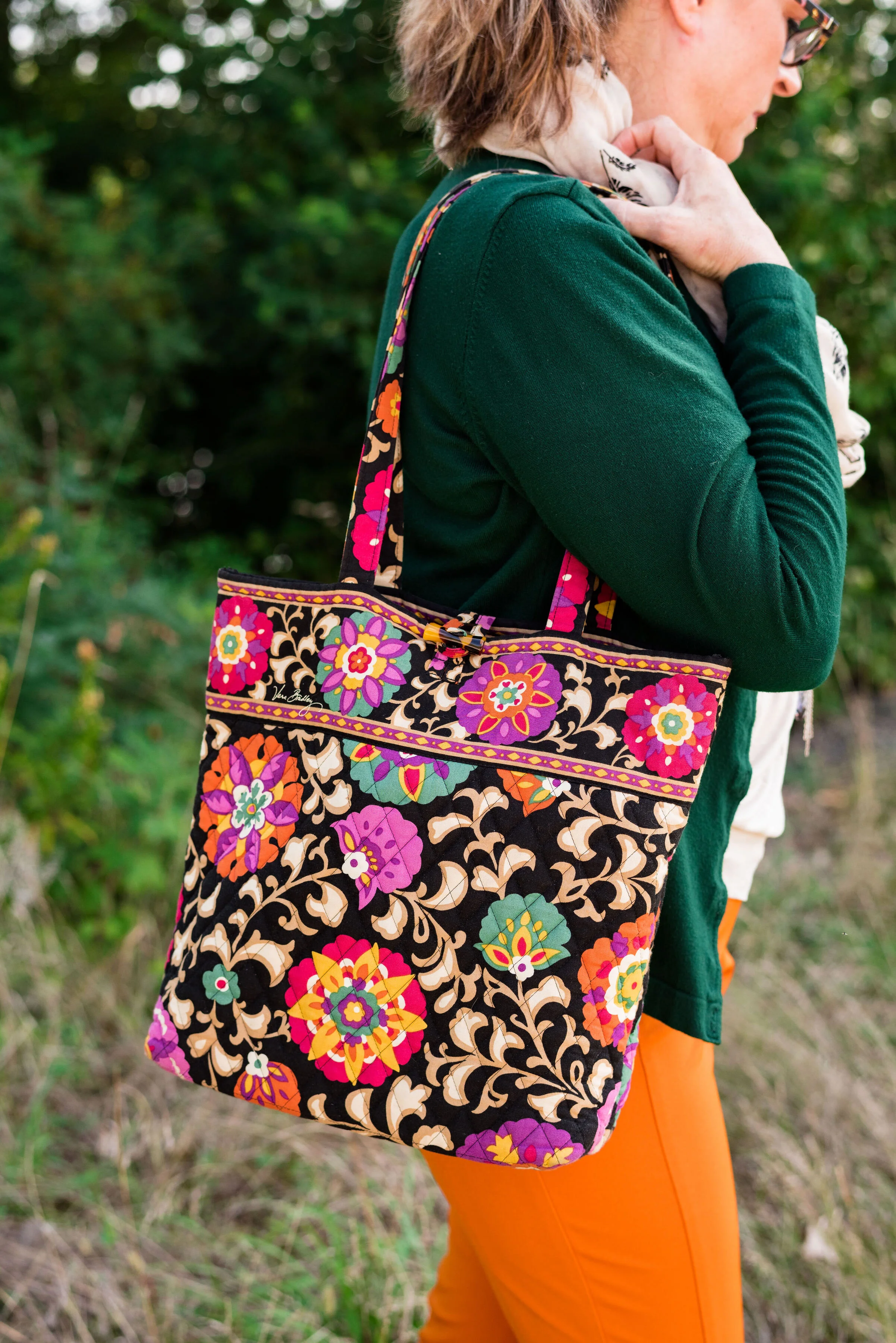
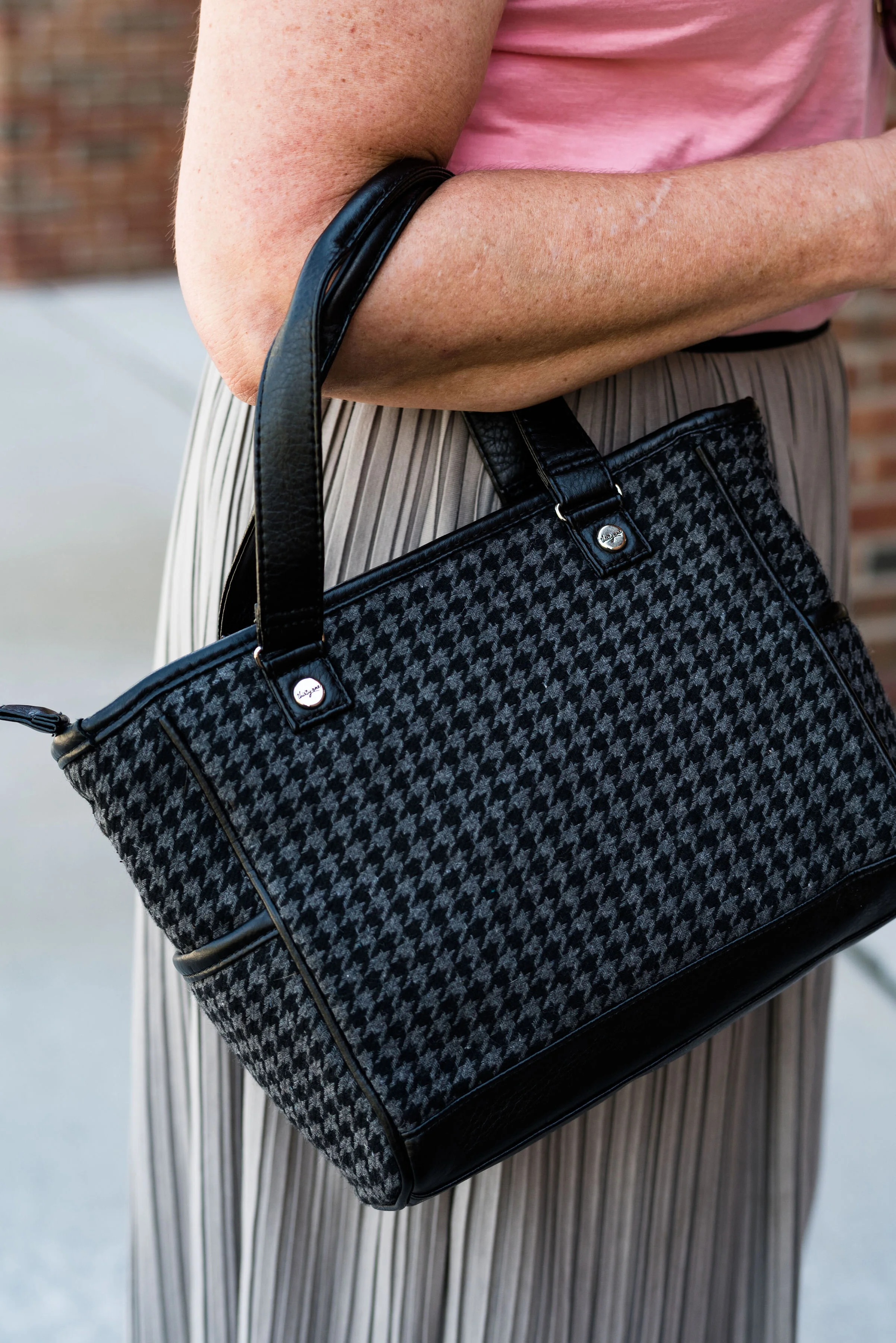
I thought this outfit would be perfect for my round Nine West snakeskin print bag. It think it adds an element of fall color to this more classic looking outfit.

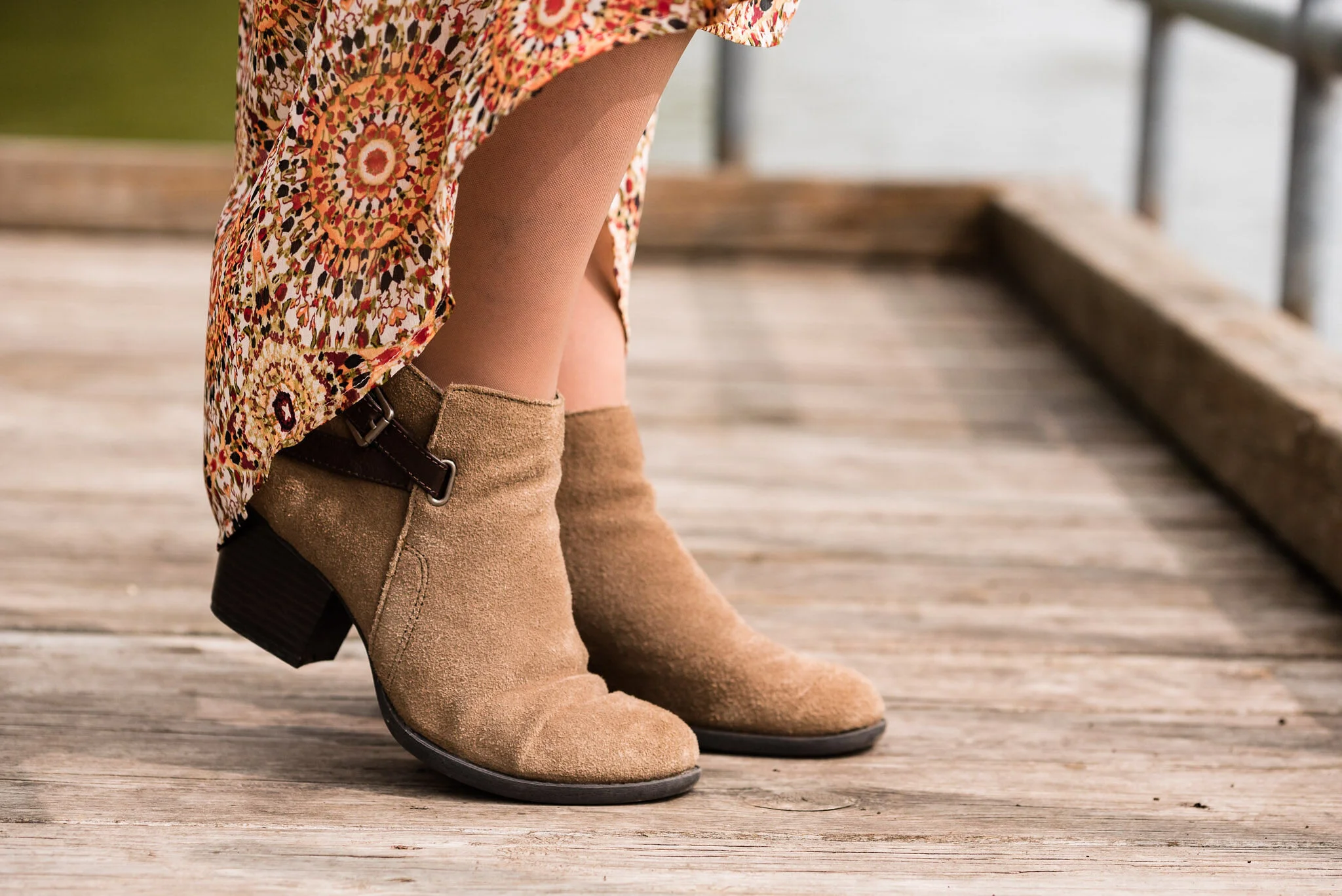
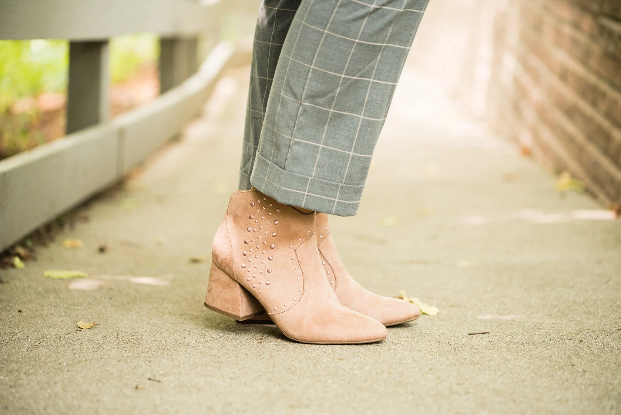
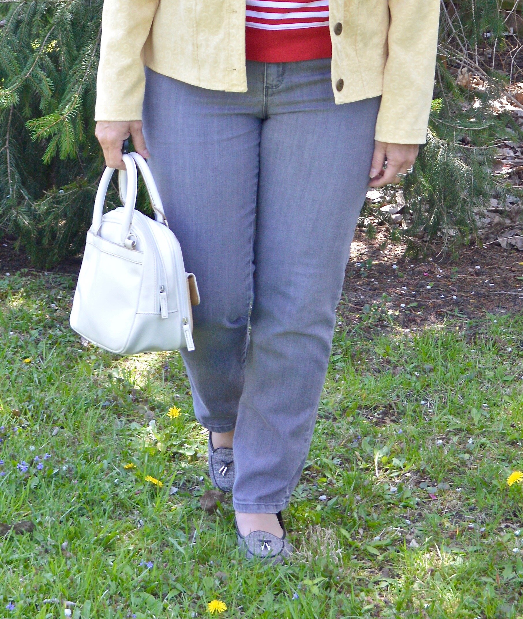
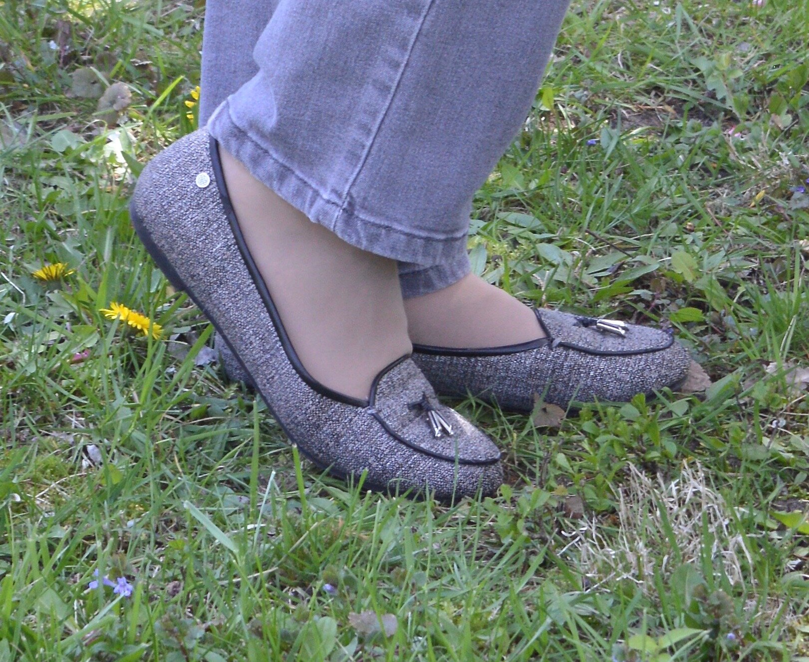
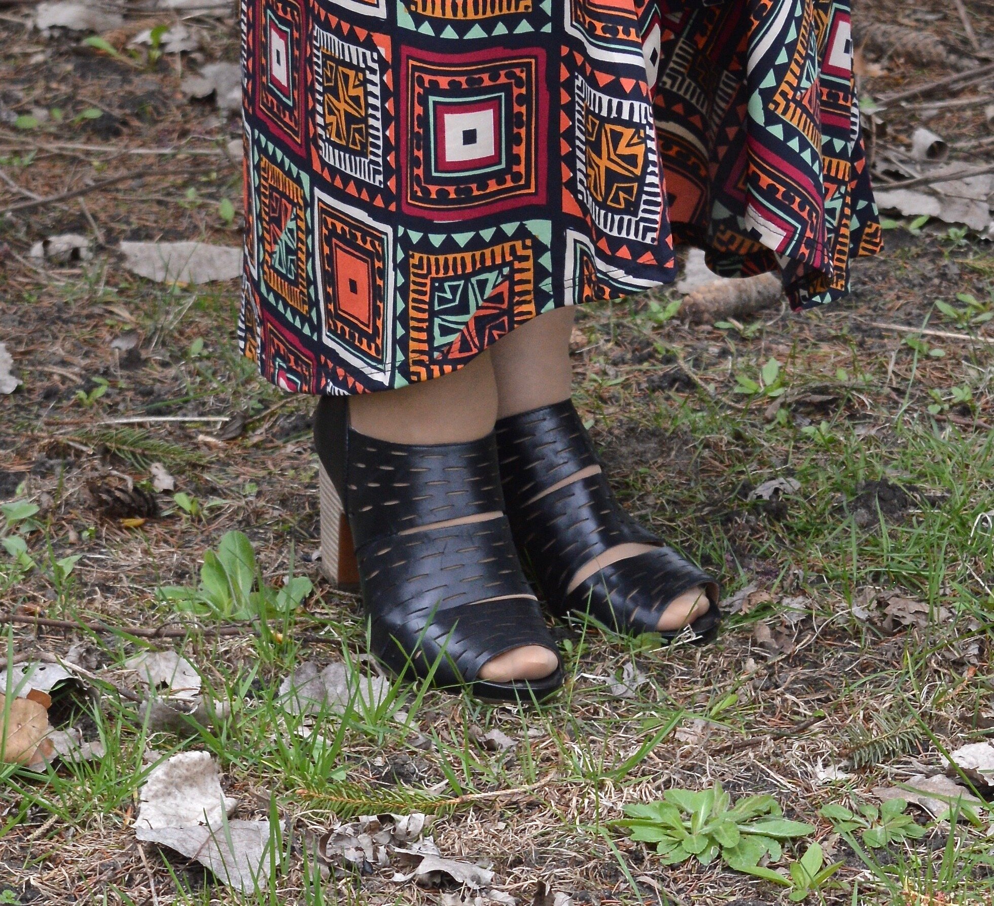
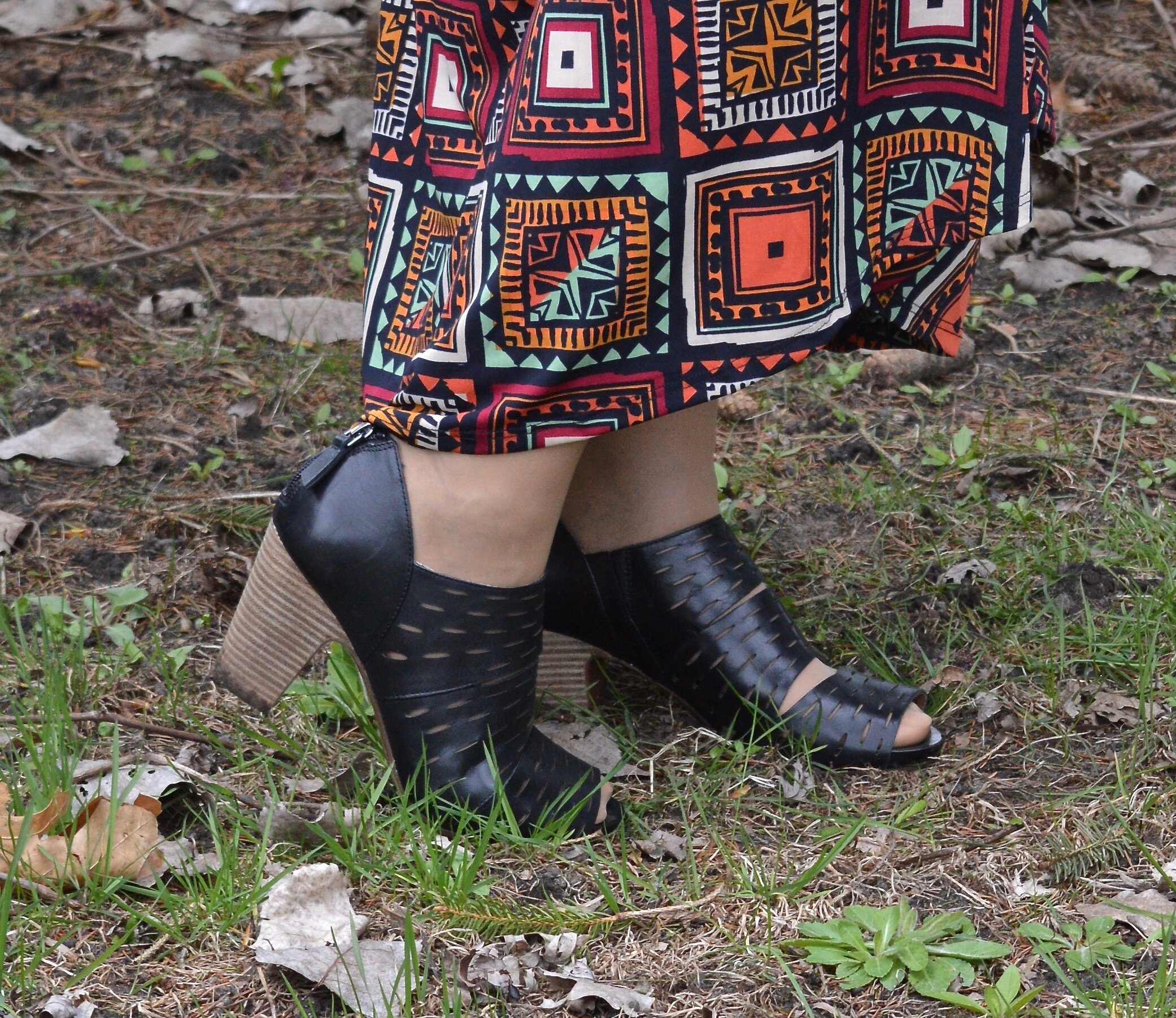
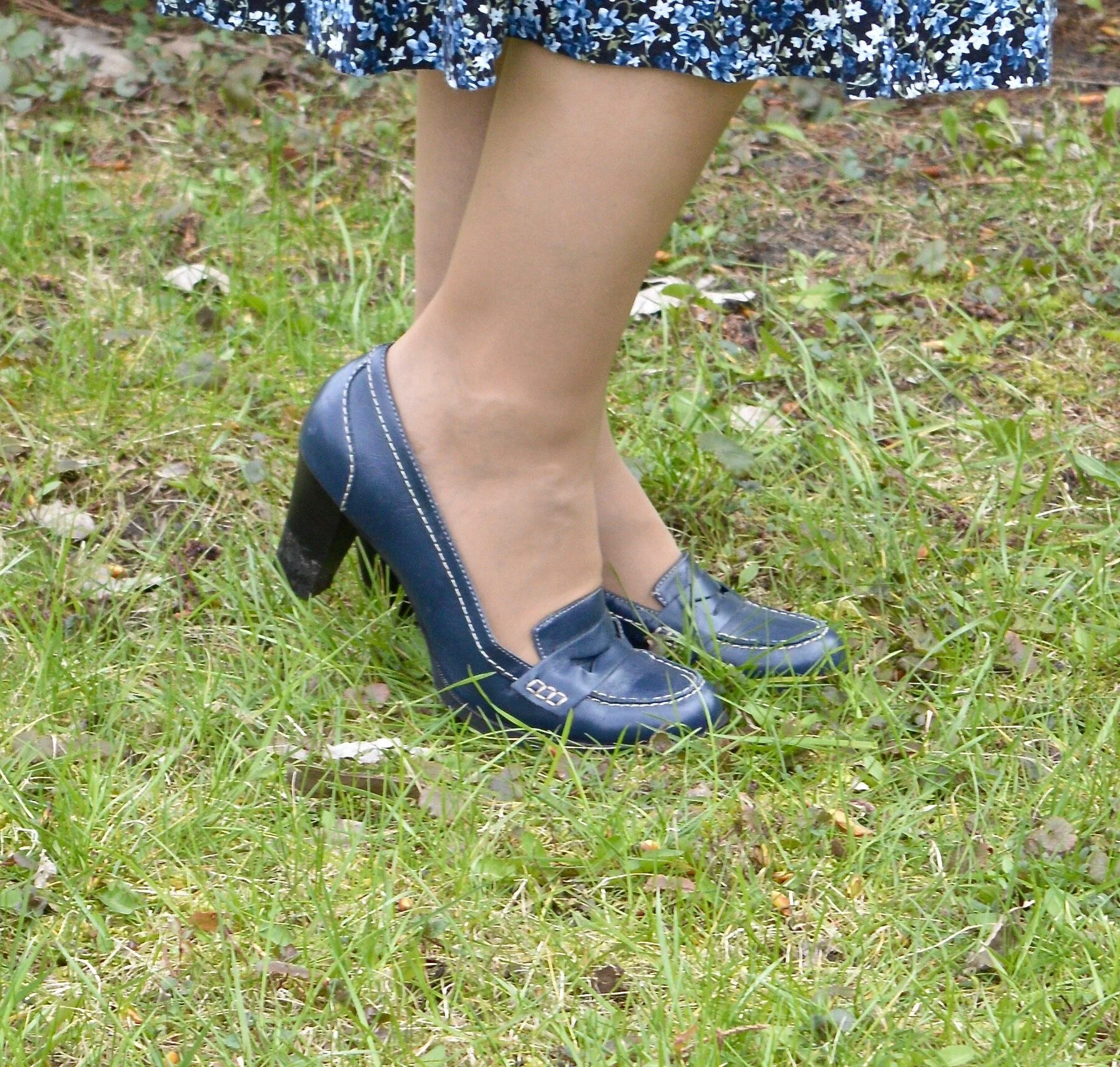
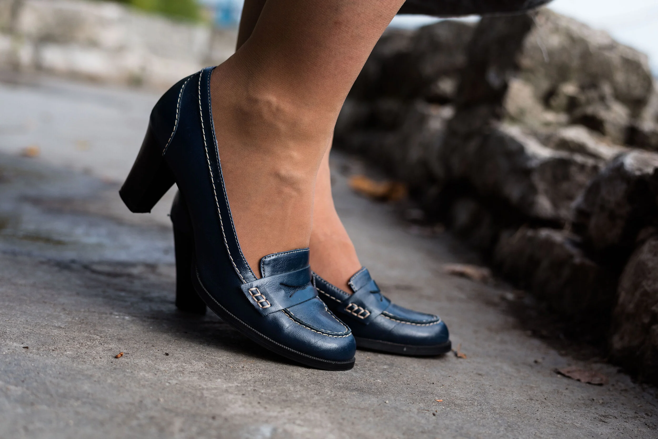
My shoes are my old stand by thrifted Relativity loafer heels. If I had an office job, I would probably wear these a lot. They are a nice height for a stacked heel and fairly comfortable.

What do you think of these colors? Do you like the Classic Blue, or do you prefer the darker tones of Blue Depths? Do you like the color Ultramarine? As it is in the graphic, it seems to be more of a forest green color, which I do like. I like how these three colors worked together into an outfit that would be perfect for a day at the office or a date night with your significant other.
My life would not be complete if I didn’t leave you with a silly picture to make you smile. When I was trying to pose, I almost fell down. Ha, ha.

I hope you enjoyed this post and I hope you’ll leave me a comment or two. Life is lonely around here, so I love to hear from my internet and long distance friends.
I’m including a few shopping links for you to peruse. These are affiliate links. That means when you click on a link I get a few pennies. All opinions are my own.
Graphic and photo credit Rebecca Trumbull.