Color Play - Dark Plaid in the Spring and Summer

Today, I am going to show you how to take a darker plaid and make it spring and summer ready. I know many of us put our darker colors away replacing them with pastels and the bright happy colors of warmer weather, but not everyone has as big of a wardrobe as I do. Indeed, for those who are more into a capsule wardrobe, this is a great way to use a darker print all year round.

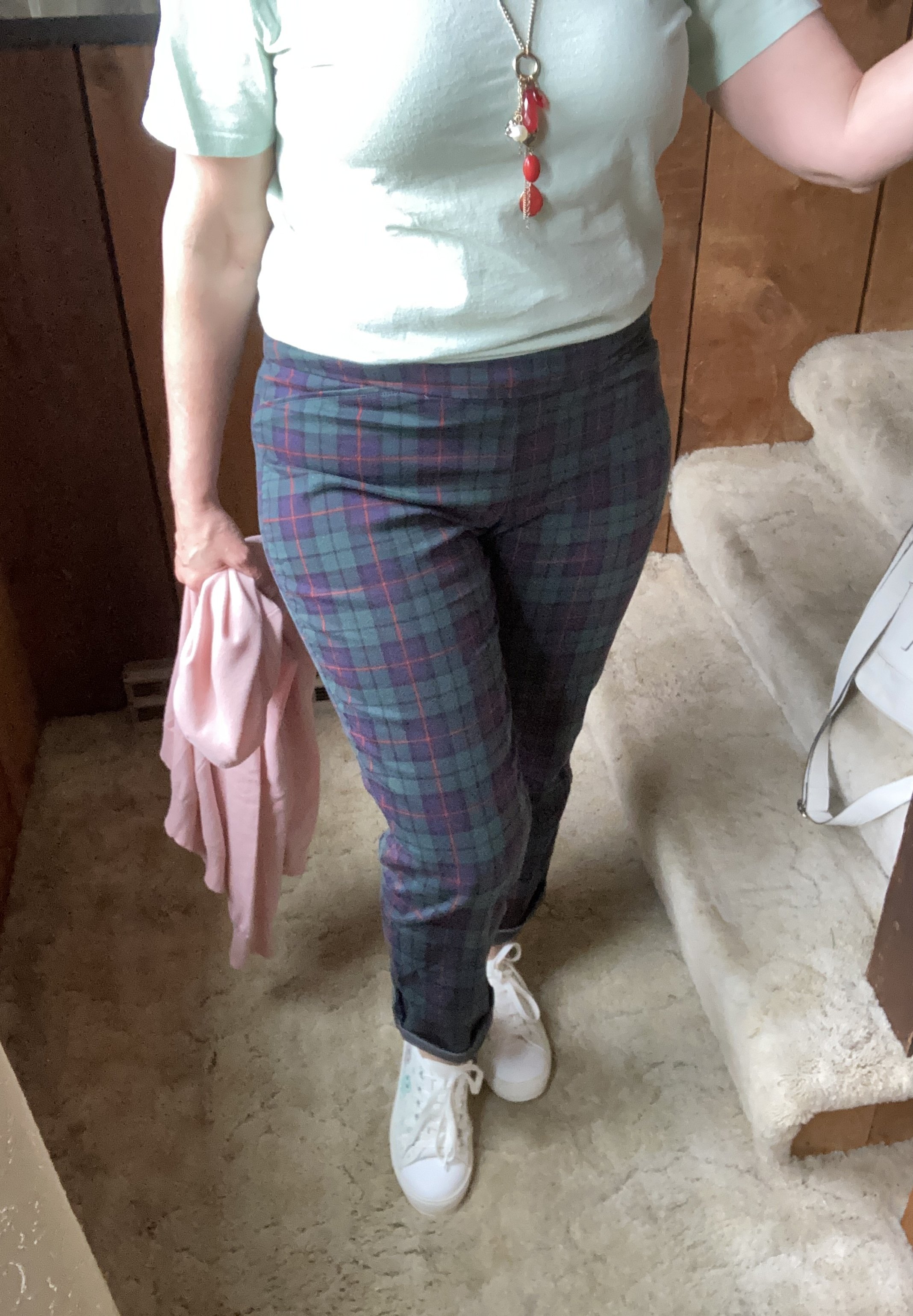
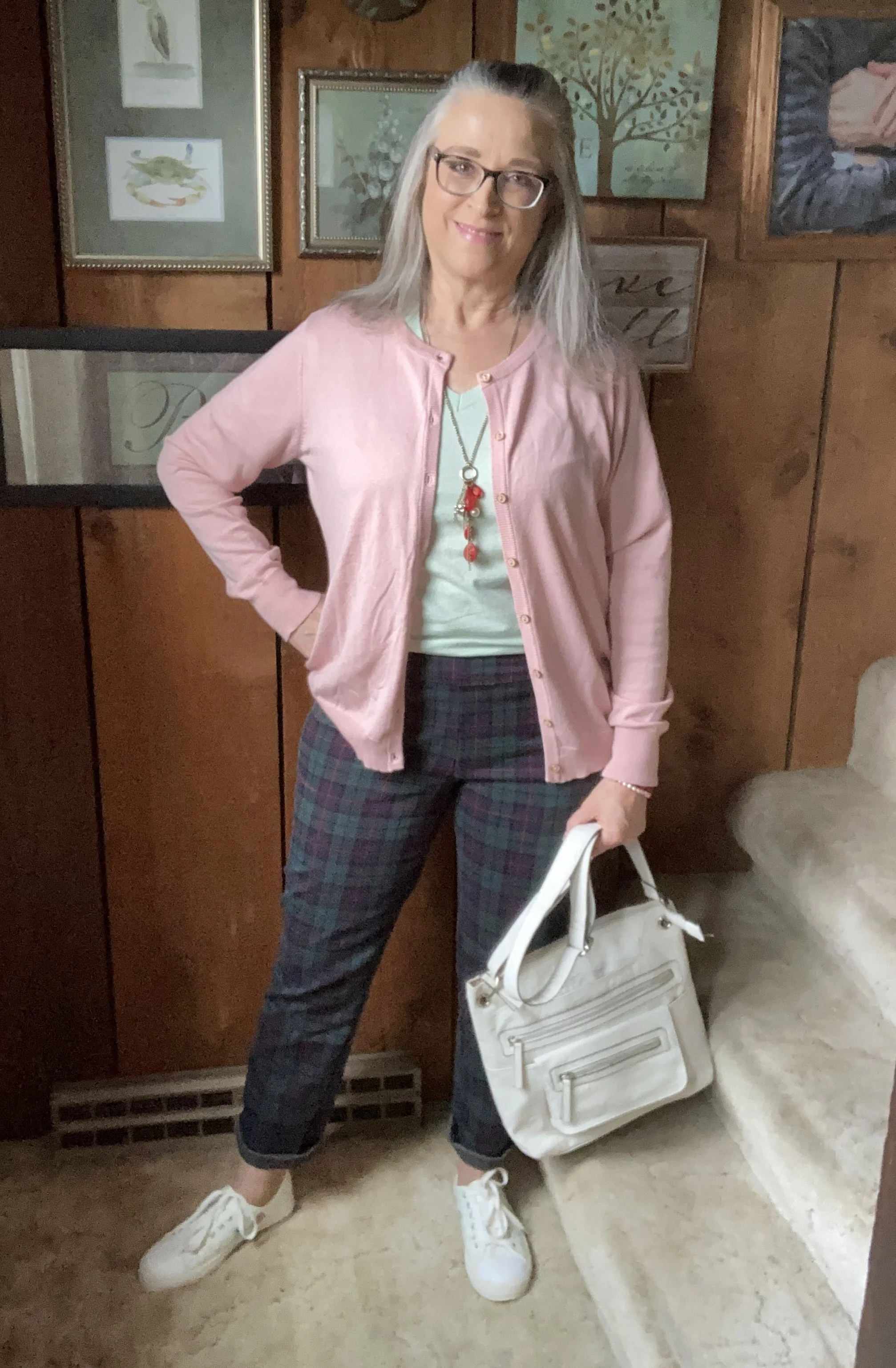
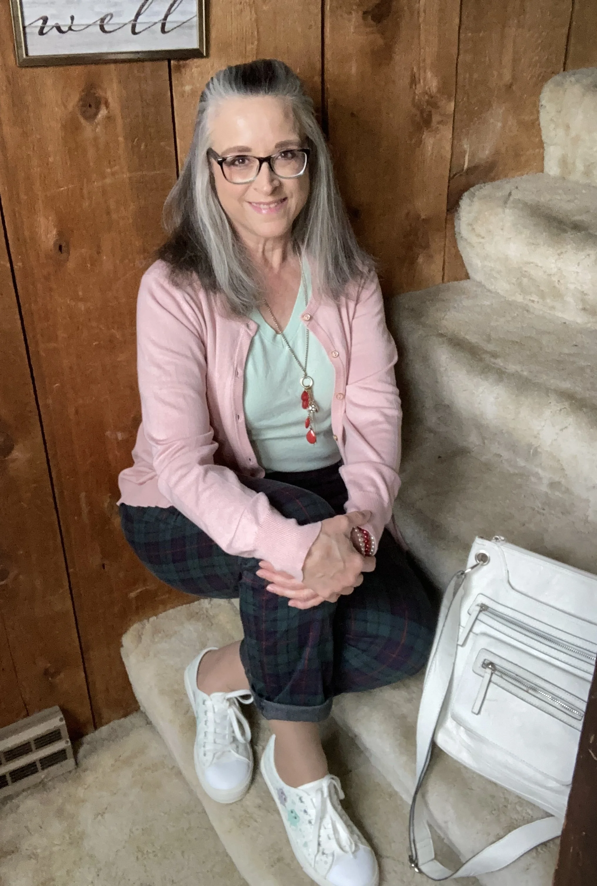
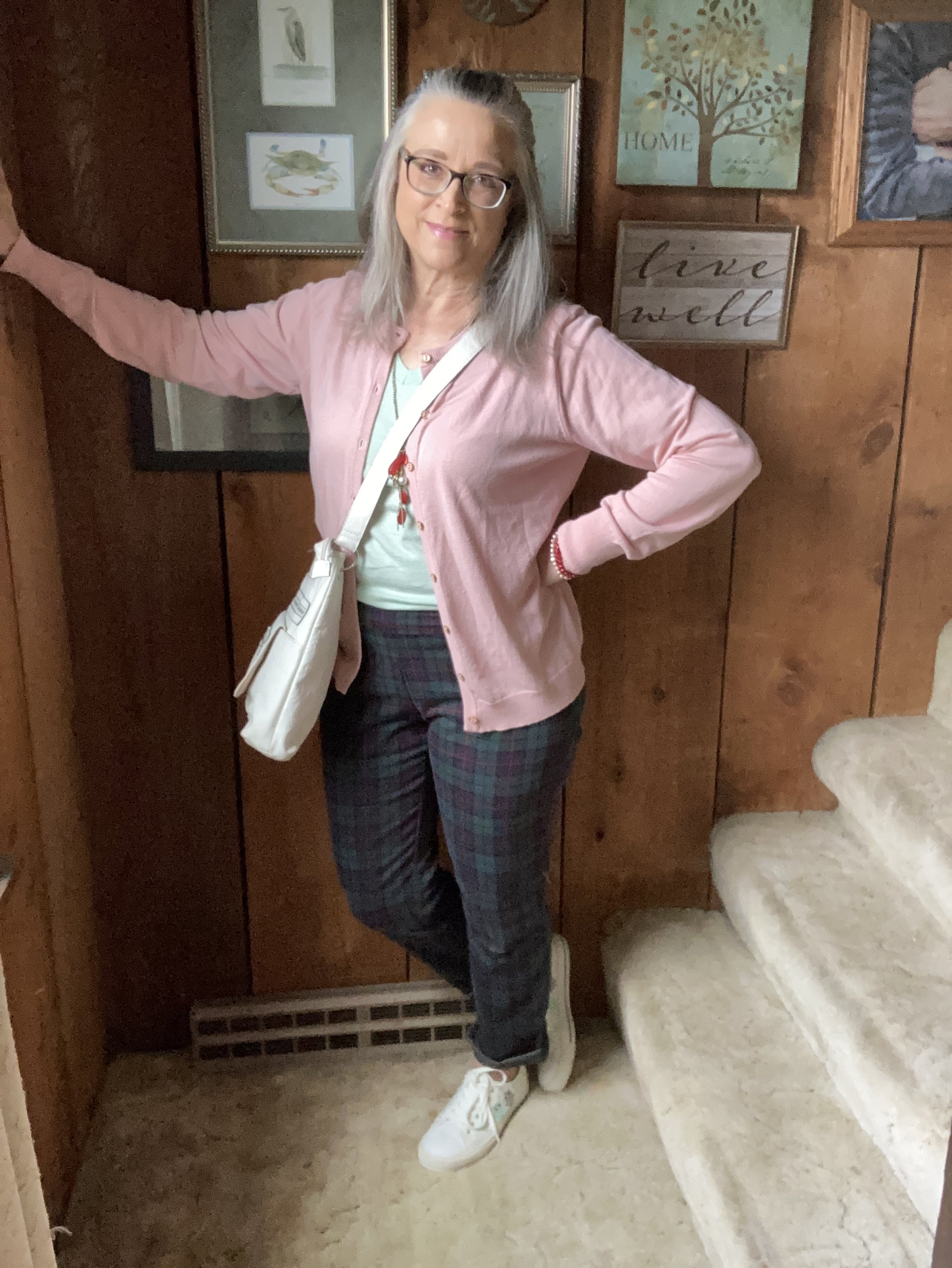
I found these plaid Croft and Barrow pants a few months ago while thrifting. When I tried them on, I liked the way they fit, and knew they would be great for the holidays, but I also thought it would be fun to wear these any time of year by just adjusting what I pair them with. I decided to pull them out for this post.

As you can see in the picture below they are a simple pull on knit, thus the name inside the waist band - Effortless Stretch Pant. The older I get, the more I like that idea. Ha, ha. But then, the younger generation all wear leggings, which is really just a stretch pant, right? You can see these are perfect for Christmas with the red stripes, and green and blue plaid.

Style Tip: Roll up the hems on your straight leg pants, creating a narrow cuff, to give them a current, casual, and youthful look.

You might be wondering how I chose the sweater and the tee. I wanted to keep to the color scheme of the pants, but with lightening up the shades to a pastel, minty green, and a pastel, blush pink, it changes the feel of the whole outfit. I could have done a similar thing with a lighter reddish orange, and a lighter blue, but in similar shades to the original.

The whole idea behind Color Play is to play with colors and color combinations. I am not a color “trekkie”, boldly going where no woman has gone before in my color combinations. I still like things to look classic, polished, and put together in a way that makes a person think, wow, that’s a cool outfit. But, I still want to experiment and try new things, and I hope I am inspiring you to do that as well.

Style Tip: In order to lighten up an outfit when using a darker print, think in terms of shades of the darker print’s colors. If it is navy, evergreen and maroon, think in terms of light blue, minty green and pink.

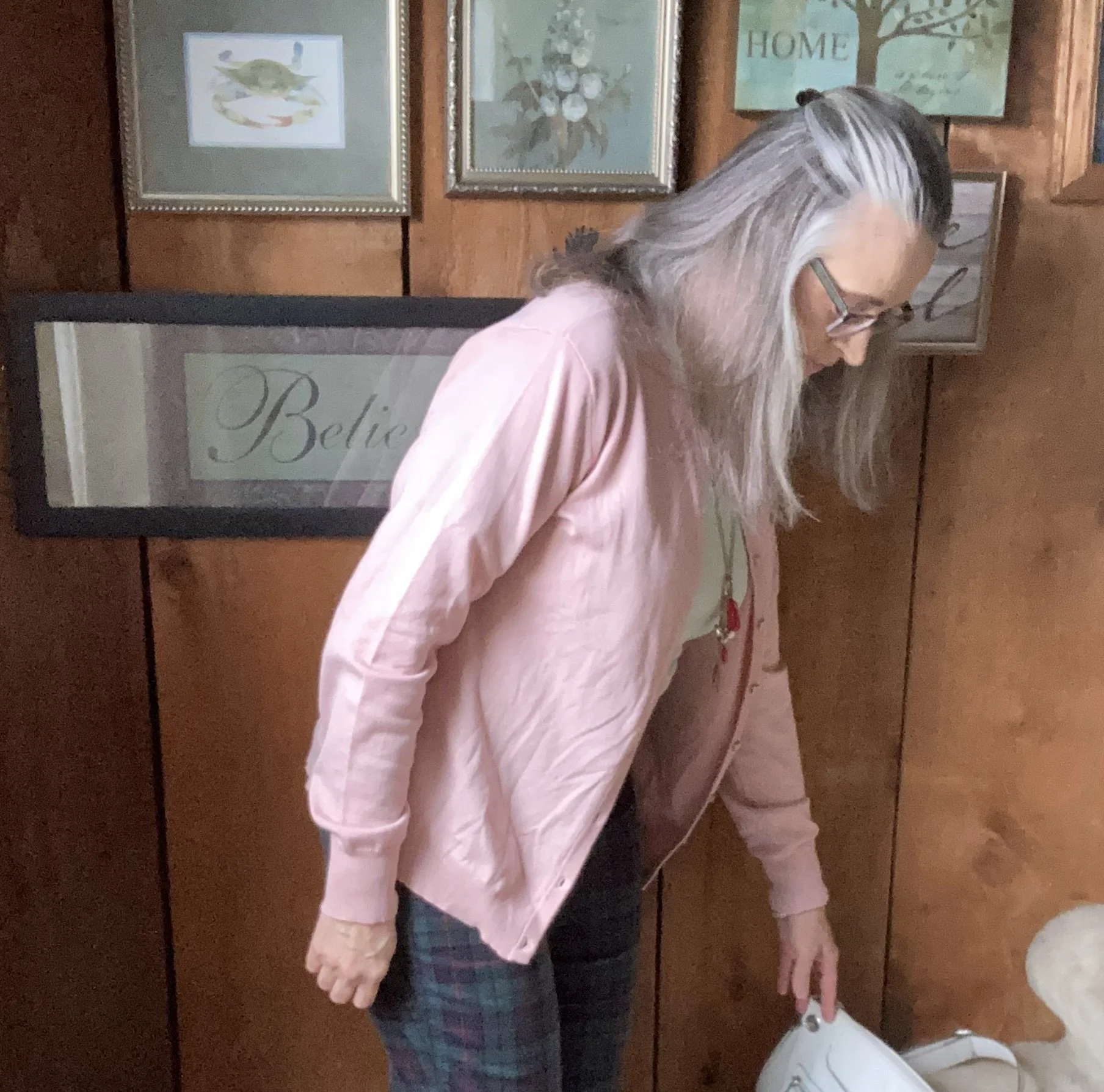
My pink sweater was a Nordstrom Rack find, and is a brand called BYdesign. You can click on the link for a variety of color options. This is a great spring, and summer sweater as it is light weight. I got an XL, as I often like a roomier option. These are also on sale right now, so feel free to click on through.

My minty green v-neck tee is Hanes brand and a second hand find. Long sleeve and short sleeve plain colored tees are great pieces to stock up on at thrift stores. It doesn’t matter as much if they are not new as they are typically worn underneath other things.

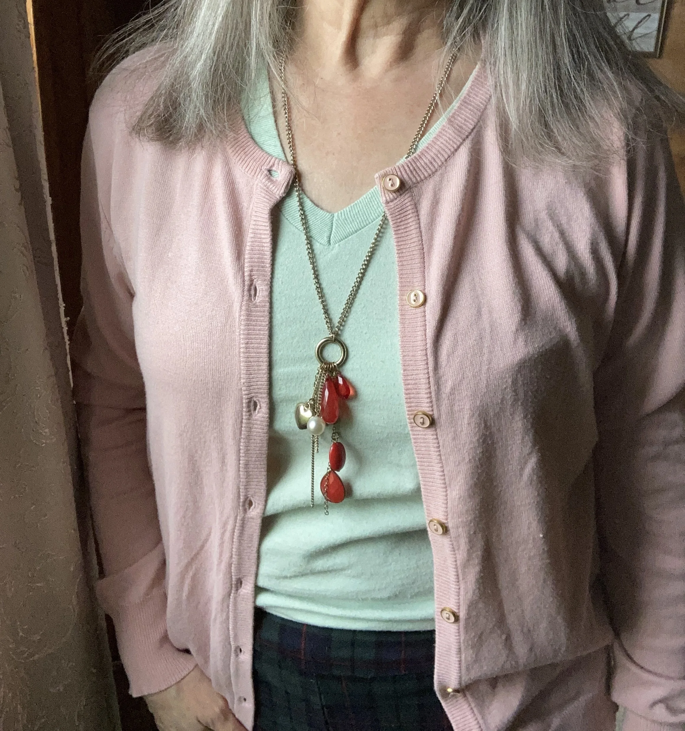
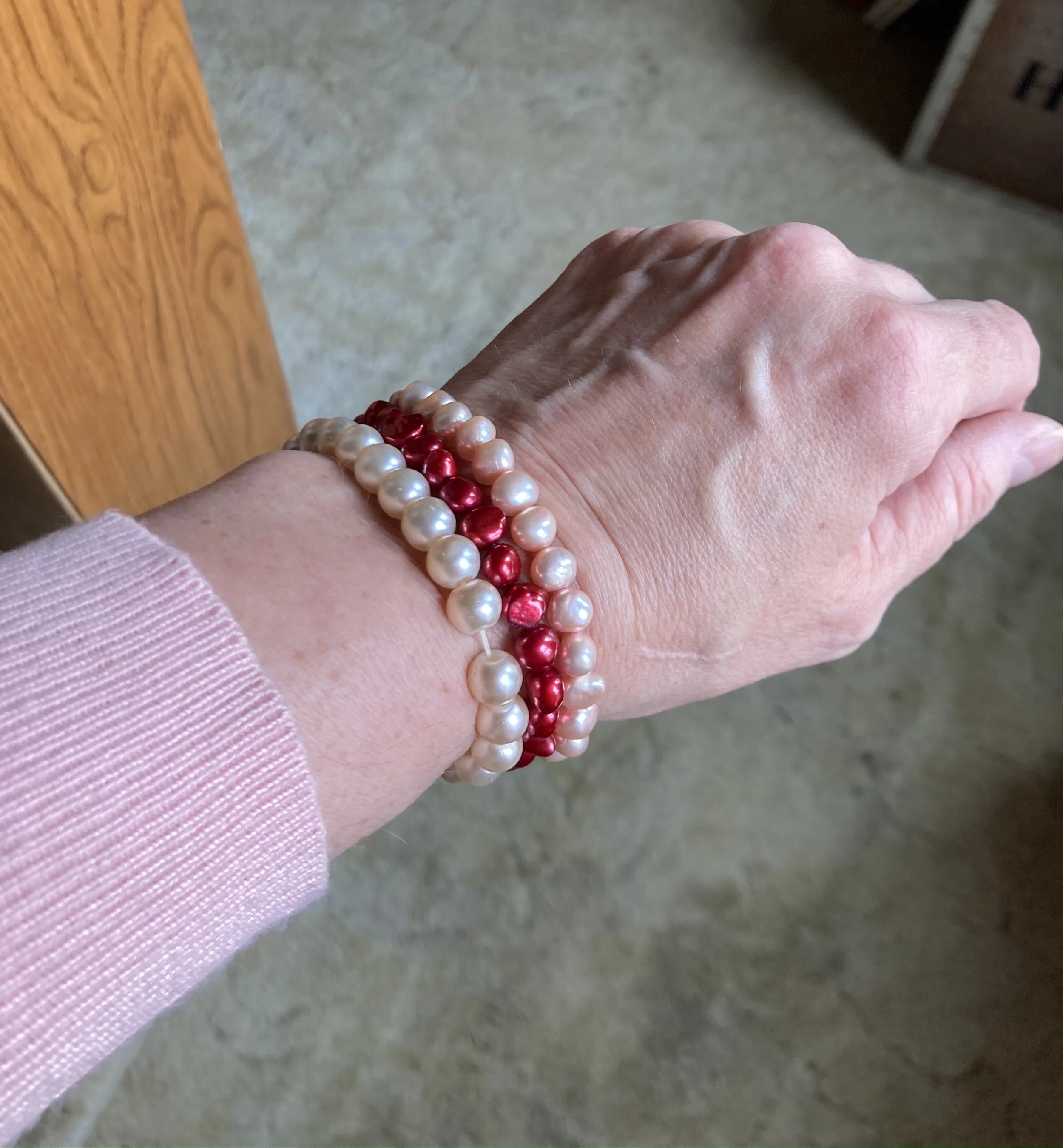
I decided to wear a few red pieces of jewelry to coordinate with the red stripes in the pants.

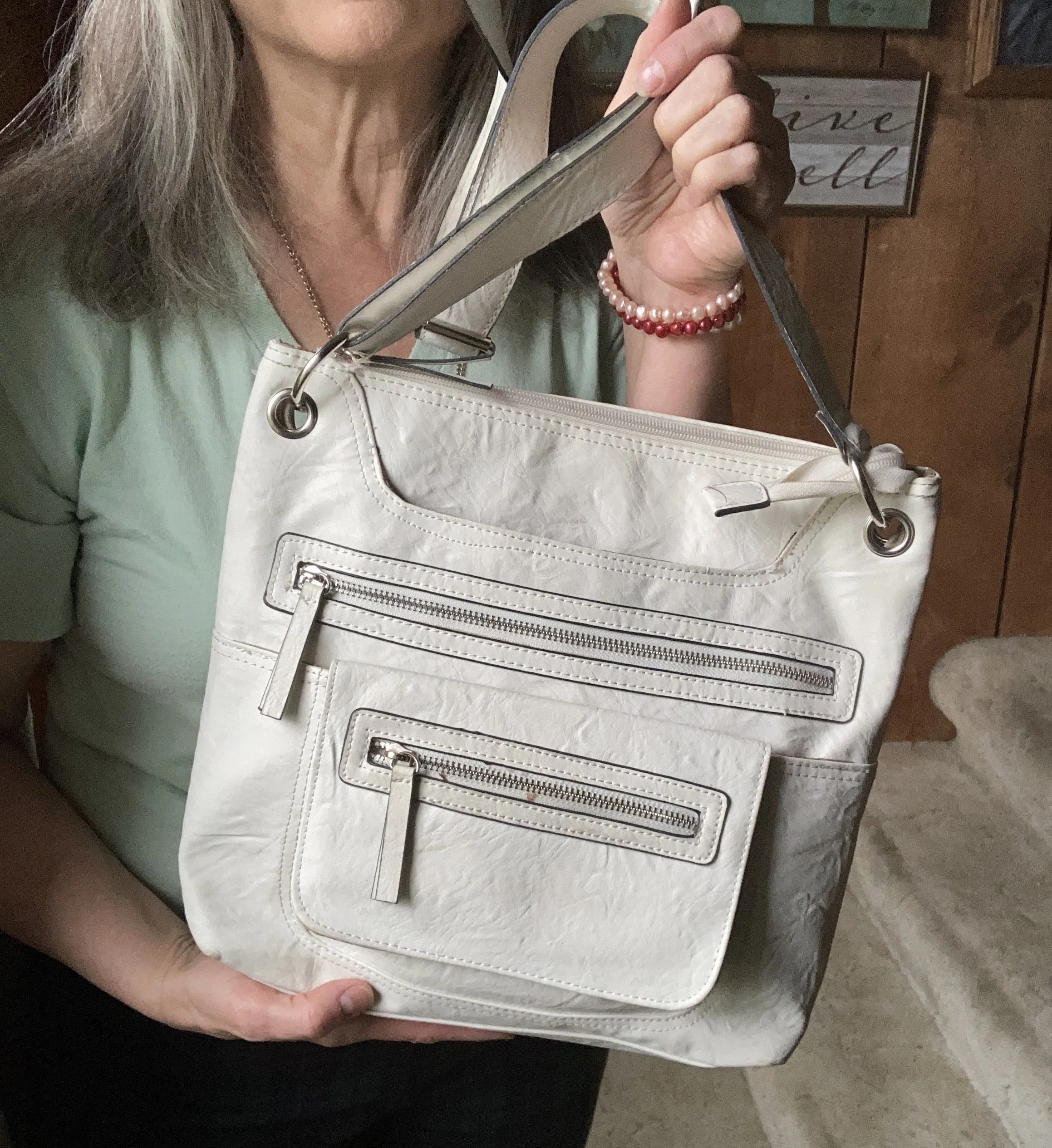
My white bag is another thrift find that I typically pull out in the summer. I still have that “wear white in the warmer months” mentality, not so much about pants or tops, but definitely bags. In our current time anything goes, as they say, but we certainly still have our own personal preferences.

These cute sneakers were another thrift find. They are brand called vaisb, which looked to be a brand that used to be sold on Amazon.

What do you think of this outfit? Do you think I accomplished a spring or summer look by incorporating lighter colored pieces with the darker plaid pants? I personally like the way the outfit turned out, but I know it is not for everyone. However, the idea is to play with color. Don’t be afraid to think outside the crayon box when it comes to what colors you are brave enough to wear, and the color combinations you might create. Getting dressed should be fun and that is one of the reasons I share this blog with you.

I am including a few other shopping links below. Don’t forget to check out the BYdesign link above if you are in need of a light weight cardigan for summer. These are affiliate links. I do not earn any money from these links unless you purchase the item through the link. I provide these links to give you information and they are brought to you at no additional cost. All opinions are my own.

Buy Me A Coffee.

Color Play - Pantone Spring 2023 - NY Palette: Fiery Red, Empire Yellow, Blue Perennial, Light Aqua

Today I am looking at a color combining technique that is known as color blocking. Color blocking is the combination of solid colors creating distinct blocks of color. I don’t use the color block technique very often because I love prints. Many times I will combine something like a pair of jeans with a vest or sweater in a solid color, combined with a print top. I guess in that case I am almost always doing a type of color blocking. However, jeans are a type of material that don't typically look solid. Does that make sense to anyone else out there besides myself? Ha, ha.

This outfit is bright and colorful and a great ensemble for the crazy fluctuating temperatures of spring.

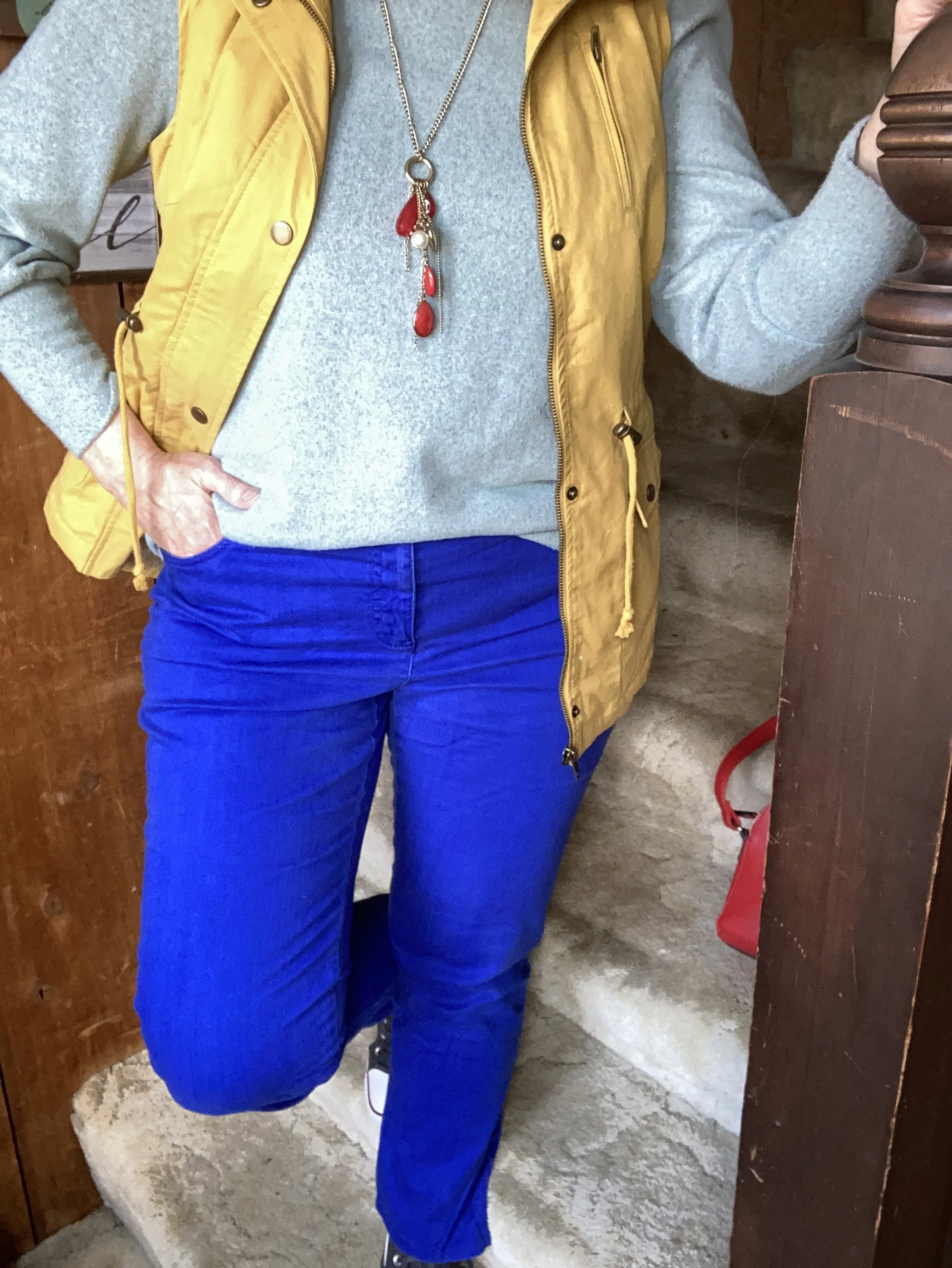
The color block technique is a great way to combine one color with another without worrying if they match. The whole point is to combine different colors to create a fun, statement worthy outfit. All of these pieces have been in my closet for a while. I have worn each of them separately, and I have worn the vest and pants together before, but not this combination.

My Light Aqua top is Massini brand and was a clearance find from Kohl’s a few years ago. It is a medium weight knit with a cozy feel.

My secondhand pants have made numerous appearances on the blog and are Ruby Rd. brand. You can see a number of my posts in this one post, Why You Should Have a Pair of Colored Pants - Bright Blue. While I don’t pull these out real frequently for my day to day outfits. I have used them over and over for a special occasion or for the blog.

This yellow vest is a brand called Love Tree. I really like this piece. It came with a detachable hood, and the inside of the vest has a fuzzy, warm sherpa lining. I think I got this at a local boutique, but I actually cannot remember. I know, I know! Too many clothes. I’ll save my clothing muses for another day.

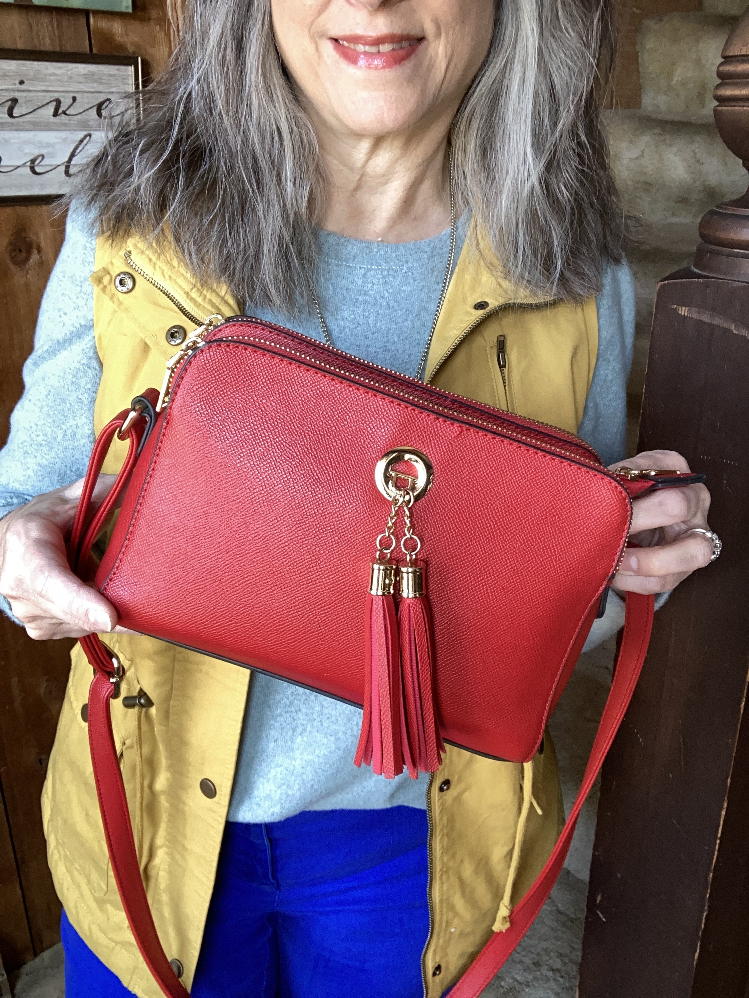
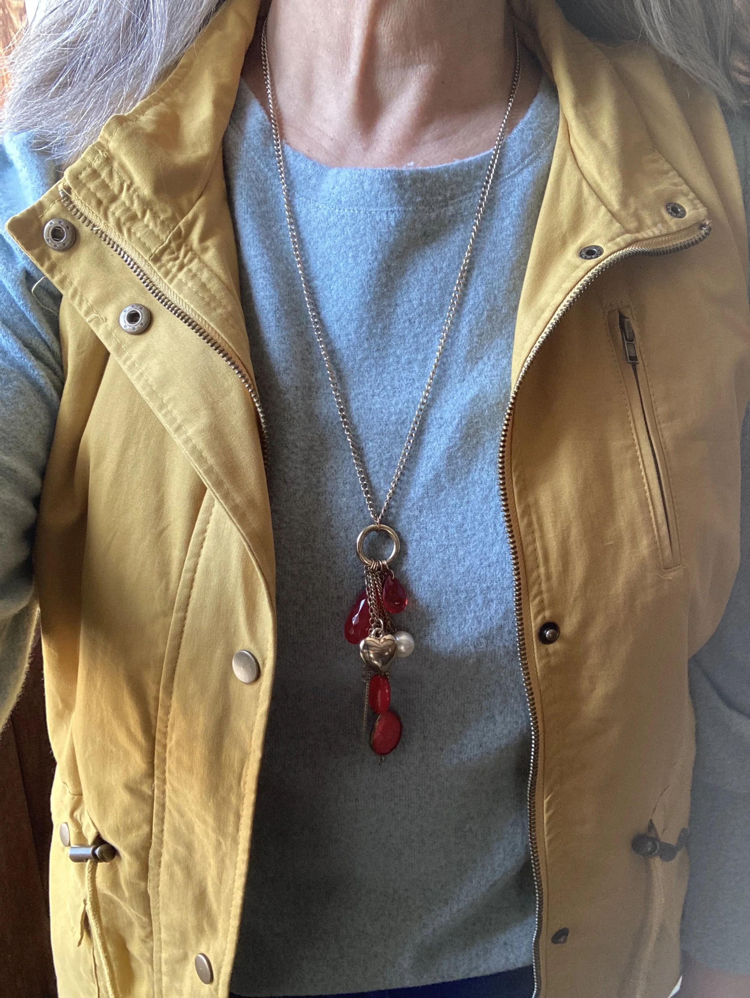
I decided to focus on Fiery Red as an accent color, so my bag, and my pendant charm necklace do the trick. Isn’t it cool, how the red pops against this already colorful outfit? I have this crossbody bag in a similar style, but different brand (both from Amazon), in black. They are great bags with three separate compartments to keep all your things organized. They are not huge, but big enough for the essentials. I’ll give a few shopping links below. A crossbody bag has become my regular go to, because I like the hands free approach. This is especially helpful when you are chasing grandkids, or shopping.

I really wasn’t sure which shoes to wear, and the only reason I ended up with my high top mesh Converse was due to the red stripe around the sole. Ha, ha. Really, my thought process for putting an outfit together is not all that complex. I tried the outfit with a pair of white sneakers first, but it just didn’t look right. I think the heaviness of the fabrics and the vest needed something a little less springy, but I also didn’t want to use knee high boots as those seemed too wintery…thus the Converse.

So what do you think of this outfit? Do you like the color blocking technique? Tell me about an outfit where you have used it. Your comments mean so much to me. You are the reason I keep this blog going, so it is wonderful to hear from you.

Please feel free to show your support for me and the blog by using my Buy Me a Coffee link. When you contribute to my page I can use that money to buy a treat when I am working on the blog at a coffee shop. I appreciate all your support.

I’m including a few shopping links. I only make money off of these links if you purchase something through a link, however, I bring these to you to give you ideas. All opinions are my own.
Have a great Tuesday!

Outfit Inspiration: Pantone's Color of the Year - Viva Magenta

I still want to bring you a look at the Pantone Color Institutes color selections for this year, so this month I am going to feature a few of the New York Palette Spring/Summer 2023 colors for each of my monthly columns. The Pantone website has become increasingly user unfriendly for just the average joe. If you want to buy their services and products they are great, but I can no longer get specific color info. If you look at their page for the Palettes, the colors are now featured as these tiny, almost imperceptible to the human eye, swatches. Ha, ha.

Before I start, let me reiterate, these are my interpretations of the Pantone colors. They are not exact matches, but correspond as closely as I am able to make them with my limited information from the website and my limited wardrobe.

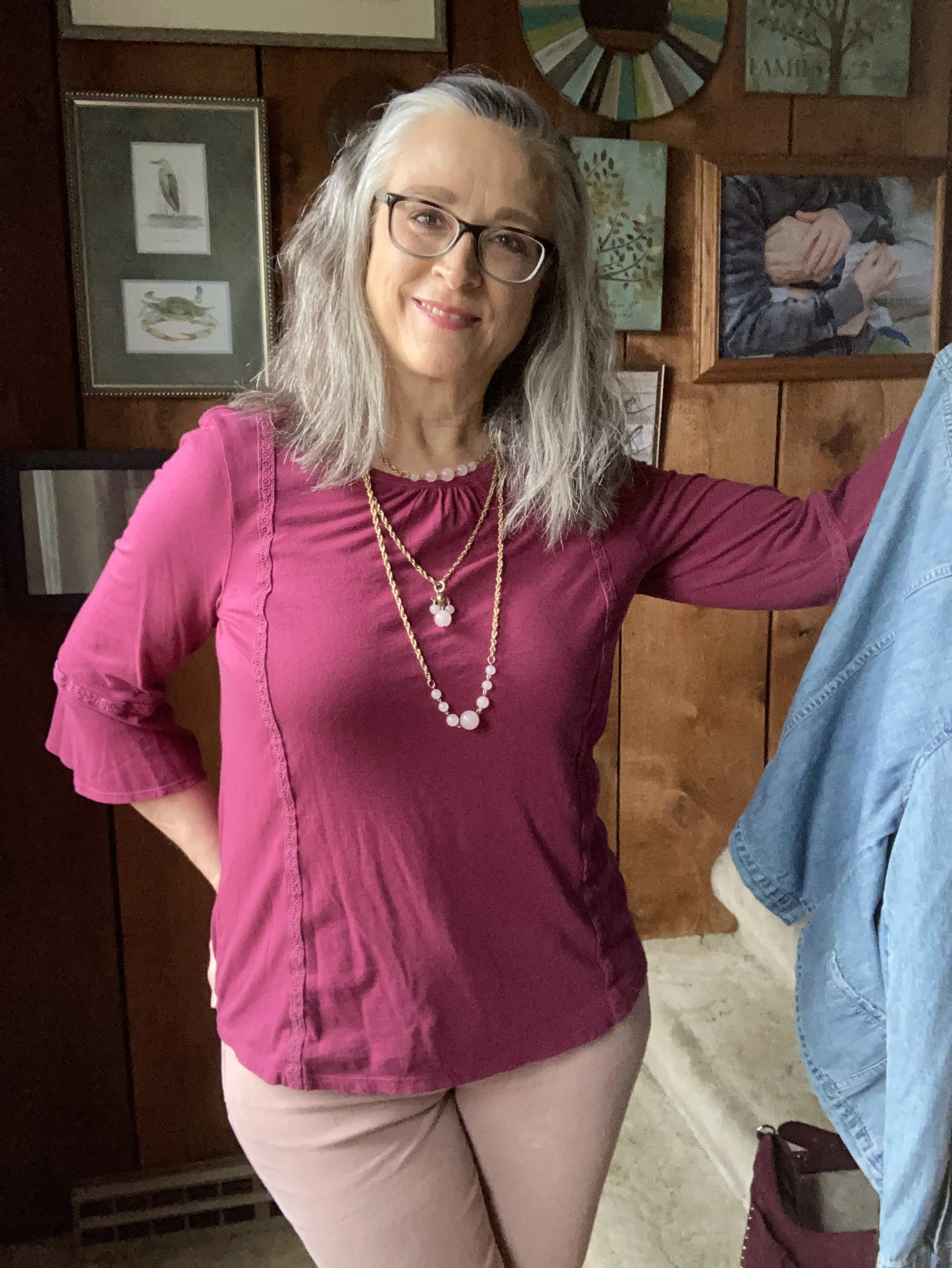
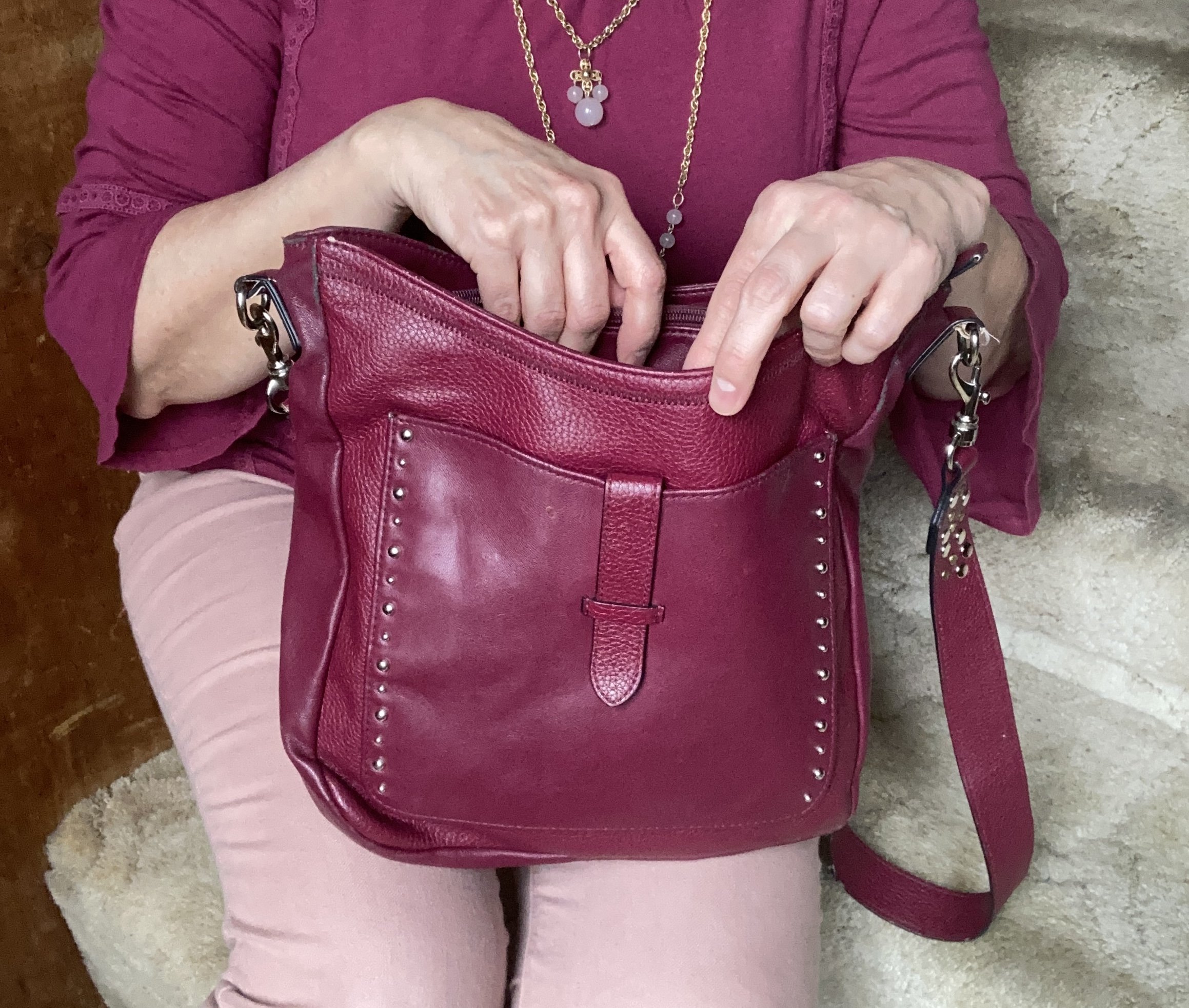
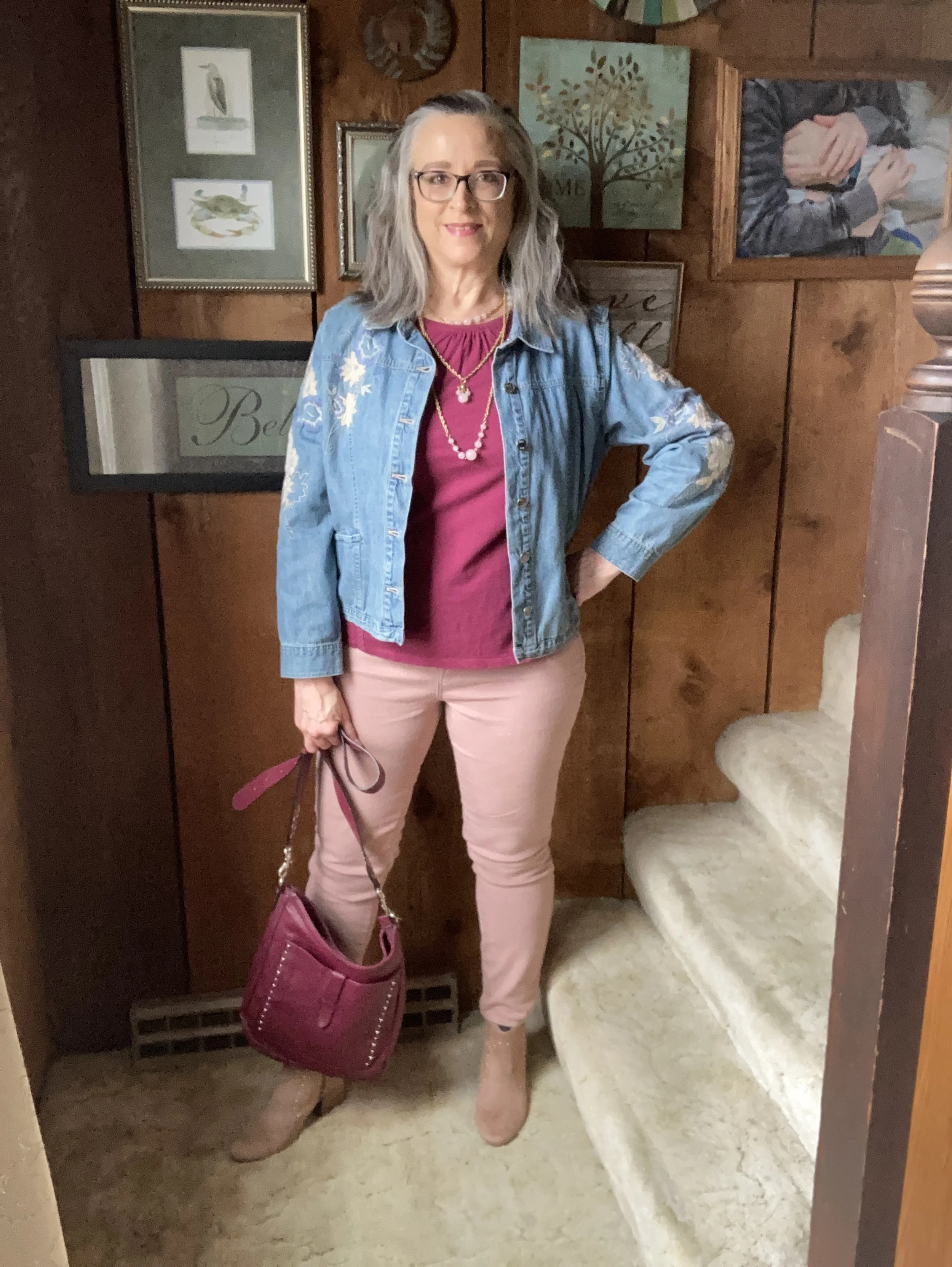
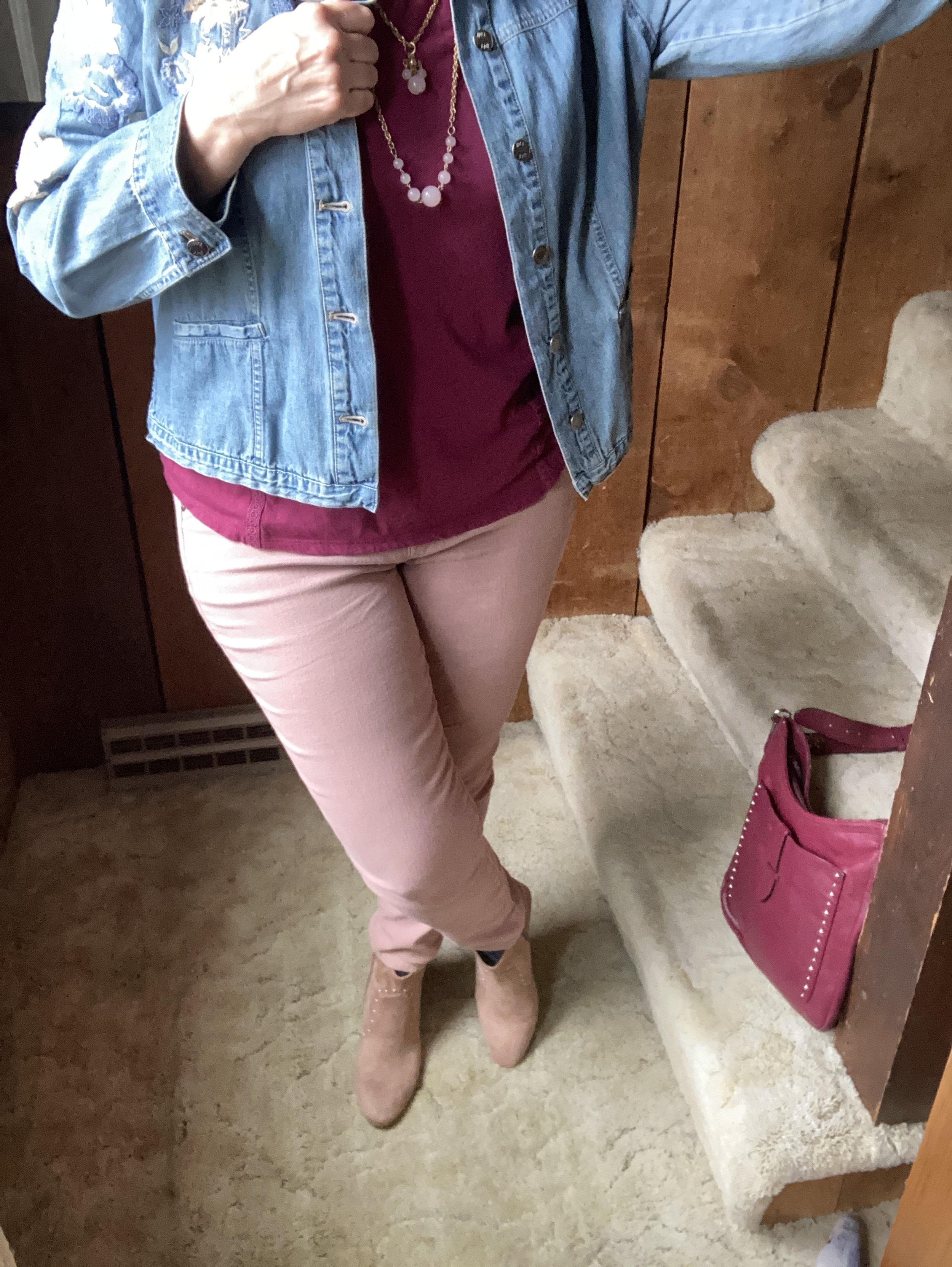
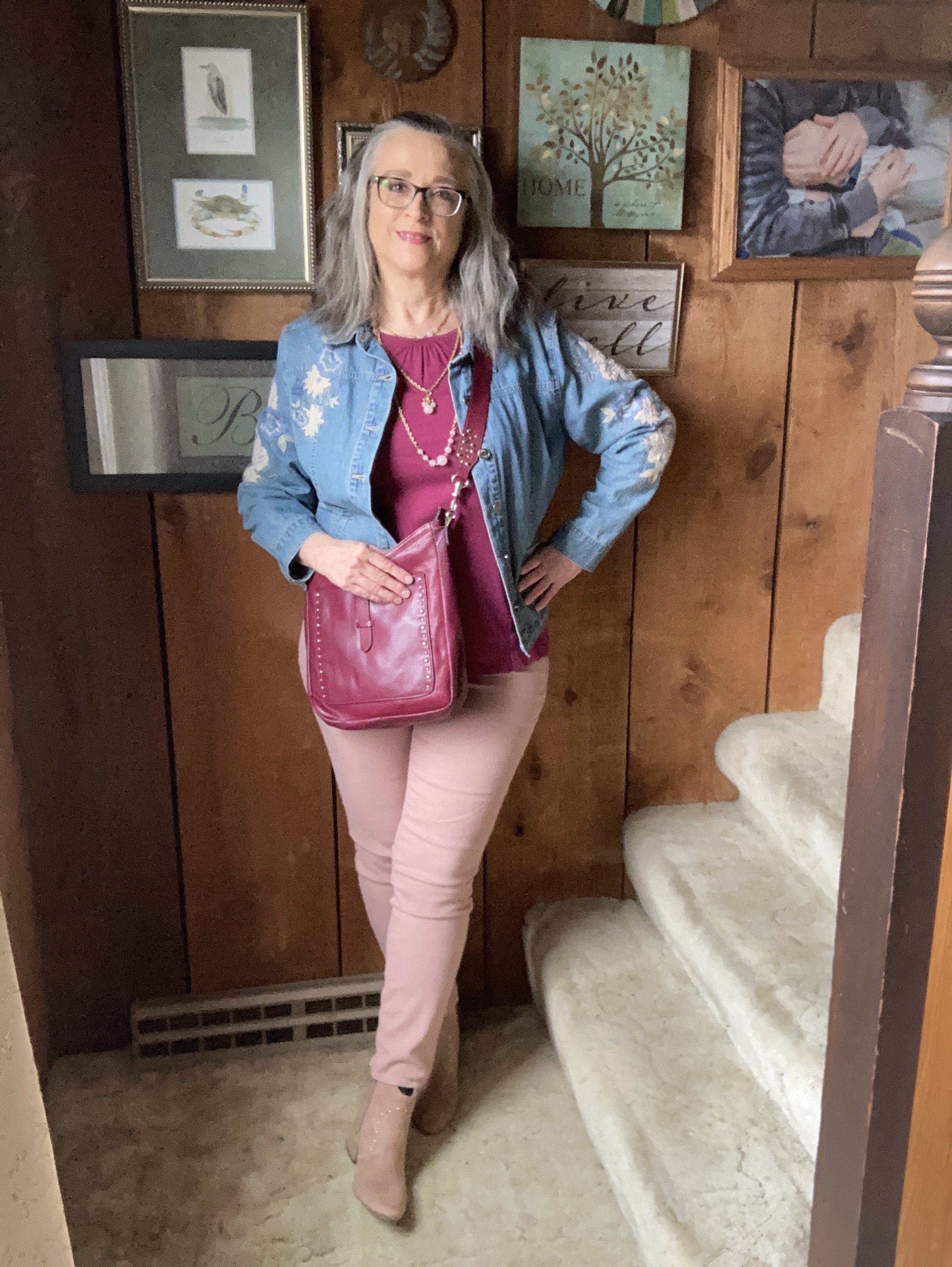
Viva Magenta is a bright, rich pinky red that easily catches the eye. It is a pretty color that can be combined with loads of other shades for a spring and summer worthy outfit palette. I don’t have a lot of pieces this color in my closet, so I was glad to see I had this Sonoma 3/4 bell sleeve top and the thrifted Libby Edelman shoulder bag.

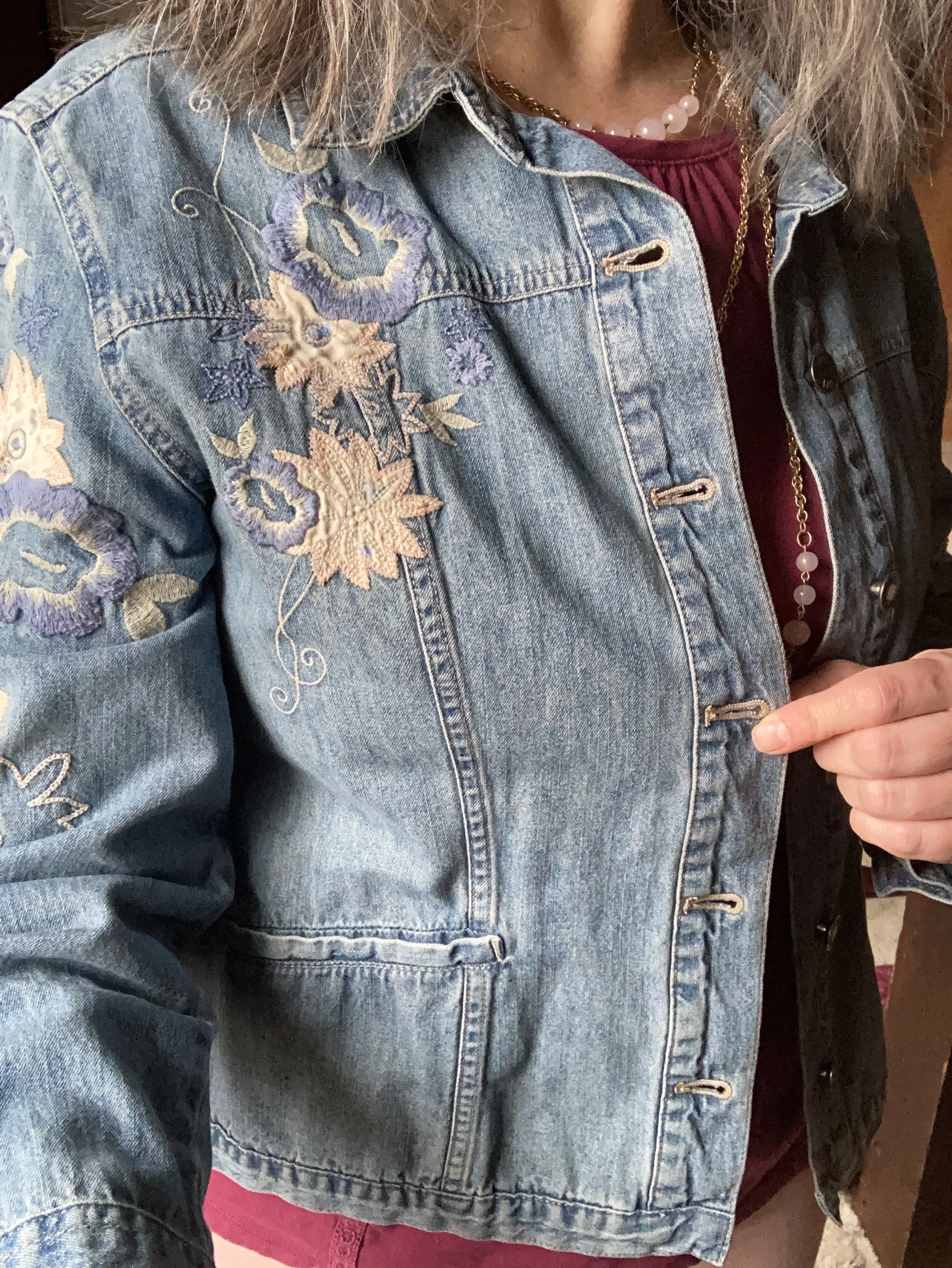
I decided to combine the Viva Magenta with two of the other colors from the Spring New York Palette. Summer Song is a soft, light blue that reminds me of a light wash denim, which is why I chose my thrifted J. Jill - Out of the Blue embroidered, jacket as a topper. I love the embroidered details on this piece. I’ve worn this on the blog before. You can see it with a white skirt for summer, and with a pair of wide leg jeans.

Vanilla Cream is one of the classic colors on the palette this year. I would say it is a cross between a pale pink and a pale coral. The Crayola Crayon box might call this one Flesh, ha, ha! These thrifted Refuge jeggings, seemed to come pretty close to the Pantone color. I don't typically wear leggings or jeggings without a longer top, but these have back pockets and do look more like jeans than leggings, even though they are incredibly soft and stretchy. You can see how I styled these with a black floral top, a belted orange tank top, in a pink monochrome look, and in a flat lay.

My SO ankle boots were a clearance find from Kohl’s a number of years ago. You can see how I styled them with my cognac jeans, a yellow knit cape, dark pink cords, and gray plaid cropped pants.

Are you a fan of Pantone’s color of the year, Viva Magenta? Do you like it combined with these other spring Pantone colors? Do you have any of these colors in your wardrobe? Leave me a comment or two. I always love to hear your thoughts. I do try to respond to all of your comments, so be sure to check back after a few days.

I am including a few shopping links for you to look over. I do apologize that I have not yet gotten linked up with some other affiliate partners. It’s all about the research which takes time. I haven’t given up, but for now I will keep bringing you at least some possible options through my ShopStyle affiliate program. These are brought to you at no additional cost, unless you purchase something of course. Ha, ha.

Color Play - Red and Orange Cream

As you know, the reason I like to play with color is to force myself to get out of my own preconceived box regarding color combinations. Most of us are familiar and comfortable with combinations like navy with white in the summer, or rust with yellow in the fall. We tend to stay away from those combinations that look like restaurant decor - think yellow and red (McDonalds), or team colors - yellow and green (Green Bay Packers), unless we are putting on our work uniform or going to a football game. However, I like the challenge of finding different or unusual color combinations allowing me to make better use of the clothing I already have in my closet.

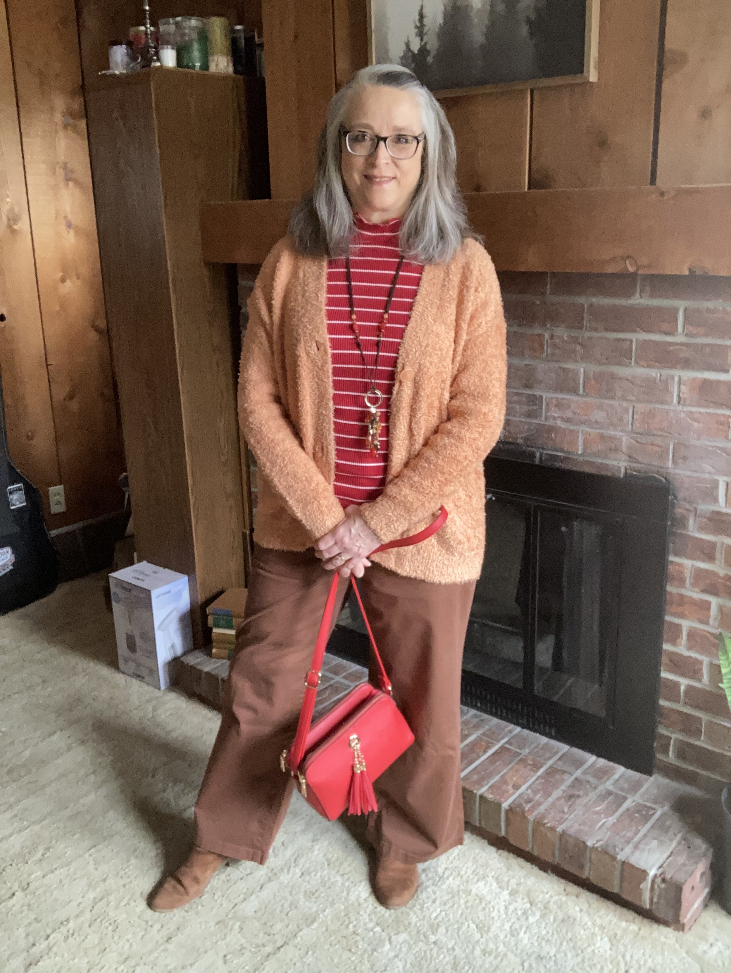
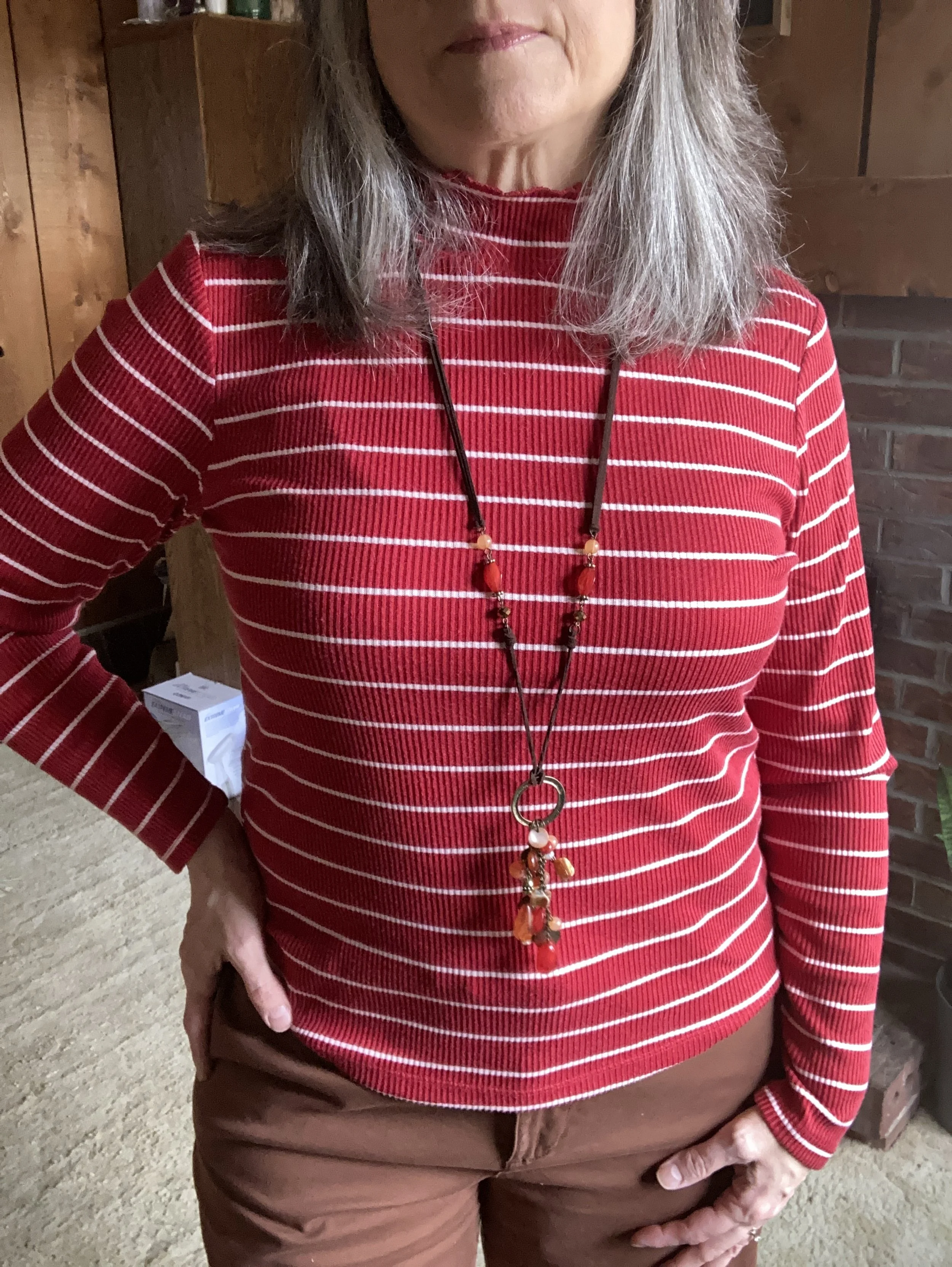
Today’s outfit revolves around two new pieces I got in the last month: a red and white striped top and a creamy light orange eyelash cardigan.

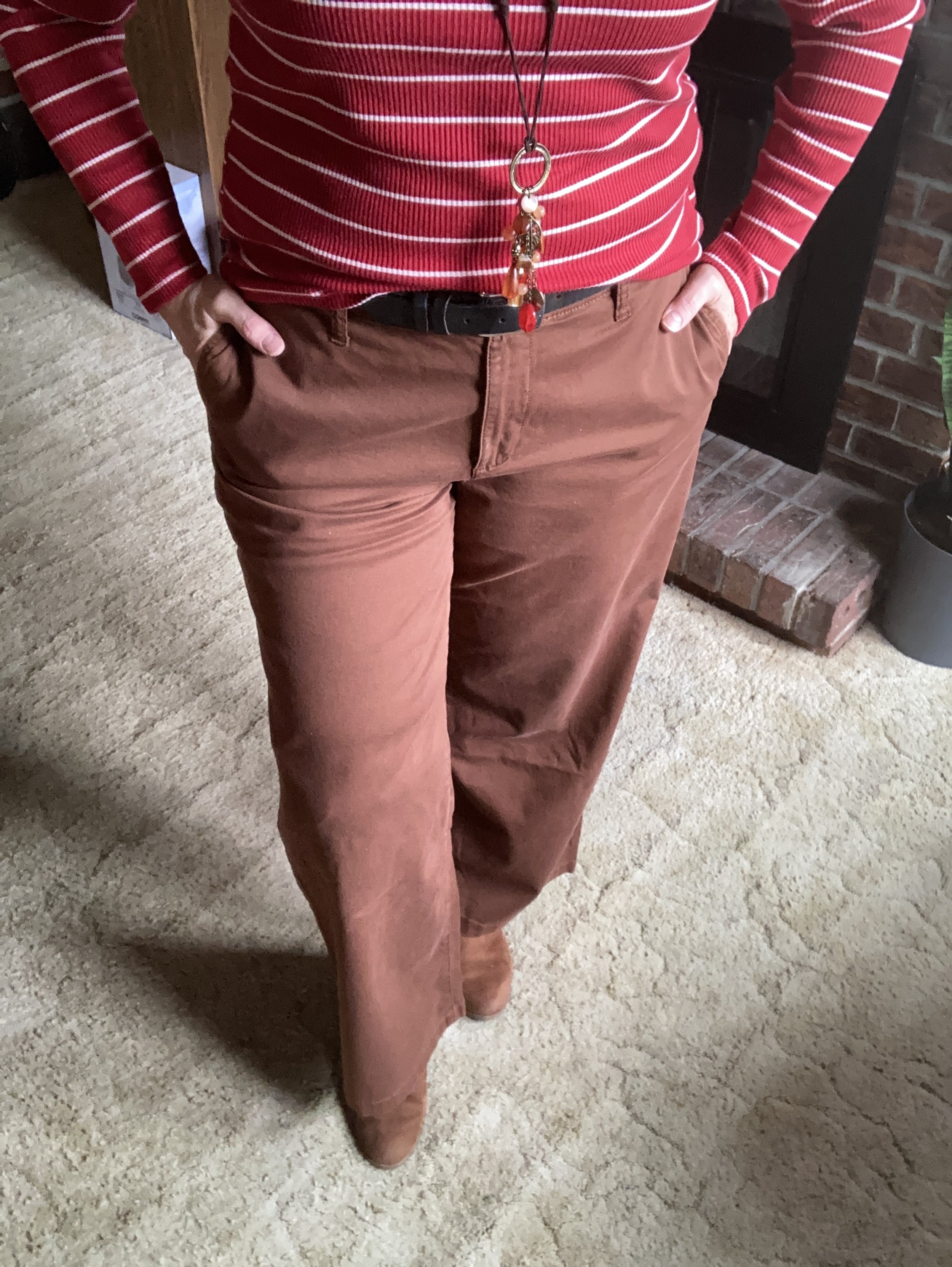
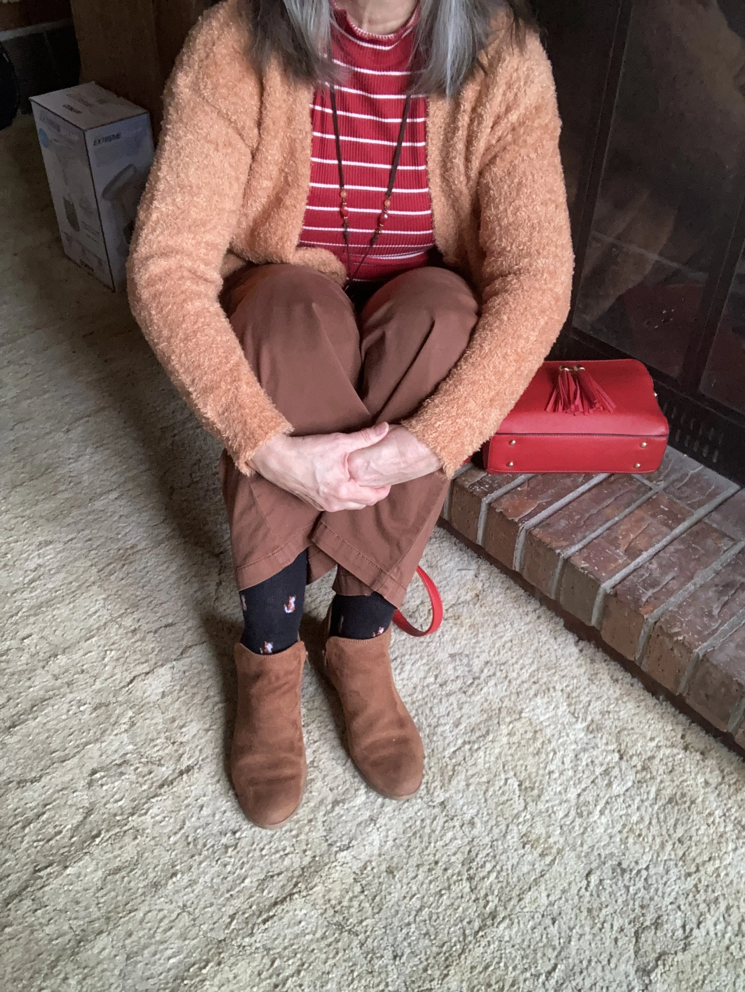
I pulled out my thrifted St. John’s Bay wide leg pants. The only reason I chose these was so I could wear my knee brace without it being seen. Ha, ha. But I actually like the way the outfit turned out. Wide legs seemed to have jumped off the trend-go-round until next time, but that is no reason to get rid of them, if you have a pair. Every once in a while it is nice to wear something outside the trend box, just because it is comfortable and the right color.

My bright red striped mock turtleneck tee is from Maurices and was another great deal. I love stripes anyway. I have a few tops that are white with red stripes, but when I saw this red with skinny white stripes, I grabbed it. It is very soft and comfortable.

I also added a long pendant necklace with reds for a bit of fun.

This wonderfully fuzzy chenille eyelash sweater is the bomb. I love the fun texture and the luxurious softness of the knit. It is also extra cozy, so I have a feeling it will be popping up here and there throughout the chaotic weather of spring. I found this on the clearance rack at our local Meijer.

I used my red top handle bag again for the Valentine’s red color and added my SO ankle boots which matched my pants fairly well. However, silly me, didn’t think to put on my brown socks…ha, ha. Oh well, the little foxes match quite well.

Style Tip: To make your legs look longer and leaner match your shoe to your pants (and your socks :)). You can get the same effect with tights and boots of the same color.

What do you think of this color combination? I think it is fun and different, but not so different that it doesn’t work. Let me know what you think by leaving me some love in the comments.

I am including a few shopping links for you to look over. These are affiliate links, but all opinions are my own. These are provided for your benefit and do not cost you anything to click on.
Have a wonderful Tuesday!

Color Play - Black and Olive

I love color. Bright color, dark color, bold color, muted color, neutral color, pastel color, and all manner of prints and print mixes. I do not think I have met a color I didn’t like, or at least that I didn’t see potential for its use. Many people will disagree with me when I say, every woman can wear every color, but my reasoning is based on two factors: the shade or hue of the color, and where the color is worn on the body. While it is true that not every woman can wear a stark black next to her face, there are numerous shades and hues of black from gray black, to blue black and even brown black. In addition, if a woman just doesn’t like any shade of black near her face, there is no reason she can’t wear black pants, or have plentiful black shoes and bags.
My desire with this monthly look at color is to open your mind to embracing colors outside your normal comfort zone. There is no problem with being an all neutrals kind of gal, but start thinking about adding a little pizzazz to your outfit with a bright pink beaded necklace and earrings , or a lovely printed scarf with rusty oranges, reds and yellows. This isn’t just about how you look to the outside world. This is also about loving yourself and enjoying all the beautiful color in this world we live in.

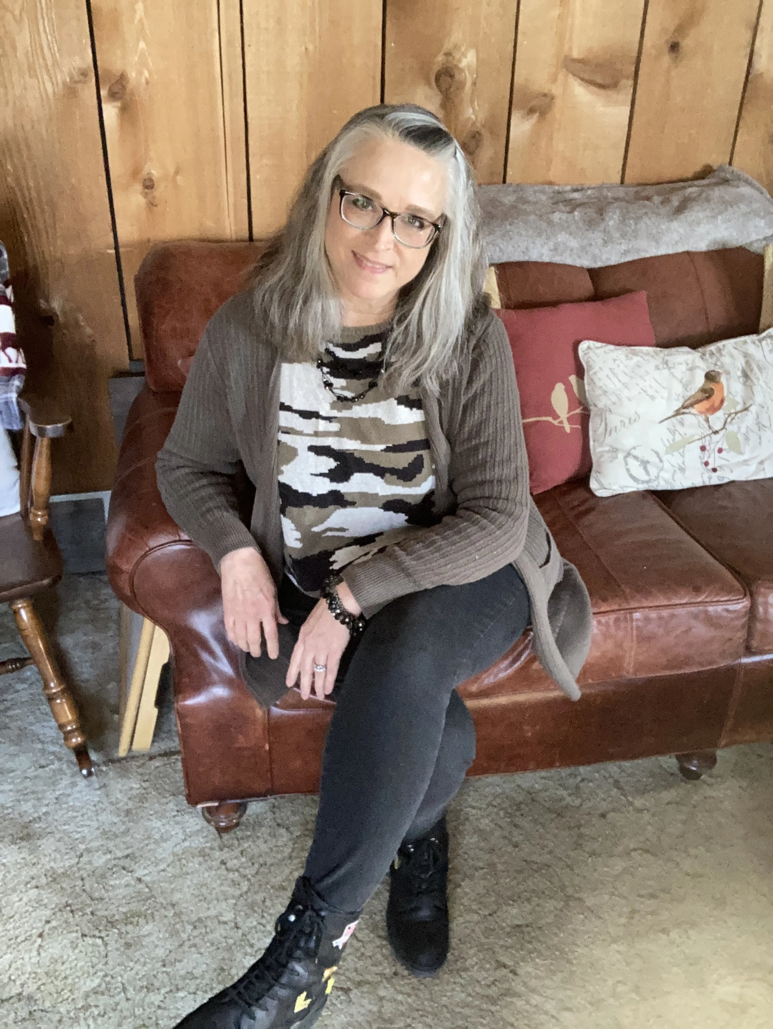
For today’s post, I decided to start with two colors that are fairly classic and unobtrusive: black and olive.

Let me first say, having a daughter who is a professional photographer always makes me keenly aware of what I lack in the picture taking realm. I will give you pictures. I will either take them on my phone or on my camera, but they won’t be to the standard I would like, ha, ha. Now that I have said my piece, on with the post.

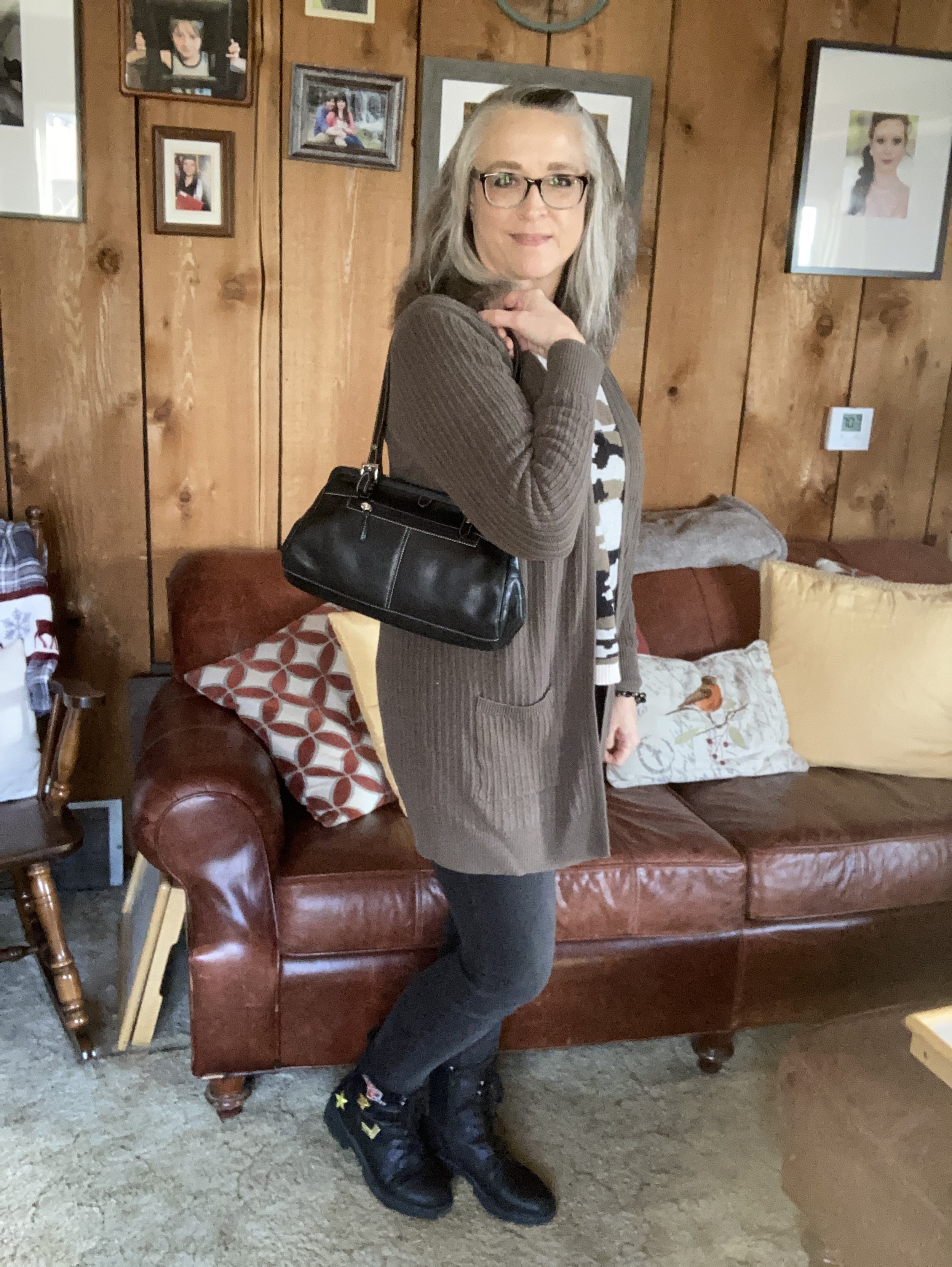
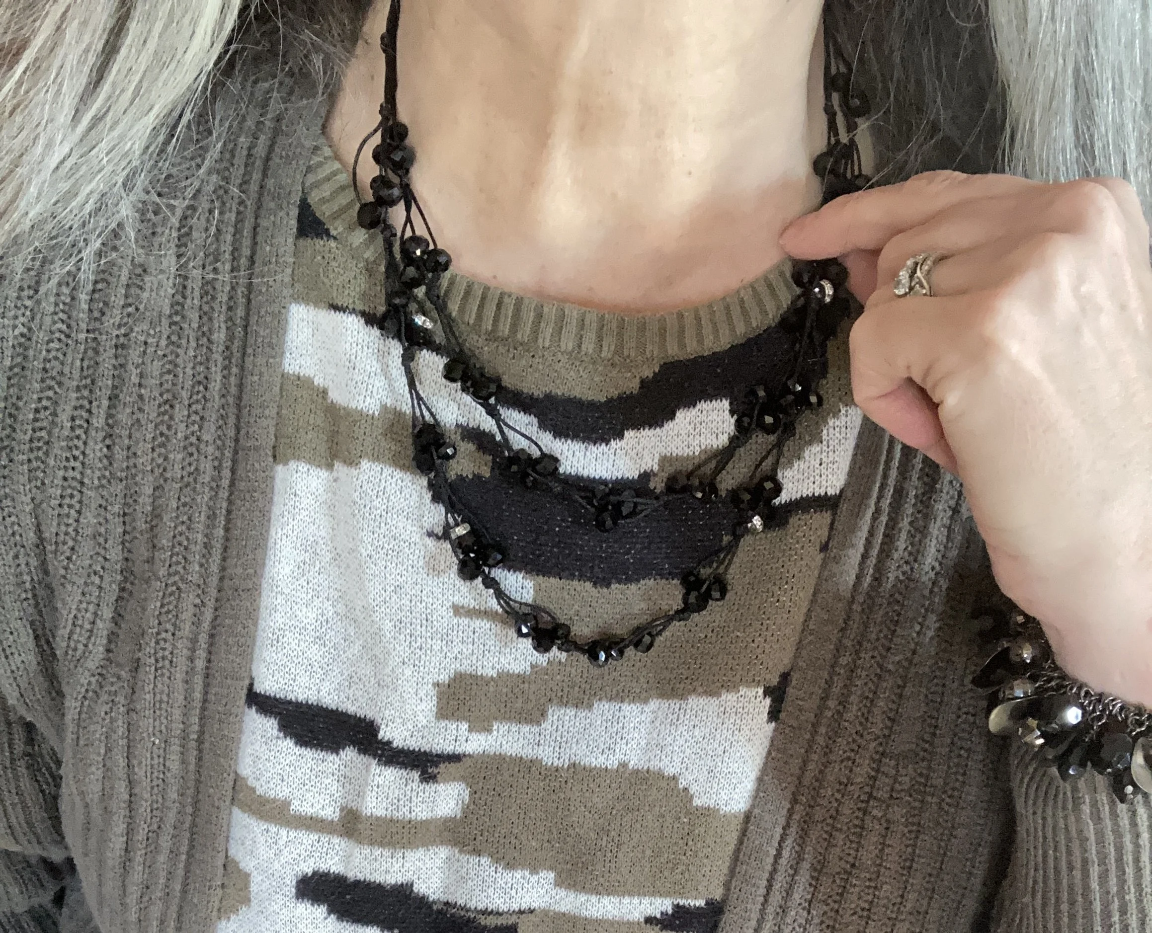
Olive is one of those greens that can come in a variety of shades. Check out this page from when I Googled olive color shades. The olive color of my older Sonoma cardigan from Kohl’s, and on this thrifted, Forever 21, camouflage sweater is what I would call olive drab, or military olive. It leans more towards brown than a true olive green. However, if you put it next to a brown sweater, it definitely looks green.

It is easy to pair olive with black. For that matter, any color pairs just as well with black as with white. Just envision this same outfit with a pair of white wide leg jeans instead of the black skinnies. It would work perfectly and give the look a whole new vibe.

My black skinnies are Simply Vera by Vera Wang and I either got them on the clearance rack at Kohl’s or at a thrift store. I really can’t remember. Yes, I know! I am still wearing my skinnies. They will likely come back around, as most things do, so I won’t be getting rid of them.

My Seven Dials combat boots are starting to show some wear, but they are one of my faves and so comfortable.

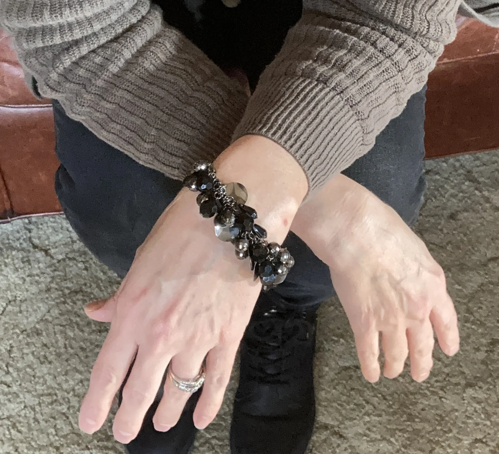
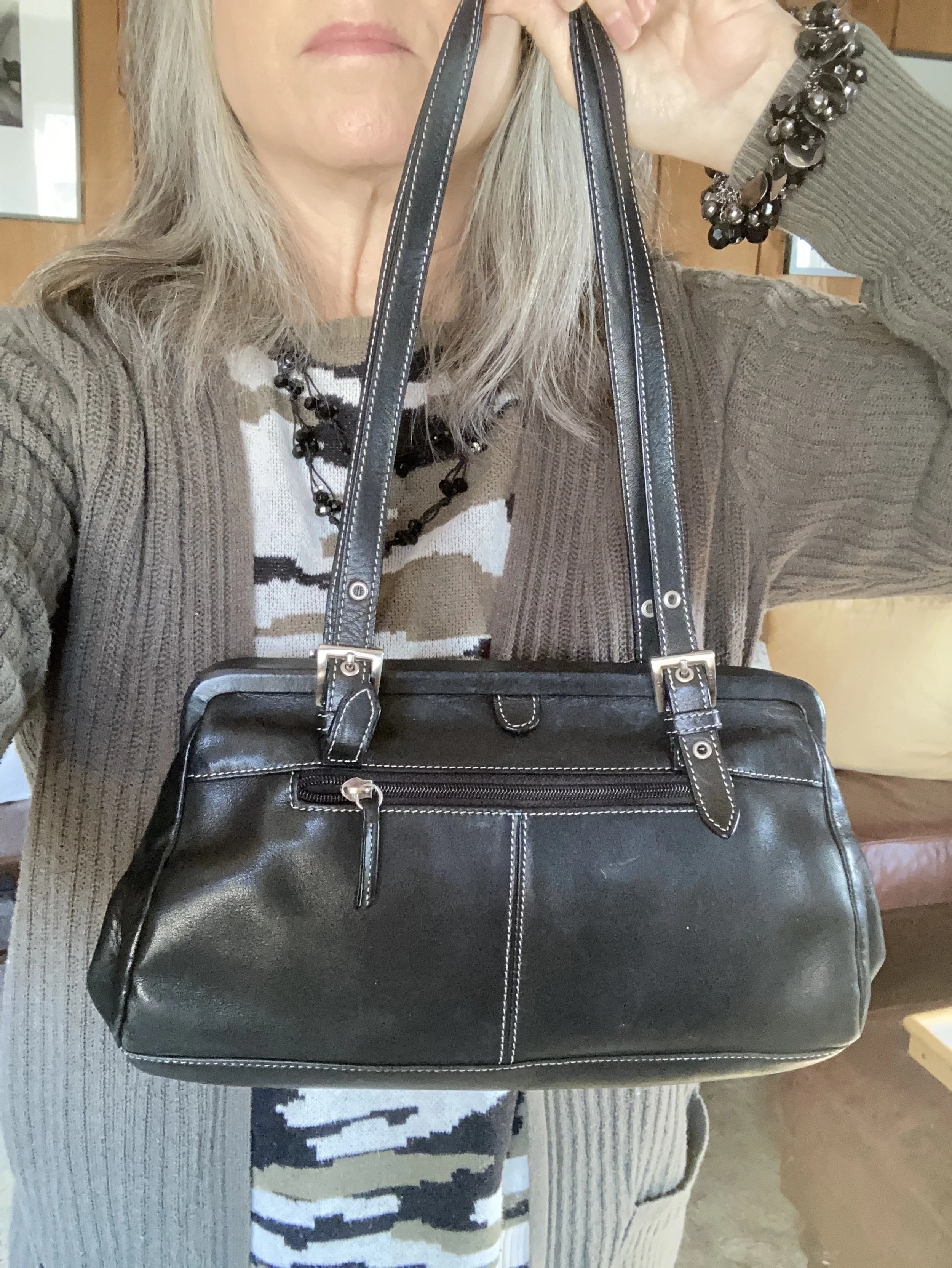
I added a few pieces of jewelry and a thrifted Tignanello bag.

I actually got this cute little bag when we were in Wisconsin for my father-in-law’s funeral. Since we ended up staying the whole week we were a bit underprepared, so I went to a thrift store to get us a few things for the funeral.

Olive and black are a great color combination for any season. In the spring you could combine a pair of black joggers with an olive zip up hoodie for a cozy, casual lunch as the temps are still cool. In the summer try pairing olive trousers with a black silky sleeveless for a classic work look. In the fall reach for that warm olive pullover to wear with your black maxi skirt.

Remember you don’t have to go full bore with these colors. You can just use each of these colors as accents with any other colored outfit. Wearing a navy dress? Reach for a set of olive beads and an olive bag and shoes. You can still have fun with a variety of colors without having to invest a lot of money.

What do you think of these colors? Do you wear olive and black together, or do you wear them separately? I’d love to hear your thoughts so leave me some love in the comments.

I’m including a few shopping links. I am going to try to find a few other affiliate programs so I can bring you more moderately priced shopping and brands you know and love. Keep an eye out for that.

Have a great Tuesday. Be sure to check back on Thursday for the first installment in a creative fiction series brought to you by me. Ha, ha.

Love and hugs!