A Look at My Fashion Philosophy and an Intro to Winter Trends

Since winter just officially started last week, I thought I would take the next few weeks to look at a few of the fashion industry winter trends. Some of these were publicized months ago with the fall trends, but as you know, I do not adhere to a super strict timeline, when it comes to trends. In fact, if it is a trend I really like I will shop the end of season sales to find a piece or pieces within the trend to save myself money. I don’t worry about being spot on with a trend timeline. My feeling is, if it is a trend worth buying into, I am going to keep it around for a while.

Image by Lorri Lang from Pixabay

Image by Lorri Lang from Pixabay

Since I have started regularly writing and blogging, I have noticed that King Solomon had a lot of wisdom when he penned these words in Ecclesiastes.

What has been, it is what will be, And what has been done, it is what will be done. So there is nothing new under the sun.
— Ecclesiastes 1:9 (NASB)

I have said it before and I will say it again, hang on to those things you love, because they will be back around again, whether it is a print like leopard or gingham, a color scheme like monochrome or color blocking, or a silhouette like flared jeans or an a-line skirt. As long as an item still fits and it is something you love, don’t get rid of it, just because it isn’t trending anymore. Just be patient. Besides, there are no rules when it comes to your fashion style. It is what makes you feel good and confident. Wear black in the summer and white in the winter. Style your leopard print all year round and your sparkles for lunch with your friends. It really is up to you.

Before I get into the Winter trends, I wanted to share with you my fashion philosophy. Over the last few years as a blogger, I have been becoming more aware of my own style and the reasoning behind my style choices. I would like to share with you a few of my fashion parameters.

Fit - If it doesn’t fit well, I am not going to wear it. I have found a few of my favorite jeans at thrift stores, because there I can find and try on brands I normally wouldn’t buy. I would have never shopped at Lane Bryant, but one of my favorite pairs is a thrifted Lane Bryant boot cut distressed jean. I love the rise, the stretch and the comfort of that pair. Now Lane Bryant is for women size 12 and up, so if you are short and thin, you will not be wearing their brand. You have to find what works for you. Don’t be afraid to order things, try them on and send them back, or (after Covid), try multiple pairs on at a store like Kohl’s, Macy’s or Nordstrom until you find what works for you.

Image by Free-Photos from Pixabay

Image by Free-Photos from Pixabay

Style - We all have our own style, and it may take you a number of years of experimentation to find out what works for you. You can Google fashion styles and it will bring up a number of articles on what the different styles are. Many men and women are strictly one style or another, but most of us are blend of multiple styles. I love moto jackets and combat boots; velvet and chenille; twirly skirts and long tiered maxis; flannel shirts, scarves and cardigans.My style is a blend of casual, biker chick, boho, and tomboy with a bit of classic and grunge thrown in. No wonder I am so confused! Ha ha. Finding and owning your style is more important than trying to keep up with the trends.

Price point - I know many people don’t let price points affect their style; if they want something, they buy it. Many people shop for higher priced products because they are a better deal as far as fit, durability and wear. As a thrifter, I know I can find quality products at second hand stores if I am willing to be choosy, do some experimenting with brands and be patient. Personally I value other things more than I value designer products. There is no doubt that many designers make very high quality products and that is part of what keeps them in business, but I cannot justify paying $300 for a bag, a pair of jeans or a pair of shoes. But that is just part of my personal style and I have nothing against people who do spend more on their clothes. Hopefully, they are in a position where that is easier on their wallets, than it is on mine. There is another idea that goes along with price point and that brings me to the next fashion rule I try to follow.

Image by NatureFriend from Pixabay

Image by NatureFriend from Pixabay

Sustainability - When we talk about sustainability in fashion we are talking about the production and distribution of clothing, shoes and accessories in a manner that is both environmentally friendly and conducive to changing consumer behaviors. In a world where so much is thrown away it is no surprise that the clothing industry for many years has been a leader in post production waste. Not only the remnants from manufacture of the products themselves, but the waste water and other toxic sludge that is dumped into the environment. There is a fledgling movement underway to change these practices in the fashion industry and make clothing manufacture and distribution what sustainability entity Green Strategy calls Circular Fashion. You can see a clearer definition of this by clicking on the link.

Basically, circular fashion promotes the ideas that fashion from beginning to end can follow a circular loop that includes better quality fabrics, more environmentally friendly production steps with less waste, marketing that includes educating the consumer and creating a consumer who is more likely to return to these products and the repurposing of textiles either through donation to second hand sellers or to entities that will turn the products back into new products through incineration to create energy or through textile fiber recycling.

Being a thrifter enables me to do my part to stay the circular course of textiles and to do it at a price point that is much easier on my checkbook.

Image by Lorri Lang from Pixabay

Image by Lorri Lang from Pixabay

Modesty - You might say I am an ostrich sticking my head in a hole if I don’t buy into the over sexualized aspects of fashion. I am fully aware of what is going on. You can’t look at a magazine cover while standing in the supermarket checkout that doesn’t have some reference to sex on the cover. Well, maybe not Taste of Home. Ha, ha. I have studied magazines like Seventeen, Vogue, Marie Claire, In Style and others. Every single one gives word space, and/or photo space, to talking about our sexual partners, fantasies, problems and issues. Pictures include women with varying degrees of sexual intonation from the lack of bras, pants or shirts, to positions with legs wide spread leaning back precariously close to an orgasm without a partner. Oh, sure, they have clothes on, but come on people, just what do you think these magazines are trying to sell?

I believe we, as women, have done ourselves a disservice in buying into what many forms of media are pushing. That is not to say, they never have an article that communicates the creativity and power of women. Many do, but I struggle to believe that the girls growing up in this world aren’t affected by the combination. If you say women are strong and creative, but place that article next to a photo of a sexualize woman, aren’t we then, promoting the idea that the only thing truly strong, creative and beautiful about women is their sex. Look at how many young women and girls idolize women in entertainment. No doubt, most of these women are gorgeous and extremely talented, but when it comes to how they present themselves by their clothing choices, it makes me wonder what are they really trying to say.

I am not saying we should be total prudes. Especially if you are in a committed relationship to another person. It is important to dress in a way that shows that person you love them and want to be sexy for them. However, when we are out in public, or promoting our blogs or our Instagrams, I think is is important to promote things that will last, like being creative or smart or talented. Physical beauty is fleeting, and what is truly sexy is not how much of ourselves we show off, but how beautifully the hidden places in our hearts rise to the surface.

Those are just some of the things I think about when it comes to my views on fashion and my approach to the outfits I pick out and the topics I talk about. I won’t be posting on Thursday this week as my Hubby and I are going to go see his parents for a few days. Next week I’ll pick back up with a look at some of this winter’s best trends. Until then, stay safe and have a very Happy New Year. See you in 2021!


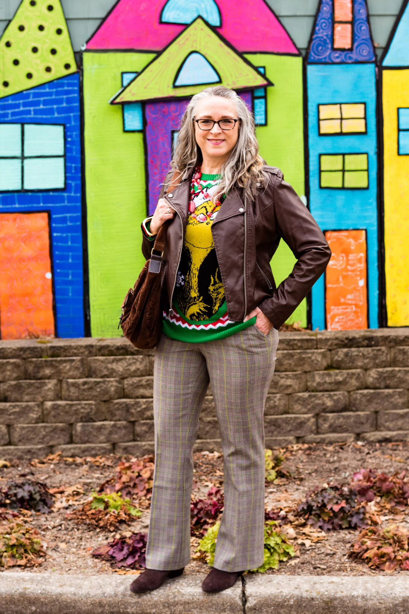
Color Play - The Grinch - Green, Red and Brown

When it comes to Christmas we are inundated with red, green, silver and gold, but today people are using blues, teals, purples and pinks to decorate their homes and wrap their presents. Check out Liz from With Wonder and Whimsy. I adore her whimsical style and her love for all things pastel. She does such an amazing job decorating for all occasions and Christmas in her home is simply beautiful. See her Holiday Home Tour by clicking on the link.

I love the red and green color combo for Christmas, but it really doesn’t work for many people in a fashion sense. I wanted to show how you could put together a fun, festive red and green outfit that could be easily worn for work and give a nod to our friend, The Grinch.

Color Play - the Grinch - Green, Red and Brown

What could possibly be more fun, than styling my very “Grinchy” work outfit in front of something that looks like it was taken right out of Whoville? This colorful 3D mural is another of the fascinating places at the Toledo Botanical Gardens. This little scene is just outside the Unruly Arts Studio, which is a studio that focuses on providing a creative space for artists with developmental disabilities. Check out their site at UnrulyArts.org , their Instagram page @unrulyartsstudio or their Facebook page.

Color Play - the Grinch - Green, Red and Brown

I have always loved The Grinch by Dr. Suess and my favorite holiday movie version is the animated one narrated by Boris Karloff. I think part of my affection for that version was that I was a fan of Karloff and his horror movies like Frankenstein and The Mummy. However, the movie that came out in 2018, where Benedict Cumberbatch plays our grumbling, green friend, is now my second fave. I actually was reluctant for a long time to watch the Jim Carey version, since I am not a big fan, but I finally did watch it and I was pleasantly surprised. I will say that Jim’s version which was directed by Ron Howard is much more geared toward adult humor, so not as appropriate for younger kids.

I got this Grinch sweater last year when I was working at Kohl’s for the holiday season. I knew I wanted a more typical ugly Christmas sweater and I thought this one was more gaudy with its candy cane stripes and the Grinch’s face plastered across the front, but I still thought it was cute.

My plaid trousers are a thrift store find and are Mossimo brand. I do love plaid in all its forms and while these slacks would feel a little better if I were a few pounds lighter, they still fit. I love that they have the green stripes throughout, and that they have a bootcut silhouette.

Color Play - The Grinch - Green, Red and Brown

My brown, faux leather moto jacket was a thrifted piece from a few years ago and I have styled it on the blog a few different times. You can see it with a maxi dress, a maxi skirt and a pair of plaid crop pants. The name of the brand is Celebrity Pink.

Color Play - The Grinch - Green, Red and Brown

You can see in the above picture I also added a little bit of red jewelry in my wrap around red beads. When these are not doubled they are more of an opera length string. I also threw on a red bracelet.

Color Play - The Grinch - Green, Red and Brown

I decided to use brown for the bag and boots to add to the more grounded vibe. You’ve seen this thrifted brown, corduroy, hobo bag on the blog before. The ankle boots are a Nine West purchase from Kohl’s.

Color Play - The Grinch - Green, Red and Brown

What do you think of this outfit? Do you like How the Grinch Stole Christmas? Which movie version is your favorite? I’d love to hear your thoughts in the comments.

Color Play - The Grinch - Red, Green and Brown

I hope you enjoyed this post. Be sure to check back next week for the final two outfits in my Christmas series. I’ve included a few shopping links for you to check out. These are affiliate links. All opinions are my own.

Photo credit, Rebecca Trumbull.


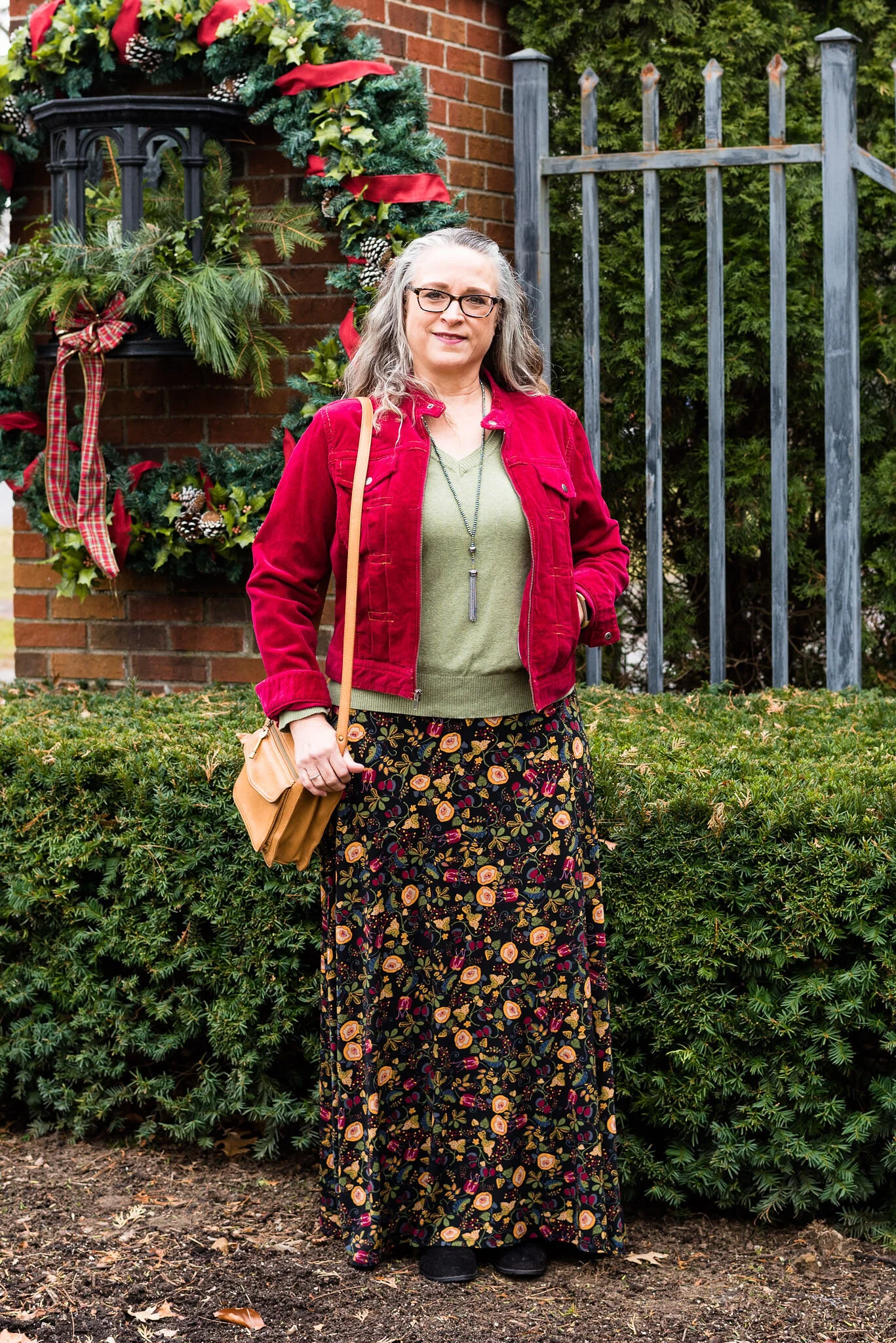
A Dickens' Christmas - The Ghost of Christmas Present

If you have seen any of the more recent versions of A Christmas Carol, the Ghost of Christmas Present is the one that exudes the festive, living presence of the holiday season. In both the George C. Scott version and the Muppet Christmas Carol version the being known as the Ghost of Christmas present is a jovial, boisterous giant of a character who escorts Scrooge on a tour of Christmas day. The day is filled with food, singing, gift giving and game playing. The joyful Ghost, shows Ebenezer a day made even more beautiful by the love of family and the generosity of his fellow man.

When I began thinking about how i wanted this outfit to look, I knew I wanted it to be bright and colorful. I wanted to present Christmas as a joyful celebration full of life and beauty.

A Dickens' Christmas - The Ghost of Christmas Present

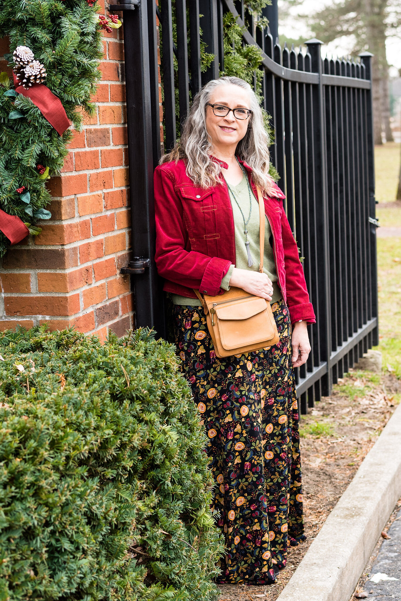
Once again, the Toledo Botanical Gardens provided the back drop for our pictures. They have the entryway into the park so festive and pretty.

Everything in this outfit is thrifted, except for the necklace and boots.

A Dickens' Christmas - The Ghost of Christmas Present

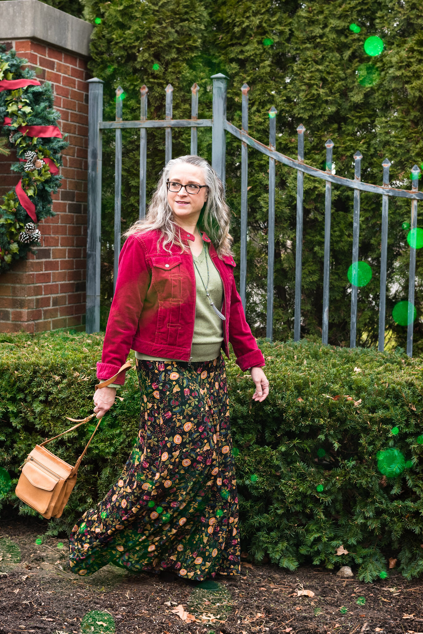
My skirt is another LuLaRoe piece that I found at a thrift store just around the corner from me. It really is a little too long and a tad too big (I rarely have that problem…ha, ha), but I love the floral pattern and it seemed perfect for representing the spirit of Christmas.

My daughter was playing around when she was editing the picture and added a smattering of festive green bubbles.

A Dickens' Christmas - The Ghost of Christmas Present

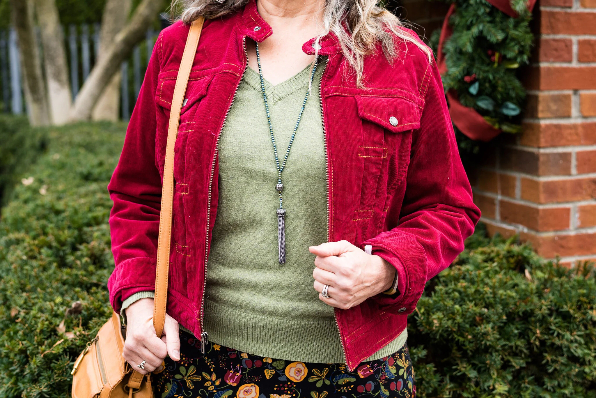
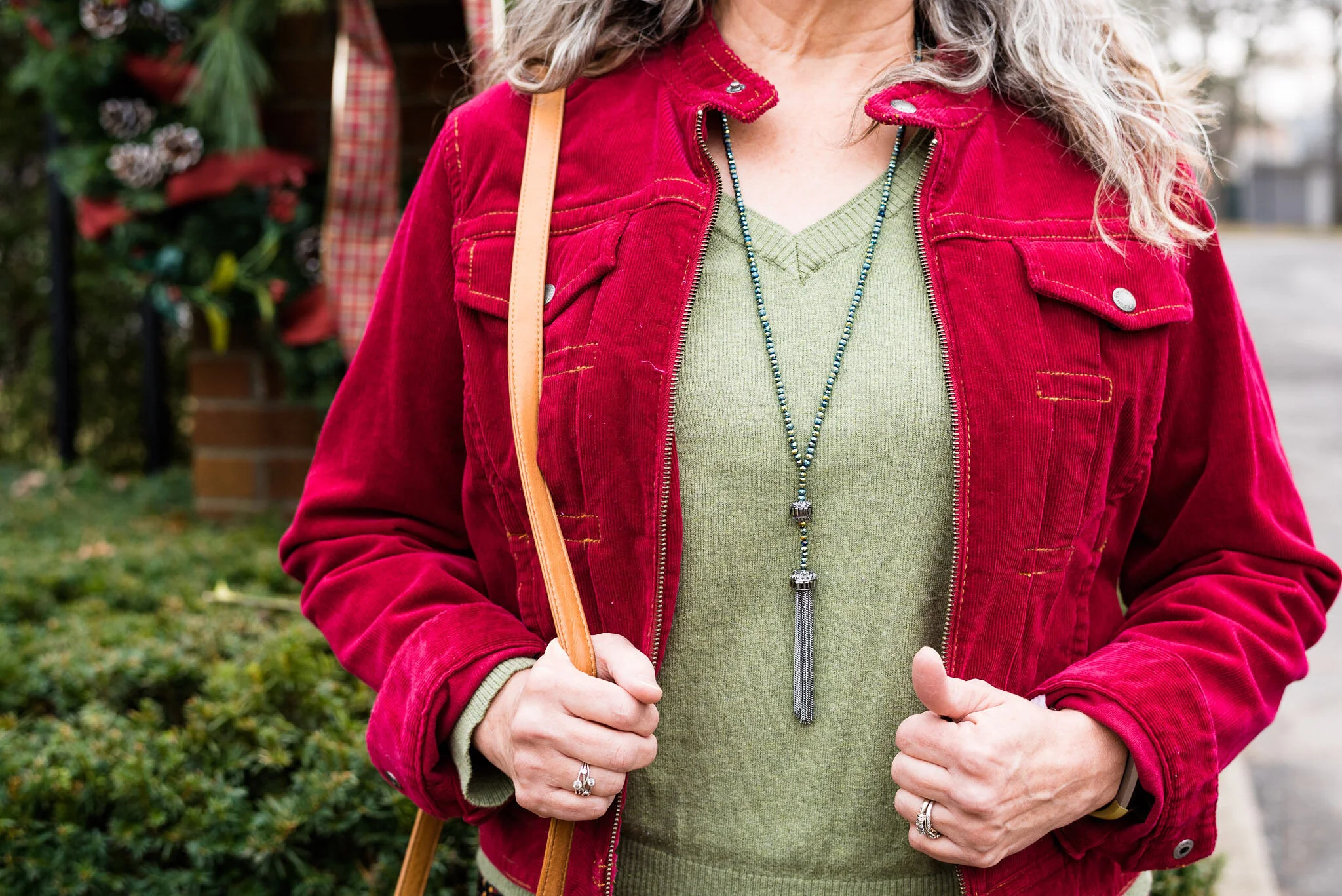
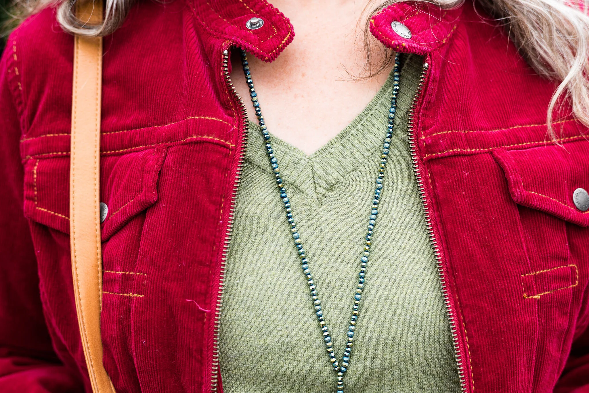
I found this fabulous Tommy Hilfiger red corduroy jacket at one of our local Goodwills. I haven’t really had a chance to show it off, until I thought about this outfit. I definitely wanted to stick with the more traditional Christmas colors of red and green, so this jacket and the lighter green Sonoma v-neck were a good combination.

A Dickens' Christmas - The Ghost of Christmas Present

I found this long, sparkly, fringe pendant necklace at a thrift store as well. You can’t see it real well in this picture, but the beads have a sparkly, iridescent quality. The picture below, shows you a closer look at the textures of the necklace, sweater and jacket.

A Dickens' Christmas - The Ghost of Christmas Present

You’ve seen this faithful leather, Fossil bag on the blog numerous times. I need to find a smaller wallet to use with this purse, as my current one is too big.

A Dickens Christmas - The Ghost of Christmas Present

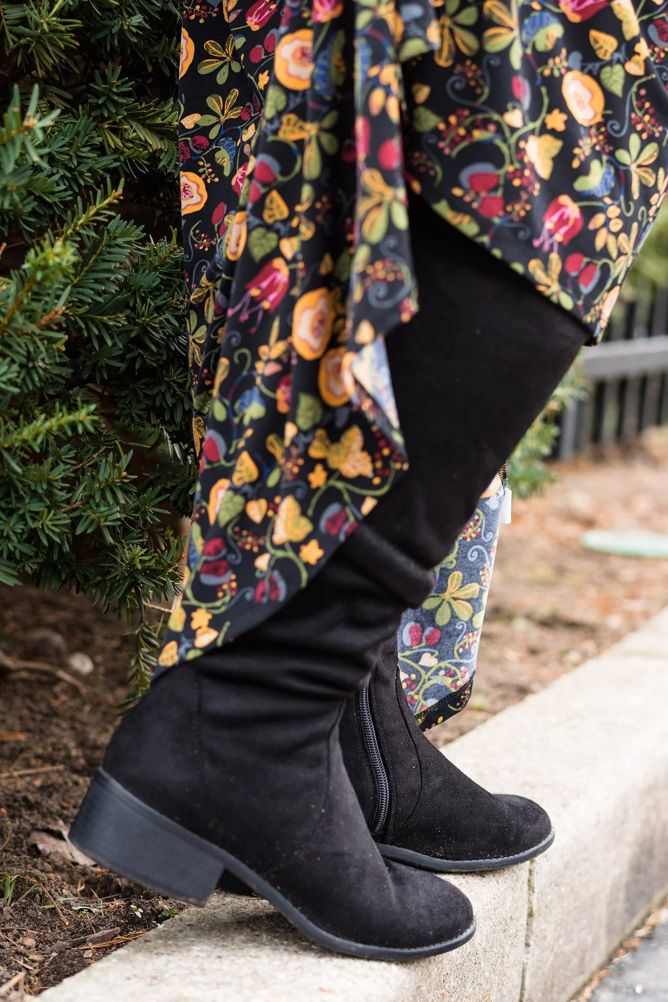
I wanted comfortable boots with this festive outfit, so I chose my suede Massini boots that I found on clearance at Meijer a few seasons ago.

A Dickens' Christmas - The Ghost of Christmas Present

What do you think of this outfit? Do you think it represents the Ghost of Christmas Present and all the symbolism that goes with it? I thought it exemplified the idea of life, celebrations and festiveness; all the things that the Ghost of Christmas Present is fond of.

A Dickens' Christmas - The Ghost of Christmas Present

I hope you enjoyed this post and are enjoying my movie inspired outfits this month. It has been fun to see what sort of outfits I could come up with.

I am including a few shopping links to look over. These are affiliate links. All opinions are my own.

Have a wonderful day!
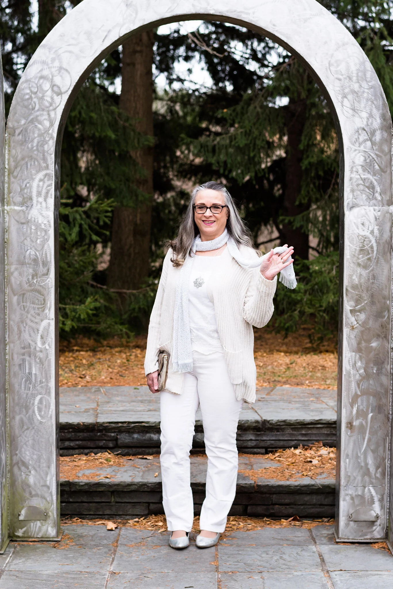
Photo credit Rebecca Trumbull.


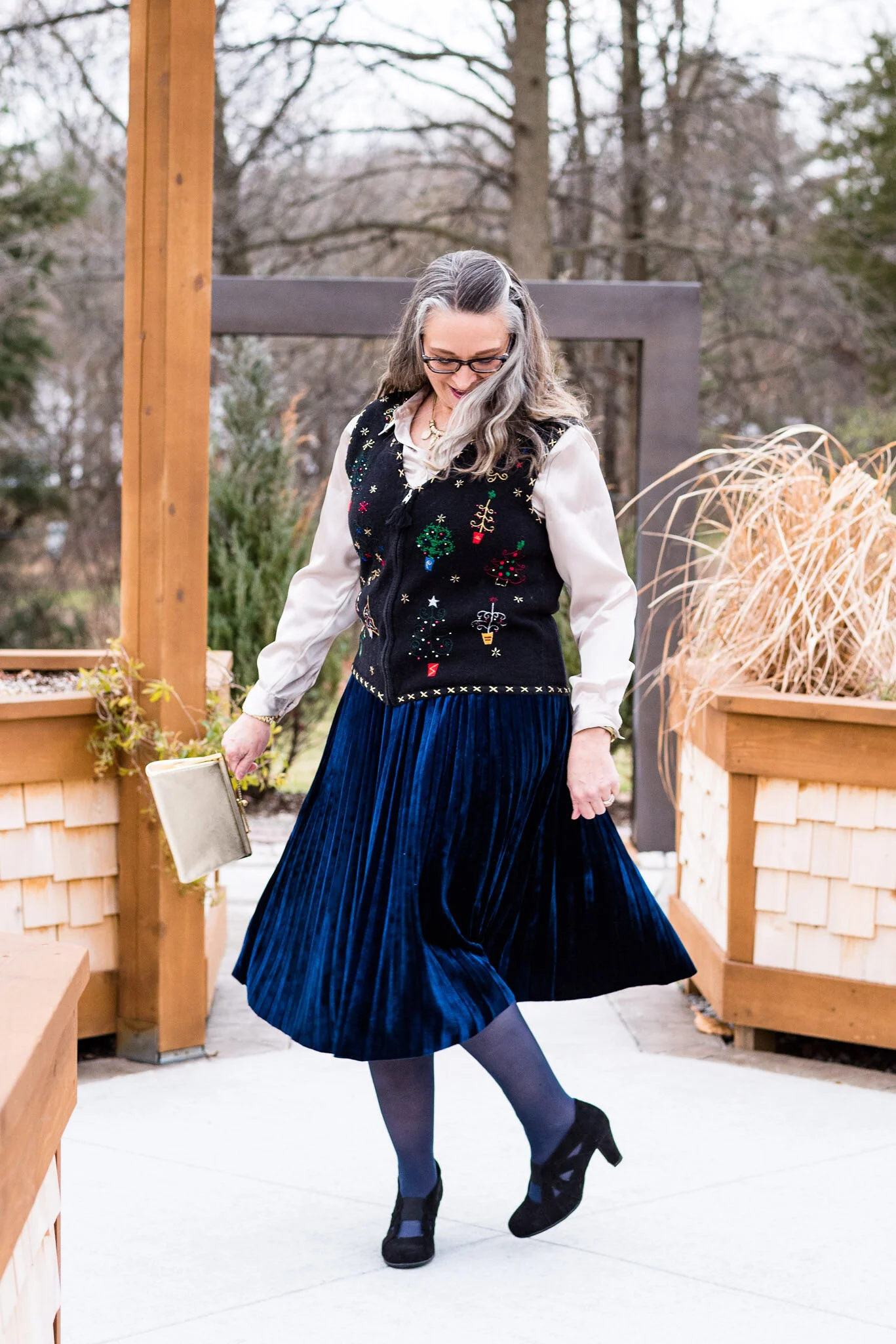
Outfit Inspiration - Christmas with the Kranks - Holiday Vest

If you haven’t seen, Tim Allen and Jamie Lee Curtis in the holiday movie, Christmas with the Kranks, it is a must see comedy, that reminds us of the importance of family and of giving to others. When Luther Krank decides to can Christmas and book a cruise for he and his wife Nora, the chaos ensues. From the neighbors demanding Luther release Frosty, so he can be put up on their roof, to the last minute chase for a particular canned ham, the Kranks try their hardest to pretend Christmas isn’t going to happen. That all changes when they realize their daughter, Blair, who was in Peru with the Peace Corp, is coming home and bringing her fiancee.

The character of Nora Krank is someone many of us can relate to. She loves her daughter and is very sad when she flies off with the Peace Corp. She also is a traditional stay at home mom, enjoying all the activities typically associated with the holidays. She even loves to wear festive holiday clothing. When my girls were young, I used to dress a lot like Nora. I would wear the festive turtleneck adorned with Christmas trees, with my colorful Christmas vest donning bells and bows.

I have come a long way since then. Now I more often enjoy graphic tees with a holiday scene or words under a blazer or sweater. I had long since gotten rid of my jazzy Christmas vest. When the thought of doing these Christmas posts came to mind, I started to think, how could I take something like an over the top Christmas sweater or vest and make it look classy and fashionable? This is what I came up with.

Outfit Inspiration - Christmas with the Kranks - Holiday Vest

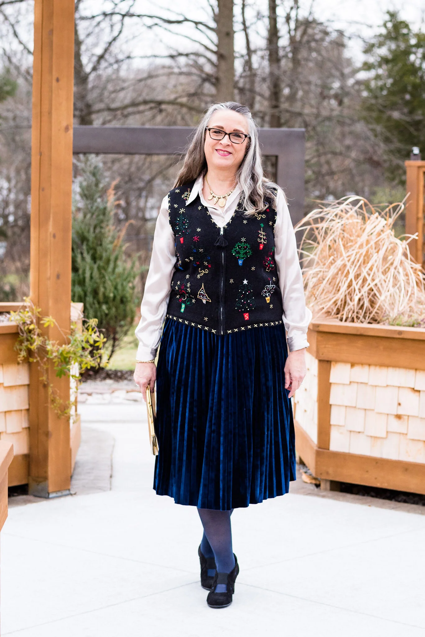
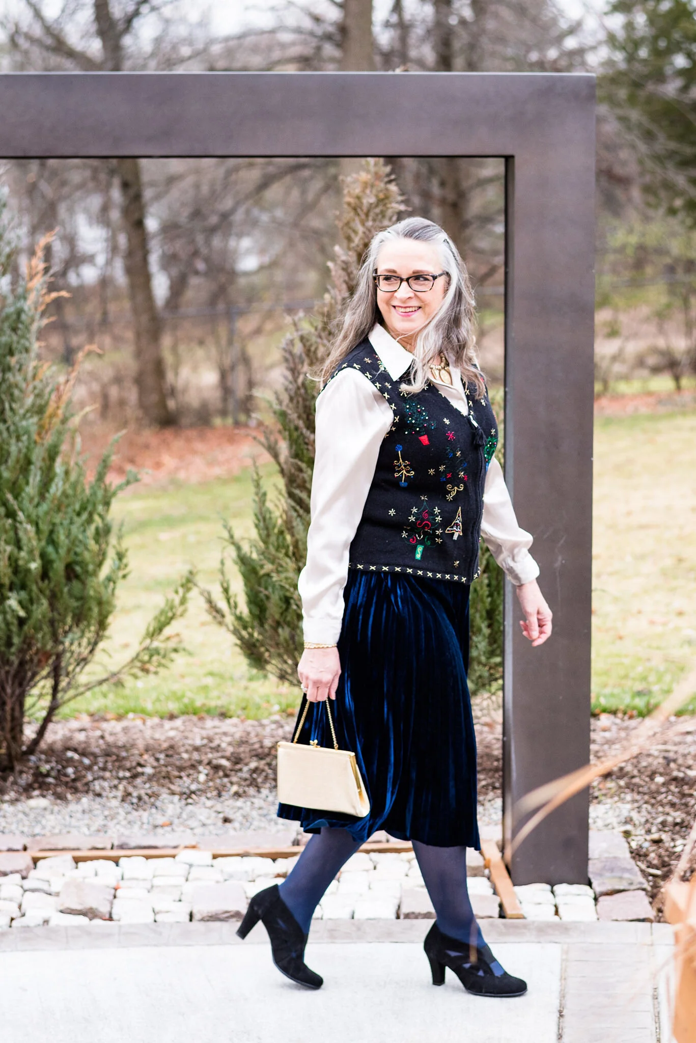
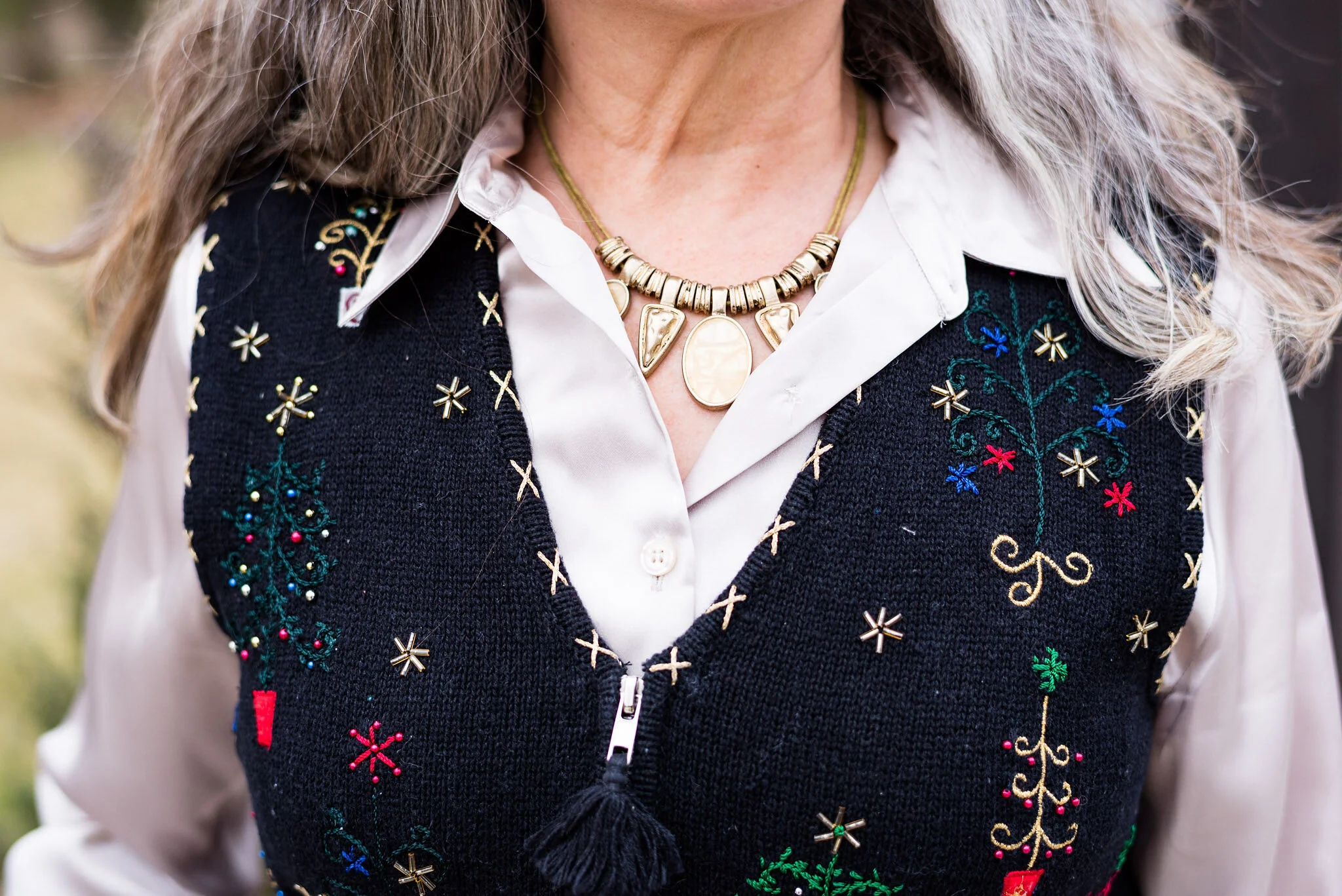
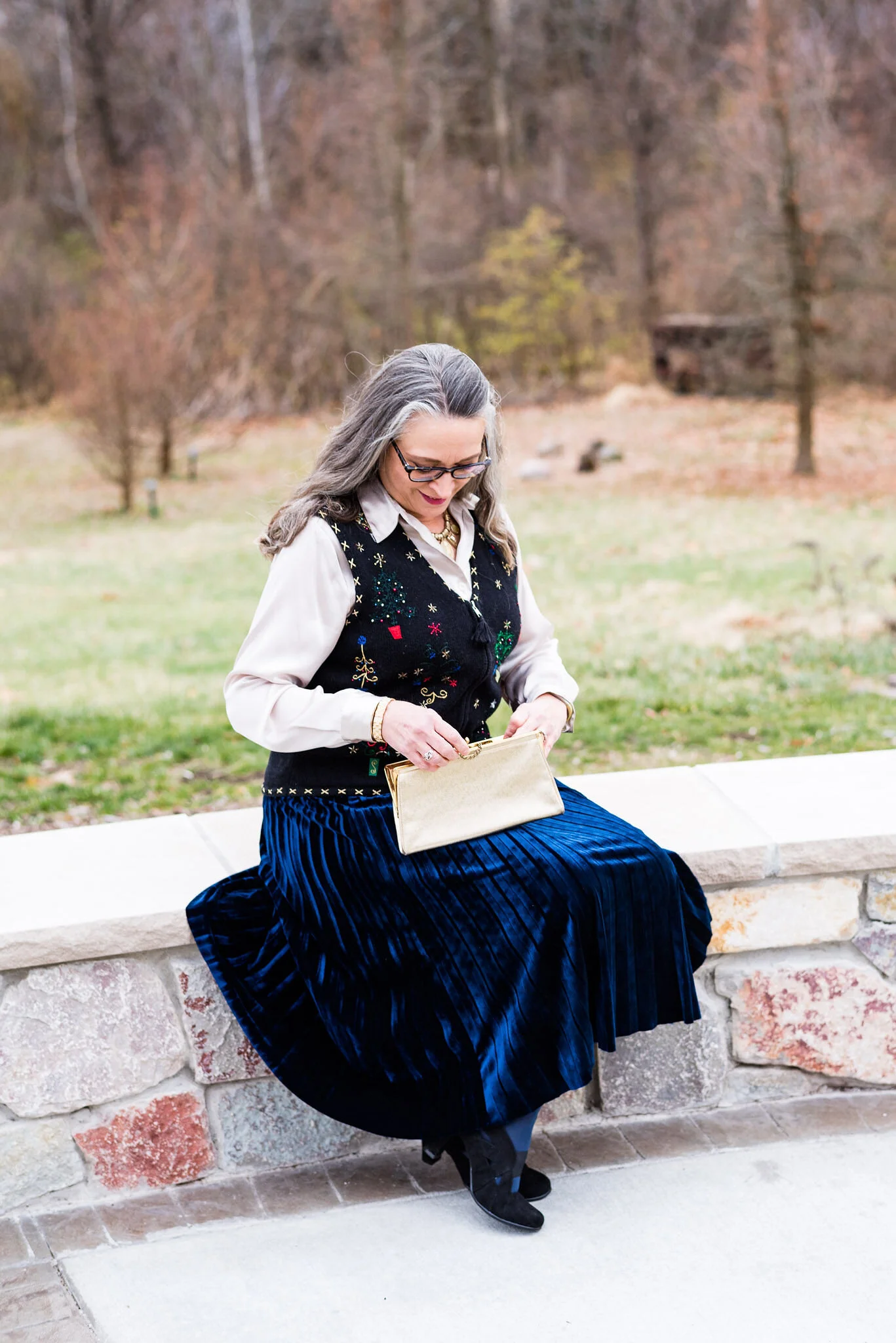
I found this snazzy vest at the American Cancer Center Discovery Shop thrift store. They typically feature items that appeal to people whose taste might include things like this retro style vest, but they have a great selection of all different items including glassware, pillows, shoes and bags. The vest is a brand called Erika. I like that the vest is black, because to me it still seems somewhat classy and stylish

Outfit Inspiration - Christmas with the Kranks - Holiday Vest

My blue, velvet skirt is Chaps brand and was a Kohl’s clearance find a few seasons ago. Velvet is a classic cold weather fabric, but especially so at the holidays. It really dresses up an outfit, and the twirlier the better!

Outfit inspiration - Christmas with the Kranks - Holiday Vest

My shiny, cream colored blouse was also a thrift find and is Jaclyn Smith brand. Her brand used to be available at K-Mart. We no longer have a K-Mart in our area, but I do remember her pieces being very classic.

I decided to go with gold for my jewelry and bag to elevate the look just a little more. Plus gold goes so well with the gold bits in the vest.

Outfit inspiration - Christmas with the Kranks - Holiday vest
OUtfit inspiration - Christmas with the Kranks - Holiday vest

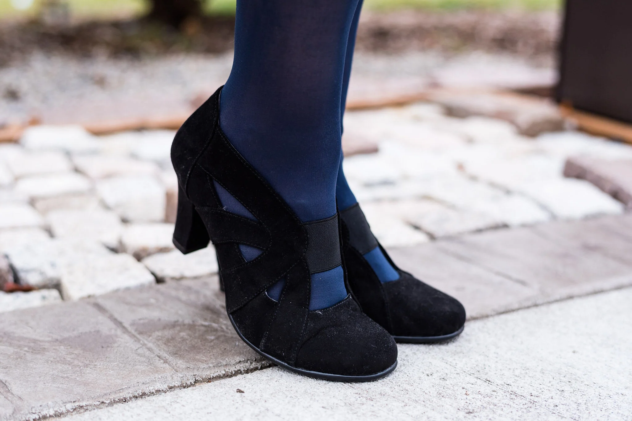
I chose my Aerosole black heels again. They are comfortable, but still look fairly nice, especially with an outfit like this. I thought blue hose, would be a different option to black and still cover up the legs.

Outfit Inspiration - Christmas with the Kranks -Holiday Vest

What do you think of this outfit? Have you seen Christmas with the Kranks? When I first watched this movie, I wasn’t sure whether I really liked it, but now I enjoy watching it and there are a few very funny scenes. Sometimes you have to watch something more than once to really appreciate it.

Outfit Inspiration - Christmas with the Kranks - Holiday vest
Outfit inspiration - Christmas with the Kranks - Holiday Vest

I am including a few shopping links. I wasn’t able to find very many Christmas themed vests, but there were plenty of sweaters, so I included a few of those. These are affiliate links. All opinions are my own.

Photo credit Rebecca Trumbull. Location Toledo Botanical Gardens.


A Dickens' Christmas - The Ghost of Christmas Past

Today’s outfit draws its inspiration from Charles Dickens’ ghostly apparition of Christmas Past. Before the visitation of the three ghostly characters, Scrooge is visited by the ghoulish presence of his former business partner in life, Jacob Marley. Jacob warns Scrooge that he will be visited by three spirits, for the hopeful purpose of his redemption. The first of these paranormal beings makes their appearance when the bell tolls one.

The idea of drawing fashion inspiration from a ghost, might seem a stretch of the imagination, but I do like a challenge. If you have watched a version of A Christmas Carol, you probably saw the Ghost of Christmas Past as a being dressed in white garments, sometimes shining and sometimes in an unearthly, ethereal manner as if floating and flowing in some unseen breeze. Two of my favorite movie versions of A Christmas Carol are the 1984 drama with George C. Scott, and the 1992 musical, The Muppet Christmas Carol. Surprisingly, the Muppet version stays fairly true to the original tale by Charles Dickens. Both versions are filled with amazing scenery, typical old time London and excellent veteran actors, (the Muppet version stars Michael Caine as Scrooge).

A Dickens' Christmas - The Ghost of Christmas Past

We often shy away from white in the colder weather. It has long been a color we wear in spring and summer. Obviously, things have changed immensely over the last decade, especially as more and more women have access to fashion blogs and more reasonably priced clothing. White is now a year round color choice. It stands true to reason, that if we live in colder areas in the winter, our white pieces will have to be compatible for those frigid temps. This is where layering, fabric choices and textures all come into play.

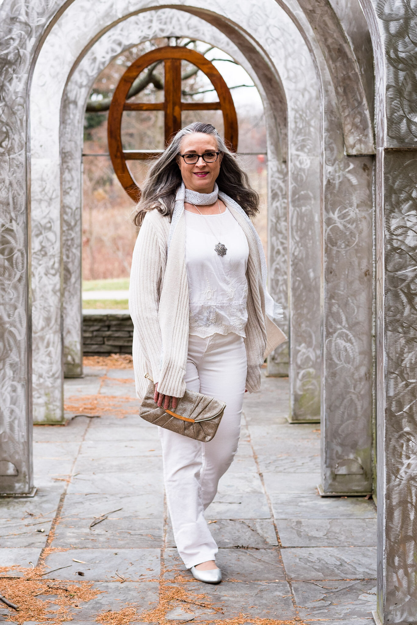
My daughter and I didn’t have a lot of time for pictures, so we went, once again, to the Toledo Botanical Gardens. They have so many interesting sculptures, garden areas and small buildings used for various events. These metal arches provided the perfect backdrop for an other worldly vibe.

A Dickens' Christmas - The Ghost of Christmas Past

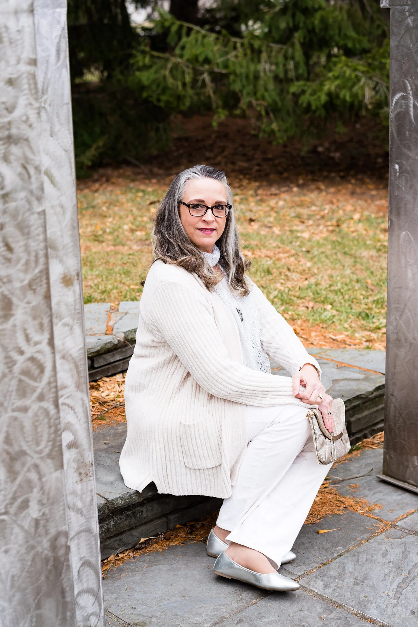
When I started thinking about an all white outfit, I knew that most of my pieces were not a true white. Not everyone can wear a crisp white near their face, but most people can pull off an ivory or a cream. All of these pieces, except the scarf, have more of a cream, or ivory tint to them.

A Dickens' Christmas - The Ghost of Christmas Past

My long, Apt. 9, chenille sweater was a piece my daughter was getting rid of. It wasn’t really her style, so when I saw it, I took it home, figuring I could always just wear it around the house as a cozy topper for casual days. As I thought about how to make this outfit look flowing, but also updated and fashionable, I knew this sweater would be perfect.

A Dickens' Christmas - The Ghost of Christmas past

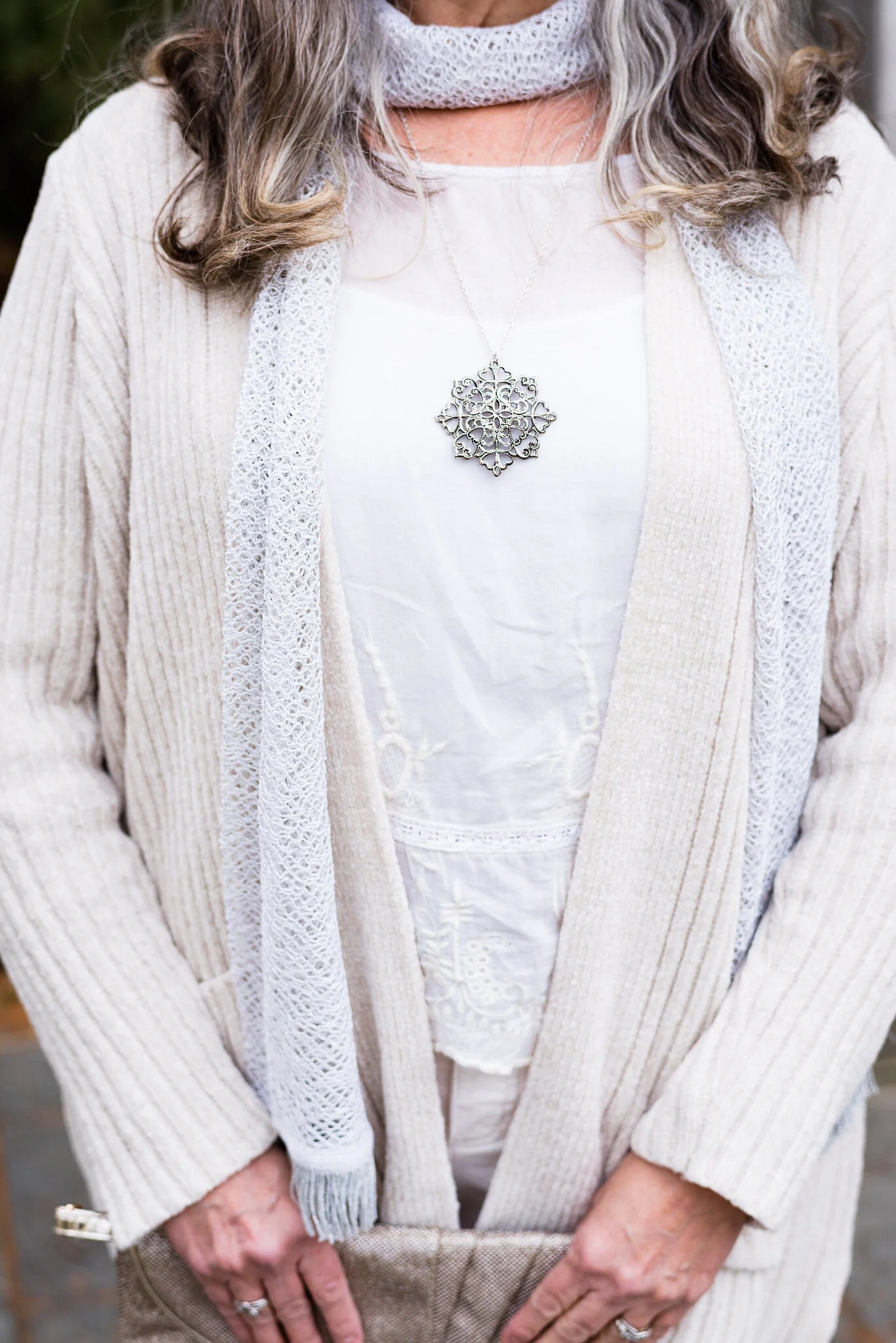
The blouse I have on under the sweater is a recent thrift store find and will be more useful in the warmer weather, but the color went well with everything else. The brand is called Mango, and when I saw the embroidery on it, I knew it was calling my name.

I also added this white scarf from The Jacket Society, that I bought a few years ago. You can’t see it in this photo, but the scarf has tiny silver threads through out, so I thought it added an extra element of texture and shine.

The silver snowflake pendant just seemed appropriate for a ghostly, Christmas outfit.

A Dickens' Christmas - The Ghost of Christmas Past

I chose silver for my accessories, to represent the shimmering appearance that many of the Ghosts of Christmas past seemed to have. Perhaps the shimmering details represented good memories from Christmases long ago; or maybe the light represents the idea that we can learn from our past, thus becoming better people. Whatever your interpretation of the details, I think silver looks very pretty with white.

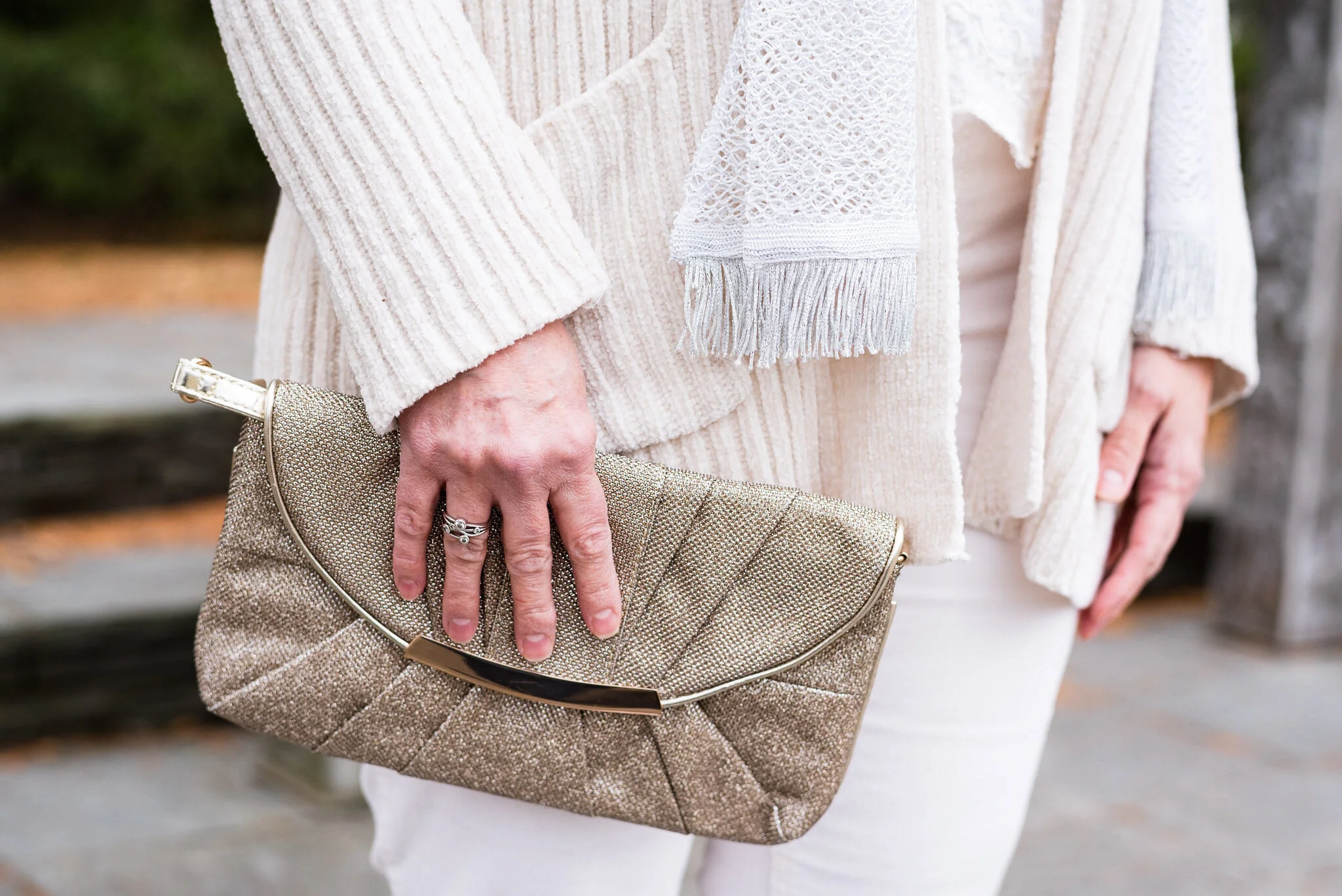
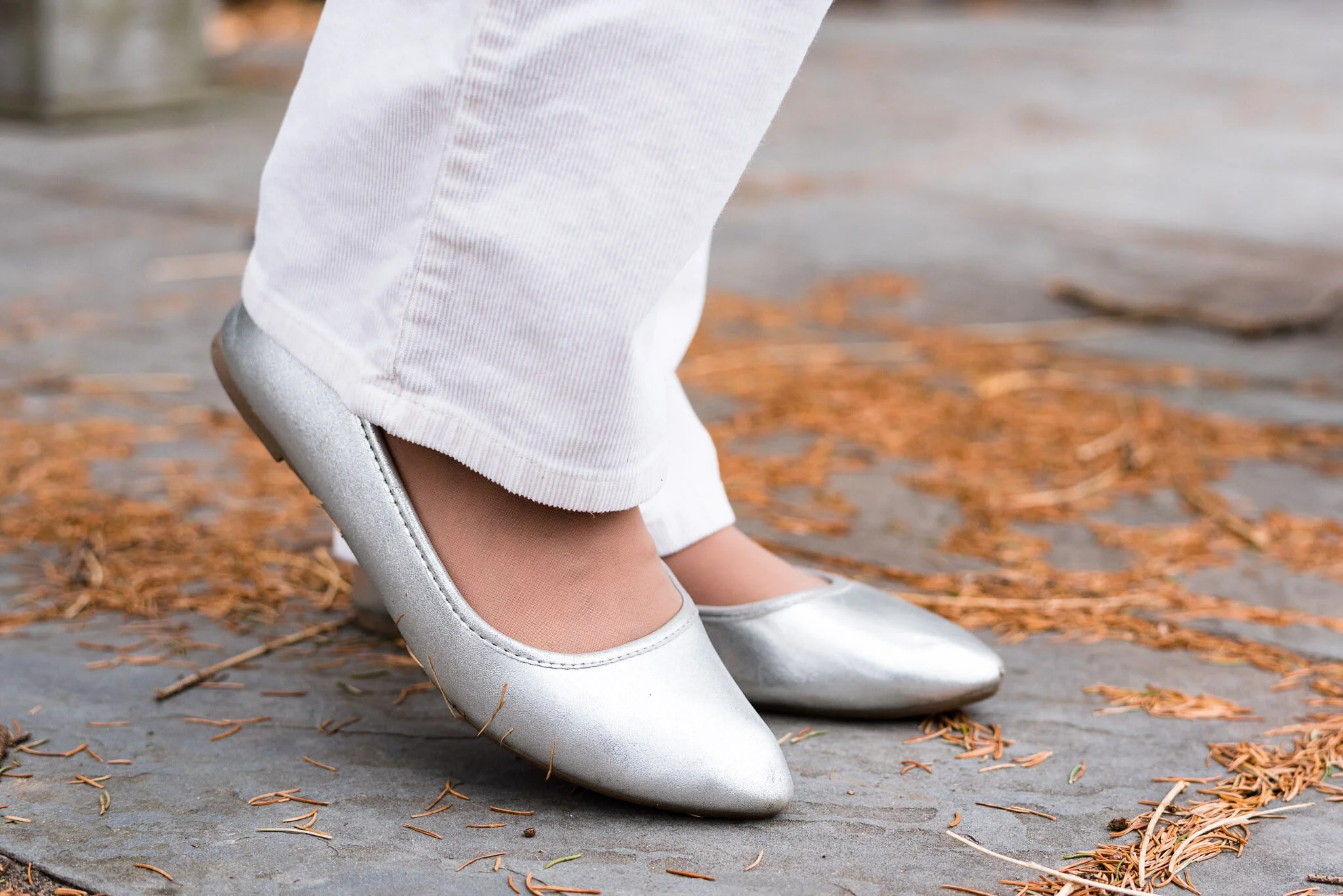
My silver, sparkly clutch has been a regular on the blog. My SO ballerina flats are from Kohl’s.

A Dickens' Christmas - The Ghost of Christmas Past

My cream colored St. John’s Bay corduroys have been around for a few years and were an original purchase at JC Penney.

A Dickens' Christmas - The Ghost of Christmas Past

I really like this outfit. It is something I would feel completely comfortable and warm in and could be worn to a special Christmas outing or just a family dinner, where I don’t have to do the cooking. If I cooked in this it wouldn’t be white anymore. Ha, ha. Here are a few other fun pictures from our shoot.

A Dickens' Christmas - The Ghost of Christmas Past

The wind was helping me look a little more ghostly. Too bad we didn’t have fog. Ha, ha.

What did you think of this outfit? Do you think I pulled off showing how taking inspiration from the Ghost of Christmas Past translated into a chic, modern look that could be worn to work, out on a date or to a Christmas concert?

I’m including a few shopping links for you to look over. These are affiliate links. All opinions are my own.

Be sure to stop back on Thursday for another Christmas movie inspired outfit.

Photo credit Rebecca Trumbull.


Fall/Thanksgiving Outfits - Maxi Skirt and Pullover Sweater - Casual

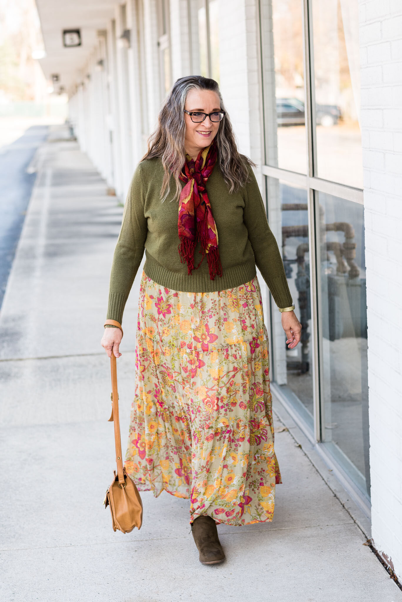
To mix it up a little bit, I decided this week I would show you two outfits using a floral maxi skirt and a pullover sweater. I love maxi skirts, and I have a number in my closet, as you probably realize by now, because I am always styling them on the blog. When I was working, I would wear them every so often, but with being home, I don’t usually reach for a skirt. It is hard to clean and go up and down the stairs to do laundry if you are wearing a long skirt. However, I still like to show you options for styling a skirt, long or short. Today’s look revolves around two thrifted pieces.

Fall/Thanksgiving - Maxi Skirt and pullover sweater

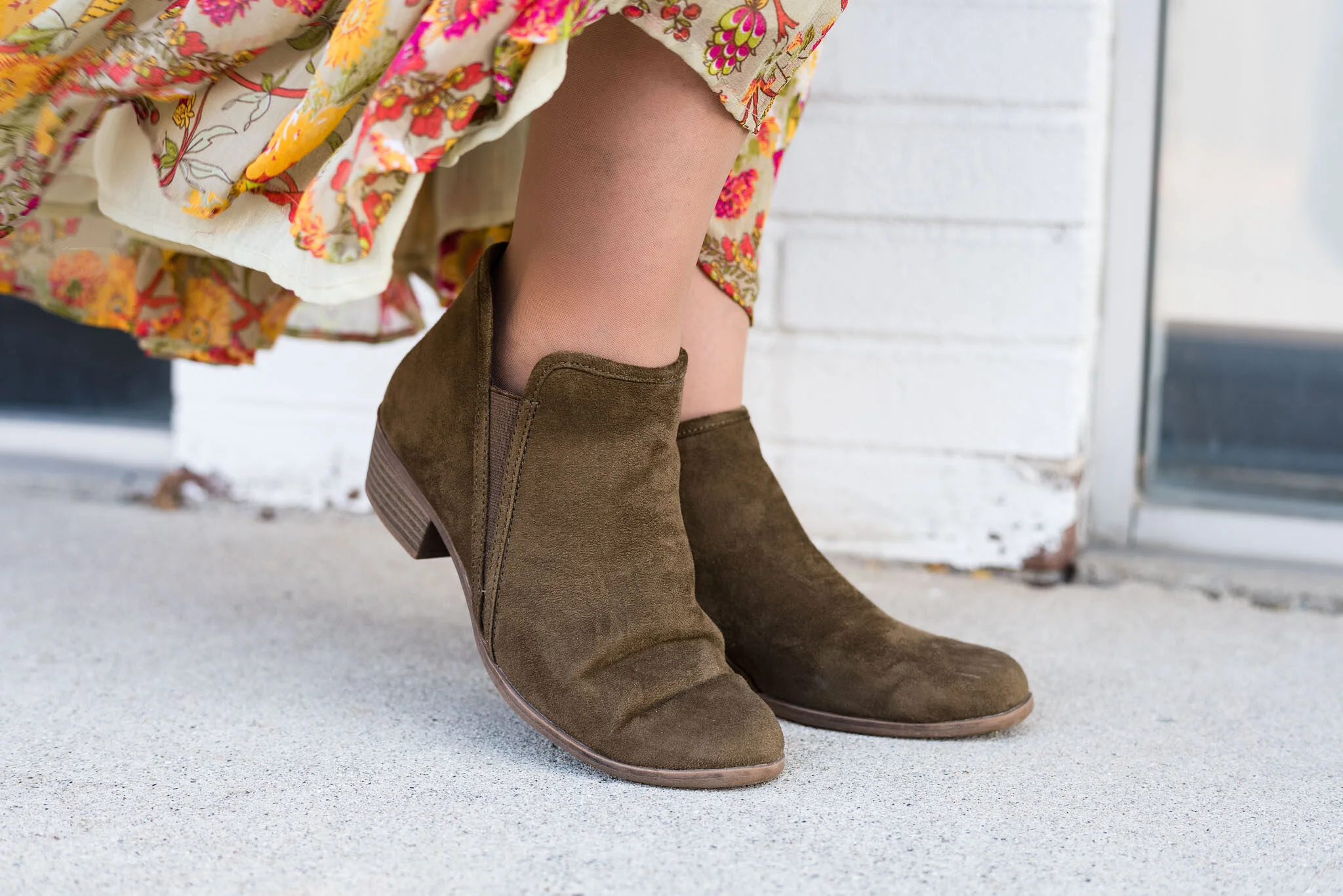
For some reason I fell in love with this thrifted tiered maxi skirt the moment I saw it. Not only could I see the possibilities for spring and summer, but I thought it would be a wonderful piece for fall and winter. It is extremely sheer, and even though it has a lining, the lining is also sheer, so I do have to wear a slip under it. I imagined it with a dark sweater and ankle boots, so that is exactly what I did for this outfit. The floral pattern makes be think of greenery and berries for Christmas, but the gold speaks to the colors of fall, so why not wear it for Thanksgiving Day?

Fall/Thanksgiving - Maxi Skirt and Pullover Sweater - casual

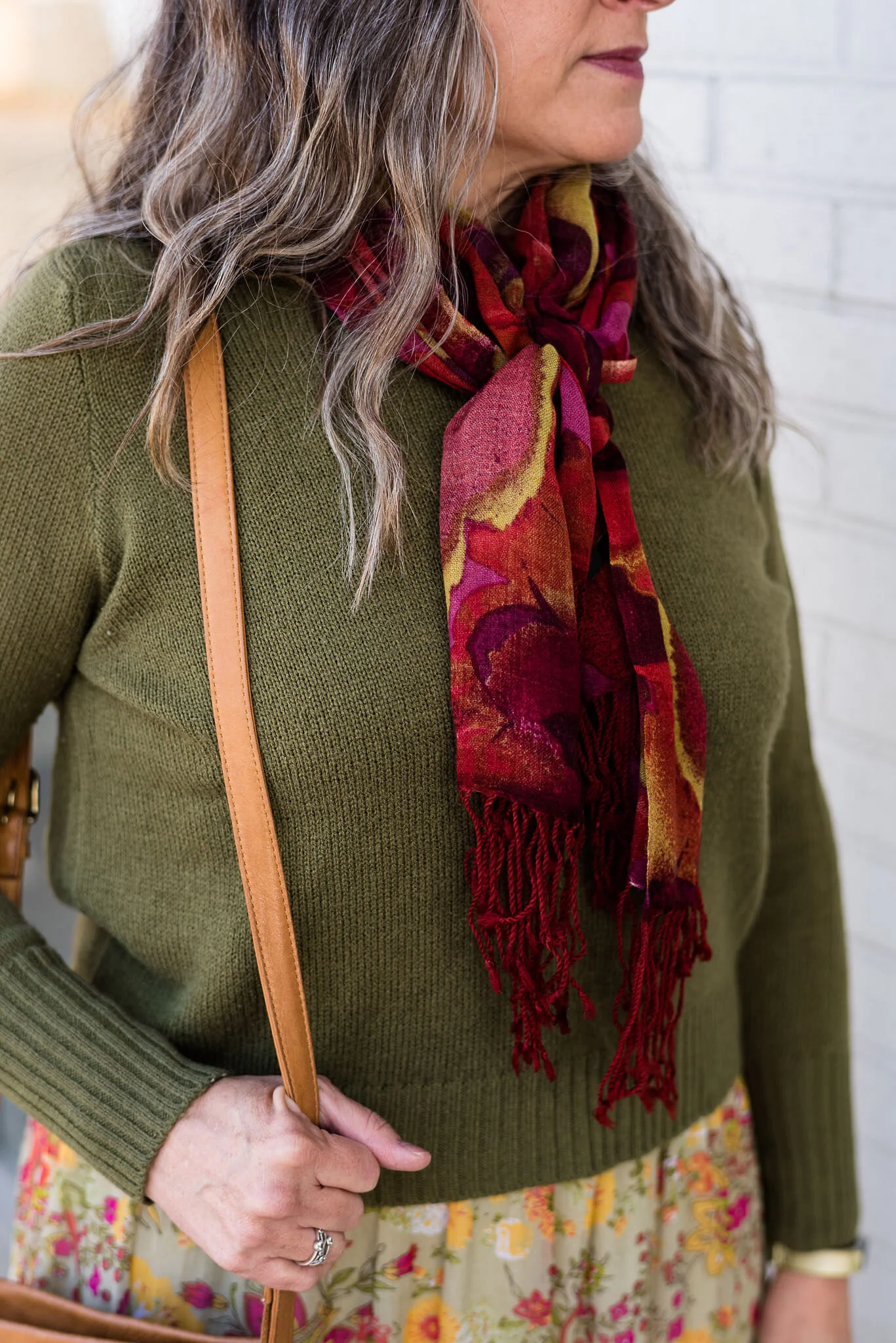
This thrifted olive sweater is the brand DIVIDED from H & M. It is simple, but soft and warm and I like that it is a little shorter than most of my other sweaters. Once in a while, you just need a different silhouette.

I also added this beautiful scarf with a watercolor type print. I used this scarf for my Color Play post on Seeing Red, last spring. You can see that post here. I thought the scarf went quite well with the floral pattern in the skirt as both of them have a similar color scheme. This is one way to print mix without getting too worried about whether the prints will clash. The prints are far enough from each other, but compliment each other with their similar hues.

Fall/Thanksgiving - maxi skirt and pullover sweater

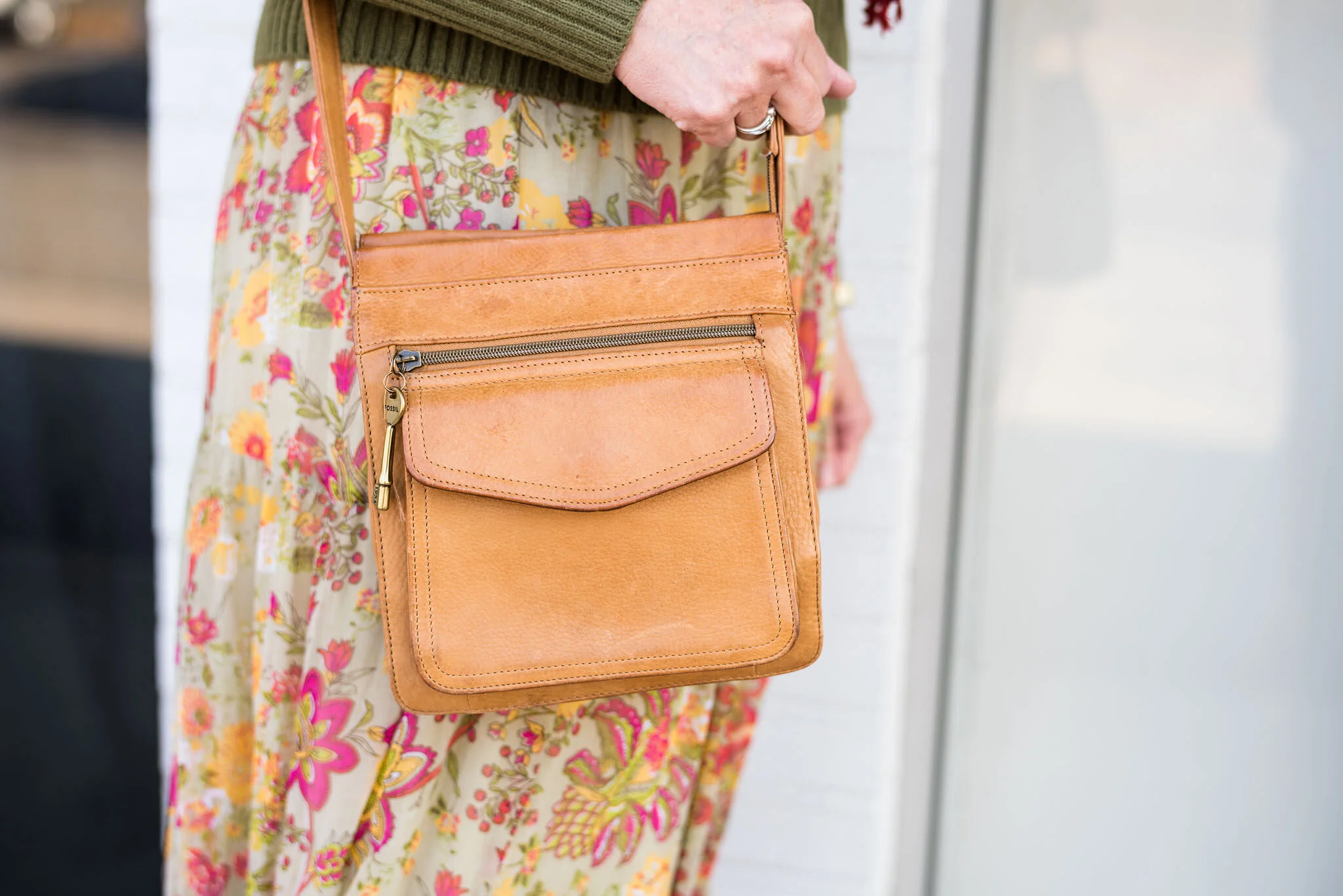
Once again, I reached for my thrifted, leather, Fossil crossbody bag. It just goes with so many things and has held up so well. I just need to find a smaller wallet to use in it. Maybe I should add that to my Christmas list. Ha, ha.

Fall/Thanksgiving - Maxi skirt and pullover sweater - casual

My faithful, olive, SO ankle boots are making another appearance. I have no regrets for purchasing several pairs of these in various colors. They are on repeat in my wardrobe all fall and winter long.

The beauty of this outfit is in its simplicity and comfort. There are no zippers or buttons. The elastic waist on the skirt allows for plenty of Thanksgiving feasting comfort. The length of the skirt means you can go without hose or tights, but if you want an extra layer of warm you can add leggings or sweater tights to raise the cozy factor.

Fall/Thanksgiving - Maxi skirt and pulloever sweater

Is this an outfit you would wear on Thanksgiving Day? Have you ever created an outfit using the colors in a skirt? I’d love to hear your thoughts, so leave a comment or two.

I am including a few shopping links for you to look over. I know this week is one of the biggest shopping weeks of the year and with the pandemic situation many of us will be doing most of our shopping on line, so make sure you shop early to ensure your gifts get where they need to go on time.

Have a great week everyone!

Photo credit Rebecca Trumbull.


Fall/Thanksgiving Outfits - Harvest Tee and Distressed Jeans - Dressy

Yesterday was my eldest’s birthday. She ordered us lunch, which I picked up and took to her house, then after we ate, we went shopping. I have to say, I felt almost like life was normal for a few hours. We had fun and I enjoyed my time with her. I have always tried to take my girls shopping on their birthdays since they were fairly young. I used to take both girls and we would get lunch together, but then the gift buying would be for the birthday girl, although I would usually end up buying the other girl a little something too. Life is so busy and with the Covid complications it is hard to find time for those moments.

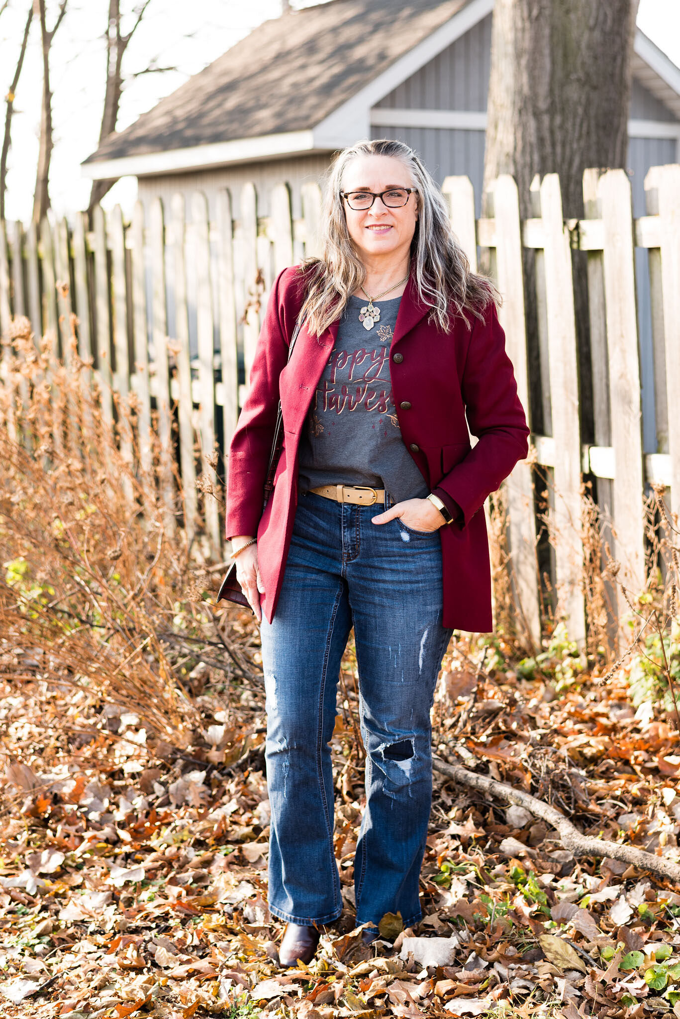
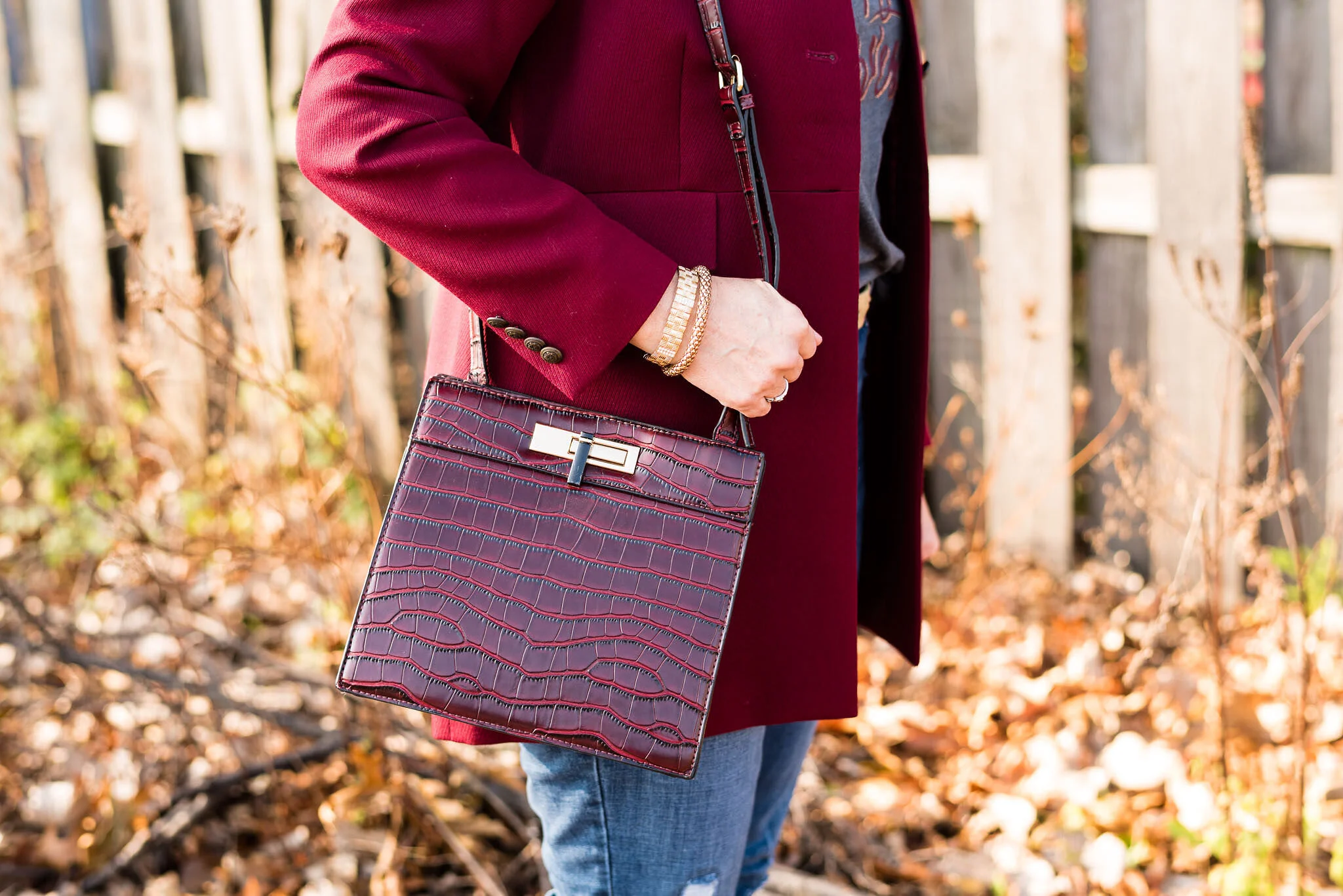
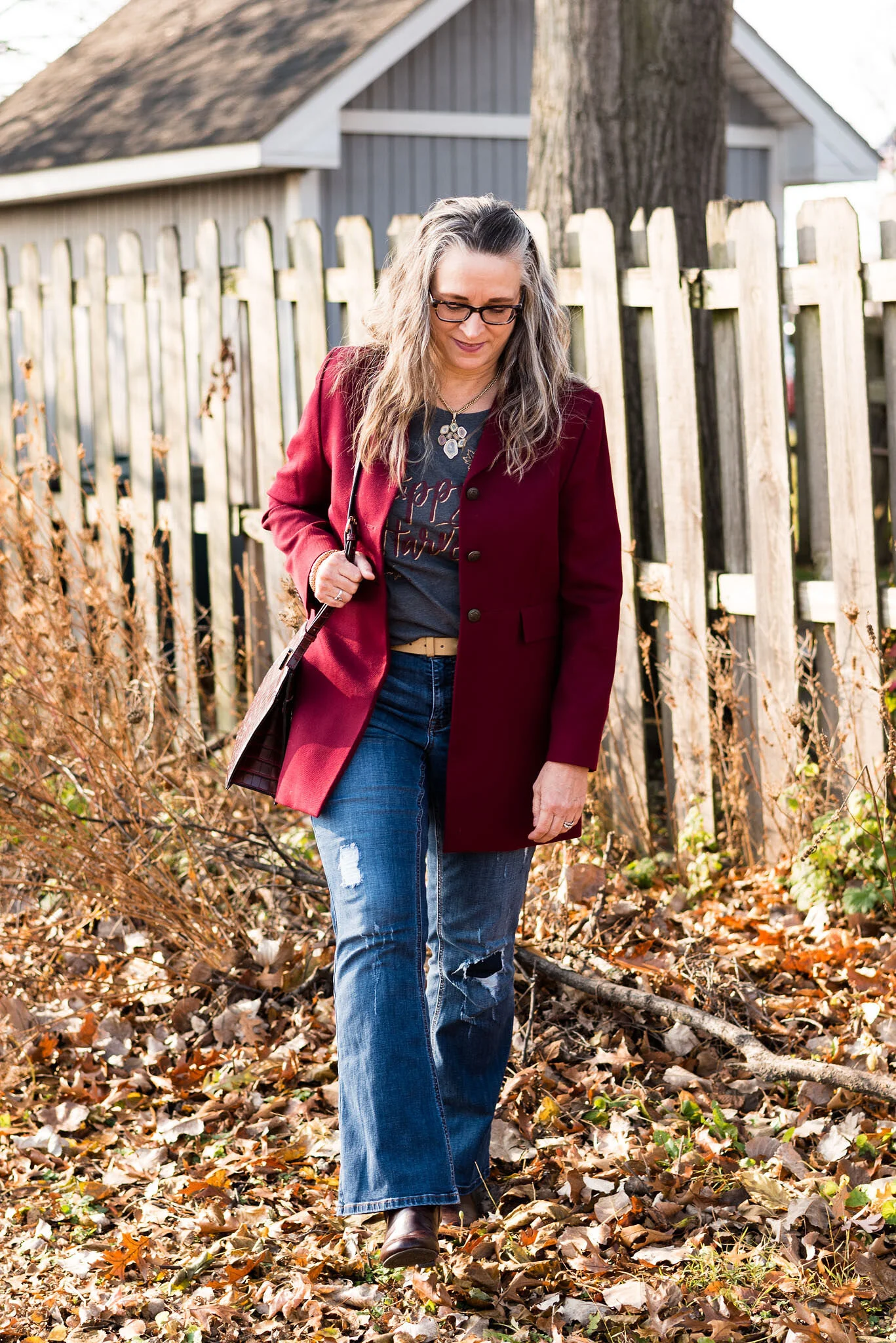
Today’s look is the dressed up version of my distressed jeans and harvest tee. I only made a few changes to elevate the look. I switched out my cozy sweater for a long burgundy blazer. I also donned a pair of heeled boots and grabbed a snazzier bag.

Fall/Thanksgiving - Harvest Tee and Distressed Jeans

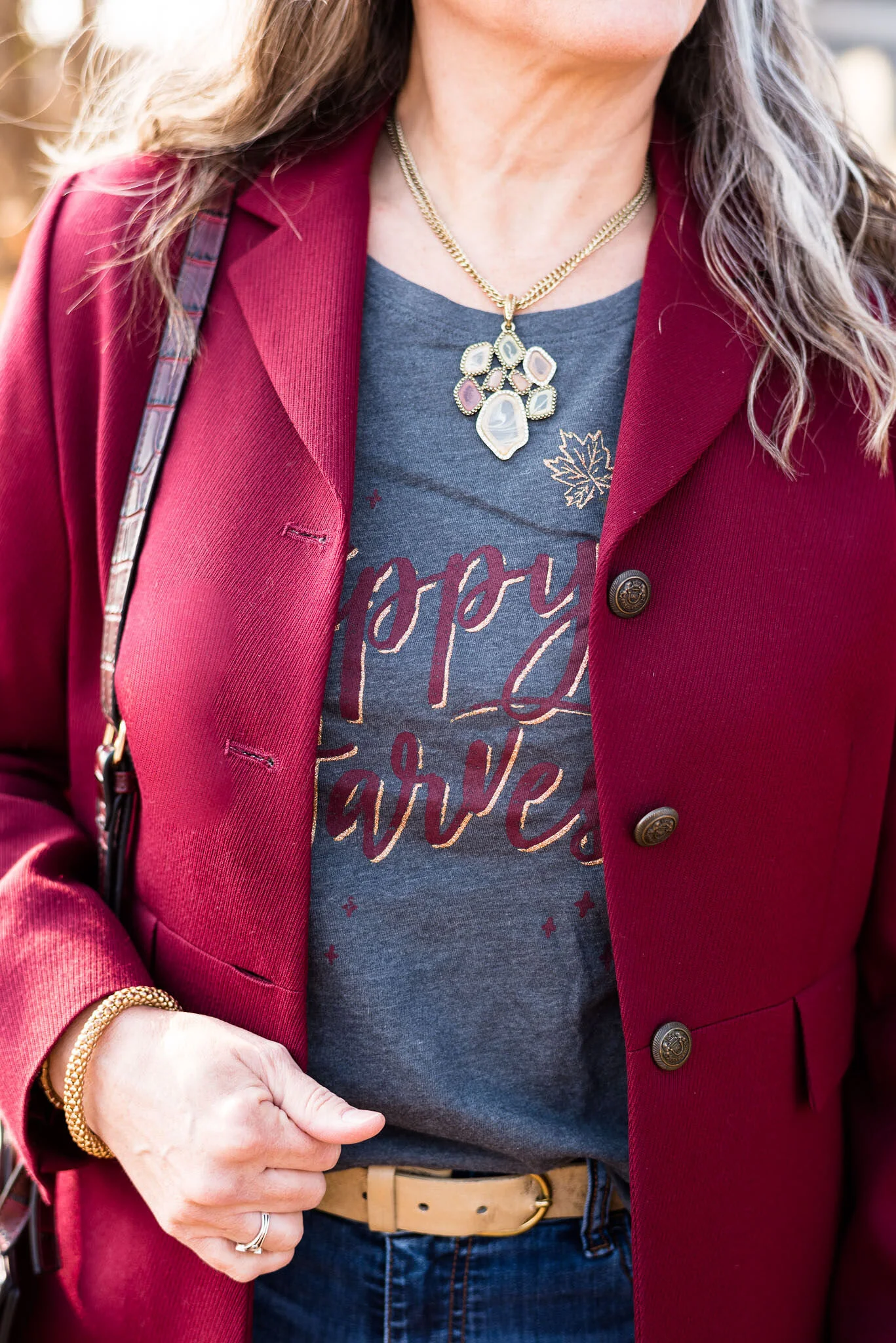
This burgundy blazer is a thrifted Pendleton piece. I have, on several occasions thought to get rid of it, but it is such a classic, tailored piece that I keep hanging on to it, and this is precisely why. I love the way it looks with jeans. Obviously, it would also look good with a pencil skirt or more dressy trousers. The structured collar, more fitted waist, pocket flaps and detailed buttons really make this a class act.

Fall/Thanksgiving - Harvest tee and distressed jeans
Fall/Thanksgiving - harvest tee and distressed jeans

I kept the same necklace, but added a couple gold bangle bracelets and a gold belt to go with the gold on the tee.

Fall/Thanksgiving - harvest tee and distressed jeans

This thrifted, no name bag has such cute details. From the faux alligator print to the fun clasp and more structured shape, I knew I had to snatch it up. Just don’t tell my hubby! Ha, ha. He thinks I have too many sweaters, bags and shoes. Ha, ha. Why would he possibly think that?

Fall/Thanksgiving - Harvest tee and distressed jeans

These boots were also a thrift store find. They are Life Stride brand and I really like the brownish, burgundy color. It makes them unique from the typical black, brown or gray colors of many of my boots.

Fall/Thanksgiving - harvest tee and distressed jeans - dressy

What do you think of this outfit? Do you think the changes I made elevates the look or do you think because of the distressed jeans, it still looks ultra casual? I would love to hear your thoughts, so leave a comment or two.

Fall/Thanksgiving - harvest tee and distressed jeans

Here are the two outfits side by side. Which one do you like better?

Can you believe a week from today is Thanksgiving? I will confess, I have started listening to Christmas music. I just need that little bit of happy in my day to day life right now. I haven’t started decorating, but I hope to get to that soon.

I am leaving a few shopping links. Be sure to check those out. These are affiliate links. All opinions are my own.

Have a good evening everyone.

Photo credit Rebecca Trumbull.


Fall/Thanksgiving Outfits - Harvest Tee and Distressed Jeans - Casual

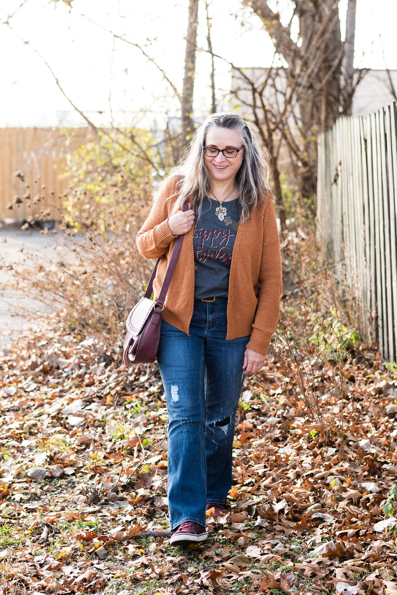
This week I am taking two more very casual pieces and showing two different ways to wear them, either for a fall shopping trip with friends or for turkey day. I chose a thrifted pair of distressed boot cut jeans and a harvest tee that I recently purchased from Kohl’s online.

I had posted an outfit on my Instagram account that featured a pair of distressed skinny jeans I recently acquire from maurice’s. When distressed jeans really started making a comeback, I was resistant to go all in and get things that were really torn up. I felt that it looked to grungy, but now, several years later, I am much more accepting of these types of pieces as I feel they add an element of texture and uniqueness to an otherwise simple outfit. I still prefer the holes to be lined or at least somewhat opaque as far as skin is concerned, although I do think it looks cute when a person wears fun colored tights under their distressed jeans, so the tights show through.

Fall/Thanksgiving outfit - distressed jeans and harvest tee - casual

These jeans are Lane Bryant brand. I have never bought anything from Lane Bryant before, thinking, they were just an underwear company for plus size women. However, what I have discovered after looking over their website, is that they sell all sorts of clothing and accessories from size 12 to 28. I love these jeans and they have easily fallen into one of my favorite jeans, spots. They have a bit of stretch, but always look good when I put them on. They also fit nicely around the waist, with no gaping. Once again, I have found a new brand, that I might consider buying, because I got to try them thrifting.

Fall/Thanksgiving - Distressed Jeans and Holiday Tee - Casual

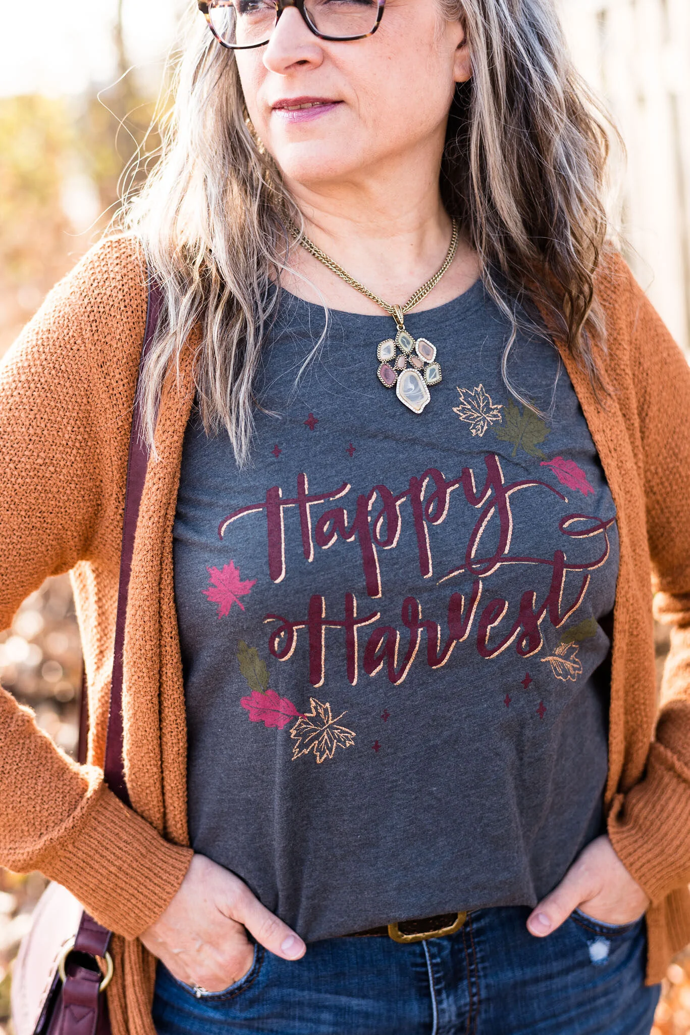
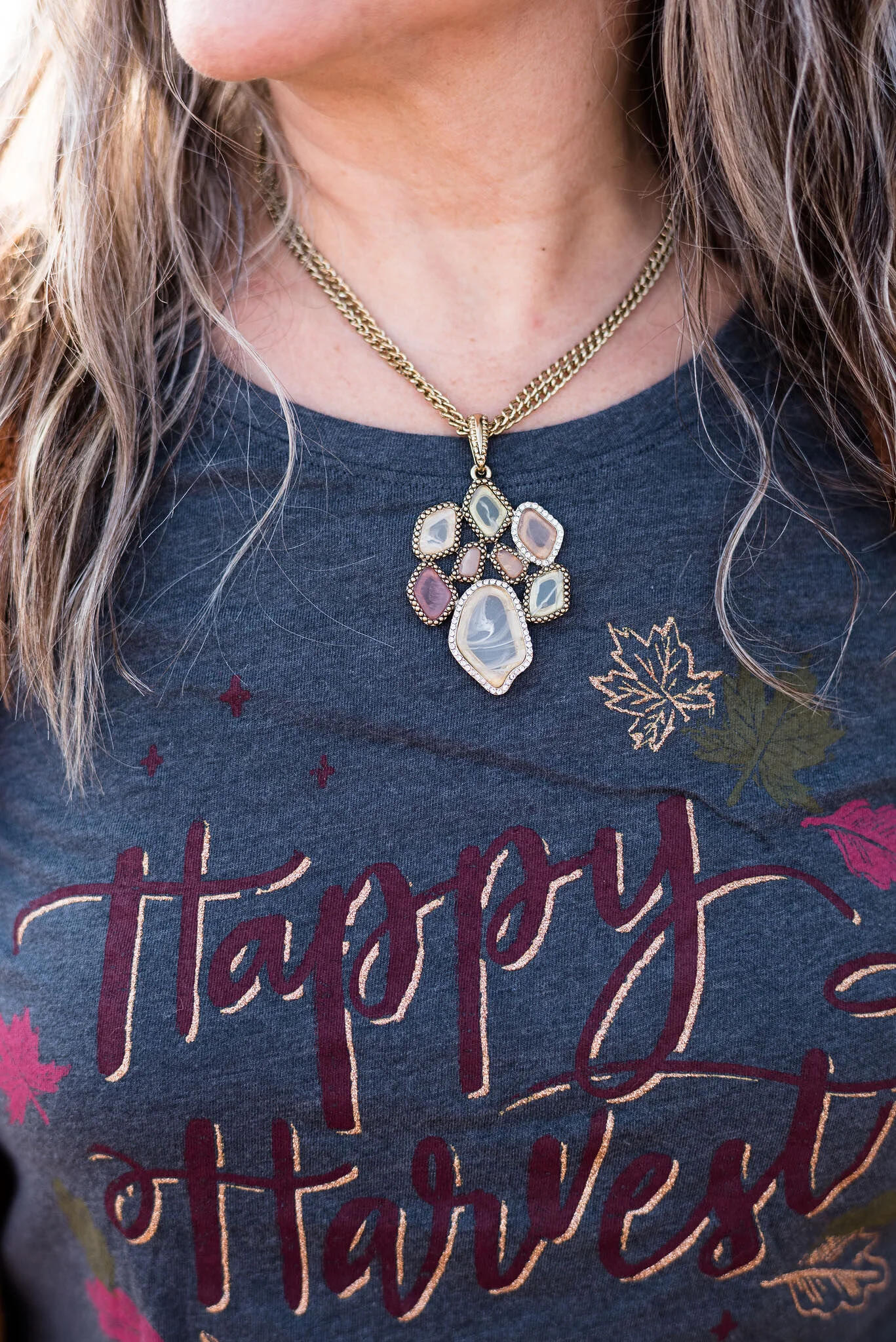
This Sonoma tee is the perfect balance between casual and dressy with its cursive print and gold leaves and edging on the letters. I don’t have a lot of fall graphic pieces, so when I saw this, I knew I wanted to add it to my collection.

Fall/Thanksgiving - Distressed jeans and holiday graphic tee - Casual

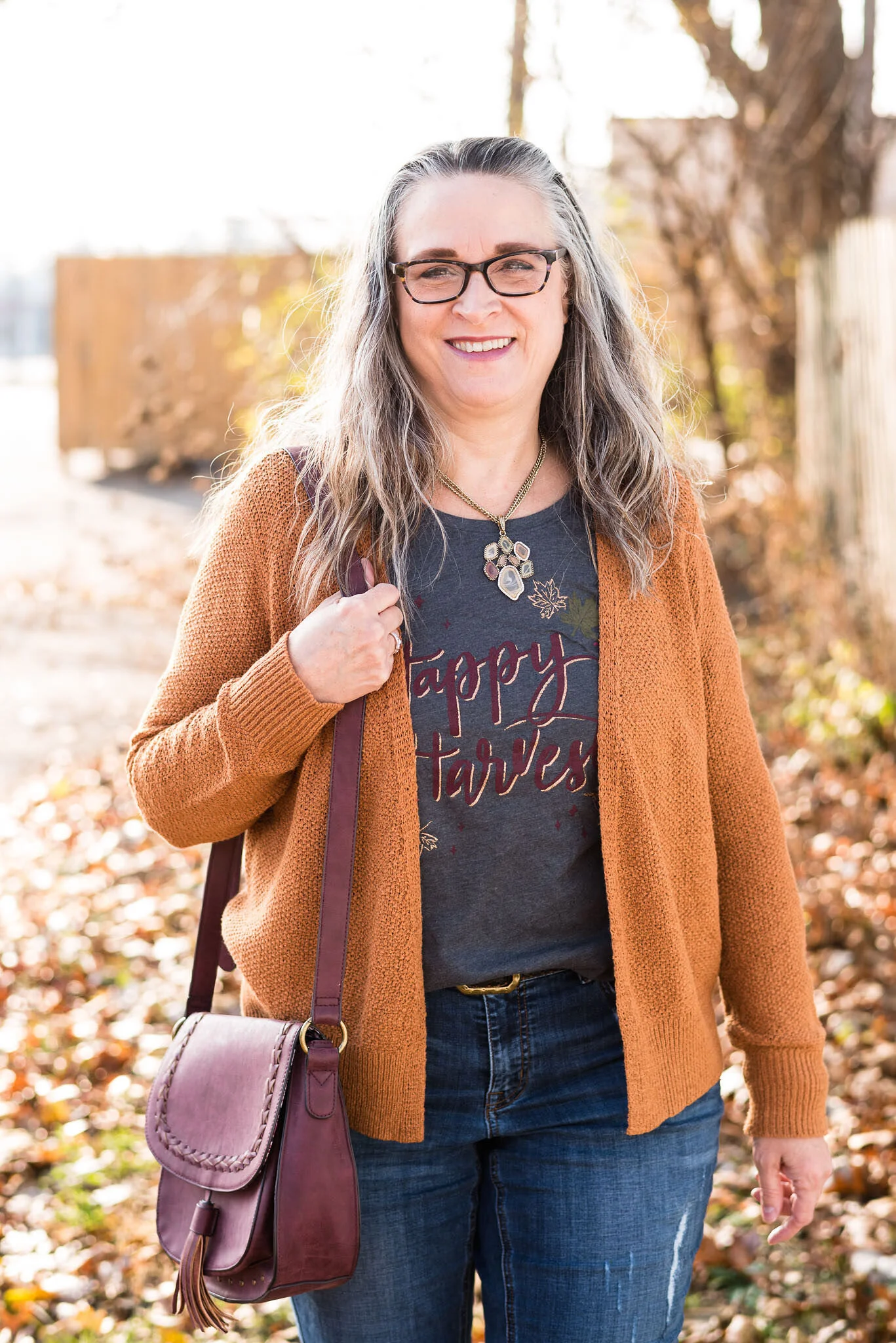
My Tahari sweater was a clearance piece last year from TJ Maxx. You can see how I styled it for a series on wearing white as a transitional piece, here.

This thrifted stained glass necklace, just seemed to go well with the outfit. I love that it almost has a leaf shape to it, which gives the outfit that extra fall feel.

Fall/Thanksgiving - Distressed jeans and holiday tee

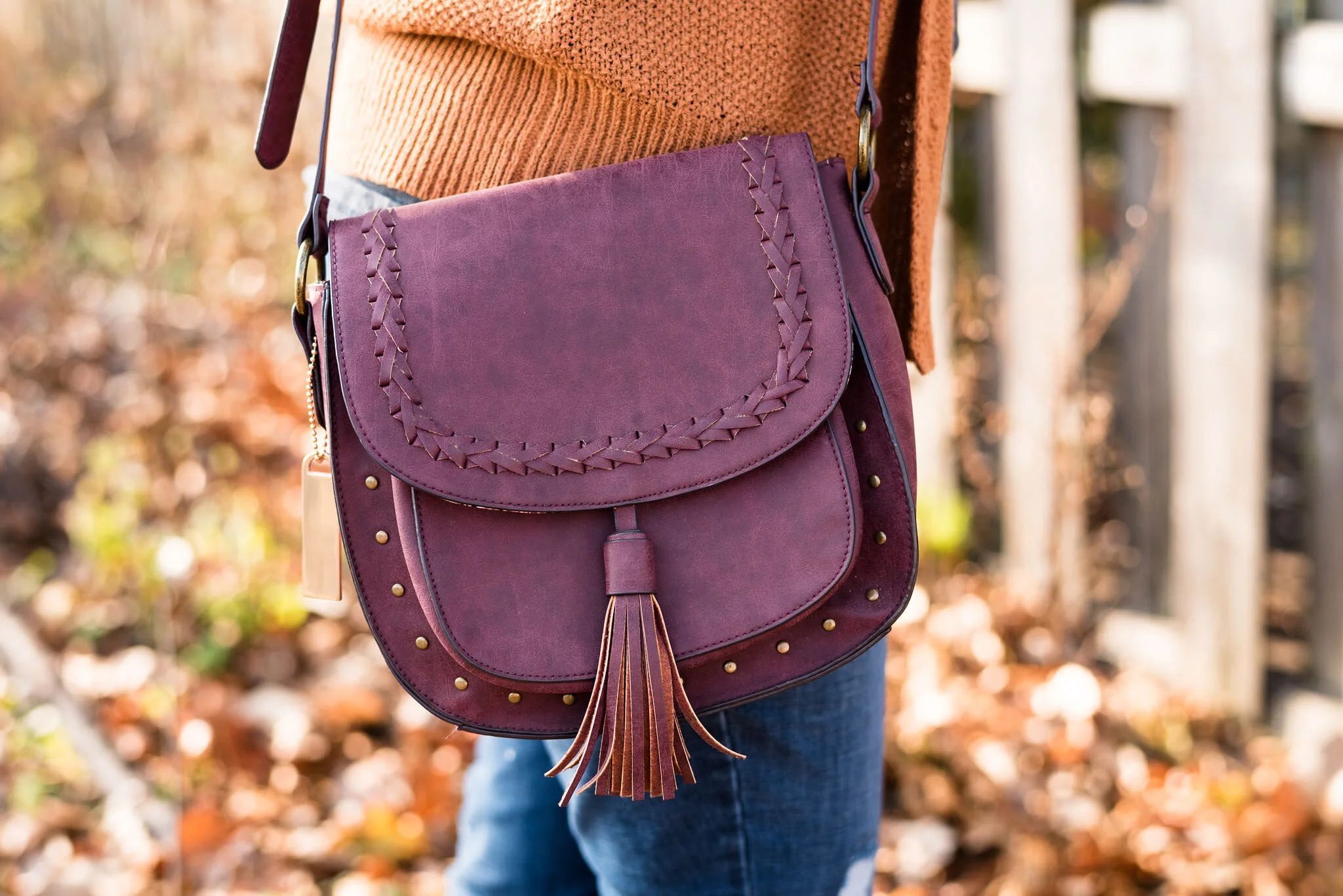
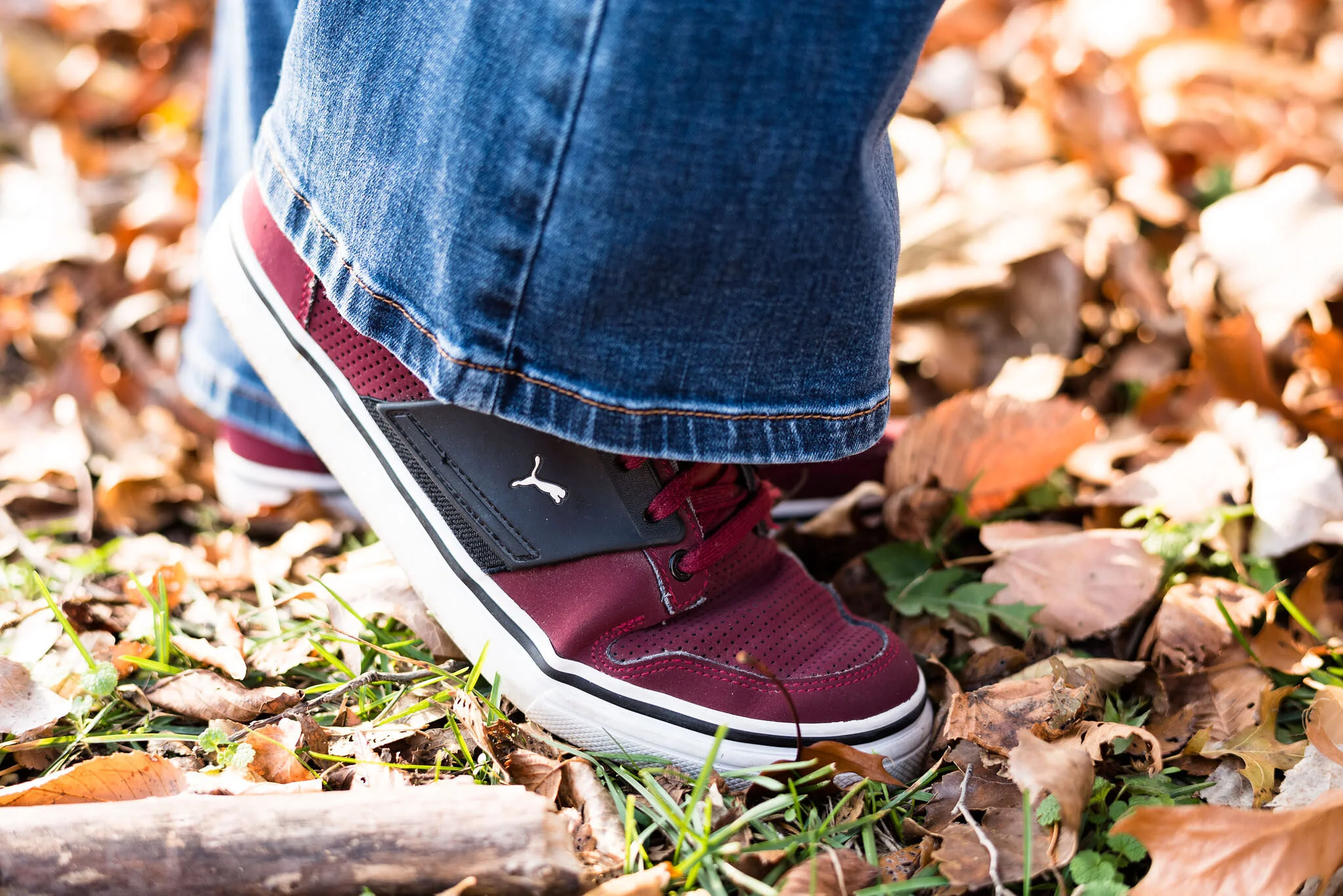
I wanted to stick with the burgundy colors in the letters as the inspiration for the rest of my accessories, so I grabbed my Massini saddle bag purse and my thrifted Puma sneakers to complete the look.

Fall/Thanksgiving - Distressed jeans and harvest tee
Fall/Thanksgiving - distressed jeans and harvest tee

What do you think of this outfit? Is this something you would wear to your Thanksgiving day celebration?

Fall/Thanksgiving - distressed jeans and harvest tee

I’ve included a few shopping links, so be sure to check those out. I try to offer pieces that are similar to the ones I show in my posts. These are affiliate links and are brought to you at no cost. If you click on a link, I get a few pennies. All opinions are my own.

Photo credit Rebecca Trumbull.

Fall/Thanksgiving Outfits - Sweatshirt and Skinny Jeans - Casual

For the next few weeks I thought I would focus on outfits that could be worn for the Thanksgiving Holiday, or just as another fall outfit. Each week I will take one or two main pieces and show how to style them two different ways. This week my pieces are a pair of embellished skinny jeans, and a deep yellow sweatshirt that I grabbed from my daughter’s "to get rid of” pile.

For today’s look I wanted to go with a more casual vibe. The two pieces could be worn by themselves and be perfectly acceptable for a casual, low key Thanksgiving; just add a scarf or necklace and some sneakers or knee high boots and you are all set. I wanted to do something with a little more texture and print, so I decided to top the whole outfit with my plaid ruana that I got last year at Bass Pro Shop. It may sound a little funny, but I love their clothes. They have a little higher price point than I usually pay, but you can read the story of how my hubby surprised me with a mini shopping spree here.

Deep yellow sweatshirt, skinny jeans and plaid ruana

It is always a journey taking my own pictures. Ha, ha. Here is the ruana from more of a back and side view.

Dark Yellow sweatshirt, skinny jeans and plaid ruana

This rich yellow sweatshirt is from a local boutique Eden Fashion Boutique. I did a blog post on their Sylvania location which you can see here. Unfortunately that shop closed up during the pandemic. The original shop is still in business in Bowling Green, OH which is about a 25 minute drive. My daughter decided she didn’t wear it enough for it to warrant taking up space in her closet. I absolutely love color. It also has snaps from about the elbow up on both sleeves, which gives it a fun look. I should have taken a picture of it without the ruana. Oh well! I’ll save that for another time.

Yellow sweatshirt, skinny jeans and plaid ruana

You can see the blingy embellishment on my jeans. There are sparkles on both legs, the right is closer to the hip. These are Juicy Couture brand and I got them a year or so ago at Kohl’s on the clearance rack.

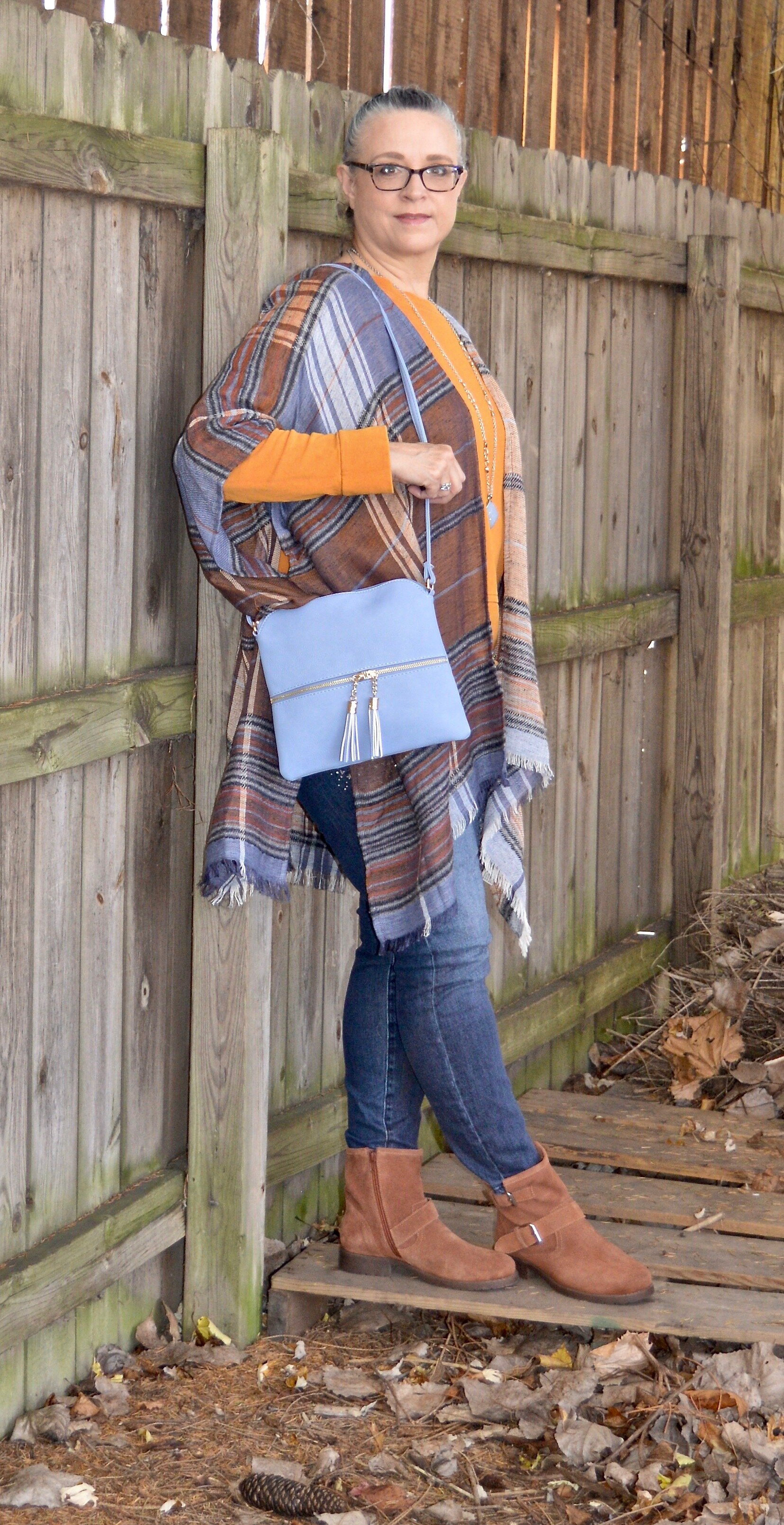
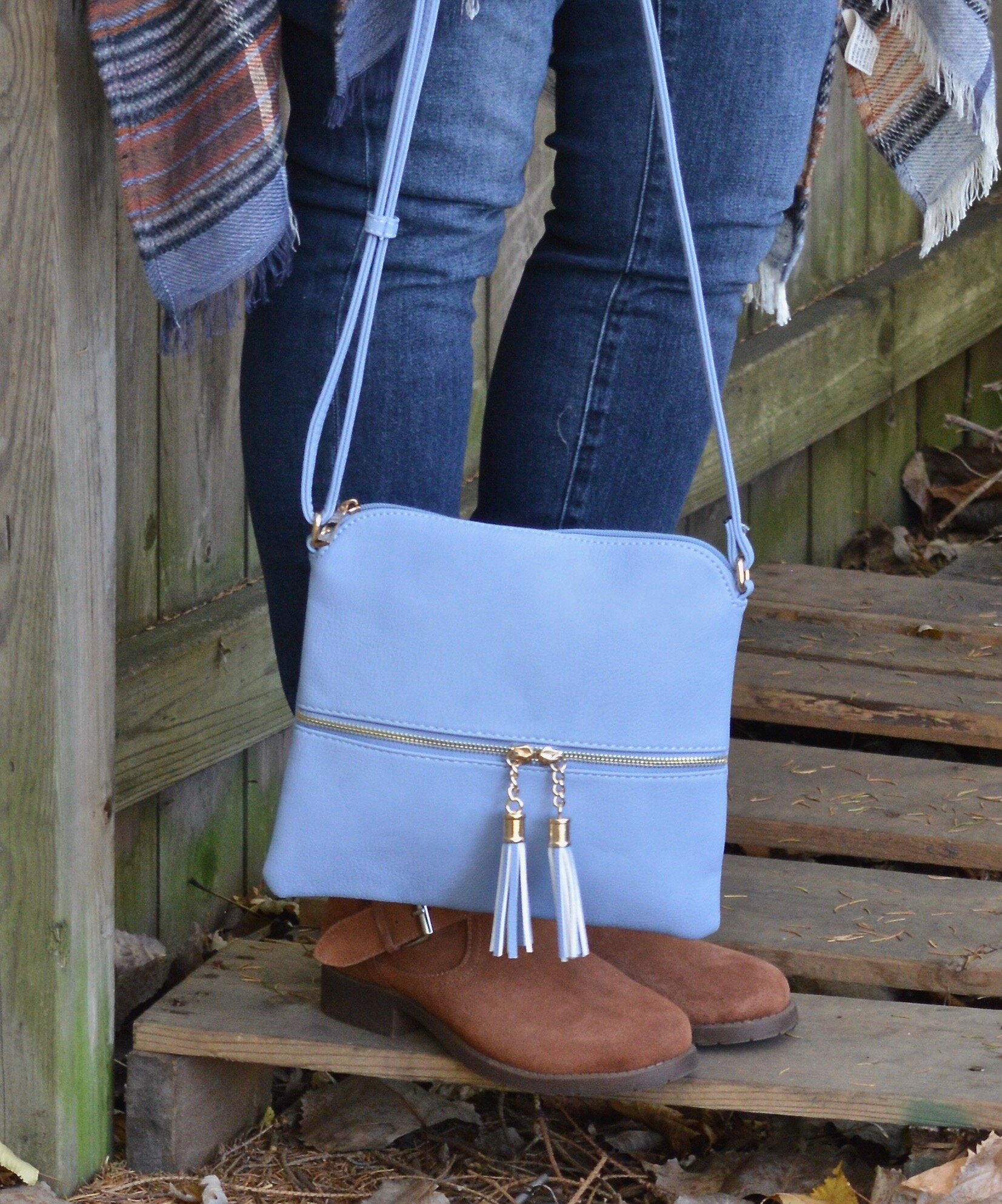
Since I wanted this to be casual, but it is also meant to be for an occasion like a Thanksgiving dinner, I added a little bit of jewelry and a bag to bring out the blue in the ruana. My long pendant necklace I use regularly. The beaded bracelet has a cute owl charm on it and the blue cross body bag was a gift a few Christmases ago from my younger daughter.

Fall outfit - blue pendant
Fall outfit - Beaded bracelet with owl
Fall outfit - blue bag

These rusty colored moto boots are a soft faux suede and have zippers on the inside of the leg. They are Steve Madden brand and I ordered them from DSW last year on clearance.

Fall outfit - rust moto boots

What do you think of this outfit? Would you wear this for a casual Thanksgiving day gathering? What might you have done differently? Leave me your thoughts in the comments. I always love to hear what you are thinking and how the blog is helping or hindering your fashion journey.

Dark yellow sweatshirt, skinny jeans and plaid ruana

This last photo is very fuzzy, but I liked the way it turned out anyway. Ha, ha. I really need to play with my camera more, so I can take better pictures. I am also a perfectionist, as if you hadn’t noticed. Ha, ha.

I’m including a few shopping links. Remember, Christmas is coming, so you might like to look over these links as possible gift ideas for you or yourself. These are affiliate links. All opinions are my own.


Pantone - Autumn/Winter - 2020 - All the Outfits

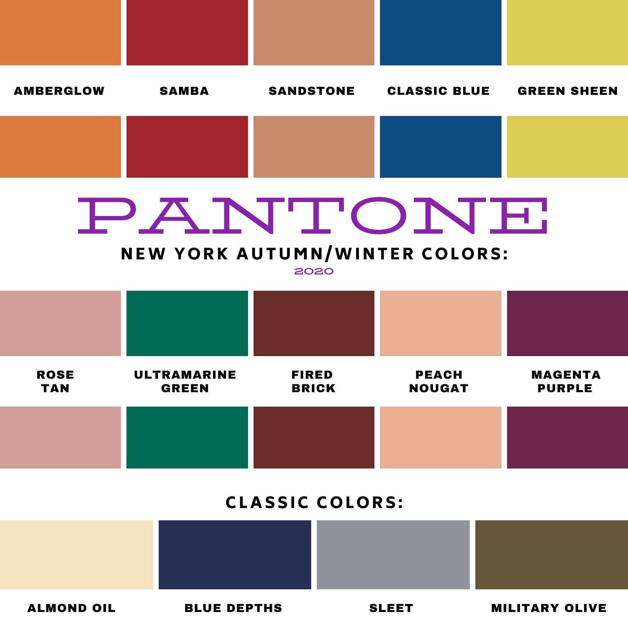
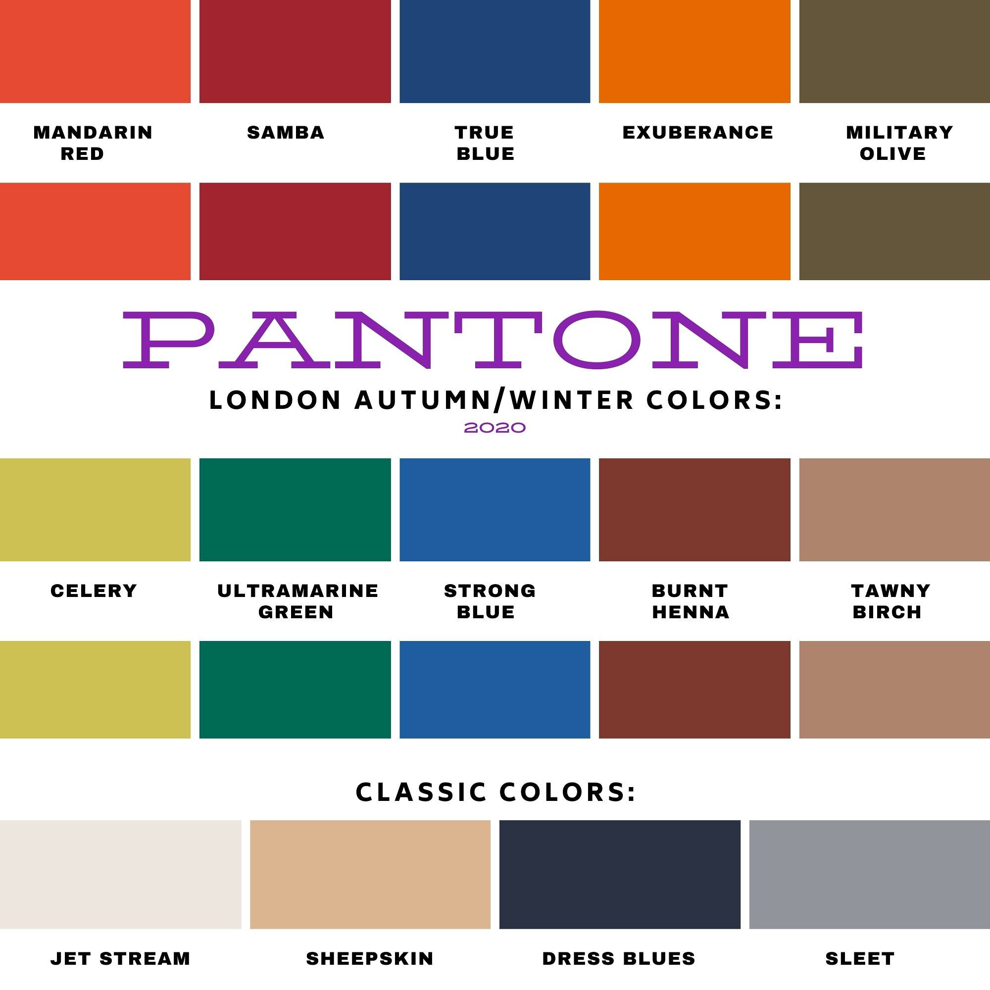
I wanted to end this fall color series by showing you all of the colors from both the Pantone New York Palette and the Pantone London Palette. To make it a little more interesting I thought I would show outfits that have, either a same color or a similar color side by side.

I hope that you enjoyed this series. If there are any other topics in fashion that you are interested in learning more about, or in seeing me talk about or put together in an outfit, I would love for you to let me know. I don’t follow trends too closely and this fall, I totally missed the boat on that, so I do apologize. I know some of you enjoy hearing what the trends are for each season and seeing how I apply those to the “real” world. Often when we look at websites or see magazines with tall, thin models or celebrities who are seamlessly coifed we think there is no way we would want to try this or that, especially when it comes to runway trends. However, there are a lot of trends that we can participate in and enjoy like leopard print, various colors and different types of accessories.

I will keep doing this Pantone series as long as I am blogging, because I feel strongly that even though we might differ from each other in our style, color is something we all have in common. Approaching new, bold and different colors without fear is a way to expand your wardrobe and spice up your style without completely committing to a whole different way of doing things.

The Color Palettes Side by Side.

Samba

I love the color red and I think there is a red for every complexion. I think both of these outfits worked quite well and love that both of them present a more neutral palette with a bright pop of red. In the New York outfit on the left Samba is paired with Fired Brick and Sleet. In the London outfit on the right Samba is paired with Tawny Birch and Sheepskin.

Ultramarine Green

Ultramarine was on both palettes and I think it is a pretty green that can bring a peaceful, yet vibrant feel to any outfit. This color green would look great in a bag, jewelry or a scarf and to me it really seems to draw your eyes to it. Maybe it is just my love for the greens in nature that make me like this color so much. In the New York outfit on the left Ultramarine Green is paired with Classic Blue and Blue Depths. In the London palette on the right Ultramarine Green is paired with Exuberance and Sleet.

Military Olive

While I love bright and bold colors like the two I mentioned previously, I love using olive as a neutral. It goes with every color, and has a different vibe than gray or beige. It is classy, yet subtle. In the New York outfit on the left, Military Olive is paired with Peach Nougat and Sandstone. In the London outfit on the right Military Olive is paired with Strong Blue and Jet Stream.

Green Sheen/Celery

It is hard to tell in these pictures, but Green Sheen and Celery are pretty similar. I think, because the lighting is different the colors look brighter in the shaded picture. They are different colors, but not enough different that they couldn’t be exchanged from one outfit to another. In the New York outfit on the left, Green Sheen is paired with Amber Glow and Almond Oil. In the London outfit on the right, Celery is paired with Mandarin and Sheepskin.

The Other Colors

These last two are paired only because they were the last two and don’t really have anything in common. The New York outfit on the left is a combination of Rose Tan, Magenta Purple and Sleet. The London outfit on the right is a combination of Burnt Henna, True Blue and Dress Blues.

Which outfit do you like most? Which color from the two palettes is one you frequently wear? What new color(s) are going to try to add to your wardrobe. As always, I love to hear your thoughts.

I apologize to those of you who subscribe to my blog. The last three weeks, I have completely forgotten to send out my weekly emails. I’ll just attribute that to “squishy brain syndrome.” Ha, ha.

Thanks for following along on the blog. I hope to use the next couple of weeks leading up to Thanksgiving showing you more fall outfits and maybe a few ideas for what to wear to Thanksgiving dinner whether you are going some place or sheltering in place.

If you follow my Faith page be sure to check back tomorrow for the next installment in my series on the Unseen Enemy.

Have a great weekend!

Graphic and photo credit Rebecca Trumbull.

Pantone - Autumn/Winter - 2020 - London Palette - Burnt Henna, True Blue and Dress Blues

This is the last color combo in the Pantone - Autumn/Winter - 2020 - London Palette series. On Thursday I will have a recap post of all of the outfits from both palettes. Today’s outfit revolves around a cranberry red, a blue that is much like Classic Blue and navy.

sdf.jpg

Both of the Pantone palettes for fall were filled with blues and reds, but they also had plenty of other options, so if you are not a blue or red wearer, you still have other fabulous colors to wear. My Christopher and Banks ankle pants are not exactly Burnt Henna, but they will due. I got these and a pair of green ones when they were on clearance. They are stretchy, which allows for ease of movement. The only thing I don’t like about them is they have no belt loops. If a pair of pants fits perfectly you don’t really need a belt, but a belt always makes me feel more secure. Otherwise, I always feel like I am pulling my pants up. These are a size 12, which is usually my normal for Christopher and Banks.

Pantone - Autumn/Winter - 2020 - Burnt Henna, Strong Blue and Dress Blues

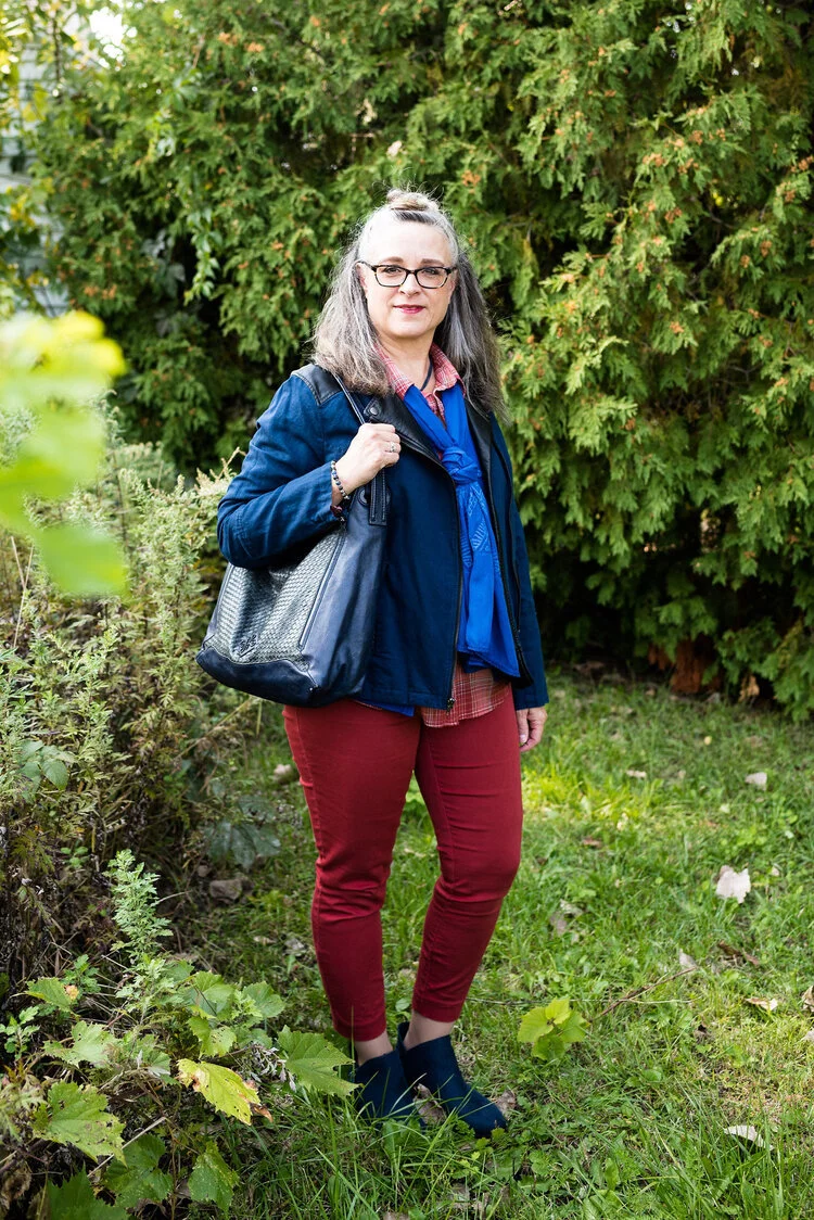
True Blue is very much like Classic Blue. It is not a dark navy, like the Dress Blues, but a nice medium blue that almost everyone can wear. I wanted to wear layers, so I added a Christopher and Banks cardi and the scarf.

My Dress Blues jacket is a thrifted Ruff Hewn piece. It is a moto jacket, but instead of being strictly leather, or faux leather, it is made of a linen/cotton blend and faux leather for the leather like portions.

Pantone - Autumn/Winter - 2020 - Burnt Henna, True blue and Dress Blues

My plaid button down shirt is also a Christopher and Banks purchase from this year. It is a little bit textured which gives it an added dimension, even though in these pictures you can’t see it very well.

Once again, with all the layers and textures, I kept my accessories very simple. I have a navy flower pendant necklace, but unlike many pendant necklaces, mine is shorter.

Pantone - Autumn/Winter -2020 - Burnt Henna, True Blue and Dress Blues

You’ve see this Simply Vera Vera Wang bag on the blog before. This was a thrifted piece and provides a nice, roomy area which is especially good for traveling to pack a few extras like a notebook or reading book. I also added a few beaded bracelets with blues.

Pantone - Autumn/Winter -2020 - Burnt Henna, True Blue and Dress Blues

Finally, these are my newer ankle boots. Once again, these are SO brand, which are my go to faves for ankle boots from Kohl’s. They fit (size up a half size if you want to be able to wear extra thick socks in the colder temps), are easy to get on an off and seem to hold up quite well in our ever changing weather here in the mid west. These are the first pair I’ve gotten that actually have the zipper on the outside of the foot rather than the inside, which is a nice contrast.

Pantone - Autumn/Winter - 2020 - Burnt Henna, True Blue and Dress Blues

What do you think of this outfit? Do you like these colors? Would you put these colors together, or would you find some other color to pair each of these with? I love hearing your thoughts, so be sure to leave me some love in the comments.

Pantone - Autumn/Winter - 2020 - Burnt Henna, True blue and Dress Blues

I am including a few shopping links. You can use these links to shop for yourself or for future Christmas presents for others. There is no extra cost to you to shop through my links. In fact, what it does is generates a tiny bit of income for me. Every click you do, gives me a few pennies. These are affiliate links. All opinions are my own.

Photo and graphic credit Rebecca Trumbull.


Pantone - Autumn/Winter - 2020 - London Palette - Exuberance, Ultramarine Green and Sleet

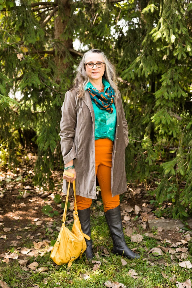
We are looking at the Pantone - Autumn/Winter - London Palette and just like last Thursday’s post saw a repeat of Samba from the New York palette, today’s outfit offers a repeat of Ultramarine Green. You can see the original outfit from the New York palette here, where I paired it with Classic Blue. Today I am pairing this pretty green with a fall orange called Exuberance. Unlike New York’s Amber Glow, Exuberance is a smidge brighter and more bold.

Pantone - Autumn/Winter - 2020 - London Palette - Exuberance, Ultramarine Green and Sleet

You have seen these bright orange Gloria Vanderbilt pants repeatedly on the blog. I never would have thought they would have been part of so many outfits for the blog, when I bought them. When I was working as an assistant manager at the bookstore, I used to wear them as they are a nice trouser for work.

Pantone - Autumn/ Winter - 2020 - London Palette - Exuberance, Ultramarine Green and Sleet
Pantone - Autumn/Winter - 2020 - London Palette - Exuberance, Ultramarine Green and Sleet

My Ultramarine Green button up is a thrifted Westbound piece. I have had this top for quite a while and don’t wear it that much, but every time I do, I think, I should wear it more often. It has such a pretty mottled green color and I love the embroidered texturing throughout. It just makes it a unique piece.

I also thought this cute little foxy infinity scarf worked perfectly to bring the whole outfit together. In the picture below you can see this statement necklace I got a while back from a shop in Grand Rapids, OH. They have the cutest shops and restaurants. Unfortunately, I haven’t been there since Covid came upon us.

Pantone - Autumn/Winter - 2020 - London Palette - Exuberance, Ultramarine Green, and Sleet

Since there is just a touch of yellow in my necklace I grabbed this bright yellow, thrifted Bueno bag. I love the bright color and the buckles.

Pantone - Autumn/Winter - 2020 - London Palette - Exuberance, Ultramarine Green, Sleet

These gray boots were another thrift store find and are Guess brand. I was very excited when I found them, because I was looking for a knee high gray pair.

Pantone - Autumn/Winter - 2020 - London Palette - Exuberance, Ultramarine, Sleet

I also added a few bracelets in the Ultramarine color.

Pantone - Autumn/Winter - 2020 - London Palette - Exuberance, Ultramarine and Sleet

My Sleet colored jacket was a J.Jill find at a thrift store. It is a tad tight if I try to button it, but I hate to get rid of it, since it is such a beautiful piece. I has a fabulous paisley print lining in pinks and purples.

Pantone - Autumn/Winter - 2020 - London Palette - Exuberance, Ultramarine Green and Sleet

What do you think of this outfit? Do you like these colors? I love to get feedback from you beautiful ladies, so leave a comment or two below. I appreciate all of your input.

I am including a few shopping links. All opinions are my own. These are affiliate links.

Graphic and photo credit Rebecca Trumbull.


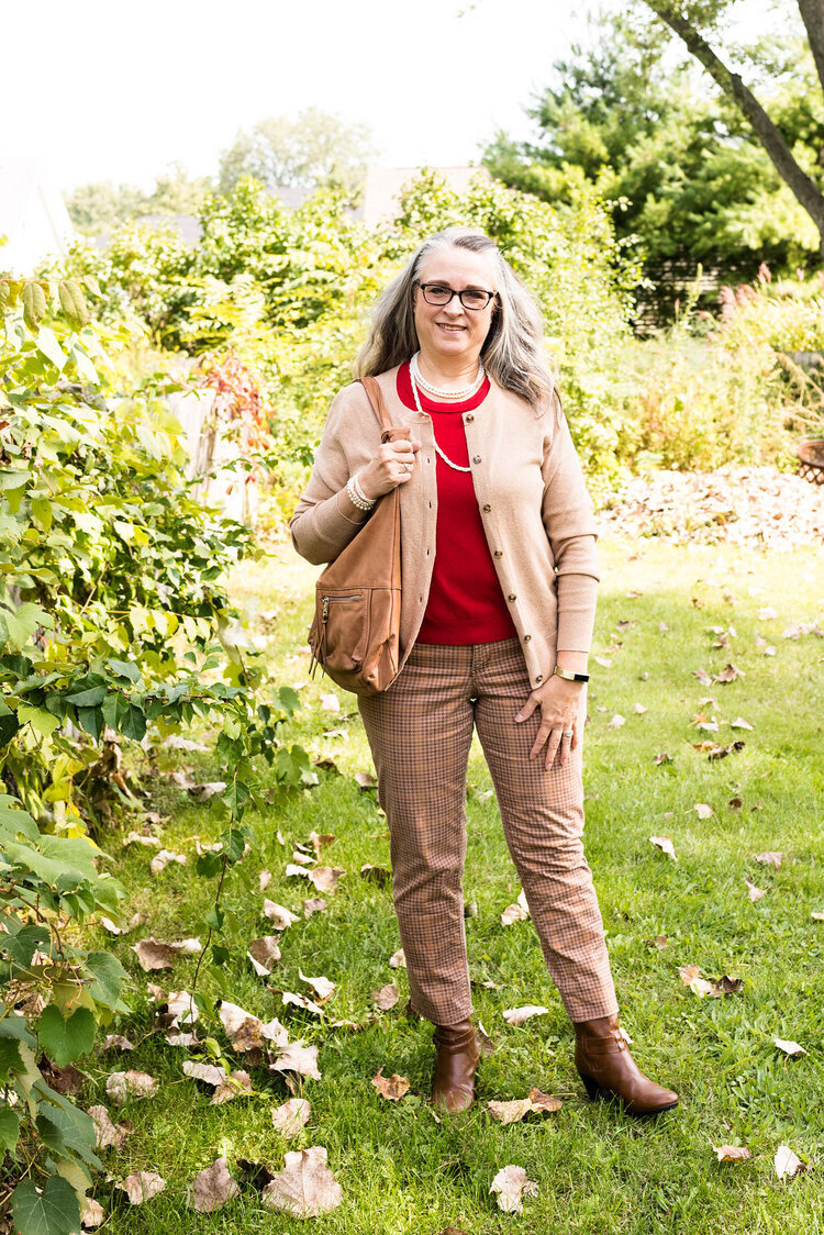
Pantone - Autumn/Winter - 2020 - London Palette - Samba, Tawny Birch, and Sheepskin

Today’s neutral palette is interrupted by the bold, daring color red. Samba was in our New York palette and if you don’t remember which outfit that was you can see it again here. In the New York outfit I paired Samba with Fired Brick and Sleet for a chic work outfit with a bit of subtle print mixing. Today’s outfit, once again, would be perfect for the office or a date night with your significant other. In this time of Covid restrictions do you get dressed up to go out, or do you go out at all? Thus far my hubby and I usually get take out and either bring it home or take it to a park and eat it, so I’m afraid I haven’t been getting very dressed up, usually just jeans and a nicer shirt. It really depends on the day. I am not sure what we are going to do when the weather gets real cold.

Pantone - Autumn/Winter - 2020 - London Palette - Samba, Tawny Birch and Sheepskin

When I was looking for pieces for this whole fall Pantone series, I knew I wanted to incorporate this thrifted, red, Calvin Klein, sleeveless sweater. I originally bought the piece thinking I could use it as a sweater vest, which, seeing as it is a larger size will offer enough room to put a blouse or long sleeve tee underneath. It will probably show up again either on the blog or in my Instagram feed. If you don’t follow me on Instagram make sure you do. I show you more of my day to day outfits there and occasional cute pictures of our cat and pretty scenery.

Pantone - Autumn/Winter - 2020 - London Palette - Samba,Tawny Birch and Sheepskin

My Sheepskin colored cardigan was another thrifted piece. I thought it was a good balance between tan and beige and will be wearable with just about any color. This is a thrifted St. John’s Bay piece.

Pantone - Autumn/Winter - 2020 - London Palette - Samba, Tawny Birch and Sheepskin

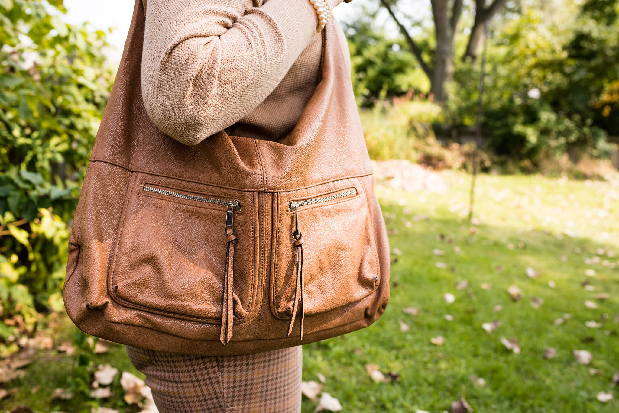
My Tawny Birch houndstooth patterned ankle pants have been on the blog before. These are Sonoma and were thrifted. You can see them styled in the Pantone Fall 2017 series, and in another series I did on vests.

Since I really wanted the red sweater to be the focal point of the outfit, I kept my bag and shoes a similar neutral tan color to the sweater and pants. Both thrifted, the bag is New Directions and the boots are Aerosoles. Then I added pearls. I thought this made for a great work look.

Pantone - Autumn/Winter 2020 - London Palette - Samba, Tawny Birch, and Sheepskin
Pantone - Autumn/Winter - 2020 - London palette - Samba, Tawny Birch, and Sheepskin
Pantone - Autumn/Winter - 2020 - London Palette - Samba, Tawny Birch, sheepskin

What do you think of these colors? Do you think the more neutral Tawny Birch goes well with the brighter Samba red? I’d love to hear your thoughts.

Pantone - Autumn/Winter - 2020 - London Palette - Samba, Tawny Birch, and Sheepskin

I hope you enjoyed this look and that you are doing well. For those of you who follow my faith page, I hope to have the next installment of my series on Our Unseen Enemy up tomorrow. Have a great evening.

I’m including a few shopping links. These are affiliate links. All opinions are my own.

Graphic and photo credit Rebecca Trumbull.


Pantone - Autumn/Winter - 2020 - London Palette - Mandarin, Celery and Sheepskin

I am now able to start the Pantone - Autumn/Winter 2020 - London Palette series. I am not sure why the Pantone Color Institute moved to having two palettes rather than one, except that it is a way to bring in a broader audience to market to. Whatever their reasoning, having two color palettes to draw from to create outfits is a fun challenge for me as a fashion blogger. Some of the colors crossed over from New York to London, but I’ll be showing them again, styled with their London counterparts. Here we go.

Pantone - Autumn/Winter - 2020 - London Palette - Mandarine, celery and sheepskin

Just as with the New York Palette, the London Palette has four classic colors. I tried to include one of the classics with each of the outfits, just so you know what they look like. With this first outfit, Sheepskin, which is a classic, neutral color, is reminiscent of Peach Nougat and Sandstone from the New York Palette. My jacket isn’t really a dark enough version of this pinky tan, but you still get the idea.

Pantone - Autumn/Winter - 2020 - London Palette - Mandarine, Celery and Sheepskin

My bright Mandarin red skirt is a thrifted piece by a brand called Kim Rogers. It was not a brand I was familiar with, but seems to be sold at retailers like Belk and online thrift retailers like Poshmark. Once again, the tiered skirt is a fave of mine. I guess I was supposed to be a gypsy. I often imagine that I have gypsy relatives, because my dad always loved to travel and we have French blood via his relatives. Ha, ha.

Pantone - Autumn/Winter - 2020 - London Palette - Mandarin, Celery and Sheepskin
Pantone - Autumn/Winter - 2020 - Mandarin, Celery and Sheepskin

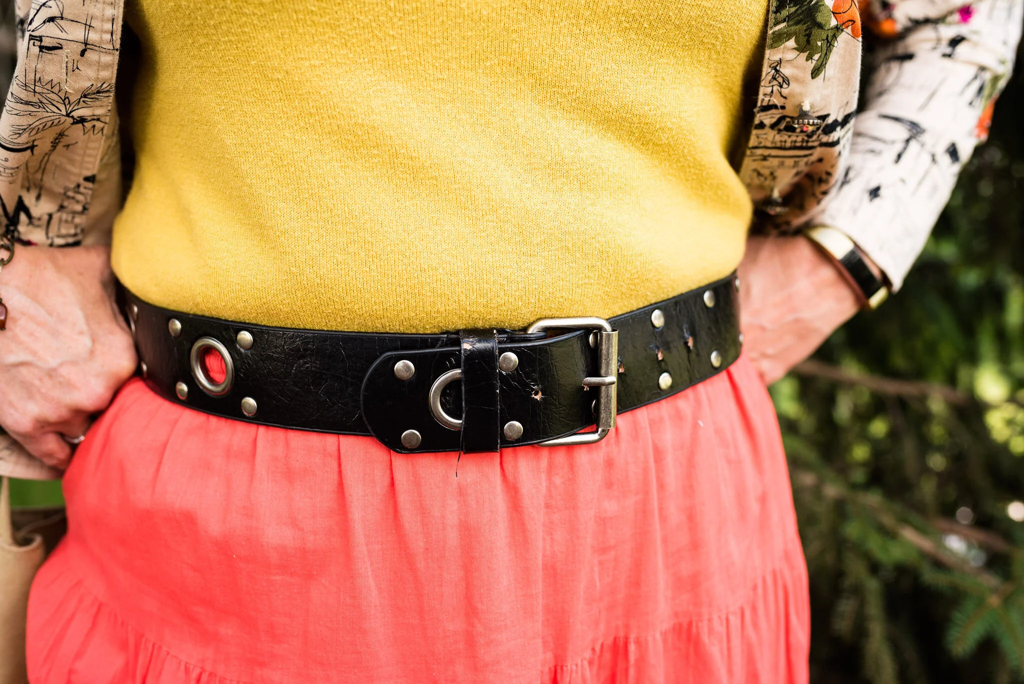
My Celery colored top is a 3/4 sleeve sweater, and a thrifted Banana Republic piece. I decided to tuck it in and add the black belt to go with the black print in the jacket and my black boots. I feel like I should have tightened the belt a notch, so you couldn’t see the skirt at the top. Oh well.

Pantone - Autumn/Winter - 2020 - London Palette - Mandarin, Celery and Sheepskin

This jacket was a fun piece I found thrifting. I like the bright orange flowers and the artistic sketching on it. It is a brand called Susan Graver Style. Susan Graver is a stylist for the retailer QVC. Once again, I learned something new and found a brand I never would have tried, if I didn’t thrift.

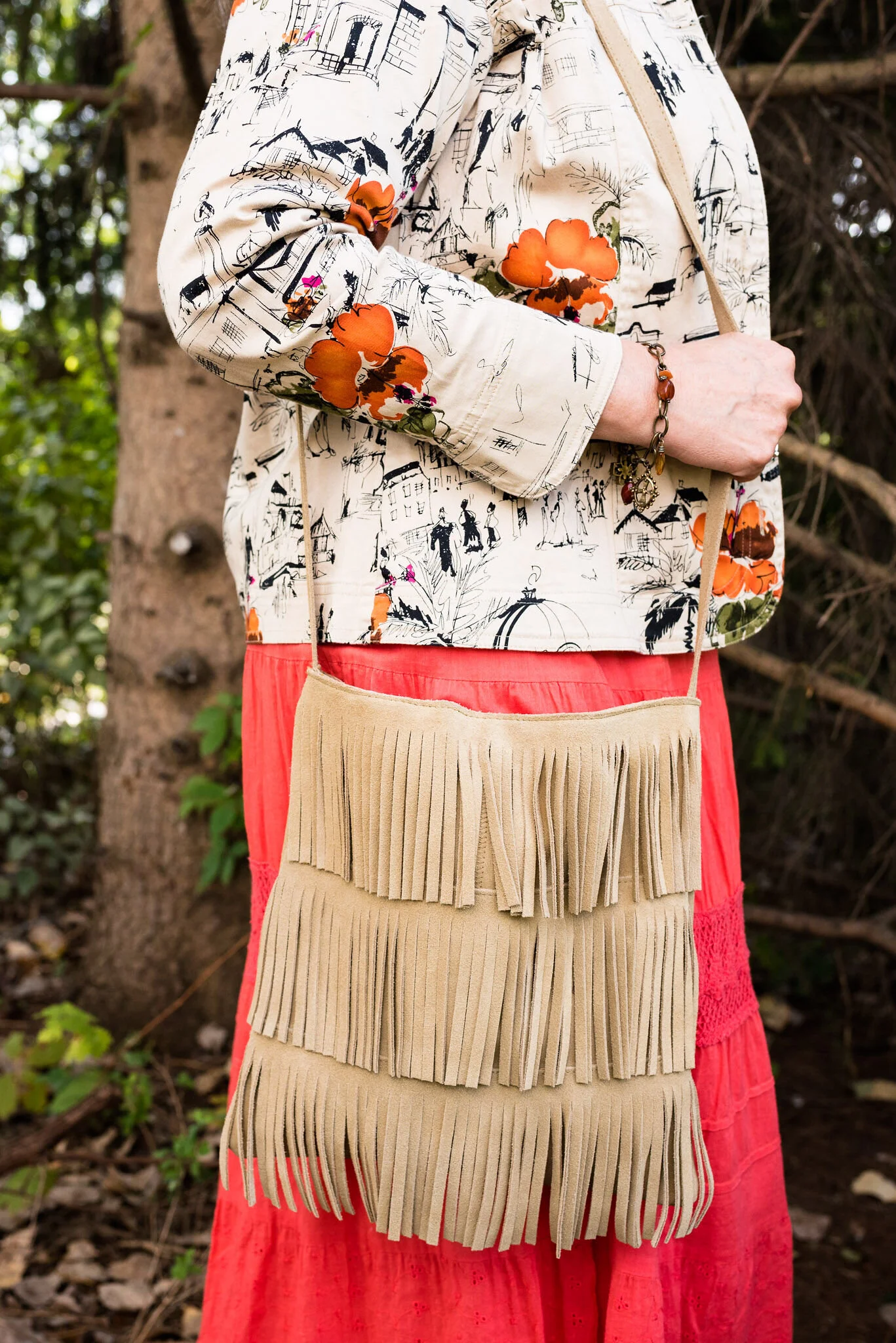
I kept my accessories simple, because there is a lot going on in the print of the jacket and the texture of the skirt and bag. You’ve seen this necklace on the blog before. It is a unique piece I found at an artisan shop up in Grayling, MI a few years ago, when my hubby and I took a short trip up there. You can see it styled for another Pantone color palette here. I also added a simple charm bracelet with rusty fall colors and my thrifted fringe bag.

Pantone - Autumn/Winter - 2020 - London Palette - Mandarin, Celery and Sheepskin
Pantone - Autumn/ Winter - 2020 - London Palette - Mandarin, Celery and Sheepskin
Pantone - Autumn/Winter - 2020 - London Palette - Mandarin, celery and sheepskin

Since we are now fully into fall, I am regularly wearing my boots. I have quite a pile of boots, mostly ankle and knee high. These are Massini brand and are very comfortable. I’ve styled these on the blog before with a black pair of jeans, and a slip dress.

Pantone - Autumn/Winter - 2020 - London Palette - Mandarin, Celery and Sheepskin

What do you think of these colors? I think if I had worn the colors by themselves without the jacket it would have looked like I was advertising for McDonalds. Ha. ha.

Pantone - Autumn/Winter - 2020 - London Palette - Mandarin, Celery and Sheepskin

I am including a few shopping links for you to look at. These are affiliate links. It does not cost you a thing to click on a link and look at merchandise, but every time you click I get a few pennies. All opinions are my own.

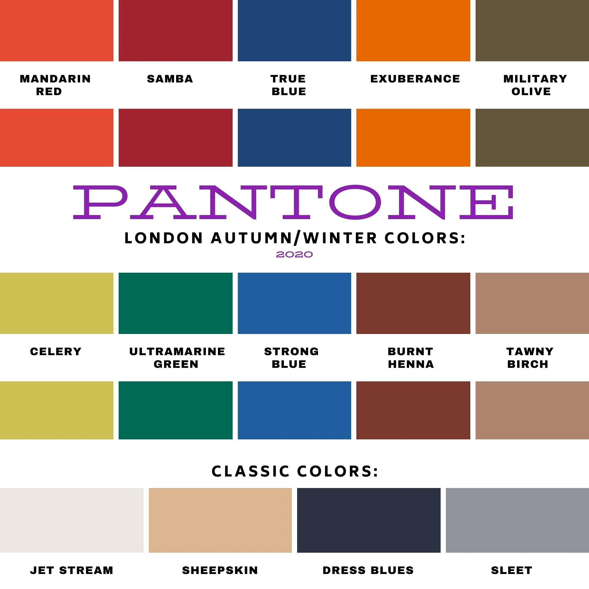
Here is the London Palette in full.

Pantone - Autumn/Winter - 2020 - London Palette

Graphics and photo credit Rebecca Trumbull.


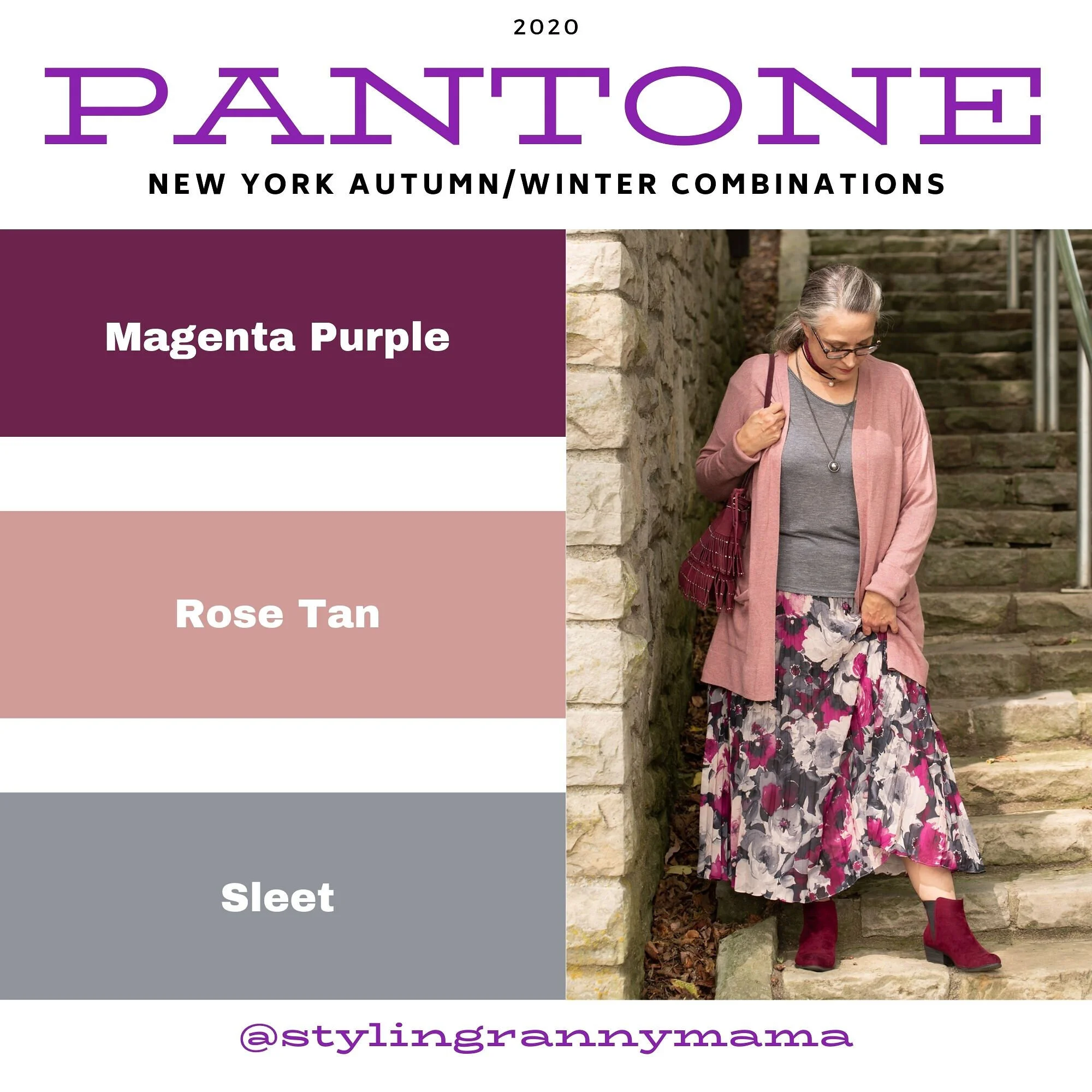
Pantone - Fall/Winter 2020 - New York Palette - Magenta Purple, Rose Tan and Sleet

This is the last installment in the Pantone Fall/Winter 2020 New York Palette series. This has been an interesting palette with both rich, bold colors like Classic Blue, Samba and Ultramarine Green and the softer more muted neutrals like Peach Nougat, Sandstone and Almond Oil. Today’s last two colors are a mix of both the bold and muted elements. While Tuesday’s post was full on bold with Classic Blue and Ultramarine paired sided by side, today’s outfit takes the bright Magenta Purple and pairs it with the more subtle Rose Tan. As always, I’ve included a classic color to bring in a more foundational element.

Pantone - Fall/Winter 2020 - New York Palette - Magenta Purple, Rose Tan and Sleet

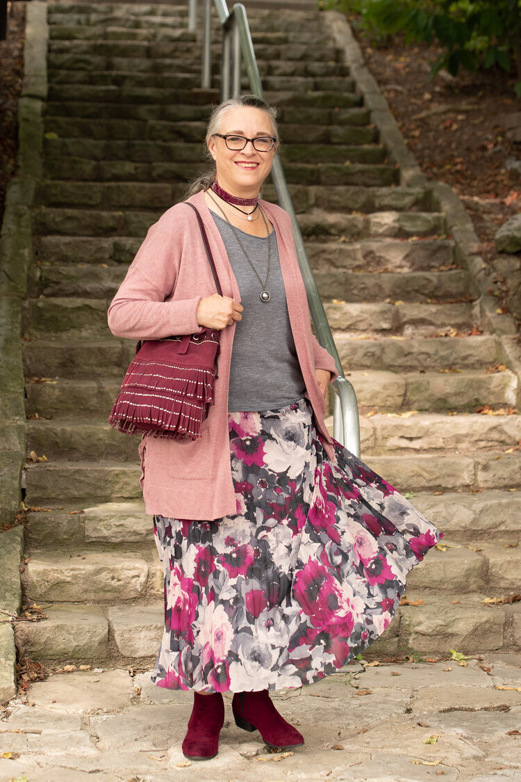
This outfit, once again, has a rather bohemian vibe with the dark florals, fringe bag, and suede booties. I also feel that the more layered, relaxed look is often indicative of the boho style as well.

Pantone - Fall/winter - 2020 - Magenta Purple, Rose Tan and Sleet

My long, pleated, floral maxi skirt is Chaps brand from Kohl’s. You can see this skirt styled for an earlier Pantone series back in Spring of 2018. I styled it with a blush top and gray sweater. The beauty of this piece is that it can be worn in any season and it is fully lined. I really like when a skirt is lined and I don’t have to wear a slip with it. This is especially nice in the cooler weather.

Pantone - Autumn/Winter 2020 - New York Palette - Magenta Purple, Rose Tan and Sleet

My Sleet colored slouchy tee is SO brand and also from Kohl’s. Do you know I have not been in a Kohl's store in months? Of course I haven’t been in any store, other than grocery stores and a few choice thrift shops since COVID happened. I have ordered a few things online from Kohl’s, so I can’t say I haven’t shopped there. Ha, ha. This tee is very light weight and has been retired to the summer clothing box for now. I have styled this on the blog before too. You can see it with another pleated skirt here.

My long pink sweater is also SO brand from Kohl’s. I bought two of these sweaters, as I mentioned a few weeks ago when I styled the maroon colored one. You can see that post here. This one is an XL and the maroon one is a L. This one is definitely bigger, but it is nice for wearing over multiple layers.

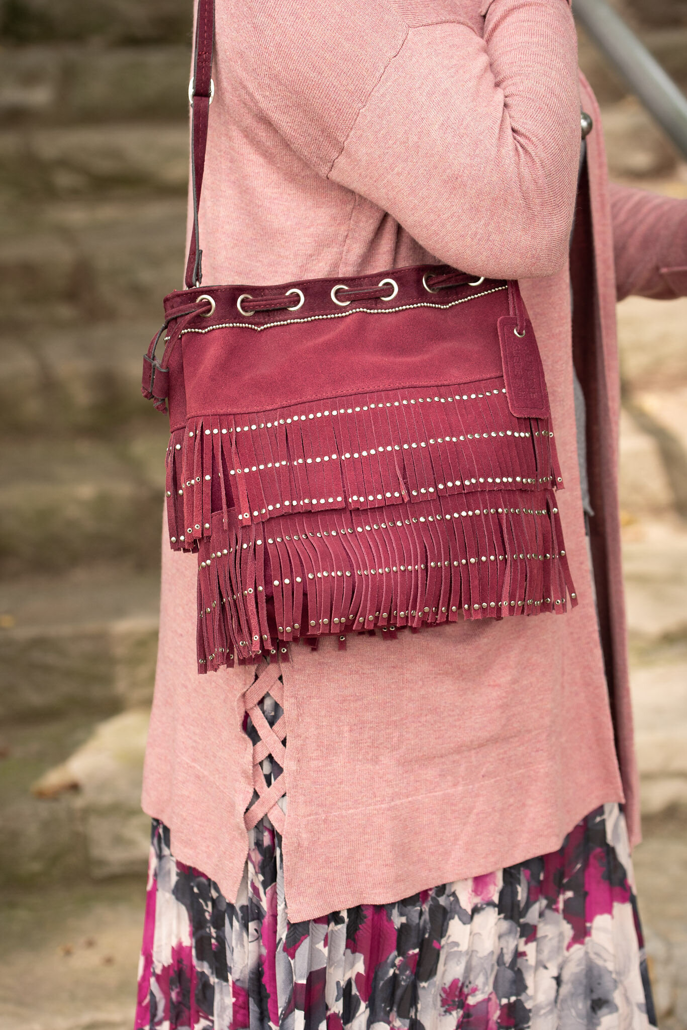
This fringe, suede bucket bag has been around for a few years and makes regular appearances on the blog. I actually haven’t used it as my day to day purse, because the top does not close. I like a little more security when I am out in public, as far as my bag goes. But it is cute and a great color for fall, so I keep it around.

Pantone - Autumn/Winter - 2020 - New York Palette - Magenta Purple, Rose Tan and Sleet

I’ve styled these Easy Spirit ankle boots on the blog before too. I have numerous pairs of faux suede ankle boots. They are so easy to get on and off. They go with all manner of outfits and I can wear them with a variety of types and thicknesses of socks and hose. They are a nice alternative to dress shoes for work or an event where you want to look a little more put together, but still be casual.

Pantone - Autumn/Winter - 2020 - New York Palette - Magenta Purple, Rose Tan and Sleet

I went for a layered look with my necklaces. I started with the ribbon choker, but gradually added the layered pearl choker and then the silver sphere pendant necklace. I like the look and I think it added a finishing touch to the outfit as a whole and still kept the boho vibe.

Pantone - Autumn/Winter - 2020 - New York Palette - Magenta Purple, Rose Tan and Sleet

What do you think of this outfit? Do you think the long cardigan and the long maxi skirt work together? What might you have done differently? I’d love to hear your thoughts.

Here a silly picture to make you smile. This is me, wishing COVID was a thing of the past. Ha, ha.

Pantone - Autumn/winter - 2020 - New York Palette - Magenta Purple, Rose Tan and Sleet

I am including a few shopping links for you. I hope you will check these out. Every click on a link gives me a few cents. It takes a very long time for the clicks to add up, but they do eventually and I appreciate every single one.

Keep laughing. Keep dancing. Keep loving. Keep Safe.

Graphic and photo credit Rebecca Trumbull.


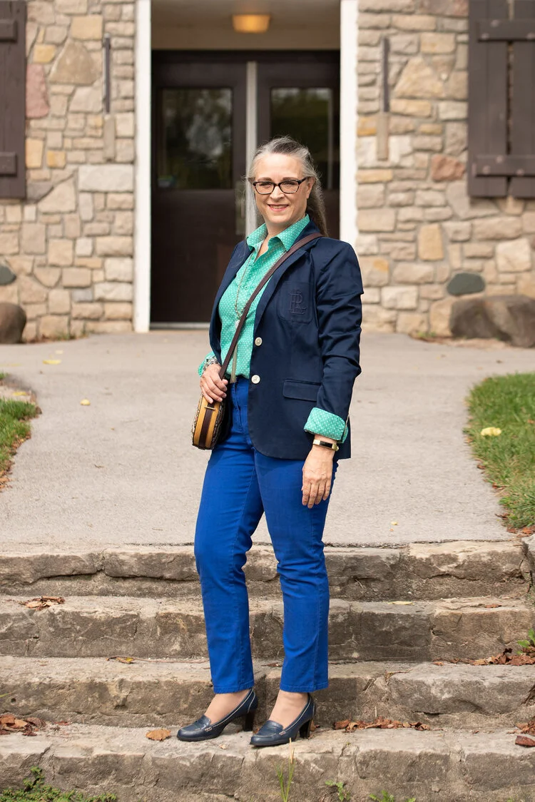
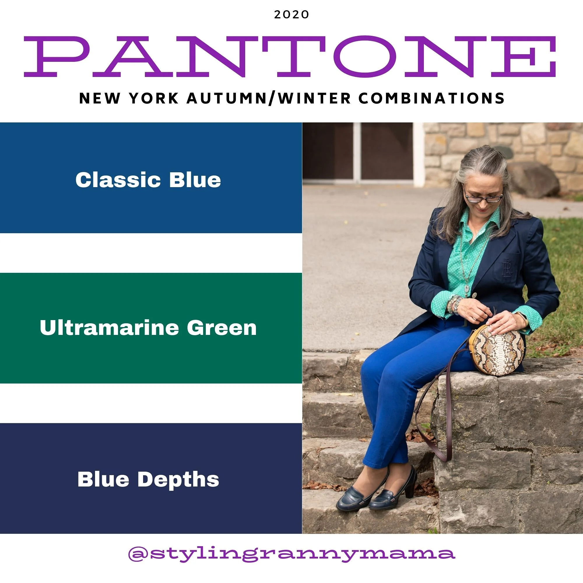
Pantone Fall/Winter 2020 - New York Palette - Classic Blue, Ultramarine Green and Blue Depths

The Pantone Color of the Year is Classic Blue , so once again we are featuring this medium blue color in the Pantone series. Back in January I showed you this color paired with a furry bomber jacket and plaid skirt. You can also see this color with a multi-print midi dress and with a bright pink top. Classic Blue is a blue that just about anyone can wear. If you prefer not to have this pretty blue to close to your face you could carry it in a lovely bag, or wear it as a brooch pinned on your lapel. I’ll provide a few shopping links at the end with various options.

Pantone Fall/Winter 2020 - New York Palette - Classic Blue, Ultramarine Green and Blue Depths

I didn’t really have anything that seemed to perfectly match the Ultramarine Green, at least not until after the fact. My button up is actually a thrifted men’s shirt; a brand called Zylos. It has very small greenish blue print with white and almost has more of an aqua feel to it. Oh well, I have long ago given up on the idea of trying to be perfect. Ha, ha. You can see a closer look at the pattern, and see my thrifted, fringe, pendant necklace. Actually, the necklace is probably a closer match to the Pantone green.

Pantone Fall/Winter 2020 - New York Palette - Classic Blue, Ultramarine Green and Blue Depths

My Classic Blue pants were a thrifted piece from shopping a friend’s closet. They are Ruby Road brand and I have styled them over and over on the blog. You can see them with a light blue sweater and scarf, Beetroot purple top from last spring’s series, an olive velvet jacket, a plaid bomber jacket, and a multi-print kimono.

Pantone Fall/Winter 2020 - New York Palette - Classic Blue, Ultramarine Green and Blue Depths

I also threw on a few beaded bracelets, just for fun. Sometimes wearing a scarf or jewelry isn’t so much to help with the outfit as a whole, but just to enjoy something I have. Since I rarely go any where other than the grocery store, I occasionally throw on some bracelets, just because I have them and they are pretty.

Pantone Fall/Winter 2020 - New York Palette - Classic Blue, Ultramarine Green and Blue Depths

I thought this outfit would be perfect for my round Nine West snakeskin print bag. It think it adds an element of fall color to this more classic looking outfit.

Pantone Fall/Winter 2020 - New York Palette - Classic Blue, Ultramarine Green and Blue Depths.

My shoes are my old stand by thrifted Relativity loafer heels. If I had an office job, I would probably wear these a lot. They are a nice height for a stacked heel and fairly comfortable.

Pantone - Fall/Winter 2020 - New York Palette - Classic Blue, Ultramarine Green and Blue Depths

What do you think of these colors? Do you like the Classic Blue, or do you prefer the darker tones of Blue Depths? Do you like the color Ultramarine? As it is in the graphic, it seems to be more of a forest green color, which I do like. I like how these three colors worked together into an outfit that would be perfect for a day at the office or a date night with your significant other.

My life would not be complete if I didn’t leave you with a silly picture to make you smile. When I was trying to pose, I almost fell down. Ha, ha.

Pantone - Fall/Winter - 2020 - New York Palette - Classic Blue, Ultramarine and Blue Depths

I hope you enjoyed this post and I hope you’ll leave me a comment or two. Life is lonely around here, so I love to hear from my internet and long distance friends.

I’m including a few shopping links for you to peruse. These are affiliate links. That means when you click on a link I get a few pennies. All opinions are my own.

Graphic and photo credit Rebecca Trumbull.


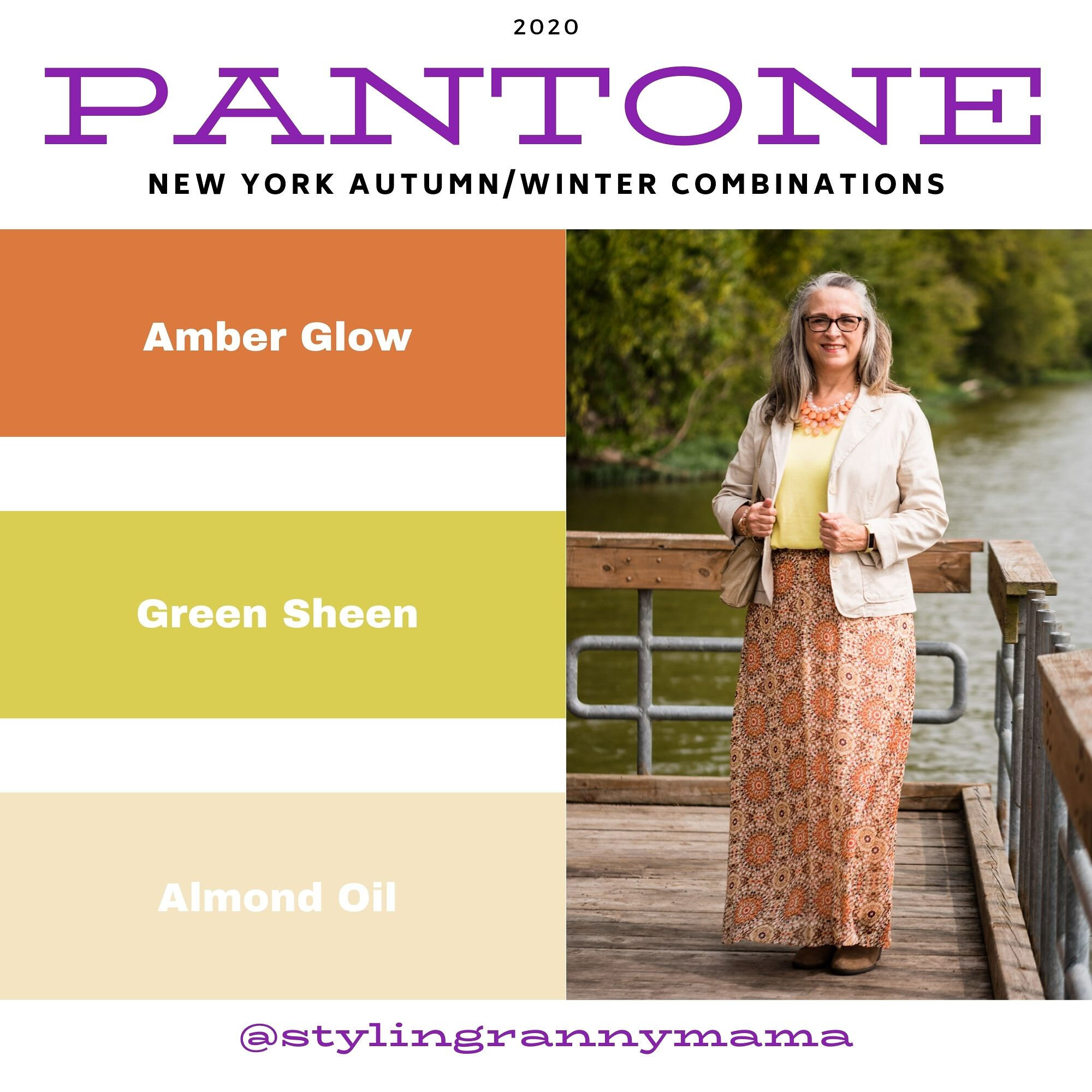
Pantone Fall/Winter 2020 - New York Palette - Amber Glow, Green Sheen and Almond Oil

The colors in today’s post are more pastel, but still encompass colors we think of when fall comes to mind. Oranges and yellows are obvious as we look at the trees around us. The Almond Oil color is an off white. When I was growing up, we never wore white after labor day. Our white shoes, bags, dresses, skirts and pants were all put away until the next year. I can still remember going out shoe shopping with my mom before Easter, because that was always when we would get out our white shoes to wear to church. Obviously, those days are gone, but many people still like the idea of wearing white in the summer and darker colors during the cooler, darker months of the year. Almond Oil might be a good alternative for those of you who would rather stay away from a pure white for the Fall/Winter seasons.

Pantone Fall/winter 2020 - Amber glow, Green Sheen and Almond oil

You’ve see this Roz & Ali maxi skirt numerous times on the blog. I got this one at dressbarn. All the dressbarn stores in the area have closed, but I know they still have a pretty major online shop, so be sure to check them out. I used this skirt last fall in the Pantone London series styled with a purple sweater. You can also see it styled with an orange tank top and a brown moto jacket.

Pantone Fall/Winter - New York Palette - Amber Glow, Green Sheen and Almond Oil

My yellowish green short sleeve sweater is a thrifted Gap piece. It is a tad big, but I like the slouchy look of it and tucking it in works great with this skirt.

Pantone Fall/Winter 2020 - Amber Glow, Green Sheen and Almond Oil

The cream colored jacket is a thrifted NY&Co. It is made of a stiff fabric with a good amount of stretch to it. It almost has a bit of a linen feel to it and it tends to be more wrinkly.

Pantone Fall/winter 2020 - Amber Glow, Green Sheen and almond oil

I opted for the orange for my jewelry. I love this tiered statement necklace and hardly ever get to wear it. I have two more in different colors. It just makes a lovely statement, especially in this outfit. It really makes the whole outfit look cohesive. Many people don’t want their outfits to have that kind of matching game, but personally I love it. There is a symmetry and completion about an outfit when it has this sort of cohesion.

Pantone Fall/Winter 2020 - Amber Glow, Green Sheen and Almond Oil

My top handle bag is another Stone Mountain thrift find. It seems to match the Almond Oil color even better than the jacket.

Pantone Fall/Winter 2020 - Amber Glow, Green Sheen, and Almond Oil

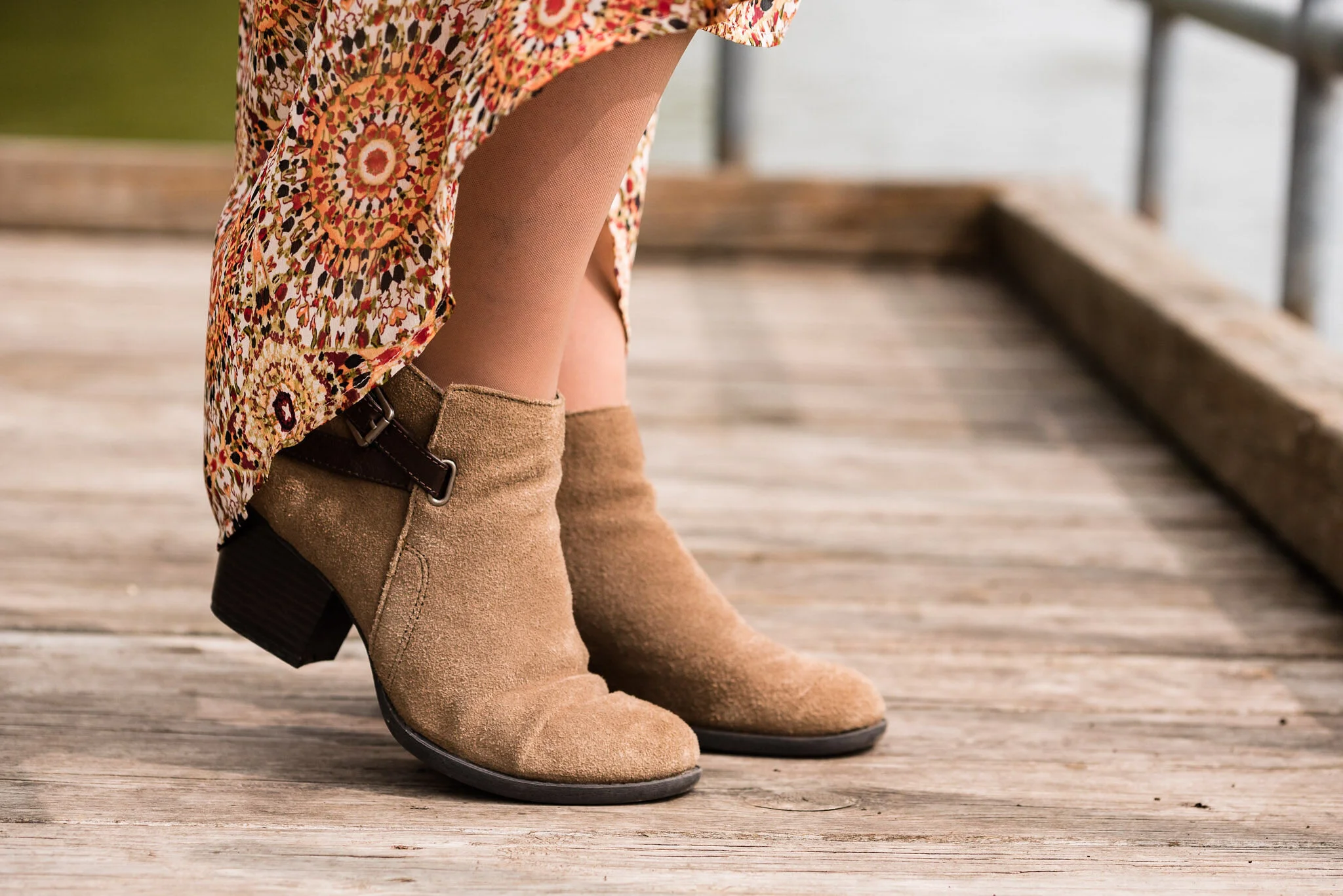
Once again, I pulled out my Sonoma suede ankle boots. The small heel gives me less of a chance for tripping over the skirt. Ha, ha.

Pantone - Fall/Winter 2020 - Amber Glow, Green Sheen and Almond Oil

What do you think of these two colors? When my daughter was editing these photos, she said it seemed these two colors would grate on each other, but she really liked the outfit. Pairing a print with a solid in these colors definitely makes the outfit softer and easier on the eye. This is something I would definitely wear…if I had some place to go. Ha, ha.

Pantone Fall/Winter 2020 - Amber Glow, Green Sheen and Almond Oil

I hope you are enjoying this series. If you are leave me some love in the comments. I hope you are having a good week.

Graphic and photo credit Rebecca Trumbull.

Feel free to shop a few links below. These are affiliate links. All opinions are my own.

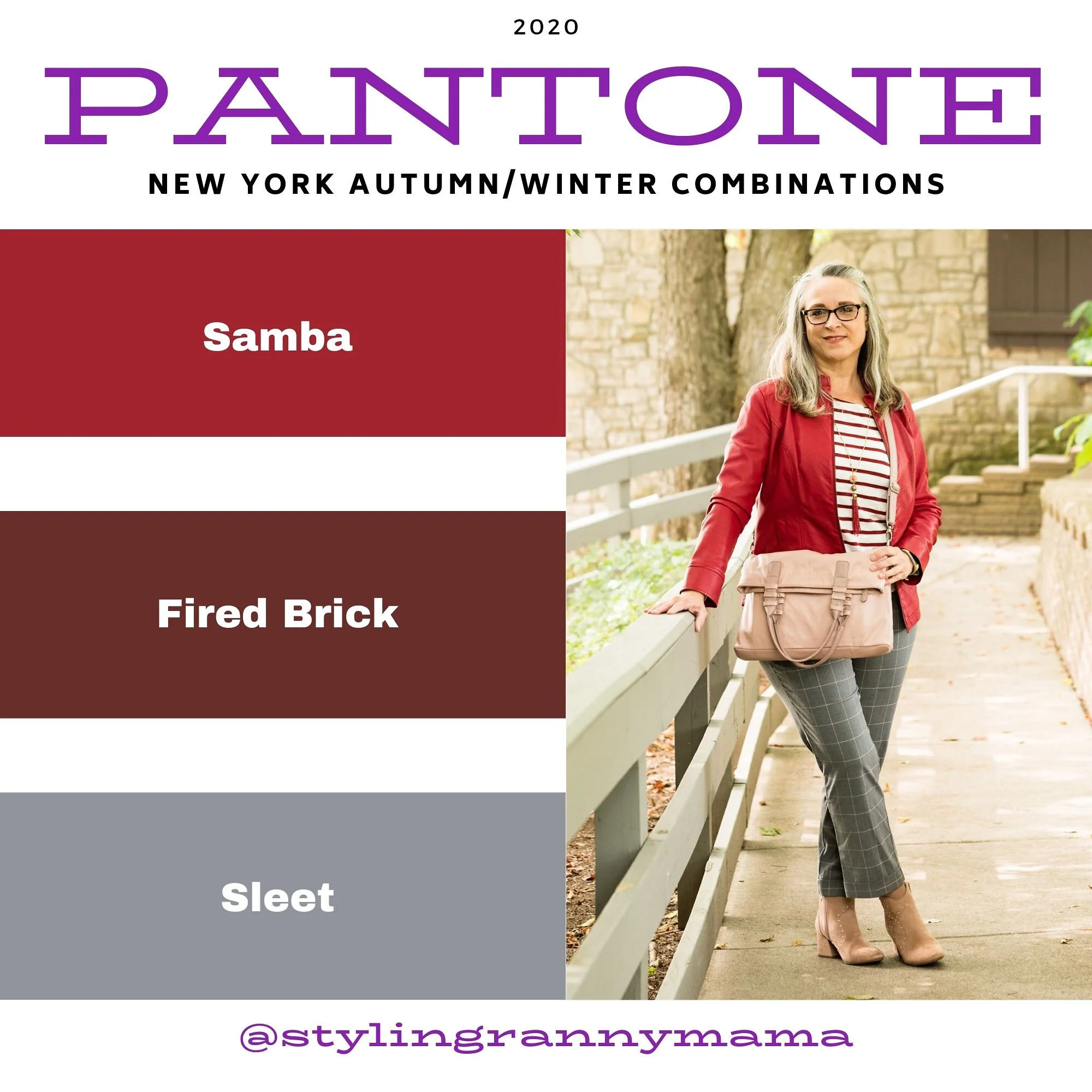
Pantone Fall/Winter 2020 - New York Palette - Samba, Fired Brick and Sleet

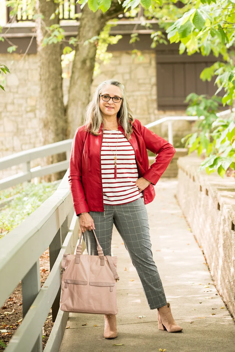
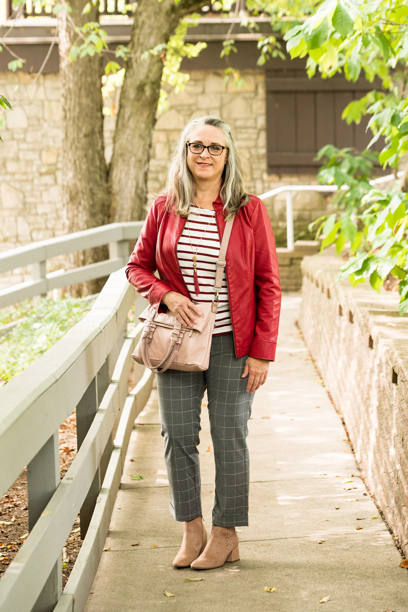
Red is not everyone’s choice of color, but this fall, both the New York and the London Color palettes offer a number of red shades that are sure to suit in one form or another. Whether you wear a whole outfit of red, red pants so they are not near your face, or just little splashes of red in your accessories, red is meant to be worn by everyone. I decided to pair these two different reds together, unfortunately the pictures don’t really pick up the Fired Brick stripes on my tee. They actually are a more brick red color. Oh well, this is about real life, so real life doesn’t always work out exactly as we planned. In fact, more often than not, it seems to be just the opposite. However, I do like this outfit, so let’s take a closer look.

Pantone Fall/Winter 2020 - Samba, Fired Brick and Sleet

I thought a little print mixing would be fun, so I pulled out these gray plaid crop pants from NY&Co. I’ve styled these on the blog before. You can see them styled with a brown moto jacket, with a silk sweater set, and with an asymmetrical vest.

Pantone Fall/Winter 2020 - Samba, Fired Brick and Sleet

My faux moto jacket is from Christopher and Banks. They do have some nice jackets, so I am always checking on their website to see what’s new. Right now they seem to have gotten away from the moto jackets, but they have this pretty plaid trucker jacket and this fun corduroy one.

sambaredfashionoutfit-8.jpg

My thrifted striped tee is Levis brand. Like I said, in person, you can tee it is a different red than the jacket, but for some reason it looks exactly the same. So many factors are involved in photography as my daughter would tell you.

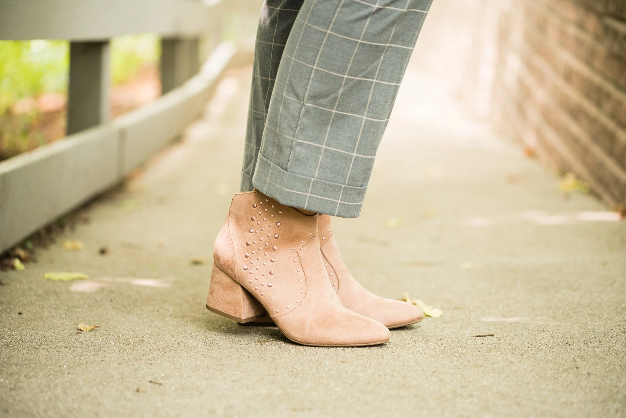
Since the gray plaid has a light stripe in it that could be blush or tan or cream, I thought blush accessories would be fun and an interesting choice for a fall outfit. The thrifted blush bag you’ve see on the blog before and is also NY&Co brand. The booties are also making another appearance. I found these on clearance at Kohl’s a couple seasons ago and had to have them because they have bling. Ha, ha. they are SO brand.

Pantone Fall/Winter 2020 - New York Palette - Samba, Fired Brick and Sleet

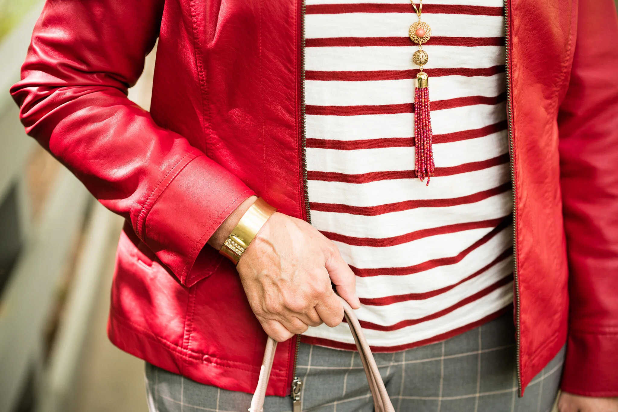
My jewelry is very simple: a bead fringe necklace and a gold bangle bracelet.

Pantone Fall/Winter 2020 - Samba. Fired Brick and Sleet

What do you think of these colors? I do have quite a bit of red in my wardrobe, both the brighter, bolder Samba and the darker, more moody Fired Brick. What about you?

Pantone Fall/Winter 2020 - New York Palette - Samba, Fired Brick and Sleet

I hope you are enjoying this series. I am going to forego my Thursday columns for the next few weeks so I can get through the Pantone colors before we head into Halloween and the holiday season. Hard to believe we are already thinking about that.

Here is another look at the entire New York Palette.

Pantone - Fall/Winter 2020 - New York Palette

Have a great week everyone.

Graphic and photo credit Rebecca Trumbull.

Here are a few shopping links. Be sure to take a look. These are brought to you at no cost to you, unless you purchase something of course. Every time you click on a link, I get a few cents. I appreciate every click. These are affiliate links. All opinions are my own.


'


Actual Amy - Layering Up

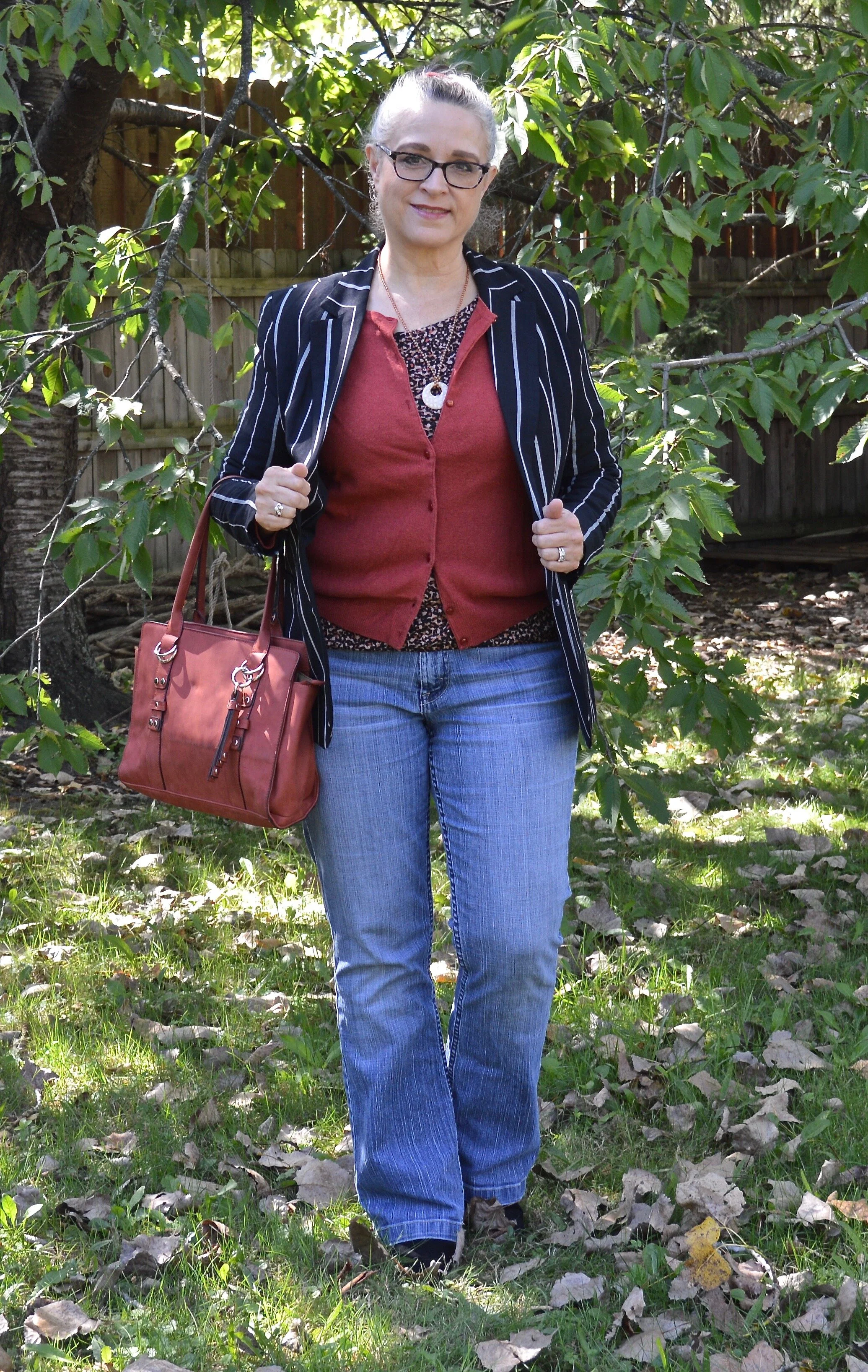
As most of you know, I love layers. Layering in these transitional times, from summer to fall, and fall to winter, gives us the ability to create outfits with even more interest and texture. Easy layering pieces include cardigans, blazers, jackets and scarves. These can all add a fun change to your wardrobe and give you layers to put on or take off as needed with the changing temperatures. We are expecting a warm spell these next few days, followed by falling temps for the beginning of October.

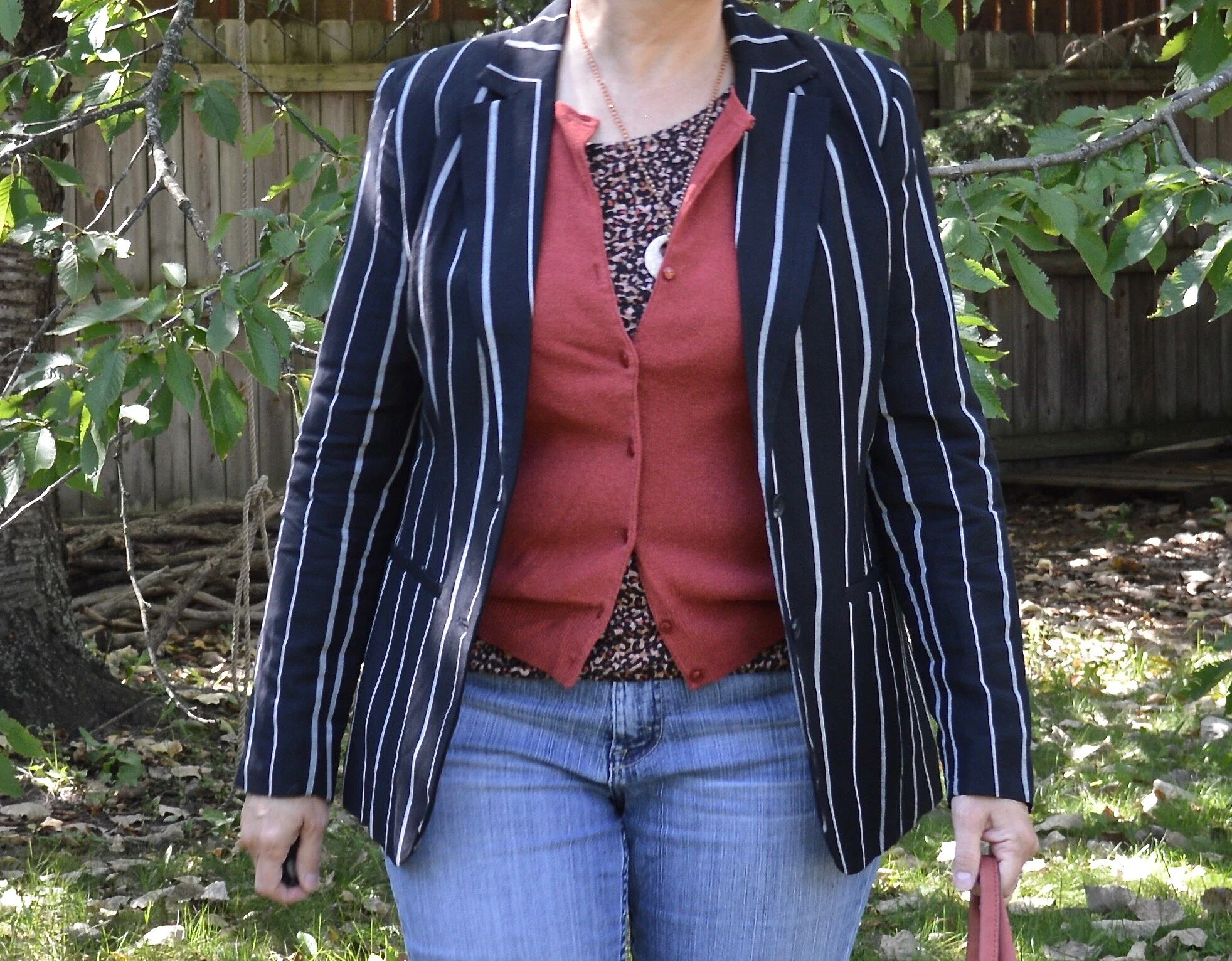
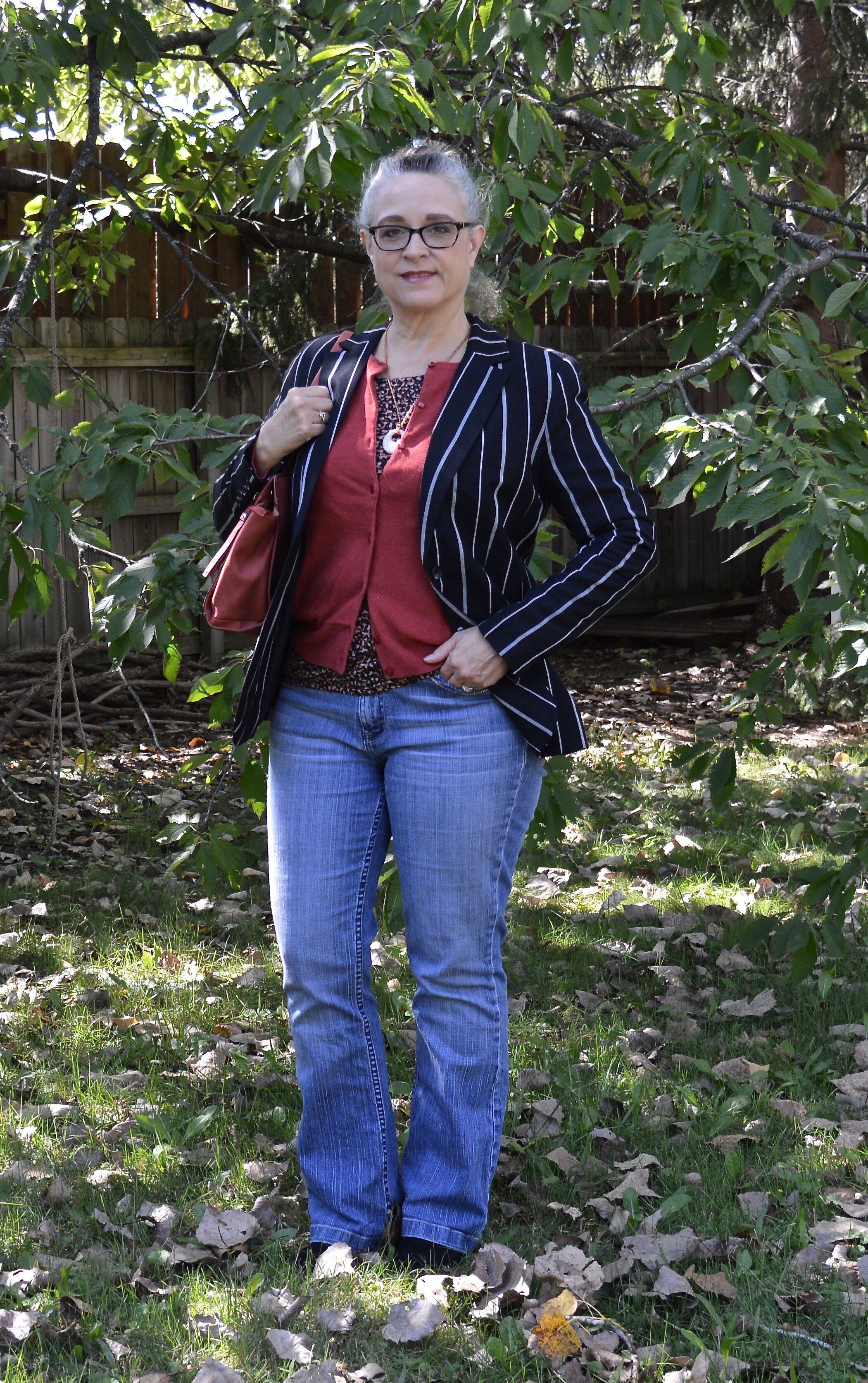
In today’s outfit, the focal point is a recent clearance find from Target. This A New Day striped blazer was uniquely different from my other blazers and jackets being that it is striped, so I knew I had to have it.

Actual Amy - Layering Up

It was a chillier day when I took these pictures, so I already had the fall colored knit top and rust colored cardigan on in the house. We are hoping to make it until October before we turn on the heat. Ha, ha.

Actual Amy - Layering Up

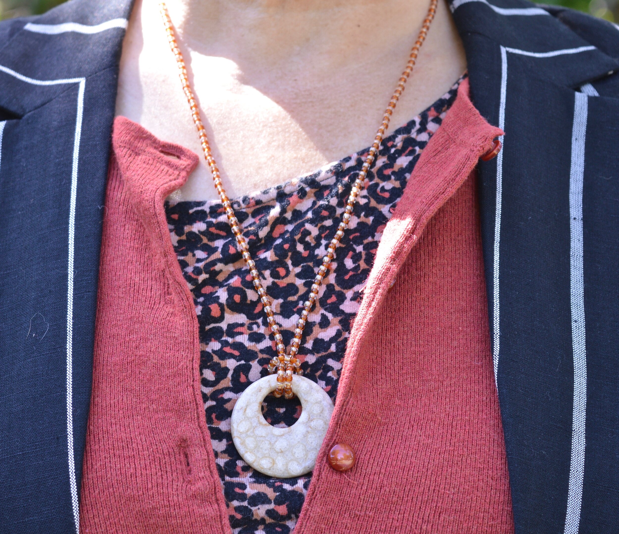
My knit, short sleeve multi-print top is a thrifted Loft piece. The rust colored cardigan is Croft & Barrow brand. There is some subtle print mixing going on here with the multi-print tee and the stripes on the blazer. This is one way to print mix without it being overwhelming. The solid color cardigan provides a border between the two prints, but you still see the mix.

Actual Amy - Layering up

These are my favorite thrifted jeans. This is an older brand called Kikit, which are only available from thrift retailers like Poshmark and Thredup. You can see how I styled these on the blog before with a leopard print blazer.

DSC_0026.jpg

Less is more, when it comes to accessories for an outfit like this. This hand made pendent necklace is a simple piece, but makes just the right statement.

Actual Amy - Layering up

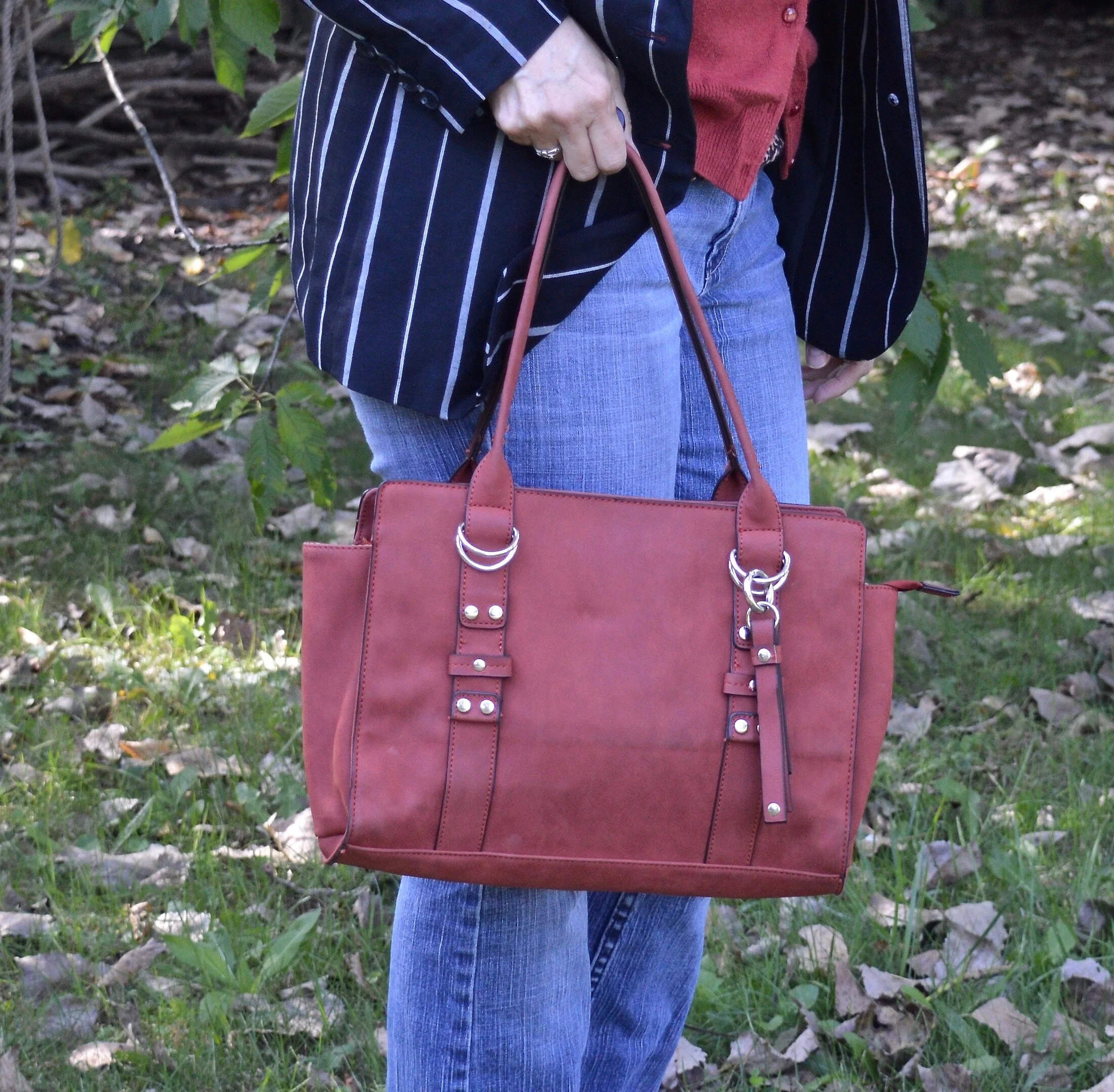
You’ve seen this pretty bag just recently on the blog when I used it with a fall colored fringe kimono.

Actual Amy - Layering up

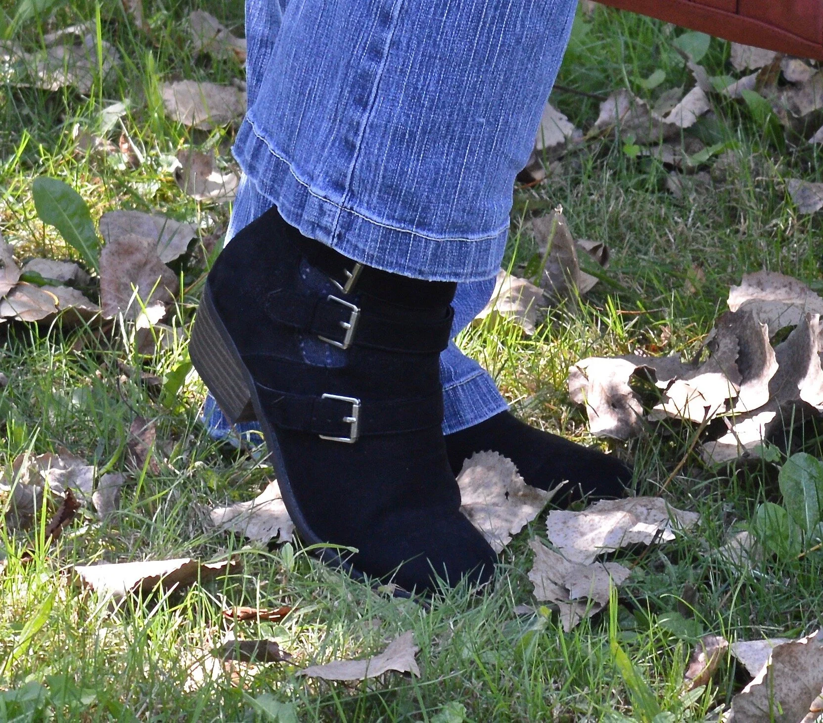
I chose my black faux suede ankle boots. These are Natural Reflections which are a brand Cabela’s carries. My hubby and I go there every so often and usually pass through the shoe department to see what’s on sale. i really love the buckle detailing on these and I use them a lot throughout the cooler seasons.

Actual Amy - Layering up

What do you think of this outfit? Do you wear lots of layers when it gets cooler? How do you like to put your layers together? I love hearing your thoughts so be sure to leave a comment or two.

I’m including a few shopping links, so be sure to stop by. Every time you click on a link I get a few cents. These are affiliate links. All opinions are my own.

Have a great weekend everyone. If you follow my faith posts be sure to stop by tomorrow to see the latest.


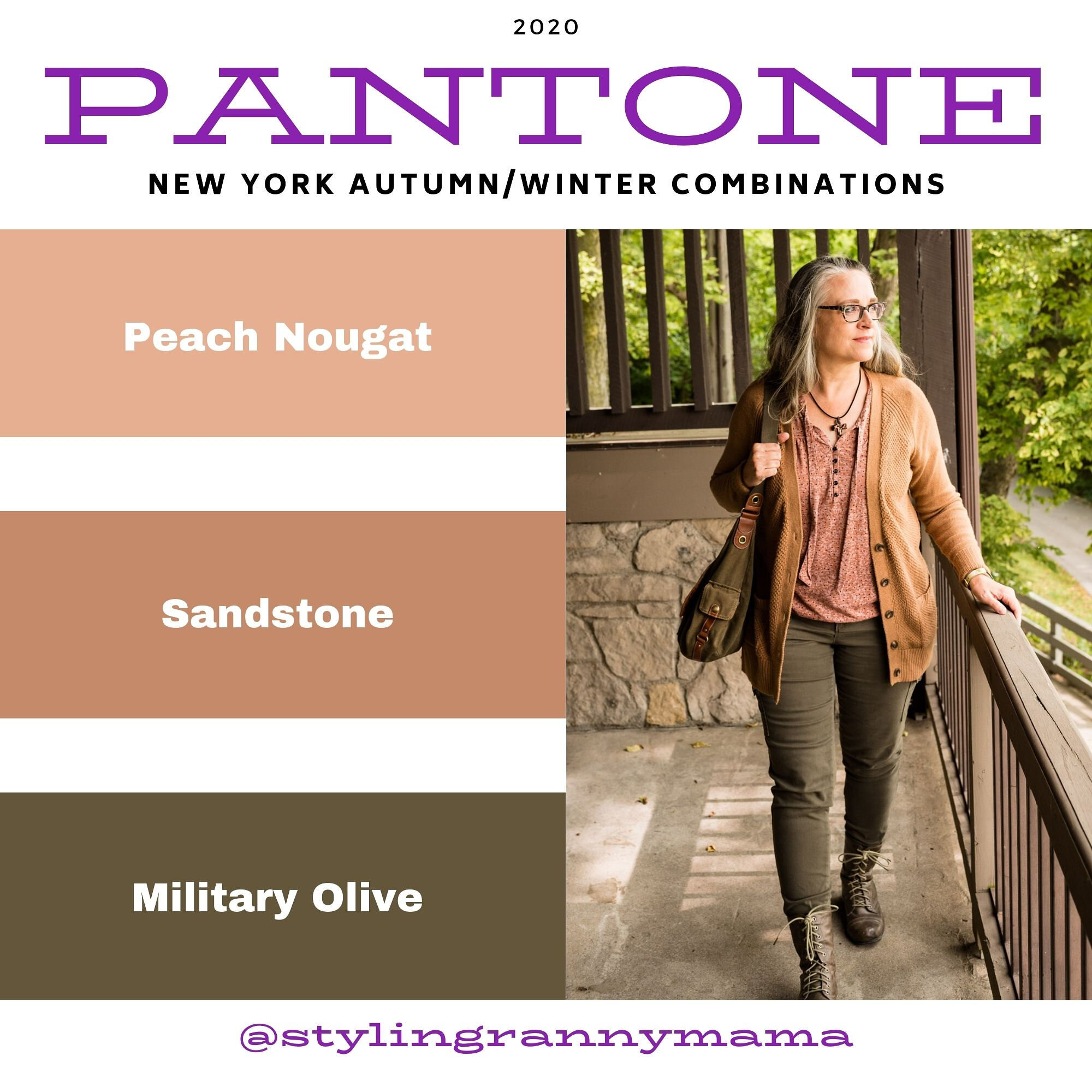
Pantone Fall/Winter 2020 - New York Palette - Peach Nougat, Sandstone & Military Olive

Welcome to another round of Pantone colors. If you are new to my blog, the Pantone Color Institute is an entity that comes up with color palettes for two seasons a year - Spring/Summer and Fall/Winter. These color palettes are referred to by members of the interior design and fashion community for designing spaces and clothing full of color and vibrancy. Many of their palette colors are meant to create a feeling of peace, unity and confidence whether at the office or on the runway.

Since becoming a Fashion Blogger in 2016 I have been drawn to the Pantone color palettes as a way to find inspiration for putting together outfits from the clothes in my closet. I enjoy all colors, so for me the two palettes put out by the Institute are a way to challenge myself to look at colors I might not normally wear in a different light. I hope you enjoy this series.

I am going to start with the New York Palette. You can see the entire palette at the end of this post. Instead of doing an intro the color palettes for both New York and London, I am just going to jump right in to the New York colors. As per usual, I am going to combine two palette colors with a classic color, which is also shown on the palette.

Pantone Fall/Winter 20/21 - Peach Nougat, Sandstone and Military Olive

There are a number of these lighter more pastel tans on both palettes this season. This is not a color I would normally reach for, however, if you are more into pastels and lighter shades both Peach Nougat and Sandstone might be good for you.

Pantone - Fall/Winter - peach nougat, sandstone and military olive.

When I originally put this outfit together I thought the sweater was more like Sandstone, but now seeing the pictures, it is much too yellow. However, the thrifted, tie-front tee has both colors in it, so I am making that my Pantone piece for both colors in this post. Even so, I do like the way this outfit came together with a rather neutral vibe.

Pantone - Fall/Winter - 20/21 - Peach Nougat, Sandstone and military olive

My camel colored, waffle knit, thrifted cardigan is Old Navy brand. I love this piece and it is the perfect weight for these changing temps. I like that it is a little longer, has pockets and will go with just about anything in my closet. It is showing a little bit of pilling, but these days, if we can wear distressed jeans, why not wear pilly sweaters. Ha, ha.

Pantone - Fall/winter - 20/21 - peach nougat, sandstone and military olive

My Gloria Vanderbilt utility pants have been a staple in my wardrobe and you have seen these appear on the blog over and over. I am so thankful they are stretchy, because my weight has fluctuated over the last few years about eight pounds, up and down, many of you know the feeling. At least with pants that have some flex you can still wear them, even when your weight is up a bit. This year Military Olive is on the New York palette as a Classic Color and on the London palette as a main color. Not sure why that is, but you’ll see I use the color both ways, once you see the London palette colors.

Pantone - Fall/Winter - 20/21 - Peach Nougat, Sandstone and Military Olive

This cross necklace was the perfect accompaniment for this outfit. It goes so well with the shirt, it looks like they are made to go together.

Pantone - Fall/Winter - 20/21 - Peach Nougat, Sandstone and Military Olive

Keeping the look ultra casual allowed me to carry this fabulous hobo bag from Fossil. Also a thrift find. Shhhh! Don’t tell my hubby. He claims I have too many purses. Is that even a thing? Ha, ha.

Pantone - Fall/Winter - 20/21 - Peach nougat, sandstone and military olive

Lastly, I chose these well worn, thrifted combat boots from Falls Creek. I have had these for quite a while and they are definitely showing their wear, but again, if you like a grunge look, like I occasionally do, then well worn is just right.

Pantone - Fall/winter - 20/21 - Peach nougat, sandstone and military olive

What do you think of these colors? Do you have any of these in your closet? Are you a pastel kind of girl, or do you like richer, bolder colors? Leave me some love in the comments. It means a lot to hear from you!

Here is the New York Fall/Winter 20/21 color palette.

Pantone - New York Fall/Winter 20/21

I hope you will follow along as I continue this color series. I’ve included a few shopping links, for you to peruse. These are affiliate links. All opinions are my own. Have a great day!

Photos and graphics Rebecca Trumbull.