Pantone Spring/Summer - 2020 - Introduction: The London Palette

Tuesday I finished the New York Palette for the Pantone Spring/Summer 2020 season. I am not sure why they decided to start doing two palettes every season, but several years ago, they began posting both a New York and a London palette. I am sure it has something to do with the Fashion influence in both of these large metropolitan areas. Regardless, I like to make you aware of these color palettes, not to raise your awareness of the Pantone entity, but to show you how wonderful color is and to challenge you to think outside the box when it comes to combining and wearing colors.
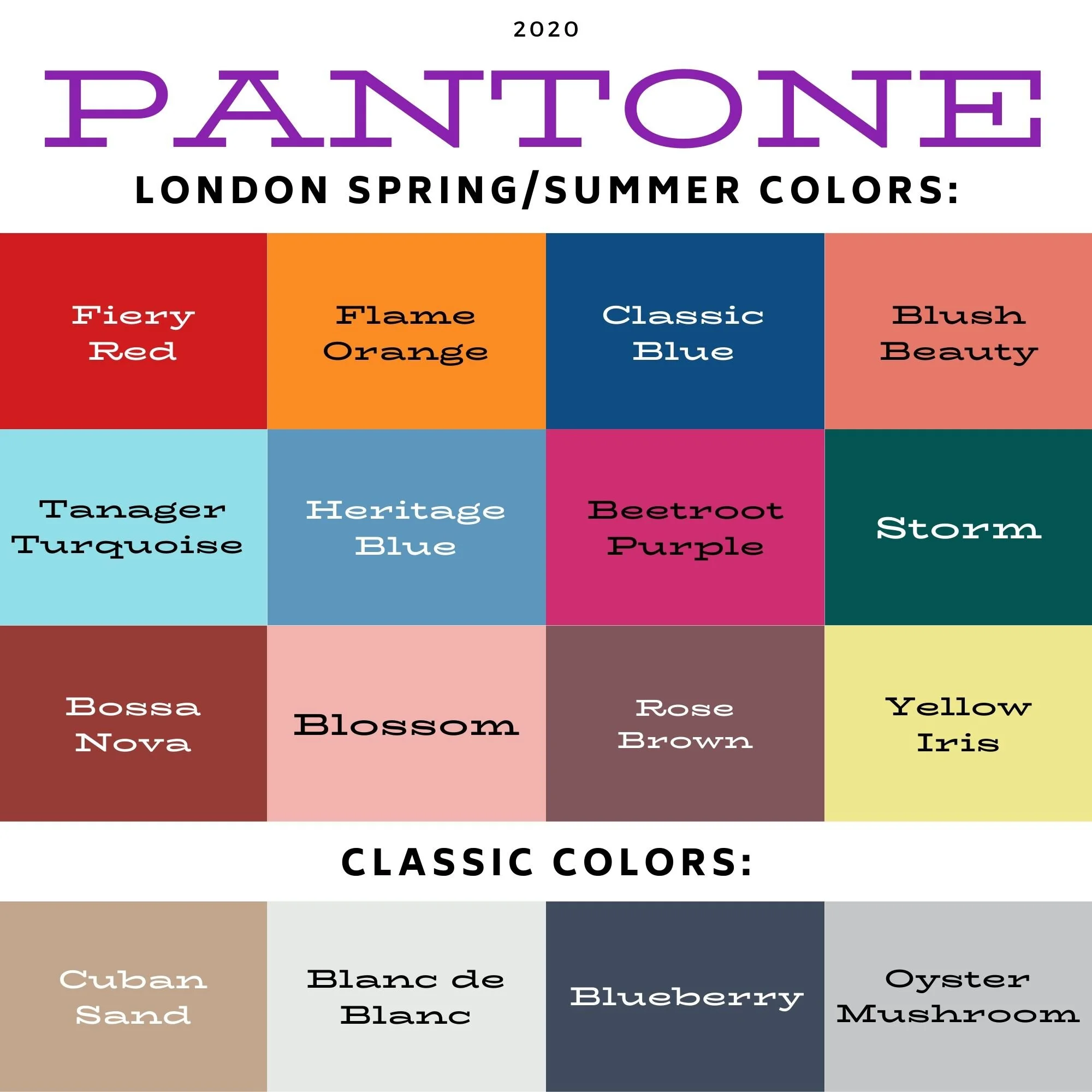
Pantone Spring/Summer - London Palette

Today I am introducing you to the London Color Palette. Many of the colors, while similar have different names and somewhat different shading. The Classic color palette is similar in that it contains a beige, white, dark navy blue and gray. I was just thinking it would be fun to do a Pantone series where the focus is on the classic colors with the other colors used to accessorize and compliment an outfit. Unfortunately, for this blogger, I don’t have many pieces that are just classic colors. Yes I do have a few things that are tan, white, navy and gray, but probably not enough to create a whole series of outfits, but then, if those proponents of capsule wardrobes could do it, I suppose I could too. I’ll have to think on that over the summer and see what the fall colors looks like.

I will confess, I haven’t even started putting outfits together for this series. Ha, ha. Rather than making that a priority over the last week, I was changing out my seasonal wardrobe and purging some things from my closet. I am trying everything on. With weight gain and post menopausal weight distribution changes I am finding many things I have don’t fit any more. Rather than hanging on to things with the hopes of losing weight and changing how my body looks, I’ve decided it is a good time to pare down and reevaluate what I feel comfortable in and what makes me feel confident. Many tees and tank tops are too tight, not only around the waist, but through the arms. Isn’t it crazy what just a few pounds can do?

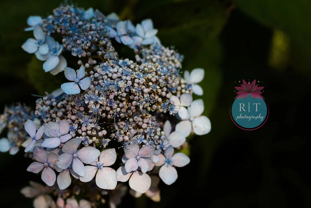
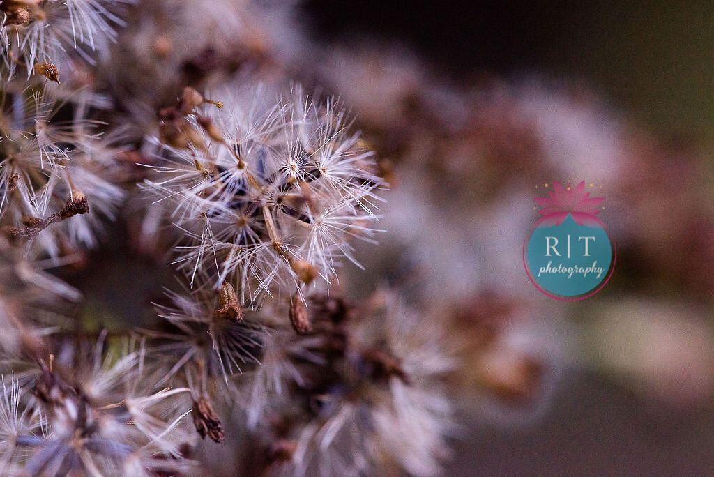
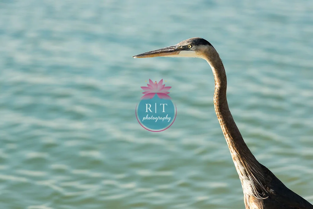
Because of my lack of planning I am posting a number of pictures from my photographer’s fine arts gallery to coordinate with the colors from this London Palette. You can visit Rebecca’s Fine Arts page here. Right now, through me, if you find something your want to purchase you get a 15% discount on your order if you use the code STYL2020. If you are looking for a colorful, natural photo to make a wall pop be sure to check out her site.

Classic Blue
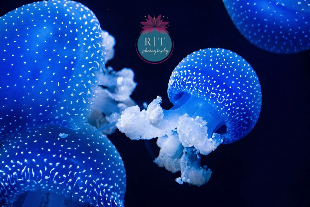
RTP - Fine Art - Jelly Fish

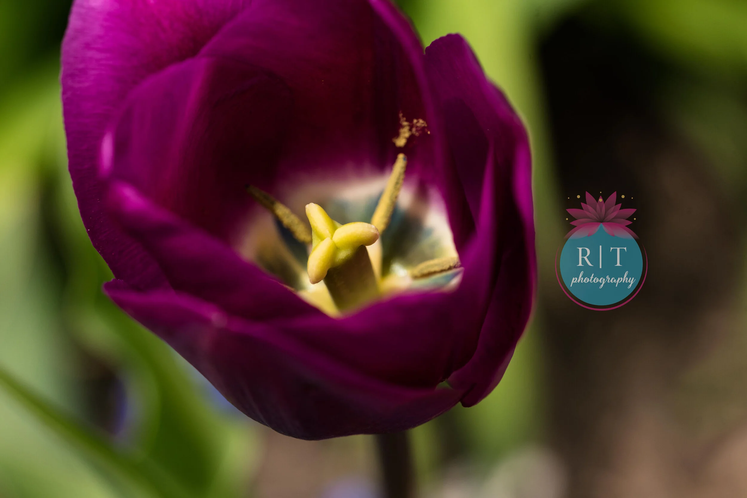
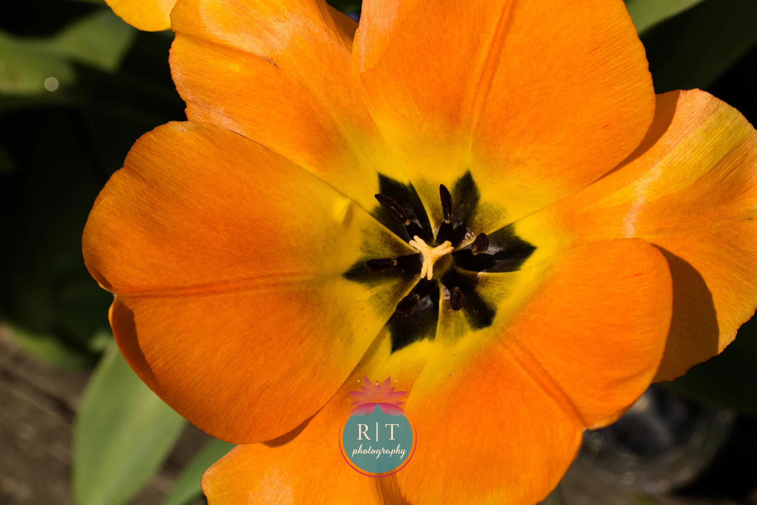
Beetroot Purple

RTP - Beetroot Purple - Tulip

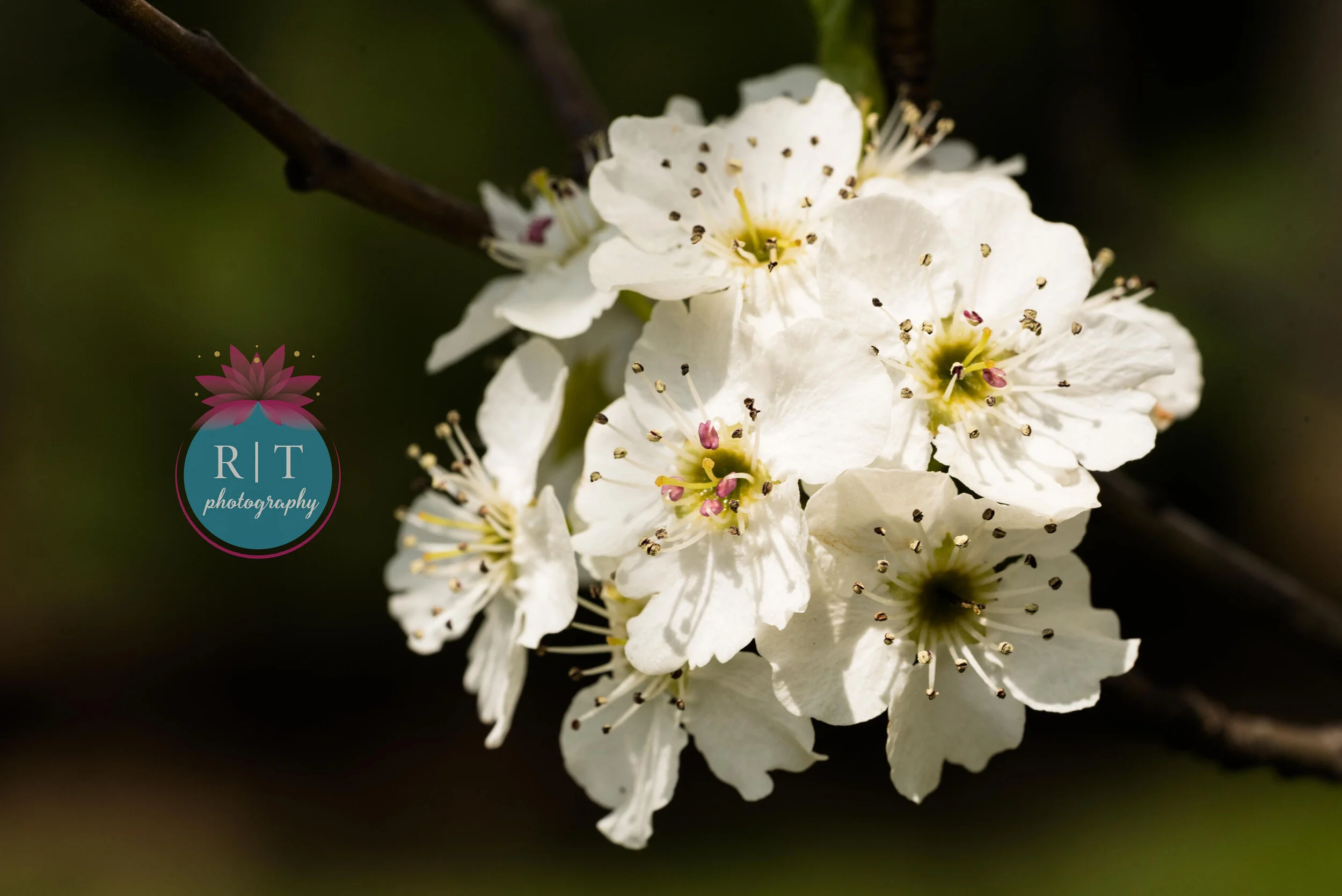
Blanc de Blanc

RTP - Fine Art - Blanc de Blanc - blossoms

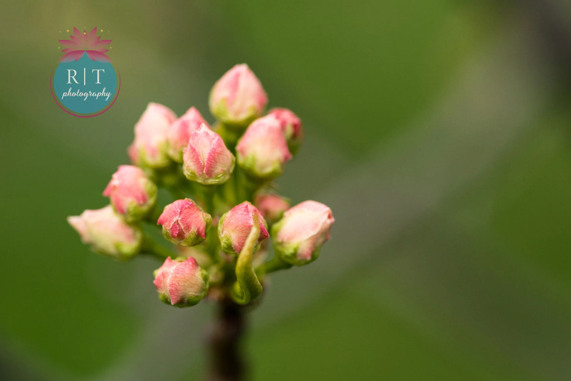
Blossom

RTP - Fine Art - Blossom

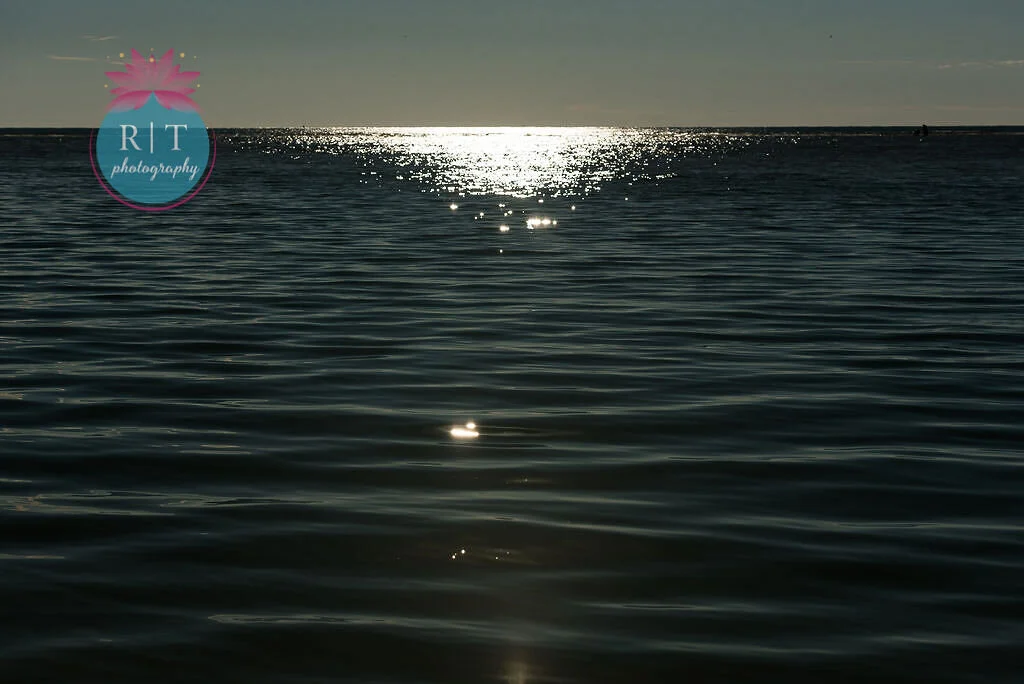
Blueberry

RTP - Fine art - blueberry - water

Blush Beauty

RTP - Fine Art - Blush Beauty

Bossa Nova

RTP - Fine Art - Bossa nova

Cuban Sand

RTP - Fine ARt - Cuban Sand

Fiery Red

RTP - Fine Art - Fiery Red

Flame Orange

RTP - Fine Art - Flame Orange

Heritage Blue

RTP - Fine Art - Heritage Blue

Rose Brown

RTF - Fine Art - Rose brown

Storm

RTP - Fine Art - Storm

Tanager Turquoise

RTP - Fine Art - Tanager Turquoise

Yellow Iris

RTP - Fine Art - Yellow Iris

I saw an amazing Instagram post from Arnold Schwarzenegger just last week, where he was giving a speech to the graduates of 2020. It was about ten minutes long and I’ve included it with this post. It was so encouraging and up lifting. He said one thing that really stood out to me about having a vision and keeping that vision in our minds as we work, train, learn and grow towards obtaining it. He knowingly shared that there will always be obstacles to overcome, but it is in that overcoming that we grow and finally obtain our dreams or visions.

I really felt encouraged to take that idea to heart. I want to lose weight. The weight I am at right now, is not comfortable for me and I don’t feel happy with it. The excess pounds are hard on my joints and on my heart. I have a vision to be a certain weight and to be healthier, so I am trying to keep that vision in mind as I evaluate what I can do differently in my eating habits, exercise and mind set to achieve that goal. In addition, I want to make a living at writing. In the same way, I am envisioning being an author for pay and trying to develop a plan for how to obtain that dream. Both of these things will take work. I have no doubt that I will fail, repeatedly, but instead of giving up, I want to dust myself off and start over. I don’t want to slide into that mindset of, “I can’t do this, so I might as well not try.”

God’s Word says,

“13 I can do all things through Him who strengthens me.”
— Philippians 4:13 (NASB)

I was also reading in My Utmost for His Highest the other day and Oswald Chambers said this:

“It is a continual struggle not to listen to the moods which arise as a result of our physical condition, but we must never submit to them for a second. We have to pick ourselves up by the back of the neck and shake ourselves; then we will find that we can do what we believed we were unable to do. The problem that most of us are cursed with is simply that we won’t. The Christian life is one of spiritual courage and determination lived out in our flesh.”
— My Utmost for His Highest - May 20 - Oswald Chambers

Moods are a huge thing for me. When I am up, I feel like I can get tons of things accomplished. When I am feeling down, I feel like am dragging my feet through sticky mud and can’t make progress in any area. Moods affect my productivity and my relationships to people and to myself. I think I need to do a whole blog post on just that idea, so maybe I’ll save that for later.

We don’t have to be failures. Yes we will fail. We will have obstacles thrown into our paths and for many of us that is a pretty regular occurrence, but they do not define who we are or what we can accomplish. Our perception and our belief have more to do with what we ultimately think about ourselves.

If the Pantone Color Institute can go about defining the color industry for thousands of businesses, fashion gurus and retail shoppers like us, than why can’t each of us have a vision for ourselves as to what we want to do and what we want to be? Let’s make it happen.

Graphic and photos by Rebecca Trumbull. Also see Fine Arts Page for purchasable photos for your home or office. Use STYL2020 for 15% off your order.

Check out this graduation speech from Arnold. It is well worth the watch. Have a great Memorial Day Weekend everyone. Stay safe.


Pantone Spring/Summer 2020 - Cinnamon Stick, Grape Compote and Navy Blazer

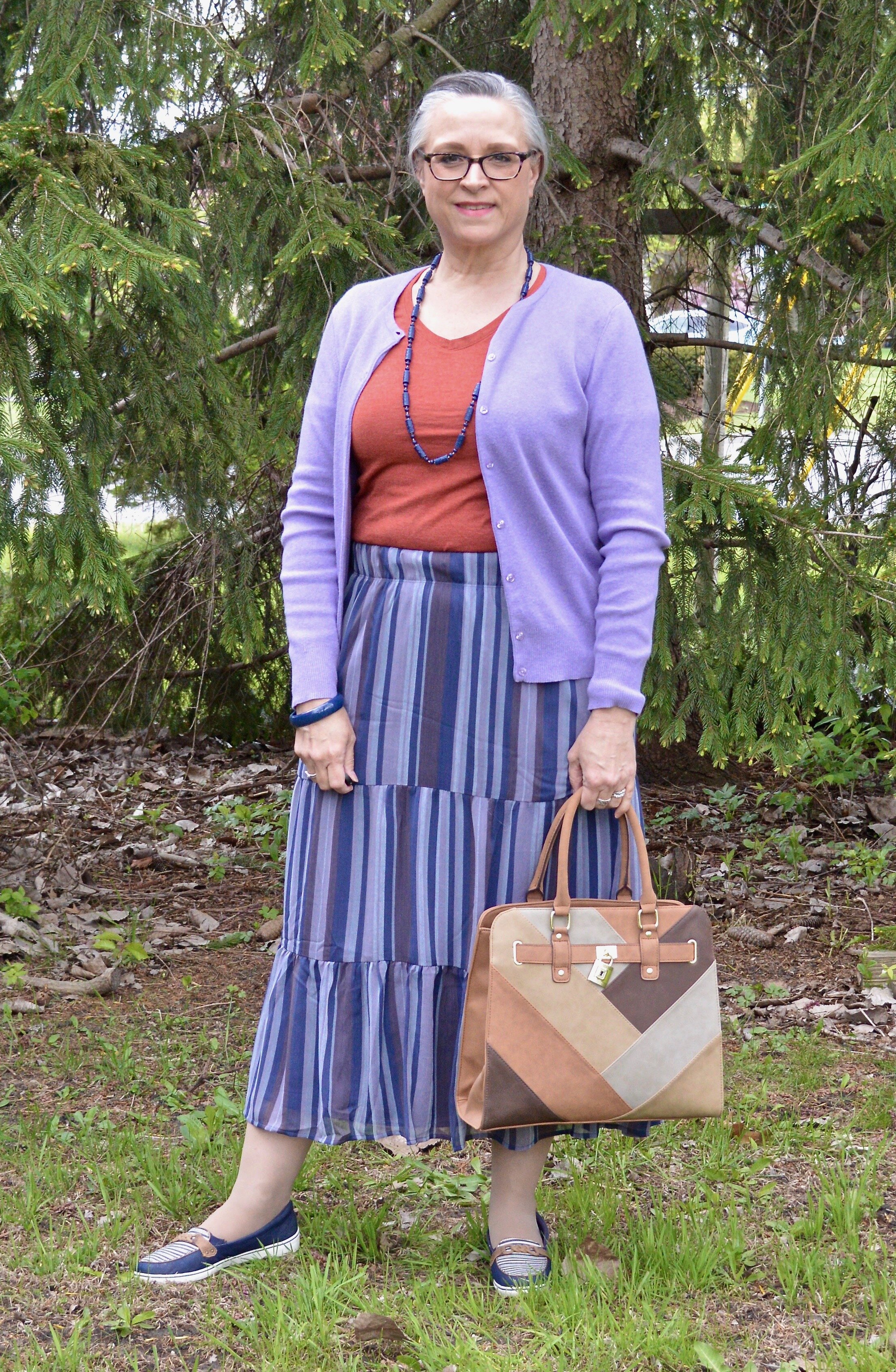
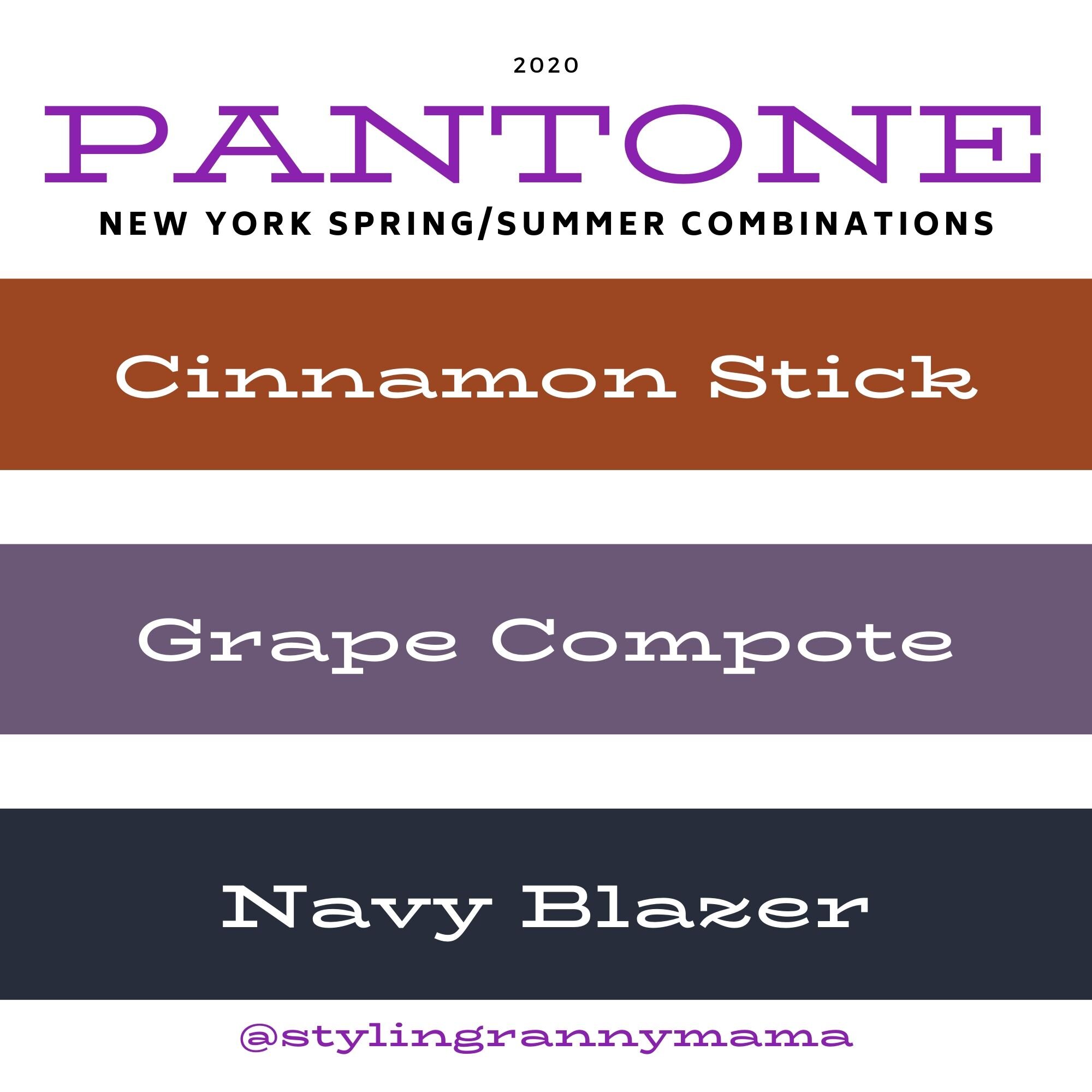
Today ends my look at the Pantone New York colors for Spring/Summer 2020. Thursday I’ll be introducing the London Palette, so be prepared for more fun colors. Today’s outfit features the colors Cinnamon Stick and Grape Compote with splashes of Navy Blazer and Lark in my accessories. I felt like Cinnamon Stick was a reach for me, not because I don’t like the color, but because it seemed misplaced on a summer palette. I definitely think this rusty red is perfect for fall, but my brain has a hard time making it a first choice for summer. However, when I thought about pairing it with the medium purple of Grape Compote, I knew I might have something that could work for a casual, but fun summer day.

The focal point of this outfit is this Christopher and Banks tiered skirt that I ordered mid-lockdown to cheer myself up. I just love it and it is so easy to wear. It is fully lined, so again, no worries about slips or coverage. It also has an elastic waist, but because it is more of a band, doesn’t look so crinkled. I should have adjusted it a bit, as my paunch was sticking out. Ha, ha. I think I have finally hit that age, where the weight is piling on very fast and it is much harder to get rid of. I have started exercising again, counting calories and doing the 12/12 fasting thing, but I think losing weight is going to be a bit more challenging. I need to focus on better food choices and cutting back on carbs. How about you? Is the whole pandemic affecting your weight?

Pantone Spring/Summer 2020 - Cinnamon Stick, Grape Compote and Navy Blazer

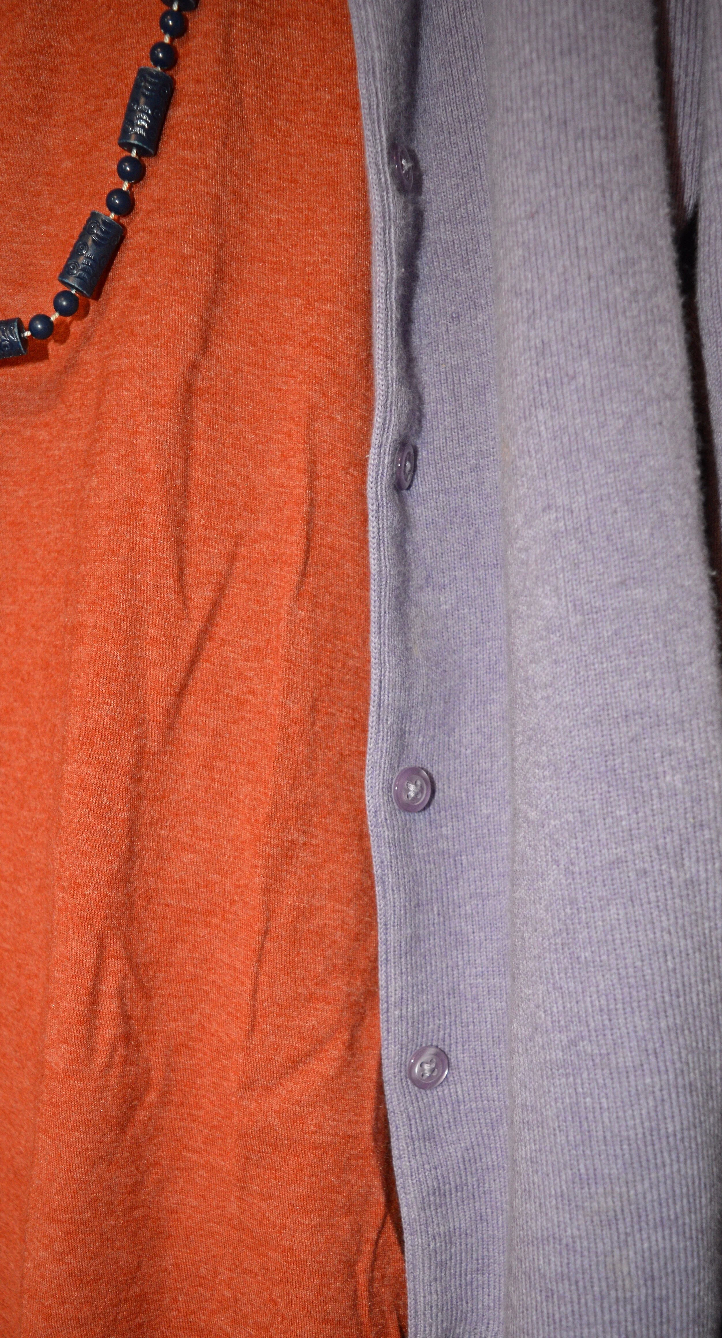
Once I decided to use the skirt, I looked for a rusty colored piece to epitomize the Cinnamon Stick Color. I think this Time & Tru tee from Walmart is probably a little too orange, but I liked how it ended up looking with the outfit and was a more summery choice than a heavy sweater, which were the only other pieces I had in this color.

Pantone Spring/Summer 2020 - Cinnamon Stick, Grape Compote and Navy Blazer

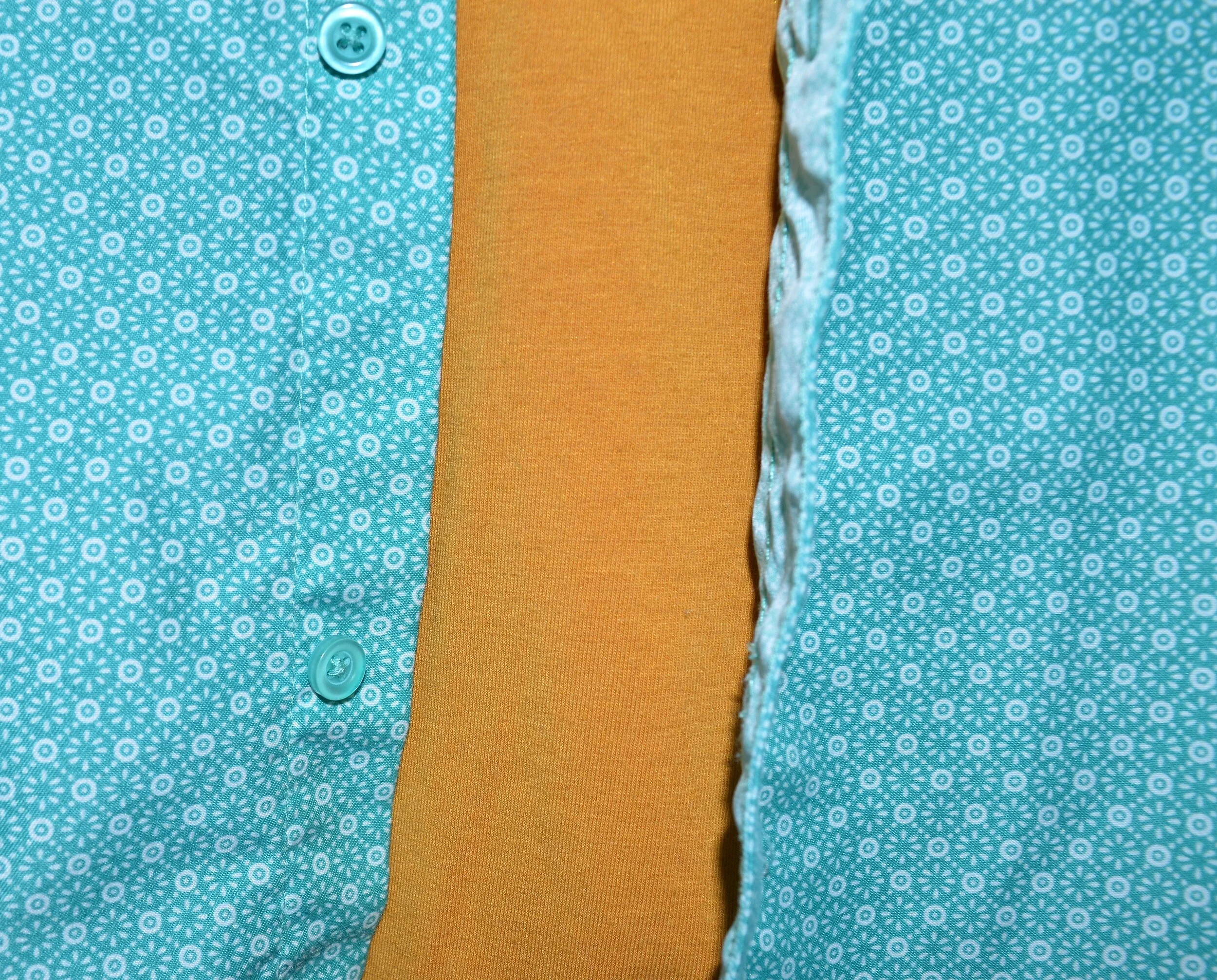
My purple cardigan is an old Croft and Barrow piece, that I don’t wear a lot, but I hung onto because I don’t have anything that color. Now I am even more glad I did, because it goes so well with the skirt.

Seeing as the skirt had navy stripes in it, I added navy accessories with a simple bangle bracelet, bead necklace and my navy Grasshopper shoes.

Pantone Spring/Summer 2020 - Cinnamon Stick, Grape Compote and Navy Blazer

I was going to grab my thrifted Simply Vera navy bag, but decided to go back to the Classic Palette and pull in Lark. My shoes have those decorative braids and my George patchwork top handle bag was just the right shade for the classic color.

Pantone Spring/Summer 2020 - Cinnamon Stick, Grape Compote and Navy Blazer

What do you think of these colors? Purple has long been one of my favorite colors, but it’s funny that I don’t reach for it as often as my yellows or my blues. However, with this cute skirt, I may have to wear it a little more often. I can see this skirt being worn well into Fall with a few of my chunkier purple sweaters and some boots.

Pantone Spring/Summer 2020 - Cinnamon Stick, Purple Compote and Navy Blazer

I hope you enjoyed this post and this outfit. I’d love to hear your thoughts so be sure to leave a comment or two. I do try to respond to all of your comments, so if you are curious, just check back in a few days.

I’m including a few shopping links. These are affiliate links. If you click on a link I get a few pennies. If you purchase something through my links I might get a little more. I appreciate all your clicks. All opinions are my own.

Graphic designed by Rebecca Trumbull.


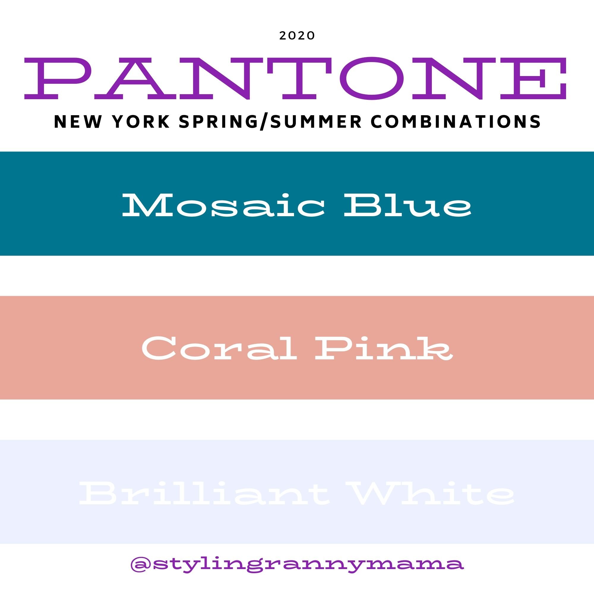
Pantone Spring/Summer 2020 - Mosaic Blue, Coral Pink and Brilliant White

Today features another pretty blue and a version of a coral color that comes around almost every summer. Just like Biscay Green, Mosaic Blue makes me think of tropical waters, blue skies and palm trees. Coral Blush reminds me of the light pink peonies that used to grow in my mother’s yard every spring. I have always loved peonies for their beautiful, large blooms and delicate scent. Once again, I am pairing these two lovely colors with Brilliant White from the Classic collection of colors.

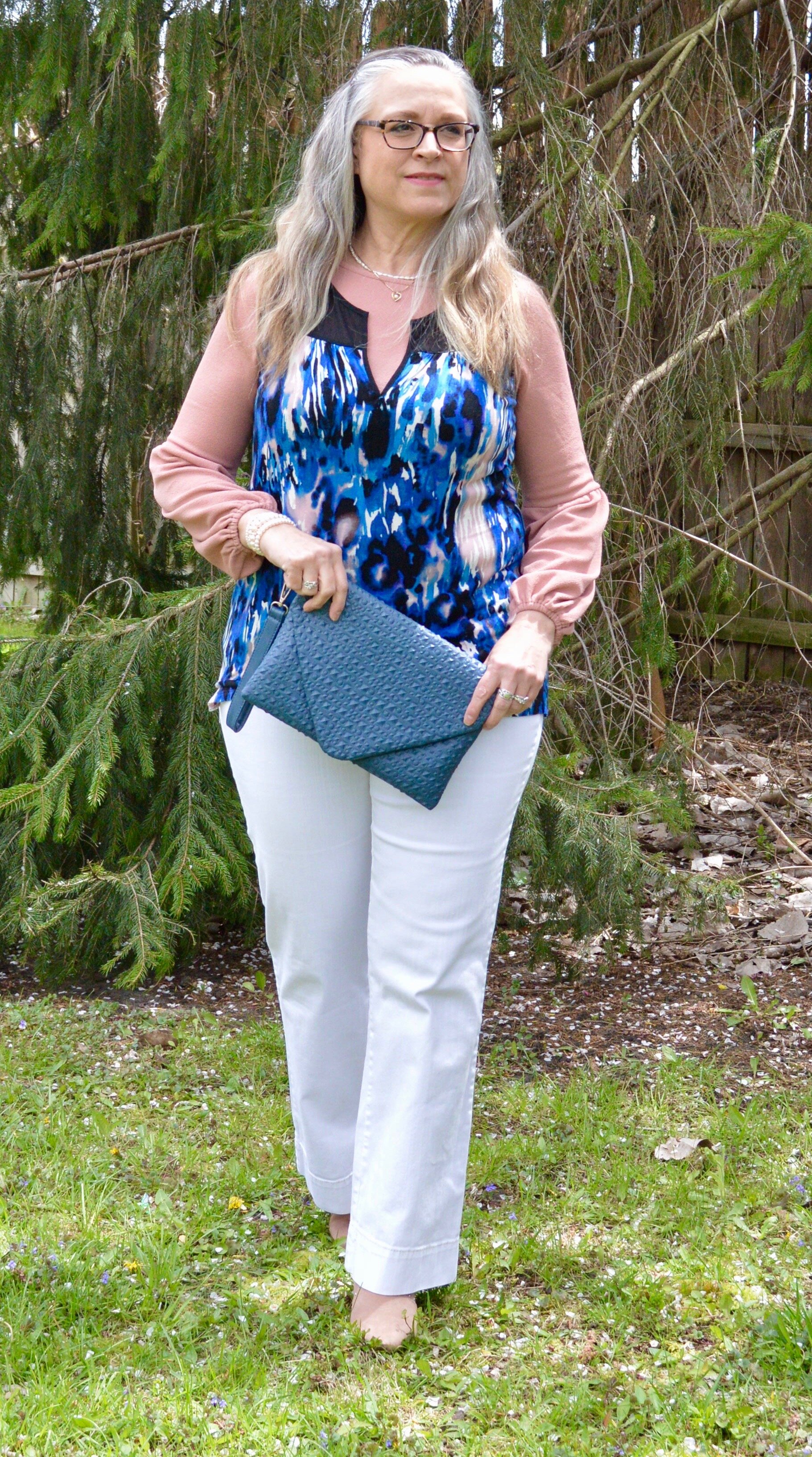
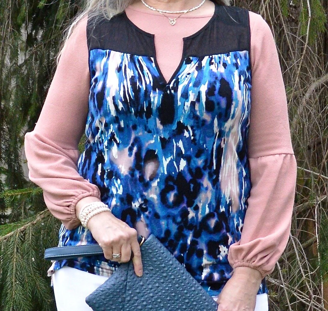
The sleeveless, abstract print top is from a Kohl’s clearance rack a few years ago. I have always liked Vera Wang’s Simply Vera line at Kohl’s, but have to be choosy about which pieces I buy because of the fit. I love the bright, abstract patterns and the way she combines different textures and styles all in one piece. Her pieces have a little bit higher price point than what I normally like to pay, so I try to find pieces on clearance. The only problem with that is I often miss out on some really fun, eclectic looks because they sell out quickly. You can see some of the other Simply Vera pieces I have styled on the blog by clicking on the links: thrifted navy bag, thrifted cross body bag, embroidered skinny jeans, a floral top, and summer dress.

DSC_0018 (2).jpg

The Coral Pink long sleeve top that I put underneath matches the Coral Pink splotches in the Vera top perfectly. Obviously if it was warmer I wouldn’t have had to layer, but it is spring here in the midwest. Ha, ha. This coral colored piece is also a Kohl’s clearance find and is Lauren Conrad brand. Lauren Conrad is another brand I like from Kohl’s, but again, unless I find it on the clearance rack I don’t usually buy her pieces. I do love her take on pastels and feminine details.

Pantone Spring summer 2020 - Mosaic Blue, Pink Coral and Brilliant White

I’ve also styled these Gloria Vanderbilt jeans from JC Penney on the blog before. These are my favorite white jeans, as they are thick and fit fairly well, even with my extra COVID pounds. Ha, ha. I like the flared style for a little dressier look and they go well with heels.

For my accessories, I thought some pearls would look good. I also grabbed my blue textured clutch and my blush SO ankle boots. Obviously, when the weather warms up I’ll exchange my ankle boots for sneakers and sandals, but these light colored booties work well for spring.

Pantone Spring/summer 2020 - Mosaic Blue, Coral Blush and Brilliant White
Pantone Spring/Summer 2020 - Mosaic Blue, Coral Pink and Briliiant White
Pantone Spring/Summer 2020 - Mosaic Blue, Coral Pink and Brilliant White

What do you think of these colors? Do you have either of these colors in your closet? I think both of these colors would look good on many complexions. Sometimes coral can be too orange, but this seems to be a happy medium.

Pantone Spring/Summer 2020 - Mosaic Blue, Coral Pink and Brilliant White

Did you like this post? If you did, do my blog some good by hitting the like button and by leaving a comment. I appreciate all your feedback.

I’m leaving you with a few shopping links to enjoy. These are affiliate links and all you clicks give me a few cents here and there. Thank you for that as well. All opinions are my own.

Graphic designed by Rebecca Trumbull.


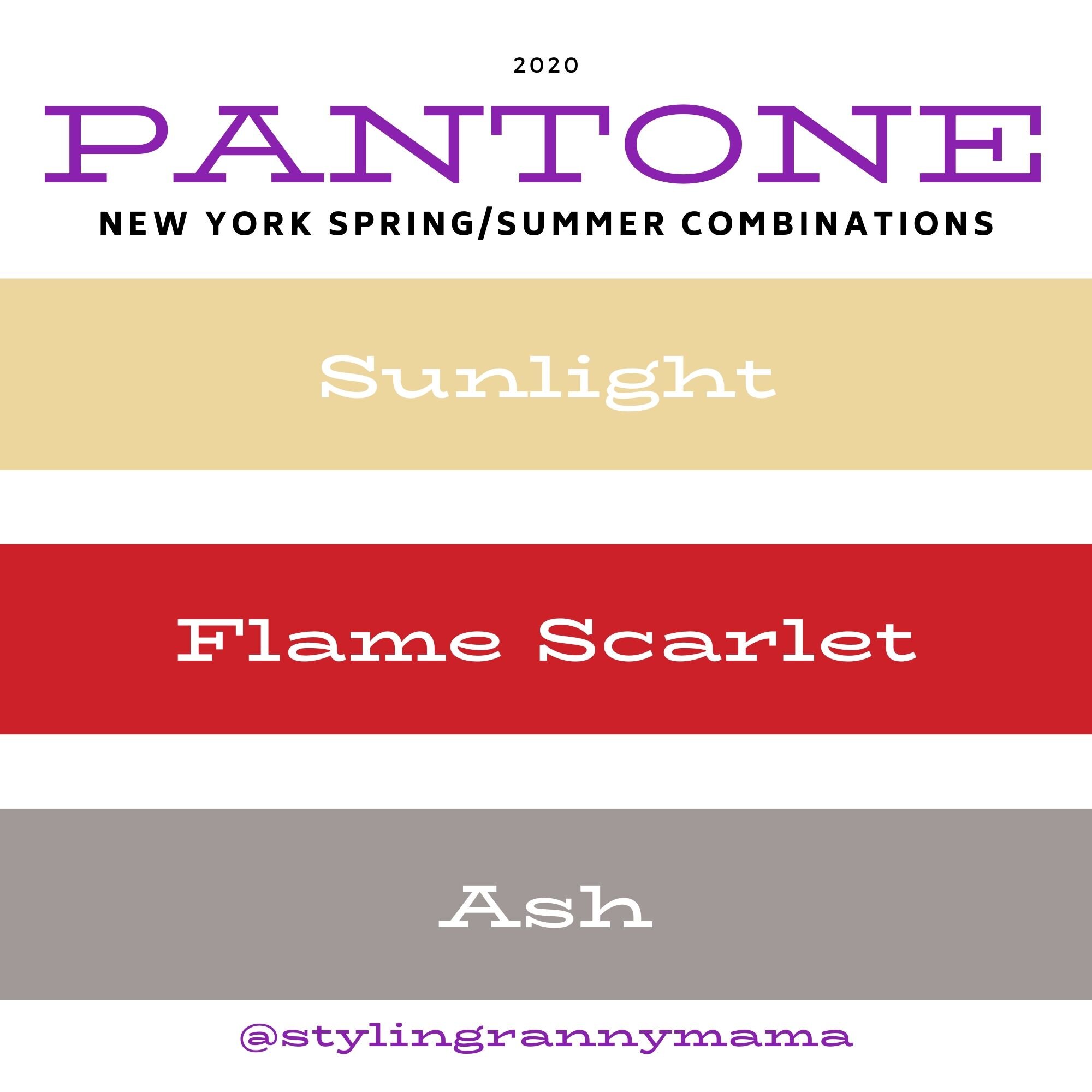
Pantone Spring/Summer - 2020 - Sunlight, Flame Scarlet and Ash

There are so many ways to combine these colors. I have had a few of you make comments about which colors you like and love to combine. Susan told me she loves today’s pale yellow, Sunlight, combined with Tuesday’s medium pale blue, Faded Denim. What a great combination. I had Karen tell me she usually veers towards the Classic colors, but suddenly realized she had a few new outfits in her closet when she saw last Thursday’s combination of Classic Blue and Chive. I would love to spend most of my blog time just talking about color combinations, because the more I do these Pantone series, the more I realize how many more beautiful combinations there are. However, I know there are other fashion topics to talk about, so I’ll keep the color talks to the Pantone series and my monthly Color Play posts, which will be back soon. Thank you, all of my beautiful subscribers, for your input and support.

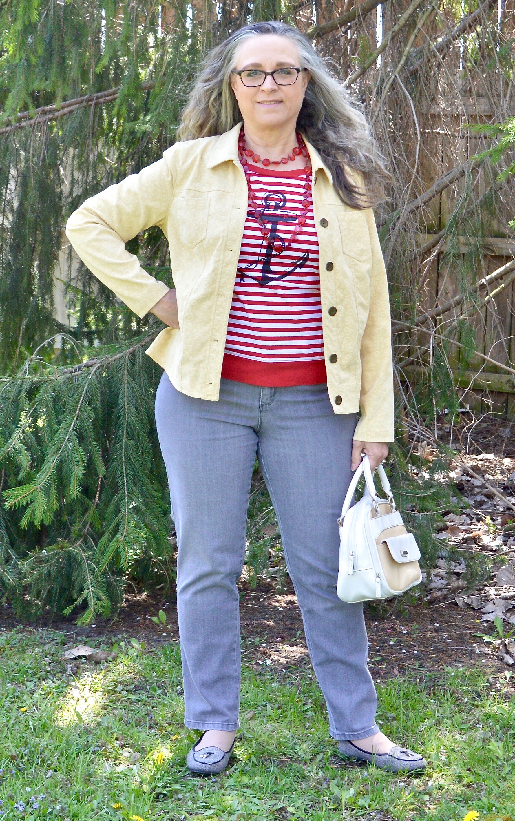
Today’s color combination may not have been your first choice. When we think of combining yellow and red my mind immediately goes to McDonald’s. Anyone else have that reaction? Yellow and red seem almost clownish together, but you may change your mind when you see how a pale faded yellow pairs with a stark red. I like it. Let me know what you think.

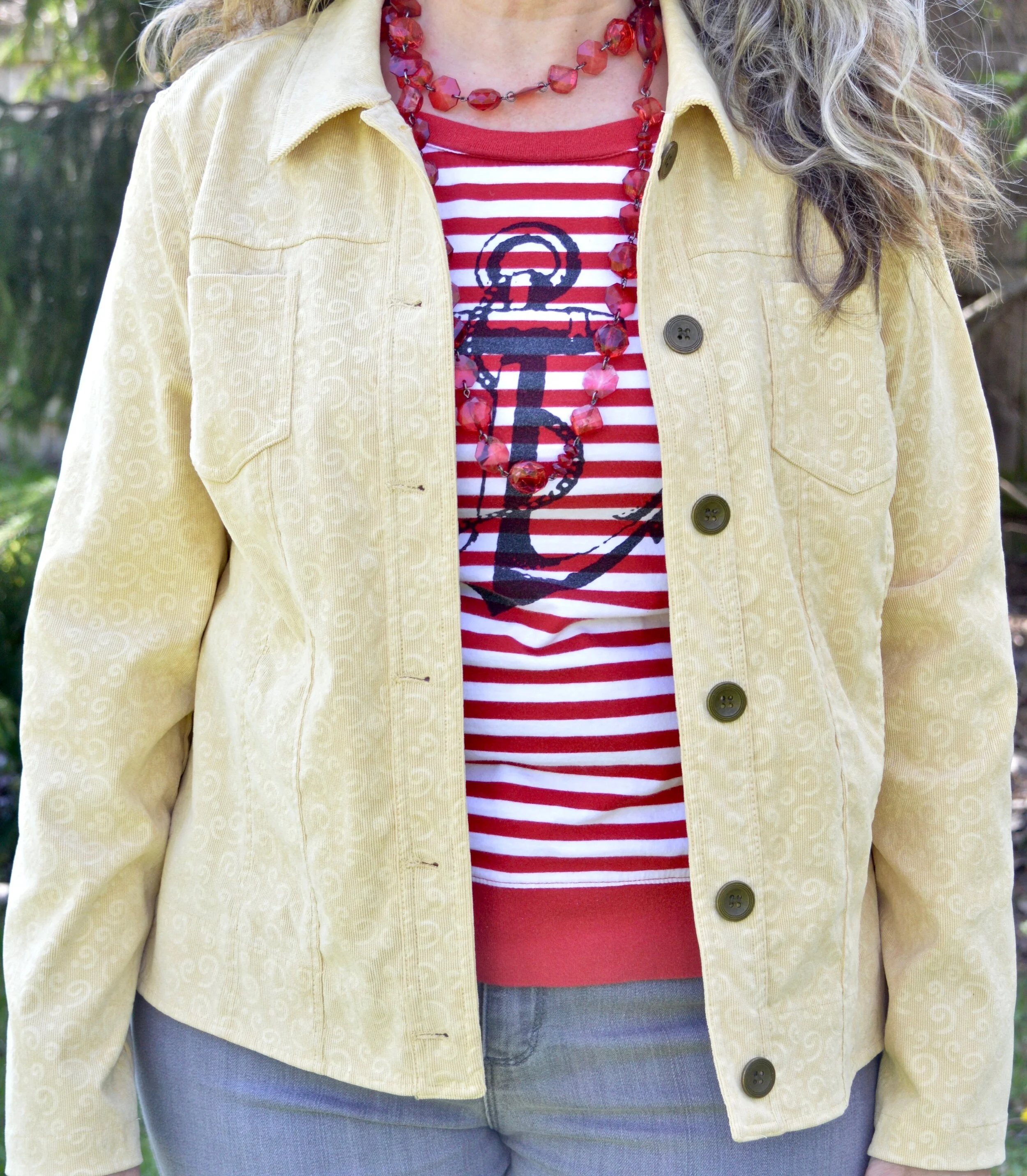
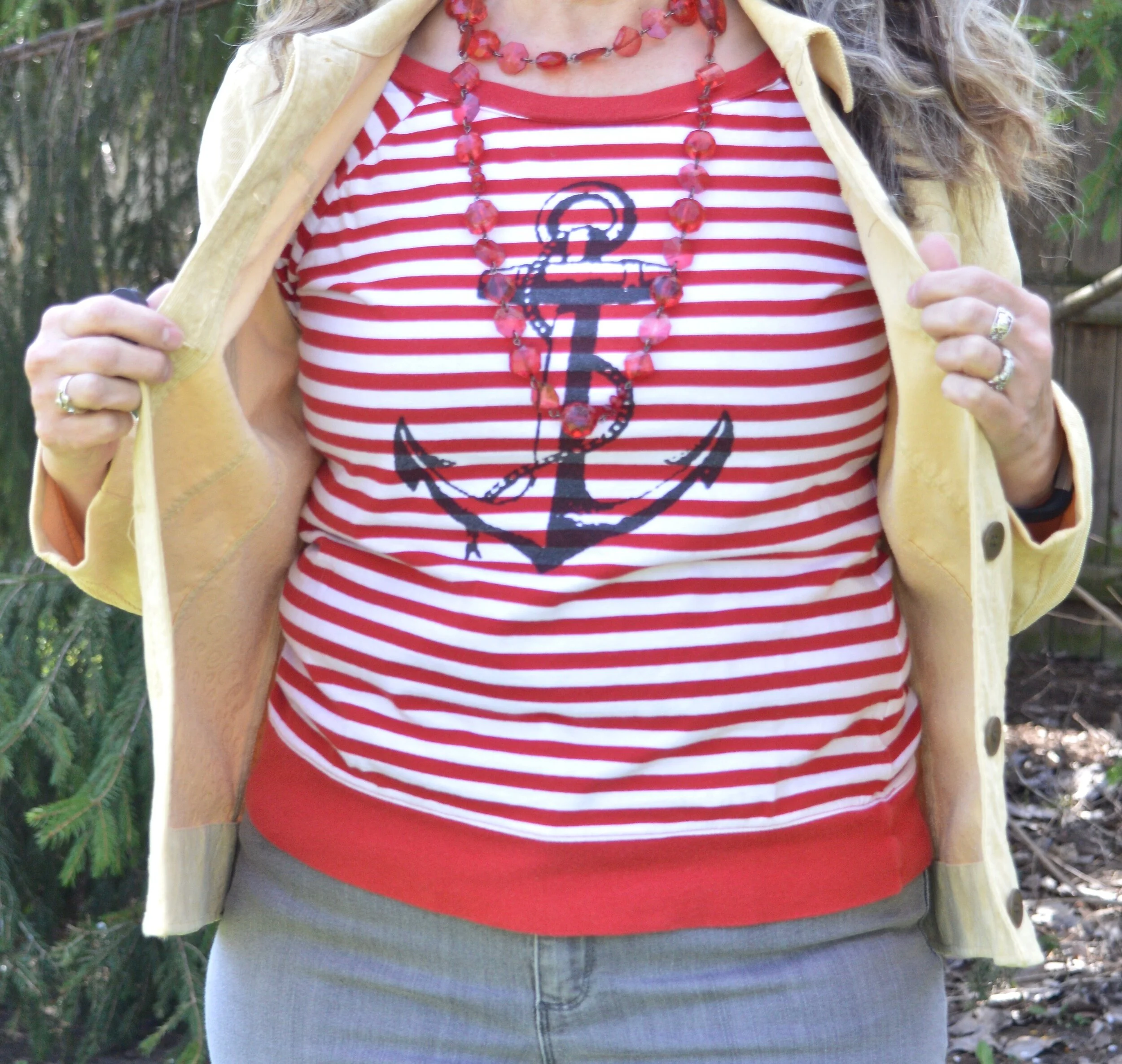
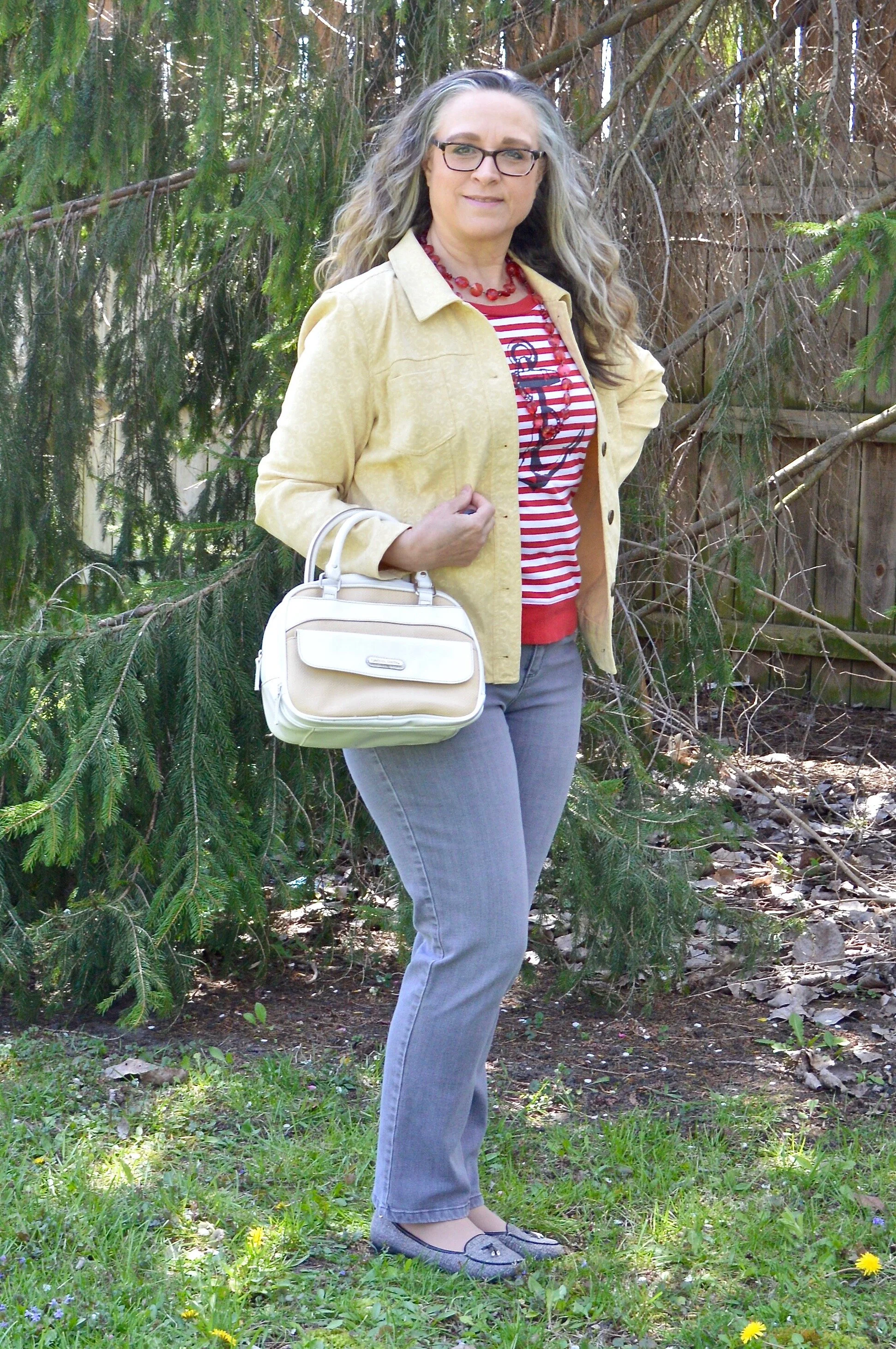
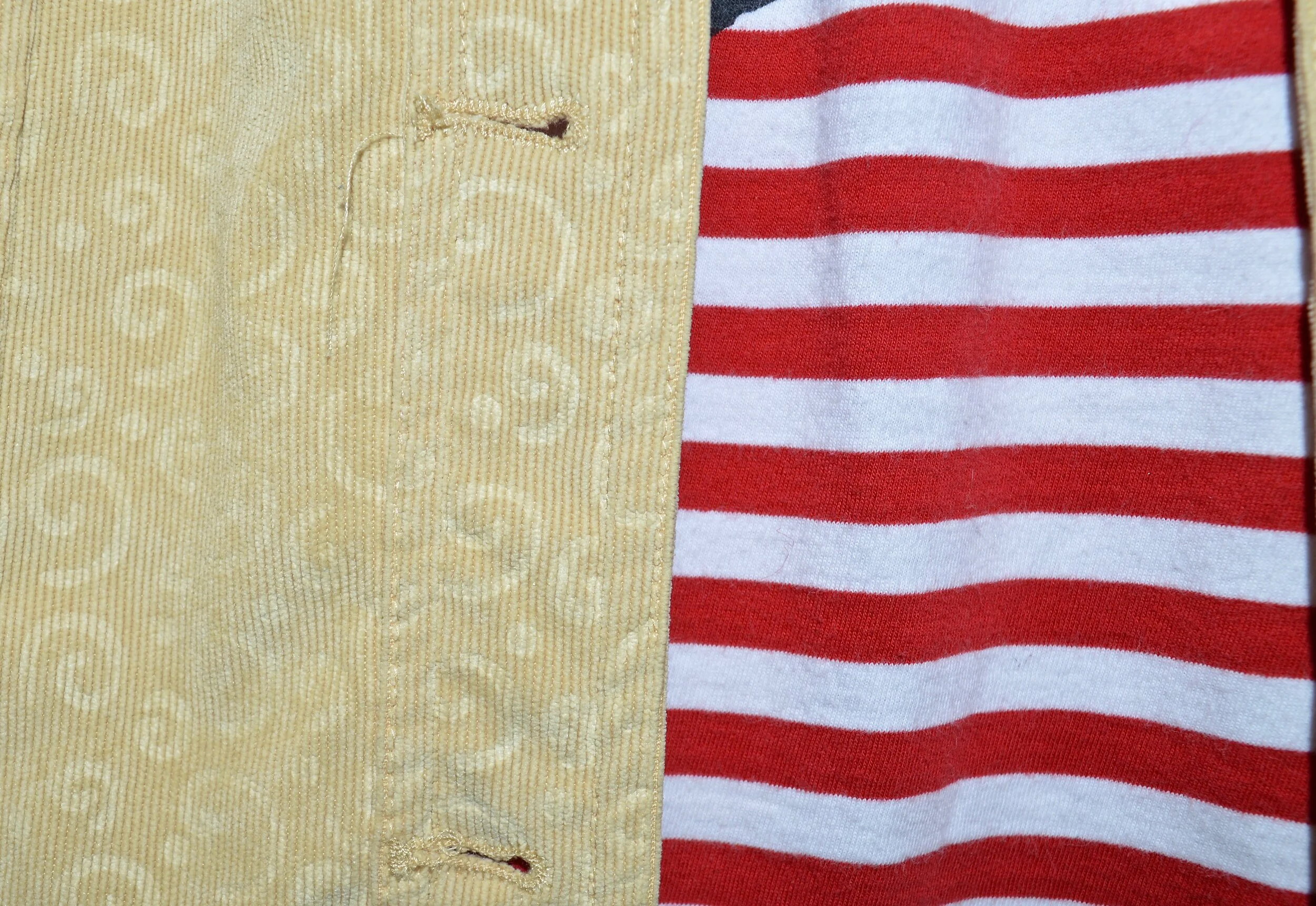
This thrifted Christopher and Banks corduroy jacket was the perfect Sunlight color. This jacket is soft, flexible, and great for those in between days when it is still cool.

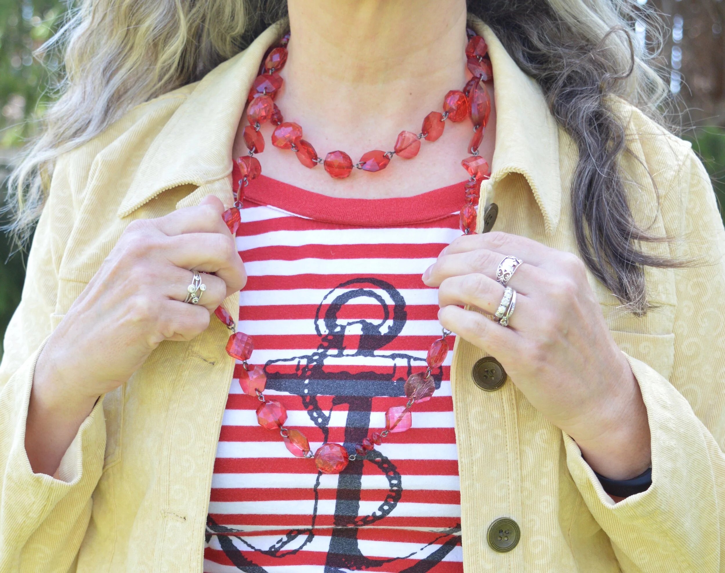
Another thrift find, this Nautica 3/4 sleeve tee is a great spring and summer staple. Not only does it have the bright Flame Scarlet and white stripes, but it bears the nautical sign of the anchor. It makes me think of the anchor of the Lord, that moors my boat in this ever stormy sea called life.

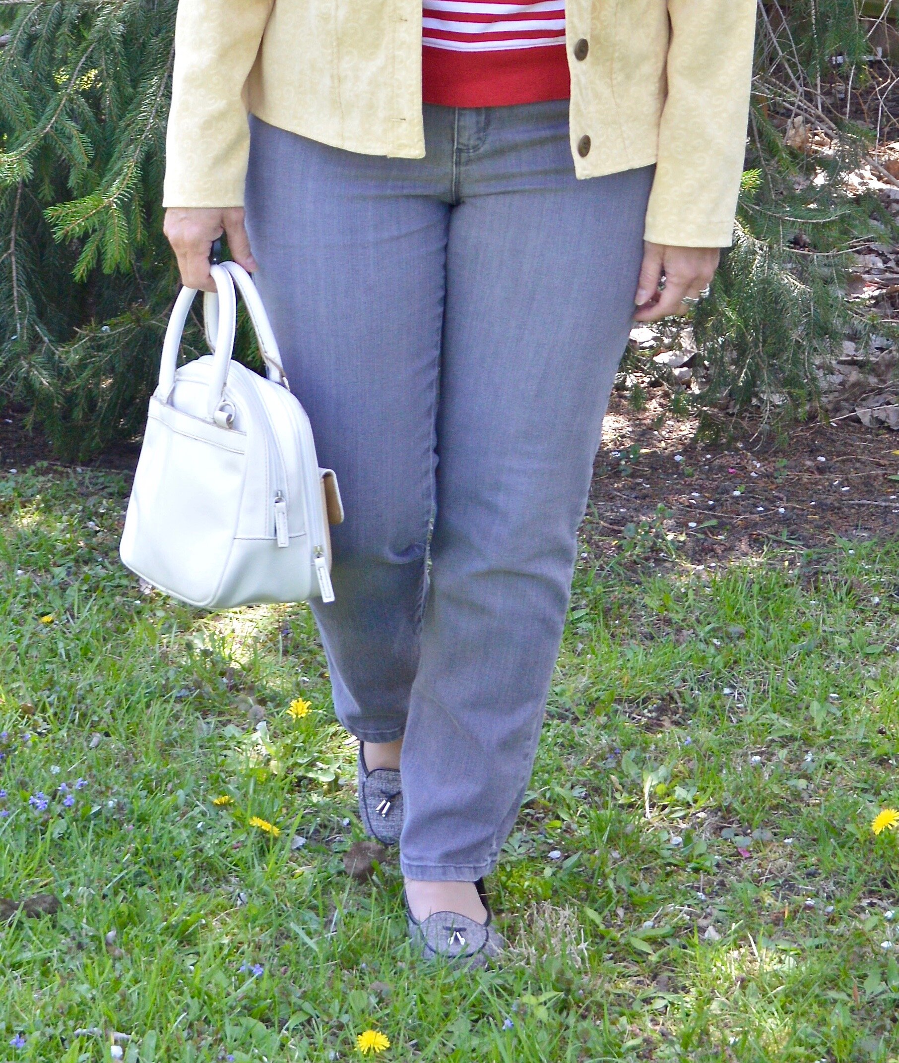
These Ash gray jeans are another thrift find, and are Gloria Vanderbilt. I used to wear Gloria’s jeans all the time, then got away from them. This pair is soft and have just enough stretch to make them so comfortable to wear. I think the length of these is great for summer. How do you like to wear your pant length in the warmer months?

I kept the jewelry minimal and threw on this opera length string of large beads. Doubling it, gives it a fun layered look.

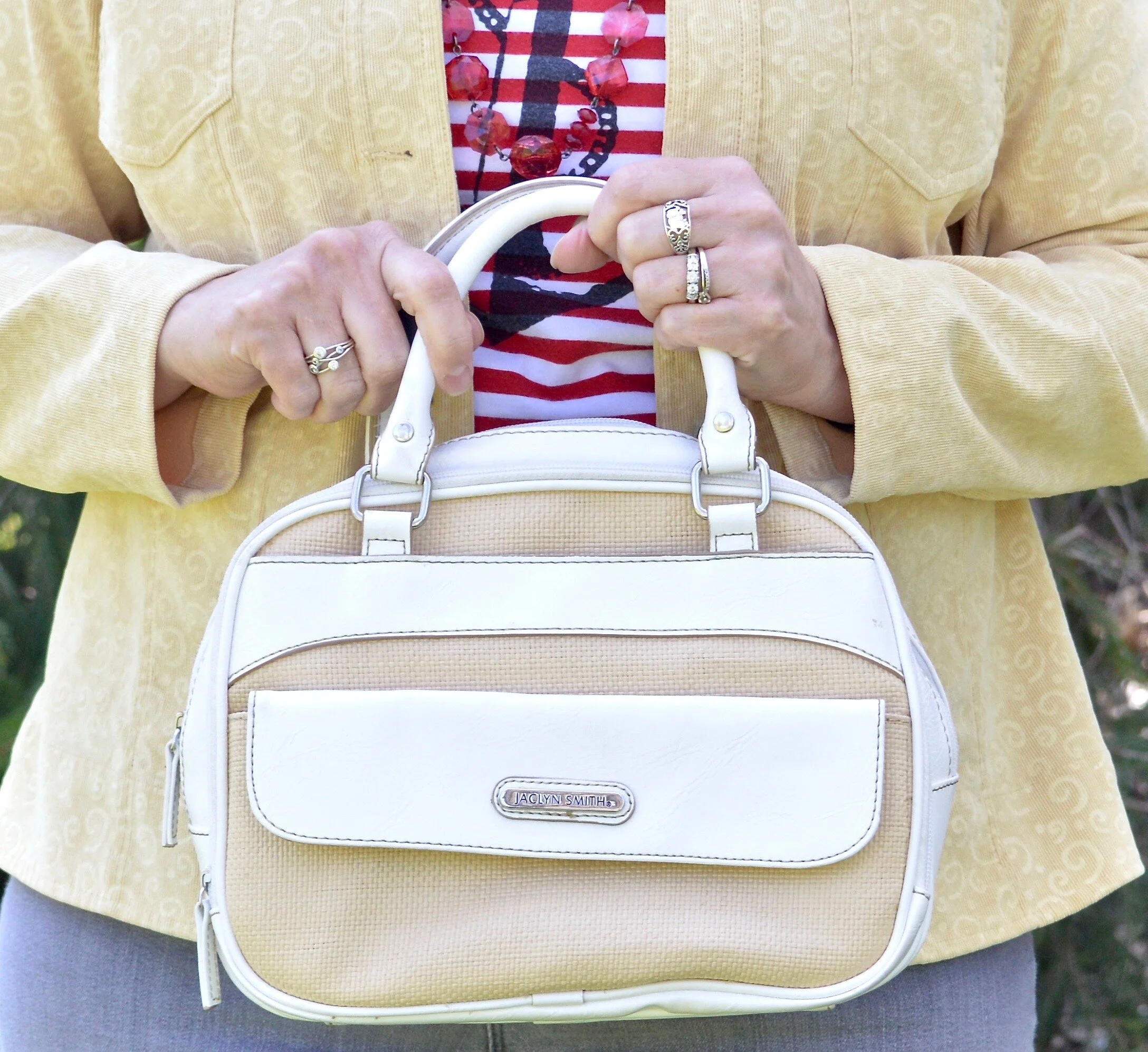
I chose this simple thrifted Jaclyn Smith top handle bag to keep the look light and fresh. This also comes with a longer strap so it can be converted into a crossbody bag. You can see how I styled this bag with white jeans, Bermuda shorts and high waisted jeans.

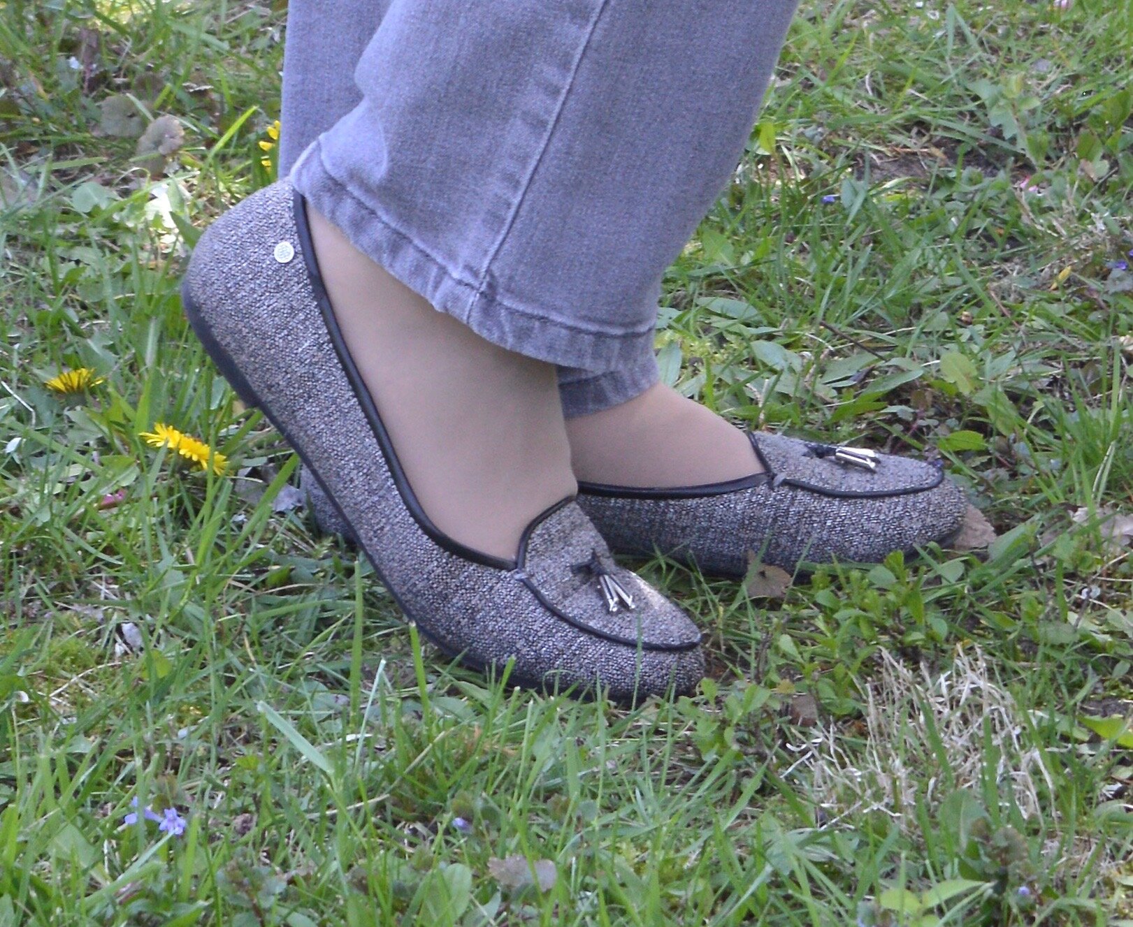
My Dana Buchman tweed loafers are making another appearance. Loafers are a great shoe for this in between time, before you really want to go out in sandals.
What do you think of this color combination? Have I changed your view on wearing red and yellow together? It would not be my first choice of colors to combine, but I am glad I did it for this series. It helps me to think outside my box. As always I love to hear you thoughts.

Graphic created by Rebecca Trumbull.

I’ve included a few shopping links which mimic this look. These are affiliate links and all opinions are my own.


Pantone Spring/Summer - 2020 - Faded Denim, Orange Peel and Lark

I must give the creators at the Pantone Color Institute credit for coming up with interesting names for their colors. It is especially mind boggling when they have been doing it for so long. Coming up with new words to describe color has to be no easy task. The name Faded Denim is cute and evokes memories of well worn jean jackets and tattered jeans. Orange Peel, mmmm, can’t you just smell the juicy, citrusy goodness? A Lark is a type of bird and you can see a few images of one here. On seeing the images the color will make perfect sense. On to our outfit.

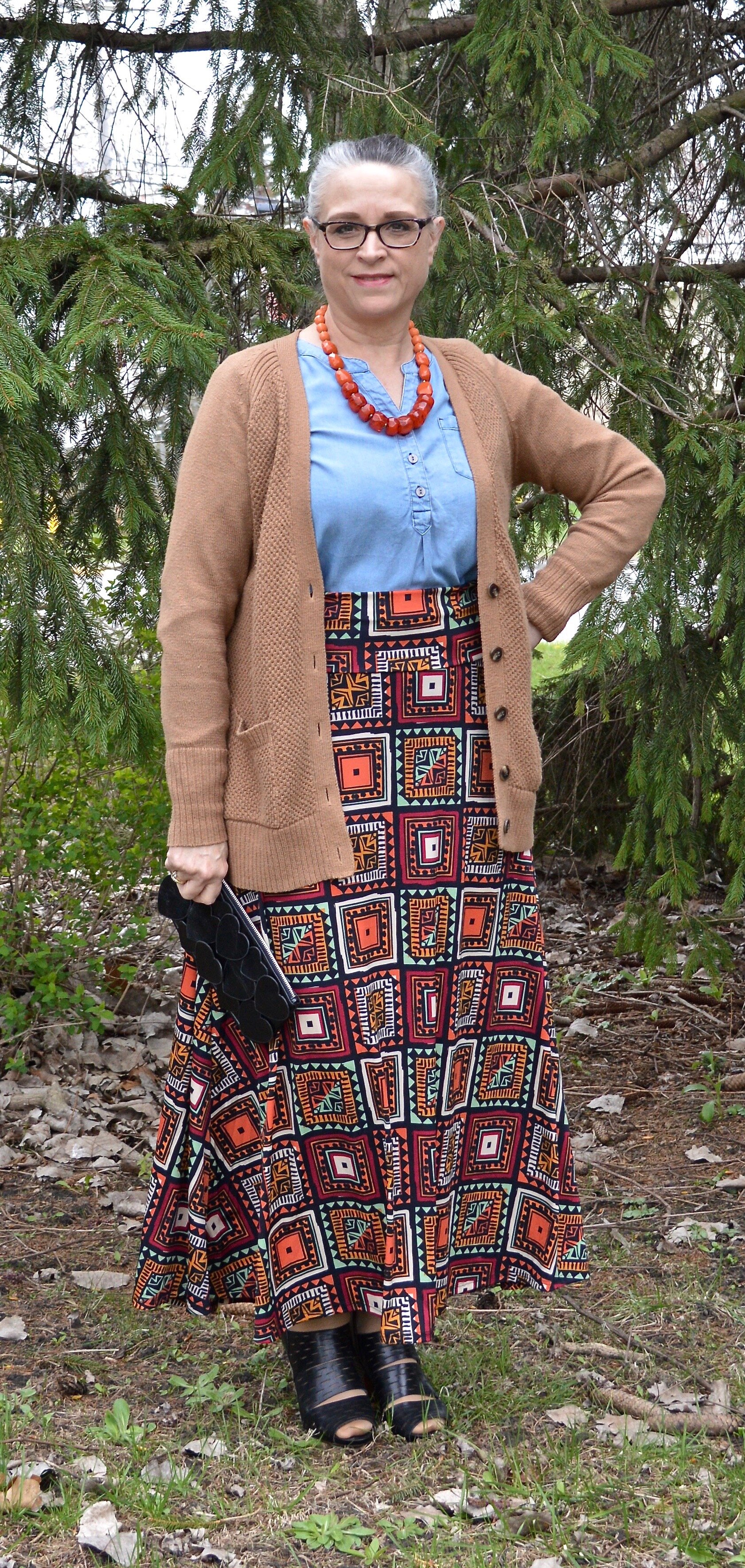
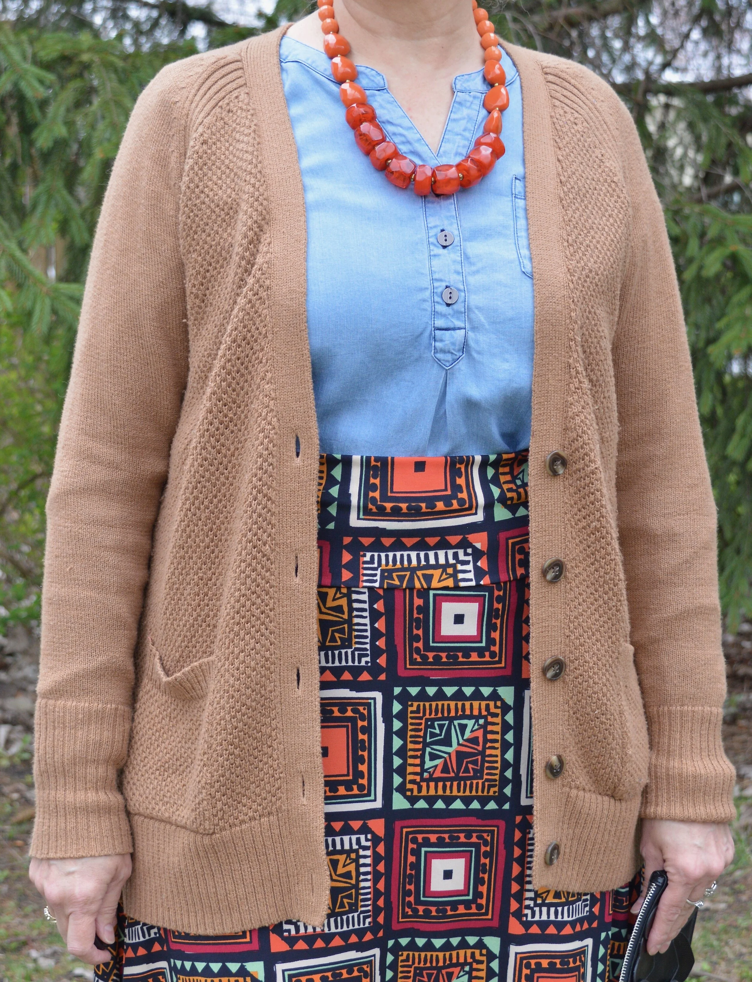
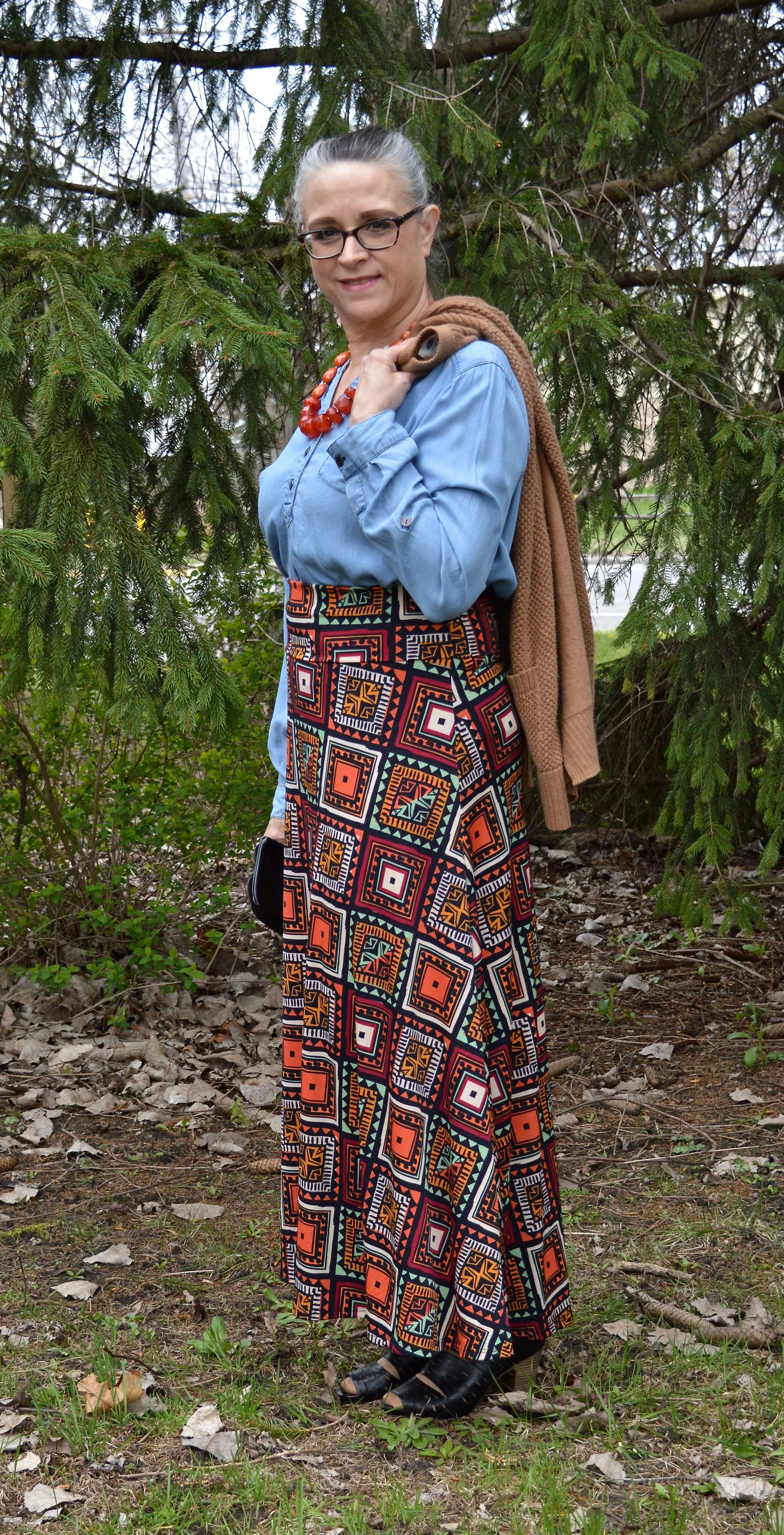
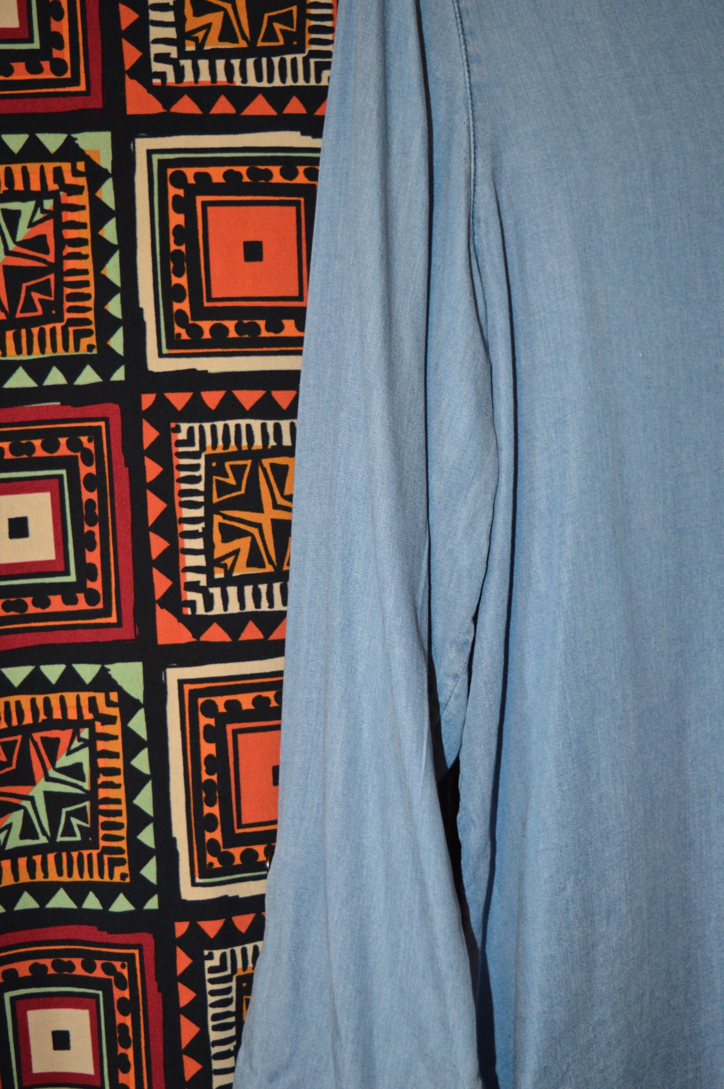
The Pantone version of Faded Denim is a more of a medium wash denim that has paled a bit from repetitive washing. I chose my light wash Christopher and Banks pop over chambray top, which is a bit lighter than the Pantone color, but it serves the purpose. I’ve used this top on the blog before. You can see how I styled it with white pants, and with a denim vest. Here is a picture without the sweater, which I’ll come back to.

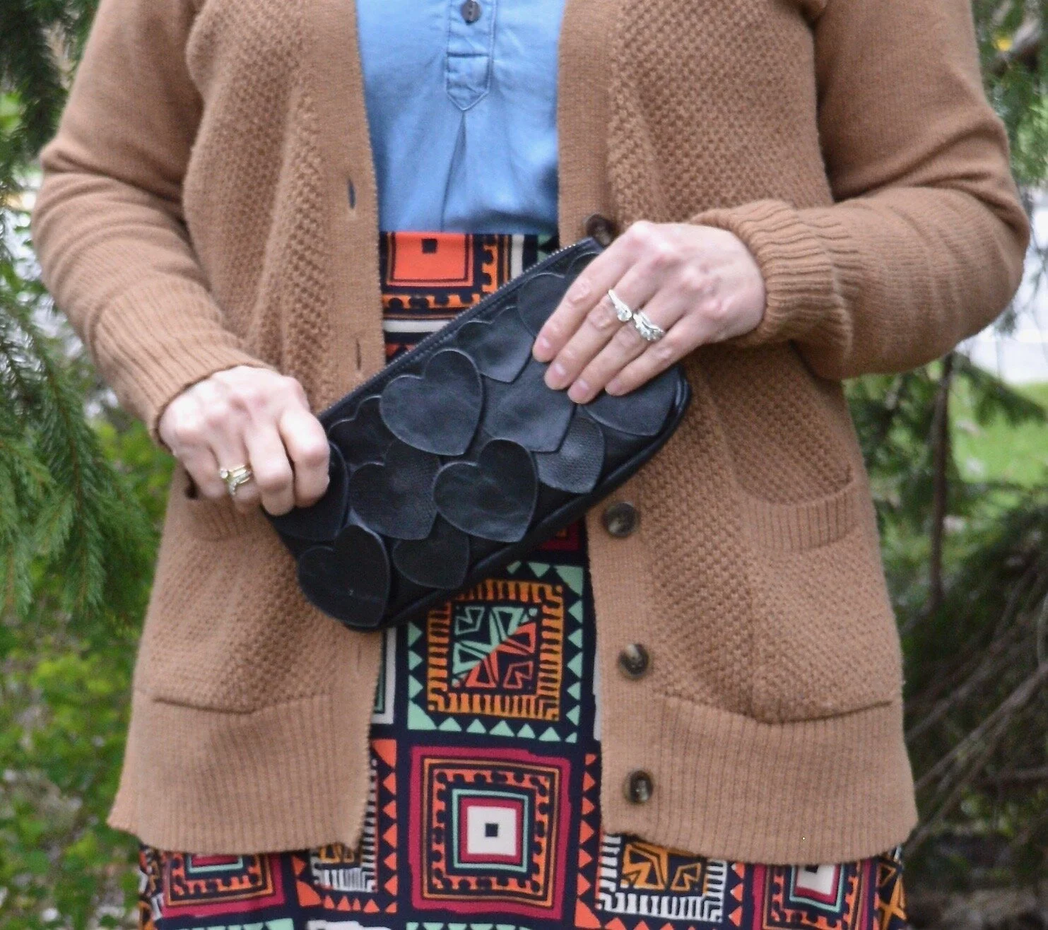
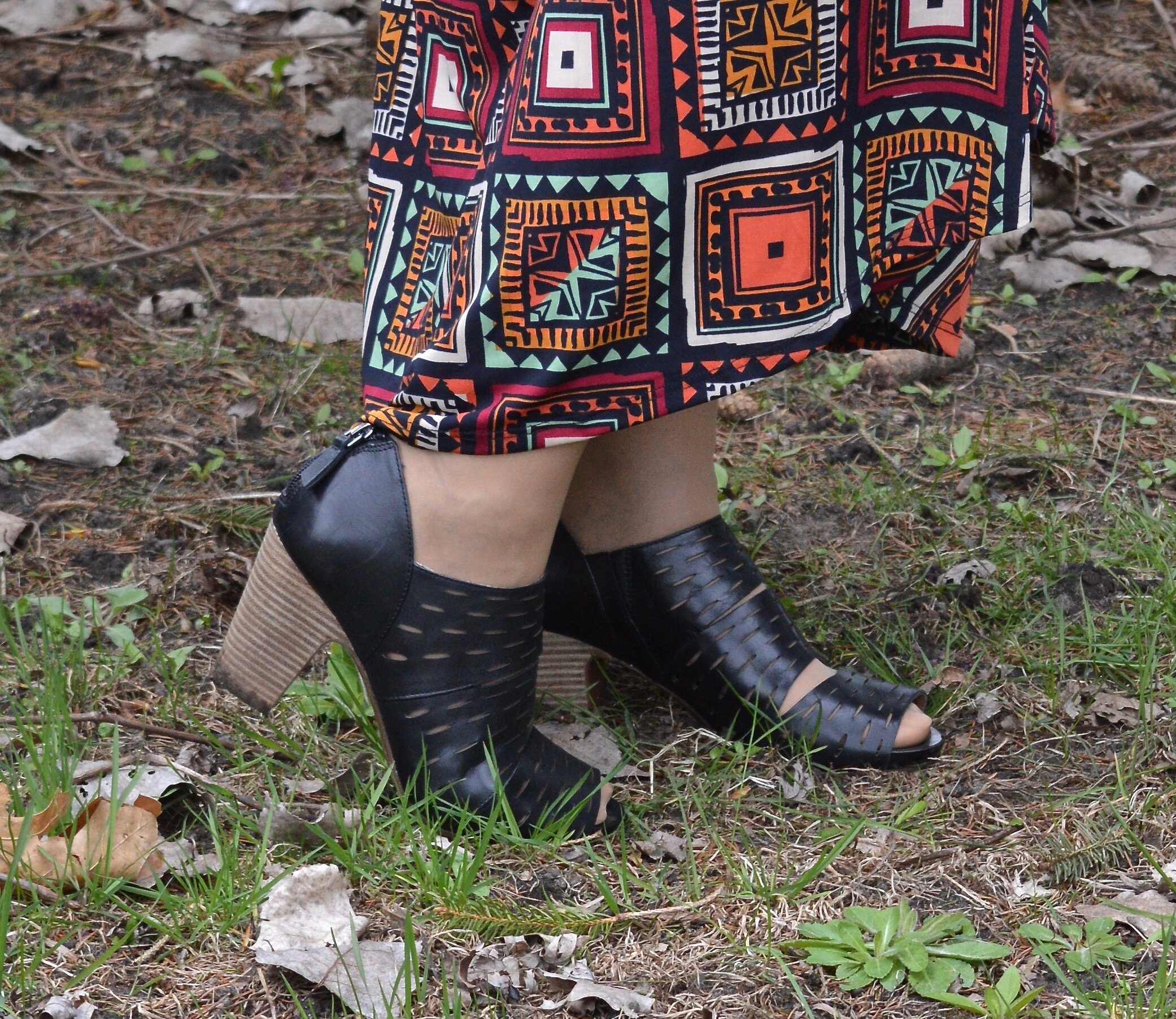
This Lu La Roe maxi skirt has a fun multi-colored print that includes Orange Peel. I like a printed skirt like this because I can match it up with so many different colored tops or sweaters. Even in this situation where the top is not one of the colors in the skirt, it works because the light blue goes well with all of the other colors. You probably could do this with numerous other colors.

I found this Lark (or camel by any other name), colored sweater thrifting. It is Old Navy brand. It has a bit of a grunge vibe, which I like. I thought pairing it with this more dressed up skirt and top gave the look a cozy feel.

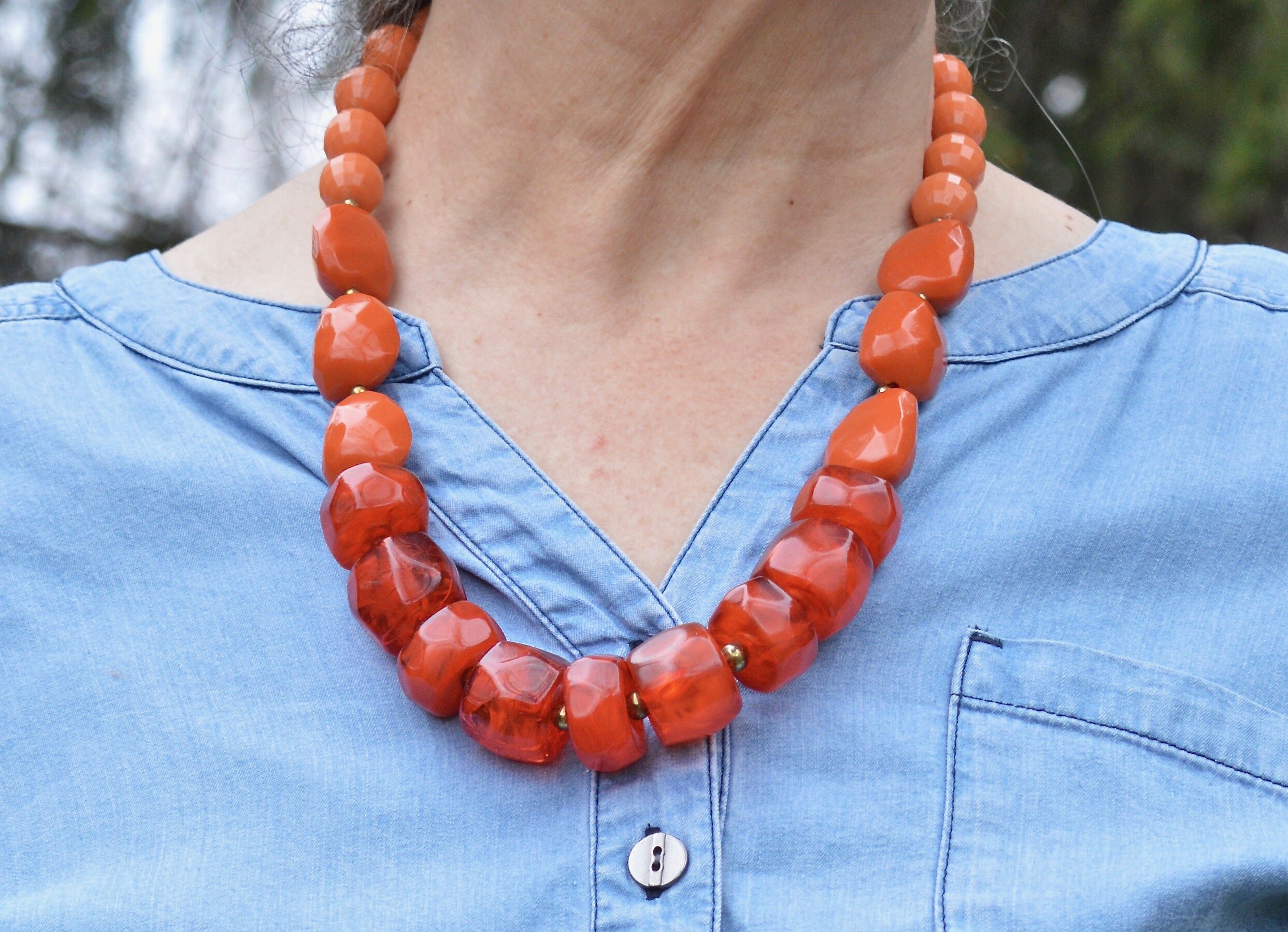
This chunky orange necklace was perfect for this outfit and the small little black clutch with heart appliques kept the whole look from being too overwhelming. Some times a big skirt and a big sweater and a big top with a big bag, just gets to be too much.

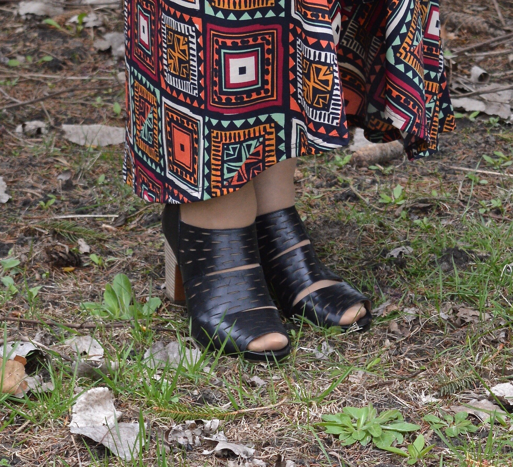
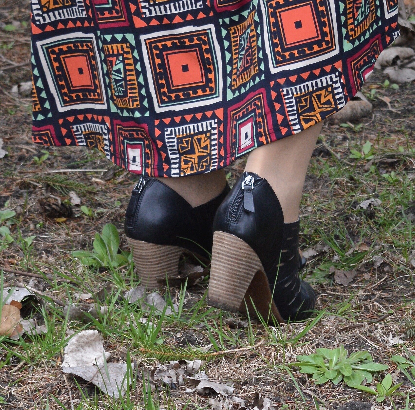
This black pair of peep toe shoeties from Clarks are so comfy and I like the zipper on the heel. They are very easy to get in and out of.

What do you think of Faded Denim and Orange Peel? Would you wear these colors? I’d love to hear your thoughts, so leave me some love in the comments.


I’ve included a few shopping links, just for fun. These are affiliate links. All opinions are my own.

Graphic by Rebecca Trumbull.

Pantone Spring/Summer - 2020 - Classic Blue, Chive and Navy Blazer

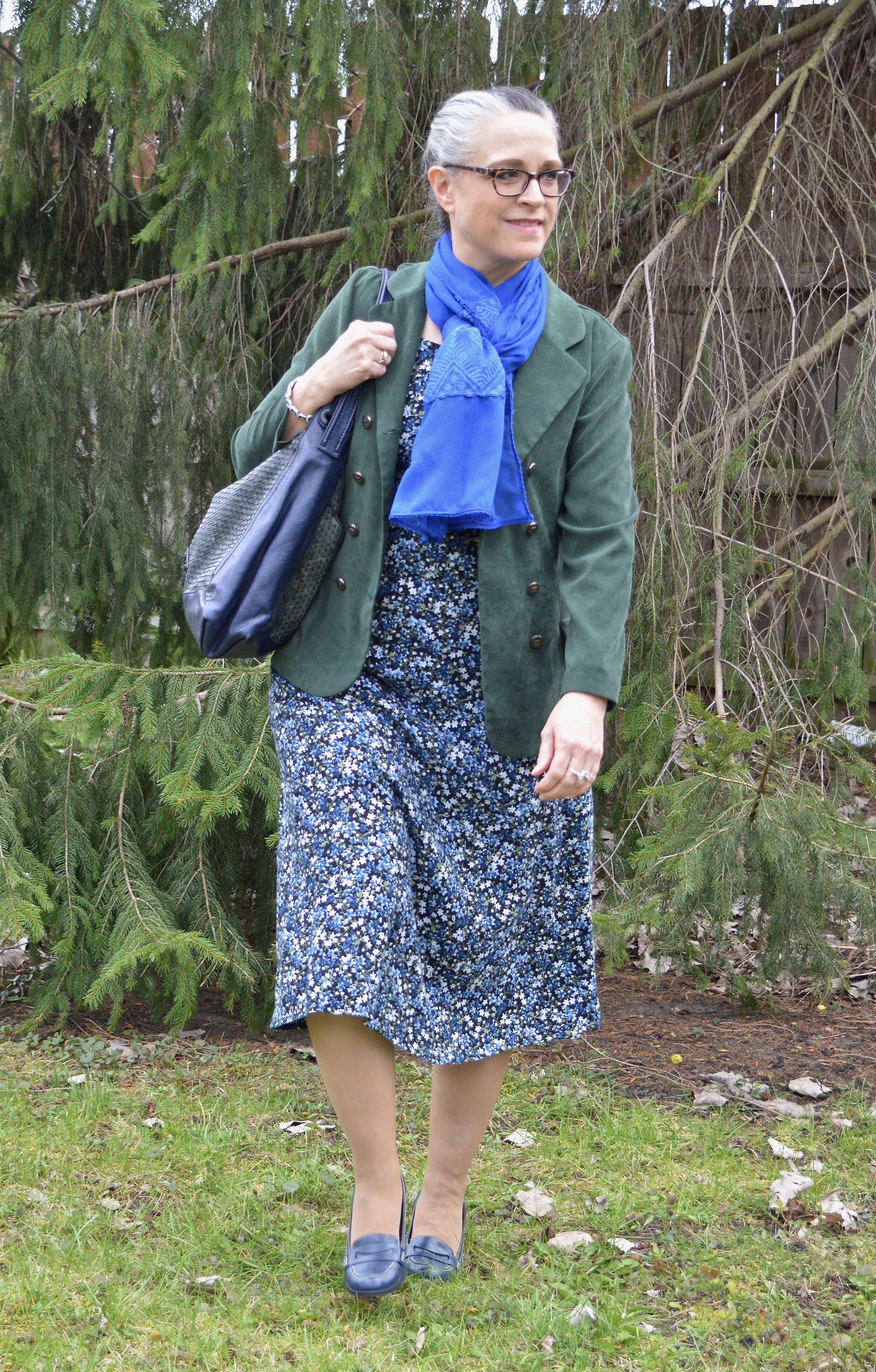
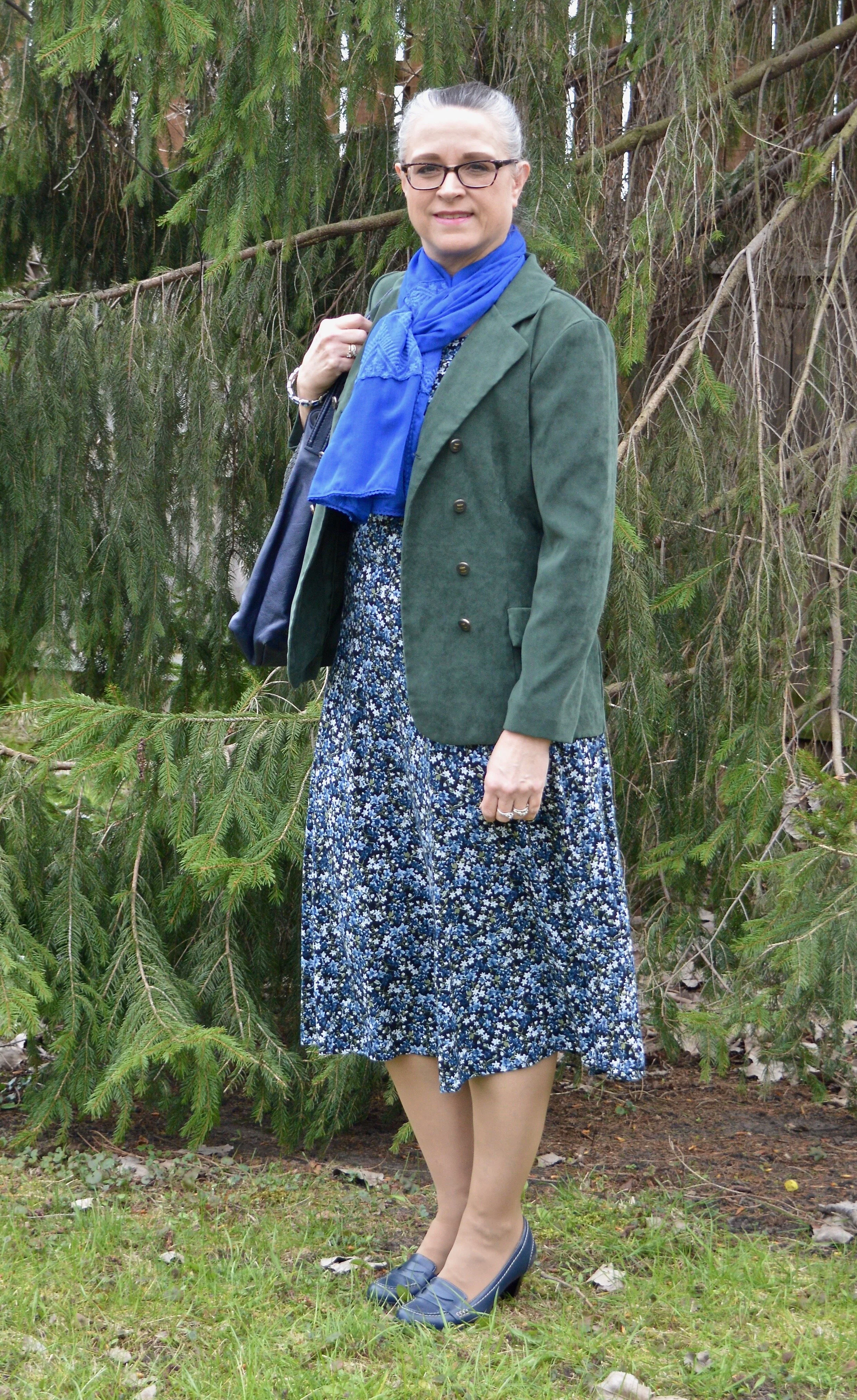
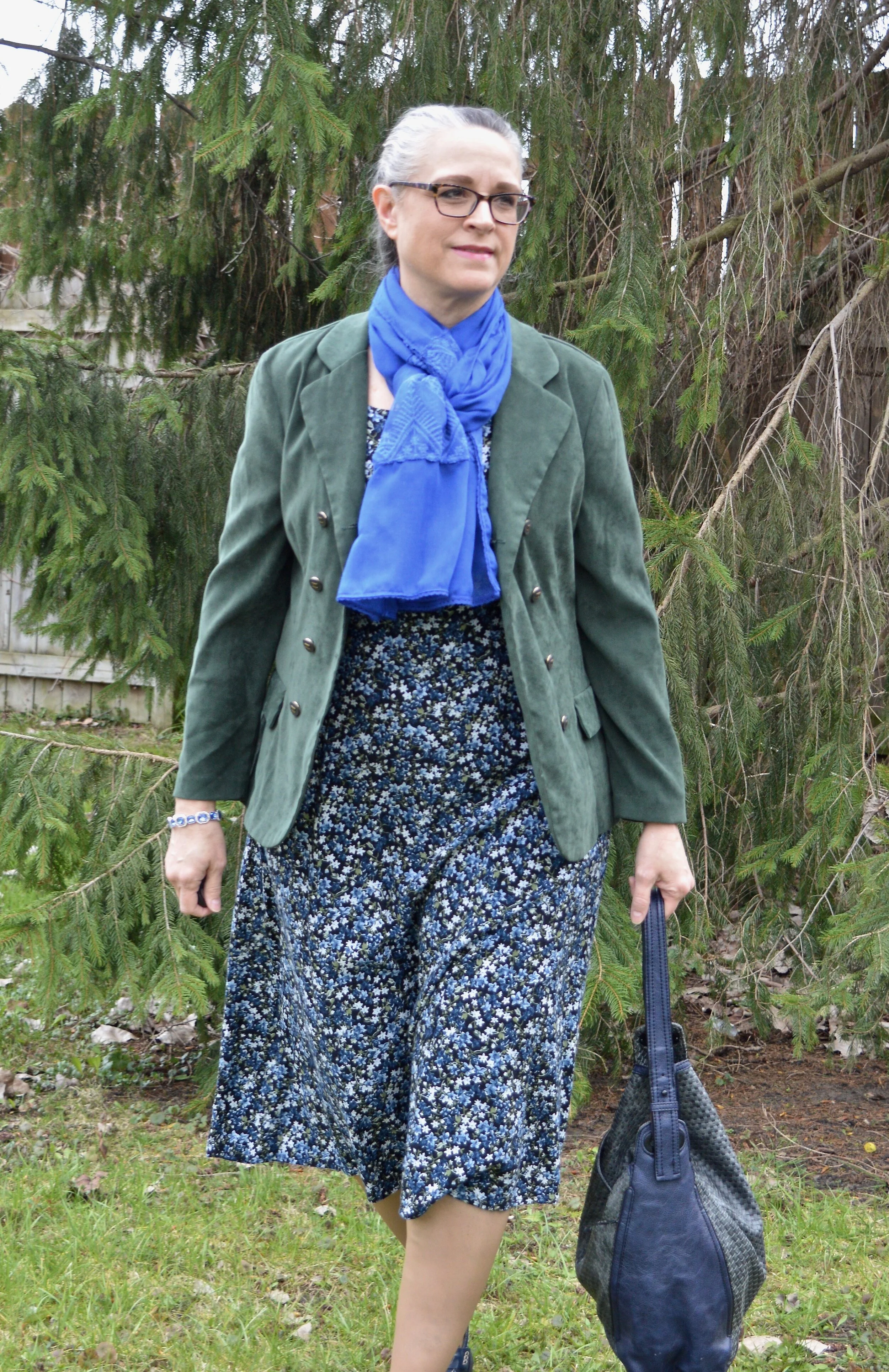
As usual, the names for the Pantone colors always amuse me. Classic Blue is pretty normal. Obviously, Chive makes me think of green onions and as you will see, the color is a pretty dark green. Navy Blazer is one of the classic colors and is your typical navy staple, which many of us have a piece or two in our closets. Since Classic Blue is the color of the year, I decided to start with it. The idea to combine it with Chive was a natural progression when I pulled out this thrifted summer midi dress.

This outfit centers around this thrifted OliviaRose dress that I got numerous years ago. Its pretty floral print combines blue, white and green a black background. I didn’t even have to think when I pulled this out of my closet. Classic Blue and Chive were the perfect pairing. An outfit like this really can be worn year round.

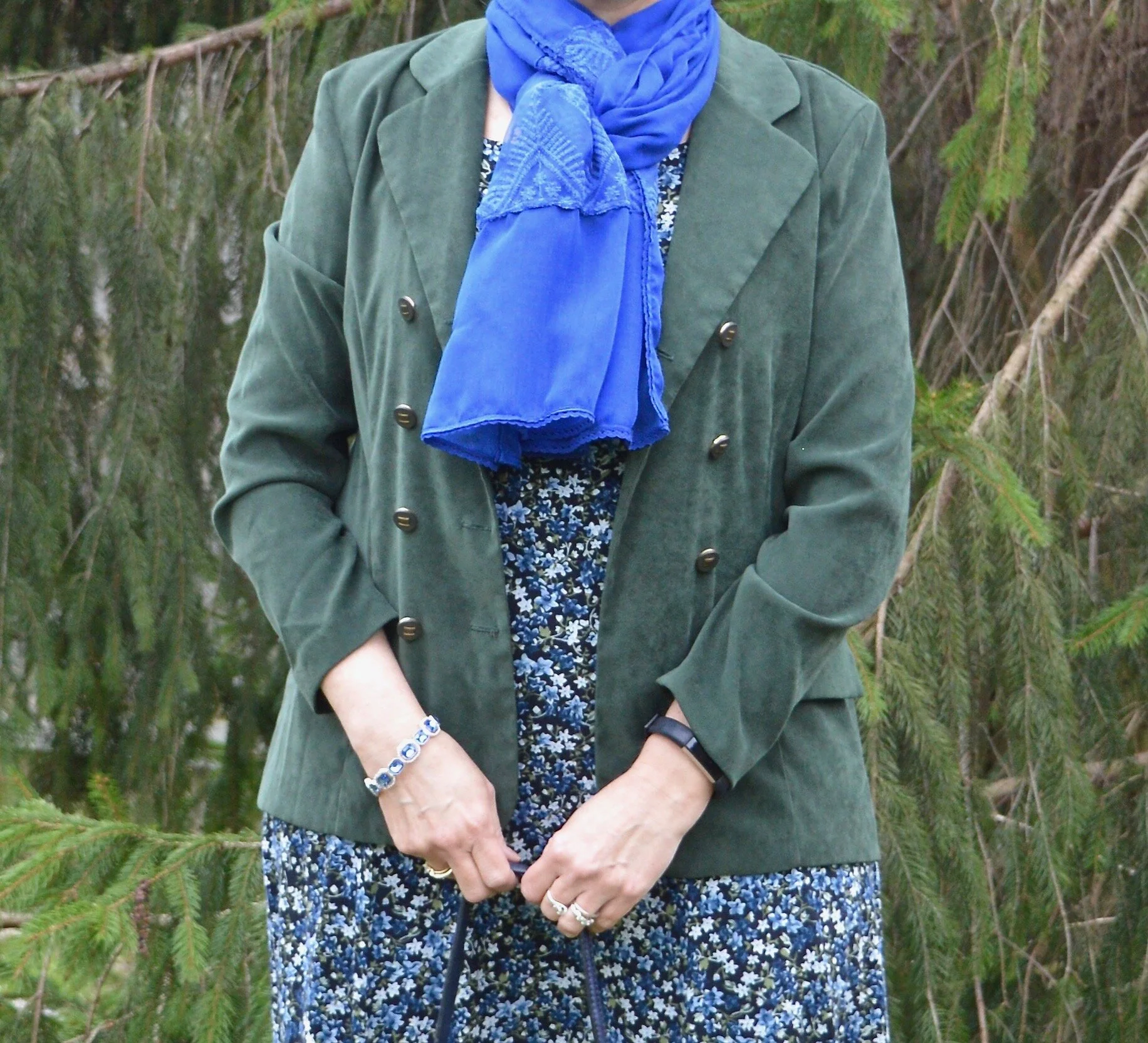
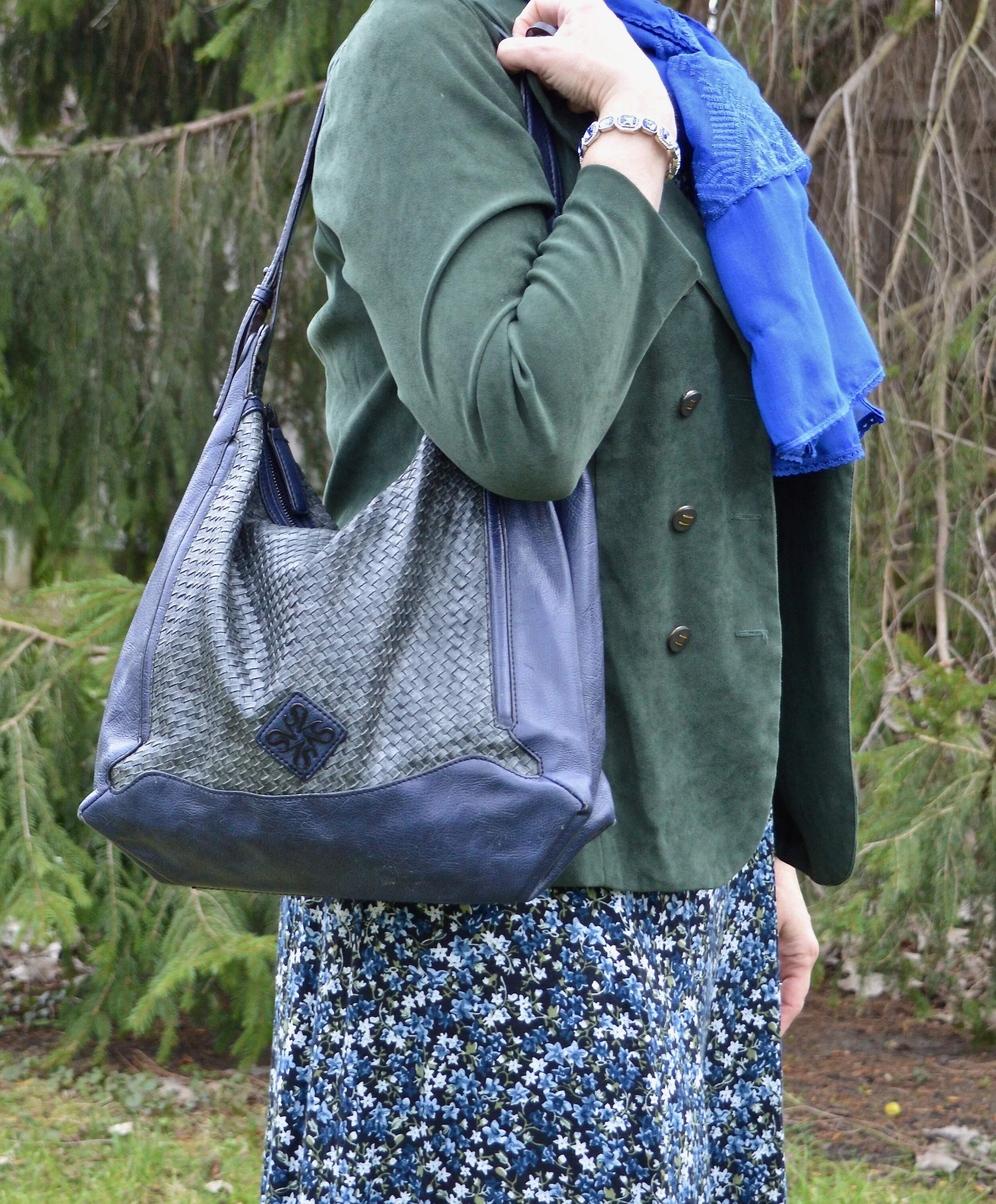
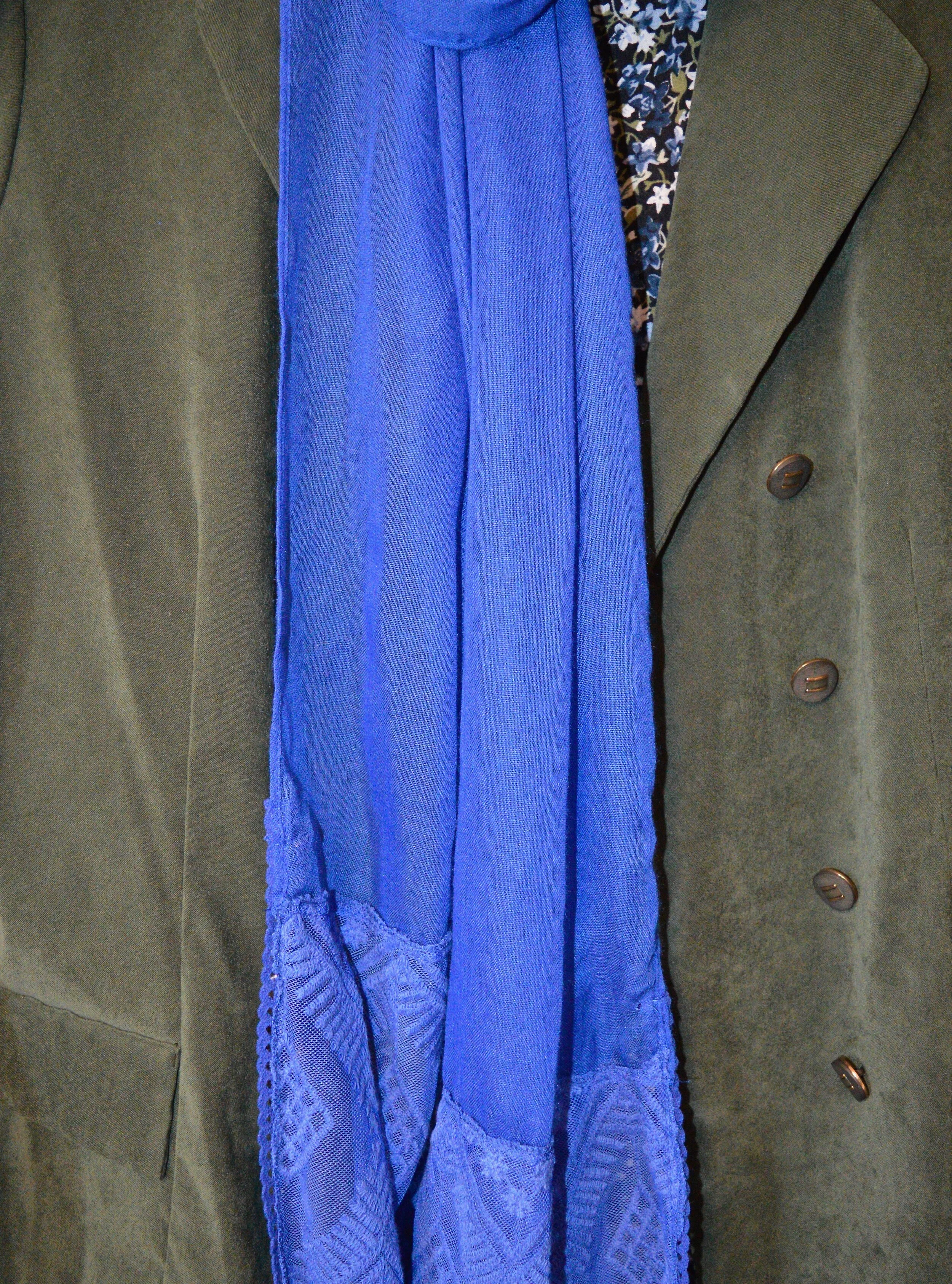
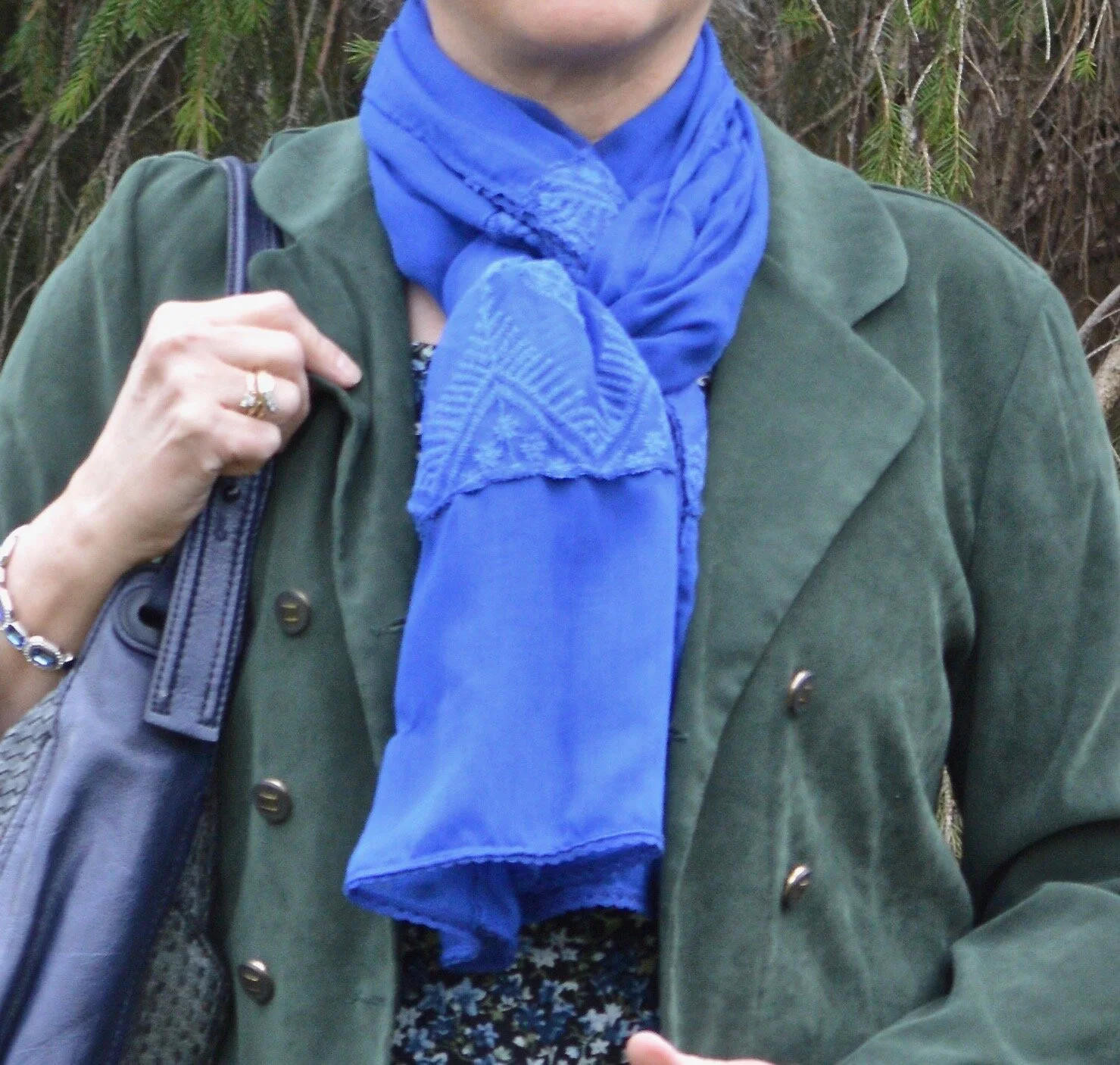
This bright blue scarf was gifted to me for Christmas and I used it to introduce the Pantone Color of the Year back in January. You can see that post here.

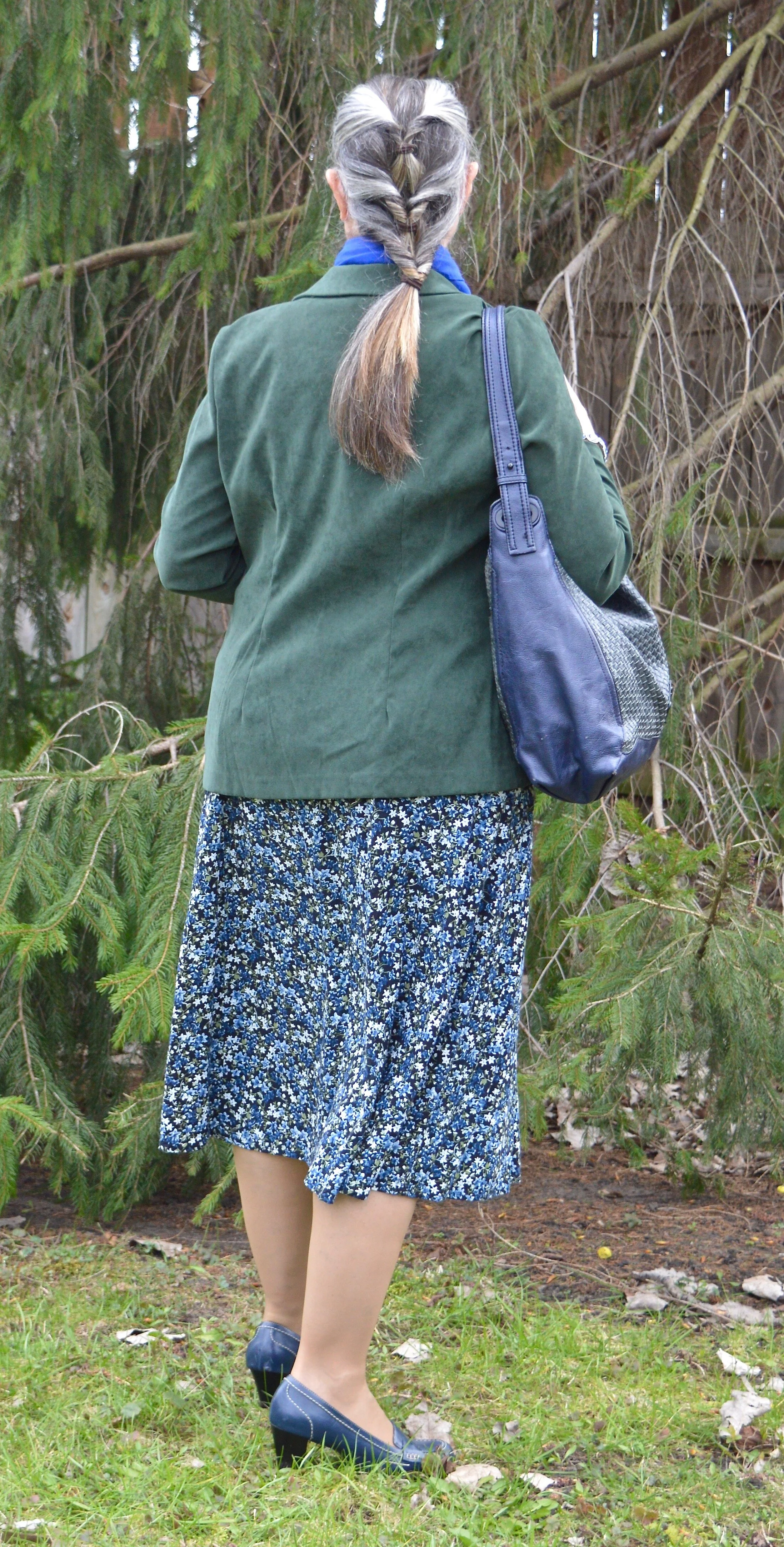
My faux suede blazer has a little more of a blue undertone than the Chive color, but I thought it was pretty close. This thrifted ISB Inc. blazer is meant to have a double breasted appearance when buttoned, but my figure right now will not allow for that. However, I think it looks just as nice left open since there are buttons on both sides.

You can see in the next picture how nicely the blazer fits through the back. I like that it is more fitted, rather than boxy. I was also trying something different with my hair.

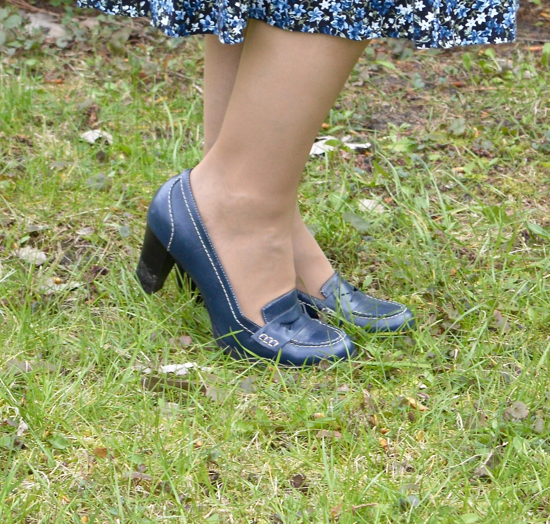
This thrifted Simply Vera/Vera Wang bag has made multiple appearances on the blog as has my thrifted Relativity loafer heels.

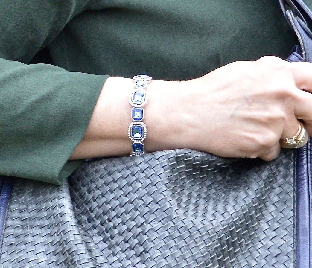
I also added my sparkly Classic Blue bracelet, which was also a Christmas gift.

If you are not into wearing bold, bright colors, then these colors would be the perfect choice for you. You could easily make this pairing more summery by adding a white skirt or crop pants instead of the darker print dress. You could also wear head to toe white with a Chive colored blazer or sweater and just a few pops of Classic Blue jewelry. There are so many options, so never say never to any color.

Do you like these colors? How would you wear them? Is this the sort of outfit you would wear? If not, what kind of outfit would you put together? I would love to hear back from you. Things are a little lonely around here. Ha, ha. I am sure you all can relate. We really need the world to get back to something more normal, even if it is not perfect.

I hope you enjoyed this post everyone. Until next time. Stay safe and healthy.

Graphic by Rebecca Trumbull.

I’ve included a few shopping links just for something to look at. These are affiliate links. All opinions are my own.


Pantone Spring/Summer 2020 - Intro: The New York Palette

Here we are again, looking at the Spring/Summer color palette for 2020. The Pantone Color Institute puts out two color palettes twice a year; the New York palette and the London palette. The palettes for Spring/Summer come out in the fall of the year before. The Fall/Winter palettes comes out around January. They are thinking much further ahead than I am. I am just gearing up to talk about the Spring/Summer palette and the fashion industry already has their color choices and styles made up for the fall and winter. It is very hard to keep up, so I don’t even try. I try to show you the seasonal trends, as those are more time focused. Colors, in my opinion are not restricted by times or seasons, although, I am one to pull out my lighter colors for spring and summer and my darker colors for fall and winter.

This Spring/Summer palette is full of colors that just about anyone can be pleased with. If you are a pastel kind of gal you will love the lighter shades of pale Sunlight, Coral Pink and Faded Denim. If you enjoy bright and bold, you’ll want to reach for Flame Scarlet, Saffron and Orange Peel. Maybe you enjoy tones that are more earthy, then you will like Chive, Classic Blue and Cinnamon Stick. Looking for color inspiration for resort wear, then take a peek at Grape Compote, Mosaic Blue and Biscay Green. In addition the Institute always includes a classic color palette if you prefer the main part of your outfit to be more neutral and conservative. This year those colors include a deep tan, called Lark, and a dark blue called Navy Blazer. Bright White and Ash are also classic options on the New York palette.

A good way to combine these colors is to take a navy blazer, a gray skirt and then add a bright pop of color like Orange Peel or Saffron in a blouse, jewelry or a bag. If you don’t normally like a bold approach to your wardrobe, this is a great way to still stay in your comfort zone, but add color in small bursts.

The way I will be pairing these, as usual is taking two of the colors and adding a pinch of a classic color to keep things from getting to outrageous. Just so you have a teaser as to what is coming up, here are a few pictures of my color combos.

Classic Blue and Chive

Faded Denim and Orange Peel

Sunlight and Flame Scarlet

Saffron and Biscay Green

Coral Pink and Mosaic Blue

Grape Compote and Cinnamon Stick

I’ll talk more about these colors and how I decided to put the outfits together when I post each of these outfits over the next couple of weeks.

Be sure to come back on Thursday to see the first outfit in the Pantone Spring/Summer 2020 New York palette.

Have a great day!

Graphic provided by Rebecca Trumbull.


Pantone Color of the Year - Classic Blue

Since I do the Pantone Color Series twice a year, it seemed to make sense that I introduce the Color of the Year. For the year 2020, blue is the chosen color. Classic Blue, as it is called is a medium, dusky blue reminiscent of the the evening sky. Pantone describes it this way:

“An expansive presence, Classic Blue is evocative of the vast and infinite evening sky opening a world of possibilities.”
— Pantone Website

This is the sort of blue that would look good head to toe, or as in my outfit, be the perfect pop of color against other backdrops. I think this blue will look good on almost anyone and is a color that can be worn all year round.

The wind was doing some crazy things to my hair, so my daughter was doing her best to capture good shots regardless. A number of the pieces in this outfit were given to me for Christmas.

The gray and blue plaid skirt is older and Croft and Barrow brand. There was a time when skirts like these were very trendy. I’ve had my share and have worn them often to church in the winter time. While they may not be the most coveted skirt, these tea length pieces are perfect to wear with boots. I chose to wear my Seven Dials combat boots. I wanted to keep the look a bit more edgy and modern.

This fuzzy faux fur bomber jacket was a Christmas gift from my hubby. It is so soft and I had been coveting all the ones I saw at Kohl’s when I was working. This one he found at Walmart and is No Boundaries brand. Walmart has definitely upped their fashion game.

The gray pullover sweater I have on under the jacket is a brand called Ellen Tracy and was thrifted. A number of retailers carry the Ellen Tracy brand, including Macy’s, Nordstrom, Belk, and others. For this look, I tucked the whole sweater into the skirt. The skirt has a finished waist line, as opposed to elastic. I think a finished waist is just a little more classy than elastic.

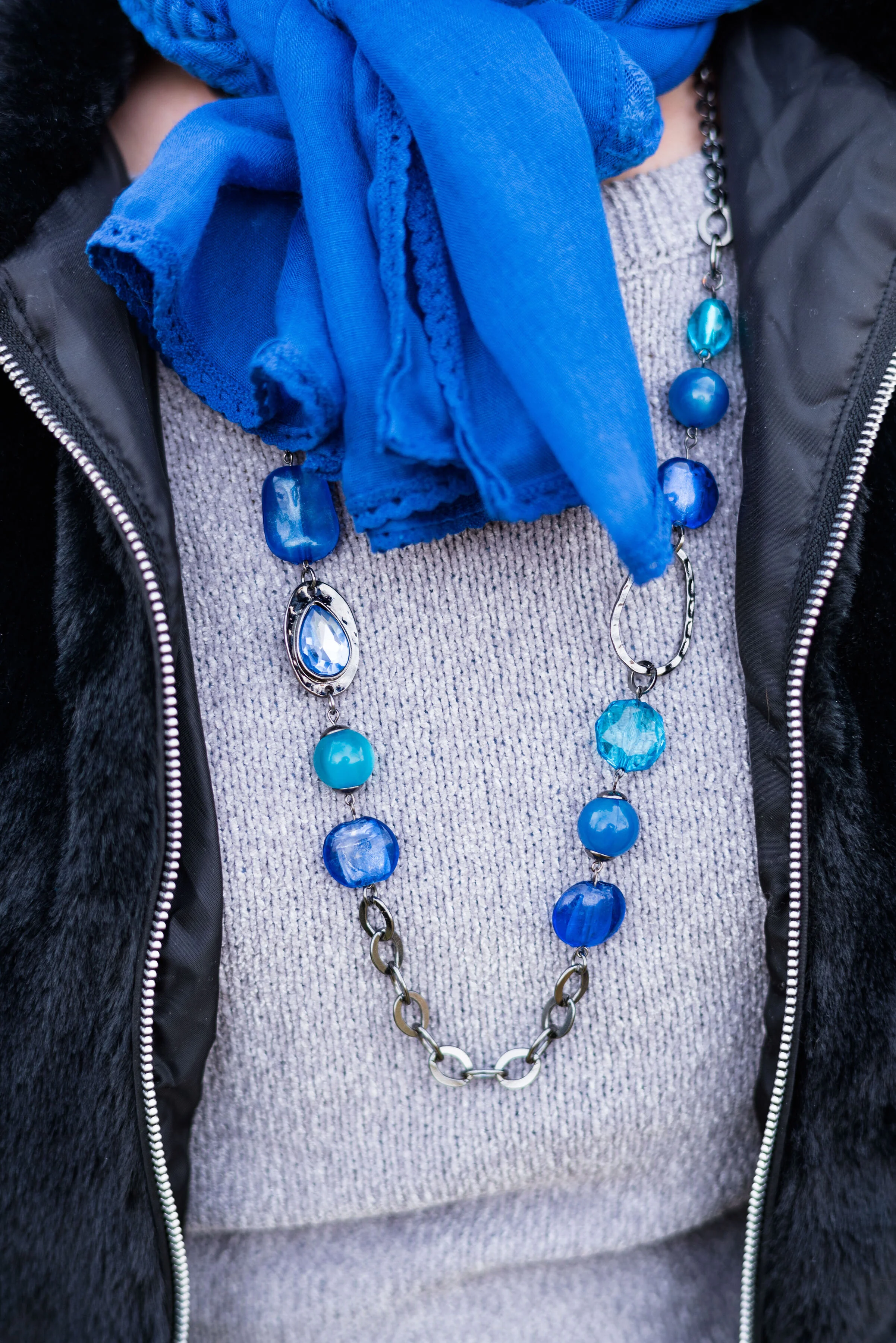
The scarf, necklace and bracelet were all Christmas gifts from my husband and oldest daughter, who went shopping together. She was the one to do the research on the Pantone color of the Year. Indeed, blue was the theme, but what a pretty blue it is.

This bag was a thrift find. I often find purses when I thrift shop. They are so much cheaper than their full price counterparts at various retailers and I don’t even by the big name brands. I just don’t like spending a lot of money on clothing or accessories. I also like variety. Sure, I could buy one bag for $500 or I could get a whole year’s worth of thrifting for that much.

What do you think of Pantone’s 2020 Color of the Year? Do you like this blue? Why or why not? Do you have a plaid skirt in your closet like this one? If you do, how do you style it? Be sure to leave me some love in the comments.

I’ve included a few shopping links. These are affiliate links, which means if you click on a link I get a few cents. If you purchase something through a link a get a few cents more. I appreciate every penny!

Have a great day.

Photo credit Rebecca Trumbull.


Pantone - Autumn/Winter - 2019 - London Palette Recap

It’s time for a recap of the all the Pantone - Autumn/Winter -2019 - London Palette colors. There were things about these colors that I liked better than the New York Palette, but each of them had colors that I felt comfortable wearing. I’ll explain my favorite from this series after a review of the outfits.

Outfit 1 - Merlot and Antique Moss

Outfit 2 - Cranberry and Chicory Coffee

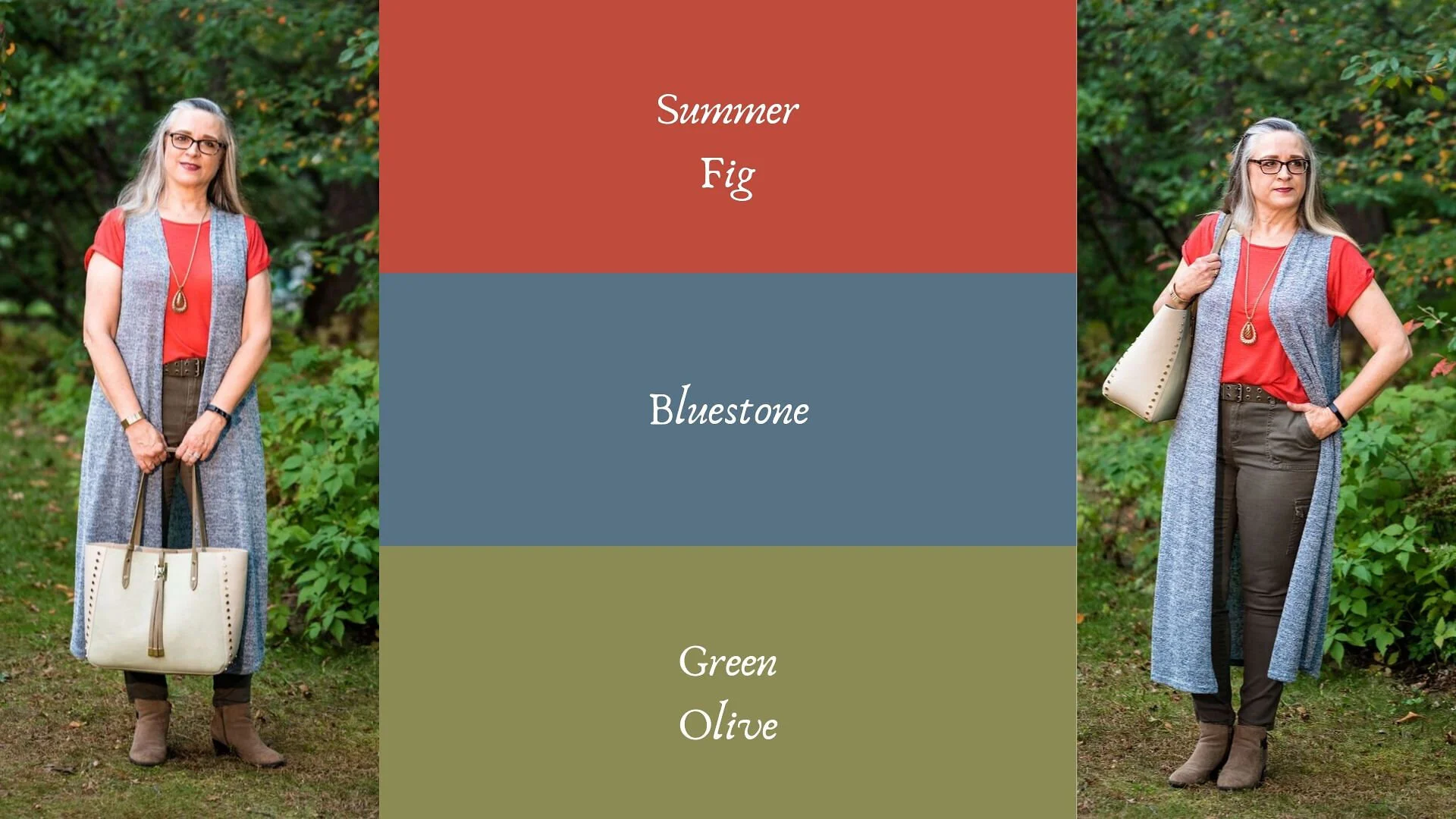
Outfit 3 - Summer Fig and Bluestone

Outfit 4 - Butterscotch and Grapeade

Outfit 5 - Crabapple and Forest Biome

Outfit 6 - Galaxy Blue and Hazel

I am having a hard time picking just one outfit from this series that I liked the best. I really liked Cranberry and Chicory Coffee. I have always been a fan of browns, but I just love the result when it is combined with the medium pinky red of Cranberry. I also like the long line of this outfit and I think the long Rutabaga open front cardi helped with the illusion.

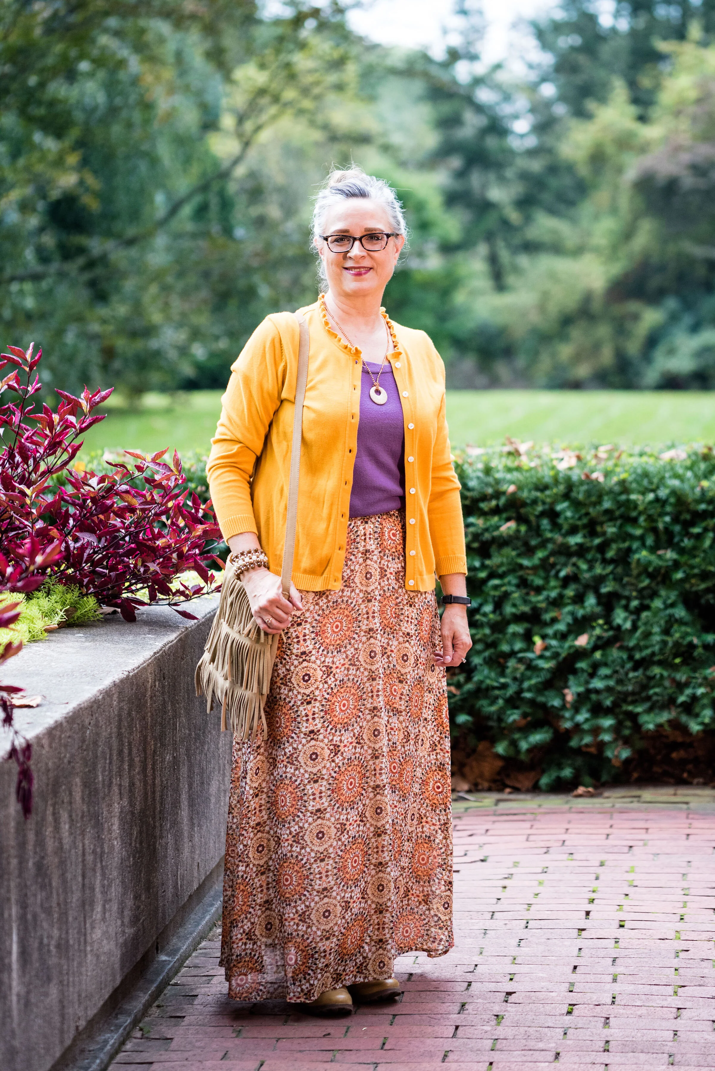
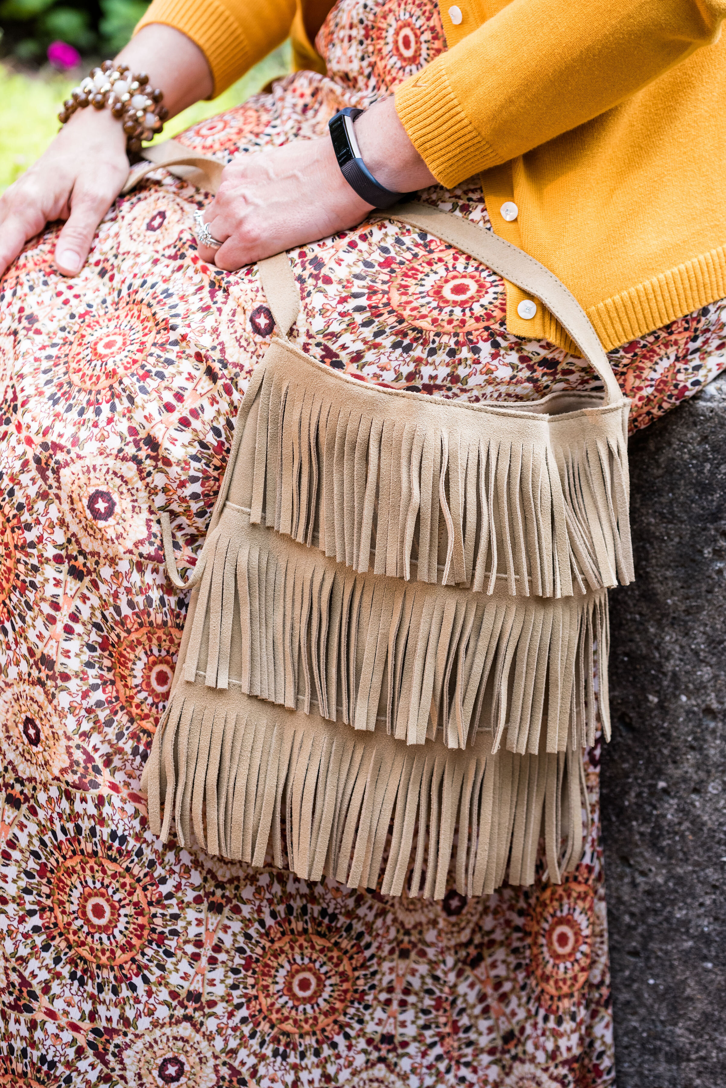
My next fave would be the boho vibe of Butterscotch and Grapeade. If you would have asked me a few years ago if I would wear an outfit with these two colors together, I would have said no way. Yellow and purple? You have to be kidding, but there is something whimsical about this outfit and the color combination is only part of it. The colors are happy and fun, but the print of the skirt, the fringe bag and the fun textured boots really give this outfit its bohemian style.

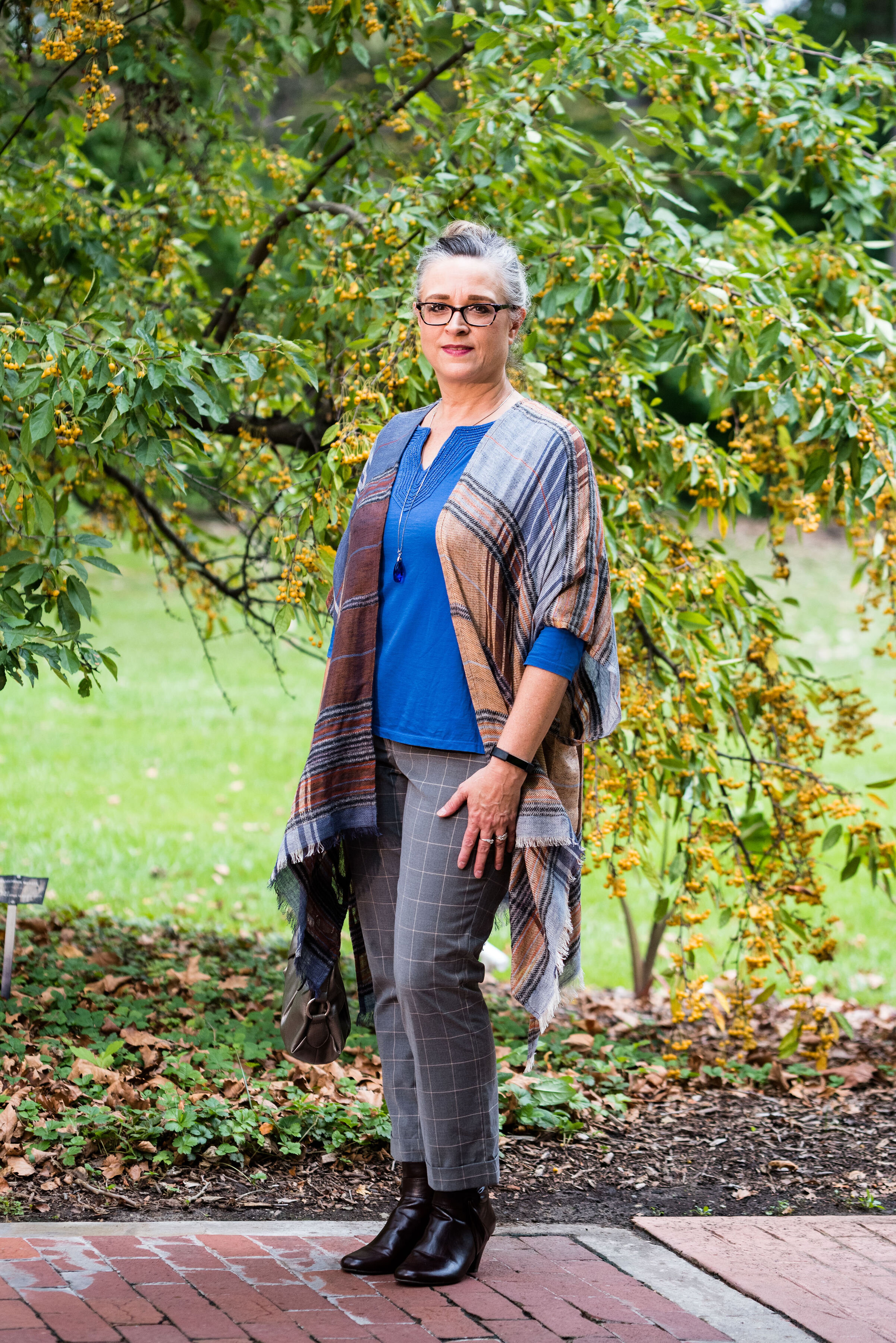
Finally, I really like the last outfit. Even though, I wouldn’t necessarily wear a color like Hazel all on it’s own, I do like the way this color pairs so well with the grays and the blues in outfit. I also like the subtle plaid print mixing. It is obvious, but it doesn’t overwhelm the eye like some print mixing is capable of doing.

Well, I’ve told you my favorites, now tell me yours. I love to hear your feedback.

i hope you enjoyed this Pantone - Autumn/Winter series. If there is anything else you would like to see, with regards to the Pantone Color Institute you can check out their website. Just click on the link.

Have a great Tuesday!

Photo credit Rebecca Trumbull.


Pantone - Autumn/Winter - Galaxy Blue and Hazel

I neglected to get my post done for Tuesday. Monday and Tuesday, my grandson had off from school. It was parent/teacher conference days. My daughter had her appointment right away on Monday morning and Quintin is doing very well. He is nationally high ranking in his reading ability and math, so this Grandma is proud of a certain nine year old.

This is the last outfit from the Pantone - Autumn/Winter - 2019 London Palette. Next week, I’ll have another recap post to show you all the London colors and then we will put the Pantone Institute aside until spring. For your information, the Spring/Summer colors for 2020 are already up on the website and have been for a couple of months, so if you are really curious, you can go the to the Pantone website and see what they look like. As for this blogger, you won’t get to view them here until spring.

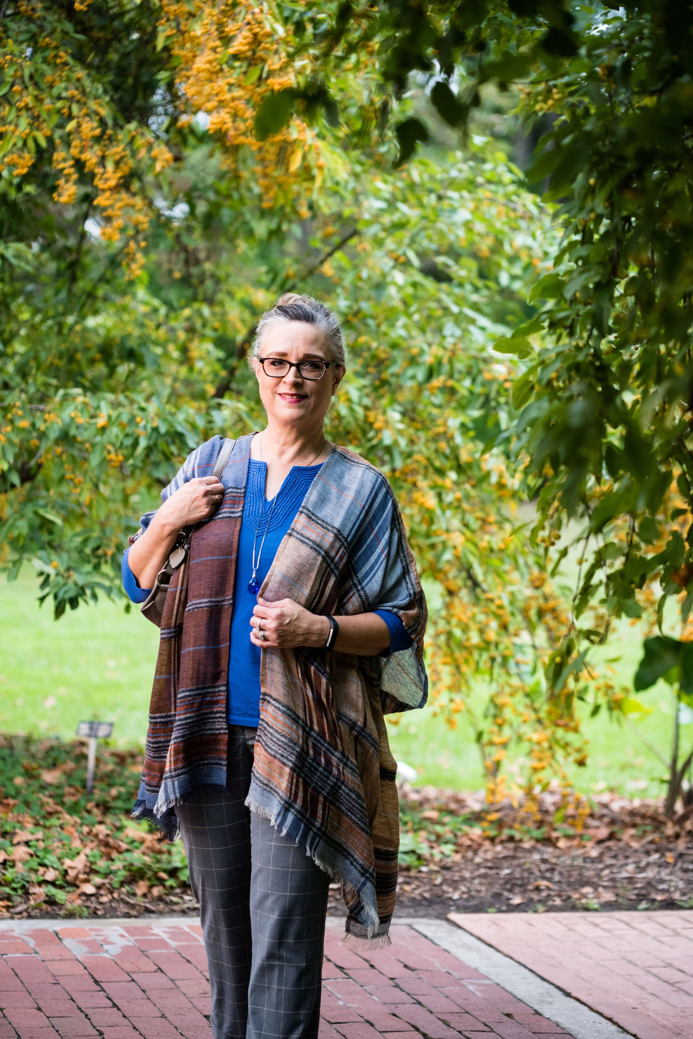
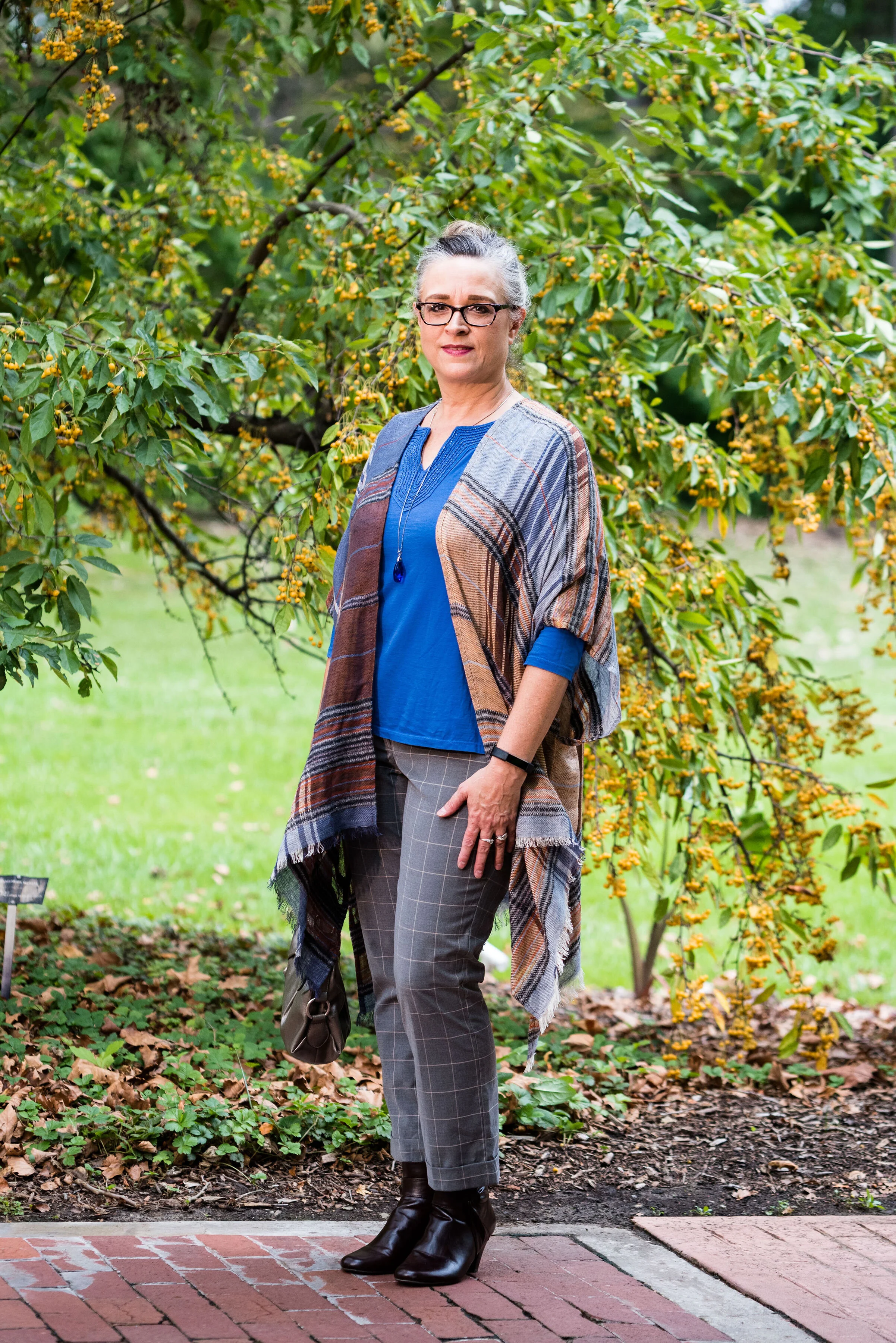
Our last two colors are Galaxy Blue, which was also on the New York palette and a mellow brown called Hazel. This brown is not one I would regularly reach for. I like colors that are more rich and saturated. In the Crayola Crayon box, this color might be similar to Antique Brass. See the complete list of current crayon colors here. Talk about fun color names! Be sure to read some of those. They are not merely called red, pink or blue any more. Ha, ha.

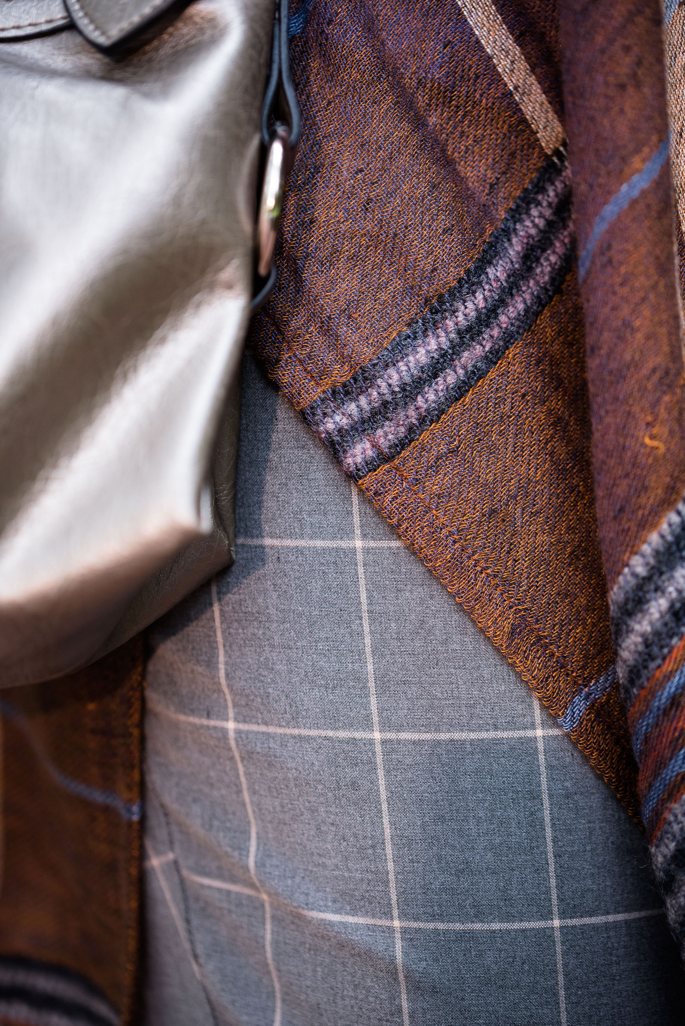
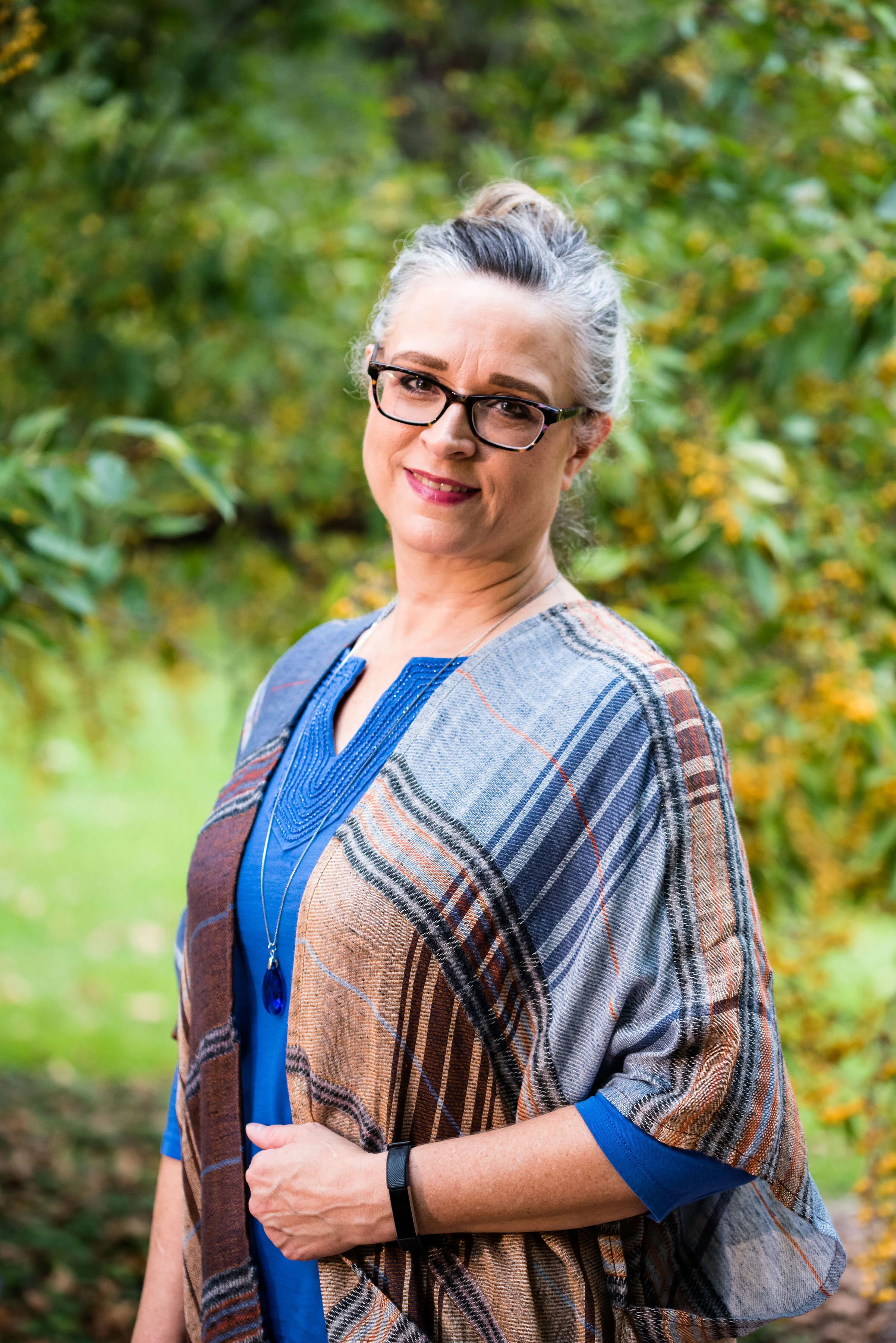
I decided to do some plaid print mixing in this outfit, as you can see with my ruana and my pants. I must tell you how I came to own this beautiful ruana. My hubby and I were out on a date. We try to go out once a week, usually for dinner and then to Barnes and Noble bookstore. We both love spending time around books and we usually end up getting a hot drink and sometimes a treat. On this particular night we went out for Mexican. After we were finished eating he told me that before we head to Barnes and Noble he had to stop at Bass Pro Shop and get something for his trailer hitch. I don’t even think twice about it. I don’t mind going to Bass Pro or Cabelas, because they both have fun things to look at, like mounted animals and clothing that I like, but would never purchase, because it is out of my price range.

We walked into the store and were heading down the center aisle. On the right side of the aisle are all the women’s clothes. We got to this lovely display where this ruana was styled over an ivory sweater. It immediately caught my eye. My husband said, “I thought you might like this.” I was shocked. Not only had he thought of me, but he had picked out something he thought I would both like and look nice in. He let me pick out a few other things besides the ruana to try on and just hung out while I did. I picked out the ruana and a rusty orange sweater, that I haven’t worn yet, but that looks great under the plaid. My husband does not do things like this very often, but it sure makes an impact on me, when he does.

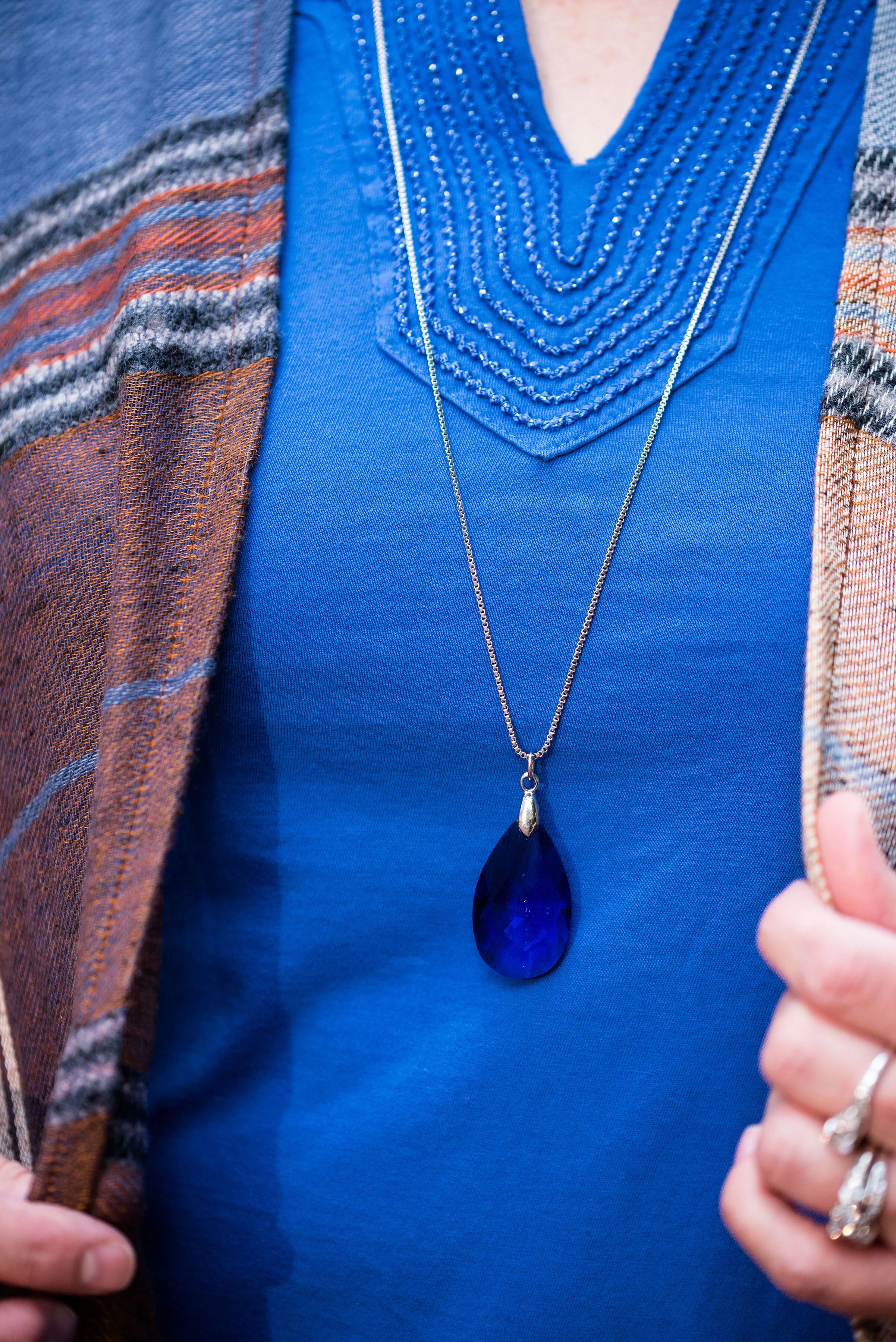
My thrifted blue tee is Charter Club brand. It is a bit brighter than Galaxy Blue, but once again, you get the idea. I like the detailing around the neckline.

These gray pants are also thrifted and you can see how I styled them with a faux leather jacket, and with a pink sweater set.

Here is a close up of my print mixing.

I kept my accessories simple since there was already so much going on in the outfit with the two plaids. A bright blue crystal pendant, a simple gray Rosetti bag, and these thrifted Lifestride maroon ankle boots.

What do you think of these colors? Do you like plaid? I’d love to hear your thoughts so be sure to leave me a comment or two. Your support and feedback mean a lot to me and help give me ideas and direction for the blog.

Graphic and photo credit Rebecca Trumbull.

I’ve included a few shopping links for you to peruse. With the holidays coming up maybe these will give you some inspiration for someone on your list. These are affiliate links. All opinions are my own.


Pantone - Autumn/Winter - 2019 - Crabapple and Forest Biome

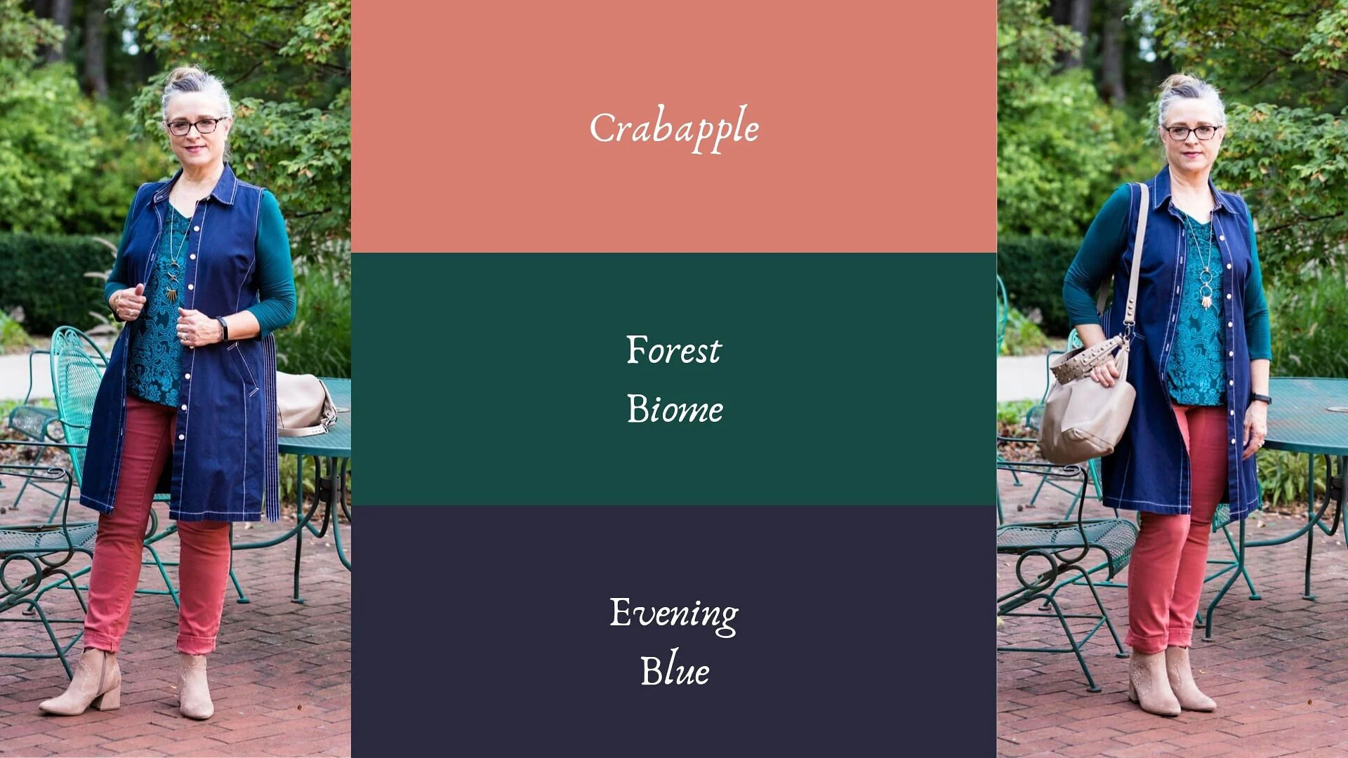
The next two colors in the Pantone - Autumn/Winter - 2019 - London Palette are Crabapple and Forest Biome. I grew up with crabapple trees in our back yard and I thought they were one of the prettiest of spring’s trees. We had a pink and a white, and they had a glorious scent that just floated on the air. Obviously this Crabapple color is meant to mimic, not only the pinky flowers, but the tiny little fruits that hang from the branches. As for Forest Biome, we know that it is a dark green, but I had to look up the word biome, to fully understand it. A biome is an ecological community system, such as a rain forest or dessert. Forest Biome, then would refer to an area of forested land probably brimming with pines and cedars and perhaps a few deciduous trees. Wherever they come up with the names for the colors and just what meaning they had in choosing the name, we don’t really need to know, but it is fun to think about.

My Forest Biome is a little more blue and my Crabapple is a bit more pink than their colors, but again, you get the idea. I thought Evening Blue would be a good classic color to pair the other two colors with.

This was a neat little sitting area at the Toledo Botanical Gardens where we took the pictures for this series. I’d love to have a patio like this with an English type garden all around, and fun outdoor furniture, but I have neither the resources, the time or the energy. They always say you will find time for the things you really want to do, but I think it would be more accurate to say, we can always find time for the things we know we should do. Ha, ha. My Grandson is a priority. Picking him up after school and hanging out with him when he has a day off are priorities. Do those things cause other things to be put off or put on the back burner? You bet, but that is what I choose to do because I love him and my daughter. What we really need to do, is stop beating ourselves up for all the other things we are not able to get to.

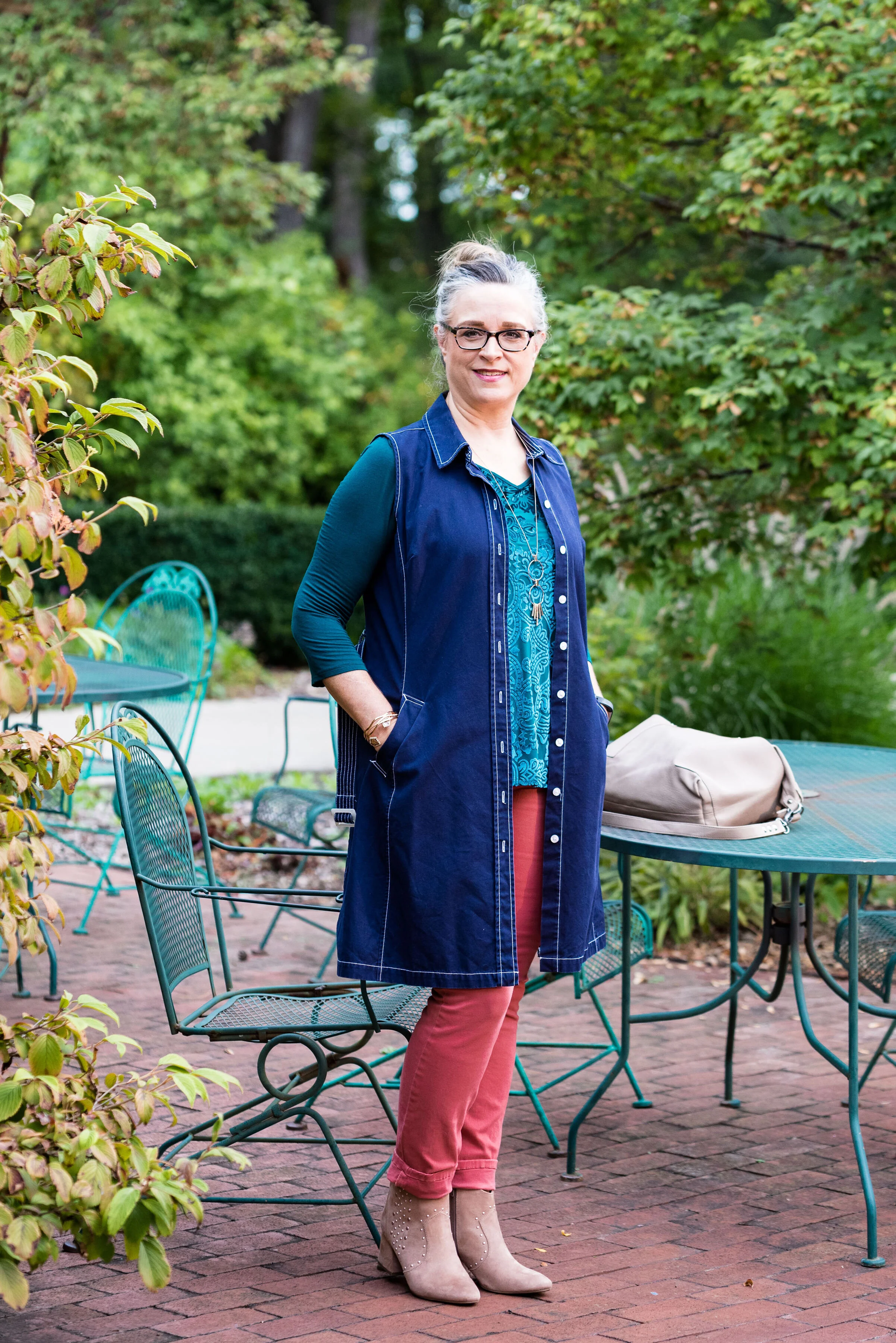
My jeans are W62 brand from dressbarn. They are very comfy and contain a good amount of stretch. I wear these again and again for work or when I just want a different color skinny jean.

This thrifted, embellished, 3/4 length sleeve top is Dana Buchman brand. I do love the swirling pattern and glistening sheen of the front portion of the top. The sleeves and the back are more like a plain jersey knit.

The dark navy vest is really a belted dress that I found at a thrift store a while ago. It is Issac Mizrahi brand and if I was thin enough, I might consider wearing it as a dress, but it works beautifully as a vest. What do you think?

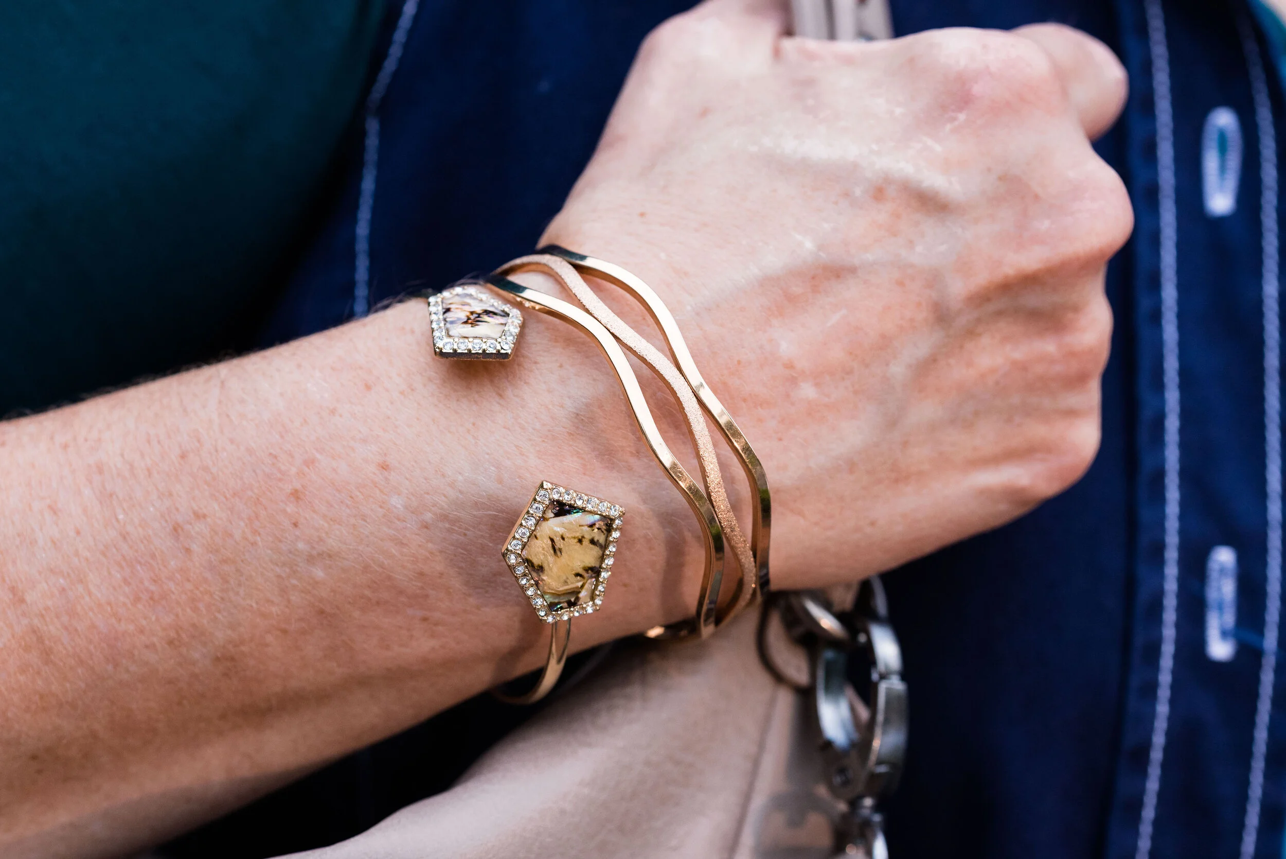
I went with a little metallic bling with my accessories including a rose gold pendent and bracelets, a Madden bag that I got on clearance at Kohl’s and my SO heeled boots, which were also a clearance purchase at Kohl’s.

What do you think of these colors? Would you wear an outfit like this? I’d love to hear from you.

I’m leaving you with a few shopping links. These are affiliate links. All opinions are my own.

Have a great weekend.

Photo and graphic credit Rebecca Trumbull.


Pantone - Autumn/Winter - 2019 - Summer Fig and Bluestone

You’ll remember from the New York Pantone series the color Bluestone. This is one of only two colors that showed up on both palettes. I’m not sure how the Pantone Color Institute comes up with the colors they choose. Is there a committee? If so who is on the committee? How do they come up with the names for each of the colors? Yes, these are the things a fashion blogger wonders when she is tired and needing a burst of writing motivation. Ha, ha. I am speaking the truth when I say, I had to look up what a fig looked like to understand where they came up with this red color. This red coincides with the bright red interior of the fig fruit. I have never eaten a fig, have you?

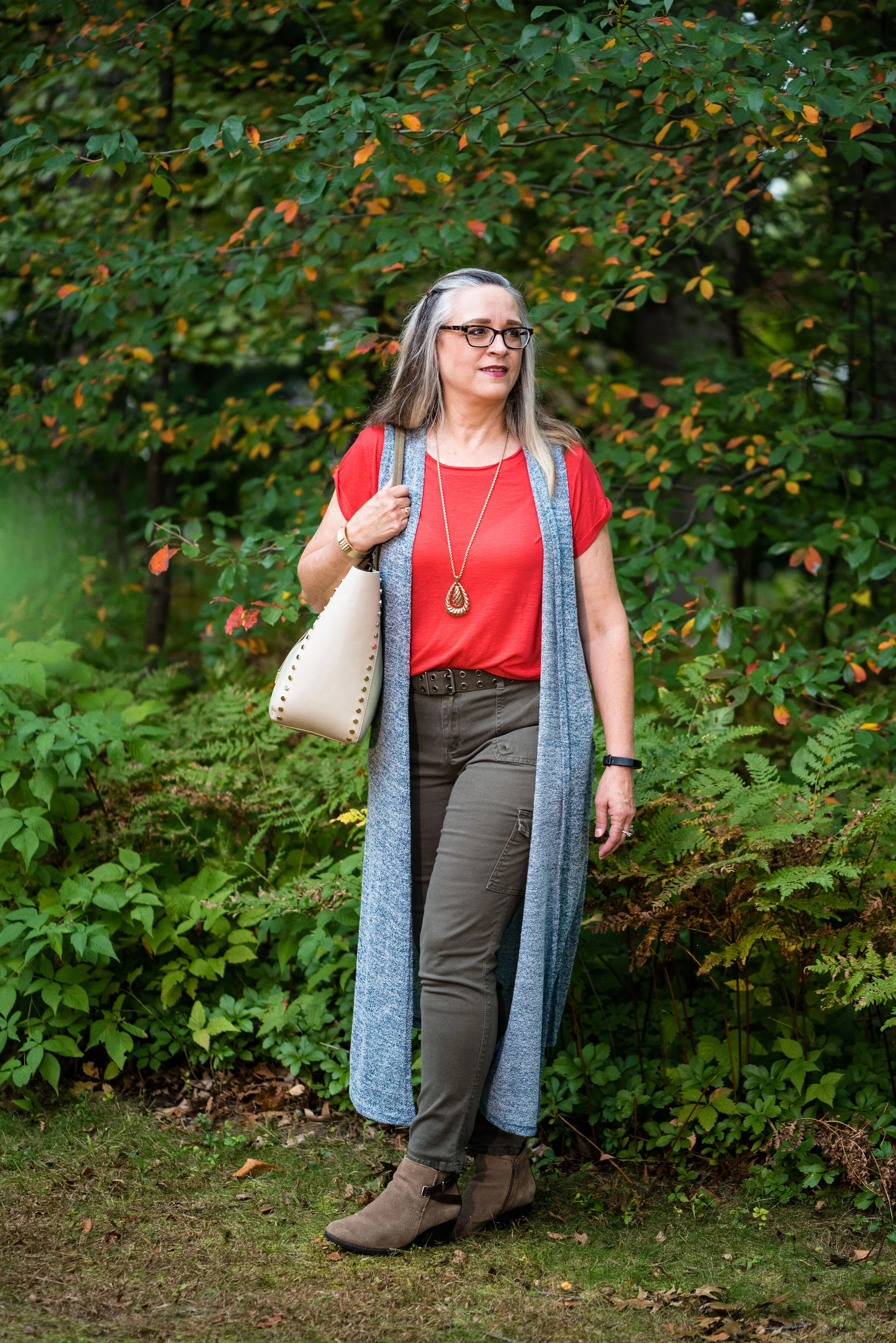
This bright red tee is SO brand from Kohl’s. It is a few years old. I find Kohl’s and JCPenney my go to’s for things like short and long sleeve tees.

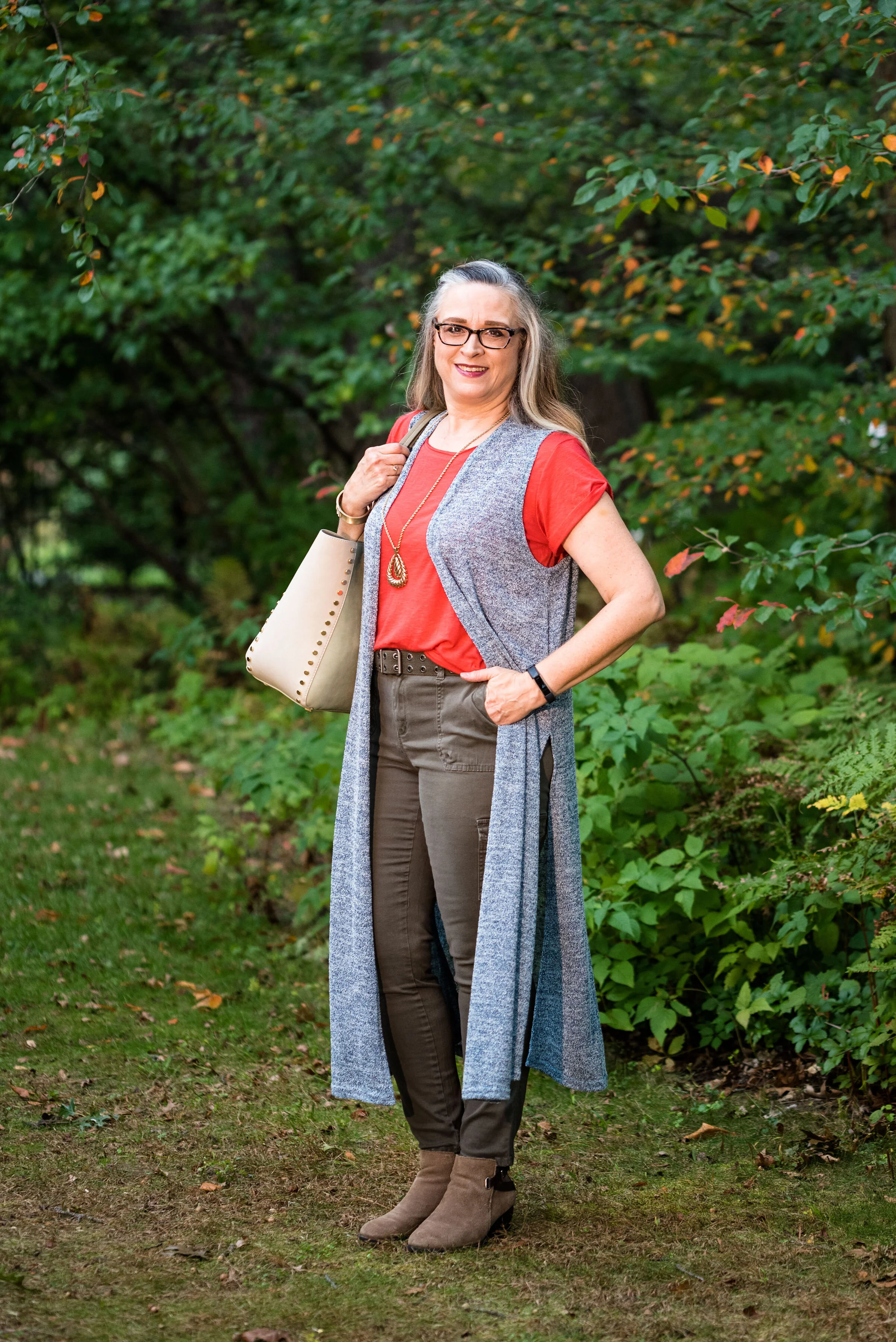
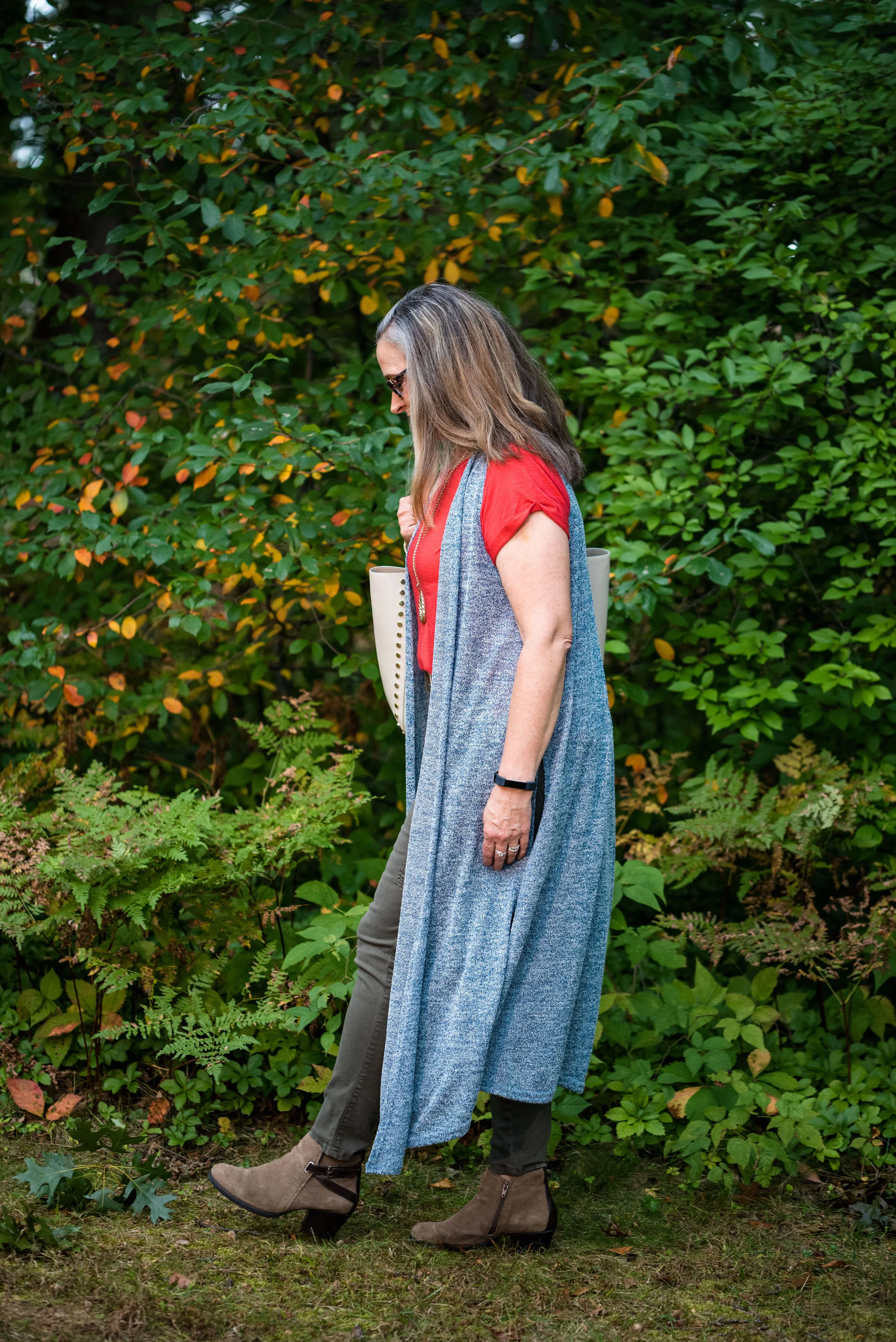
The Bluestone vest is a LuLaRoe piece. This particular style is called Joy. I like that some clothing companies name each of their styles. Not that I will remember what they are called, but I just think it adds another dimension to a retailer, that they have taken the time and effort to specify a certain line has a name. This is the only vest I have that is this length and I like how it looks in this outfit. The fabric has plenty of stretch, but doesn’t lose its shape.

Once again, I turned to the classic color of Olive Green for my pants, bag, and belt. Olive just seems to be an easy color to pair other colors with and it grounds an outfit and keeps it looking chic with a bit of an edge. These utility pants are Gloria Vanderbilt brand and I’ve styled them before on the blog. You can see them styled with an olive utility vest here and in a flat lay with a snakeskin jacket here. I got the tote bag from Charming Charlie a couple years before they went out of business. Belts are so expensive, I usually try to pick them up at thrift stores.

I kept the jewelry simple with a gold pendant necklace and a gold bracelet.

This old pair of Sonoma ankle boots has been with me for a while, but they are the perfect neutral finishing touch and the suede texture is just right for a fall outfit.

What do you think of these colors? They are very similar to the New York palette using Bluestone and Chili Pepper. Do you like to wear vests? Do you have a long one like this? What are some other ways you could style a long vest? I’d love to have your feedback.

I’m including a few shopping links. These are affiliate links. All opinions are my own.

Photo and graphic credit Rebecca Trumbull.


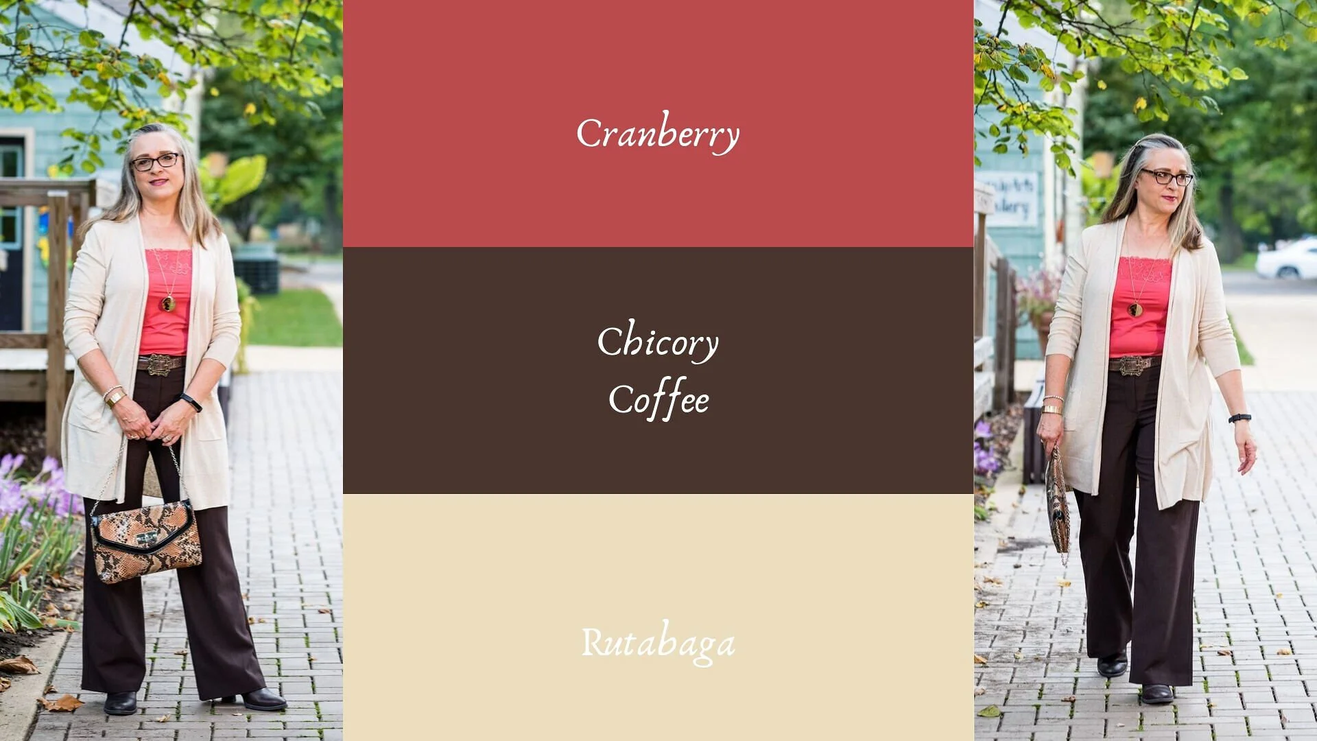
Pantone - Autumn/Winter - 2019 - Cranberry and Chicory Coffee

Hi everyone. The days are flying by and we are almost to Halloween. I haven’t even gotten out my decorations yet! That is how far behind I am. Maybe I should just skip Halloween and start decorating for Christmas. All the stores are doing it. Ha, ha . Well, I don’t think I’ll get that crazy, but this time of year does seem to go awfully fast. Do you get that feeling?

Today’s colors are what the Pantone Color Institute label a “vital red that adds a pungent punch to the palette,” and a “robust and tasteful” brown that, “introduces an element of heartiness.”

I was able to pull these pieces from my closet and decided to add the off white cardi that mimics Rutabaga from the London classic color palette.

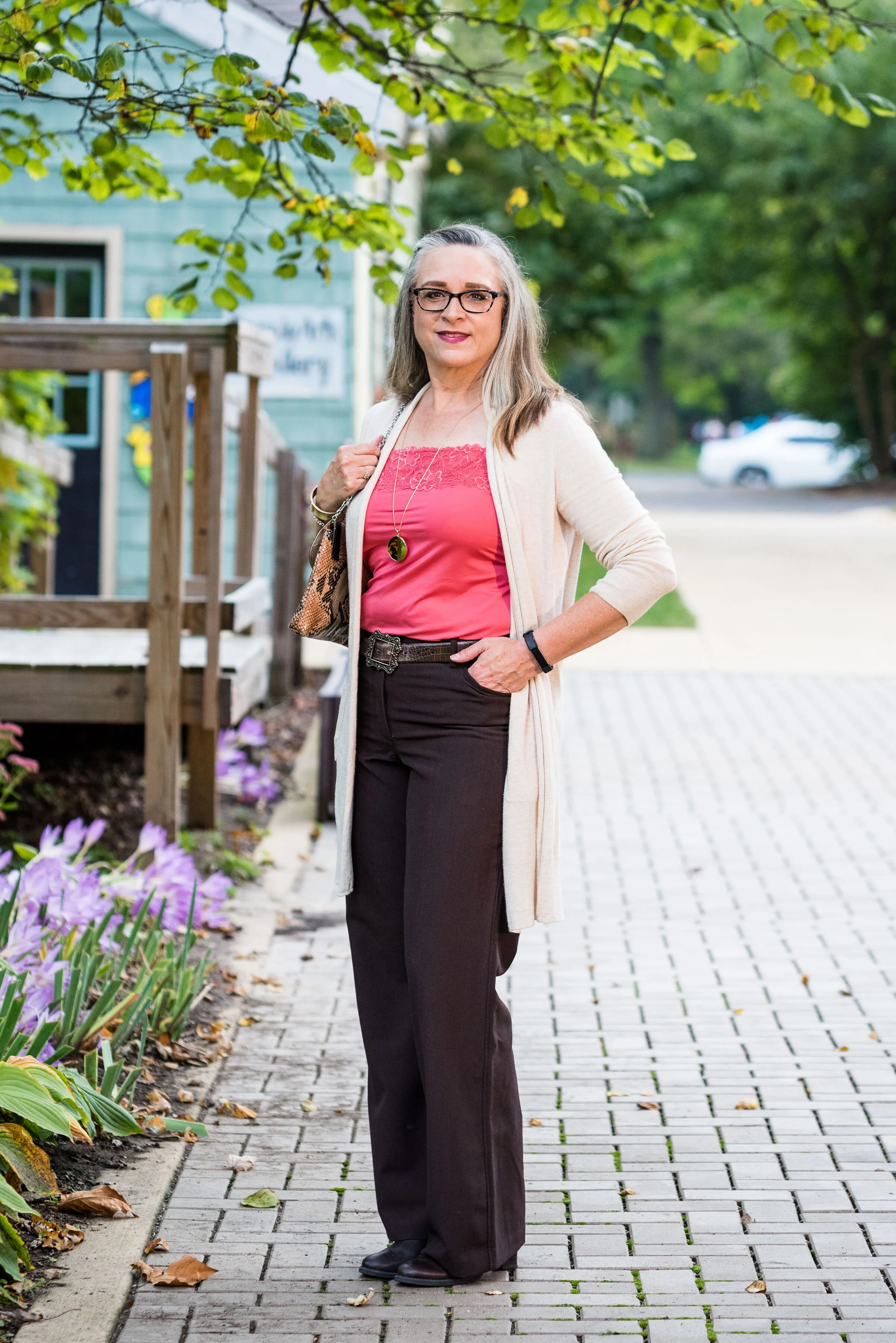
This Cranberry cami was a recent thrift purchase. Most of my camis are pretty tight and I wear them as layering pieces under long sleeve tops and sweaters. I do not wear them to be seen, but it occurred to me that it would be nice to have something I could have more visible under an open sweater. It is Maurice’s brand. I am becoming a fan of Maurice’s. I see pieces every so often at thrift stores and recently I bought what has become one of my favorite pairs of jeans on the clearance rack. What really drew me to this cami was the pretty lace detailing.

These trousers are Worthington brand from JCPenney. Do you know how hard it is to find brown slacks? Now maybe that has changed. I have seen rust, and that more yellowy brown called cognac, but real brown is hard to find, especially a dark brown like this one.

The off white open front cardigan is Chaps brand and another clearance rack find from Kohl’s. Chaps has some nice pieces, but they do have a higher price point than I would normally pay, thus my reasoning for waiting for them to go on clearance. If I thought a particular piece is really worth paying full price for, I would buy it, but for the most part there isn’t anything that I absolutely have to have. I could shop my closet for months and come up with all sorts of new combinations, because I have so many clothes. Truth!

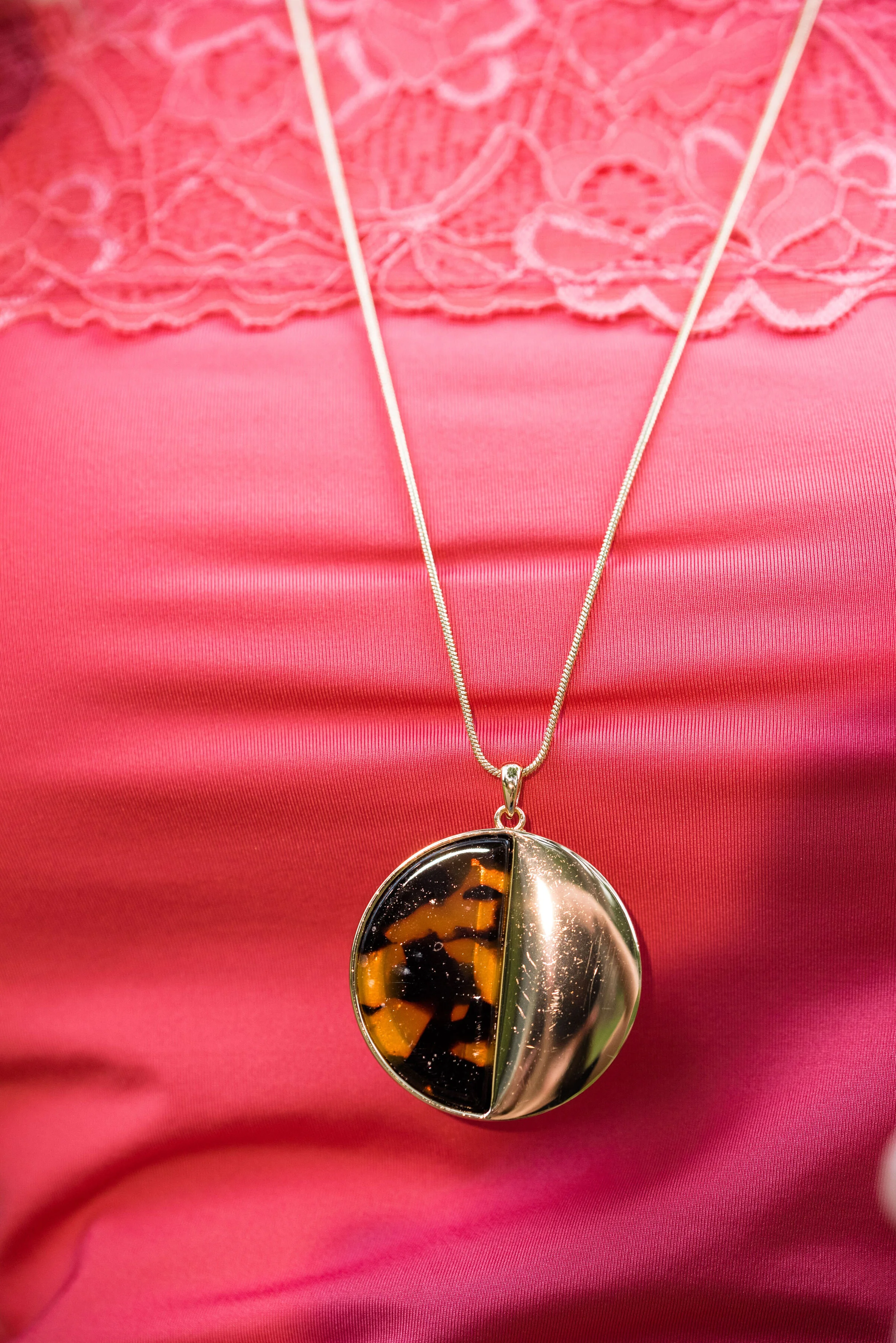
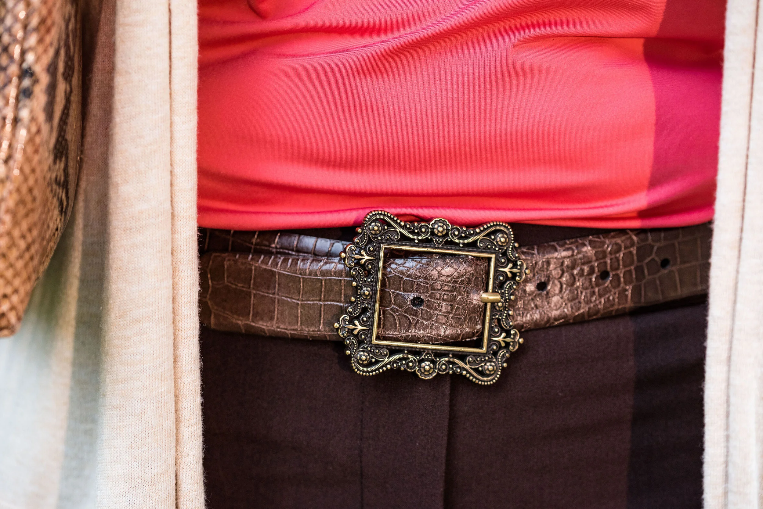
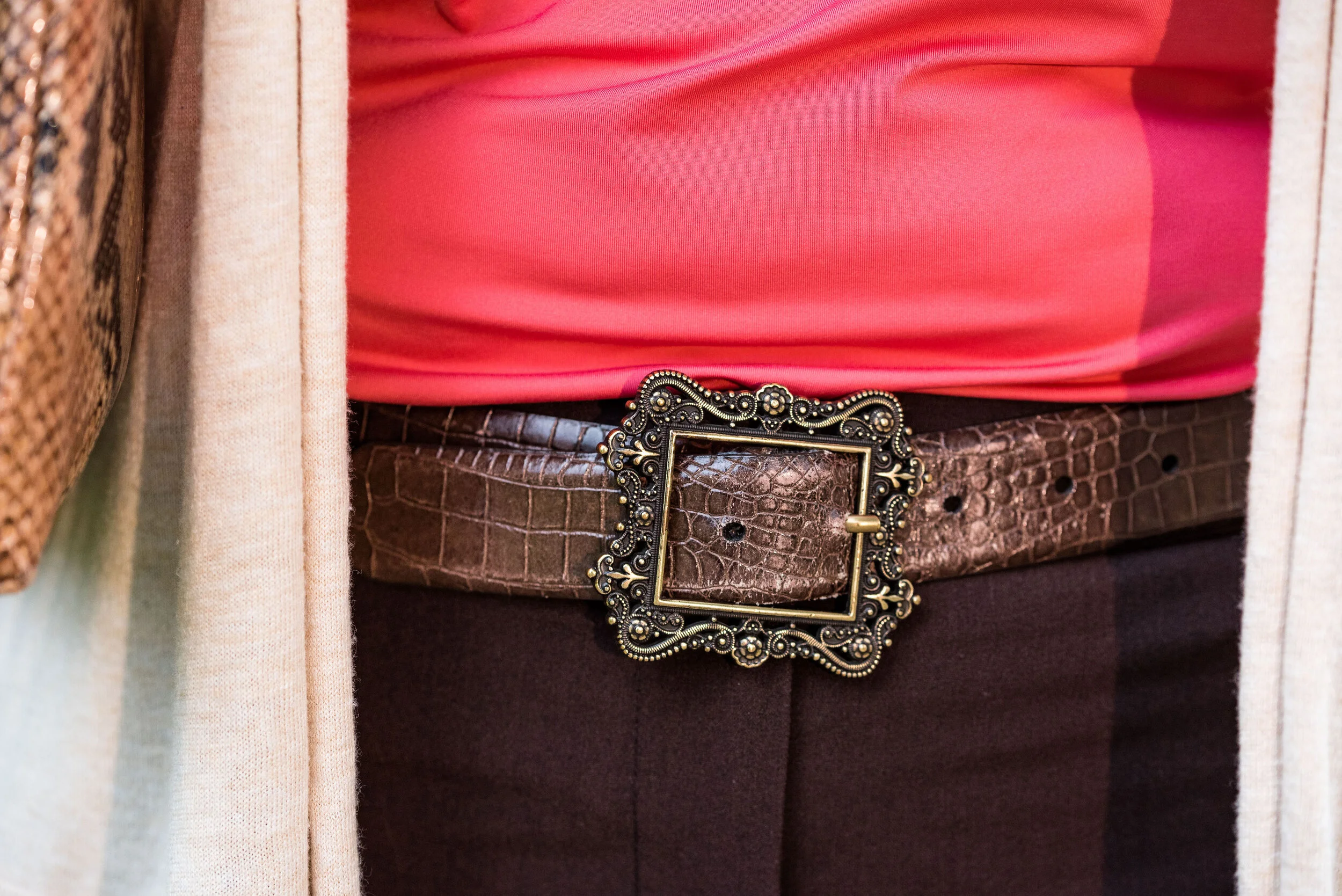
I kept the accessories minimal with my gold leopard print medallion necklace, a few gold bracelets, my snakeskin clutch, a brown belt, and brown boots. I thought this was a good outfit for complimenting with animal prints.

These are two colors that I can get behind. I love the combination and think these two work well together. What do you think? Do you have any of these colors in your closet? Do you wear camis a lot? Do you wear them more for layering or to be seen? I’d love to hear you thoughts, so leave me a comment or two in the comments section. I appreciate hearing from you and all your support.

I’m including a few shopping links for you to peruse. I hope that you find these helpful. Every click you do, gives me a few cents and I appreciate every one. These are affiliate links. All opinions are my own.

Photo and graphic credit Rebecca Trumbull.

Have a great day.


Pantone - Autumn/Winter - 2019 - Merlot and Antique Moss

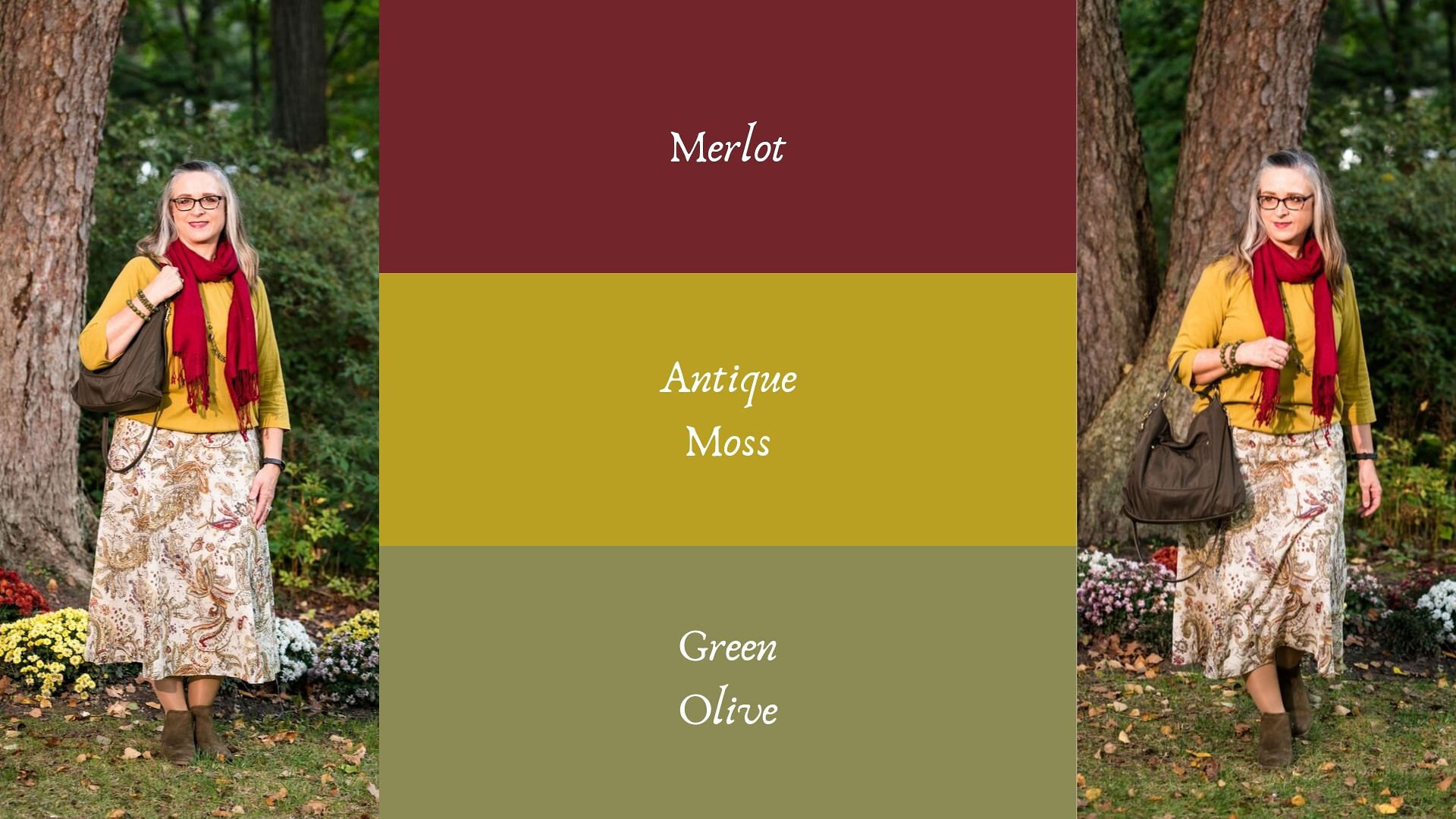
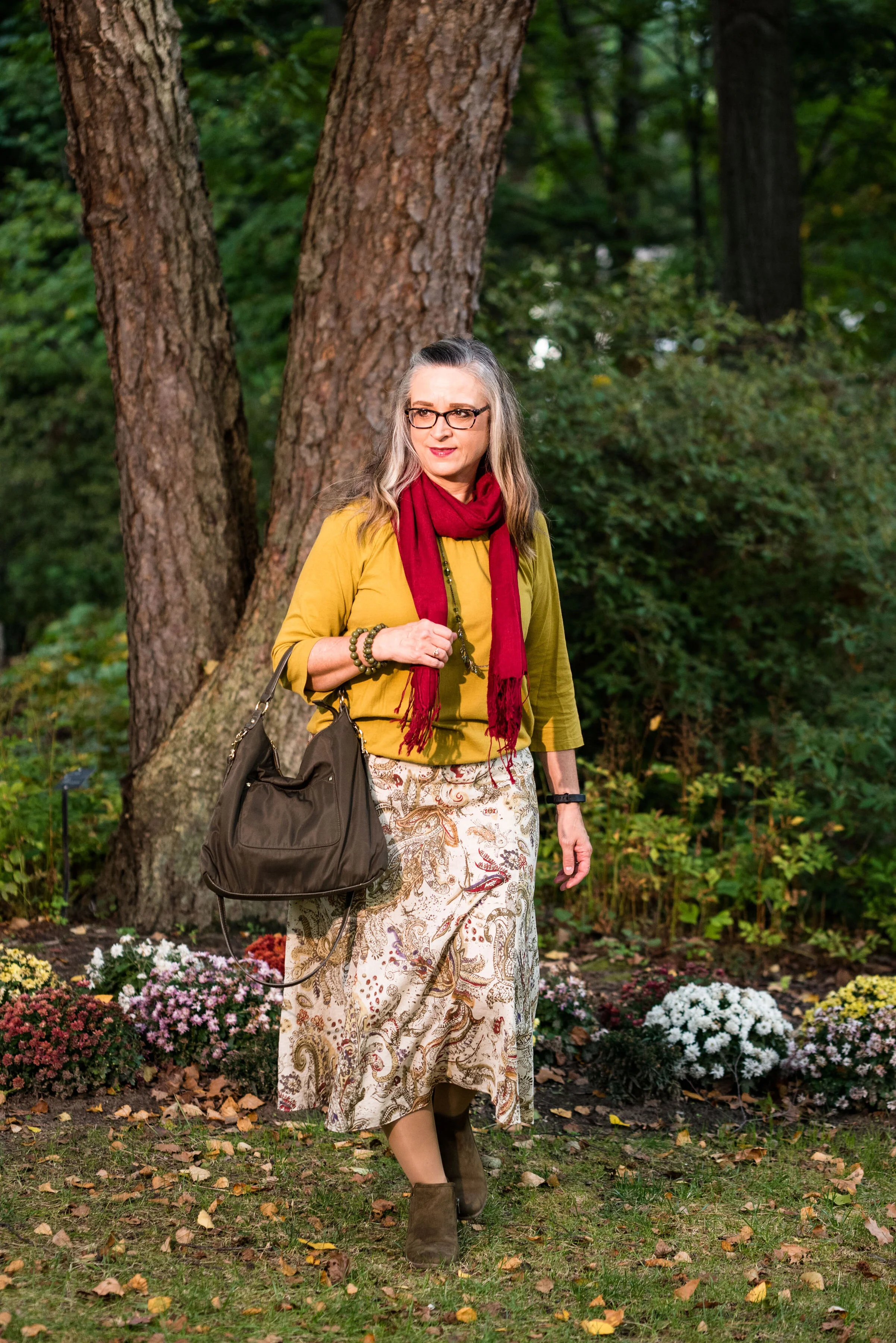
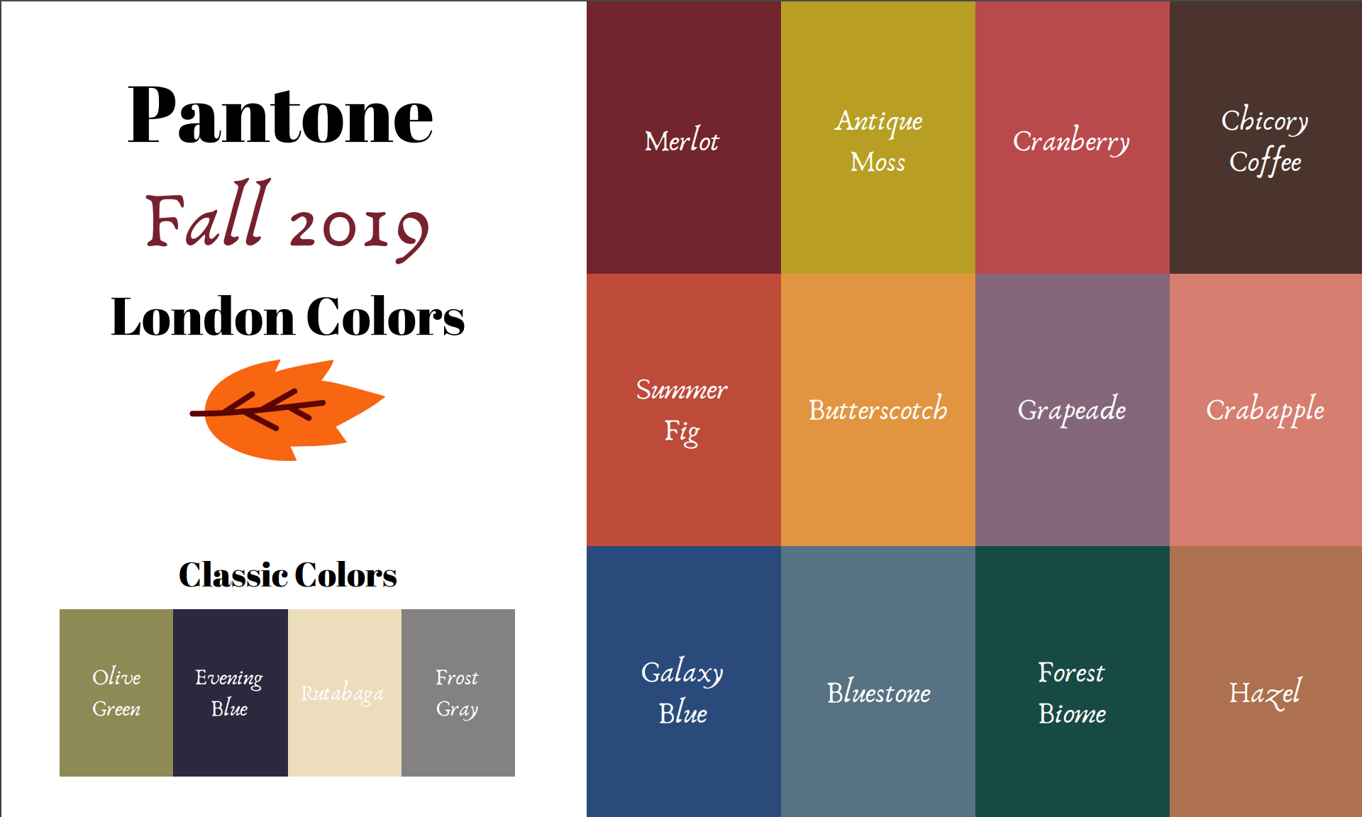
The first two colors from the Pantone - Autumn/Winter - London palette that I am featuring are Merlot and Antique Moss. As you can imagine, Merlot, like the wine is a rich burgundy red, while Antique Moss is a yellowy green. Often when we think of pairing red and yellow, we are concerned we will come out looking like an advertisement for McDonald’s, but let me reassure you these two colors pair in a perfectly un-Ronald like way and I love the combination.

The London color palette classic colors were just a bit different. Green Olive is comparable to Guacamole from the New York palette, with a little more of a gray tinge. My version of olive in my accessories is much darker, but you get the idea.

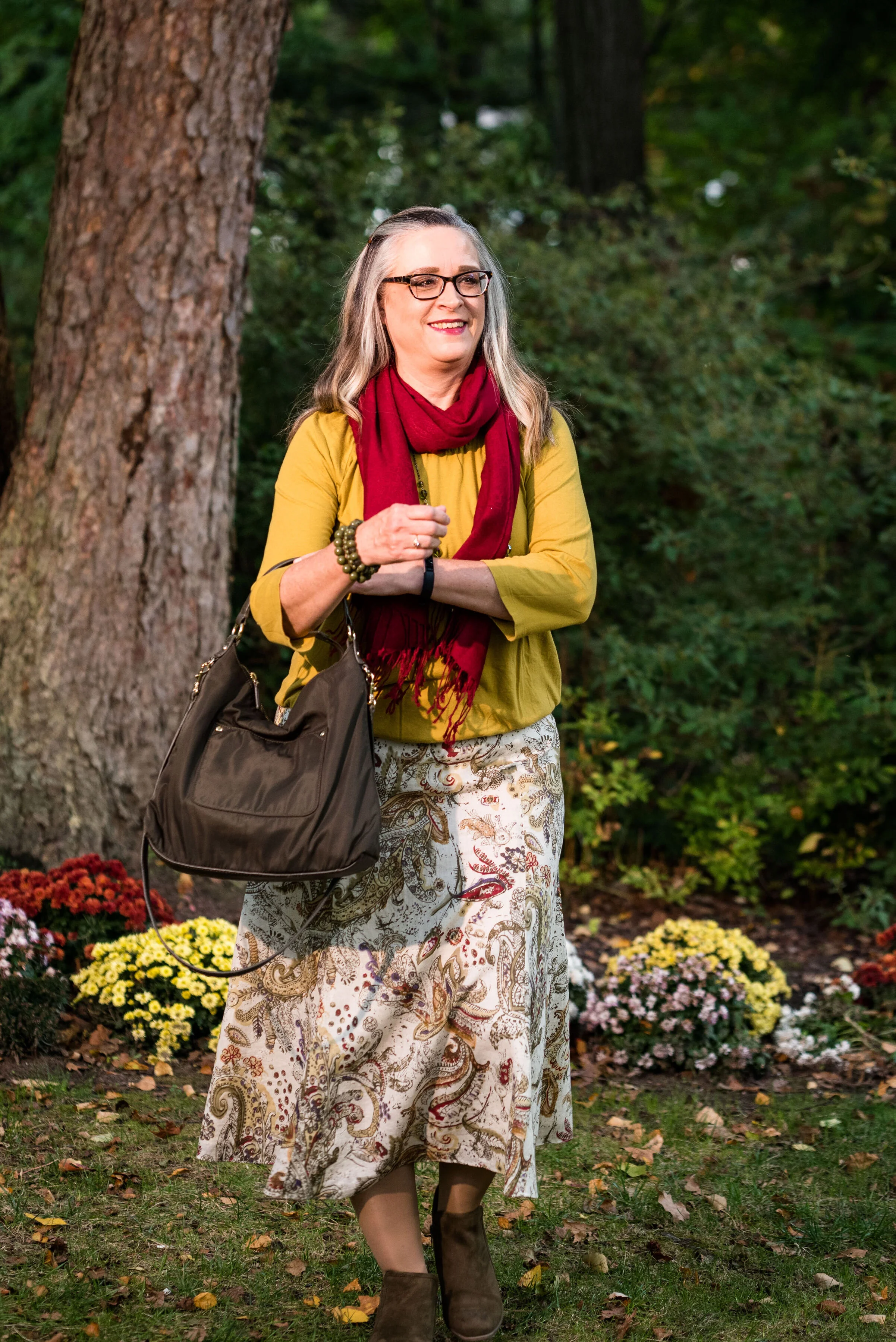
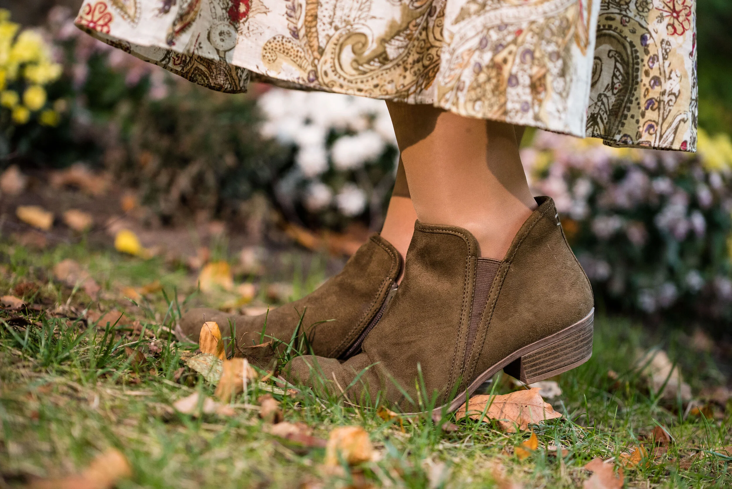
This Jones Wear skirt you’ve seen on the blog before. I styled it for the Pantone Fall 2017 New York Palette in a very similar fashion. I even used the same dark olive bag. Ha, ha. You can see that post here. I also used it this past spring for the Pantone Spring/Summer 2019 colors. You can see that post here. In addition you can see it with a green cardigan, here. I keep coming back to this skirt, because it works so well for these color schemes due to the reds and greens in the print of the skirt. I could easily used this printed skirt for a Christmas outfit as well, so you might see it come up again later this year. I love a versatile piece and when I purchased this skirt, I never knew how often I would use it for the blog.

We took the pictures for this series at the Toledo Botanical Gardens, which are just down the street from where my daughter lives. The gardens are beautiful in all seasons and with walking paths through the grounds, it is a lovely place to visit and I don’t do it nearly enough. In the picture below, I am watching several bus loads of kids scramble on to the grounds and thinking, “Oh boy!” Ha, ha.

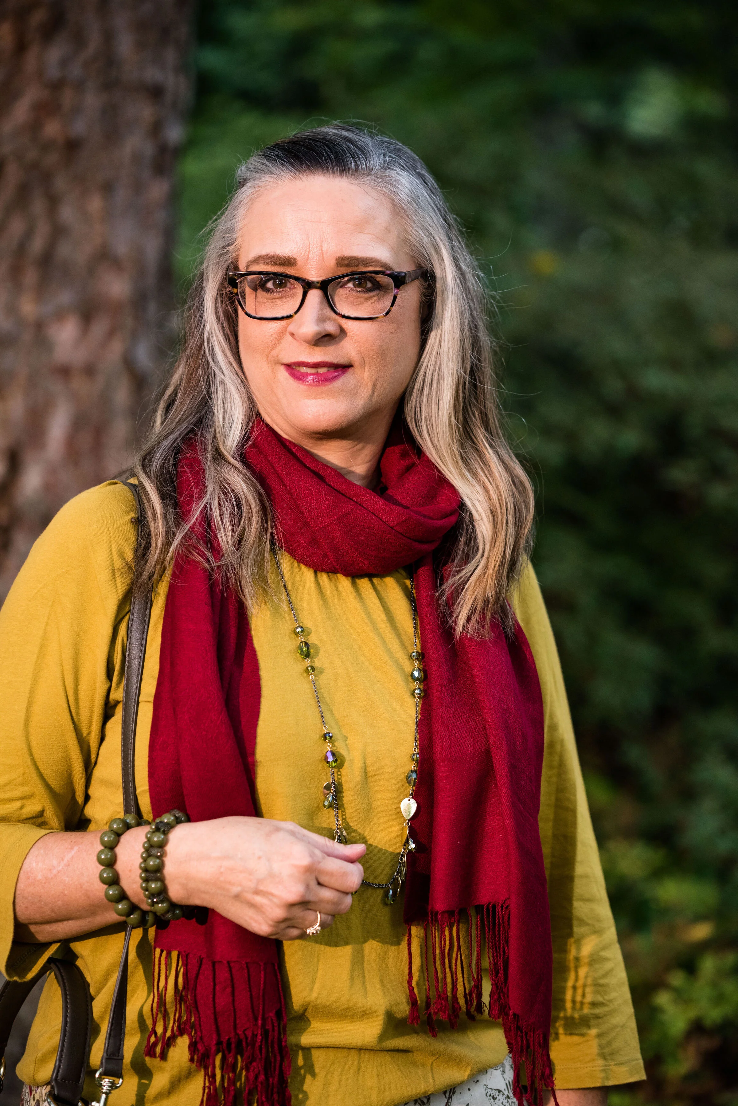
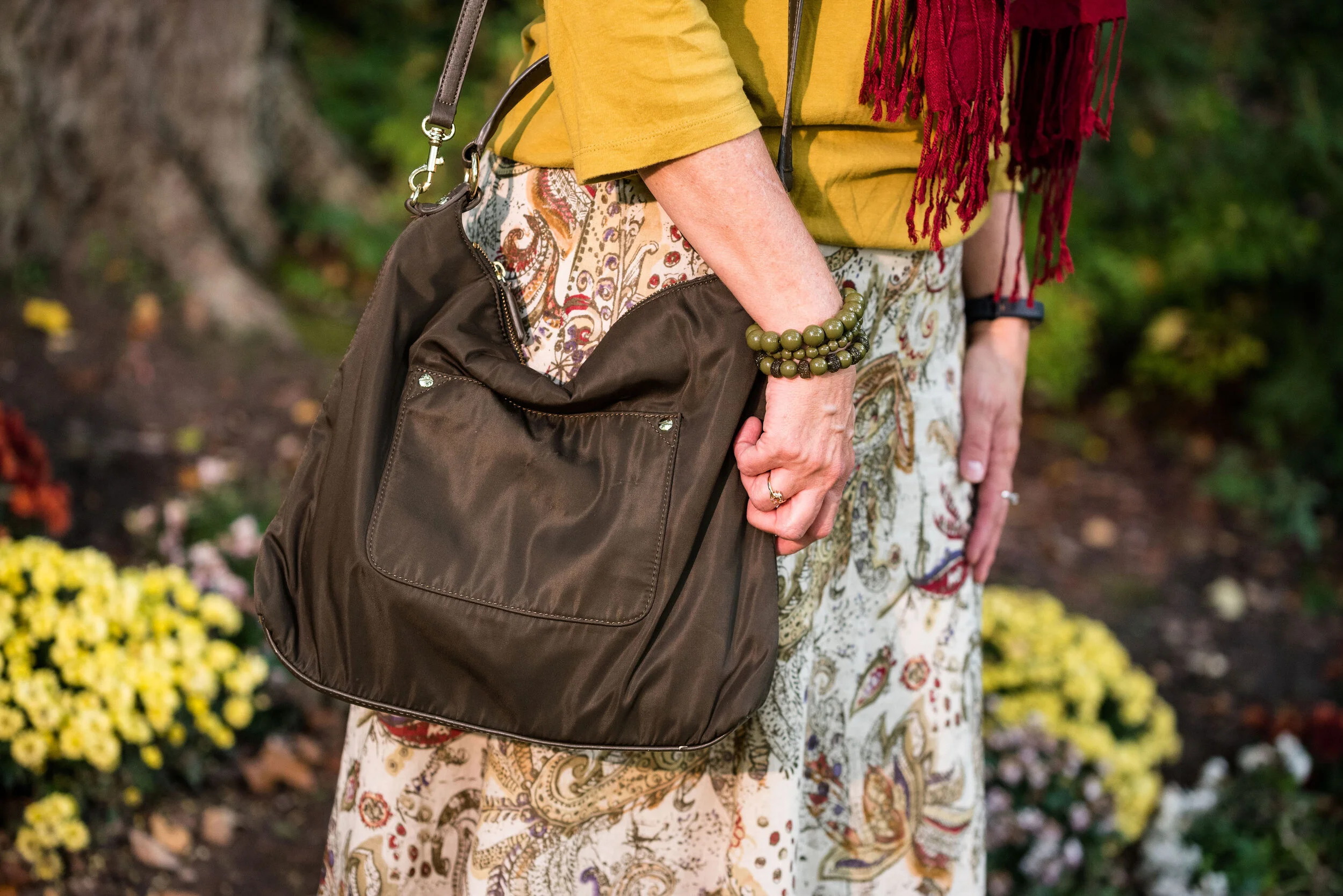
I obtained this red scarf from a friend’s closet. It looked a little more like Merlot, when it was in the low light of my closet, but here it looks much brighter. However, It is not a true red, but more of a burgundy. My 3/4 sleeve tee, I’ve worn on the blog before too. It is a thrifted Sonoma piece and has elastic on the bottom, which allows for freedom of movement and bulge camouflage. Ha, ha. You can see the tee styled with boyfriend jeans and a leopard print skirt here, and with a snakeskin print skirt here.

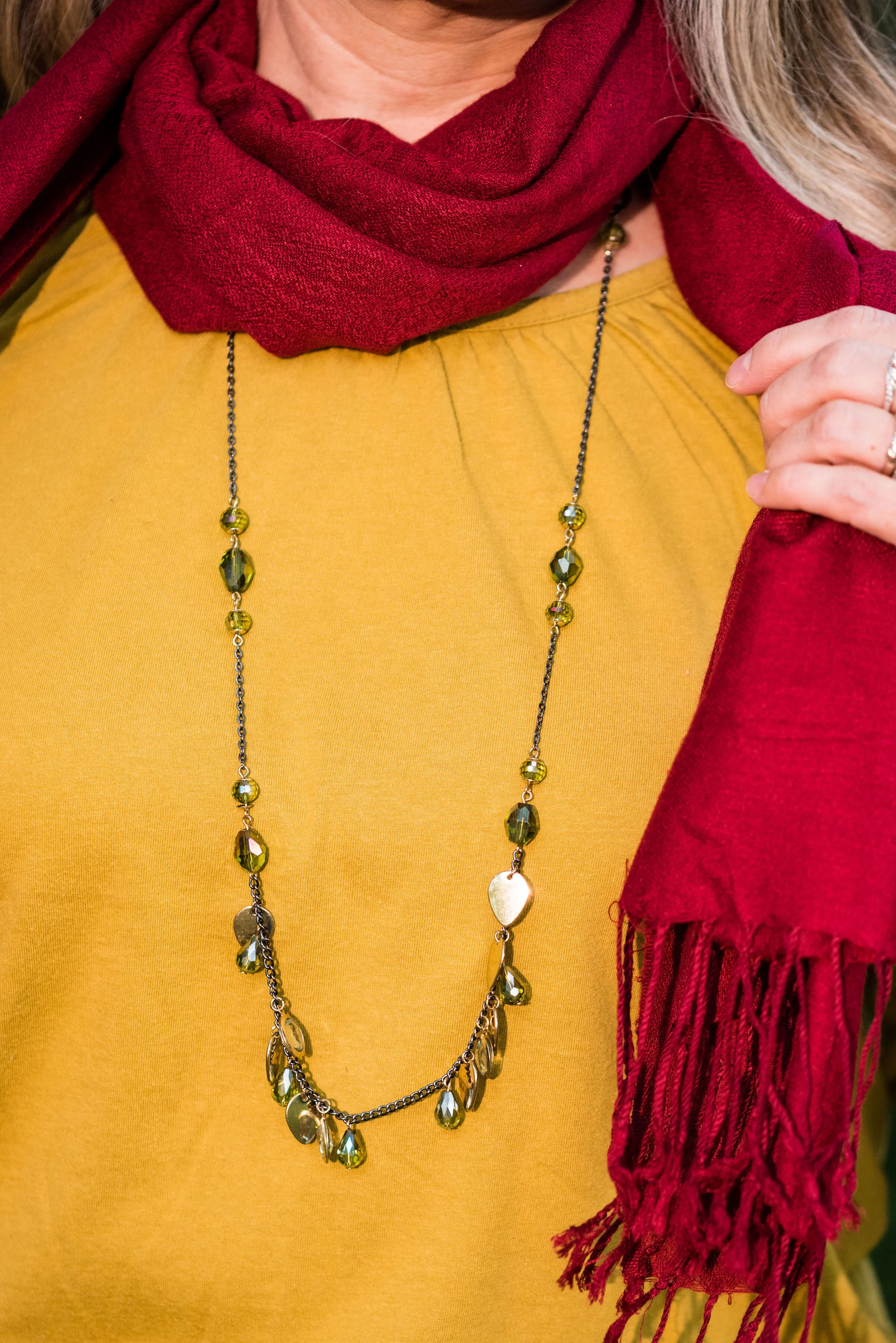
As I said earlier, I opted for olive green accessories which included my necklace, bracelets, thrifted bag and SO booties.

What do you think of these colors? Would you wear either of these? Would you wear them together? I’d love to have your feedback. Your support means a lot to me. I always respond to your comments. Just check back in a few days if you are interested in my reply.

I’m including a few shopping links for Merlot and Antique Moss if those colors got you excited. These are affiliate links, which means I get a few cents when you click on a link. All opinions are my own.

Photo and graphic credit Rebecca Trumbull.


Pantone - Autumn/Winter - 2019 - London Palette - Intro

Past Pantone seasons, I have tried to combine both the New York and the London color palettes into one series. Most of the time there were plenty of overlapping colors, so I was able to take colors from both palettes to make my outfits. This fall there were only two overlapping colors, Galaxy Blue and Bluestone. It was for this reason, that I decided to break the series into two parts. We just finished the New York palette last week. You can see a recap of those outfits here.

Today’s post will introduce you to the London palette and give you a few sneak peeks at the upcoming outfits.

Both the New York and the London palettes included numerous fall yellows, reds and browns. They both included a green, some blues and hues with pink undertones, but the London palette is the only one to include purple, which I thought was interesting since purple is trending right now. Purple has always been one of my favorite colors, so I was excited to see it included on this palette.

In all honesty, I like this palette better than the New York one. I always veer towards richer more saturated colors, rather than pastels and I felt that I had an easier time finding pieces in my wardrobe that better personified the color palette. In this palette we find words like vital, fortifying, robust, delicious, rich, baked, arresting, mellow and distinctive to describe the colors.

I hope you will join me on Thursday as I take a closer look at the London color palette for this fall. Here are a few peeks at what is coming up.

I hope you will join me on Thursday for the start of this series and a look at the first two colors.

Have a great day.

Photo and graphic credit Rebecca Trumbull.


Pantone - Autumn/Winter - 2019 - New York Palette Recap

I was going to start the Pantone London color palette today, but decided to do a recap of all the New York colors. Some people have told me they like to see all of the outfits and colors together in one post, so here we go.

Outfit 1 - Chili Pepper and Bluestone

Outfit 2 - Fruit Dove and Galaxy Blue

Outfit 3 - Crème de Pêche and Rocky Road

Outfit 4 - Sugar Almond and Dark Cheddar


Outfit 5 - Orange Tiger and Eden

Outfit 6 - Peach Pink and Biking Red

I hope you enjoyed this look at the Pantone - Autumn/Winter - 2019 - New York palette. Which outfit was your favorite? I’d love to hear your thoughts.

Next week I’ll be starting the Pantone - Autumn/Winter - 2019 - London palette. Believe it or not, the only two overlapping colors this year were Galaxy Blue and Bluestone. Be sure to check that out next week.

Thank you all for being a part of my blogging journey. If you ever have something you would like to see me feature on the blog, send me an email. I’m open to new ideas and value your opinions and support.

Have a fabulous weekend!

Photo credit Rebecca Trumbull.

Pantone - Autumn/Winter - 2019 - Peach Pink and Biking Red

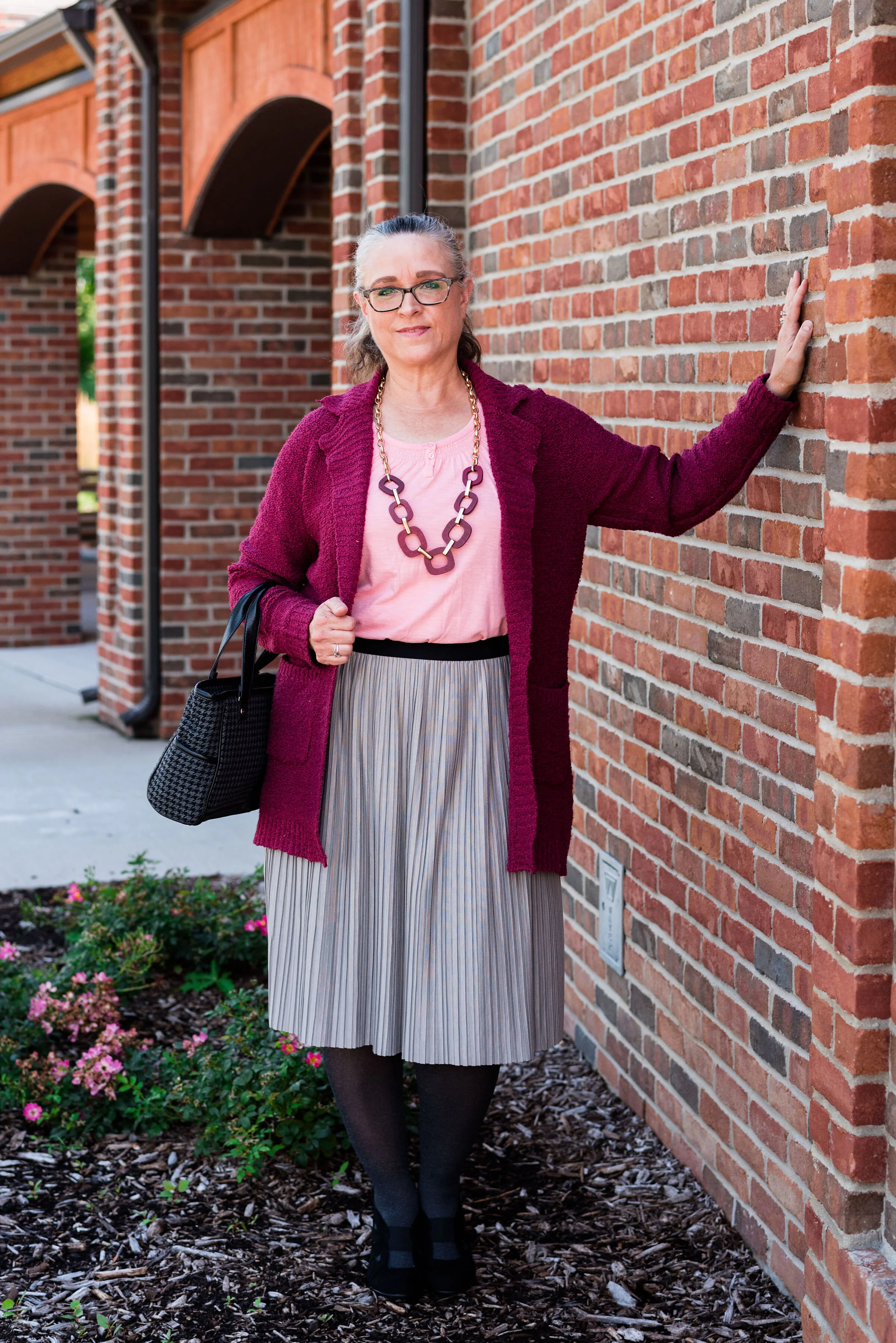
These are the last two colors from the Pantone - Autumn/Winter - New York palette. Peach Pink is reminiscent of coral, which never really seemed like a fall color to me, but I must remember that the old rules don’t apply…at least to some things. I know many people buy into the old adage, the rules are meant to be broken, but I don’t always believe that is the best mindset to have, and that mindset trickles down to our children and our grandchildren. As far as rules, I think that many of them are in place for our protection and our benefit. Rules like, look both ways before you cross the street, floss your teeth once a day and eat your fruits and veggies are not bad. Actually, they are for our well being. Rules about color, really no longer apply, so I am okay with wearing white after Labor Day and wearing coral in October. Why not?

The other color in this ensemble is a dark red. It reminds me of the Brick Red from my Crayola Crayon box. How many of you remember those wonderful boxes of crayons? I used to obsess about having all the similar colors arranged by shade in my box. I didn’t want to hunt around for Brick Red, so I put it in the “red” section. Ha, ha.

As you can see, once again, my colors were not perfect matches. You will see I did a little better with the London Palette, which I will be introducing on Thursday.

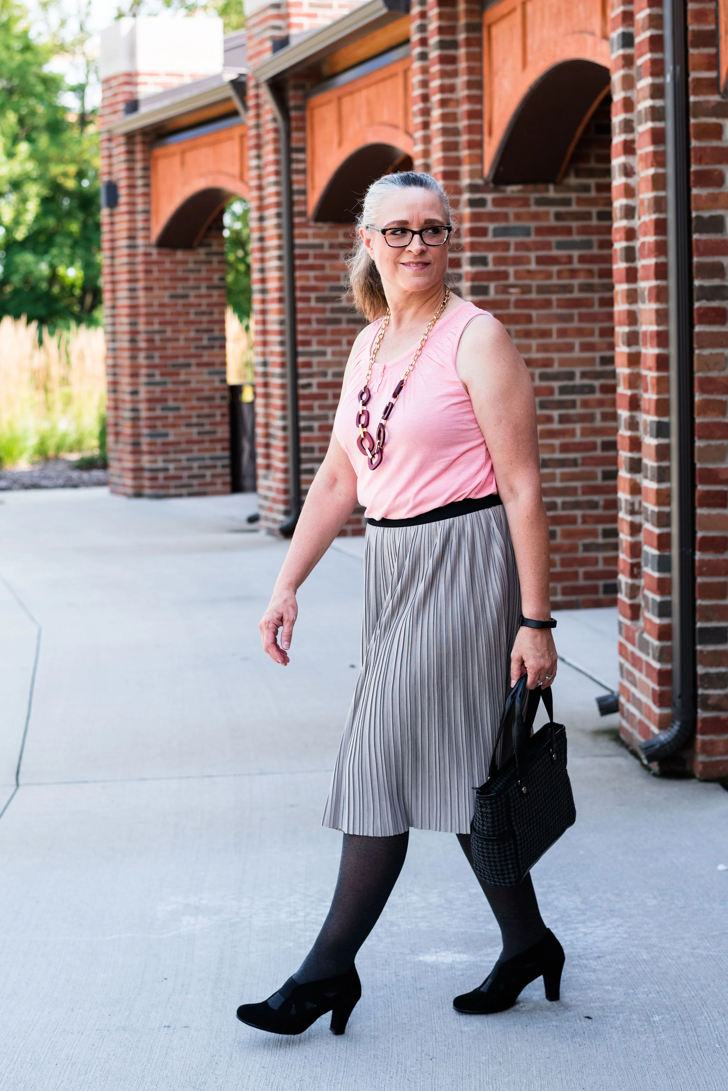
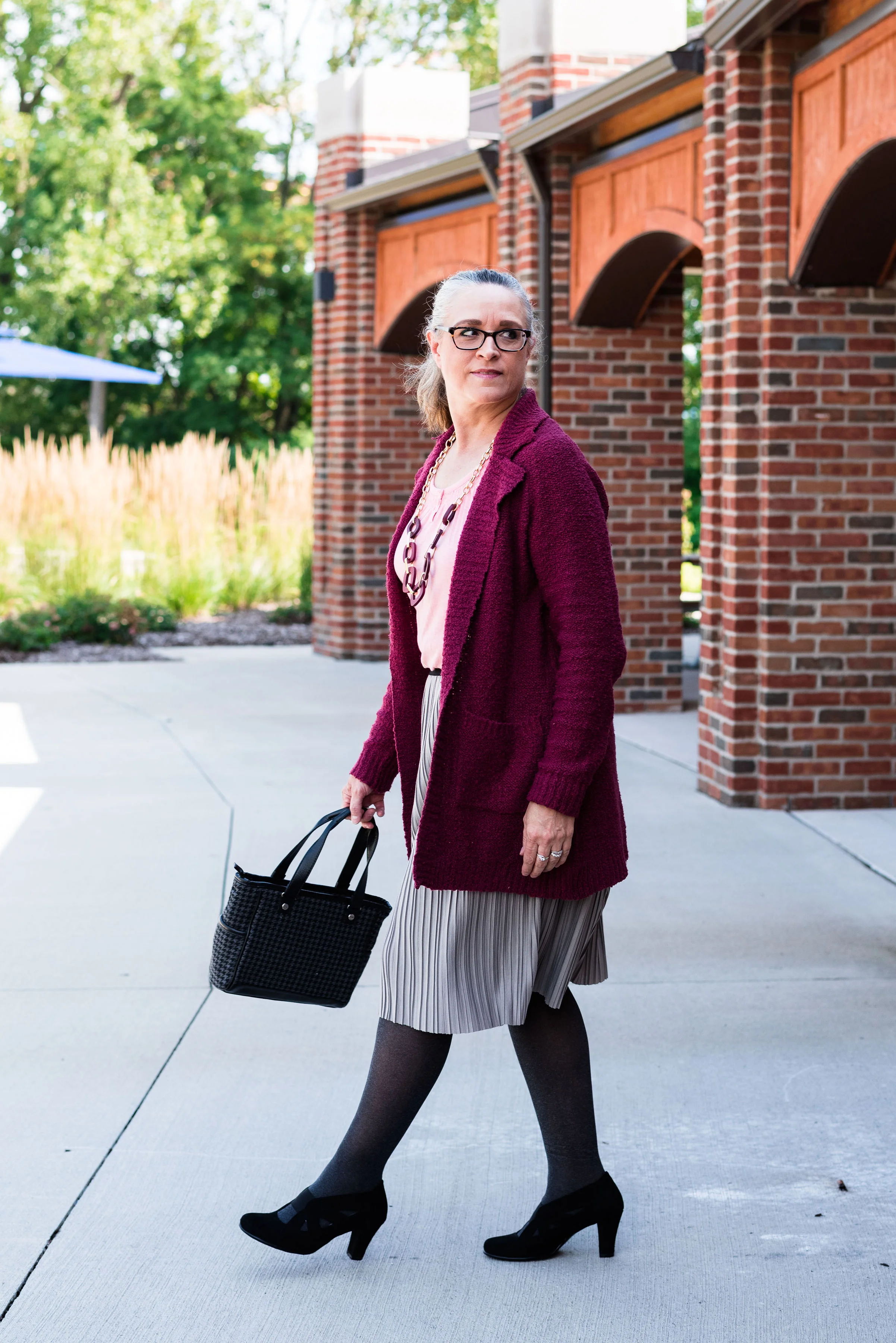
The heavy gauge sweater is Candies brand from the Koh’s clearance rack at end of last winter’s season. I find this is the best time to shop for those pieces you want for the season, if you don’t want to pay full price. I have found most of my non-thrifted clothing pieces this way.

My Peach Pink tank top was a thrift find from a few years ago. It is Eddie Bauer brand. You’ll be able to see the ruching on the neckline in an upcoming picture.

My Paloma gray pleated skirt was also a Kohl’s clearance find a few years ago and is Apt. 9 brand.

My chunky wood ring necklace is making an appearance again. I love this necklace my daughter gave me for Christmas. It is so handy for making a statement and pulling the colors in an outfit together. A necklace like this works much the same way a scarf will, but without the added heat around your neck.

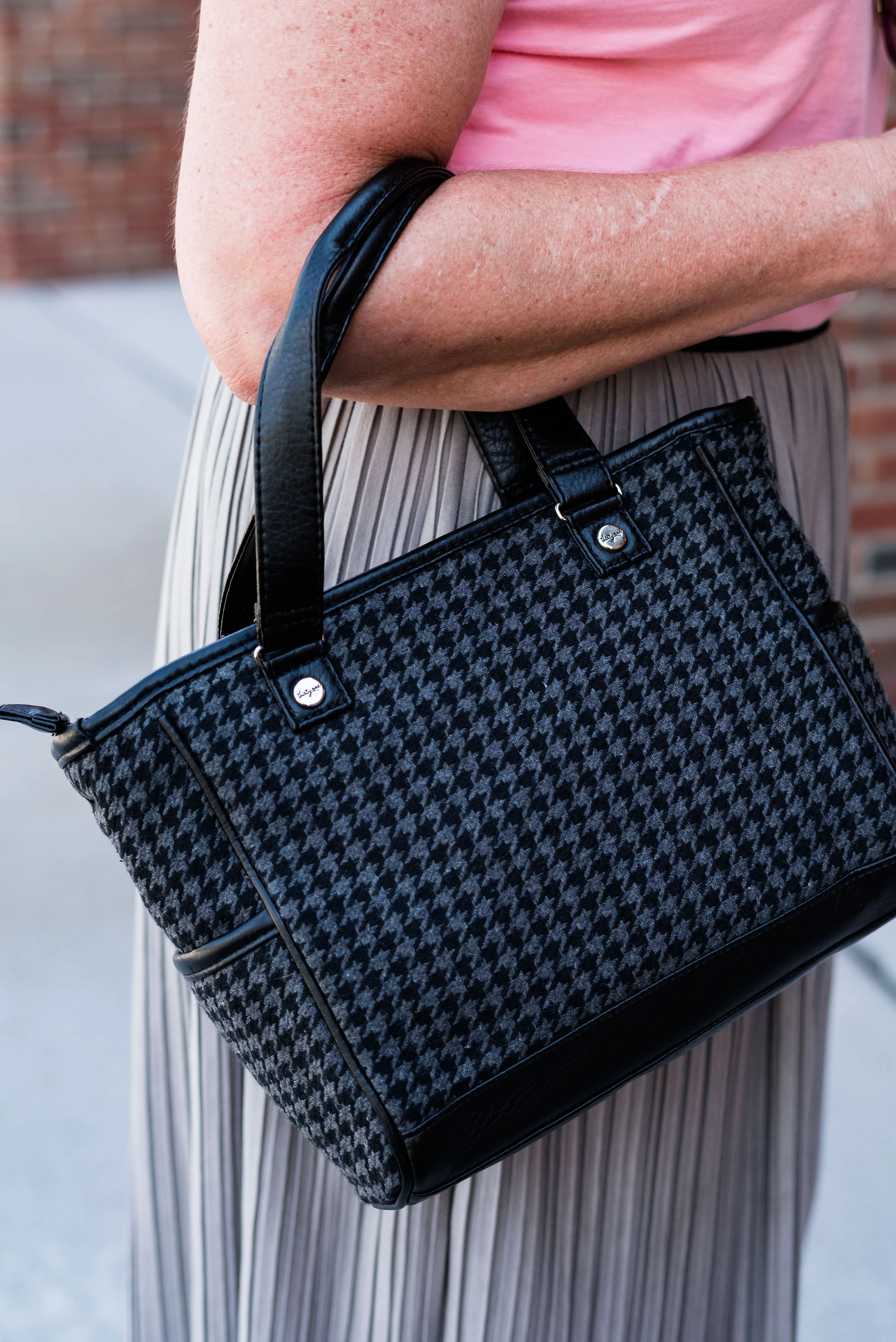
My little thrifted Houndstooth bag works both as a satchel and a cross body. The shoulder strap is inside the bag, but can easily be taken out and attached so I can wear this for hands free activities.

I really like these black Aerosole heels. They are comfortable and stay on my feet with no slipping or sliding. I decided to add the dark tights at the last minute for two reasons. The first was to keep the leg more monochrome and thus make the legs look longer. The other was to make the outfit seem more ready for fall weather. The day we took these pics it was hot!

What do you think of this outfit? Is this something you would wear? Do you like these Pantone colors? Why or why not? I’d love to hear from you, so leave a comment or two.

I’ve included a few shopping links. These are affiliate links. All opinions are my own.

Photo and graphic credit, Rebecca Trumbull.

Have a great day.

Pantone - Autumn/Winter - 2019 - Sugar Almond and Dark Cheddar

Today’s colors, in my opinion are the epitome of fall. The browns and oranges remind me of pumpkins and firewood stacked as it waits to be used. Red’s and yellows are other bright colors associated with this season and we will be seeing more of those in the London color palette, which will be coming up shortly. Let’s take a closer look at Sugar Almond and Dark Cheddar.

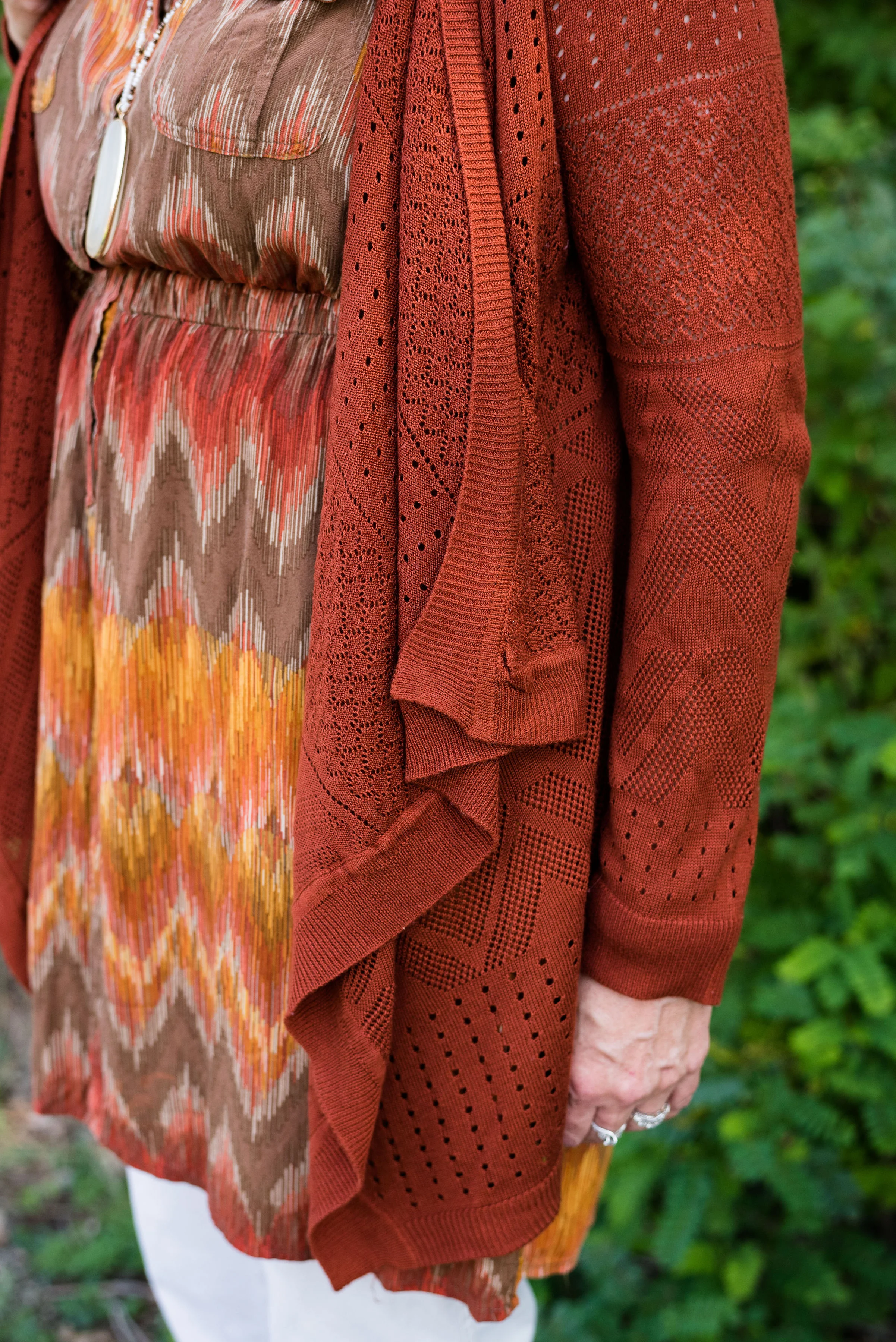
This thrifted, Sonoma, chevron print, dress caught my eye a few months ago and I knew it would be perfect for fall. Originally, I was going to used the waterfall cardi for the Sugar Almond color, but I actually think the colors in the dress are more suited to both of these Pantone colors.

Since I don’t normally wear dresses this short, I thought it would be fun to pair it with cropped pants. This pair of St. John’s Bay, creamy colored pants were another thrift store find. I almost didn’t get them, because I thought they were a little tight, but then, what isn’t on me right now. Ha, ha. However, I ‘m glad I put them in my cart. I think they make a cute addition to this dress. I want to try them with boots, when the weather gets colder. I might even try this dress with a chunky sweater, tights or leggings and boots. If I have success with that, I’ll post pictures either on Instagram, or I’ll do a post about it.

You can see in the above picture, the dress has a partial button front and an elastic waist. Wearing a belt with this would be another fashion forward idea, but I wanted an uninterrupted look from collar to hem, especially since I chose to wear this with cropped pants.

Let’s take just a moment to talk about the rule of thirds. The rule of thirds is a photography guideline that suggests mentally dividing your picture into thirds, horizontally and vertically. You then place the image you wish to photograph at the intersection of two lines. This can make for a more interesting picture, that draws the eye to the image.

Fashion also has a rule of thirds. The body is divided into thirds: head to waist, waist to knees and knees to feet. This is an approximation and as we all know, some people have longer necks, shorter torsos and longer legs, so each individual will be a little different. This rule is good to be aware of when putting together an outfit.

If you look at the above picture, the dress would be considered in the first two thirds of my body and the crop pants and shoes in the last third. Take a look at this article to learn more about the rule of thirds in fashion, and why it helps to keep it in mind when you dress. Dressing Your Best: Rule of Thirds.

This Pink Rose, waterfall cardi is another thrift find. I love the open weave, and as you can see, it also has the chevron pattern on it. I did not plan that. Ha, ha. I just thought the color went perfectly with the colors in the dress. This is a great piece for these fall days that are still warm.

For accessories, I went with a coppery bag and my thrifted Naturalizer shooties. I also added the pendant bead necklace as a way to bring out the cream in the dress and tie in the pants. Accessories are the best way to pull an entire outfit together and make it look finished.

What do you think of these colors? Do you wear orange? Orange is often an intimidating color to wear, but there are so many different shades and tones that there is probably one out there you could wear. Would you wear crop pants with a dress like this? Let me know your thoughts. I love to hear from you.

Be sure to check back Thursday for two more Pantone colors.

Photo and graphic credit Rebecca Trumbull.

I’ve included a few shopping links for you to look at. These are affiliate links. Any time you click on a link, I get a few pennies. If you purchase something through my links, I get a a small commission. I appreciate all your support and all opinions are my own.

Have a great week.

Pantone - Autumn/Winter - 2019 - Crème de Pêche and Rocky Road

I am not sure how the Pantone Color Institute decides the colors they are going to feature for each of their palettes. If you have been following me for a few years now, you can probably tell that many of the colors that appear on the palette are very similar to another season’s palette and are just called a different name. For example Tuesday’s Galaxy Blue was very similar to last spring’s Princess Blue.

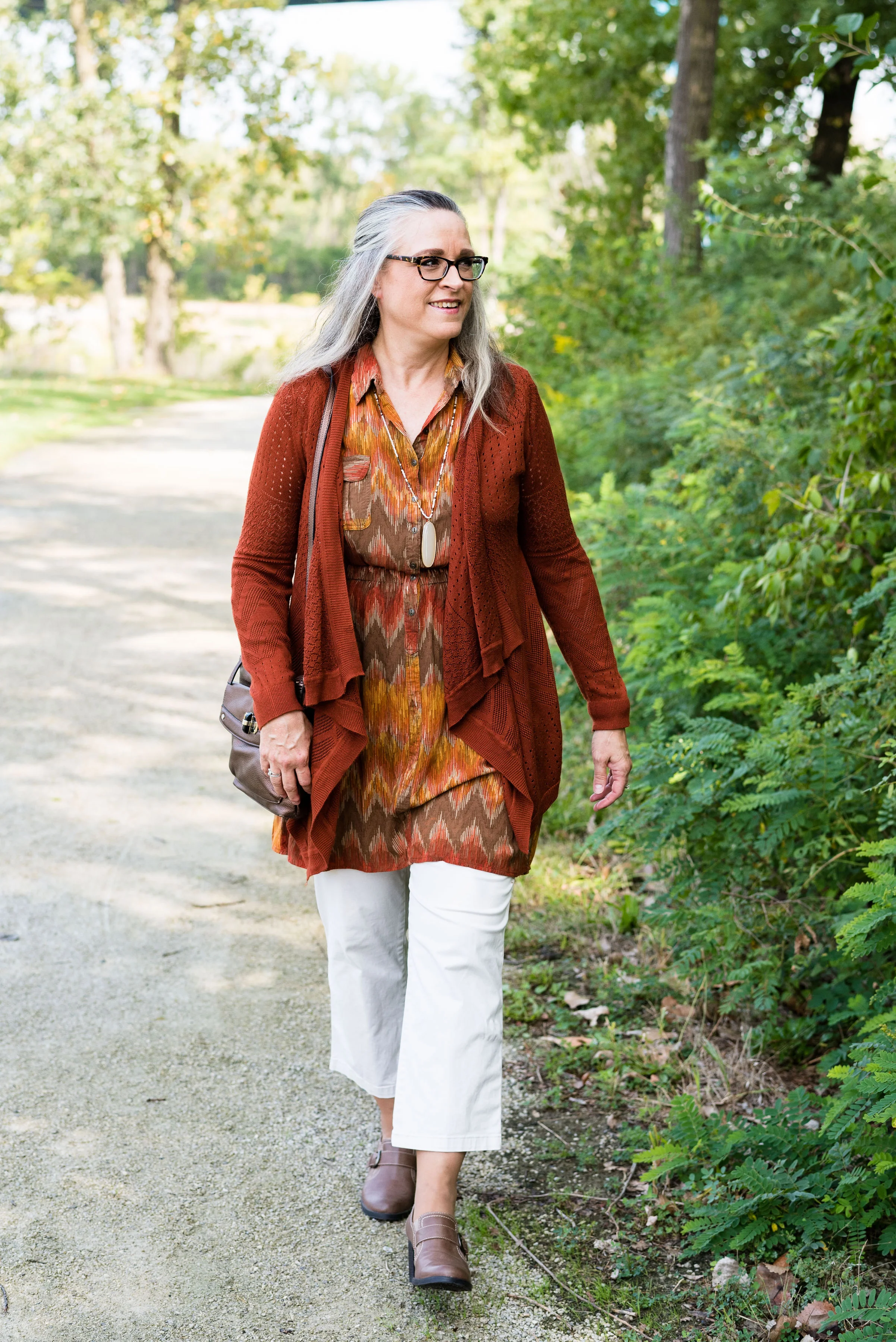
Today’s outfit features two colors called Crème de Pêche and Rocky Road. Once again, my versions of the colors, do not look much like the Pantone colors, but it still gives us inspiration to pair to fall type colors together and pull it all together with a light gray.

My Chico pants look much more orange in comparison to the Pantone color swatch, but I do like how this pair of pull on Ponte knit pants looks combined with the light peach top.

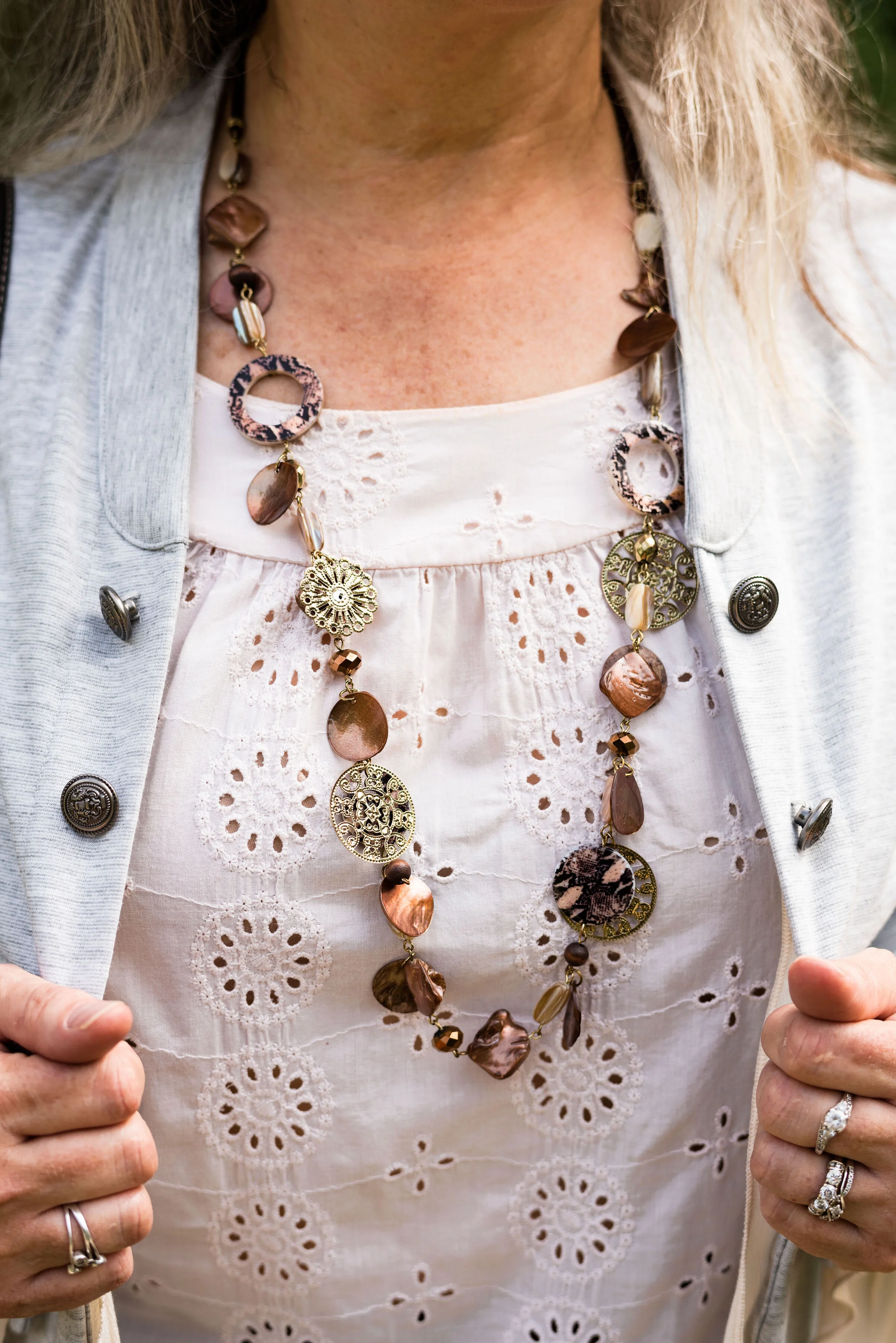
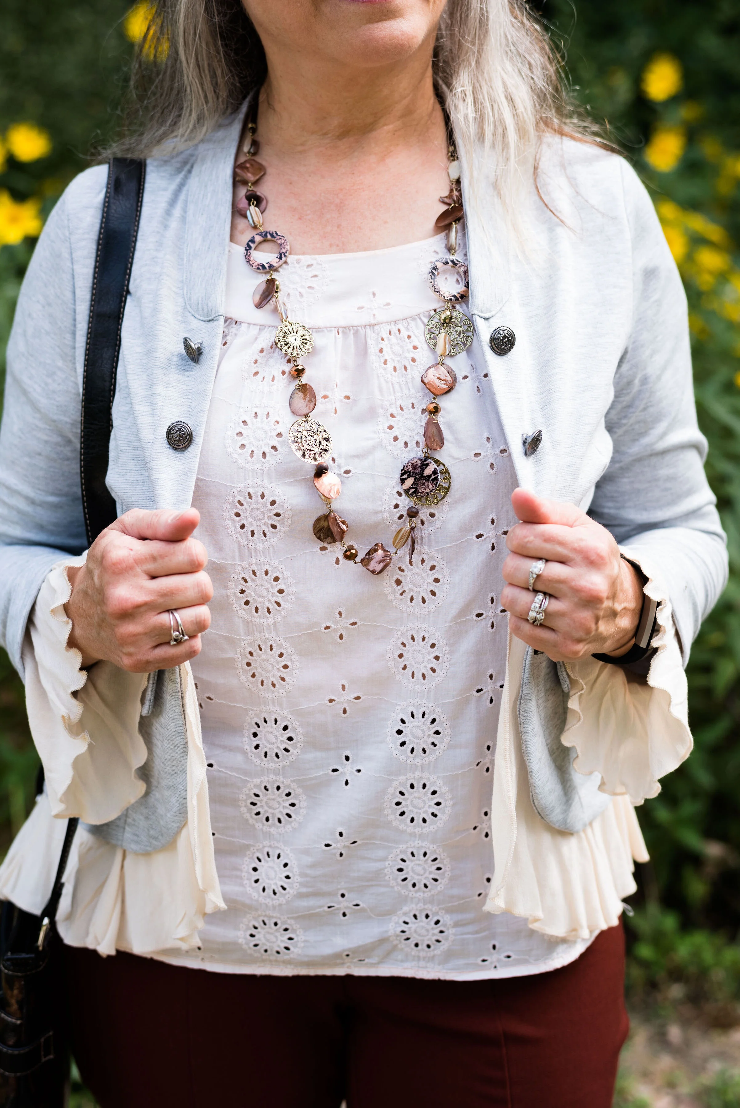
The light peach eyelet top was a thrift find and I wear it a lot in the warmer months. You can see a closer look at that and the necklace I chose in the picture below. I thought the necklace was a good compliment because of its similar colors.

This light gray, About A Girl, jacket was a fun find on the Kohl’s clearance rack. I like the military vibe of the buttons, but the surprising feminine detail of the ruffles on the hem and sleeves.

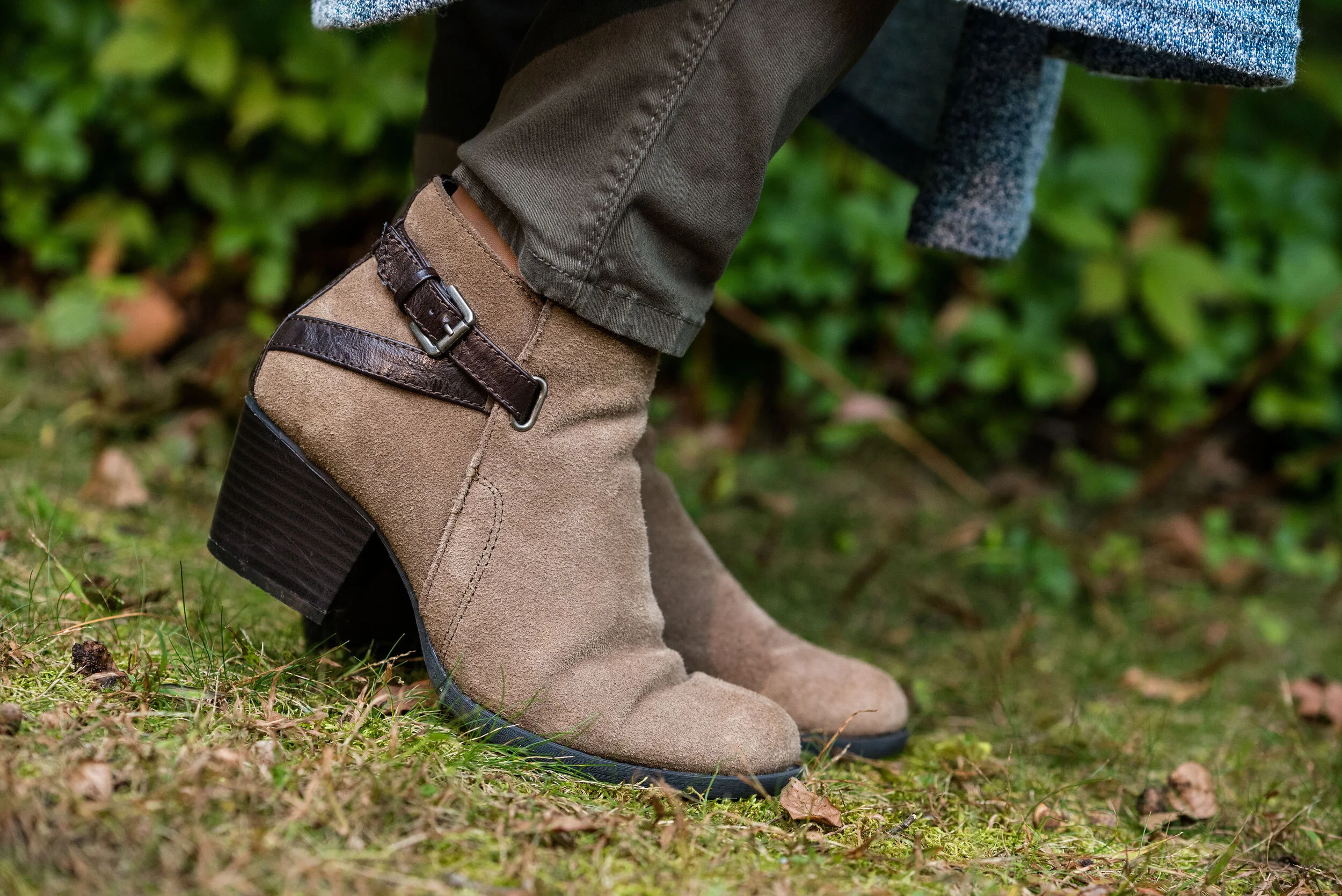
Another Kohl’s clearance find, I got these Sonoma boots at the end of last winter season. They are a faux suede and a different look that some of my others boots. I love the slouchy and buckle details. Yes, I do have too many pairs of boots, but can a woman who lives in the midwest, have too many? Ha, ha.

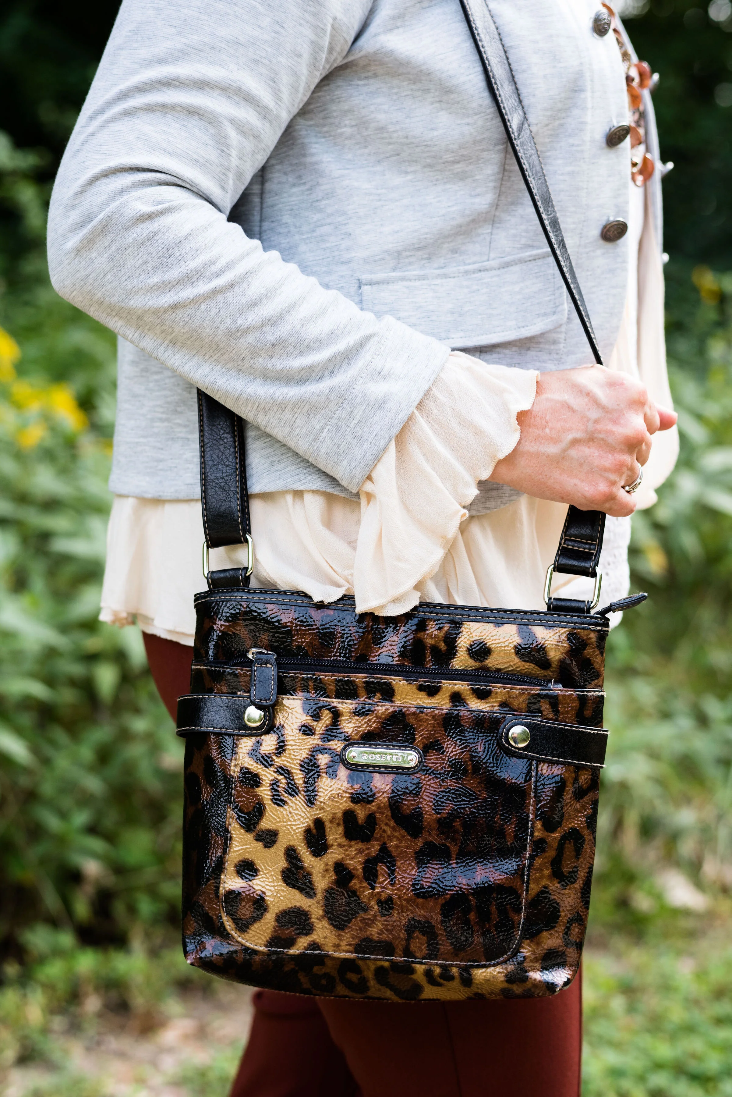
Here is the thrifted Rosetti leopard cross body again. I am planning on making this my “normal” every day bag, as soon as I get around to changing things over. How many of you change your purse on a regular basis? I have many more purses and bags than I actually use. I use them for the blog, so you can see the different styles and shapes, but more often than not, I carry a cross body bag like this. It is just so convenient for hands free shopping.

Here are a few more pictures. I really liked these photos, especially with the large rock and the yellow flowers in the background.

Although my colors were off, I hope you enjoyed this outfit. Do you have a favorite pair of boots you like to wear? What color are they? What do you think of these colors from the Pantone palette? Let me know your thoughts in the comments.

I hope you have a wonderful weekend!

Photo and graphic credit Rebecca Trumbull.

Pantone Autumn/Winter - 2019 - Fruit Dove and Galaxy Blue

These next two colors are described by the Pantone Color Institute as an “extroverted pink” and a “thoughtful blue”. I like that combination of terms, in the same way I like this combination of colors. We often think of extroverted people as popular, charming and talkative, while thoughtful people could be described as people who think more than they talk, or people who are on the look out for ways to help others. I am not an extrovert, but an introvert. I have a hard time in crowds, get tired of too much noise or activity and I need my alone time. Wearing a bright pink like this is my way of standing out in the crowd, without saying very much.

You might think these three colors are more spring like than fall like, but colors transcend all seasons. I do like darker, richer colors for fall and lighter, breezier colors for spring, but that is my personal opinion. What really makes an outfit more season specific are the textures and accessories you incorporate into it.

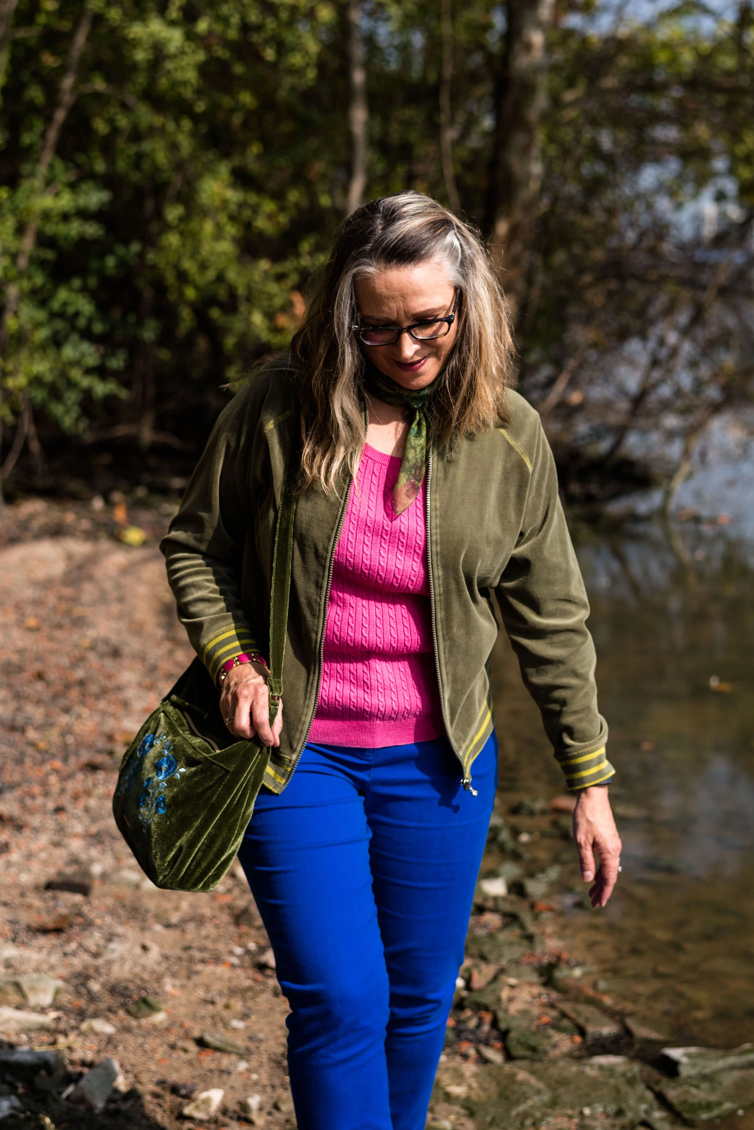
i’ve worn these bright blue Ruby Rd. pants on the blog before. You can see them with a light blue sweater, a plaid bomber jacket, and a multi-colored kimono. My friend was getting rid of these and I took them, not realizing how much I would actually wear them and used them for the blog. This royal blue color seems to keep coming around again and again.

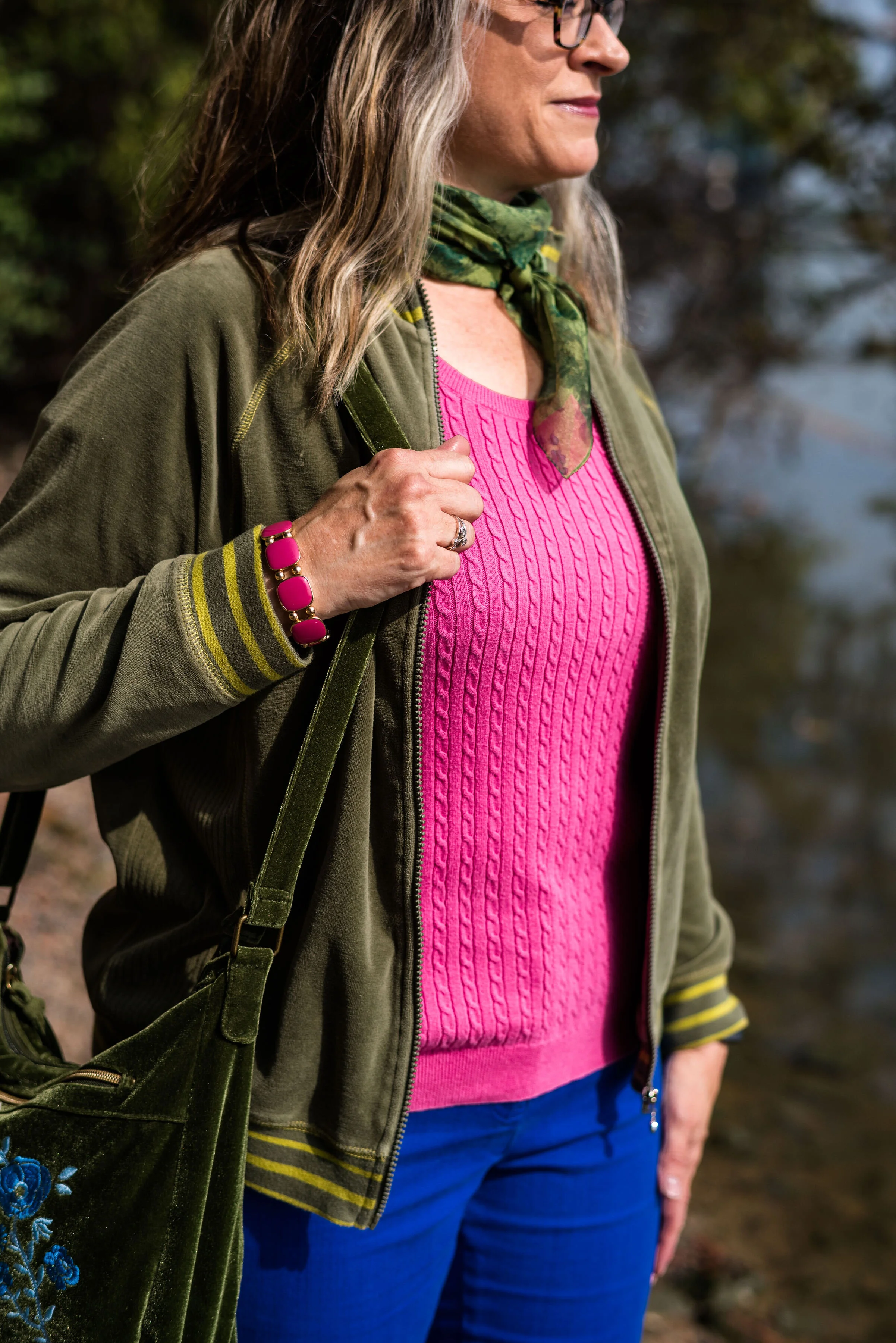
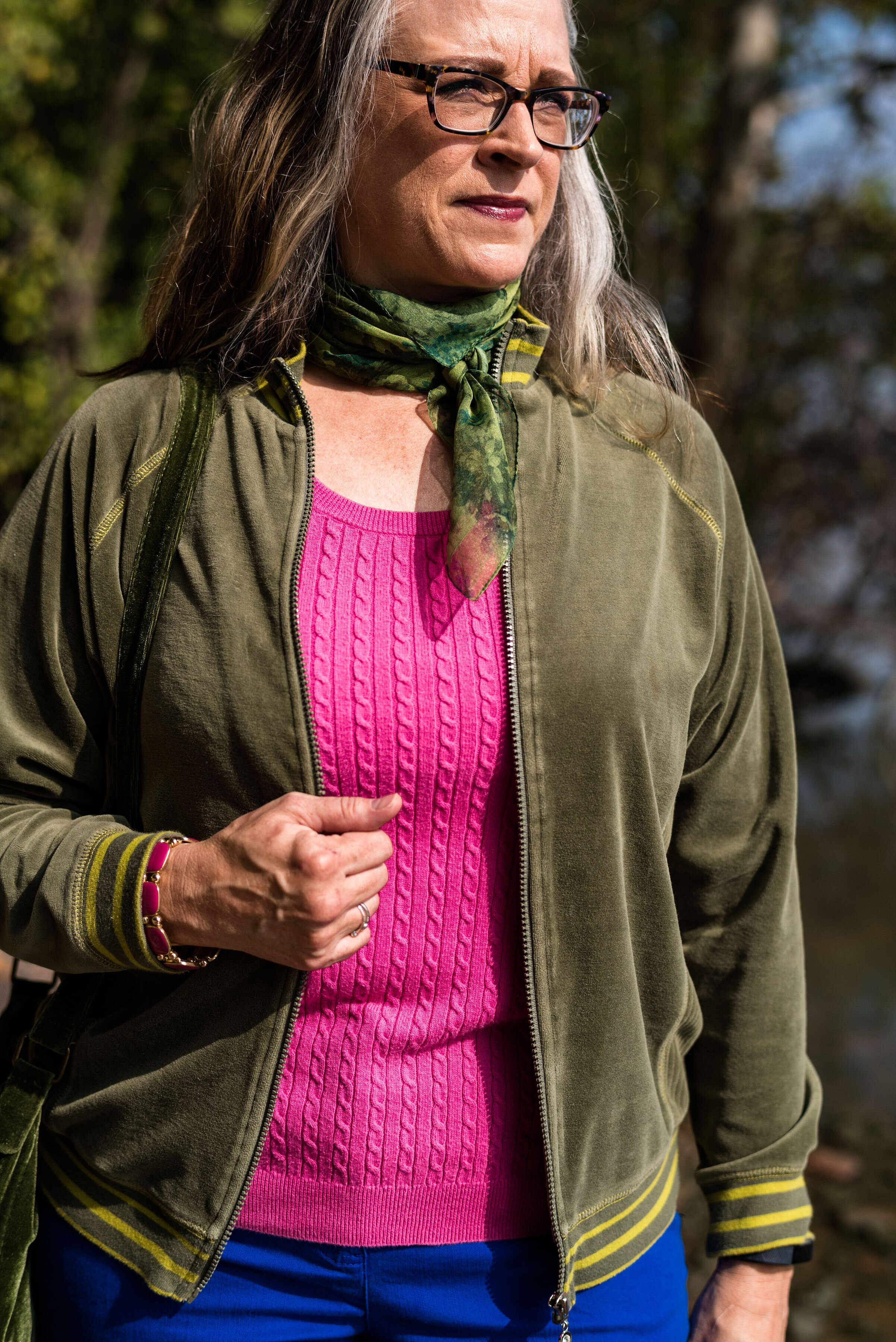
I have had this thrifted Ralph Lauren pullover sweater for a while. I don’t wear short sleeve sweaters too often, because in the summer it is too hot and in the fall, winter and spring it is too cold. However, for some of these warm fall days, where the temps are still in the 70’s in the day and 50’s at night, a short sleeve sweater is a good option. Can you tell in the picture below I am trying to stand up straight and suck in my rolls? Ha, ha. Well, I am! Just being real!

In addition to the two New York palette colors of Fruit Dove and Galaxy Blue, I wanted to incorporate one of the classic colors. I thought it was interesting that they included this olive green, which they call Guacamole. In the past, the classic color palettes usually contained a dark blue, a gray, some sort of cream or ivory and either a camel or a shade of brown. This was the first year they included a green. At first, I thought that was a rather odd choice, but once I got used to the idea, I realized this green would work with a number of color combinations. I pulled out my velour jacket, knowing it would be a great accompanying piece for this outfit.

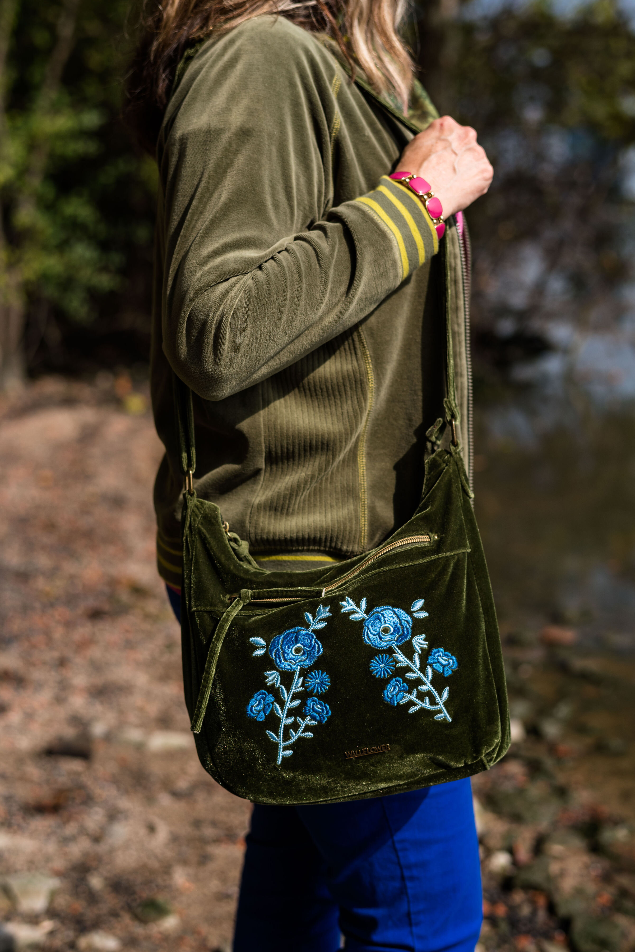
Since I pulled in the Guacamole, I decided to go for green accessories. My SO olive booties, the velvet floral bag and the green neck scarf bring a continuity to the outfit and tone down the bright blue and pink.

Believe me when I say, it was too hot to be wearing all of these layers. As soon as we finished at outfit, I was undressing as we walked back to the car. Ha, ha.

What do you think of this outfit? Would you wear these colors? Would you wear these colors together? Are you an introvert or an extrovert? Do you like to wear clothes that attract attention, or do you like to wear pieces that make you disappear? I’d love to hear your opinions and thoughts. Your support keeps my blog going, so leave a comment or two.

I’m leaving you with a few shopping links for pieces in these colors. These are affiliate links. All opinions are my own.

Photos and graphic credit Rebecca Trumbull.