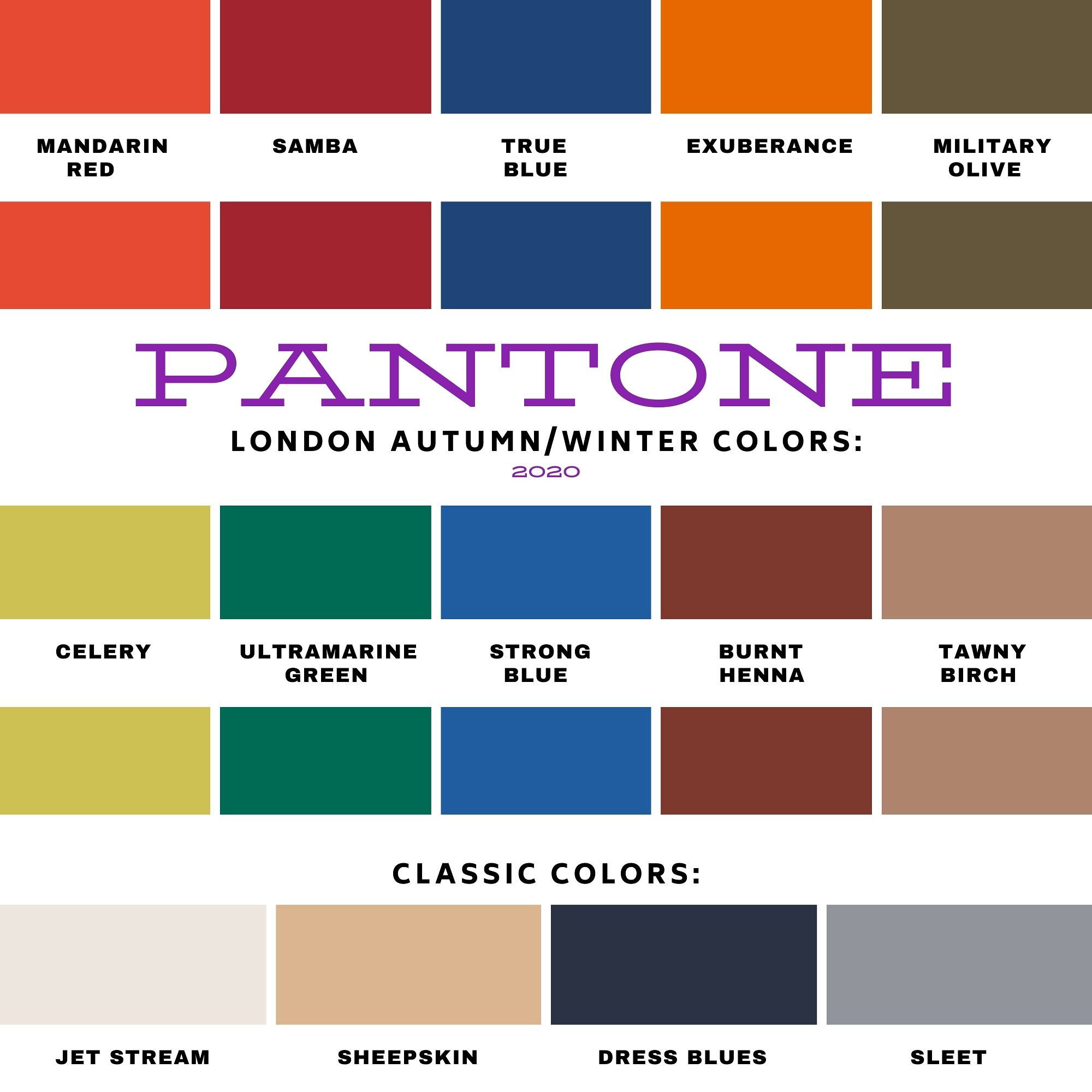
Pantone - Autumn/Winter - 2020 - All the Outfits

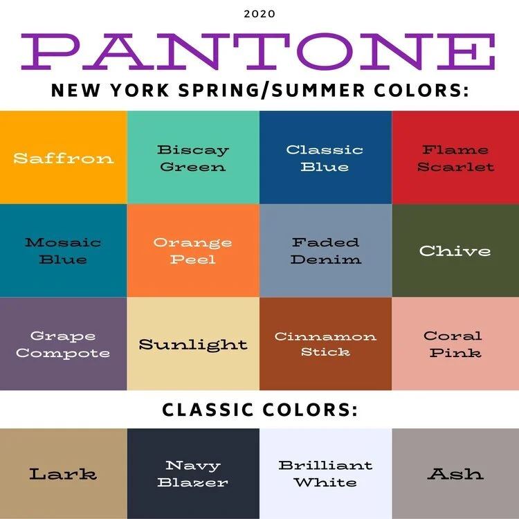
I wanted to end this fall color series by showing you all of the colors from both the Pantone New York Palette and the Pantone London Palette. To make it a little more interesting I thought I would show outfits that have, either a same color or a similar color side by side.

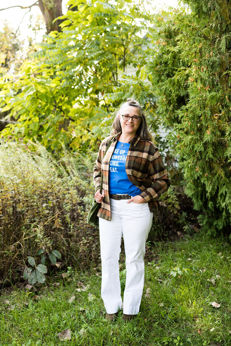
I hope that you enjoyed this series. If there are any other topics in fashion that you are interested in learning more about, or in seeing me talk about or put together in an outfit, I would love for you to let me know. I don’t follow trends too closely and this fall, I totally missed the boat on that, so I do apologize. I know some of you enjoy hearing what the trends are for each season and seeing how I apply those to the “real” world. Often when we look at websites or see magazines with tall, thin models or celebrities who are seamlessly coifed we think there is no way we would want to try this or that, especially when it comes to runway trends. However, there are a lot of trends that we can participate in and enjoy like leopard print, various colors and different types of accessories.

I will keep doing this Pantone series as long as I am blogging, because I feel strongly that even though we might differ from each other in our style, color is something we all have in common. Approaching new, bold and different colors without fear is a way to expand your wardrobe and spice up your style without completely committing to a whole different way of doing things.

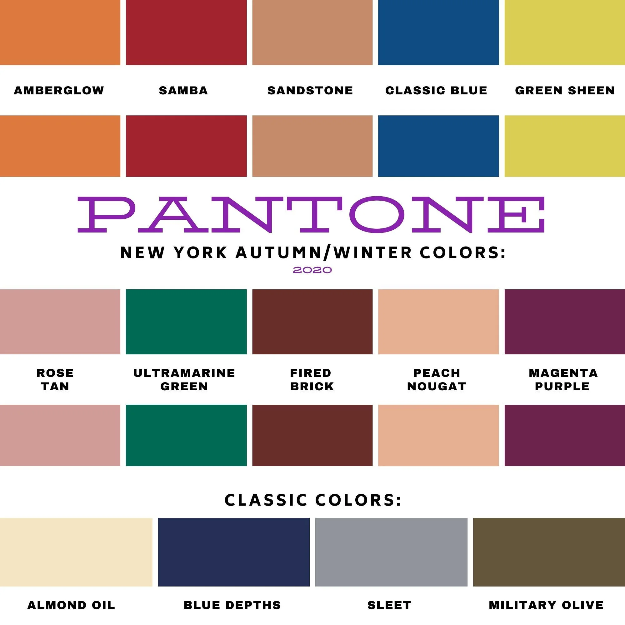
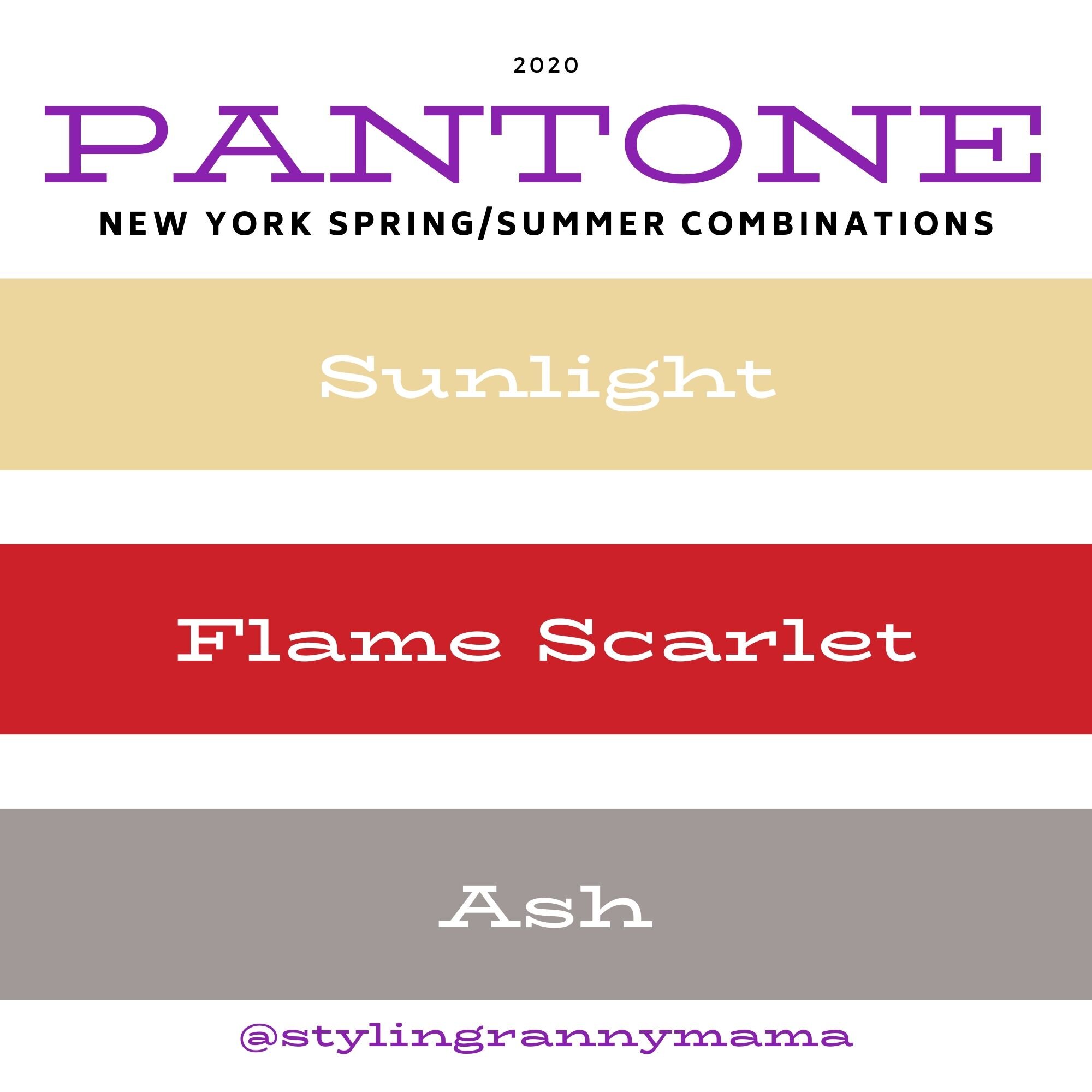
The Color Palettes Side by Side.
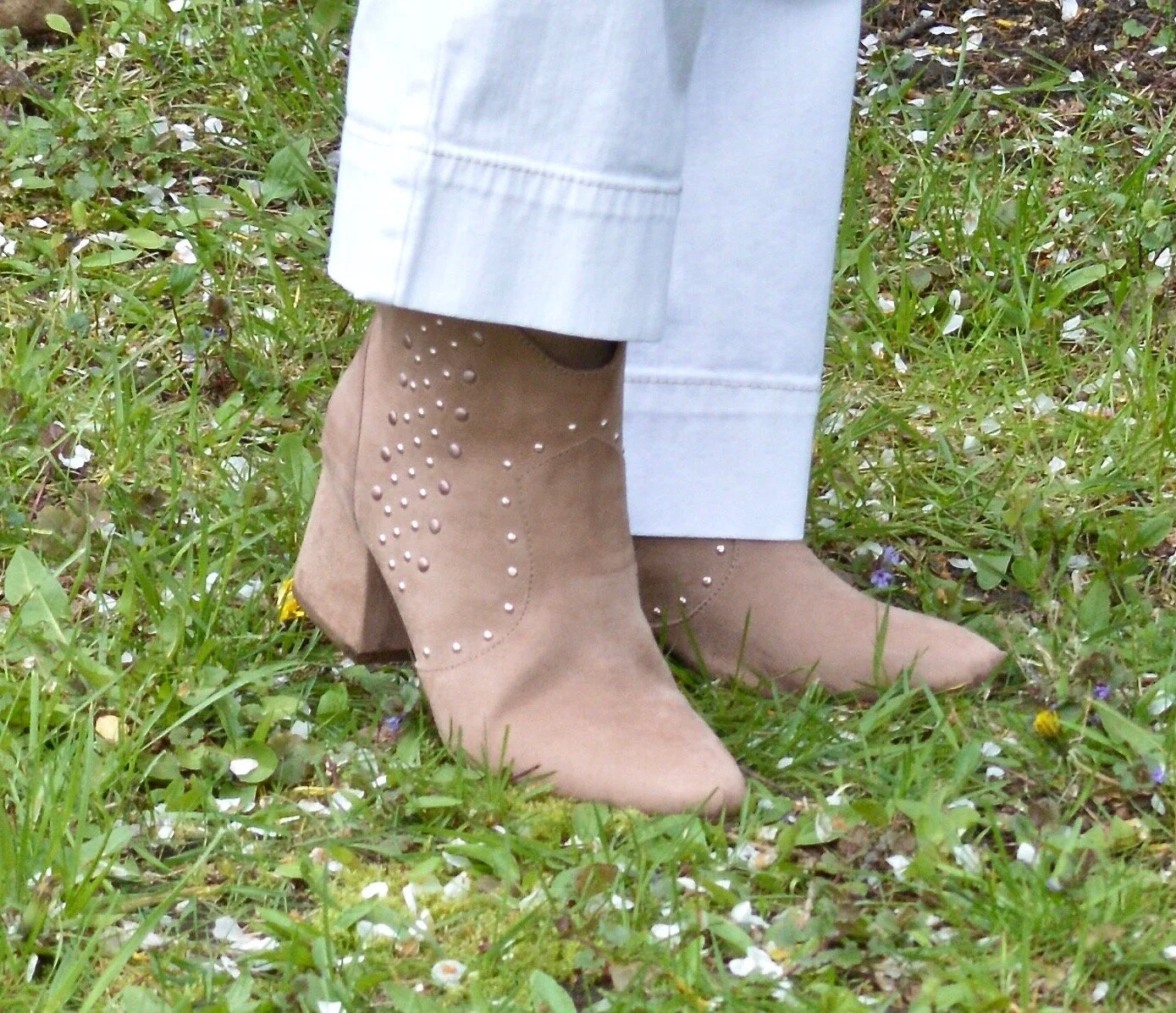
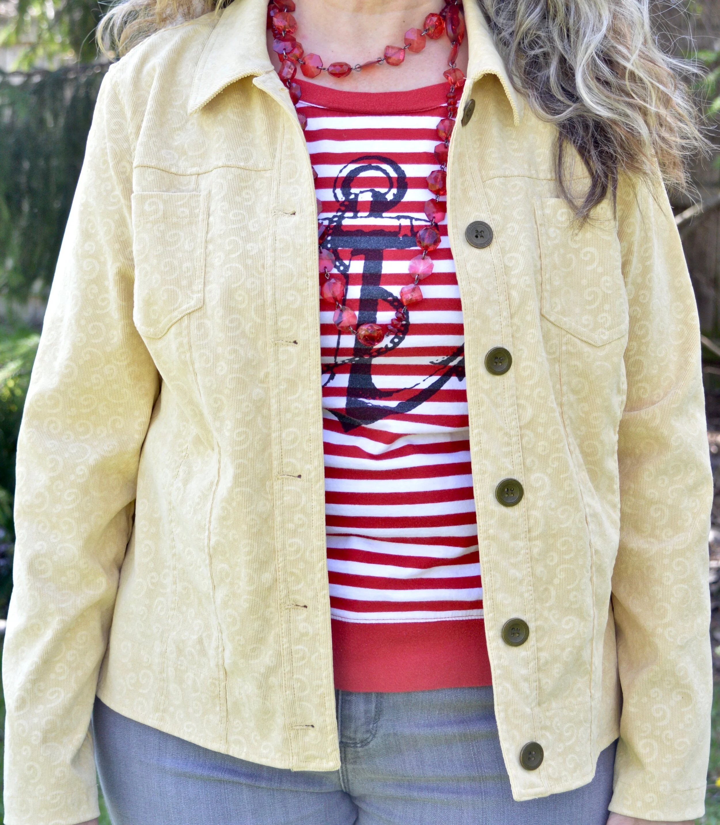
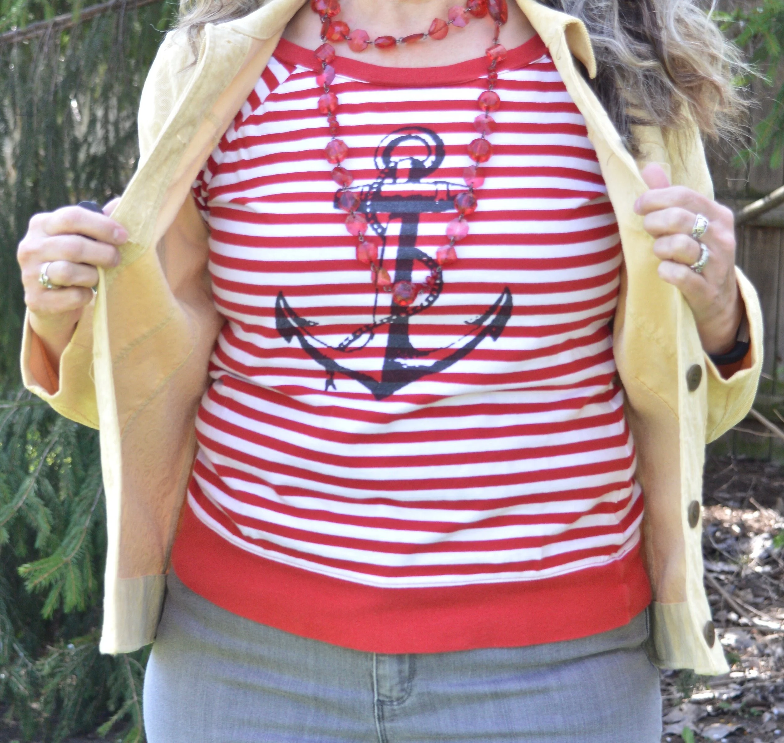
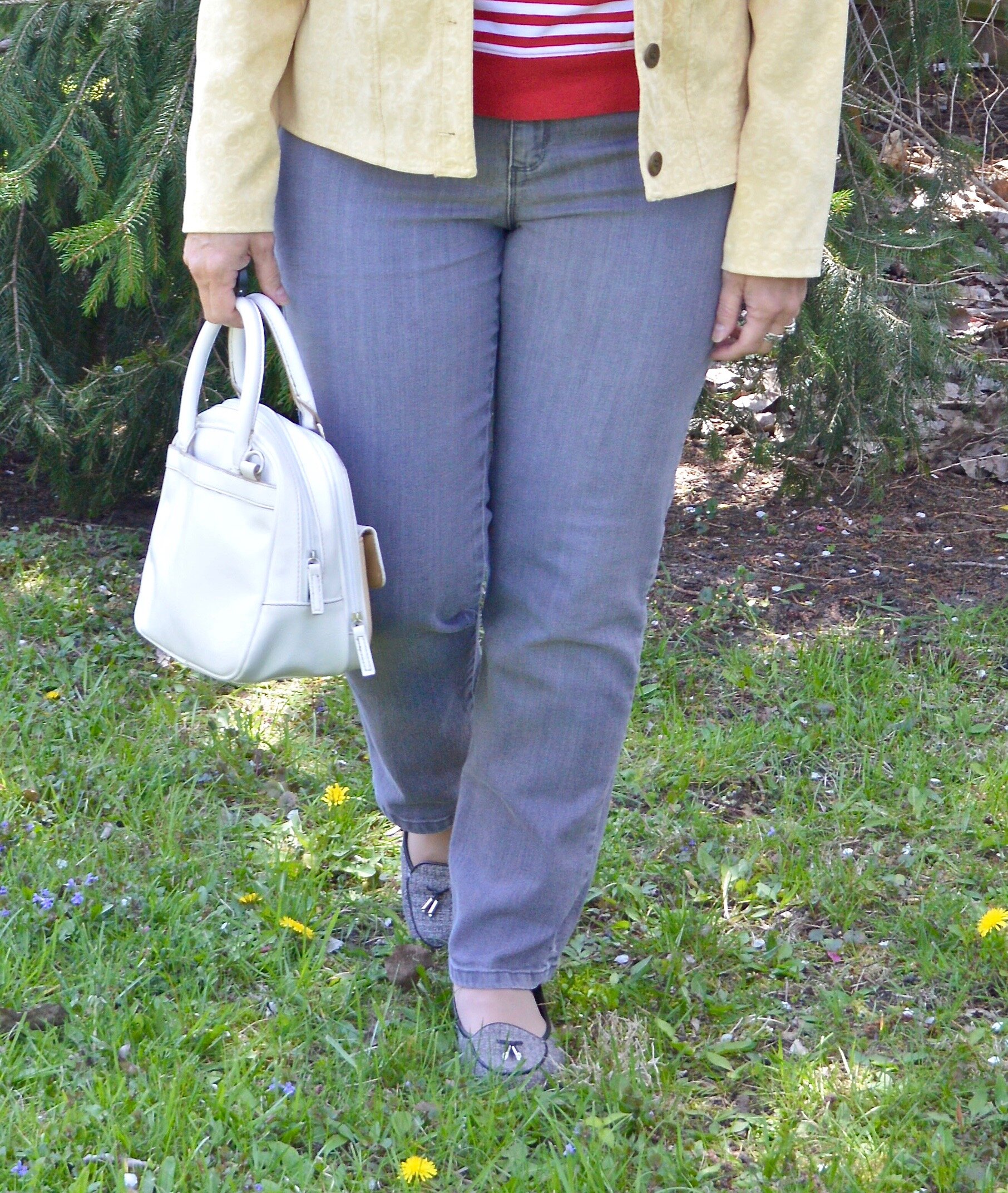
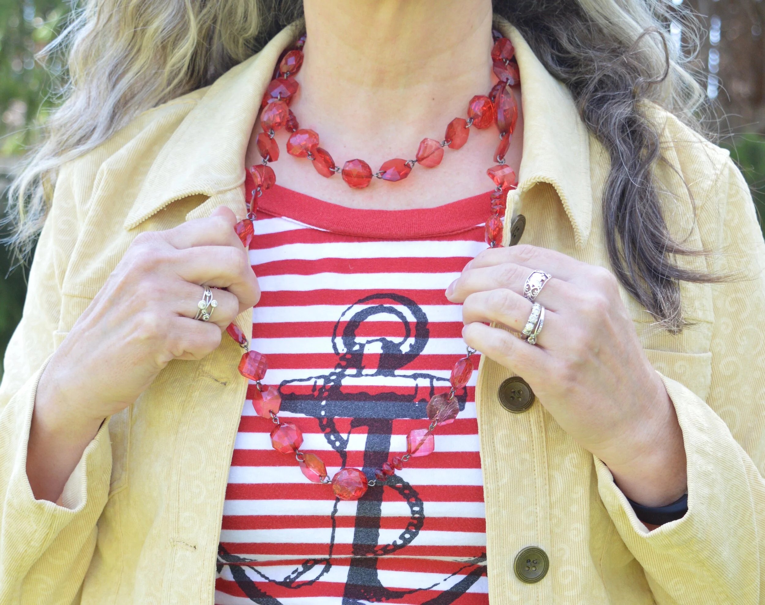
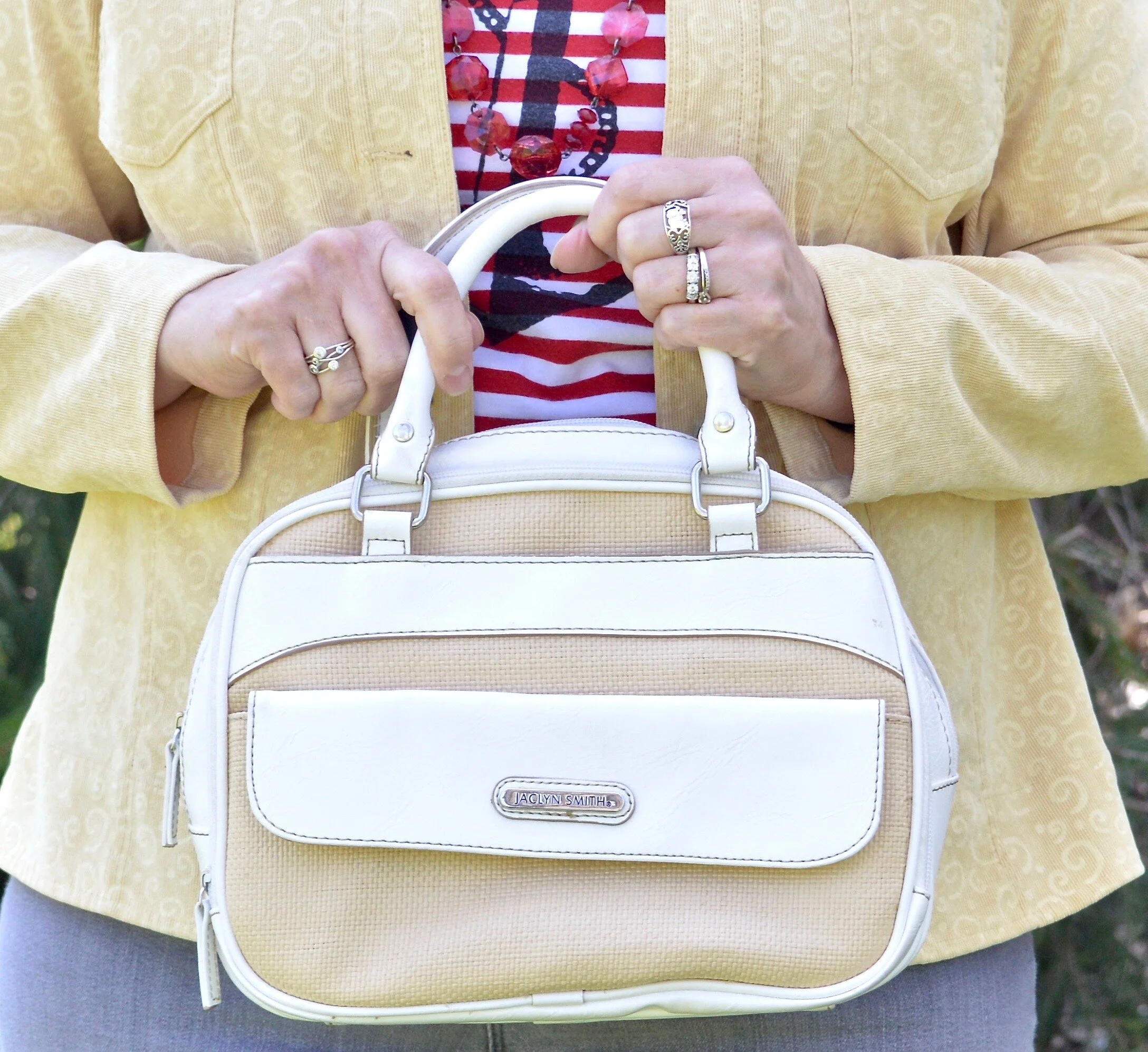
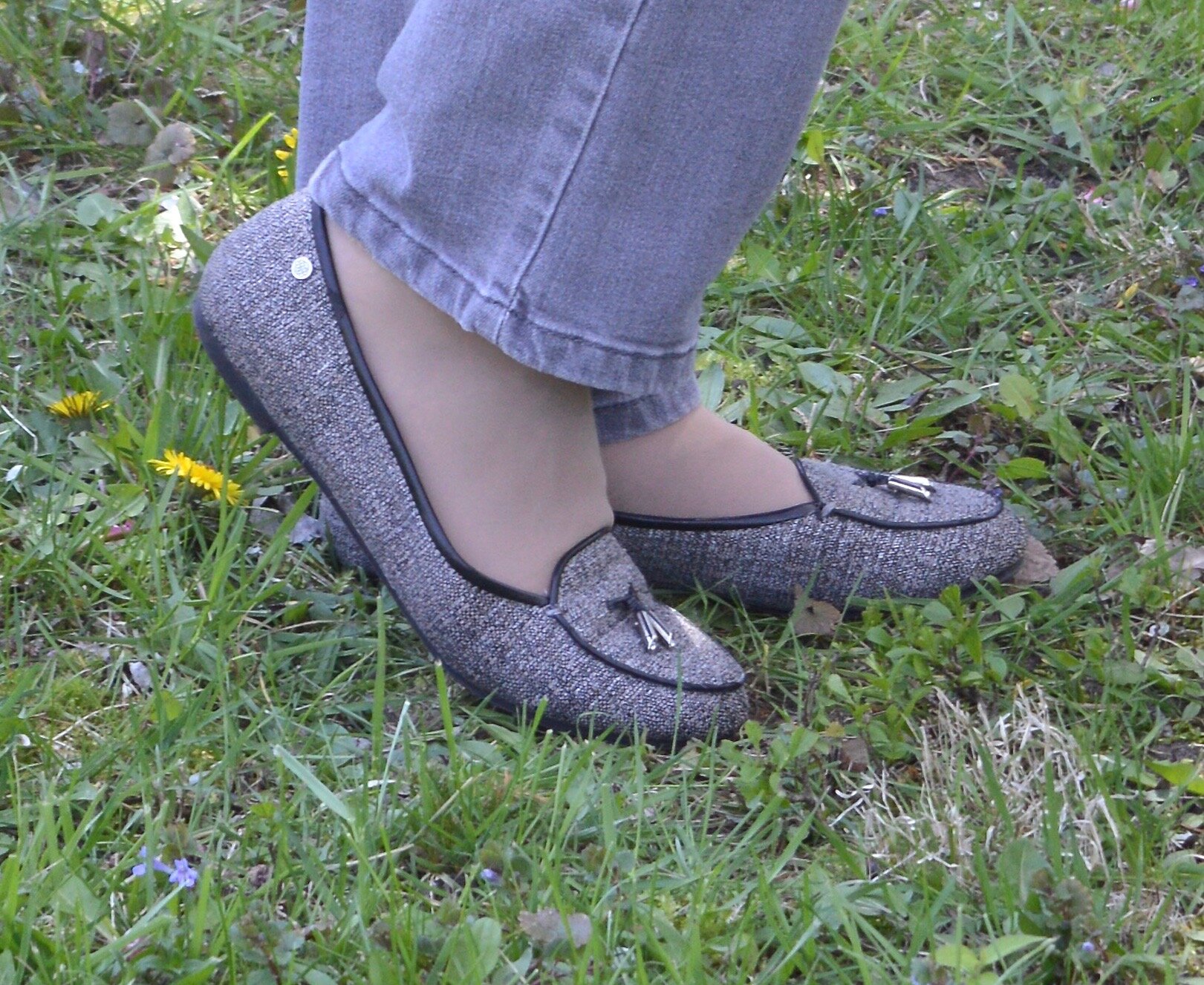
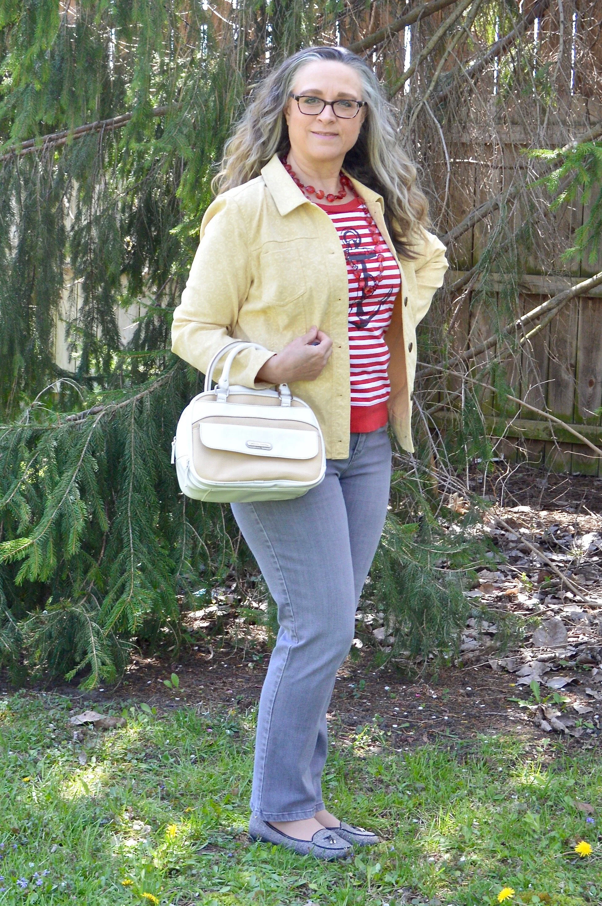
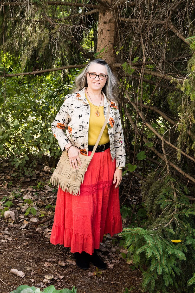
Samba

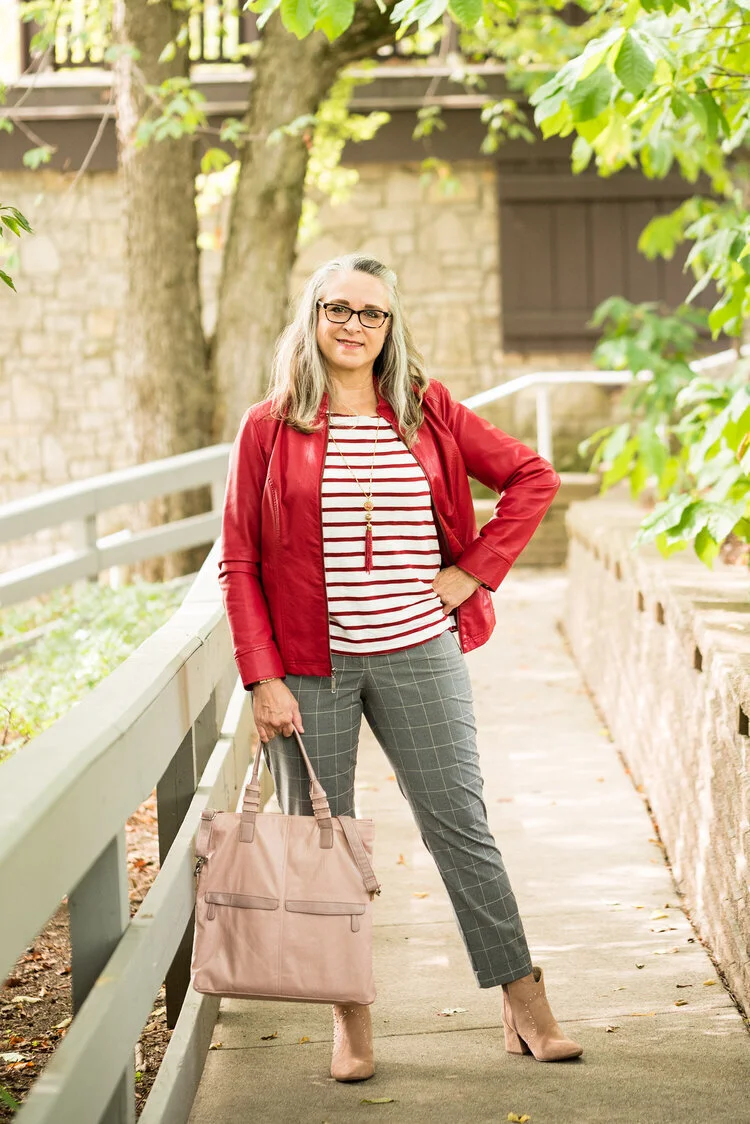
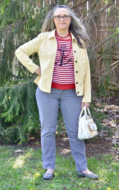
I love the color red and I think there is a red for every complexion. I think both of these outfits worked quite well and love that both of them present a more neutral palette with a bright pop of red. In the New York outfit on the left Samba is paired with Fired Brick and Sleet. In the London outfit on the right Samba is paired with Tawny Birch and Sheepskin.
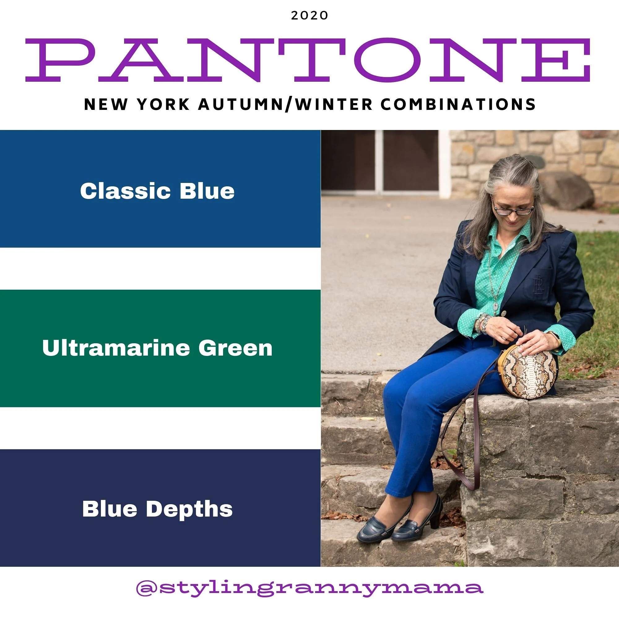
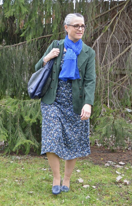
Ultramarine Green

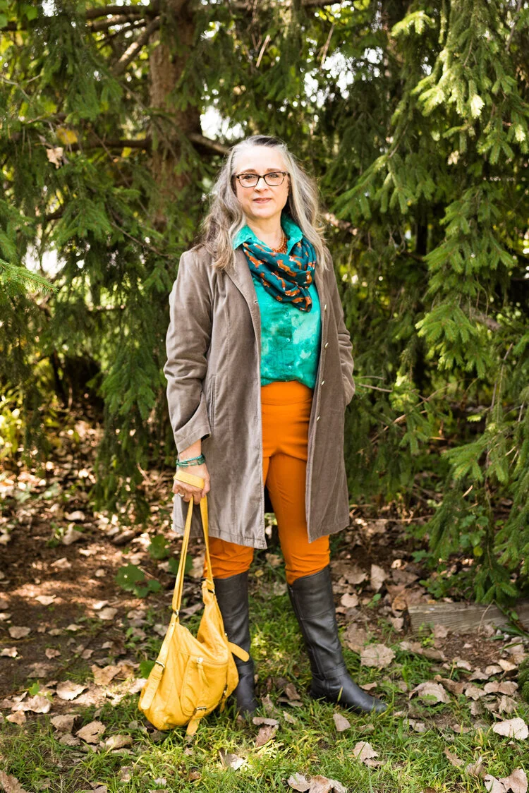
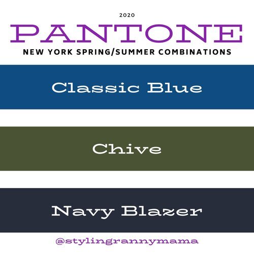
Ultramarine was on both palettes and I think it is a pretty green that can bring a peaceful, yet vibrant feel to any outfit. This color green would look great in a bag, jewelry or a scarf and to me it really seems to draw your eyes to it. Maybe it is just my love for the greens in nature that make me like this color so much. In the New York outfit on the left Ultramarine Green is paired with Classic Blue and Blue Depths. In the London palette on the right Ultramarine Green is paired with Exuberance and Sleet.
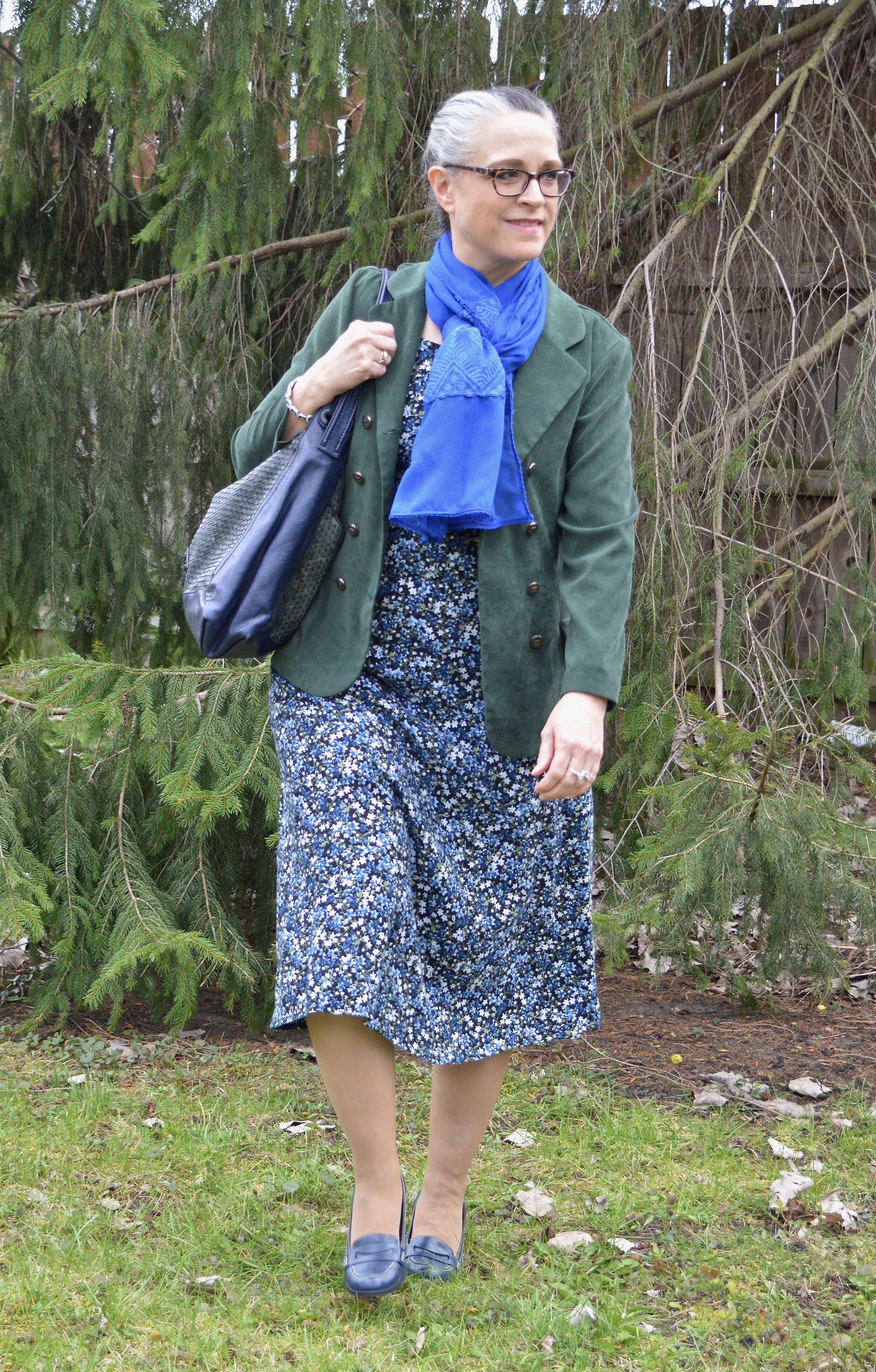
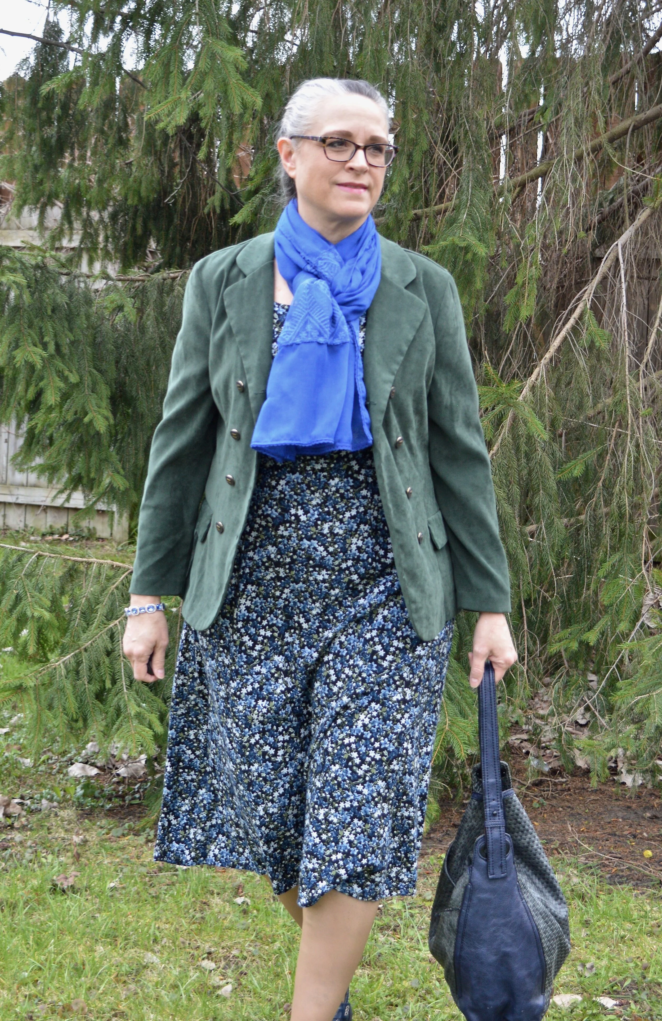
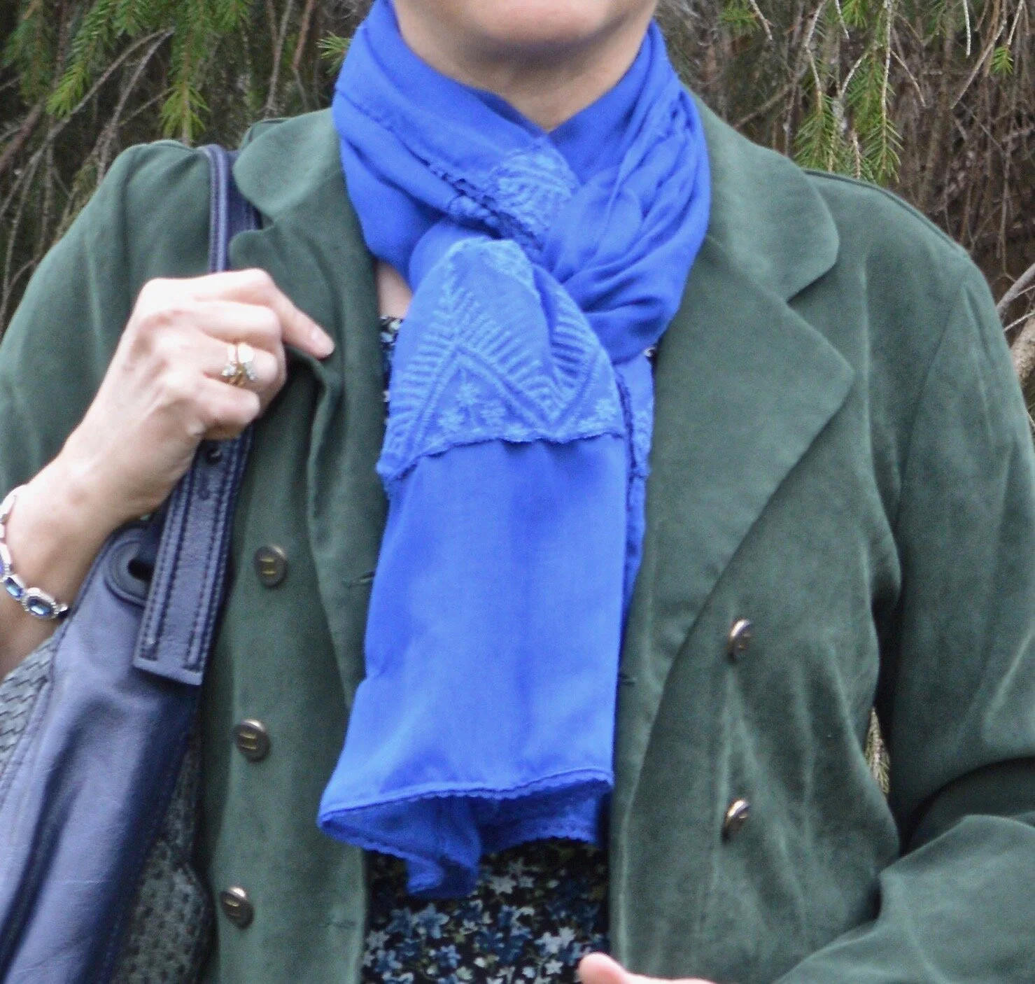
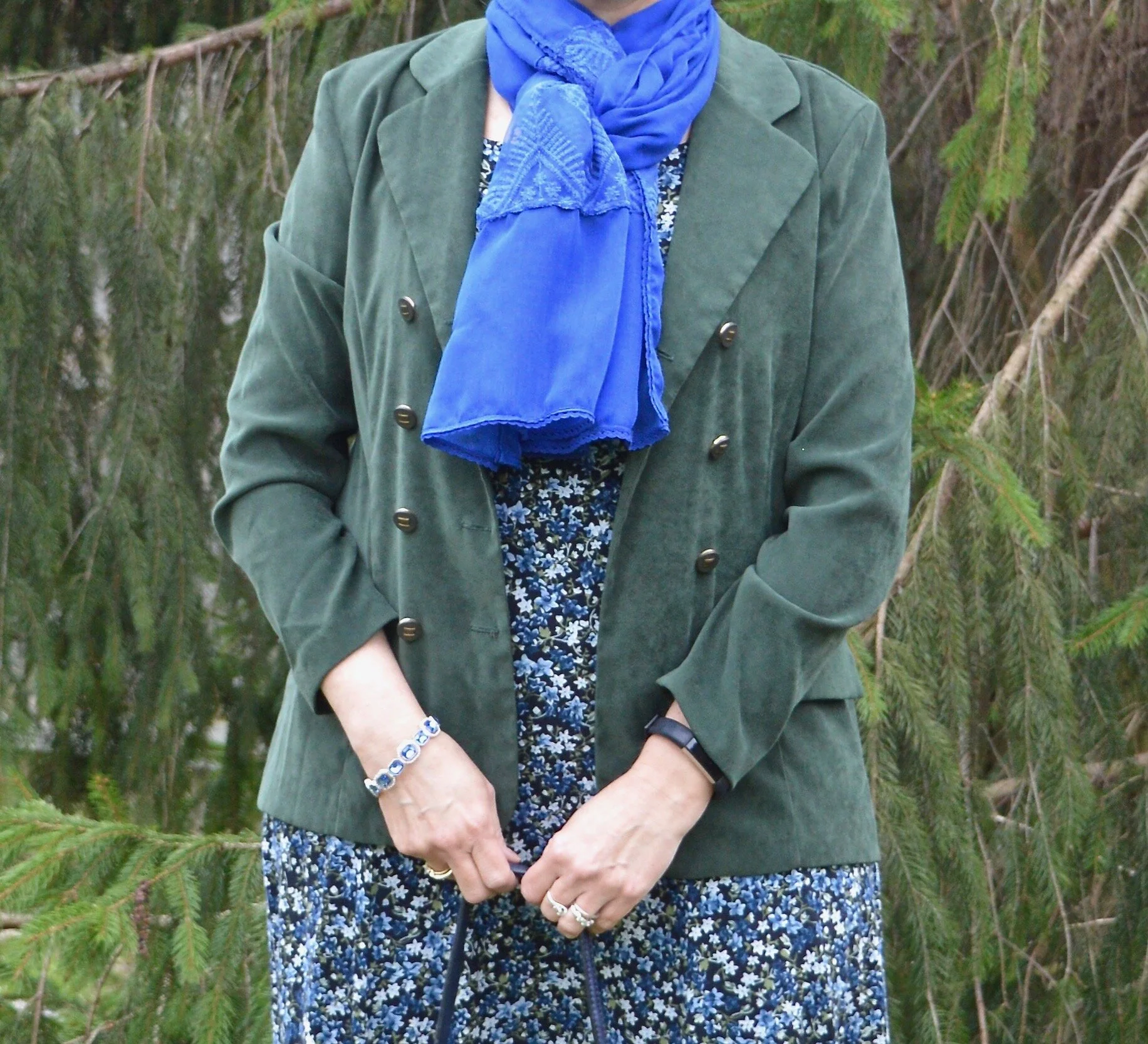
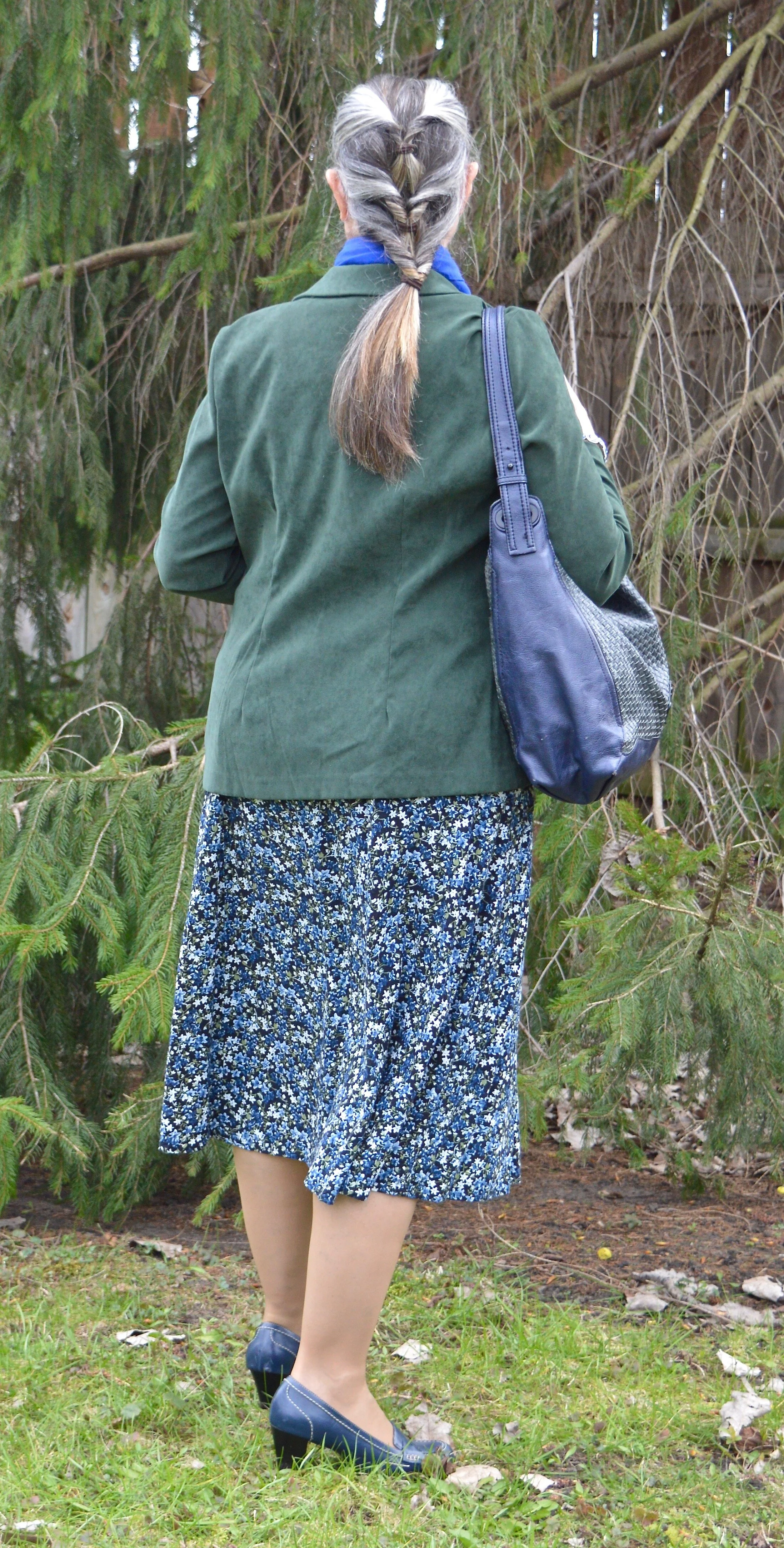
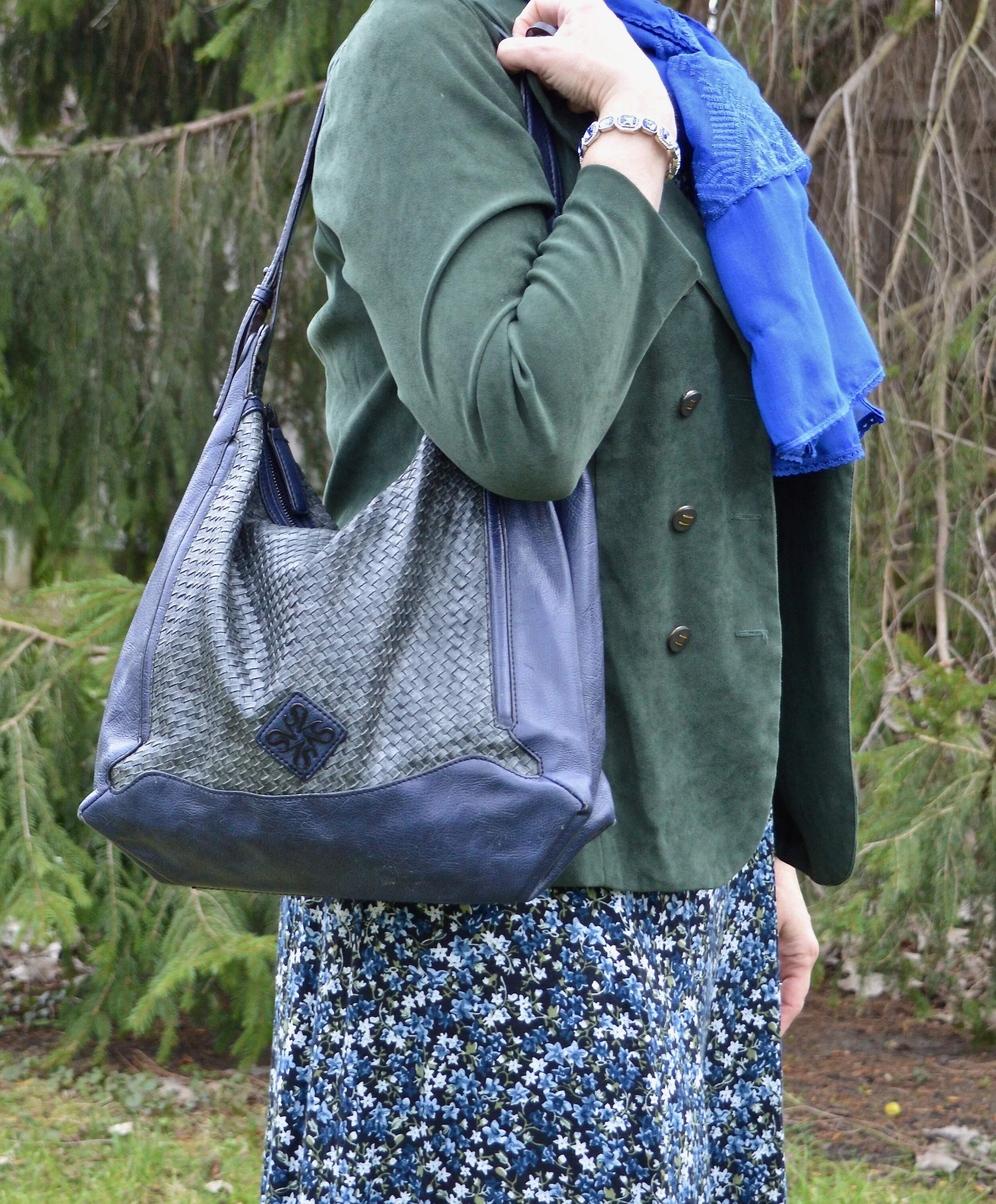
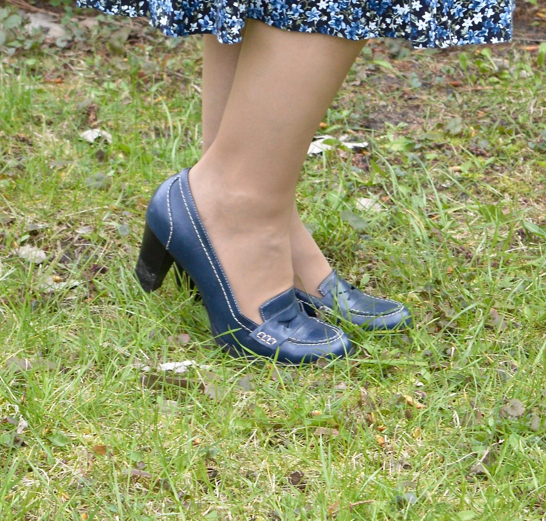
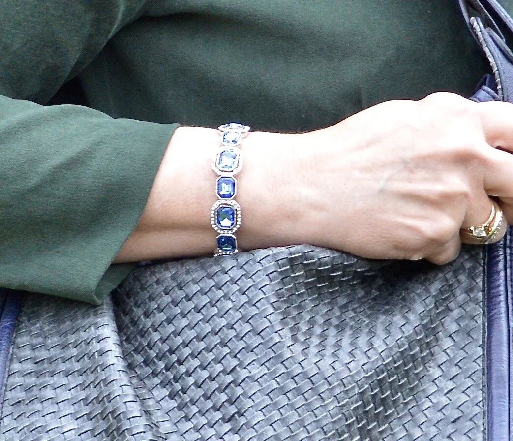
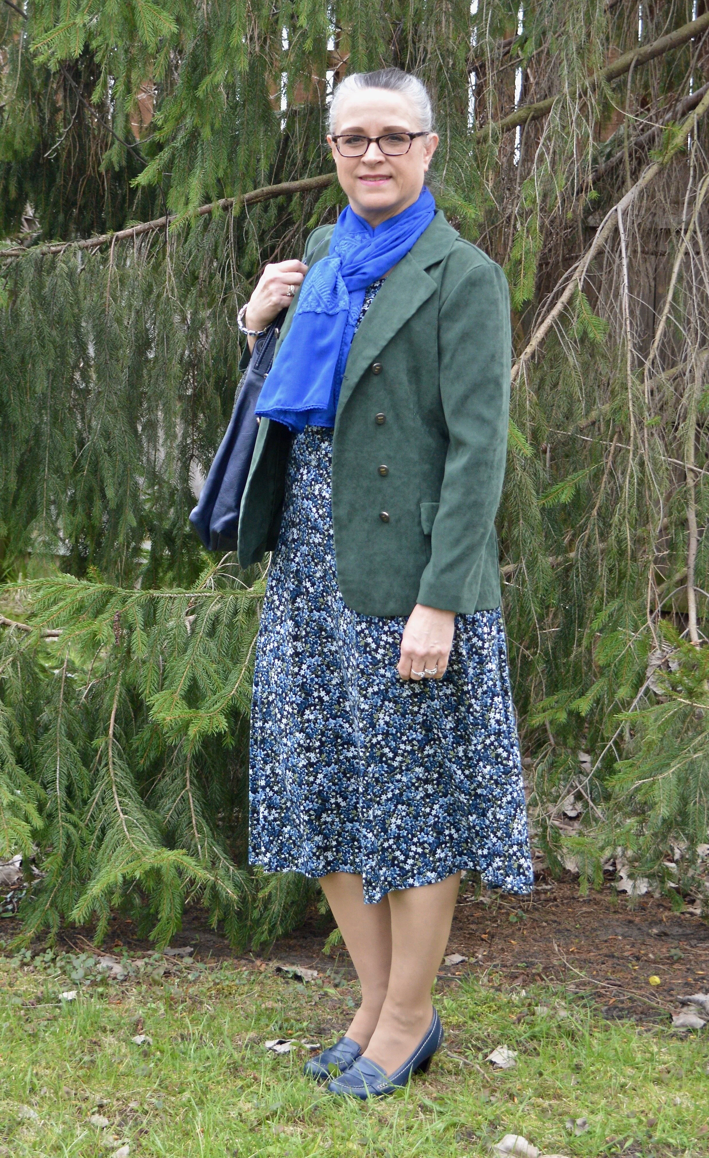
Military Olive

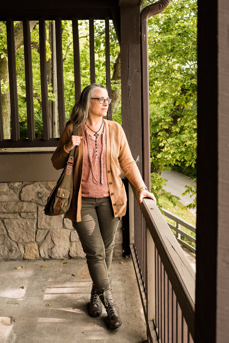
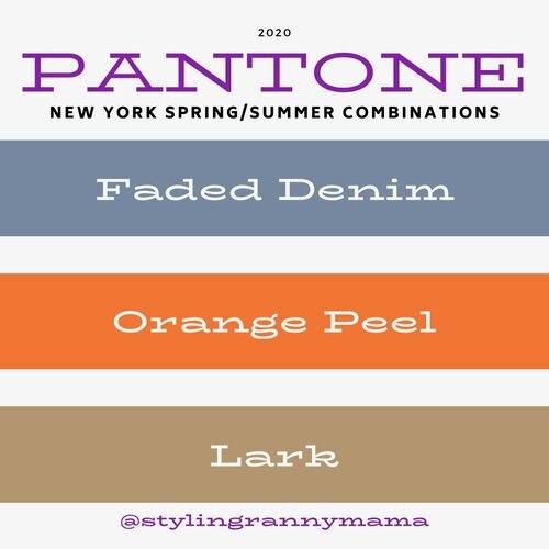
While I love bright and bold colors like the two I mentioned previously, I love using olive as a neutral. It goes with every color, and has a different vibe than gray or beige. It is classy, yet subtle. In the New York outfit on the left, Military Olive is paired with Peach Nougat and Sandstone. In the London outfit on the right Military Olive is paired with Strong Blue and Jet Stream.
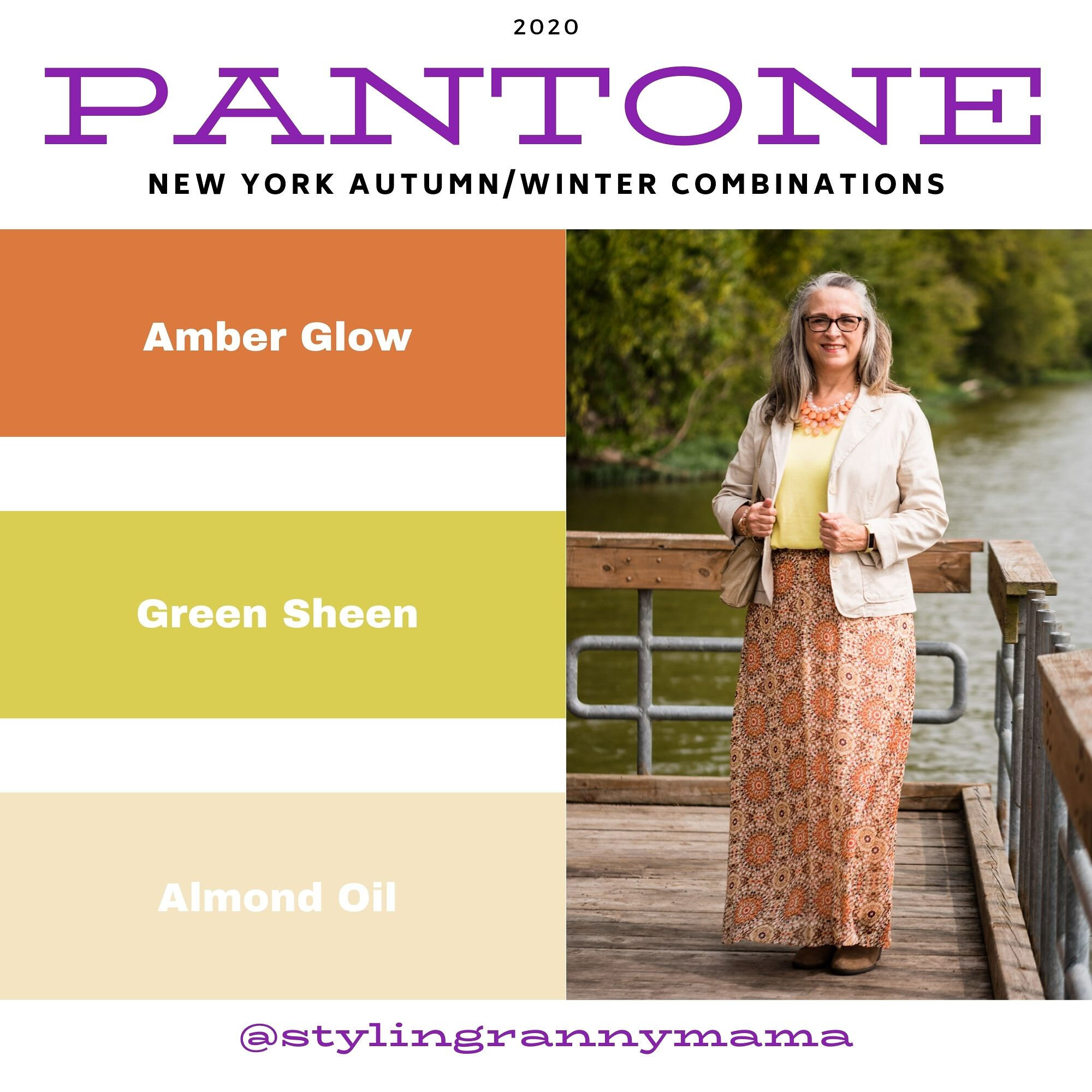
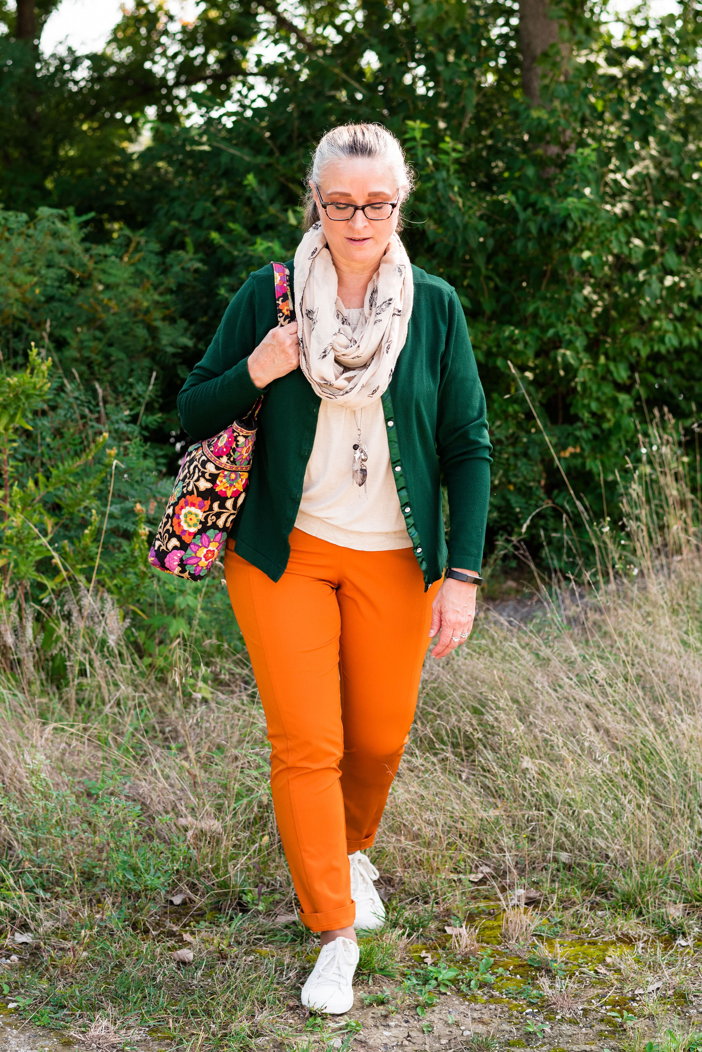
Green Sheen/Celery

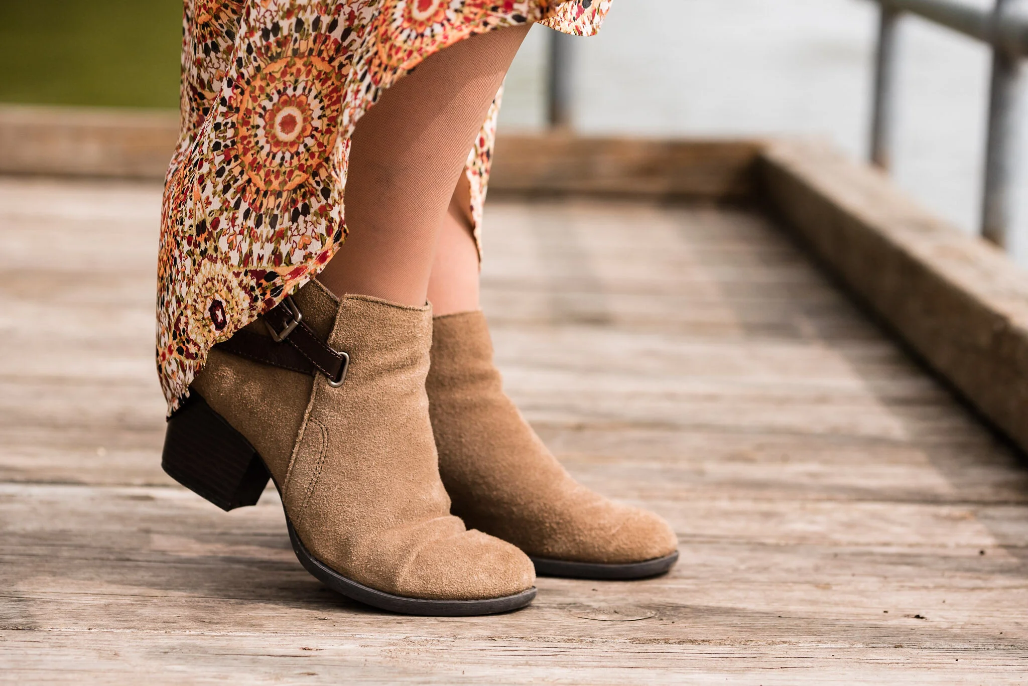
It is hard to tell in these pictures, but Green Sheen and Celery are pretty similar. I think, because the lighting is different the colors look brighter in the shaded picture. They are different colors, but not enough different that they couldn’t be exchanged from one outfit to another. In the New York outfit on the left, Green Sheen is paired with Amber Glow and Almond Oil. In the London outfit on the right, Celery is paired with Mandarin and Sheepskin.
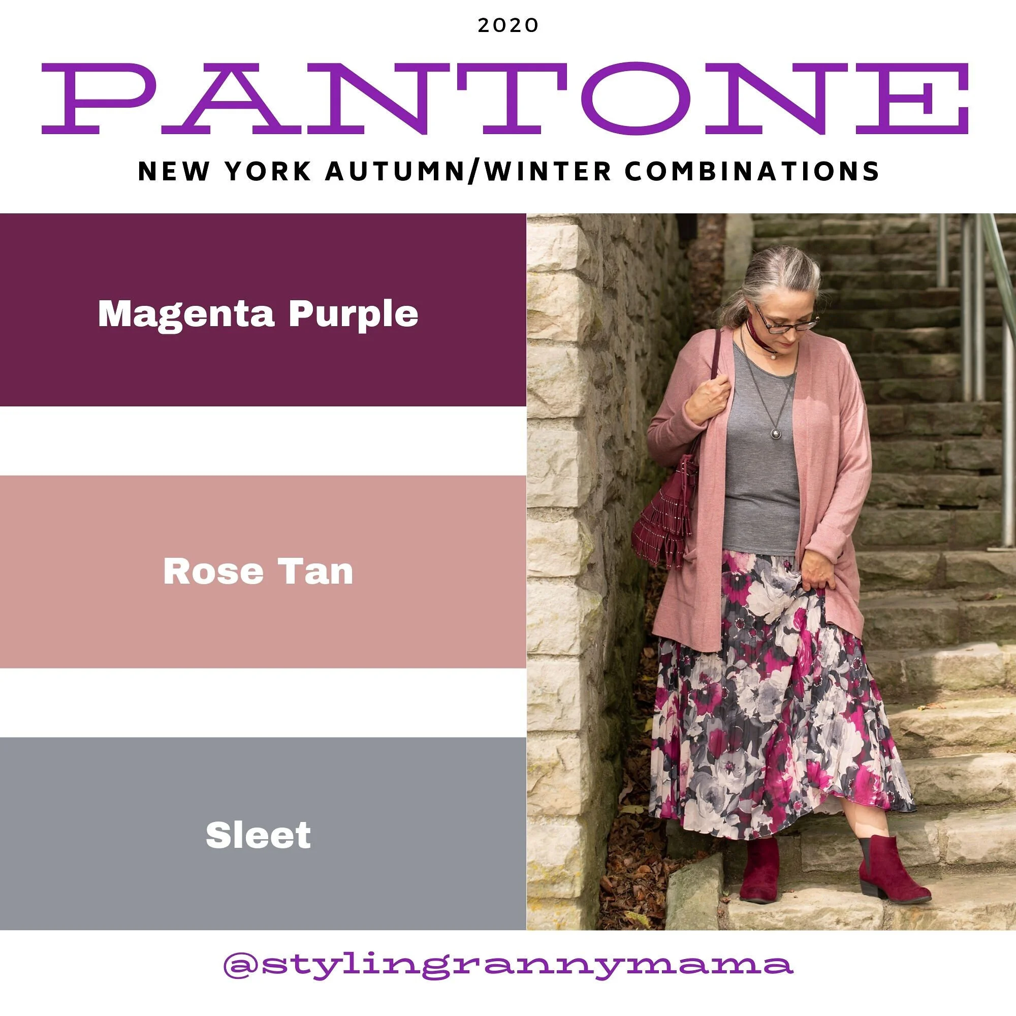
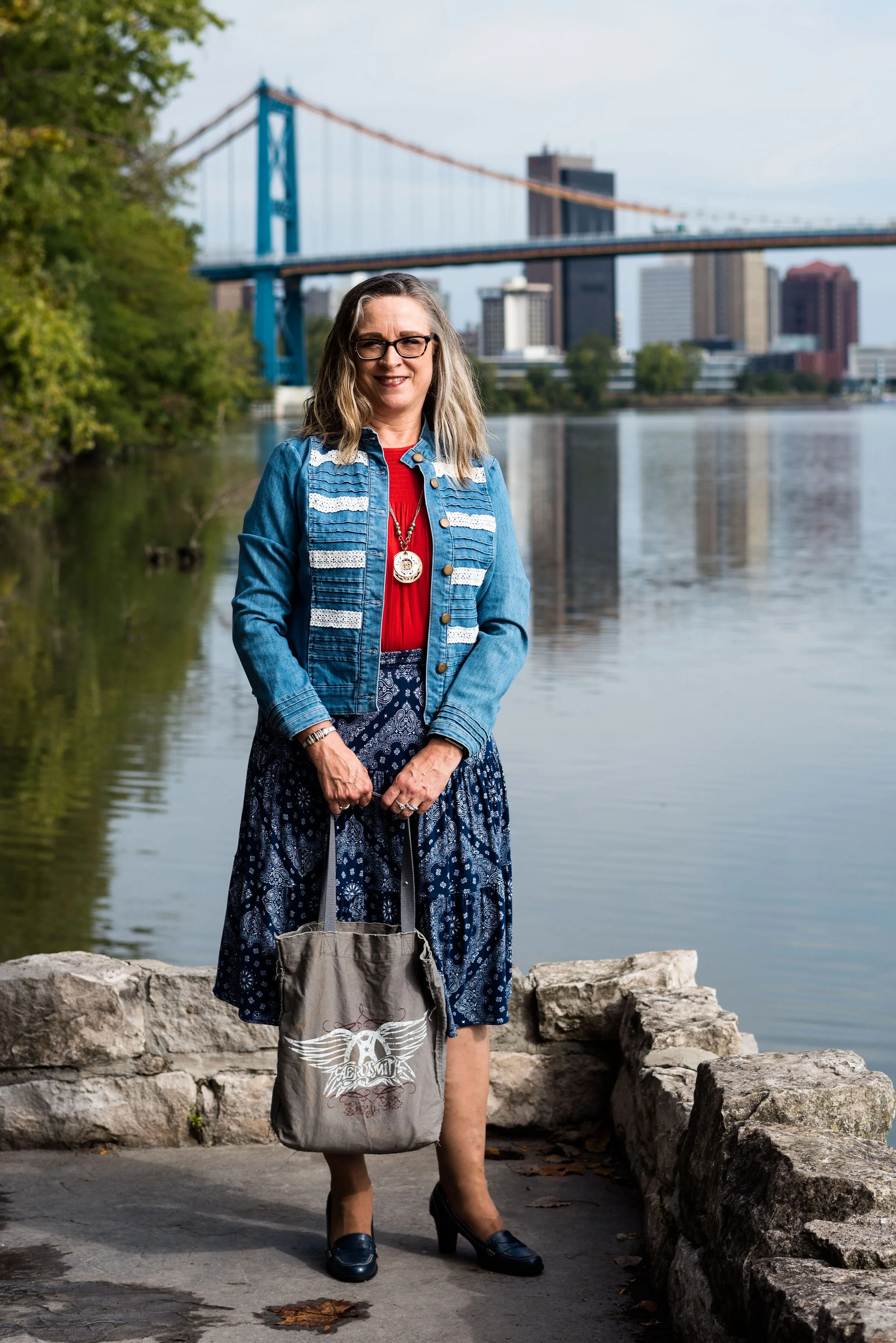
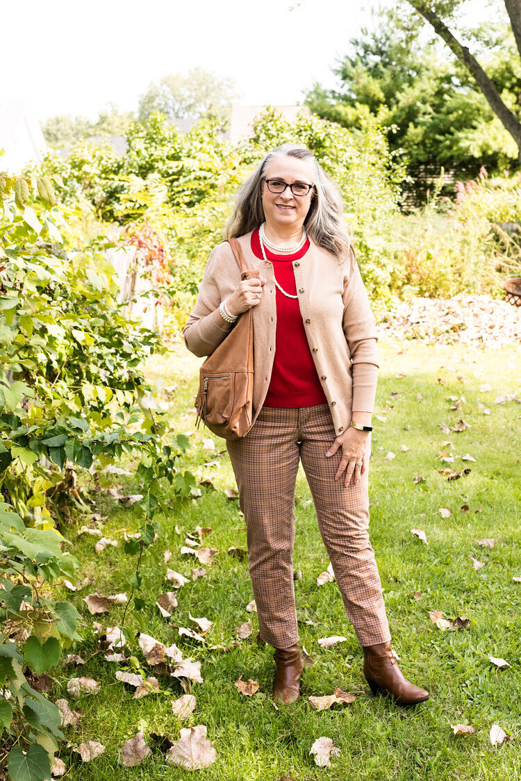
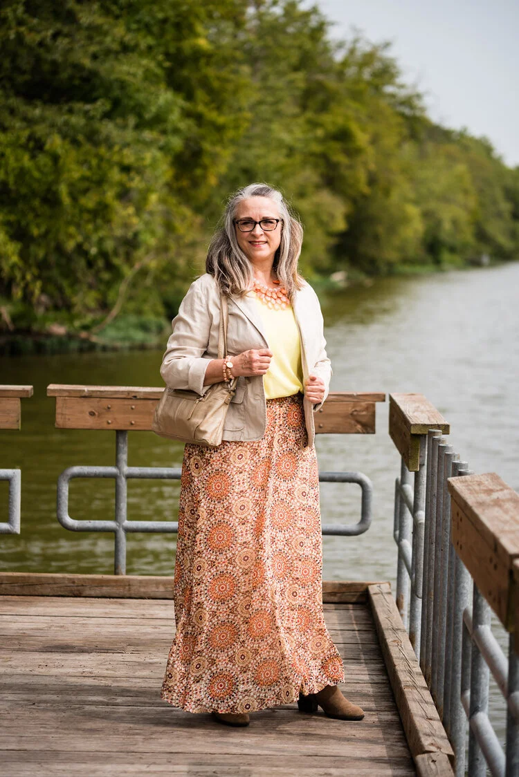
The Other Colors

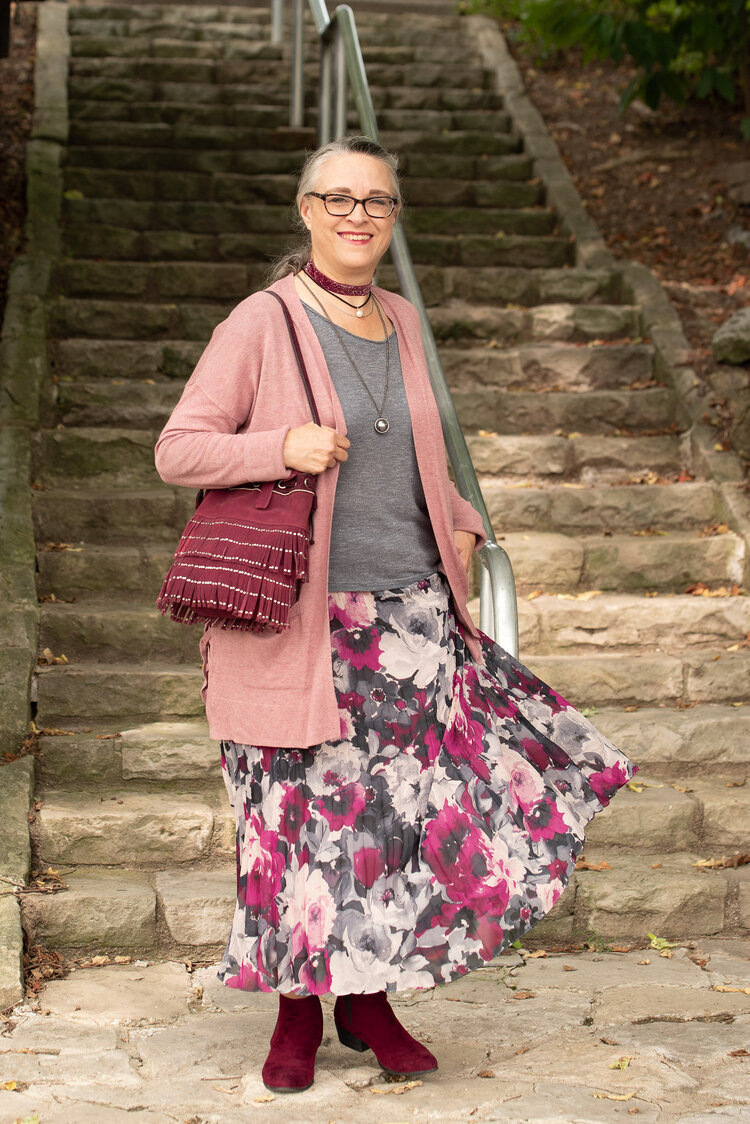
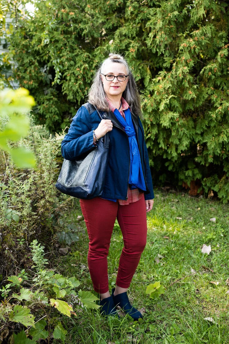
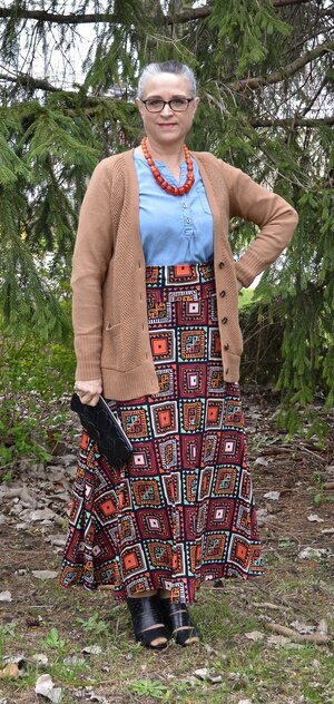
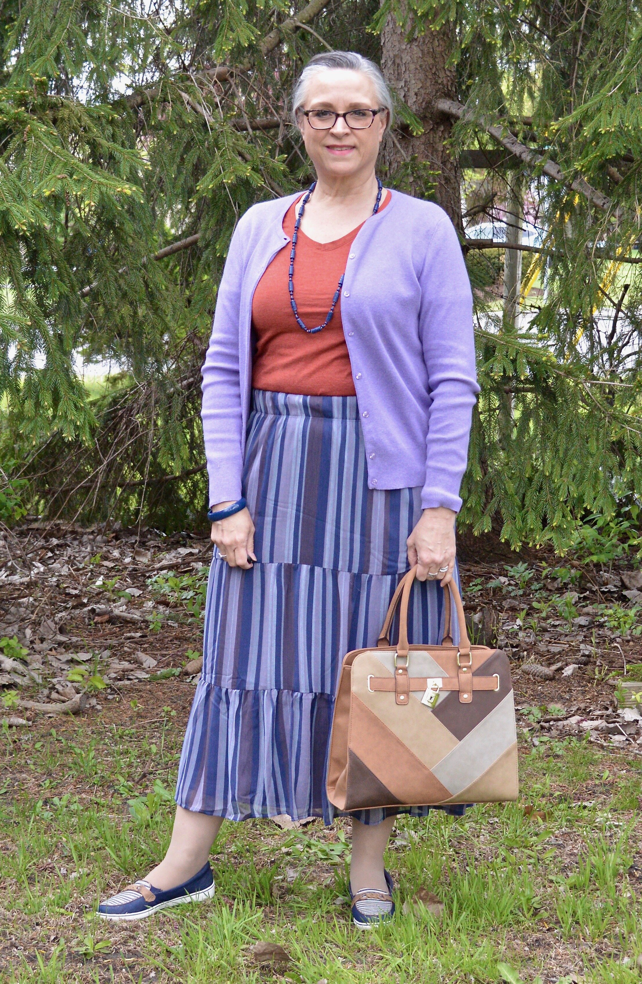
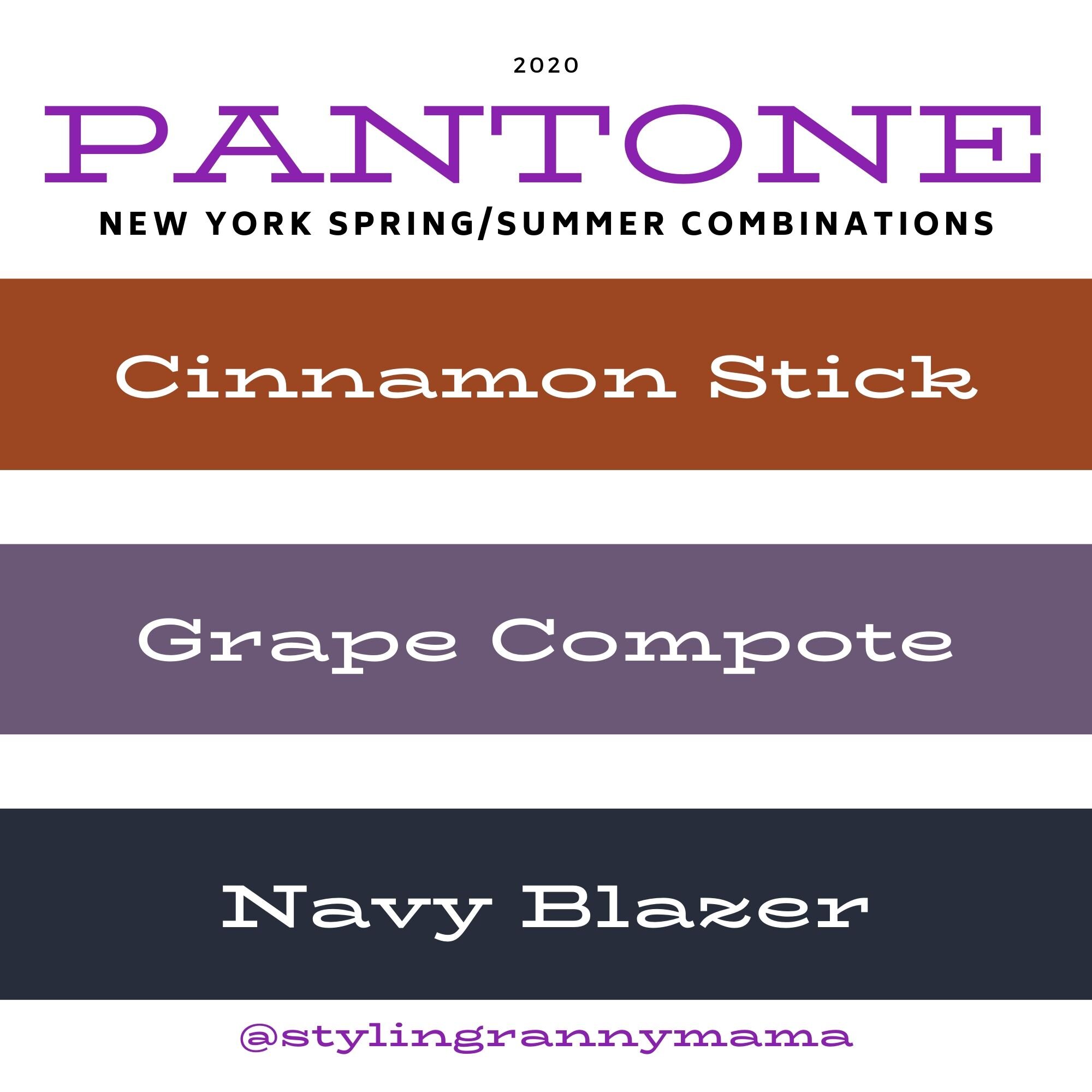
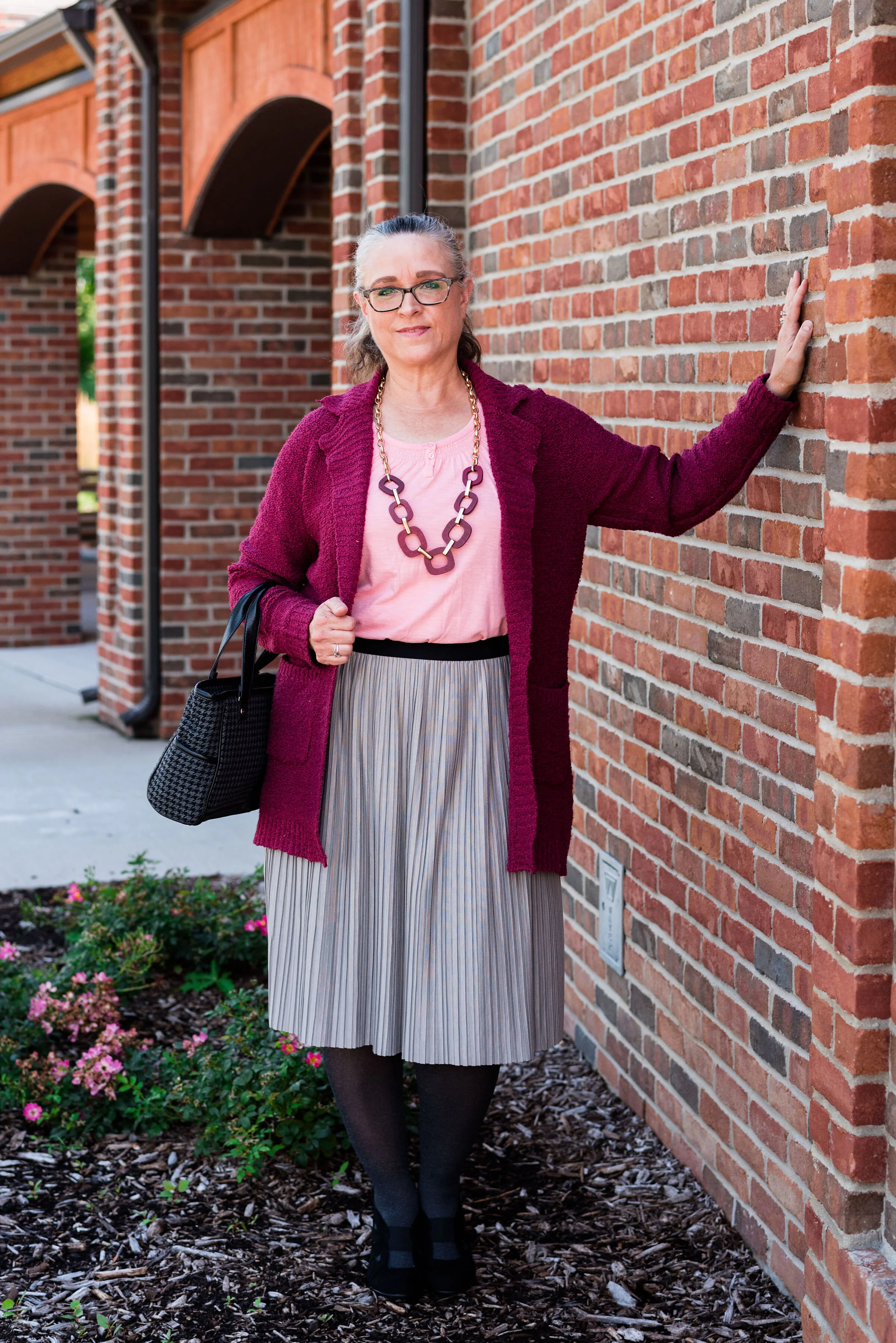
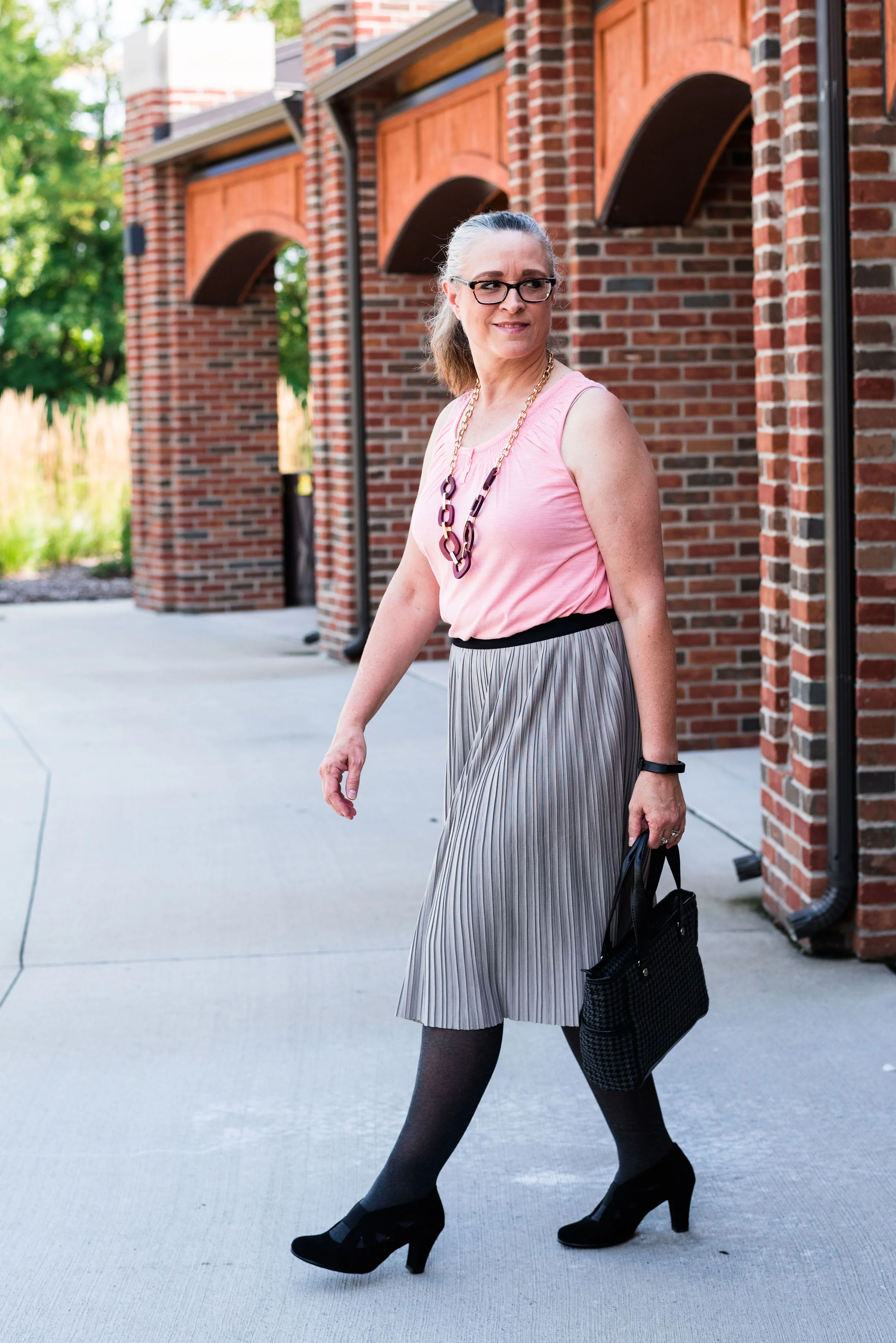
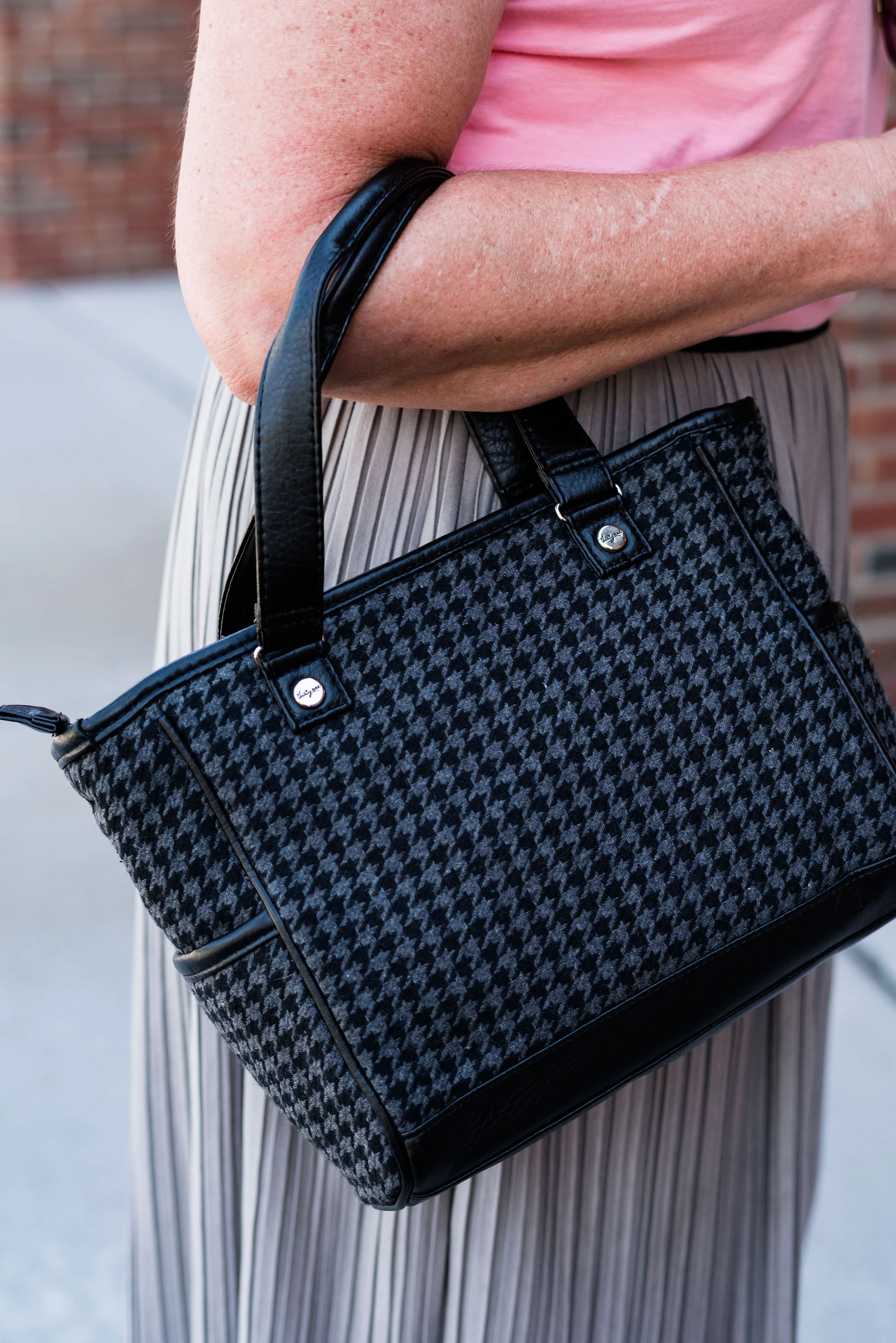
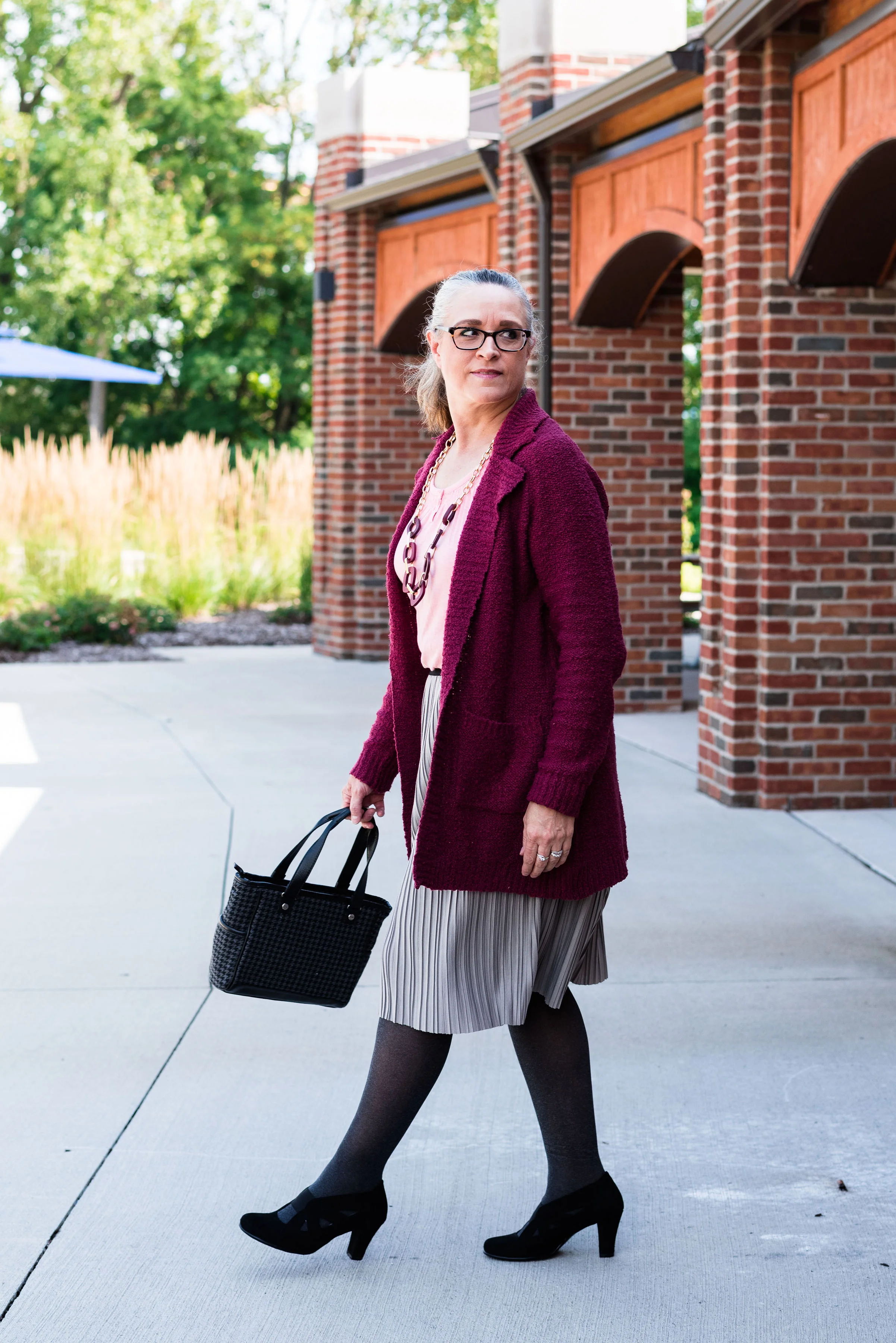
These last two are paired only because they were the last two and don’t really have anything in common. The New York outfit on the left is a combination of Rose Tan, Magenta Purple and Sleet. The London outfit on the right is a combination of Burnt Henna, True Blue and Dress Blues.

Which outfit do you like most? Which color from the two palettes is one you frequently wear? What new color(s) are going to try to add to your wardrobe. As always, I love to hear your thoughts.

I apologize to those of you who subscribe to my blog. The last three weeks, I have completely forgotten to send out my weekly emails. I’ll just attribute that to “squishy brain syndrome.” Ha, ha.

Thanks for following along on the blog. I hope to use the next couple of weeks leading up to Thanksgiving showing you more fall outfits and maybe a few ideas for what to wear to Thanksgiving dinner whether you are going some place or sheltering in place.

If you follow my Faith page be sure to check back tomorrow for the next installment in my series on the Unseen Enemy.

Have a great weekend!

Graphic and photo credit Rebecca Trumbull.

Pantone - Autumn/Winter - 2020 - New York Palette - Recap

I was going to jump right into the London Palette, but there have been some unforeseen problems, so I am going to put that off for a little bit. I usually do a recap post to show you all the the outfits at the same time, so that is what I am doing today.

Here is the whole New York Palette, along with the classic colors as well. Some people take the classic colors and build their outfits around them and simply add pops of the other colors for a more subdued approach to the palette. I think I need to try that some time. What keeps me from doing that more often is that I don’t have very many classic colored pieces. What I mean is, I don’t have a whole suit with pants or skirt and a jacket in any of the classic colors. In fact, I don’t have very many dress clothes that aren’t made up of colors and prints. Maybe in the spring I will try to focus more on using the classics as a way to build an outfit and add in the regular palette colors as accessories. We’ll see.

I thought I would give you a few of my thoughts about each outfit and why I think it worked or didn’t after each picture.

Pantone - Autumn/ Winter - 2020 - New York Palette

Peach Nougat, Sandstone and Military Olive

Pantone - Autumn/Winter - 2020 - Peach Nougat, Sandstone and Military Olive.

I like this outfit. I am not a big fan of these colors, but I really think the three colors worked well together and I think people found this, a neutral palette they could relate too. Almost everyone has something olive in their closet, so the fact that this was a classic color was a win, in my opinion. Not everyone can wear dark blue, oxford gray or tan, but I think everyone can wear Military Olive.

Samba, Fired Brick and Sleet

Pantone - Autumn/Winter - 2020 - Samba, Fired Brick and Sleet

I think this outfit might be my favorite out of this New York Palette. I like the mix of a more true red with the brick red, even thought my outfit in the photos didn’t do it justice. Putting the colors aside, however, I just like how this outfit looks polished and professional, but has a fun blend of bold and pastel colors along with the subtle print mix.

Amber Glow, Green Sheen and Almond Oil

Pantone - Autumn/Winter - 2020 - Amber Glow, Green Sheen and Almond Oil

This outfit was a surprise. Both my daughter and I thought these two colors just seemed to grate against each other, and well they might have, if I had worn a solid skirt with the solid top, but the printed skirt makes all the difference in the world. I also think the jacket and boots softened the whole look.


Classic Blue, Ultramarine Green and Blue Depths

Pantone - Autumn/Winter 2020 - Classic Blue, Ultramarine Green and Blue Depths

We don’t often think of combining green and blue, or blue with blue, for that matter, but I think this worked. The blue shades are quite different, but worked well next to each other and the green really pops against the blues. I think the addition of the snakeskin patterned round bag completed the look perfectly.

Magenta Purple, Rose Tan and Sleet

Pantone - Autumn/Winter - 2020 - Magenta Purple, Rose Tan and sleet

I really love both of these colors, but I was not thrilled with this outfit. Don’t get me wrong, I love a comfy, boho outfit, but I don’t know if throwing the long pink sweater in with the floral maxi and the gray tee made for a great outfit. I could see this with a long gray sweater, a similar shade to the tee and then a necklace or a scarf in a similar shade to the Magenta Purple. I don’t think it is the worst outfit I have ever done, but not my fave.

I would love to hear which outfit you liked the best from this series and which colors you like best from the New York Palette. Let me know by leaving a comment below, or a comment on Facebook. Thanks for following along. Be sure to check back on Thursday and hopefully I’ll have the first post for the London Palette colors. Also, if you follow my faith page, I am trying to post on Wednesdays, but due to schedule constraints, I am often having to post on Friday’s, so just check back if you don’t see it on Wednesday.

Have a great Tuesday everyone!

Photo and graphic credit Rebecca Trumbull.


Pantone - Fall/Winter 2020 - New York Palette - Magenta Purple, Rose Tan and Sleet

This is the last installment in the Pantone Fall/Winter 2020 New York Palette series. This has been an interesting palette with both rich, bold colors like Classic Blue, Samba and Ultramarine Green and the softer more muted neutrals like Peach Nougat, Sandstone and Almond Oil. Today’s last two colors are a mix of both the bold and muted elements. While Tuesday’s post was full on bold with Classic Blue and Ultramarine paired sided by side, today’s outfit takes the bright Magenta Purple and pairs it with the more subtle Rose Tan. As always, I’ve included a classic color to bring in a more foundational element.

Pantone - Fall/Winter 2020 - New York Palette - Magenta Purple, Rose Tan and Sleet

This outfit, once again, has a rather bohemian vibe with the dark florals, fringe bag, and suede booties. I also feel that the more layered, relaxed look is often indicative of the boho style as well.

Pantone - Fall/winter - 2020 - Magenta Purple, Rose Tan and Sleet

My long, pleated, floral maxi skirt is Chaps brand from Kohl’s. You can see this skirt styled for an earlier Pantone series back in Spring of 2018. I styled it with a blush top and gray sweater. The beauty of this piece is that it can be worn in any season and it is fully lined. I really like when a skirt is lined and I don’t have to wear a slip with it. This is especially nice in the cooler weather.

Pantone - Autumn/Winter 2020 - New York Palette - Magenta Purple, Rose Tan and Sleet

My Sleet colored slouchy tee is SO brand and also from Kohl’s. Do you know I have not been in a Kohl's store in months? Of course I haven’t been in any store, other than grocery stores and a few choice thrift shops since COVID happened. I have ordered a few things online from Kohl’s, so I can’t say I haven’t shopped there. Ha, ha. This tee is very light weight and has been retired to the summer clothing box for now. I have styled this on the blog before too. You can see it with another pleated skirt here.

My long pink sweater is also SO brand from Kohl’s. I bought two of these sweaters, as I mentioned a few weeks ago when I styled the maroon colored one. You can see that post here. This one is an XL and the maroon one is a L. This one is definitely bigger, but it is nice for wearing over multiple layers.

This fringe, suede bucket bag has been around for a few years and makes regular appearances on the blog. I actually haven’t used it as my day to day purse, because the top does not close. I like a little more security when I am out in public, as far as my bag goes. But it is cute and a great color for fall, so I keep it around.

Pantone - Autumn/Winter - 2020 - New York Palette - Magenta Purple, Rose Tan and Sleet

I’ve styled these Easy Spirit ankle boots on the blog before too. I have numerous pairs of faux suede ankle boots. They are so easy to get on and off. They go with all manner of outfits and I can wear them with a variety of types and thicknesses of socks and hose. They are a nice alternative to dress shoes for work or an event where you want to look a little more put together, but still be casual.

Pantone - Autumn/Winter - 2020 - New York Palette - Magenta Purple, Rose Tan and Sleet

I went for a layered look with my necklaces. I started with the ribbon choker, but gradually added the layered pearl choker and then the silver sphere pendant necklace. I like the look and I think it added a finishing touch to the outfit as a whole and still kept the boho vibe.

Pantone - Autumn/Winter - 2020 - New York Palette - Magenta Purple, Rose Tan and Sleet

What do you think of this outfit? Do you think the long cardigan and the long maxi skirt work together? What might you have done differently? I’d love to hear your thoughts.

Here a silly picture to make you smile. This is me, wishing COVID was a thing of the past. Ha, ha.

Pantone - Autumn/winter - 2020 - New York Palette - Magenta Purple, Rose Tan and Sleet

I am including a few shopping links for you. I hope you will check these out. Every click on a link gives me a few cents. It takes a very long time for the clicks to add up, but they do eventually and I appreciate every single one.

Keep laughing. Keep dancing. Keep loving. Keep Safe.

Graphic and photo credit Rebecca Trumbull.


Pantone Fall/Winter 2020 - New York Palette - Classic Blue, Ultramarine Green and Blue Depths

The Pantone Color of the Year is Classic Blue , so once again we are featuring this medium blue color in the Pantone series. Back in January I showed you this color paired with a furry bomber jacket and plaid skirt. You can also see this color with a multi-print midi dress and with a bright pink top. Classic Blue is a blue that just about anyone can wear. If you prefer not to have this pretty blue to close to your face you could carry it in a lovely bag, or wear it as a brooch pinned on your lapel. I’ll provide a few shopping links at the end with various options.

Pantone Fall/Winter 2020 - New York Palette - Classic Blue, Ultramarine Green and Blue Depths

I didn’t really have anything that seemed to perfectly match the Ultramarine Green, at least not until after the fact. My button up is actually a thrifted men’s shirt; a brand called Zylos. It has very small greenish blue print with white and almost has more of an aqua feel to it. Oh well, I have long ago given up on the idea of trying to be perfect. Ha, ha. You can see a closer look at the pattern, and see my thrifted, fringe, pendant necklace. Actually, the necklace is probably a closer match to the Pantone green.

Pantone Fall/Winter 2020 - New York Palette - Classic Blue, Ultramarine Green and Blue Depths

My Classic Blue pants were a thrifted piece from shopping a friend’s closet. They are Ruby Road brand and I have styled them over and over on the blog. You can see them with a light blue sweater and scarf, Beetroot purple top from last spring’s series, an olive velvet jacket, a plaid bomber jacket, and a multi-print kimono.

Pantone Fall/Winter 2020 - New York Palette - Classic Blue, Ultramarine Green and Blue Depths

I also threw on a few beaded bracelets, just for fun. Sometimes wearing a scarf or jewelry isn’t so much to help with the outfit as a whole, but just to enjoy something I have. Since I rarely go any where other than the grocery store, I occasionally throw on some bracelets, just because I have them and they are pretty.

Pantone Fall/Winter 2020 - New York Palette - Classic Blue, Ultramarine Green and Blue Depths

I thought this outfit would be perfect for my round Nine West snakeskin print bag. It think it adds an element of fall color to this more classic looking outfit.

Pantone Fall/Winter 2020 - New York Palette - Classic Blue, Ultramarine Green and Blue Depths.

My shoes are my old stand by thrifted Relativity loafer heels. If I had an office job, I would probably wear these a lot. They are a nice height for a stacked heel and fairly comfortable.

Pantone - Fall/Winter 2020 - New York Palette - Classic Blue, Ultramarine Green and Blue Depths

What do you think of these colors? Do you like the Classic Blue, or do you prefer the darker tones of Blue Depths? Do you like the color Ultramarine? As it is in the graphic, it seems to be more of a forest green color, which I do like. I like how these three colors worked together into an outfit that would be perfect for a day at the office or a date night with your significant other.

My life would not be complete if I didn’t leave you with a silly picture to make you smile. When I was trying to pose, I almost fell down. Ha, ha.

Pantone - Fall/Winter - 2020 - New York Palette - Classic Blue, Ultramarine and Blue Depths

I hope you enjoyed this post and I hope you’ll leave me a comment or two. Life is lonely around here, so I love to hear from my internet and long distance friends.

I’m including a few shopping links for you to peruse. These are affiliate links. That means when you click on a link I get a few pennies. All opinions are my own.

Graphic and photo credit Rebecca Trumbull.


Pantone Fall/Winter 2020 - New York Palette - Amber Glow, Green Sheen and Almond Oil

The colors in today’s post are more pastel, but still encompass colors we think of when fall comes to mind. Oranges and yellows are obvious as we look at the trees around us. The Almond Oil color is an off white. When I was growing up, we never wore white after labor day. Our white shoes, bags, dresses, skirts and pants were all put away until the next year. I can still remember going out shoe shopping with my mom before Easter, because that was always when we would get out our white shoes to wear to church. Obviously, those days are gone, but many people still like the idea of wearing white in the summer and darker colors during the cooler, darker months of the year. Almond Oil might be a good alternative for those of you who would rather stay away from a pure white for the Fall/Winter seasons.

Pantone Fall/winter 2020 - Amber glow, Green Sheen and Almond oil

You’ve see this Roz & Ali maxi skirt numerous times on the blog. I got this one at dressbarn. All the dressbarn stores in the area have closed, but I know they still have a pretty major online shop, so be sure to check them out. I used this skirt last fall in the Pantone London series styled with a purple sweater. You can also see it styled with an orange tank top and a brown moto jacket.

Pantone Fall/Winter - New York Palette - Amber Glow, Green Sheen and Almond Oil

My yellowish green short sleeve sweater is a thrifted Gap piece. It is a tad big, but I like the slouchy look of it and tucking it in works great with this skirt.

Pantone Fall/Winter 2020 - Amber Glow, Green Sheen and Almond Oil

The cream colored jacket is a thrifted NY&Co. It is made of a stiff fabric with a good amount of stretch to it. It almost has a bit of a linen feel to it and it tends to be more wrinkly.

Pantone Fall/winter 2020 - Amber Glow, Green Sheen and almond oil

I opted for the orange for my jewelry. I love this tiered statement necklace and hardly ever get to wear it. I have two more in different colors. It just makes a lovely statement, especially in this outfit. It really makes the whole outfit look cohesive. Many people don’t want their outfits to have that kind of matching game, but personally I love it. There is a symmetry and completion about an outfit when it has this sort of cohesion.

Pantone Fall/Winter 2020 - Amber Glow, Green Sheen and Almond Oil

My top handle bag is another Stone Mountain thrift find. It seems to match the Almond Oil color even better than the jacket.

Pantone Fall/Winter 2020 - Amber Glow, Green Sheen, and Almond Oil

Once again, I pulled out my Sonoma suede ankle boots. The small heel gives me less of a chance for tripping over the skirt. Ha, ha.

Pantone - Fall/Winter 2020 - Amber Glow, Green Sheen and Almond Oil

What do you think of these two colors? When my daughter was editing these photos, she said it seemed these two colors would grate on each other, but she really liked the outfit. Pairing a print with a solid in these colors definitely makes the outfit softer and easier on the eye. This is something I would definitely wear…if I had some place to go. Ha, ha.

Pantone Fall/Winter 2020 - Amber Glow, Green Sheen and Almond Oil

I hope you are enjoying this series. If you are leave me some love in the comments. I hope you are having a good week.

Graphic and photo credit Rebecca Trumbull.

Feel free to shop a few links below. These are affiliate links. All opinions are my own.

Pantone Spring/Summer 2020 - Recap

I hope you have enjoyed this Pantone color series. Today I just want to show you a recap where you can see all the outfits in one post. Here we go.

New York Palette

Pantone Spring/Summer 2020 - New York Palette

Classic Blue, Chive and Navy Blazer

Faded Denim, Orange Peel and Lark

Sunlight, Flame Scarlet and Ash

Biscay Green, Saffron and Brilliant White

Mosaic Blue, Coral Pink and Brilliant White

Cinnamon Stick, Grape Compote and Navy Blazer

London Palette

Pantone Spring/Summer 2020 London Palette

Classic Blue, Beetroot Purple and Oyster Mushroom

Pantone Spring/Summer - London Palette

Flame Orange, Blossom and Cuban Sand

Pantone Spring/Summer 2020 - London Palette

Yellow Iris, Rose Brown and Cuban Sand

Pantone Spring/Summer 2020 - London Palette

Storm, Fiery Red and Blueberry

Pantone Spring/Summer 2020 - London Palette

Blush Beauty, Bossa Nova and Blanc de Blanc

Pantone Spring/Summer 2020 - London Palette

Tanager Turquoise, Heritage Blue and Blanc de Blanc

Pantone Spring/Summer 2020 - London Palette

Which color palette was your favorite? Which outfit did you like the best? I would love to hear your thoughts. I hope you all have a wonderful weekend. We will be celebrating Father’s Day with our kids on different days, since schedules wouldn’t allow for everyone getting together. God bless each of you with peace and joy.

All graphics and London color palette photos by Rebecca Trumbull.

Pantone Spring/Summer 2020 - Cinnamon Stick, Grape Compote and Navy Blazer

Today ends my look at the Pantone New York colors for Spring/Summer 2020. Thursday I’ll be introducing the London Palette, so be prepared for more fun colors. Today’s outfit features the colors Cinnamon Stick and Grape Compote with splashes of Navy Blazer and Lark in my accessories. I felt like Cinnamon Stick was a reach for me, not because I don’t like the color, but because it seemed misplaced on a summer palette. I definitely think this rusty red is perfect for fall, but my brain has a hard time making it a first choice for summer. However, when I thought about pairing it with the medium purple of Grape Compote, I knew I might have something that could work for a casual, but fun summer day.

The focal point of this outfit is this Christopher and Banks tiered skirt that I ordered mid-lockdown to cheer myself up. I just love it and it is so easy to wear. It is fully lined, so again, no worries about slips or coverage. It also has an elastic waist, but because it is more of a band, doesn’t look so crinkled. I should have adjusted it a bit, as my paunch was sticking out. Ha, ha. I think I have finally hit that age, where the weight is piling on very fast and it is much harder to get rid of. I have started exercising again, counting calories and doing the 12/12 fasting thing, but I think losing weight is going to be a bit more challenging. I need to focus on better food choices and cutting back on carbs. How about you? Is the whole pandemic affecting your weight?

Pantone Spring/Summer 2020 - Cinnamon Stick, Grape Compote and Navy Blazer

Once I decided to use the skirt, I looked for a rusty colored piece to epitomize the Cinnamon Stick Color. I think this Time & Tru tee from Walmart is probably a little too orange, but I liked how it ended up looking with the outfit and was a more summery choice than a heavy sweater, which were the only other pieces I had in this color.

Pantone Spring/Summer 2020 - Cinnamon Stick, Grape Compote and Navy Blazer

My purple cardigan is an old Croft and Barrow piece, that I don’t wear a lot, but I hung onto because I don’t have anything that color. Now I am even more glad I did, because it goes so well with the skirt.

Seeing as the skirt had navy stripes in it, I added navy accessories with a simple bangle bracelet, bead necklace and my navy Grasshopper shoes.

Pantone Spring/Summer 2020 - Cinnamon Stick, Grape Compote and Navy Blazer

I was going to grab my thrifted Simply Vera navy bag, but decided to go back to the Classic Palette and pull in Lark. My shoes have those decorative braids and my George patchwork top handle bag was just the right shade for the classic color.

Pantone Spring/Summer 2020 - Cinnamon Stick, Grape Compote and Navy Blazer

What do you think of these colors? Purple has long been one of my favorite colors, but it’s funny that I don’t reach for it as often as my yellows or my blues. However, with this cute skirt, I may have to wear it a little more often. I can see this skirt being worn well into Fall with a few of my chunkier purple sweaters and some boots.

Pantone Spring/Summer 2020 - Cinnamon Stick, Purple Compote and Navy Blazer

I hope you enjoyed this post and this outfit. I’d love to hear your thoughts so be sure to leave a comment or two. I do try to respond to all of your comments, so if you are curious, just check back in a few days.

I’m including a few shopping links. These are affiliate links. If you click on a link I get a few pennies. If you purchase something through my links I might get a little more. I appreciate all your clicks. All opinions are my own.

Graphic designed by Rebecca Trumbull.


Pantone Spring/Summer 2020 - Mosaic Blue, Coral Pink and Brilliant White

Today features another pretty blue and a version of a coral color that comes around almost every summer. Just like Biscay Green, Mosaic Blue makes me think of tropical waters, blue skies and palm trees. Coral Blush reminds me of the light pink peonies that used to grow in my mother’s yard every spring. I have always loved peonies for their beautiful, large blooms and delicate scent. Once again, I am pairing these two lovely colors with Brilliant White from the Classic collection of colors.

The sleeveless, abstract print top is from a Kohl’s clearance rack a few years ago. I have always liked Vera Wang’s Simply Vera line at Kohl’s, but have to be choosy about which pieces I buy because of the fit. I love the bright, abstract patterns and the way she combines different textures and styles all in one piece. Her pieces have a little bit higher price point than what I normally like to pay, so I try to find pieces on clearance. The only problem with that is I often miss out on some really fun, eclectic looks because they sell out quickly. You can see some of the other Simply Vera pieces I have styled on the blog by clicking on the links: thrifted navy bag, thrifted cross body bag, embroidered skinny jeans, a floral top, and summer dress.

DSC_0018 (2).jpg

The Coral Pink long sleeve top that I put underneath matches the Coral Pink splotches in the Vera top perfectly. Obviously if it was warmer I wouldn’t have had to layer, but it is spring here in the midwest. Ha, ha. This coral colored piece is also a Kohl’s clearance find and is Lauren Conrad brand. Lauren Conrad is another brand I like from Kohl’s, but again, unless I find it on the clearance rack I don’t usually buy her pieces. I do love her take on pastels and feminine details.

Pantone Spring summer 2020 - Mosaic Blue, Pink Coral and Brilliant White

I’ve also styled these Gloria Vanderbilt jeans from JC Penney on the blog before. These are my favorite white jeans, as they are thick and fit fairly well, even with my extra COVID pounds. Ha, ha. I like the flared style for a little dressier look and they go well with heels.

For my accessories, I thought some pearls would look good. I also grabbed my blue textured clutch and my blush SO ankle boots. Obviously, when the weather warms up I’ll exchange my ankle boots for sneakers and sandals, but these light colored booties work well for spring.

Pantone Spring/summer 2020 - Mosaic Blue, Coral Blush and Brilliant White
Pantone Spring/Summer 2020 - Mosaic Blue, Coral Pink and Briliiant White
Pantone Spring/Summer 2020 - Mosaic Blue, Coral Pink and Brilliant White

What do you think of these colors? Do you have either of these colors in your closet? I think both of these colors would look good on many complexions. Sometimes coral can be too orange, but this seems to be a happy medium.

Pantone Spring/Summer 2020 - Mosaic Blue, Coral Pink and Brilliant White

Did you like this post? If you did, do my blog some good by hitting the like button and by leaving a comment. I appreciate all your feedback.

I’m leaving you with a few shopping links to enjoy. These are affiliate links and all you clicks give me a few cents here and there. Thank you for that as well. All opinions are my own.

Graphic designed by Rebecca Trumbull.


Pantone Spring/Summer - 2020 - Sunlight, Flame Scarlet and Ash

There are so many ways to combine these colors. I have had a few of you make comments about which colors you like and love to combine. Susan told me she loves today’s pale yellow, Sunlight, combined with Tuesday’s medium pale blue, Faded Denim. What a great combination. I had Karen tell me she usually veers towards the Classic colors, but suddenly realized she had a few new outfits in her closet when she saw last Thursday’s combination of Classic Blue and Chive. I would love to spend most of my blog time just talking about color combinations, because the more I do these Pantone series, the more I realize how many more beautiful combinations there are. However, I know there are other fashion topics to talk about, so I’ll keep the color talks to the Pantone series and my monthly Color Play posts, which will be back soon. Thank you, all of my beautiful subscribers, for your input and support.

Today’s color combination may not have been your first choice. When we think of combining yellow and red my mind immediately goes to McDonald’s. Anyone else have that reaction? Yellow and red seem almost clownish together, but you may change your mind when you see how a pale faded yellow pairs with a stark red. I like it. Let me know what you think.

This thrifted Christopher and Banks corduroy jacket was the perfect Sunlight color. This jacket is soft, flexible, and great for those in between days when it is still cool.

Another thrift find, this Nautica 3/4 sleeve tee is a great spring and summer staple. Not only does it have the bright Flame Scarlet and white stripes, but it bears the nautical sign of the anchor. It makes me think of the anchor of the Lord, that moors my boat in this ever stormy sea called life.

These Ash gray jeans are another thrift find, and are Gloria Vanderbilt. I used to wear Gloria’s jeans all the time, then got away from them. This pair is soft and have just enough stretch to make them so comfortable to wear. I think the length of these is great for summer. How do you like to wear your pant length in the warmer months?

I kept the jewelry minimal and threw on this opera length string of large beads. Doubling it, gives it a fun layered look.

I chose this simple thrifted Jaclyn Smith top handle bag to keep the look light and fresh. This also comes with a longer strap so it can be converted into a crossbody bag. You can see how I styled this bag with white jeans, Bermuda shorts and high waisted jeans.

My Dana Buchman tweed loafers are making another appearance. Loafers are a great shoe for this in between time, before you really want to go out in sandals.

What do you think of this color combination? Have I changed your view on wearing red and yellow together? It would not be my first choice of colors to combine, but I am glad I did it for this series. It helps me to think outside my box. As always I love to hear you thoughts.

Graphic created by Rebecca Trumbull.

I’ve included a few shopping links which mimic this look. These are affiliate links and all opinions are my own.


Pantone Spring/Summer - 2020 - Classic Blue, Chive and Navy Blazer

As usual, the names for the Pantone colors always amuse me. Classic Blue is pretty normal. Obviously, Chive makes me think of green onions and as you will see, the color is a pretty dark green. Navy Blazer is one of the classic colors and is your typical navy staple, which many of us have a piece or two in our closets. Since Classic Blue is the color of the year, I decided to start with it. The idea to combine it with Chive was a natural progression when I pulled out this thrifted summer midi dress.

This outfit centers around this thrifted OliviaRose dress that I got numerous years ago. Its pretty floral print combines blue, white and green a black background. I didn’t even have to think when I pulled this out of my closet. Classic Blue and Chive were the perfect pairing. An outfit like this really can be worn year round.

This bright blue scarf was gifted to me for Christmas and I used it to introduce the Pantone Color of the Year back in January. You can see that post here.

My faux suede blazer has a little more of a blue undertone than the Chive color, but I thought it was pretty close. This thrifted ISB Inc. blazer is meant to have a double breasted appearance when buttoned, but my figure right now will not allow for that. However, I think it looks just as nice left open since there are buttons on both sides.

You can see in the next picture how nicely the blazer fits through the back. I like that it is more fitted, rather than boxy. I was also trying something different with my hair.

This thrifted Simply Vera/Vera Wang bag has made multiple appearances on the blog as has my thrifted Relativity loafer heels.

I also added my sparkly Classic Blue bracelet, which was also a Christmas gift.

If you are not into wearing bold, bright colors, then these colors would be the perfect choice for you. You could easily make this pairing more summery by adding a white skirt or crop pants instead of the darker print dress. You could also wear head to toe white with a Chive colored blazer or sweater and just a few pops of Classic Blue jewelry. There are so many options, so never say never to any color.

Do you like these colors? How would you wear them? Is this the sort of outfit you would wear? If not, what kind of outfit would you put together? I would love to hear back from you. Things are a little lonely around here. Ha, ha. I am sure you all can relate. We really need the world to get back to something more normal, even if it is not perfect.

I hope you enjoyed this post everyone. Until next time. Stay safe and healthy.

Graphic by Rebecca Trumbull.

I’ve included a few shopping links just for something to look at. These are affiliate links. All opinions are my own.


Pantone - Autumn/Winter - 2019 - New York Palette Recap

I was going to start the Pantone London color palette today, but decided to do a recap of all the New York colors. Some people have told me they like to see all of the outfits and colors together in one post, so here we go.

Outfit 1 - Chili Pepper and Bluestone

Outfit 2 - Fruit Dove and Galaxy Blue

Outfit 3 - Crème de Pêche and Rocky Road

Outfit 4 - Sugar Almond and Dark Cheddar


Outfit 5 - Orange Tiger and Eden

Outfit 6 - Peach Pink and Biking Red

I hope you enjoyed this look at the Pantone - Autumn/Winter - 2019 - New York palette. Which outfit was your favorite? I’d love to hear your thoughts.

Next week I’ll be starting the Pantone - Autumn/Winter - 2019 - London palette. Believe it or not, the only two overlapping colors this year were Galaxy Blue and Bluestone. Be sure to check that out next week.

Thank you all for being a part of my blogging journey. If you ever have something you would like to see me feature on the blog, send me an email. I’m open to new ideas and value your opinions and support.

Have a fabulous weekend!

Photo credit Rebecca Trumbull.

Pantone - Autumn/Winter - 2019 - Peach Pink and Biking Red

These are the last two colors from the Pantone - Autumn/Winter - New York palette. Peach Pink is reminiscent of coral, which never really seemed like a fall color to me, but I must remember that the old rules don’t apply…at least to some things. I know many people buy into the old adage, the rules are meant to be broken, but I don’t always believe that is the best mindset to have, and that mindset trickles down to our children and our grandchildren. As far as rules, I think that many of them are in place for our protection and our benefit. Rules like, look both ways before you cross the street, floss your teeth once a day and eat your fruits and veggies are not bad. Actually, they are for our well being. Rules about color, really no longer apply, so I am okay with wearing white after Labor Day and wearing coral in October. Why not?

The other color in this ensemble is a dark red. It reminds me of the Brick Red from my Crayola Crayon box. How many of you remember those wonderful boxes of crayons? I used to obsess about having all the similar colors arranged by shade in my box. I didn’t want to hunt around for Brick Red, so I put it in the “red” section. Ha, ha.

As you can see, once again, my colors were not perfect matches. You will see I did a little better with the London Palette, which I will be introducing on Thursday.

The heavy gauge sweater is Candies brand from the Koh’s clearance rack at end of last winter’s season. I find this is the best time to shop for those pieces you want for the season, if you don’t want to pay full price. I have found most of my non-thrifted clothing pieces this way.

My Peach Pink tank top was a thrift find from a few years ago. It is Eddie Bauer brand. You’ll be able to see the ruching on the neckline in an upcoming picture.

My Paloma gray pleated skirt was also a Kohl’s clearance find a few years ago and is Apt. 9 brand.

My chunky wood ring necklace is making an appearance again. I love this necklace my daughter gave me for Christmas. It is so handy for making a statement and pulling the colors in an outfit together. A necklace like this works much the same way a scarf will, but without the added heat around your neck.

My little thrifted Houndstooth bag works both as a satchel and a cross body. The shoulder strap is inside the bag, but can easily be taken out and attached so I can wear this for hands free activities.

I really like these black Aerosole heels. They are comfortable and stay on my feet with no slipping or sliding. I decided to add the dark tights at the last minute for two reasons. The first was to keep the leg more monochrome and thus make the legs look longer. The other was to make the outfit seem more ready for fall weather. The day we took these pics it was hot!

What do you think of this outfit? Is this something you would wear? Do you like these Pantone colors? Why or why not? I’d love to hear from you, so leave a comment or two.

I’ve included a few shopping links. These are affiliate links. All opinions are my own.

Photo and graphic credit, Rebecca Trumbull.

Have a great day.