Color Play: Pantone Autumn/Winter NY Palette - Tomato Cream, Moonstruck and Buckthorn Brown

Today I am combining the last three colors from the Pantone Autumn/Winter 2024 New York Palette. Tomato Cream will definitely remind you of the familiar soup. I still have cans of Campbell’s Tomato Soup in my pantry and use them regularly. My mom always used water to make the soup when I was growing up, but when I got married to a Wisconsin man who loved dairy I learned to use half a can of milk and half a can of water, or if I have skim milk, I use a full can. It makes the soup creamier and it takes on this orangey red color.

Moonstruck is a medium gray and reminds me of the gray skies of fall and winter that just hang around, but don’t produce any rain or snow. For this sufferer of Seasonal Affective Disorder those gray clouds are the worst! Just rain or snow, already. Ha, ha.

Buckthorn Brown is an earthy sunshine color. It tends towards yellowish gold, but is not truly yellow. I think their idea was buckskin, but without the bad press that animal skins or prints have for many people. I do not have an issue with leather, but I do prefer it is sustainably and responsibly sourced. Fast fashion is not good for our environment and certainly not for animals who are used just to make a buck…pardon the pun! That being said, I do like this color. It is a nice change from our darker browns, and gives our wardrobes a peppy vibe.

My outfit for these last three colors is very casual. This is more in line with my every day looks, so for those of you who are not working, or are working from home, this might be for you.

To see the actual Pantone Autumn/Winter 2024 New York Palette colors just click on the link. I do the best I can to match the colors with what I have in my closet, so they differ slightly.

My Tomato Cream Tahari open front cardigan was a clearance find from TJMaxx a few years ago. You can see how I styled that with a white sleeveless sweater, a fall graphic tee, and in a monochrome fall look from last year.

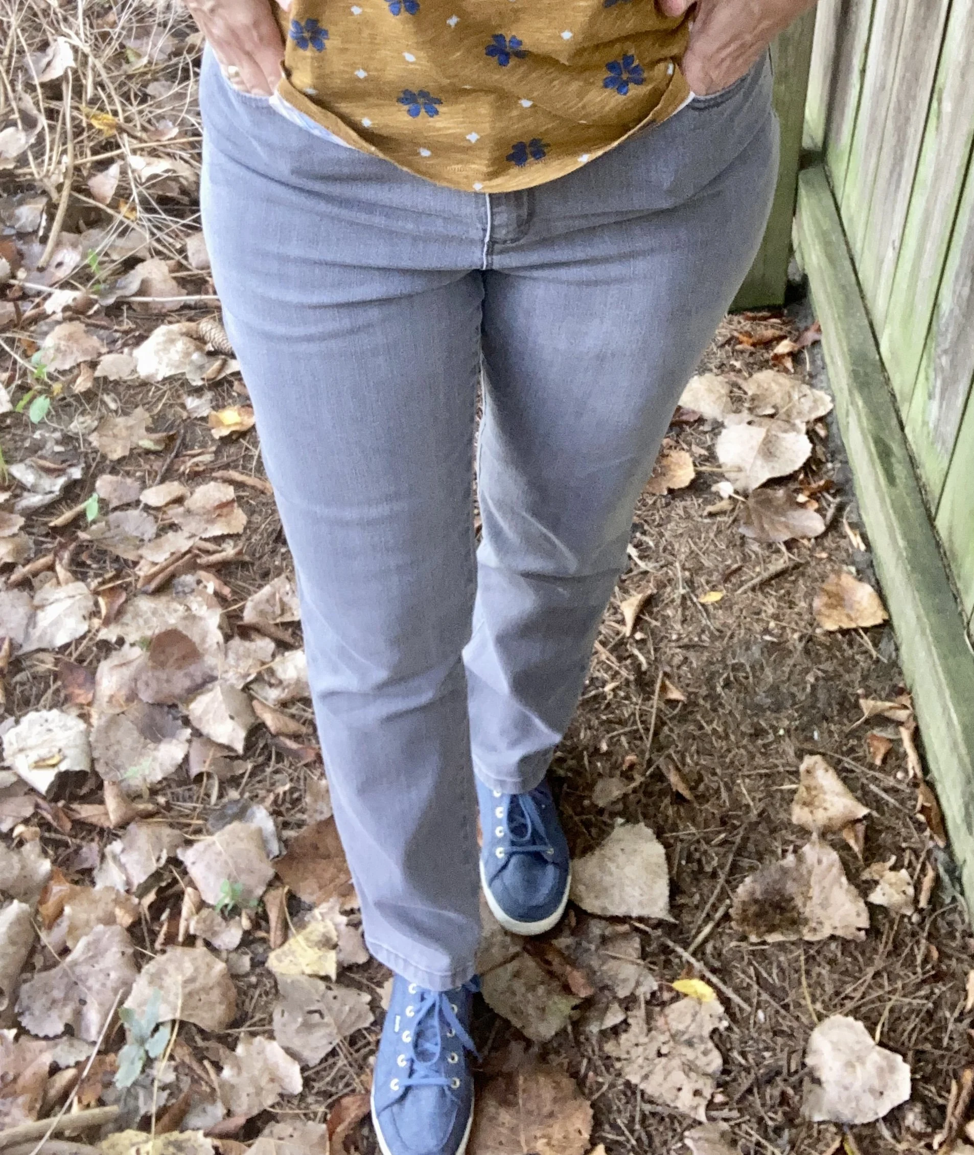
My Gloria Vanderbilt Moonstruck jeans have been around for a while. It seems every time there is a Pantone series, I bring these out as there is always some sort of gray. You can see them styled with a red and white striped tee, and with a red plaid blazer.

Buckthorn Brown is really more of a brownish gold or yellow, but I thought this Sonoma tee from Kohl’s was a pretty good match. Kohl’s has always been a great place to find basics like short and long sleeve tees, pullover sweaters for the cooler weather and fun tees with holiday motifs. I don’t shop there much any more due to my lack of need for clothing, and due to my love of thrifting. Ha, ha.

I kept my accessories pretty minimal. My necklace was a more recent thrift find, and might seem a little to fancy for this casual look, but I like the contrast of dressy and casual, and the color goes well with the Tomato Cream cardi.

I chose blue for my bag and my sneakers, just to play off the blue flowers in the tee. My bag is an old thrift find, a brand called Nine & Co. My sneakers are Keds.

What do you think of these colors? What did you think of this fall’s New York palette? What colors were your favorites? I’d love to get your feedback, so leave me a comment or two.

I’m including a few shopping links. These are affiliate links. All opinions are my own.

Have a great weekend, everyone!

My Style: Pantone Autumn/Winter 2024 NY Palette - Fern, Adventurine, and Dark Gull

I wanted to continue the Pantone color series, but I also wanted to stick to my monthly posts, so for today’s look I am combining three of the Pantone NY palette colors into another style I like, but haven’t as much experience in: Dark Academia.

Academia fashion draws their ideas from university influences both real and imagined. Think of looks combining plaids, tweeds, cozy sweaters, pleated skirts, houndstooth patterns and other vibes associated with higher education. Dark Academia (click on the links to see a few of my pins on Pinterest) uses the darker, moodier end of the color spectrum, while Light Academia chooses pastels, and lighter shades, but in similar textures, styles and patterns. While some looks may include preppy, these are not specifically prep school leanings. I think of Dark Academia as outfits with a Detective Noir slant, but with more fun accessories like back packs, boots and plaid skirts.

This is my take on the Dark Academia style using the colors Fern, Adventurine, and Dark Gull.

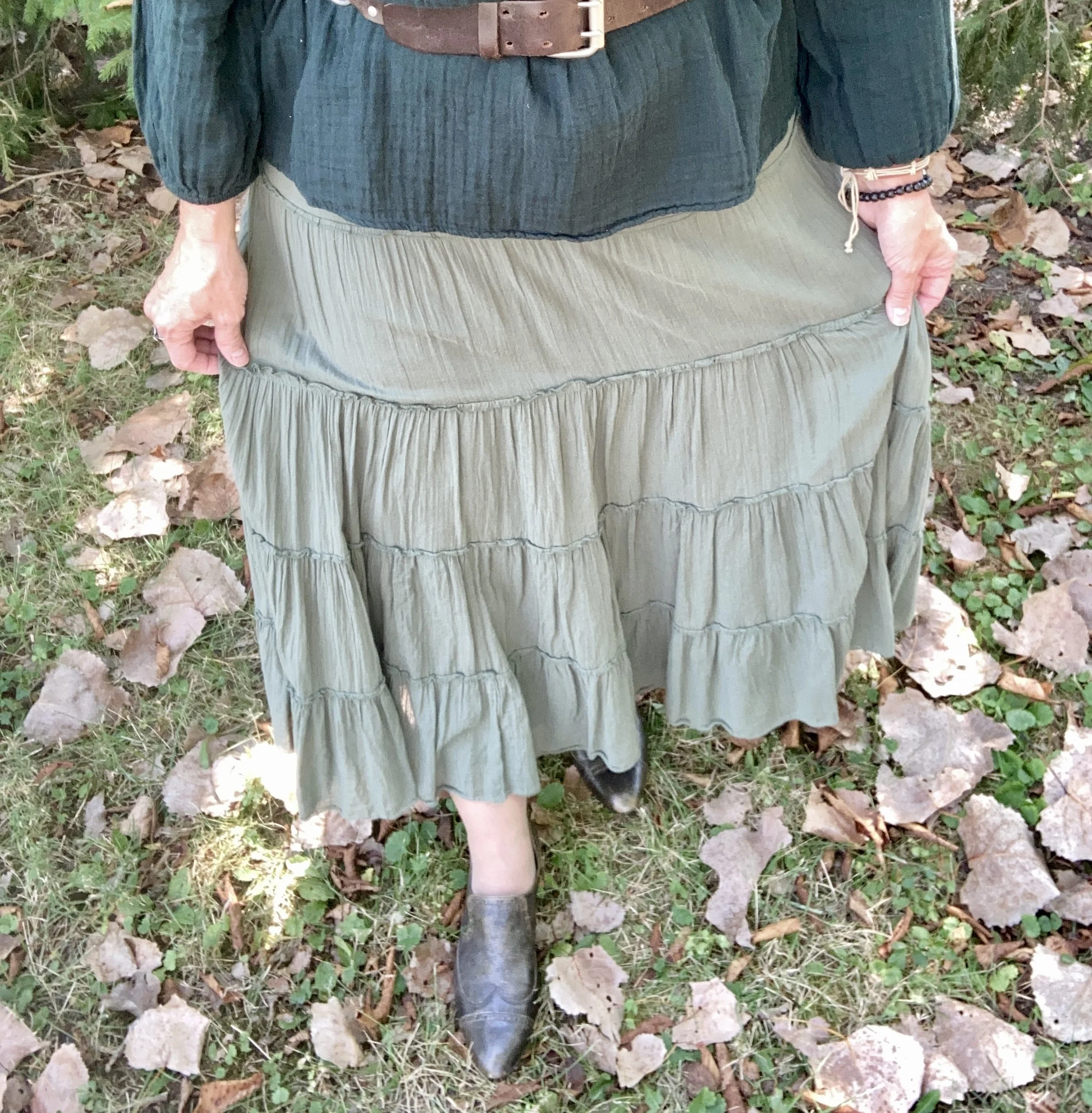
To start off, I chose this thrifted, Old Navy, tiered Fern skirt. Tiered skirts are not really part of the academic vibe, but at the current moment I don’t have anything green in pants or a skirt that would have fit both the color and the style. However, I think this worked pretty well. You can see how I styled this skirt before on the blog with a colorful kimono, with a sheer floral top, and with a colorful fall jacket.

This second hand, Old Navy green top I chose is a tad darker than the Adventurine color, but it is pretty close. I found this gauzy piece recently at the second hand shop around the corner. I have always loved gauze tops. They are so pretty, comfortable, and while we often think of them as warm weather pieces they are perfect to layer a jacket or sweater over.

This thrifted, Mossimo, Dark Gull blazer was a hand-me-over from my daughter. I have always liked a dark gray, better than a light gray, so I am naturally drawn to pieces this color. To me they are classy looking, but aren’t black, so a good choice when you don’t want to go as formal as black.

On Pinterest most of the accessories revolving around academic fashion are simple pendant necklaces, leather, or faux leather boots, loafers and oxfords and back packs or bags. There are also scarves, but our weather is still too hot for those. I decided to focus on silver as the belt over my shirt has silver links and buckles. I also chose a thrifted pair of shoes, a brand called Enzo Angiolini, that are like loafers, but also like oxfords. Ha, ha. And yes my collar is crooked in the first two pictures. Ha, ha.

What do you think of these three Pantone colors? Do you like the Dark Academia vibe? How would you change this type of outfit to make it your own? I’d love to hear your thoughts, so leave me some love in the comments below.

I’m including a few shopping links for pieces that would fall into the Dark Academia style. These are affiliate links brought to you at no extra cost. All opinions are my own.

Shopping Our Closets: Pantone Autumn/Winter 2024 NY - Red Orange, Scarlet Smile and Baritone Blue

The best part about having a closet full of color is that I can almost always come close to matching the Pantone color palettes, whether for spring or fall. I do try to come as close as possible to the palette colors, but it is not a science. It is meant to be a fun exercise in trying new color combinations that you might not normally try.

Today’s outfit is a fun combination of Red Orange, Scarlet Smile, and Baritone Blue. I think this look would be great for work, or for a fall festival or party.

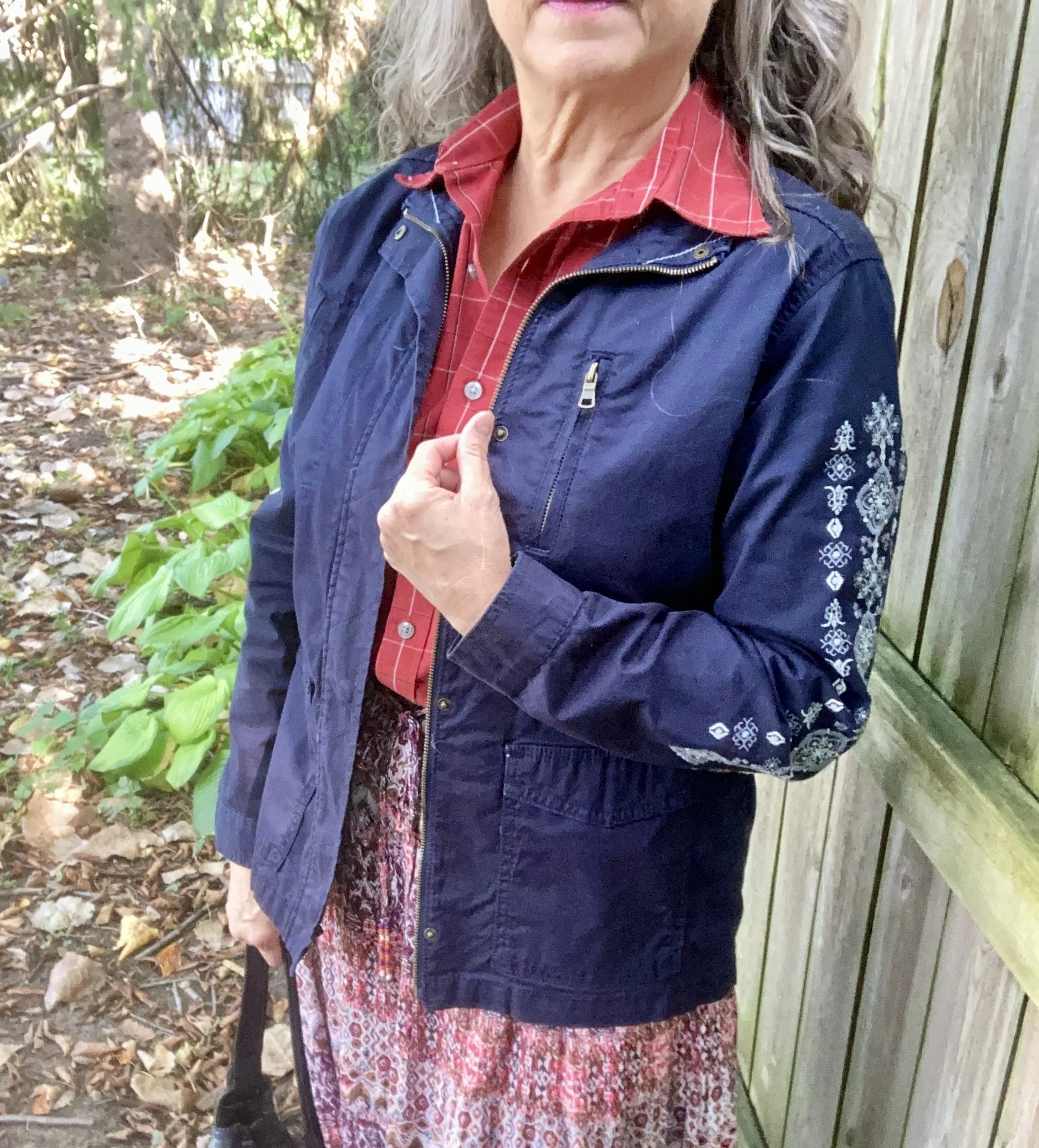
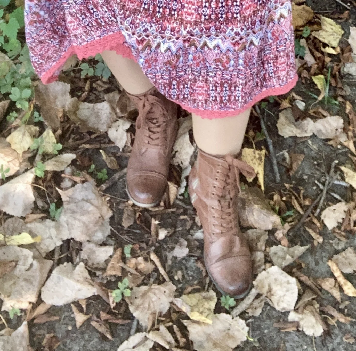
For this outfit I started with this recently thrifted Notations prairie skirt. It has the Red Orange color throughout. I am a sucker for tiered maxi skirts and especially like the boho feel of the fall colored print. Seeing as the skirt has a variety of colors I am looking forward to trying out a few other ways to style this. It is light weight, so for this shoot I added a slip, but that’s just my personal preference. In the cooler weather I would also add heavier tights.

I had a different top picked out that leaned more towards a reddish pink, but looking at Scarlet Smile again, I opted for this men’s Van Heusen, plaid, short sleeve number. It gives the look a touch of a masculine feel. You certainly could make it much more feminine by choosing a top with ruffles, lace or puffy sleeves.

To bring in the darker classic Baritone Blue, which is basically navy, I chose my Sonoma utility jacket from Kohl’s with the embroidered sleeves. I thought the embroidery added a nice element and pulled the whole look together.

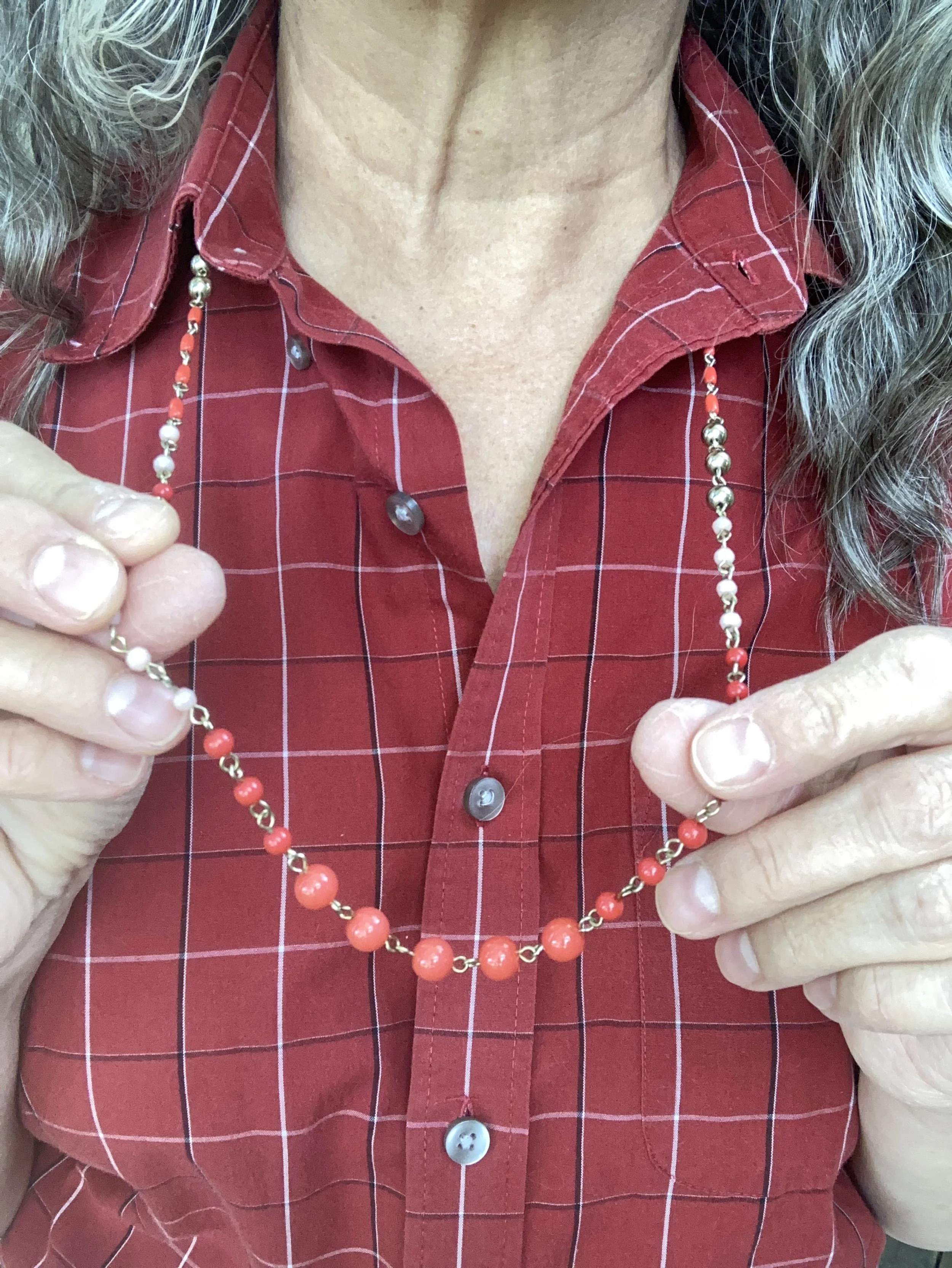
Once I had the outfit figured out, it was an easy choice to add a simple bead and metal necklace in the Red Orange color, my brown, thrifted combat boots, and my thrifted Simple Vera, Vera Wang, bag. Unfortunately, once I was finished with the shoot this bag went in the dumpster. I know of no way to stop the fake leather bags from peeling. If anyone knows a cure, let me know. Ha, ha.

What do you think of these colors? do you have any of these in your closet? Would you wear these colors together? I love to hear your thoughts, so be sure to take the time to comment.

I’m including a few shopping links for you to look at. These are affiliate links. All opinions are my own.

Have a great day!

Outfit Inspiration: Pantone Autumn/Winter 2024 NY Palette: Italian Plum, Winter Sky, and White Swan

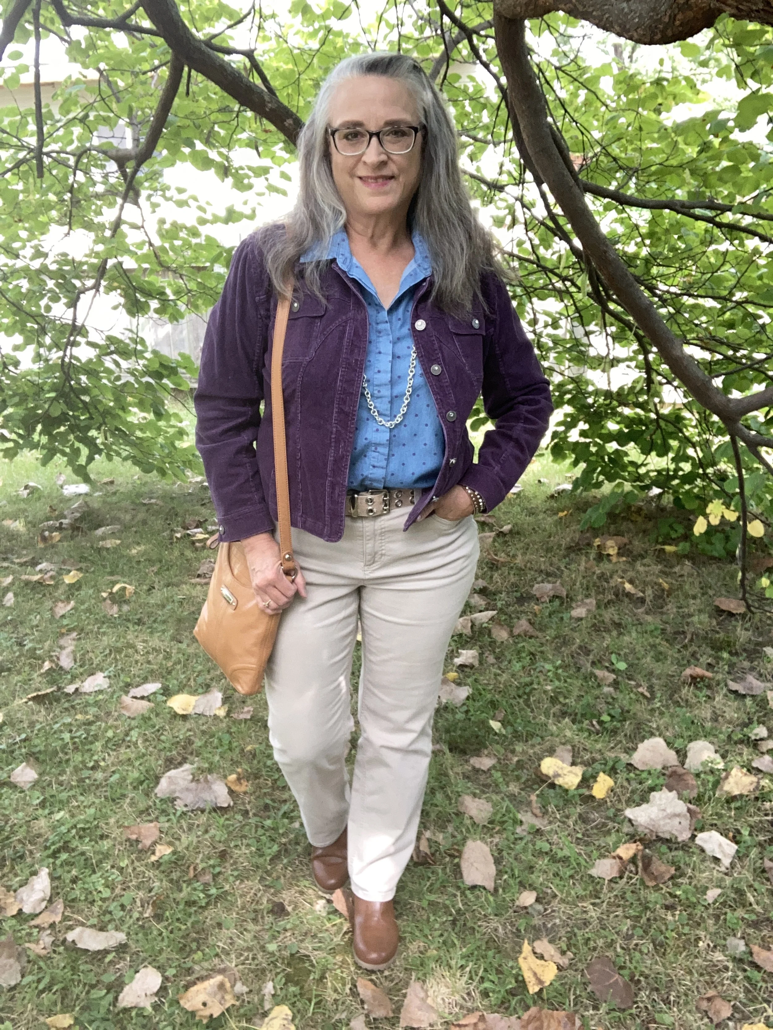
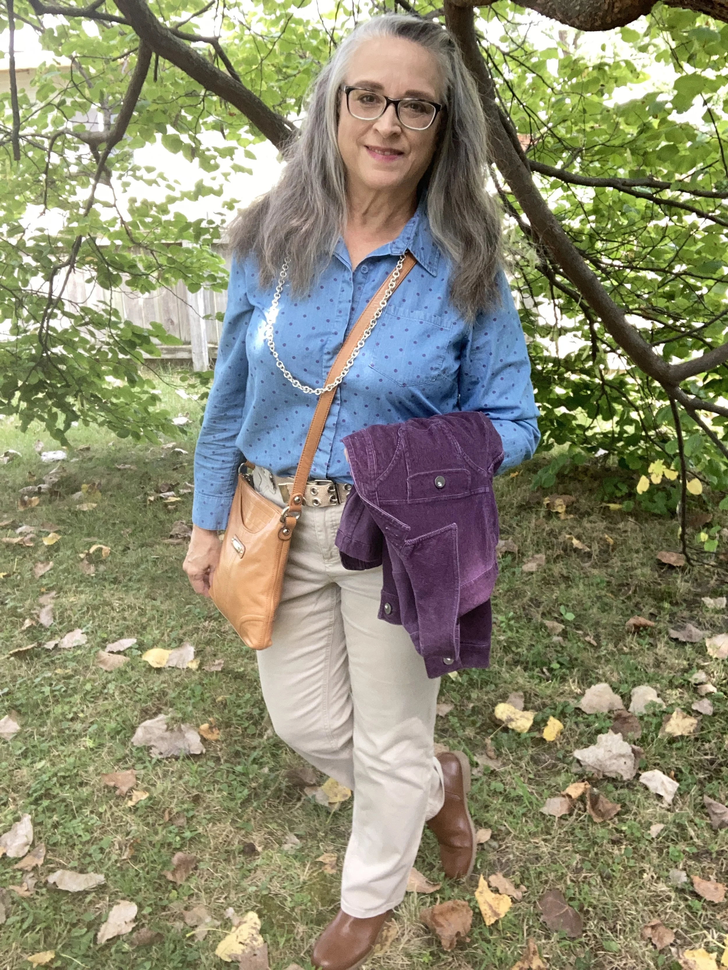
This week’s inspiration came from the Pantone Color Institute’s Autumn/Winter 2024 New York Palette. The three colors I am featuring were fairly easy to find in my wardrobe. My colors may not match spot on, but they are close enough. Feel free to look at the exact colors as given by the Pantone company by clicking on the above link. This week the two main palette colors are the dark purple called Italian Plum, and the blue called Winter Sky. The creamy color is from the classics palette and is called White Swan.

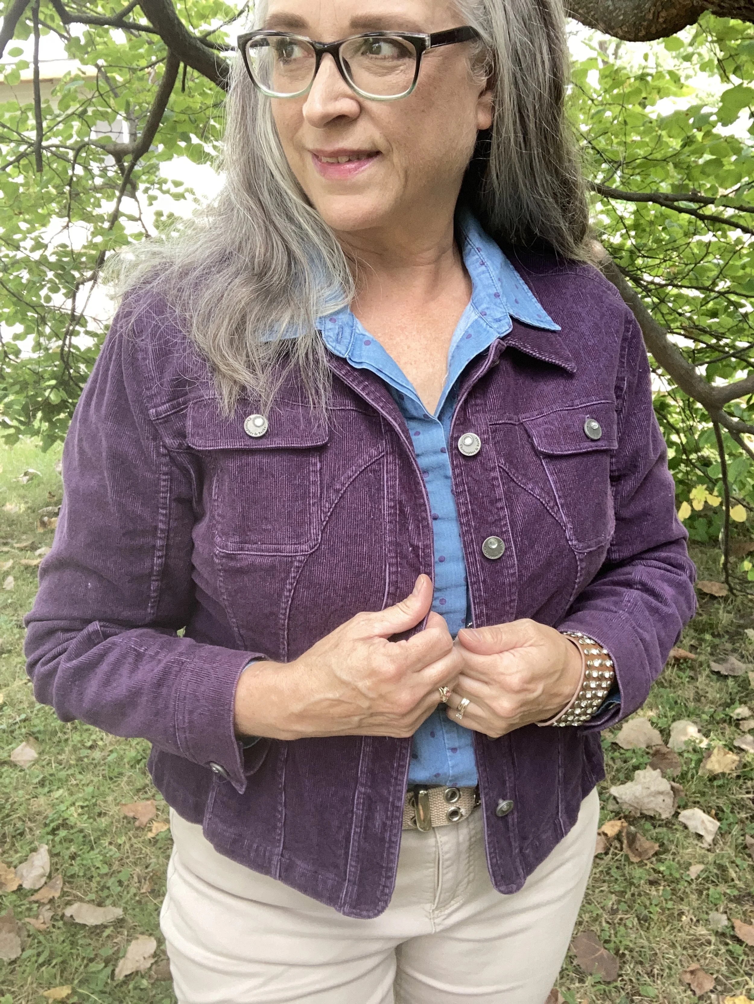
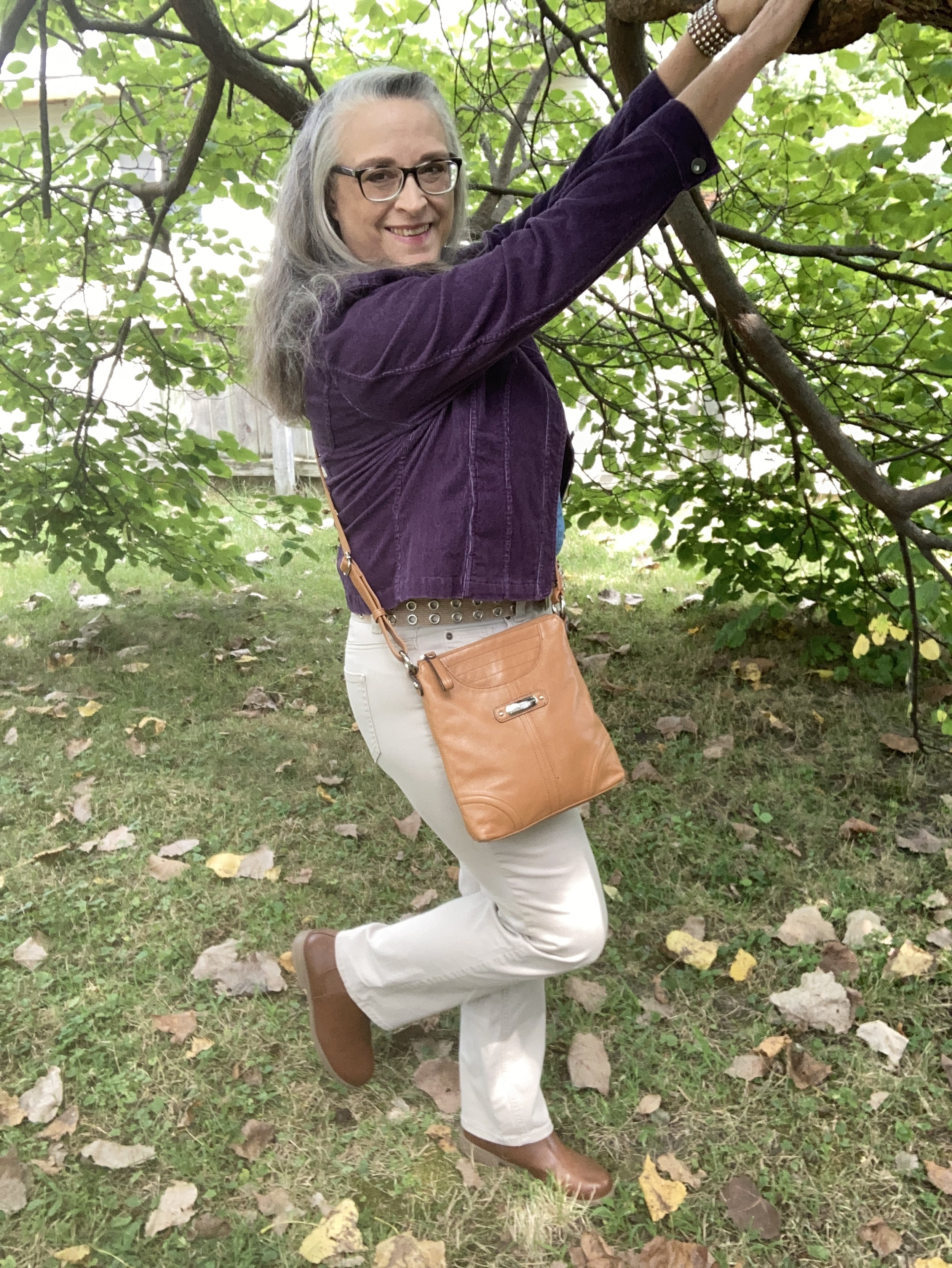
My Italian Plum corduroy jacket is a thrifted Christopher & Banks piece. It is actually a petite large, but I like that it has more of a cropped look. I like the different seams on this piece, and corduroy is perfect for cooler weather.

Style Tip: Shop sizes outside your normal because sizing is different across many manufacturers, and you might like how the piece looks if it is a bit shorter, longer or oversized.

Here are a few possibilities, but there isn’t much out there in this color.

My polka dot Winter Sky top is another Christopher & Banks piece that I bought on a sale back when we had a store in our area. A chambray piece the purple dots were a fun addition to the normal denim style shirt.

My light colored White Swan pants are Croft & Barrow brand from Kohl’s clearance a few years ago. They are plain and simple and sometimes that is just what an outfit calls for.

Style Tip: Not every outfit needs pants or skirts that are texturized or embellished. Sometimes, the simpler the better. Plain pants are typically better for work if you don’t have a uniform provided by the company.

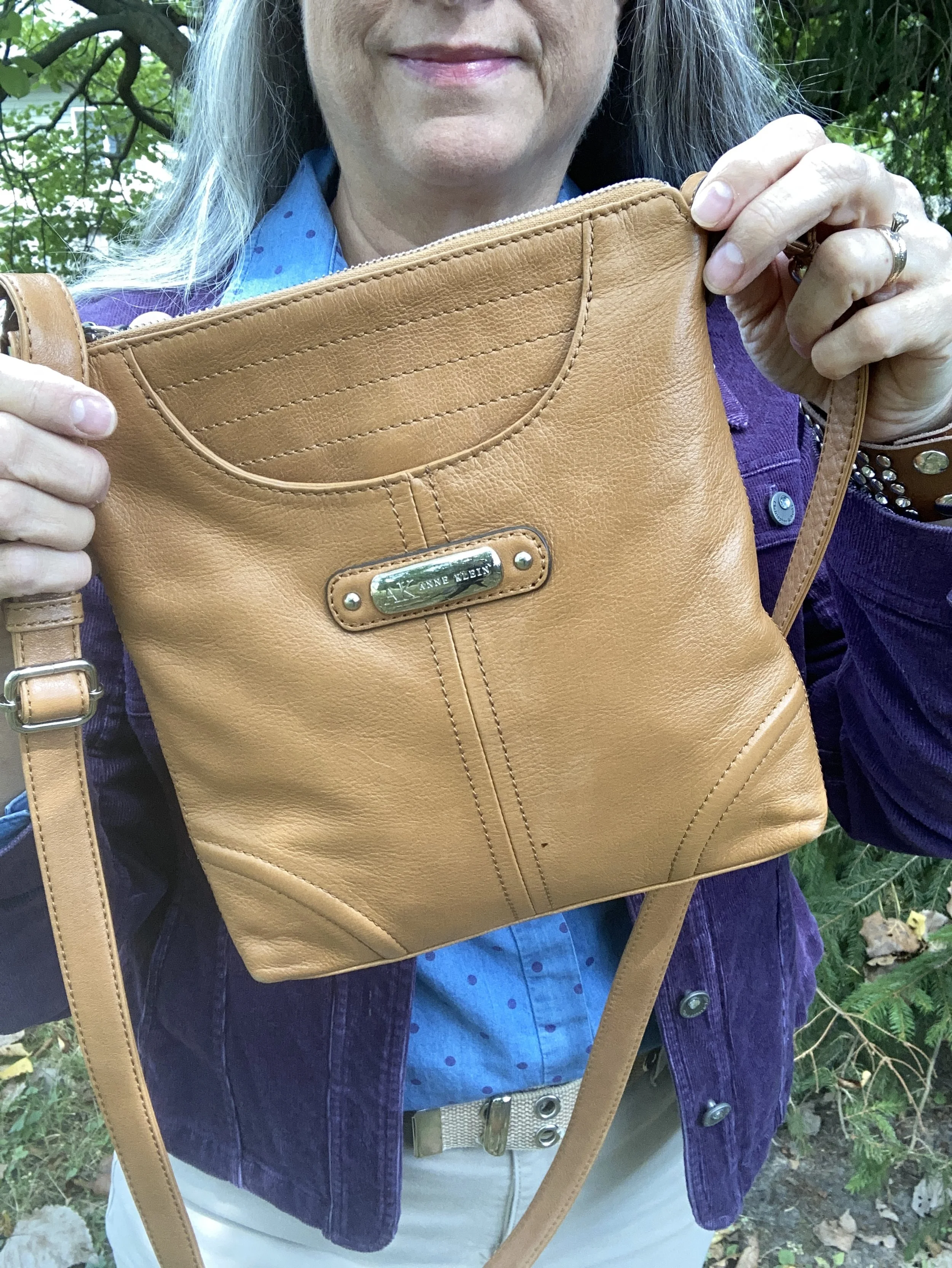
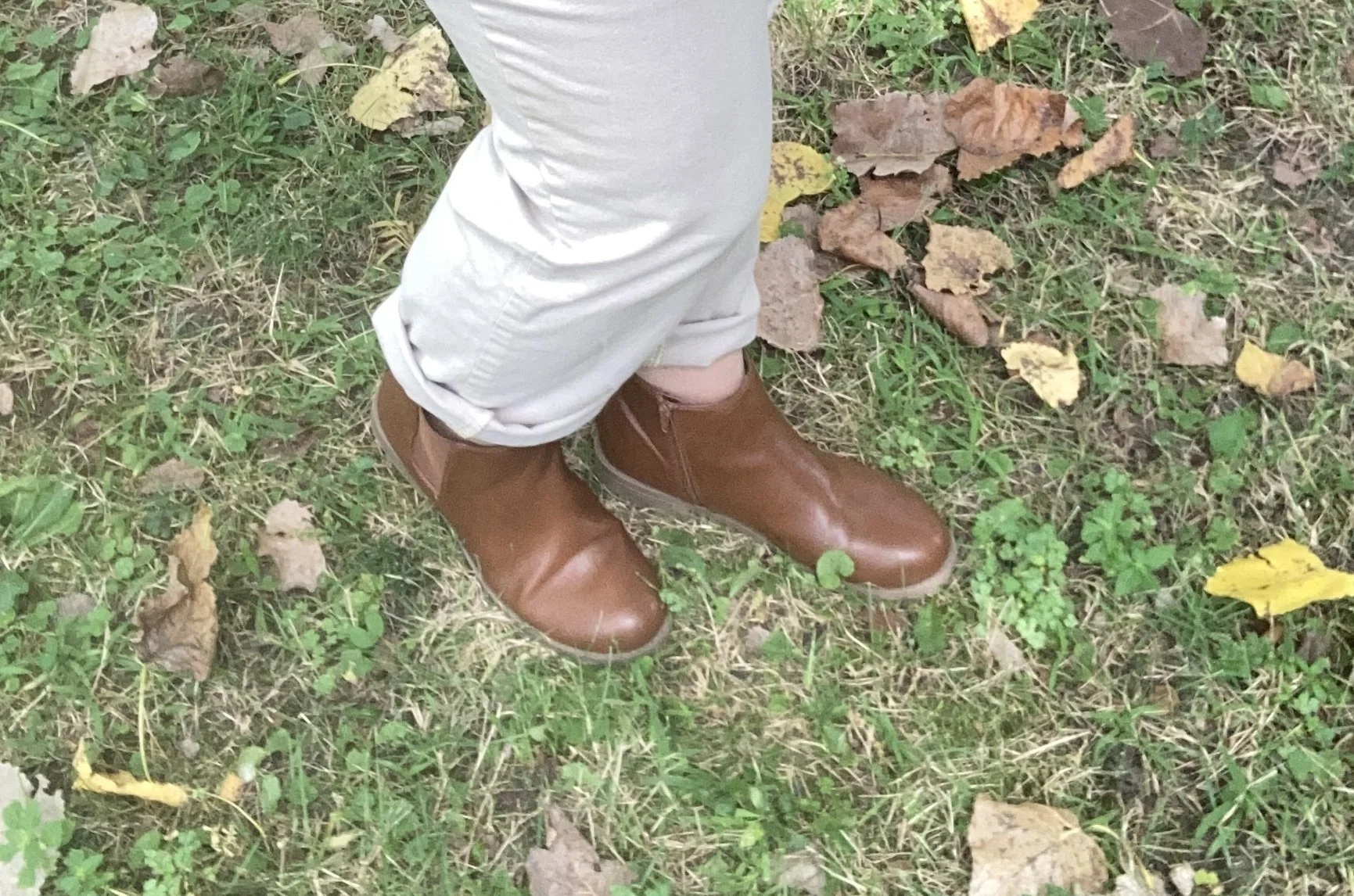
I kept my accessories fairly simple as well. I opted for tan as my color of choice for both my bag and boots since that seems to be trending this fall. I also chose silver as my jewelry color.

What do you think of these Pantone colors? I love purple anyway, so this darker color is a fave, especially for fall. Do you think the a chambray shirt would have worked with this purple jacket and lighter colored pants even if it didn’t have the purple dots on it?

I hope you enjoyed this post. Let me know your thoughts on these colors. Have a great week!

Shopping links are affiliate links, but all opinions are my own.