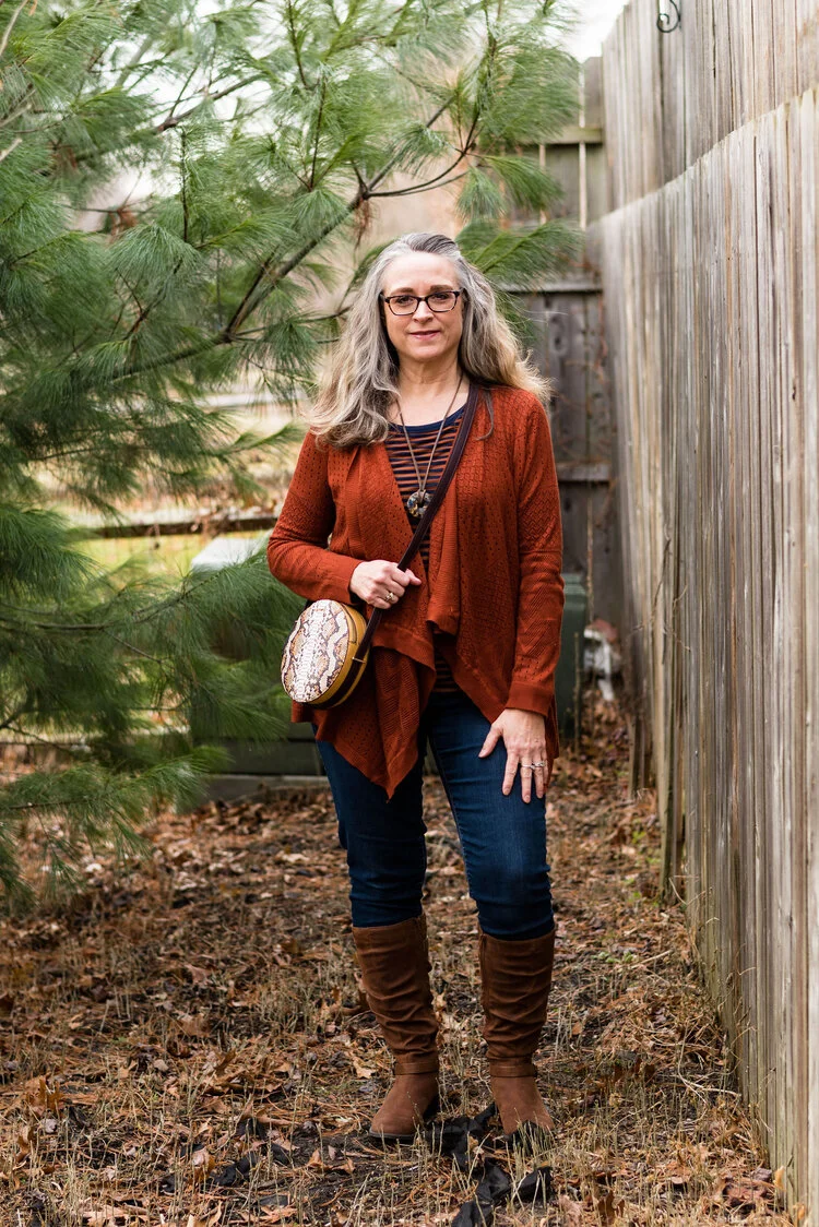
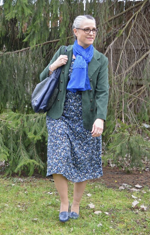
Winter Trend - My Take on Bohemian Chic

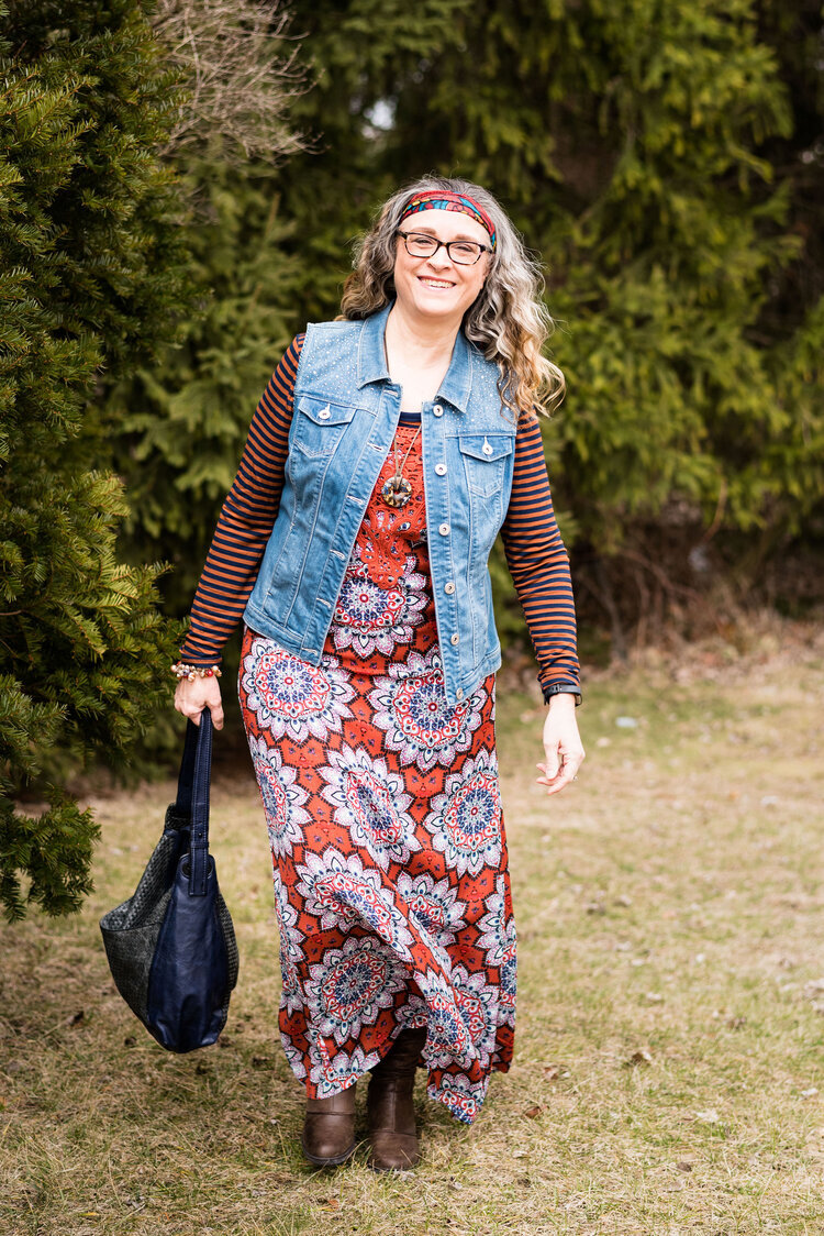
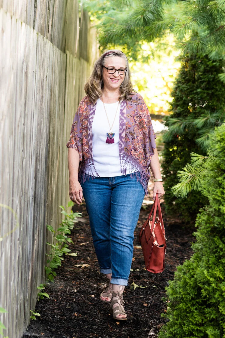
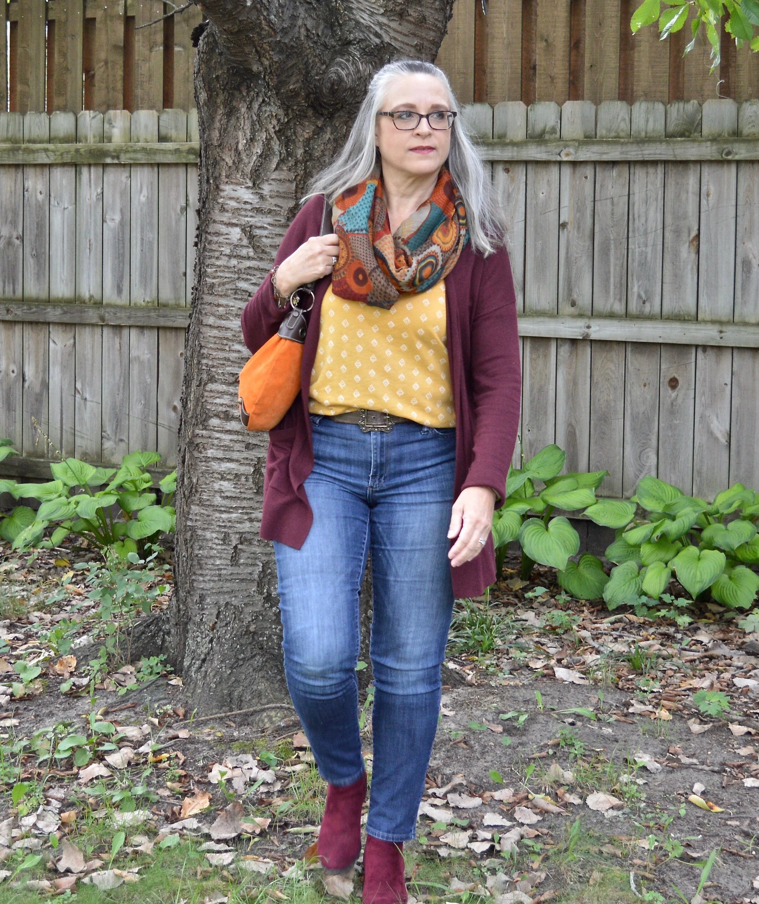
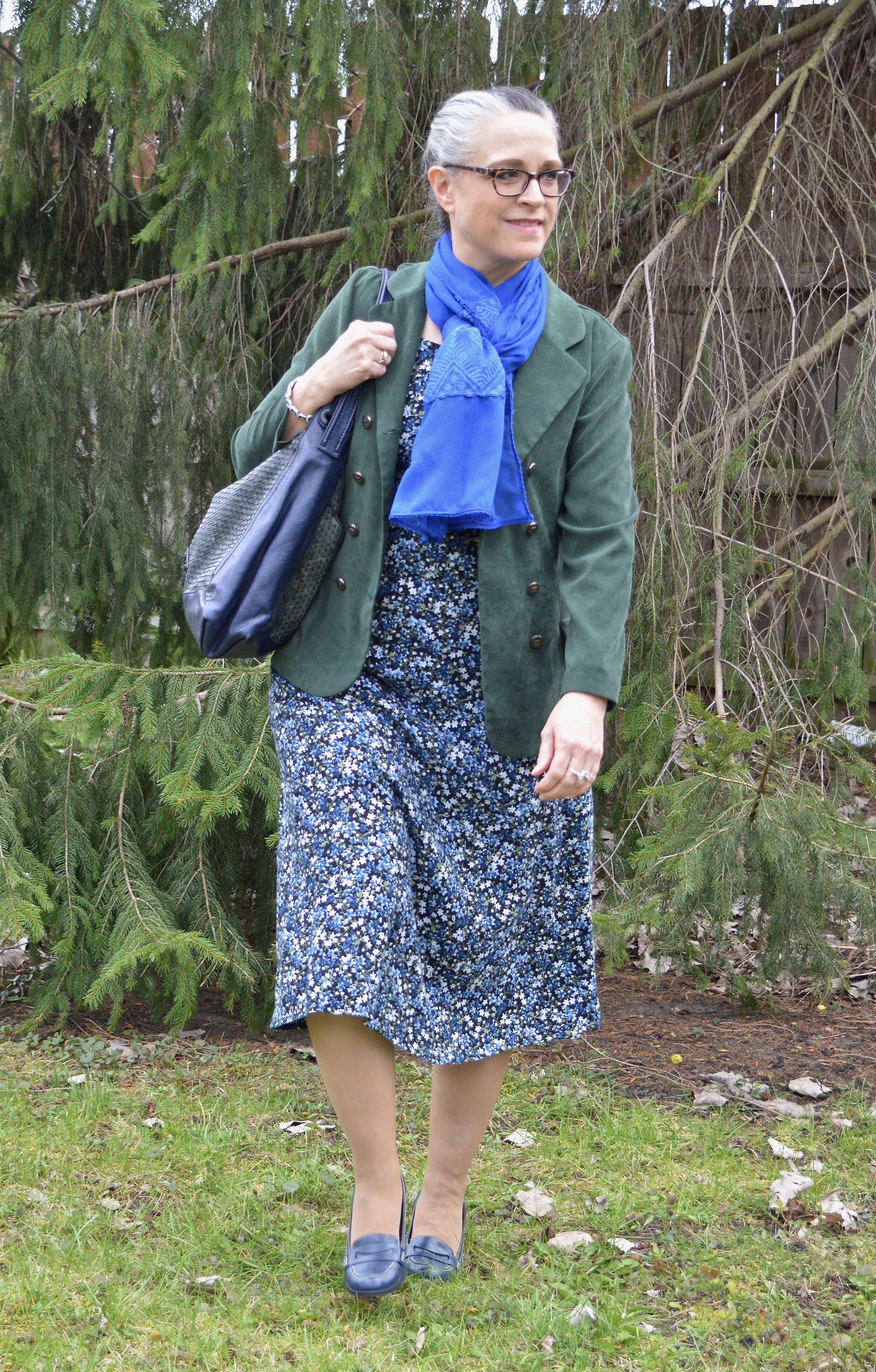
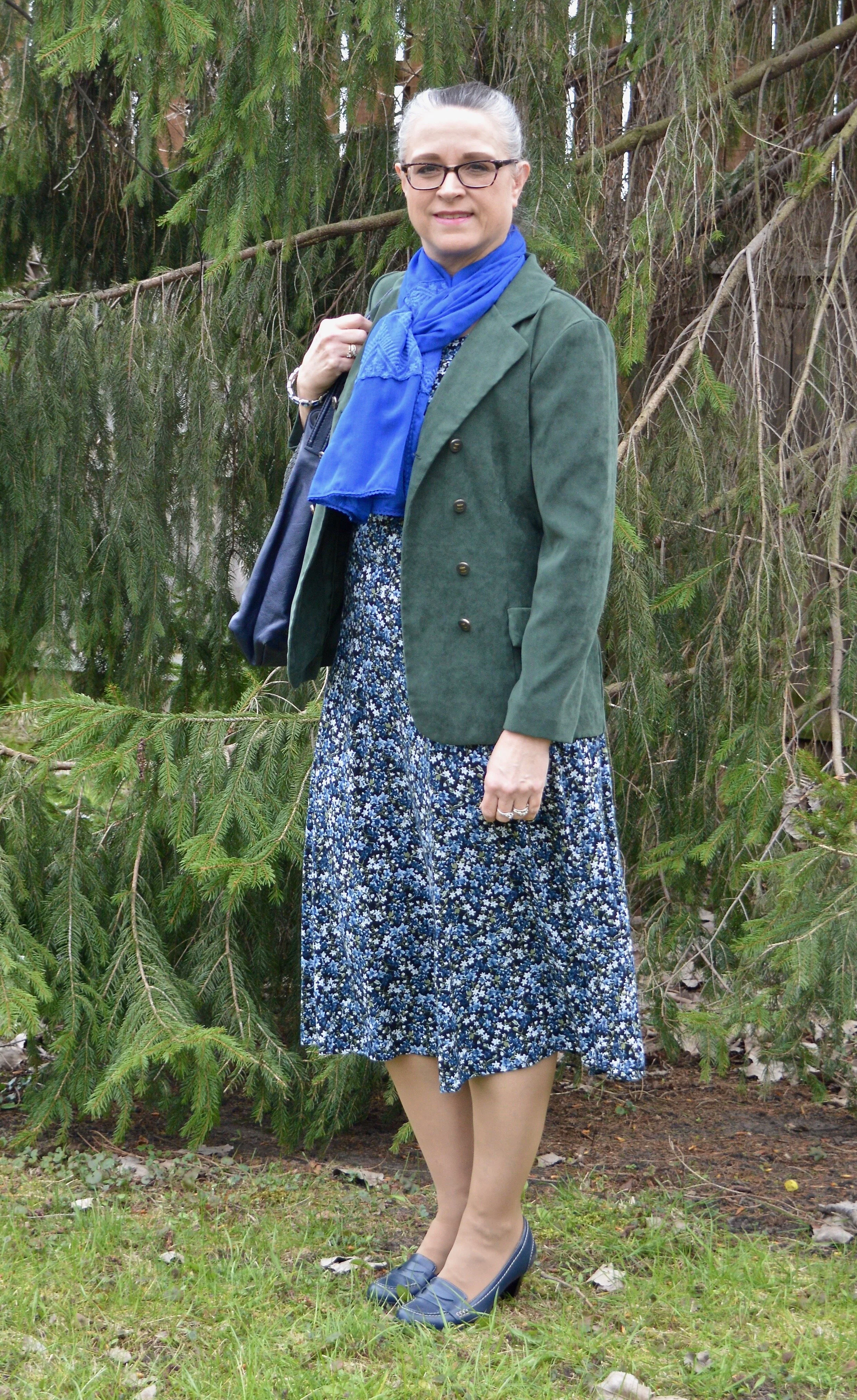
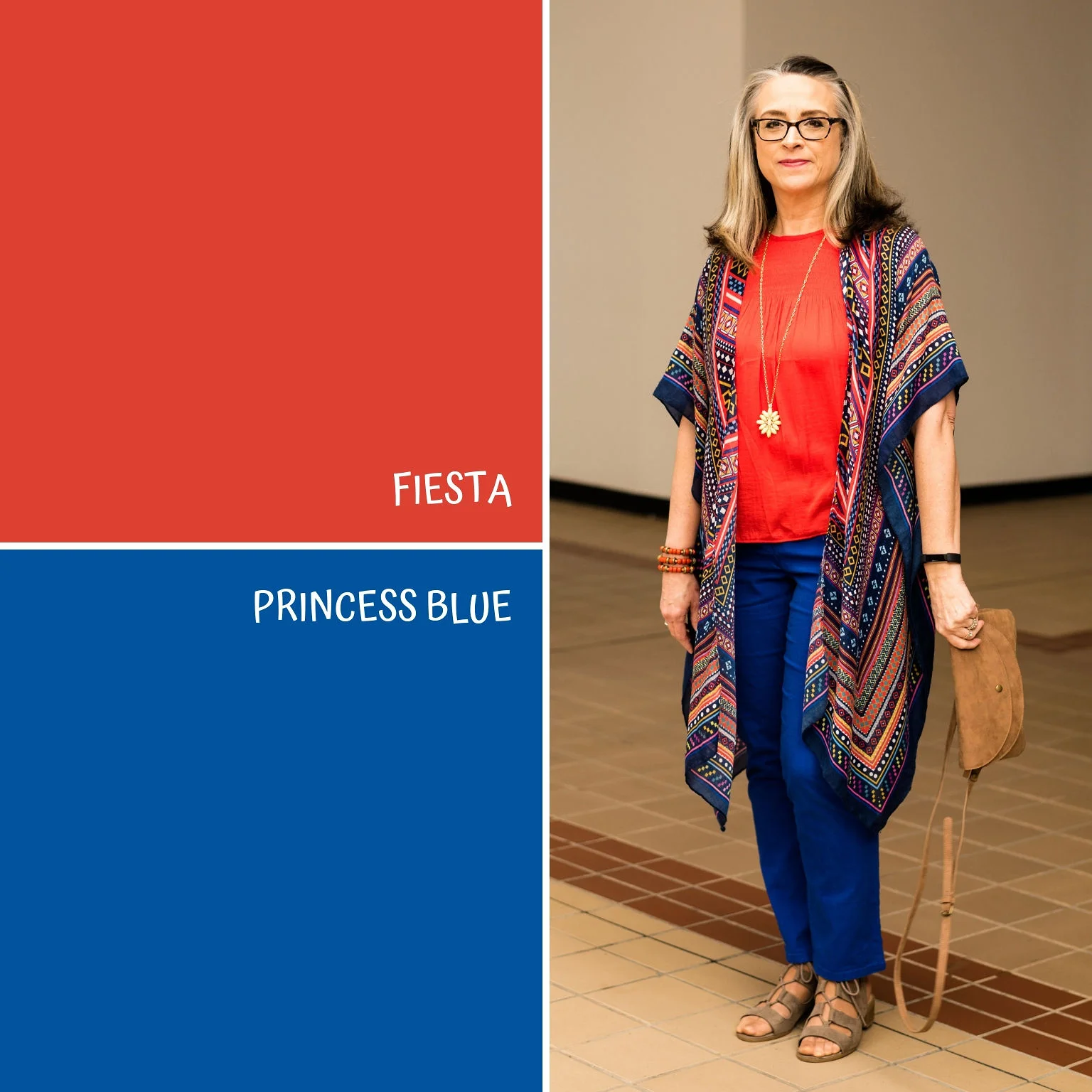
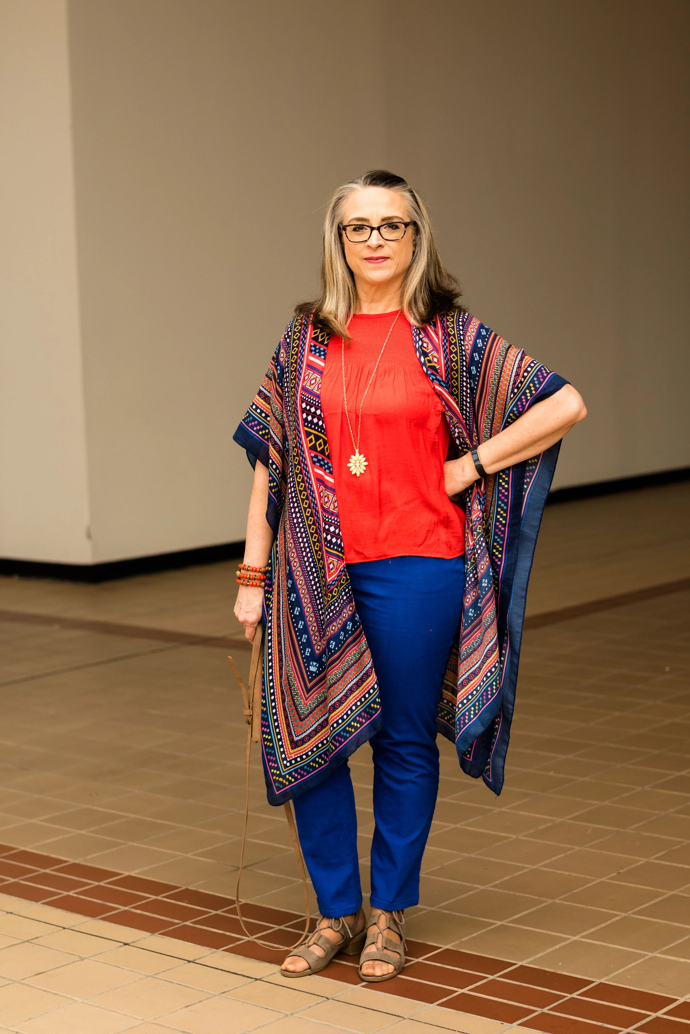
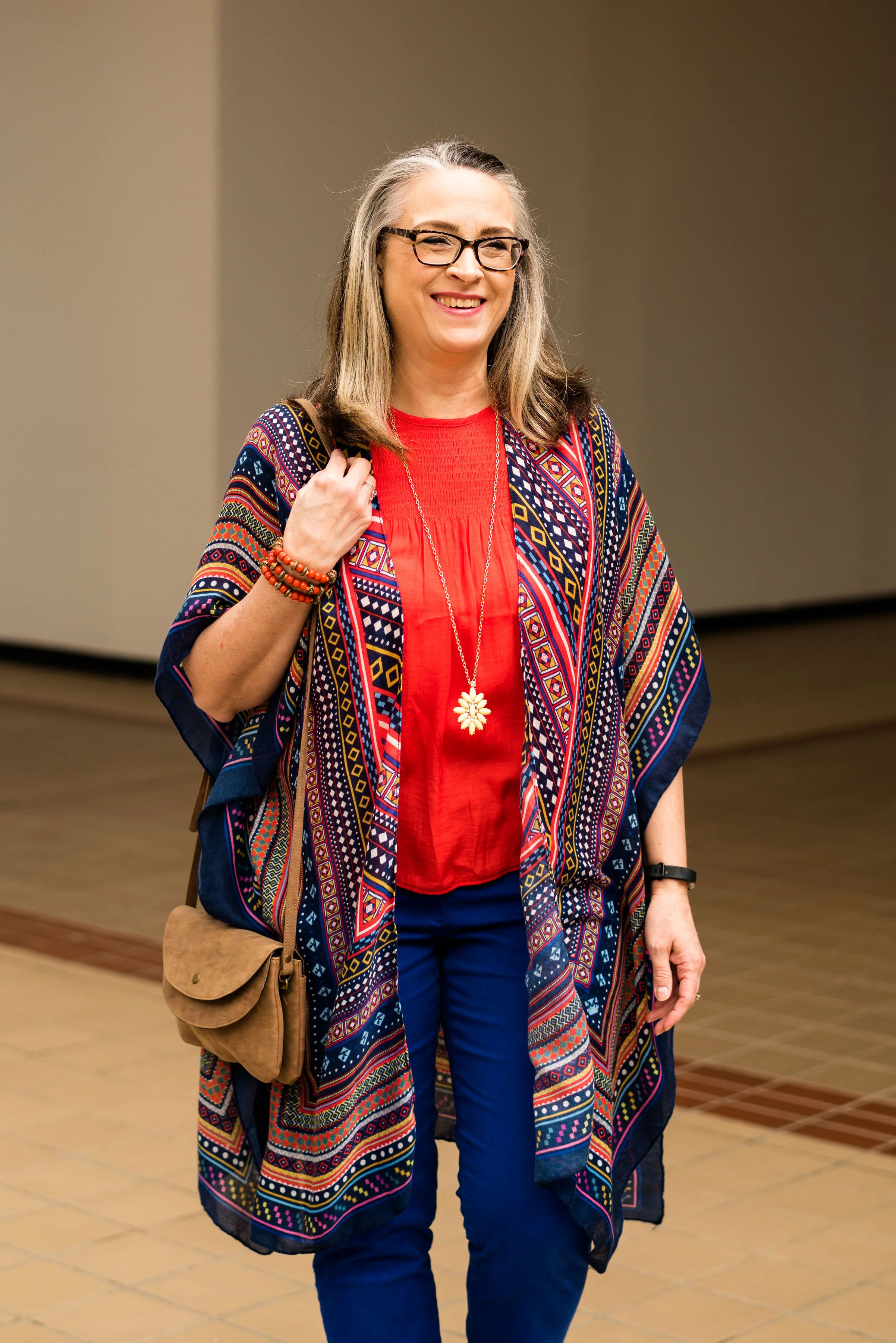
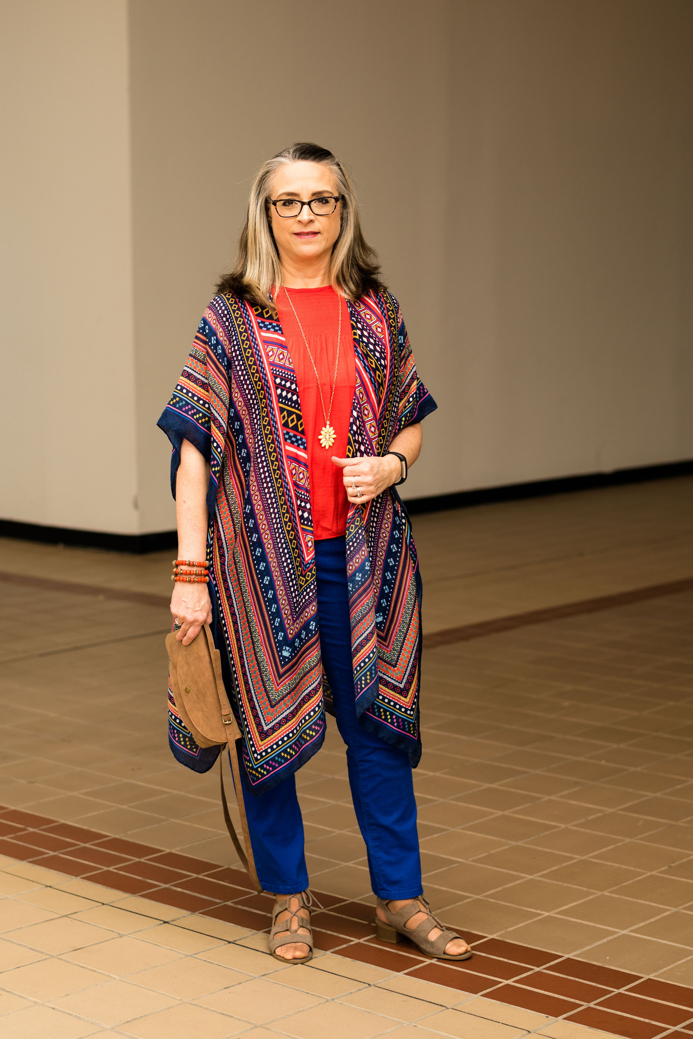
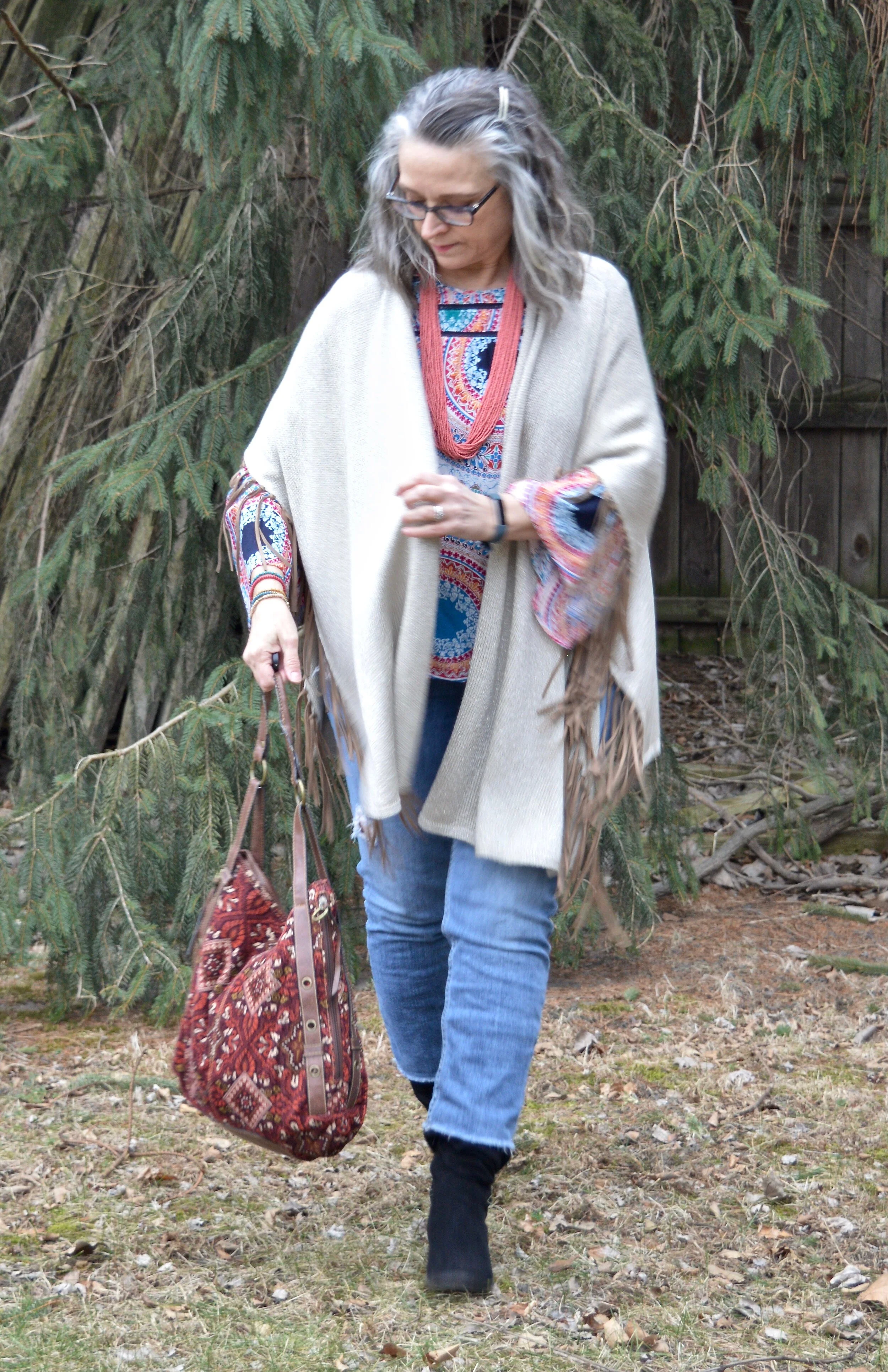
The idea of bohemian style always brings to my mind, gypsies. I think of long, tiered skirts, bright colors and all manner of patterns. I also think of the 1960’s hippies with fringe, headbands and bell bottoms. When I went to put this outfit together, I knew I wanted to incorporate a few of those characteristics into the outfit, but still stay true to my own style. Let’s face it, the 1960’s brought the women’s lib movement, so many women were burning their bras while I was still in diapers and just learning to walk. I personally like to keep the “girls” covered, except when I am ready for bed, so that aspect of the 1960’s boho vibe will not be part of my style.

Winter trends - boho chic

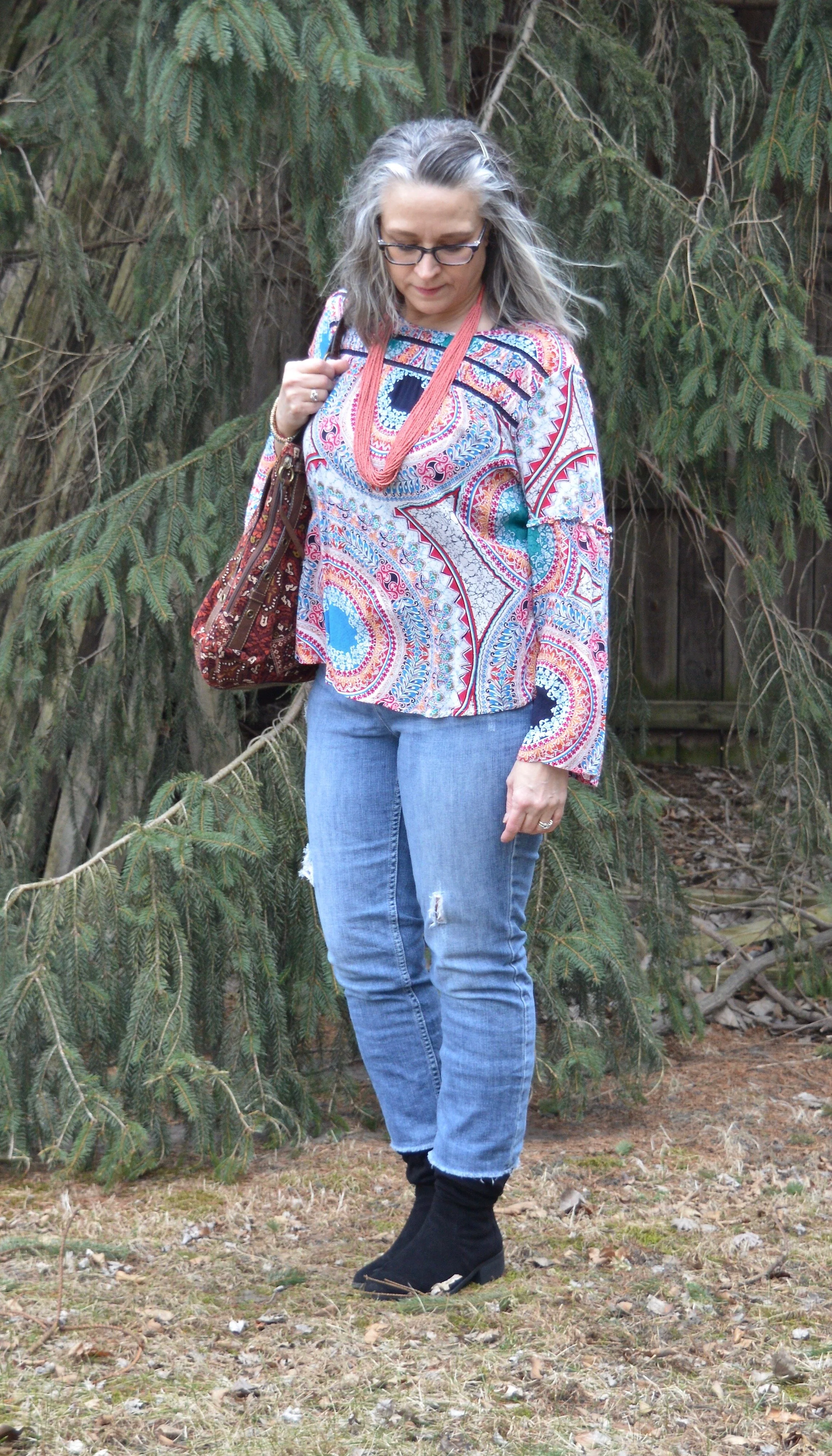
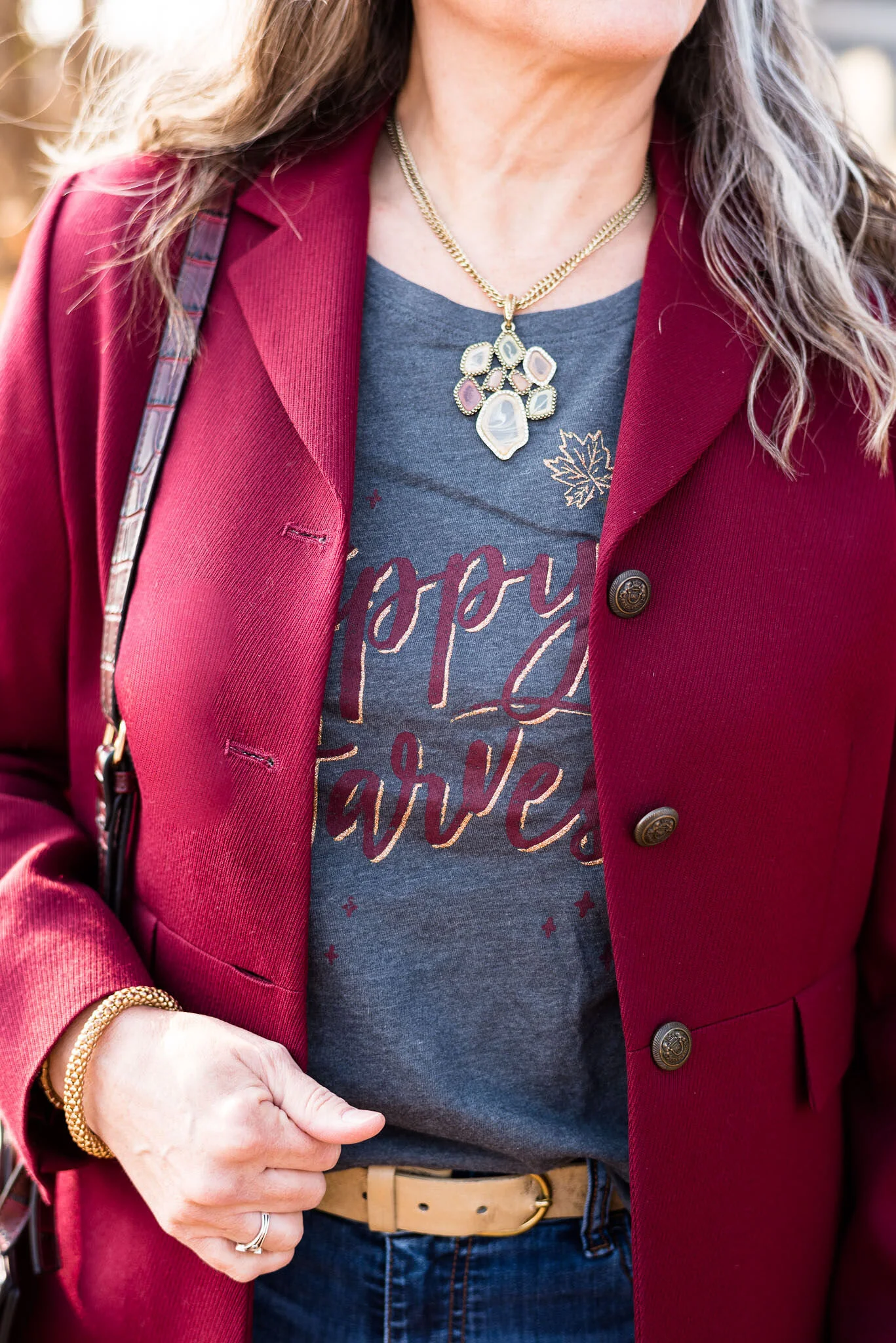
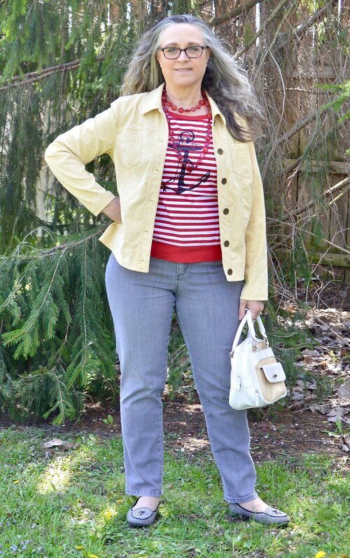
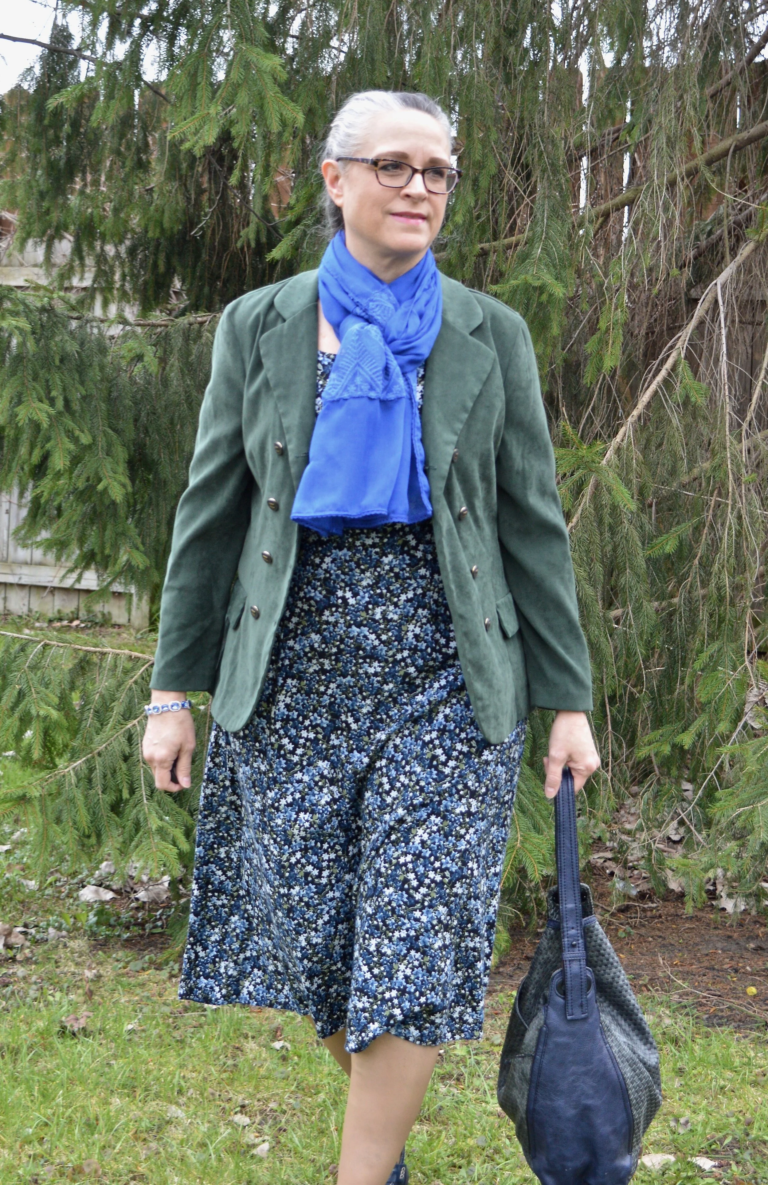
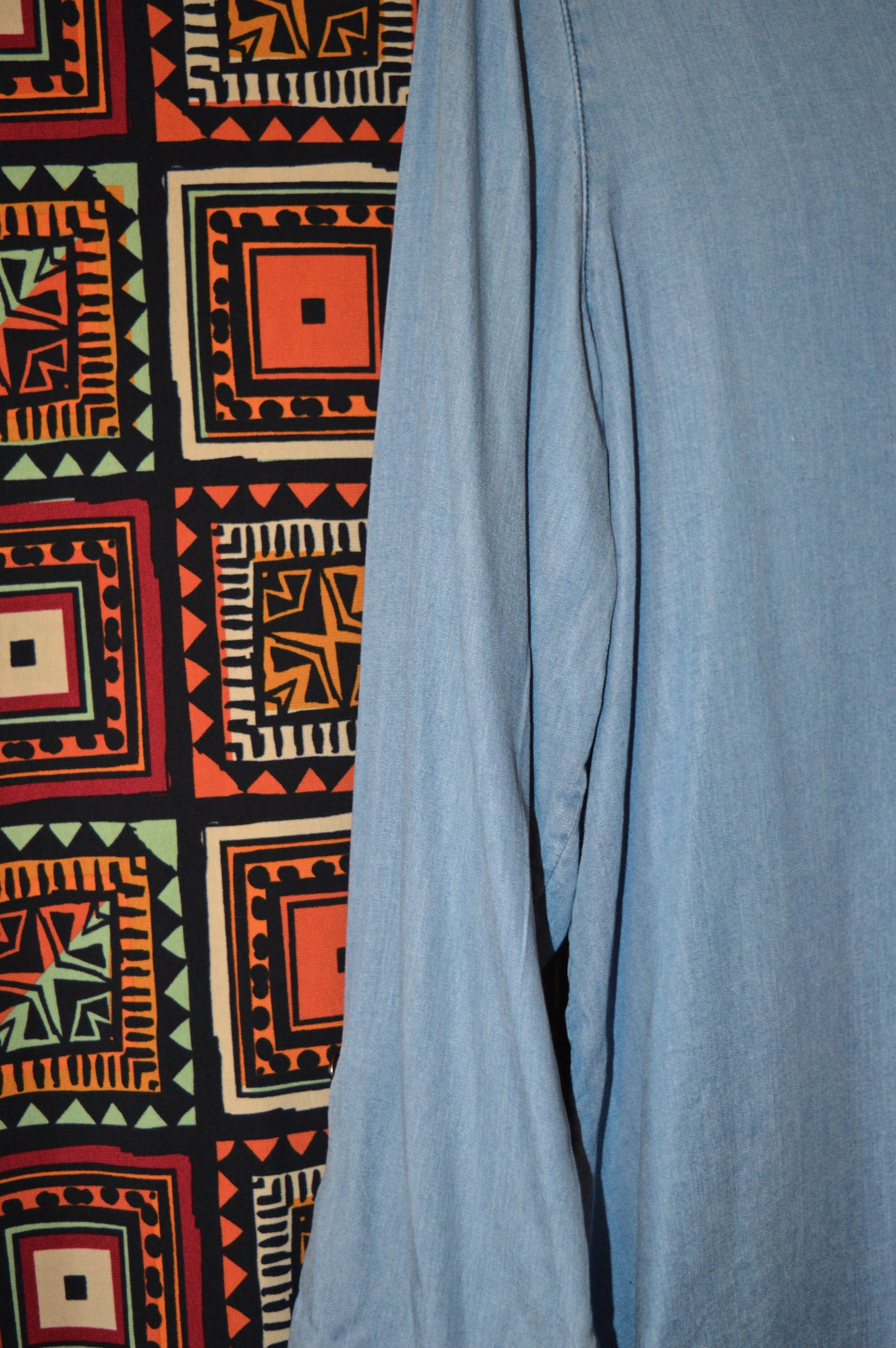
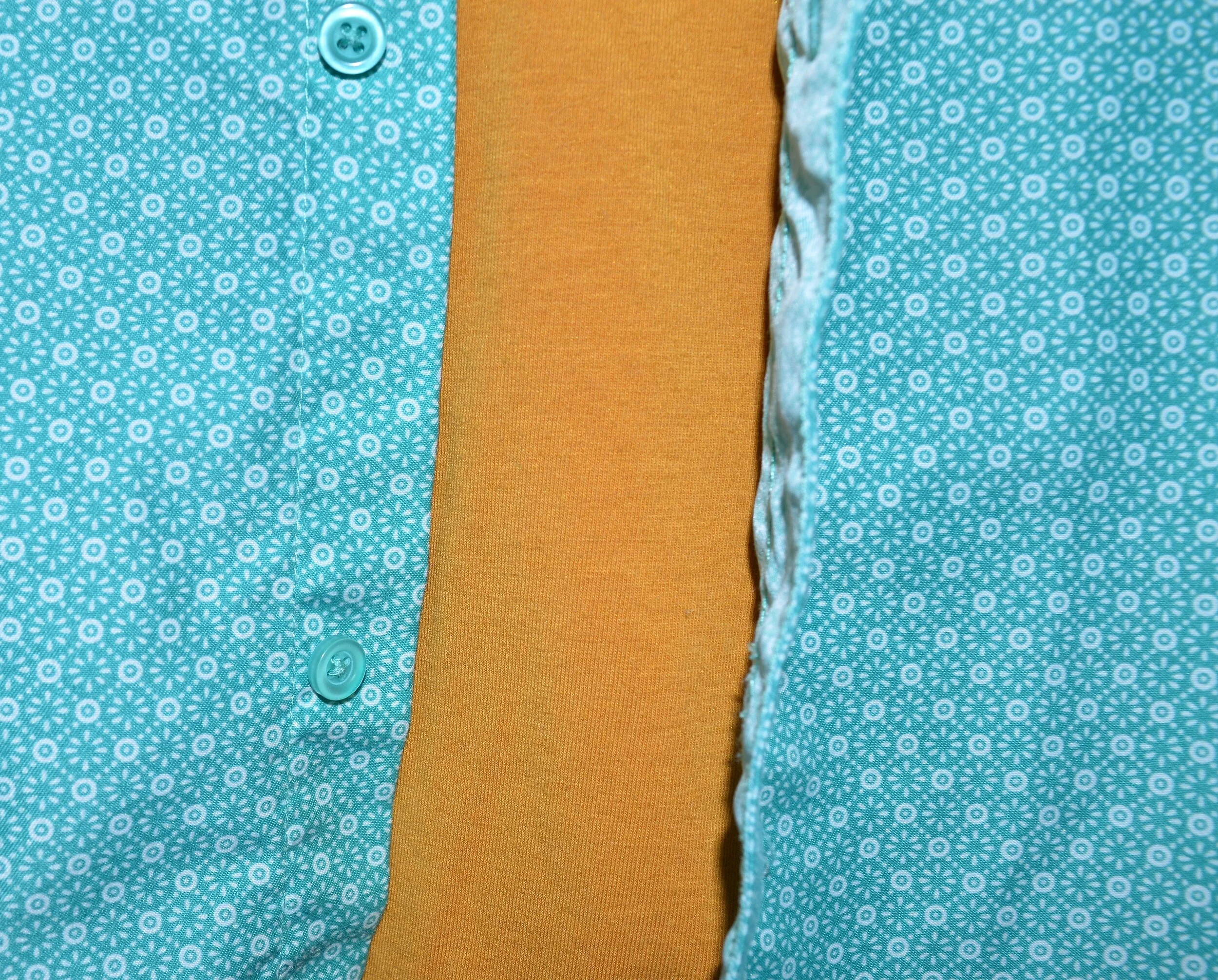
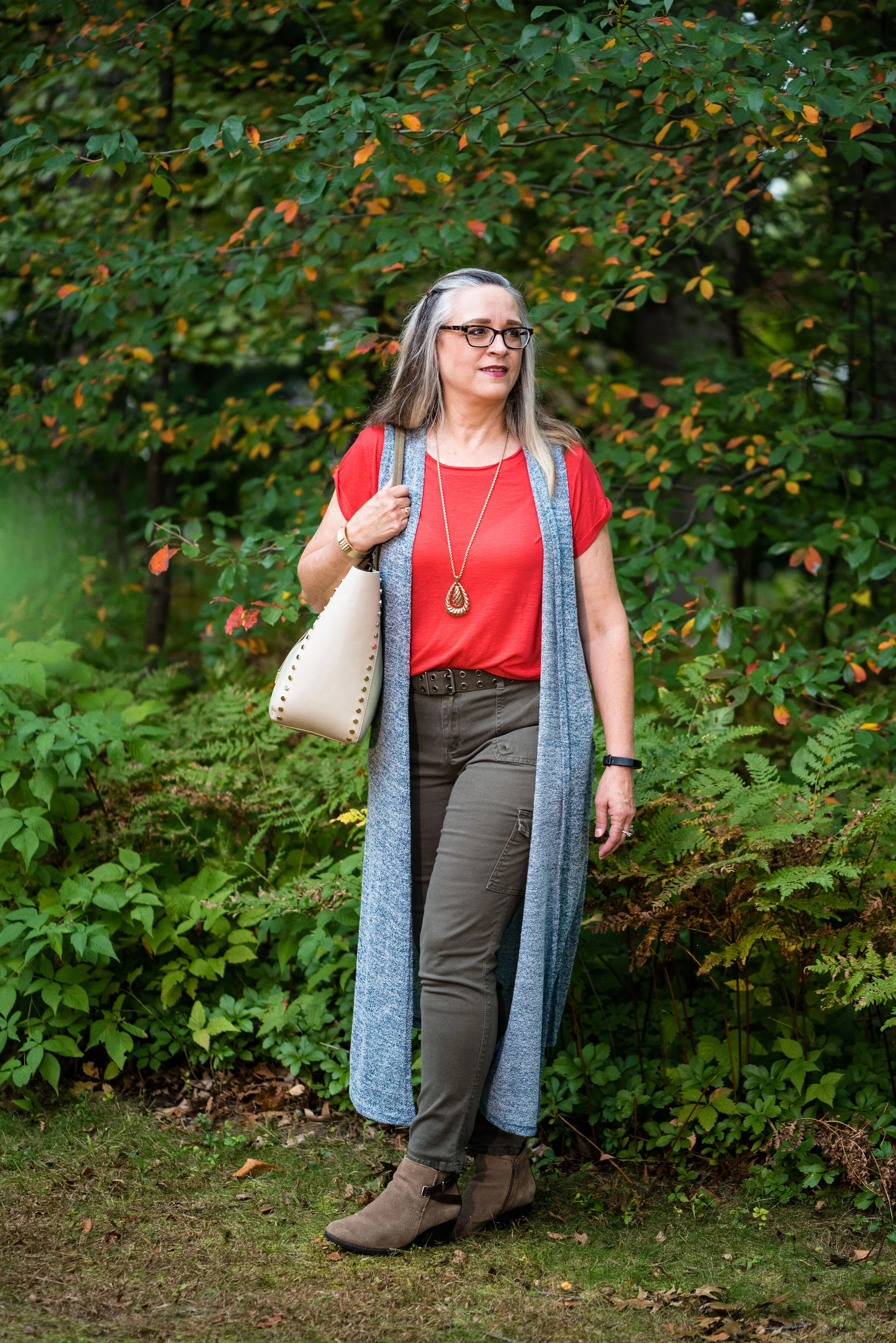
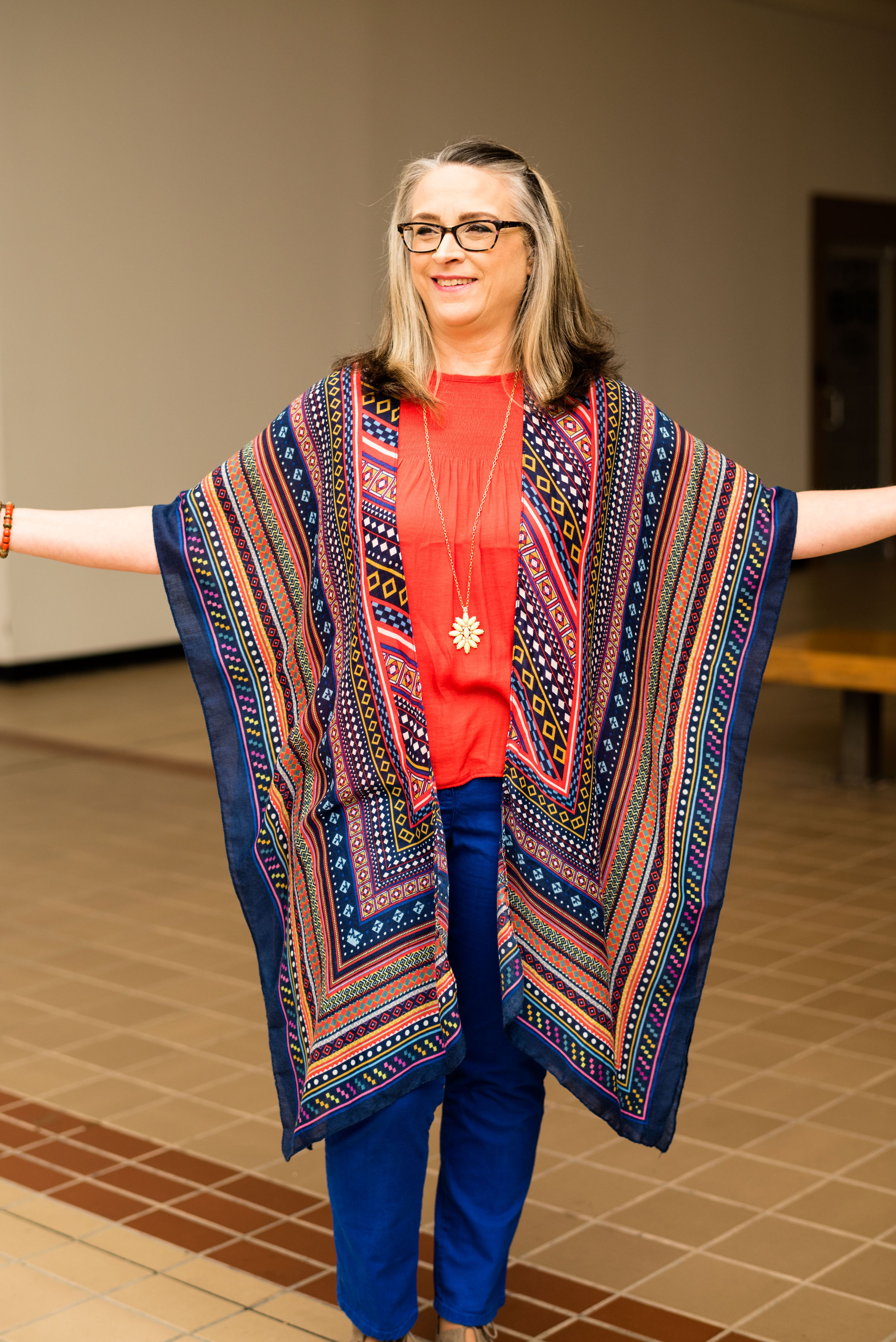
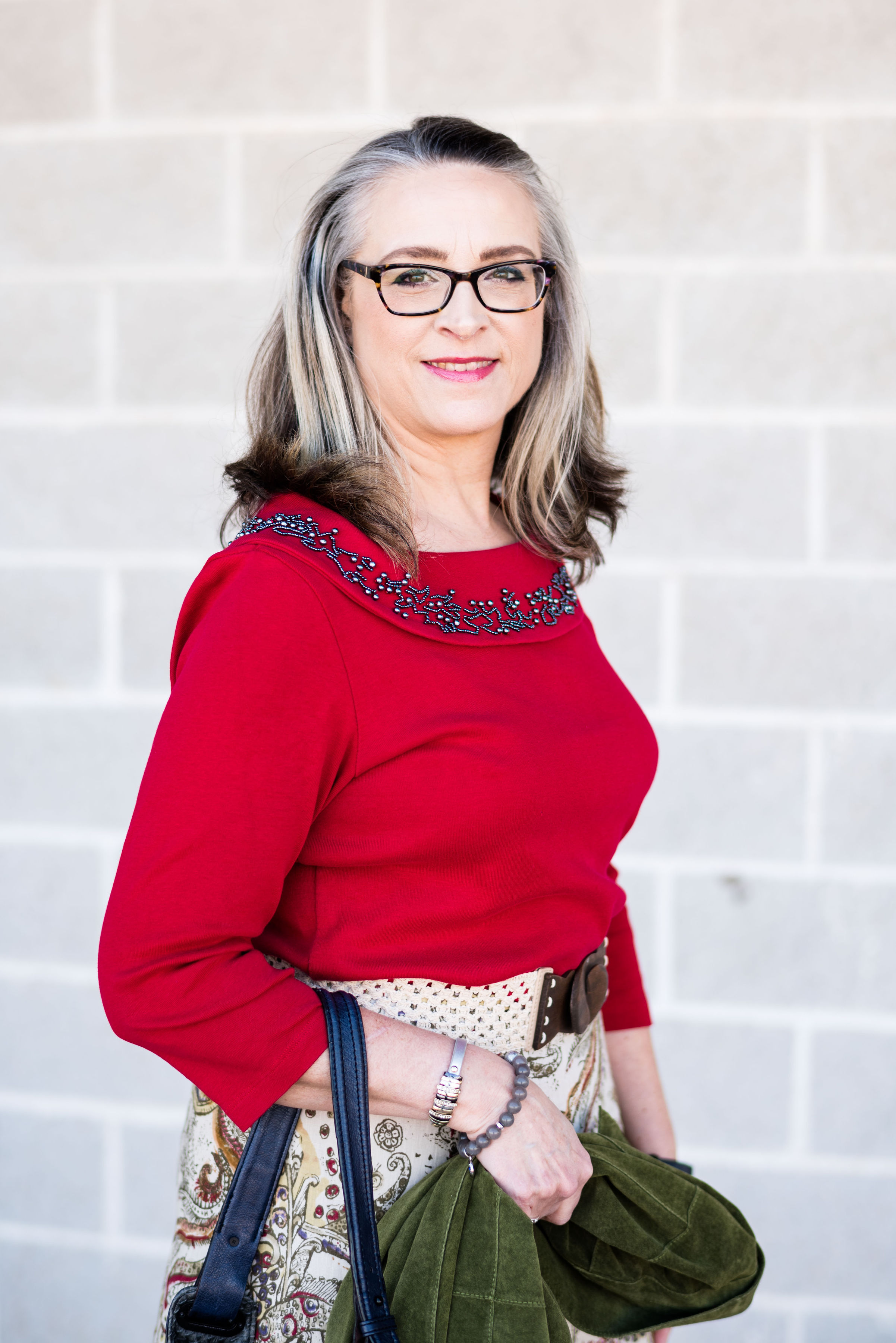
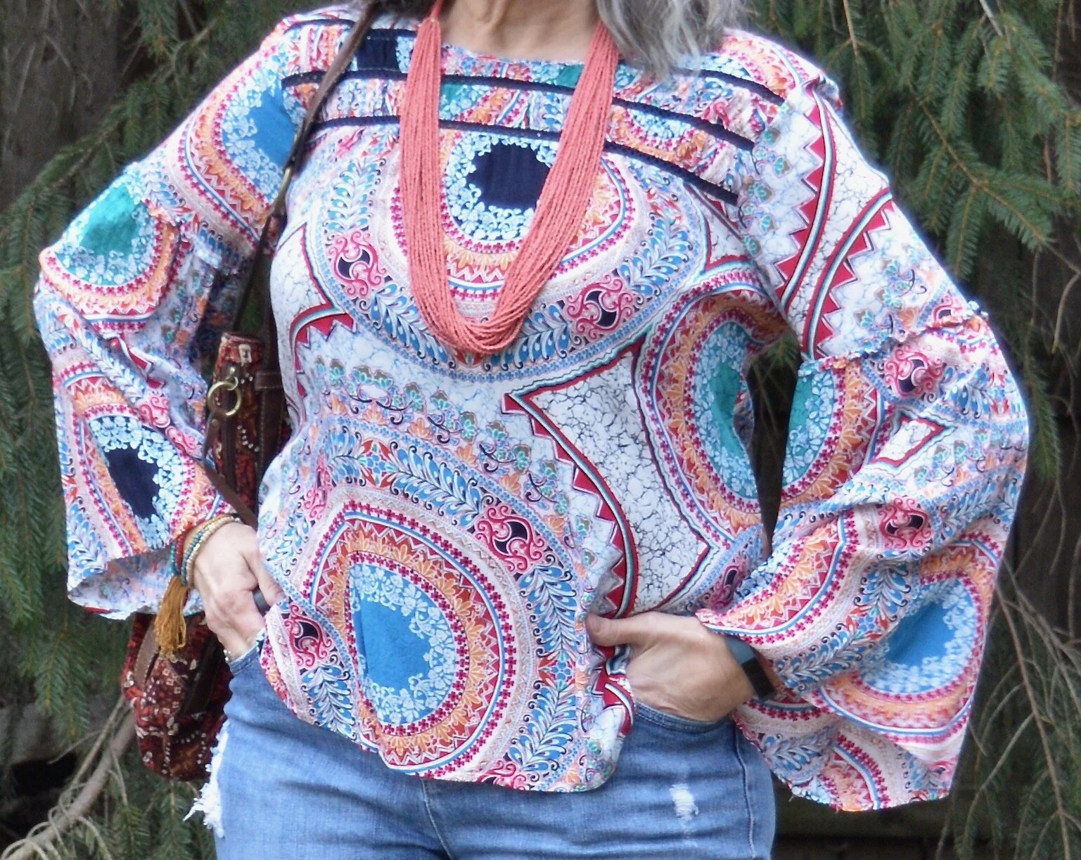
I found this pretty Westbound medallion print top a while back during a thrift run. I love the bright, happy pattern, the ruching on the front yoke and the unique sleeves.

Winter trend - boho chic

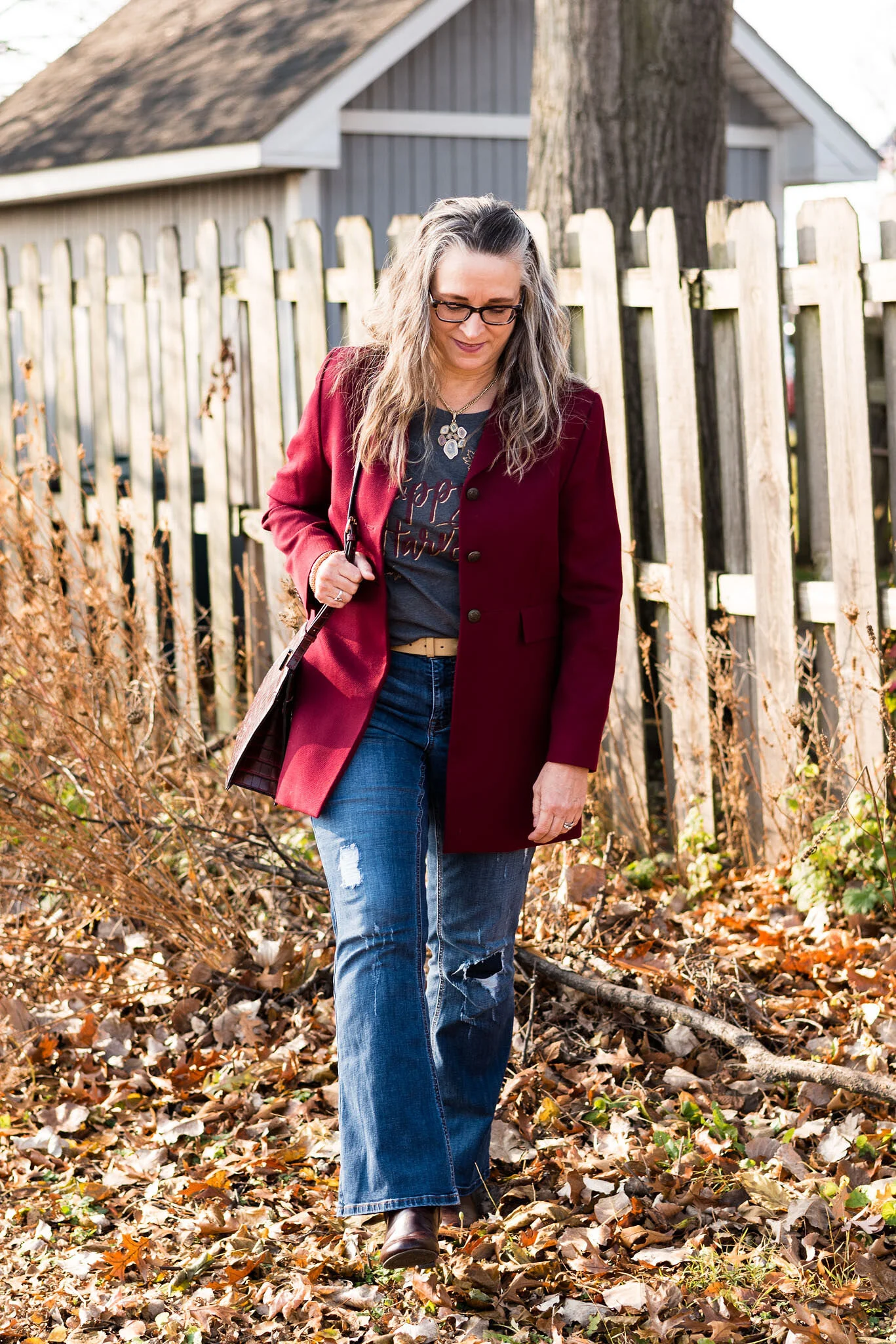
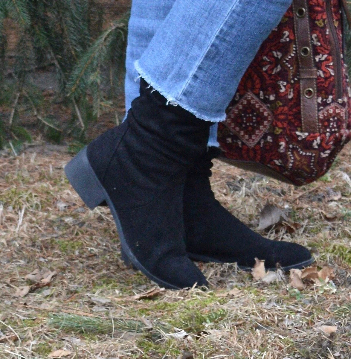
My Vera Wang distressed cropped jeans have made multiple appearances on the blog. You can see them with a holiday sweater, a red plaid jacket and a graphic tee and long fringe vest. I typically don’t wear them until warmer weather, but occasionally I will pull them out and use them with a pair of boots. Another thrift find, these are great for a casual look. If you look back at the other photos you can see they are starting to show some wear.

Winter trends - boho chic

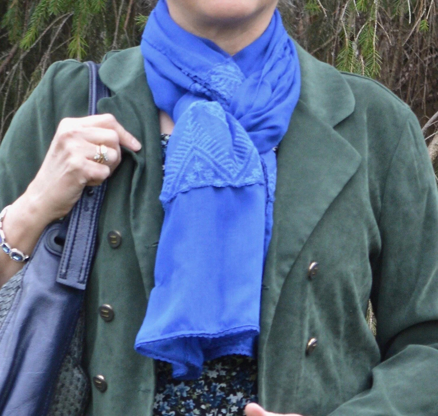
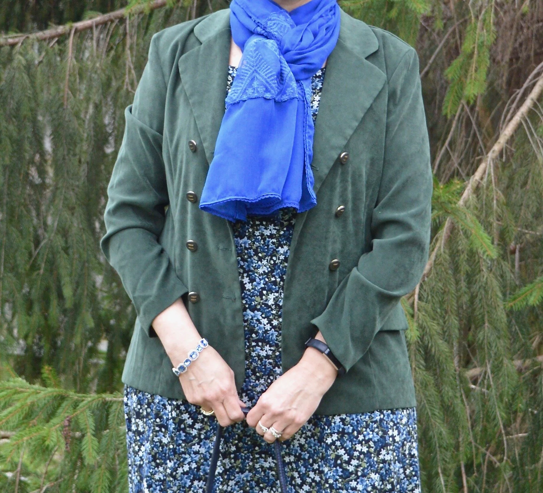
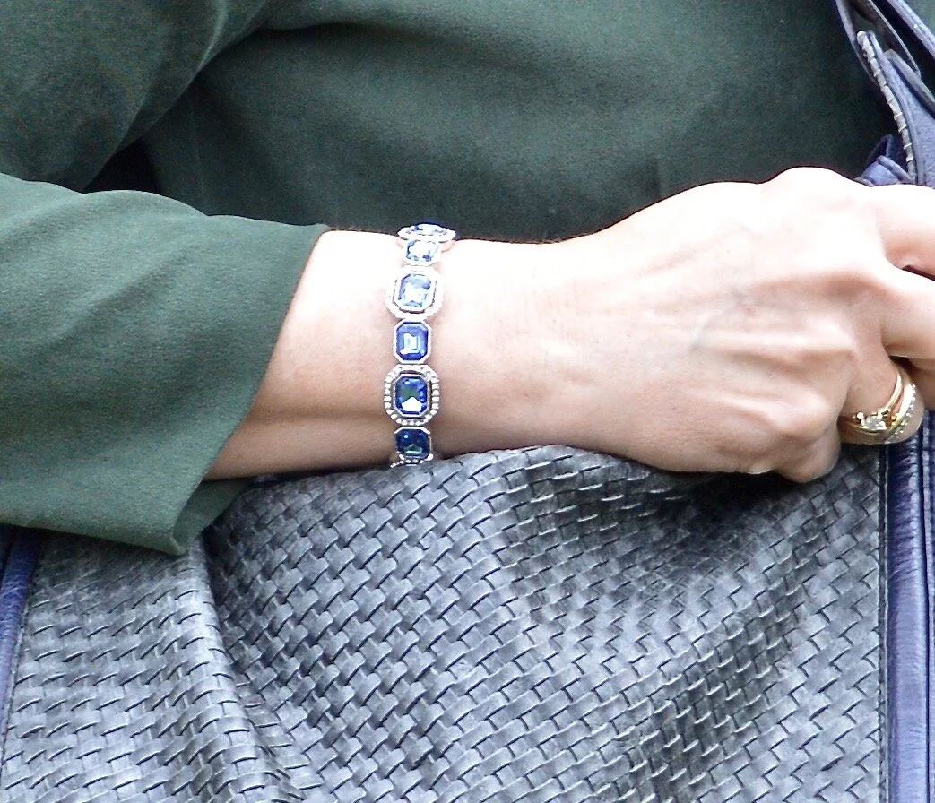
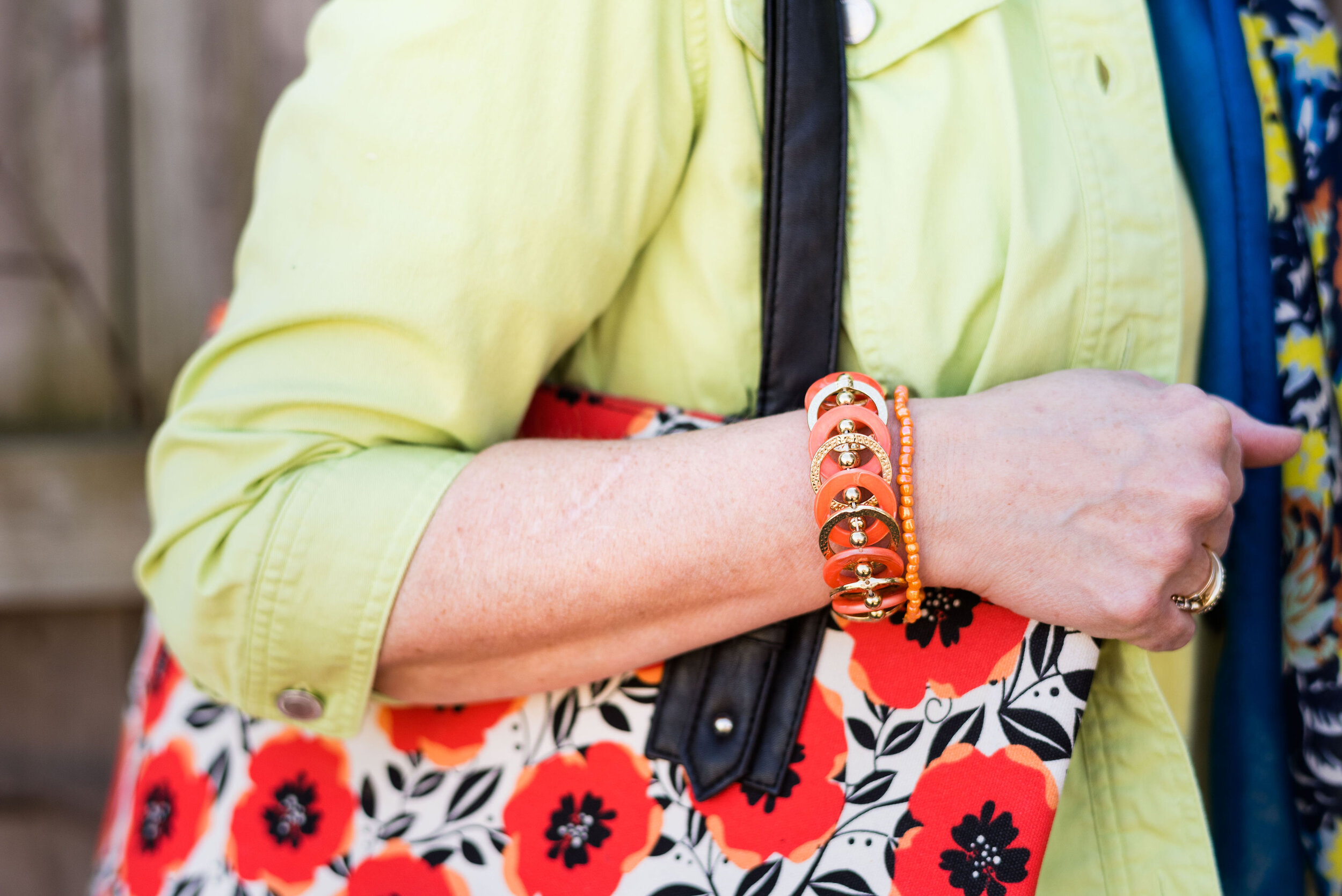
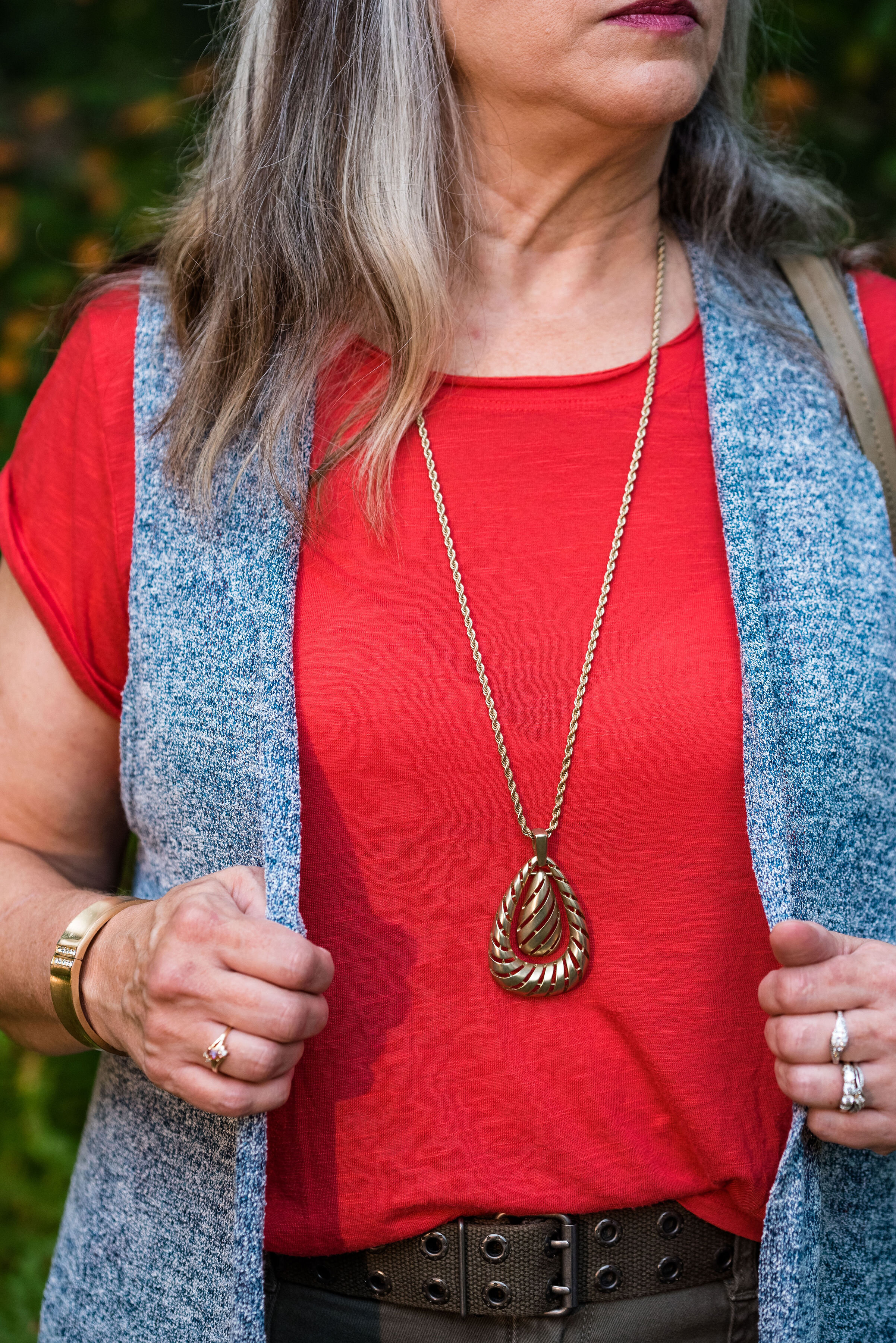
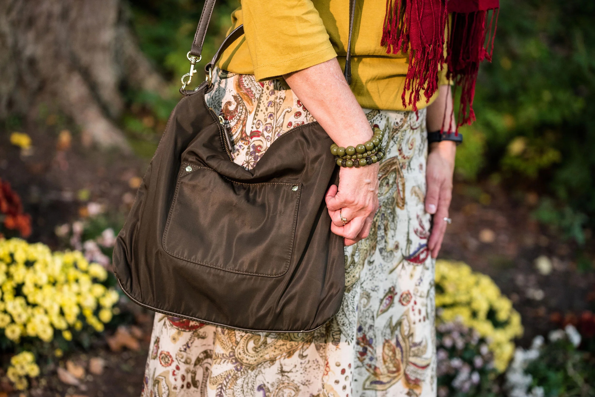
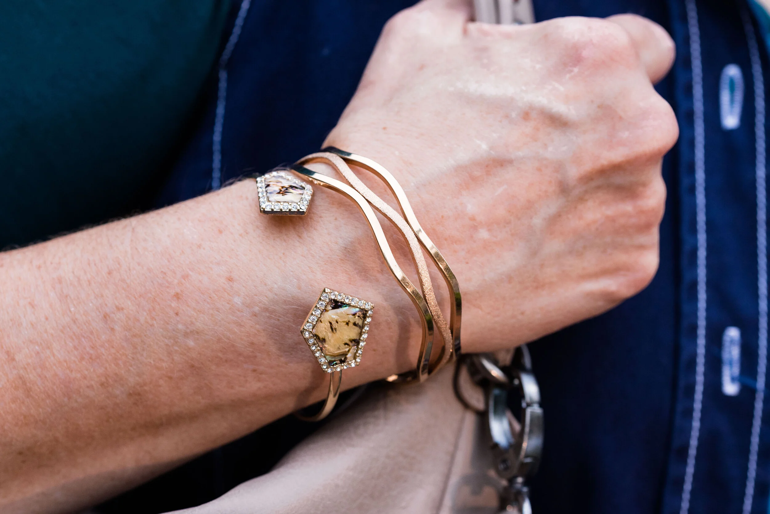
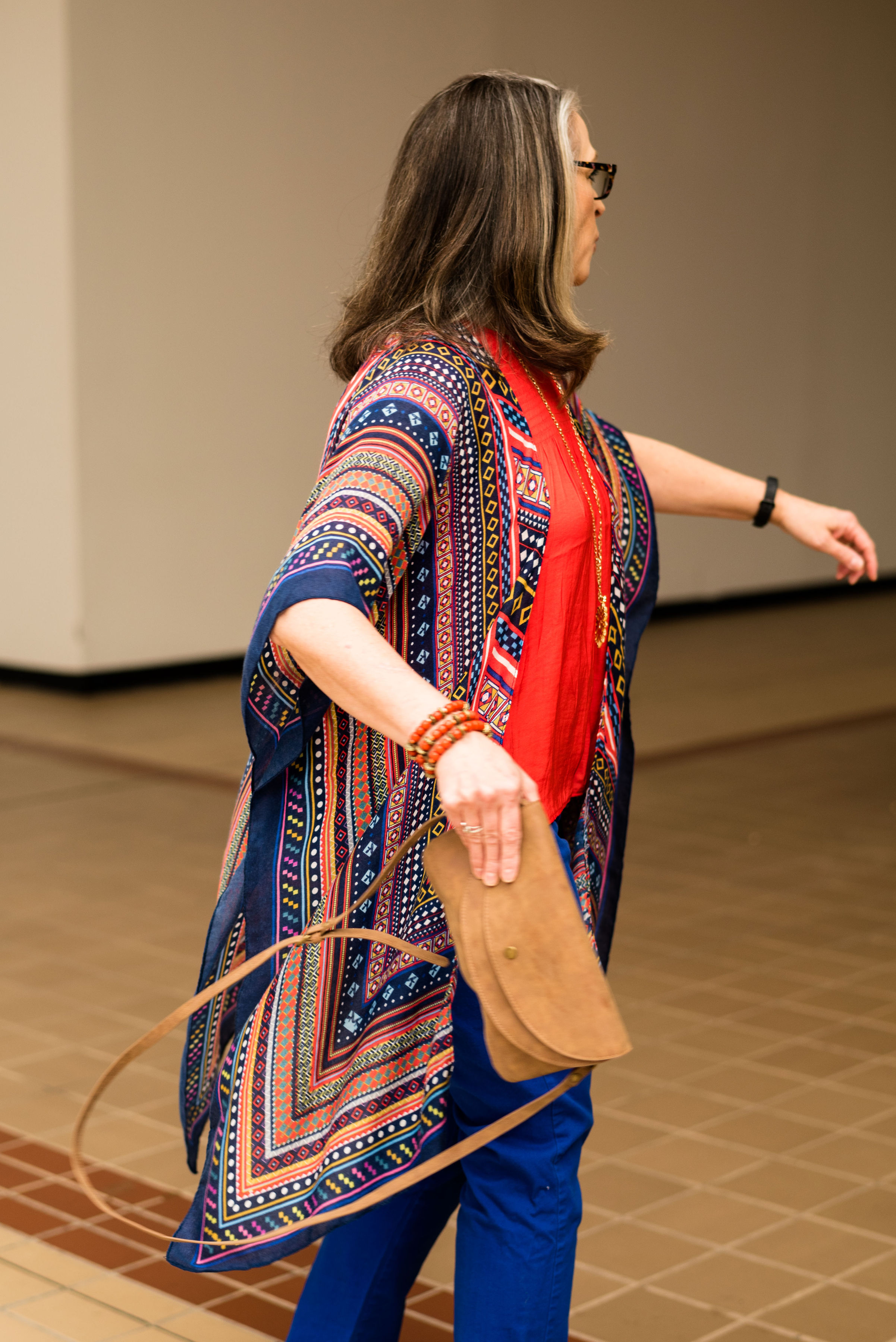
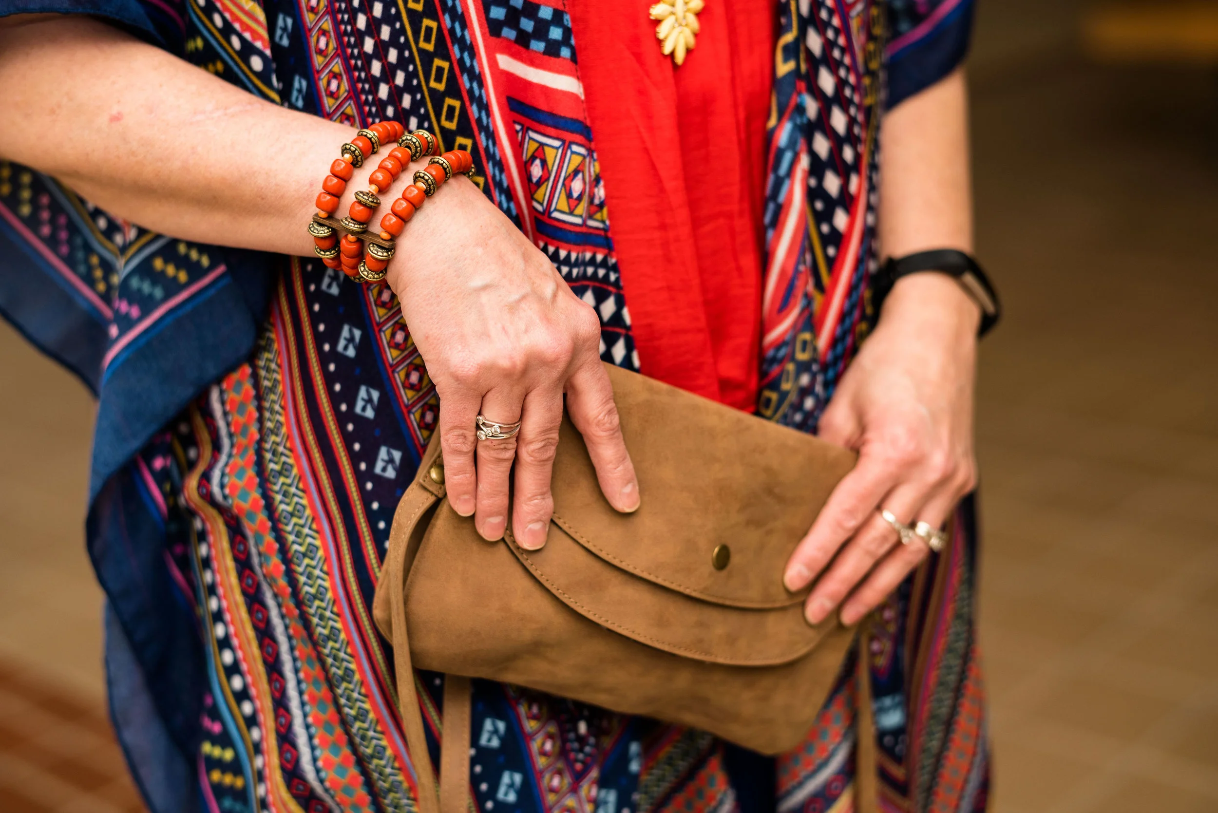
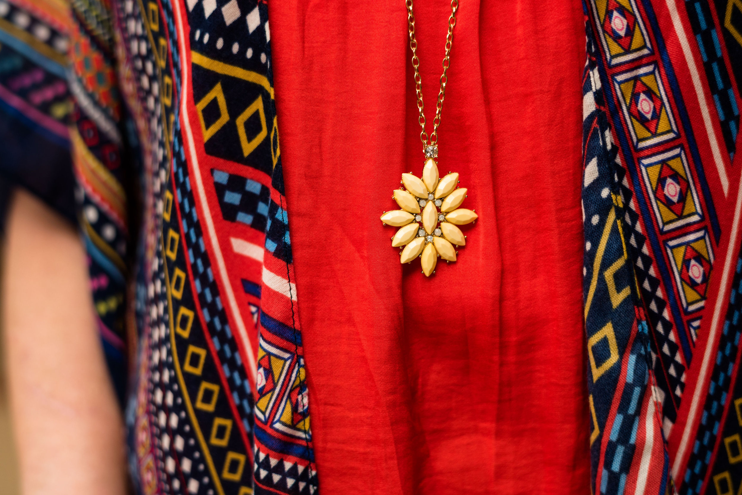
I chose beads for my jewelry, since beading also seems to be a bohemian statement.

Winter trend - boho chic

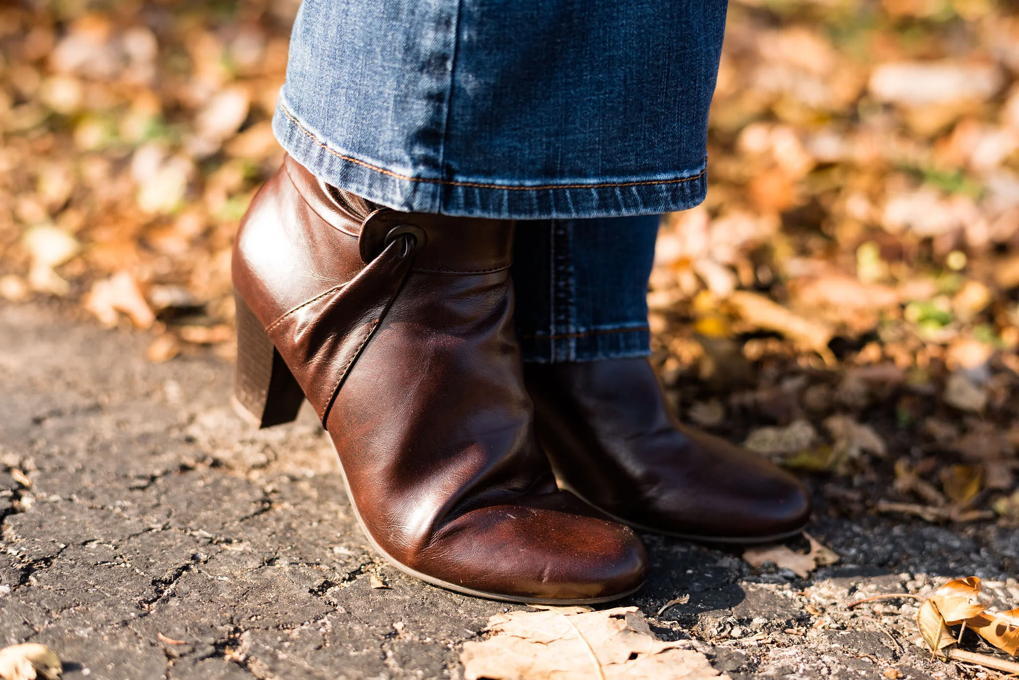
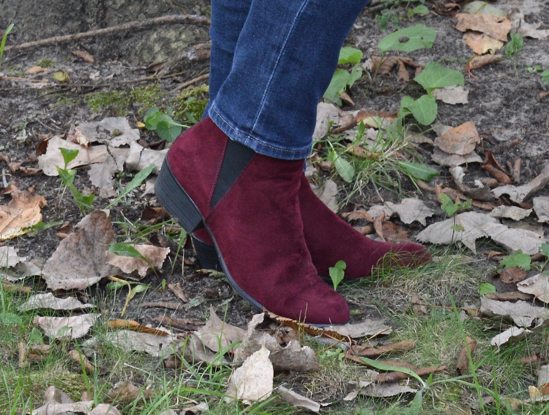
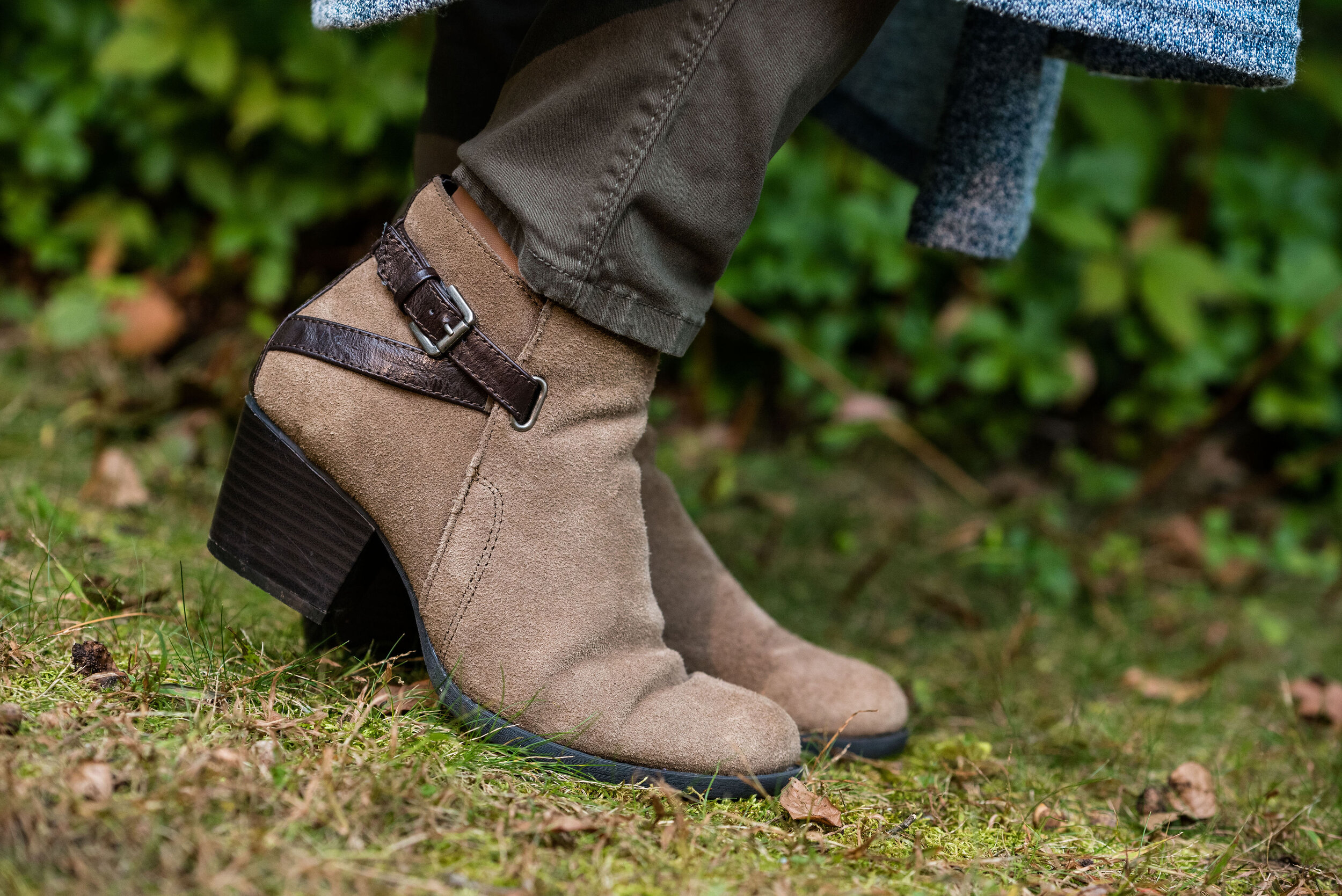
I chose my black suede Massini slouch boots, as they made me think of the 1960’s styles again. Suede has long been associated with the days of flower children and Woodstock in the form of fringe on bags, jackets and vests. Typically, the suede would have been a natural looking brown, but you get the idea.

winter trends - boho chic

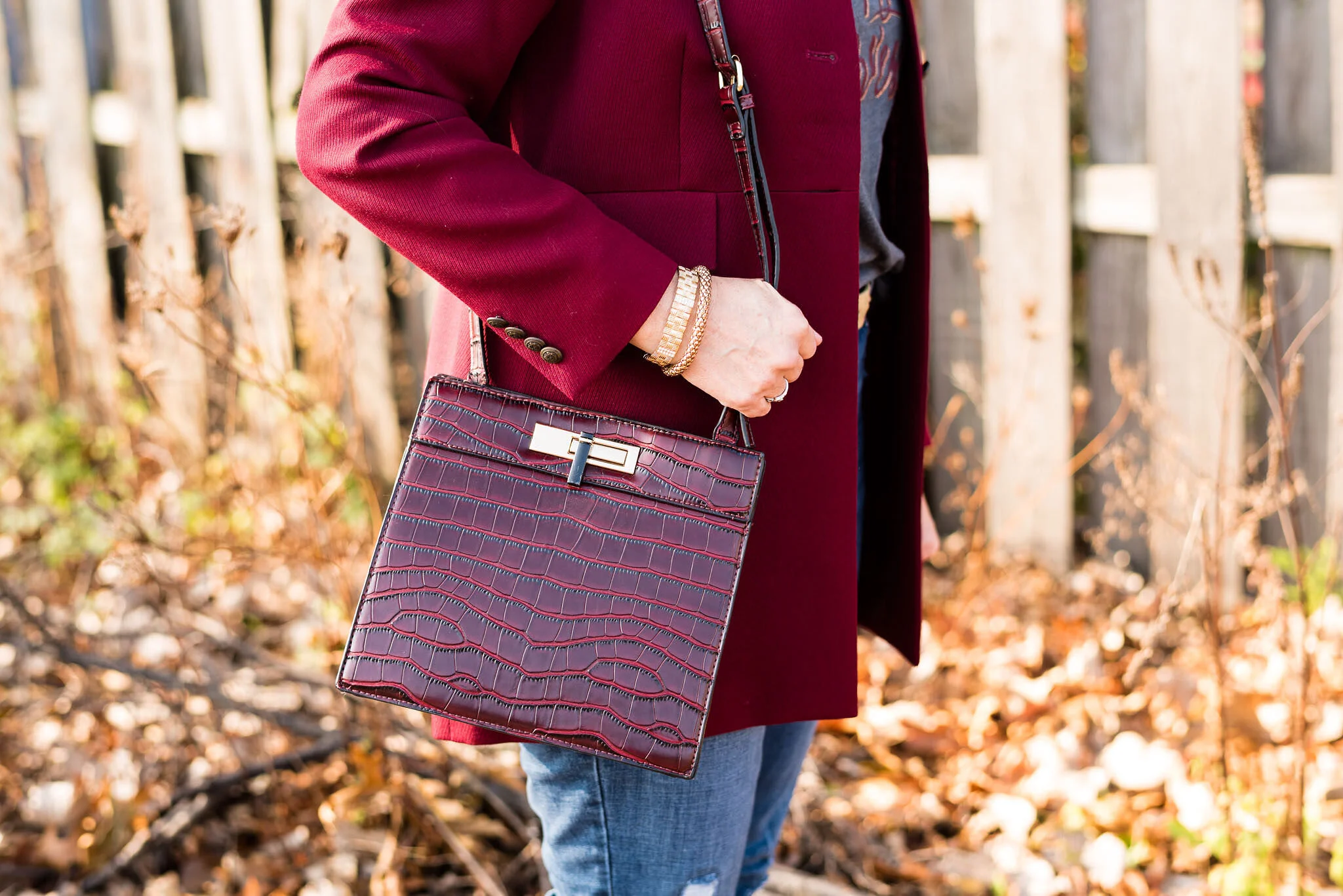
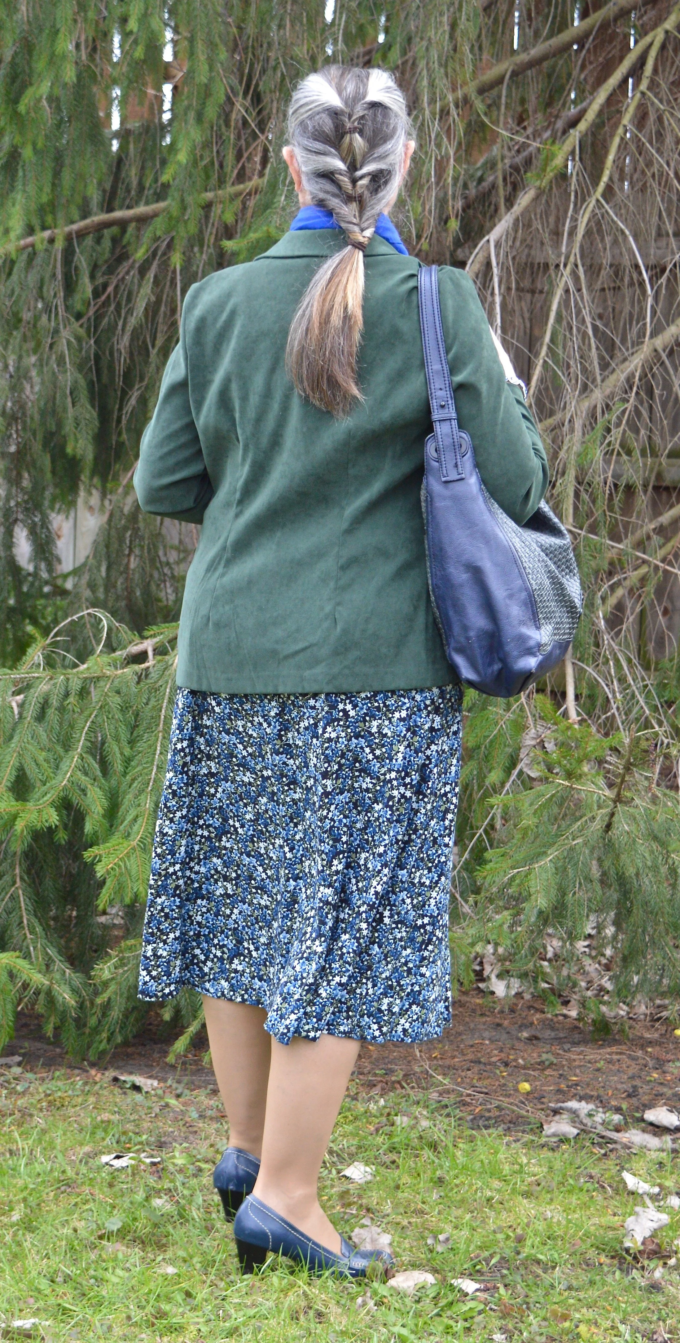
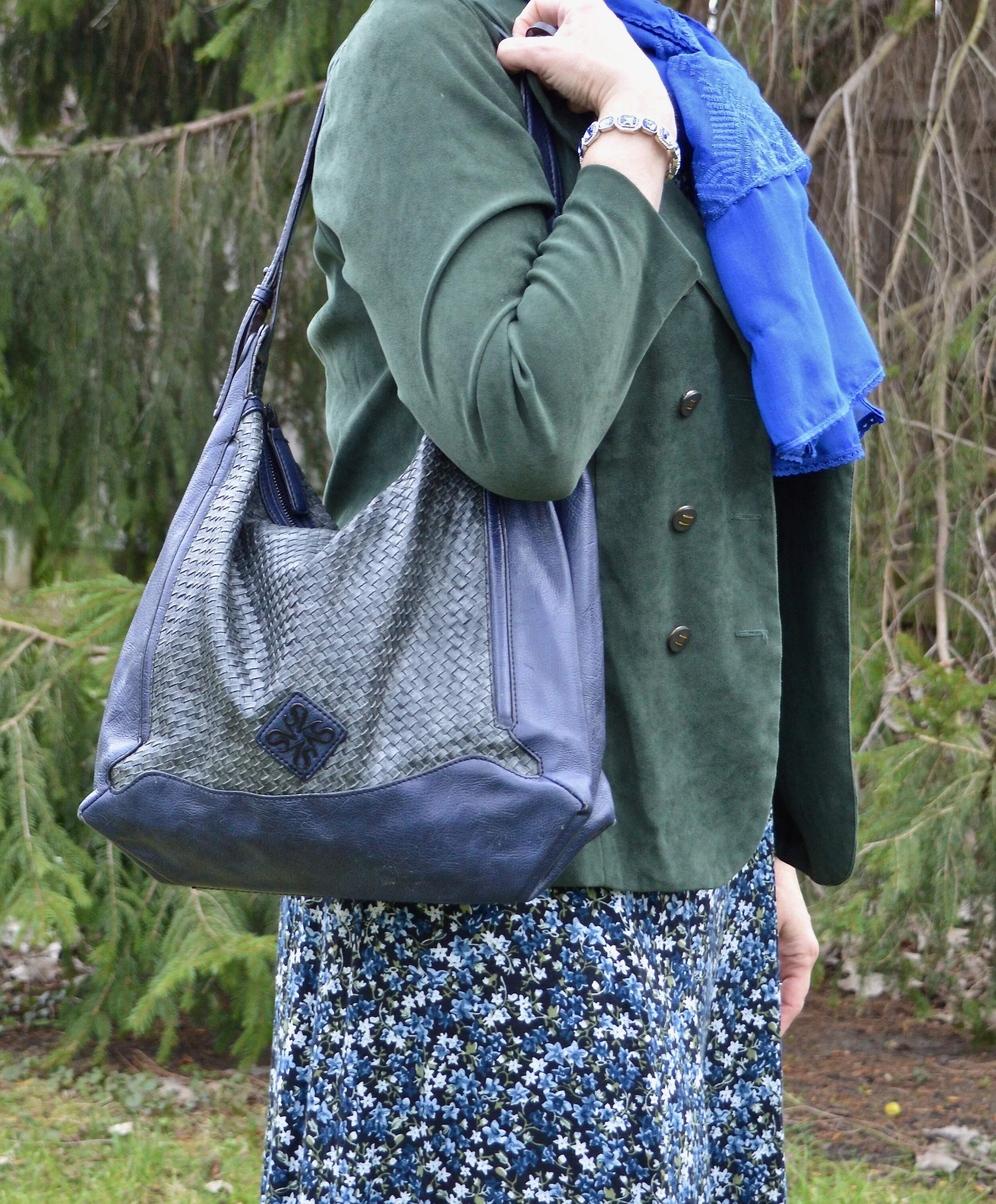
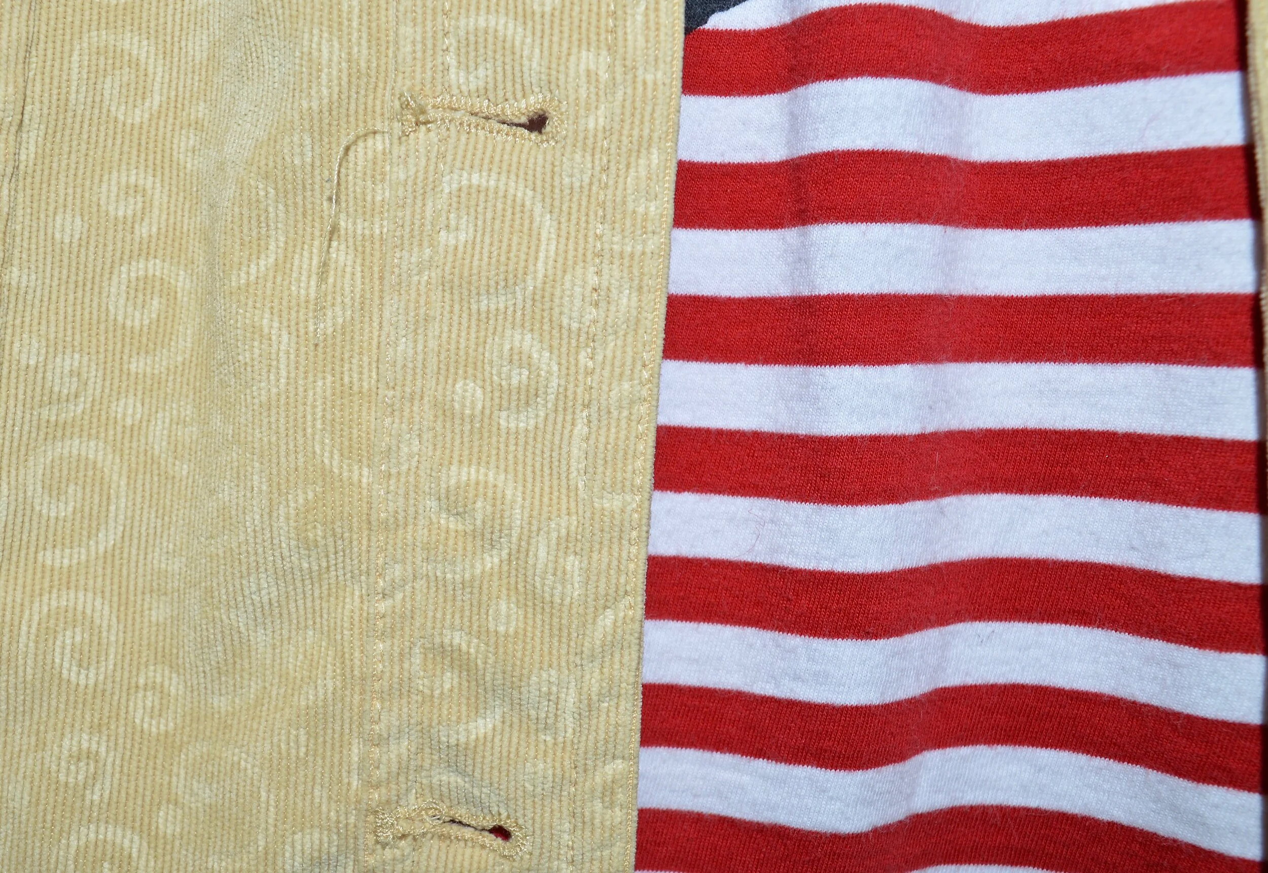
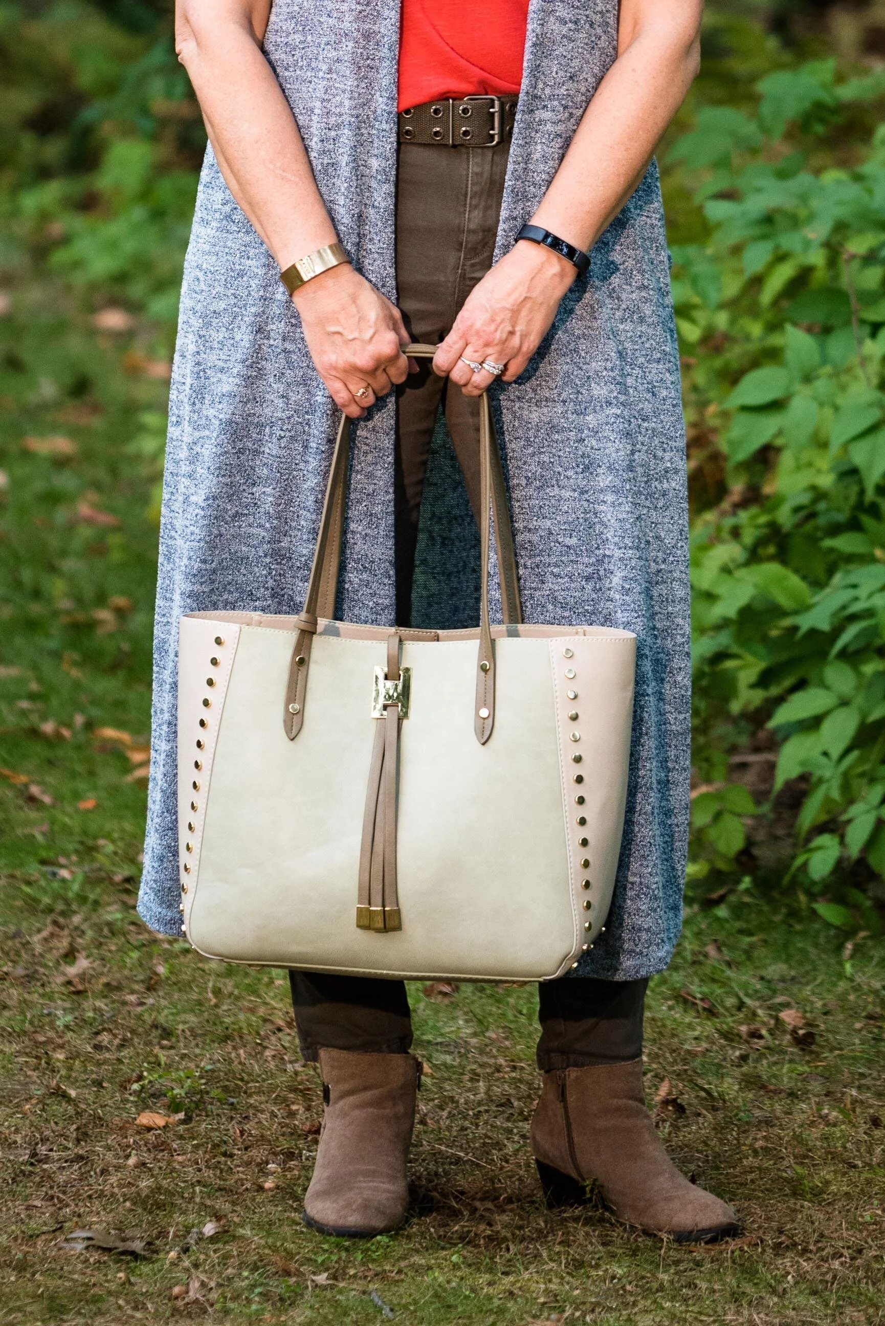
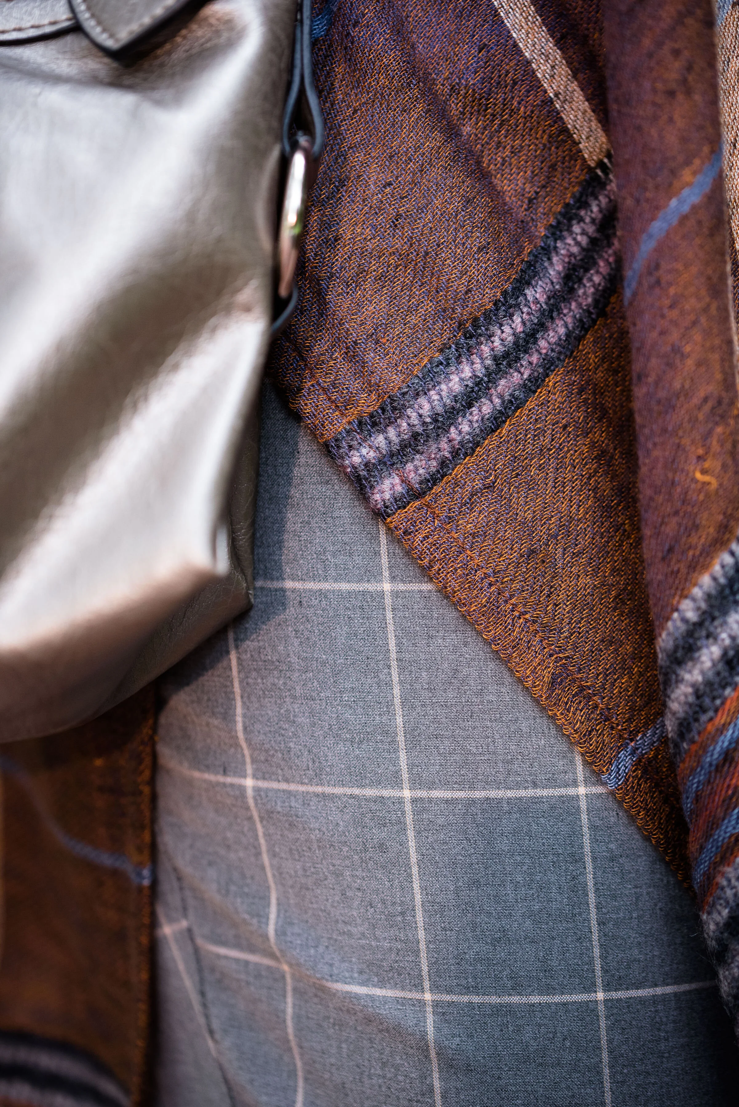
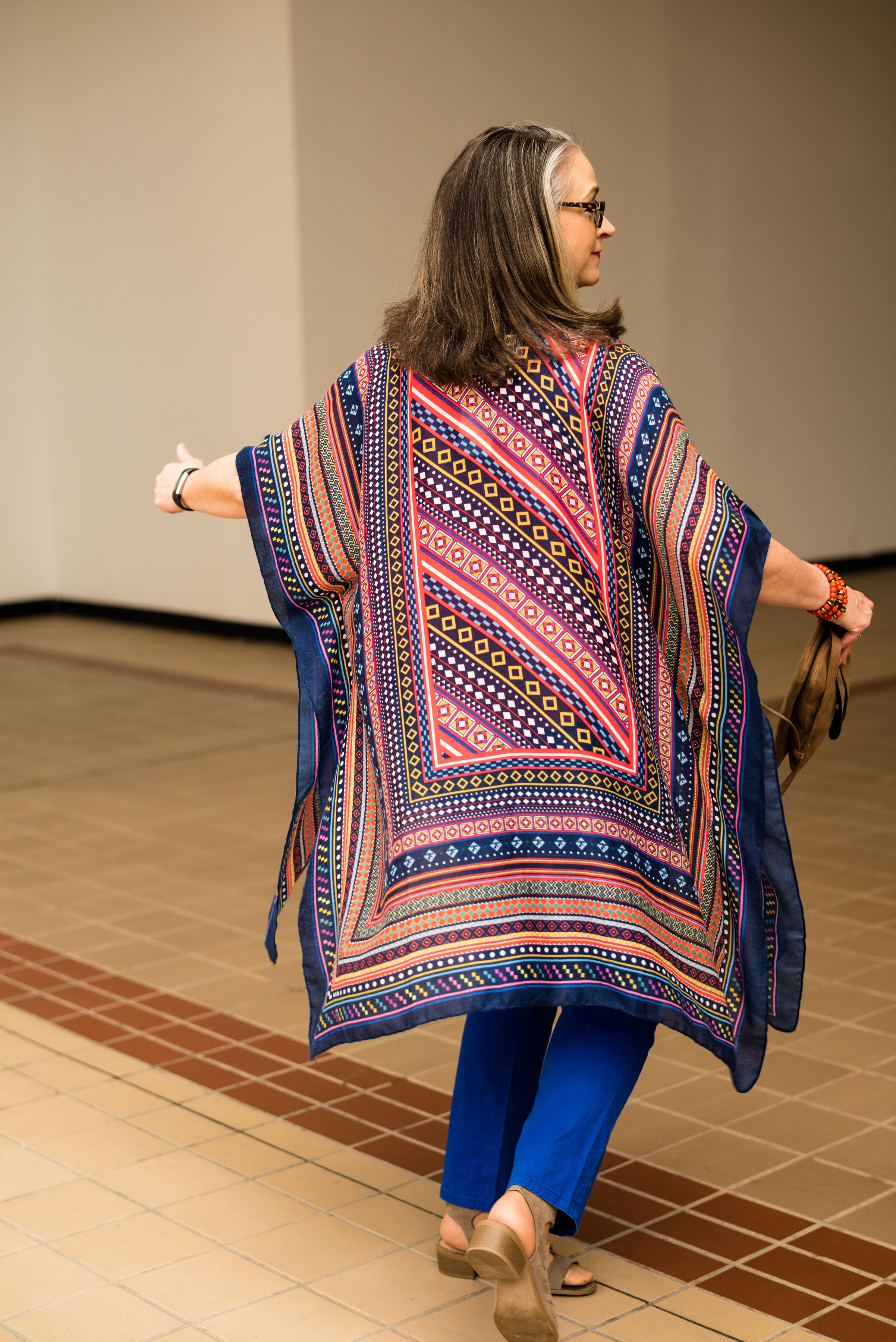
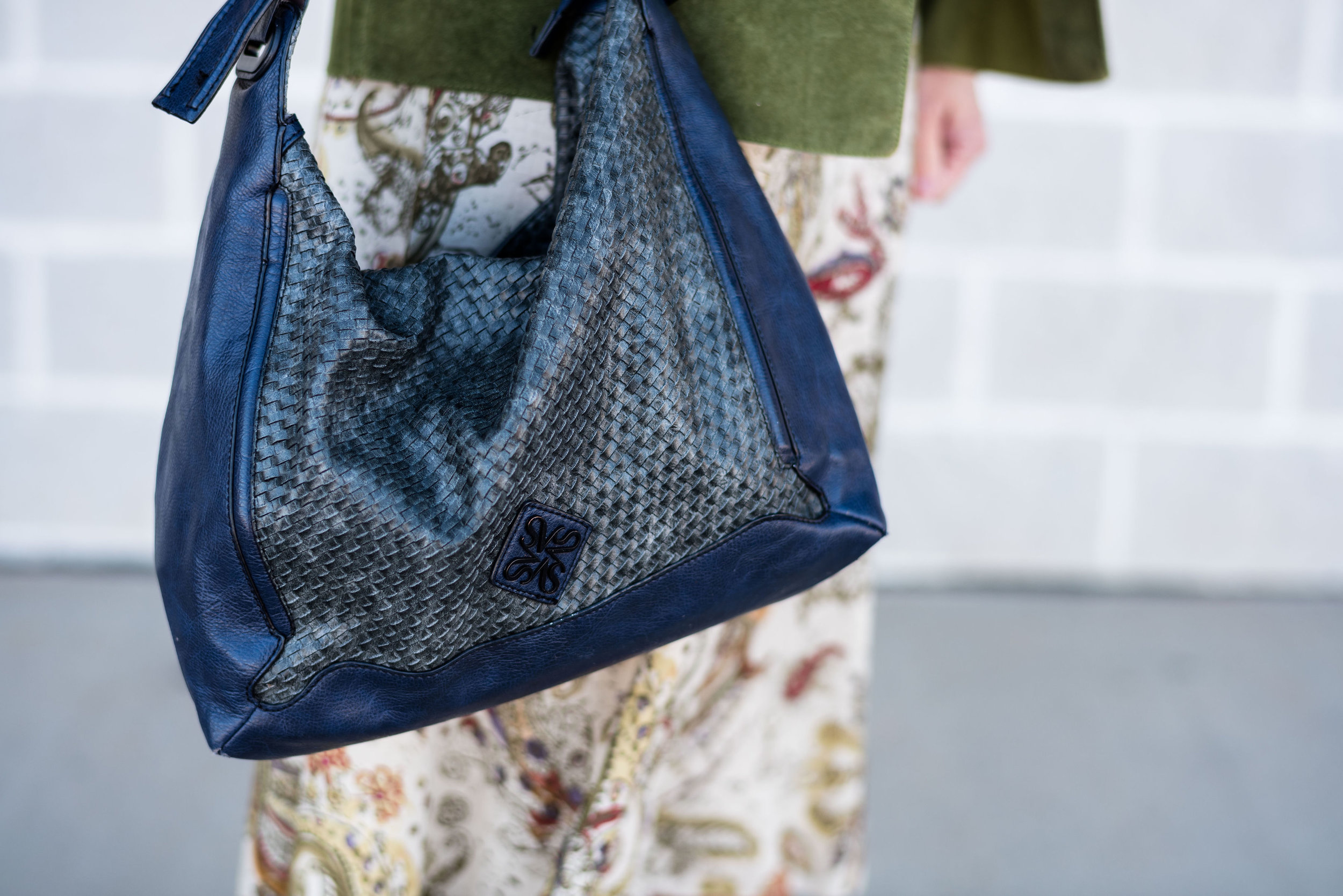
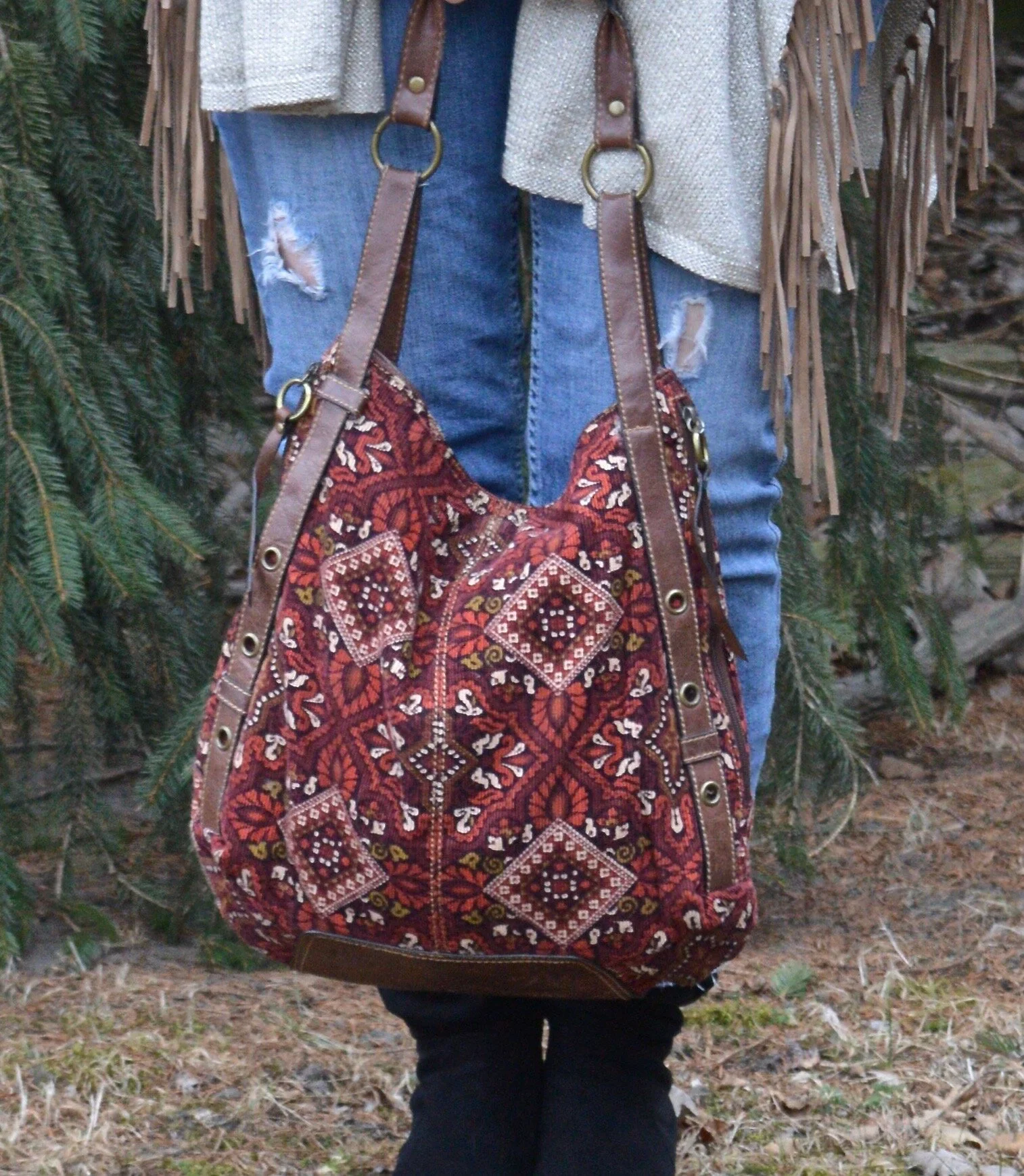
My bag is an older Liz Claiborne brand called Axcess. It doesn’t really match, but I thought the pattern, the shape, the colors and the corduroy material was channeling a bit of its own boho chic.

Winter Trends - boho chic

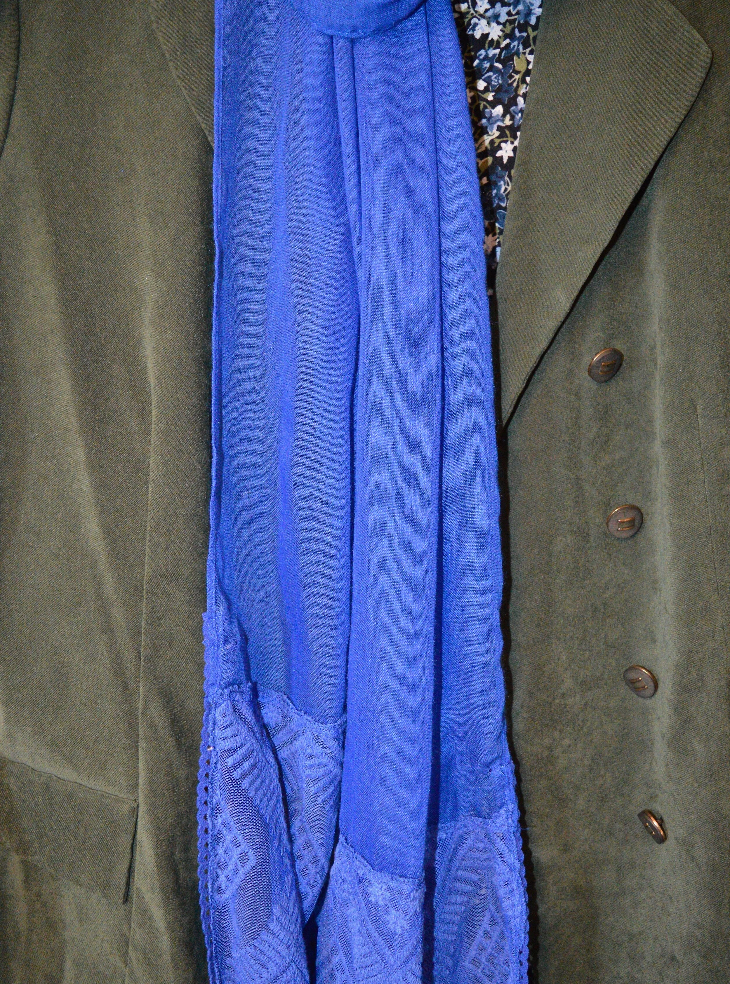
I ended up adding my Chico’s fringe trimmed cape. Not only did it add one last element of bohemian flair, but it helped keep me warm while I was messing with my camera. This piece was a clearance find via Chico’s online about four years ago. I can’t believe it’s been that long already!

Winter Trends - Boho Chic

Do you like the Bohemian trend? What are the things you like about it? What don’t you like about it? I’d love to hear your thoughts.

I am including a few shopping links for a plethora of things with that Boho vibe. I hope you will spend a little time shopping. These are affiliate links. All opinions are my own.

I will not be posting for the rest of the week. I have several articles on the docket for the community magazine I am writing for, I have to houseclean tomorrow and on Friday I am having minor surgery in the morning. I have a small mass on my upper left thigh that needs to be removed.

I hope you all have a good rest of the week and a great weekend. I hope to be back at it next Tuesday. I have a few ideas for posts, if I can’t get out and take pictures, so we’ll see how things go.

A Look Back at 2020 - My Favorite Outfits

Before I launch into a short series on some of the current winter trends, i wanted to revisit my favorite outfits from this past year. 2020 was a year unlike any other with the Covid Pandemic, racial unrest and the election overwhelming our newsfeeds. There were times where I just didn’t feel like being a blogger any more. I just wanted to crawl into a nice, cozy hole and not come out until all of the bad news went away. Fortunately, I didn’t do that. I had a sense that every single one of you that regularly follow me, needed a brief respite from all the bad that was going on around us. The normalcy of looking at and talking about faith and fashion, just seemed to be a good thing to do, so I kept at it.

I have a feeling that 2021 is not going to be a whole lot different from 2020. Change is going to continue to happen and change is what often pushes us well outside of our comfort zones. However, my little blog is still going to be here, as long as God gives me the health, energy and brain power to continue, I will do so. Many of you have become like family to me. Those of you who have regularly commented or even taken the time to send me a personal email have been a great source of encouragement to me, so thank you.

Here is a look back at 2020. As I have done before, I go month by month and pick out my faves. I’d love to know which outfit really inspired you.

January

Actual Amy - Waterfall Cardigan

Actual Amy - Waterfall Cardigan

Why I like It: This whole outfit is very much me. I love the rusty textures of the waterfall cardigan and faux suede boots. As you all know, I love my jeans and the striped long sleeve tee is the perfect choice for this ultra casual outfit. I also like the subtle print mixing going on between the stripes, snakeskin patterned bag and the speckled bead pendant.

February

Seeing Red - Thrifted Thursday - Burgundy Skirt

Seeing Red - Thrifted Thursday - Burgundy Skirt

Why I Like It: In all honesty, I had three outfits, all together, that I liked from February. I decided to post this one as my favorite, because it was totally unexpected. I honestly did not think this outfit was going to look as good as it did when I started putting it together. I wasn’t sure about the color combo or the mix of smooth faux leather pencil skirt with oversized textured sweater, but I absolutely love everything about this outfit. The color combo was perfect and the unexpected mix of textures and lengths honestly works well. The only thing I might have changed is the shoes. I’m wondering if a burgundy shoe would have been a better choice, but overall it worked. The other two that I liked from February were, Seeing Red - Red with Tan - Velvet Jacket, and Seeing Red - Actual Amy - Plaid Jacket.

March

Spring Trends 2020 - Maxi Dresses, Psychedelic Prints and Vests

Spring Trends 2020 - Maxi Dress

Why I Like It: March was the month I focused on the Spring Trends for the year. I will do that again this year. I like the boho, hippy vibe of this outfit with the medallion printed maxi dress, the striped tee and the denim vest. It just presents a fun, eclectic mix that makes for a great casual date night look.

April

Transitional Spring Outfit

Photo credit Rachel Christensen

Photo credit Rachel Christensen

Why I Like It: Who doesn’t like a kimono? They are just fun, fabulous pieces and every woman should have one or two in her closet. I have many more than that, but there are so many pretty styles, prints and colors. This pink, burgundy and white piece is no exception. I especially like the fringe on the sleeve and bottom hems. Every since I learned about print mixing, I have become obsessed and nothing pairs better than stripes and flowers. The burgundy colored accessories complete the look perfectly.

May

Pantone Spring/Summer - 2020 - Sunlight, Flame Scarlet and Ash

Photo credit Amy Christensen

Photo credit Amy Christensen

Why I Like It: There is nothing special about this outfit, other than it is something I would actually wear. Though all of the outfits I post are things I actually own, I don’t necessarily wear everything that you see, exactly as you see it. The reason for this is, I am trying to show a varied audience outfits that could be used for every day, work, going out or traveling. Right now I am not working outside the home and we really aren’t going anywhere, yet this outfit is something I would still wear.

June

Pantone Spring/Summer - 2020 - Tanager Turquoise, Heritage Blue and Blanc de Blanc

Pantone Spring/Summer - 2020

Why I Like It: This look is classic. It could be worn by any woman, anywhere. It is a great outfit for work, but could also be worn for a date night, or lunch with the girls. It also exudes spring and summer with the bright floral top, crisp white ankle pants and silver ballerina flats. The blue bag, beaded necklace and bracelets add fun matching elements to the ensemble.

July

Summer Outfit - Geometric Maxi Dress - Casual

Summer Outfit - Geometric Maxi Dress - Casual

Why I Like It: Honestly, I like this outfit, because I think it is fun! I love the hat, the tee and the geometric print on the maxi dress. The top is a light weight sleeveless tee material, so adding the other tee did not add bulk, weight or make it hotter. This would be a great look for traveling, going to the beach or on a picnic.

August

Outfit Inspiration - Dressed Up Casual Style

Outfit Inspiration

Why I Like It: What is not to love about this dressy casual look. The star piece is the thrifted kimono. It took a simple white tee and boyfriend jeans up to a new level of style. The fringe necklace compliments the purples in the kimono and the rusty orange bag the oranges. This was a nice transitional outfit for the waning days of summer.

September

Pantone Fall/Winter 2020 - Samba, Fired Brick and Sleet

Pantone Fall/Winter 2020

Why I Like It: September was another month where I had several favorite outfits, but this one still stands out as a winner. Once again, the combination of colors, as well as the print mixing, really goes a long way to making this dressier outfit perfect for the office. I also like how my last minute addition of blush accessories pulled everything together. Two of my other faves were, Pantone Fall Winter 2020 - Peach Nougat, Sandstone and Military Olive, and Color Play - Fall Mix.

October

Pantone - Autumn/Winter 2020 - London Palette - Samba, Tawny Birch and Sheepskin

Pantone Autumn Winter  2020

Why I Like It: I don’t wear neutrals all that often, but a combination like this really pops. The neutral palette colors of Tawny Birch and Sheepskin, combined with the bright Samba red makes an exceptional outfit. The added joy is that everything in this outfit is thrifted, except the pearls. When I can put a whole outfit together with thrifted pieces and it ends up looking like this, I am all for it.

November

Fall/Thanksgiving Outfits - Harvest Tee and Distressed Jeans - Dressy

Fall/Thanksgiving Outfit

Why I Like It: This outfit is just very me. I love wearing tees, and jeans and throwing a nice blazer and a pair of boots on really levels up a very casual outfit. The addition of a fun statement necklace and a cute bag also provide a dressier look, even with the distressed jeans.

December

A Dickens’ Christmas - The Ghost of Christmas Past

A+Dickens'+Christmas+-+The+Ghost+of+Christmas+Past.jpeg

Why I Like It: Out of my whole Christmas series, I think this outfit and these photos were my faves. Winter white is really trending right now and when I put these pieces together for my Ghost of Christmas Past persona, I didn’t realize how popular these creamy whites were. The outfit itself was cozy and in keeping with my love for pants and flats. Ha, ha.

There you have it, my favorite picks from 2020. What were your faves? I would love to hear back from you. Also, if there is anything you would like to see more of on the blog, or a different topic you would like me to talk about, please let me know.

I hope your New Year is off to a great start. Check back on Thursday for a look at some of the current winter trends.

Photo credit unless otherwise stated, Rebecca Trumbull Photography.

Fall/Thanksgiving Outfits - Harvest Tee and Distressed Jeans - Dressy

Yesterday was my eldest’s birthday. She ordered us lunch, which I picked up and took to her house, then after we ate, we went shopping. I have to say, I felt almost like life was normal for a few hours. We had fun and I enjoyed my time with her. I have always tried to take my girls shopping on their birthdays since they were fairly young. I used to take both girls and we would get lunch together, but then the gift buying would be for the birthday girl, although I would usually end up buying the other girl a little something too. Life is so busy and with the Covid complications it is hard to find time for those moments.

Today’s look is the dressed up version of my distressed jeans and harvest tee. I only made a few changes to elevate the look. I switched out my cozy sweater for a long burgundy blazer. I also donned a pair of heeled boots and grabbed a snazzier bag.

Fall/Thanksgiving - Harvest Tee and Distressed Jeans

This burgundy blazer is a thrifted Pendleton piece. I have, on several occasions thought to get rid of it, but it is such a classic, tailored piece that I keep hanging on to it, and this is precisely why. I love the way it looks with jeans. Obviously, it would also look good with a pencil skirt or more dressy trousers. The structured collar, more fitted waist, pocket flaps and detailed buttons really make this a class act.

Fall/Thanksgiving - Harvest tee and distressed jeans
Fall/Thanksgiving - harvest tee and distressed jeans

I kept the same necklace, but added a couple gold bangle bracelets and a gold belt to go with the gold on the tee.

Fall/Thanksgiving - harvest tee and distressed jeans

This thrifted, no name bag has such cute details. From the faux alligator print to the fun clasp and more structured shape, I knew I had to snatch it up. Just don’t tell my hubby! Ha, ha. He thinks I have too many sweaters, bags and shoes. Ha, ha. Why would he possibly think that?

Fall/Thanksgiving - Harvest tee and distressed jeans

These boots were also a thrift store find. They are Life Stride brand and I really like the brownish, burgundy color. It makes them unique from the typical black, brown or gray colors of many of my boots.

Fall/Thanksgiving - harvest tee and distressed jeans - dressy

What do you think of this outfit? Do you think the changes I made elevates the look or do you think because of the distressed jeans, it still looks ultra casual? I would love to hear your thoughts, so leave a comment or two.

Fall/Thanksgiving - harvest tee and distressed jeans

Here are the two outfits side by side. Which one do you like better?

Can you believe a week from today is Thanksgiving? I will confess, I have started listening to Christmas music. I just need that little bit of happy in my day to day life right now. I haven’t started decorating, but I hope to get to that soon.

I am leaving a few shopping links. Be sure to check those out. These are affiliate links. All opinions are my own.

Have a good evening everyone.

Photo credit Rebecca Trumbull.


Pantone Fall/Winter 2020 - New York Palette - Amber Glow, Green Sheen and Almond Oil

The colors in today’s post are more pastel, but still encompass colors we think of when fall comes to mind. Oranges and yellows are obvious as we look at the trees around us. The Almond Oil color is an off white. When I was growing up, we never wore white after labor day. Our white shoes, bags, dresses, skirts and pants were all put away until the next year. I can still remember going out shoe shopping with my mom before Easter, because that was always when we would get out our white shoes to wear to church. Obviously, those days are gone, but many people still like the idea of wearing white in the summer and darker colors during the cooler, darker months of the year. Almond Oil might be a good alternative for those of you who would rather stay away from a pure white for the Fall/Winter seasons.

Pantone Fall/winter 2020 - Amber glow, Green Sheen and Almond oil

You’ve see this Roz & Ali maxi skirt numerous times on the blog. I got this one at dressbarn. All the dressbarn stores in the area have closed, but I know they still have a pretty major online shop, so be sure to check them out. I used this skirt last fall in the Pantone London series styled with a purple sweater. You can also see it styled with an orange tank top and a brown moto jacket.

Pantone Fall/Winter - New York Palette - Amber Glow, Green Sheen and Almond Oil

My yellowish green short sleeve sweater is a thrifted Gap piece. It is a tad big, but I like the slouchy look of it and tucking it in works great with this skirt.

Pantone Fall/Winter 2020 - Amber Glow, Green Sheen and Almond Oil

The cream colored jacket is a thrifted NY&Co. It is made of a stiff fabric with a good amount of stretch to it. It almost has a bit of a linen feel to it and it tends to be more wrinkly.

Pantone Fall/winter 2020 - Amber Glow, Green Sheen and almond oil

I opted for the orange for my jewelry. I love this tiered statement necklace and hardly ever get to wear it. I have two more in different colors. It just makes a lovely statement, especially in this outfit. It really makes the whole outfit look cohesive. Many people don’t want their outfits to have that kind of matching game, but personally I love it. There is a symmetry and completion about an outfit when it has this sort of cohesion.

Pantone Fall/Winter 2020 - Amber Glow, Green Sheen and Almond Oil

My top handle bag is another Stone Mountain thrift find. It seems to match the Almond Oil color even better than the jacket.

Pantone Fall/Winter 2020 - Amber Glow, Green Sheen, and Almond Oil

Once again, I pulled out my Sonoma suede ankle boots. The small heel gives me less of a chance for tripping over the skirt. Ha, ha.

Pantone - Fall/Winter 2020 - Amber Glow, Green Sheen and Almond Oil

What do you think of these two colors? When my daughter was editing these photos, she said it seemed these two colors would grate on each other, but she really liked the outfit. Pairing a print with a solid in these colors definitely makes the outfit softer and easier on the eye. This is something I would definitely wear…if I had some place to go. Ha, ha.

Pantone Fall/Winter 2020 - Amber Glow, Green Sheen and Almond Oil

I hope you are enjoying this series. If you are leave me some love in the comments. I hope you are having a good week.

Graphic and photo credit Rebecca Trumbull.

Feel free to shop a few links below. These are affiliate links. All opinions are my own.

Color Play - Fall Color Mix

What better time to play with color than in the fall? I love the bright hues of red, orange and gold, as well as the moodier tones of burgundy, brown and forest green. I have found many Pinterest pins on fall color combos, so drew some of my inspiration from those. The pieces I chose are perfect for this in between time where the days can still be warm but the mornings and evenings cool. Today, took a turn towards the cooler side and I am typing this post with a cup of hot cocoa at my side. I need the milk for calcium, but thought this morning I would add a little chocolate and pop it in the microwave. Yum!

Color Play - Fall Color mix

When I started looking for my Warm Spice colors, I knew I wanted to used my burgundy SO sweater, which was a Kohl’s purchase last year. I have another one just like this in a light pink, which you will see on the Pantone series coming up. I also got two sizes. This one is a large and the light pink is an extra large. I liked the way each fit for different reasons, so I got both. Ha, ha. You can see the side detailing below.

Color play - fall color mix

Yellow was the next color in the Pinterest Warm Spice Pin, so I chose a thrifted short sleeve Sonoma tee with a small white pattern.

I also, knew I wanted this to be a cozy, casual look so opted for my Rock & Republic straight leg jeans.

Color play - fall color mix

The third color is orange. I wasn’t sure, at first, how I was going to pull that off, and then I saw this infinity scarf hanging in my closet. This was another thrift store find. I love getting scarves, bags and jewelry at thrift stores, because there are so many different choices and you can’t be the prices. I absolutely love athe fall vibe of this piece. It contains all those colors I think of when I think of fall and the pattern is reminiscent of the 1970’s. You can see I did a bit of print mixing as well.

Color play - fall color mix

With the mix of orange in the scarf, I thought it would be fun to add another pop of orange away from my face with the addition of this thrifted orange suede bag. It may be small, but this little number packs a powerful color punch.

Color play - fall color mix

It seemed the natural choice to also reach for my Spirit faux suede ankle boots, to balance out the whole look. I love all of my boots, but especially enjoy wearing these ankle boots in the late summer and early fall. Only 5 days until the first day of fall. Whoo, hoo. I have already noticed Halloween decorations in yards and Christmas items in the stores. Eye, yie, yie.

Color play - fall color mix

The only jewelry I added was a fun charm bracelet with a bit of fall color.

Color play - fall color mix

What did you think of this outfit? Would you wear these colors together?

Color play - fall color mix

I hope you are having a good week. I have been busy. My grandson’s 10th birthday was Tuesday. He was supposed to have a small friend party, but one of the boys got sick and with our #covidlife as it is currently we had to cancel. We hope to reschedule for a future date. My husband and I went over and I made a cake and he got to open some presents. This weekend, we are going out to Maumee Bay State Park for one night at the lodge as a part of the birthday celebration. Quintin’s mom and he will go with us and our other daughter and her hubby will join us for dinner. We find ways to make life work, even in our current circumstances.

I am including a few shopping links. These are affiliate links. All opinions are my own.

I hope to get my faith post up tomorrow, so be sure to check back for that. Have a great weekend!


Summer Outfit - Geometric Maxi Dress - Dressy

Today’s outfit revolves around a maxi dress my mother-in-law passed along to me. She had bought it for herself, but then didn’t really like it as well as she thought. When she showed it to me, and asked if I wanted it, I said sure. I actually wasn’t sure how to style it, or rather, didn’t give it a lot of thought since I haven’t been reaching for my maxi dresses all that often. If it was just me and my hubby and I wasn’t hanging out with a nine year old, I might wear one more frequently, as they are comfortable and a fun way to dress for summer. However, when I started thinking about featuring a few summer outfits for the blog, I wanted to show off this fun maxi dress.

Summer style - geometric maxi - dressy

The dress is Calvin Klein brand and features a tank style top attached at the waist to an a-line style skirt featuring a geometric pattern of rectangles and squares. The bottom is fully lined. Macy’s carries a broad line of dresses with all lengths and styles. I’ll include a few shopping links below.

The pink shrug doesn’t match the pink in the dress, but I felt like it worked. This shrug is a thrifted Forever 21 piece. It is sheer and flowy, making it the perfect way to dress up and outfit.

Gold accessories just seem to take the outfit up another notch. My thrifted gold necklace and clutch go with the gold beads and baubles on my wrist.

Summer style - geometric maxi - dressy

I do get rather silly when we are taking pictures, especially when we are in a place where other people are around. I already feel silly getting my picture taken, but then if there are people walking by, I feel even sillier. Ha, ha. Anyway, sometimes, my daughter catches me in my shenanigans. I felt like I was up against the firing squad wall. This is another spot at the Toledo Botanical Gardens.

Summer style - geometric print dress - dressy

By the time this is posted I will have gotten a much needed hair cut. My ends are looking terrible and I need to get some of the length taken off. Have you been to the hair dresser recently? I know for a lot of people that was one of the first things they did after things started opening back up a bit.

These are a different pair of black wedge sandals, also thrifted, but a brand called Connie.

Summer style - geometric print dress- dressy
Summer style - geometric maxi dress - dressy

What did you think of this outfit? Do you like to wear maxi dresses? They are an easy piece to wear and create a whole outfit with only one piece and a few accessories.

I’ve included some shopping links for you to look at. These are affiliate links. If you click on a link, I get a a few cents. All your clicks are appreciated since blogging is a hobby for me, I don’t make money, but it is nice to get a few dollars here and there. All opinions are my own.

Photo credit Rebecca Trumbull.


Pantone Spring/Summer 2020 - Recap

I hope you have enjoyed this Pantone color series. Today I just want to show you a recap where you can see all the outfits in one post. Here we go.

New York Palette

Pantone Spring/Summer 2020 - New York Palette

Classic Blue, Chive and Navy Blazer

Faded Denim, Orange Peel and Lark

Sunlight, Flame Scarlet and Ash

Biscay Green, Saffron and Brilliant White

Mosaic Blue, Coral Pink and Brilliant White

Cinnamon Stick, Grape Compote and Navy Blazer

London Palette

Pantone Spring/Summer 2020 London Palette

Classic Blue, Beetroot Purple and Oyster Mushroom

Pantone Spring/Summer - London Palette

Flame Orange, Blossom and Cuban Sand

Pantone Spring/Summer 2020 - London Palette

Yellow Iris, Rose Brown and Cuban Sand

Pantone Spring/Summer 2020 - London Palette

Storm, Fiery Red and Blueberry

Pantone Spring/Summer 2020 - London Palette

Blush Beauty, Bossa Nova and Blanc de Blanc

Pantone Spring/Summer 2020 - London Palette

Tanager Turquoise, Heritage Blue and Blanc de Blanc

Pantone Spring/Summer 2020 - London Palette

Which color palette was your favorite? Which outfit did you like the best? I would love to hear your thoughts. I hope you all have a wonderful weekend. We will be celebrating Father’s Day with our kids on different days, since schedules wouldn’t allow for everyone getting together. God bless each of you with peace and joy.

All graphics and London color palette photos by Rebecca Trumbull.

Pantone Spring/Summer - 2020 - Biscay Green, Saffron and Brilliant White

Today’s outfit revolves around three colors from the Pantone Spring 2020 New York Palette that are described as flavorful, cleansing and pristine. Saffron is a rich orangey yellow color, while Biscay Green leans towards a more soothing aqua. Both colors to me are perfect for summer and when paired with a bright white give a warm weather, party ready look.

When I saw Biscay Green on the palette, I knew that I had nearly nothing in my closet that was this pretty greenish blue, so I started keeping an eye out at my local thrift stores last fall for an item or two that would add this medium green to my closet. This oversized button-up caught my eye. It is a brand called Zylos, which appears to be a past men’s brand in dress shirts and ties. As I have mentioned before, I am liking the oversized button up shirts for a fun, casual way to dress up a pair of jeans or in this case a skirt. For this outfit, I tied the bottom of the shirt and buttoned two buttons.

Pantone Spring/Summer 2020 - Biscay Green, Saffron and Brilliant White

The Saffron colored Apt. 9 tee, is another thrift find and I have used it on the blog before for another Pantone series. Last year a similar color was called Mango Mojito and I used this same tee to represent that color. You can see that post here. I thought the color was independent enough that I didn’t need the whole tee shirt to show. The bright pop of yellow orange stands out quite nicely with the peaceful green.

Pantone Spring/Summer 2020 - Biscay Green, Saffron and Brilliant White

I’ve styled this skirt on the blog before. It is St. John’s Bay brand and I got it at JC Penney a few years ago. I was drawn to it for two reasons. The first was that it was white and it was lined. It is so hard to find white you can wear in the summer that doesn’t require a slip or some other underwear that won’t show. This skirt is completely lined. You can still see through it if you have on a dark pair of panties, like red, black or navy, but for the most part they won’t be noticeable. The other reason was the beautiful lace detailing. It is a very pretty piece and can be dressed up or down, depending if you are feeling classic or boho.

DSC_0012 (2).jpg

I have had this layered beaded necklace for a while. I really like it, but don’t think to wear it that much. When I saw how well it complimented this outfit I was excited to include it. So much of my jewelry I can’t even remember where or when I got it. Ha, ha. Maybe that’s because I have so much of it. I also included a navy beaded bracelet, which you will see in the next picture, to pair with the navy beads in the necklace.

Pantone Spring/Summer 2020 - Biscay Green, Saffron and Brilliant White

I found this bag at another thrift store when my girls took me thrifting back on my birthday in January. Ahh, those were the days, when we could get together, go shopping and get lunch. Hopefully, those days will come again. I love the color and feel of this bag. It is a brand called Stone Mountain and is very well made. It has a long handle which can be adjusted, so you can either use it for a shoulder bag or a cross body bag.

Pantone Spring/Summer 2020 - Biscay Green, Saffron and Brilliant white

My perforated peep toe shoeties are Sonoma brand and from Kohl’s. I need to paint my toes. I don’t wear sandals a lot because my feet are like my legs and covered with nasty looking varicose veins. Last fall I went to a vascular surgeon who did an ultra sound to see what could be done. Unfortunately, most of the veins in my legs are in the same bad condition, so having them worked on would provide some temporary relief, but over the course of time, they would develop the same issues. I am putting that off for now, but one day may revisit the idea.

Pantone Spring/summer -Biscay Green, Saffron and Brilliant White

Do you like these colors? How would you wear them? Remember you don’t have to put the colors together as I do. I am simply trying to show you what the colors are for the Pantone seasons and ways you might combine them. Do you wear white in the summer? Do you have a white skirt or do you prefer to wear pants, capris or shorts? I’d love to hear from you, so leave a comment or two.

Graphic designed by Rebecca Trumbull.

I’ve included a few shopping links for you. These are affiliate links. All opinions are my own.

Have a great day and be safe as the world begins to open back up!

.

Pantone Spring/Summer - 2020 - Classic Blue, Chive and Navy Blazer

As usual, the names for the Pantone colors always amuse me. Classic Blue is pretty normal. Obviously, Chive makes me think of green onions and as you will see, the color is a pretty dark green. Navy Blazer is one of the classic colors and is your typical navy staple, which many of us have a piece or two in our closets. Since Classic Blue is the color of the year, I decided to start with it. The idea to combine it with Chive was a natural progression when I pulled out this thrifted summer midi dress.

This outfit centers around this thrifted OliviaRose dress that I got numerous years ago. Its pretty floral print combines blue, white and green a black background. I didn’t even have to think when I pulled this out of my closet. Classic Blue and Chive were the perfect pairing. An outfit like this really can be worn year round.

This bright blue scarf was gifted to me for Christmas and I used it to introduce the Pantone Color of the Year back in January. You can see that post here.

My faux suede blazer has a little more of a blue undertone than the Chive color, but I thought it was pretty close. This thrifted ISB Inc. blazer is meant to have a double breasted appearance when buttoned, but my figure right now will not allow for that. However, I think it looks just as nice left open since there are buttons on both sides.

You can see in the next picture how nicely the blazer fits through the back. I like that it is more fitted, rather than boxy. I was also trying something different with my hair.

This thrifted Simply Vera/Vera Wang bag has made multiple appearances on the blog as has my thrifted Relativity loafer heels.

I also added my sparkly Classic Blue bracelet, which was also a Christmas gift.

If you are not into wearing bold, bright colors, then these colors would be the perfect choice for you. You could easily make this pairing more summery by adding a white skirt or crop pants instead of the darker print dress. You could also wear head to toe white with a Chive colored blazer or sweater and just a few pops of Classic Blue jewelry. There are so many options, so never say never to any color.

Do you like these colors? How would you wear them? Is this the sort of outfit you would wear? If not, what kind of outfit would you put together? I would love to hear back from you. Things are a little lonely around here. Ha, ha. I am sure you all can relate. We really need the world to get back to something more normal, even if it is not perfect.

I hope you enjoyed this post everyone. Until next time. Stay safe and healthy.

Graphic by Rebecca Trumbull.

I’ve included a few shopping links just for something to look at. These are affiliate links. All opinions are my own.


Pantone Spring/Summer 2020 - Intro: The New York Palette

Here we are again, looking at the Spring/Summer color palette for 2020. The Pantone Color Institute puts out two color palettes twice a year; the New York palette and the London palette. The palettes for Spring/Summer come out in the fall of the year before. The Fall/Winter palettes comes out around January. They are thinking much further ahead than I am. I am just gearing up to talk about the Spring/Summer palette and the fashion industry already has their color choices and styles made up for the fall and winter. It is very hard to keep up, so I don’t even try. I try to show you the seasonal trends, as those are more time focused. Colors, in my opinion are not restricted by times or seasons, although, I am one to pull out my lighter colors for spring and summer and my darker colors for fall and winter.

This Spring/Summer palette is full of colors that just about anyone can be pleased with. If you are a pastel kind of gal you will love the lighter shades of pale Sunlight, Coral Pink and Faded Denim. If you enjoy bright and bold, you’ll want to reach for Flame Scarlet, Saffron and Orange Peel. Maybe you enjoy tones that are more earthy, then you will like Chive, Classic Blue and Cinnamon Stick. Looking for color inspiration for resort wear, then take a peek at Grape Compote, Mosaic Blue and Biscay Green. In addition the Institute always includes a classic color palette if you prefer the main part of your outfit to be more neutral and conservative. This year those colors include a deep tan, called Lark, and a dark blue called Navy Blazer. Bright White and Ash are also classic options on the New York palette.

A good way to combine these colors is to take a navy blazer, a gray skirt and then add a bright pop of color like Orange Peel or Saffron in a blouse, jewelry or a bag. If you don’t normally like a bold approach to your wardrobe, this is a great way to still stay in your comfort zone, but add color in small bursts.

The way I will be pairing these, as usual is taking two of the colors and adding a pinch of a classic color to keep things from getting to outrageous. Just so you have a teaser as to what is coming up, here are a few pictures of my color combos.

Classic Blue and Chive

Faded Denim and Orange Peel

Sunlight and Flame Scarlet

Saffron and Biscay Green

Coral Pink and Mosaic Blue

Grape Compote and Cinnamon Stick

I’ll talk more about these colors and how I decided to put the outfits together when I post each of these outfits over the next couple of weeks.

Be sure to come back on Thursday to see the first outfit in the Pantone Spring/Summer 2020 New York palette.

Have a great day!

Graphic provided by Rebecca Trumbull.


Spring Trends 2020 - Color Play - Neon

When playing with color I have found the biggest obstacle to overcome is the fear that something won’t go together; that it might look silly or clownish if I have too many colors boldly blasting their way down the street. Obviously, right now, it really doesn’t matter what we are wearing because most of us aren’t going anywhere. I still like to get up, shower, put on make up, do my hair and at least put on a pair of jeans and a top and sweater or sweatshirt. A few days I have even put on jewelry, just because I could. It really doesn’t matter if anyone else sees us. It comes down to what makes you feel happier and more comfortable during this difficult time.

Since neon is once again trending on the runways this spring and summer, I decided to look to Pinterest for some inspiration. As most of you know, when you want to find something on Pinterest you just go to the website and search. I put in neon outfits and got all sorts of ideas, some of which were definitely way outside my style zone. Since I couldn’t find exactly what I was looking for, I made up my own outfit. This is what I came up with.

This outfit would be perfectly acceptable at most work establishments and certainly helps to brighten up a drab, gloomy day. These bright red thrifted Faded Glory pants made their blog debut a few weeks ago in last months Color Play post.

This pale neon yellow short sleeve v-neck sweater was a Gap thrift find a few years ago. It is a very comfortable piece and I purposely chose the oversized look. As I told you last week, I have been getting into more oversized pieces. They are comfortable and if chosen carefully don’t add the illusion of extra pounds, but actually hide some of the more prominent bulges. Ha, ha.

My pale neon green jacket is a thrifted Christopher and Banks piece. The 3/4 length sleeves make it a great piece for spring and even for summer, when you need a little something extra for overly air conditioned offices and restaurants.

I thought the addition of this scarf was the perfect way to pull the pieces together. You could think of the this outfit as a type of color blocking, where you wear two or three plain colors next to each other. The addition of a printed scarf and bag add a touch of visual interest.

I have had this large tote bag for a long time. I don’t even remember where I got it, although I think it may have been something JC Penney’s carried in their luggage department a number of years ago and they were phasing it out. I believe I got it quite cheap. It is very roomy and easily fits my computer bag, notebooks and other writing necessities. Now that I think about it, I need to switch over to this bag from my buffalo check tote that I am currently using.

I threw on a few neon orange bracelets, just for fun.

Once again, I am featuring loafers, as they are trending right now. These are a thrifted pair of Nine West brand. Kohl’s started carrying Nine West brand clothing and shoes last fall, so I was pleasantly surprised when I pulled these out and realized they were that brand. I’m trendy and didn’t even know it. Ha, ha. I’ll include a few shopping links at the end if you are interested in adding a cute pair of loafers to your shoe collection.

Would you wear an outfit like this? Do you like neon colors? If you want to add neon to your wardrobe, but don’t want to go all out, look for a bright neon scarf, sweater or bag. I’ve provided a few shopping links below for a few fun neon items.

These are affiliate links. All opinions are my own.

Photo credit Rebecca Trumbull.


Seeing Red - Color Play - Patterned Scarf

Color inspiration can come from so many different places. In this monthly column, I am trying to force myself to look in different places for color. The typical places we look to are our clothes. For instance a pattern on a top or sweater, might be the basis for the rest of your clothing piece choices. Last month I chose a watercolor painting and table center piece as the inspiration for my outfit. I am hoping to inspire you to look in places you never thought of looking for color inspiration.

This month, I decided to inspire you with something probably every one of us has in our closets; a scarf. This particular scarf is full of color and not typically colors we would want to put together into an outfit, but why not? Think outside the box. Most of us use our scarves at accessories, without ever really letting them inspire our whole look. I decided to give it a try, so be sure to let me know what you think.

This scarf is perfect for this month’s Seeing Red theme. It is full of burgundy, red, shades of purple and a yellowy green. Using this as my spring board, I dove into my closet to see what I could find. This is what I came up with.

These bright red Faded Glory pants are a recent thrift find. I like ankle pants as the weather gets warmer and I thought this color would be fun for spring and summer. I used to never wear bright colored pants like this, but I have decided that life is too short to not wear the fun pants. I still reach for my simple blue denim jeans the most, but a bright color once in a while is a good way to stretch ourselves, whether it be on the bottom or the top.

My lavender colored button up shirt is a thrifted Merona piece. The longer yellow sweater was a clearance find at the end of last winter season from Forever 21. I don’t shop there too often, because most juniors sized clothing, does not fit me very well, but with the advent of bigger, roomier fashion, I can find things once in a while that don’t make me look like I’m trying to dress like I am still 21; 39 maybe, but not 21. Ha, ha. The sweater is soft and cozy, the perfect topper for these very chilly winter days.

I know the fashion industry and many bloggers are already talking about spring and the upcoming fashion trends. I understand the need for being ahead of the game and often at this time of year we are yearning for the change of seasons and the warmer days of spring. However, the reality is, it is still, very cold! This morning when I checked the temperature, it registered at 18, but the “feels like” temp was only 9. Um, I’m still going to wear my warm, cozy sweaters, thank you very much. To even think about baring my ankles or talking about shorts and less layers makes me feel cold.

I’ve had this red and gold charm necklace for a long time. It is the perfect piece to add a pop of red color against any top. I love pendant necklaces and I am fortunate enough to have a long enough torso to wear them. I especially like these charm type necklaces with all their different fun charms, beads and dangles.

You’ve seen this cranberry colored bag just recently on the blog (you can see that post here), and I realized it would be a great color match for the berry color in the scarf. This thrifted Libby Edelman bag was brought to my attention by my thrifting bestie back in Buffalo, NY one time when I was back visiting my mom. As much as my hubby prefers that I never bring a purse into the house again, once in a while a girl has to bring it home.

My olive SO ankle boots are making another appearance. These ankle boots are the most comfortable, versatile pieces and are the one purchase I would strongly recommend. It doesn’t have to be the SO brand, but I have found Kohl’s carries SO and Sonoma boots and I have really liked both. They are comfortable, fairly durable and have a great price point, especially if you can get them on sale or on clearance. I’m including shopping links at the bottom of the post, so be sure to check those out. Now is a great time to get boots for next season as many of them are on clearance. The great thing about ankle boots is you can wear them well into the spring with cropped pants, rolled pant hems and even skirts.

Do you have a scarf in your closet that you would love to build an outfit around? Give it a try. It is always fun to challenge your fashion brain to think beyond your norm. Many people might say they don’t want to change the way they do things, but there is something fun and satisfying about doing things differently and having it turn out well. Give it a try and let me know how you did.

For some beautiful scarves check out Nora Minassian at The Jacket Society. She has some beautiful printed pieces like this blue and white multi, ivory, pink and orange, tan and orange, multi-leaf print, and many others. Nora’s scarves are large and can be used as a shawl too, which would also be perfect for an outfit like this.

I love to hear your thoughts and I really wish there was a way to get more people to interact on the blog. The reason I say this, is not just for my benefit, but you all can be an encouragement to each other. After all, isn’t that what this is all about? For those of you who do comment, thanks again. For those who don’t, I would never want you to feel pressured. I know life is crazy busy. I often delete posts from other bloggers, because I just don’t have the time to comment, but I always feel good if I do. I feel like I am reaching out and encouraging a friend I’ve never met.

Thanks again for all your support.

Photo credit Rebecca Trumbull.

The shopping links included are affiliate links. I get a few cents if you click on a link and a little bit more if you purchase something through one of my links. I appreciate every click.

Have a great weekend and I hope the sun is shining where you are.

Pantone - Autumn/Winter - 2019 - London Palette Recap

It’s time for a recap of the all the Pantone - Autumn/Winter -2019 - London Palette colors. There were things about these colors that I liked better than the New York Palette, but each of them had colors that I felt comfortable wearing. I’ll explain my favorite from this series after a review of the outfits.

Outfit 1 - Merlot and Antique Moss

Outfit 2 - Cranberry and Chicory Coffee

Outfit 3 - Summer Fig and Bluestone

Outfit 4 - Butterscotch and Grapeade

Outfit 5 - Crabapple and Forest Biome

Outfit 6 - Galaxy Blue and Hazel

I am having a hard time picking just one outfit from this series that I liked the best. I really liked Cranberry and Chicory Coffee. I have always been a fan of browns, but I just love the result when it is combined with the medium pinky red of Cranberry. I also like the long line of this outfit and I think the long Rutabaga open front cardi helped with the illusion.

My next fave would be the boho vibe of Butterscotch and Grapeade. If you would have asked me a few years ago if I would wear an outfit with these two colors together, I would have said no way. Yellow and purple? You have to be kidding, but there is something whimsical about this outfit and the color combination is only part of it. The colors are happy and fun, but the print of the skirt, the fringe bag and the fun textured boots really give this outfit its bohemian style.

Finally, I really like the last outfit. Even though, I wouldn’t necessarily wear a color like Hazel all on it’s own, I do like the way this color pairs so well with the grays and the blues in outfit. I also like the subtle plaid print mixing. It is obvious, but it doesn’t overwhelm the eye like some print mixing is capable of doing.

Well, I’ve told you my favorites, now tell me yours. I love to hear your feedback.

i hope you enjoyed this Pantone - Autumn/Winter series. If there is anything else you would like to see, with regards to the Pantone Color Institute you can check out their website. Just click on the link.

Have a great Tuesday!

Photo credit Rebecca Trumbull.


Pantone - Autumn/Winter - 2019 - Summer Fig and Bluestone

You’ll remember from the New York Pantone series the color Bluestone. This is one of only two colors that showed up on both palettes. I’m not sure how the Pantone Color Institute comes up with the colors they choose. Is there a committee? If so who is on the committee? How do they come up with the names for each of the colors? Yes, these are the things a fashion blogger wonders when she is tired and needing a burst of writing motivation. Ha, ha. I am speaking the truth when I say, I had to look up what a fig looked like to understand where they came up with this red color. This red coincides with the bright red interior of the fig fruit. I have never eaten a fig, have you?

This bright red tee is SO brand from Kohl’s. It is a few years old. I find Kohl’s and JCPenney my go to’s for things like short and long sleeve tees.

The Bluestone vest is a LuLaRoe piece. This particular style is called Joy. I like that some clothing companies name each of their styles. Not that I will remember what they are called, but I just think it adds another dimension to a retailer, that they have taken the time and effort to specify a certain line has a name. This is the only vest I have that is this length and I like how it looks in this outfit. The fabric has plenty of stretch, but doesn’t lose its shape.

Once again, I turned to the classic color of Olive Green for my pants, bag, and belt. Olive just seems to be an easy color to pair other colors with and it grounds an outfit and keeps it looking chic with a bit of an edge. These utility pants are Gloria Vanderbilt brand and I’ve styled them before on the blog. You can see them styled with an olive utility vest here and in a flat lay with a snakeskin jacket here. I got the tote bag from Charming Charlie a couple years before they went out of business. Belts are so expensive, I usually try to pick them up at thrift stores.

I kept the jewelry simple with a gold pendant necklace and a gold bracelet.

This old pair of Sonoma ankle boots has been with me for a while, but they are the perfect neutral finishing touch and the suede texture is just right for a fall outfit.

What do you think of these colors? They are very similar to the New York palette using Bluestone and Chili Pepper. Do you like to wear vests? Do you have a long one like this? What are some other ways you could style a long vest? I’d love to have your feedback.

I’m including a few shopping links. These are affiliate links. All opinions are my own.

Photo and graphic credit Rebecca Trumbull.


Pantone - Autumn/Winter - 2019 - London Palette - Intro

Past Pantone seasons, I have tried to combine both the New York and the London color palettes into one series. Most of the time there were plenty of overlapping colors, so I was able to take colors from both palettes to make my outfits. This fall there were only two overlapping colors, Galaxy Blue and Bluestone. It was for this reason, that I decided to break the series into two parts. We just finished the New York palette last week. You can see a recap of those outfits here.

Today’s post will introduce you to the London palette and give you a few sneak peeks at the upcoming outfits.

Both the New York and the London palettes included numerous fall yellows, reds and browns. They both included a green, some blues and hues with pink undertones, but the London palette is the only one to include purple, which I thought was interesting since purple is trending right now. Purple has always been one of my favorite colors, so I was excited to see it included on this palette.

In all honesty, I like this palette better than the New York one. I always veer towards richer more saturated colors, rather than pastels and I felt that I had an easier time finding pieces in my wardrobe that better personified the color palette. In this palette we find words like vital, fortifying, robust, delicious, rich, baked, arresting, mellow and distinctive to describe the colors.

I hope you will join me on Thursday as I take a closer look at the London color palette for this fall. Here are a few peeks at what is coming up.

I hope you will join me on Thursday for the start of this series and a look at the first two colors.

Have a great day.

Photo and graphic credit Rebecca Trumbull.


Summer Pieces - Water Color Maxi Skirt

With my photographer on vacation I have to resort to taking pictures myself for a week or two, meaning relearning how to use my camera. Ha, ha. I thought I would talk about a few of the fun summer pieces I have recently acquired. Every seasonal change, I have to go through my wardrobe to purge what I do not wear, what no longer fits or what I realize was one of those, why did I buy this, moments. As I have said before, I love clothes and I love shopping, so you can imagine that I am inundated with clothing. I also, (true confession time), often shop in spurts, somewhat like an addict trying to get my fix. It is sad, really, but for many of us, shopping is a hobby. To keep myself from ending up on the show, Hoarders, I decided that when I buy, I also need to purge. I am in the middle of this process right now and the fun part of it is, I get reminded of all the fun pieces I do have, and it inspires me to put together a few new outfits.

This water color maxi skirt, I found at a Goodwill store along the way, when my hubby and I were on vacation. It is a brand called eci New York. Macy’s does carry a few eci pieces that revolve around bright, bold florals and patterns. I love all the colors, because it provides a myriad of options for putting outfits together. Made of a medium weight polyester, this piece is easy wash and wear with no ironing needed. It has a wider elastic waist which provides comfort, as well as ease of wear.

I first thought of pairing the skirt with a light pink top, but then when I pulled this top from last year out of hibernation, I knew that was it. The yellow, St. John’s Bay top, from JC Penney, has a bit of a boho vibe already so I thought it was the perfect companion for this unique skirt. I love the textured aspect of this top, from the eyelet on the bodice, to the poms along the bodice edge, to the tasseled cords. I also like the flowy sleeves.

When I started veering towards the Bohemian feel, I chose a woven belt that ties, leaving long fringe hanging along the skirt. You could position this belt wherever you wanted, with the fringe in the front, back or off to either side. I chose the left side, since I typically carry my bag on my right side.

I also chose jewelry that I felt epitomized that characteristically gypsy feel, like a multi-layered beaded bracelet with a dollop of fringe and a unique amber pendant choker with an aesthetically pleasing swirl.

My bag, bought many years ago, is the only true macrame piece I own and what says boho more than macrame? Ha, ha. It is small, but I have used this piece over and over as a cross body bad when we travel. It is big enough to hold the essentials, but not so big that it hurts your neck. This probably could use another washing. Bags like this are easy to wash. Be sure to put it in a laundry bag, then throw it in with your lights or towels. It isn’t meant to be a true white, but more of a cream.

For shoes I chose my No Boundaries black, gladiator sandals. These are ankle high gladiators, unlike the ones that go all the way up the calf. I’ve had these for a long time. They are comfy for a flat sandal and easy to pair with so many outfits for summer. I finally painted my toes, so summer must be pretty well here to stay. It is not that warm, but perfect in my opinion. If I owned a pool, I’d be happy with temps in the mid eighties, but as it is, I really like it to be about seventy five with a slight breeze.

Do you like this outfit? Would you wear a skirt like this? What sort of artsy or uniques pieces do you have in your closet? I’d love you hear from you. I don’t mean to be a nag, but I really do like when my followers give me a little feedback. It is good for my blog as well. It helps me to know what you like and what sorts of things you would like to see on the blog. Even if you made a commitment to comment once a month, that would mean a great deal to me. Thank you so much, for all of your support, whether you comment or not! I appreciate you.

I’ve included a few shopping links. These are affiliate links. When You click on a link, I receive a few cents. Every little bit helps. These links are to things I think you might like and that follow along with the outfits I am posting. All opinions are my own.

Have a great Tuesday.


Pantone Spring/Summer - 2019 - Recap

I think it is always good to do a recap of these series so that you can see all of the outfits in one post. This is especially helpful, when I have had a few interruptions in the flow of the series. When I do a recap, I like to spend a little time talking about various things related to my fashion journey.

Growing up I wasn’t really that fashion conscious, although looking back, I remember my love for bell bottoms and tie dye in the early to mid seventies. I remember having a pair of red bell bottoms that were cuffed. Oh my goodness, how fashionable I was and I didn’t even know it. Ha, ha. Obviously, with a love for red bell bottoms, I had no fear of color. I have never been a black and white sort of girl. I have always loved color and for a long time purple was my fave. Now I love all color, including black, white and gray. Yes, those are colors too.

With my love of color, it only made sense once I became a fashion blogger, that I figured out how to make color a central part of my blog. Once I found out about the Pantone Color Institute and their twice yearly color palettes, I knew I would have to do a regular series on color, thus the Pantone Spring and Pantone Fall series. All that being said, here is a recap of this Spring/Summer 2019 series that I just finished.

Living Coral & Terrarium Moss

Here are each of the outfits side by side.

Which colors are your favorites? Which of my outfits do you like the most? What makes it your favorite? Which of my outfits do you like the least and why? I love to hear from you. Even if you think you have nothing to say, I love to know what you are thinking and your feedback is what helps me make a better blog. Just leave a comment below.

I think my favorite outfit is the Toffee and Mango Mojito. I just love how the leopard print skirt and the tee went together so well and how the white jacket added a crisp, polished look to the outfit. I also love the Fiesta Red and Princess Blue colors. They are so bright and happy and it makes me smile when I look at that outfit! Overall, I was pleased with this whole series. I loved all of the colors and had an easy time finding most of these in my closet and putting outfits together.

I hope you have enjoyed this series. I will be on vacay for the next week with my hubby, but I am hoping to still get a few posts up about our travels. Have a wonderful Memorial Day everyone!

Photo credit Rebecca Trumbull. Make up Rachel Christensen.


Pantone Spring/Summer - 2019 - Fiesta & Princess Blue

Today’s Pantone outfit revolves around two, rich, party ready colors, called Fiesta and Princess Blue. Fiesta is another red on this spring’s palette, with a leaning towards orange undertones. This bright, cheerful red is perfect for pairing with this royal blue. We’ve had other versions of this royal blue color appear on multiple palettes over the last few years. You can see a few of my renditions and other names for this color by clicking on the links. Riverside Blue, Marina, Lapis Blue, Palace Blue, and Nebulas Blue. While each of these is not exactly the same as the other, you get the point.

I found this Popsugar Fiesta Red top at Kohl’s on the clearance rack. I was very excited, because all the the reds in my closet either lean more towards a purple/brown base - maroon/burgundy or towards a blue base - a truer red. This red definitely has more yellow undertones, which when you see it compares to other reds, makes it look more orange.

You’ve seen these Ruby Rd. pants on the blog many times. When I went through all of my pants, I thought about getting rid of these, but then realized I don’t have anything else in this exact color. They were a thrift find, when shopping a friend’s closet, and they fit pretty well and are made of a denim type fabric, so a perfect for more colorful looks. I just don’t think to grab them that often for everyday wear.

This Do Everything in Love, kimono is from DSW. I absolutely love this piece and when I saw the Fiesta Red top and Princess Blue pants next to it, I knew I was going to get my party on. This has so many amazing colors in it, so it will be useful for many outfits. This would look really cute with a white tee, and jean shorts, or a pair of crop pants with some fun sneakers.

Again, I kept my accessories simple, lest the outfit get too overwhelming. I thought the yellow flower pendant necklace a good choice to bring in the yellow in the kimono. The bag is a clearance find from Meijer and the gladiator sandals are Massini brand.

Do you have your toenails painted yet? I need to do that pretty soon. It’s lovely when you can go to a salon and get a manicure or a pedicure or both, but I don’t do my finger nails very often as they tend to chip and tear easily. I do try to paint my toes when the weather gets warm enough that I can put my flip flops on. It hasn’t warmed up quite to that point here, but my hubby and I are hoping to go on vacation next week and it will be warmer then.

What do you think of this outfit? Do you like these colors and would you wear them? I love to have your feedback. If you have the time, leave a comment below. It helps me to know what you are thinking and as always, if you have any suggestions for the blog, I’d love to hear that as well.

I’m including a few shopping links for you to look over. These are affiliate links. All opinions are my own. Thank you for spending time on the blog. I appreciate all your input.

Have a great day.

Photo credit Rebecca Trumbull. Make up Rachel Christensen.


Pantone Spring/Summer - 2019 - Jester Red & Pepper Stem

Today’s Pantone colors are the rich saturated relatives of red and green. These two pair perfectly for a tropical vibe mixed with a punch. Jester Red jams with a touch of blue and Pepper Stem is green with lilting yellow tones. I love how these two mix together to create a colorful summer vibe.

This Jones Wear printed midi-skirt is a great piece for spring, summer and fall. It is fully lined, so in the summer you don’t have to worry about wearing a slip. The length is modest, and pairs well with anything from heels to flats to flip flops. I’ve featured this skirt on the blog before in a fall Pantone palette. You can see that post here.

This Field Gear jacket is thrifted. I have also featured this on the blog before too. You can see that post here. If you take a look at that post, you’ll see it was also for the Pantone palette from last spring, where the color of the year was Greenery. This is a softer, light weight suede, which makes it the perfect piece for spring and summer.

This 3/4 length sleeve tee is a bit more red than the Jester Red color, but I thought it was pretty close. What drew me to this Rafaella Studio thrifted piece was the embellished neckline. The cowl neck is covered with beads in a hematite type sheen. I didn’t need any necklaces with this pretty piece in place. Tops with embellished necklines are a nice, easy way to dress up an outfit, without having to think about jewelry. You can see the intricate beading below.

For my accessories, I chose a thrifted Simply Vera/Vera Wang navy bag and thrifted Relativity loafer heels, to go along with the classic color Eclipse. Once again, let me reiterate, this is not a contest to see how close to the Pantone color palette you can get, but a spring board for inspiration and new color combinations that you may not have thought of before. We often think of red and green as a Christmas color combo, but when you make the green a little more tropical it pairs well with any red without looking Christmasy.

I added this belt too, just to make the outfit a little more polished. This is a stretchy belt that just clasps together in the front. A stretch belt is a fun way to add fun to an outfit and cinch in our waists.

I thought this was a fun, festive outfit that could be worn to a party. If the weather is hotter, sub out the 3/4 length sleeve tee for a tank top and use a light weight sweater or hoodie with flip flops or sneakers for a more casual look.

What do you think of Jester Red and Pepper Stem? Do you have any of these colors in your closet? If you do, have you ever worn them together? I love to hear you feedback.

I’ve included a few shopping links for similar colored items. Have fun perusing. These are affiliate links. All opinions are my own.

Photo credit Rebecca Trumbull. Make up Rachel Christensen.


Pantone Spring/Summer - Introduction

I’m a little late, putting this series together this spring, but the Pantone colors are really for two seasons, spring/summer and fall/winter. Since the colors bleed over into summer, I figured it would be okay if my series started a little later.

Once again, we are introduced to both the New York and London color palettes, but the overlap between the two is substantial, so we’ve combined all the colors, so you can see the whole palette at once.

This spring/summer palette is full of rich, saturated colors, but also has sweet, light pastels that will appeal to the little girls in us. As usual the Pantone Color Institute has named these colors with fun foodie words like Pepper Stem, Turmeric, Toffee, Mango Mojito and Lemon Verbena. Other names convey the beauties of the natural world, such as Living Coral (the Pantone Color of the Year), Aspen Gold, Terrarium Moss, Sweet Lilac and Pressed Rose. Finally, summer wouldn’t be complete without a few colors that remind us of cookouts, parties and fun times: Fiesta, Jester Red, Pink Peacock and Princess Blue.

I liked all of the colors on this palette. I had fun choosing outfits around these colors and when we get to the actual outfit posts, I’ll explain my rationale for each outfit more fully.

I addition to the 14 colors above both the New York and London palettes both share the four neutral palette shown below.

I wish they had included a gray, like they’ve done in the past, but I don’t begrudge them for changing things up a bit. The Brown Granite is a nice choice, but I find, that it is easier to locate a gray piece than a color like this. Gray seems to be more classic, but maybe things will change and this brownish gray will take over.

Here are a few sneak peeks at what is to come over the next few weeks.

If you like color and like to challenge yourself to try new things, be sure to join me for this Spring/Summer Pantone 2019 series, beginning next Tuesday.

What do you think of this spring’s color palette? I’d love to hear your thoughts.

Have a great weekend!

Photos and graphics, Rebecca Trumbull.