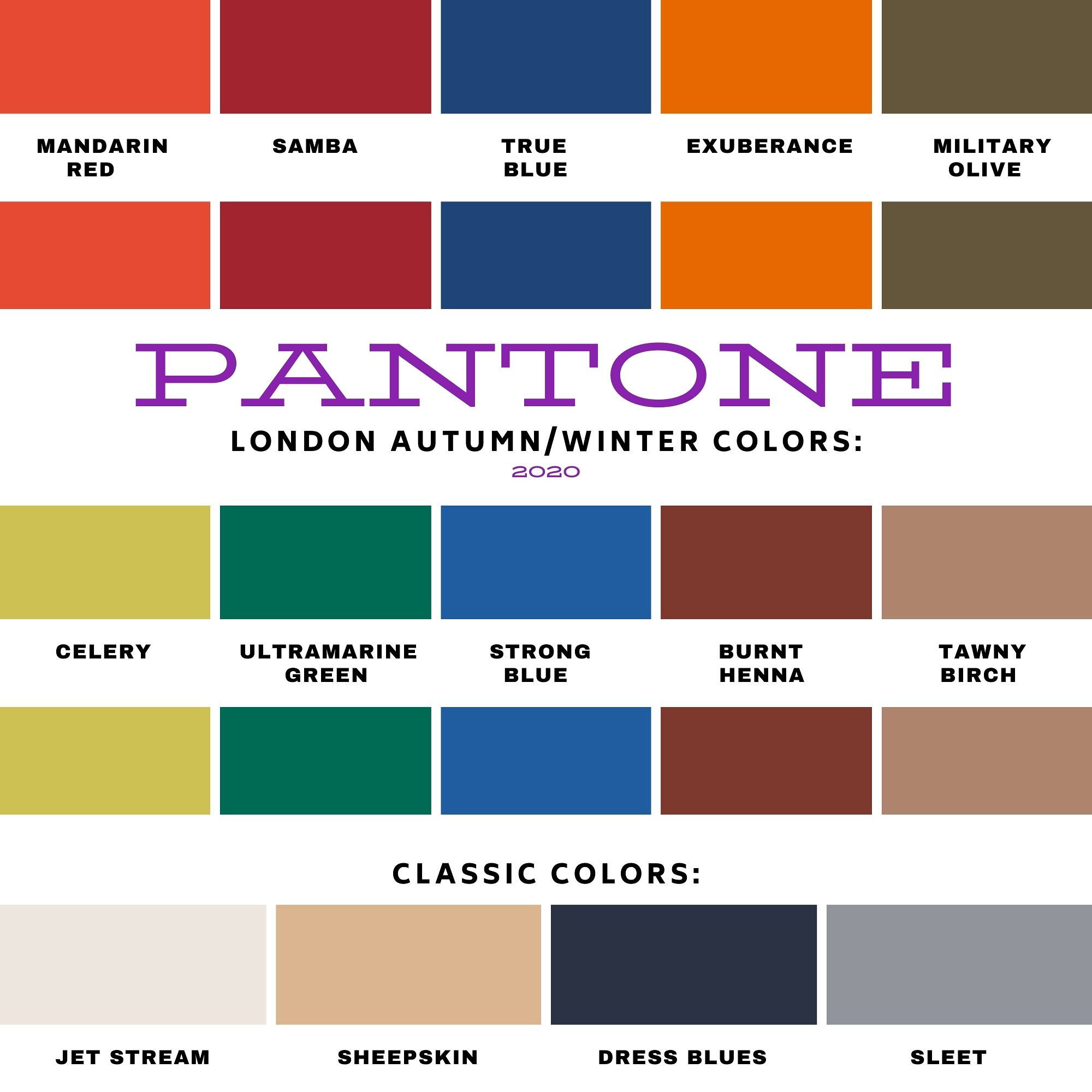
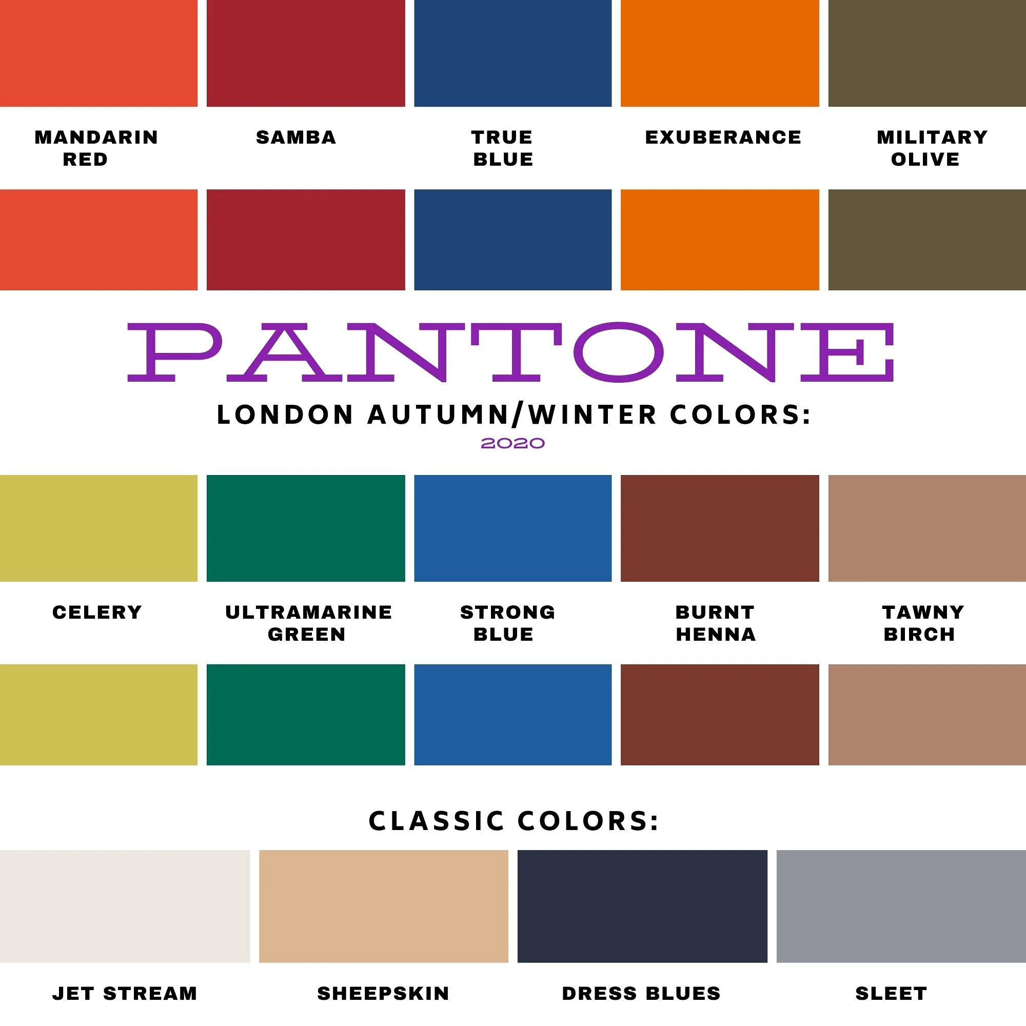
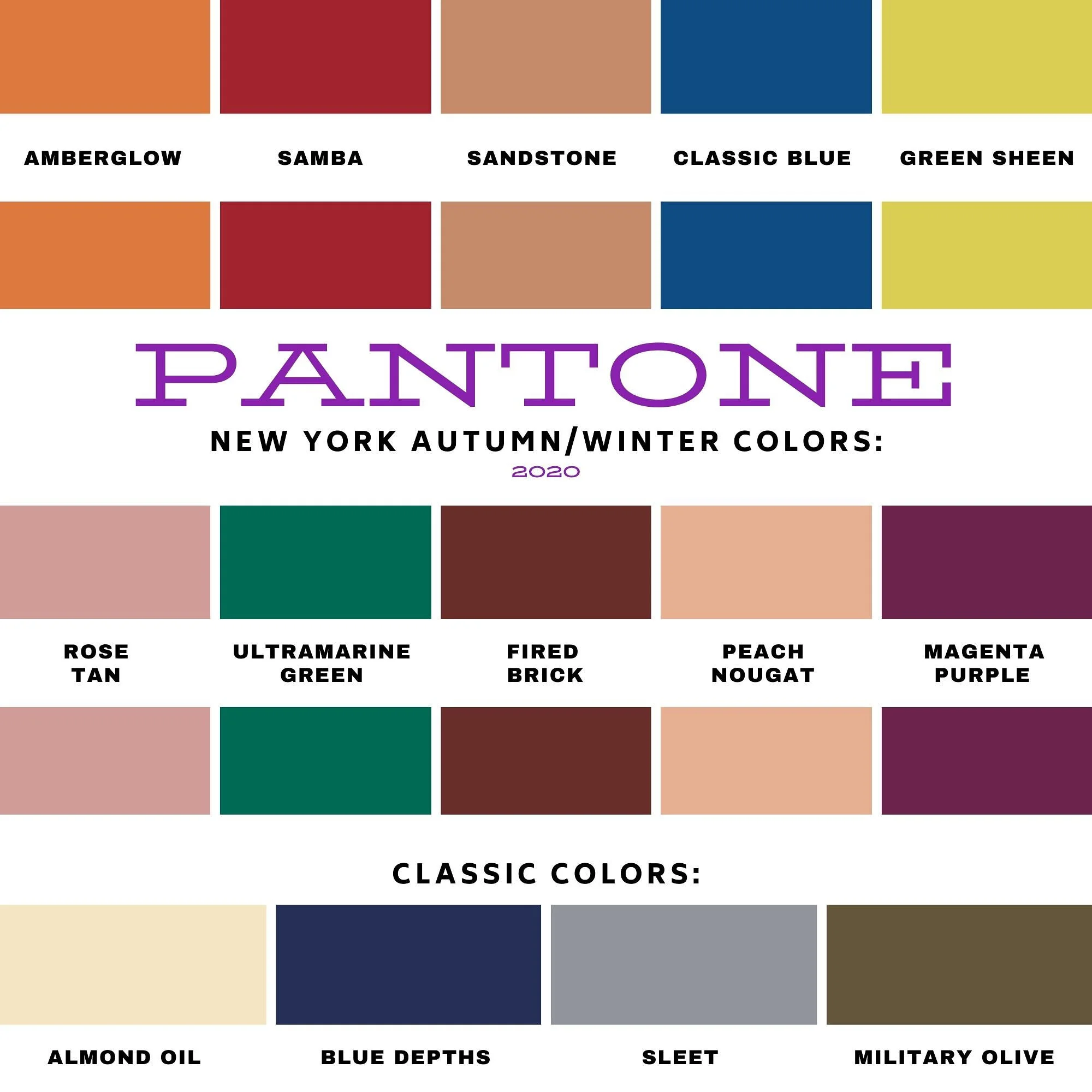
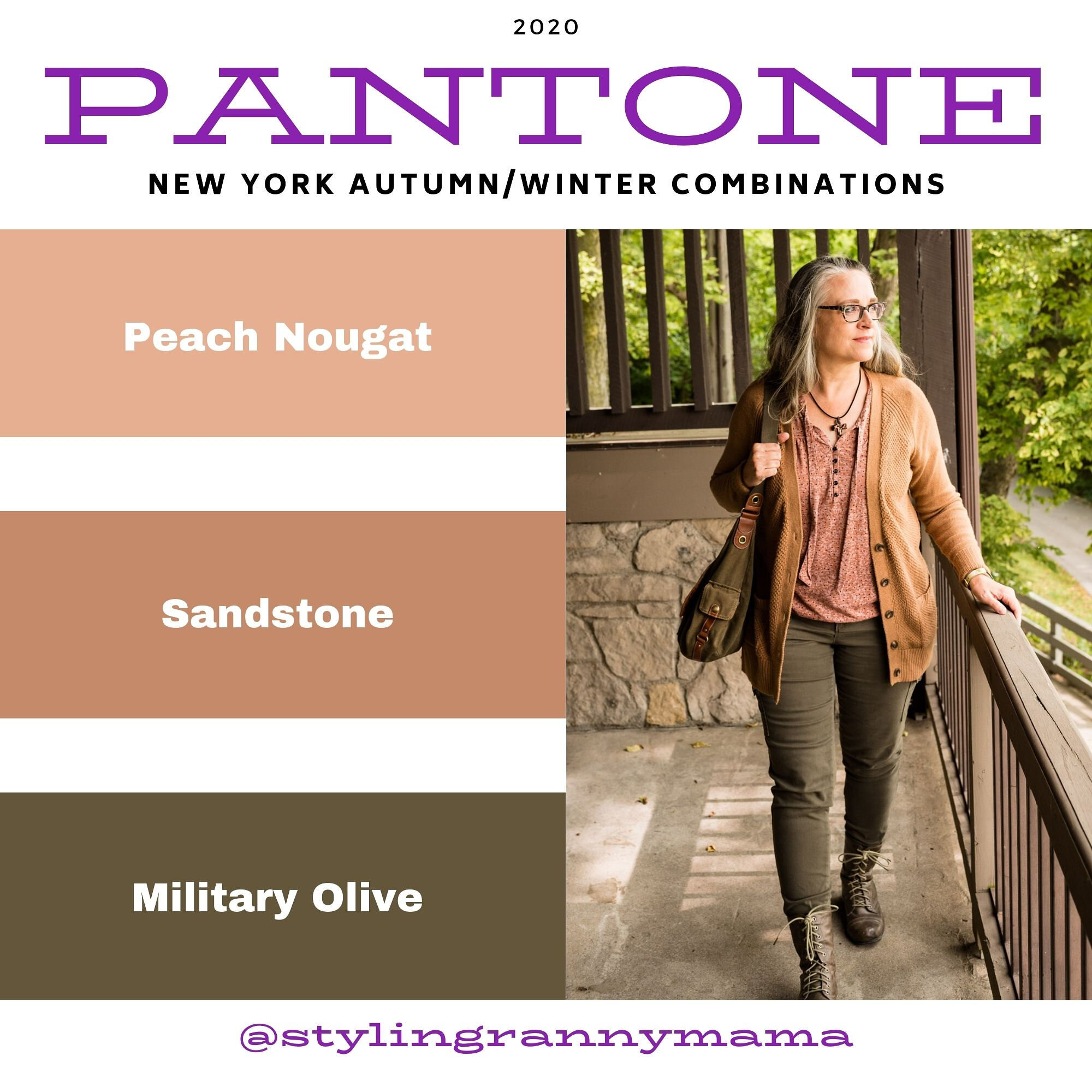
Pantone - Autumn/Winter - 2021 - New York Palette: Illuminating, Fire Whirl and Ultimate Gray

Over the weekend, I became grandmother again. My oldest daughter had a little boy and we are very excited to meet him, as soon as we can. Obviously, with all the restrictions for visitors in the hospital, we were not able to meet him before he came home.

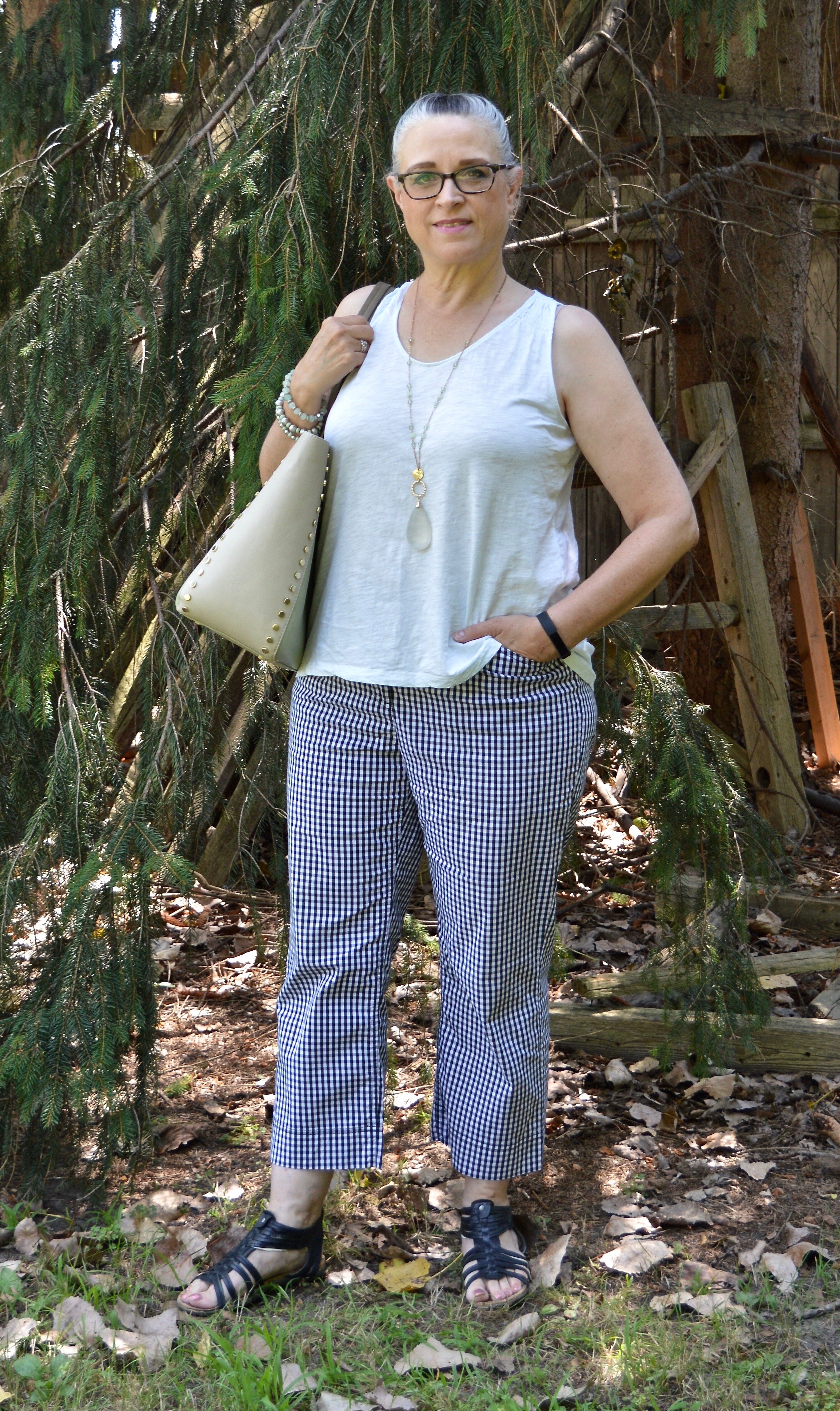
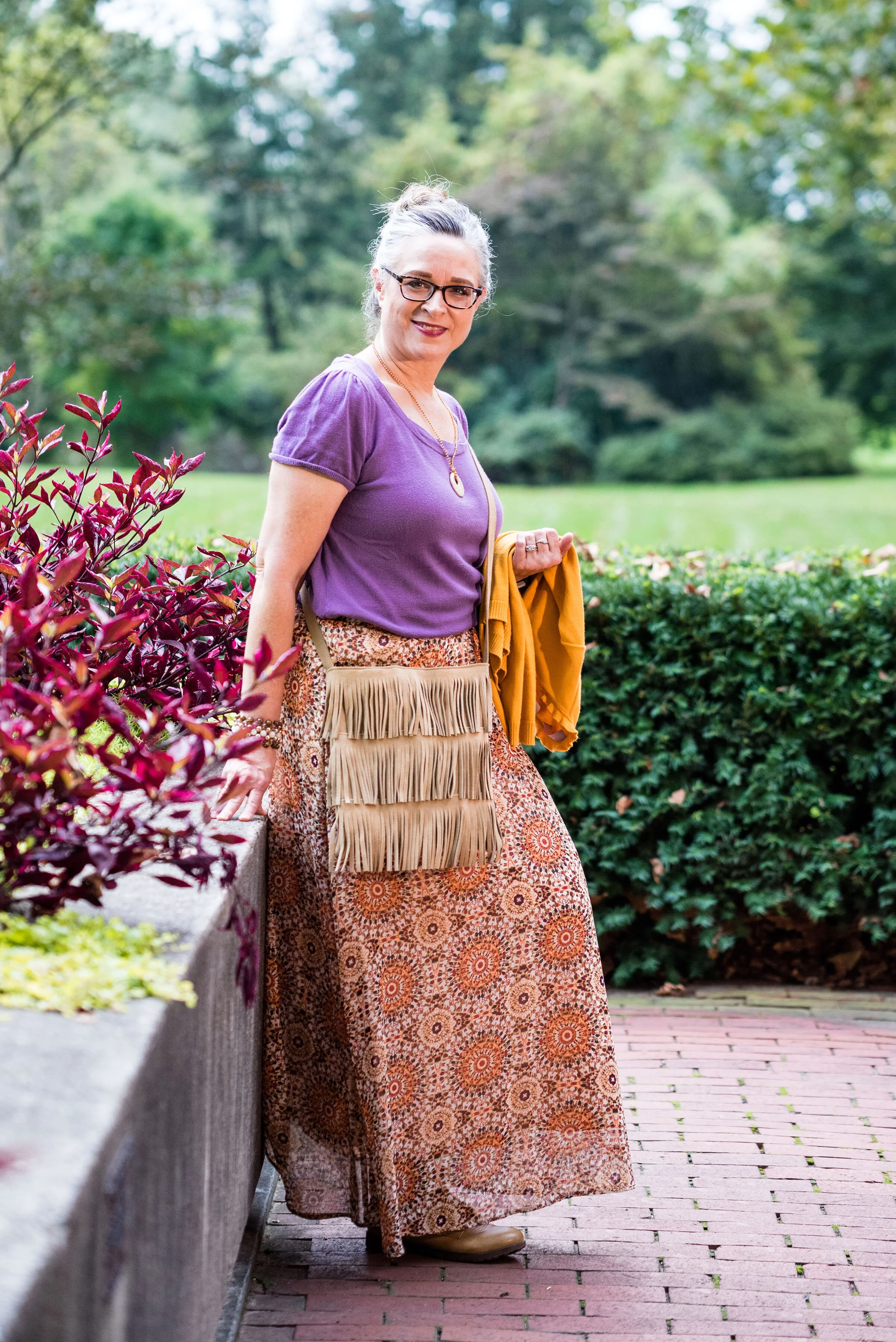
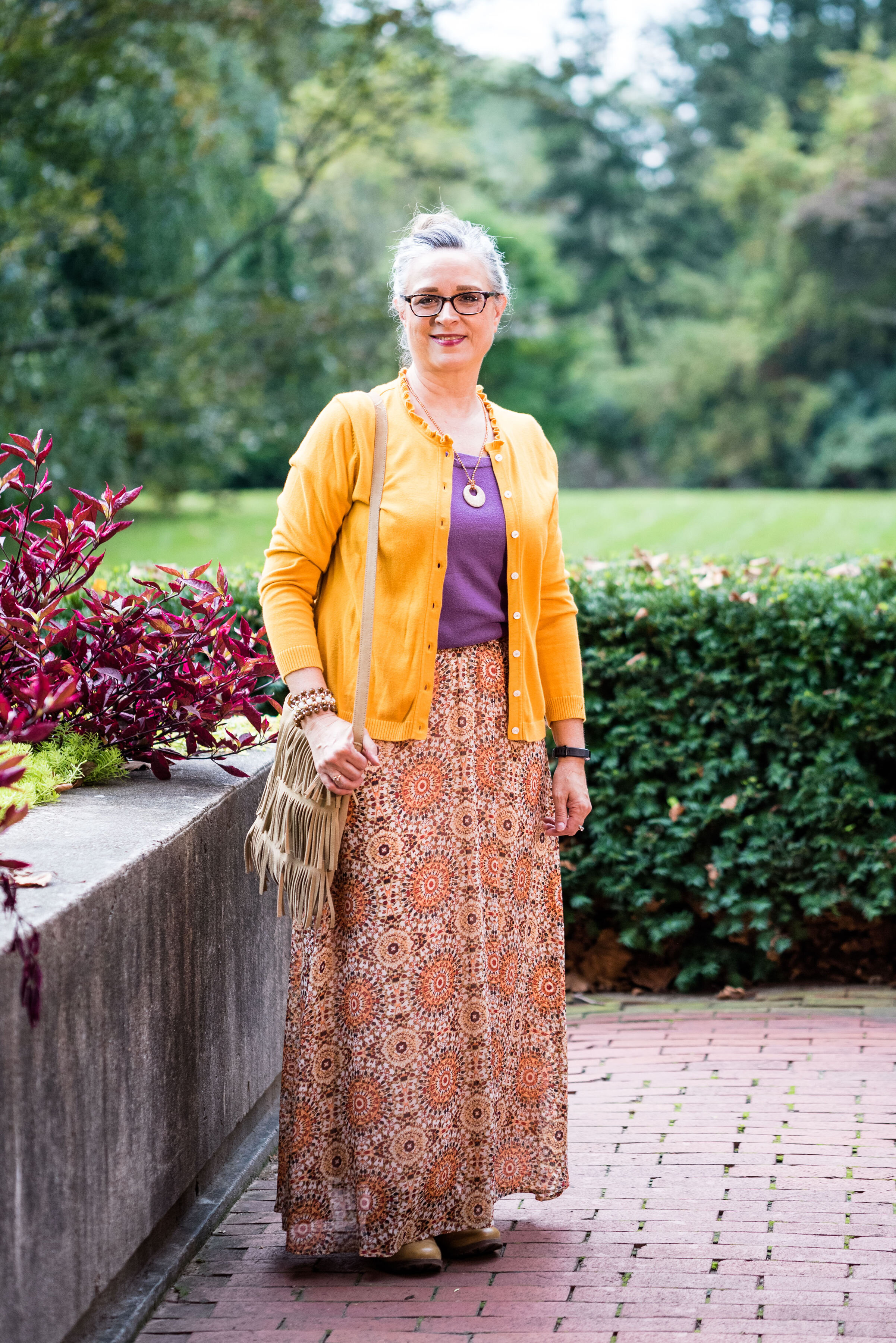
I am going to being this Autumn/Winter series, as I usually do with the New York Palette. It wasn’t until recently that the Pantone entity added the London Palette to its long list of color tools. Today’s outfit revolves around the two Colors of the Year, the sunny yellow, Illuminating and the classic gray, Ultimate Gray.

FireWhirl.jpg

In all honesty I was having a hard time putting the outfits together for this series. I think most of it had to do with being plagued by this stupid sinus stuff and cough for so long. I am finally sleeping in my bed again, but I still have a wheezy, chronic cough. We’ll see how long it takes to get some sort of resolution, or maybe it has moved in permanently, but it is a pain. It is hard to have long conversations and I cannot sing at all, not that I really could before I got this cough, but it was better than now. Oh well, life is just that way sometimes.

The other problem I think I was having, was the weather. It was so hot, I was having a hard time really getting into styling fall outfits. I love fall, and am excited about that change, but it has just been slow to actually feel like the season to wear layers. Here in my area, by Wednesday, the highs are only going to be in the 50’s. That definitely feels like fall.

pantonefallcolortrendsfirewhirl-3.jpg

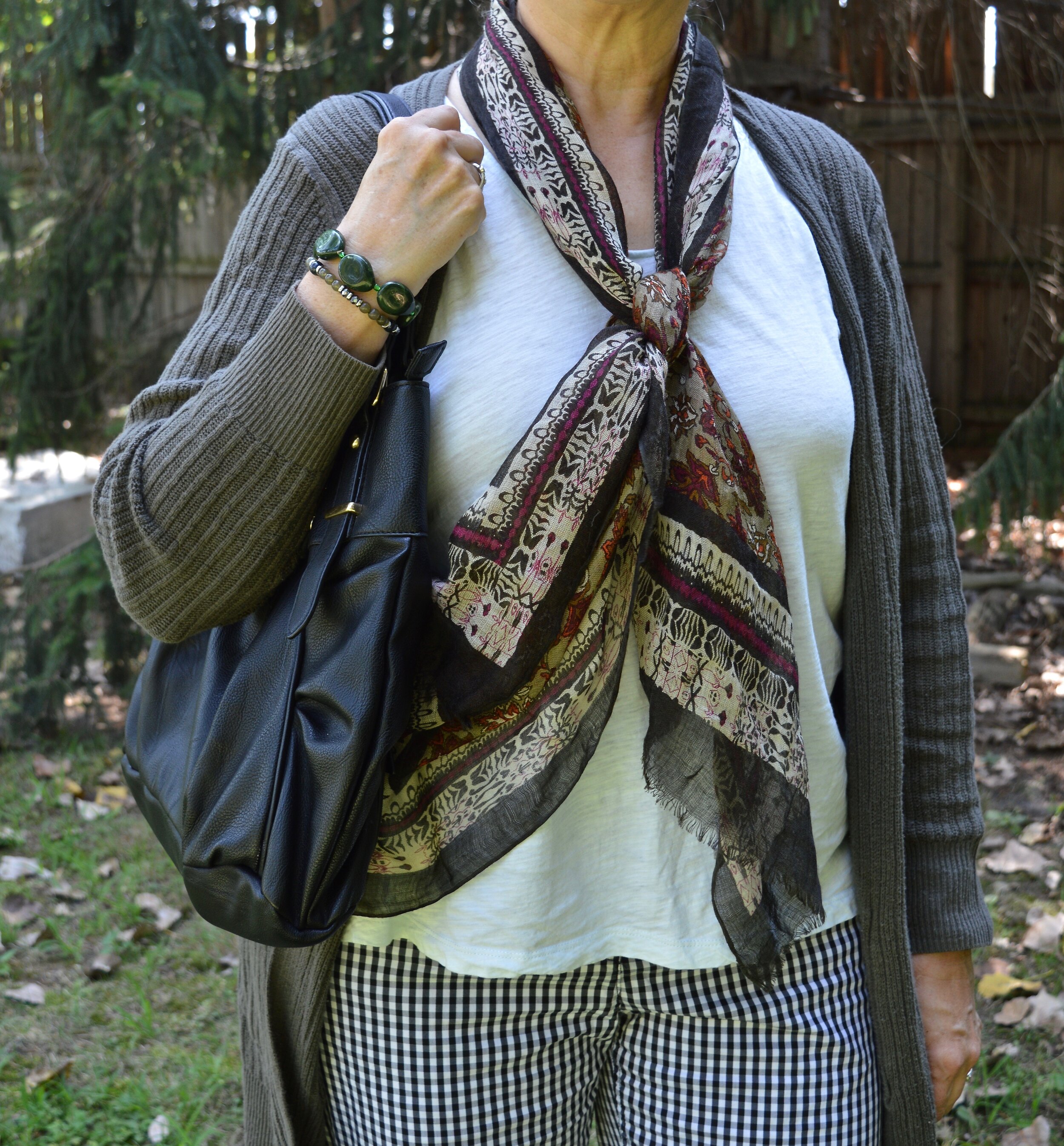
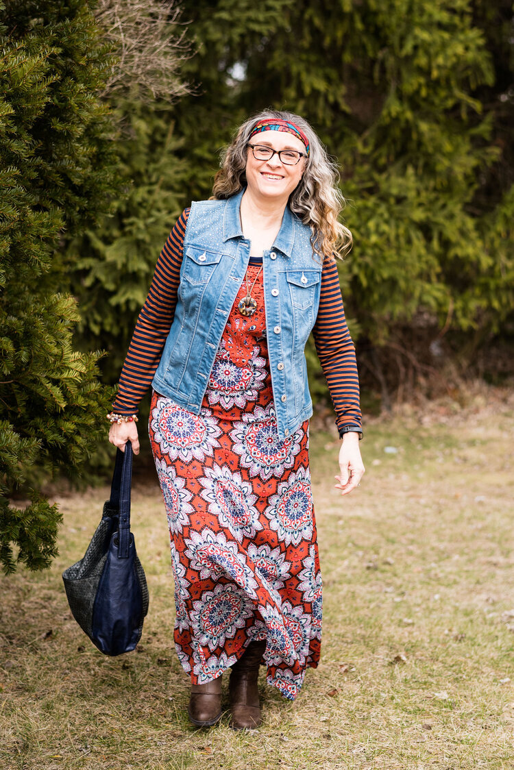
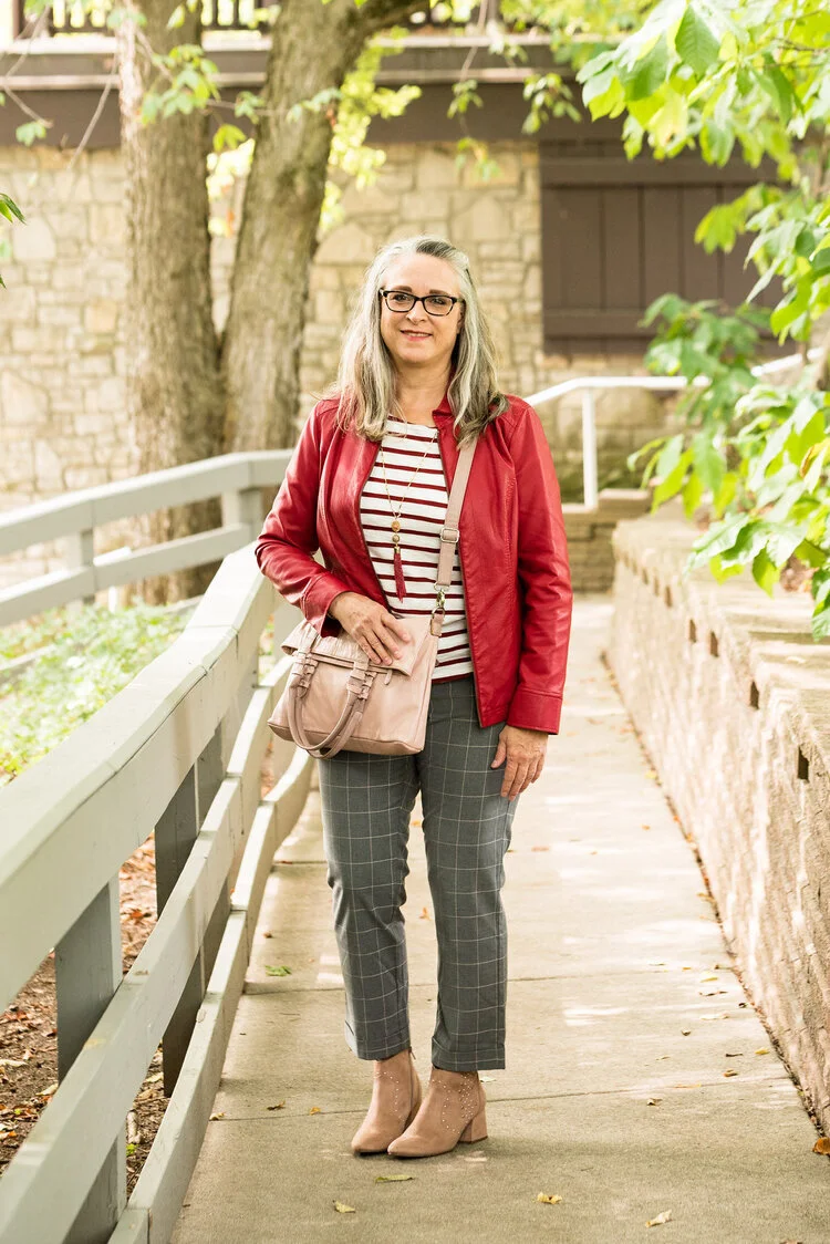
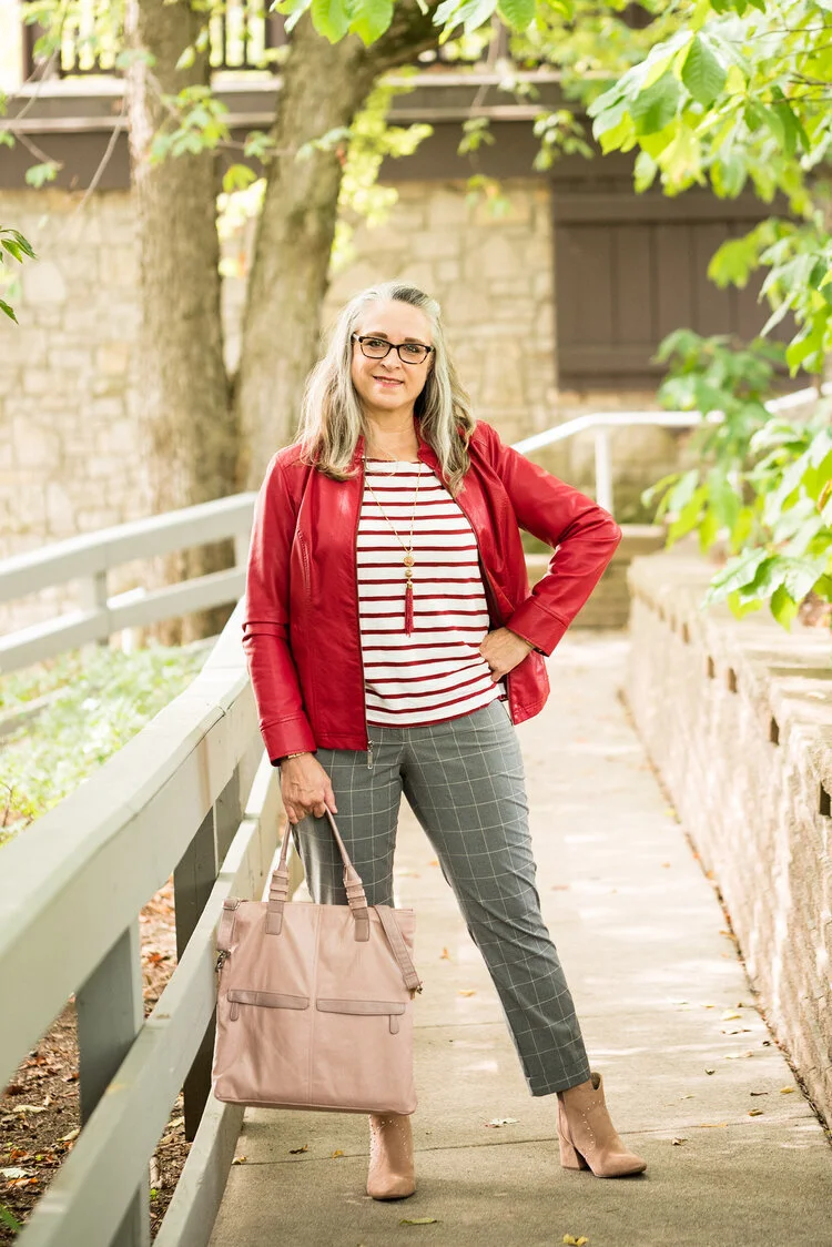
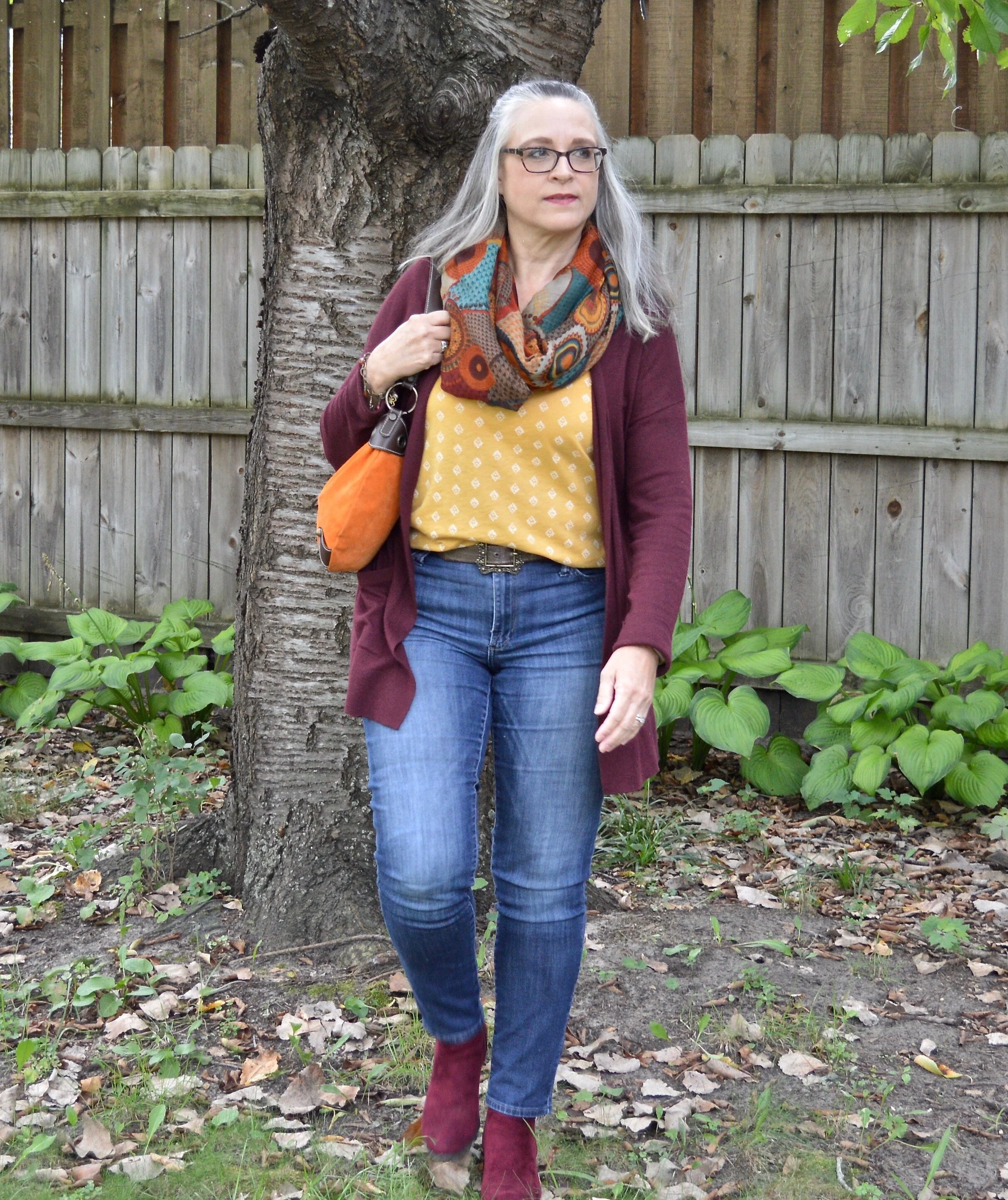
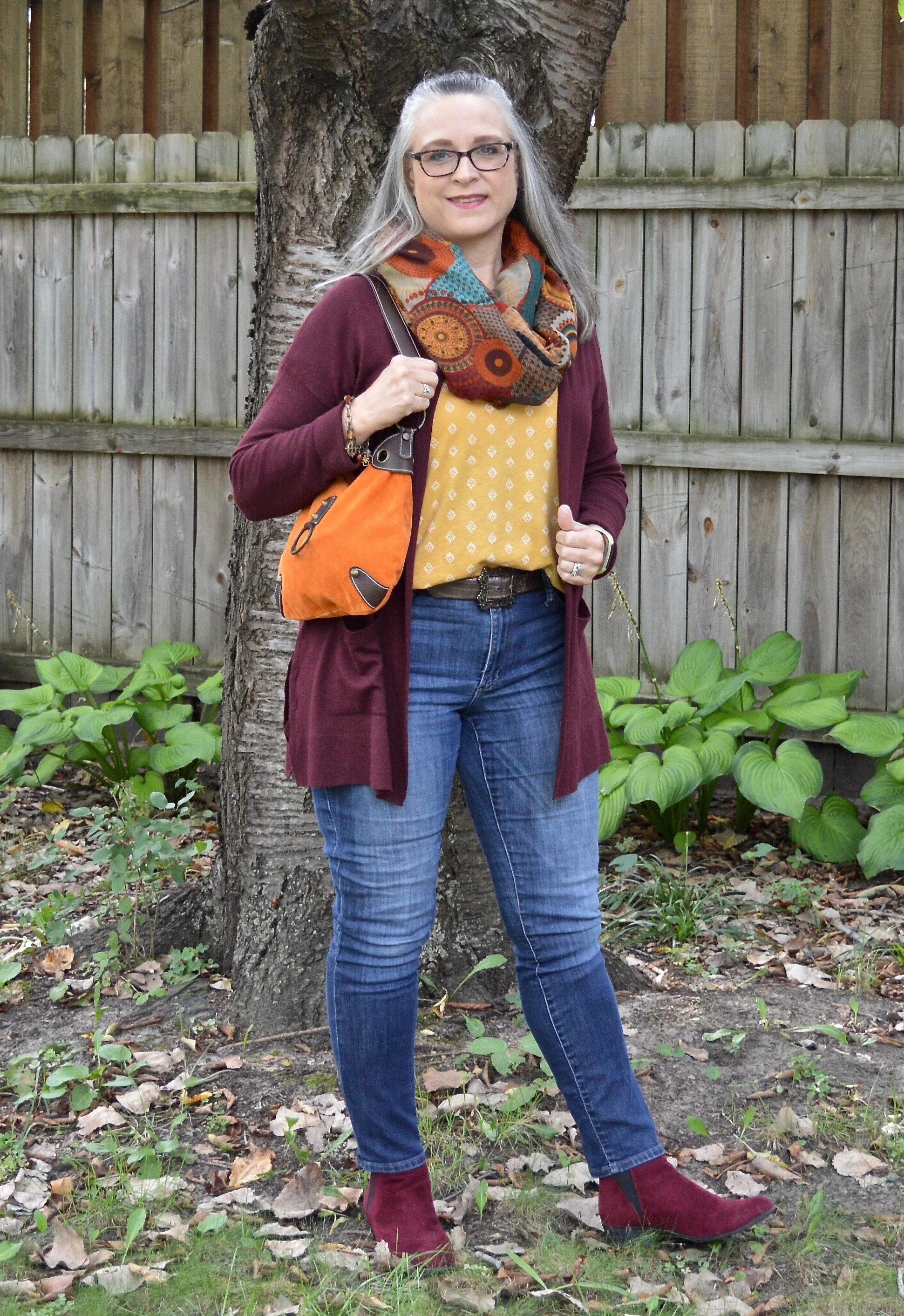
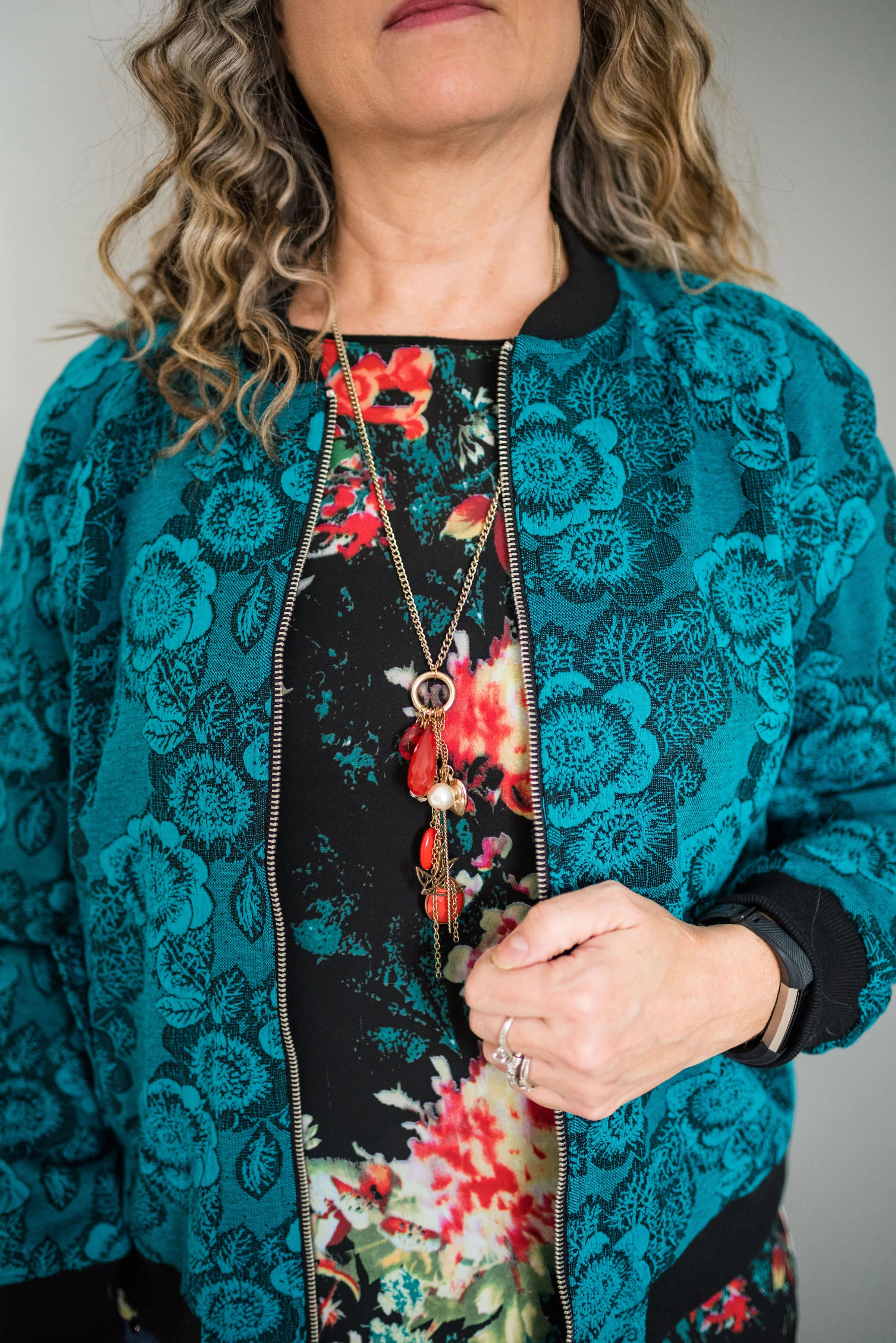
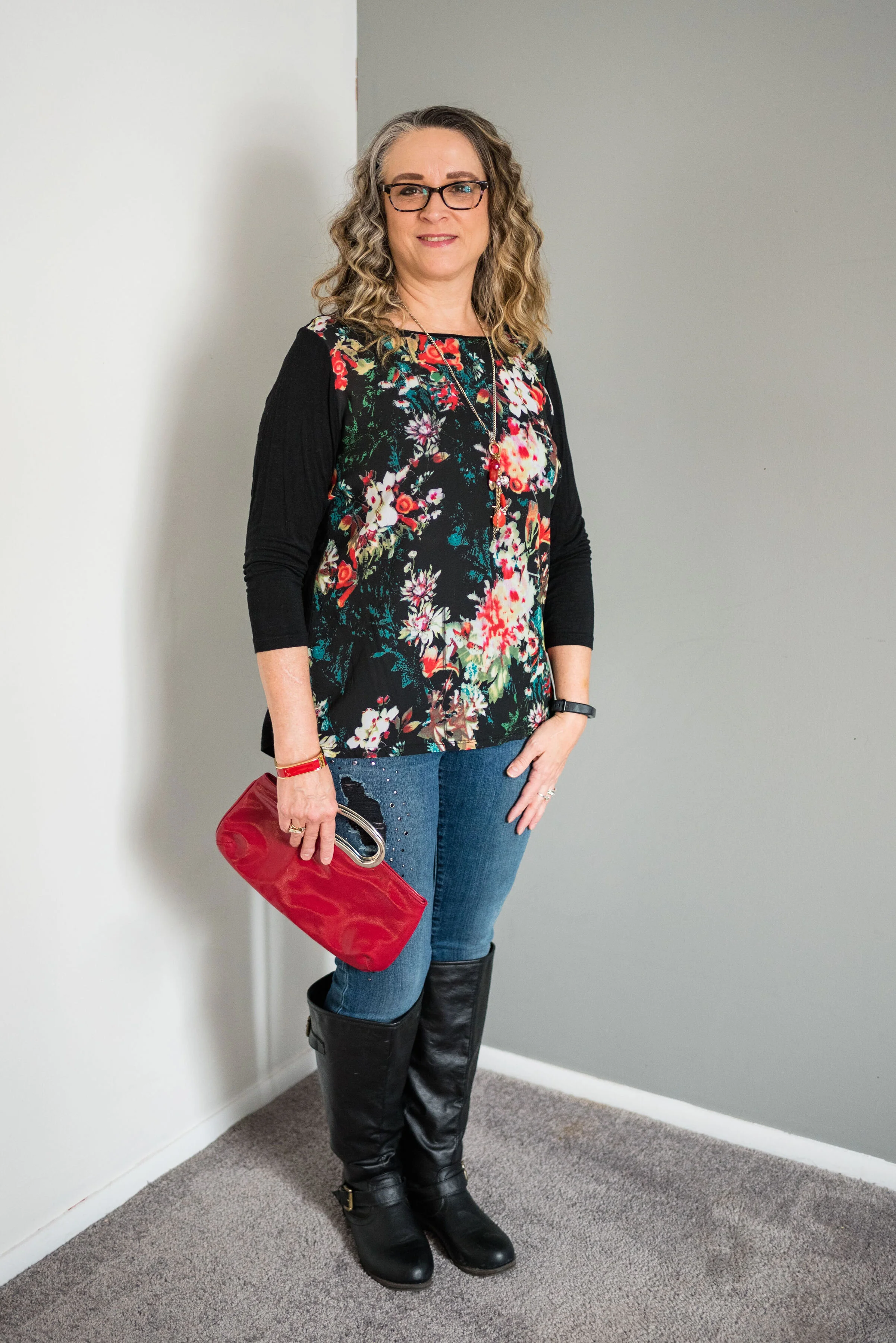
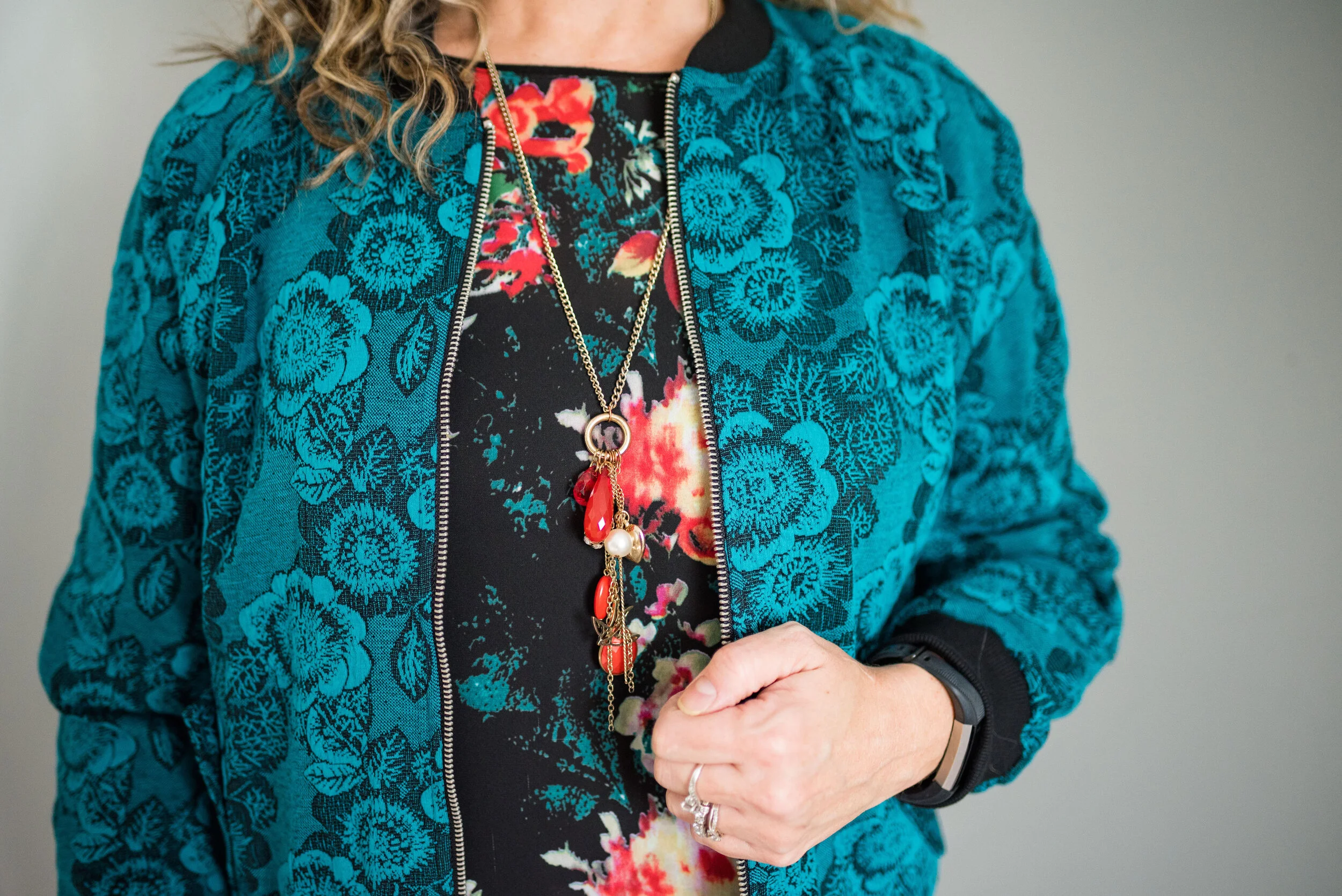
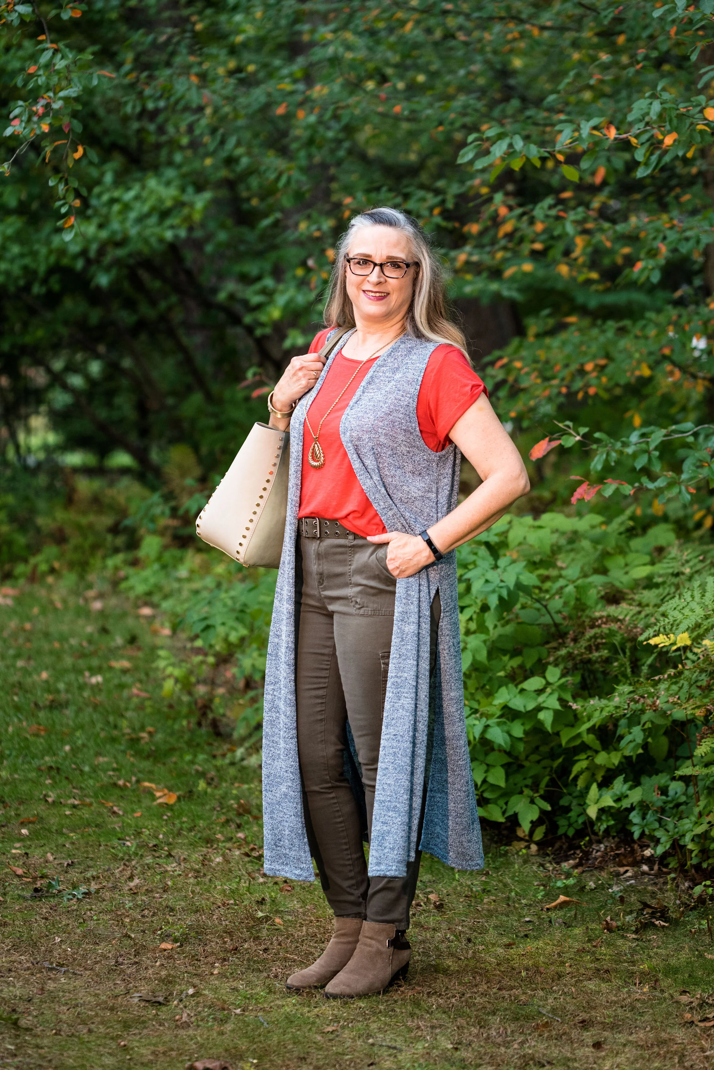
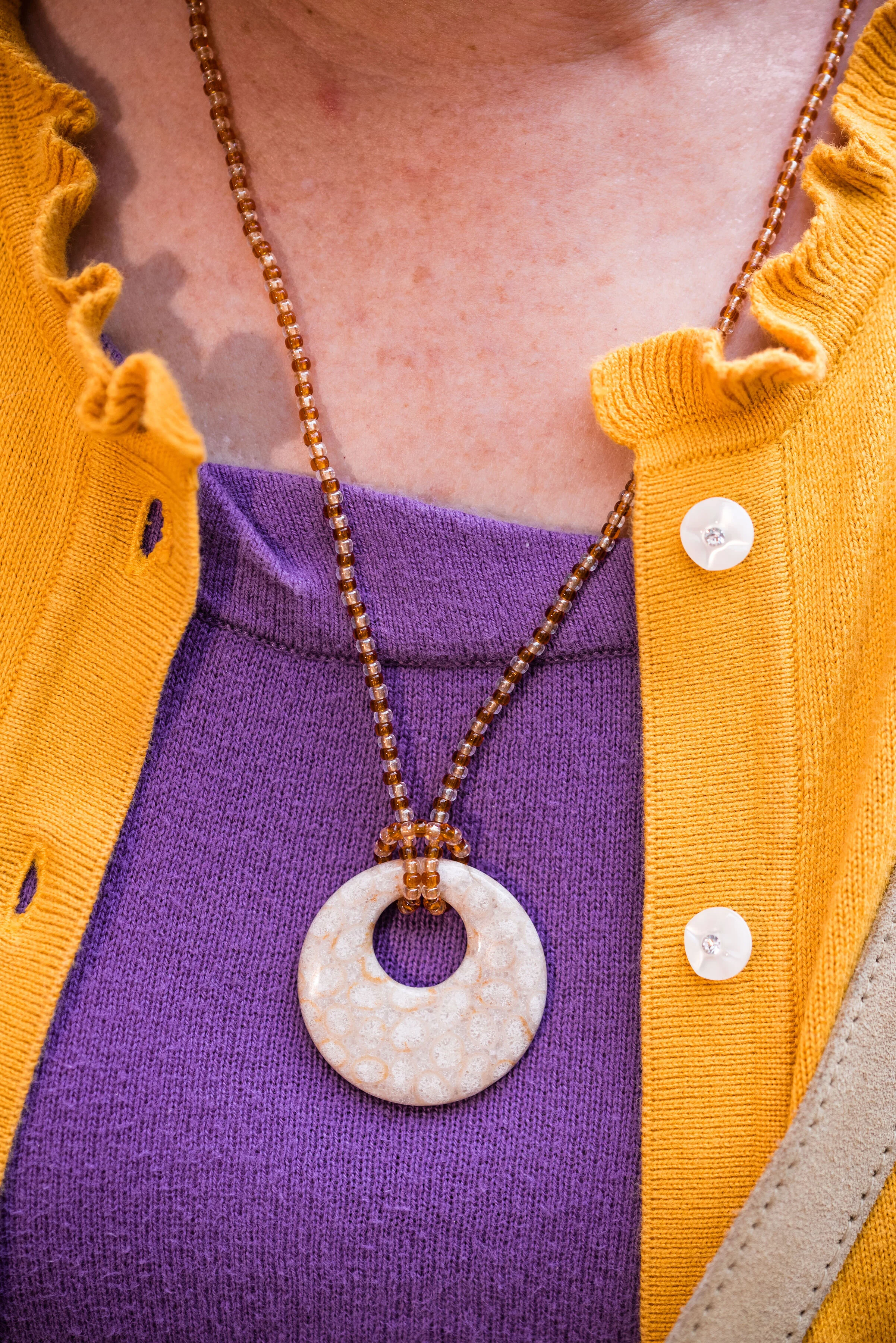
You can see that I only used Illuminating in very small doses with my yellow beaded necklace and bracelets. The Fire Whirl red tank top is a thrifted Loft piece. It is actually more of an a-line or swing silhouette, so I gathered the shirt underneath in the front, then secured the little “pony tail” with a hair band. The result is to give the top a more fitted look with a fun swirl at the front.

pantonefallcolortrendsfirewhirl-12.jpg

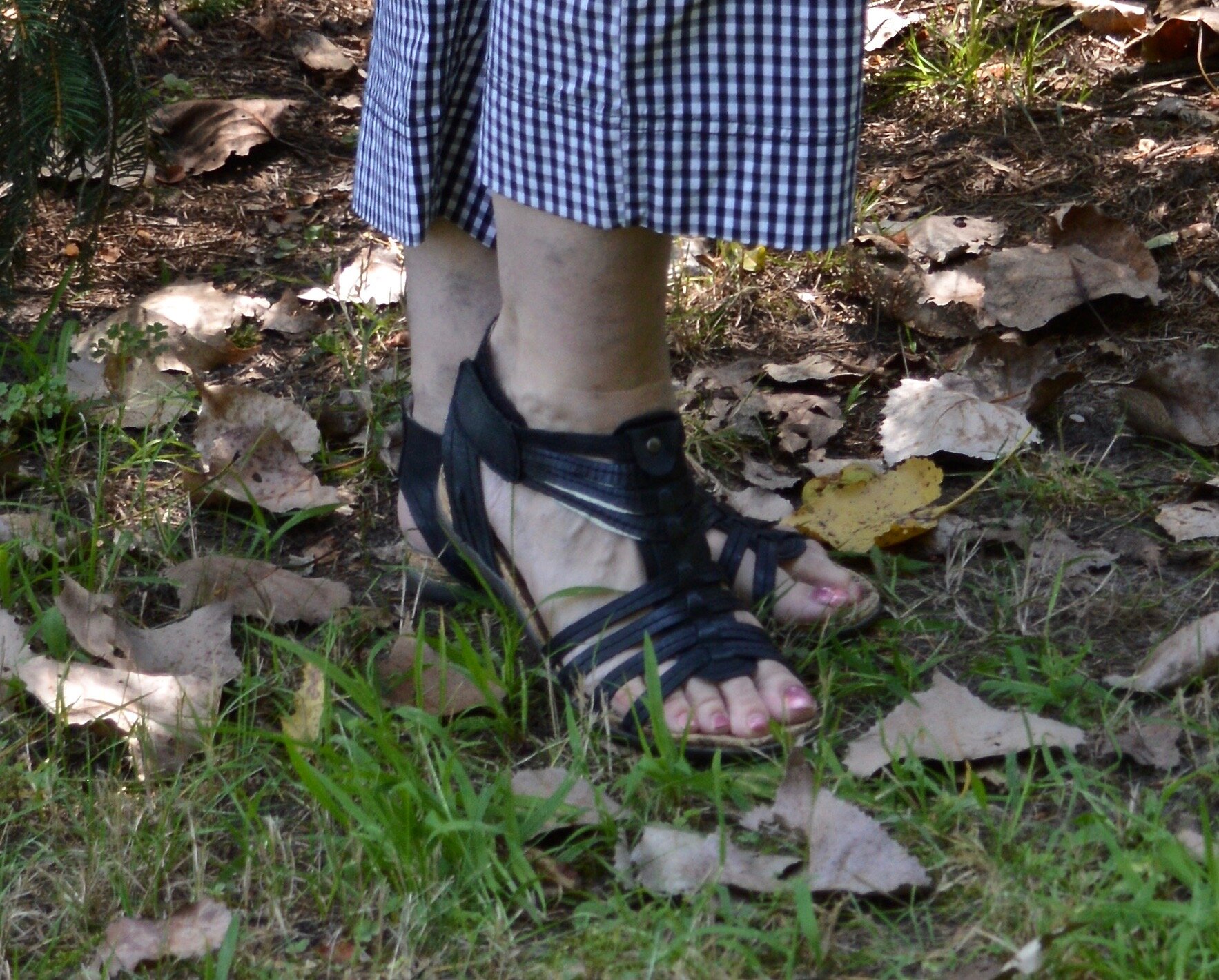
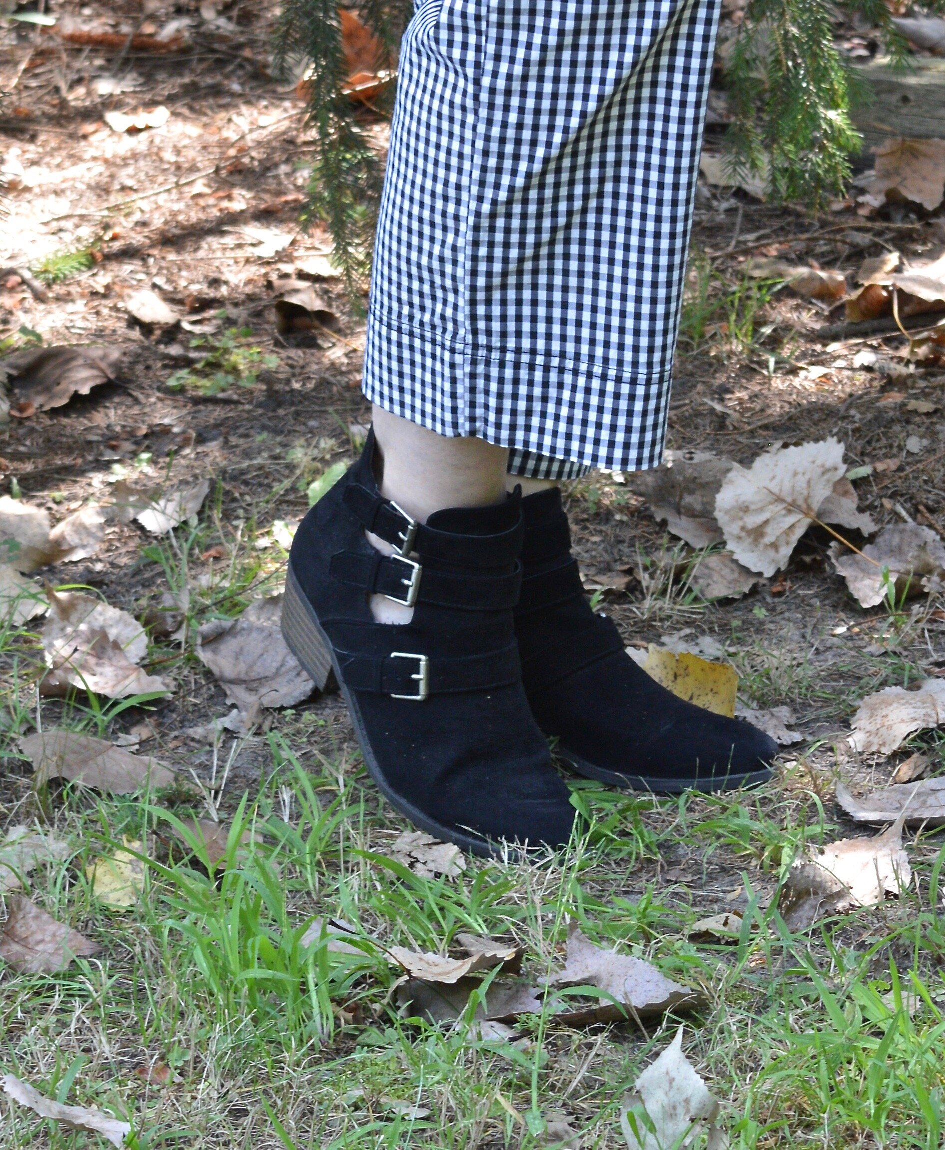
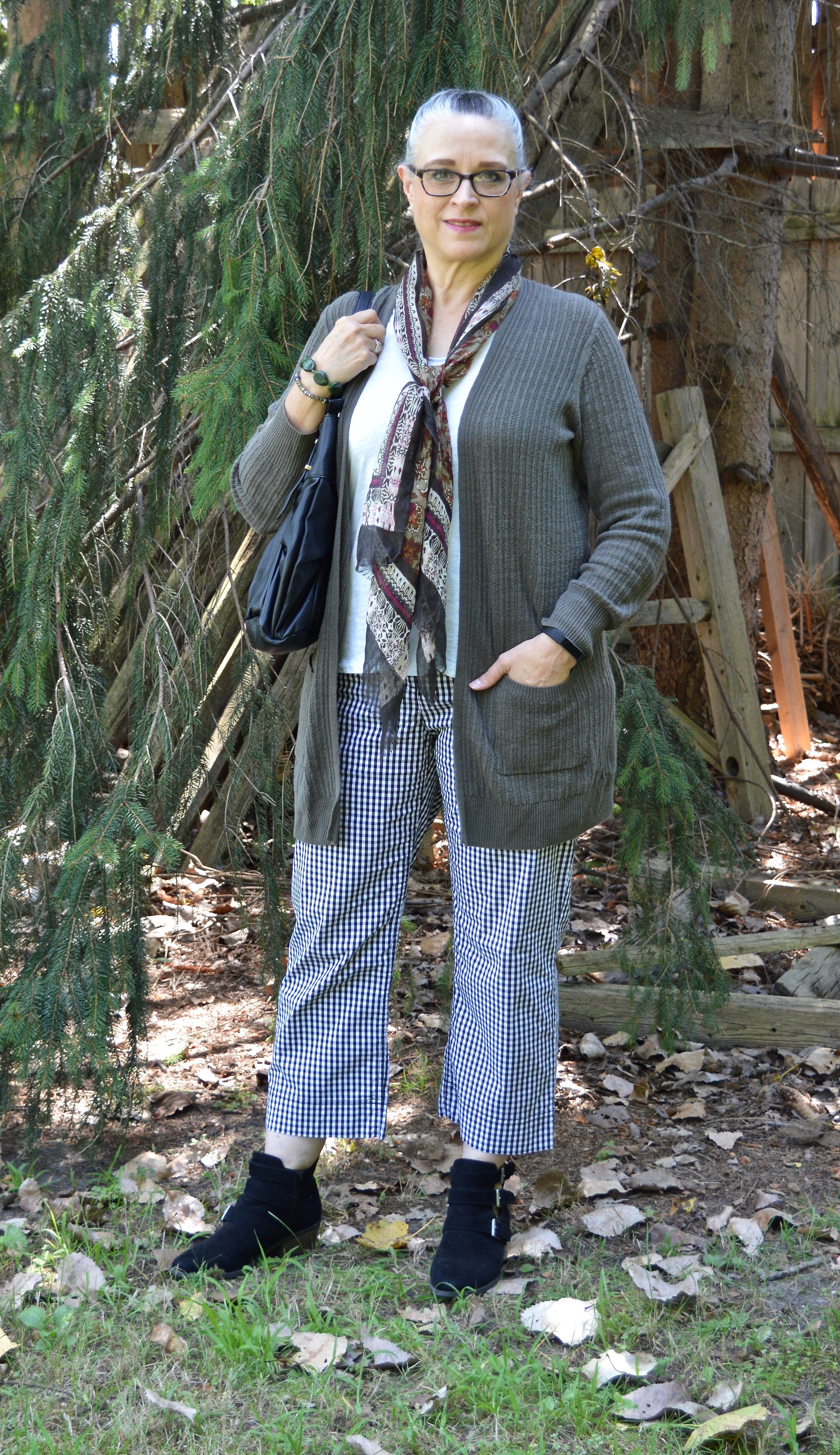
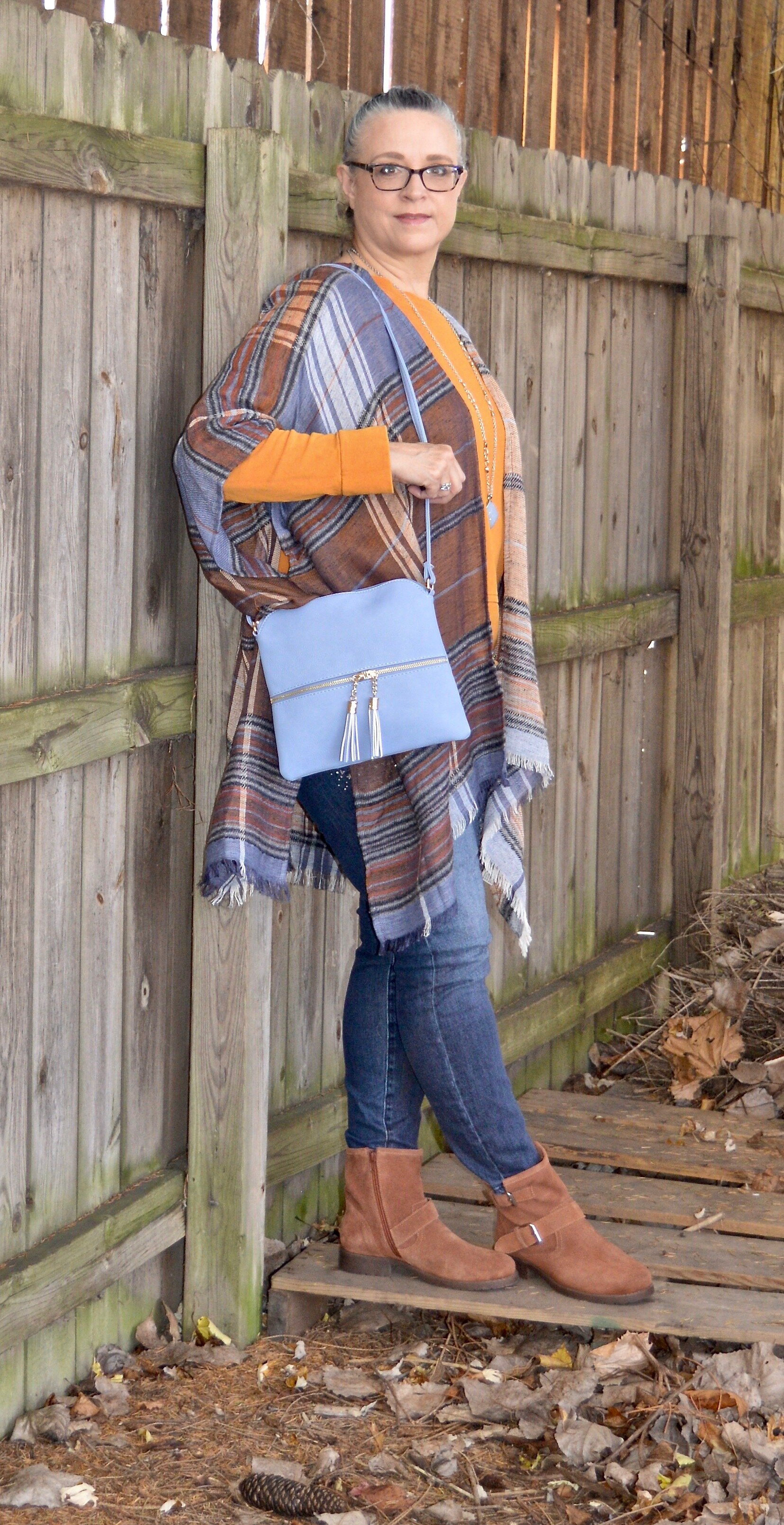
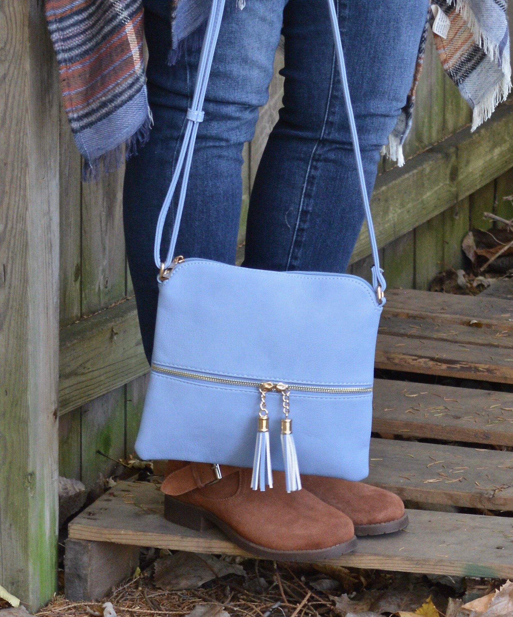
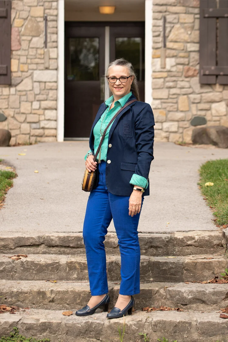
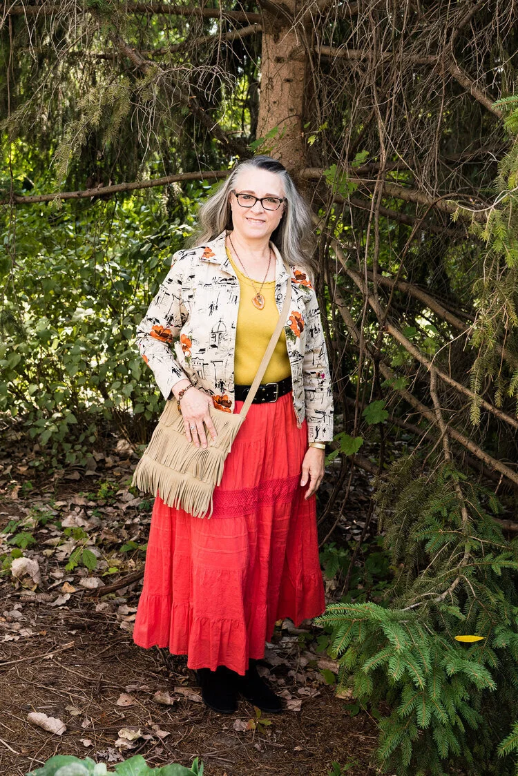
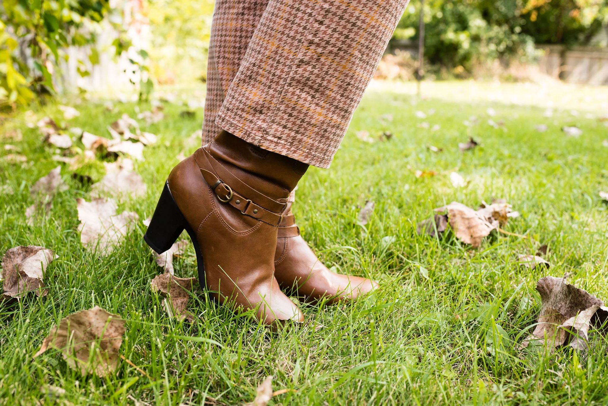
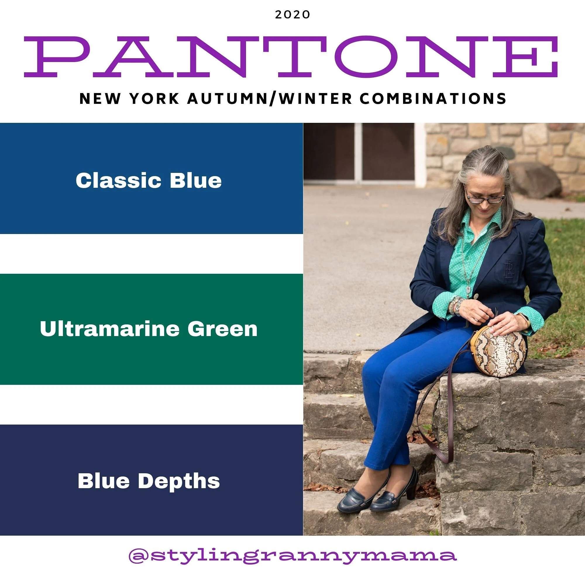
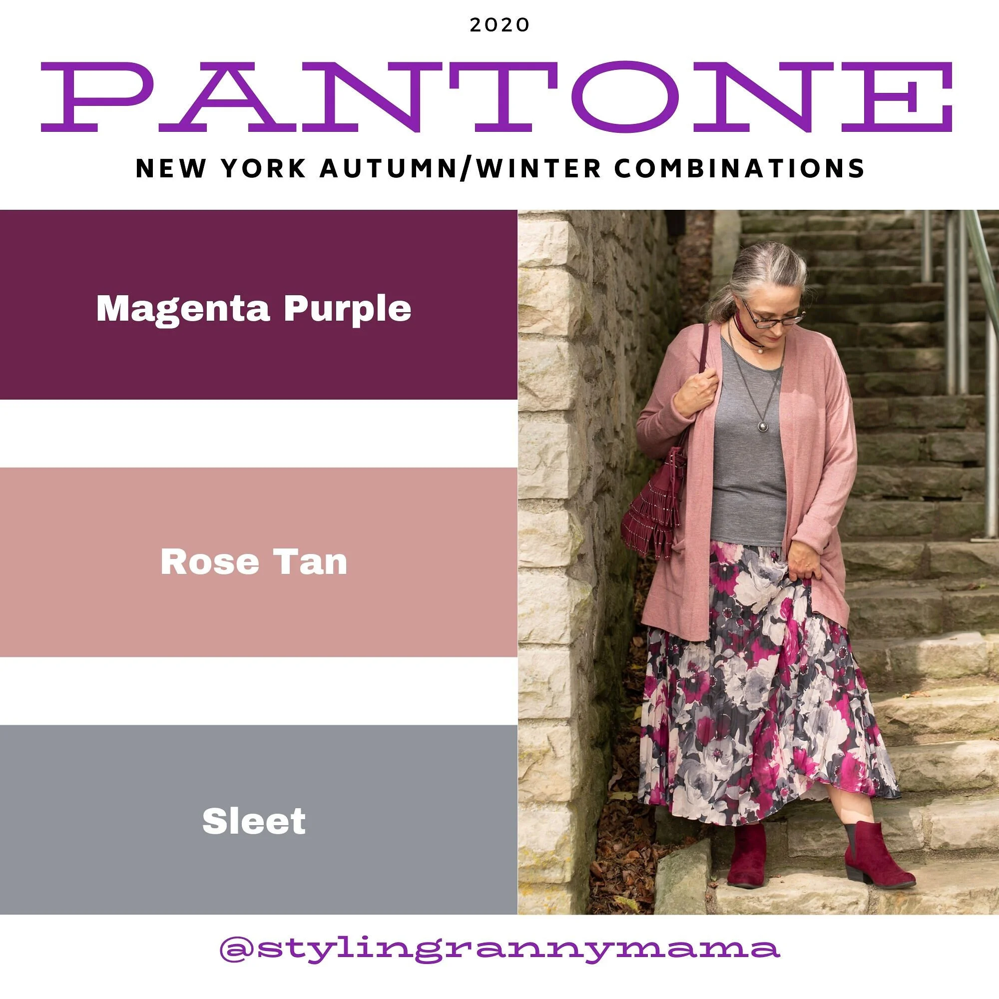
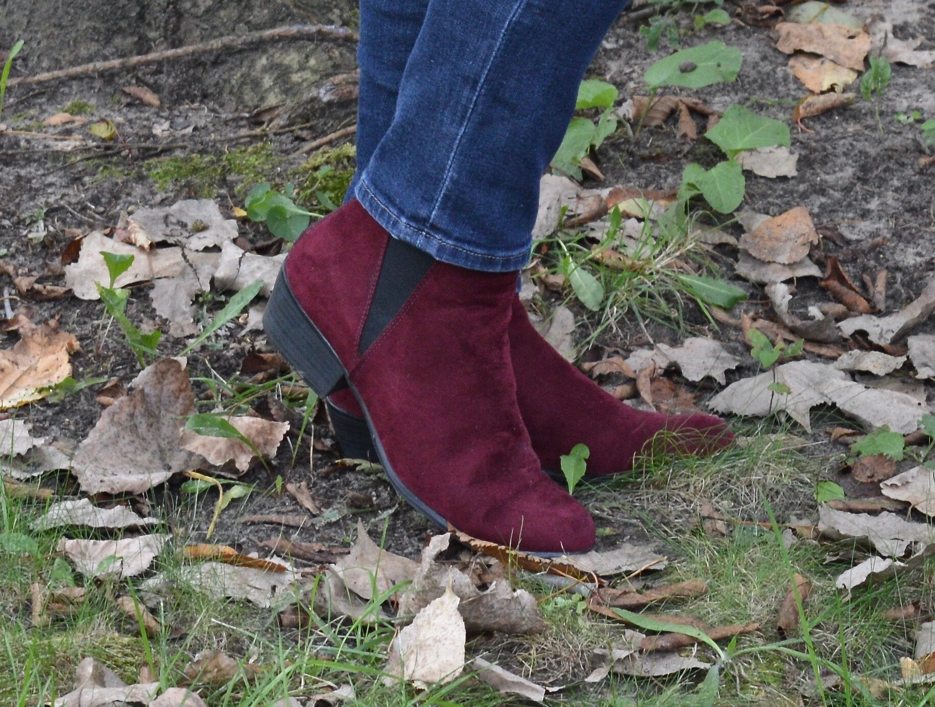
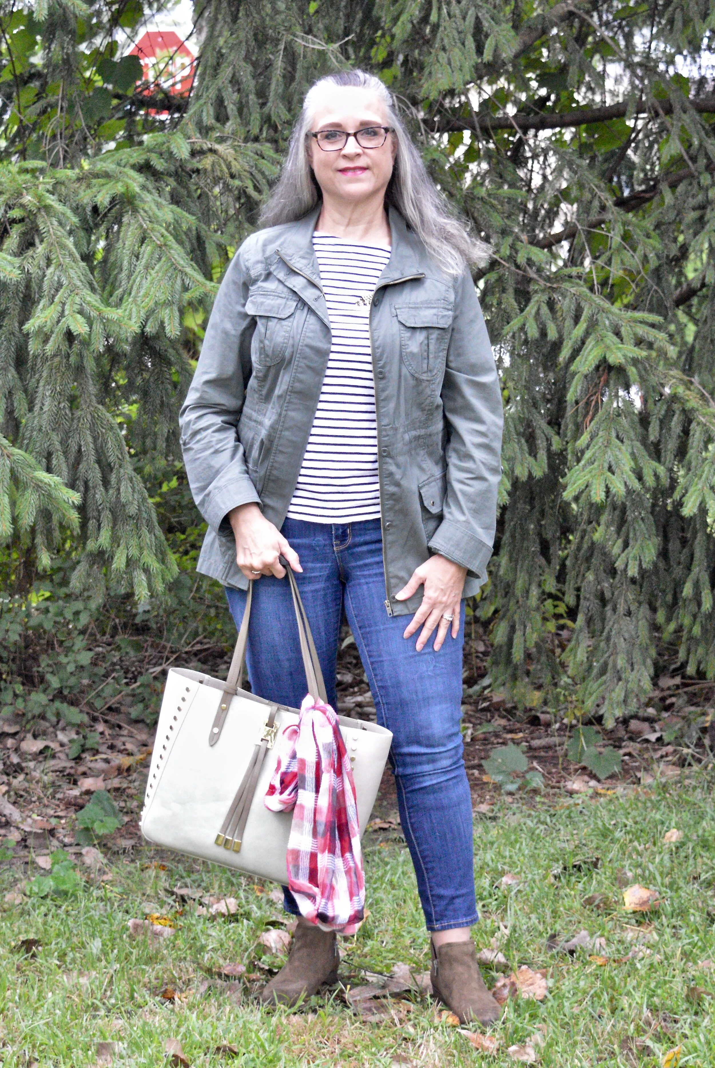
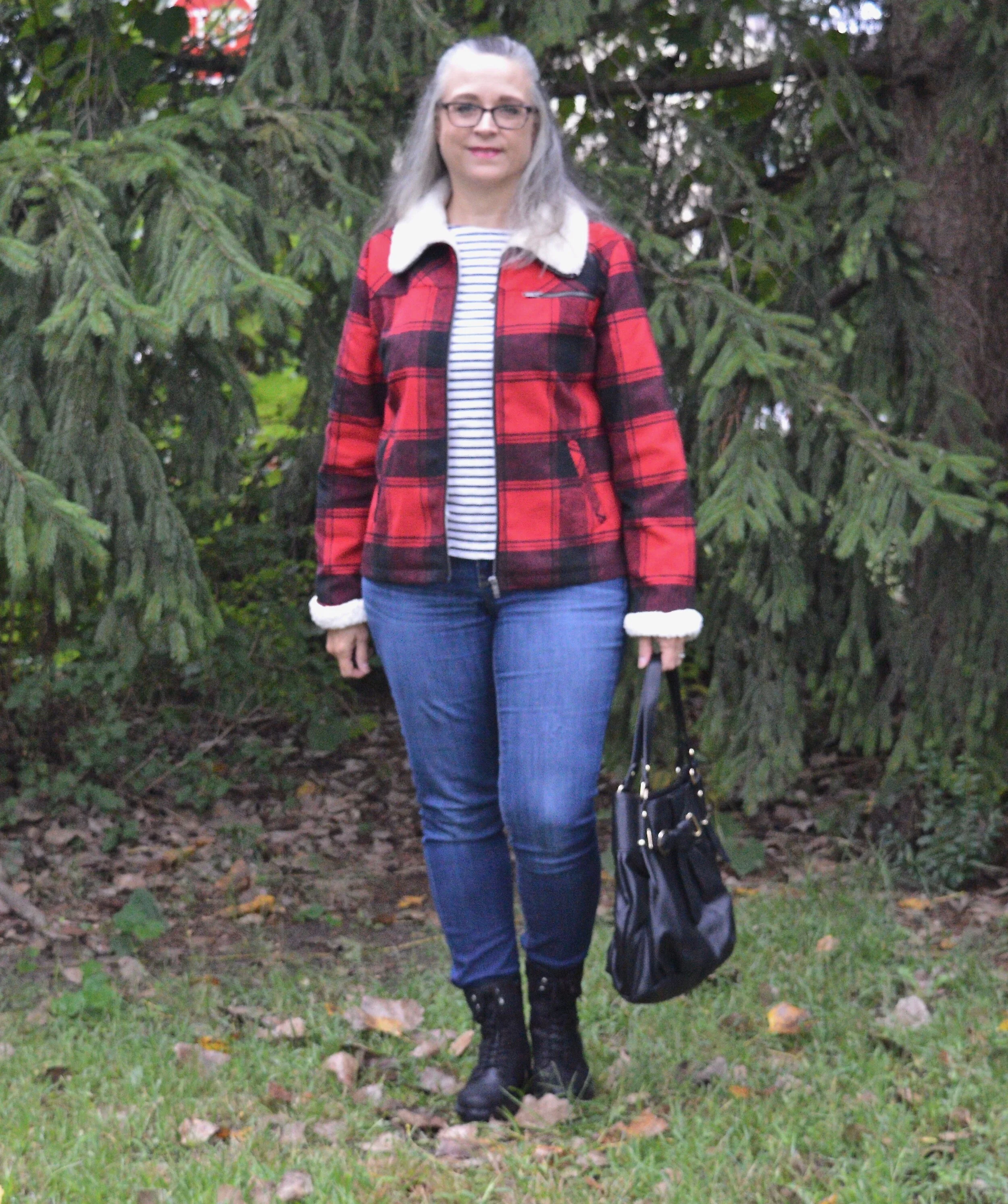
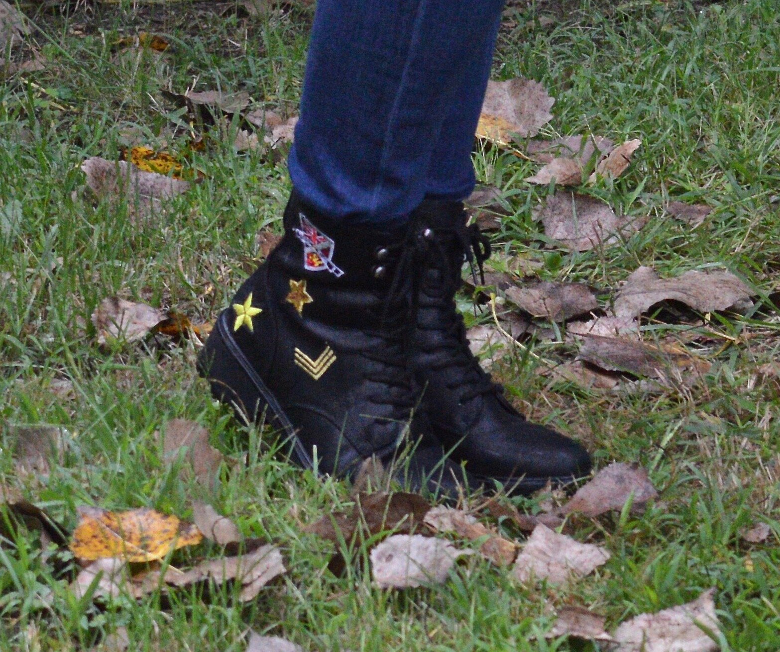
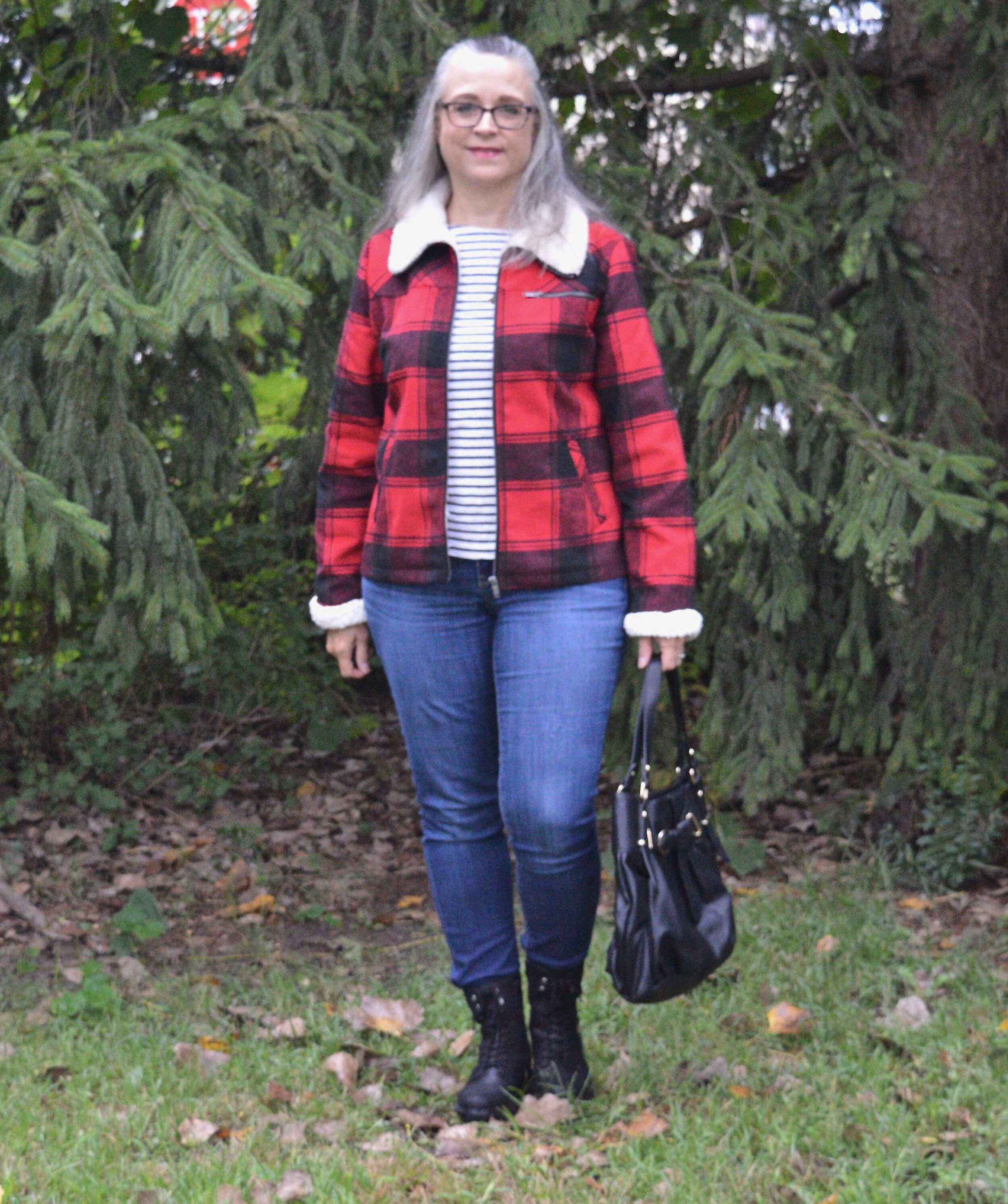
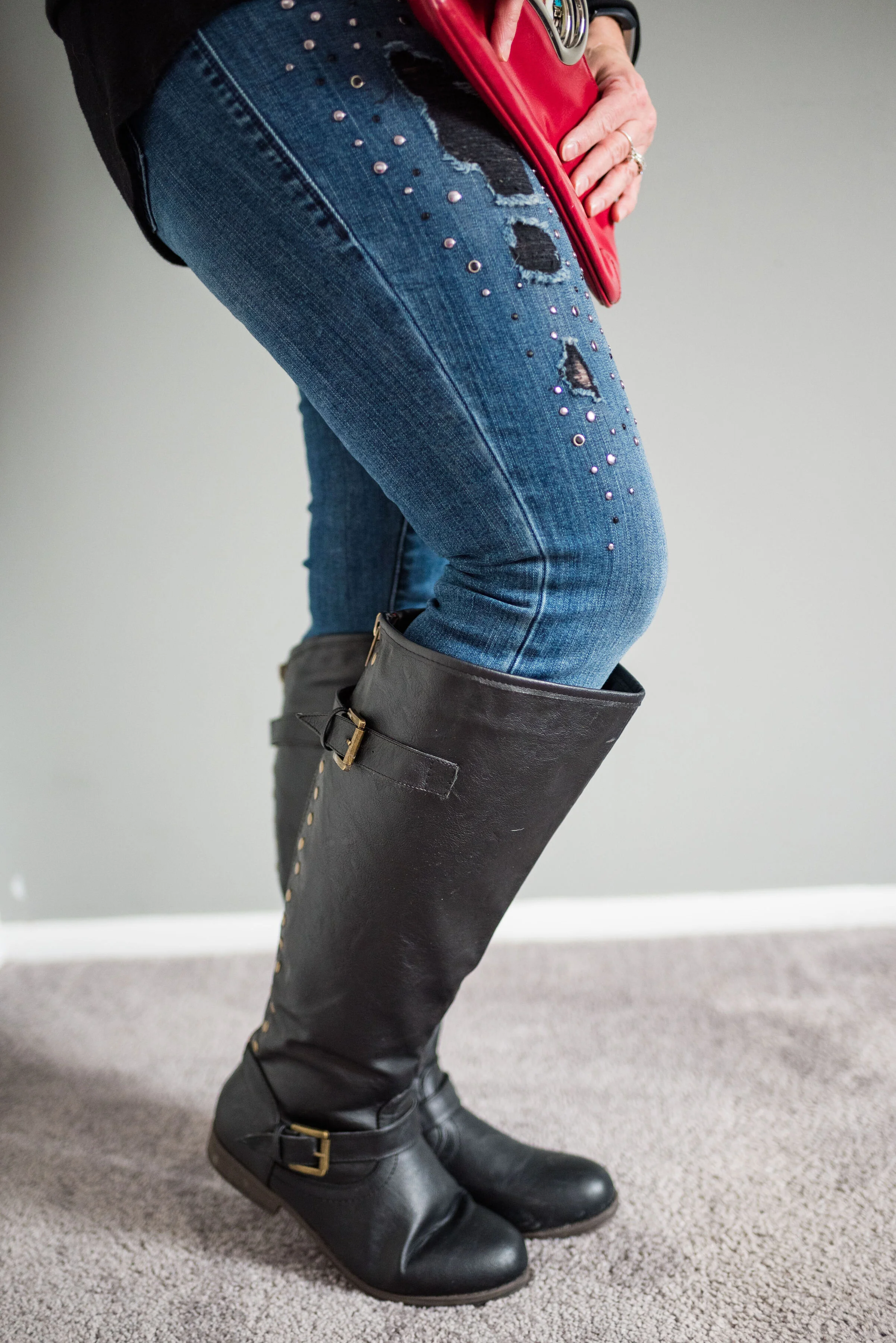
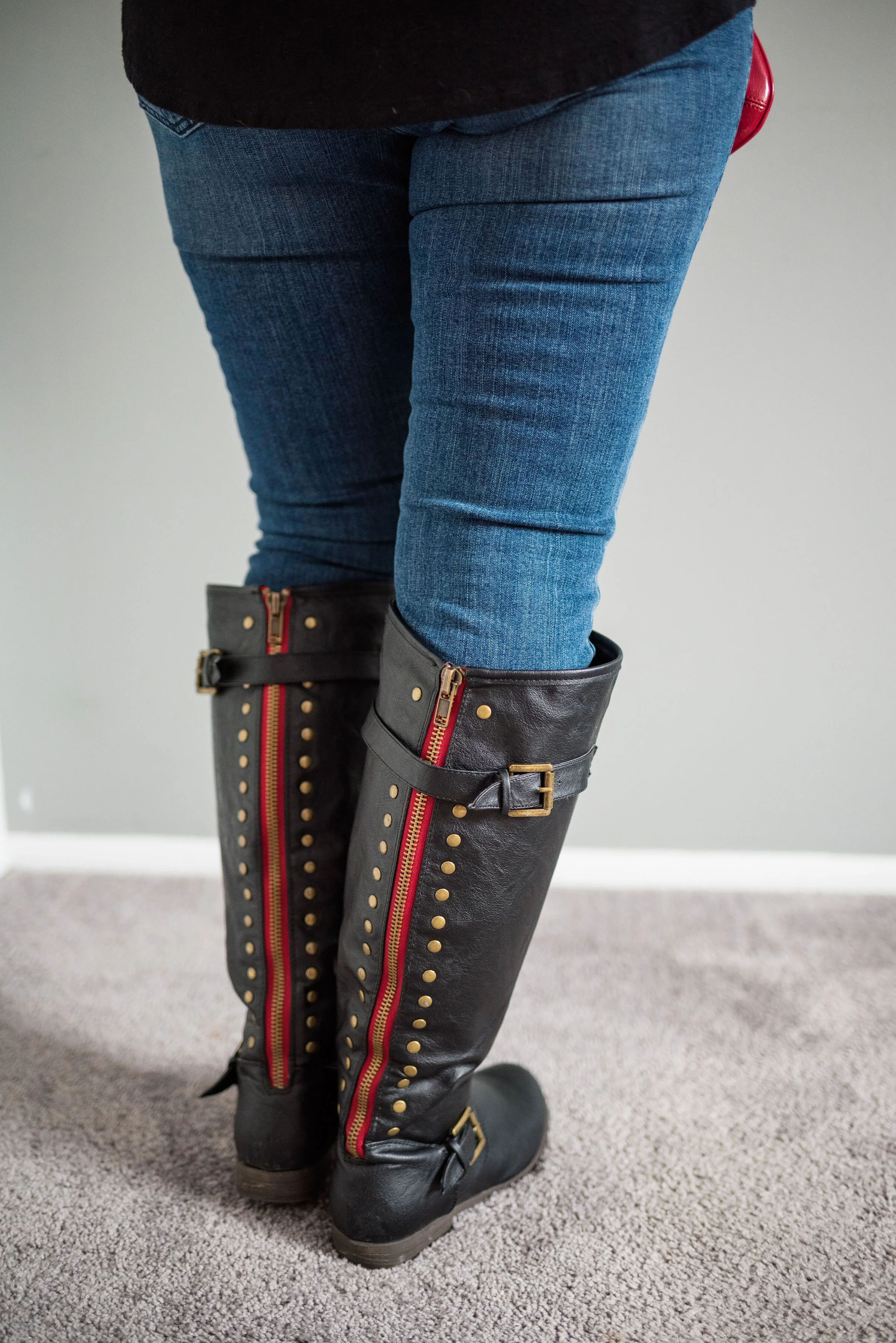
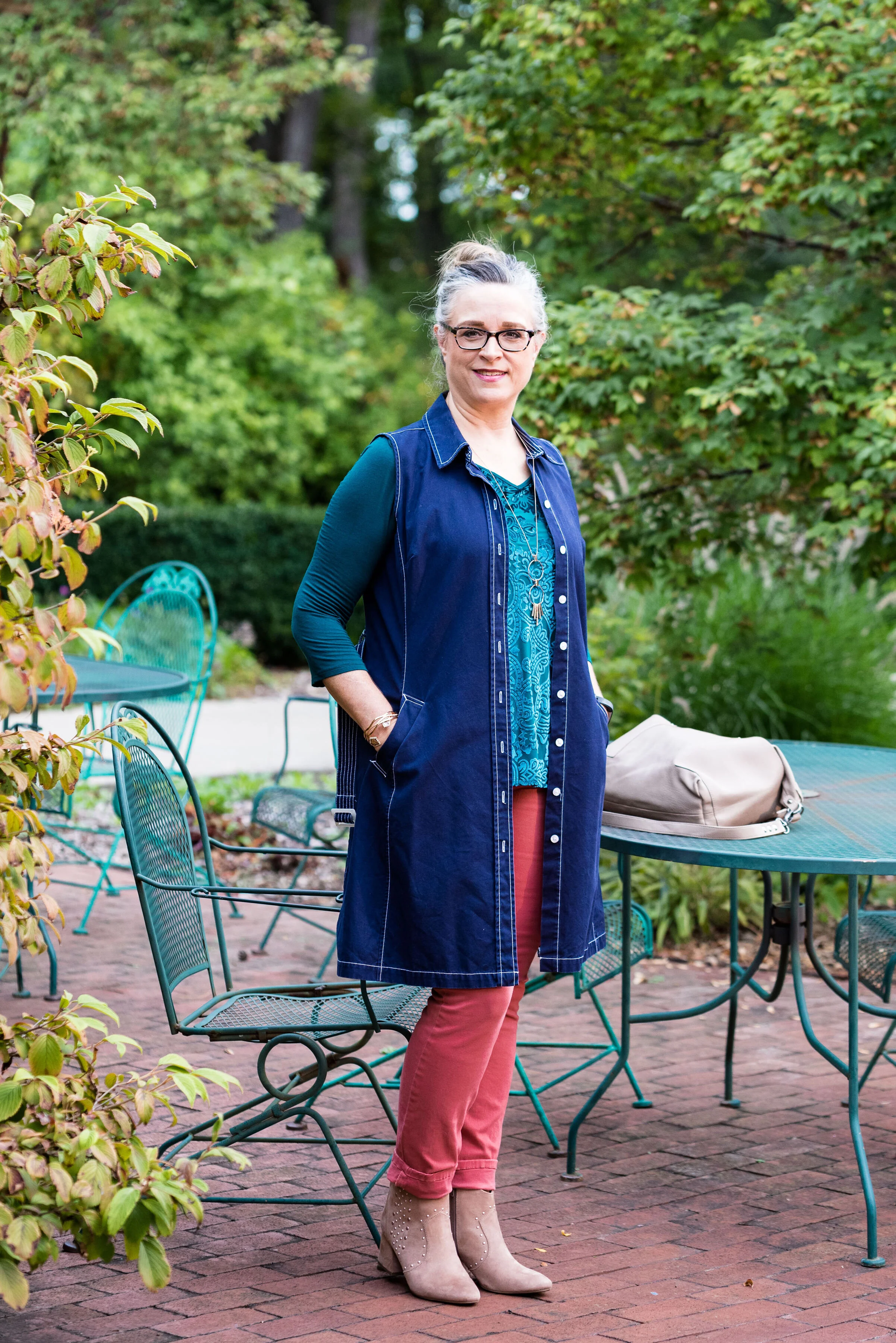
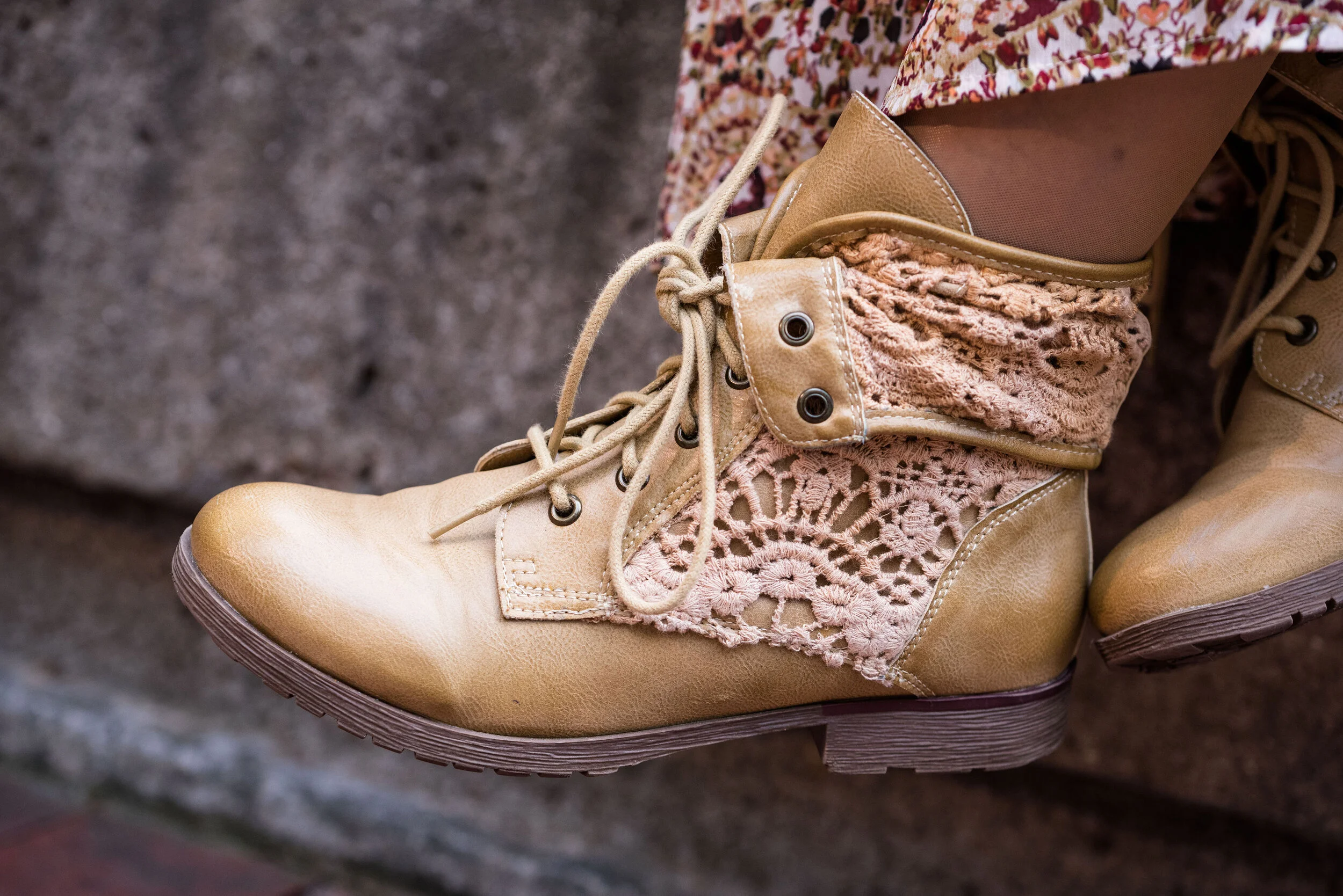
For this outfit, it worked out that Ultimate Gray takes center stage with just a few pops of Fire Whirl and Illuminating. My thrifted, plaid, Sag Harbor trousers are actually petites, so I expect they would be closer to an ankle pant than a crop pant, but I like the way it looks, especially with my darker gray Impo booties.

pantonefallcolortrendsfirewhirl-11.jpg

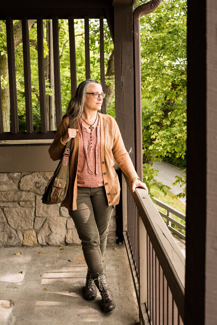
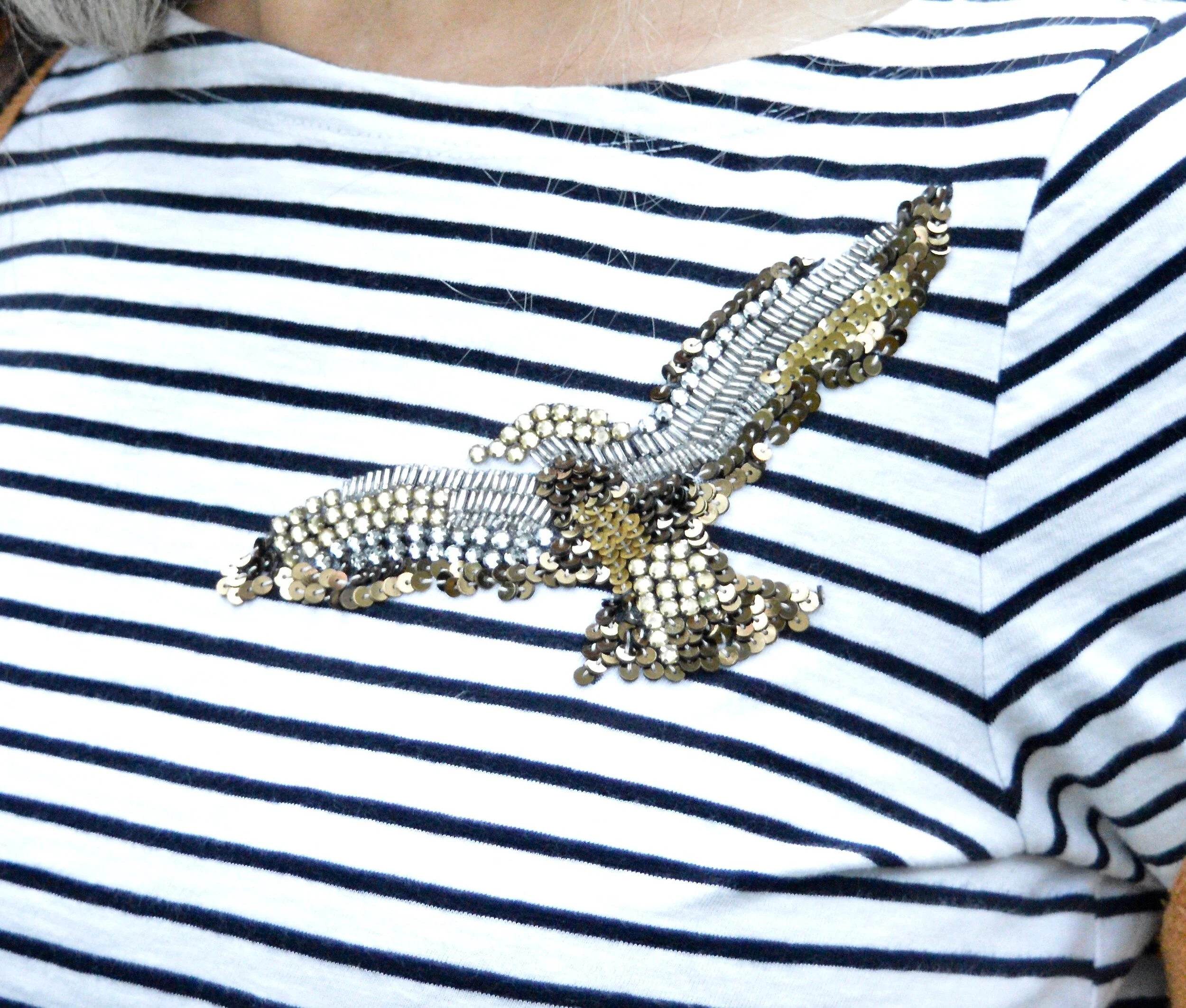
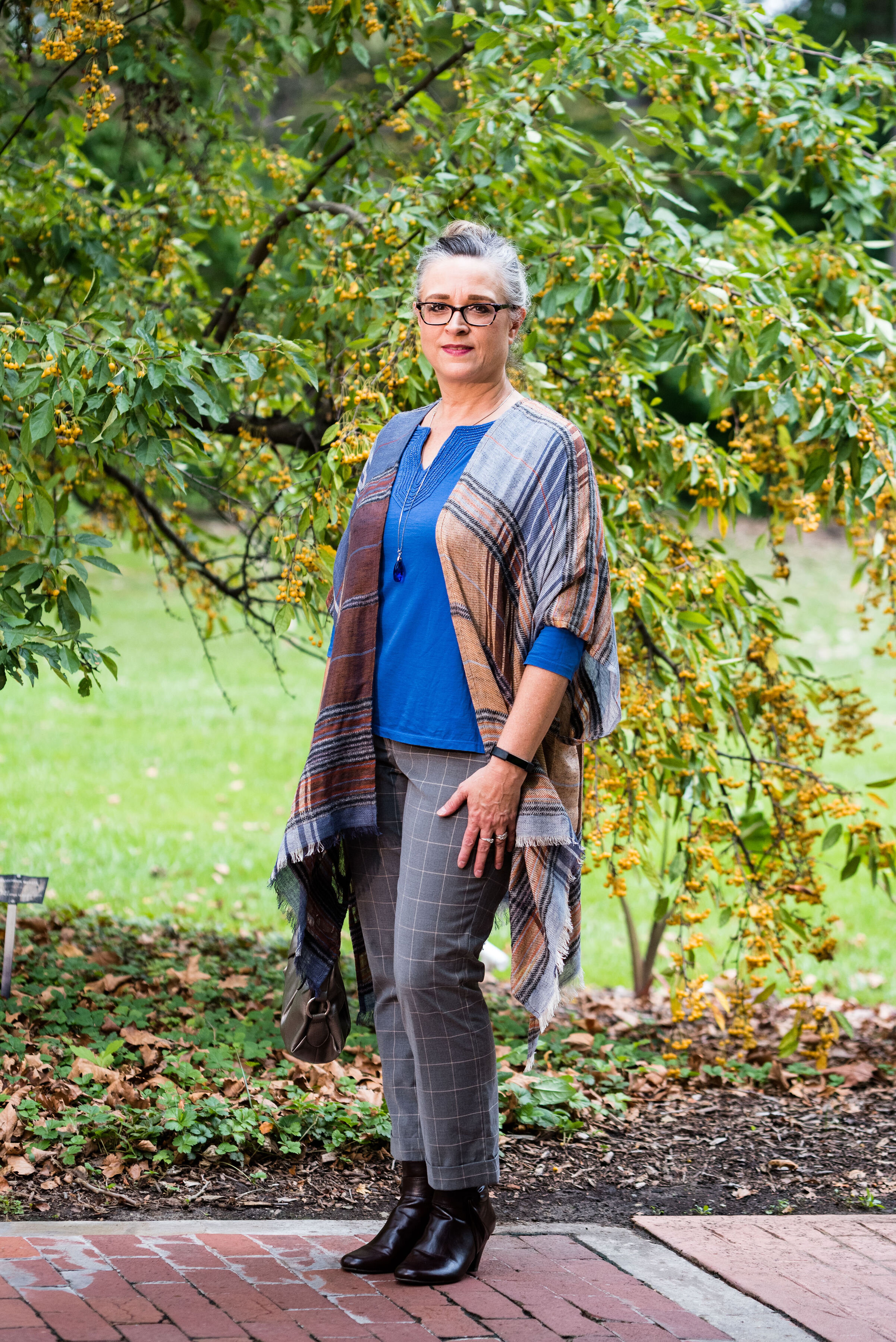
The next picture shows you a closer look a the Illuminating jewelry and the detailing on the yoke of the top. The gray moto jacket is a no name brand and I am not sure where I got it. I wanted to say it was thrifted, but for some reason, I think I bought it at a store. I really cannot remember. Is that bad? Ha, ha.

pantonefallcolortrendsfirewhirl-8.jpg

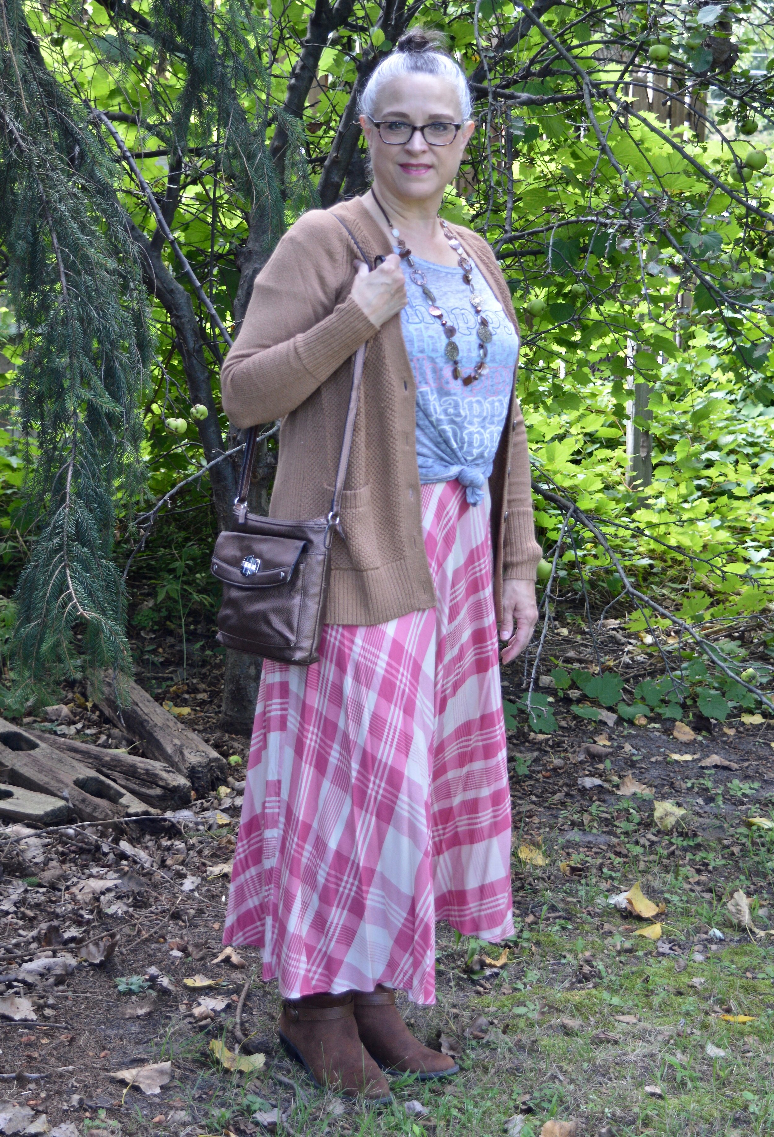
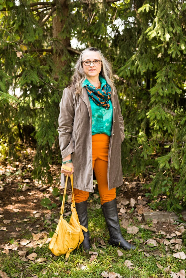
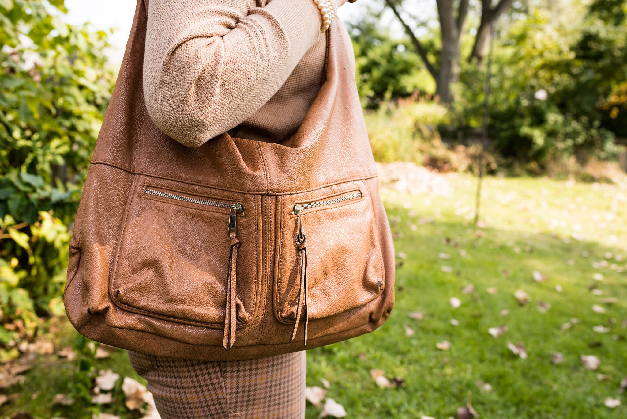
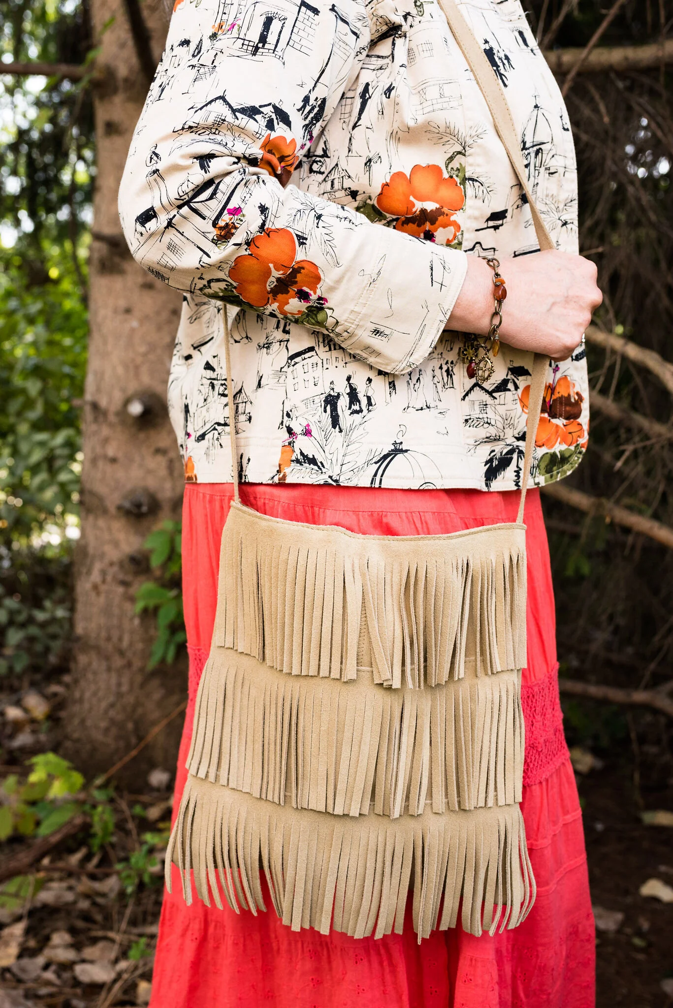
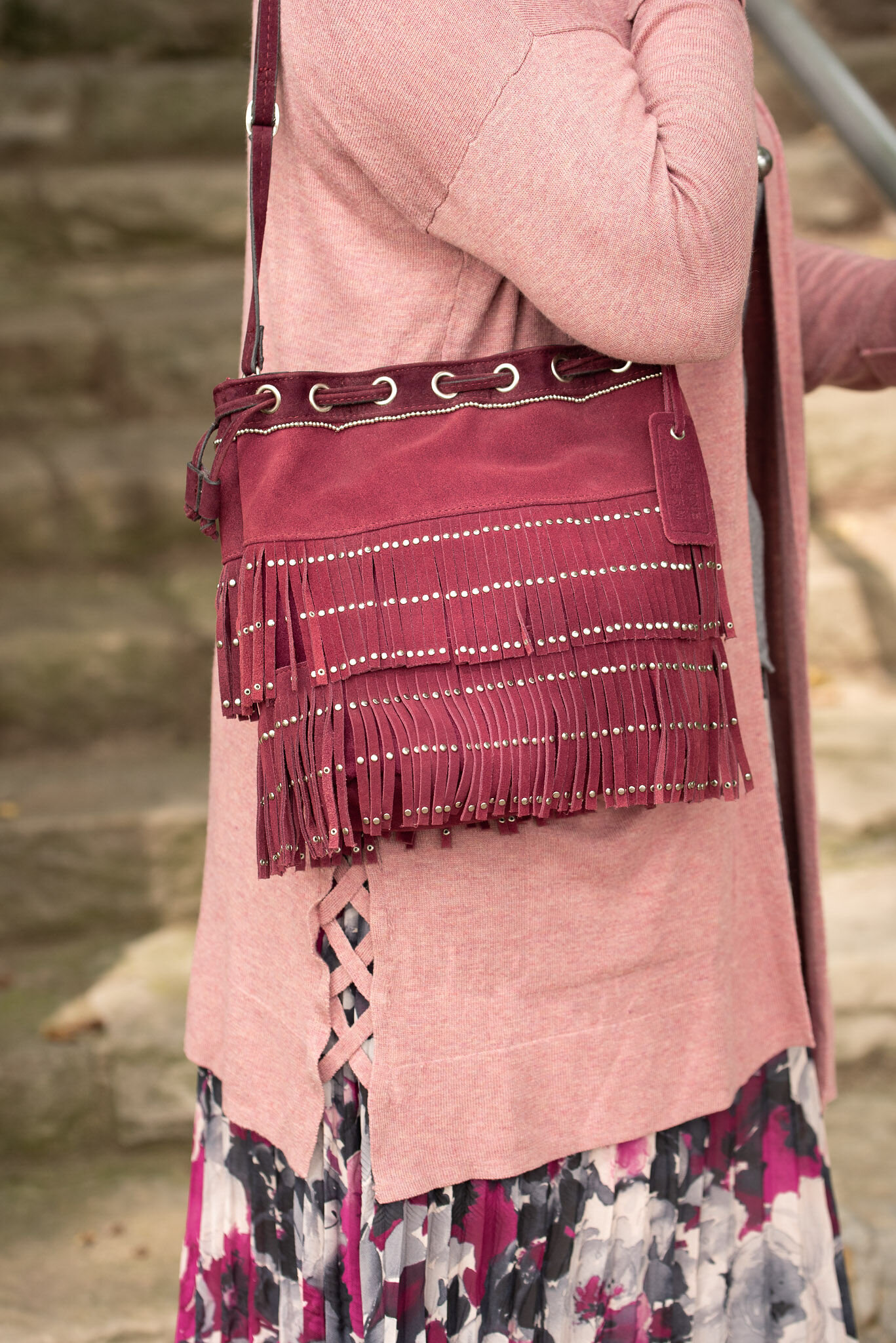
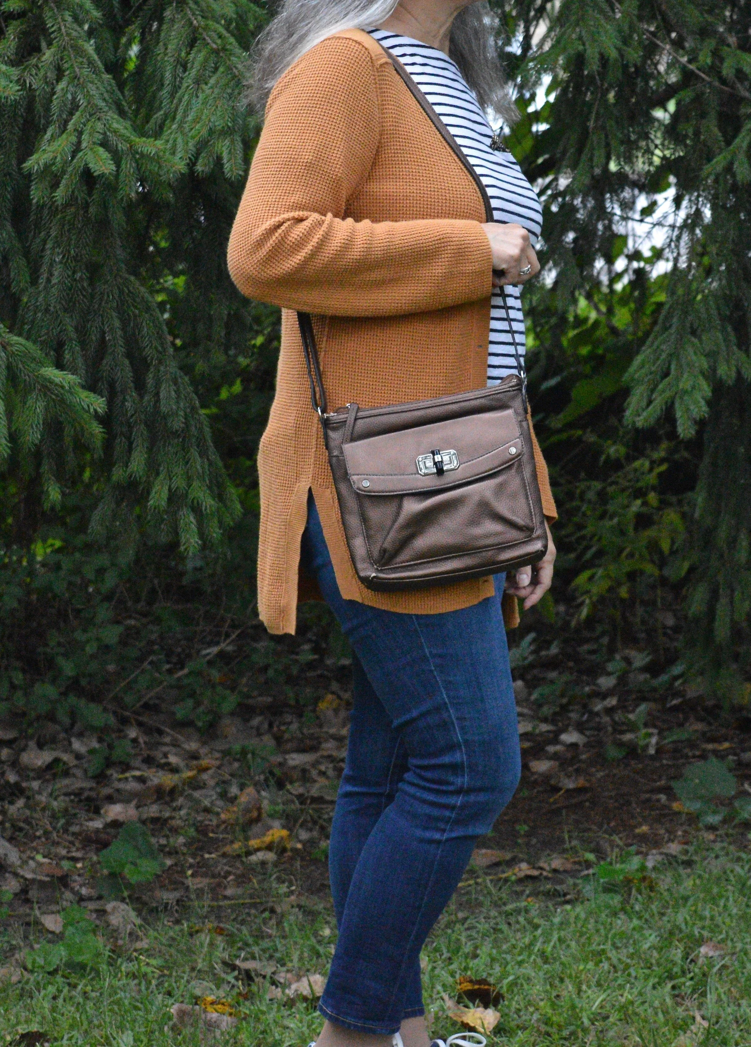
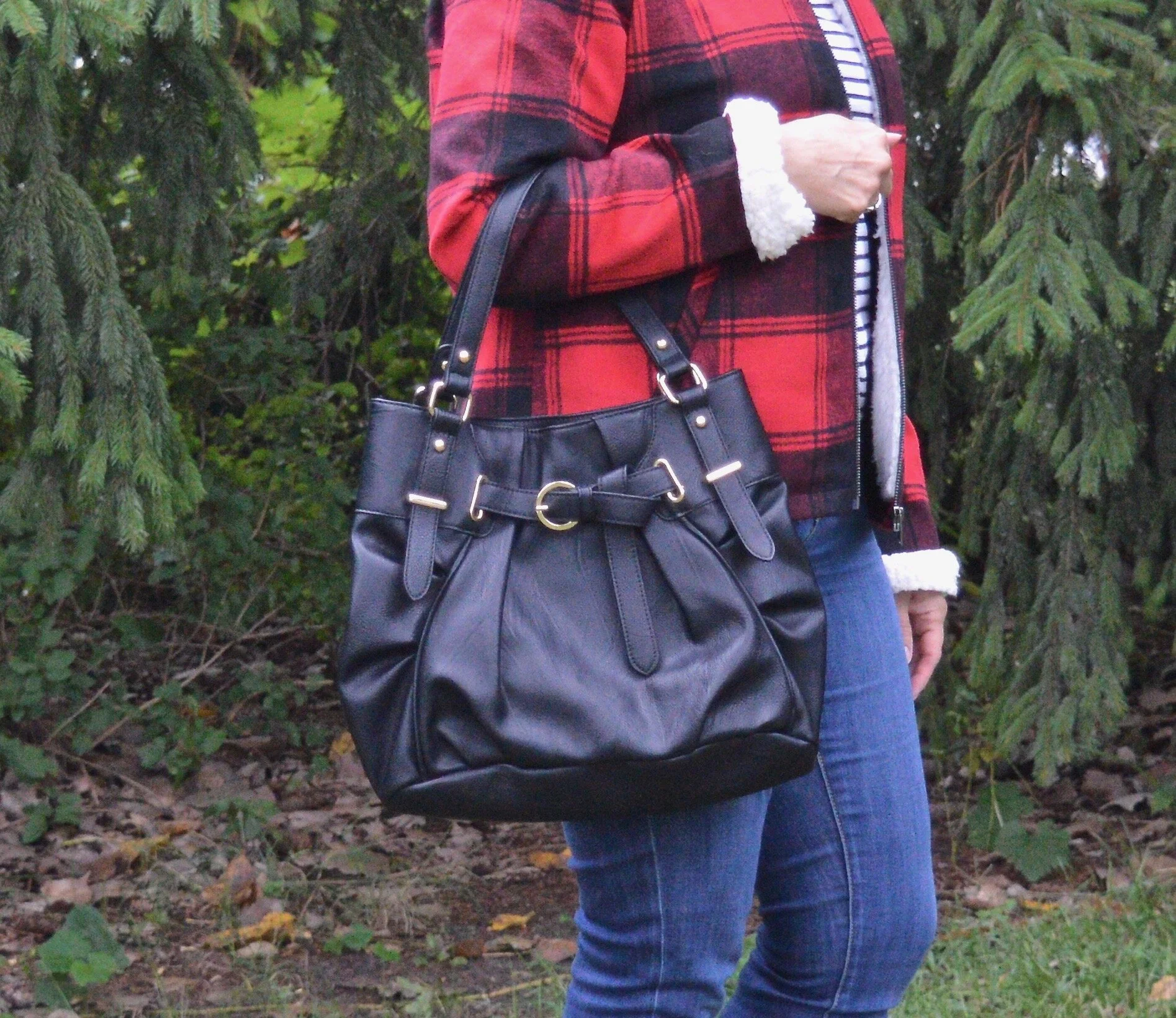
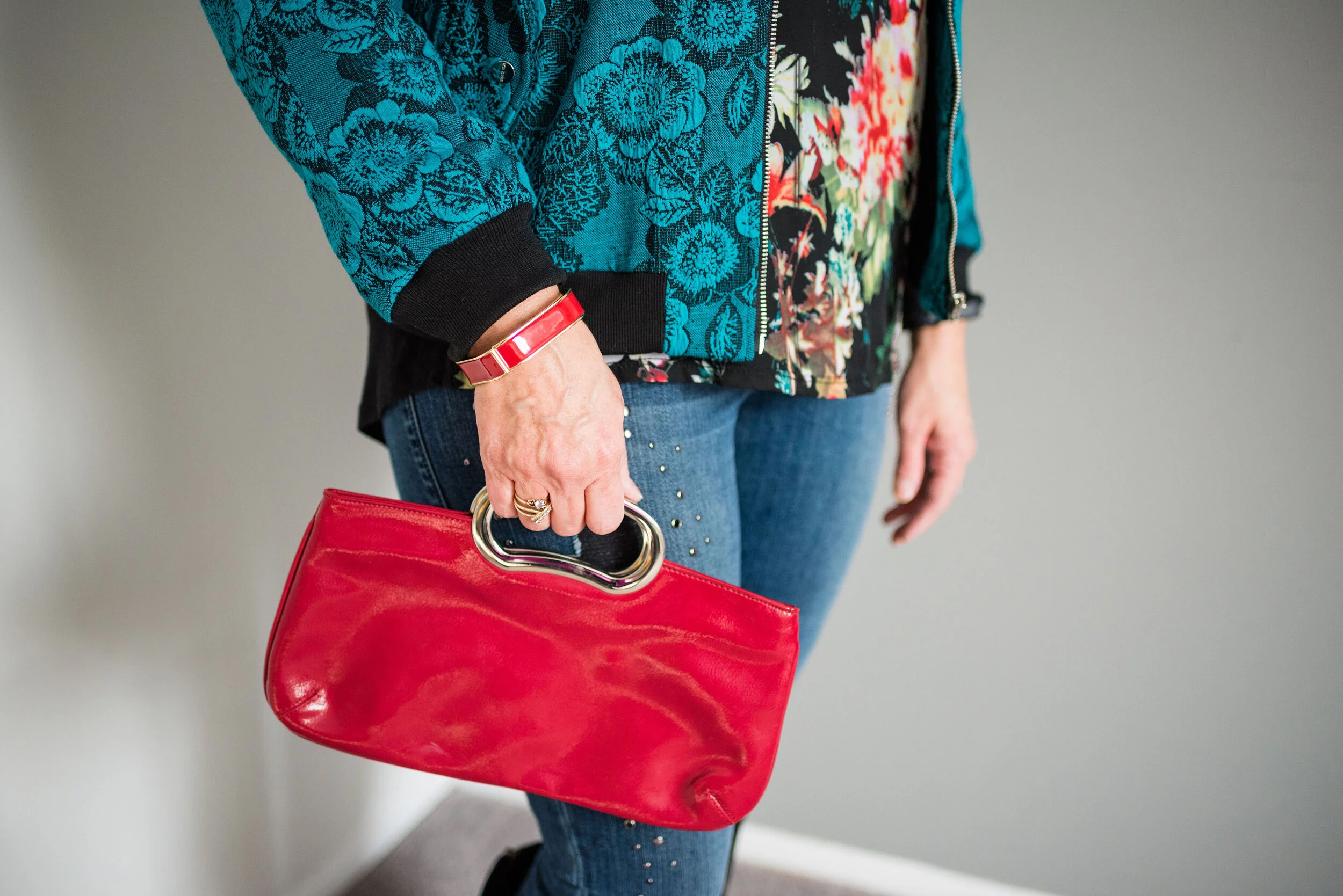
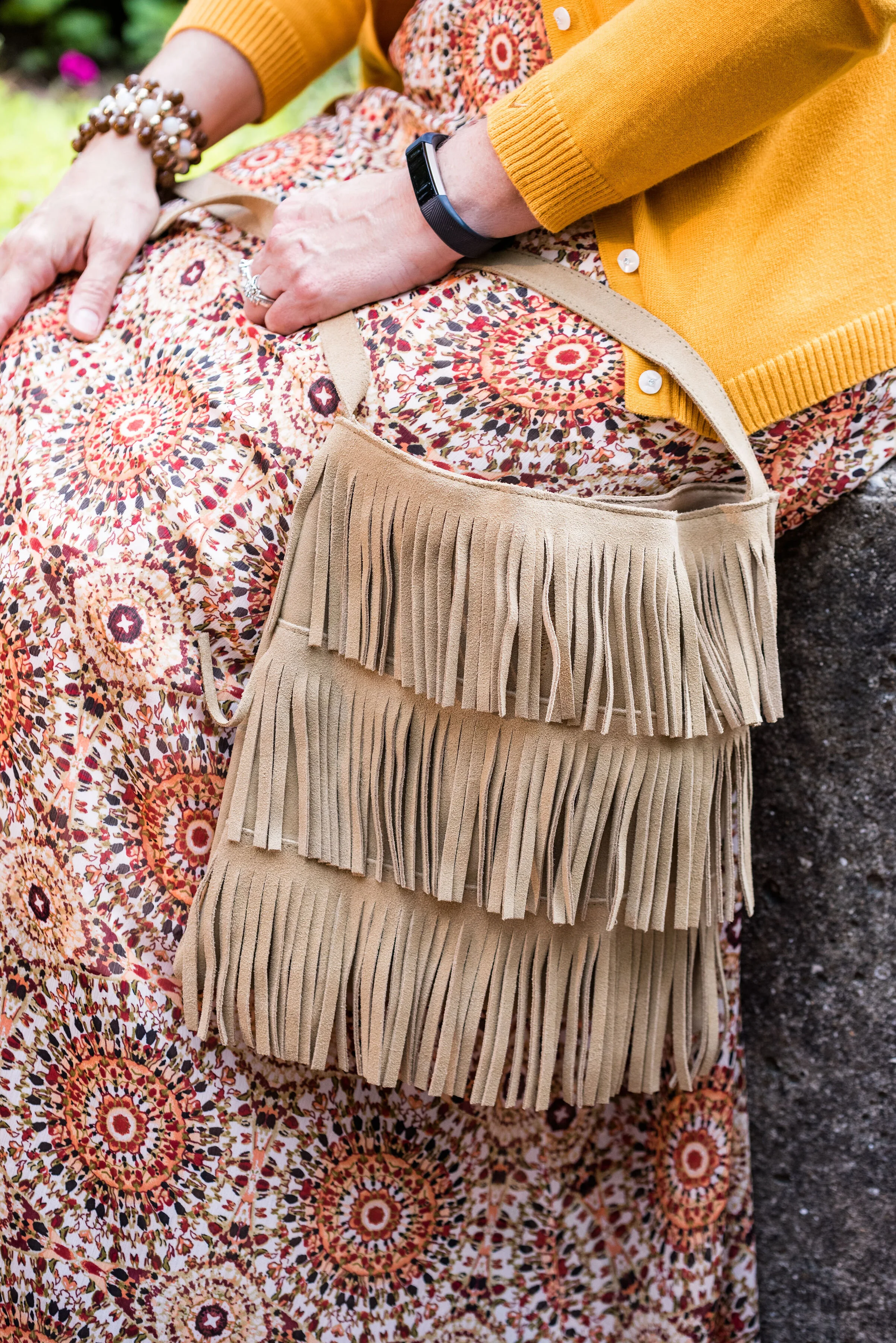
My tote bag was going to be a gift for one of my daughter’s one Christmas a few years ago and I ended up keeping it. Many times, I just end up buying too many items, so I have to return stuff, but this was a cheap purchase, I believe from Kohl’s and I really liked it.

pantonefallcolortrendsfirewhirl-9.jpg

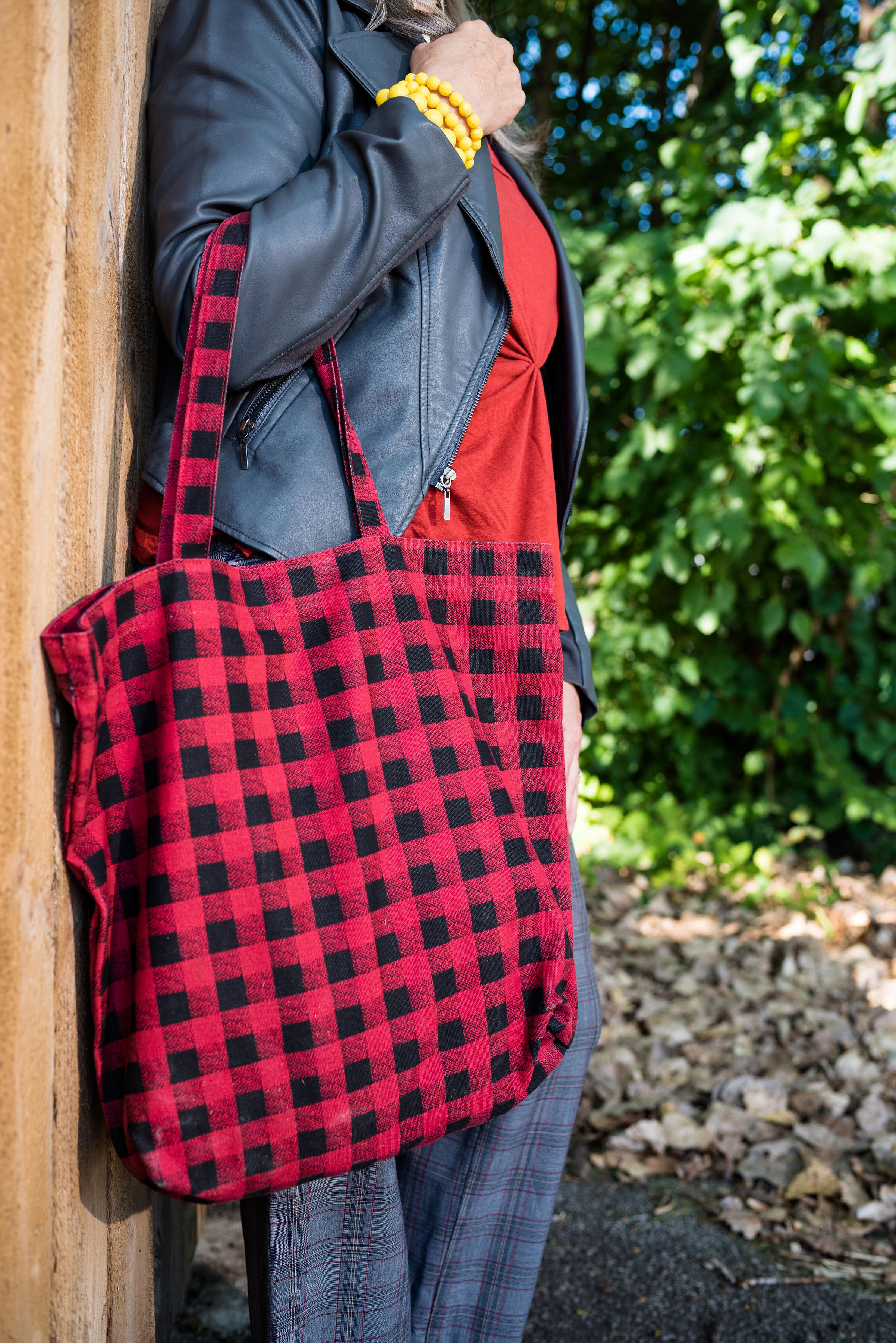
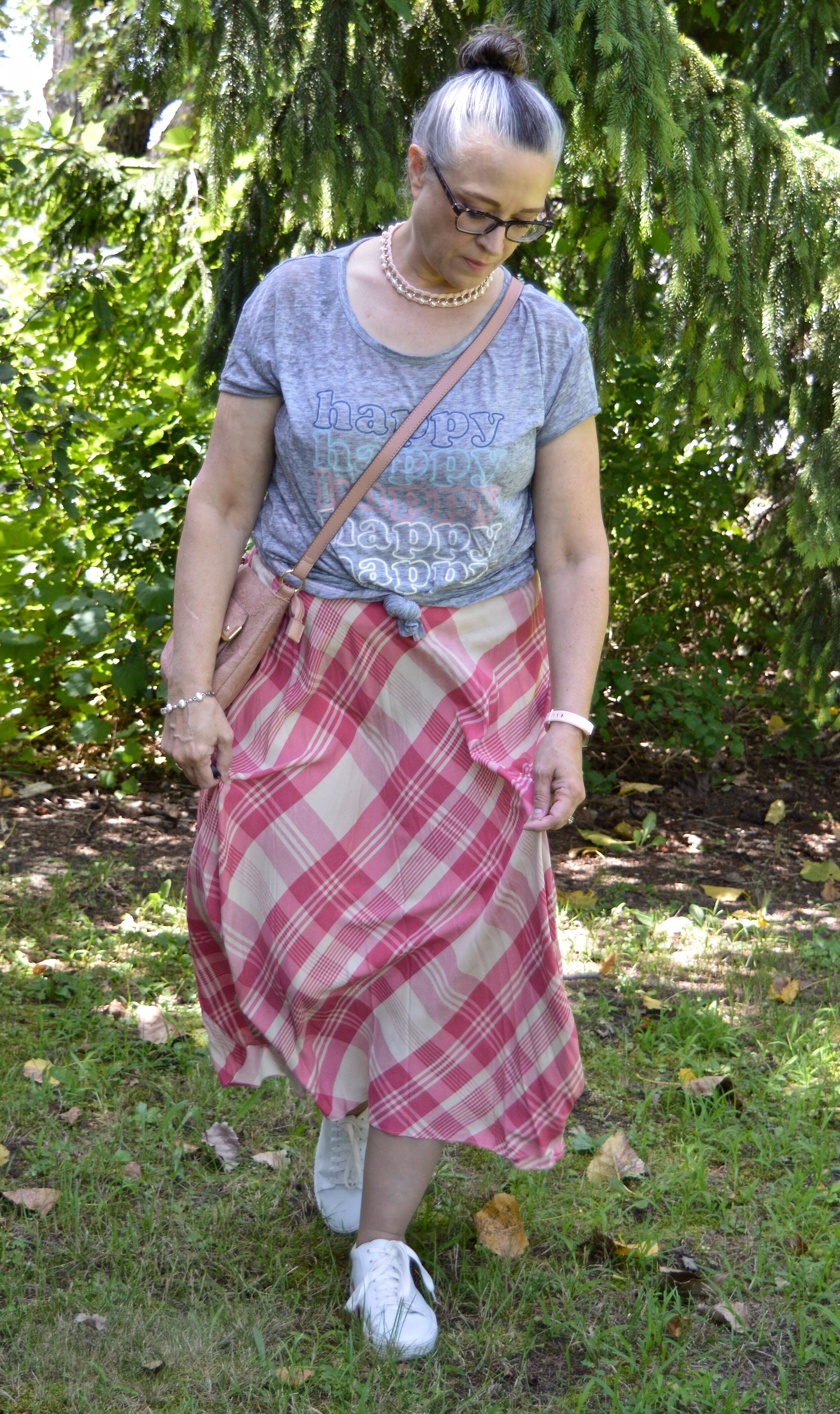
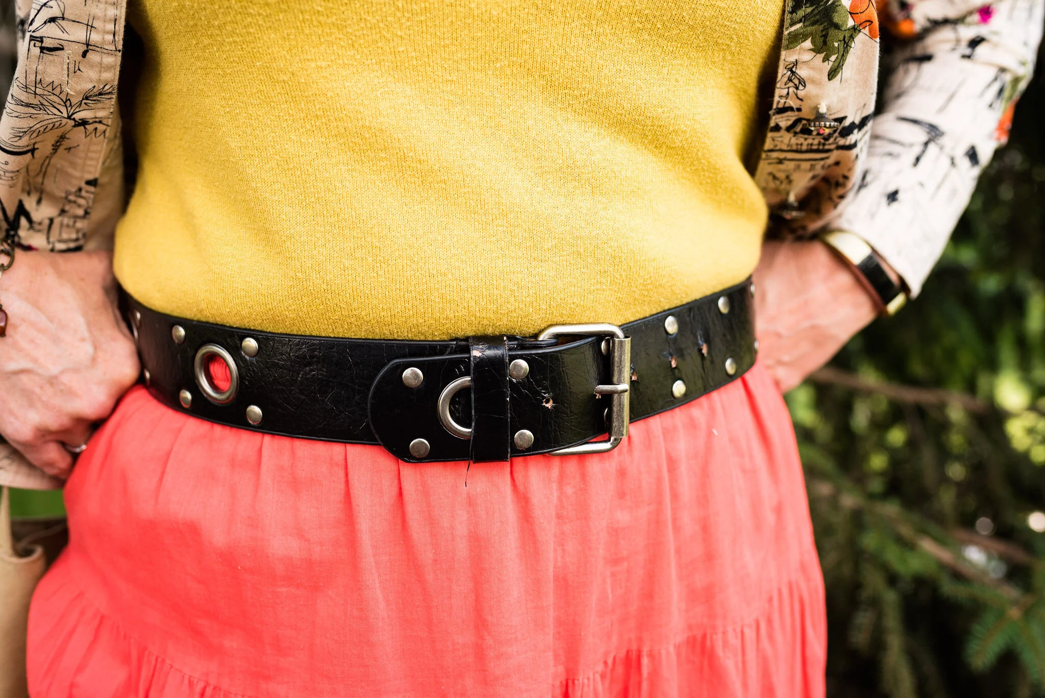
Fire Whirl is more the color of my top, but I kind of liked the contrasting shades of red, as well as the two differing plaid patterns. It just gives the outfit a fun vibe.

pantonefallcolortrendsfirewhirl-1.jpg

What do you think of these colors? Would you pair these colors with one another? Do you have these colors in your closet? Let me know your thoughts in the comments below.

I am including a few shopping links for you to look over. These are affiliate links, brought to you at no extra cost. If you click on a link, I get a few cents, if you purchase something through my site, I get a little more. Thank you for all of your support.

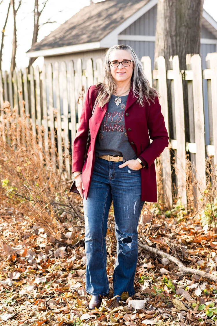
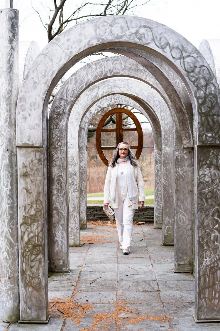
Photo credit Jessica Trumbull, with Rebecca Trumbull.

Thinking About Fall - What's Trending for 2021

I like to share with you some of the new trends for each season after I’ve done a little online research. I typically go to websites like Marie Claire, Cosmopolitan, Harper’s Bazaar, Vogue and WhoWhatWear to see what the fashion world deems important for us to know. Believe me, I am not a huge trend follower, but I do like to see what’s going on out there. Many trends continue from one season to the next, and we often find trends come and go, then come back again. I have gotten into the habit of telling people, don’t throw things away that no longer seem trendy, because they will come back around. As long as you enjoy a trend and can still fit into it, there is no reason to give it up, just because the fashion gurus say it is no longer trending.

Image by suju-foto from Pixabay

Image by suju-foto from Pixabay

Today’s post will cover a few of the trends I could easily get on board with. Some of these trends I already have in my closet and a few I might write on my thrift shopping list to look for the next time I go to a second hand store. I am including a variety of shopping links for you to look over. These are affiliate links and are brought to you at no additional cost. If you click on a link I get a few cents. I appreciate all your clicks.

Sweater Vests

These core layering pieces have been slowly making a comeback with a bit of a surge last winter spring. They are now on the radar for fall. I am glad. I like a classic sweater vest and think they can add so much to an outfit. Besides just adding a layer of warmth around your middle, they add texture and interest to any outfit from casual jeans and sneakers, to a shapely pencil skirt and heels.

Chunky Knits

Going along with the trend towards knit vests, there is the trend towards chunky, oversized knits. This would include pants, skirts, dresses and the like, but I know many of my followers would not be caught dead in a sweater dress or pants, so I am just including links for pullovers and cardigans. Some of the runway trends lean toward knits on steroids, which is definitely not me, so I will not be sharing those.

Fair Isle Sweaters

Another knit trend that is coming in popular this fall is the “Snow Bunny” trend or Fair Isle sweaters. This recognizable knit was popularized by the royal family in England in the 1920’s when Edward VIII wore his in public. Originally hand made on the island of Fair Isle, a somewhat isolated community north of Scotland, the original knit patterns donned wool hats and sweaters on fisherman, to keep them warm. See the article, History of the Fair Isle Sweater, for more information. While true Fair Isle sweaters are wool or at least partially wool, I’ve included some links for a few that are less itchy for those of us who can’t handle the wool.

Sequins and Sparkles

A girl can never have enough bling in my opinion, so when I saw sequins and sparkles on the trend radar, I thought how fun that can be. Whether you add it in big doses like a skirt, dress or top, or you add just a touch with a small clutch or the pocket on a tee, bling is a great way to jazz up an otherwise casual look.

Leopard Print and Faux Fur Coats

Leopard print is still trending and while the focus is on coats, don’t get rid of those leopard booties, sweaters and bags. I am on the prowl for a fuzzy faux fur coat this year, so I am going to put that on my Christmas list. I just found a leopard print, longer sweater while thrifting, so I will probably ask for my faux fur in a solid color.

The last two trends I want to look at I am going to include shopping links for accessories. I think these two trends are already in many of our closets, so I thought it would be fun to see what there is in the way of bags, shoes and other outfit add ons.

Quilted and Padded Textures

Most of us have a jacket, a longer coat, or at least a vest that has that puffer like quality. I have a number of vests, and a thrifted black coat that I use regularly in the winter. The quilted texture is a fun add on, especially in late fall and winter, when the temperatures plummet.

Highly Saturated Colors

I think most of us who are on the color wagon have multiple things in our wardrobes that fit into this category. Colors like fuchsia, violet, emerald green, royal blue, and bold orange come to mind when we think of saturated colors. Many people do not like deep, bright colors like these, but if you add just a pop here or there in the form of a pair of shoes, a scarf or some beads, you don’t have to feel overwhelmed by them.

I hope you enjoyed this look at some of this fall’s trends and that you will take a few minutes to stop and shop. Maybe there was something in today’s post, that you thought, “That is just what I was look for to fill that hole in my wardrobe.” Let me know which of these trends you already have in your closet and which one you are going to invest in.

Until next time, have a great day!

Thinking About Fall - Transitional Style - Lightweight Crop Pants

I’m going to give you a couple more weeks of Transitional Style and then hopefully I’ll be ready to start the Pantone Series. We decided to forgo pictures this week since the weather was too hot for this post menopausal woman and her very pregnant photographer. Ha ha. Hopefully, next week will be a tad bit more humane for all involved.

Today we are going to look at how to take a pair of lightweight cropped pants from summer into fall. Once again, these changes are so easy and everyone can do them. It is only a matter of swapping out a few things or adding another layer. Other than those little changes the outfit overall stays exactly the same.

DSC_0005.jpg

I found these black and white, gingham cropped pants thrifting. I wanted something a little different than my usual rolled up jeans and I think these work very well. Today was my first attempt at wearing them and I was pleased with this cool, casual look. These are Jones New York Sport brand.

DSC_0004.jpg

My simple light green tank top is a thrifted Loft piece. I decided to wear a few more of my sleeveless pieces this week, since it is going to be so hot all week long. I liked the mix of the pastel green with the black and white print of the pants.

I finished off the look with a long light green pendant necklace, a few beaded stretch bracelets, my green bag from Charming Charlie and my thrifted, black Bare Traps sandals.

DSC_0012.jpg
DSC_0009.jpg
DSC_0008.jpg

In order to make this outfit fall worthy, I added my longer olive Sonoma cardigan. I have had this piece for a number of years now and it it definitely one of those work horses in my cold weather wardrobe.

DSC_0016.jpg

Instead of the necklace I swapped it out for a scarf that is totally speaking the fall vibes. Scarves are great things to find at thrift stores. I also swapped out the lighter beaded bracelets for a couple of darker pieces.

DSC_0022.jpg

It was a no brainer to add my black Natural Reflections ankle boots and a thrifted black Scarleton bag.

DSC_0019.jpg
DSC_0021.jpg

Here are the two outfits side by side. Do you have a pair of light weight pants that you are unsure how to transition to fall? I hope this post helps. Let me know what your thought are, or how you might do something similar to this.

I’m including a few shopping links for you to look over. Every click on a link gives me a few pennies, at no cost to you. These are affiliate links and I appreciate every click.

Have a great Tuesday!

Thinking About Fall - Transitional Style - Lightweight Skirt

When we start thinking about fall, we are probably starting to yearn for our cozy sweaters, scarves and boots. As the weather begins its journey through the waning days of summer we know the days will still be plenty warm, but the evenings might start cooling off, especially after the sun goes down. That is a good time to think about layers. Why not pull out a few of your medium weight sweaters and a couple pairs of ankle boots and start using them, even though the start of fall on the calendar is not for another month?

Today’s outfit revolves around a light weight skirt that I picked up just a few weeks ago at Kohl’s on the clearance rack. It is obviously from this past spring, perhaps even related to Easter style, so I thought this would be a good piece to take from warm summer day, to cool weather appropriate with just a few simple changes.

DSC_0077.jpg

For a cute, breezy, summer look I thought this Chaps plaid skirt would pair well with a fun graphic tee. You have see this thrifted No Boundaries tee on the blog before. You can see it styled with a denim pencil skirt, and a fringe vest. Isn’t it funny that I did the front knot with the fringe vest as well? The shirt is a little over sized and very stretchy, so knotting it is easy. The skirt is not lined, but I wasn’t going anywhere and it is not sheer, so unless I had on a pair of dark panties, there was no show through worries.

DSC_0088.jpg

I wanted to highlight the pink and the white letters in the tee, so chose pink and pearl accessories.

DSC_0086.jpg
DSC_0083.jpg

I thought the Steve Madden white tennis shoes a good choice to keep the look fun and casual.

To make the transition to cooler weather, I once again reached for the color brown. I love brown in the fall. My husband likes the color brown on me, so I have been trying to incorporated it into a year round color, but it is often hard to find. For this look, instead of a jacket I chose my cozy, thrifted Old Navy cardigan.

DSC_0091.jpg

Once again, I chose a more chunky necklace with shades of brown, gold, and coppery bronze. I really wasn’t sure how I felt about this look, but now that I see it, I like it. Brown and pink are always a winning combo and the contrast of the gray tee gives it interest and keeps it from being overly two-toned.

DSC_0096.jpg

I went with my taller Sonoma suede boots, because I liked the more slouchy look with this casual outfit. They give it a bit more of a boho vibe. Most of the boots I own, that I have bought new I got at Kohl’s. I like both So and Sonoma brand. They fit my feet well and allow room for socks or tights. They are ultra casual, but still make an outfit look polished and complete. I’ll provide a few shopping links at the end if you are thinking about a new pair for fall.

DSC_0097.jpg

My bronze cross body bag is another staple in my closet. I bring this one out every fall.

DSC_0098.jpg

Here are the two looks side by side.

Do you have a summer skirt that you would like to wear longer? What can you add to make that skirt still useable in the cooler weather? I’d love to hear your thoughts, so leave me a comment or two.

I’m including a few shopping links. These are affiliate links. All opinions are my own

Have a great Tuesday!

A Look Back at 2020 - My Favorite Outfits

Before I launch into a short series on some of the current winter trends, i wanted to revisit my favorite outfits from this past year. 2020 was a year unlike any other with the Covid Pandemic, racial unrest and the election overwhelming our newsfeeds. There were times where I just didn’t feel like being a blogger any more. I just wanted to crawl into a nice, cozy hole and not come out until all of the bad news went away. Fortunately, I didn’t do that. I had a sense that every single one of you that regularly follow me, needed a brief respite from all the bad that was going on around us. The normalcy of looking at and talking about faith and fashion, just seemed to be a good thing to do, so I kept at it.

I have a feeling that 2021 is not going to be a whole lot different from 2020. Change is going to continue to happen and change is what often pushes us well outside of our comfort zones. However, my little blog is still going to be here, as long as God gives me the health, energy and brain power to continue, I will do so. Many of you have become like family to me. Those of you who have regularly commented or even taken the time to send me a personal email have been a great source of encouragement to me, so thank you.

Here is a look back at 2020. As I have done before, I go month by month and pick out my faves. I’d love to know which outfit really inspired you.

January

Actual Amy - Waterfall Cardigan

Actual Amy - Waterfall Cardigan

Why I like It: This whole outfit is very much me. I love the rusty textures of the waterfall cardigan and faux suede boots. As you all know, I love my jeans and the striped long sleeve tee is the perfect choice for this ultra casual outfit. I also like the subtle print mixing going on between the stripes, snakeskin patterned bag and the speckled bead pendant.

February

Seeing Red - Thrifted Thursday - Burgundy Skirt

Seeing Red - Thrifted Thursday - Burgundy Skirt

Why I Like It: In all honesty, I had three outfits, all together, that I liked from February. I decided to post this one as my favorite, because it was totally unexpected. I honestly did not think this outfit was going to look as good as it did when I started putting it together. I wasn’t sure about the color combo or the mix of smooth faux leather pencil skirt with oversized textured sweater, but I absolutely love everything about this outfit. The color combo was perfect and the unexpected mix of textures and lengths honestly works well. The only thing I might have changed is the shoes. I’m wondering if a burgundy shoe would have been a better choice, but overall it worked. The other two that I liked from February were, Seeing Red - Red with Tan - Velvet Jacket, and Seeing Red - Actual Amy - Plaid Jacket.

March

Spring Trends 2020 - Maxi Dresses, Psychedelic Prints and Vests

Spring Trends 2020 - Maxi Dress

Why I Like It: March was the month I focused on the Spring Trends for the year. I will do that again this year. I like the boho, hippy vibe of this outfit with the medallion printed maxi dress, the striped tee and the denim vest. It just presents a fun, eclectic mix that makes for a great casual date night look.

April

Transitional Spring Outfit

Photo credit Rachel Christensen

Photo credit Rachel Christensen

Why I Like It: Who doesn’t like a kimono? They are just fun, fabulous pieces and every woman should have one or two in her closet. I have many more than that, but there are so many pretty styles, prints and colors. This pink, burgundy and white piece is no exception. I especially like the fringe on the sleeve and bottom hems. Every since I learned about print mixing, I have become obsessed and nothing pairs better than stripes and flowers. The burgundy colored accessories complete the look perfectly.

May

Pantone Spring/Summer - 2020 - Sunlight, Flame Scarlet and Ash

Photo credit Amy Christensen

Photo credit Amy Christensen

Why I Like It: There is nothing special about this outfit, other than it is something I would actually wear. Though all of the outfits I post are things I actually own, I don’t necessarily wear everything that you see, exactly as you see it. The reason for this is, I am trying to show a varied audience outfits that could be used for every day, work, going out or traveling. Right now I am not working outside the home and we really aren’t going anywhere, yet this outfit is something I would still wear.

June

Pantone Spring/Summer - 2020 - Tanager Turquoise, Heritage Blue and Blanc de Blanc

Pantone Spring/Summer - 2020

Why I Like It: This look is classic. It could be worn by any woman, anywhere. It is a great outfit for work, but could also be worn for a date night, or lunch with the girls. It also exudes spring and summer with the bright floral top, crisp white ankle pants and silver ballerina flats. The blue bag, beaded necklace and bracelets add fun matching elements to the ensemble.

July

Summer Outfit - Geometric Maxi Dress - Casual

Summer Outfit - Geometric Maxi Dress - Casual

Why I Like It: Honestly, I like this outfit, because I think it is fun! I love the hat, the tee and the geometric print on the maxi dress. The top is a light weight sleeveless tee material, so adding the other tee did not add bulk, weight or make it hotter. This would be a great look for traveling, going to the beach or on a picnic.

August

Outfit Inspiration - Dressed Up Casual Style

Outfit Inspiration

Why I Like It: What is not to love about this dressy casual look. The star piece is the thrifted kimono. It took a simple white tee and boyfriend jeans up to a new level of style. The fringe necklace compliments the purples in the kimono and the rusty orange bag the oranges. This was a nice transitional outfit for the waning days of summer.

September

Pantone Fall/Winter 2020 - Samba, Fired Brick and Sleet

Pantone Fall/Winter 2020

Why I Like It: September was another month where I had several favorite outfits, but this one still stands out as a winner. Once again, the combination of colors, as well as the print mixing, really goes a long way to making this dressier outfit perfect for the office. I also like how my last minute addition of blush accessories pulled everything together. Two of my other faves were, Pantone Fall Winter 2020 - Peach Nougat, Sandstone and Military Olive, and Color Play - Fall Mix.

October

Pantone - Autumn/Winter 2020 - London Palette - Samba, Tawny Birch and Sheepskin

Pantone Autumn Winter  2020

Why I Like It: I don’t wear neutrals all that often, but a combination like this really pops. The neutral palette colors of Tawny Birch and Sheepskin, combined with the bright Samba red makes an exceptional outfit. The added joy is that everything in this outfit is thrifted, except the pearls. When I can put a whole outfit together with thrifted pieces and it ends up looking like this, I am all for it.

November

Fall/Thanksgiving Outfits - Harvest Tee and Distressed Jeans - Dressy

Fall/Thanksgiving Outfit

Why I Like It: This outfit is just very me. I love wearing tees, and jeans and throwing a nice blazer and a pair of boots on really levels up a very casual outfit. The addition of a fun statement necklace and a cute bag also provide a dressier look, even with the distressed jeans.

December

A Dickens’ Christmas - The Ghost of Christmas Past

A+Dickens'+Christmas+-+The+Ghost+of+Christmas+Past.jpeg

Why I Like It: Out of my whole Christmas series, I think this outfit and these photos were my faves. Winter white is really trending right now and when I put these pieces together for my Ghost of Christmas Past persona, I didn’t realize how popular these creamy whites were. The outfit itself was cozy and in keeping with my love for pants and flats. Ha, ha.

There you have it, my favorite picks from 2020. What were your faves? I would love to hear back from you. Also, if there is anything you would like to see more of on the blog, or a different topic you would like me to talk about, please let me know.

I hope your New Year is off to a great start. Check back on Thursday for a look at some of the current winter trends.

Photo credit unless otherwise stated, Rebecca Trumbull Photography.

Fall/Thanksgiving Outfits - Sweatshirt and Skinny Jeans - Casual

For the next few weeks I thought I would focus on outfits that could be worn for the Thanksgiving Holiday, or just as another fall outfit. Each week I will take one or two main pieces and show how to style them two different ways. This week my pieces are a pair of embellished skinny jeans, and a deep yellow sweatshirt that I grabbed from my daughter’s "to get rid of” pile.

For today’s look I wanted to go with a more casual vibe. The two pieces could be worn by themselves and be perfectly acceptable for a casual, low key Thanksgiving; just add a scarf or necklace and some sneakers or knee high boots and you are all set. I wanted to do something with a little more texture and print, so I decided to top the whole outfit with my plaid ruana that I got last year at Bass Pro Shop. It may sound a little funny, but I love their clothes. They have a little higher price point than I usually pay, but you can read the story of how my hubby surprised me with a mini shopping spree here.

Deep yellow sweatshirt, skinny jeans and plaid ruana

It is always a journey taking my own pictures. Ha, ha. Here is the ruana from more of a back and side view.

Dark Yellow sweatshirt, skinny jeans and plaid ruana

This rich yellow sweatshirt is from a local boutique Eden Fashion Boutique. I did a blog post on their Sylvania location which you can see here. Unfortunately that shop closed up during the pandemic. The original shop is still in business in Bowling Green, OH which is about a 25 minute drive. My daughter decided she didn’t wear it enough for it to warrant taking up space in her closet. I absolutely love color. It also has snaps from about the elbow up on both sleeves, which gives it a fun look. I should have taken a picture of it without the ruana. Oh well! I’ll save that for another time.

Yellow sweatshirt, skinny jeans and plaid ruana

You can see the blingy embellishment on my jeans. There are sparkles on both legs, the right is closer to the hip. These are Juicy Couture brand and I got them a year or so ago at Kohl’s on the clearance rack.

Since I wanted this to be casual, but it is also meant to be for an occasion like a Thanksgiving dinner, I added a little bit of jewelry and a bag to bring out the blue in the ruana. My long pendant necklace I use regularly. The beaded bracelet has a cute owl charm on it and the blue cross body bag was a gift a few Christmases ago from my younger daughter.

Fall outfit - blue pendant
Fall outfit - Beaded bracelet with owl
Fall outfit - blue bag

These rusty colored moto boots are a soft faux suede and have zippers on the inside of the leg. They are Steve Madden brand and I ordered them from DSW last year on clearance.

Fall outfit - rust moto boots

What do you think of this outfit? Would you wear this for a casual Thanksgiving day gathering? What might you have done differently? Leave me your thoughts in the comments. I always love to hear what you are thinking and how the blog is helping or hindering your fashion journey.

Dark yellow sweatshirt, skinny jeans and plaid ruana

This last photo is very fuzzy, but I liked the way it turned out anyway. Ha, ha. I really need to play with my camera more, so I can take better pictures. I am also a perfectionist, as if you hadn’t noticed. Ha, ha.

I’m including a few shopping links. Remember, Christmas is coming, so you might like to look over these links as possible gift ideas for you or yourself. These are affiliate links. All opinions are my own.


Pantone - Autumn/Winter - 2020 - All the Outfits

I wanted to end this fall color series by showing you all of the colors from both the Pantone New York Palette and the Pantone London Palette. To make it a little more interesting I thought I would show outfits that have, either a same color or a similar color side by side.

I hope that you enjoyed this series. If there are any other topics in fashion that you are interested in learning more about, or in seeing me talk about or put together in an outfit, I would love for you to let me know. I don’t follow trends too closely and this fall, I totally missed the boat on that, so I do apologize. I know some of you enjoy hearing what the trends are for each season and seeing how I apply those to the “real” world. Often when we look at websites or see magazines with tall, thin models or celebrities who are seamlessly coifed we think there is no way we would want to try this or that, especially when it comes to runway trends. However, there are a lot of trends that we can participate in and enjoy like leopard print, various colors and different types of accessories.

I will keep doing this Pantone series as long as I am blogging, because I feel strongly that even though we might differ from each other in our style, color is something we all have in common. Approaching new, bold and different colors without fear is a way to expand your wardrobe and spice up your style without completely committing to a whole different way of doing things.

The Color Palettes Side by Side.

Samba

I love the color red and I think there is a red for every complexion. I think both of these outfits worked quite well and love that both of them present a more neutral palette with a bright pop of red. In the New York outfit on the left Samba is paired with Fired Brick and Sleet. In the London outfit on the right Samba is paired with Tawny Birch and Sheepskin.

Ultramarine Green

Ultramarine was on both palettes and I think it is a pretty green that can bring a peaceful, yet vibrant feel to any outfit. This color green would look great in a bag, jewelry or a scarf and to me it really seems to draw your eyes to it. Maybe it is just my love for the greens in nature that make me like this color so much. In the New York outfit on the left Ultramarine Green is paired with Classic Blue and Blue Depths. In the London palette on the right Ultramarine Green is paired with Exuberance and Sleet.

Military Olive

While I love bright and bold colors like the two I mentioned previously, I love using olive as a neutral. It goes with every color, and has a different vibe than gray or beige. It is classy, yet subtle. In the New York outfit on the left, Military Olive is paired with Peach Nougat and Sandstone. In the London outfit on the right Military Olive is paired with Strong Blue and Jet Stream.

Green Sheen/Celery

It is hard to tell in these pictures, but Green Sheen and Celery are pretty similar. I think, because the lighting is different the colors look brighter in the shaded picture. They are different colors, but not enough different that they couldn’t be exchanged from one outfit to another. In the New York outfit on the left, Green Sheen is paired with Amber Glow and Almond Oil. In the London outfit on the right, Celery is paired with Mandarin and Sheepskin.

The Other Colors

These last two are paired only because they were the last two and don’t really have anything in common. The New York outfit on the left is a combination of Rose Tan, Magenta Purple and Sleet. The London outfit on the right is a combination of Burnt Henna, True Blue and Dress Blues.

Which outfit do you like most? Which color from the two palettes is one you frequently wear? What new color(s) are going to try to add to your wardrobe. As always, I love to hear your thoughts.

I apologize to those of you who subscribe to my blog. The last three weeks, I have completely forgotten to send out my weekly emails. I’ll just attribute that to “squishy brain syndrome.” Ha, ha.

Thanks for following along on the blog. I hope to use the next couple of weeks leading up to Thanksgiving showing you more fall outfits and maybe a few ideas for what to wear to Thanksgiving dinner whether you are going some place or sheltering in place.

If you follow my Faith page be sure to check back tomorrow for the next installment in my series on the Unseen Enemy.

Have a great weekend!

Graphic and photo credit Rebecca Trumbull.

Pantone - Autumn/Winter - 2020 - London Palette - Burnt Henna, True Blue and Dress Blues

This is the last color combo in the Pantone - Autumn/Winter - 2020 - London Palette series. On Thursday I will have a recap post of all of the outfits from both palettes. Today’s outfit revolves around a cranberry red, a blue that is much like Classic Blue and navy.

sdf.jpg

Both of the Pantone palettes for fall were filled with blues and reds, but they also had plenty of other options, so if you are not a blue or red wearer, you still have other fabulous colors to wear. My Christopher and Banks ankle pants are not exactly Burnt Henna, but they will due. I got these and a pair of green ones when they were on clearance. They are stretchy, which allows for ease of movement. The only thing I don’t like about them is they have no belt loops. If a pair of pants fits perfectly you don’t really need a belt, but a belt always makes me feel more secure. Otherwise, I always feel like I am pulling my pants up. These are a size 12, which is usually my normal for Christopher and Banks.

Pantone - Autumn/Winter - 2020 - Burnt Henna, Strong Blue and Dress Blues

True Blue is very much like Classic Blue. It is not a dark navy, like the Dress Blues, but a nice medium blue that almost everyone can wear. I wanted to wear layers, so I added a Christopher and Banks cardi and the scarf.

My Dress Blues jacket is a thrifted Ruff Hewn piece. It is a moto jacket, but instead of being strictly leather, or faux leather, it is made of a linen/cotton blend and faux leather for the leather like portions.

Pantone - Autumn/Winter - 2020 - Burnt Henna, True blue and Dress Blues

My plaid button down shirt is also a Christopher and Banks purchase from this year. It is a little bit textured which gives it an added dimension, even though in these pictures you can’t see it very well.

Once again, with all the layers and textures, I kept my accessories very simple. I have a navy flower pendant necklace, but unlike many pendant necklaces, mine is shorter.

Pantone - Autumn/Winter -2020 - Burnt Henna, True Blue and Dress Blues

You’ve see this Simply Vera Vera Wang bag on the blog before. This was a thrifted piece and provides a nice, roomy area which is especially good for traveling to pack a few extras like a notebook or reading book. I also added a few beaded bracelets with blues.

Pantone - Autumn/Winter -2020 - Burnt Henna, True Blue and Dress Blues

Finally, these are my newer ankle boots. Once again, these are SO brand, which are my go to faves for ankle boots from Kohl’s. They fit (size up a half size if you want to be able to wear extra thick socks in the colder temps), are easy to get on an off and seem to hold up quite well in our ever changing weather here in the mid west. These are the first pair I’ve gotten that actually have the zipper on the outside of the foot rather than the inside, which is a nice contrast.

Pantone - Autumn/Winter - 2020 - Burnt Henna, True Blue and Dress Blues

What do you think of this outfit? Do you like these colors? Would you put these colors together, or would you find some other color to pair each of these with? I love hearing your thoughts, so be sure to leave me some love in the comments.

Pantone - Autumn/Winter - 2020 - Burnt Henna, True blue and Dress Blues

I am including a few shopping links. You can use these links to shop for yourself or for future Christmas presents for others. There is no extra cost to you to shop through my links. In fact, what it does is generates a tiny bit of income for me. Every click you do, gives me a few pennies. These are affiliate links. All opinions are my own.

Photo and graphic credit Rebecca Trumbull.


Pantone - Autumn/Winter - 2020 - London Palette - Strong Blue, Military Olive and Jet Stream

Happy Thursday friends! Are you all as tired as I am. When morning comes I feel like I could just stay in bed for days. I am sure some of it has to do with our current Covid life. It really is extremely disheartening to see the numbers keep rising and know that there is really nothing different we can do, other than keep on keepin’ on. I implore, those of you who don’t wear masks, to at least consider it for the sake of others. These are very hard times. Do what you can to keep yourself busy and involved in life as much as you can. I have been spending a lot of time alone, when I am not with my family and I don’t think it is good for me. As an introvert, I enjoy my alone time, but I seriously feel like my brain is turning into slush. Anyone else feeling the “squishy brain syndrome”? I have also noticed a lax in my creativity. Going places and doing different things has always fed my creative brain, but being stuck at home, well, it isn’t very interesting. Ha, ha. What do you other creatives do to keep the creative vibes flowing? I’d love to have some feedback.

Today’s outfit centers around another medium blue, olive and white. Strong Blue could be a close cousin of Classic Blue. I was fortunate to have just found this graphic tee while thrifting. I think it matched the color perfectly and I really like the message. I can do the get up part, and being kind isn’t too hard, but being awesome is a bit of a stretch. Ha, ha.

Pantone - Autumn/Winter - 2020 - Strong Blue, Military Olive and Jet Stream

This tee is a brand called Gildan. Once again, I have been exposed to a brand I had never heard of before, by thrifting. This is a basics retailer, selling tees, underwear, sweatpants and hoodies for men, women and children.

Pantone - Autumn/Winter - 2020 - London Palette - Strong Blue, Military Olive and Jet Stream

When we looked at the New York palette, Military Olive was a classic color. If you remember I wore it with Peach Nougat and Sandstone for that palette. You can click here to see the outfit again. For this look I just wanted to do something different from a solid colored sweater or jacket, and then I remembered I had this thrifted plaid piece. This is Jones NY brand and is part wool, so I can’t wear it without something long sleeved underneath. I made an exception with this outfit, because I knew I wouldn’t have it on very long. Wool makes me itch. I doesn’t matter if it is rich Merino wool or cashmere, my skin can tell the moment I put it on.

Pantone - Autumn/Winter - 2020 - London Palette - Strong Blue, Military Olive and Jet Stream

My Gloria Vanderbilt jeans have been on the blog numerous times before. They are a heavier weight, so perfect for the cooler temps of fall, winter and spring. They are really a little too white compared to the Jet Stream color which almost has a hint of tan or gray to it.

My military belt, SO ankle boots and beaded bracelets all have the Military Olive vibe.

Pantone - Autumn/Winter - 2020 - London Palette - Strong Blue, Military Olive and Jet Stream
Pantone - Autumn/Winter - 2020 - London Palette - Strong Blue, Military Olive and Jet stream
Pantone - Autumn/Winter - 2020 - Strong Blue, Military Olive and Jet Stream

I also added a heart necklace that has a sort of greenish colored stone. I think this used to belong to one of my daughters, who did not want it any more, so I snatched it. Ha, ha.

Pantone - Autumn/Winter - 2020 - London Palette - Strong Blue, Military Olive and Jet Stream

While my bag is not really Military Olive it does have an olive leaning and the blue flowers go well with the blue of the tee.

Pantone - Autumn/Winter - 2020 - London Palette - Strong Blue, Military Olive and Jet Stream

What do you think of this color combination? I like olive and blue together and I feel that olive goes with so many different blues, and really with so many different colors. It really can be used as a neutral in many situations.

Pantone - Autumn/Winter - 2020 - London Palette - Strong Blue, Military Olive and Jet Stream

I hope you are enjoying the colors on the London Palette. It is fun to experiment with color, especially when you discover, that color you thought you couldn’t wear, looks fabulous on you. Have a great rest of your week. I am including some shopping links for you to look over. These are affiliate links and are brought to you at no cost to you. If you click on a link, I get a few pennies. I offer these as a way for you to shop similar items in my posts. Since most of my items are from my closet or thrifted, I try to find items as close to mine as possible. All opinions are my own.

Keep in mind, the holidays are quickly approaching, so these shopping links may also offer you a way to shop for others you need to buy for. Enjoy.

Graphic and photo credit Rebecca Trumbull.


Pantone - Autumn/Winter - 2020 - London Palette - Samba, Tawny Birch, and Sheepskin

Today’s neutral palette is interrupted by the bold, daring color red. Samba was in our New York palette and if you don’t remember which outfit that was you can see it again here. In the New York outfit I paired Samba with Fired Brick and Sleet for a chic work outfit with a bit of subtle print mixing. Today’s outfit, once again, would be perfect for the office or a date night with your significant other. In this time of Covid restrictions do you get dressed up to go out, or do you go out at all? Thus far my hubby and I usually get take out and either bring it home or take it to a park and eat it, so I’m afraid I haven’t been getting very dressed up, usually just jeans and a nicer shirt. It really depends on the day. I am not sure what we are going to do when the weather gets real cold.

Pantone - Autumn/Winter - 2020 - London Palette - Samba, Tawny Birch and Sheepskin

When I was looking for pieces for this whole fall Pantone series, I knew I wanted to incorporate this thrifted, red, Calvin Klein, sleeveless sweater. I originally bought the piece thinking I could use it as a sweater vest, which, seeing as it is a larger size will offer enough room to put a blouse or long sleeve tee underneath. It will probably show up again either on the blog or in my Instagram feed. If you don’t follow me on Instagram make sure you do. I show you more of my day to day outfits there and occasional cute pictures of our cat and pretty scenery.

Pantone - Autumn/Winter - 2020 - London Palette - Samba,Tawny Birch and Sheepskin

My Sheepskin colored cardigan was another thrifted piece. I thought it was a good balance between tan and beige and will be wearable with just about any color. This is a thrifted St. John’s Bay piece.

Pantone - Autumn/Winter - 2020 - London Palette - Samba, Tawny Birch and Sheepskin

My Tawny Birch houndstooth patterned ankle pants have been on the blog before. These are Sonoma and were thrifted. You can see them styled in the Pantone Fall 2017 series, and in another series I did on vests.

Since I really wanted the red sweater to be the focal point of the outfit, I kept my bag and shoes a similar neutral tan color to the sweater and pants. Both thrifted, the bag is New Directions and the boots are Aerosoles. Then I added pearls. I thought this made for a great work look.

Pantone - Autumn/Winter 2020 - London Palette - Samba, Tawny Birch, and Sheepskin
Pantone - Autumn/Winter - 2020 - London palette - Samba, Tawny Birch, and Sheepskin
Pantone - Autumn/Winter - 2020 - London Palette - Samba, Tawny Birch, sheepskin

What do you think of these colors? Do you think the more neutral Tawny Birch goes well with the brighter Samba red? I’d love to hear your thoughts.

Pantone - Autumn/Winter - 2020 - London Palette - Samba, Tawny Birch, and Sheepskin

I hope you enjoyed this look and that you are doing well. For those of you who follow my faith page, I hope to have the next installment of my series on Our Unseen Enemy up tomorrow. Have a great evening.

I’m including a few shopping links. These are affiliate links. All opinions are my own.

Graphic and photo credit Rebecca Trumbull.


Pantone - Autumn/Winter - 2020 - London Palette - Mandarin, Celery and Sheepskin

I am now able to start the Pantone - Autumn/Winter 2020 - London Palette series. I am not sure why the Pantone Color Institute moved to having two palettes rather than one, except that it is a way to bring in a broader audience to market to. Whatever their reasoning, having two color palettes to draw from to create outfits is a fun challenge for me as a fashion blogger. Some of the colors crossed over from New York to London, but I’ll be showing them again, styled with their London counterparts. Here we go.

Pantone - Autumn/Winter - 2020 - London Palette - Mandarine, celery and sheepskin

Just as with the New York Palette, the London Palette has four classic colors. I tried to include one of the classics with each of the outfits, just so you know what they look like. With this first outfit, Sheepskin, which is a classic, neutral color, is reminiscent of Peach Nougat and Sandstone from the New York Palette. My jacket isn’t really a dark enough version of this pinky tan, but you still get the idea.

Pantone - Autumn/Winter - 2020 - London Palette - Mandarine, Celery and Sheepskin

My bright Mandarin red skirt is a thrifted piece by a brand called Kim Rogers. It was not a brand I was familiar with, but seems to be sold at retailers like Belk and online thrift retailers like Poshmark. Once again, the tiered skirt is a fave of mine. I guess I was supposed to be a gypsy. I often imagine that I have gypsy relatives, because my dad always loved to travel and we have French blood via his relatives. Ha, ha.

Pantone - Autumn/Winter - 2020 - London Palette - Mandarin, Celery and Sheepskin
Pantone - Autumn/Winter - 2020 - Mandarin, Celery and Sheepskin

My Celery colored top is a 3/4 sleeve sweater, and a thrifted Banana Republic piece. I decided to tuck it in and add the black belt to go with the black print in the jacket and my black boots. I feel like I should have tightened the belt a notch, so you couldn’t see the skirt at the top. Oh well.

Pantone - Autumn/Winter - 2020 - London Palette - Mandarin, Celery and Sheepskin

This jacket was a fun piece I found thrifting. I like the bright orange flowers and the artistic sketching on it. It is a brand called Susan Graver Style. Susan Graver is a stylist for the retailer QVC. Once again, I learned something new and found a brand I never would have tried, if I didn’t thrift.

I kept my accessories simple, because there is a lot going on in the print of the jacket and the texture of the skirt and bag. You’ve seen this necklace on the blog before. It is a unique piece I found at an artisan shop up in Grayling, MI a few years ago, when my hubby and I took a short trip up there. You can see it styled for another Pantone color palette here. I also added a simple charm bracelet with rusty fall colors and my thrifted fringe bag.

Pantone - Autumn/Winter - 2020 - London Palette - Mandarin, Celery and Sheepskin
Pantone - Autumn/ Winter - 2020 - London Palette - Mandarin, Celery and Sheepskin
Pantone - Autumn/Winter - 2020 - London Palette - Mandarin, celery and sheepskin

Since we are now fully into fall, I am regularly wearing my boots. I have quite a pile of boots, mostly ankle and knee high. These are Massini brand and are very comfortable. I’ve styled these on the blog before with a black pair of jeans, and a slip dress.

Pantone - Autumn/Winter - 2020 - London Palette - Mandarin, Celery and Sheepskin

What do you think of these colors? I think if I had worn the colors by themselves without the jacket it would have looked like I was advertising for McDonalds. Ha. ha.

Pantone - Autumn/Winter - 2020 - London Palette - Mandarin, Celery and Sheepskin

I am including a few shopping links for you to look at. These are affiliate links. It does not cost you a thing to click on a link and look at merchandise, but every time you click I get a few pennies. All opinions are my own.

Here is the London Palette in full.

Pantone - Autumn/Winter - 2020 - London Palette

Graphics and photo credit Rebecca Trumbull.


Pantone - Autumn/Winter - 2020 - New York Palette - Recap

I was going to jump right into the London Palette, but there have been some unforeseen problems, so I am going to put that off for a little bit. I usually do a recap post to show you all the the outfits at the same time, so that is what I am doing today.

Here is the whole New York Palette, along with the classic colors as well. Some people take the classic colors and build their outfits around them and simply add pops of the other colors for a more subdued approach to the palette. I think I need to try that some time. What keeps me from doing that more often is that I don’t have very many classic colored pieces. What I mean is, I don’t have a whole suit with pants or skirt and a jacket in any of the classic colors. In fact, I don’t have very many dress clothes that aren’t made up of colors and prints. Maybe in the spring I will try to focus more on using the classics as a way to build an outfit and add in the regular palette colors as accessories. We’ll see.

I thought I would give you a few of my thoughts about each outfit and why I think it worked or didn’t after each picture.

Pantone - Autumn/ Winter - 2020 - New York Palette

Peach Nougat, Sandstone and Military Olive

Pantone - Autumn/Winter - 2020 - Peach Nougat, Sandstone and Military Olive.

I like this outfit. I am not a big fan of these colors, but I really think the three colors worked well together and I think people found this, a neutral palette they could relate too. Almost everyone has something olive in their closet, so the fact that this was a classic color was a win, in my opinion. Not everyone can wear dark blue, oxford gray or tan, but I think everyone can wear Military Olive.

Samba, Fired Brick and Sleet

Pantone - Autumn/Winter - 2020 - Samba, Fired Brick and Sleet

I think this outfit might be my favorite out of this New York Palette. I like the mix of a more true red with the brick red, even thought my outfit in the photos didn’t do it justice. Putting the colors aside, however, I just like how this outfit looks polished and professional, but has a fun blend of bold and pastel colors along with the subtle print mix.

Amber Glow, Green Sheen and Almond Oil

Pantone - Autumn/Winter - 2020 - Amber Glow, Green Sheen and Almond Oil

This outfit was a surprise. Both my daughter and I thought these two colors just seemed to grate against each other, and well they might have, if I had worn a solid skirt with the solid top, but the printed skirt makes all the difference in the world. I also think the jacket and boots softened the whole look.


Classic Blue, Ultramarine Green and Blue Depths

Pantone - Autumn/Winter 2020 - Classic Blue, Ultramarine Green and Blue Depths

We don’t often think of combining green and blue, or blue with blue, for that matter, but I think this worked. The blue shades are quite different, but worked well next to each other and the green really pops against the blues. I think the addition of the snakeskin patterned round bag completed the look perfectly.

Magenta Purple, Rose Tan and Sleet

Pantone - Autumn/Winter - 2020 - Magenta Purple, Rose Tan and sleet

I really love both of these colors, but I was not thrilled with this outfit. Don’t get me wrong, I love a comfy, boho outfit, but I don’t know if throwing the long pink sweater in with the floral maxi and the gray tee made for a great outfit. I could see this with a long gray sweater, a similar shade to the tee and then a necklace or a scarf in a similar shade to the Magenta Purple. I don’t think it is the worst outfit I have ever done, but not my fave.

I would love to hear which outfit you liked the best from this series and which colors you like best from the New York Palette. Let me know by leaving a comment below, or a comment on Facebook. Thanks for following along. Be sure to check back on Thursday and hopefully I’ll have the first post for the London Palette colors. Also, if you follow my faith page, I am trying to post on Wednesdays, but due to schedule constraints, I am often having to post on Friday’s, so just check back if you don’t see it on Wednesday.

Have a great Tuesday everyone!

Photo and graphic credit Rebecca Trumbull.


Pantone - Fall/Winter 2020 - New York Palette - Magenta Purple, Rose Tan and Sleet

This is the last installment in the Pantone Fall/Winter 2020 New York Palette series. This has been an interesting palette with both rich, bold colors like Classic Blue, Samba and Ultramarine Green and the softer more muted neutrals like Peach Nougat, Sandstone and Almond Oil. Today’s last two colors are a mix of both the bold and muted elements. While Tuesday’s post was full on bold with Classic Blue and Ultramarine paired sided by side, today’s outfit takes the bright Magenta Purple and pairs it with the more subtle Rose Tan. As always, I’ve included a classic color to bring in a more foundational element.

Pantone - Fall/Winter 2020 - New York Palette - Magenta Purple, Rose Tan and Sleet

This outfit, once again, has a rather bohemian vibe with the dark florals, fringe bag, and suede booties. I also feel that the more layered, relaxed look is often indicative of the boho style as well.

Pantone - Fall/winter - 2020 - Magenta Purple, Rose Tan and Sleet

My long, pleated, floral maxi skirt is Chaps brand from Kohl’s. You can see this skirt styled for an earlier Pantone series back in Spring of 2018. I styled it with a blush top and gray sweater. The beauty of this piece is that it can be worn in any season and it is fully lined. I really like when a skirt is lined and I don’t have to wear a slip with it. This is especially nice in the cooler weather.

Pantone - Autumn/Winter 2020 - New York Palette - Magenta Purple, Rose Tan and Sleet

My Sleet colored slouchy tee is SO brand and also from Kohl’s. Do you know I have not been in a Kohl's store in months? Of course I haven’t been in any store, other than grocery stores and a few choice thrift shops since COVID happened. I have ordered a few things online from Kohl’s, so I can’t say I haven’t shopped there. Ha, ha. This tee is very light weight and has been retired to the summer clothing box for now. I have styled this on the blog before too. You can see it with another pleated skirt here.

My long pink sweater is also SO brand from Kohl’s. I bought two of these sweaters, as I mentioned a few weeks ago when I styled the maroon colored one. You can see that post here. This one is an XL and the maroon one is a L. This one is definitely bigger, but it is nice for wearing over multiple layers.

This fringe, suede bucket bag has been around for a few years and makes regular appearances on the blog. I actually haven’t used it as my day to day purse, because the top does not close. I like a little more security when I am out in public, as far as my bag goes. But it is cute and a great color for fall, so I keep it around.

Pantone - Autumn/Winter - 2020 - New York Palette - Magenta Purple, Rose Tan and Sleet

I’ve styled these Easy Spirit ankle boots on the blog before too. I have numerous pairs of faux suede ankle boots. They are so easy to get on and off. They go with all manner of outfits and I can wear them with a variety of types and thicknesses of socks and hose. They are a nice alternative to dress shoes for work or an event where you want to look a little more put together, but still be casual.

Pantone - Autumn/Winter - 2020 - New York Palette - Magenta Purple, Rose Tan and Sleet

I went for a layered look with my necklaces. I started with the ribbon choker, but gradually added the layered pearl choker and then the silver sphere pendant necklace. I like the look and I think it added a finishing touch to the outfit as a whole and still kept the boho vibe.

Pantone - Autumn/Winter - 2020 - New York Palette - Magenta Purple, Rose Tan and Sleet

What do you think of this outfit? Do you think the long cardigan and the long maxi skirt work together? What might you have done differently? I’d love to hear your thoughts.

Here a silly picture to make you smile. This is me, wishing COVID was a thing of the past. Ha, ha.

Pantone - Autumn/winter - 2020 - New York Palette - Magenta Purple, Rose Tan and Sleet

I am including a few shopping links for you. I hope you will check these out. Every click on a link gives me a few cents. It takes a very long time for the clicks to add up, but they do eventually and I appreciate every single one.

Keep laughing. Keep dancing. Keep loving. Keep Safe.

Graphic and photo credit Rebecca Trumbull.


Pantone Fall/Winter 2020 - New York Palette - Classic Blue, Ultramarine Green and Blue Depths

The Pantone Color of the Year is Classic Blue , so once again we are featuring this medium blue color in the Pantone series. Back in January I showed you this color paired with a furry bomber jacket and plaid skirt. You can also see this color with a multi-print midi dress and with a bright pink top. Classic Blue is a blue that just about anyone can wear. If you prefer not to have this pretty blue to close to your face you could carry it in a lovely bag, or wear it as a brooch pinned on your lapel. I’ll provide a few shopping links at the end with various options.

Pantone Fall/Winter 2020 - New York Palette - Classic Blue, Ultramarine Green and Blue Depths

I didn’t really have anything that seemed to perfectly match the Ultramarine Green, at least not until after the fact. My button up is actually a thrifted men’s shirt; a brand called Zylos. It has very small greenish blue print with white and almost has more of an aqua feel to it. Oh well, I have long ago given up on the idea of trying to be perfect. Ha, ha. You can see a closer look at the pattern, and see my thrifted, fringe, pendant necklace. Actually, the necklace is probably a closer match to the Pantone green.

Pantone Fall/Winter 2020 - New York Palette - Classic Blue, Ultramarine Green and Blue Depths

My Classic Blue pants were a thrifted piece from shopping a friend’s closet. They are Ruby Road brand and I have styled them over and over on the blog. You can see them with a light blue sweater and scarf, Beetroot purple top from last spring’s series, an olive velvet jacket, a plaid bomber jacket, and a multi-print kimono.

Pantone Fall/Winter 2020 - New York Palette - Classic Blue, Ultramarine Green and Blue Depths

I also threw on a few beaded bracelets, just for fun. Sometimes wearing a scarf or jewelry isn’t so much to help with the outfit as a whole, but just to enjoy something I have. Since I rarely go any where other than the grocery store, I occasionally throw on some bracelets, just because I have them and they are pretty.

Pantone Fall/Winter 2020 - New York Palette - Classic Blue, Ultramarine Green and Blue Depths

I thought this outfit would be perfect for my round Nine West snakeskin print bag. It think it adds an element of fall color to this more classic looking outfit.

Pantone Fall/Winter 2020 - New York Palette - Classic Blue, Ultramarine Green and Blue Depths.

My shoes are my old stand by thrifted Relativity loafer heels. If I had an office job, I would probably wear these a lot. They are a nice height for a stacked heel and fairly comfortable.

Pantone - Fall/Winter 2020 - New York Palette - Classic Blue, Ultramarine Green and Blue Depths

What do you think of these colors? Do you like the Classic Blue, or do you prefer the darker tones of Blue Depths? Do you like the color Ultramarine? As it is in the graphic, it seems to be more of a forest green color, which I do like. I like how these three colors worked together into an outfit that would be perfect for a day at the office or a date night with your significant other.

My life would not be complete if I didn’t leave you with a silly picture to make you smile. When I was trying to pose, I almost fell down. Ha, ha.

Pantone - Fall/Winter - 2020 - New York Palette - Classic Blue, Ultramarine and Blue Depths

I hope you enjoyed this post and I hope you’ll leave me a comment or two. Life is lonely around here, so I love to hear from my internet and long distance friends.

I’m including a few shopping links for you to peruse. These are affiliate links. That means when you click on a link I get a few pennies. All opinions are my own.

Graphic and photo credit Rebecca Trumbull.


Pantone Fall/Winter 2020 - New York Palette - Peach Nougat, Sandstone & Military Olive

Welcome to another round of Pantone colors. If you are new to my blog, the Pantone Color Institute is an entity that comes up with color palettes for two seasons a year - Spring/Summer and Fall/Winter. These color palettes are referred to by members of the interior design and fashion community for designing spaces and clothing full of color and vibrancy. Many of their palette colors are meant to create a feeling of peace, unity and confidence whether at the office or on the runway.

Since becoming a Fashion Blogger in 2016 I have been drawn to the Pantone color palettes as a way to find inspiration for putting together outfits from the clothes in my closet. I enjoy all colors, so for me the two palettes put out by the Institute are a way to challenge myself to look at colors I might not normally wear in a different light. I hope you enjoy this series.

I am going to start with the New York Palette. You can see the entire palette at the end of this post. Instead of doing an intro the color palettes for both New York and London, I am just going to jump right in to the New York colors. As per usual, I am going to combine two palette colors with a classic color, which is also shown on the palette.

Pantone Fall/Winter 20/21 - Peach Nougat, Sandstone and Military Olive

There are a number of these lighter more pastel tans on both palettes this season. This is not a color I would normally reach for, however, if you are more into pastels and lighter shades both Peach Nougat and Sandstone might be good for you.

Pantone - Fall/Winter - peach nougat, sandstone and military olive.

When I originally put this outfit together I thought the sweater was more like Sandstone, but now seeing the pictures, it is much too yellow. However, the thrifted, tie-front tee has both colors in it, so I am making that my Pantone piece for both colors in this post. Even so, I do like the way this outfit came together with a rather neutral vibe.

Pantone - Fall/Winter - 20/21 - Peach Nougat, Sandstone and military olive

My camel colored, waffle knit, thrifted cardigan is Old Navy brand. I love this piece and it is the perfect weight for these changing temps. I like that it is a little longer, has pockets and will go with just about anything in my closet. It is showing a little bit of pilling, but these days, if we can wear distressed jeans, why not wear pilly sweaters. Ha, ha.

Pantone - Fall/winter - 20/21 - peach nougat, sandstone and military olive

My Gloria Vanderbilt utility pants have been a staple in my wardrobe and you have seen these appear on the blog over and over. I am so thankful they are stretchy, because my weight has fluctuated over the last few years about eight pounds, up and down, many of you know the feeling. At least with pants that have some flex you can still wear them, even when your weight is up a bit. This year Military Olive is on the New York palette as a Classic Color and on the London palette as a main color. Not sure why that is, but you’ll see I use the color both ways, once you see the London palette colors.

Pantone - Fall/Winter - 20/21 - Peach Nougat, Sandstone and Military Olive

This cross necklace was the perfect accompaniment for this outfit. It goes so well with the shirt, it looks like they are made to go together.

Pantone - Fall/Winter - 20/21 - Peach Nougat, Sandstone and Military Olive

Keeping the look ultra casual allowed me to carry this fabulous hobo bag from Fossil. Also a thrift find. Shhhh! Don’t tell my hubby. He claims I have too many purses. Is that even a thing? Ha, ha.

Pantone - Fall/Winter - 20/21 - Peach nougat, sandstone and military olive

Lastly, I chose these well worn, thrifted combat boots from Falls Creek. I have had these for quite a while and they are definitely showing their wear, but again, if you like a grunge look, like I occasionally do, then well worn is just right.

Pantone - Fall/winter - 20/21 - Peach nougat, sandstone and military olive

What do you think of these colors? Do you have any of these in your closet? Are you a pastel kind of girl, or do you like richer, bolder colors? Leave me some love in the comments. It means a lot to hear from you!

Here is the New York Fall/Winter 20/21 color palette.

Pantone - New York Fall/Winter 20/21

I hope you will follow along as I continue this color series. I’ve included a few shopping links, for you to peruse. These are affiliate links. All opinions are my own. Have a great day!

Photos and graphics Rebecca Trumbull.


Color Play - Fall Color Mix

What better time to play with color than in the fall? I love the bright hues of red, orange and gold, as well as the moodier tones of burgundy, brown and forest green. I have found many Pinterest pins on fall color combos, so drew some of my inspiration from those. The pieces I chose are perfect for this in between time where the days can still be warm but the mornings and evenings cool. Today, took a turn towards the cooler side and I am typing this post with a cup of hot cocoa at my side. I need the milk for calcium, but thought this morning I would add a little chocolate and pop it in the microwave. Yum!

Color Play - Fall Color mix

When I started looking for my Warm Spice colors, I knew I wanted to used my burgundy SO sweater, which was a Kohl’s purchase last year. I have another one just like this in a light pink, which you will see on the Pantone series coming up. I also got two sizes. This one is a large and the light pink is an extra large. I liked the way each fit for different reasons, so I got both. Ha, ha. You can see the side detailing below.

Color play - fall color mix

Yellow was the next color in the Pinterest Warm Spice Pin, so I chose a thrifted short sleeve Sonoma tee with a small white pattern.

I also, knew I wanted this to be a cozy, casual look so opted for my Rock & Republic straight leg jeans.

Color play - fall color mix

The third color is orange. I wasn’t sure, at first, how I was going to pull that off, and then I saw this infinity scarf hanging in my closet. This was another thrift store find. I love getting scarves, bags and jewelry at thrift stores, because there are so many different choices and you can’t be the prices. I absolutely love athe fall vibe of this piece. It contains all those colors I think of when I think of fall and the pattern is reminiscent of the 1970’s. You can see I did a bit of print mixing as well.

Color play - fall color mix

With the mix of orange in the scarf, I thought it would be fun to add another pop of orange away from my face with the addition of this thrifted orange suede bag. It may be small, but this little number packs a powerful color punch.

Color play - fall color mix

It seemed the natural choice to also reach for my Spirit faux suede ankle boots, to balance out the whole look. I love all of my boots, but especially enjoy wearing these ankle boots in the late summer and early fall. Only 5 days until the first day of fall. Whoo, hoo. I have already noticed Halloween decorations in yards and Christmas items in the stores. Eye, yie, yie.

Color play - fall color mix

The only jewelry I added was a fun charm bracelet with a bit of fall color.

Color play - fall color mix

What did you think of this outfit? Would you wear these colors together?

Color play - fall color mix

I hope you are having a good week. I have been busy. My grandson’s 10th birthday was Tuesday. He was supposed to have a small friend party, but one of the boys got sick and with our #covidlife as it is currently we had to cancel. We hope to reschedule for a future date. My husband and I went over and I made a cake and he got to open some presents. This weekend, we are going out to Maumee Bay State Park for one night at the lodge as a part of the birthday celebration. Quintin’s mom and he will go with us and our other daughter and her hubby will join us for dinner. We find ways to make life work, even in our current circumstances.

I am including a few shopping links. These are affiliate links. All opinions are my own.

I hope to get my faith post up tomorrow, so be sure to check back for that. Have a great weekend!


Outfit Inspiration - Pinterest Fall Fashion

Right now is a great time to look to Pinterest for inspiration for fall outfits. There are so many outfit combinations complete with fall colors, textures and accessories. I don’t know why I haven’t used Pinterest before this to find inspiration for an outfit. This pin is from my Pinterest board titled Fall Fashion. I wanted to find something that would be a subtle shift from summer to fall, to provide both the colors and layers we often associate with this wonderful season.

I decided to give you a three for one deal today too. Instead of just showing you the original Pinterest inspired outfit, I thought it would be fun to show you two additional outfits I came up with as I was getting out my camera to take pictures. The only changes I made were the outer layer, bag and shoes. You’ll see how easy it is to come up with multiple combinations using the same two pieces.

Outfit 1 - The Pinterest Copy

Outfit Inspiration - Pinterest

Yes, there is a huge, red stop sign behind me and yes, my tee is wrinkled. I am going to blame it on the pretty bird bling. Of course I didn’t realize it until after I had taken the pictures. The joy of taking my own shots.

I am a huge fan of striped shirts and have many in my closet in just about every color. I have short sleeve tees, long sleeve tees and sweaters. For this outfit, I decided to choose a thrifted, short sleeve, J.Crew tee since it is still fairly warm during the day. I also love the embellished bird on this piece that I found thrifting. When I find a unique piece like this I grab it. It is just a step above ordinary. Of course with the sweater on, you can’t see it as well, but in the warmer part of the day, I will probably have the sweater off.

Outfit Inspiration - pinterest

For an outfit like this any pair of skinny jeans will do. In fact, you don’t even have to wear skinnies. A pair of boyfriend or bootcut jeans would work just as well and give the outfit a totally different vibe. These jeans are a.n.a brand. I wear these all summer long. They are stretchy and the cropped length is perfect for warm weather. In fact, I usually wear them turned up, but as fall approaches, the ankle length is just right.

Outfit Inspiration - Pinterest

My cognac colored sweater is an old thrift find and is a brand called Maison Jules. It is a soft waffle weave and while I can button it, I usually just leave it open, for more of a fly away look. It has a bit of a high-lo hemline and side slits.

Outfit inspiration - Pinterest

I’ve had this bronzy cross body bag for a while. I think it is a nice color for fall.

For shoes, I chose my white Keds, since the Pinterest outfit was styled with white sneakers.

Outfit Inspiration - Pinterest

Outfit 2 - Utility Jacket and Booties

For this next look, I simply swapped out the sweater for an olive, utility jacket. This one is St. John’s Bay from JCPenney. You could use any color utility jacket. I have a number of these, ahem…just like my striped shirts…ha, ha.

OUtfit inspiration - Pinterest

You can see I also swapped out my white sneakers for my olive, SO ankle boots. In addition I changed the small bronze cross body bag for this large mint green tote. I added the checked scarf as a pop of color and if it was extra cool, I could put the scarf around my neck.

OUtfit inspiration - Pinterest

I took these photos all at the same time of day, with pretty much the same settings, so I am not sure what happened to these. I was sort of misting out, so I don’t know if the weather conditions had anything to do with it.

Outfit 3 - Plaid Jacket and Combat Boots

My final ensemble was chosen for the cooler temps that will soon be upon us. I love this plaid jacket with sherpa trim I got at Maurices at the end of last season. You can see how I first styled it on the blog in a similar look here.

OUtfit inspiration - Pinterest

My black bag was a recent thrift store find. I had been looking for a black one and this Scarlton tote was perfect.

OUtfit inspiration - Pinterest

Once again, my Seven Dials combat boots are featured. I have used these frequently on the blog, since I got them. You can see them styled with a dress, a plaid skirt, distressed jeans, a denim skirt, and black faux lace pants. I like to give you the links to these previous posts, so you can see how one piece, like a jacket or a pair of boots can be used over and over again.

Outfit Inspiration - Pinterest

Here are the three outfits side by side.

Do you have a favorite? It is fun to see what combinations you can come up with for different pieces in your wardrobe. These are all looks I would return to again and again. I would call this a formula that works for me. A pair of jeans, a striped tee and then some sort of top layer in the form of a sweater, jacket or other topper. You could do the same thing with a graphic tee.

I hope you enjoyed this post. I am working on the Fall/Winter Pantone series, so hopefully I’ll have that for you soon. I also want to apologize to any of you who have sent me personal emails over the last few months that I may not have responded to. I love to get your emails, and please don’t stop. I get so many emails that I tend to not keep up very well, so if you have emailed me, I am sorry if I have not gotten back to you. I am going through my in box now, trying to clean it up a bit, so hopefully it won’t happen again. All of you are important to me and it means a lot when you take the time to comment on the blog or send me a little personal encouragement. Thank you so much and please don’t stop!

I’m including a few shopping links for you to peruse. These are affiliate links. All opinions are my own. Since there were so many options I’ve included a number of links, so feel free to click and shop.

I hope you had a good week and have a safe and happy weekend!


Flat Lays in the Flesh - Dark Florals

For those of you just joining me on the blog, I am doing a short series based on the Fall Trends 2019 flat lays that I did back in September. You can see those original posts by clicking on the links: Part 1, Part 2, Part 3 and Part 4. I’ve been discussing how a flat lay can present how an outfit might look, but only from a more two dimensional view. Actually putting a person into the outfit is three dimensional and helps you see how the pieces go together and fit on the human body. In this case it is my human body, with all of its lovely flaws. Ha, ha

Photo credit Amy Christensen

This week’s outfit was based on the dark floral trend which was prominent this fall. Dark florals are moody, mysterious and melodramatic and that is why I like them. Dark florals want to be noticed, but are just as happy being partially hidden under a jacket, sweater or blazer. So what does this flat lay look like in the flesh?

This teal floral bomber jacket was a late summer purchase from National an online women’s clothing retailer, that I did a sponsored post for back in May. You can see that original post here. After working with National, I regularly received their catalogues and had my eye on this fun jacket. I was able to purchase it at a good discount, so ordered it straight away. The jacket is fully lined, has soft banding around the neck, sleeves and bottom and a durable metal zipper that is easy to zip.

This thrifted Jeans by Buffalo floral tee goes perfectly with the color of the bomber jacket. You can see the same teal color in the top and they look like they were meant to be together. Here is a picture of the top without the jacket, just so you get an idea of the shape. I like the longer tunic length hi-low hem and the a-line cut of this top.

The pattern on the top is only on the front. The back and sleeves are a simple, basic black. I’ve been thinking of pairing this with a black button up or a turtleneck so I can have the warmer layers without covering up the pretty print. I think I’d also like to try this with white jeans and a red jacket. What do you think? The colors in the shirt make me think of Christmas, so this might be a good top to wear throughout the holiday season.

These Rock and Republic jeans from Kohl’s have a good deal of stretch, otherwise I would never fit into them. Ha, ha. I like the bling and the distressing and I figure as long as my bum is covered I can still wear these because they are very comfy, even though they are tight.

My tall black boots were a clearance find at DSW. Don’t you love the clearance racks? They are definitely worth checking out from time to time at any store you may shop at. i love the detailing on these and the bright red zipper casement along the back. Sorry about the cheeky bum!

I went with red for my other accessories, and even though the necklace doesn’t make a bold statement, I like the way the gold chain and charms give added texture to the top.

Do you think this flat lay worked in the flesh? What about it do you like? What don’t you like? I appreciate all your input and your support.

I’m including a few shopping links for some dark florals. Remember Christmas is right around the corner and shopping from home is so easy. Ha, ha. These are affiliate links. All opinions are my own.

Photo credit, unless specified, Rebecca Trumbull.


Pantone - Autumn/Winter - 2019 - London Palette Recap

It’s time for a recap of the all the Pantone - Autumn/Winter -2019 - London Palette colors. There were things about these colors that I liked better than the New York Palette, but each of them had colors that I felt comfortable wearing. I’ll explain my favorite from this series after a review of the outfits.

Outfit 1 - Merlot and Antique Moss

Outfit 2 - Cranberry and Chicory Coffee

Outfit 3 - Summer Fig and Bluestone

Outfit 4 - Butterscotch and Grapeade

Outfit 5 - Crabapple and Forest Biome

Outfit 6 - Galaxy Blue and Hazel

I am having a hard time picking just one outfit from this series that I liked the best. I really liked Cranberry and Chicory Coffee. I have always been a fan of browns, but I just love the result when it is combined with the medium pinky red of Cranberry. I also like the long line of this outfit and I think the long Rutabaga open front cardi helped with the illusion.

My next fave would be the boho vibe of Butterscotch and Grapeade. If you would have asked me a few years ago if I would wear an outfit with these two colors together, I would have said no way. Yellow and purple? You have to be kidding, but there is something whimsical about this outfit and the color combination is only part of it. The colors are happy and fun, but the print of the skirt, the fringe bag and the fun textured boots really give this outfit its bohemian style.

Finally, I really like the last outfit. Even though, I wouldn’t necessarily wear a color like Hazel all on it’s own, I do like the way this color pairs so well with the grays and the blues in outfit. I also like the subtle plaid print mixing. It is obvious, but it doesn’t overwhelm the eye like some print mixing is capable of doing.

Well, I’ve told you my favorites, now tell me yours. I love to hear your feedback.

i hope you enjoyed this Pantone - Autumn/Winter series. If there is anything else you would like to see, with regards to the Pantone Color Institute you can check out their website. Just click on the link.

Have a great Tuesday!

Photo credit Rebecca Trumbull.


Pantone - Autumn/Winter - 2019 - Butterscotch and Grapeade

Today’s outfit features two colors from the London Autumn/Winter palette that Pantone describes as a “deliciously appealing golden yellow” and a “notable muted mauve tone.” You might wonder why I would pair purple with yellow. There was just something about this combination that I loved and when I paired them with the printed maxi skirt, I felt I had a winning outfit. Take a look.

This outfit says several things. First, it says I’m not afraid to try unusual color combinations. Second, it says you can make up your own style. The short sleeve sweater with a cardigan topper is a more classic combination, but the medallion print skirt, beaded jewelry and fringe bag scream boho. Let’s talk details.

The purple short sleeve sweater is a thrifted Loft piece. I like the scoop neck and it has plenty of stretch, but still holds its shape. I also love purple, which is trending this fall.

The Butterscotch thrifted cardigan is a brand called Callaway. When I looked it up, it appears to be a clothing brand for golfing, selling things like polo shirts, pants, jackets and other golf related pieces. The brand also has their own website which features golfing equipment like drivers, putters and bags. Neither my hubby, nor I play golf. He calls it “cow pasture pool.” He’s always got a name for everything. You can see Callaway clothing on Amazon, and on their own website, Callaway Apparel.

I may not be a golfer, but I know a quality sweater when I see one. I love the women’s fit of this cardi and the ruffle treatment around the neckline. It makes the sweater very feminine and fun.

I’ve styled this medallion print Roz & Ali brand skirt on the blog before. I got this at Dressbarn a few years ago. While it is a summer weight skirt, it is fully lined, so good for cooler temps and if you pair it with leggings or heavy tights you could wear it all winter. You can see how I paired the skirt with both an orange tank and a gold top here, and with another lighter purple color here.

In keeping with the boho feel of the outfit, I went for a hand crafted look with my jewelry and bag. The necklace was actually made by my oldest. She was into beading as a teen and made some fun pieces, of which I still have a few.

This beaded bracelet was probably a Kohl’s or JCPenney piece from the clearance rack. I’ve had it for a while, so I don’t remember.

I found this fringe bag at a thrift store and knew I had to have it. It looks like it was hand made and there is no label inside. I like that it is a neutral color and long enough to be a cross body bag.

My ankle boots are another thrift store find and I thought paired well with the boho theme of the outfit. These are a brand called Rock Candy by Zigi.

What do you think of these colors? Do you have these in your closet? Would you wear yellow and purple together? I’d love to hear your thoughts. Leave me some love in the comments.

i’m including a few shopping links for things purple and yellow. The holidays are coming up. How many of you have started your Christmas shopping? I’m guilty! Life is so busy, I can’t afford to wait until the last minute. These are affiliate links. All opinions are my own.

Photo and graphic credit Rebecca Trumbull.