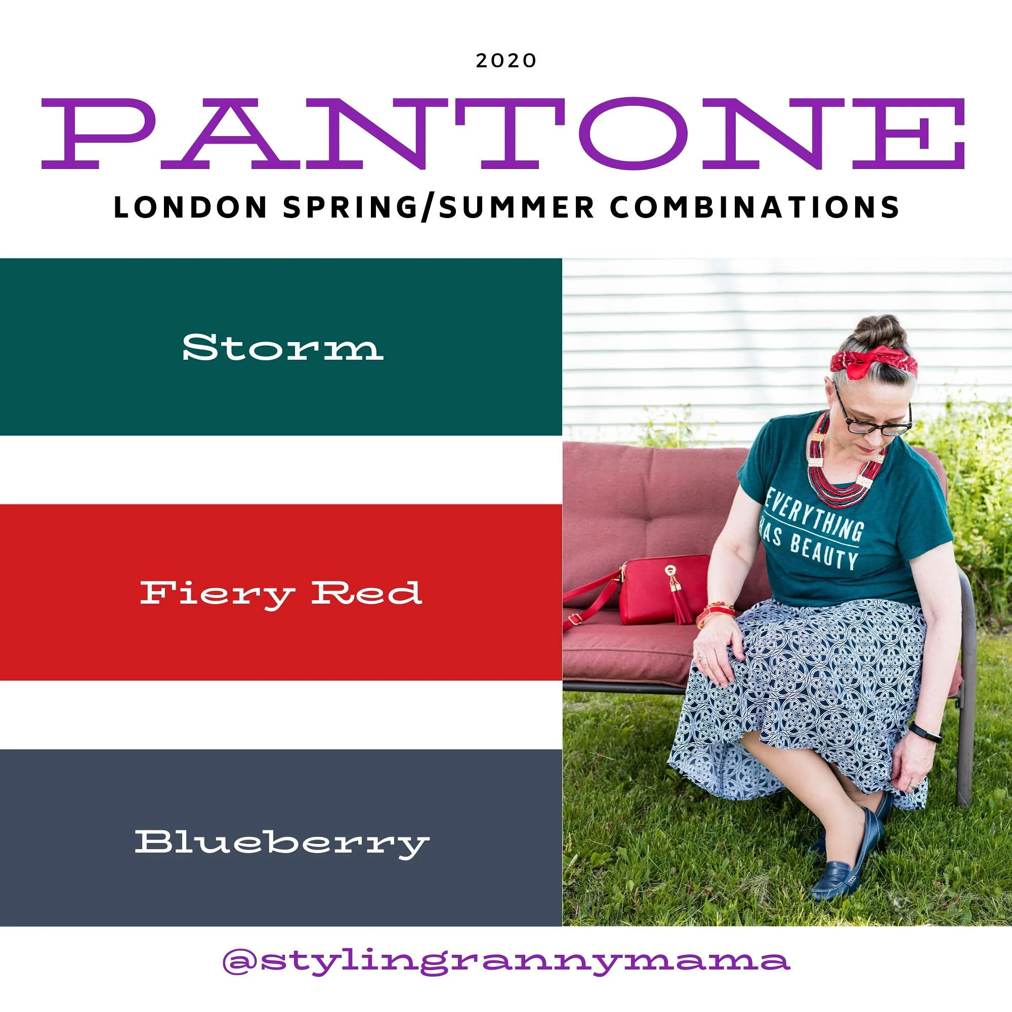
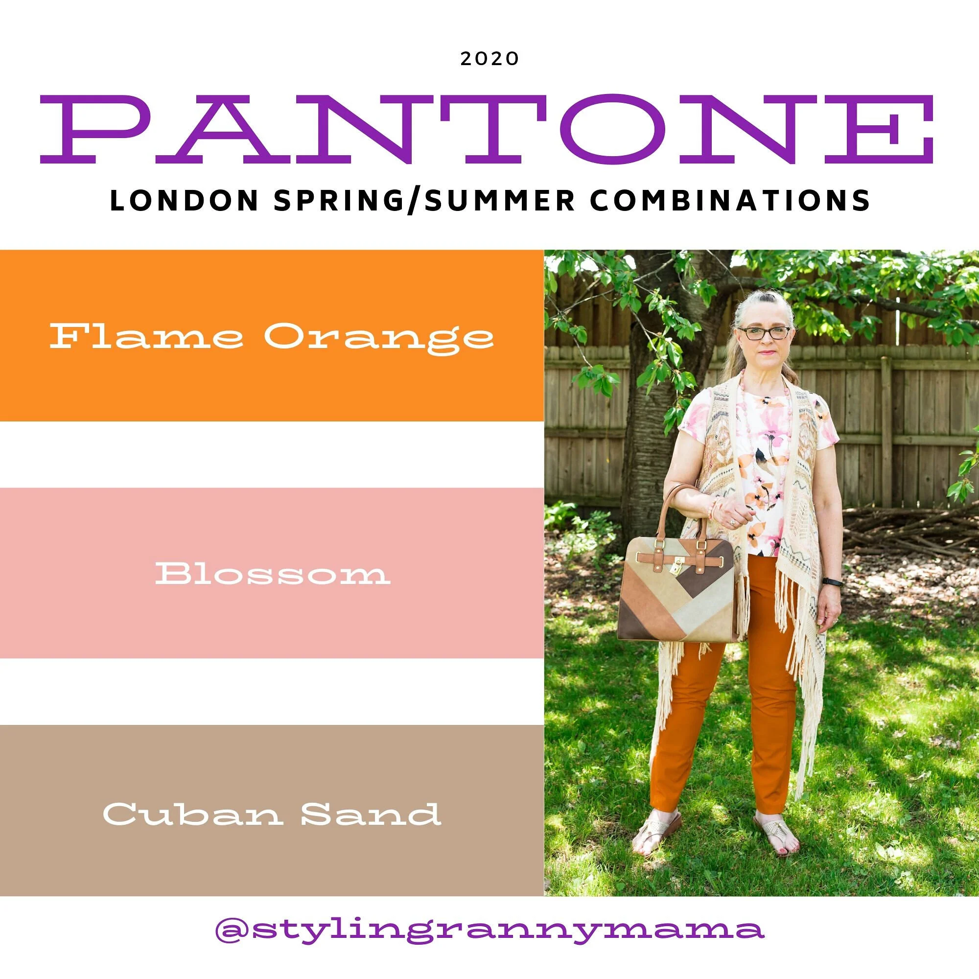
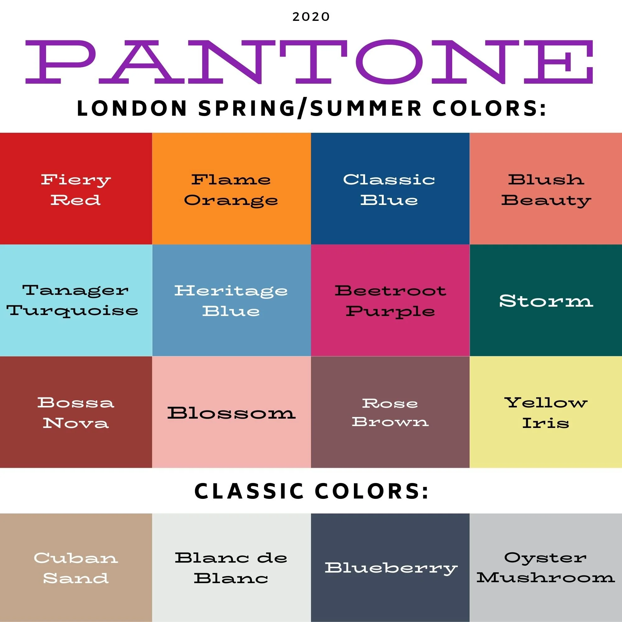
Pantone - Autumn/Winter - 2020 - New York Palette - Recap
I was going to jump right into the London Palette, but there have been some unforeseen problems, so I am going to put that off for a little bit. I usually do a recap post to show you all the the outfits at the same time, so that is what I am doing today.
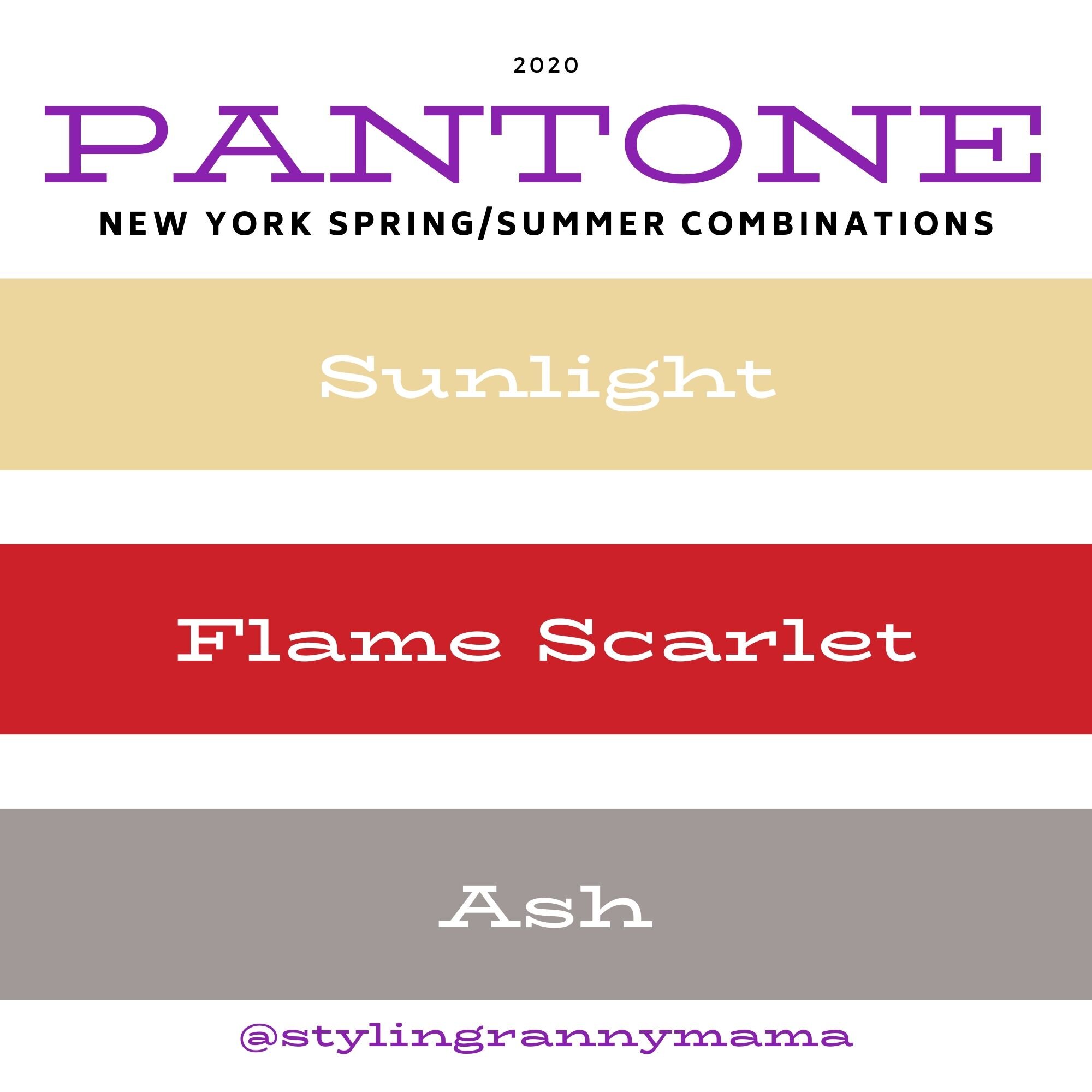
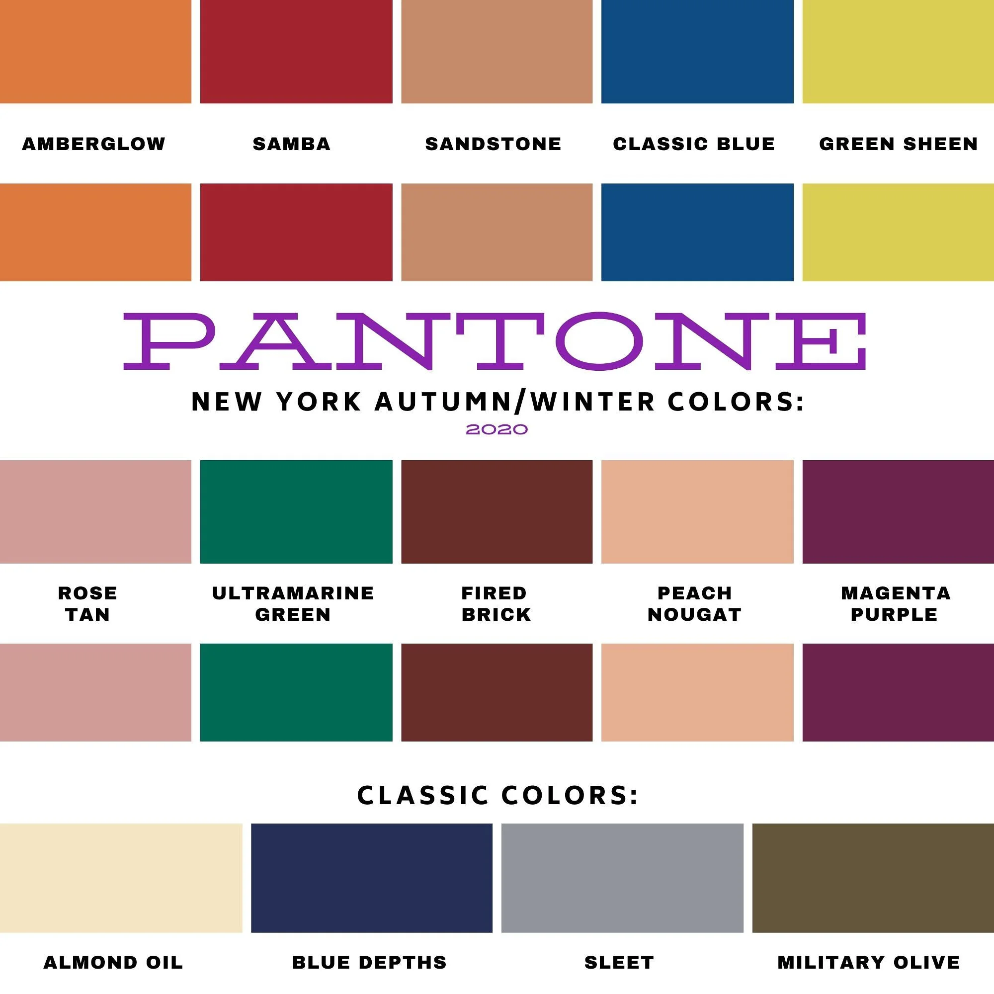
Here is the whole New York Palette, along with the classic colors as well. Some people take the classic colors and build their outfits around them and simply add pops of the other colors for a more subdued approach to the palette. I think I need to try that some time. What keeps me from doing that more often is that I don’t have very many classic colored pieces. What I mean is, I don’t have a whole suit with pants or skirt and a jacket in any of the classic colors. In fact, I don’t have very many dress clothes that aren’t made up of colors and prints. Maybe in the spring I will try to focus more on using the classics as a way to build an outfit and add in the regular palette colors as accessories. We’ll see.
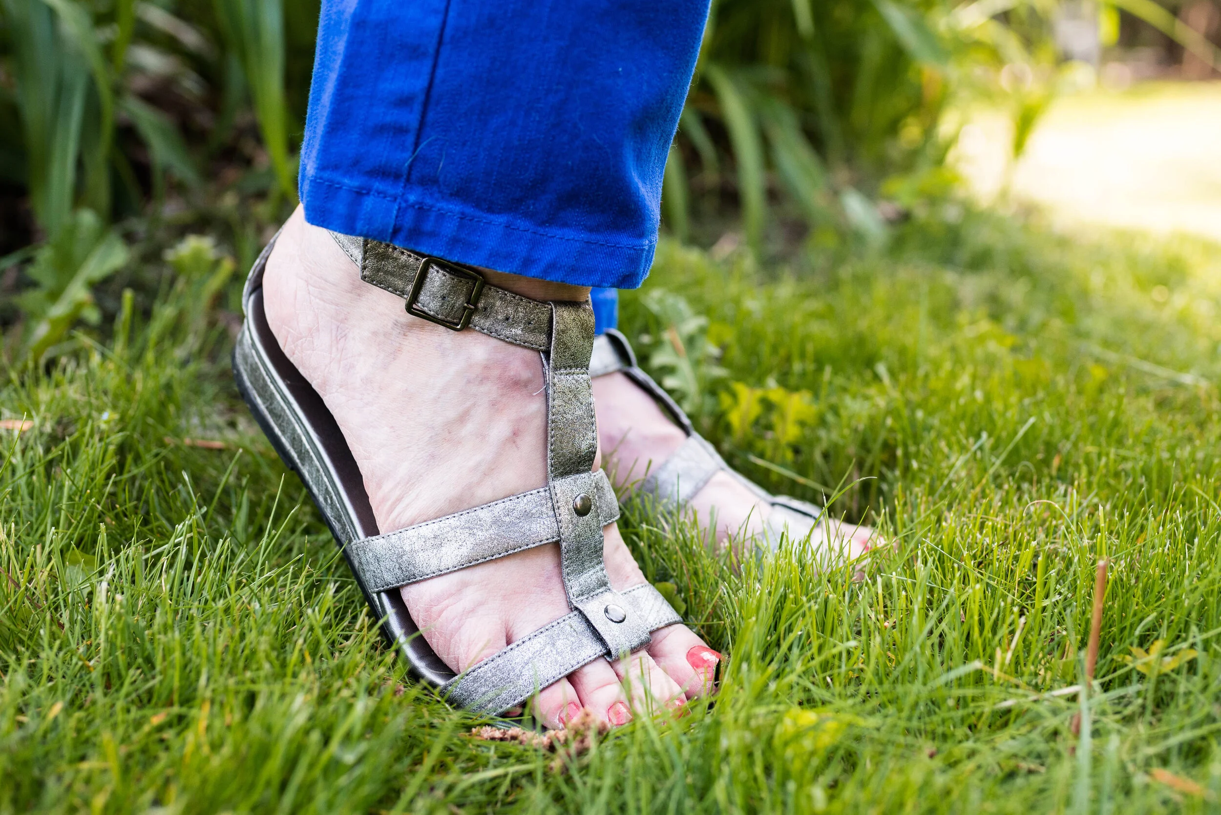
I thought I would give you a few of my thoughts about each outfit and why I think it worked or didn’t after each picture.
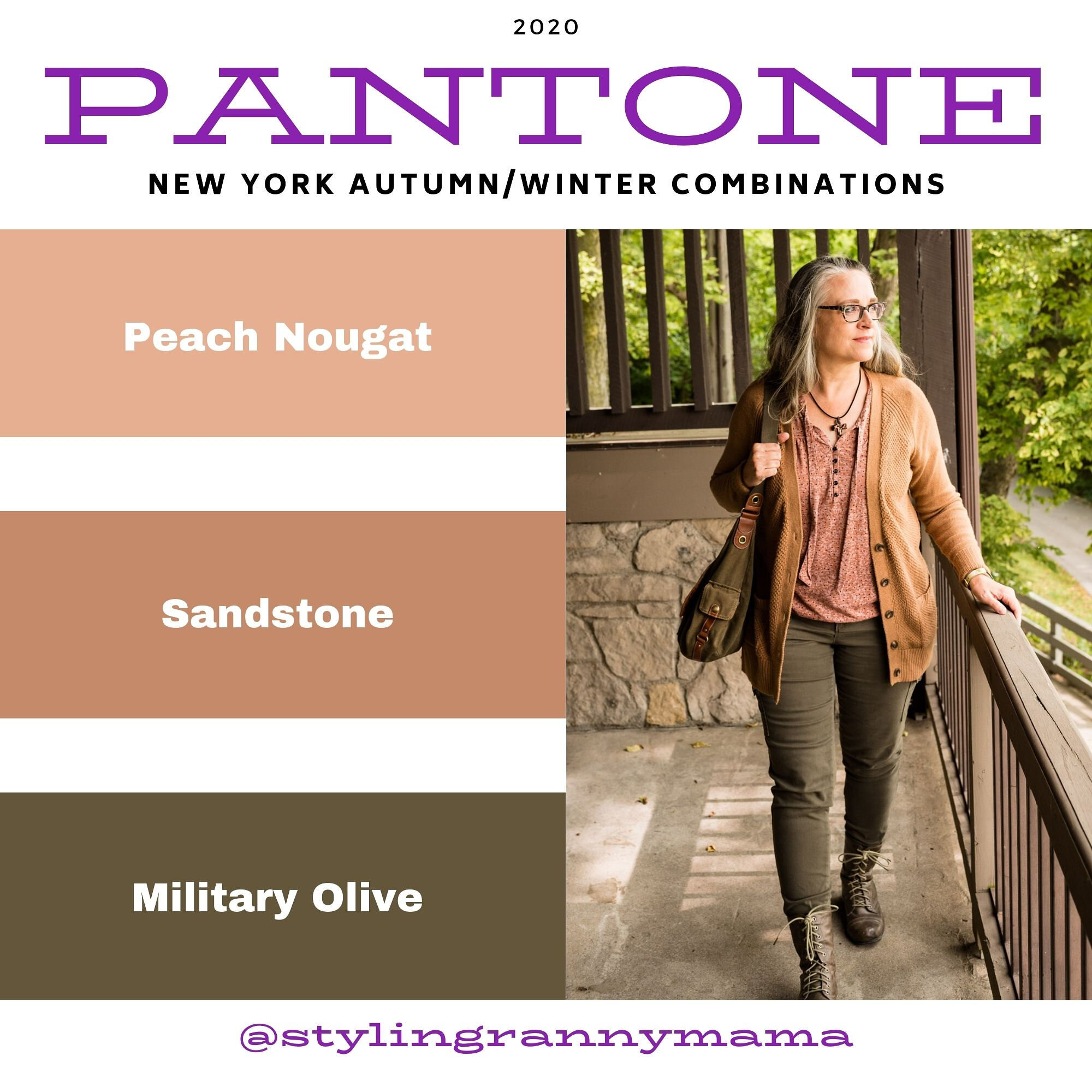
Peach Nougat, Sandstone and Military Olive

I like this outfit. I am not a big fan of these colors, but I really think the three colors worked well together and I think people found this, a neutral palette they could relate too. Almost everyone has something olive in their closet, so the fact that this was a classic color was a win, in my opinion. Not everyone can wear dark blue, oxford gray or tan, but I think everyone can wear Military Olive.
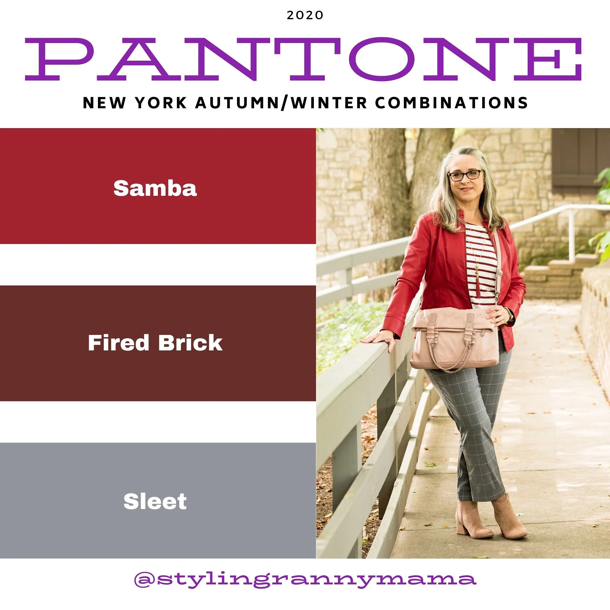
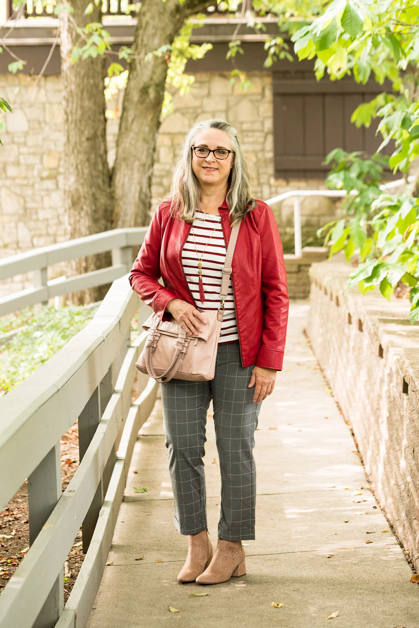
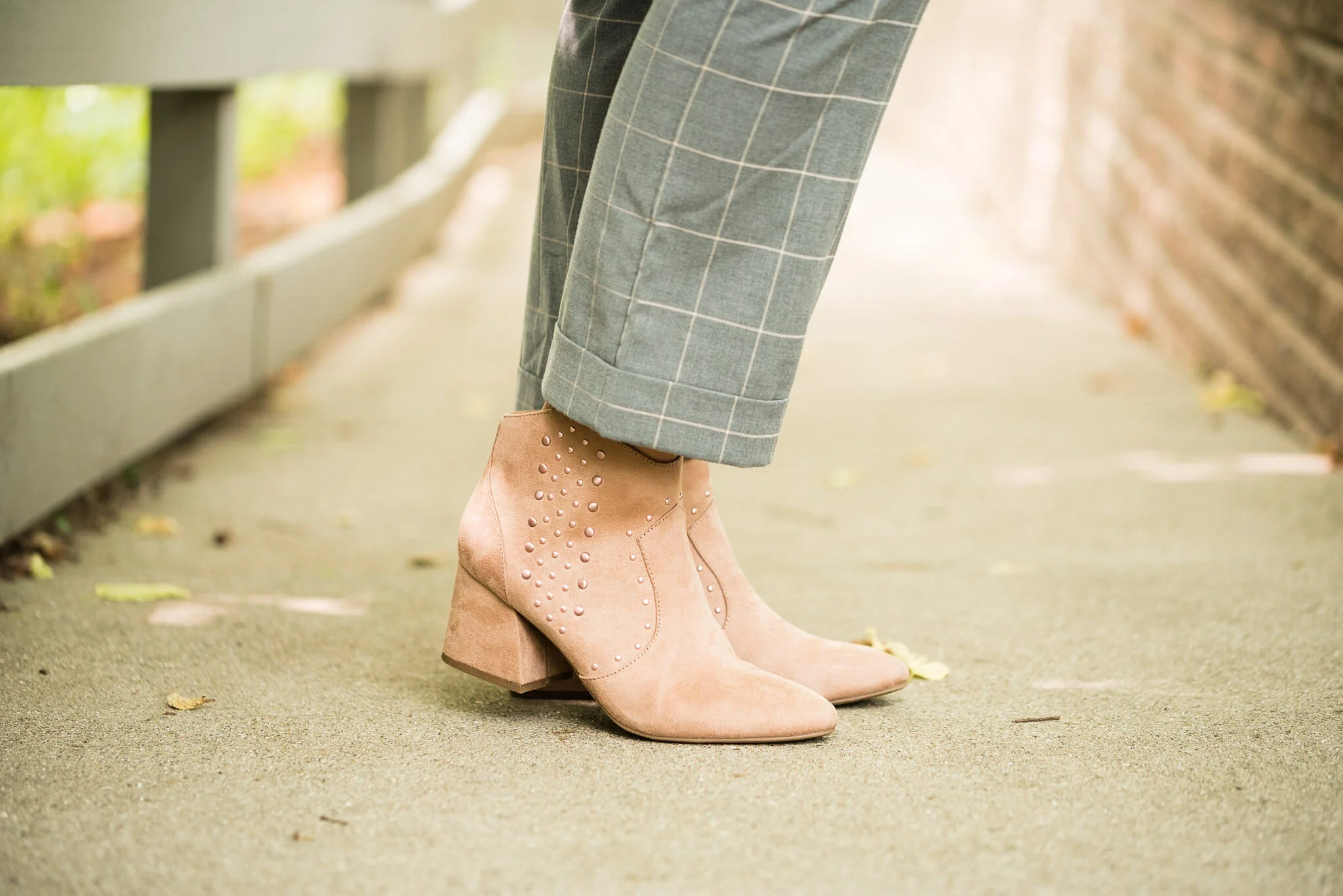
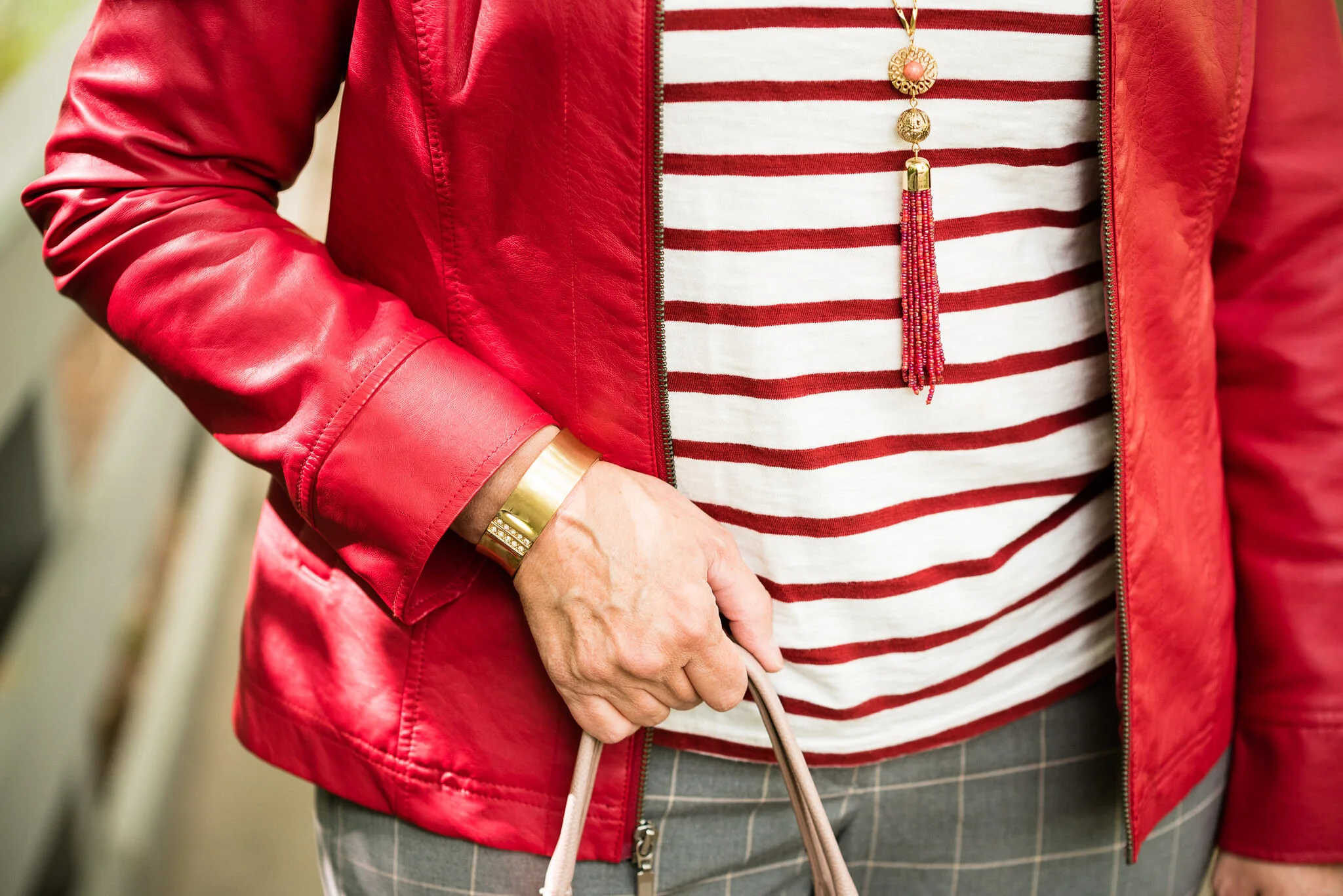
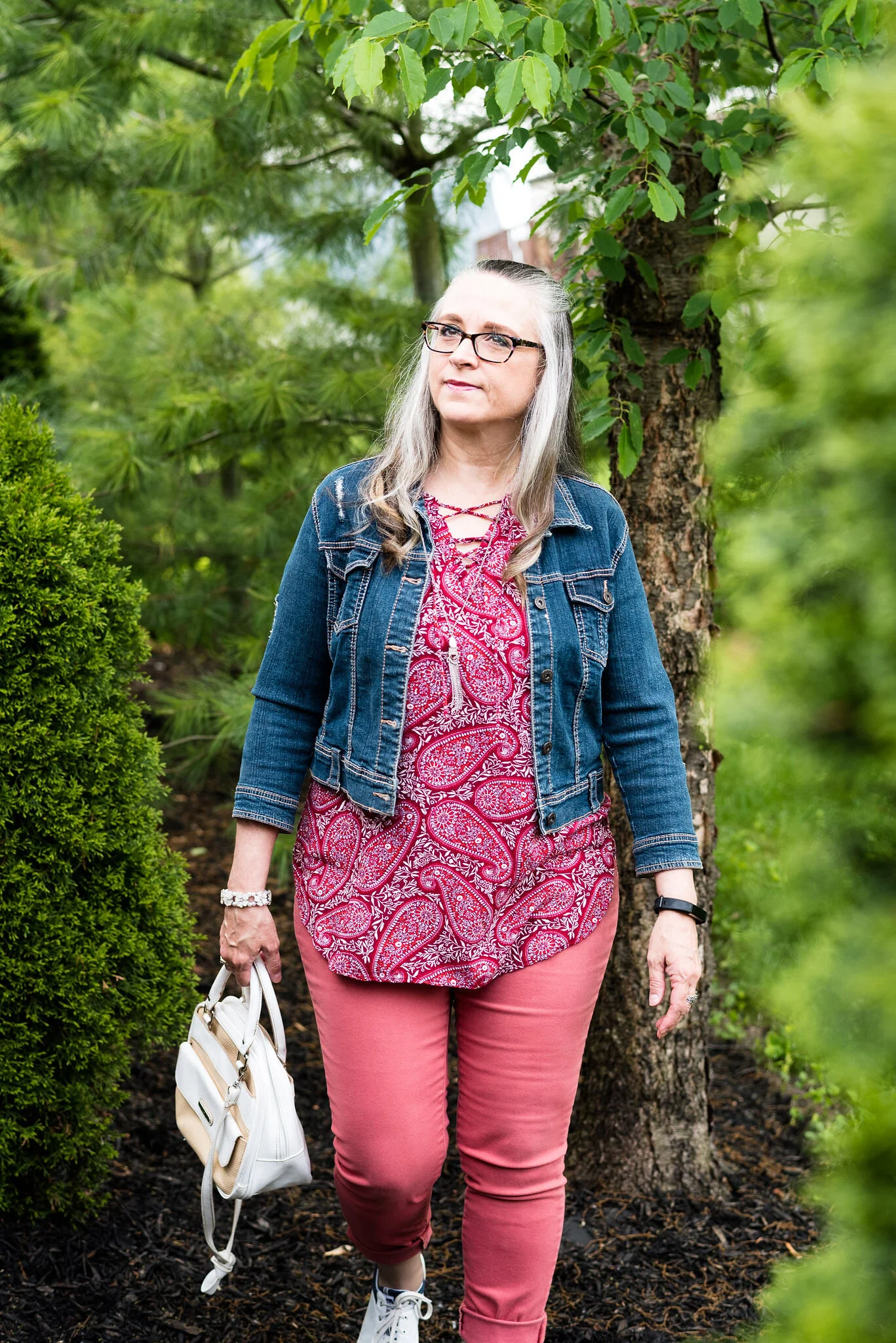
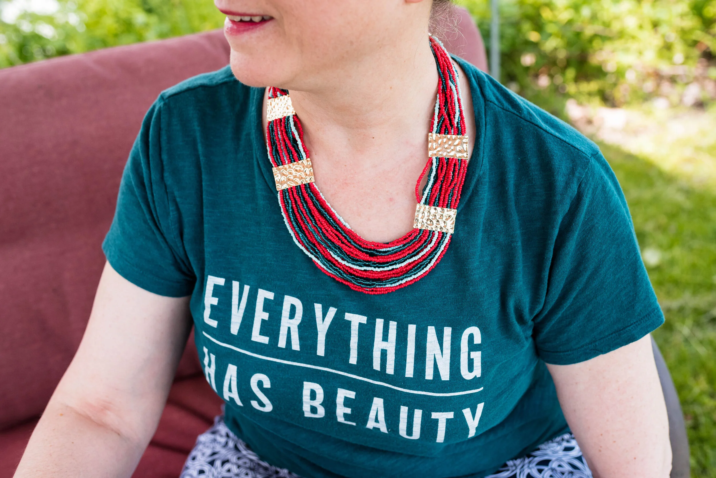
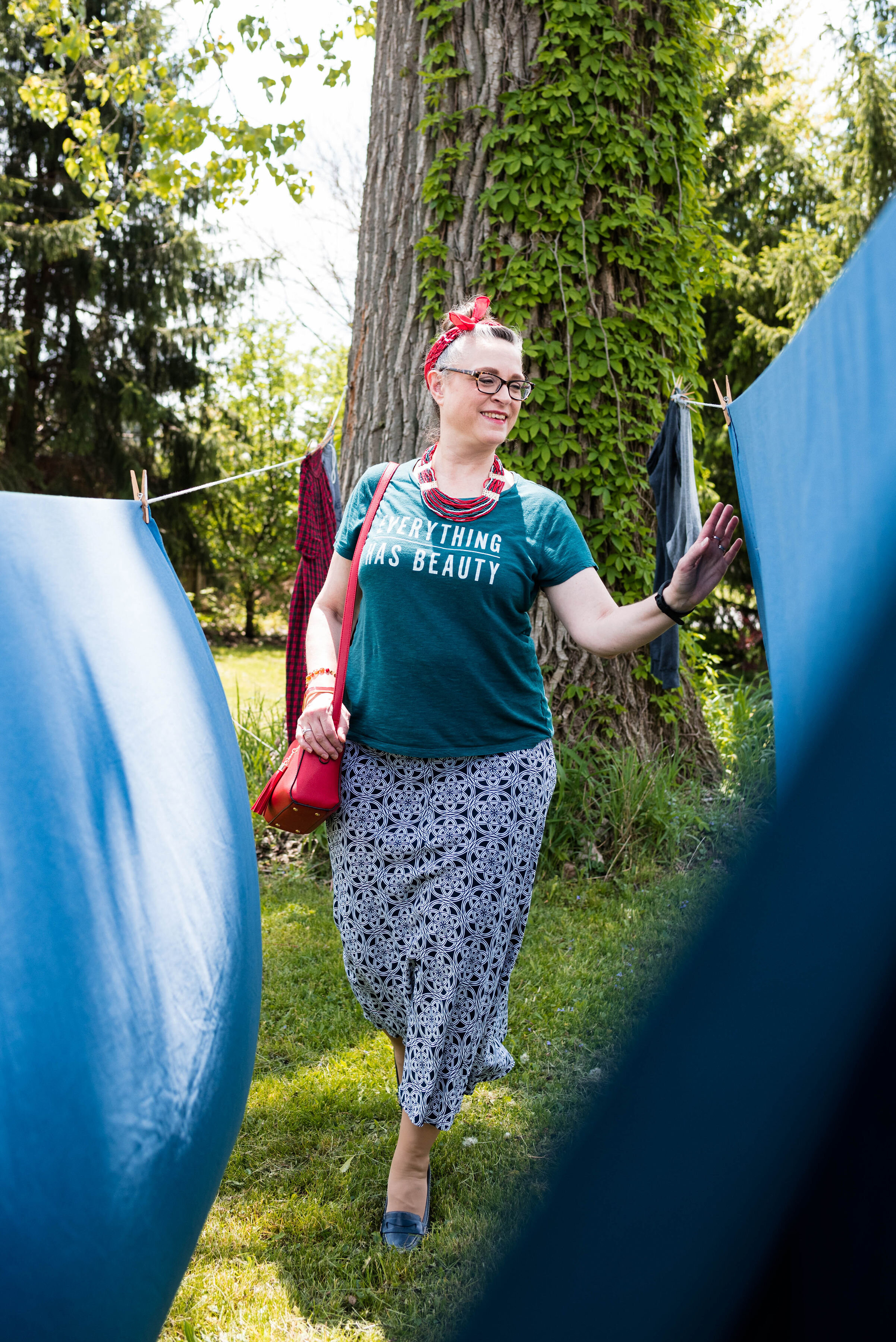
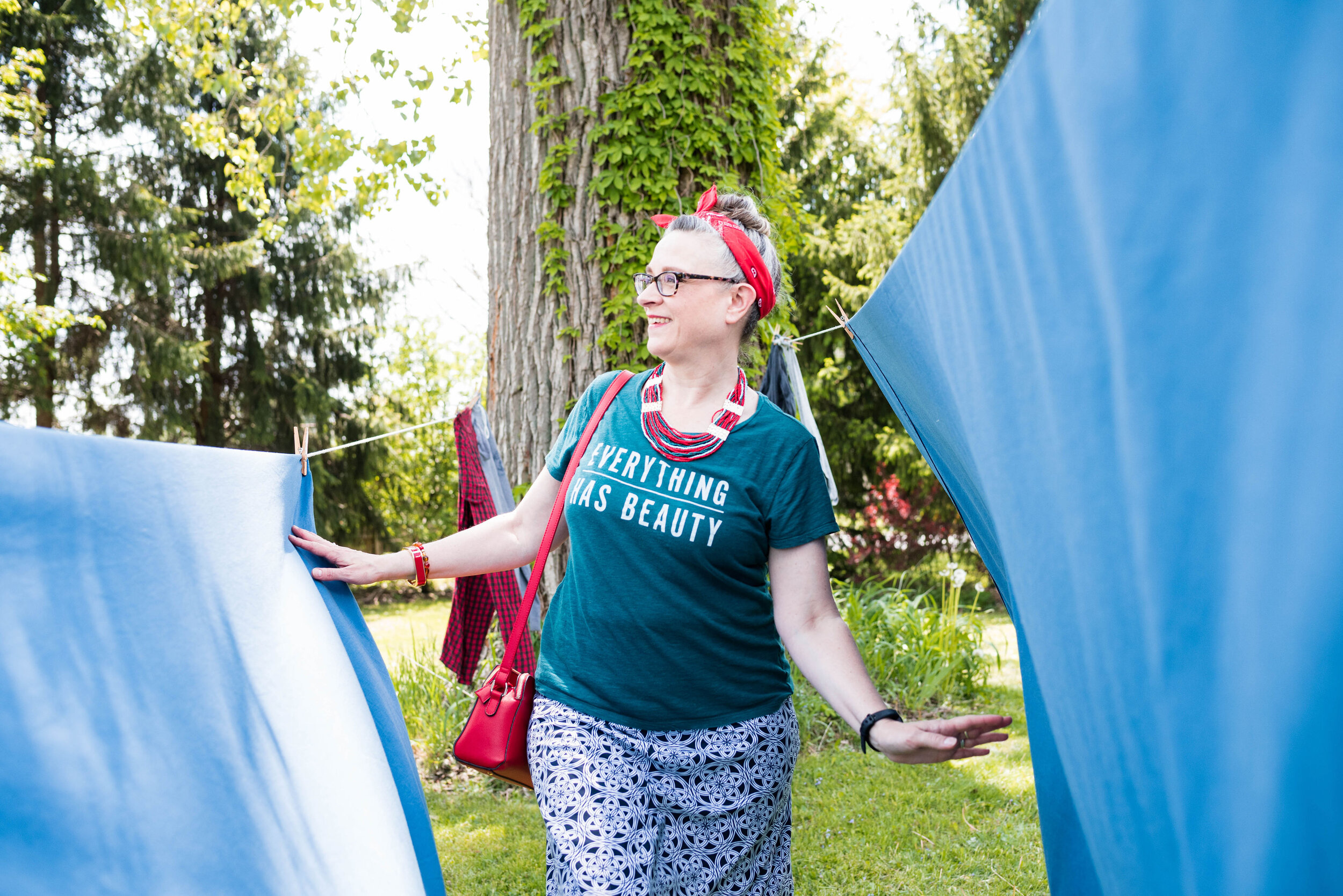
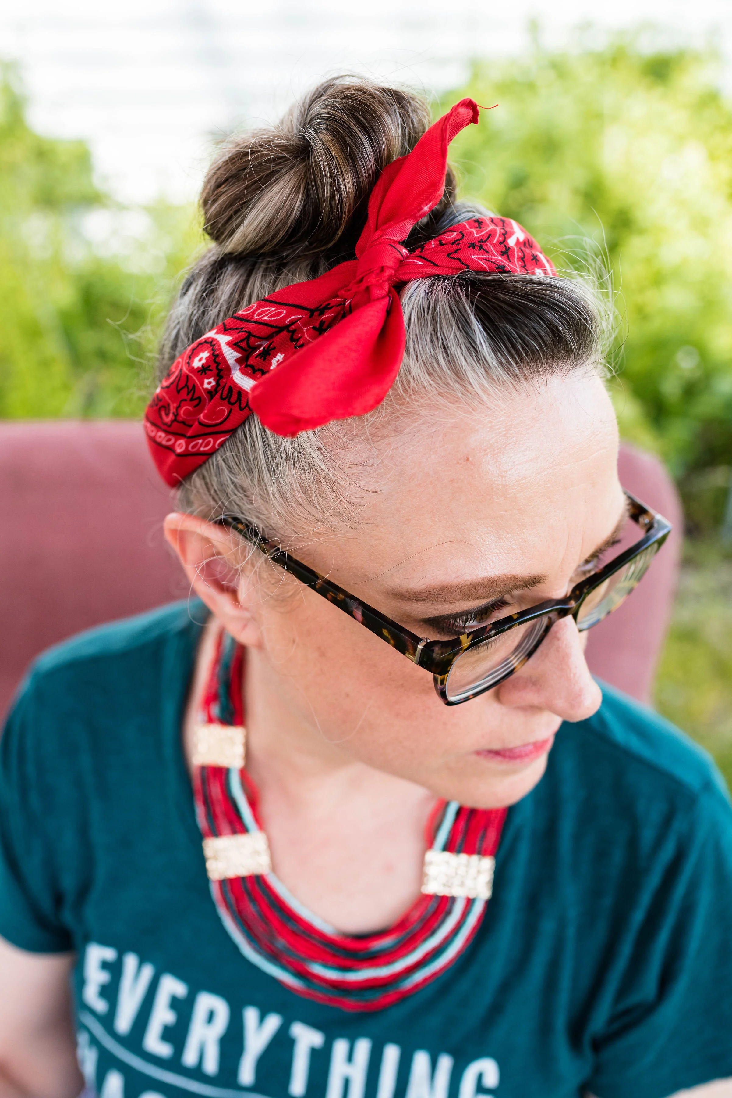
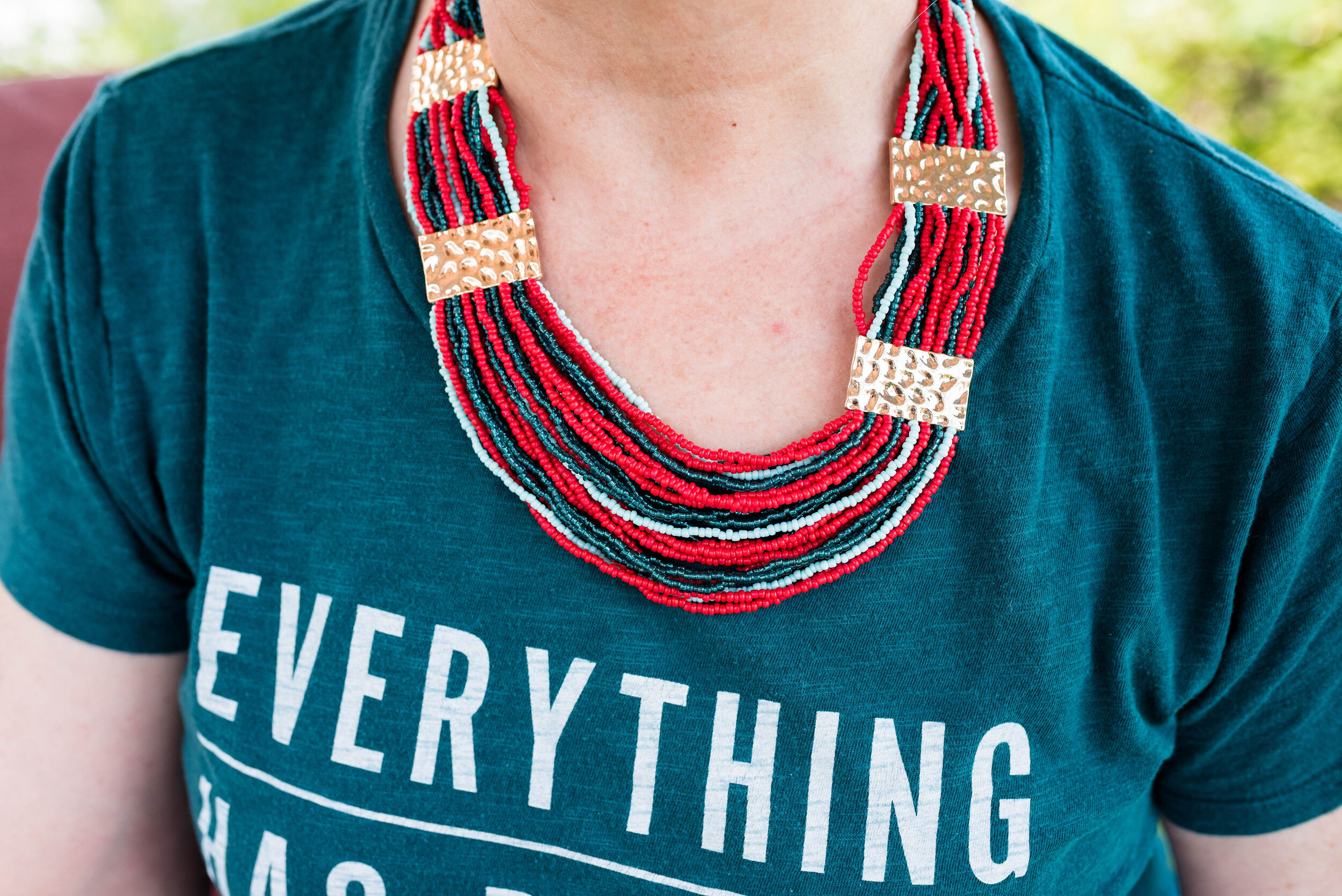
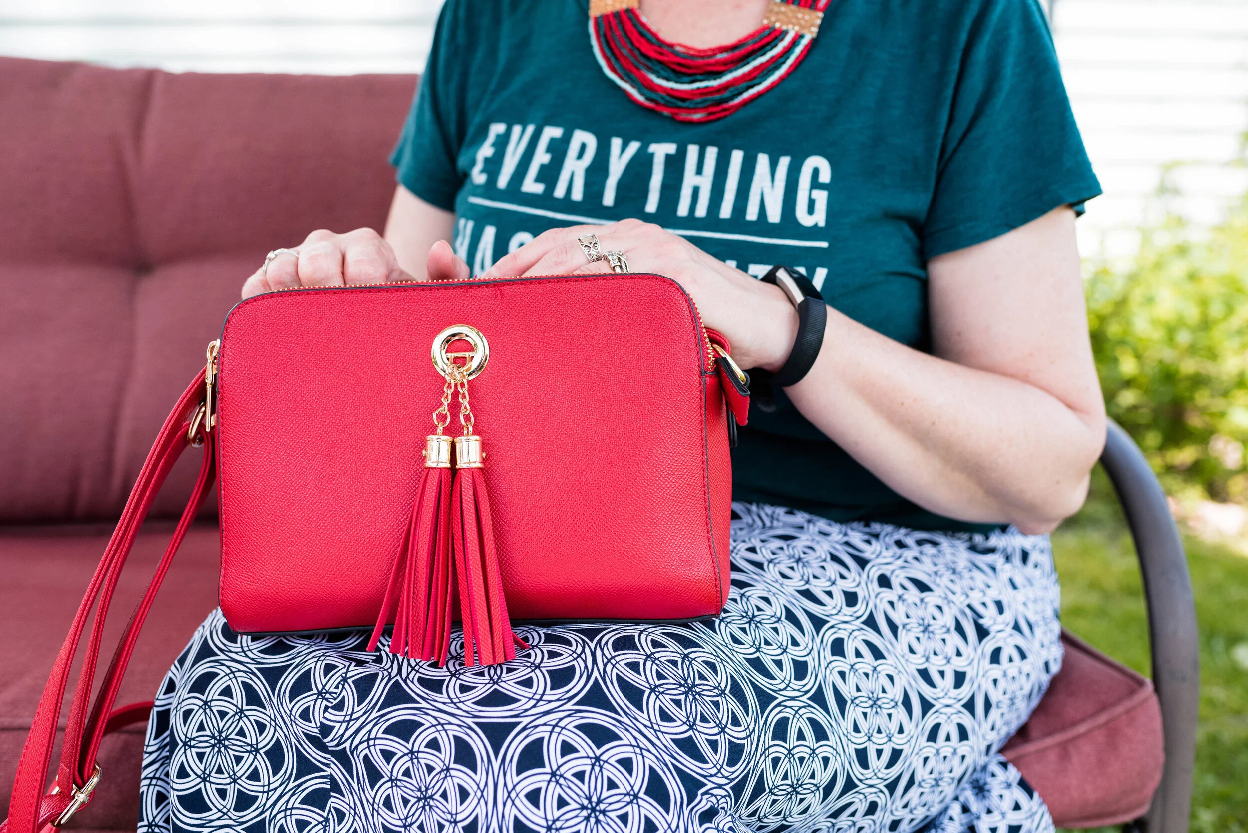
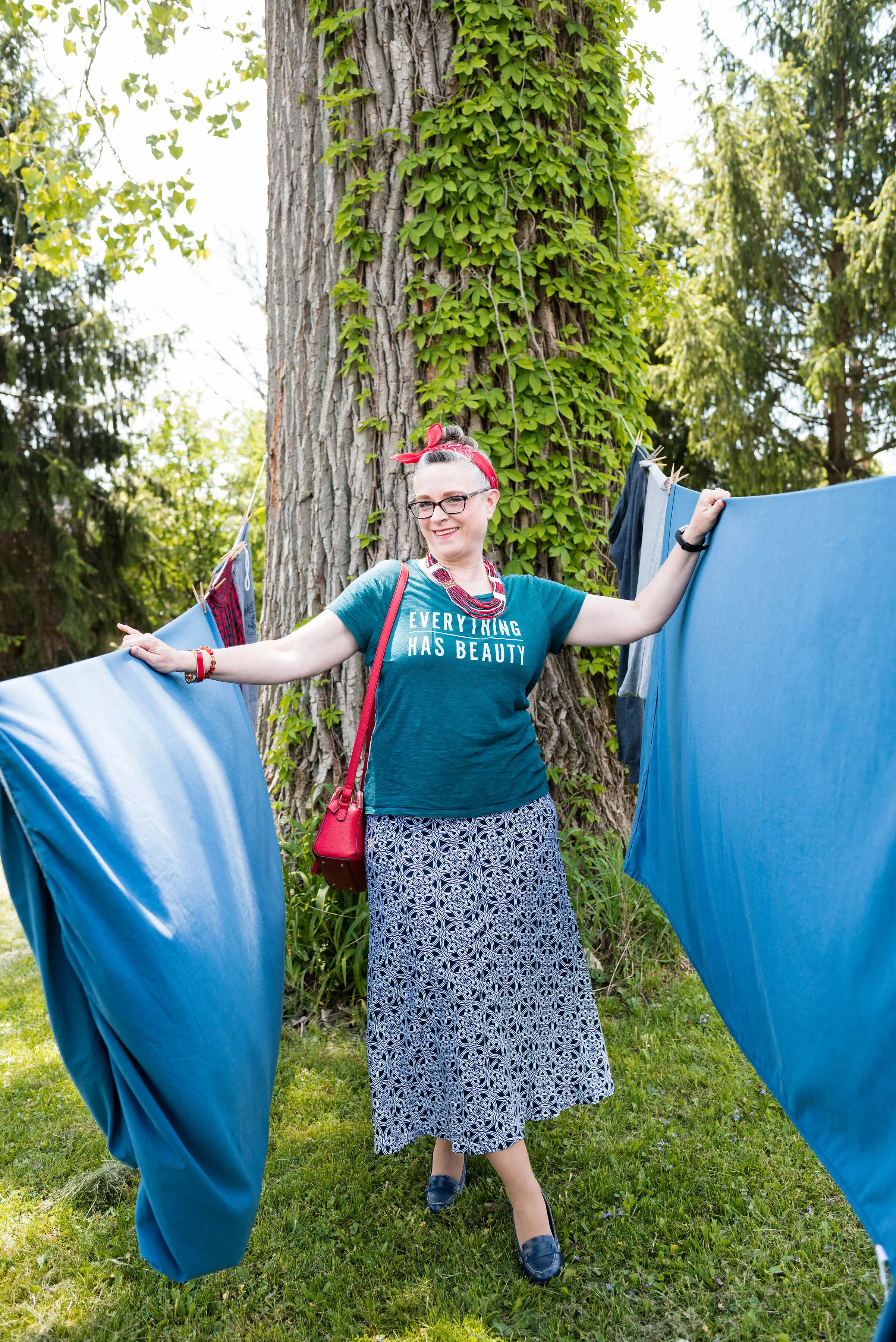
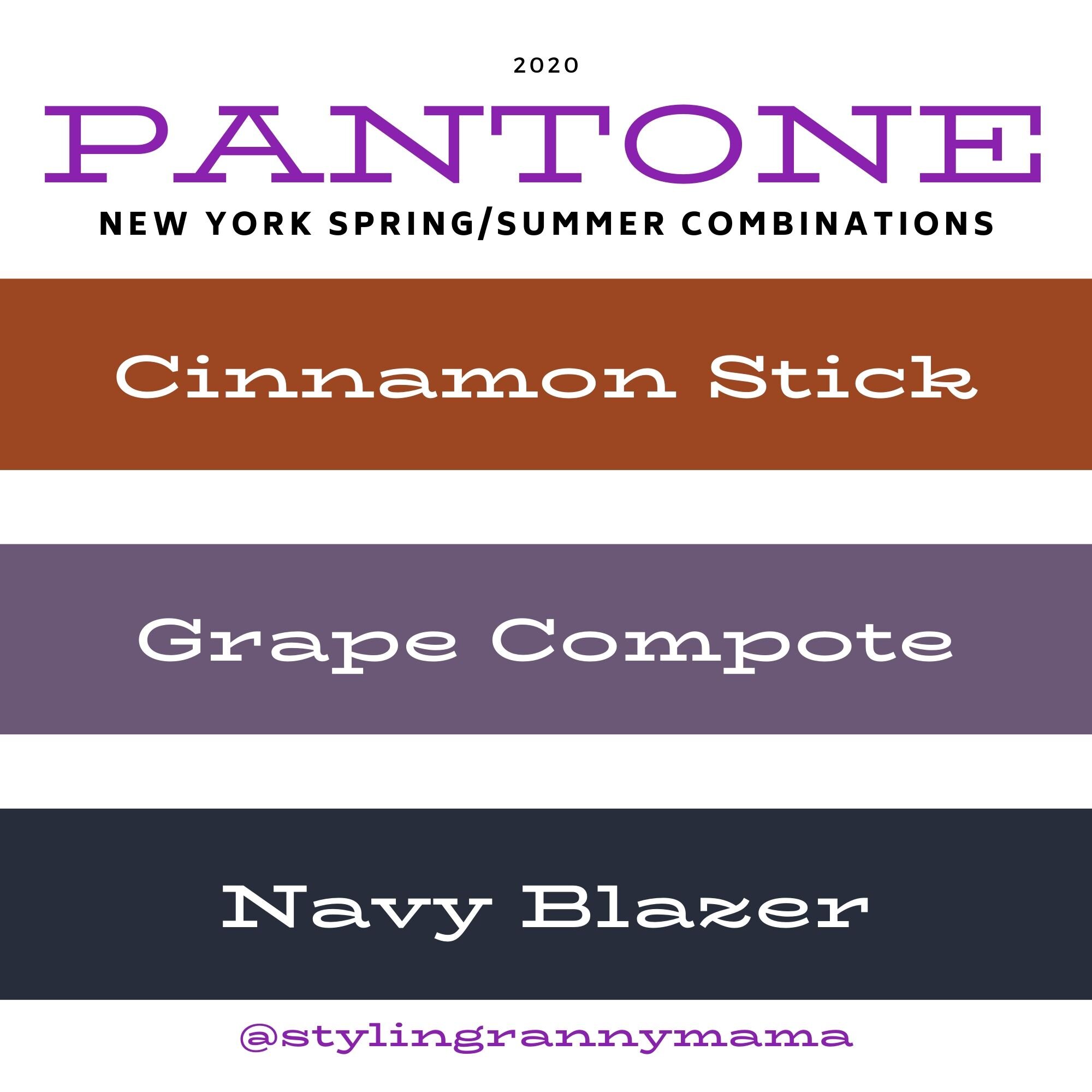
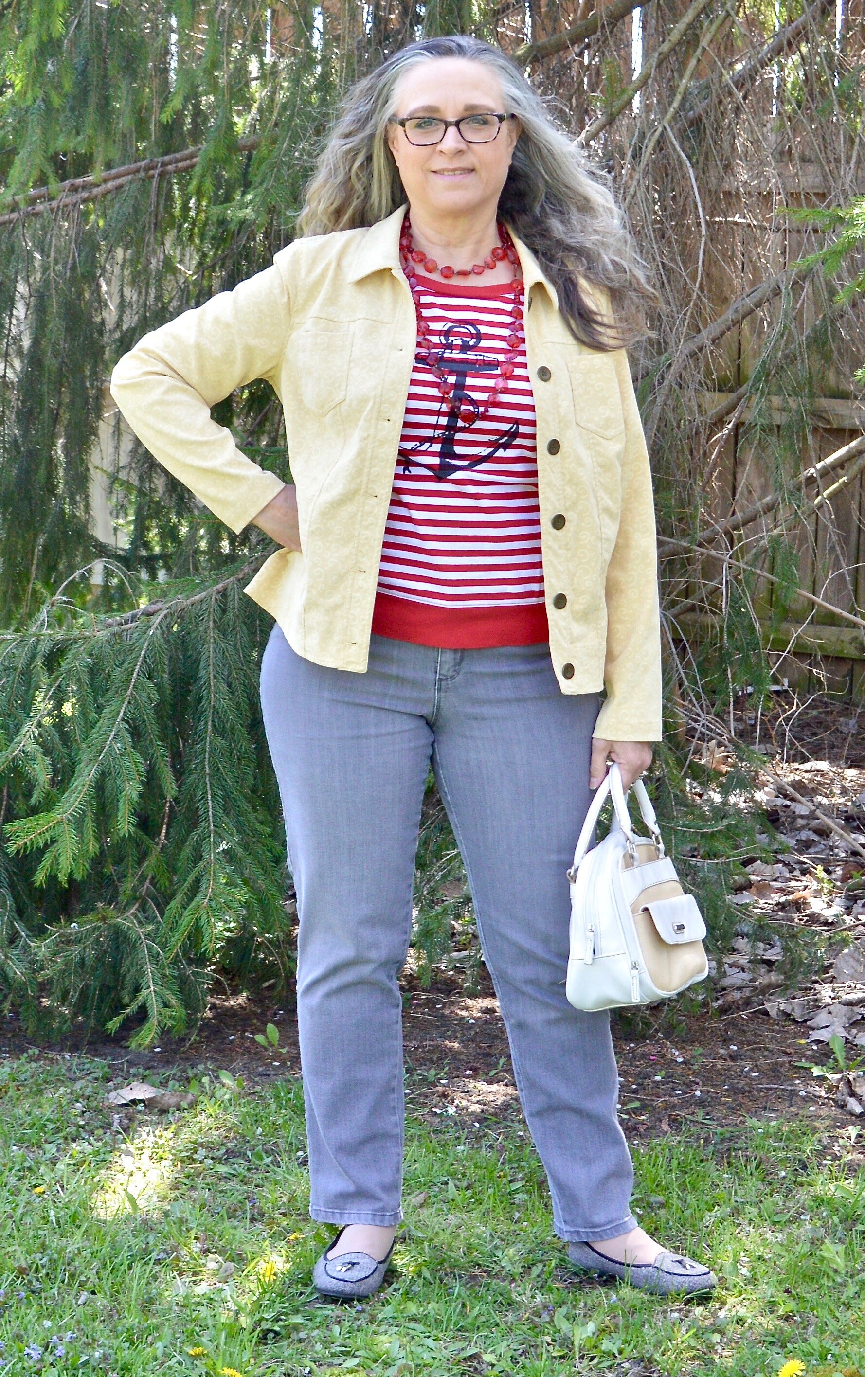
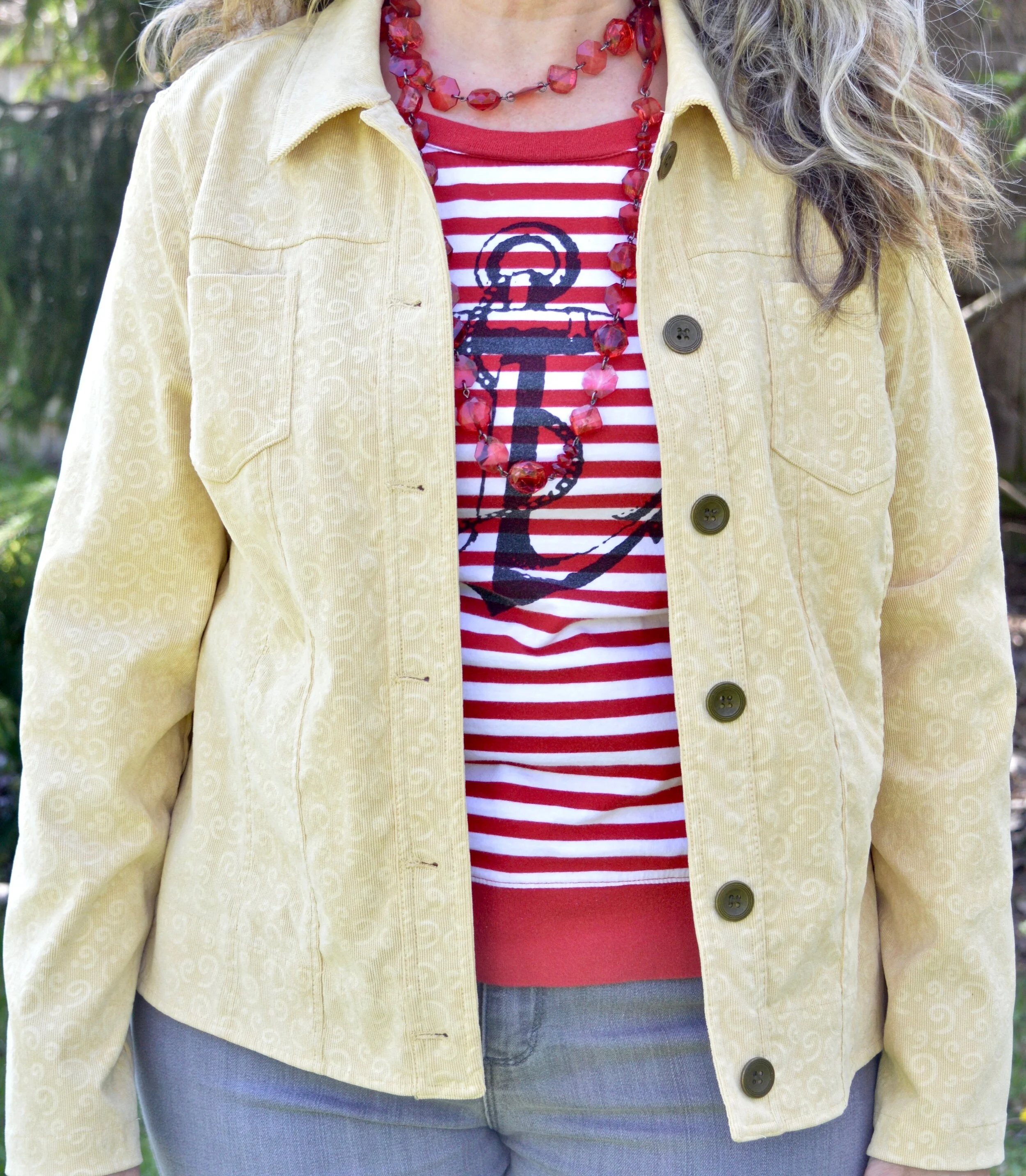
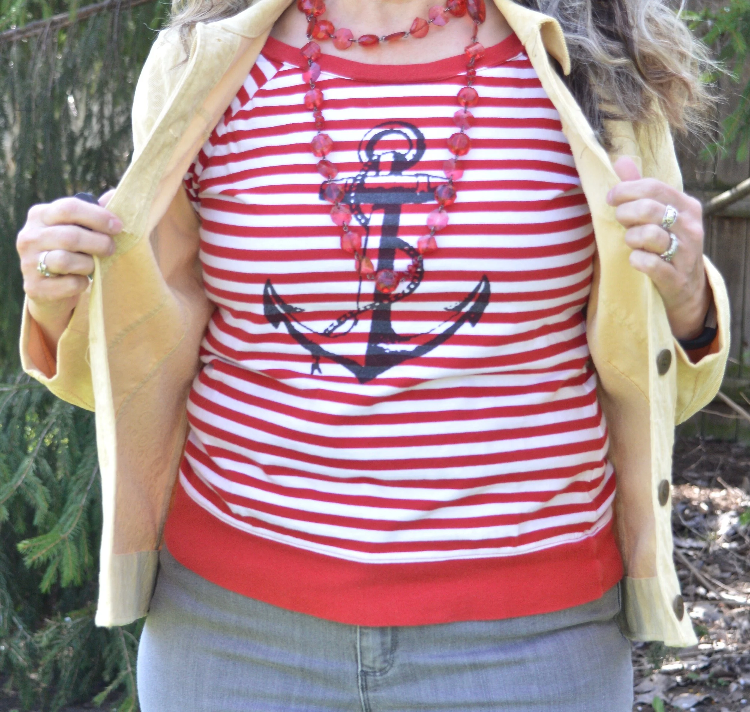
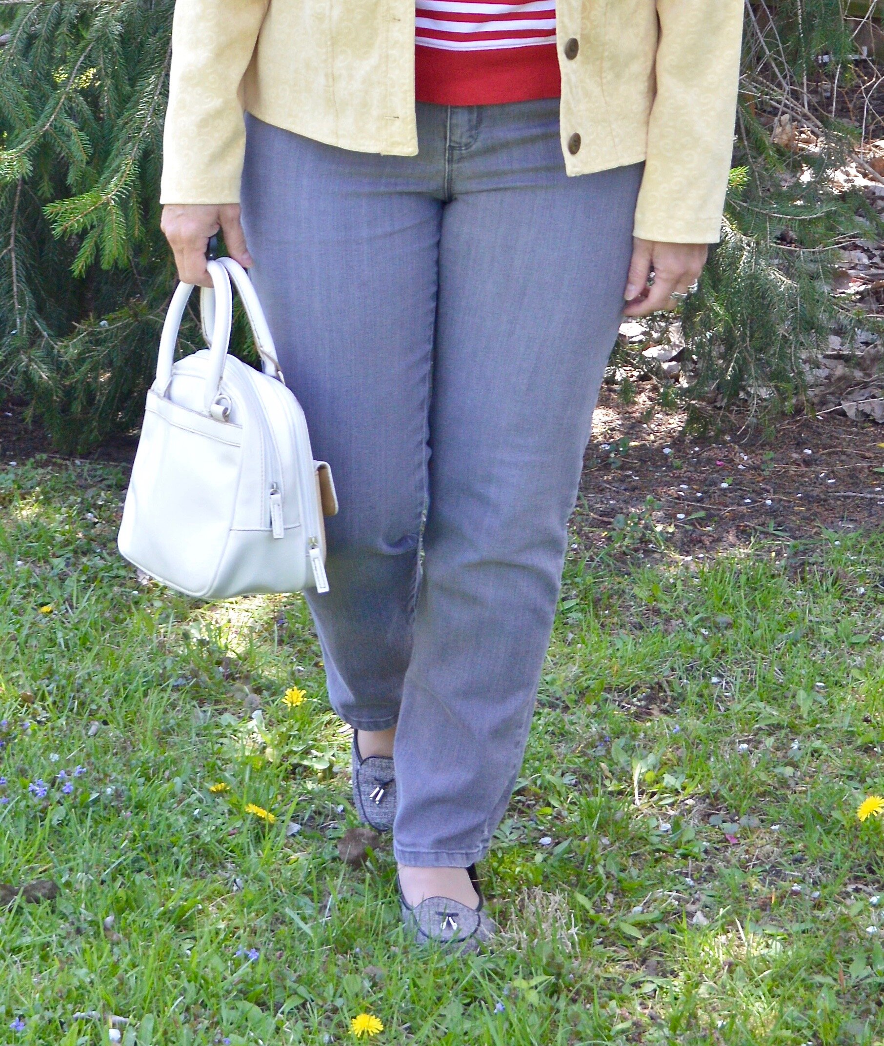
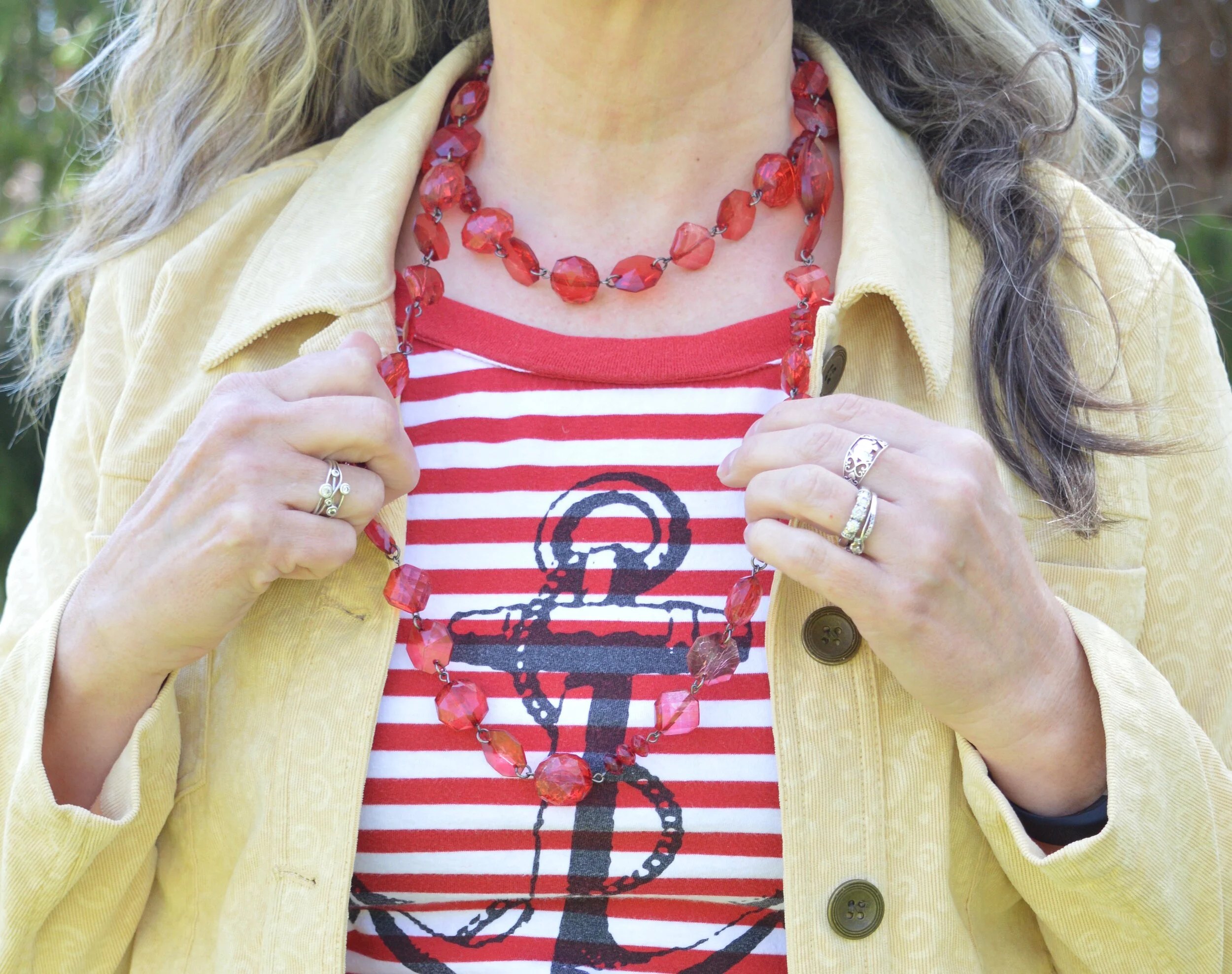
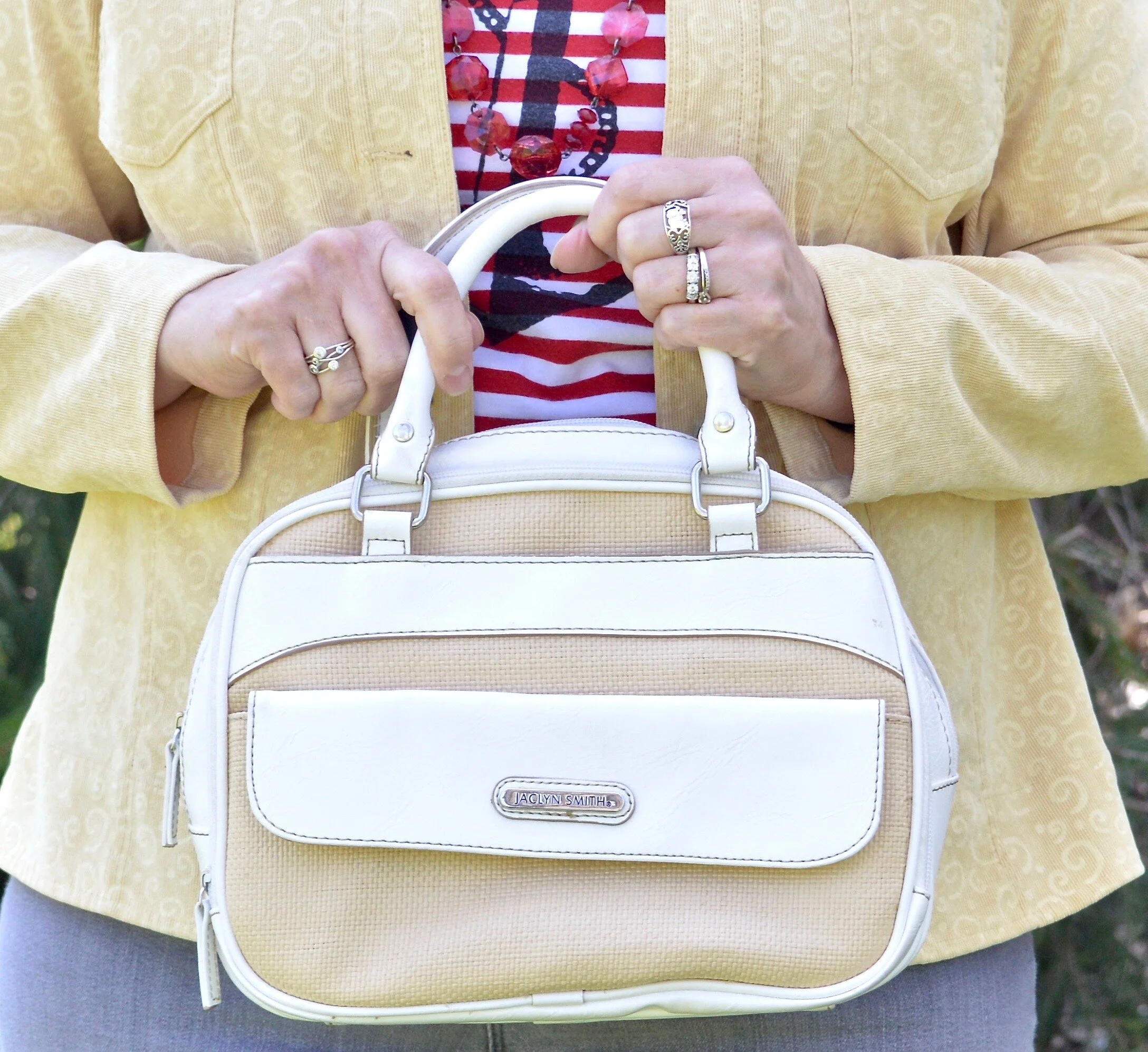
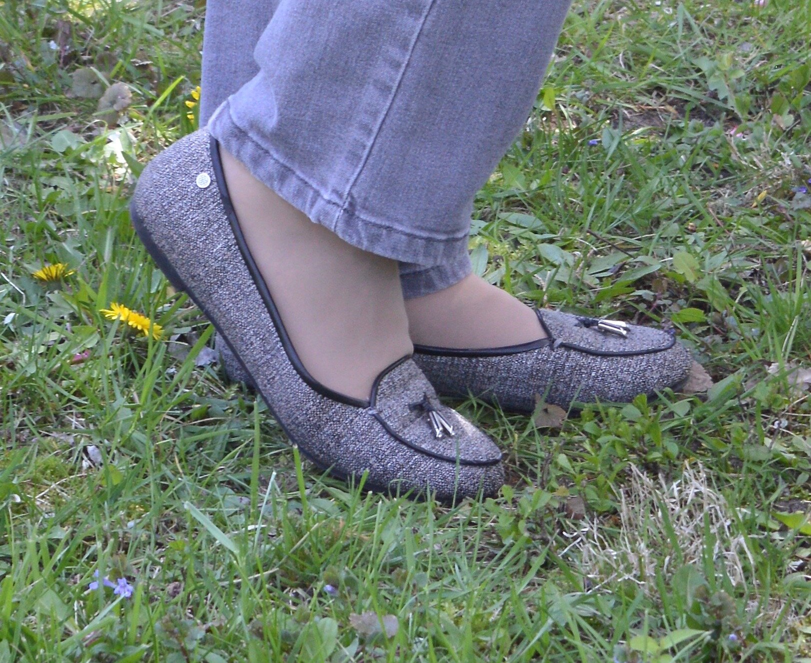
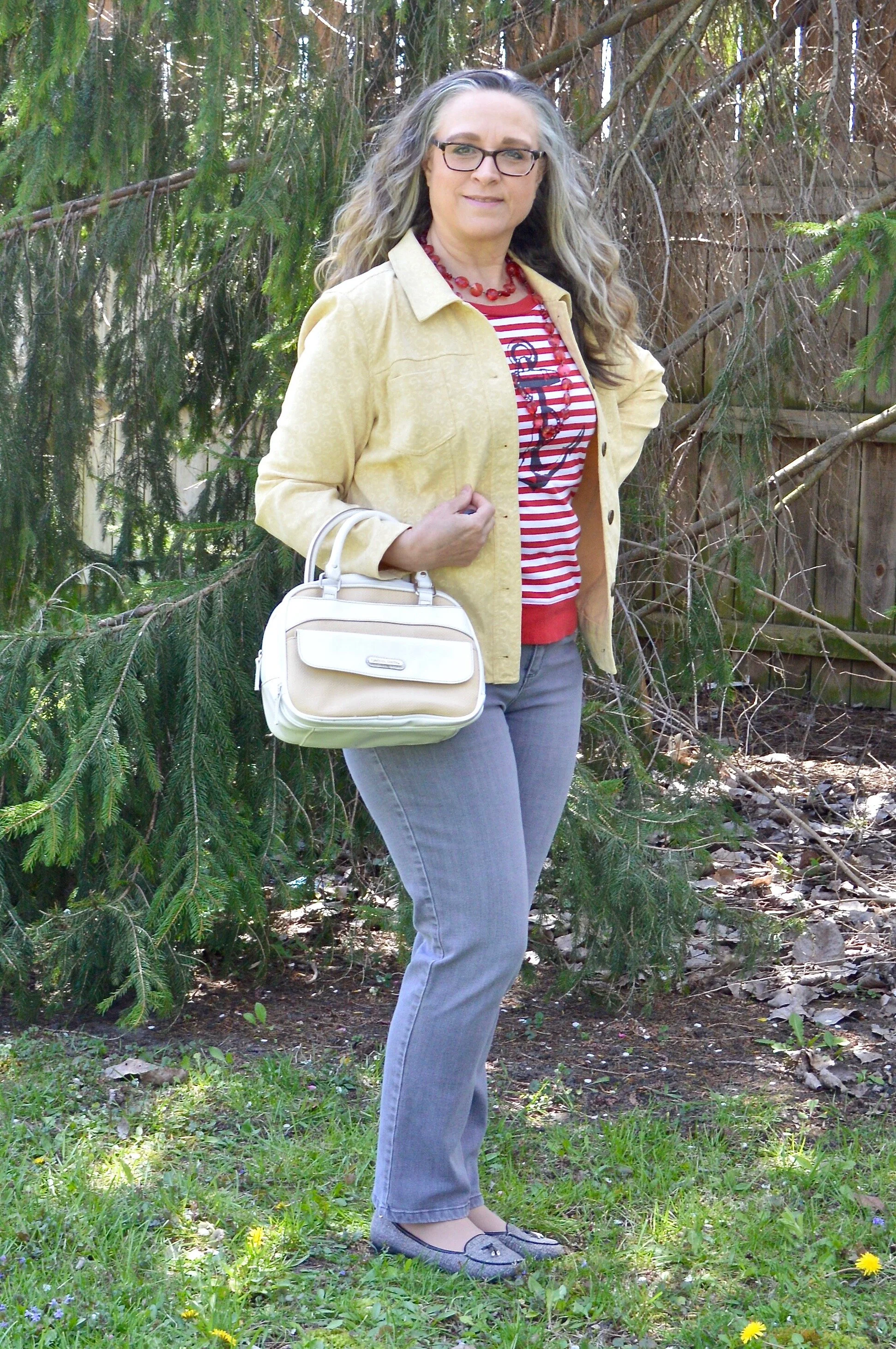
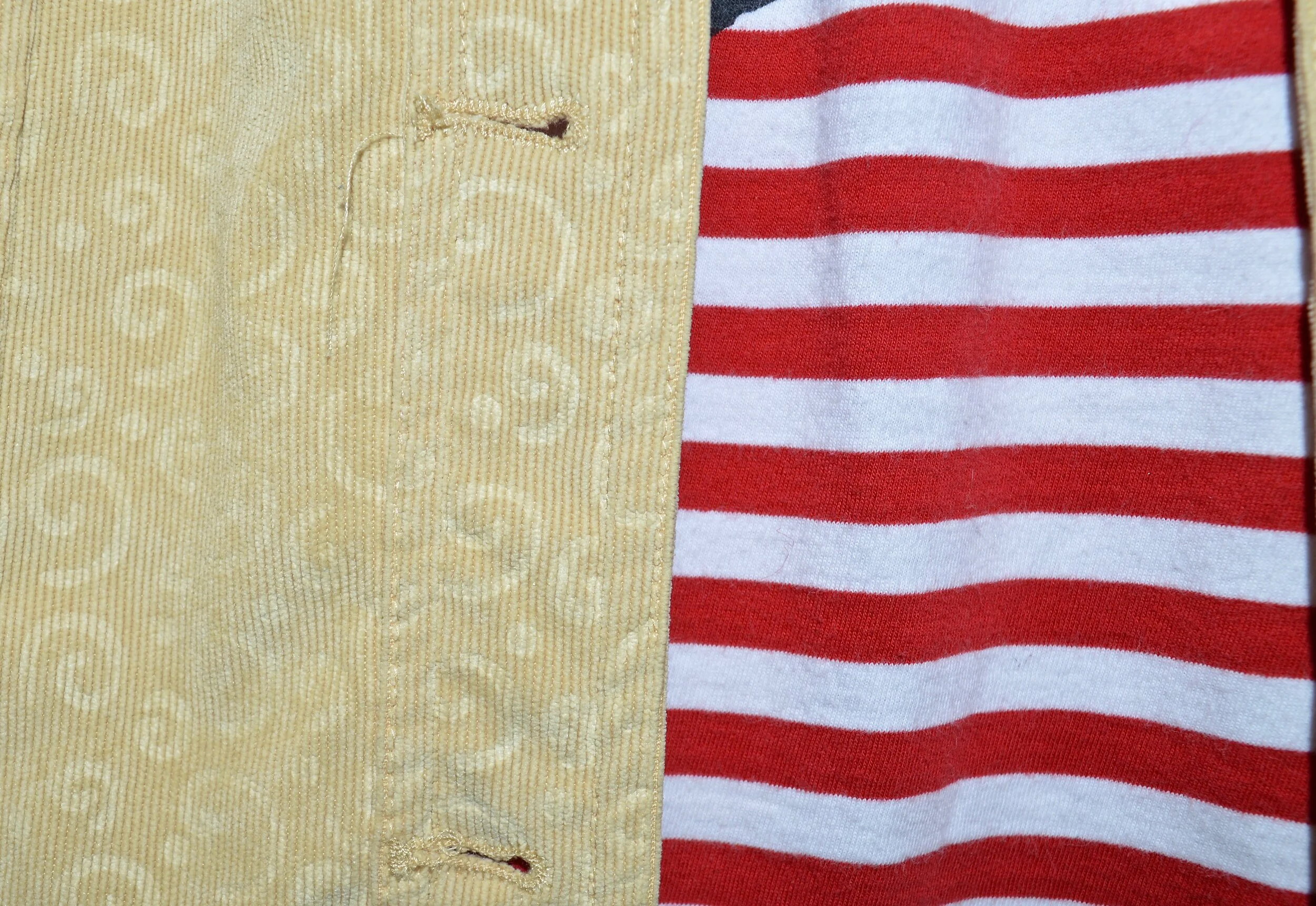
Samba, Fired Brick and Sleet

I think this outfit might be my favorite out of this New York Palette. I like the mix of a more true red with the brick red, even thought my outfit in the photos didn’t do it justice. Putting the colors aside, however, I just like how this outfit looks polished and professional, but has a fun blend of bold and pastel colors along with the subtle print mix.
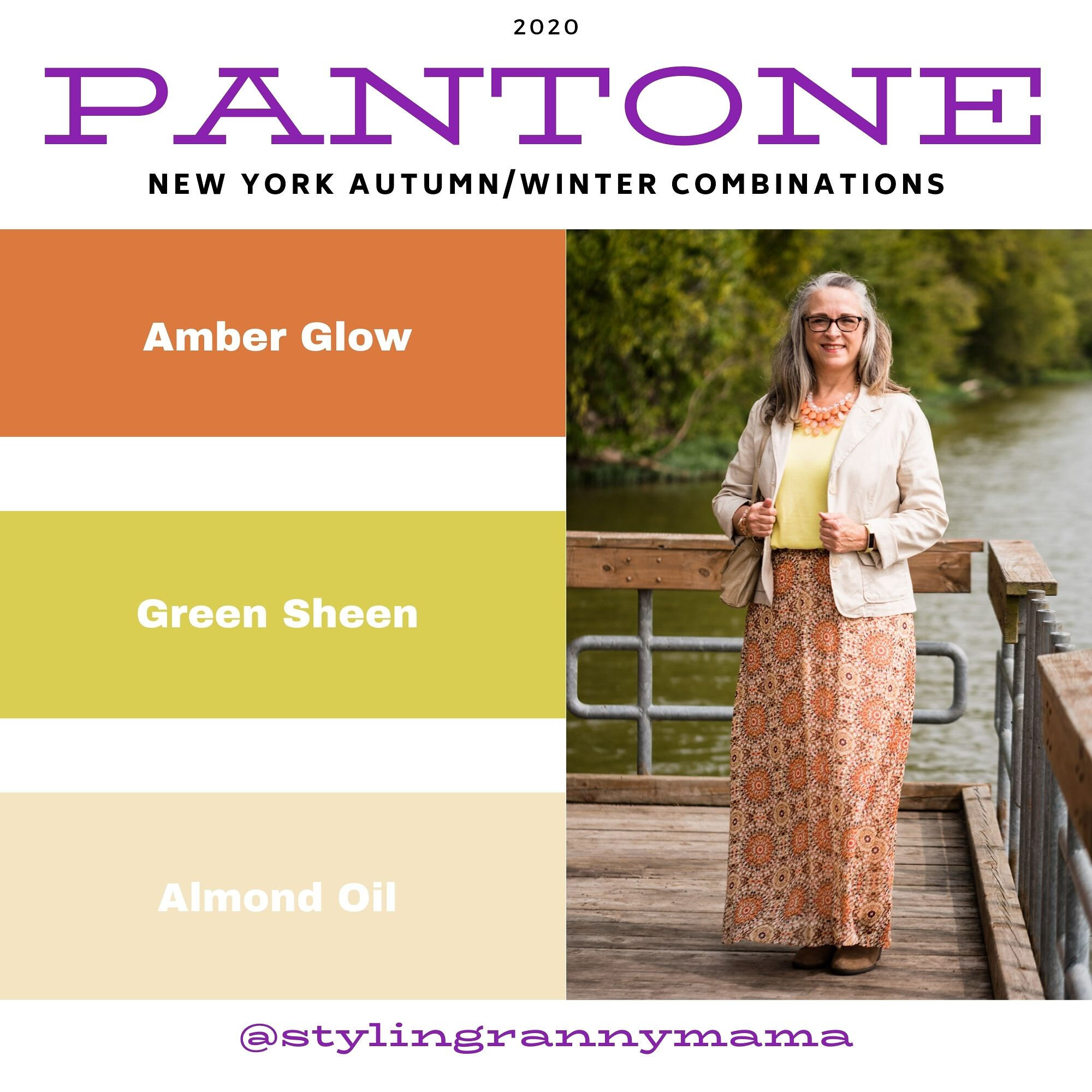
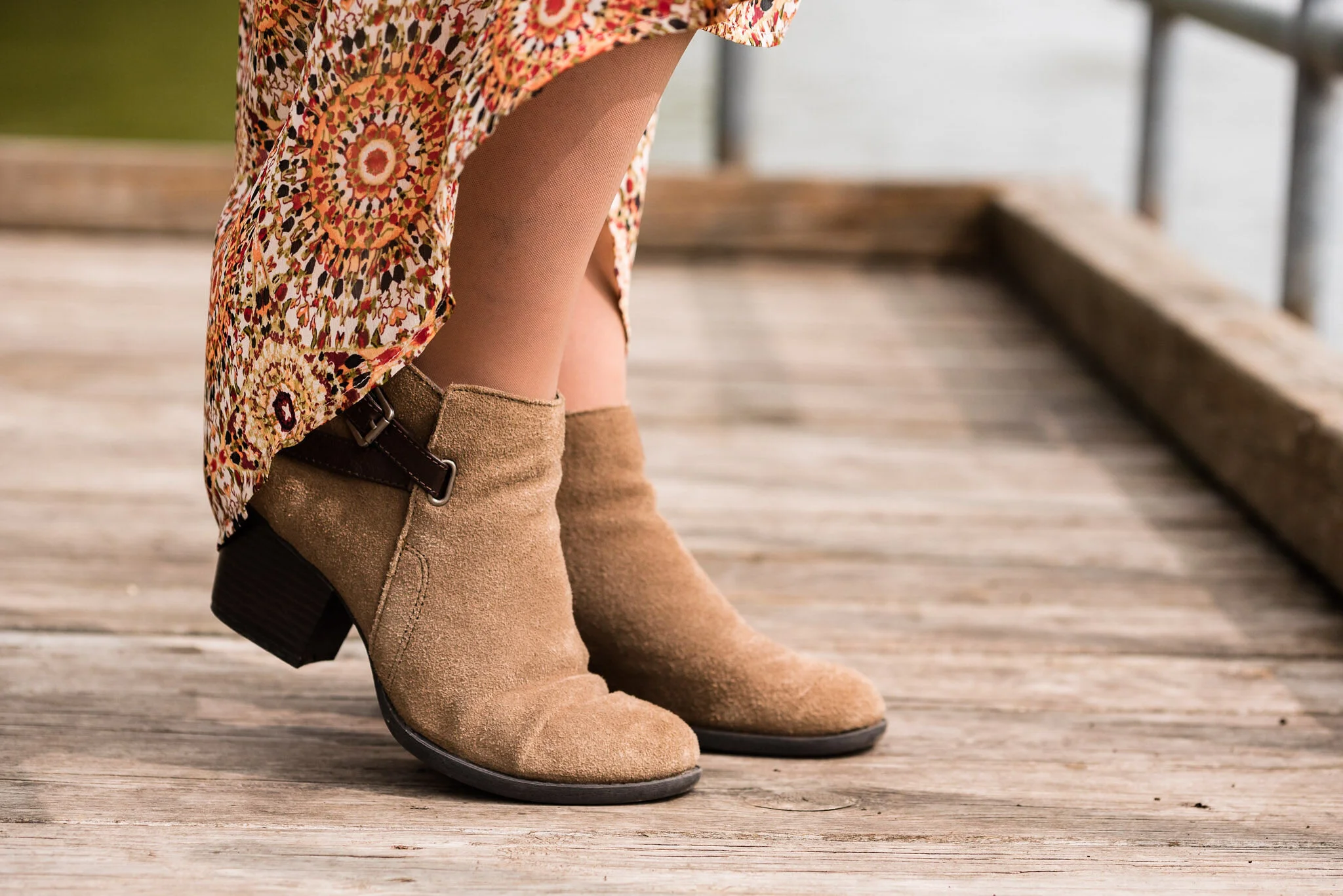
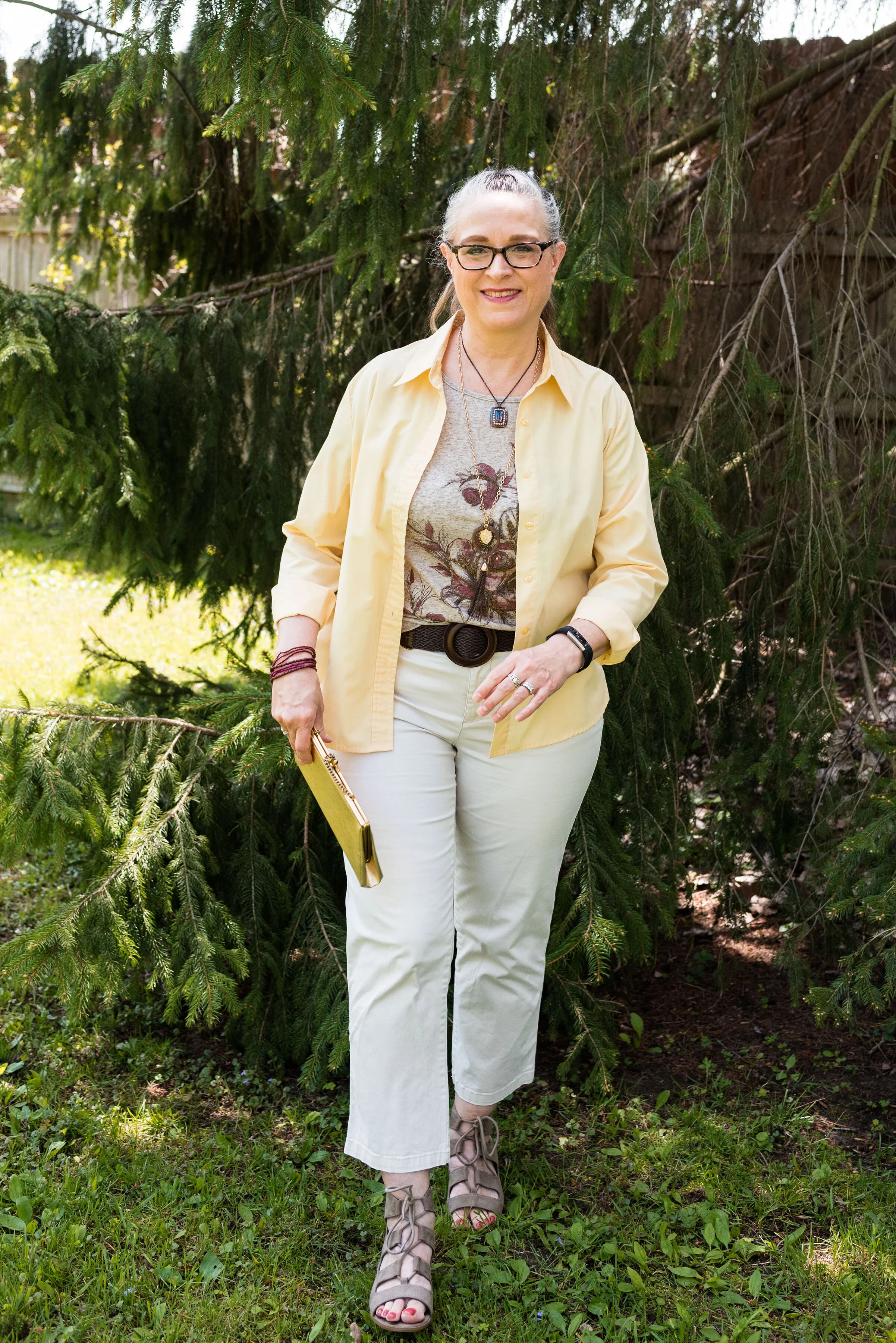
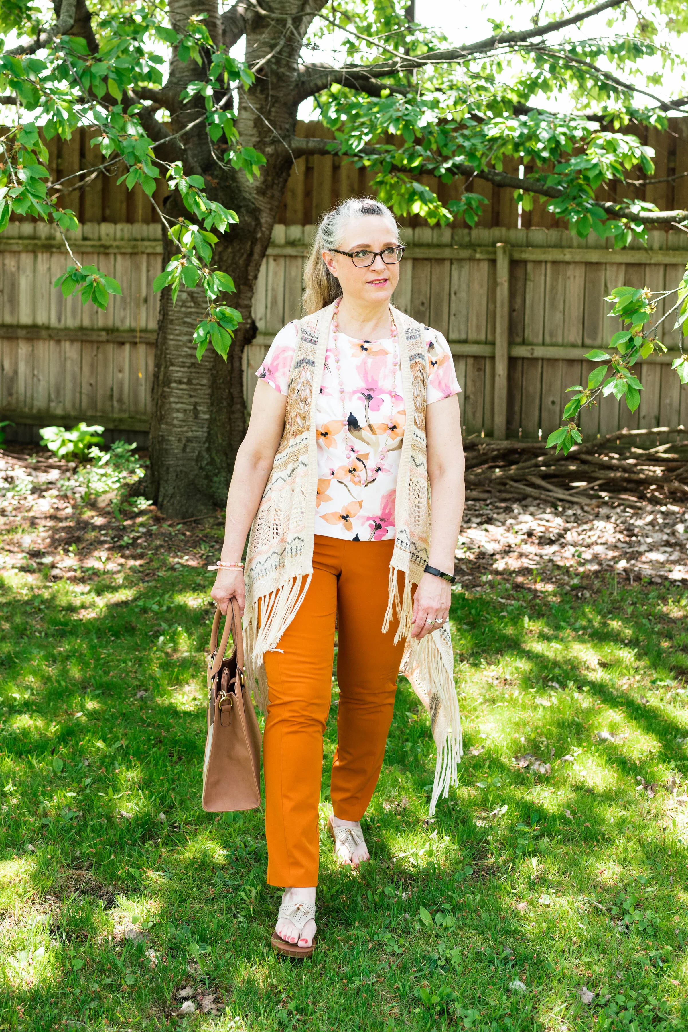
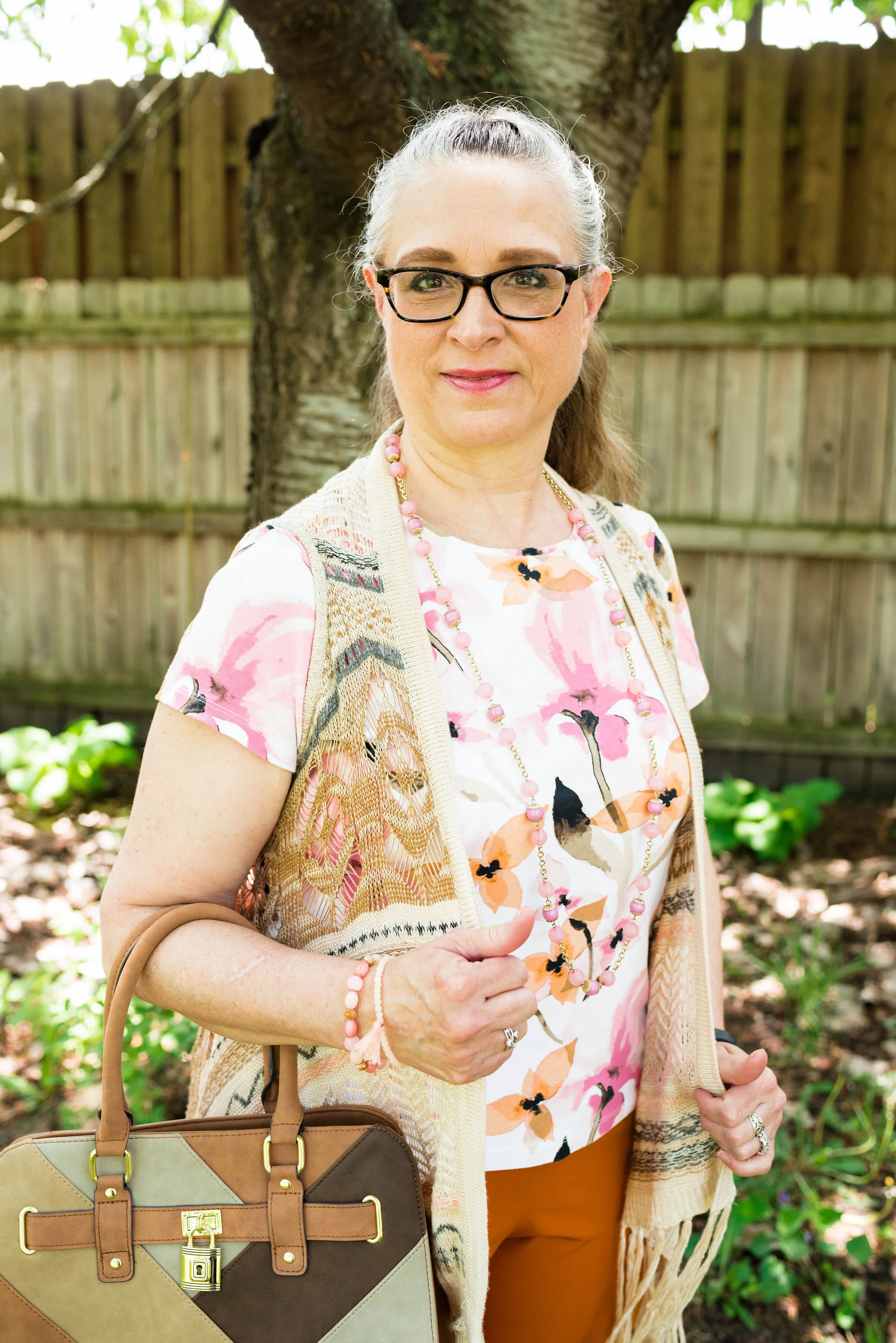
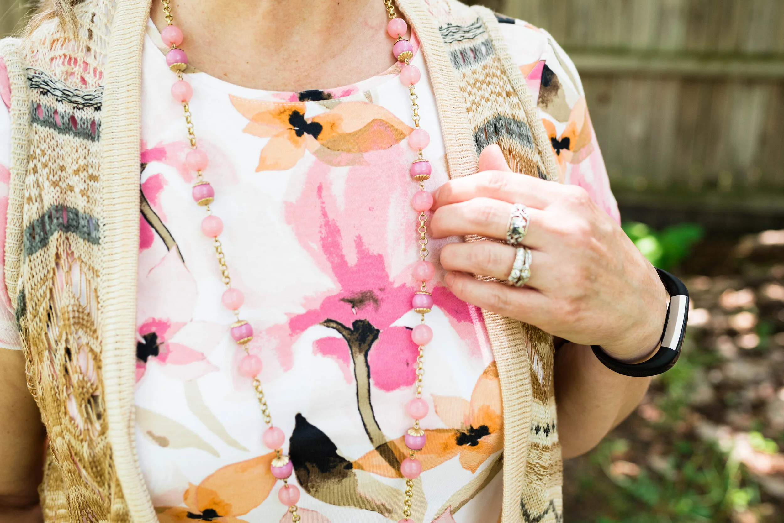
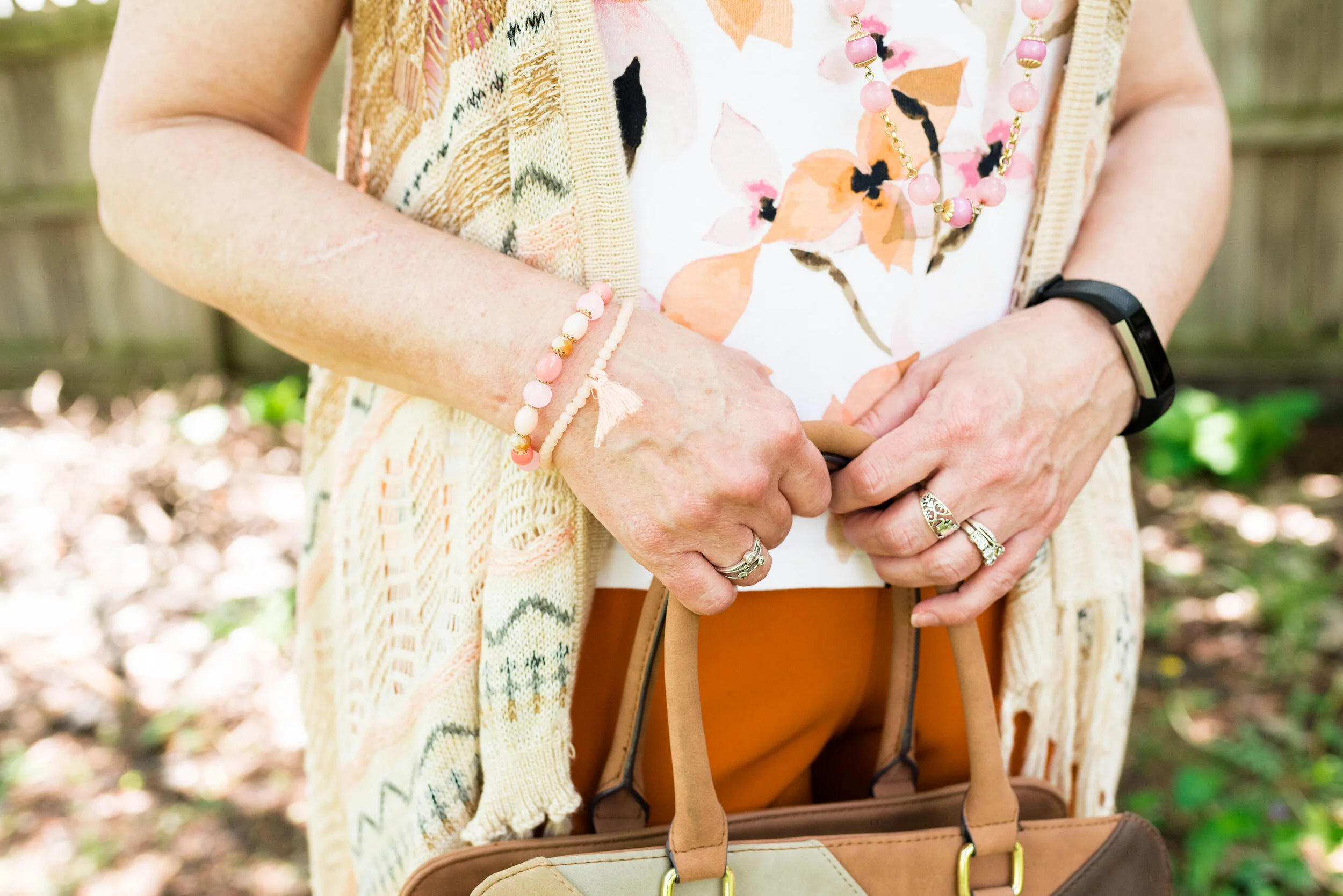
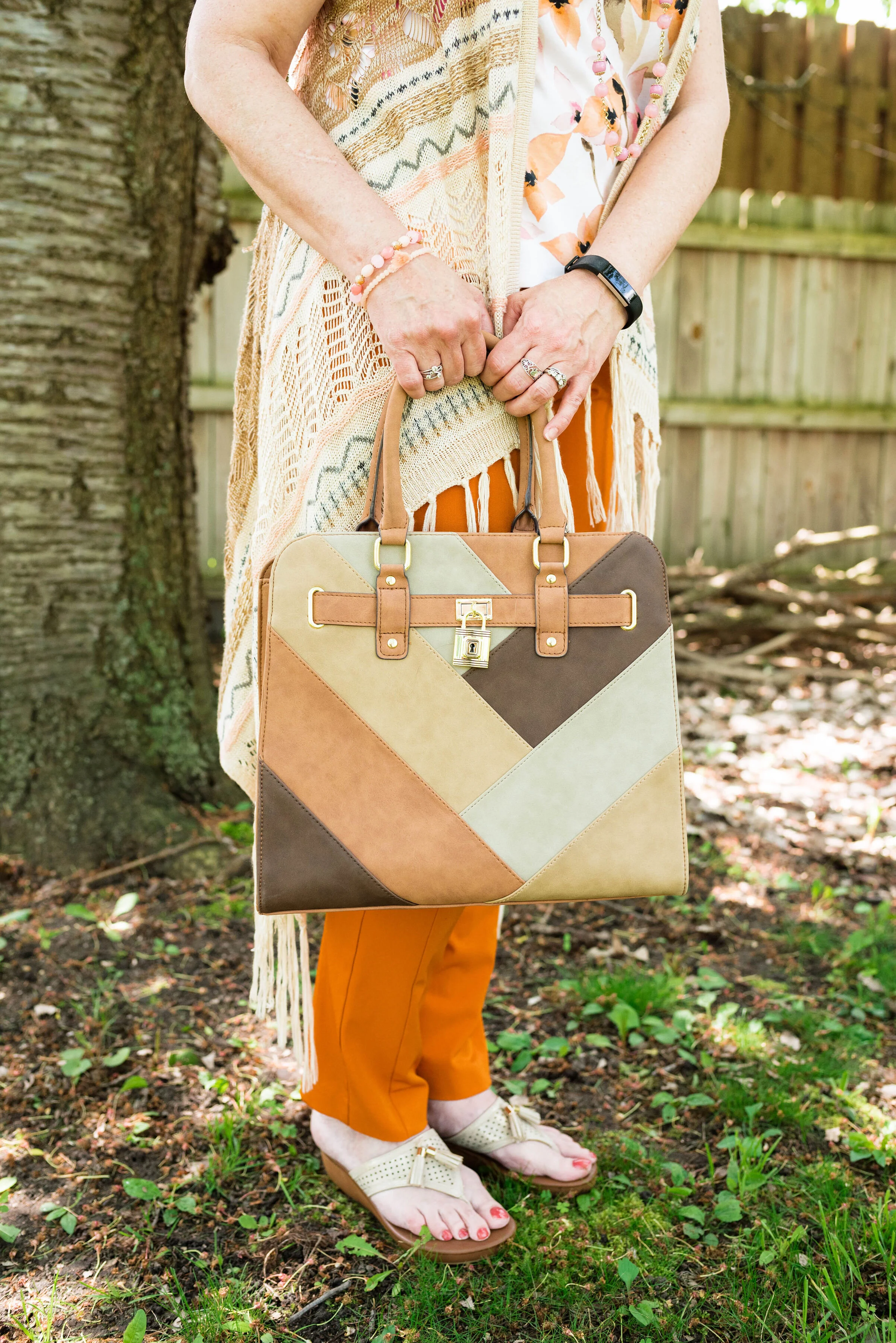
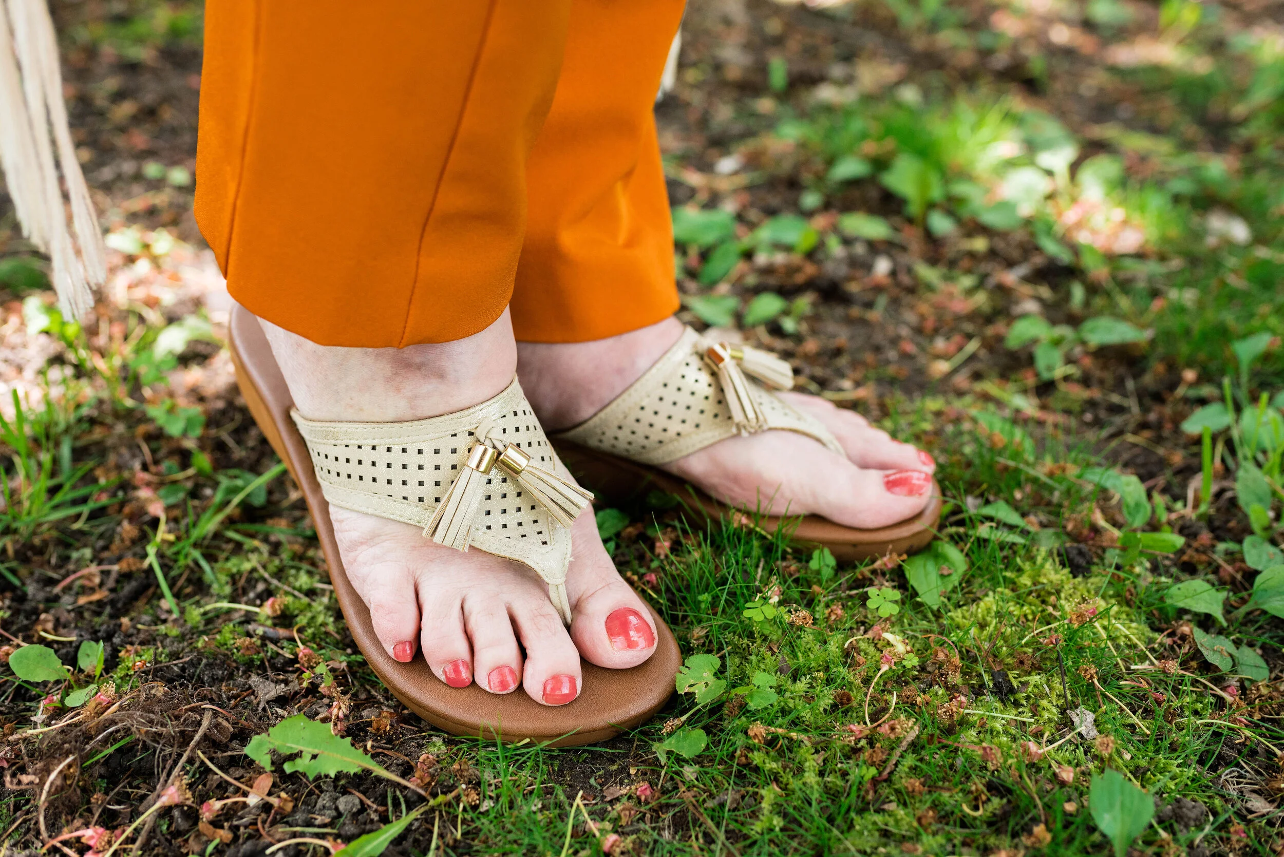
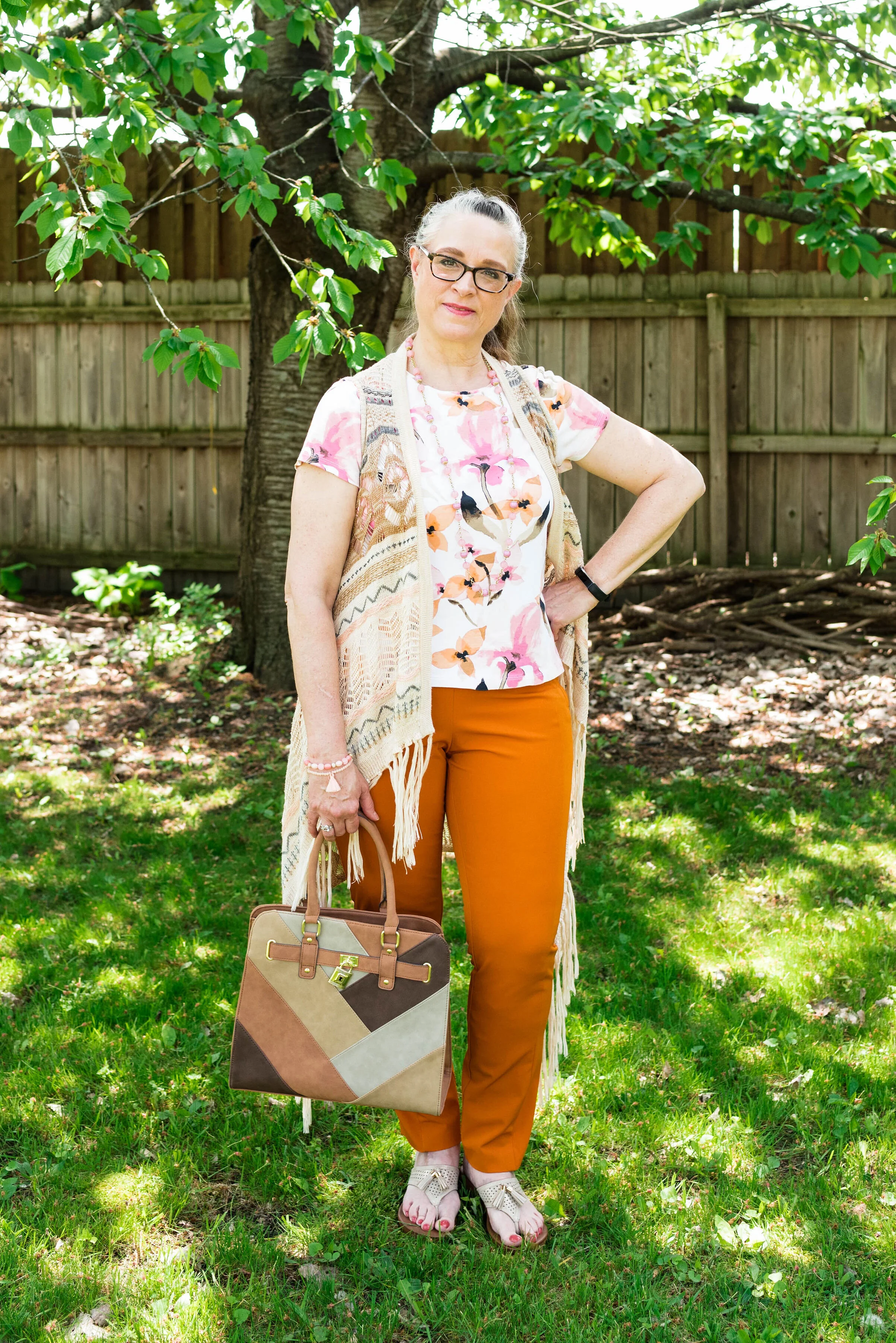
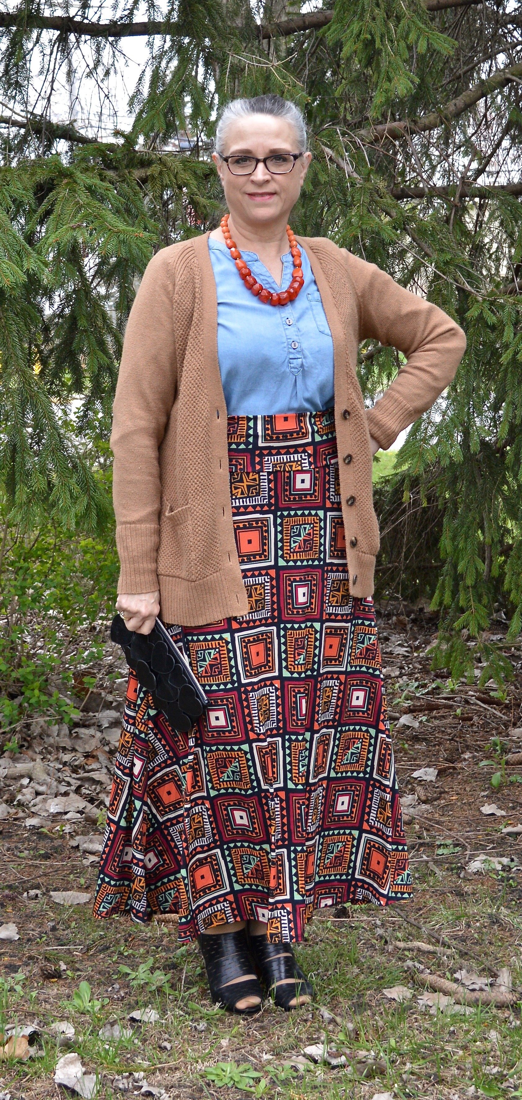
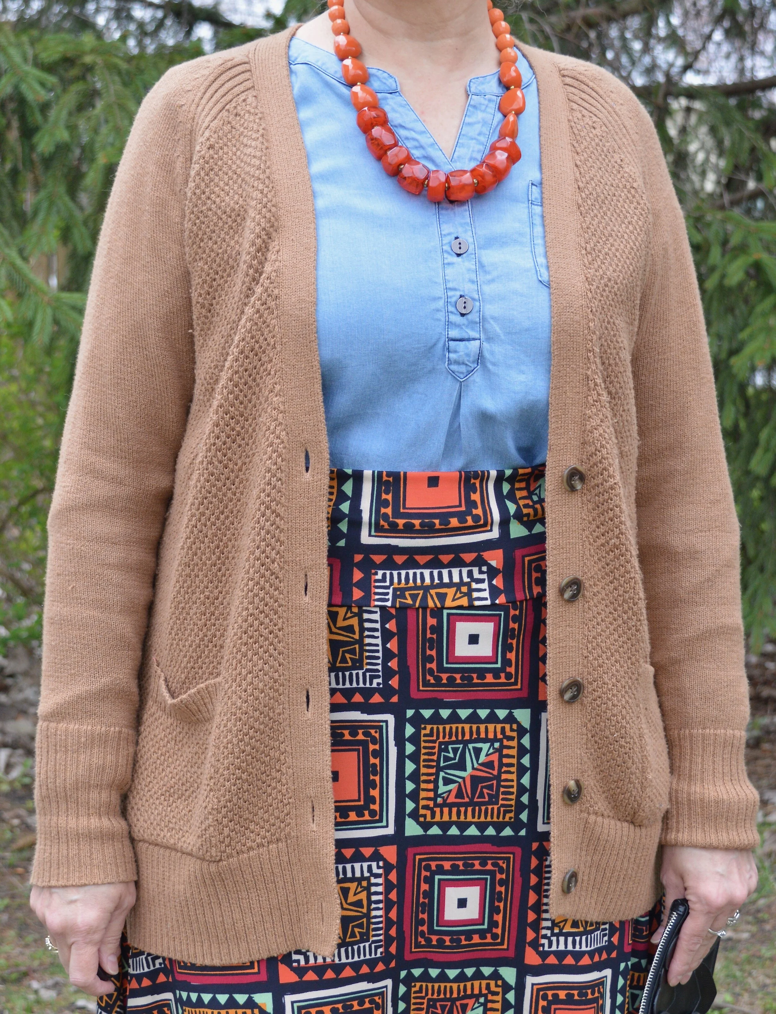
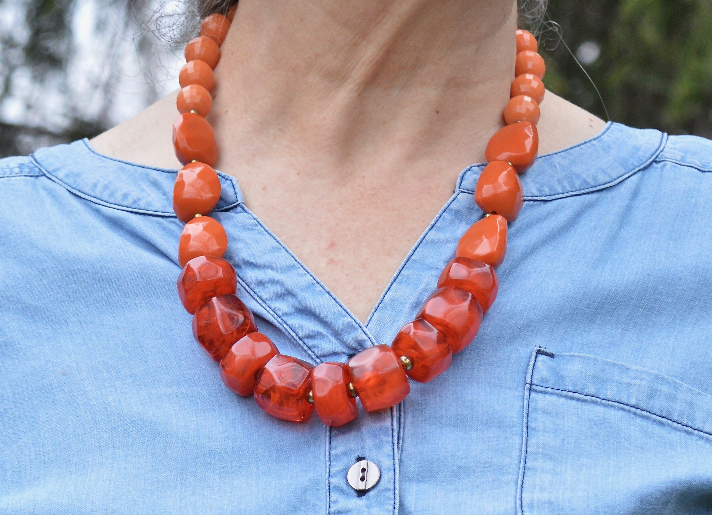
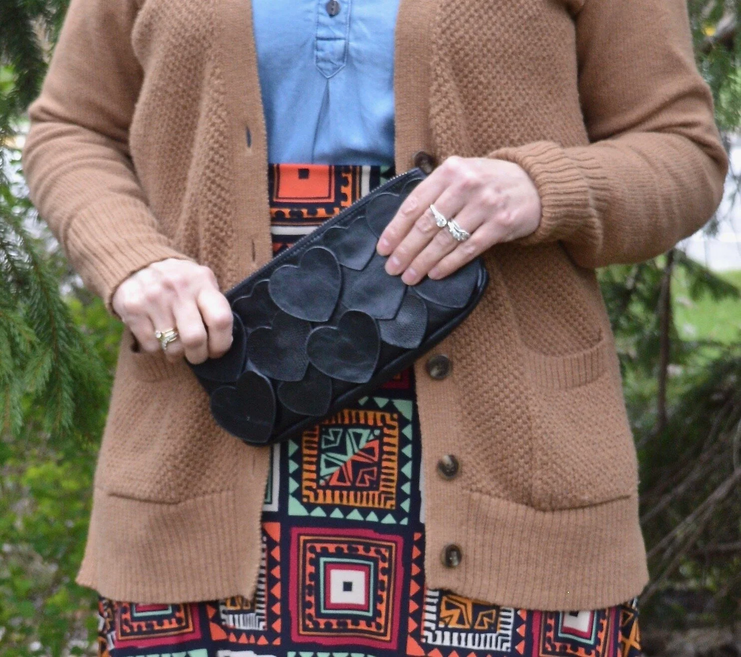
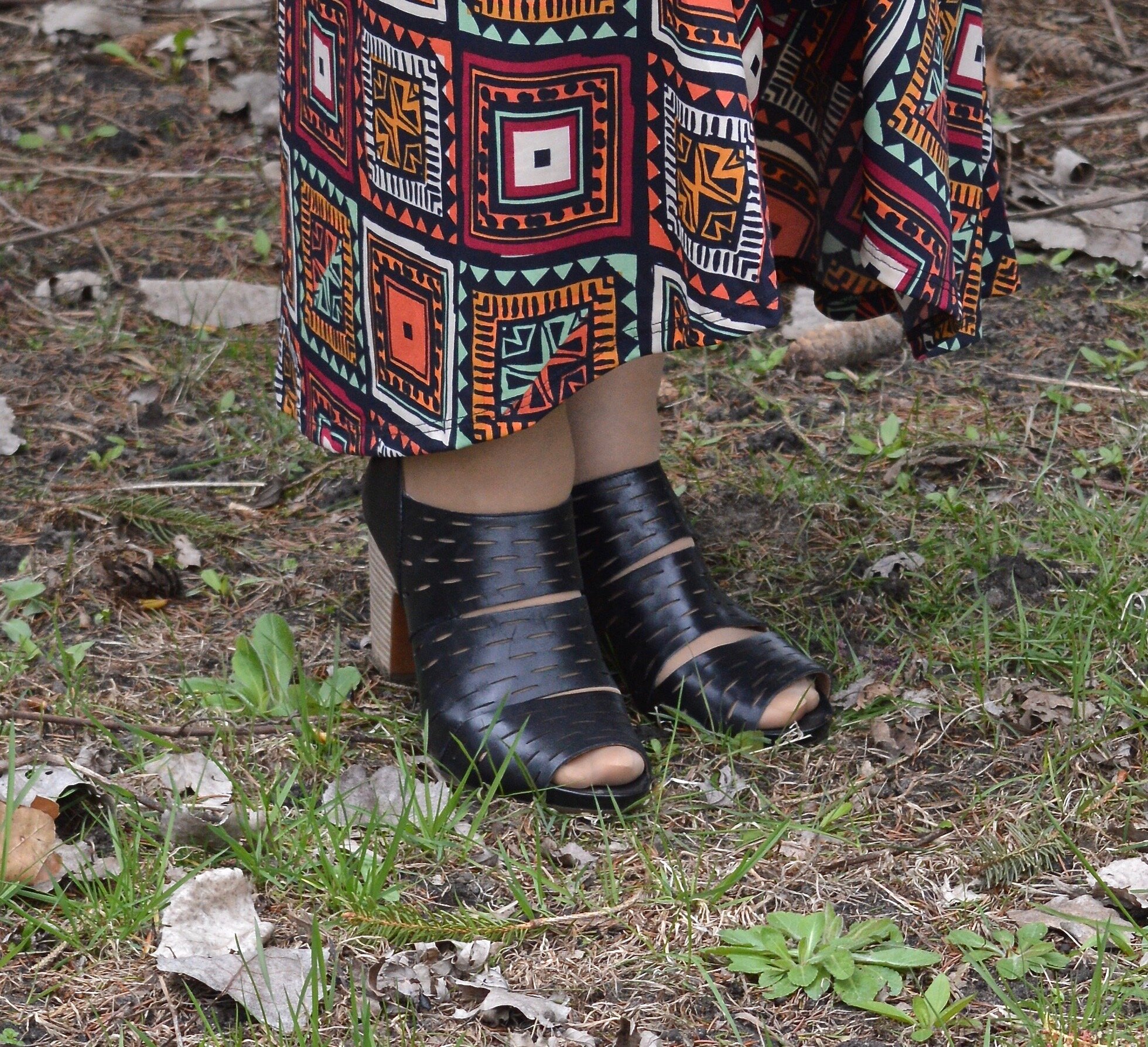
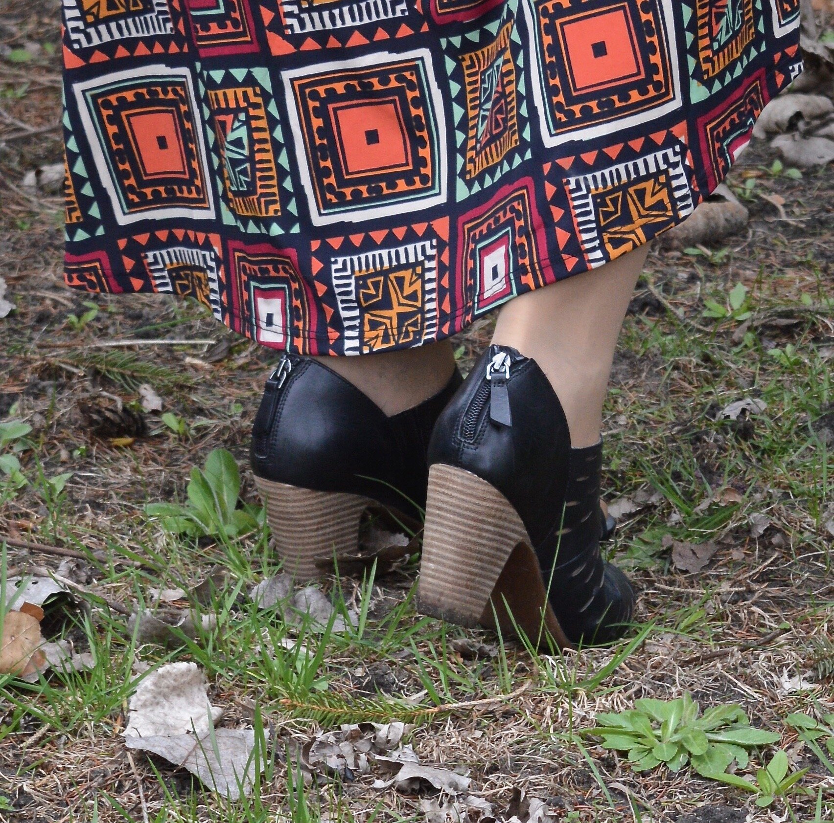
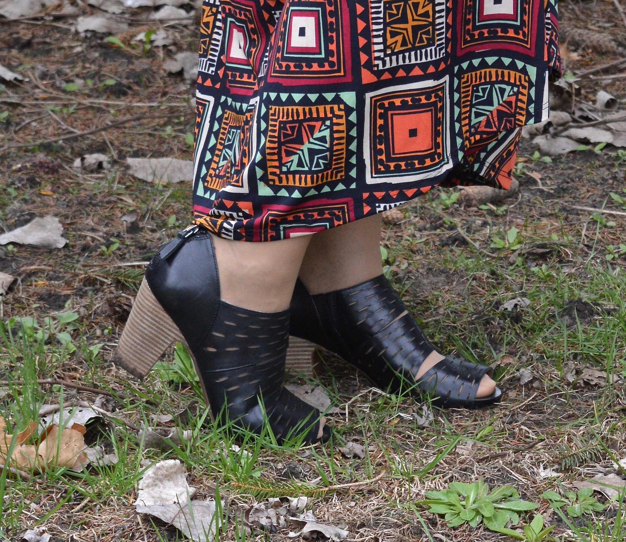
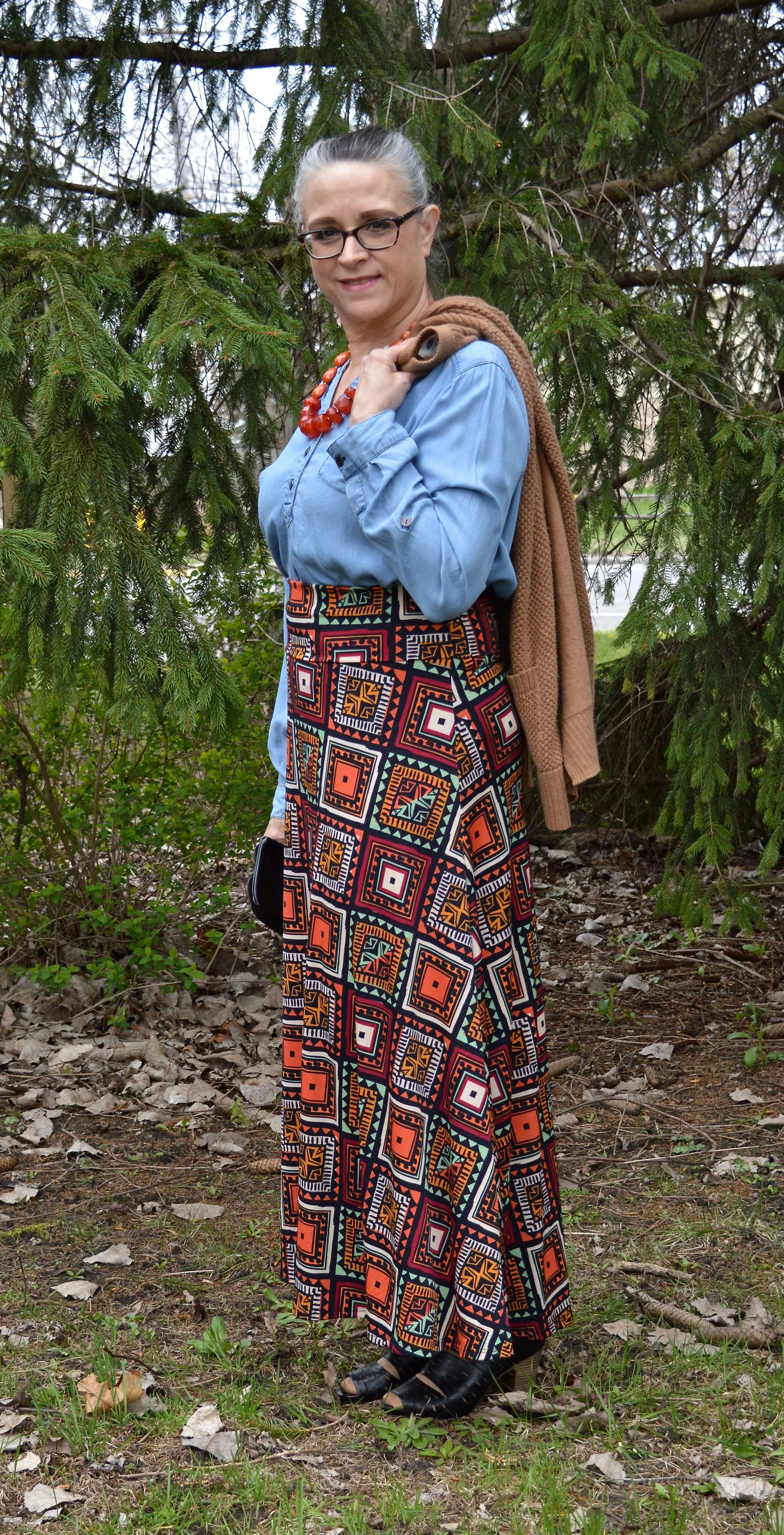
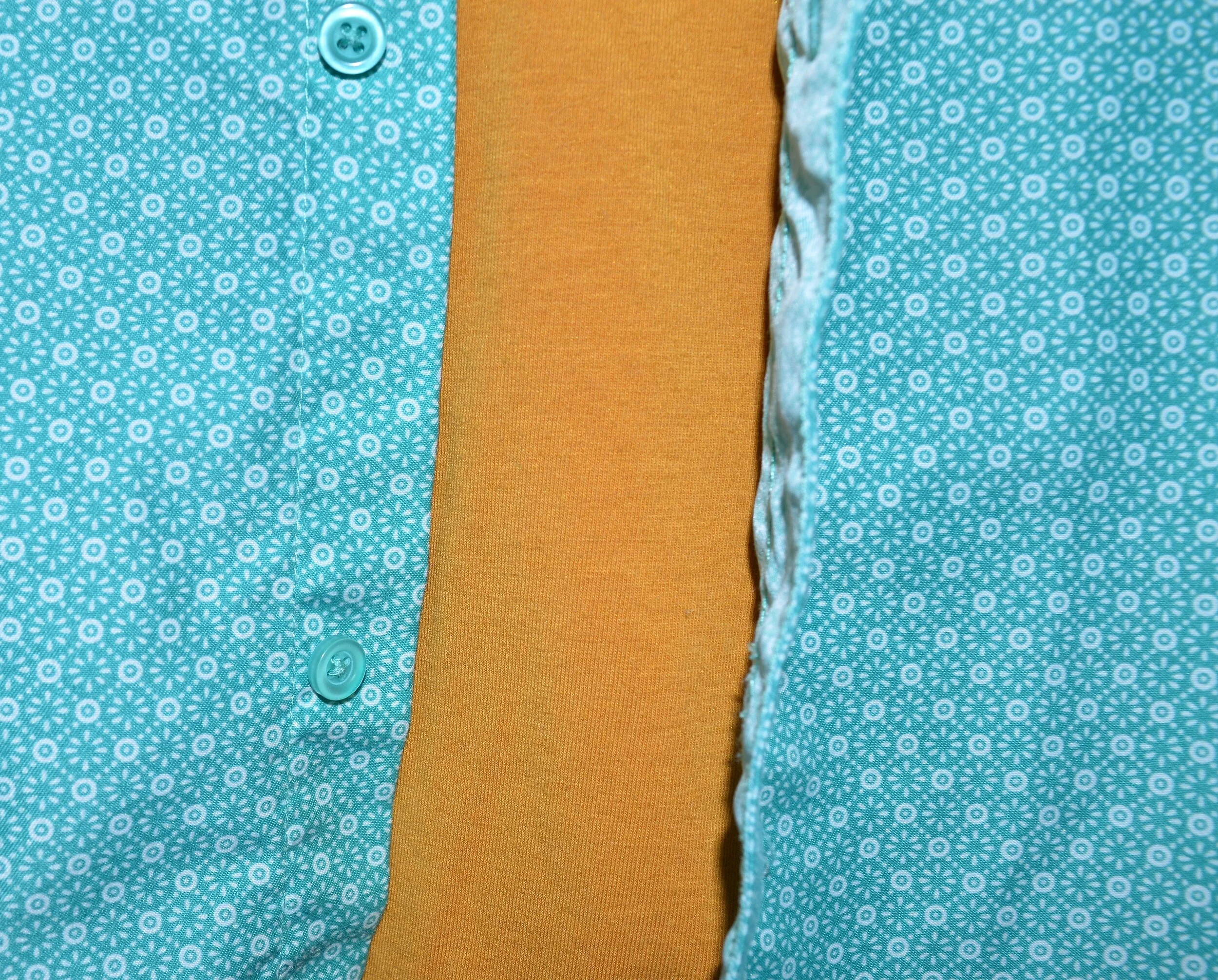
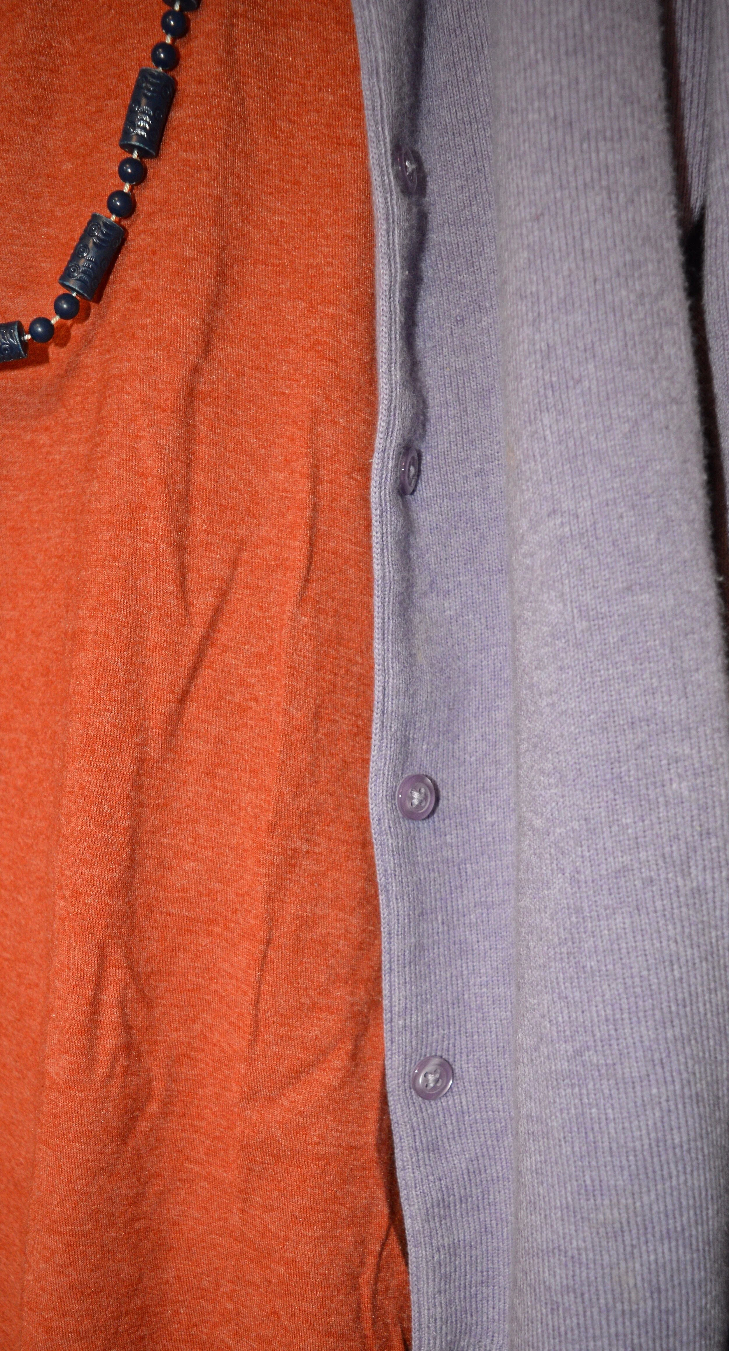
Amber Glow, Green Sheen and Almond Oil

This outfit was a surprise. Both my daughter and I thought these two colors just seemed to grate against each other, and well they might have, if I had worn a solid skirt with the solid top, but the printed skirt makes all the difference in the world. I also think the jacket and boots softened the whole look.
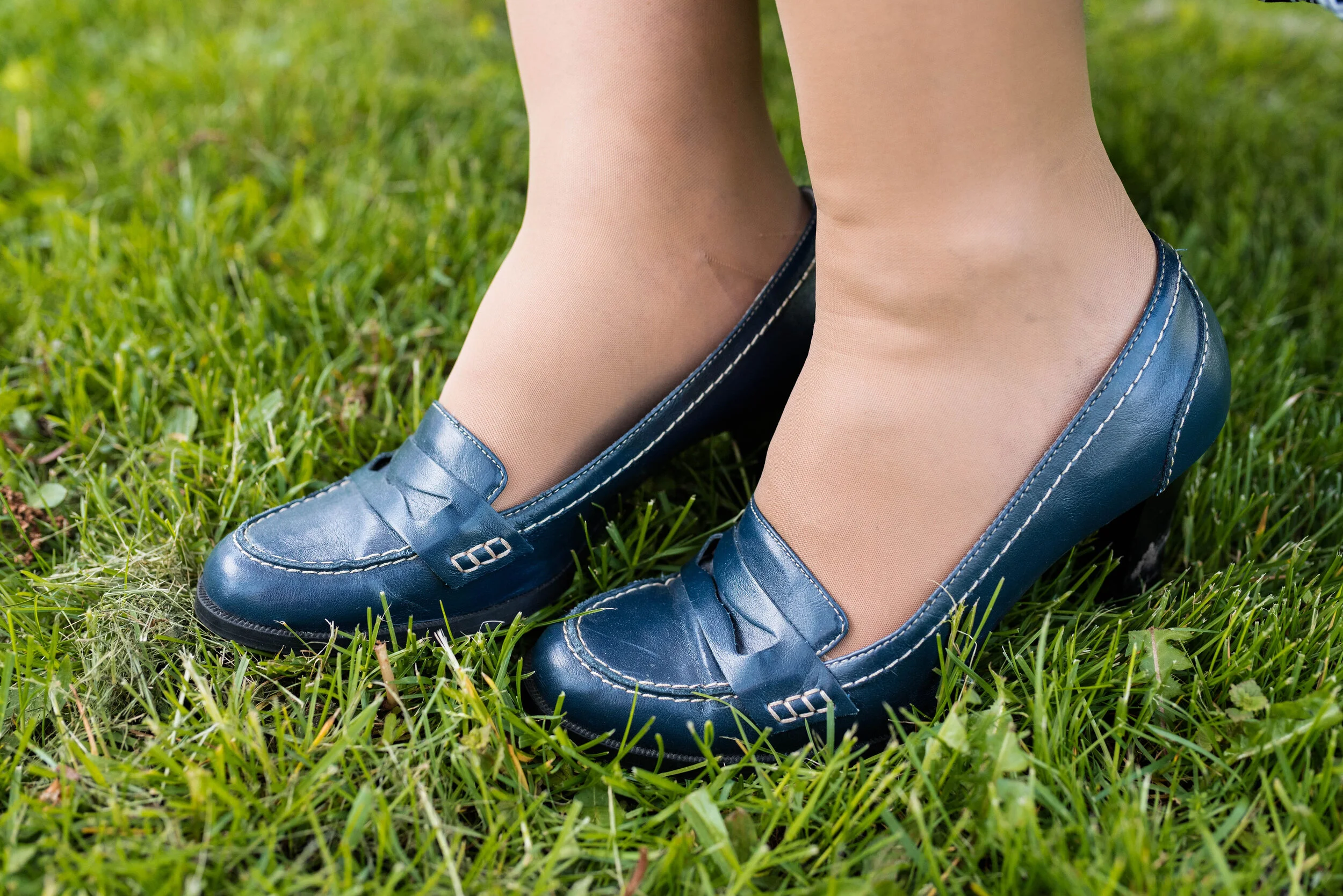
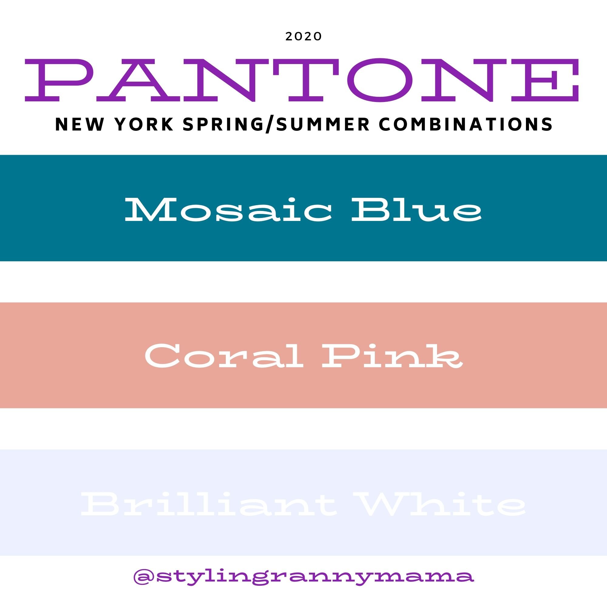
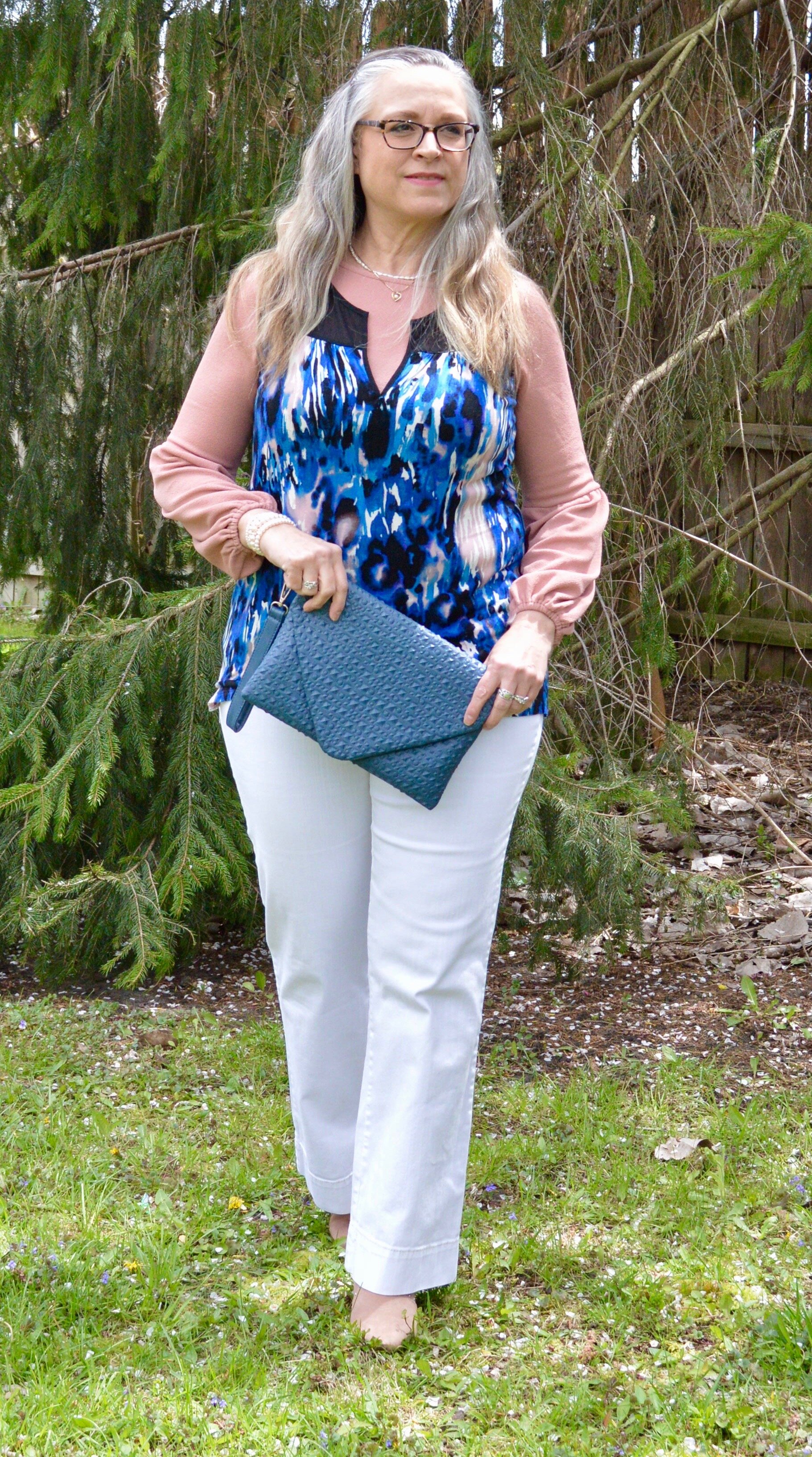
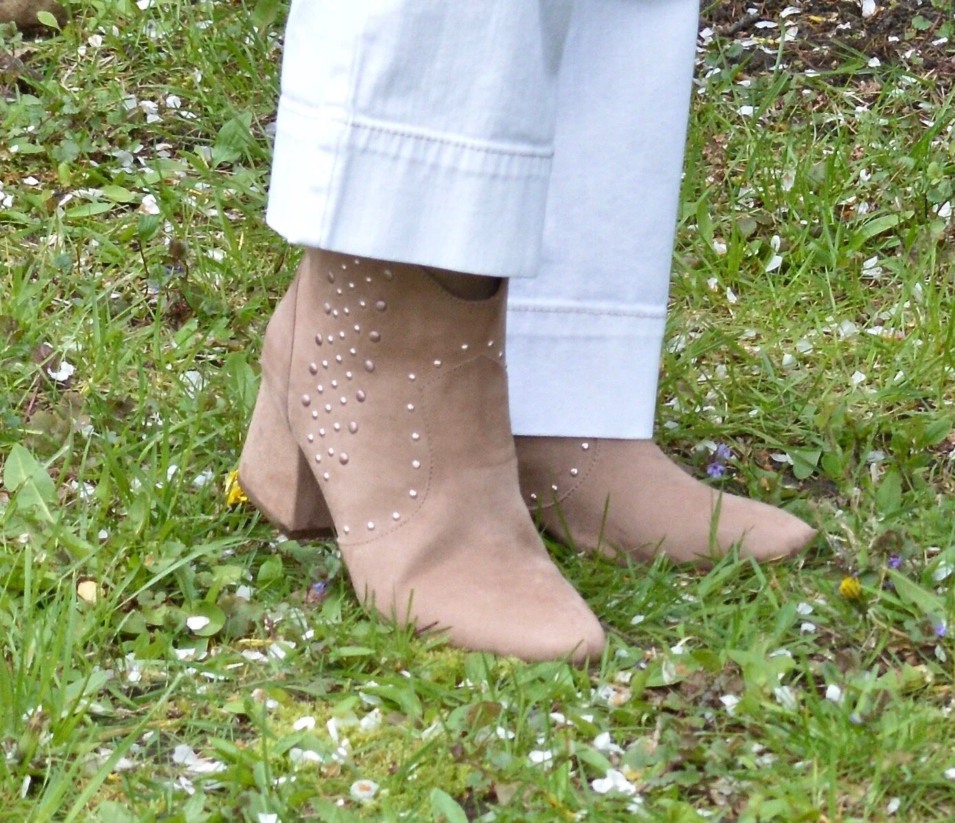
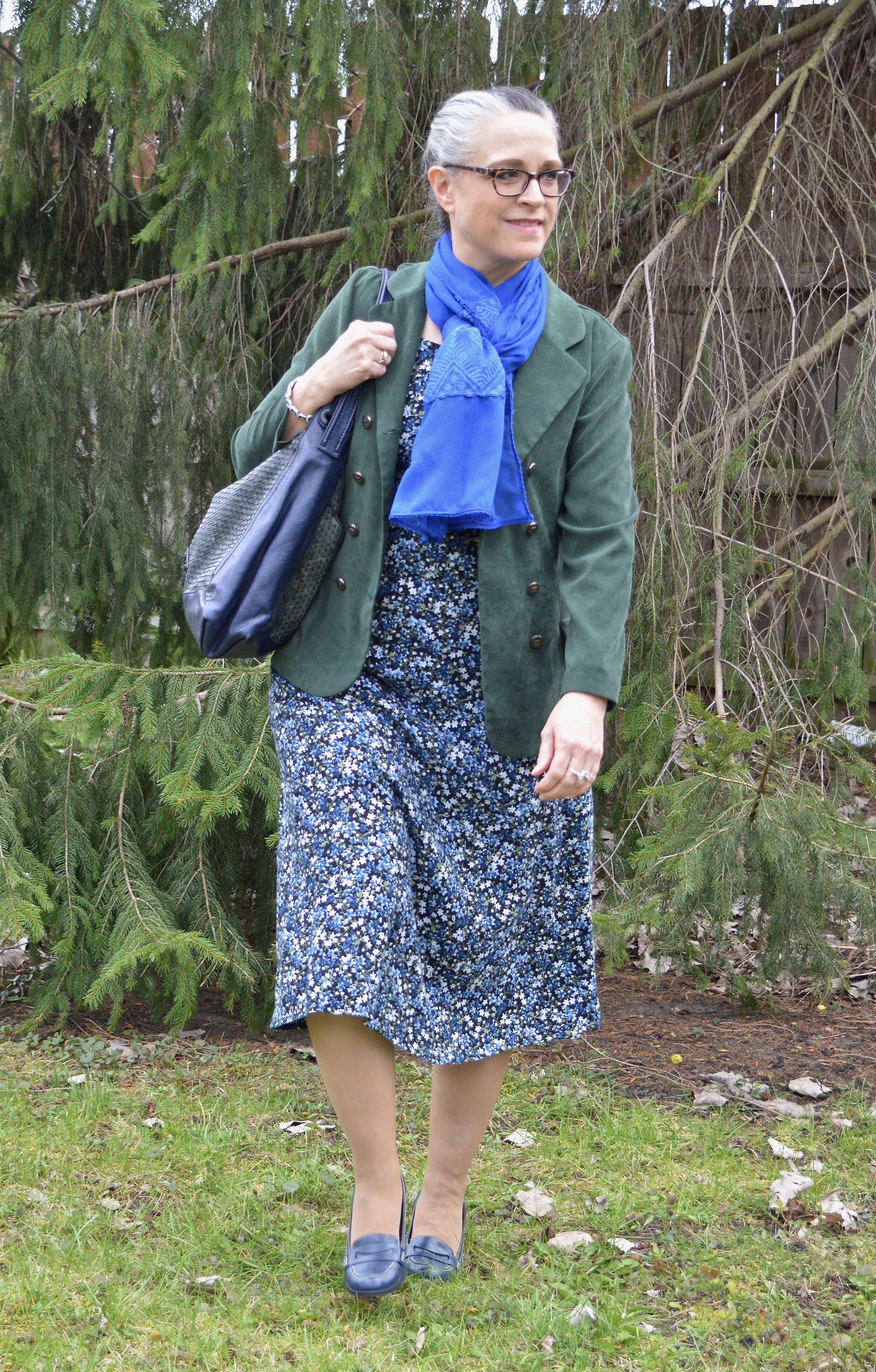
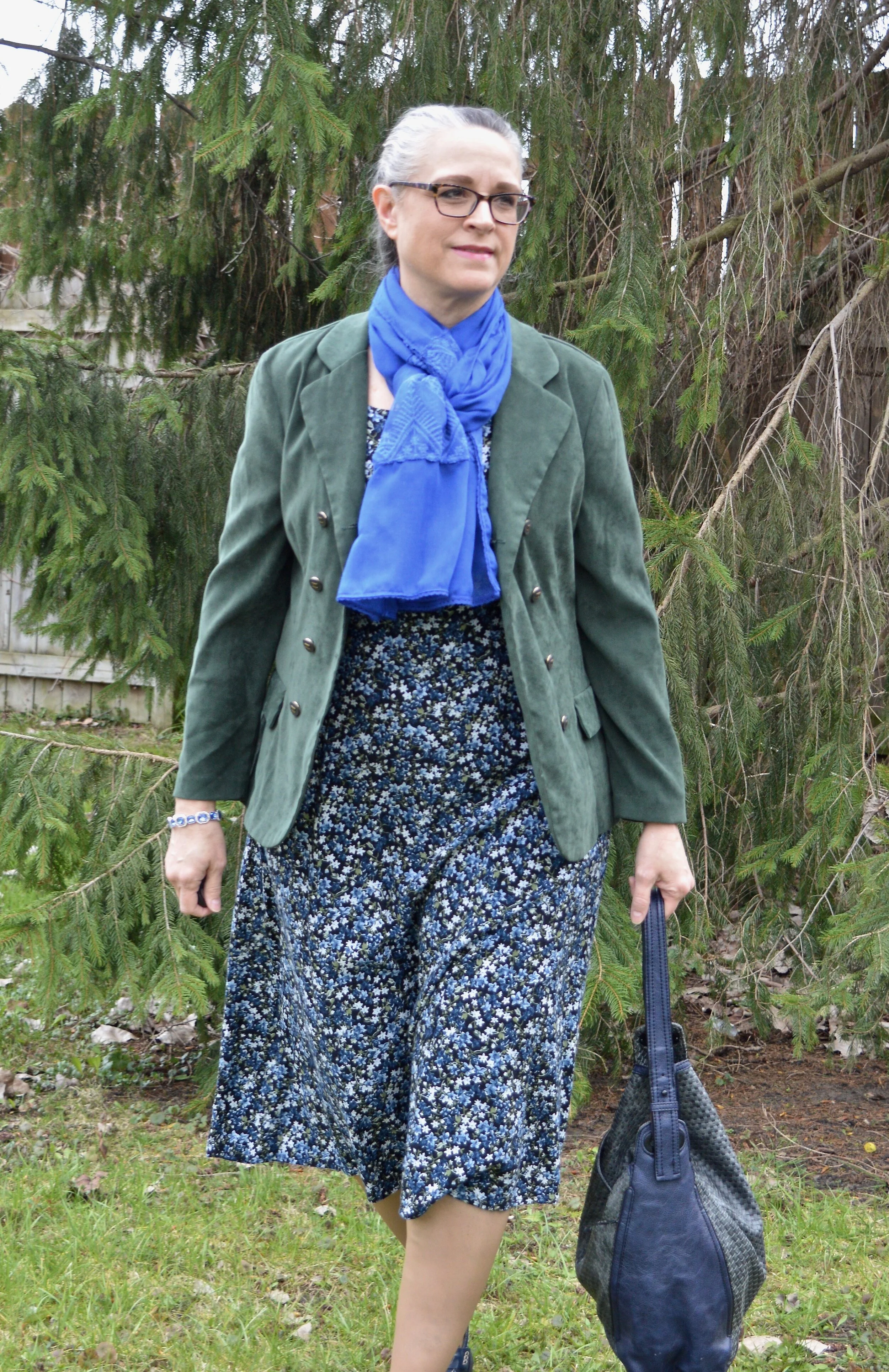
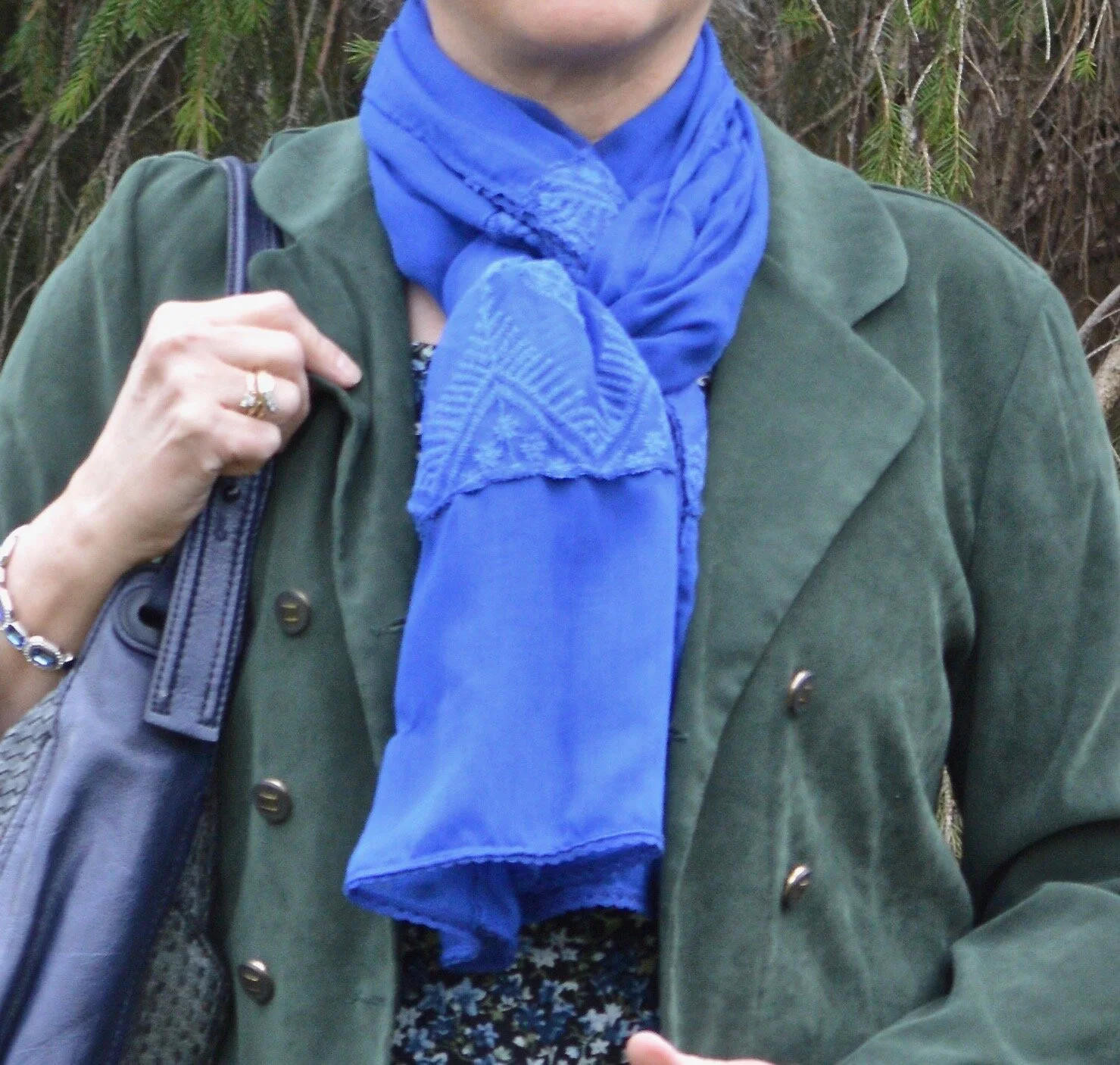
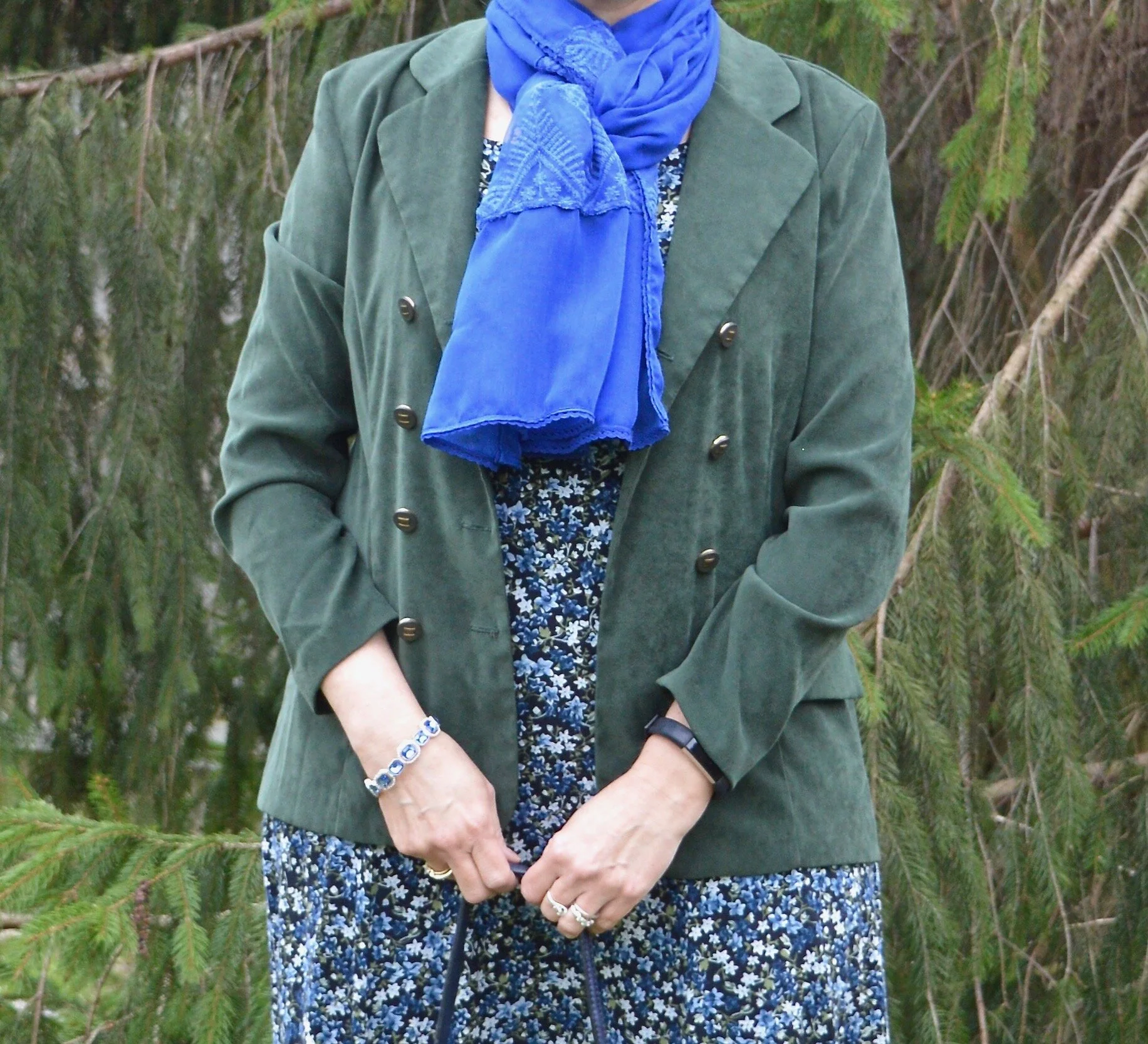
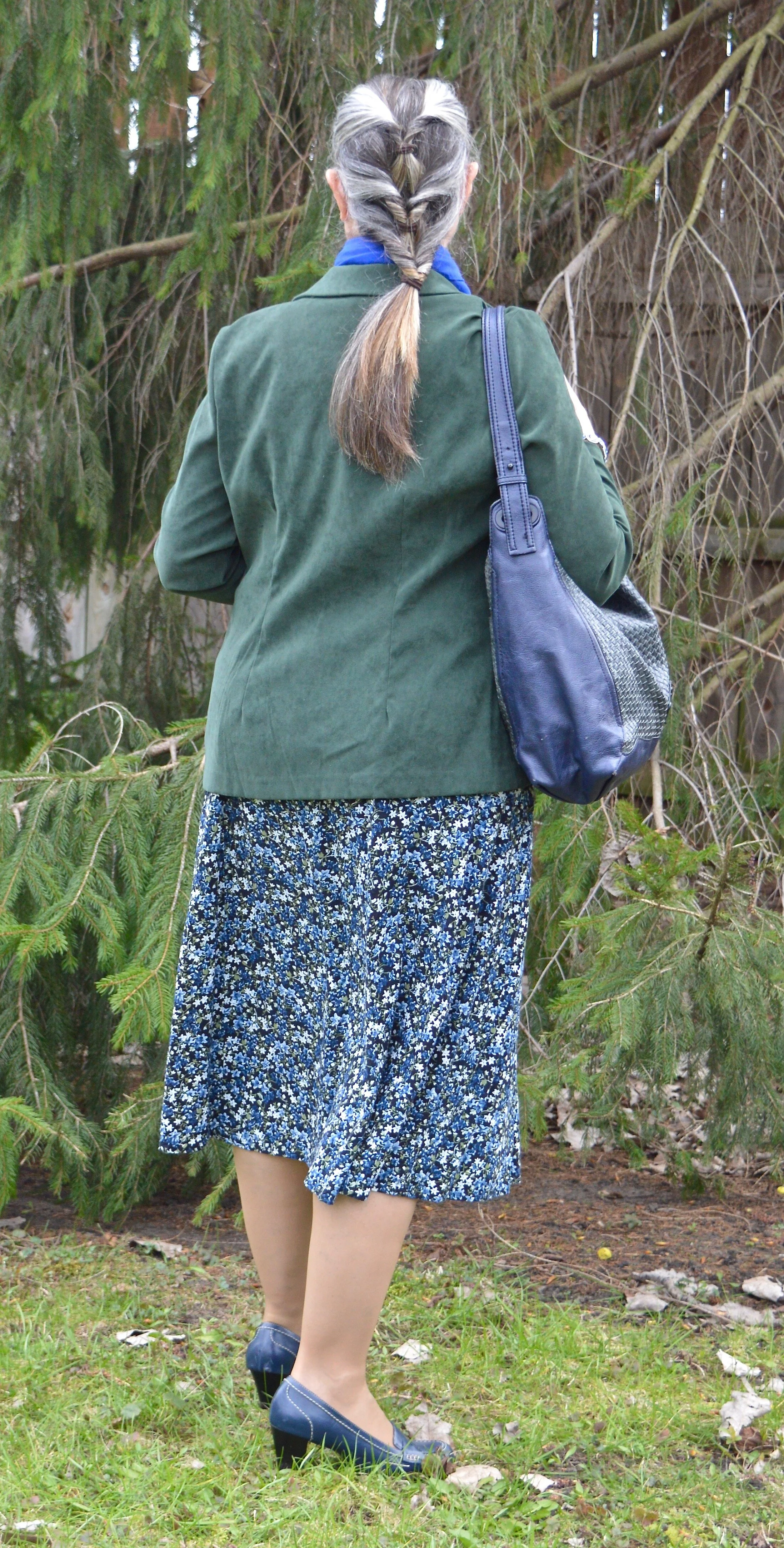
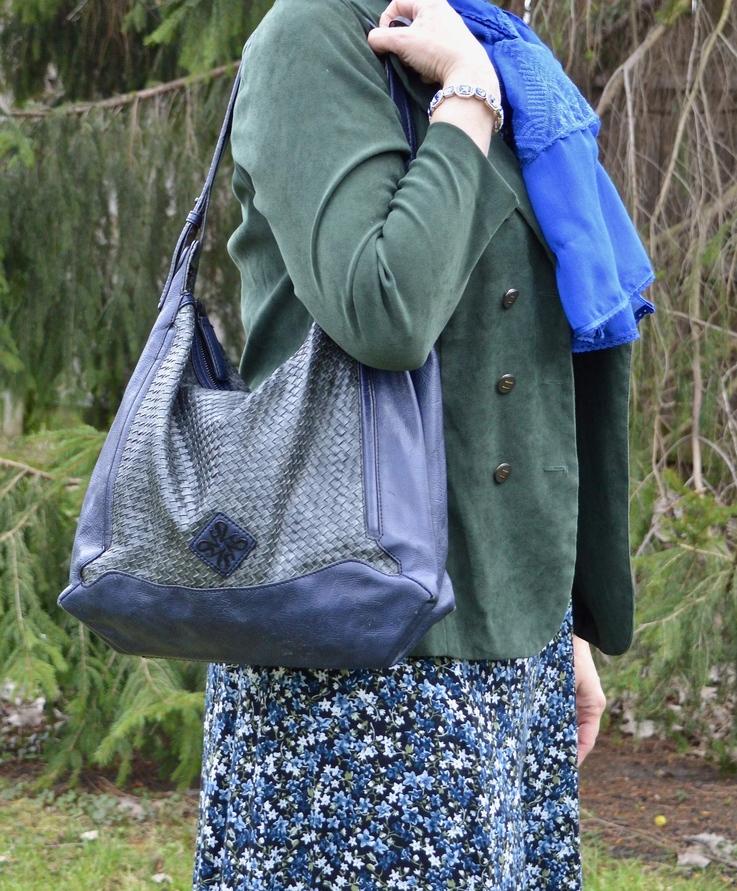
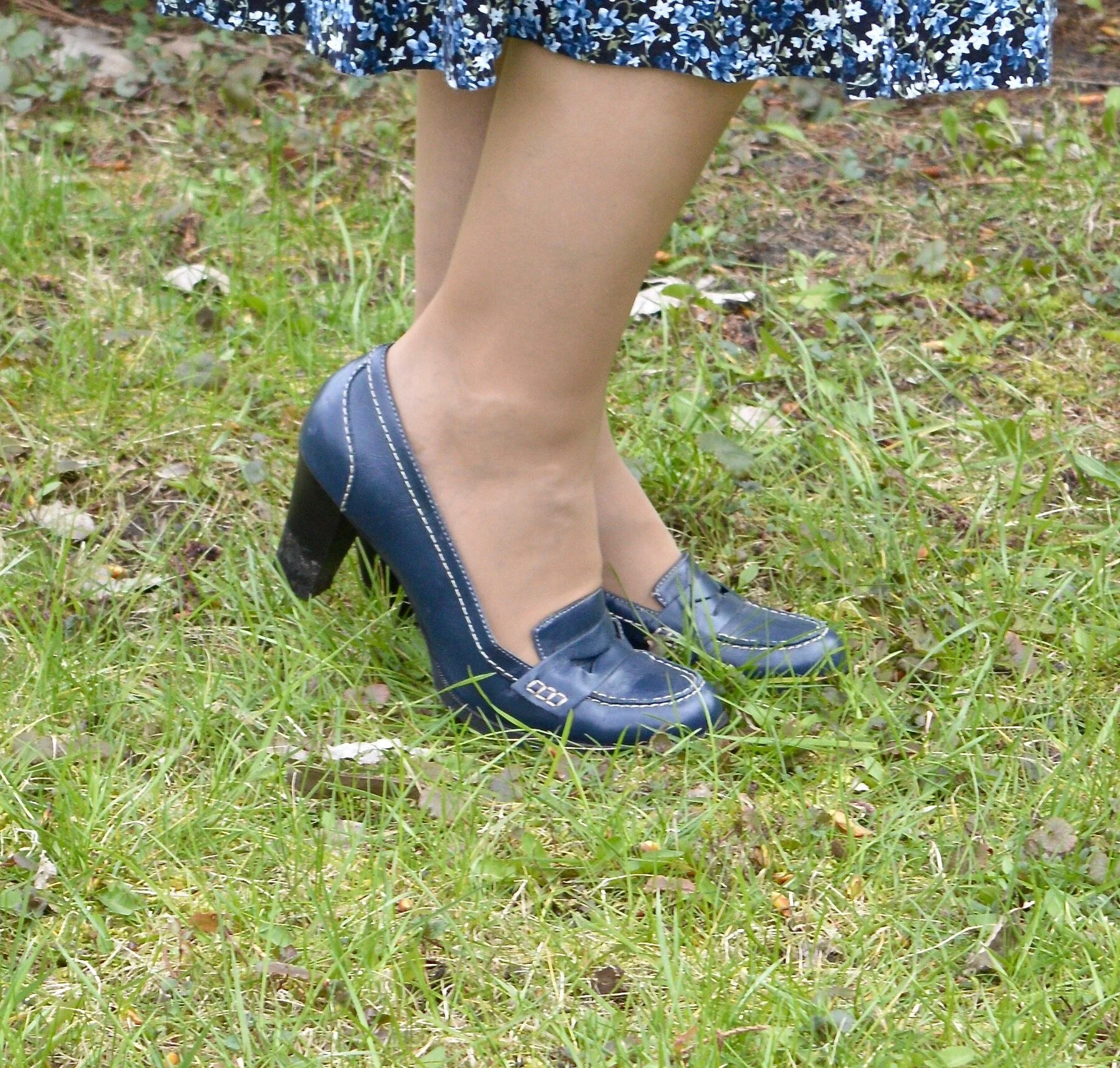
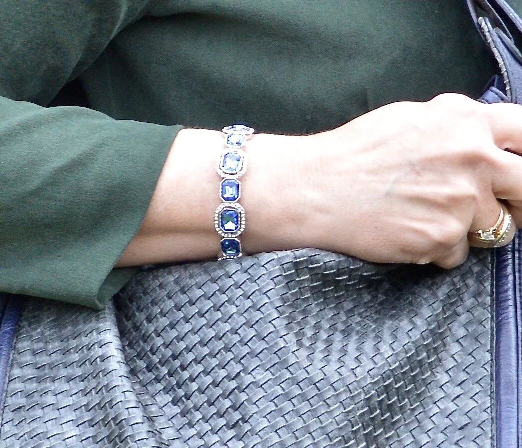
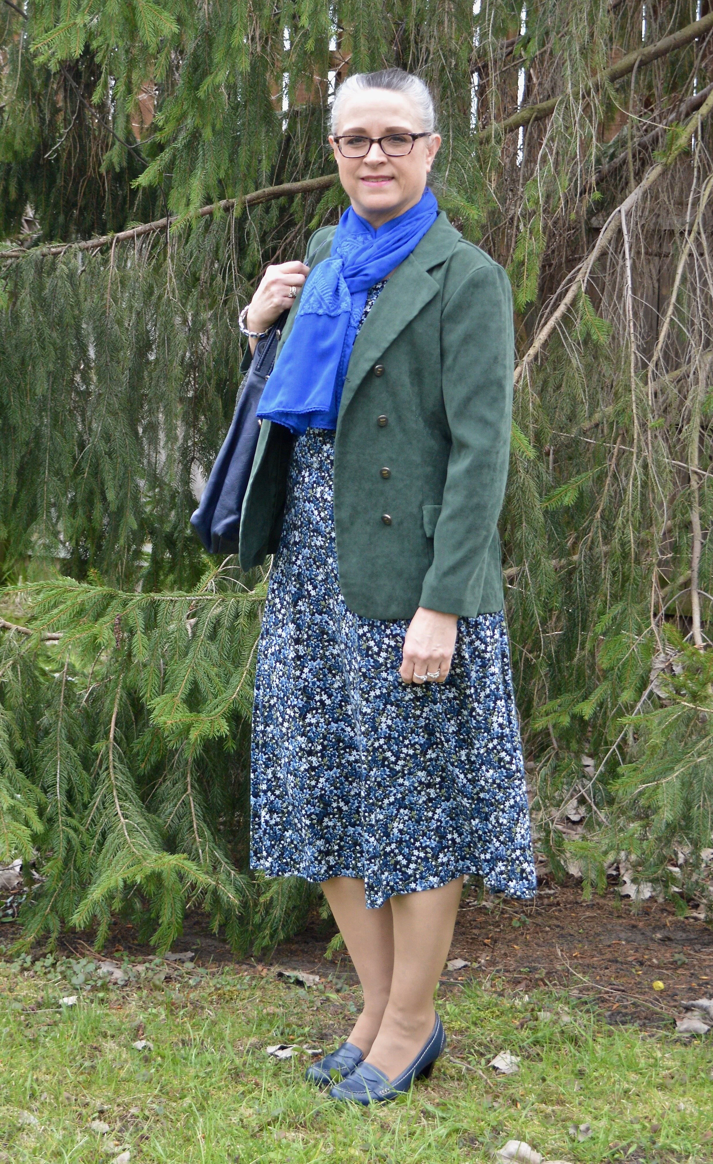
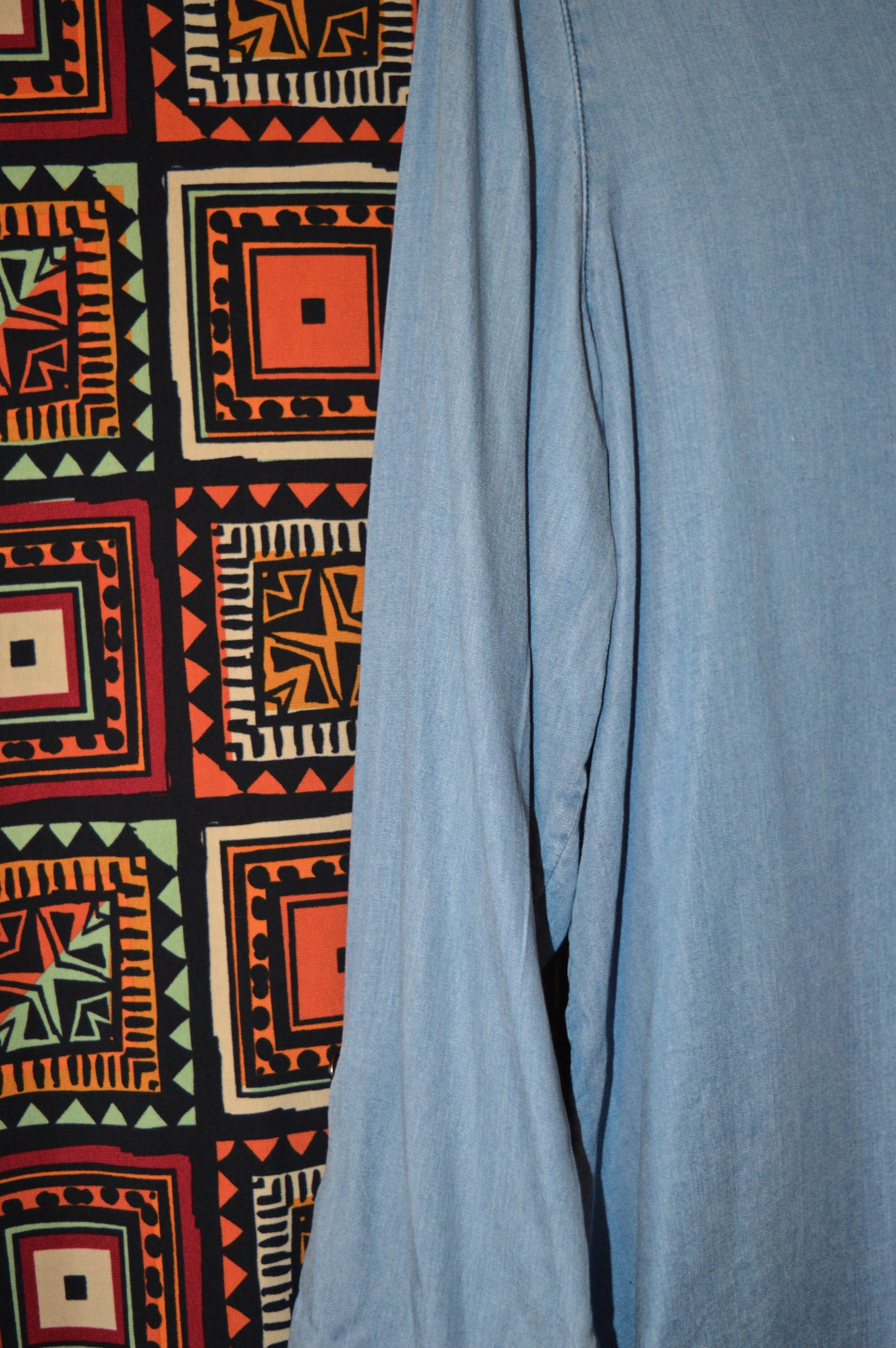
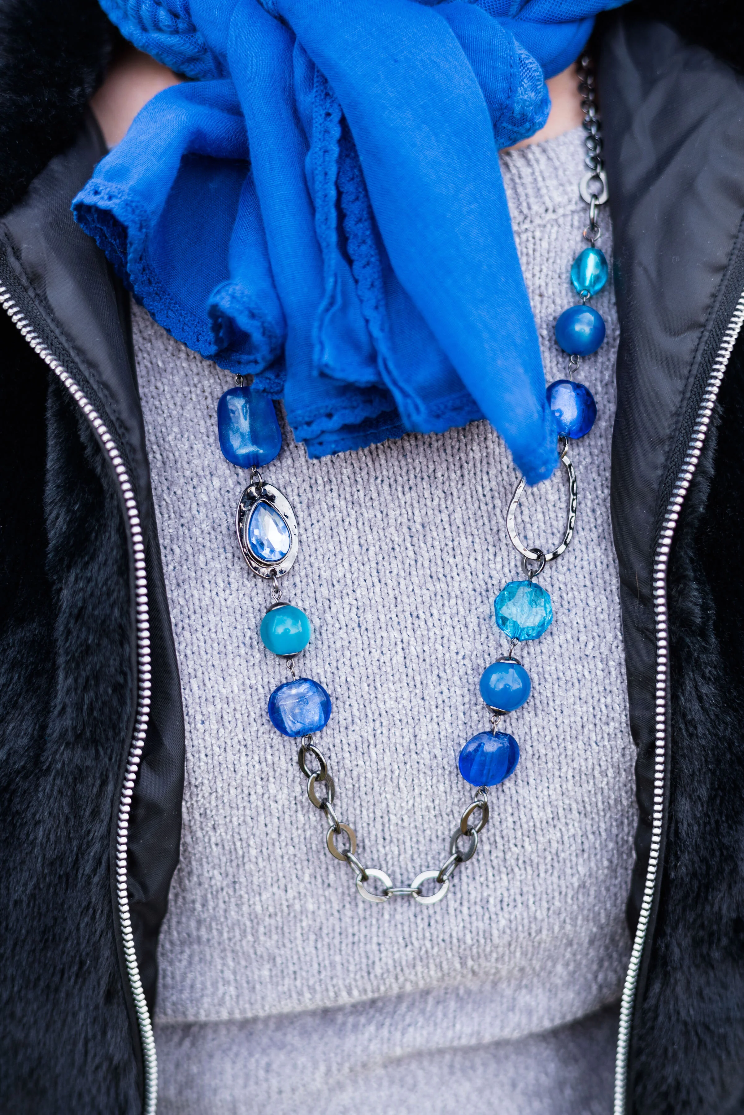
Classic Blue, Ultramarine Green and Blue Depths
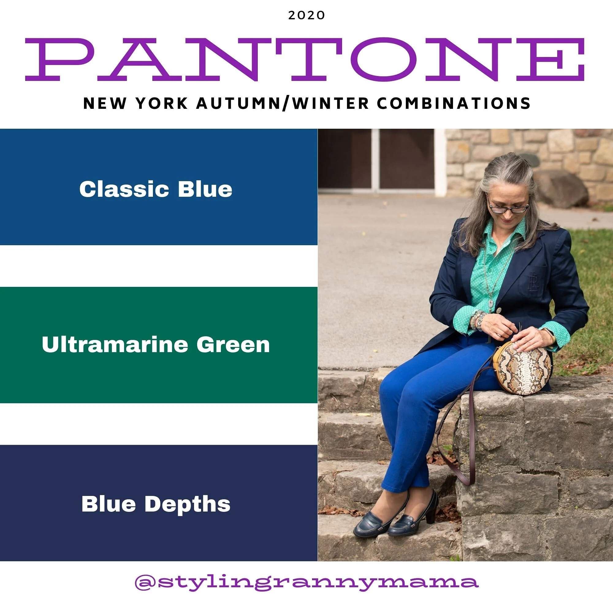
We don’t often think of combining green and blue, or blue with blue, for that matter, but I think this worked. The blue shades are quite different, but worked well next to each other and the green really pops against the blues. I think the addition of the snakeskin patterned round bag completed the look perfectly.
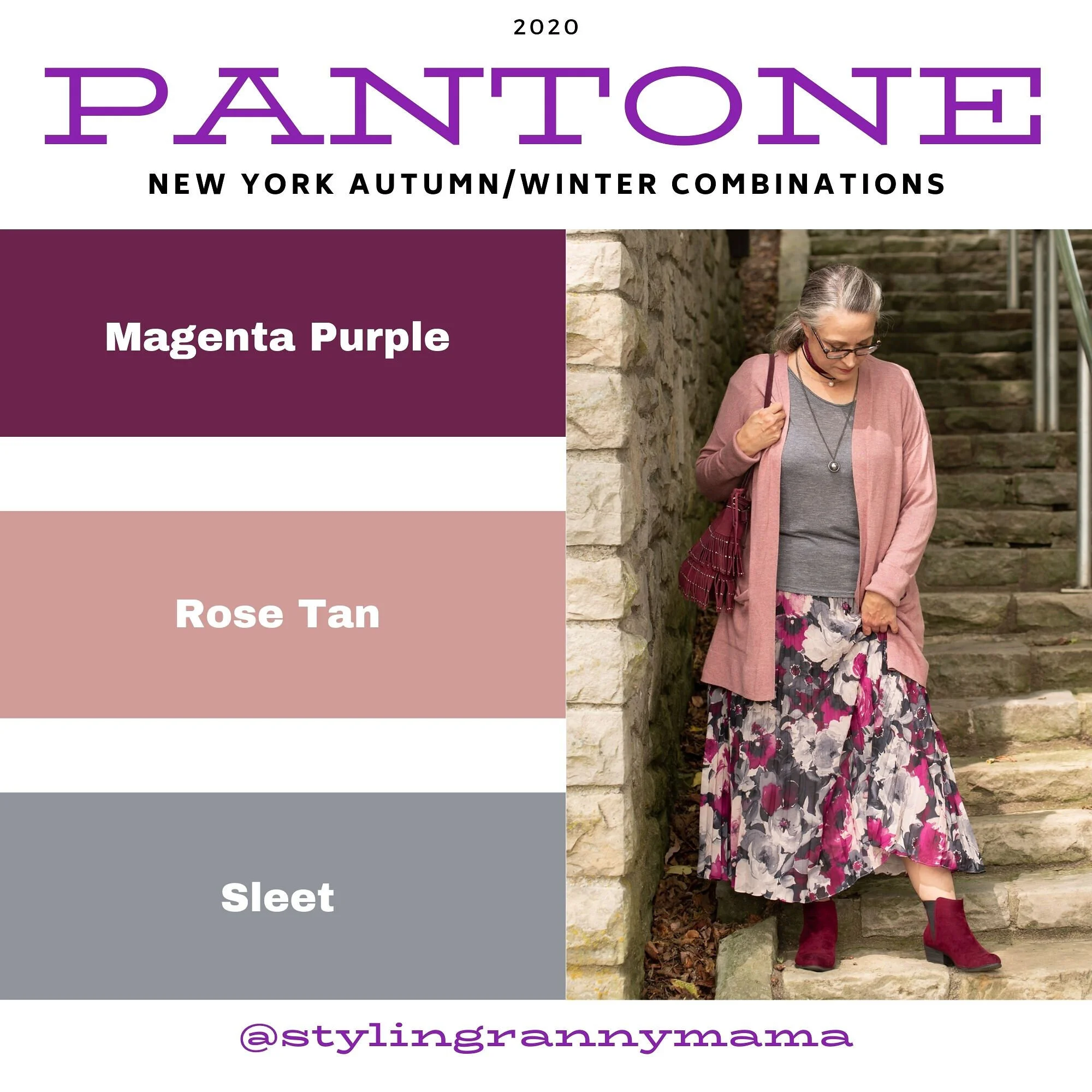
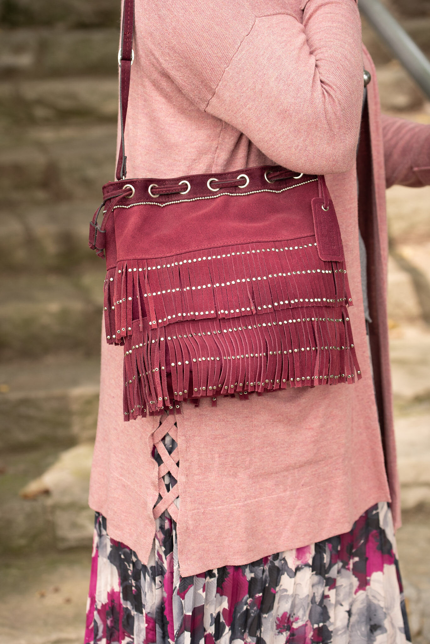
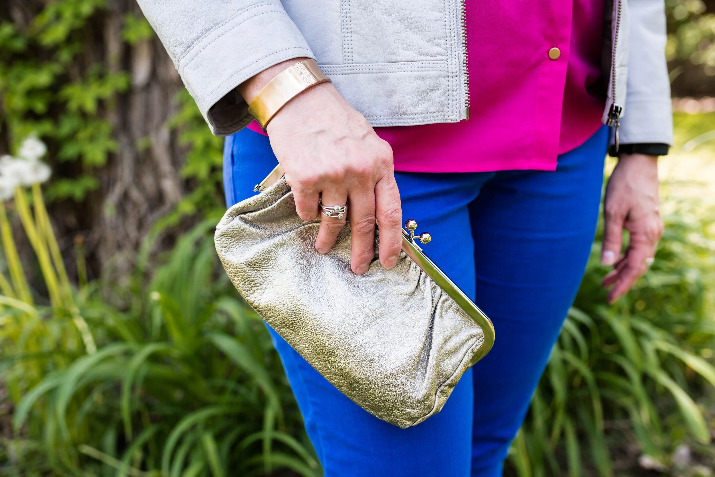
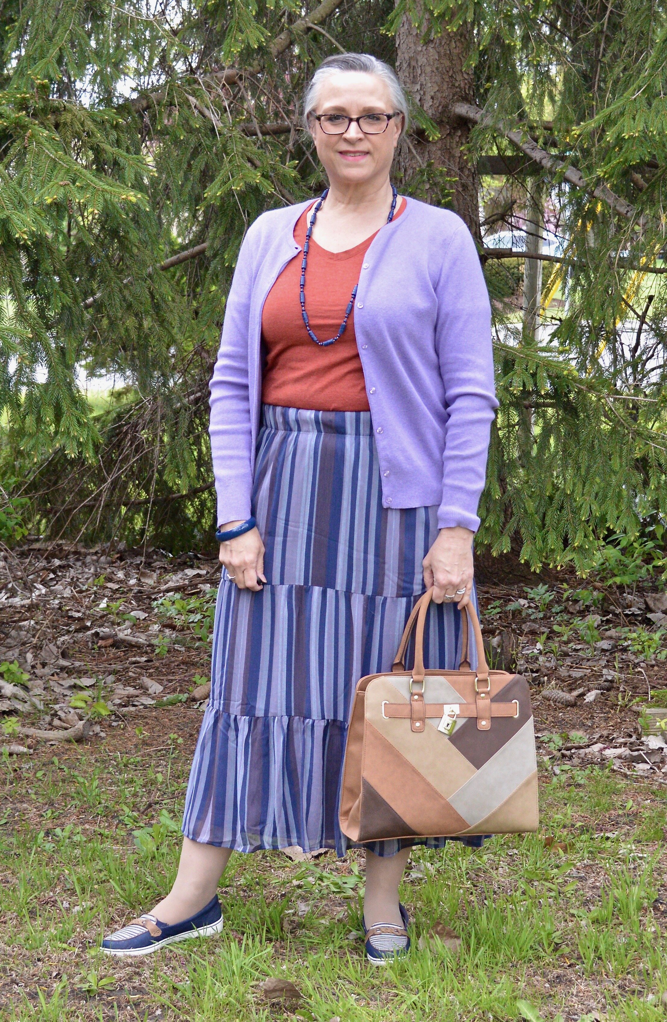
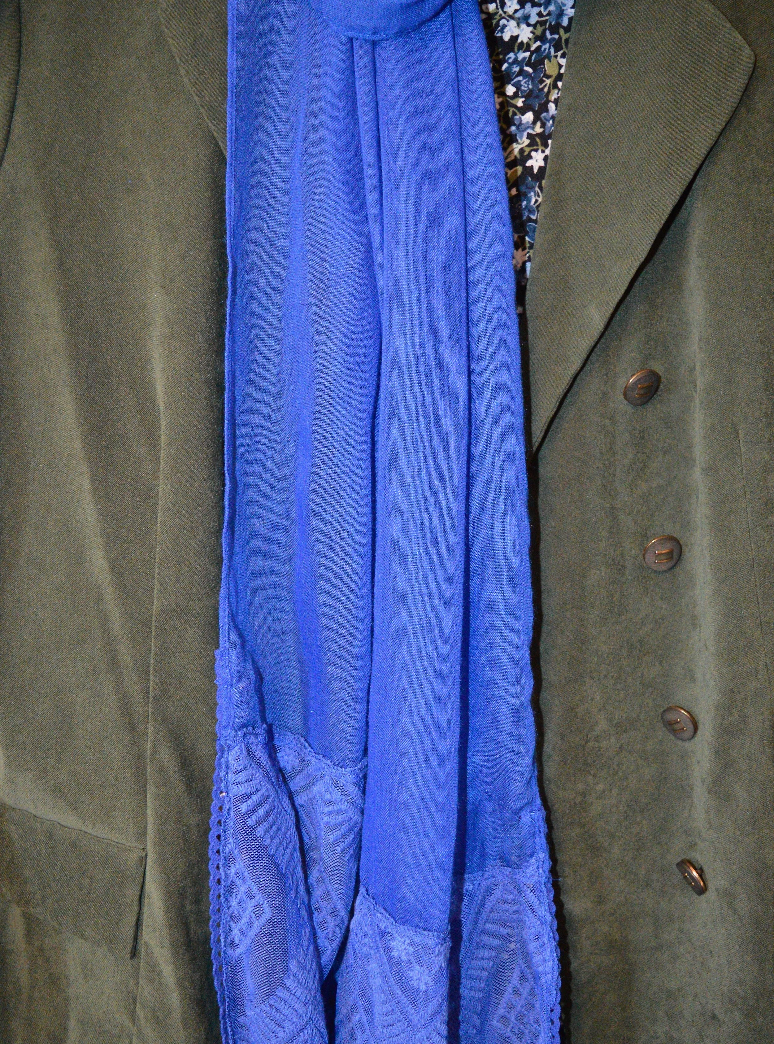
Magenta Purple, Rose Tan and Sleet

I really love both of these colors, but I was not thrilled with this outfit. Don’t get me wrong, I love a comfy, boho outfit, but I don’t know if throwing the long pink sweater in with the floral maxi and the gray tee made for a great outfit. I could see this with a long gray sweater, a similar shade to the tee and then a necklace or a scarf in a similar shade to the Magenta Purple. I don’t think it is the worst outfit I have ever done, but not my fave.
I would love to hear which outfit you liked the best from this series and which colors you like best from the New York Palette. Let me know by leaving a comment below, or a comment on Facebook. Thanks for following along. Be sure to check back on Thursday and hopefully I’ll have the first post for the London Palette colors. Also, if you follow my faith page, I am trying to post on Wednesdays, but due to schedule constraints, I am often having to post on Friday’s, so just check back if you don’t see it on Wednesday.
Have a great Tuesday everyone!
Photo and graphic credit Rebecca Trumbull.