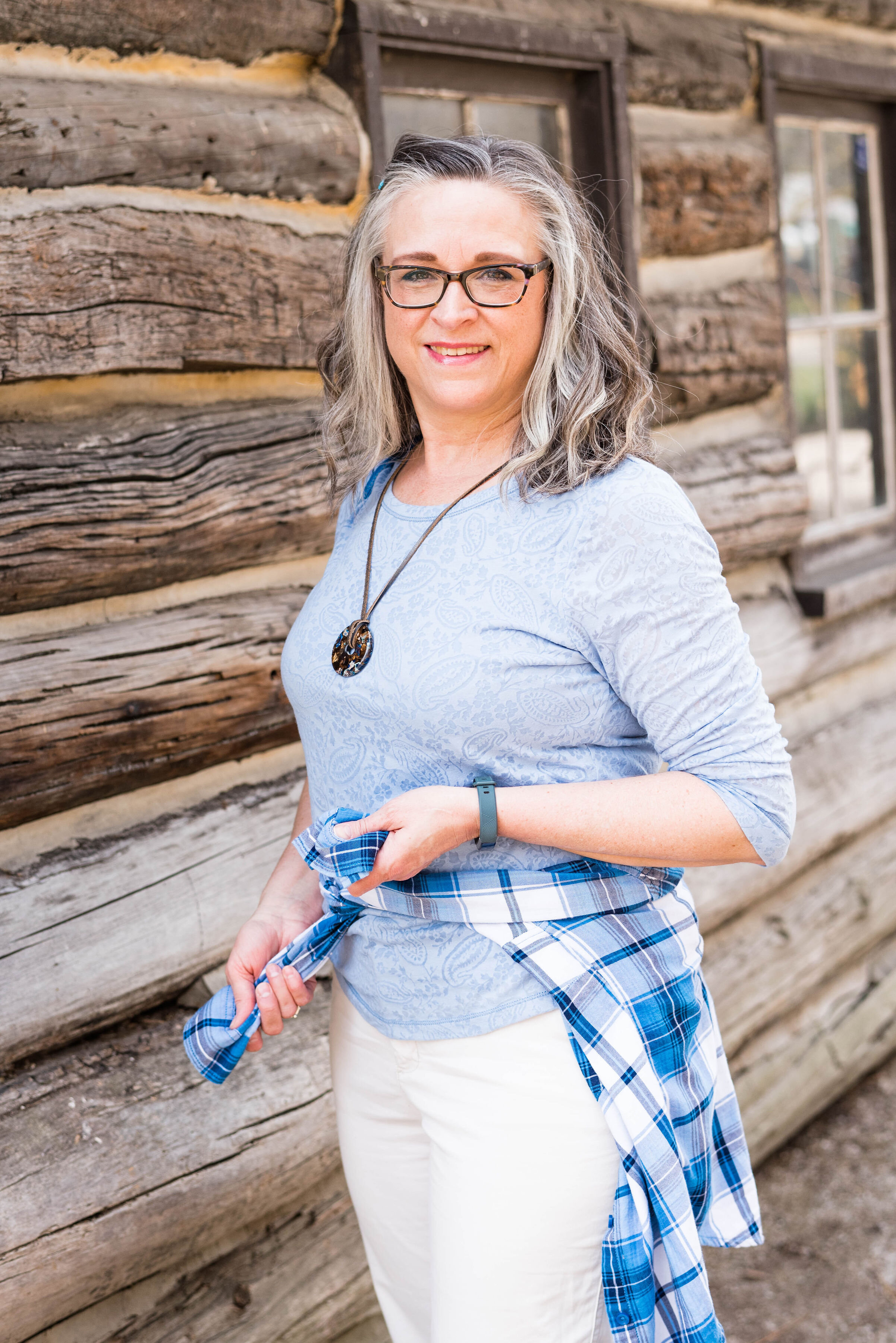
Pantone - Spring/Summer - 2021 - London Palette - Pickled Pepper, Orange Ochre and Sphagnum

For today’s outfit I decided to combine the two greens that were on the London Palette. Both Pickled Pepper and Sphagnum are great green shades for summer time. While Pickled Pepper is one of the main palette colors, Sphagnum is one of the palette classic colors. Olive is a great neutral and goes with just about every color out there, so Sphagnum, (which is actually a type of moss), makes for the perfect classic color.

pickledpepper.jpg

My Pickled Pepper popover top is Sonoma from Kohl’s a few years ago. This top is easy to wear, as well as cool for these hot, humid days. I don’t usually prefer to wear sleeves with elastic, but as long as the elastic isn’t cutting off the circulation in my arms I’m okay with it.

pickledpepperpantoneoutfitideas-12.jpg

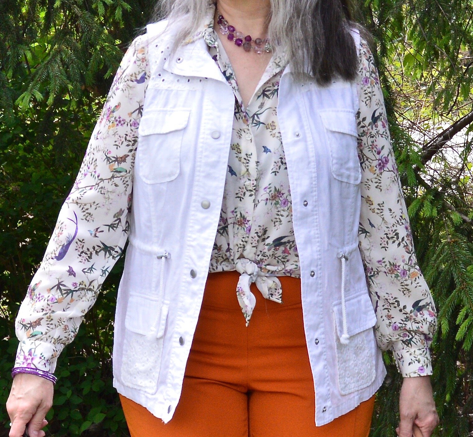
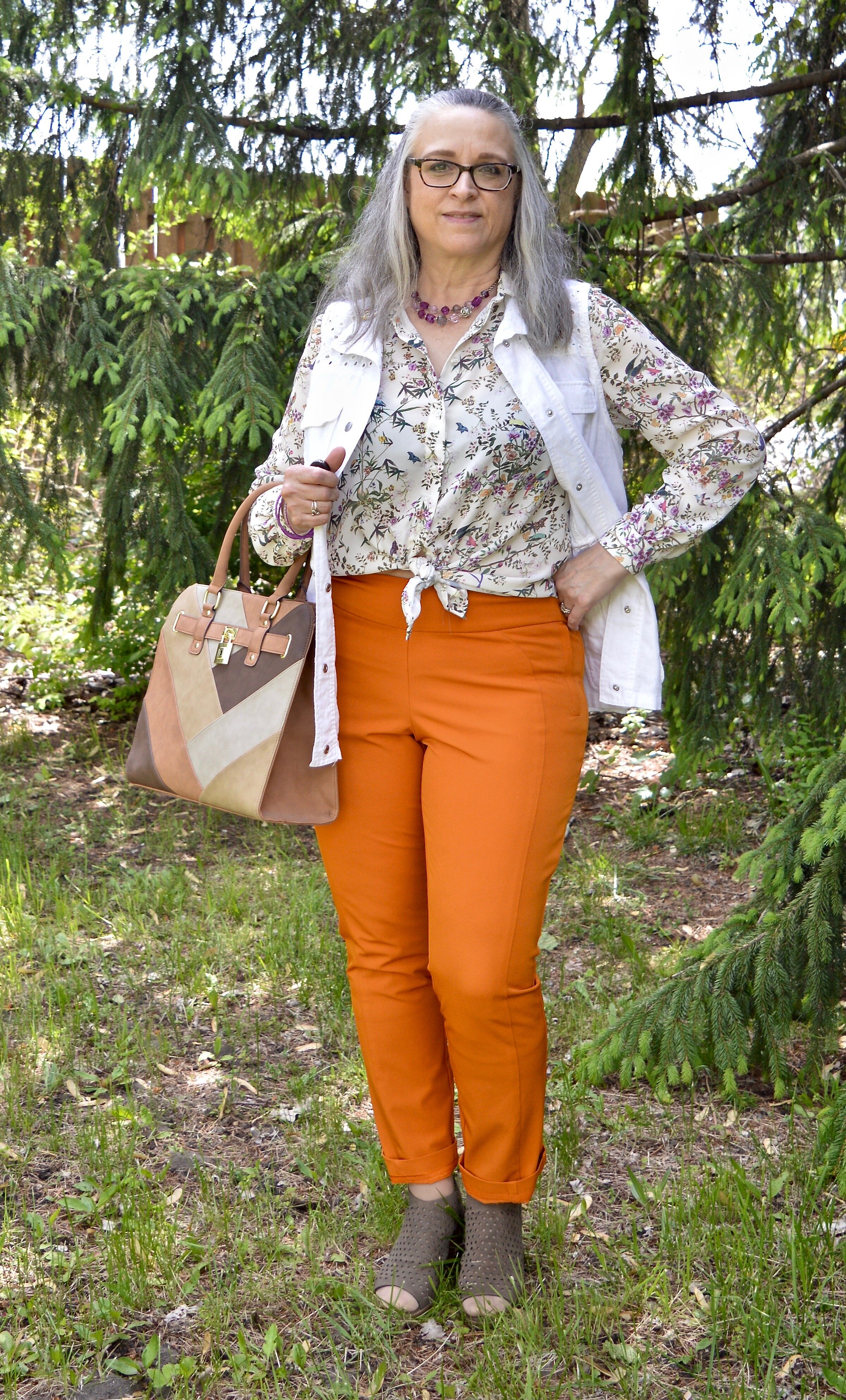
My Sphagnum utility vest is Mudd brand, and was another clearance purchase from Kohl’s a few seasons ago.

pickledpepperpantoneoutfitideas-4.jpg

These light wash jeans were a recent thrift find. A brand called Ella Moss, this brand is available at stores like Nordstrom, Bloomingdales, Amazon, Dillards, and others. I like the cropped length and the high waist of this pair.

For the Orange Ochre color, I grabbed my thrifted, orange suede bag and a fun pendant choker. It is much easier to include a brighter color, if you do it with accessories.

pickledpepperpantoneoutfitideas-9.jpg
pickledpepperpantoneoutfitideas-7.jpg

I had to show off my new clearance Converse sneakers from DSW. They are very comfy and I love the blue color. They are similar in color to my thrifted Keds, which are showing a bit of wear, so these were a great find.

pickledpepperpantoneoutfitideas-11.jpg

Here are a few silly pictures. I was jumping for joy. Ha, ha.

pickledpepperpantoneoutfitideas-5.jpg
pickledpepperpantoneoutfitideas-6.jpg

What do you think of these colors? Do you like to wear green? Do you have Sphagnum (olive) in your closet? I would love to hear from you. I’m including a few shopping links for you to look over. These are affiliate links. All opinions are my own.

pickledpepperpantoneoutfitideas-3.jpg

Graphic and photo credit Rebecca Trumbull.

Pantone - Spring/Summer - 2021 - London Palette - Purple Rose, Lava Falls and Baby's Breath

Today’s colors are a blend of pastel purple, bold red and creamy off white. I have always loved purple, but it really isn’t a color I regularly wear. I easily got on board with Purple Rose which is a medium purple that goes well with many other colors, especially things like brown, olive and navy. Why, then did I decide to pair it with a fierce red like Lava Falls? Because I always like to show you things outside the box. It is not very often, that I think to put purple and red together.

purplerose.jpg

The factor that clinched the deal on putting these colors together, was that my thrifted Old Navy, Lava Falls, paisley popover top had both of these colors in it. How fortuitous was that? Ha, ha. This is a fun, tunic type shirt that has short sleeves, and the interesting details of a shirt tail hem line and a lace up v-neck. I love the paisley print too, which always reminds me of the 70’s.

The Croft and Barrow cardigan is older and I like I said, doesn’t get a lot of regular wear, but i just love the color so I keep it around.

purplerosepantoneoutfitideas-2.jpg

You’ve seen these creamy, Baby’s Breath, thrifted, St. John’s Bay ankle pants on the blog before. I really think this look would have been cuter with a creamy denim pencil skirt or a pair of Bermuda shorts, but I don’t have either of those. I am not as fond of the silhouette, but it is okay, just not great.

purplerosepantoneoutfitideas-7.jpg

I didn’t need to wear a necklace and this long opera length beaded strand is exactly the same color as the top, but sometimes I like the subtle texture and shine of a piece, even if it is a similar color. Wrapping this long strand of beads around my neck makes it look like I have on a choker.

purplerosepantoneoutfitideas-8.jpg

I added a few beaded bracelets with similar reds, although there is plenty going on in the top, so it wasn’t really needed. Often, less is more.

purplerosepantoneoutfitideas-9.jpg

My thrifted Simply Vera, Vera Wang cross body bag is making another appearance. This is a great little bag for the warmer months. The off white color goes perfectly with the Baby’s Breath color of the pants.

purplerosepantoneoutfitideas-10.jpg

These Steve Madden platform sneakers were a new purchase from DSW. I had a coupon and I had been looking at this type of sneaker since last summer. I finally took the plunge. They are not something I would use for walking, but they are cute for a casual day of picnicking or window shopping.

purplerosepantoneoutfitideas-4.jpg

What do you think of these colors? Do you think you would ever combine red with purple? I’d love to hear your thoughts, so leave me some love.

I am including a few shopping links in these colors, so if you have time, give those a look. I hope you have a wonderful weekend!

Graphic and photo credit, Rebecca Trumbull.

Pantone - Spring/Summer - 2021 - London Palette - Pirouette, Indigo Bunting and Polar Night

As always, with the Pantone color series, I find their choice of names for their colors intriguing. Today’s colors center on a pretty purply pink, called Pirouette, which, of course, makes me think of a ballerina. Indigo Bunting is a pretty blue, much like the bird after which it is named. I have had the privilege of seeing an Indigo Bunting flitting through the trees at one of our local metro parks a few years back. They regularly reside in Ohio in the summer time, but like to hang out in abandoned fields, scrubby bush areas and areas with red cedar trees, none of which I have around my house. Polar Night, much like its New York partner Inkwell, is a very dark navy blue.

pirouette.jpg

This fun, multi-print dress is a few years old and was a Kohl’s clearance purchase. I really like many of the pieces by Vera Wang, made specifically for this retailer and called Simply Vera by Vera Wang. These are the pieces that real world women like myself can afford and wear. I have styled this dress, like a tunic for a trip we took to Florida a few years ago. You can see that post here. The dress really contains all three colors, except that its blue borders on being more of a teal.

londonpantonecoloroutfitideapiurouette-8.jpg

I decided to add the bright blue sweater, another Christopher and Banks cardi, as my attempt at the Indigo Bunting. It is a tad bit bluer and maybe brighter, but I think it works well. I would have never thought to pair it with this dress, but I like how it looks.

This is me being silly as I commune with nature. Ha, ha.

londonpantonecoloroutfitideapiurouette-5.jpg

I centered all my accessories around the necklace that is perfectly Pirouette. Since the beads are strung along a silver chain, I went for silver as my accessory color of choice. My thrifted silver clutch and my SO ballerina flats makes the outfit just a little more dressy.

londonpantonecoloroutfitideapiurouette-12.jpg
londonpantonecoloroutfitideapiurouette-14.jpg
londonpantonecoloroutfitideapiurouette-15.jpg

What do you think of these colors? Would you wear them? Do you have any of these colors in your closet? Let me know what you think by leaving me a comment here on the blog or on Facebook.

londonpantonecoloroutfitideapiurouette-9.jpg

Don’t forget, I also post on Instagram and typically you’ll see more of what I wear on a regular basis. Right now my daily looks are very casual, since I am not working, but you’ll definitely get to see more of my clothes, that don’t make it to the blog.

As usual, I am including a few shopping links for these colors. These are affiliate links, but all opinions are my own.

Have a great day!

Graphic and photo credit, Rebecca Trumbull.

Pantone - Spring/Summer - 2021 - London Palette: Illuminating, Marigold and Ultimate Gray

Illuminating and Ultimate Gray are the two colors of the year, so just like I did for the New York Palette, I decided to pair the two colors together and for this one I added Marigold, which was also on the New York palette.

illuminating.jpg

We decided to go to the Toledo Botanical Gardens again for these pictures and we did come across some beautiful blooms. This particular bush is a rhododendron. I just did some research and found out that all azaleas are rhododendrons, but not all rhododendrons are azaleas. Whether you like azaleas or rhododendrons they are all beautiful.

Once again, I chose my recently thrifted bright yellow jacket to serve as the Illuminating color. The jacket is D&Co. (Denim and Co.). It has a nice stretch to it and I like the 3/4 length sleeves for a change of pace.

londonpantonecoloroutfitideailluminating-8.jpg

I’ve styled my medium yellow tee on the blog before. You can see it styled with a leopard print skirt. Having tees in a variety of colors comes in handy when you want to put an outfit together. This thrifted tee is Apt. 9 brand.

My Gloria Vanderbilt jeans were another Kohl’s clearance find. They are soft and stretchy, so great for my fluctuating weight. I say fluctuating, but it really doesn’t go up and down. It either stays the same or goes up. Ha, ha.

londonpantonecoloroutfitideailluminating-11.jpg

I wanted my accessories to make a statement since the outfit itself was not overwhelmingly interesting. I found this pretty layered necklace in gray tones somewhere along the way. I think it was a thrift shop nearby. I added a few beaded bracelets to tie the jewelry together.

When I decided on the thrifted tan loafers, I knew my Nine West snakeskin print circle bag would be the perfect piece to complete the whole look and bring everything together.

londonpantonecoloroutfitideailluminating-13.jpg
londonpantonecoloroutfitideailluminating-15.jpg
londonpantonecoloroutfitideailluminating-16.jpg

What do you think of these colors together? Do you like the lighter yellow of Illuminating or the richer tone of Marigold? I’d love to hear your thoughts in the comments below. I appreciate when you give me your feedback. It can be kind of lonely as a blogger, when I don’t know if anyone is reading my content or looking at my posts, so I really love to hear from you.

londonpantonecoloroutfitideailluminating-10.jpg

I am including a few shopping link for you to enjoy. These are affiliate links and are brought to you at no cost. If you click on a link I get a few pennies and I appreciate all of your clicks. I do not get paid to write my blog, I do it as a hobby and as a service to whomever wants to follow along. I hope that I inspire you to take a second look at your wardrobe and see new ways to put things together, that you never thought of before.

Photo and graphic credit Rebecca Trumbull.

Pantone - Spring/Summer - 2021 - London Palette - Intro

I am finally getting around to sharing the Pantone London Palette with you. It has been hard to get things posted in a timely fashion. Even though I would normally try to get these colors to you, much earlier in the Spring, I figure they are meant for spring and summer, so we are still okay. Today’s post will introduce you to the colors and give you a few little sneak peeks from our recent photo shoot.

londonspring2021.jpg

These are all great colors for spring and summer. The palette is a nice mix of warm and cool colors and there is likely to be a color for everyone. The classic colors, while still showcasing your typical navy, gray and creamy white, also includes a soft light brown and an mossy olive green. I really like the blues included with this palette. They make me think of tropical waters and blue skies.

Enjoy these sneak peeks.

pantonefashionideassummer-1.jpg
pantonefashionideassummer-3.jpg
pantonefashionideassummer-4.jpg
pantonefashionideassummer-5.jpg
pantonefashionideassummer-6.jpg

Be sure to check back on Thursday for the first outfit in this series. I hope you had a lovely Memorial Day weekend.

Photo and graphic credit Rebecca Trumbull.

Spring Outfit with Orange Pants

Just like I did for the blue pants, I wanted to show you a new outfit with my Worthington orange pants. For this one I focused on a work appropriate look. With many people finally returning to their jobs I thought it would be a good time to feature an outfit that would be perfect for the office, especially as air conditioners come back on.

DSC_0047.jpg

I wish I would have thought to get close up of the details on this thrifted Maurices vest. I snatched it up, because I don’t have any summer weight white vests and I thought the eyelet detail and the texturing on the pockets made this such a unique piece. It has the utility vibe with the patch pockets and drawstring, but is dressier.

You can also see my H&M button down top. I found this one on the clearance rack a few years ago and just loved the botanical print with its flowers, butterflies and birds. I thought tying the front shirt tails made for a more summery look, but one that remains work appropriate. I also like the soft contrast between the stark white of the vest and the more off white of the blouse.

DSC_0020.jpg

I added a double layered purple necklace and a few purple metal bangles to pull out the purple in the top.

DSC_0046.jpg

I opted for more neutral shoes and bag. I thought the outfit had enough color with the bright orange pants and the flora print in the top. The neutral accessories give it not only a summer feel, but a polished and professional look. If I ever go back to an office job, I would definitely wear this. My bag you have seen on the blog before and is from Walmart and George brand. My perforated peep toe sandals are Sonoma brand from Kohl’s.

DSC_0037.jpg
DSC_0040.jpg

I was pleased with how this outfit turned out. What do you think? Would you wear something like this to work? I’d love to hear your thoughts.

DSC_0038.jpg

I’m including a few shopping links for you to enjoy. These are affiliate links. All opinions are my own.

Have a great day, everyone and thanks for following along on the blog.

Spring Outfit with Bright Blue Pants

I thought I would come up with another outfit using my thrifted, bright blue, Ruby Rd. pants, since I was just talking about them on Tuesday. It was a beautiful day, so I managed to snap a few pictures for this post. They are never as good as my daughter’s pictures, but that is okay. This is real life, right? I never want to come across to you all as having it all together. There are so many bloggers and people who post on Instagram and it is easy to feel like we don’t measure up to their fabulous outfits, looks, or homes, but I know reality. It is messy, hard, busy and many times overwhelming. So I am trying to be as real as possible and not so great pictures are my reality, and so is my wide bottom. Ha, ha.

DSC_0005.jpg

I wanted to create a look that was casual with just a touch of sass. My Star Wars tee belonged to my oldest daughter and she didn’t want it any more. I’m all for fun graphic tees and certainly am a Star Wars fan. I am actually a bigger Star Trek fan, but Star Wars is a close second.

DSC_0012.jpg

Funny story about my thrifted silver belt. I chose the silver belt and my silver SO ballerina flats to jazz the look up a little bit, and it went with the silver lettering on the tee. When I went to pull the belt through the first belt loop a ton of the silver flaked off. I had silver dust all over my pants and my rug. Needless to say, I threw the belt in the trash when I was done with the pictures. I was disappointed, as I had great plans for that belt. Oh well, like I said, real life.

DSC_0010.jpg

I’ve styled this thrifted, white, Sanctuary, jean jacket one other time on the blog. You can see how I styled it with a leopard print skirt. This jacket is not truly denim, it is a thicker cotton material, but doesn’t have the same characteristics of denim. However, I really like it and it is a good piece for the warmer weather and something different from the traditional jean jacket.

DSC_0004.jpg

I didn’t take a picture of my little silver clutch, but you have seen it on the blog before. I chose it because it went with the belt and shoes. I do like things to match, but it is okay to not have things match as well. Many of our old fashion rules have gone by the wayside. I always go back to the idea, do what is best for you. If you like things to match, then make them match. If you want to wear purple shoes, carry a red bag and wear a green belt, you go girl! As bloggers, we are only here to give you inspiration, not tell you how you have to dress.

DSC_0015.jpg

I want to know if you have gotten yourself a pair of bright blue pants? Ha, ha. Actually, they are a little hard to find, but if you thrift shop, be sure to check there. Thrift stores will often have loads of brightly colored pants, because they are no longer trending.

I hope you enjoyed this post and one more idea on how to style those bright blue pants.

I’m including a few shopping links just for fun. These are affiliate links brought to you at no added cost. If you click on a link I get a few cents. I appreciate every click. All opinions are my own.

Have a great weekend everyone!

Pantone - Spring/Summer - 2021 - New York Palette: French Blue, Cerulean and Buttercream

Today’s three color combo is the last of the Pantone Spring/Summer New York Palette. I am going to take a week off, as I hope to go visit my mom next week. In due time, I will proceed with the London Palette, but I haven’t even begun to pick out outfits. Breaking my wrist has really thrown a wrench into the works, so bear with me. I got my second Covid shot yesterday, so getting up this morning was grueling. I got the shot in my left arm, figuring it already hurts and I wanted my right arm to remain relatively pain free. I say relatively because there is some pain in my wrist and rib cage on that side, from having to do all the work. This is making me see how much I need to get back to exercising, especially weight lifting and walking since I have osteoporosis. We ladies need to take of them bones, and all the other parts as well. Ha, ha.

I thought it would be fun to pair these two blues, for a fun, casual summer look. Adding the off white of buttercream gives the outfit that perfect warm weather vibe. I kept my accessories casual to add to the picnic ready style. This would be a great outfit for a Fourth of July get together, just add some red jewelry or a bag.

frenchblue.jpg

French Blue and Cerulean are two cool colors that make me think of blue skies and water. I found this French blue plaid shirt while thrifting. I really like this medium blue for spring and summer, as opposed to a dark blue like navy. This button down is Faded Glory brand.

frenchbluepantonespringcoloroutfitideas-2.jpg

My Buttercream ankle pants have made an appearance on the blog before. These were thrifted St. John’s Bay. You can see these styled for two other Pantone series. This one is styled with a yellow button down and this with my Chevron print dress.

Cerulean is a different light blue. I like the sky blue feel of this color, yet it leans towards a bit more pastel. My top is a thrifted Ralph Lauren piece. I like that it has a lining that is similar t-shirt type material to the outside. It has a fun faux lace texture to it.

frenchbluepantonespringcoloroutfitideas-13.jpg

I kept my accessories simple. This thrifted French Blue bag was a recent find and I had to grab it since it matched the color perfectly. This is a nice small bag for carrying just the essentials.

frenchbluepantonespringcoloroutfitideas-7.jpg

My pendant necklace had little flecks of all the colors. I have been on the search for more of these large beads with the hole in the middle. It is so easy to make a necklace out of them.

frenchbluepantonespringcoloroutfitideas-5.jpg

Lastly, my thrifted Keds finally fit the Pantone color. Cerulean is the right name for these sneakers that are great for warm weather outfits.

frenchbluepantonespringcoloroutfitideas-8.jpg

What do you think of these colors? Do you have these blues in your closet? What about Buttercream? I’d love to hear your thoughts. I’d also love to hear which of these colors you would put together to make an outfit.

frenchbluepantonespringcoloroutfitideas-10.jpg

I hope you have enjoyed this look at the Pantone Spring/Summer 2021 New York Palette colors.

I am including a few shopping links, so be sure to check those out. These are affiliate links. I get a few pennies when you click on a link, so I appreciate all the clicks.

Photo credit and graphic Rebecca Trumbull.

Pantone - Spring/Summer - 2021 - New York Palette: Burnt Coral, Marigold and Desert Mist

Today’s outfit blends three colors that seem to epitomize summer with all of its beauty. The deep orange yellow of Marigold, combined with the rustic feel of Burnt Coral and the soft pastel of Desert Mist makes me think of picnics, outdoor parties and long walks on the beach. While my outfit today is probably too warm for summer temperatures, I works well for that in between time when the weather is still unsure of what it is going to do.

burntcoral.jpg

I ordered this waffle weave dolman sleeve top from Maurices earlier this year. It has elastic on the bottom, so has more of a cropped feel to it, which isn’t always my favorite, but I think this works well with pieces where the top can be worn without the need for tucking or wearing a belt.

burntcoralpantonespringcoloroutfitideas-10.jpg

I wasn’t going to use this Roz & Ali medallion print skirt again, but I was having a hard time finding things in my closet that were going to work with these colors. Besides this is a pretty skirt, so I don’t mind using it again. You can see how I styled this piece for several other Pantone color series. Last fall I styled it with a neon yellow short sleeve sweater, and the fall before that with a purple short sleeve sweater. I like that this skirt works perfectly for spring, summer and fall. The skirt contains all the colors from the graphic, even though you can’t see Marigold as well, you can definitely see the Burnt Coral and Desert Mist.

burntcoralpantonespringcoloroutfitideas-6.jpg

My Desert Mist sweater is a little light compared to the Pantone color, but again, this isn’t about having an exact match, but about giving you options that you can find in your closet. This is a thrifted St. John’s Bay piece. It is always good to have a neutral cardigan or jacket that will work well with many different outfits and colors.

burntcoralpantonespringcoloroutfitideas-8.jpg

For the Marigold color, I just added a few accessories, similar to what I did in last Thursday’s post with Raspberry Sorbet. The necklace and Sophia Caperelli bag are both thrift finds.

burntcoralpantonespringcoloroutfitideas-11.jpg

You were recently introduced to these Clark’s flats. They are perfect for wearing with a skirt, whether long or short.

burntcoralpantonespringcoloroutfitideas-13.jpg

What do you think of these colors? Do you have all of these in your closet? Would you wear them together? I’d love to hear your thoughts, so leave me some love.

burntcoralpantonespringcoloroutfitideas-4.jpg

I’m including a few shopping links. These are affiliate links. All opinions are my own. Here’s a picture, just for your enjoyment. Ha, ha.

burntcoralpantonespringcoloroutfitideas-7.jpg

Have a great evening!

Photo and graphic credit Rebecca Trumbull.

Pantone - Spring/Summer - 2021 - Raspberry Sorbet, Mint and Willow

Today’s Pantone outfit revolves around a tantalizing pink, a refreshing green and another earthy color reminiscent of the weeping willow trees that hug the banks of lakes and streams. Raspberry Sorbet, Mint and Willow combine in an outfit that is both sleek, colorful and casual.

raspberrysorbet.jpg

When I think of the color mint, I am more inclined to think of the light Green Ash color from Tuesday’s post. I guess my rendering of mint is based more on ice cream and Christmas candies than it is the actual plant. The mint plant is a bright, living green, so I think the Pantone color is much truer to the natural source. My Mint green top is a thrifted Falls Creek piece. I wore it for this shoot and then I got rid of it. It has been hanging in my closet for a while and I wasn’t certain, why I didn’t reach for it more often. After putting it on, I just didn’t like how stiff the fabric was. I’m all for structured pieces, but a piece has to move with me for me to want to wear it.

raspberrysorbetpantonecolorsoutfit-4.jpg

My camouflage pants, also Falls Creek, are a recent clearance find from Meijer. They are light weight, so good for summer. Unlike some camo that is more green, these tend towards more brown and gray. The Willow color is in there as you can see in the following picture. Willow was hard color to find. Most of my pieces are more olive green and Willow has more of a brown undertone.

raspberrysorbetpantonecolorsoutfit-10.jpg

Instead of choosing another clothing piece for the Raspberry Sorbet color, I opted to include it in my accessories. My necklace, bracelets, and the Vera Bradley tote were the perfect pop of this bright, saturated pink.

raspberrysorbetpantonecolorsoutfit-6.jpg
raspberrysorbetpantonecolorsoutfit-8.jpg

I went for my silver SO flats to tie in with the silver chains on the necklaces.

raspberrysorbetpantonecolorsoutfit-9.jpg

What do you think of these Pantone colors? Do you have the color Willow in your closet? I love to hear back from you, so leave a comment or two.

raspberrysorbetpantonecolorsoutfit-3.jpg

I’m including a few shopping links for you to peruse. These links are brought to you at no cost, but using them to purchase something gives me a few pennies as a kick back. I appreciate all your support. These are affiliate links. All opinions are my own.

Photo and graphic credit Rebecca Trumbull.

Have a great weekend everyone!

Pantone - Spring/Summer - 2021 - NY Palette - Amethyst Orchid, Green Ash and Inkwell

Today’s combination of Pantone colors from the New York palette is a study in contrasts. The dark, moody blue of Inkwell, which mimics a night sky is a type of color disparity when side by side with the pale pastel of Green Ash. When I pair colors I often go for bold with bold, or light with light, but I wanted to experiment by creating an outfit with an eye catching difference in color. The addition of Amethyst Orchid gives the perfect compliment of medium purple color.

amethystorchid.jpg

Let me start the outfit details by talking about this recently thrifted tee. I love the bold flower on the front and purple has long been a favorite color of mine, so I was glad it was on the palette. This tee is St. John’s Bay brand. The darker inner petals are actually separate pieces of material, which gives the tee added dimension.

To go along with the Amethyst Orchid color in the tee, I also added this recently thrifted scarf. I love the large gingham pattern. It was the perfect accompaniment to the whole look. Another interesting feature of this scarf is the ruching of elastic throughout its length adding texture.

amethystorchidpantonecolorsoutfit-9.jpg

These thrifted, Inkwell pants are a brand called Hydrant. A dark pant like this is great for making our lower halves look longer and slimmer. I really like these, but they are a lint magnate. Wearing them with a fuzzy sweater like this is probably not the best idea. Ha, ha. You can also see I added a wider, olive belt since belts are trending and did my usual front tuck.

My fuzzy Green Ash sweater might be a little light, but it is pretty close to the Pantone color. This was a Christopher and Banks purchase last year. Before I bought this piece I had very little of this color in my wardrobe. I have picked up a few things since then. It is a pretty pastel color to wear, especially in the spring and summer. I really like how well it goes with the Amethyst Orchid color.

amethystorchidpantonecolorsoutfit-6.jpg

I decided to go with white for my shoes and bag. White is definitely a go to in the warmer months. My white Keds will be on repeat. My white shoulder bag is a new thrift find. I have been searching for a different white bag and this one has plenty of room and can also be worn as a cross body bag. This is a brand called Bueno.

amethystorchidpantonecolorsoutfit-10.jpg
amethystorchidpantonecolorsoutfit-12.jpg

What do you think of these colors? Would you wear a light pastel with a dark color like navy or black? I’d love to hear your thoughts. Thanks so much for taking the time to comment.

amethystorchidpantonecolorsoutfit-15.jpg

I’m including a few shopping links. These are affiliate links. All opinions are my own.

Photo and graphic Rebecca Trumbull.

Pantone - Spring/Summer - 2021 - New York Palette: Introduction

I am a bit behind on the Pantone colors this year. I had a hard time getting back into the swing of regularly posting, but here I am. While we are a few weeks into spring, the Pantone colors for this season are for spring and summer. I don’t pay attention too much to their time table, because they already have the colors out for the fall/winter season. Who wants to think about fall/winter when we have barely made it into spring? Ha, ha.

Just as a quick review, the Pantone Color Institute is an entity that provides the color trends for both the fashion and interior design industries. If you go to their website you can see all sorts of information from color swatches you can order to educational opportunities. Obviously, these are not the only colors that you see trending on the runways, but Pantone is easily considered a color authority by both design areas.

Every year, Pantone chooses a color of the year. Last year it was Classic Blue. In 2019 it was Living Coral. This year they picked two colors, Illuminating, a sunny yellow and Ultimate Gray, which is a classic medium gray. Typically, the colors of the year are seen on both the New York and the London Palettes. As I have done in the past I will be starting my series with the New York Palette. This year, the palettes are quite dissimilar, which makes it more interesting for me, as I pick out outfits and for you, my lovely subscribers.

Here is the New York Palette.

ClassicColors_(12).jpg

This is a mix of jewel tones and pastels, so if you lean towards one or the other, this palette will make everyone happy. Rust is a different color for summer, but I think it can work well with many of the others colors. Once again there is a selection of classic colors, which to me are helpful if you want to tone down an outfit and just accent with the brighter colors through jewelry and other accessories.

The following are a few photos from our shoot which give you some sneak peeks at how I combined these colors.

pantonespring2021preview-1.jpg
pantonespring2021preview-2.jpg
pantonespring2021preview-3.jpg
pantonespring2021preview-4.jpg
pantonespring2021preview-5.jpg
pantonespring2021preview-6.jpg

I hope you will join me on Thursday as I start the series. Have a great day!

Photo and graphic credit Rebecca Trumbull.

Spring/Summer - 2021 - Lady with a Twist

Today’s final Spring/Summer 2021 Trend is called Lady with a Twist. The idea behind this trend is taking classic feminine workwear pieces and adding casual, athleisure pieces for a blend that I often refer to as dressy casual. This trend could certainly be worn in most work places, but it also could be worn for a day out shopping or a walk in the park. Just make sure you have on your walking shoes.

My outfit is less about going to the office and more about looking fun and comfortable. I would definitely wear this to the coffee shop to work on writing projects or for a day running around with a girlfriend.

sunflowermaxiskirt-4.jpg

Everything in this outfit is thrifted, except the bag, which was a gift from my youngest. I am a lover of all things Edgar Allen Poe. My shoes were also a new purchase from DSW a few years ago.

sunflowermaxiskirt-3.jpg

I am sure, I have a bit of Lucille Ball in me, with all my silly facial expressions and antics. Ha, ha. Anyway, this thrifted skirt was a recent find. It appeared to be a piece that was altered. It must have been a much larger size and was brought in to make it smaller, so it has no brand name on it. It has a bit of a fit and flare silhouette, so is more fitted through the hips and bum, then flares outward towards the knees and ankles. It is lined, so no worries about having to wear a slip. The material is a medium weight and is covered with stitching giving it a textured feel. What really drew me to it, were the yellow sunflowers!

sunflowermaxiskirt-11.jpg

You’ve see this thrifted Paris tee on the blog before. It is such a great summer piece because it keeps me cool and comfy. You can see it worn with another maxi skirt, and olive pants.

sunflowermaxiskirt-9.jpg

This pale yellow zip up hoodie is a nice alternative to a cardigan or more structured blazer or jacket. Another thrift store fine, this is a brand called SB Active.

Since the look was a combination of feminine workwear and althleisure, I didn’t want to over accessorize, but I did add a couple of necklaces for an interesting layered look. I used my Poe tote bag for my purse and donned my Saucony sneakers.

sunflowermaxiskirt-12.jpg
sunflowermaxiskirt-10.jpg
sunflowermaxiskirt-13.jpg

What do you think of the Lady with a Twist trend? You certainly could do this in many different ways. Instead of a maxi skirt, wear a pencil skirt with a fun sweatshirt and platform sneakers. If skirts are not your jam, then wear a pair of joggers with a structured blazer, heels and a clutch. There are a lot of ways to carry this trend off. It is completely up to you.

sunflowermaxiskirt-7.jpg

I am including a few shopping links. These are affiliate links. All opinions are my own.

Photo credit Rebecca Trumbull.