Winter Trends - My Take on Quilting

I have always loved handmade quilts. I think they are beautiful testaments to the women who work on them, tirelessly sewing, piecing together and creating a work of art in the form of a wall hanging or full sized quilt for a bed. When we went to the fair, back when that was allowed, I used to love to visit the hall where all the quilts were displayed. I always thought it would be cool to be part of a group of women who worked together to create these masterful pieces.

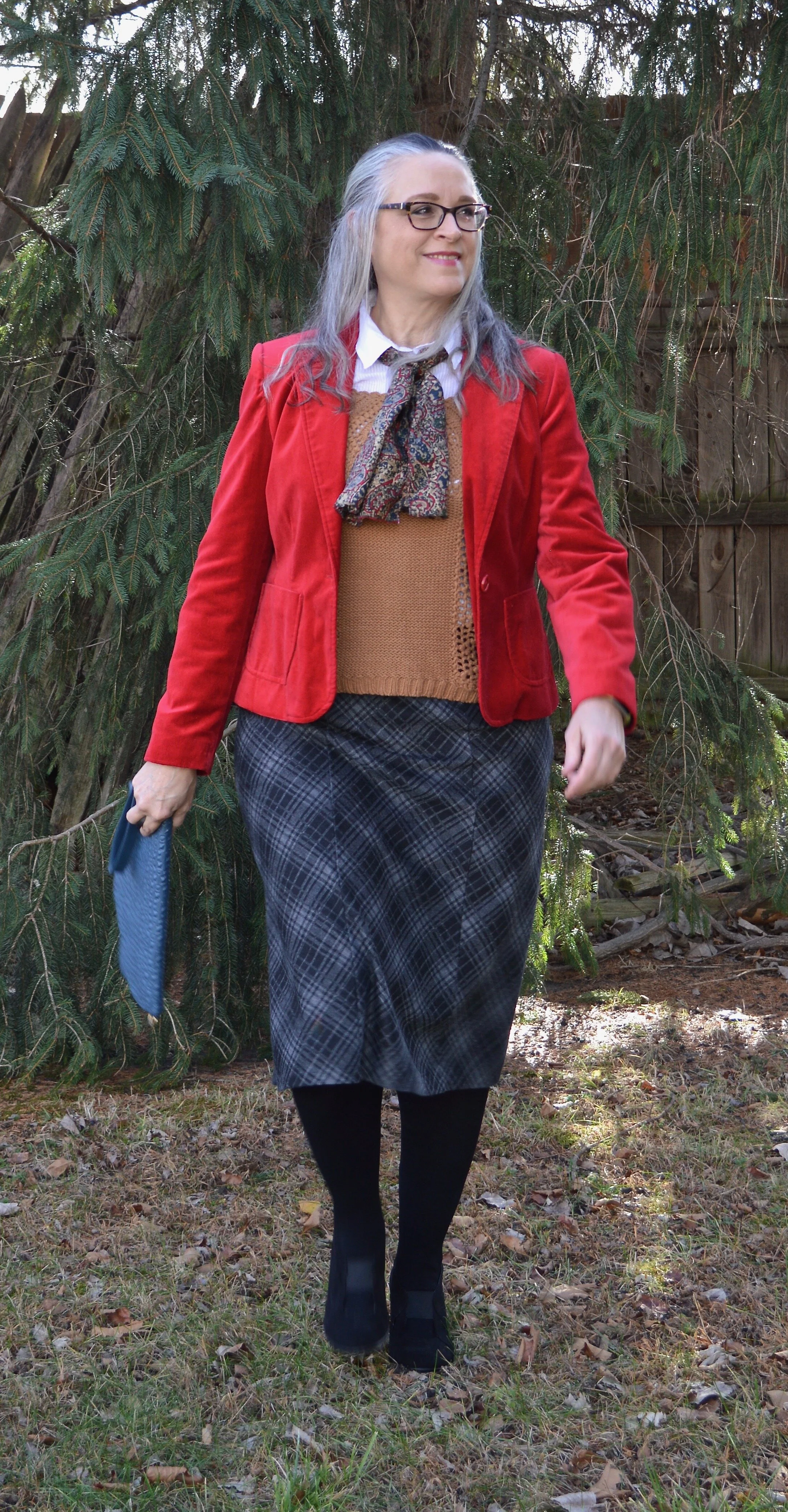
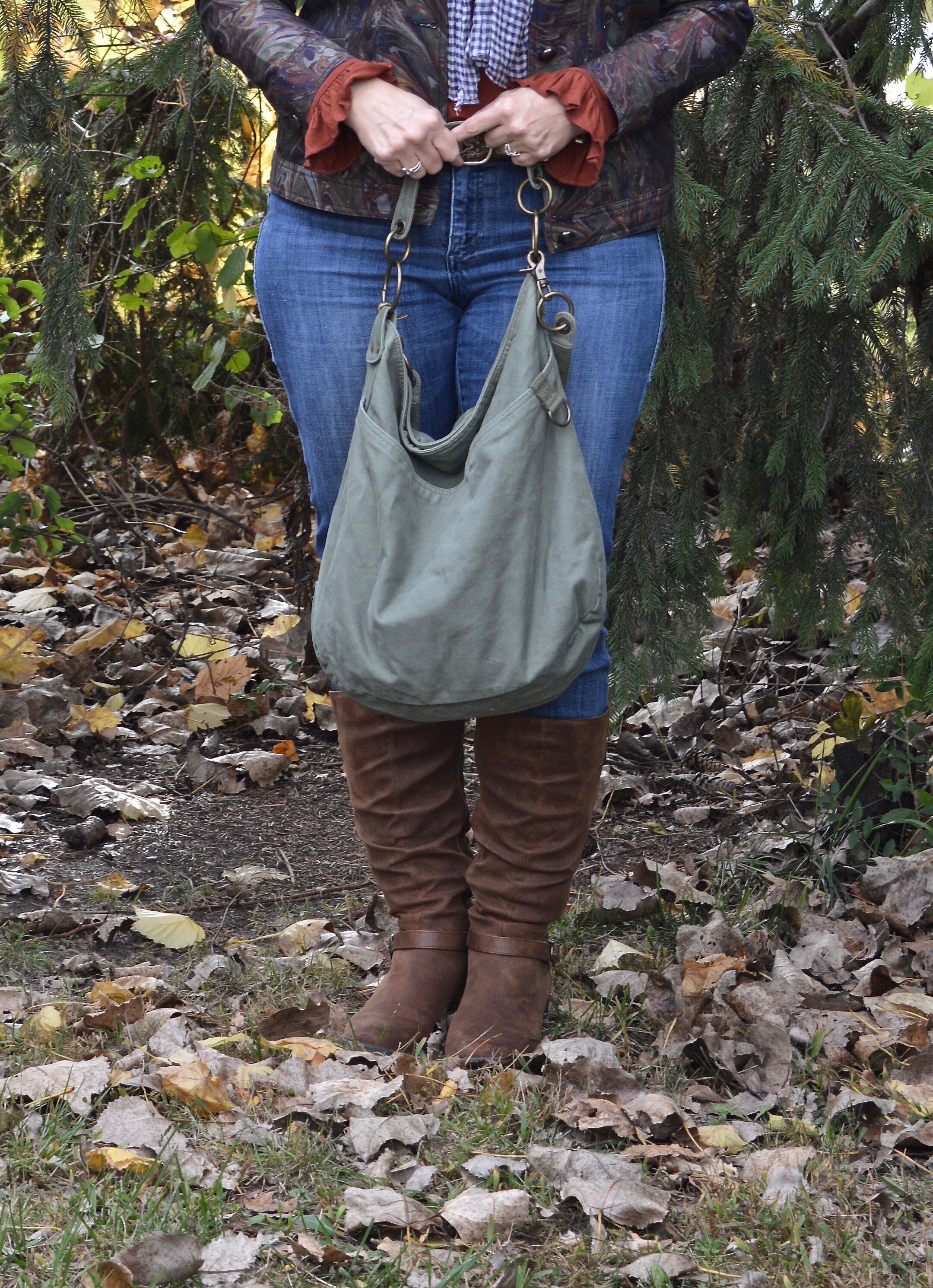
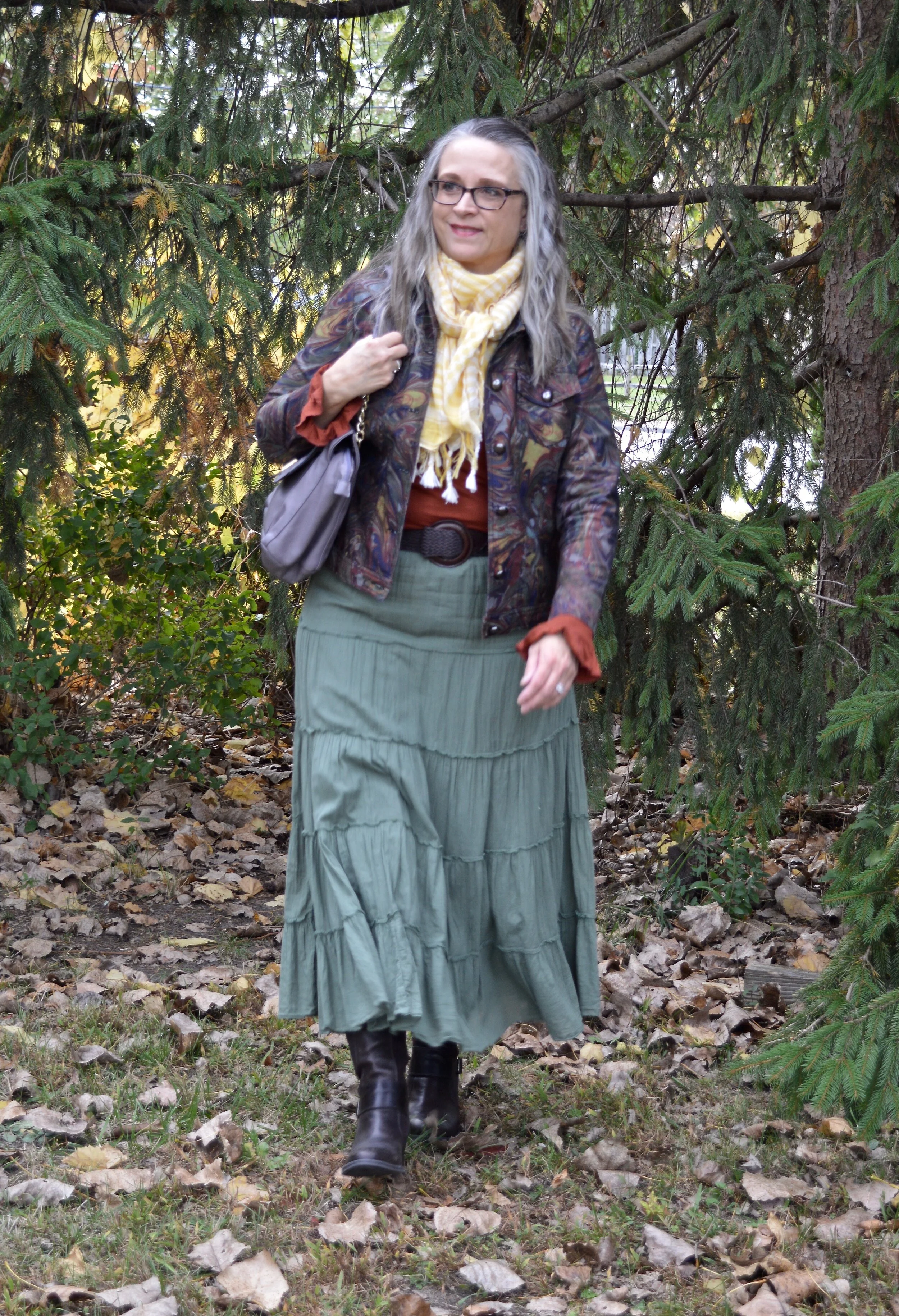
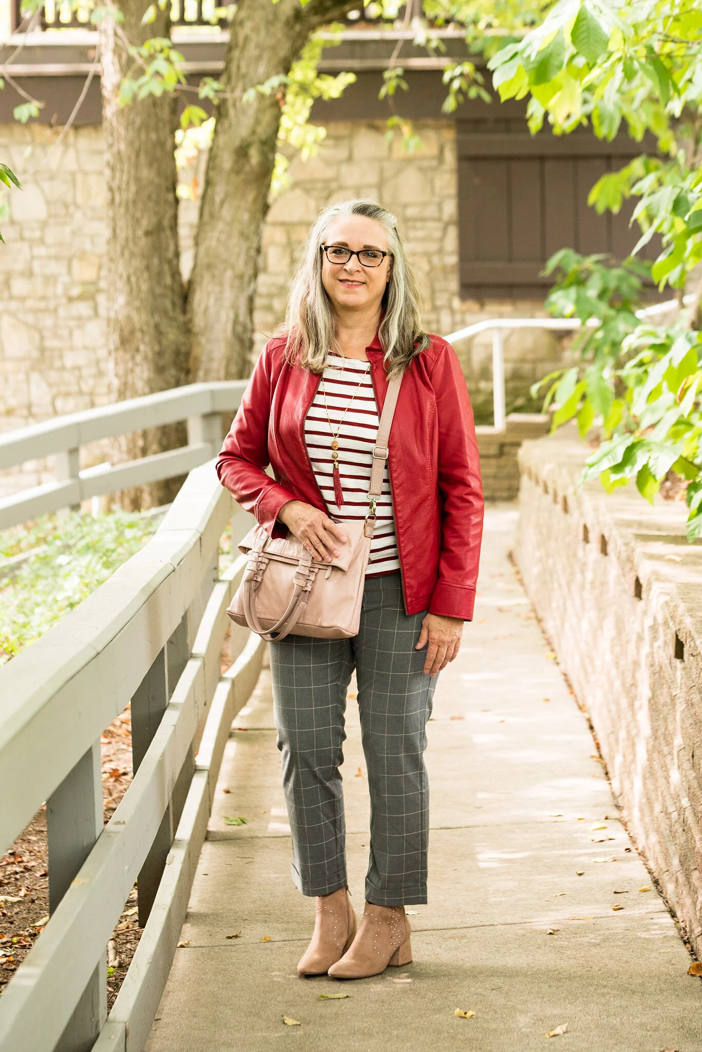
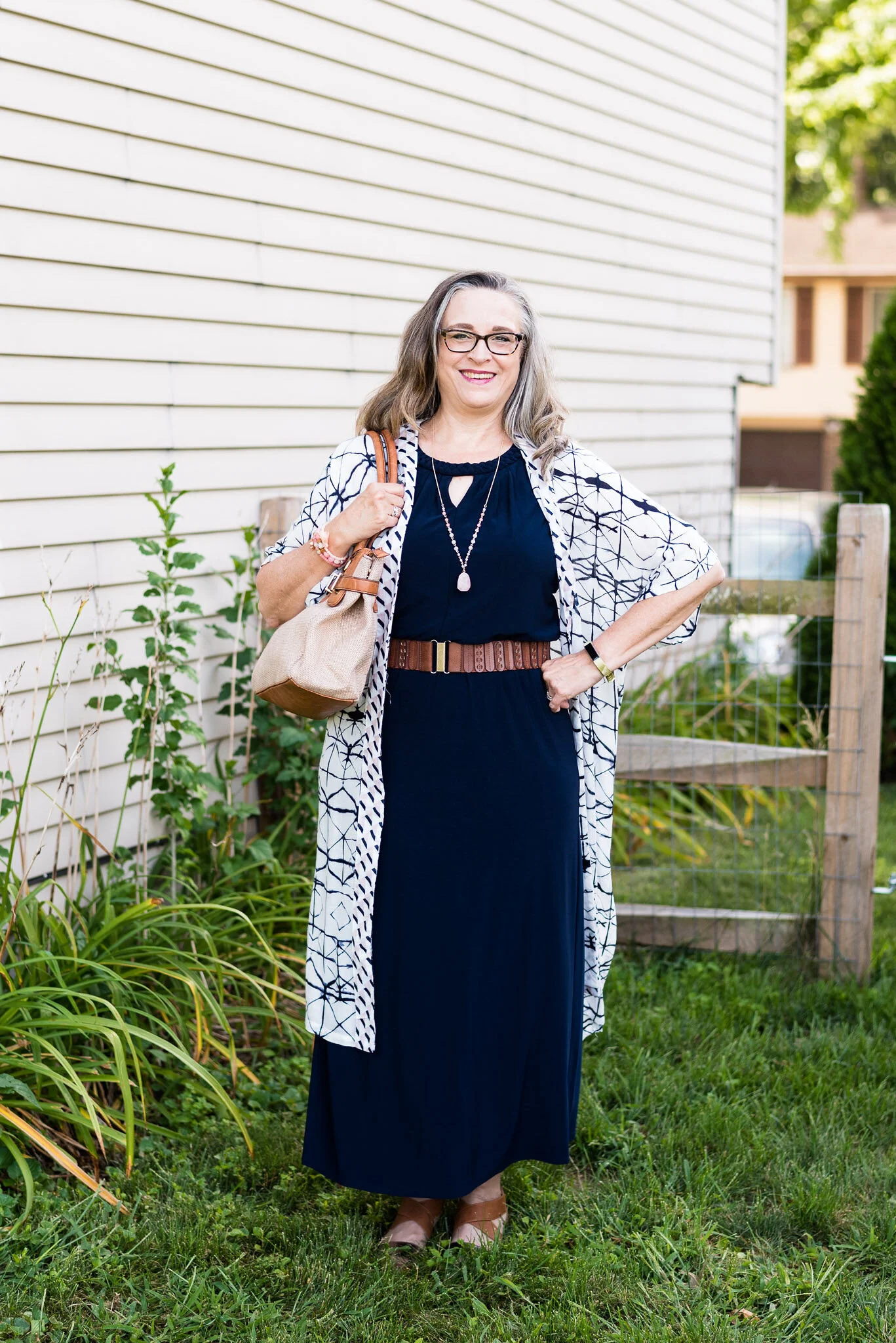
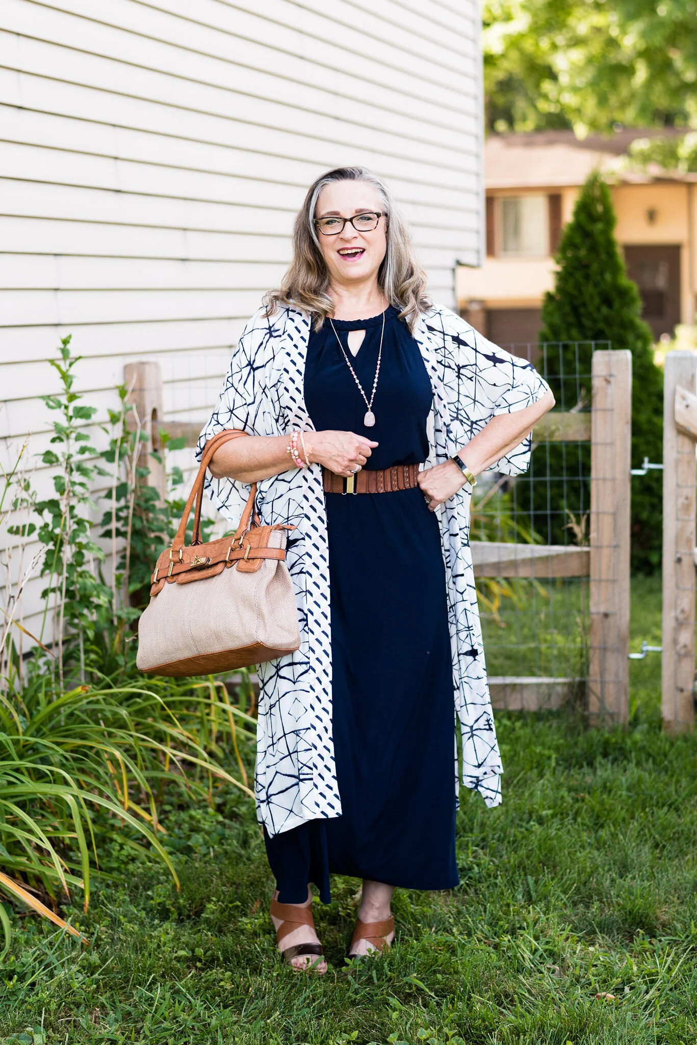
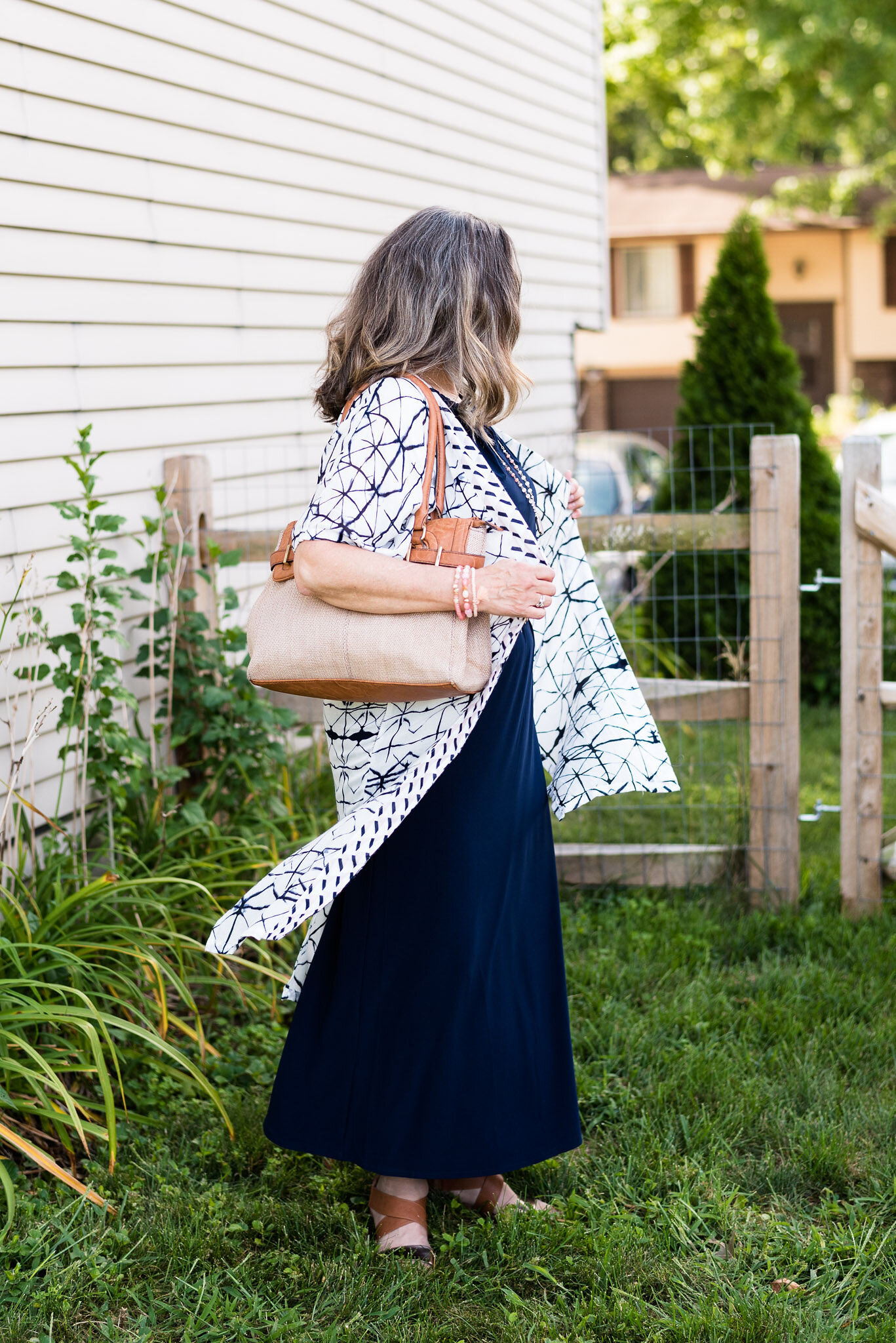
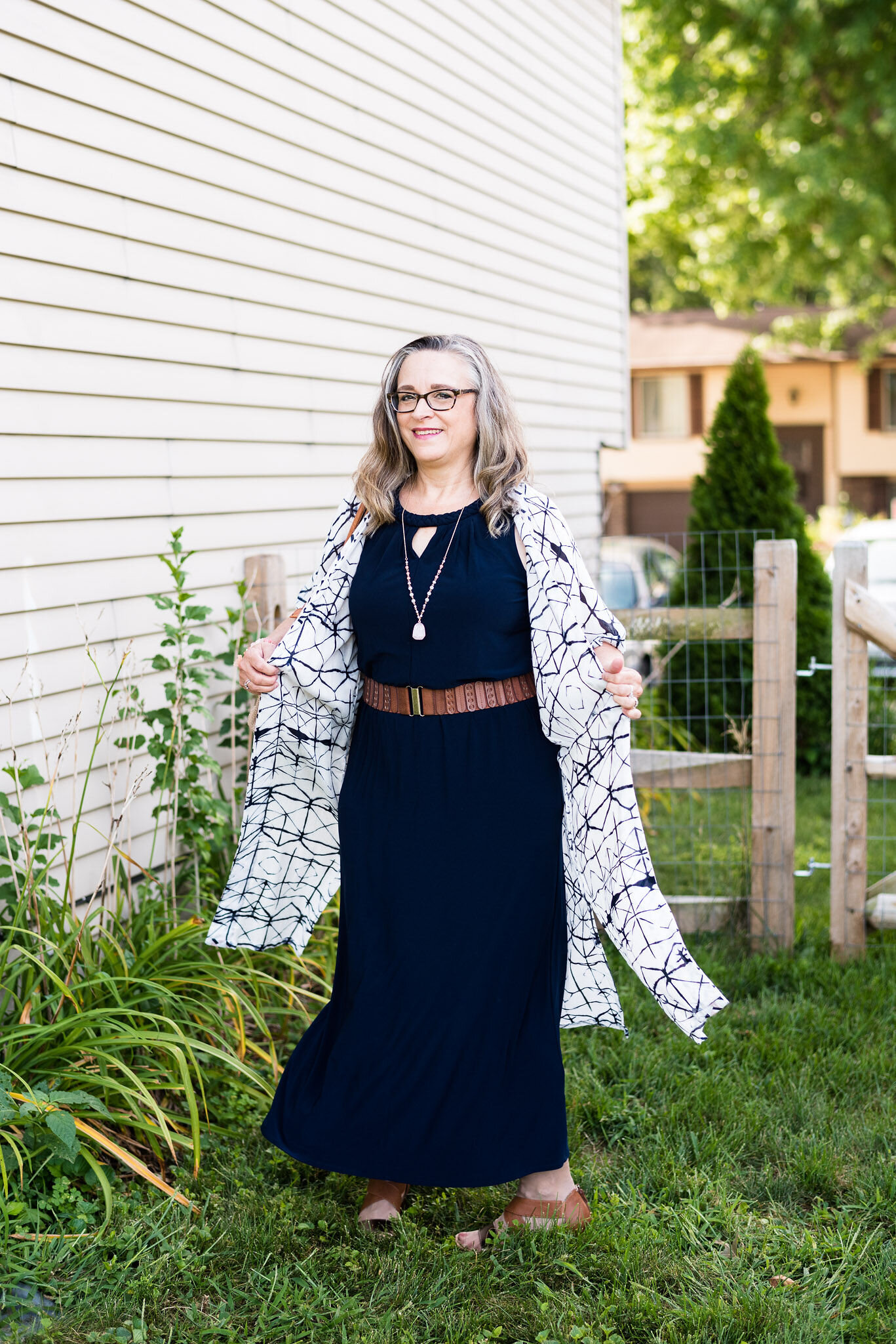
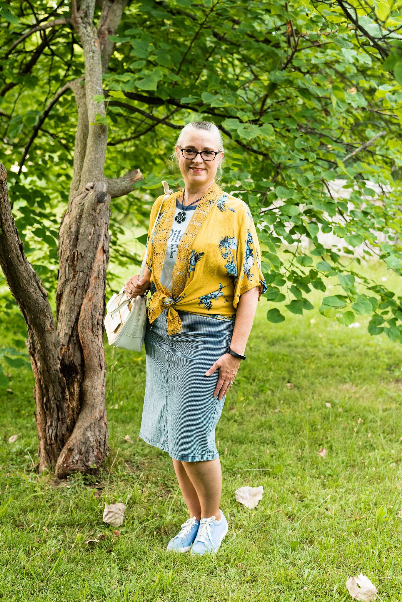
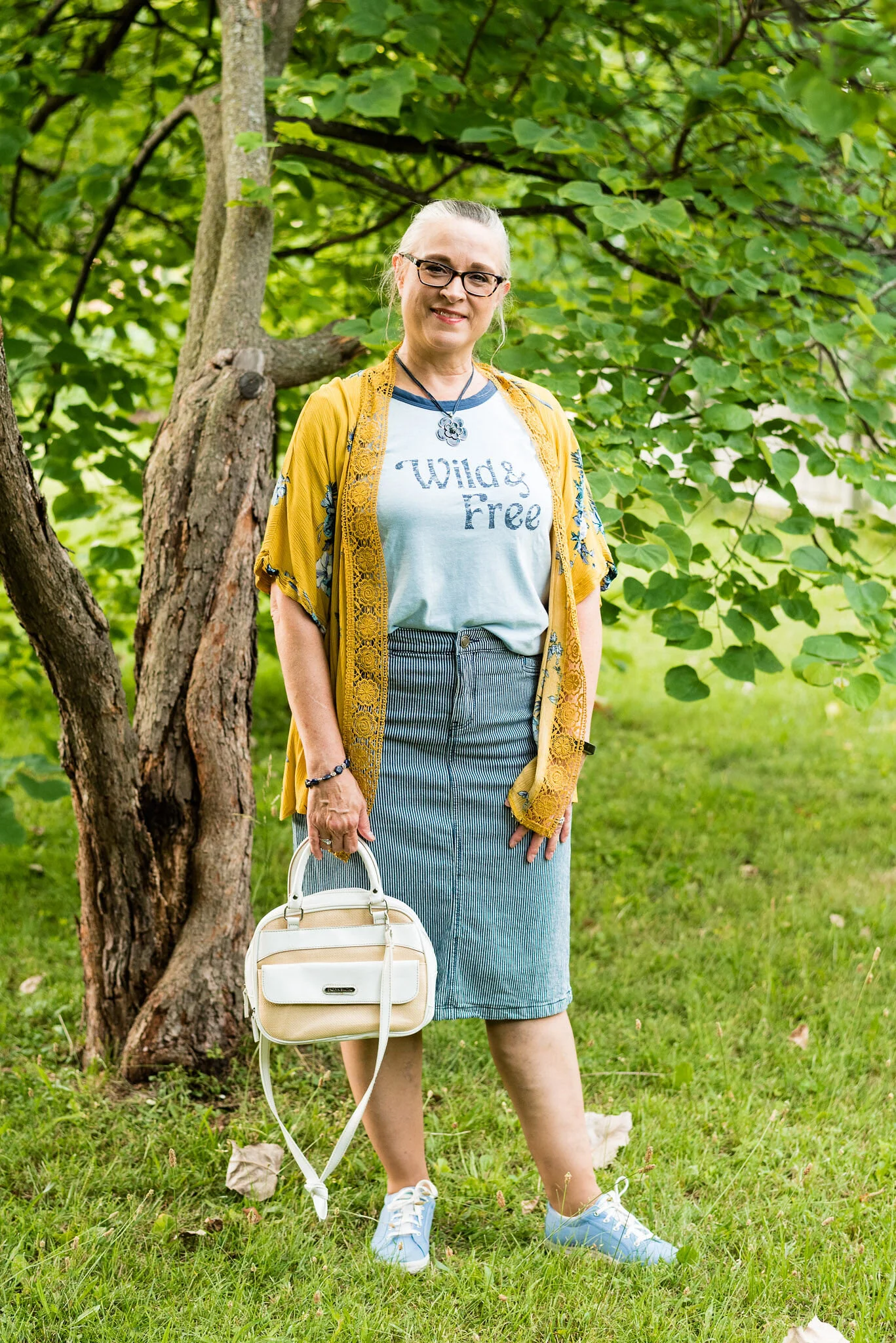
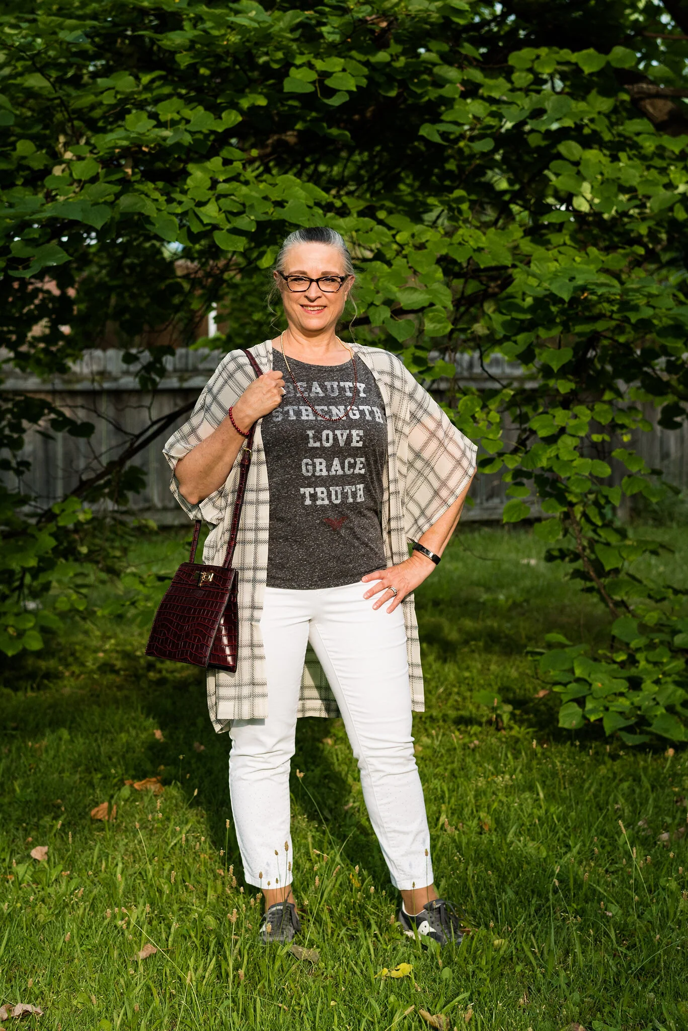
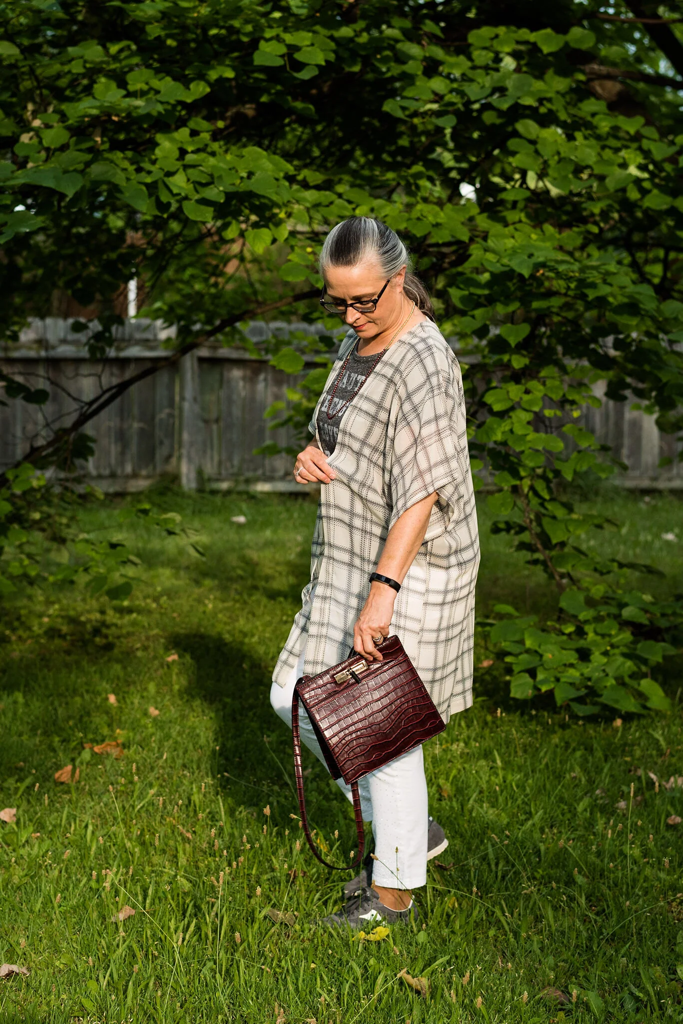
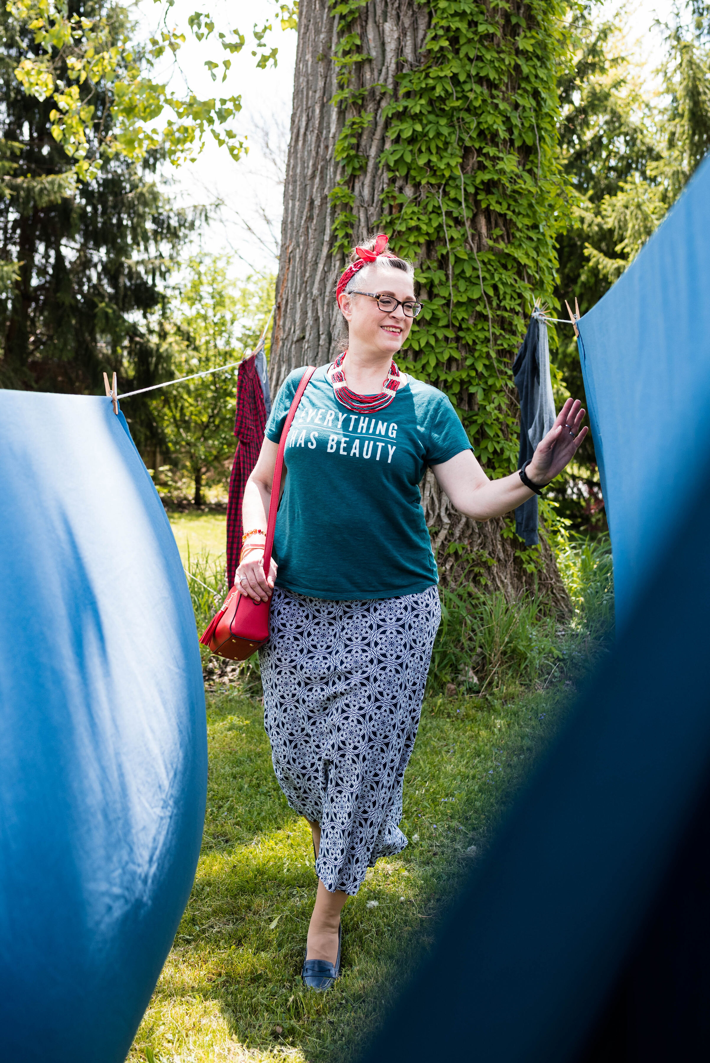
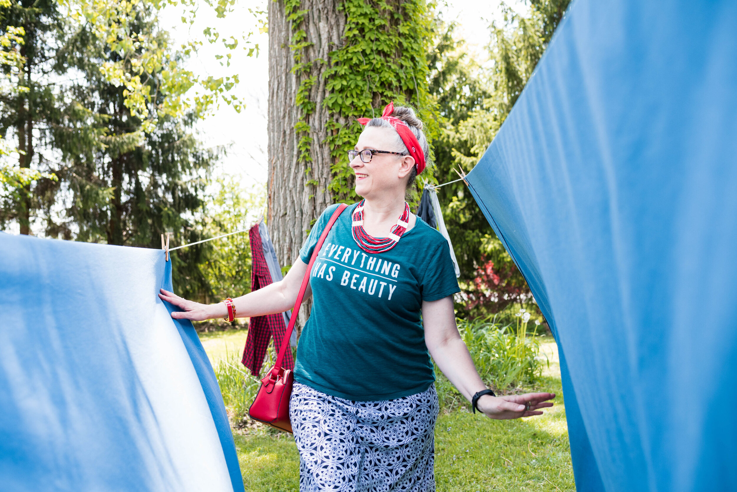
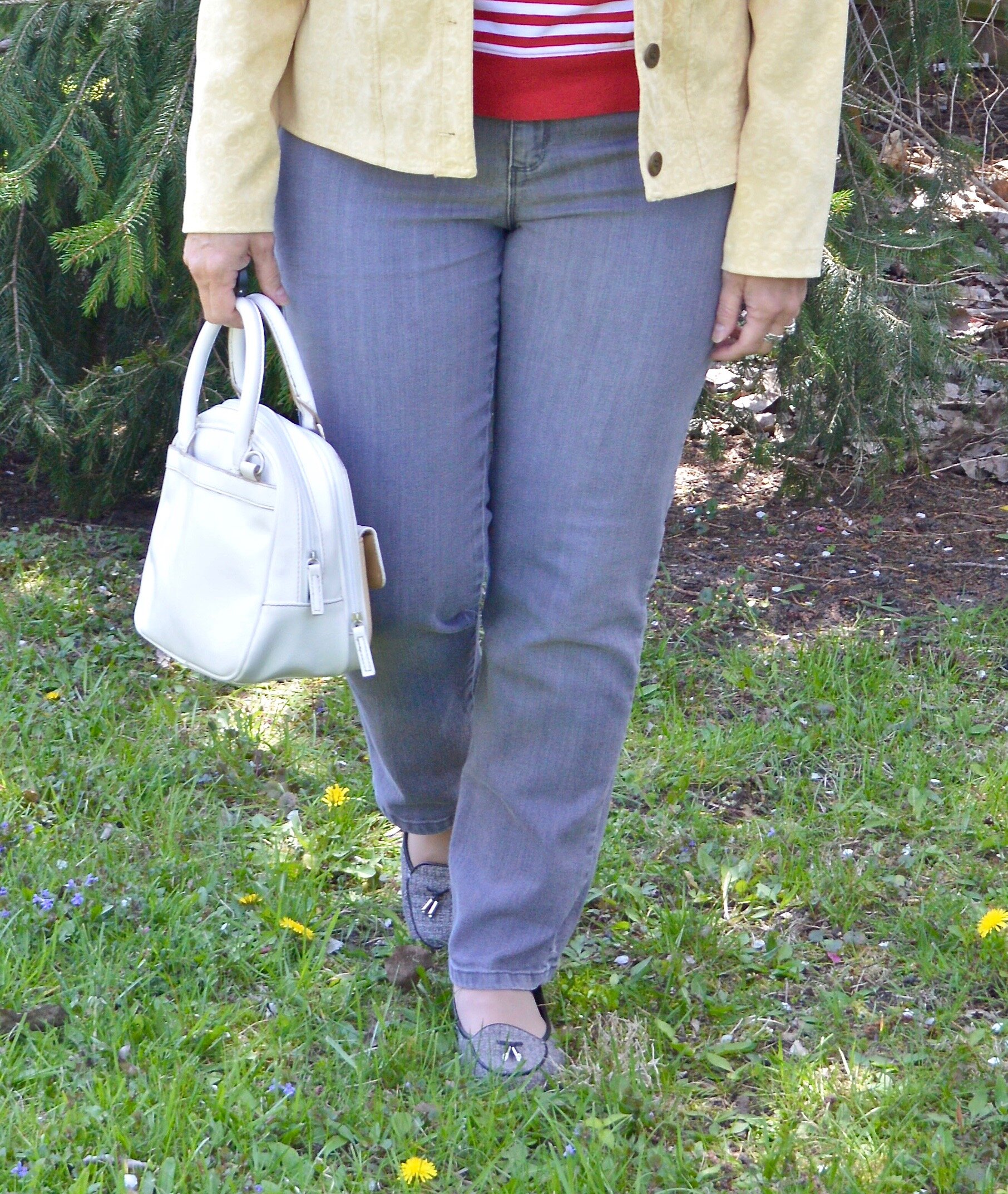
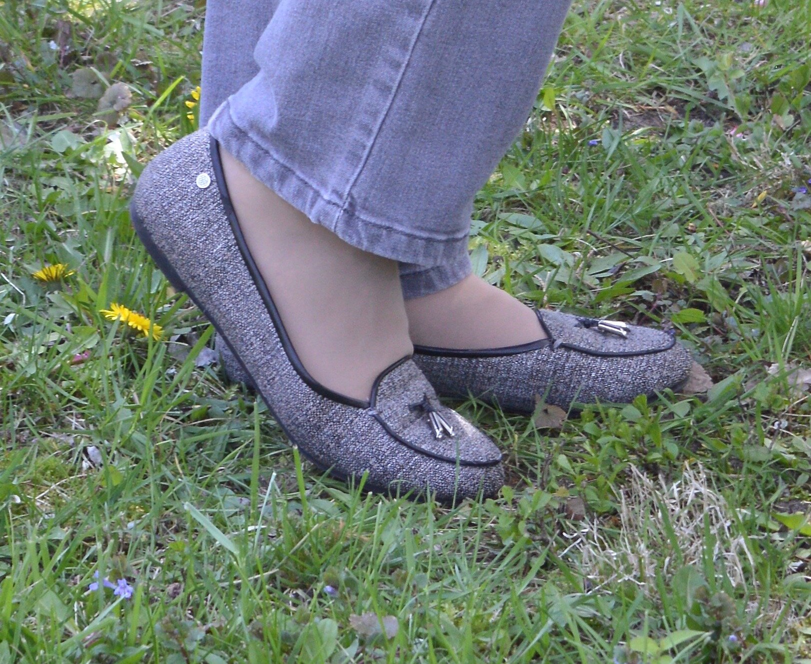
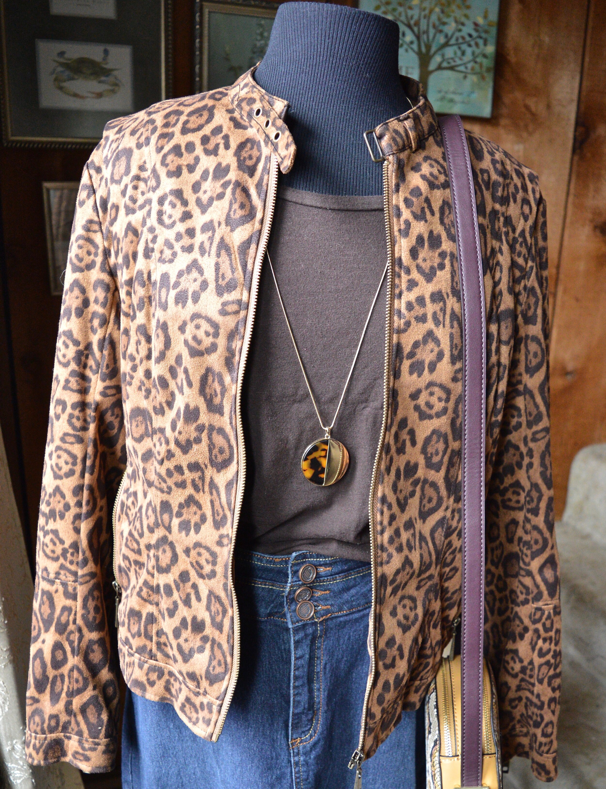
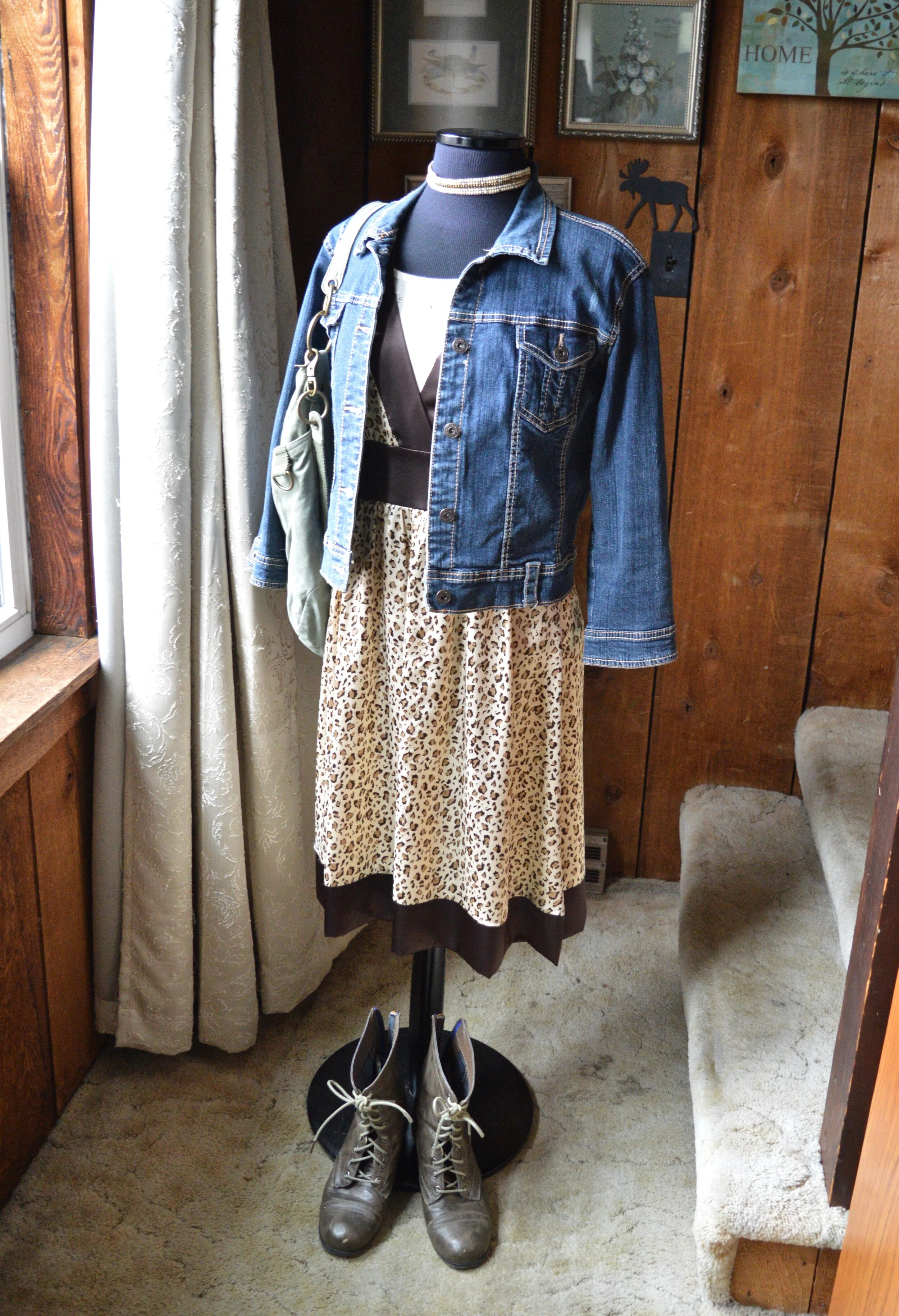
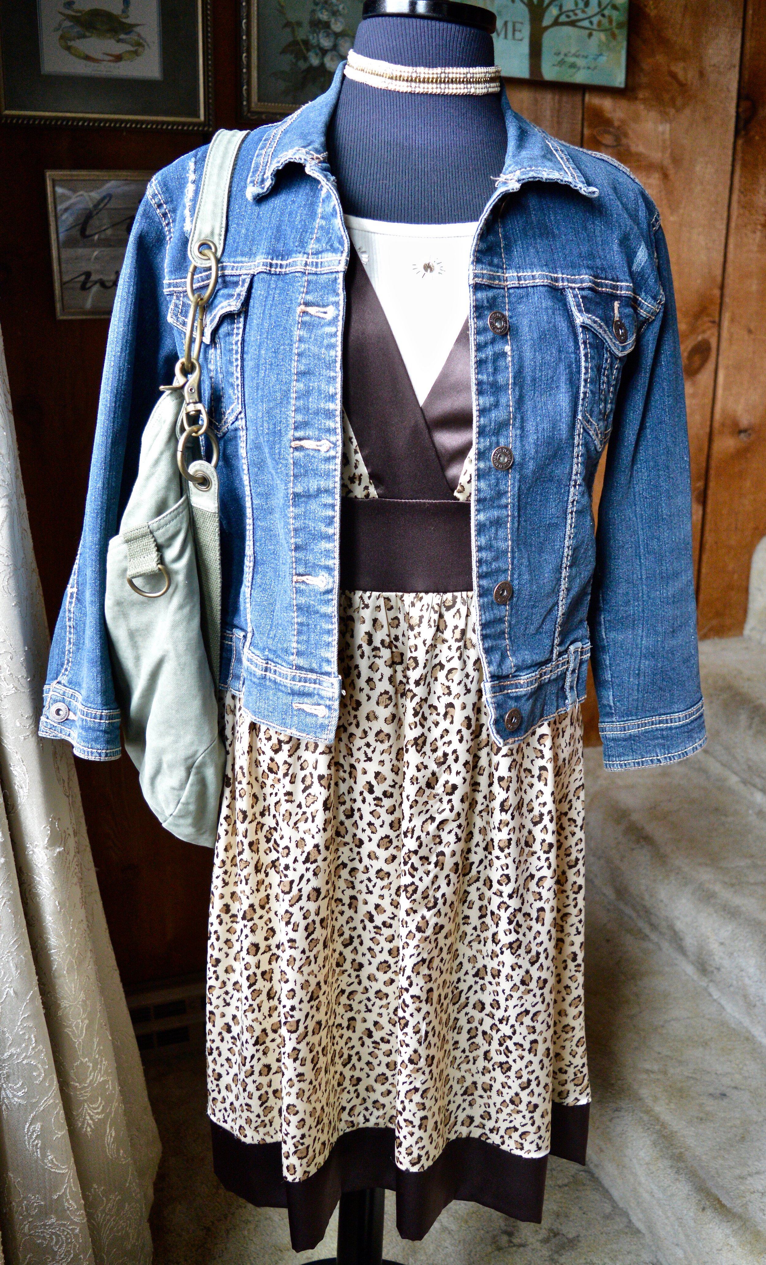
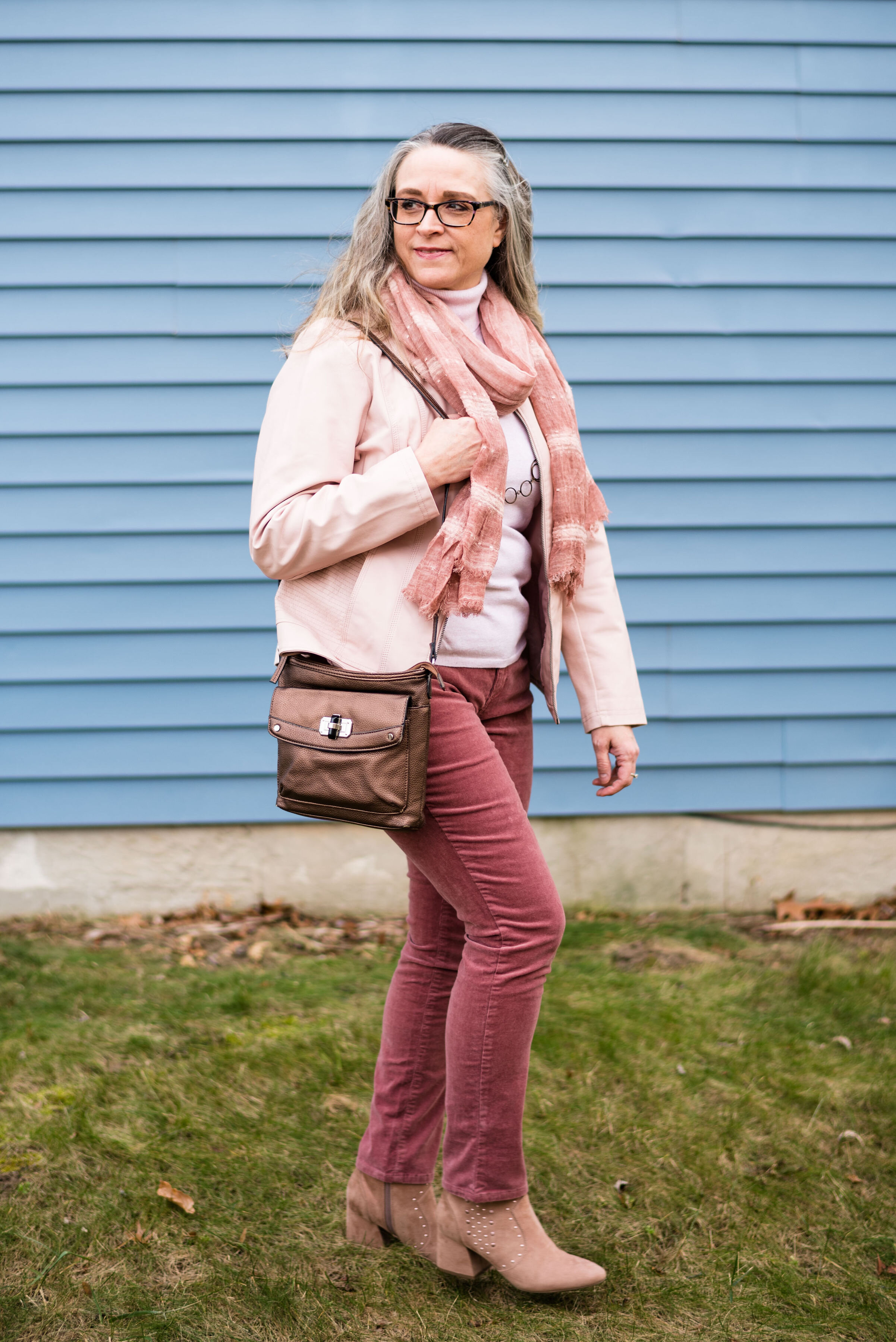
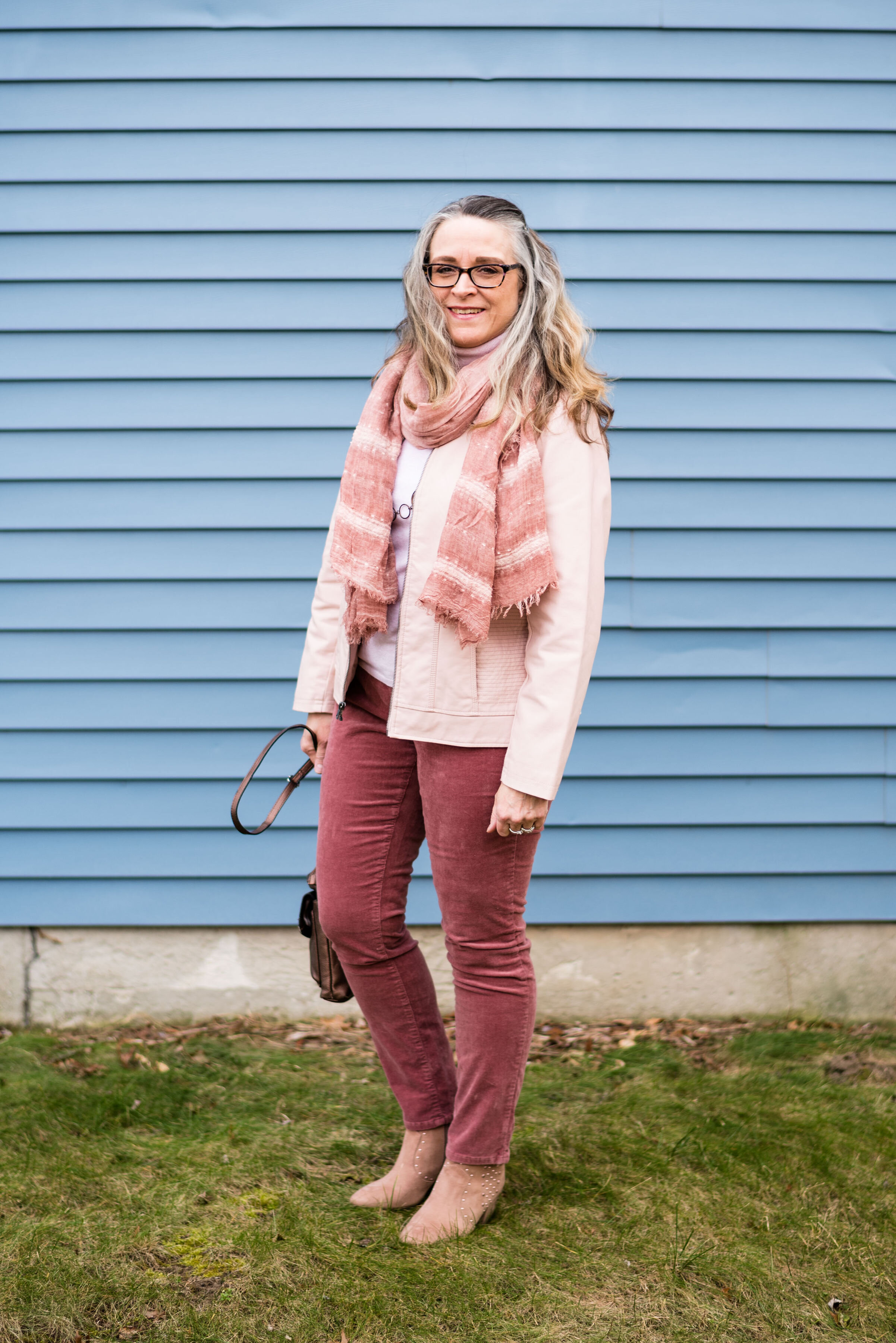
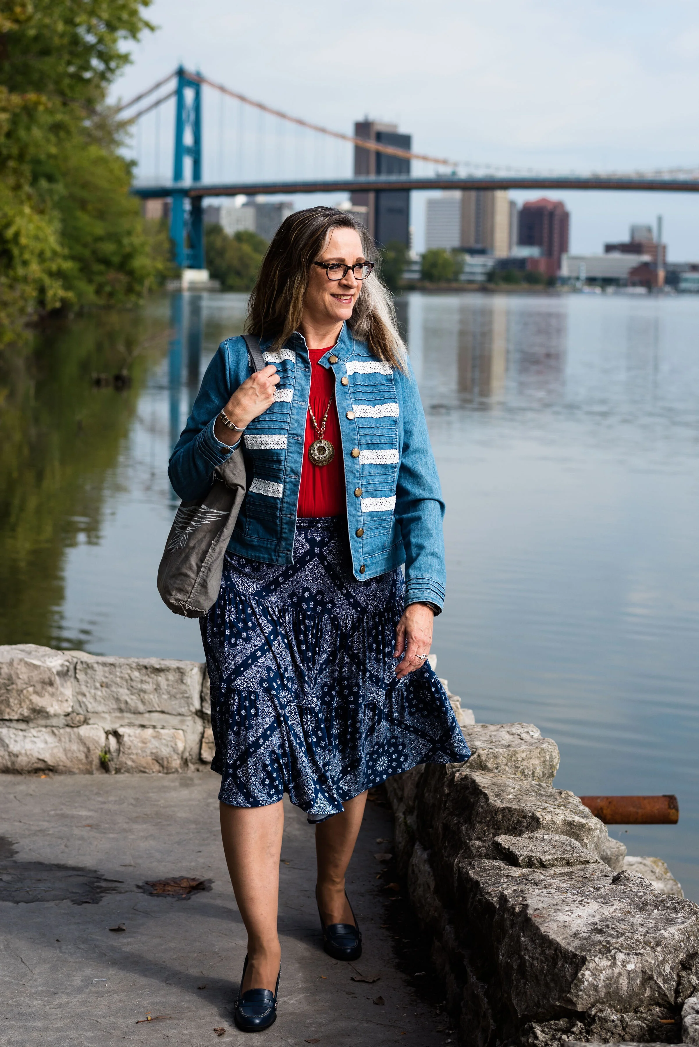
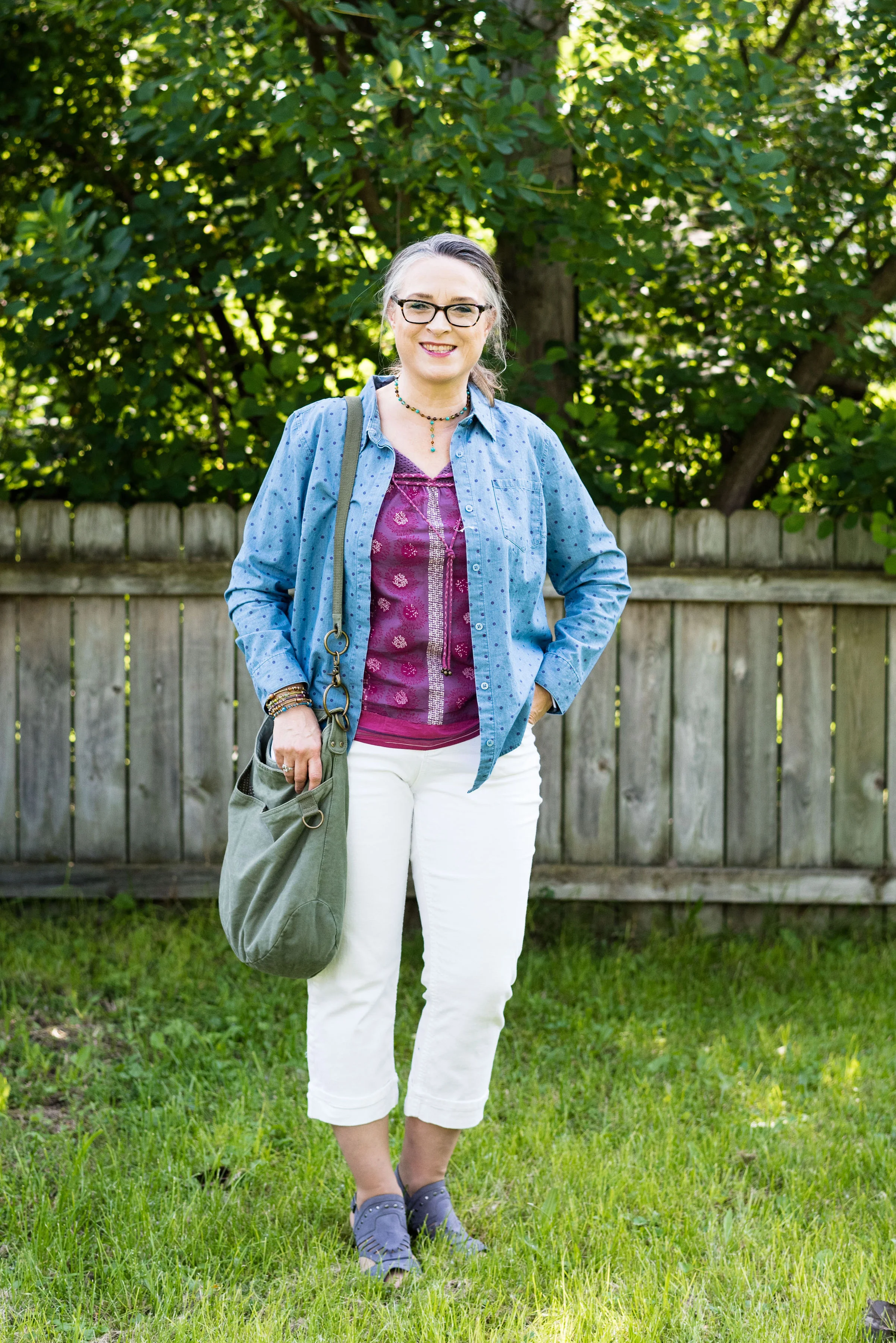
The winter trend of quilting is, once again, more present in outerwear, than in every day clothing. However, I wanted to show you something other than my quilted outerwear vests, so I reached for an older piece that for some reason I do not wear very often and a new piece that I just got. The blatant truth is, I have way too many clothes and one of these days I need to really pare things down, but for the time being, I would like to wear more of the things that I don’t wear as often.

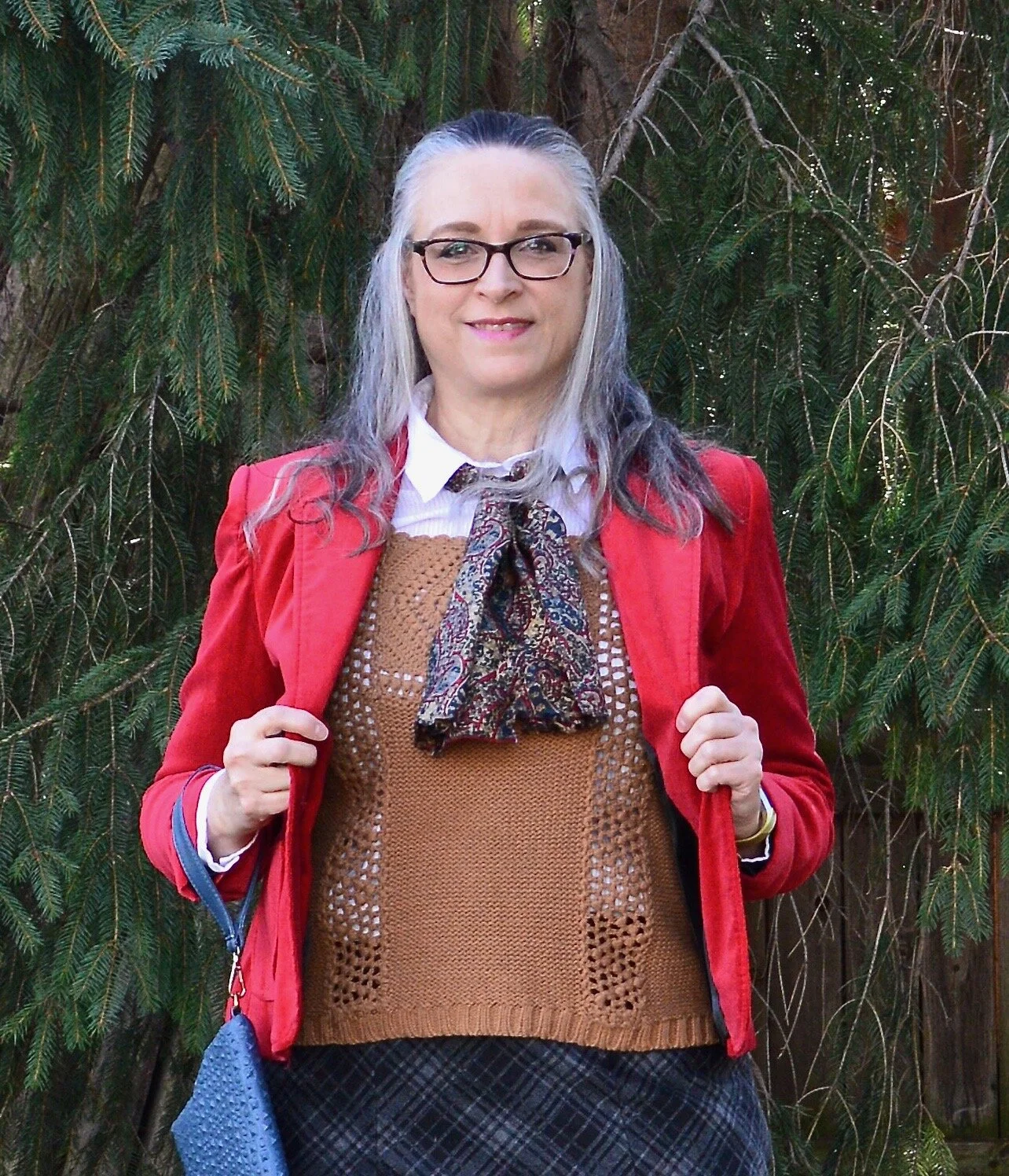
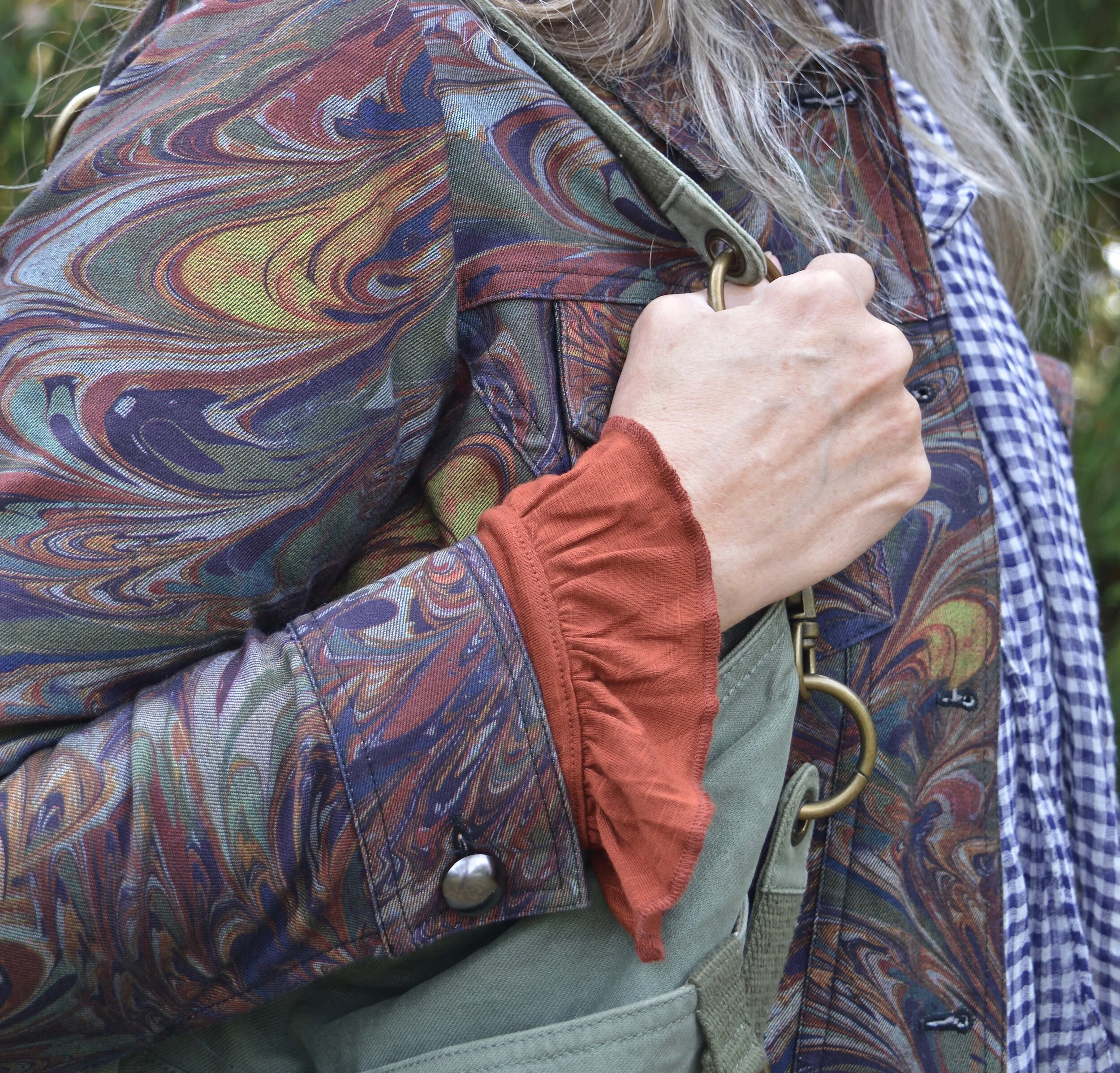
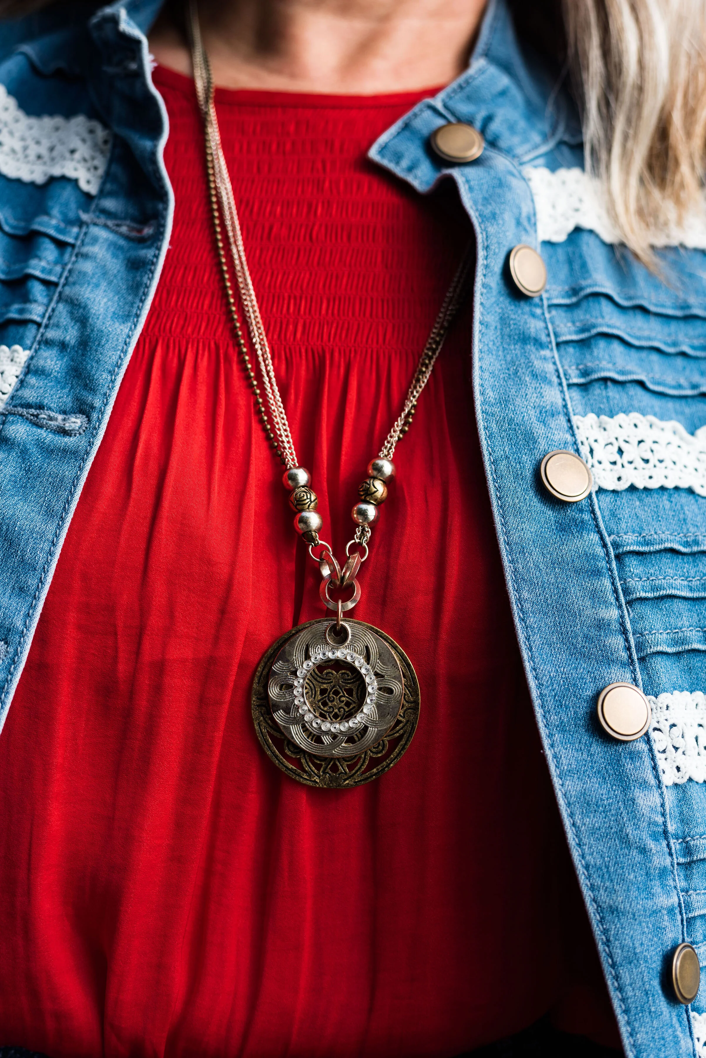
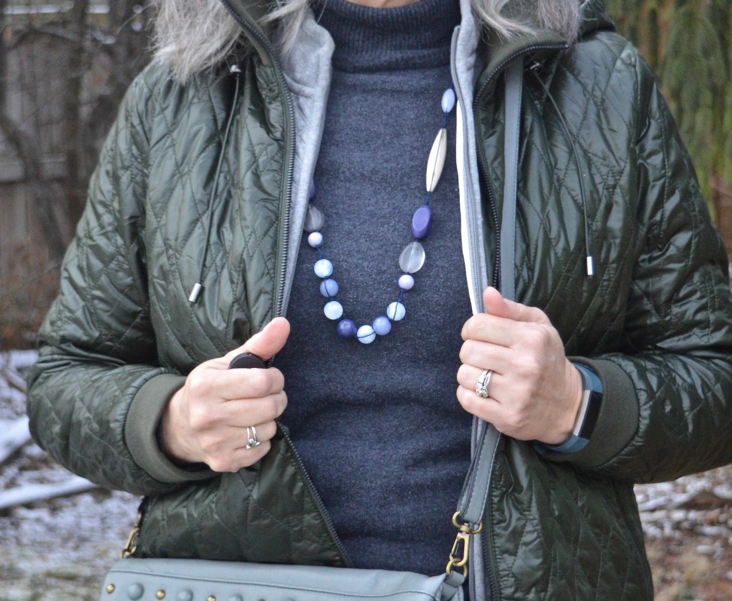
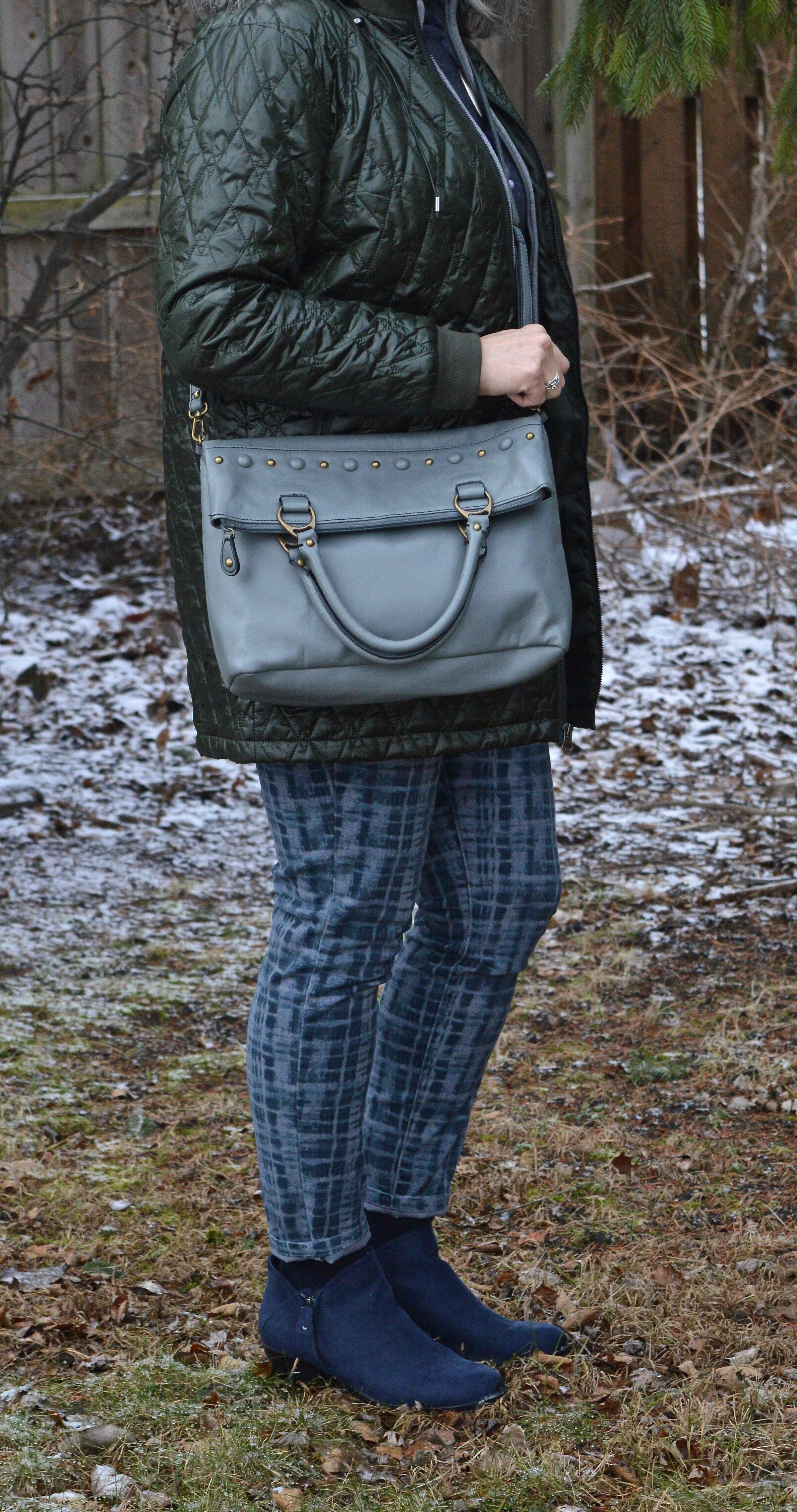
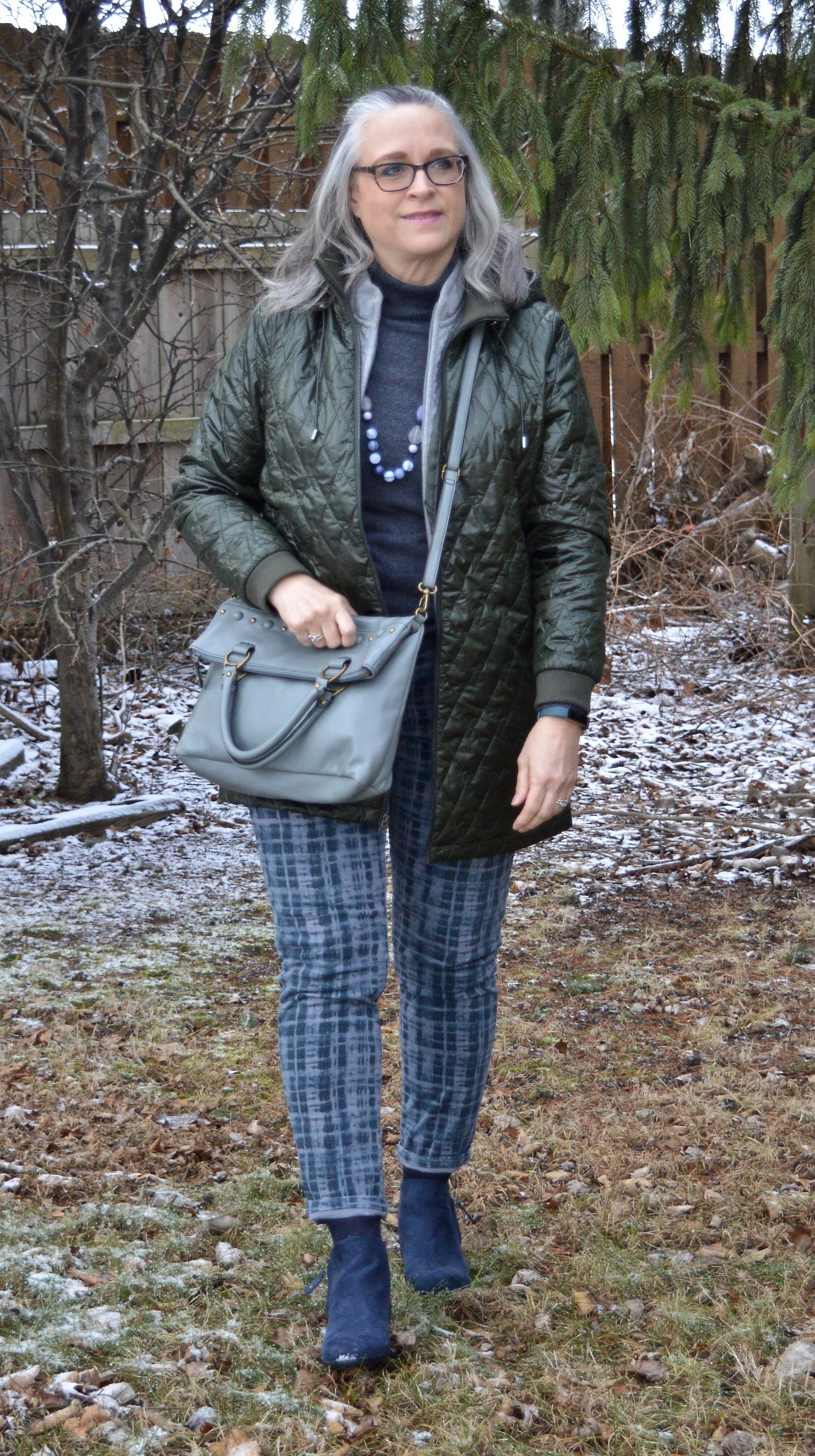
This jacket is a new purchase from Christopher & Banks. It was marked down and then had another percent off. I like that it is light weight and on the day I took these photos it was quite cold and it kept me toasty warm. The shiny, olive green color was a nice addition to my outerwear wardrobe and this is a jacket that I will be able to wear fall, winter and spring when the temps are still cold. It appears, that Christopher & Banks, while closing all their brick and mortar stores, is still going to have on online presence. I know they still have these available on their website, so check it out.

Winter Trends - quilting

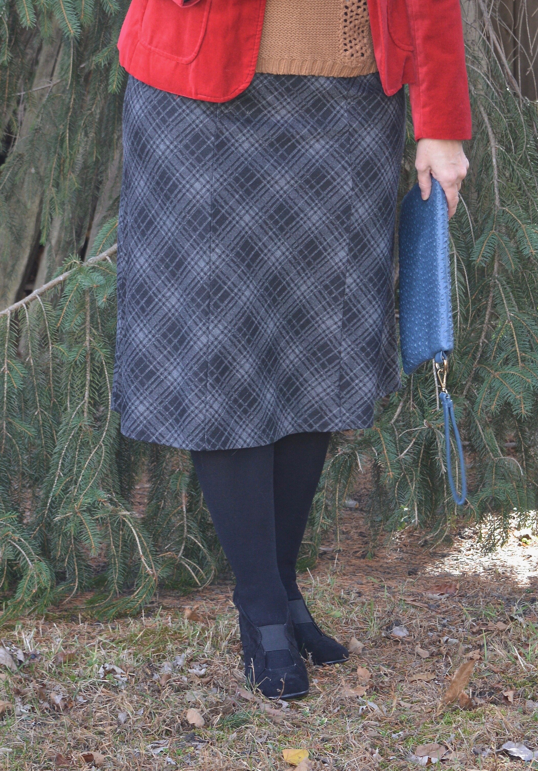
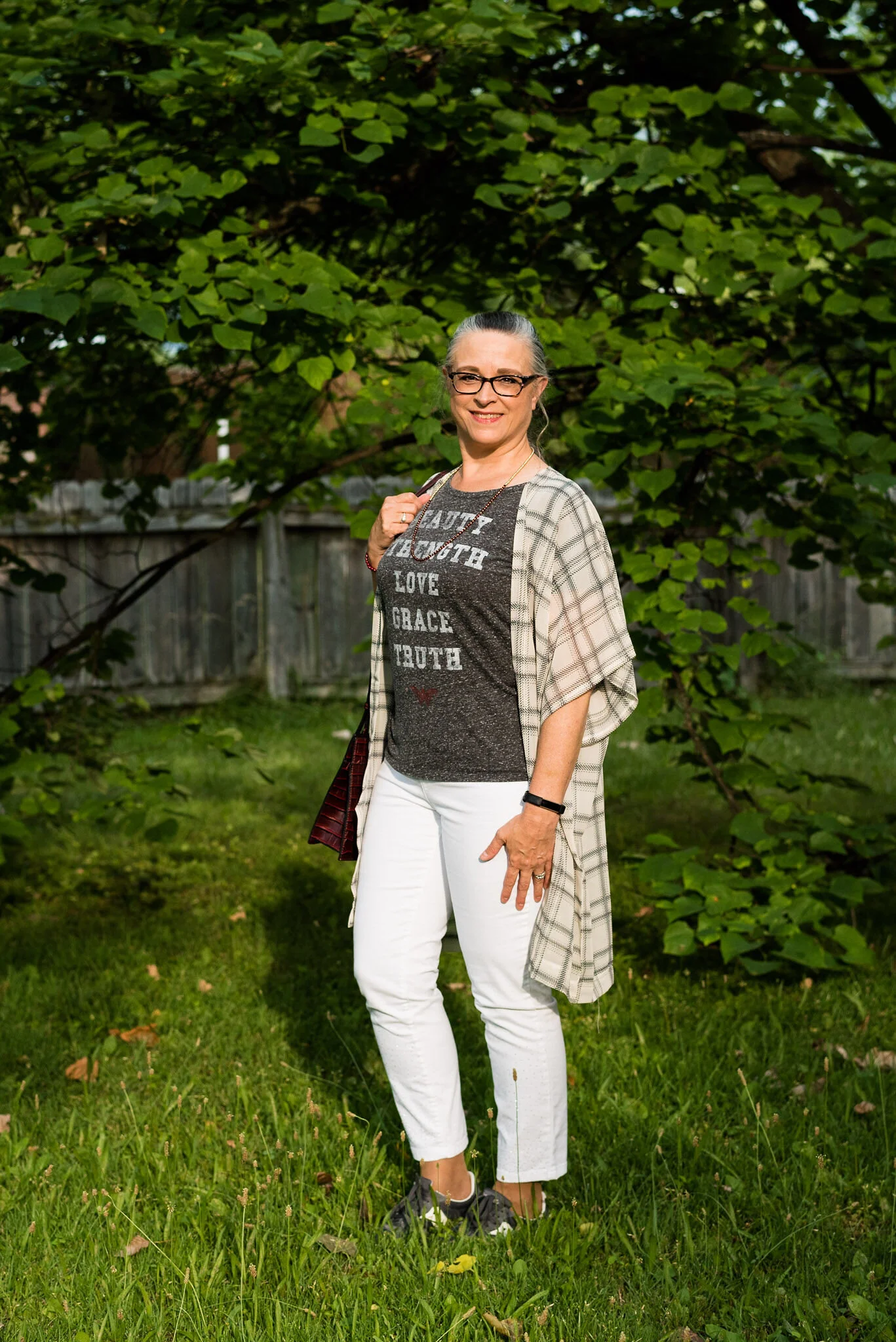
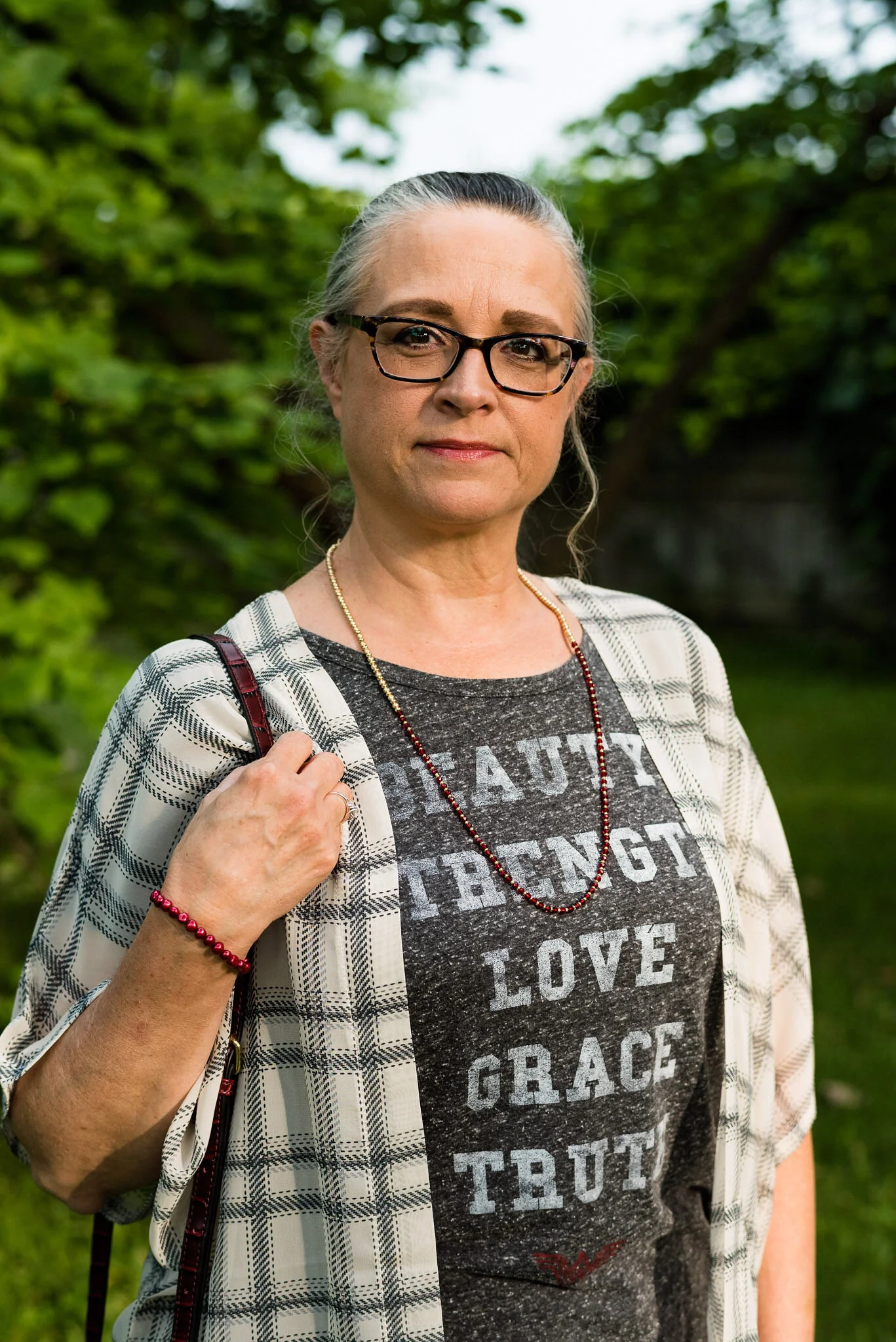
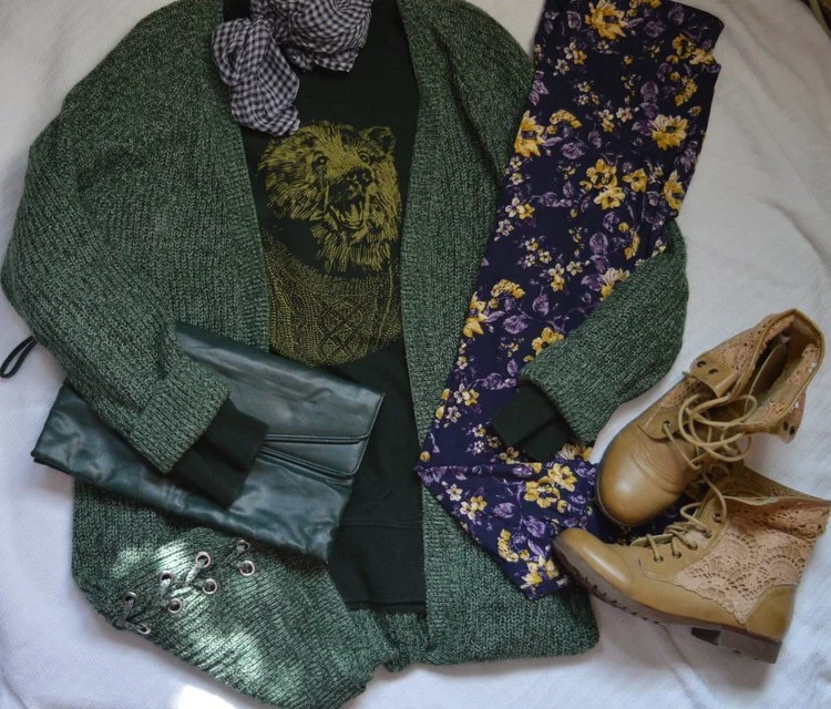
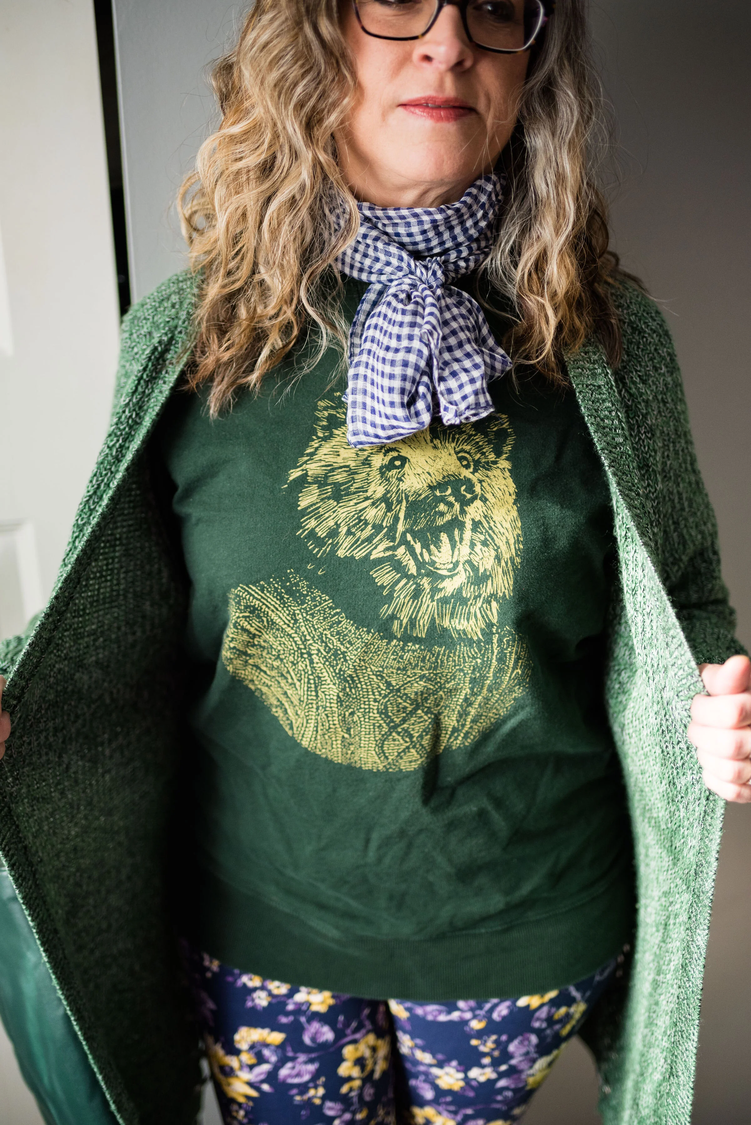
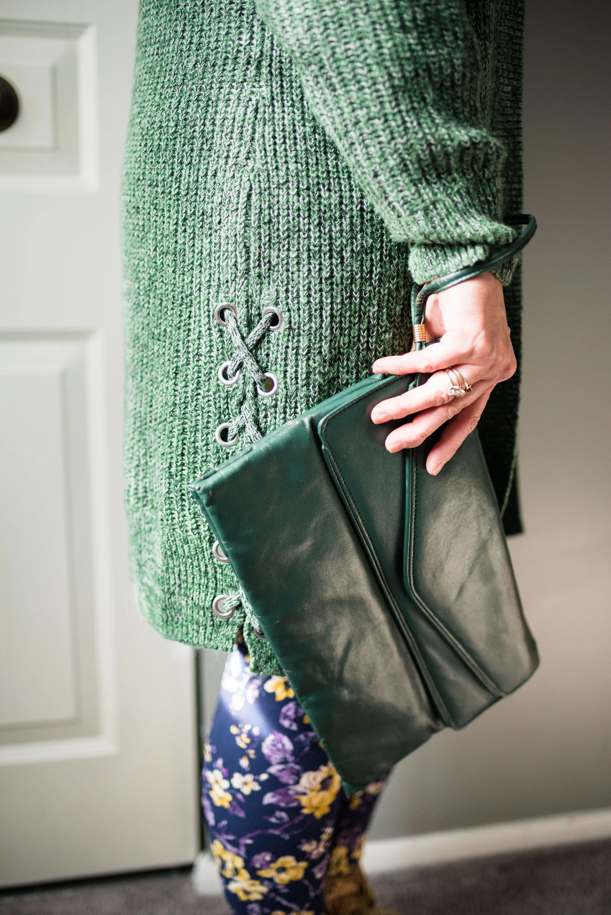
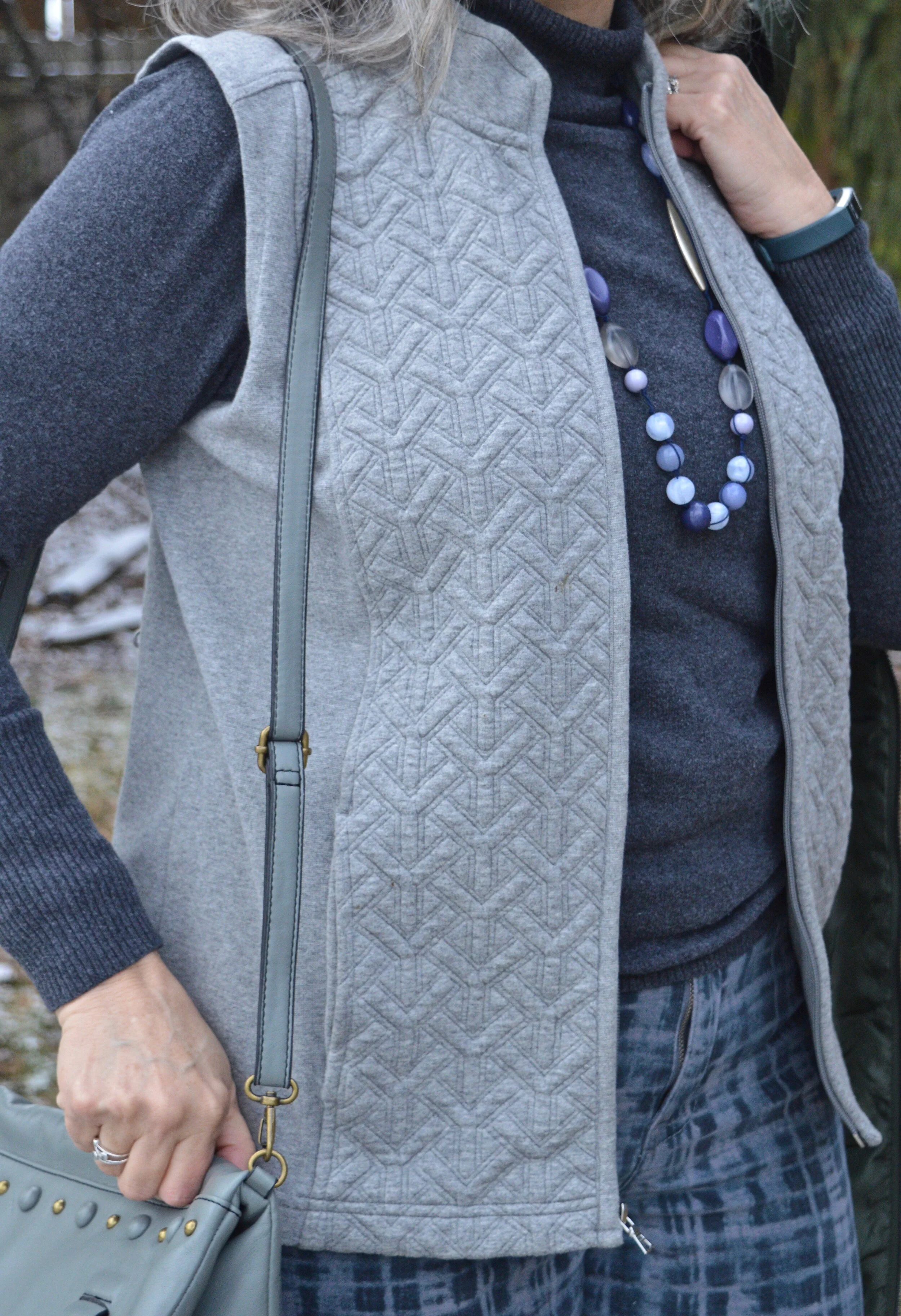
The other quilted piece I want to show you is the gray vest I have on underneath the coat. This vest is also a Christopher & Banks purchase, but from a number of years ago. The quilting detail is much more intricate and unique on the front portions of the vest.

Winter Trends - quilting
Winter trends - quilting

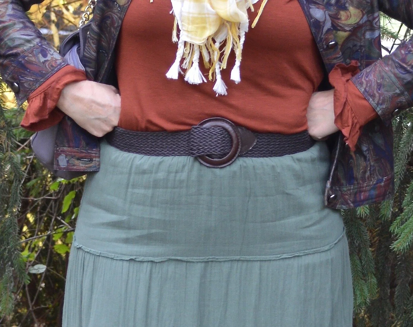
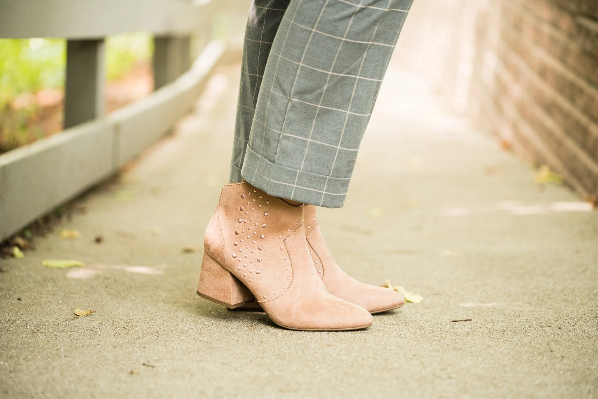
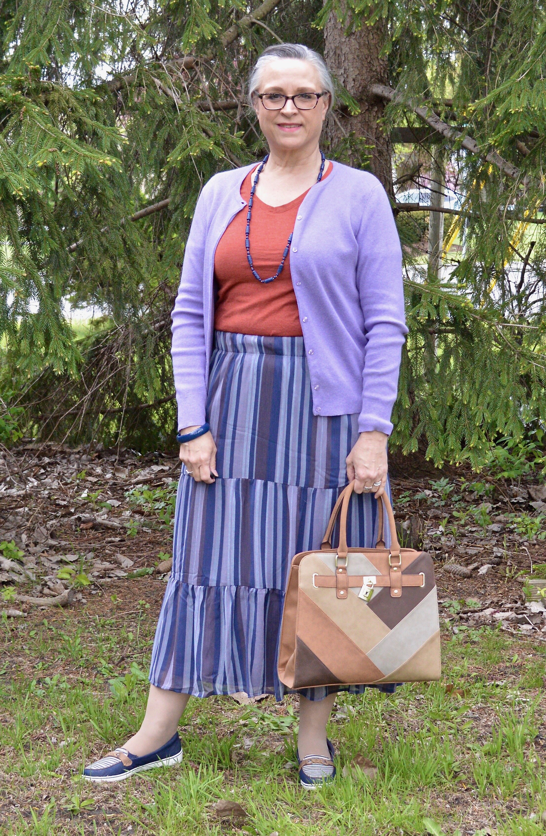
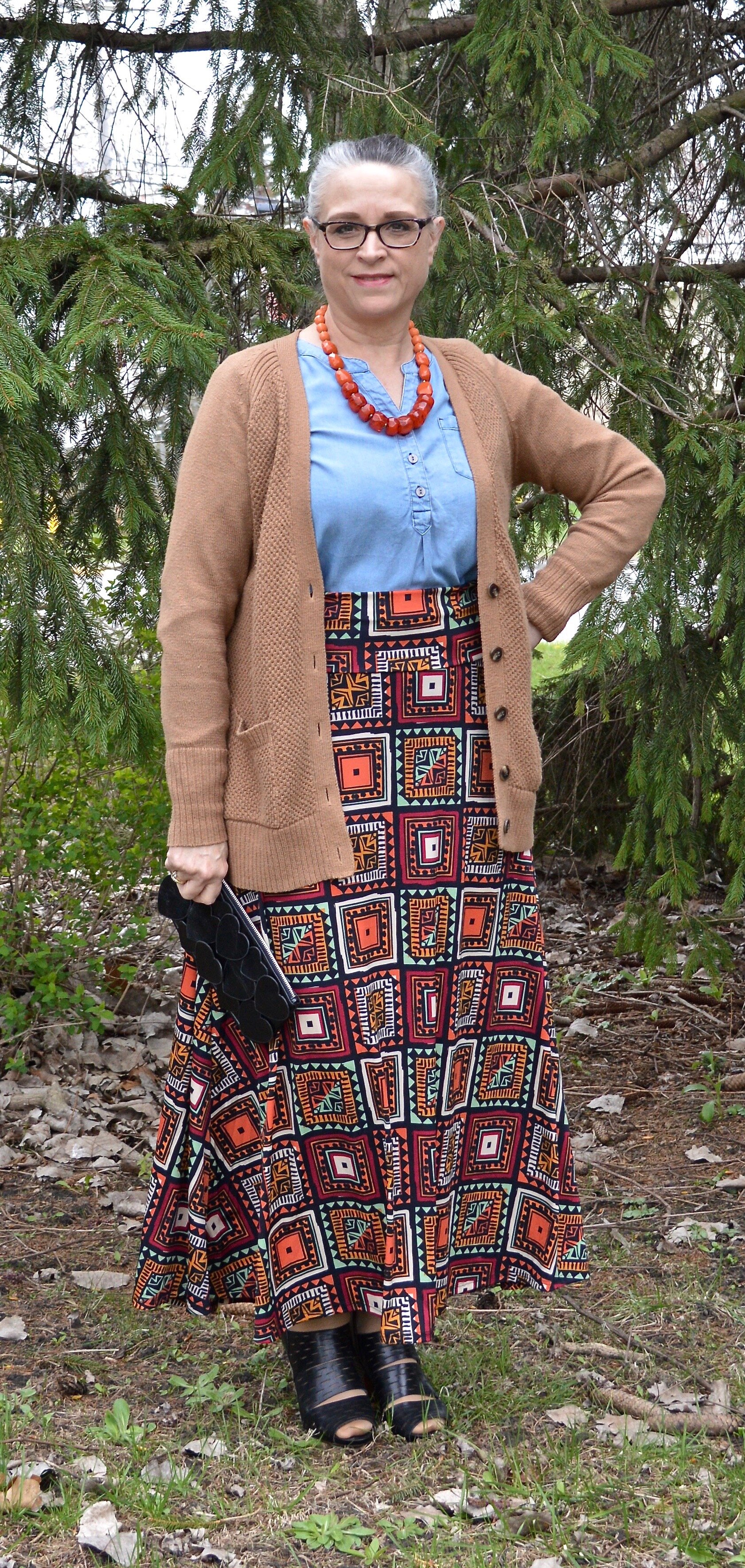
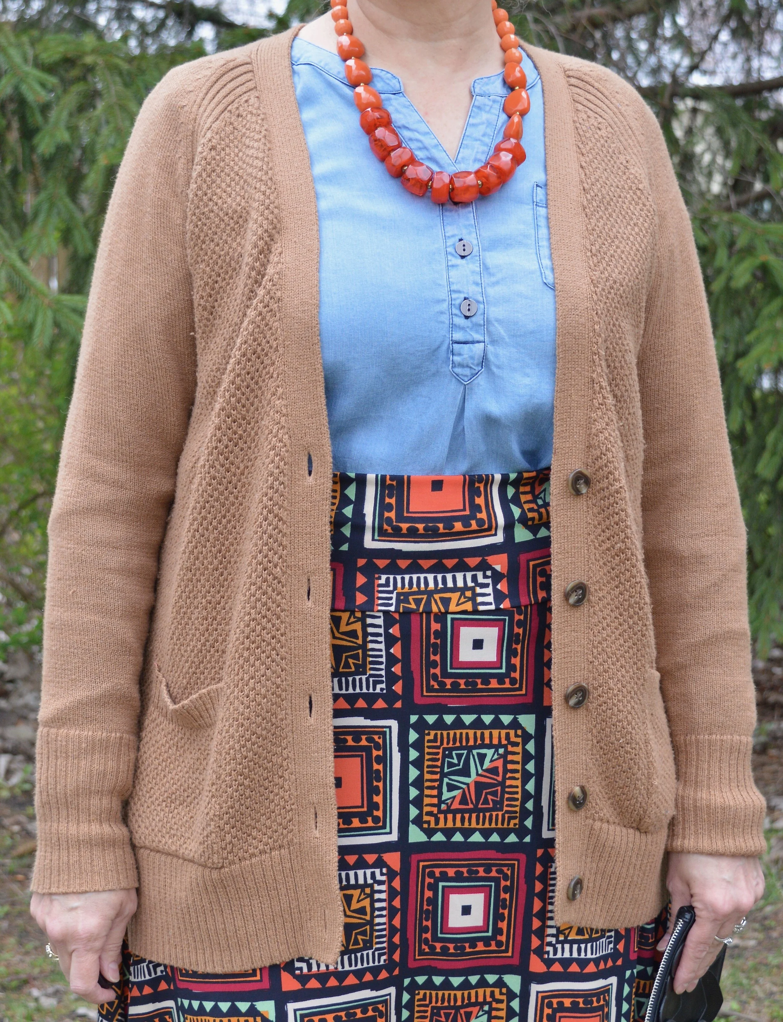
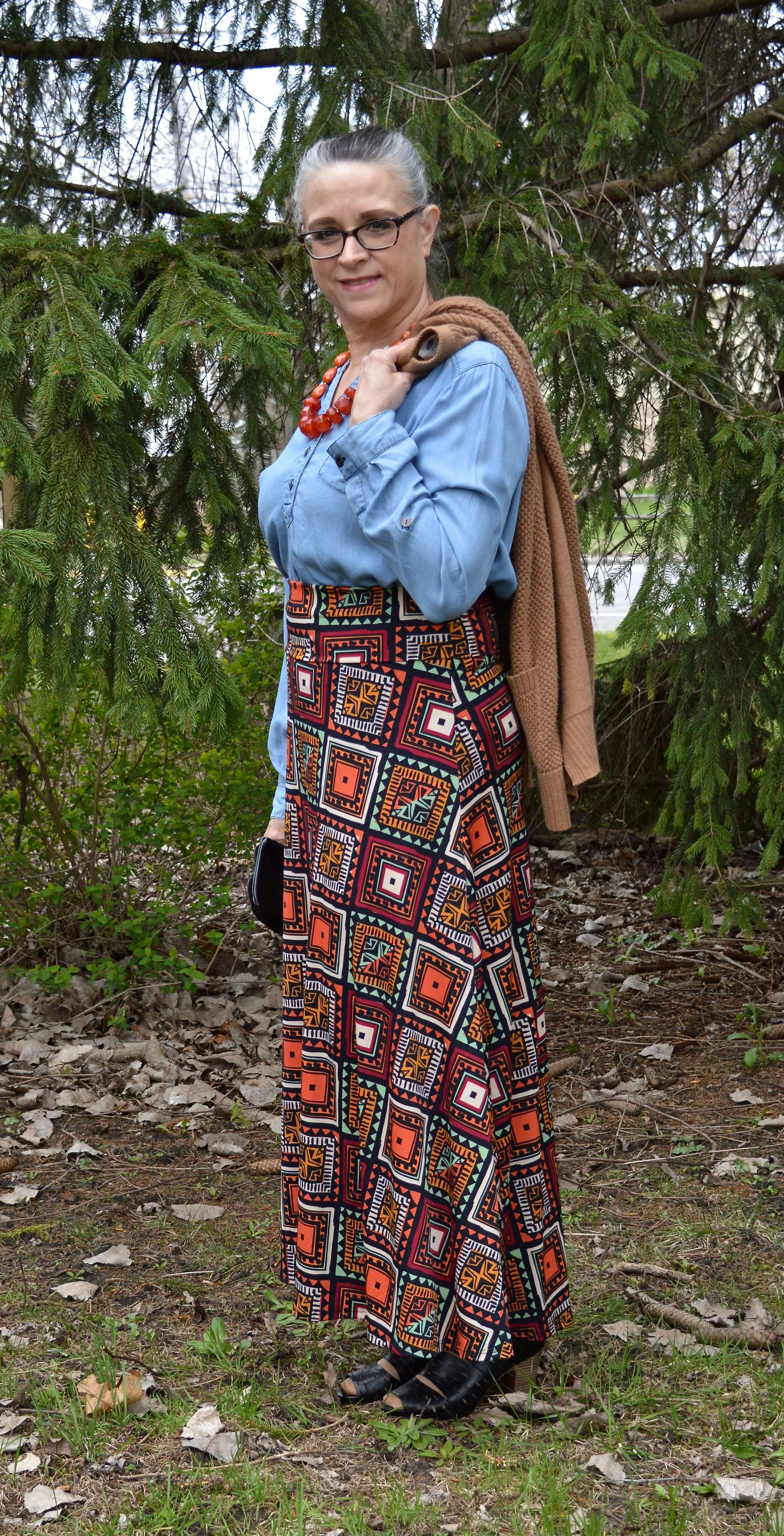
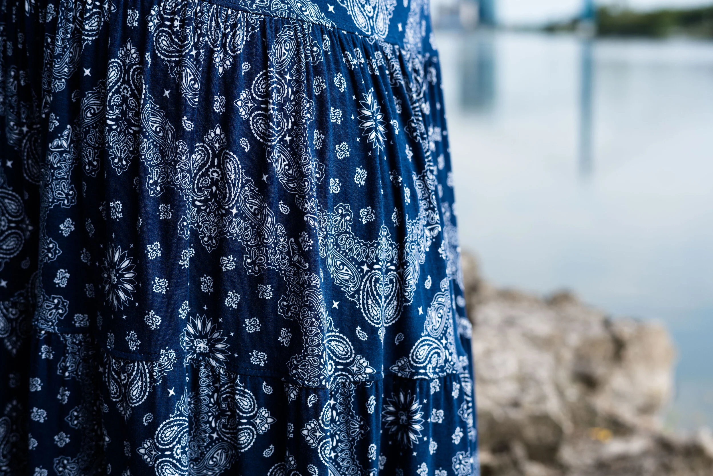
My fun printed pants were a recent thrift find from when my girls took me thrift shopping on my birthday. I saw these on the rack and I have always had this thing for plaid pants. I threw them in my cart thinking there was no way they’d fit, but why not try them on. I was so happy that they did. These are a brand called cabi jeans. Once again, a brand I am not familiar with, but they are a current online retailer, so you can check out their website here.

Winter trends - quilting

I will be able to use these jeans all year round and I am already thinking of spring outfit styled with a chambray shirt.

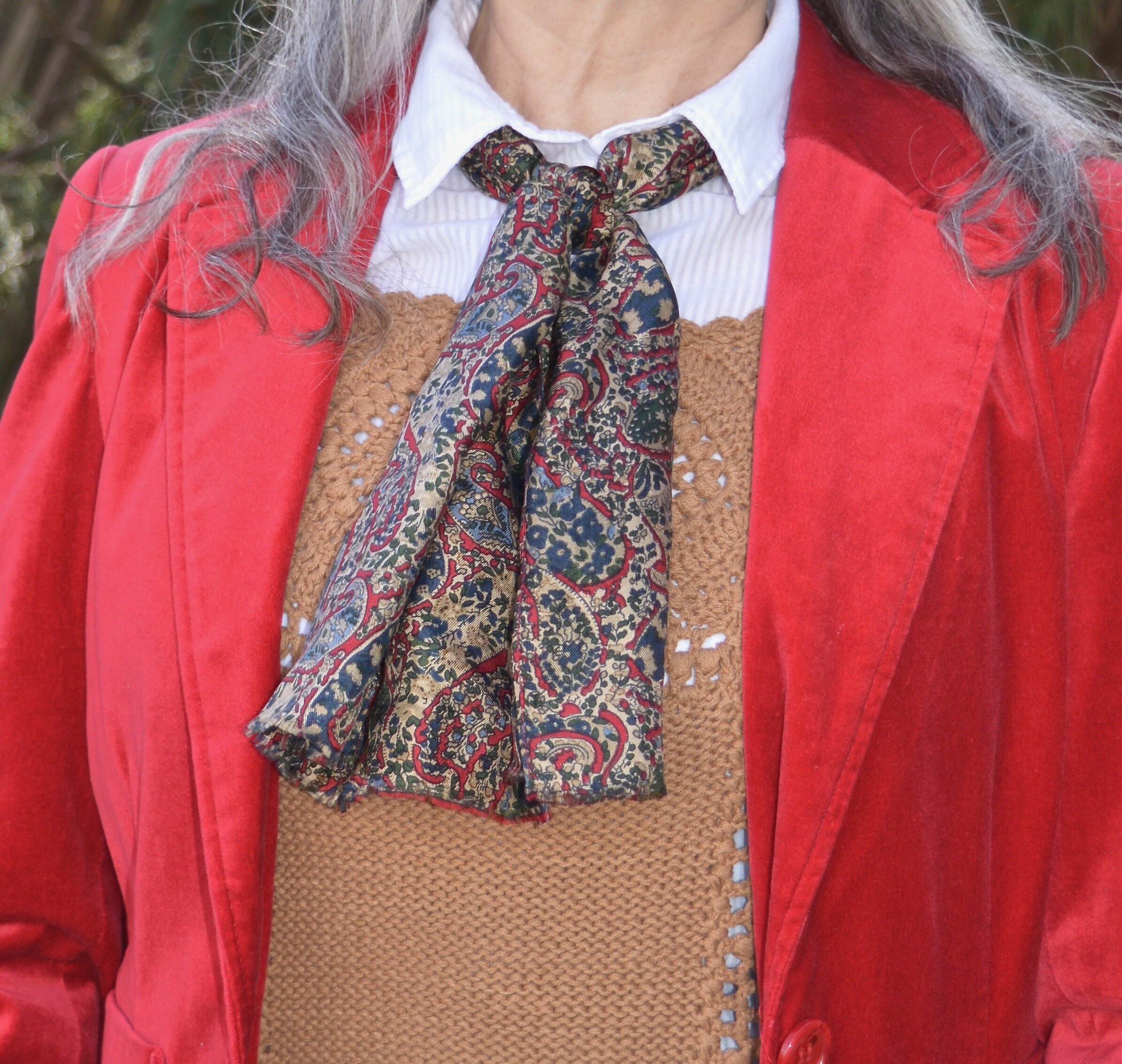
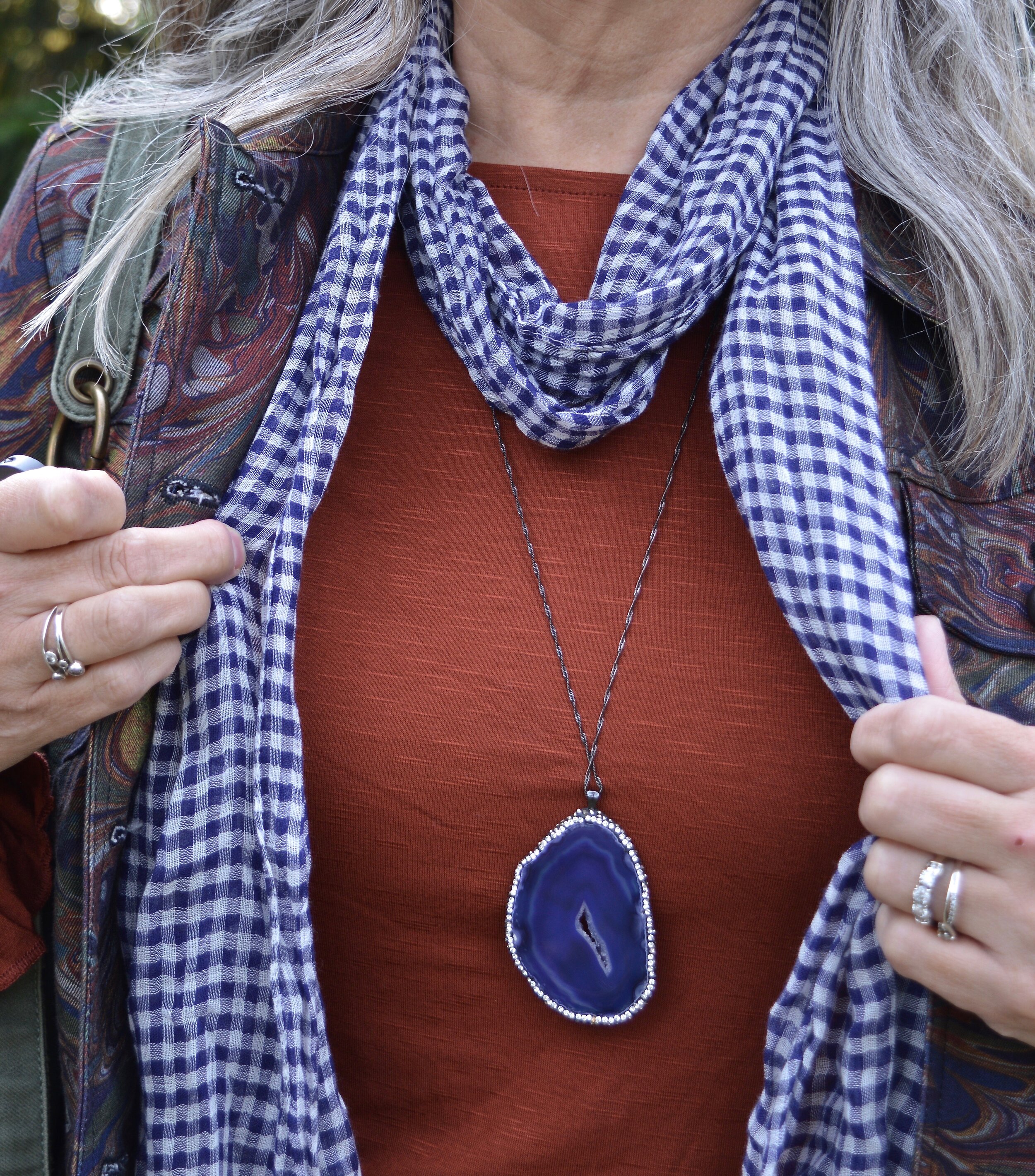
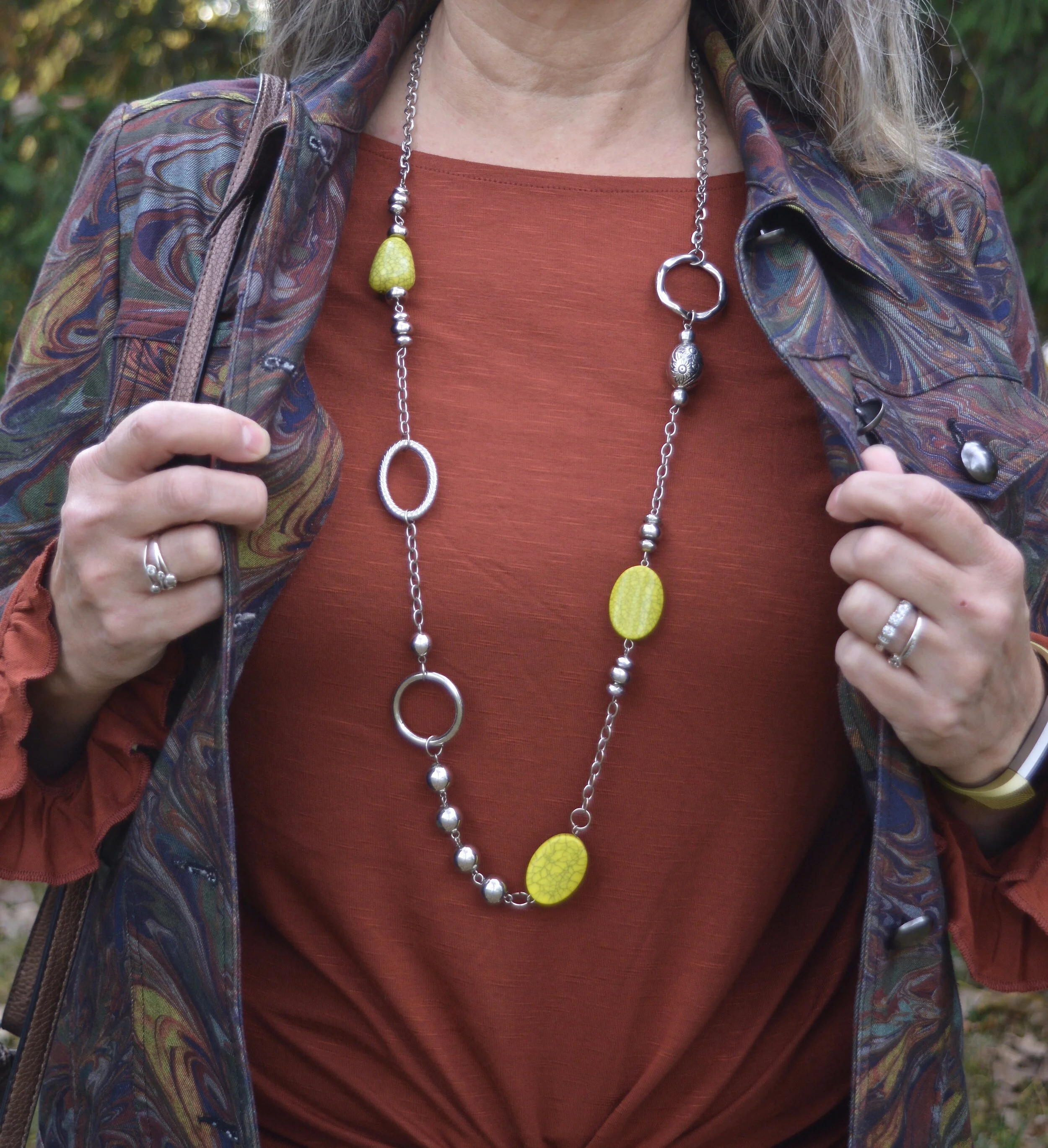
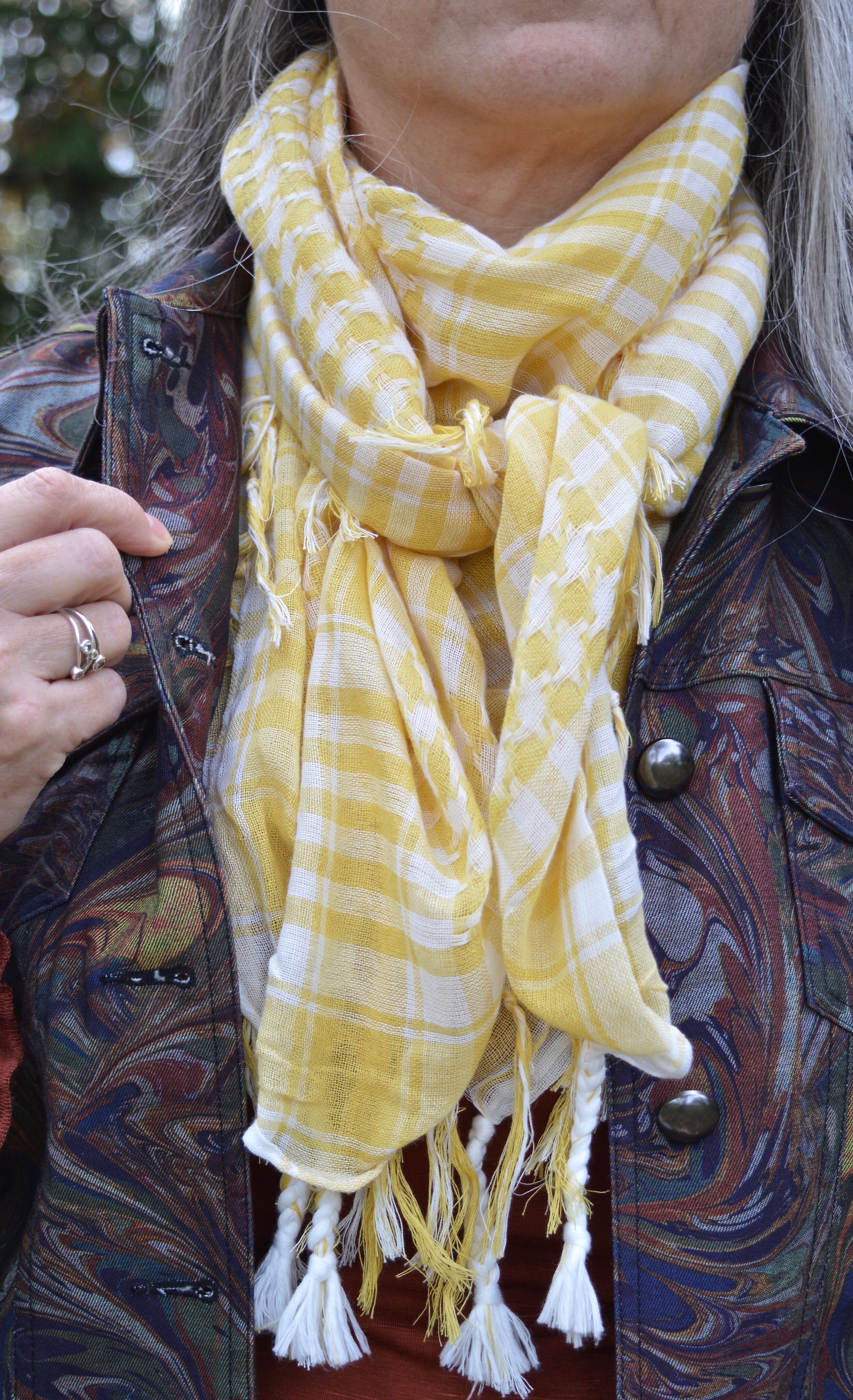
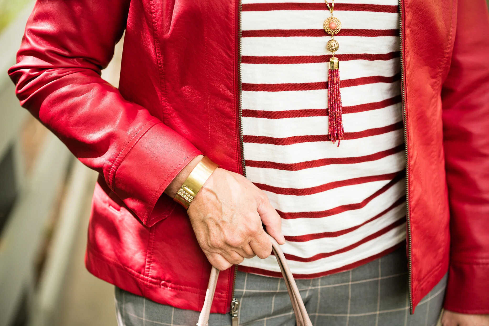
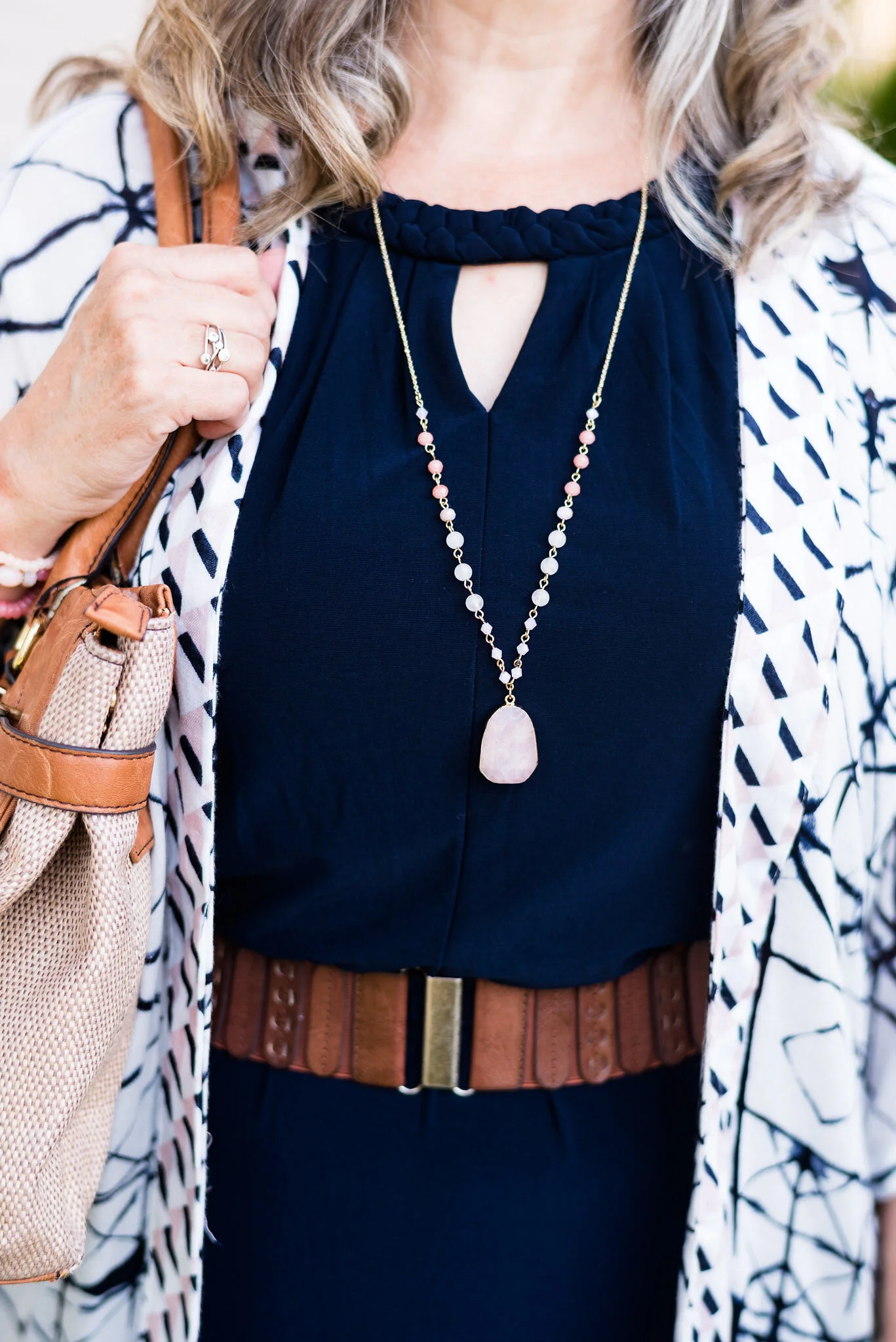
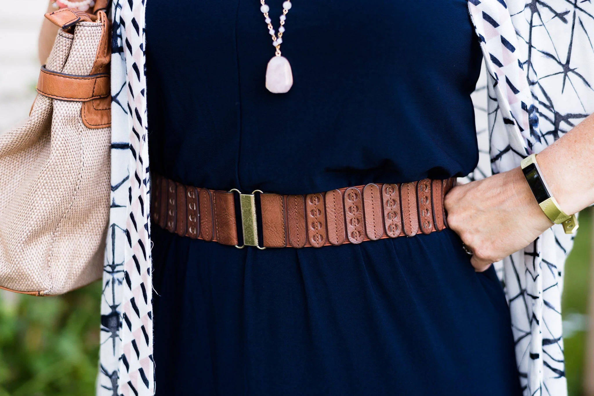
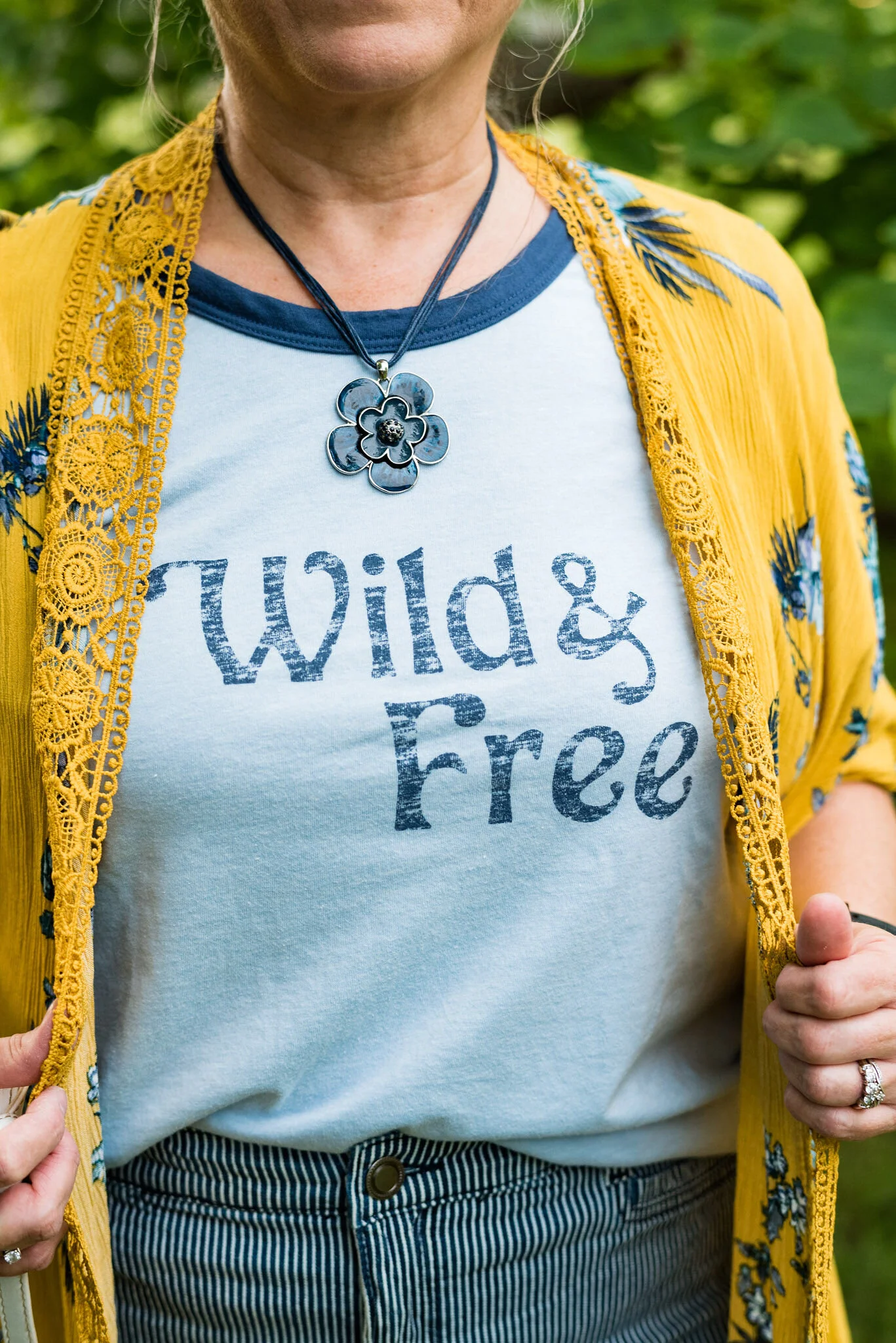
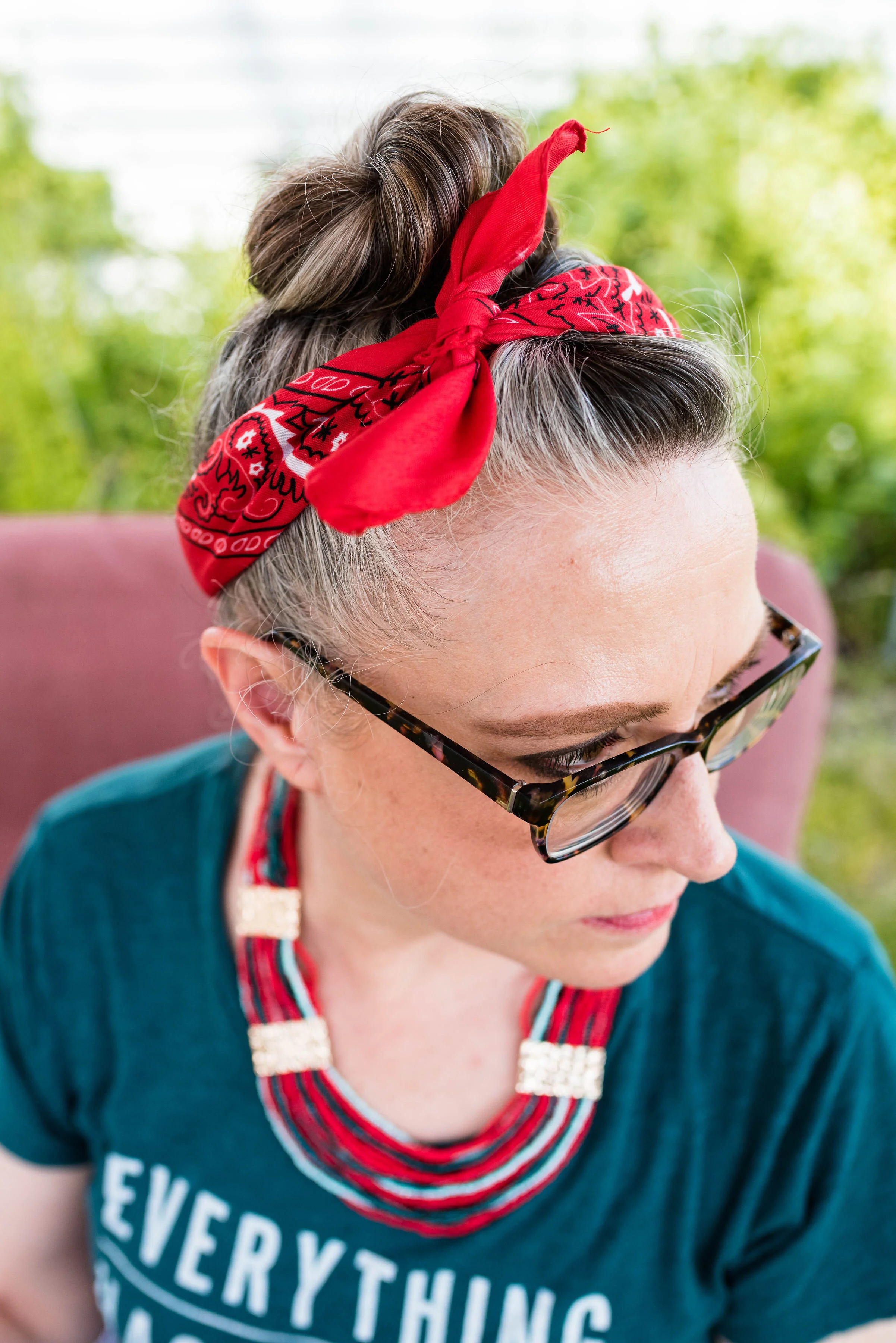
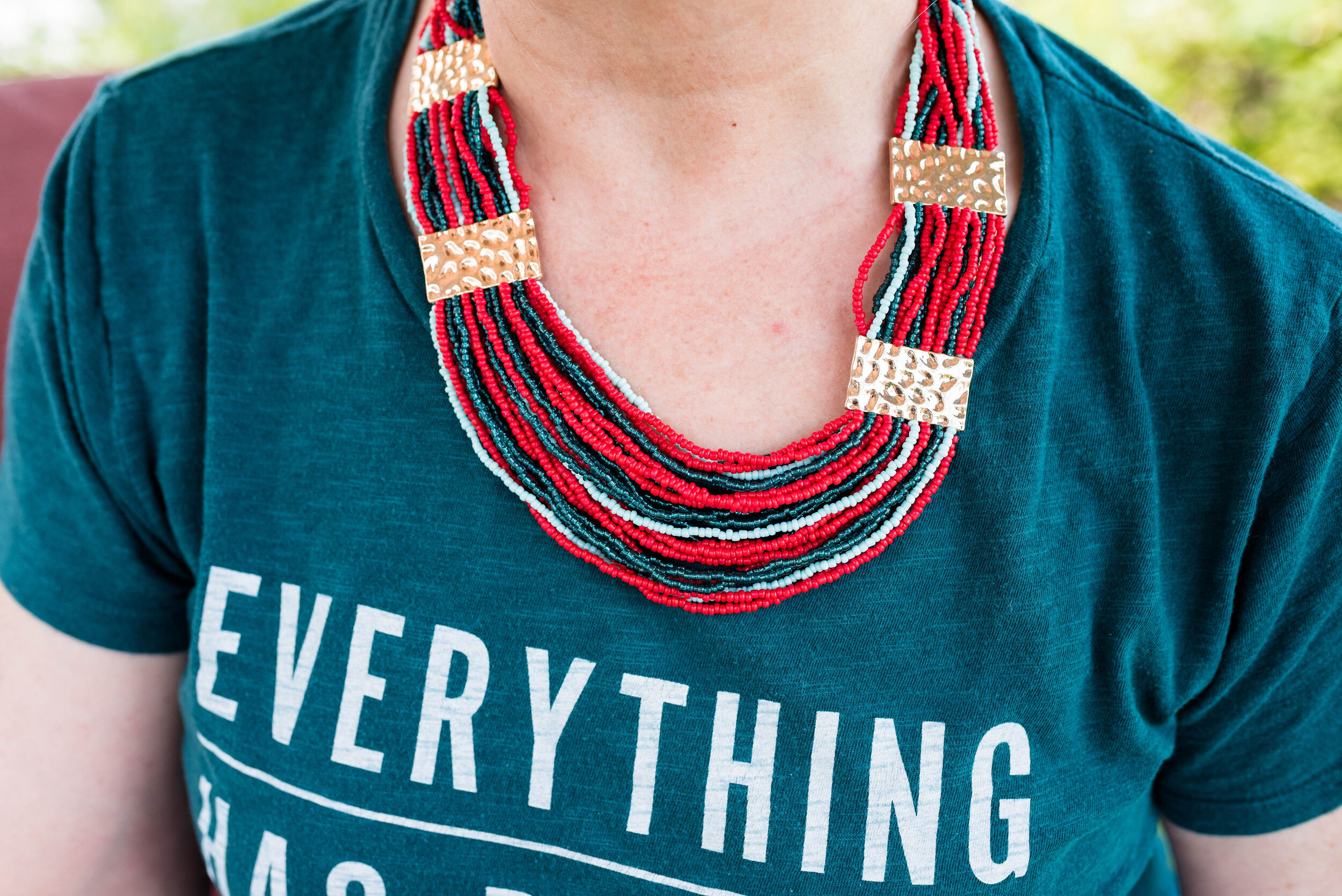
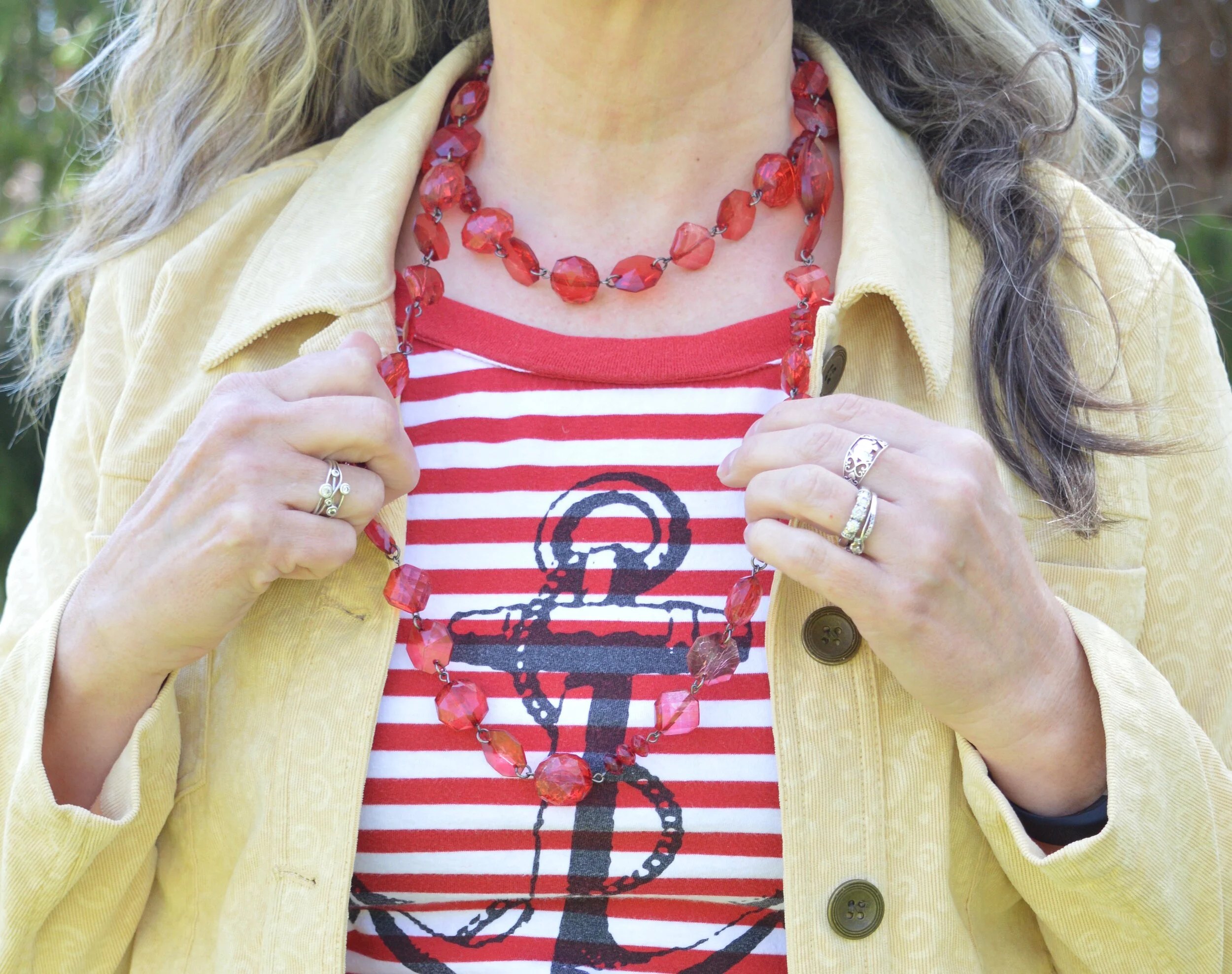
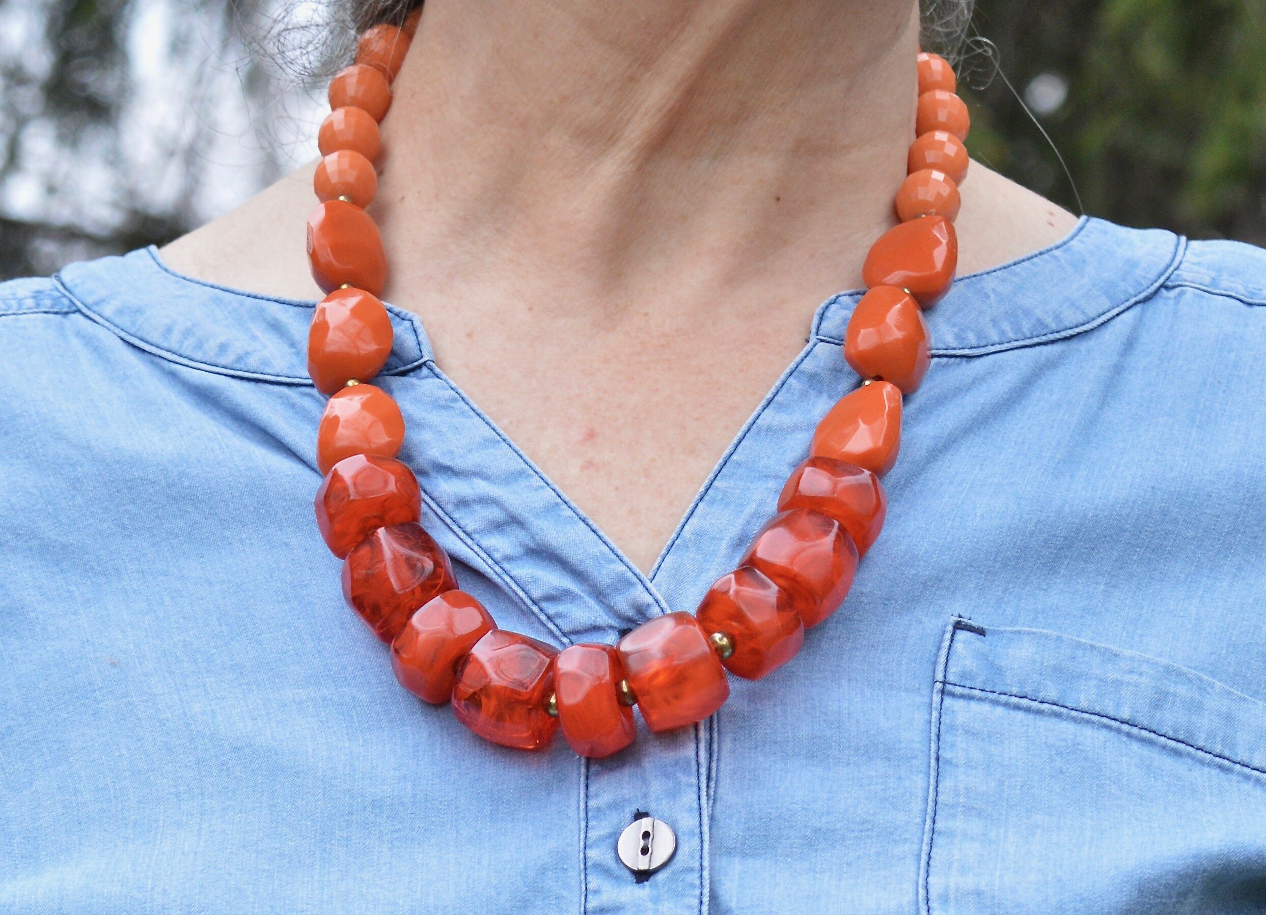
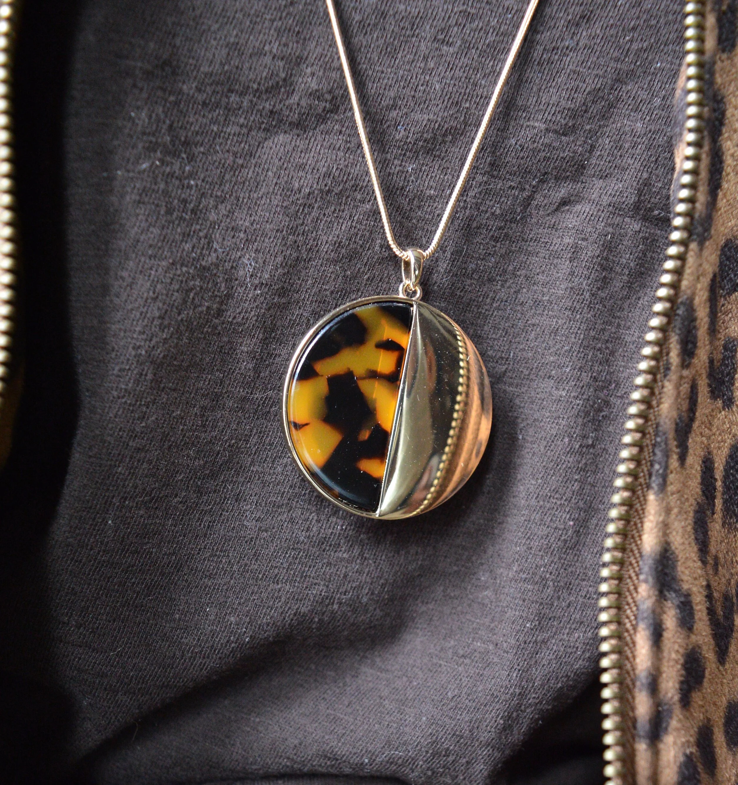
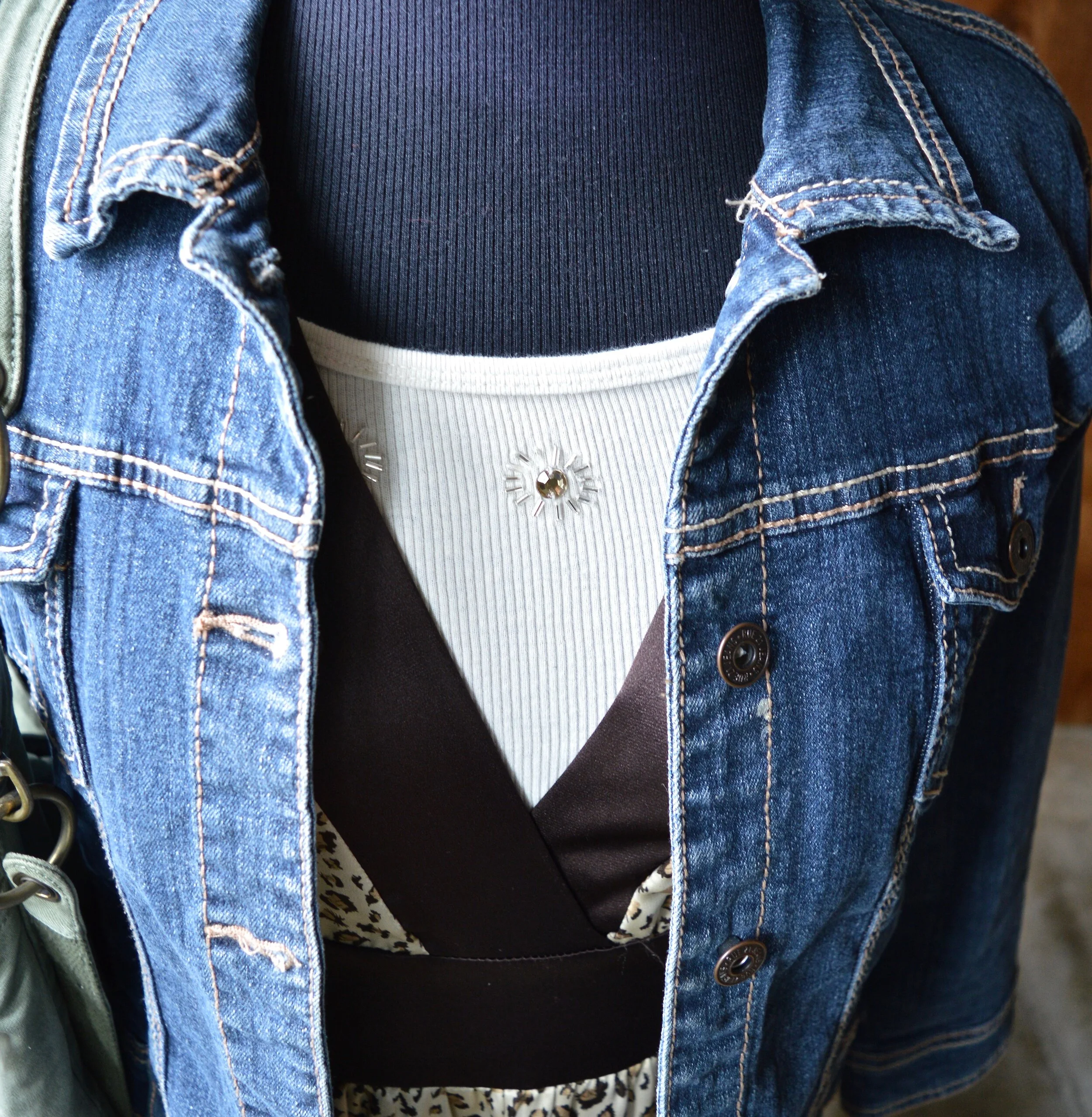
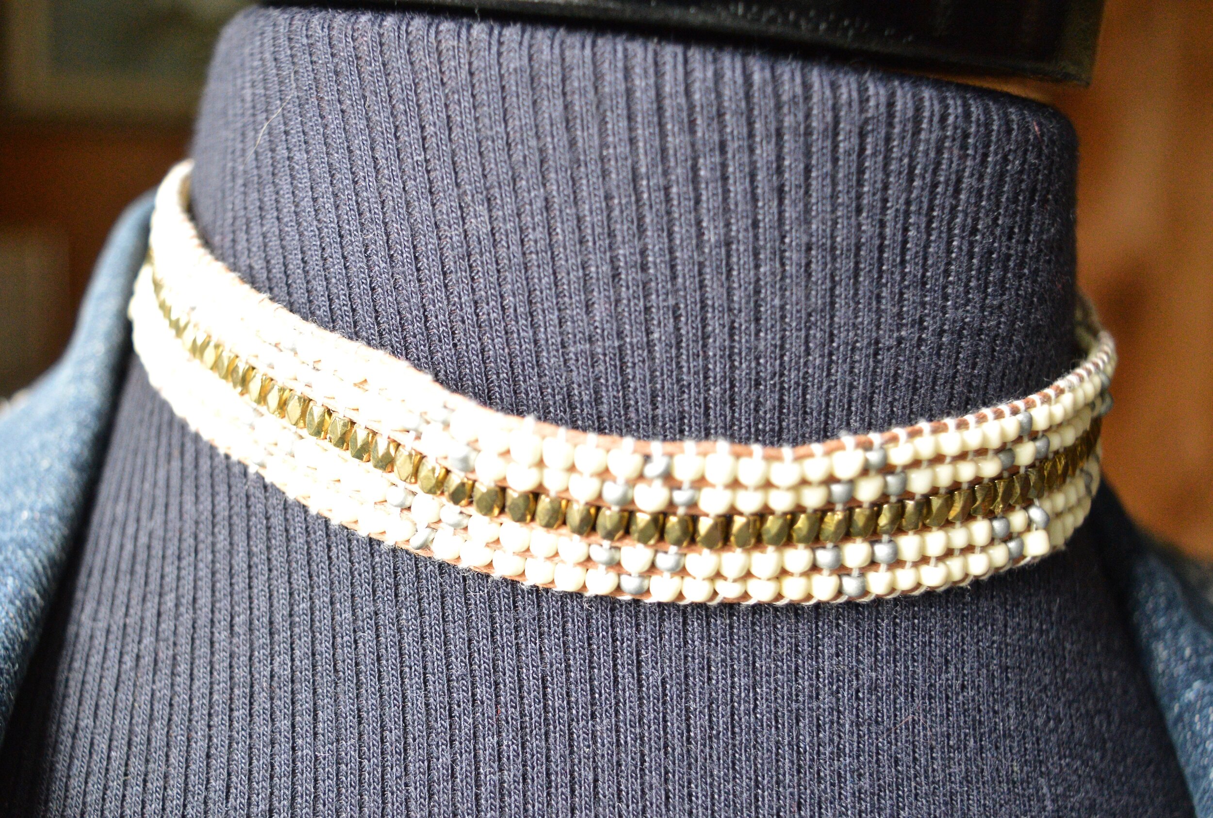
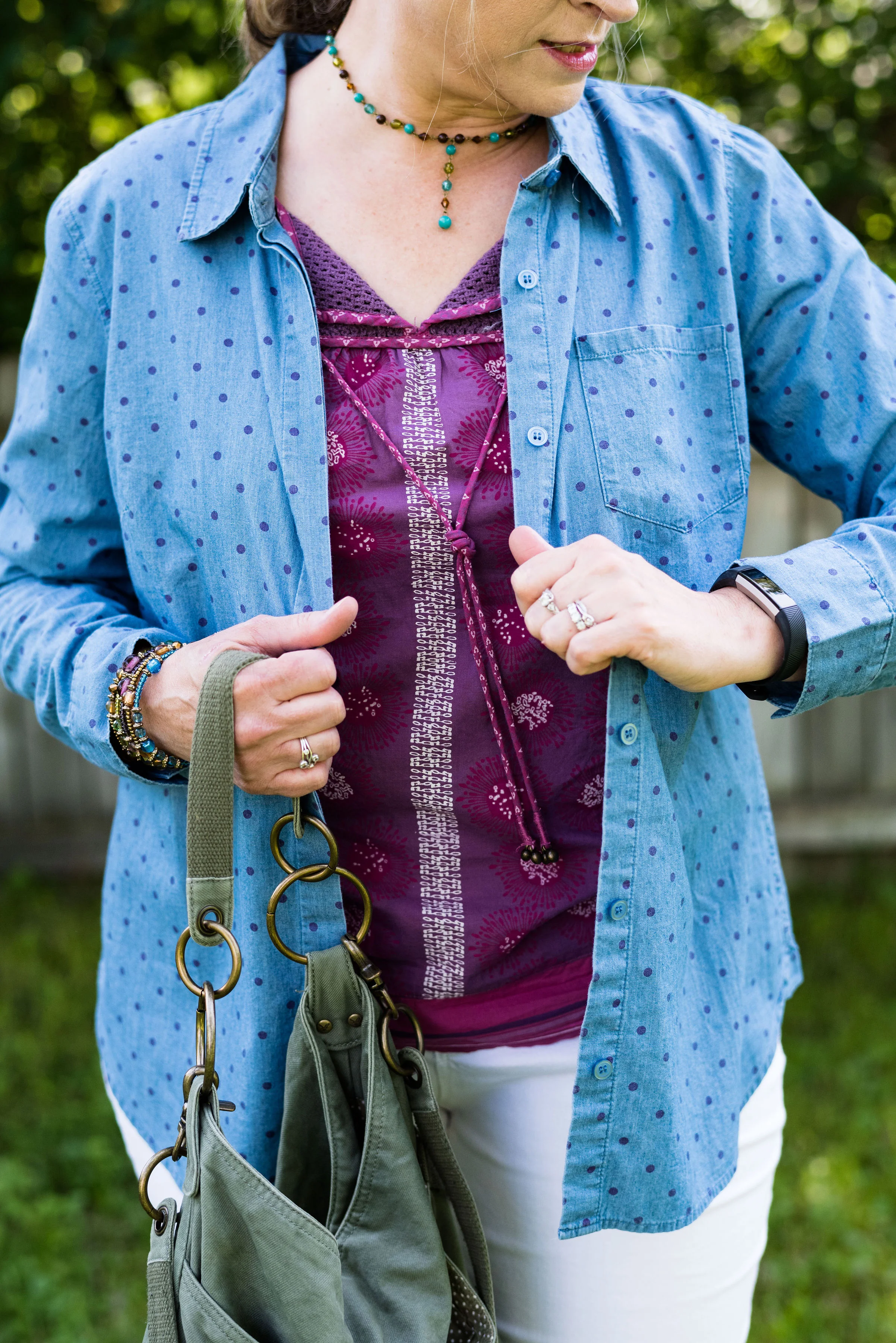
The next photo shows, not only my beaded necklace, but the gray, Worthington turtleneck sweater I wore under the vest. There is nothing like a cozy turtleneck to keep you warm in the winter months. This was the same one I styled a few weeks ago in my post, A Dickens’ Christmas - The Ghost of Christmas Yet to Come.

Winter Trends - Quilting

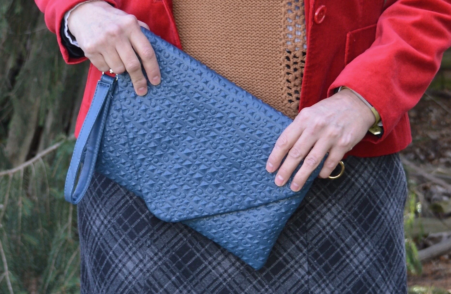
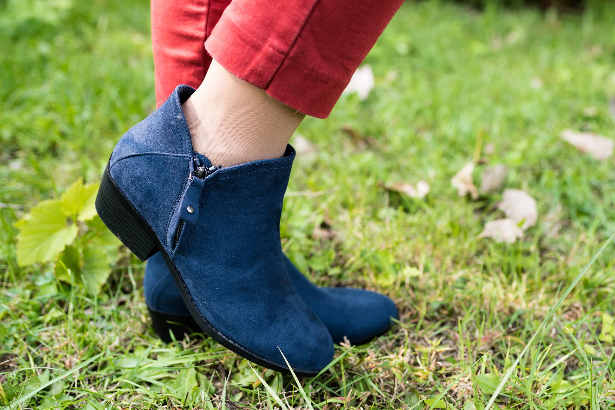
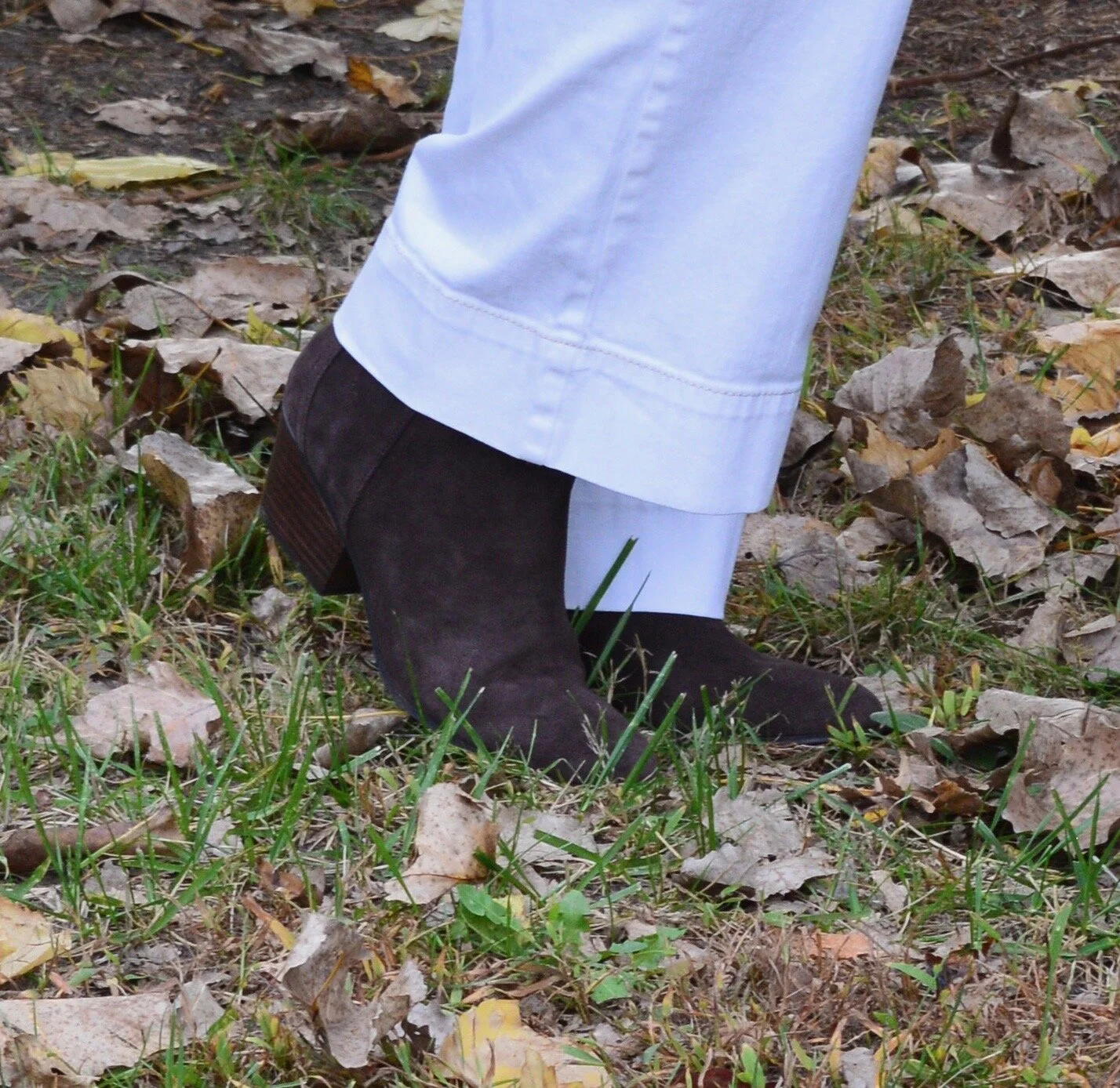
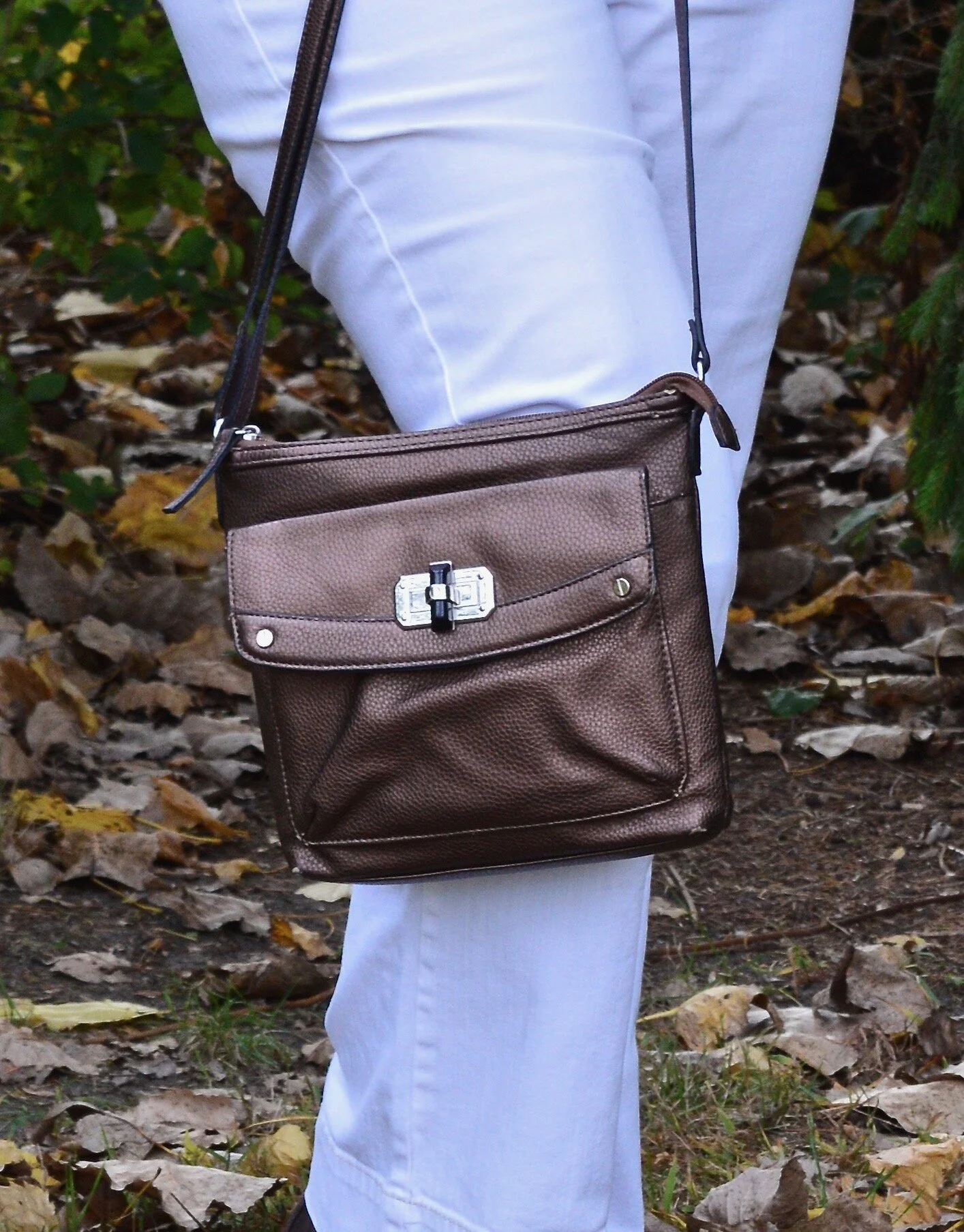
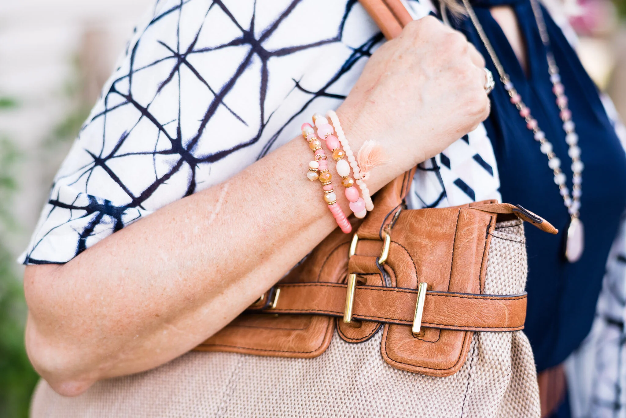
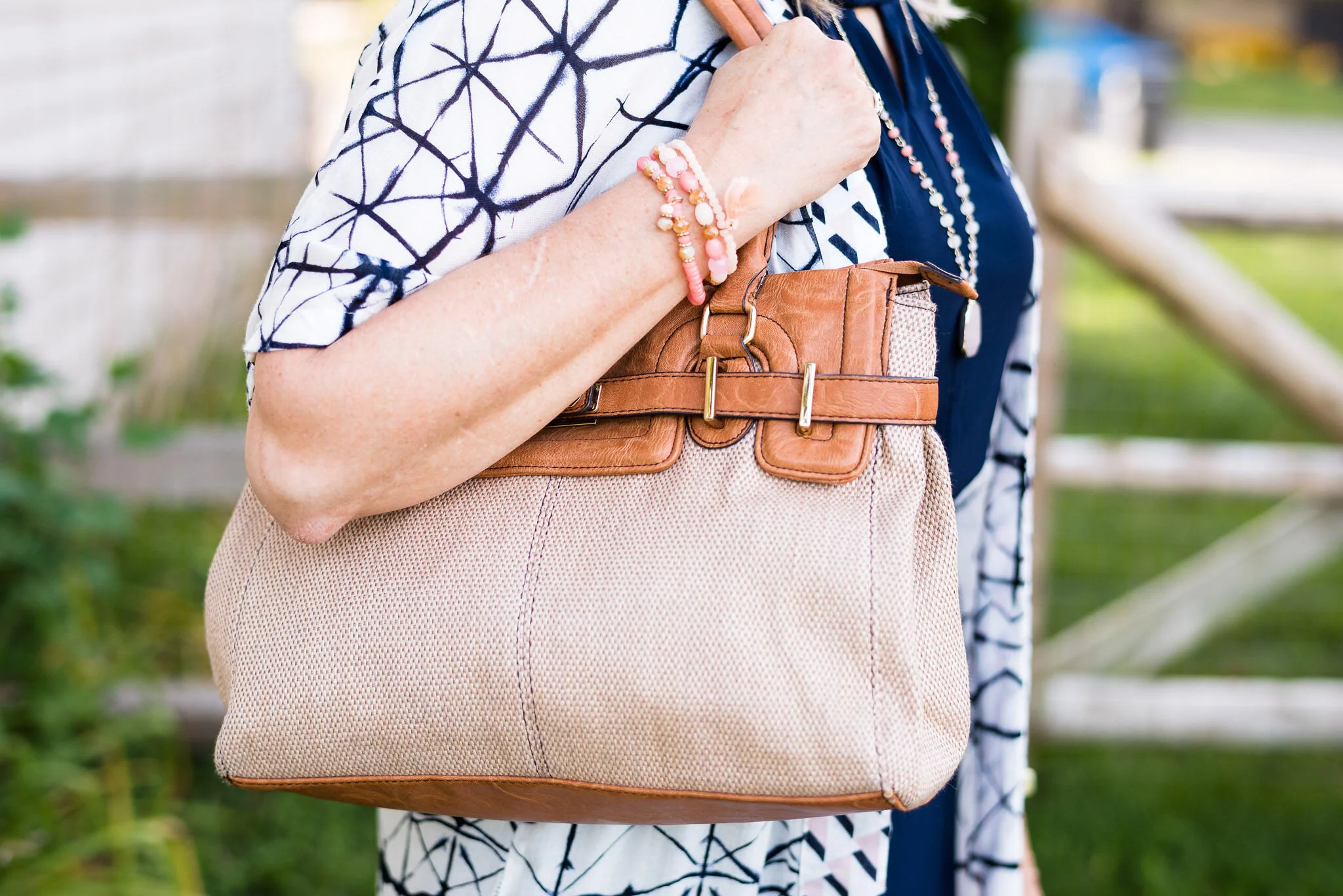
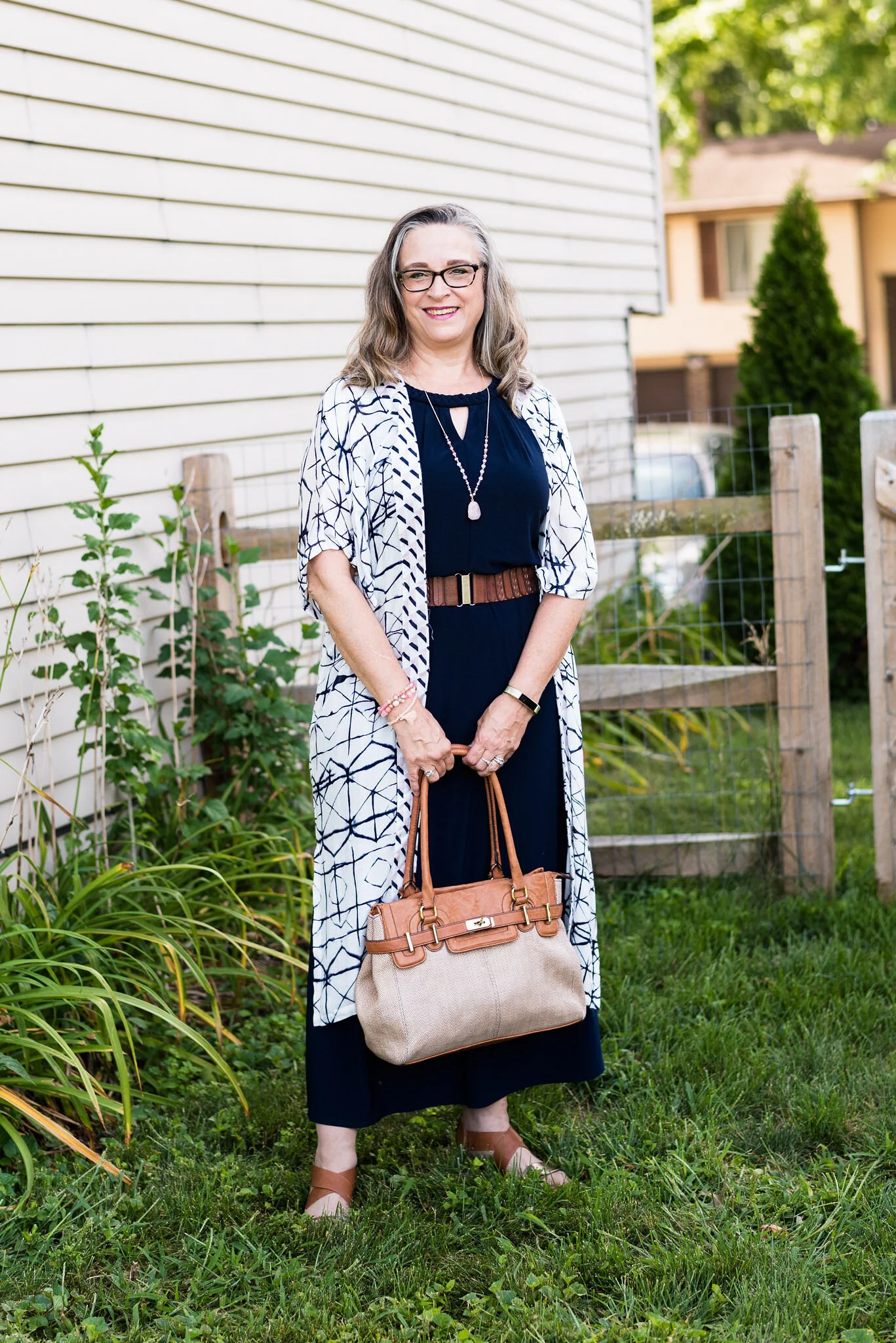
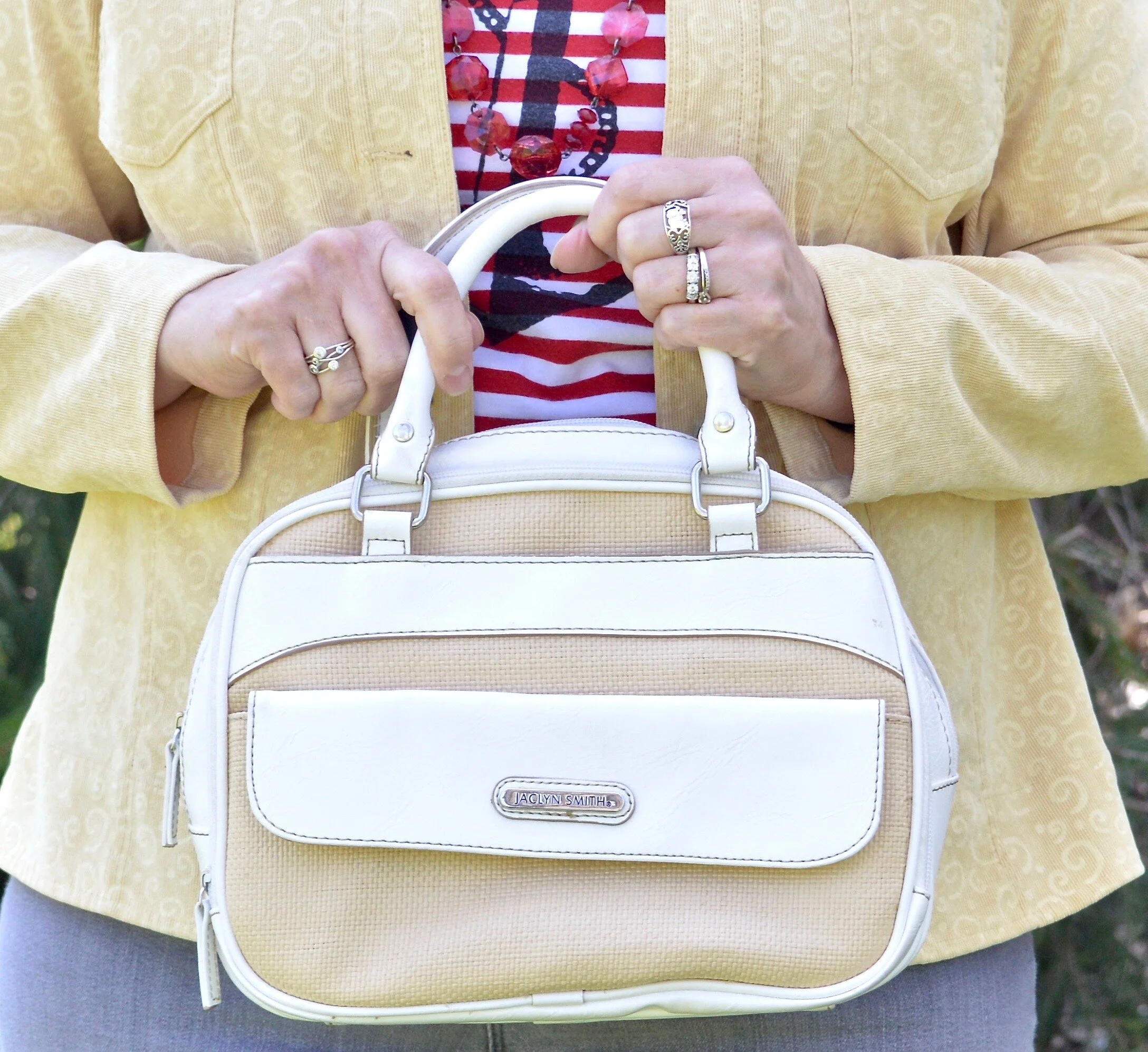
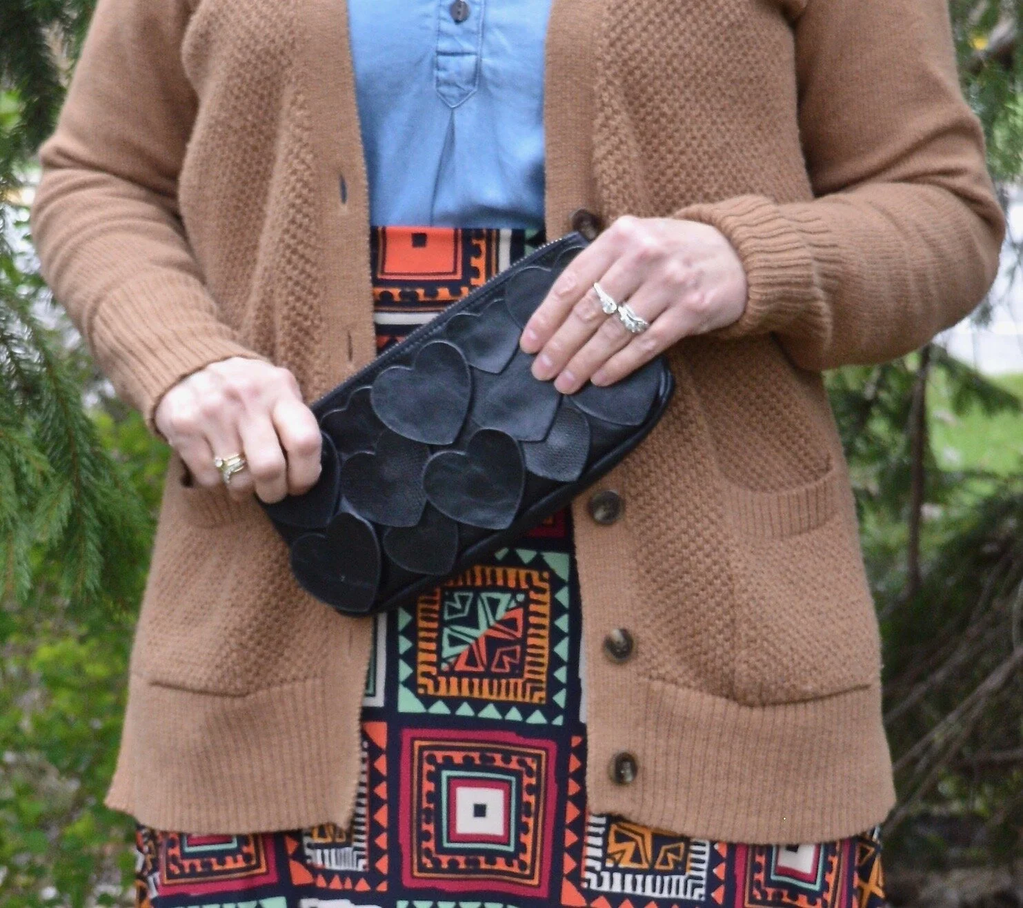
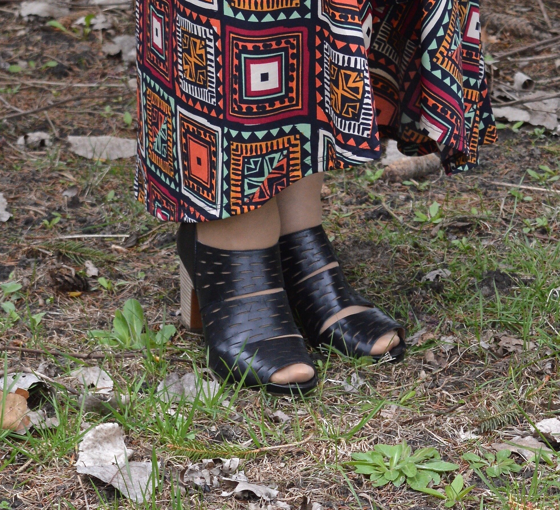
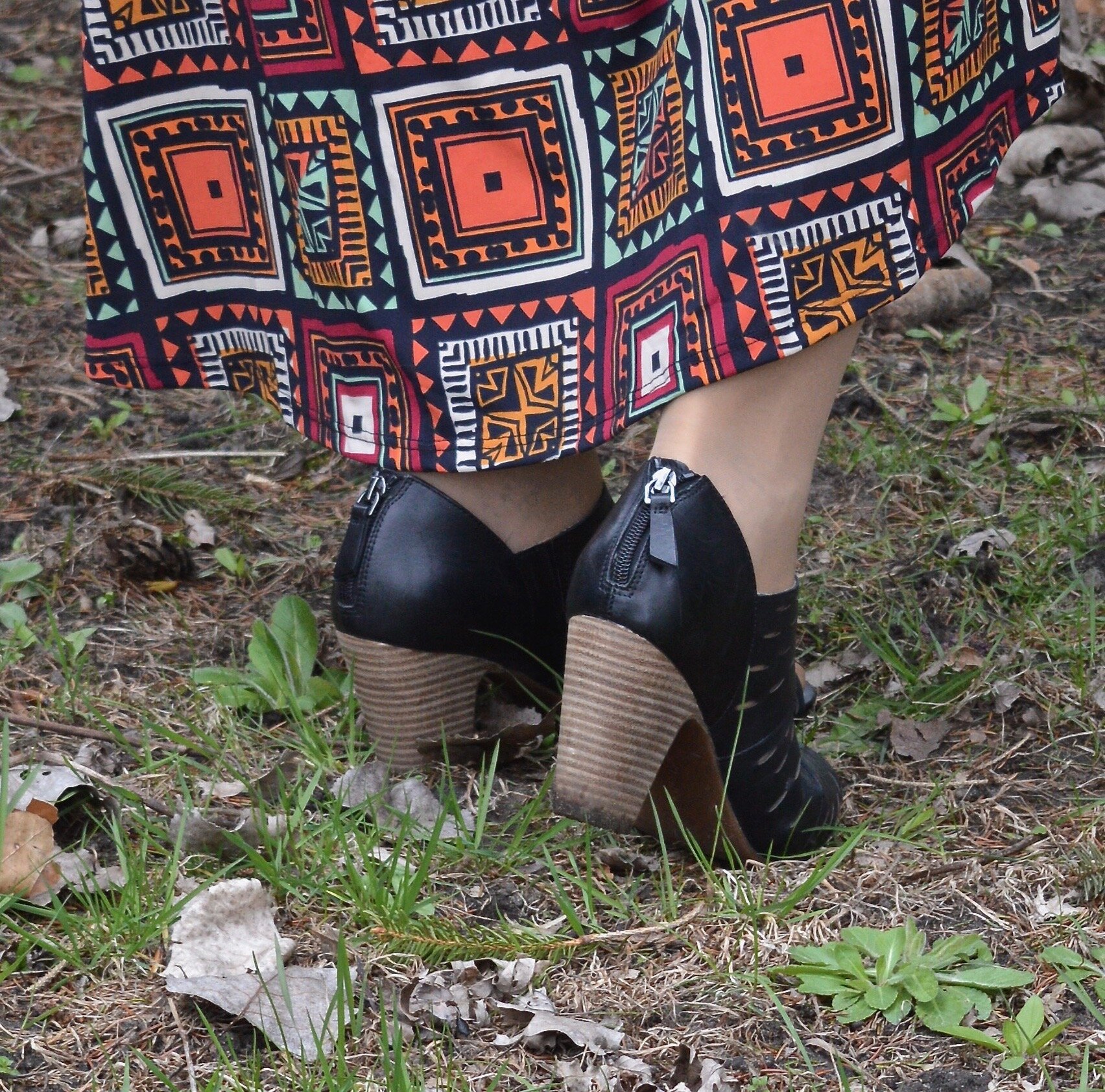
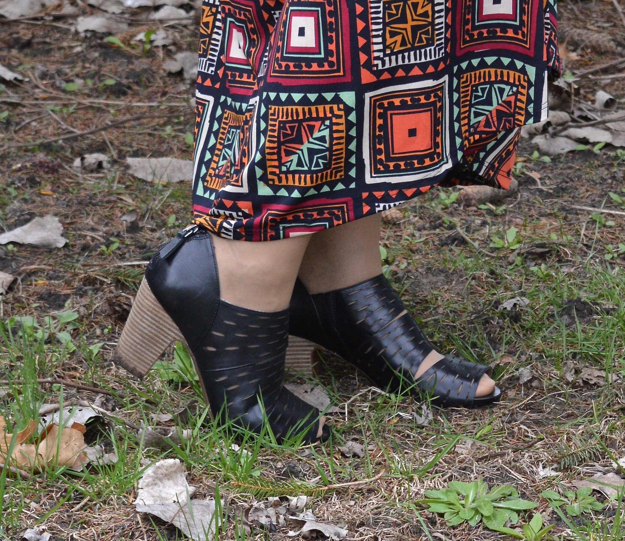
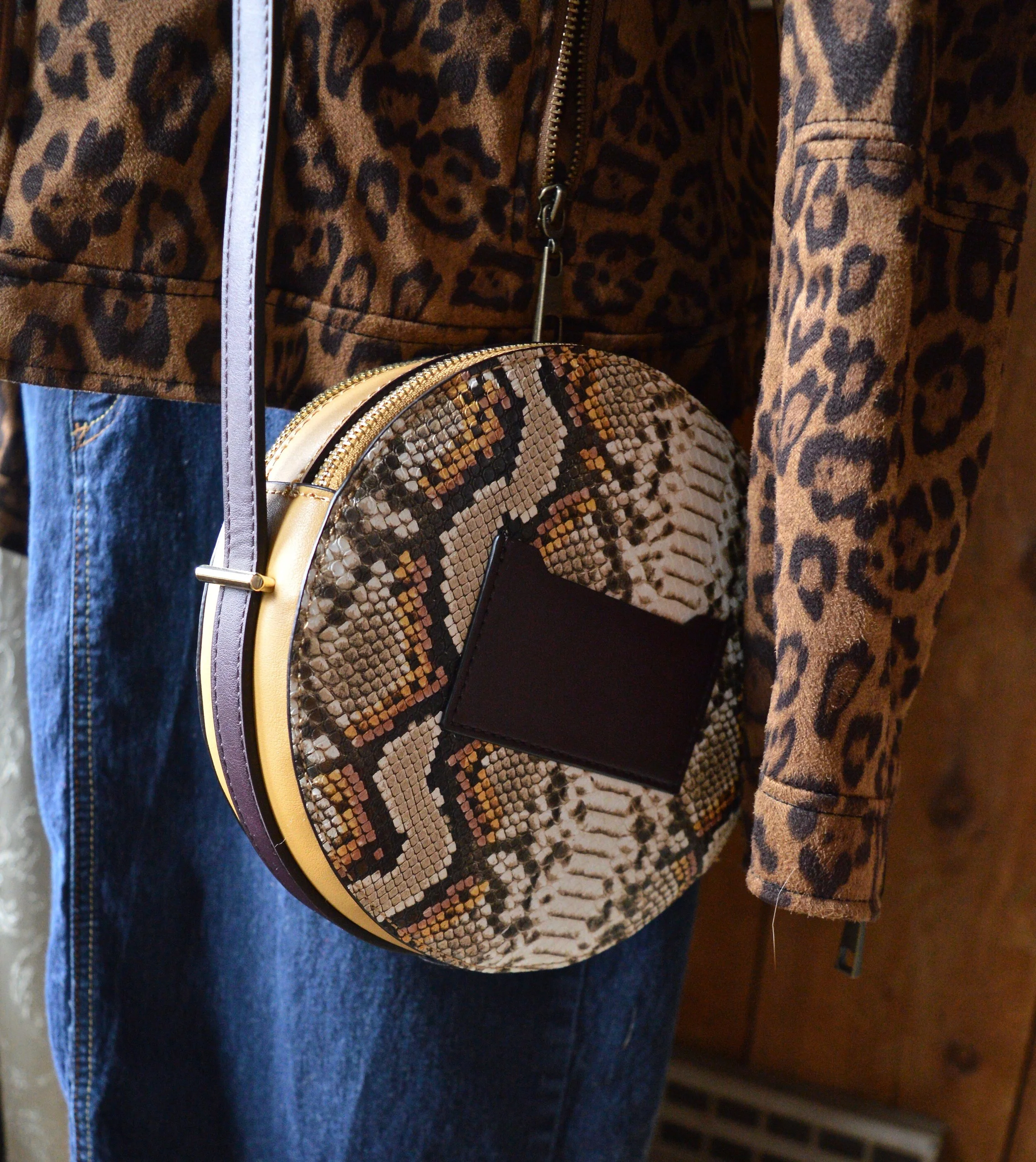
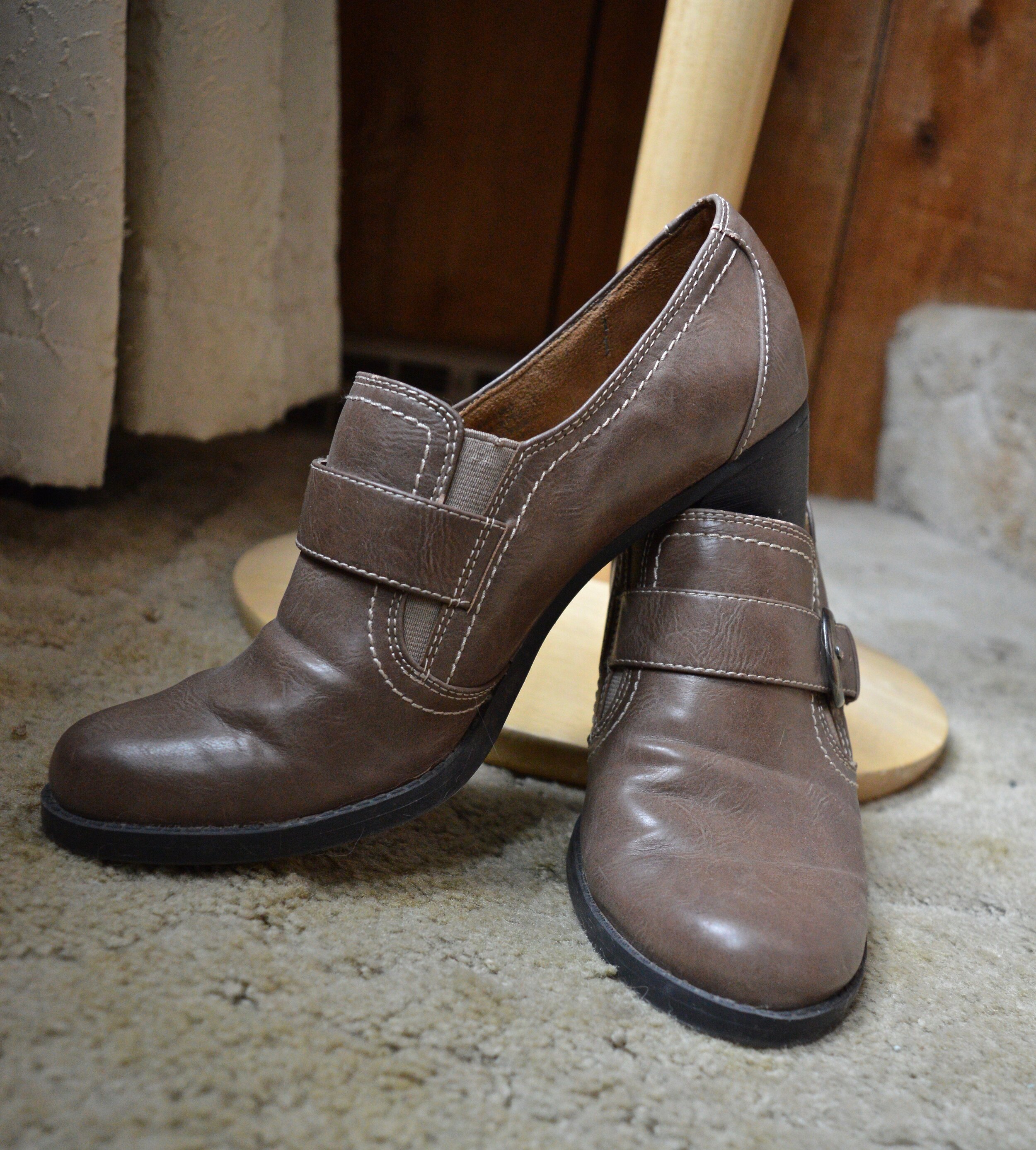
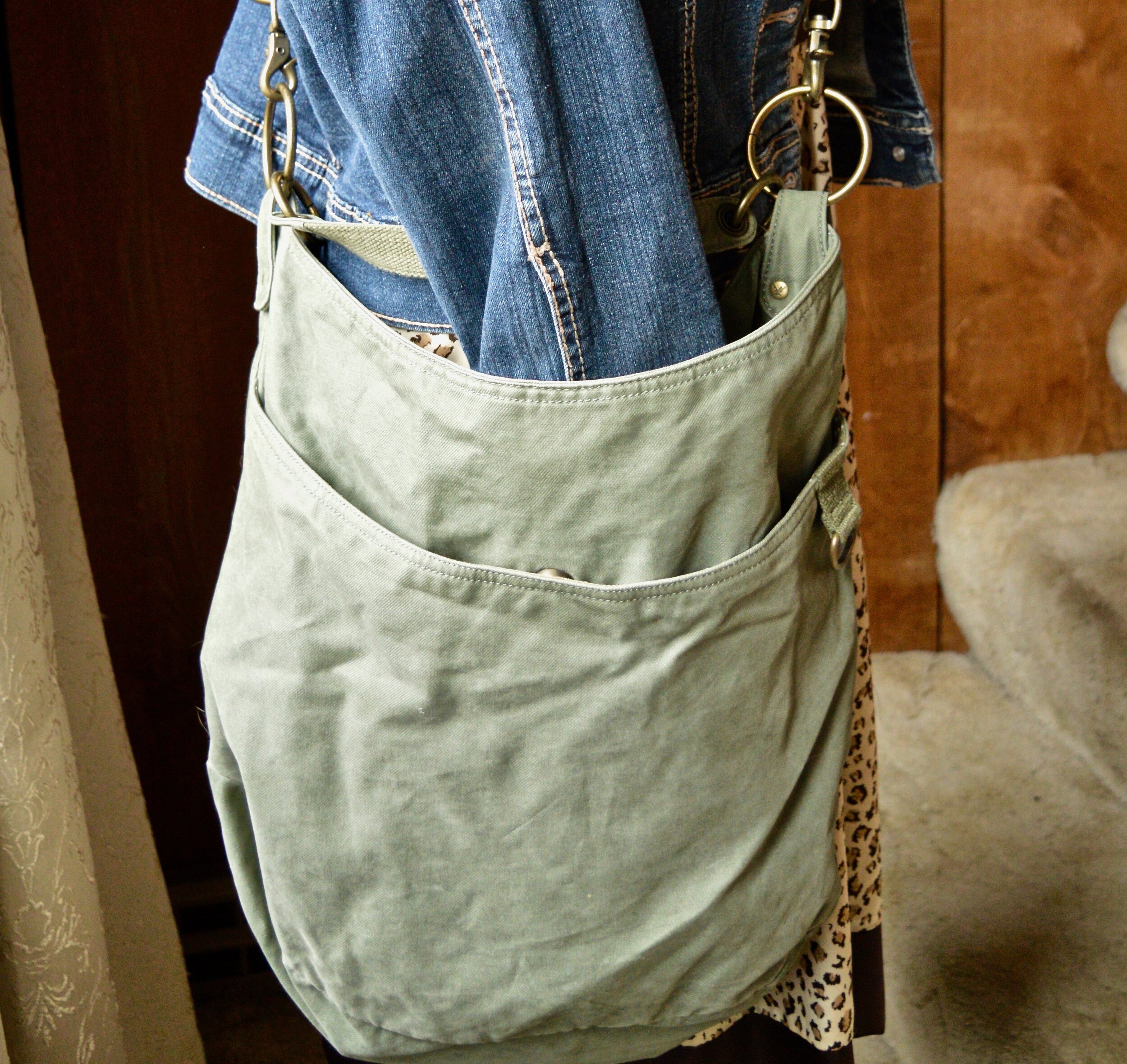
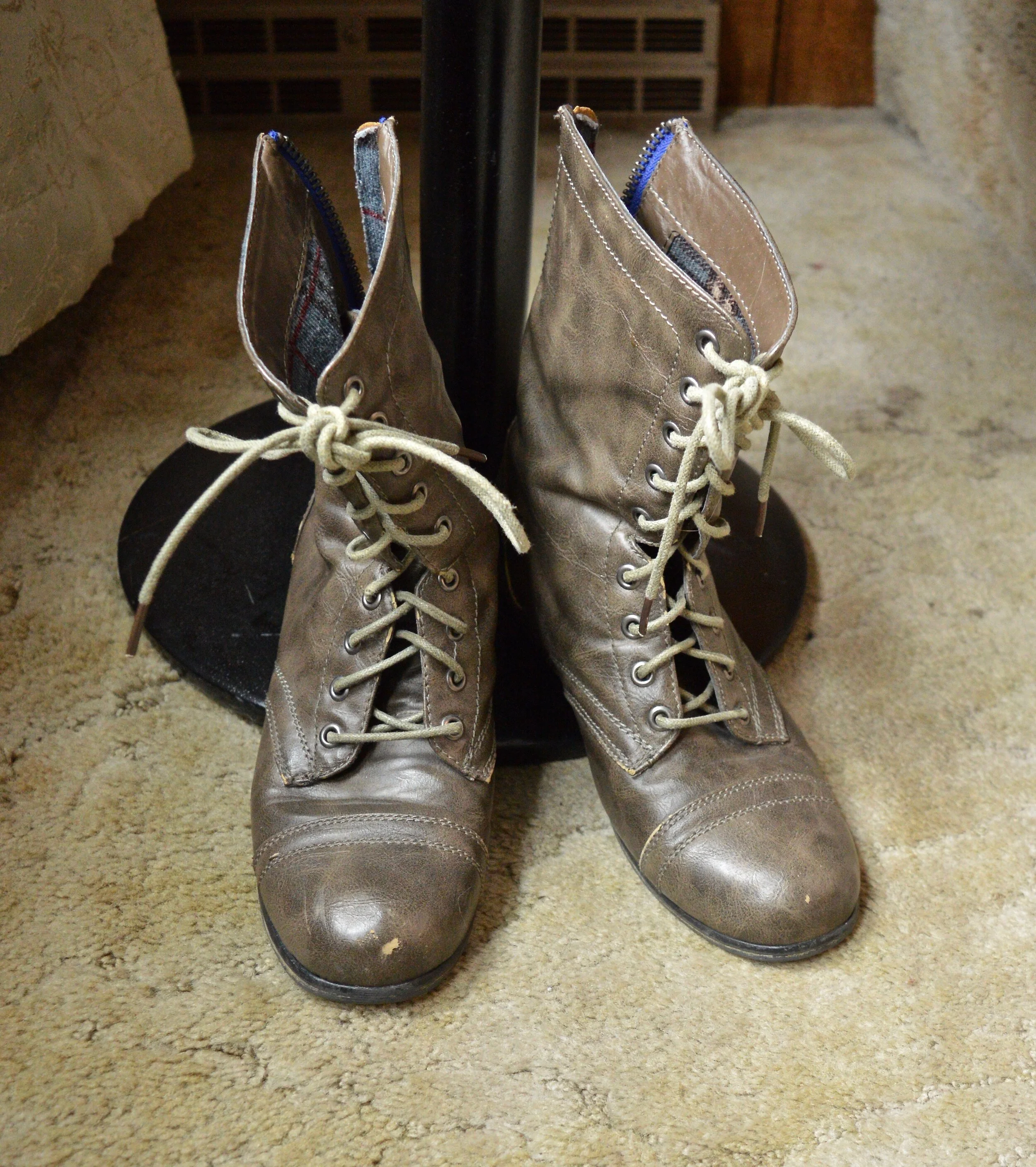
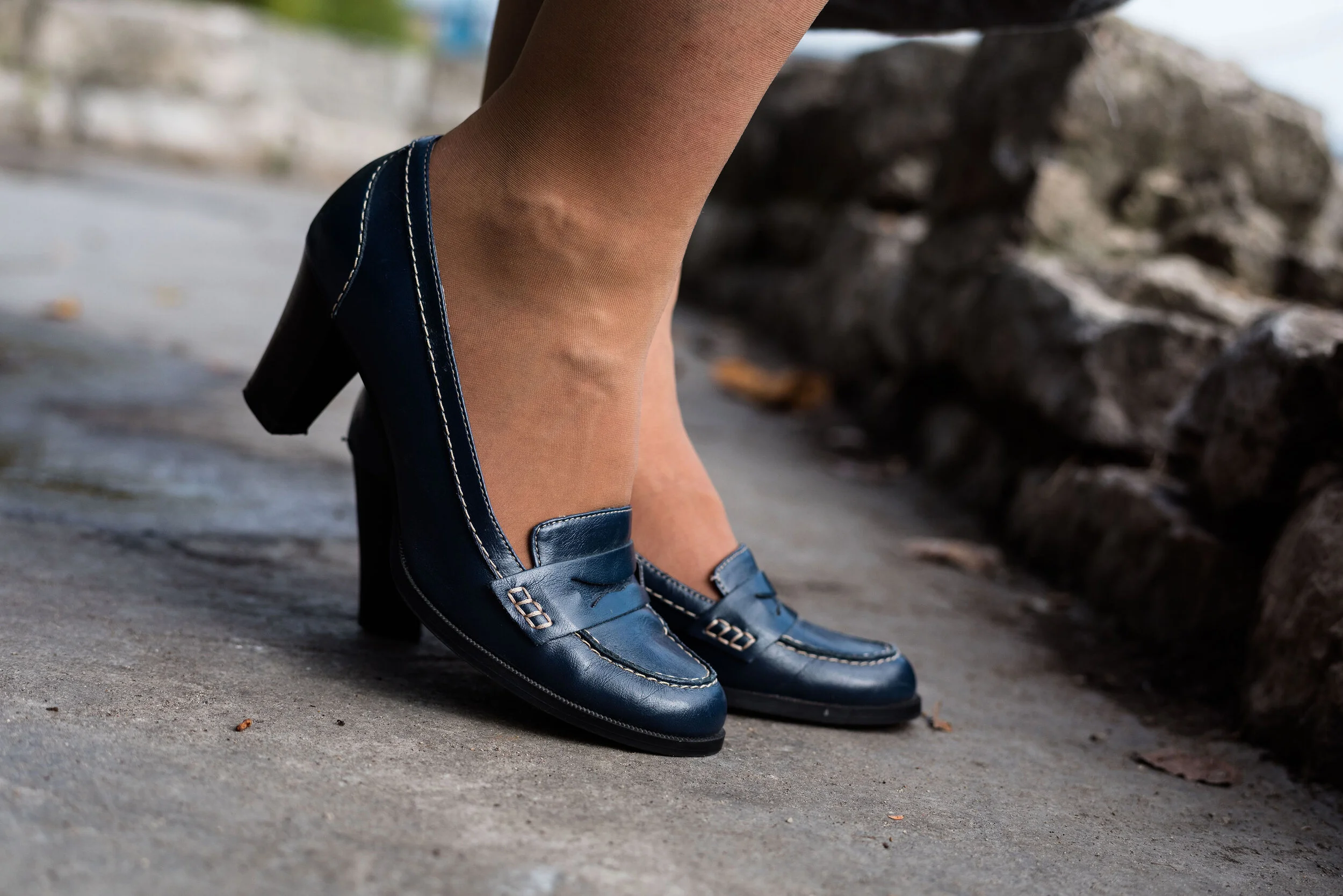
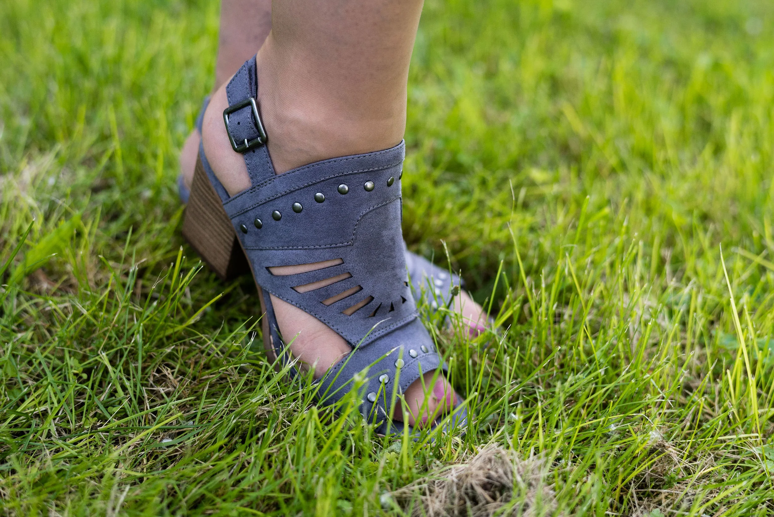
The only other accessories I had besides my beads were my faux suede boots and my gray convertible bag. These navy SO ankle boots have been on repeat this winter since I purchased them online from Kohl’s. My Evan Picone bag was a thrift find. I like that it can be carried as a top handle tote bag and also as a smaller cross body bag.

Winter trends - Quilting
Winter trends - quilting

Do you have any quilted pieces in your closet besides the comforter you throw on the bed? Quilting is hit or miss. Most of us have heard of Vera Bradley and I almost pulled out one of my tote bags, but it didn’t really go with what I was wearing. I do like many of her things, but it has to be the right pattern and style for me and I usually just look for them at thrift stores. I’ve included some of her products in the shopping links.

Winter trends - quilting

What did you think of this outfit? Would you wear patterned pants like these? I’d love to hear your thoughts, so leave me a comment or two.

I’m including a few shopping links, for all things quilted. These are affiliate links. All opinions are my own. I apologize that there are not more varied sizes available. I think a lot of things are selling out.

A Dickens' Christmas - Introduction

I love Christmas, and I especially love coming up with outfits around the holidays. If you have been following me for a while, you know I enjoy finding inspiration for my ensembles in all manner of places, from colors in the natural world, like leaves and flowers, to colors and designs in home decor and bathroom tiles. You also know I love using movies and songs around Christmas time to inspire outfits. Last year I used a number of my favorite Christmas carols and songs, some well known and a few that were less popular, to inspire a month of looks that were both somber and understated as well as fun and party ready.

This month I am going to switch from music to movies: from auditory to visual, to inspire my choices for outfits. All my outfits are going to be built around inspiration from a particular character or characters from a Christmas movie. Starting today, and for the next three Tuesdays, I am going to focus on Charles Dickens’ A Christmas Carol. It has long been one of my favorite stories from the Christmas season, but it has also become one of my favorite Christmas movies. On the following Thursday of each of those weeks, I am going to resume my monthly columns, but each outfit will be inspired by a certain character in different Christmas movies, which I will share with each post.

When I think of A Christmas Carol, I don’t usually think about the time period during which it was written, other than to see it as a back drop for the fabulous ghost story that Dickens weaves. This year, it struck me to look at what people were wearing during that time period and for this first post use that as the inspiration spring board for my outfit. These outfits are not meant to mimic a time period or character from the movies, but to simply draw inspiration from which to build an outfit I could realistically wear to work, a holiday party or a show.

A Dicken's Christmas - plaid skirt and red velvet jacket

When I started looking at 1800’s fashion, I was specifically looking at the dress of Christmas carolers. One of the costumes I saw was a long plaid skirt, a jacket with buttons and a tightly fitted bodice, with a small cape over the shoulders. Bonnets were also worn, typically with a large ribbon tied under the chin to hold the bonnet in place. You can see a “costume” version here.

A Dicken's Christmas - introduction

This gray and black, A-line, plaid skirt is from Christopher & Banks from a couple of years ago. While it looks like a wool blend, it actually is a medium weight knit, making it very comfortable, though not quite as warm, thus the heavy weight black tights. It would look cute with black boots and nude hose as well.

A Dicken's Christmas - introduction

I’ve styled this thrifted, red velvet, Briggs New York blazer on the blog two years ago, for this Christmas outfit. The idea to wear it with a white blouse seemed obvious, so I chose my H & M clearance pinstriped blouse from a few seasons ago. I also wanted to add an unexpected element, so I chose this Pepin brand knit vest. I do not remember where I picked this up, but knit vests are trending right now and they are a great way to add an extra layer of warmth around your core. I like both the unexpected color combination and the textural element it adds.

A Dicken's Christmas - Introduction

I picked up this paisley scarf at some thrift store along the way a number of years ago. It looks particularly festive for the Christmas season with its reds and greens, making it the perfect accessory to bring this whole outfit together. Instead of trying to tie a bow, I just did a regular knot.

Since the scarf also had blue in it, I decided to carry my blue, textured clutch.

A Dicken's Christmas - Introduction

I wanted to wear a heel rather than a flat boot for this look, so I chose my faux suede Aerosoles. The black shoe with the black tights helps to elongate the leg and wearing tights allows you to show off the shape of your gams without the unsightly varicose veins.

A Dicken's Christmas - Introduction

Does this look make you think of Christmas carolers back in Charles Dickens’ time period? Is this something you might wear to work at the office on a chilly winter day? You could easily pair it with a different colored jacket or sweater for a completely non Christmas look.

A Dickens' Christmas - introduction

I hope you enjoy this series and will follow along the rest of the month as we look at more Christmas movie outfit inspiration.

I am including a few shopping links, just for fun. These are affiliate links and come to you at no cost. All opinions are my own.

I hope your December is starting off well.


Pantone - Autumn/Winter - 2020 - London Palette - Burnt Henna, True Blue and Dress Blues

This is the last color combo in the Pantone - Autumn/Winter - 2020 - London Palette series. On Thursday I will have a recap post of all of the outfits from both palettes. Today’s outfit revolves around a cranberry red, a blue that is much like Classic Blue and navy.

sdf.jpg

Both of the Pantone palettes for fall were filled with blues and reds, but they also had plenty of other options, so if you are not a blue or red wearer, you still have other fabulous colors to wear. My Christopher and Banks ankle pants are not exactly Burnt Henna, but they will due. I got these and a pair of green ones when they were on clearance. They are stretchy, which allows for ease of movement. The only thing I don’t like about them is they have no belt loops. If a pair of pants fits perfectly you don’t really need a belt, but a belt always makes me feel more secure. Otherwise, I always feel like I am pulling my pants up. These are a size 12, which is usually my normal for Christopher and Banks.

Pantone - Autumn/Winter - 2020 - Burnt Henna, Strong Blue and Dress Blues

True Blue is very much like Classic Blue. It is not a dark navy, like the Dress Blues, but a nice medium blue that almost everyone can wear. I wanted to wear layers, so I added a Christopher and Banks cardi and the scarf.

My Dress Blues jacket is a thrifted Ruff Hewn piece. It is a moto jacket, but instead of being strictly leather, or faux leather, it is made of a linen/cotton blend and faux leather for the leather like portions.

Pantone - Autumn/Winter - 2020 - Burnt Henna, True blue and Dress Blues

My plaid button down shirt is also a Christopher and Banks purchase from this year. It is a little bit textured which gives it an added dimension, even though in these pictures you can’t see it very well.

Once again, with all the layers and textures, I kept my accessories very simple. I have a navy flower pendant necklace, but unlike many pendant necklaces, mine is shorter.

Pantone - Autumn/Winter -2020 - Burnt Henna, True Blue and Dress Blues

You’ve see this Simply Vera Vera Wang bag on the blog before. This was a thrifted piece and provides a nice, roomy area which is especially good for traveling to pack a few extras like a notebook or reading book. I also added a few beaded bracelets with blues.

Pantone - Autumn/Winter -2020 - Burnt Henna, True Blue and Dress Blues

Finally, these are my newer ankle boots. Once again, these are SO brand, which are my go to faves for ankle boots from Kohl’s. They fit (size up a half size if you want to be able to wear extra thick socks in the colder temps), are easy to get on an off and seem to hold up quite well in our ever changing weather here in the mid west. These are the first pair I’ve gotten that actually have the zipper on the outside of the foot rather than the inside, which is a nice contrast.

Pantone - Autumn/Winter - 2020 - Burnt Henna, True Blue and Dress Blues

What do you think of this outfit? Do you like these colors? Would you put these colors together, or would you find some other color to pair each of these with? I love hearing your thoughts, so be sure to leave me some love in the comments.

Pantone - Autumn/Winter - 2020 - Burnt Henna, True blue and Dress Blues

I am including a few shopping links. You can use these links to shop for yourself or for future Christmas presents for others. There is no extra cost to you to shop through my links. In fact, what it does is generates a tiny bit of income for me. Every click you do, gives me a few pennies. These are affiliate links. All opinions are my own.

Photo and graphic credit Rebecca Trumbull.


Color Play - More Fall Mixing

My daughter has come into her very busy season and has numerous editing projects on her plate from all sorts of clients, so my Pantone - Autumn/Winter - London Palette series is going to be delayed for a little bit. In the mean time I am falling back to my Thursday columns, so today’s is based on, of all things, fall colors. You just aren’t going to get away from my obsession with color. Ha, ha.

Today’s outfits are centered around a thrifted Christopher and Banks jacket. I absolutely love the muted frenzy of colors and I knew it would be something I could wear repeatedly throughout fall, winter and spring. This is the back of the jacket. It is shaped and feels somewhat like a denim jacket, though the material seems a little less stiff. I paired the jacket with a rusty colored long sleeve tee that I got last year at Maurices. I am going to show you three ways these two pieces can be styled for different looks.

DSC_0034.jpg

Look 1 - With Jeans

This first look was what I wore on the day I took these pictures. This is a simple look with my Rock & Republic jeans that I have had for years. I added my Sonoma faux suede boots to keep the fall color scheme intact, then I added my purple agate pendant necklace and a purply blue gingham scarf. The last piece to add was the thrifted olive hobo bag. I love the little ruffle on the sleeve hem on the tee. The sleeves on this jacket were the perfect length to let the sleeves stick out.

DSC_0004.jpg
Color play - fall mix
Color Play - fall mix

Look 2 - With White Jeans

For this look I swapped out the regular jeans fro my white Gloria Vanderbilt pair. I also removed the scarf, put on a different necklace and changed the bag and boots. White all year round is simple the rage, and that is one trend I am willing to put up with. These jeans are especially suited to the cooler weather, because they are a heavier weight. They also have a wider leg, so it is easier to get taller boots under them.

Color play - fall mix
Color Play - fall mix

These brown ankle boots are a new pair I ordered from Kohl’s. I just love my suede and faux suede ankle boots and wear them all the time. I decided to add this dark brown Nine West pair to my collection because they were on sale and I had a coupon. To go with the boots I chose my thrifted bronzy colored shoulder bag.

Color Pay - fall mix
Color Play - fall mix

Look 3 - Green Skirt

In the final look I chose my thrifted Old Navy tiered skirt, which I have styled numerous other times on the blog. I also added a pale yellow gingham scarf that I bought from the Jacket Society three years ago. Nora always has such unique and beautiful pieces. Be sure to check out the scarves and wraps here. I swapped out my bronze bag for this purple Nicole bag with gold chain handle accents, and my ankle boots for these thrifted mid-calf leather heeled boots. You can see I also added a woven belt that goes with the boots, just for some fun added texture and contrast.

Color play - fall mix
DSC_0031.jpg
Color play - fall mix
Color Play - fall mix

Here are all three outfits side by side. Which one do you like best? Do you have a colorful jacket that you were thinking of getting rid of because you never wear it? How about trying some of these ideas and making your wardrobe work for you?


I hope you enjoyed this post. Let me know your thoughts on these outfits. Tomorrow I will have a new Faith post on the blog, so be sure to stop by and check that out.

Have a great day!

I’ve included a few shopping links for printed jackets. These are affiliate links. It does not cost you anything to click on a link to shop, but it might pay me a few cents. Enjoy!


Pantone Fall/Winter 2020 - New York Palette - Samba, Fired Brick and Sleet

Red is not everyone’s choice of color, but this fall, both the New York and the London Color palettes offer a number of red shades that are sure to suit in one form or another. Whether you wear a whole outfit of red, red pants so they are not near your face, or just little splashes of red in your accessories, red is meant to be worn by everyone. I decided to pair these two different reds together, unfortunately the pictures don’t really pick up the Fired Brick stripes on my tee. They actually are a more brick red color. Oh well, this is about real life, so real life doesn’t always work out exactly as we planned. In fact, more often than not, it seems to be just the opposite. However, I do like this outfit, so let’s take a closer look.

Pantone Fall/Winter 2020 - Samba, Fired Brick and Sleet

I thought a little print mixing would be fun, so I pulled out these gray plaid crop pants from NY&Co. I’ve styled these on the blog before. You can see them styled with a brown moto jacket, with a silk sweater set, and with an asymmetrical vest.

Pantone Fall/Winter 2020 - Samba, Fired Brick and Sleet

My faux moto jacket is from Christopher and Banks. They do have some nice jackets, so I am always checking on their website to see what’s new. Right now they seem to have gotten away from the moto jackets, but they have this pretty plaid trucker jacket and this fun corduroy one.

sambaredfashionoutfit-8.jpg

My thrifted striped tee is Levis brand. Like I said, in person, you can tee it is a different red than the jacket, but for some reason it looks exactly the same. So many factors are involved in photography as my daughter would tell you.

Since the gray plaid has a light stripe in it that could be blush or tan or cream, I thought blush accessories would be fun and an interesting choice for a fall outfit. The thrifted blush bag you’ve see on the blog before and is also NY&Co brand. The booties are also making another appearance. I found these on clearance at Kohl’s a couple seasons ago and had to have them because they have bling. Ha, ha. they are SO brand.

Pantone Fall/Winter 2020 - New York Palette - Samba, Fired Brick and Sleet

My jewelry is very simple: a bead fringe necklace and a gold bangle bracelet.

Pantone Fall/Winter 2020 - Samba. Fired Brick and Sleet

What do you think of these colors? I do have quite a bit of red in my wardrobe, both the brighter, bolder Samba and the darker, more moody Fired Brick. What about you?

Pantone Fall/Winter 2020 - New York Palette - Samba, Fired Brick and Sleet

I hope you are enjoying this series. I am going to forego my Thursday columns for the next few weeks so I can get through the Pantone colors before we head into Halloween and the holiday season. Hard to believe we are already thinking about that.

Here is another look at the entire New York Palette.

Pantone - Fall/Winter 2020 - New York Palette

Have a great week everyone.

Graphic and photo credit Rebecca Trumbull.

Here are a few shopping links. Be sure to take a look. These are brought to you at no cost to you, unless you purchase something of course. Every time you click on a link, I get a few cents. I appreciate every click. These are affiliate links. All opinions are my own.


'


Kickin' It with Kimonos - White Print

Today’s outfit features a longer kimono with the more traditional rectangular shape with sleeves. I have styled this pretty Sonoma kimono one other time on the blog. You can see it styled for a casual look with ankle jeans and a silk sweater top. I found this piece on the Kohl’s clearance rack last summer. Speaking of Kohl’s, I got a 40% off coupon in my wallet that I need to use before the day is over. Plus, my hubby had gotten me a Kohl’s gift card for our anniversary, so I guess I will be doing a little online shopping today. Ha. ha.

Kickin' It with Kimonos - white print

I have shown you how to wear kimonos and ruanas with skirts, shorts, white pants, short dresses and jeans. Today I thought it would be appropriate to show you, that you can also wear a kimono or ruana with a maxi dress.

I have had this navy, column type maxi dress from Christopher & Banks for a few years. It is a medium weight knit, so no need for a slip. It drapes nicely and can be dressed up or down, depending on where you want to wear it. The heavier knit has stayed fresh over the years, so the dress never looks worn or faded. The dress has its own elastic waistline and came with a simple cloth, tie belt. I typically use other belts to jazz it up a bit, but you really wouldn’t have to use a belt at all. You can see how I styled this sleeveless piece before in my Marvelous Maxis series.

Kickin' it with kimonos - white print

When I chose my accessories, I wanted to keep the look slightly more casual, so I opted for browns and a little blush in my jewelry to pull out the very light pink along the front edge and neck line of the kimono. My sandals are Croft & Barrow, Ortholite brand and they are very comfy. The bag was a thrifted Aldo piece. I really like how the earth tones of the bag, sandals and belt really compliment the whole outfit.

Kickin' it with kimonos - white print
Kickin' it with kimonos

Here’s a few twirling pictures. What little and big girls don’t love a good twirl…but not too much, or I’ll get sick. Ha, ha. The joys of aging!

I do like how this outfit turned out. What do you think? Have your worn a kimono with a maxi dress? I’d love to hear your thoughts. Your comments do help my blog grown and they also help me to know what content you enjoy reading, so if you have a moment, leave me some love.

Kickin it with kimonos - White print

I am including a few shopping links for you to look over. Have fun shopping! All you clicks give me a little bit of money. These are affiliate links. All opinions are my own.

Photo credit Rebecca Trumbull.


Kickin' It with Kimonos - Yellow Floral

It seems that floral is a very popular pattern for kimonos. I am not sure it that is because most of us use our kimonos during the warmer months as a way to level up an otherwise, “normal” outfit like a pair of jeans or shorts or if I just am more naturally drawn to the floral prints in my purchases. Today’s kimono is a shorter style, but once again is covered with a floral print, although this time a bit more tropical.

Kickin it with kimonos - yellow floral

I was on the verge of getting rid of this pretty yellow kimono. It is a brand called TruSelf and I think I got it at Walmart a few years ago. I am not real thrilled about the length of this piece. If the hemline was more asymmetrical, I think I might like it better, but for the sake of trying something different I kept it.

One of the bloggers I have followed since becoming a blogger is Jodie at Jodie’s Touch of Style. Jodie is such a warm, friendly lady, and an actual person. She isn’t at all fake, and I love that about her. Most of the fashion bloggers I follow are real women, who have their own sets of struggles and difficulties, but they are trying, just like me, to accept themselves and this process called aging. Jodie featured a post on a different way to wear your kimonos and that is where I learned this trick of tying the front to give the kimono a different look. You can see Jodie’s original post on how to make kimonos look more fitted here.

Kickin' it with kimonos - yellow floral

I tied mine differently than Jodie did in her post, but it still serves the same function, to make the kimono more fitted, rather than boxy. Here’s what it looks like tied up.

Kickin it with kimonos - yellow floral

My light blue tee is a thrifted Sonoma piece. I love graphic tees and a great place to find them are thrift stores. Whether you like band tees, place tees or just random word tees, you can find plenty of different graphics second hand. Be sure to check out the men’s section as well. I found a few tees that were perfect for my younger daughter.

Kickin' it with kimonos - yellow floral

My pin striped skirt is reminiscent of the old time railroad engineers’ caps. this was a recent online purchase from Christopher and Banks. I was looking for another pencil type skirt with a little different look than just plain denim. This works perfectly. I am looking forward to cooler weather and styling this skirt with some tights and ankle boots.

Kickin' it with kimonos - yellow floral

Since the chunky sneaker look is trendy with skirts and dresses right now, I knew I could add my bright blue thrifted Keds and be spot on. My other accessories consisted of my thrifted Jaclyn Smith bag, a navy flower pendant necklace from Christopher and Banks and a simple beaded navy bracelet.

Kickin it with kimonos - yellow floral
Kickin' it with kimonos
Kickin it with kimonos - yellow floral

Do you have a kimono in your closet that you are not sure how to wear? I hope these little posts are offering you some inspiration. Sometimes we only need a new way of looking at something to give us a whole new set of ideas for styling outfits with clothes already in our closets.

I hope you week is off to a great start.

Photo credit Rebecca Trumbull.

Have fun looking over the shopping links below. These are affiliate links. All opinions are my own.


KIckin' It with Kimonos - Gray and White Plaid

Today, I am beginning a series on wearing kimonos. My kimono collection has grown in size and I really love how they can dress up an outfit and give it a whole different feel and look. The kimono has been around for hundreds of years and were, at one point in time, the traditional garb in Japanese cultures. Today most instances of kimono wear in Japan are for more formal occasions and typically worn by older people as a way to honor others at funerals and weddings. They are also used for cultural festivals and plays.

In the fashion world the pieces we refer to as kimono are only similar to their predecessors in the cut of the fabric. While traditionally the kimono was made of specific types of fabric such as hemp or for more formal occasions, silk, today the kimono is found in all fabrics and sizes. The word itself has come to embrace a much broader meaning and type of piece than what it was traditionally. Now anything we thrown on over a top that is long, flowy and has sleeves we refer to as a kimono, even though some of these pieces are actually more specifically called ponchos, capes, and ruanas.

Today’s look revolves around a kimono I found at Kohl’s online in the clearance section. I didn’t have anything that was plaid, as far as a kimono goes, so I thought it would be a fun addition to my collection.

Kickin' It with Kimonos - Gray and White Plaid
KIckin' It with Kimonos - gray and white plaid

This piece is shaped more like a traditional kimono, coming down to my knees and sewn in a t-shape with the side seems and attached sleeves. This Apt. 9 kimono is light weight and a bit see through, which is no problem since I am wearing it over other things.

I wanted to keep the look more monochrome, yet when searching for a top to wear, I knew this Wonder Woman tee would be perfect. I found this tee a few years ago when the movie came out and I just love the message. I love words, as you no doubt know since I am a writer, but I like when the words that are being displayed, either on our walls at home, or on our clothing, mean something significant.

Kickin' it with Kimonos - gray and white plaid

You can see the small, red, Wonder Woman insignia at the bottom of the list of words. I pulled out that color by choosing a few red accessories. My necklace and bracelet are both just simple chains of beads. My structured bag was a recent thrift store find. I like the color and the texture and thought it will be a great bag for fall, but why not use it in the summer too?

Kickin' it with kimonos - gray and white plaid

You’ve seen these Christopher and Banks, pull on, white ankle pants numerous times on the blog. They are a staple in my closet for summer outfits where I want white pants.

Kickin' it with kimonos - gray and white plaid

I wore my Saucony, gray and white sneakers to complete this casual look.

Kickin it with kimonos - gray and white plaid

So what do you think of this outfit? Frankly, right now, with as hot as it has been I have been wearing as few layers as possible. Ha, ha. However, a kimono is a great way to add a layer for those air conditioned places, that we all are not supposed to go to right now! Eye, yie, yie.

Kickin' it with kimonos - gray and white plaid

I’m including a few shopping links. These are affiliate links. All opinions are my own. Have a fabulous Tuesday!

Photo credit Rebecca Trumbull.


Pantone Spring/Summer - 2020 - Tanager Turquoise, Heritage Blue and Blanc de Blance

This is our last set of colors for this Pantone Spring/Summer 2020 series. Thursday I will do a recap of all the outfits from both palettes. Today’s blues are perfect for summer. Think tropical waters and blue skies and you have Tanager Turquoise and Heritage Blue. Pairing these two blues with white just seemed to be the right thing to do for a pretty summer outfit.

Pantone Spring/Summer 2020 - Tanager Turquoise, Heritage Blue and Blanc de Blanc

The basis for this outfit turned out to be a short sleeve floral sweater that I found while thrifting before the lockdown ever happened. I have yet to step back into a thrift store. I know many people are getting back out and resuming normal life, but I and my family have chosen to be a little more cautious. My husband and I have aging parents and we haven’t been able to spend any time since last fall visiting with them. Usually we spend the Thanksgiving through New Years holidays traveling to see our parents and other extended family, but this past fall, my job situation changed and I took on a seasonal job that did not allow for travel. Then, of course the pandemic happened. We miss our parents and hope to see them in a few weeks, Lord willing, but COVID is far from over.

Pantone Spring/Summer 2020 - Tanager Turquoise, Heritage Blue and Blanc de Blanc

Anyhow, this pretty sweater is Land’s End brand. It is perfect for these lingering cooler days of spring, before the really hot weather of summer begins, which for us, appears to be happening in just a couple of days. It is a medium weight with a crew neck and banded bottom. It has plenty of stretch so is easy to get on an off, although not like a regular tee shirt. Here are a few Land’s End tee’s to check out: leaf print, tropical, striped with ruffled sleeves, pale pineapple stripe, and here is a cute sleeveless polo as well.

I am also wearing one of my summer pants staples, my Christopher & Banks crop pants. I have used these numerous times on the blog. They are the perfect weight and thickness for summer and they have a banded waistline, so just pull on and off.

Pantone Spring/Summer 2020 - Tanager Turquoise, Heritage Blue and Blanc de Blanc

I added my light blue Croft and Barrow sweater that I have had for a number of years. I thought that this color mimicked the Tanager Turquoise in a softer more pastel shade. Now that I see the pictures, I think the blue flowers in the short sleeve sweater were a closer representation of that rather aqua blue color, with my purse being a closer shade to the Heritage Blue. Here are a few similar cardigans to look at: essential button up, seed stitch and another button up in darker colors.

I kept my accessories fairly simple since the floral sweater is doing all the talking. A few beaded bracelets, a bead and silver necklace that disappears in the sweater, the blue Rosetti cross body bag and my silver SO flats round out the outfit.

Pantone Spring/Summer 2020 - Tanager Turquoise, Heritage Blue and Blanc de Blance
Pantone Spring/Summer 2020 - Tanager Turquoise, Heritage Blue and Blanc de Blanc

What do you think of these colors? Do you like this outfit? Do you have these colors in your closet? I’d love to have your feedback, so be sure to leave me some love in the comments section. Your feedback helps me grown as a blogger and helps my blog as well. Thanks for all you do.

Pantone Spring/Summer 2020 - Tanager Turquoise, Heritage Blue and Blanc de Blanc

I’m including a few other shopping links below. Feel free to peruse. These are affiliate links. All opinions are my own.

Photo and graphic credit Rebecca Trumbull.


Pantone Spring/Summer 2020 - Storm, Fiery Red and Blueberry

Last week I was really struggling with all that was going on in the world and in our country, so I only posted once, and never did send out an email. I apologize for that. Sometimes, life is like a sucker punch to the gut and you have to step back and try to catch your breath. I am going to approach the subject of all that is happening and my own response to it on my Faith page tomorrow, so just know that I do feel this is important enough to talk about, but I do not think it needs to be done on my Fashion page. Be sure to look for that post tomorrow.

Today we are looking at two very bright and bold colors. When I thought about pairing Storm with Fiery Red, I knew I wanted to keep it as far away from looking Christmasy as possible. Obviously, Storm would never be mistaken for the typical Christmas green that we usually associate with that holiday, but things have changed. Christmas green and red are no longer the only color combinations in holiday decor. Still, I wanted this look to evoke a feeling of fierce femininity, so let me know what you think.

Pantone Spring/Summer 2020 - Storm, Fiery Red and Blueberry

This thrifted, graphic tee from Old Navy is the perfect green and considering everything we have been going through, I love its positive message. Everything has beauty, we just need to look for it.

Pantone Spring/Summer 2020 - Storm Fiery Red and Blueberry

I had some sheets hanging out on the line on the day we took these pictures, so we had a little fun with it.

Rather than create an outfit with a full red piece, I thought I would show you an outfit where you use one color just in your accessories and wow, what a statement it makes! The Fiery Red bandana in my hair, the jewelry and the bag, add that bright red color, without being overwhelming. Some people feel less comfortable wearing bright colors and prefer to just stick to the classics, like navy, gray or black. Adding a bright color really boosts the overall look of an outfit.

Pantone Spring/Summer - Fiery Red, Storm and Blueberry
Pantone Spring/Summer 2020 - Storm, Fiery Red and Blueberry

My medallion print skirt is from Christopher and Banks last year. I like that it is light weight, and yet not at all see through. Win, win. I felt that it was a good match for the Blueberry Pantone classic color.

Pantone Spring/Summer 2020 - Storm, Fiery Red and Blueberry

You’ve seen these loafer heels numerous times on the blog before. I got these thrifting and have had them for years, but they still look pretty good. The plus side of real leather. These are Relativity brand.

Pantone Spring/Summer 2020 - Storm, Fiery Red and Blueberry

What do you think of these colors? Do you think this was a good combination? Do you where skirts in the summer? What length skirt do you like to wear; mini, knee, midi or maxi? I would love to hear your thoughts. Thank you to all of you who regularly comment on my posts. I always look forward to your insights and of course the positive feedback is wonderful, but your negative feedback is welcome too.

I’m including a few shopping links for you to look over. I hope you are staying safe and healthy wherever you are!

Photos and graphic Rebecca Trumbull.

These shopping links are affiliate links which means I get a few pennies when you click on a link. Thanks for those clicks. All opinions are my own.


Pantone Spring/Summer - 2020 - Classic Blue, Beetroot Purple and Oyster Mushroom

I am now starting the Pantone Spring/Summer London color palette. Once again, as you saw in the intro post from last Thursday these colors vary across the spectrum from blues and reds, to greens and purples. I like the variety in the Spring/Summer palette this year. There really are so many ways you could combine and wear these bright colors, so let my combinations be a spring board for your own creative style. Try combining different colors that you already have in your closet, rather than going out and purchasing new pieces. In addition, if you are more of a classic color kind of gal, think of these brighter colors as accent colors for choices in your jewelry, shoes, bags and scarves.

Pantone Spring/Summer 2020 - Classic Blue, Beetroot Purple and Oyster Mushroom

Once again, I am starting the series with the Pantone Color of the Year, which for 2020 is Classic Blue. These Ruby Rd. pants are a bit more like royal blue, but I thought they worked well enough. These pants were from a friend’s closet when she no longer wanted them. I have styled these repeatedly on the blog. You can see them with a blue sweater, a pink sweater, a plaid bomber jacket, and a colorful kimono.

Pantone - Spring/Summer 2020 - Classic Blue, Beetroot Purple and Oyster Mushroom

My Beetroot Purple button up top is a piece I picked up from my daughter who was getting rid of it. It is A New Day brand. I would call this color fuschia, but I am not the one making up the names. Ha, ha. They can call it whatever they want, but basically it is a bright pink.

Pantone Spring/Summer 2020 - Classic Blue, Beetroot Purple and Oyster Mushroom

This light gray, or Oyster Mushroom moto jacket is another thrifted piece and Christopher and Banks brand. I love when I can find brands I already love at a thrift store. Especially older styles and colors that aren’t around any more. This is a simple, no frills jacket, which makes it perfect for this kind of outfit when the color is doing the talking.

Pantone Spring/Summer 2020 - Classic Blue, Beetroot Purple and Oyster Mushroom

I decided to do a mixed metals sort of thing with my accessories. The statement necklace and bracelet take on the gold hue of my shirt buttons, while my clutch and simple gladiator sandals go for more of a silvery look.

Pantone Spring/Summer 2020 - Classic blue, beetroot purple and oyster mushroom
Pantone Spring/Summer - 2020 - Classic blue, beetroot purple and oyster mushroom

What do you think of these colors? Do you think the bright blue and pink is too bold? What would you wear these colors with? Leave me a comment or two below. I love to hear from you.

Pantone Spring/Summer 2020 - Classic Blue, beetroot purple and oyster mushroom

I hope you are enjoying learning more about the Pantone color palettes.

I am including a few shopping links. These are affiliate links which means if you click on a link I get a few cents. I blog for a hobby, but a few cent here and does help to defray the cost of my platform. I appreciate every click and purchase, but even more I appreciate your kind comments on the blog and the emails some of you send me. Thank you.

Photo credit and graphic Rebecca Trumbull.


Pantone Spring/Summer 2020 - Cinnamon Stick, Grape Compote and Navy Blazer

Today ends my look at the Pantone New York colors for Spring/Summer 2020. Thursday I’ll be introducing the London Palette, so be prepared for more fun colors. Today’s outfit features the colors Cinnamon Stick and Grape Compote with splashes of Navy Blazer and Lark in my accessories. I felt like Cinnamon Stick was a reach for me, not because I don’t like the color, but because it seemed misplaced on a summer palette. I definitely think this rusty red is perfect for fall, but my brain has a hard time making it a first choice for summer. However, when I thought about pairing it with the medium purple of Grape Compote, I knew I might have something that could work for a casual, but fun summer day.

The focal point of this outfit is this Christopher and Banks tiered skirt that I ordered mid-lockdown to cheer myself up. I just love it and it is so easy to wear. It is fully lined, so again, no worries about slips or coverage. It also has an elastic waist, but because it is more of a band, doesn’t look so crinkled. I should have adjusted it a bit, as my paunch was sticking out. Ha, ha. I think I have finally hit that age, where the weight is piling on very fast and it is much harder to get rid of. I have started exercising again, counting calories and doing the 12/12 fasting thing, but I think losing weight is going to be a bit more challenging. I need to focus on better food choices and cutting back on carbs. How about you? Is the whole pandemic affecting your weight?

Pantone Spring/Summer 2020 - Cinnamon Stick, Grape Compote and Navy Blazer

Once I decided to use the skirt, I looked for a rusty colored piece to epitomize the Cinnamon Stick Color. I think this Time & Tru tee from Walmart is probably a little too orange, but I liked how it ended up looking with the outfit and was a more summery choice than a heavy sweater, which were the only other pieces I had in this color.

Pantone Spring/Summer 2020 - Cinnamon Stick, Grape Compote and Navy Blazer

My purple cardigan is an old Croft and Barrow piece, that I don’t wear a lot, but I hung onto because I don’t have anything that color. Now I am even more glad I did, because it goes so well with the skirt.

Seeing as the skirt had navy stripes in it, I added navy accessories with a simple bangle bracelet, bead necklace and my navy Grasshopper shoes.

Pantone Spring/Summer 2020 - Cinnamon Stick, Grape Compote and Navy Blazer

I was going to grab my thrifted Simply Vera navy bag, but decided to go back to the Classic Palette and pull in Lark. My shoes have those decorative braids and my George patchwork top handle bag was just the right shade for the classic color.

Pantone Spring/Summer 2020 - Cinnamon Stick, Grape Compote and Navy Blazer

What do you think of these colors? Purple has long been one of my favorite colors, but it’s funny that I don’t reach for it as often as my yellows or my blues. However, with this cute skirt, I may have to wear it a little more often. I can see this skirt being worn well into Fall with a few of my chunkier purple sweaters and some boots.

Pantone Spring/Summer 2020 - Cinnamon Stick, Purple Compote and Navy Blazer

I hope you enjoyed this post and this outfit. I’d love to hear your thoughts so be sure to leave a comment or two. I do try to respond to all of your comments, so if you are curious, just check back in a few days.

I’m including a few shopping links. These are affiliate links. If you click on a link I get a few pennies. If you purchase something through my links I might get a little more. I appreciate all your clicks. All opinions are my own.

Graphic designed by Rebecca Trumbull.


Pantone Spring/Summer - 2020 - Sunlight, Flame Scarlet and Ash

There are so many ways to combine these colors. I have had a few of you make comments about which colors you like and love to combine. Susan told me she loves today’s pale yellow, Sunlight, combined with Tuesday’s medium pale blue, Faded Denim. What a great combination. I had Karen tell me she usually veers towards the Classic colors, but suddenly realized she had a few new outfits in her closet when she saw last Thursday’s combination of Classic Blue and Chive. I would love to spend most of my blog time just talking about color combinations, because the more I do these Pantone series, the more I realize how many more beautiful combinations there are. However, I know there are other fashion topics to talk about, so I’ll keep the color talks to the Pantone series and my monthly Color Play posts, which will be back soon. Thank you, all of my beautiful subscribers, for your input and support.

Today’s color combination may not have been your first choice. When we think of combining yellow and red my mind immediately goes to McDonald’s. Anyone else have that reaction? Yellow and red seem almost clownish together, but you may change your mind when you see how a pale faded yellow pairs with a stark red. I like it. Let me know what you think.

This thrifted Christopher and Banks corduroy jacket was the perfect Sunlight color. This jacket is soft, flexible, and great for those in between days when it is still cool.

Another thrift find, this Nautica 3/4 sleeve tee is a great spring and summer staple. Not only does it have the bright Flame Scarlet and white stripes, but it bears the nautical sign of the anchor. It makes me think of the anchor of the Lord, that moors my boat in this ever stormy sea called life.

These Ash gray jeans are another thrift find, and are Gloria Vanderbilt. I used to wear Gloria’s jeans all the time, then got away from them. This pair is soft and have just enough stretch to make them so comfortable to wear. I think the length of these is great for summer. How do you like to wear your pant length in the warmer months?

I kept the jewelry minimal and threw on this opera length string of large beads. Doubling it, gives it a fun layered look.

I chose this simple thrifted Jaclyn Smith top handle bag to keep the look light and fresh. This also comes with a longer strap so it can be converted into a crossbody bag. You can see how I styled this bag with white jeans, Bermuda shorts and high waisted jeans.

My Dana Buchman tweed loafers are making another appearance. Loafers are a great shoe for this in between time, before you really want to go out in sandals.

What do you think of this color combination? Have I changed your view on wearing red and yellow together? It would not be my first choice of colors to combine, but I am glad I did it for this series. It helps me to think outside my box. As always I love to hear you thoughts.

Graphic created by Rebecca Trumbull.

I’ve included a few shopping links which mimic this look. These are affiliate links and all opinions are my own.


Pantone Spring/Summer - 2020 - Faded Denim, Orange Peel and Lark

I must give the creators at the Pantone Color Institute credit for coming up with interesting names for their colors. It is especially mind boggling when they have been doing it for so long. Coming up with new words to describe color has to be no easy task. The name Faded Denim is cute and evokes memories of well worn jean jackets and tattered jeans. Orange Peel, mmmm, can’t you just smell the juicy, citrusy goodness? A Lark is a type of bird and you can see a few images of one here. On seeing the images the color will make perfect sense. On to our outfit.

The Pantone version of Faded Denim is a more of a medium wash denim that has paled a bit from repetitive washing. I chose my light wash Christopher and Banks pop over chambray top, which is a bit lighter than the Pantone color, but it serves the purpose. I’ve used this top on the blog before. You can see how I styled it with white pants, and with a denim vest. Here is a picture without the sweater, which I’ll come back to.

This Lu La Roe maxi skirt has a fun multi-colored print that includes Orange Peel. I like a printed skirt like this because I can match it up with so many different colored tops or sweaters. Even in this situation where the top is not one of the colors in the skirt, it works because the light blue goes well with all of the other colors. You probably could do this with numerous other colors.

I found this Lark (or camel by any other name), colored sweater thrifting. It is Old Navy brand. It has a bit of a grunge vibe, which I like. I thought pairing it with this more dressed up skirt and top gave the look a cozy feel.

This chunky orange necklace was perfect for this outfit and the small little black clutch with heart appliques kept the whole look from being too overwhelming. Some times a big skirt and a big sweater and a big top with a big bag, just gets to be too much.

This black pair of peep toe shoeties from Clarks are so comfy and I like the zipper on the heel. They are very easy to get in and out of.

What do you think of Faded Denim and Orange Peel? Would you wear these colors? I’d love to hear your thoughts, so leave me some love in the comments.


I’ve included a few shopping links, just for fun. These are affiliate links. All opinions are my own.

Graphic by Rebecca Trumbull.

Styling an Easter Outfit Around a Scarf - Dressy Look

This week I am using a spring scarf around which to build two Easter outfits. On Tuesday I showed you a casual look with blush pants, a polka dot denim shirt, and a utility jacket. That look was something you could wear to your kids’ Easter egg hunt, a spring picnic at the park or even to a more casual church service. Obviously, right now, we are not doing any of those things, but you could also use either one of these outfits for some other event later in the summer when, hopefully, things will be open again.

Today’s look still revolves around the pretty floral print scarf that was a gift from my daughter. It is the perfect piece to draw inspiration from because of all the beautiful colors. However, for this look I wanted to be more dressed up.

This long, silky, Jennifer Lopez dress was a Kohl’s purchase a number of years ago. I have styled this on the blog before with my cropped denim jacket and with a floral bag.

I wanted to add a belt and thought this recent clearance purchase would be a fun pop of color around my waist, and it went with the scarf.

Once again you can see a closer view of the scarf and all its pretty colors. The bright blue cardigan Is from Christopher and Banks.

You’ve seen this little blush clutch on the blog before and I thought it went well with the pink scarf and the dressy vibe of the outfit. I found this on clearance at Meijer, a few seasons ago.

My pretty blue bracelet was a Christmas gift from my hubby. I love the sparkle.

I went with my silver SO flats to go with the silver in the bracelet and on the clutch.

What do you think of this outfit? Would you wear something like this for Easter? What pieces do you have in your closet to build an outfit similar to this? What scarf do you own that you could build an outfit around?

With all that is going on right now to keep us at home, it is kind of fun to go rummaging through your closet for ways to style pieces you already own differently. Try it and find out. You might have several new outfits you didn’t know you had. Think outside the box.

I hope you enjoyed these Easter outfits and I hope and pray you are doing well, both physically and mentally. Hang in there and have a lovely Easter weekend!

I’m including a few shopping links, just for fun. These are affiliate links. All opinions are my own.


Meet Maureen and Mavis

I want to introduce you to two gals who are going to help me out on the blog every once in a while. They used to work retail, but lost their jobs last fall and now they live with us. They were kind of happy their retail positions got canned. Both of them really wanted to become detectives and solve murder mysteries. For the time being they said they would model for me, since they have nothing better to do and there haven’t been any murders in our neighborhood. Although, with a lot more husbands and wives having to spend loads more time together, would it really be a surprise if someone ended up dead? Ha, ha.

Mavis is the taller one. She has a more conservative, classic stye, and is the planner on the team. Maureen likes to mix it up, gets a little edgy with her clothes and loves to play with technology.

Today, our models are showing off a trendy style that is perfect for spring, leopard print and denim. Join me as we get to know the girls and their style a little better.

Mavis

Mavis is wearing a thrifted dark wash denim pencil skirt. This is a brand called No Faze Jeans. I’ve worn this skirt before on the blog and you can see it styled for a casual look and for a date night look. Mavis is dressed for a stop at the coffee shop to do some computer work on a case (or she would be if she had a client and their wasn’t a lockdown). She likes this skirt because it is comfortable to sit in, with a good amount of stretch.

This awesome leopard print bomber jacket was another thrift find. Another Christopher and Banks piece, I like the cognac colored background and the sturdy zippers on the front and pockets. Mavis likes that it looks cool, but still classy.

The brown top is a Faded Glory tee that I have had for a while.

This leopard and gold pendant necklace goes perfectly with the outfit.

Mixing snakeskin print with leopard? Why not! Mavis isn’t afraid to print mix. A private eye needs to have a cute bag to keep their necessities in: lip gloss, tissues, credit cards and a gun, of course. A girl needs to have some protection.

Mavis always goes for a more conservative shoe. She likes shoes that look cute, but also offer support and stay on the foot. You never know when you might need to run after a criminal. These thrifted Natural Soul by Naturalizer heels are perfect.

Maureen

Maureen loves to stand out and be noticed. She loves clothes that are more flirty and feminine, but also has no problem wearing motorcycle boots and leather jackets. Today’s look revolves around a light weight, silky leopard print dress, a brand called Forever (possibly from Forever 21) and also a thrift store find. the dress is perfect for warmer weather as it is light weight and sleeveless.

You’ve see this thrifted Rue 21 distressed denim jacket on the blog before. It is one of my favorite denim jackets and offers a shorter cut, than most. The fact that this jacket has 3/4 length sleeves and subtle distressing means it is versatile for casual and dressed up occasions. You can see how I styled it with a LuLaRoe dress, a midi dress and a maxi dress, a leopard print skirt, a sweater tunic and a high waisted skirt. Maureen loves her denim, especially with a dress.

Maureen and Mavis are both modest girls by choice, so Maureen wanted a tank top under the lower cut v-neck of the dress. This one is thrifted and St John’s Bay. I like the little sparkle detail along the scoop.

Maureen, like Mavis loves jewelry, but hers will typically carry an air of hippy vibes and boho. I found this beaded choker while thrifting.

Maureen loves a bag that she can throw her lunch in if she wants and just like Mavis, she usually carries a piece, although her’s is a bit bigger than her friend’s. This thrifted, slouchy, hobo bag is American Eagle brand and has two handles, so you can either use it as a cross body bag, or a shoulder bag.

These thrifted Falls Creek combat boots are definitely showing their wear, but I thought they would look cute with this dress. Maureen thought so too. You can see how I styled these boots with pink jeggings, skinny jeans, and a printed a-line skirt.

I hope you enjoyed meeting Mavis and Maureen. They will be around again in the future and maybe they will have some adventures to share. Until then, have a great weekend. Stay safe and keep looking up.

I’ve included a few shopping links for leopard print jackets and dresses. These are affiliate links. All opinions are my own.


Seeing Red - Layering Light - Monochrome Pink Outfit

Seeing as it is the beginning of February, I thought it would be fun to make this whole month revolve around the color red, or some derivative thereof in keeping with a Valentines theme. Today’s outfit is the last in my Layering Light series, but I felt it fit into this month’s theme, because pink is just a lighter shade of red. I remember in grade school, learning how to make pink by mixing red paint with white paint. Even though this outfit is mainly pink, just think of it as a shade a red with white mixed in.

I got these dark pink Sonoma corduroy jeans at Kohl’s this past fall. They are soft and stretchy, and the narrow wale corduroy is extra warm in the chilly winter weather.

This light pink moto jacket is a clearance buy from Christopher and Banks. Can you have too many moto jackets? Of course not! Ha, ha.

This light pink Gap turtleneck was a thrift find. I like that it is lighter weight, because that makes it easy to layer under other pieces. The ribbed neck is also soft and comfortable, with no itchiness or irritation. Different fabrics affect my skin in different ways. I cannot wear wool and usually try to stay away from fabrics that are stiff and scratchy.

You can also see in the above picture, I added a pink scarf which subtly ties in to the darker color of the pants. The coppery metallic ring necklace and the thrifted copper bag were a way to add a touch of earthy color to the outfit.

These SO block heeled blush boots were the perfect choice to finish off the outfit.

This outfit would be a great date night look to wear with your significant other for Valentine’s Day. My husband is not a huge fan of pink, so I might wear this out with friends and choose something else for the romantic holiday.

Would you wear all pink? Do you own a pair of corduroy’s? Let me know your thoughts in the comments below.

This month I will be having another give away since this is my bloggiversary month, so keep a look out for that.


Flat Lays in the Flesh - Layering Knits

One of my favorite flat lays from my Fall Trends 2019 series was the one featuring layered knits. I’ve always been a fan of layering, especially in the winter time. I don’t like to feel cold, so laying is the obvious choice here in northwest Ohio. I know it might sound funny, but the other reason I like to layer is so that I can wear more of my clothes at the same time. Ha, ha. When I saw that layering knits was a trend for this fall, I was so excited. Finally, a trend I can really buy into.

Photo by Amy Christensen

Normally, I only layer knits on the top. I don’t typically wear leggings, but would be more likely to do this outfit with a pair of jeans. However, wanting to keep an open mind and use these LuLaRoe leggings my daughter got me, I decided to add them to the mix. Here is the look in the flesh.

This long green sweater is from Christopher and Banks. They are having some good sales on sweaters right now, so check out their website or if you have one near you drop in. This sweater is medium weight and has no closures, so just hang open. I rather like that idea, because then I can wear something underneath and know that it will still be seen.

What you see underneath the sweater this time is my thrifted Merona bear sweatshirt. This is definitely not something you want to wear when you are going to be real active, but if you are sitting around watching a movie at home or want to be comfy when running to the store, this would be a great outfit. Mr. Bear looks a little wrinkly. Ha, ha.

I added the gingham scarf as a way to pull the purples together, making the outfit look a little more cohesive. I added a green envelope clutch and my Rock & Candy by Zigi thrifted boots.

In the picture below, you can see the fun lace detail on the side of the sweater. Little details like those are what draw me to different pieces. It was the same way with the boots. I love the lace overlay giving them a unique texture.

I was a little disappointed with how this outfit looked in the flesh. Part of it might be the leggings. I think I would look better in leggings that were a solid color and preferably a darker color. I feel that these flowers are a little much for my pudgy gams. The other thing I do not like is the volume of the sweatshirt and the sweater together. It makes me look like some sort of pillar. Just being real here and analyzing this. When we think about what we are wearing and what works and what doesn’t we will begin to make better choices about how to put pieces together.

My verdict on this outfit is that it looks better as a flat lay, than in the flesh. What do you think? Please be honest. I love to hear your opinions and ideas.

I hope you all have a great weekend. See you next week.

I’ve included a few shopping links for sweaters. These are affiliate links. All opinions are my own.

Photo credit (except where noted) Rebecca Trumbull.


Pantone Autumn/Winter - 2019 - Chili Pepper and Bluestone

Before I get started showing the outfits I put together for this color series, let me refresh what the Pantone colors are. The Pantone Color Institute is an entity that provides color related solutions across the industry for designers of graphics, products and fashion. It is their color choices for seasons and color of the year that influence the fashion and interior design fields. You can read more on their About Page.

When I began blogging over three years ago, I decided to include the Pantone seasonal color series as a regular feature of my blog. Many bloggers share their favorites with you, but I like to really explore how each of these colors can be combined to make creative outfits that are both fashionable and reasonable financially as almost all of these colors are already in my wardrobe.

This season’s outfits turned out a bit differently than some of the specific colors due to shade variances on different computers, phones and so on. However, the point is not to get perfect matches, but to broaden our thinking about color over all. I ask myself questions like, “How can I combine these colors into one outfit? How can I take this color I am not fond of and use it? How can colors in an outfit make us feel happier, more put together and more confident?”

Today’s outfit combines a cool grayish blue with a spicy red. Meet Bluestone and Chili Pepper. The third color is from Panone’s Classics palette, which I have tried to incorporate into each outfit.

This bright red top is most definitely not the exact same red at Chili Pepper. It was rather strange. I have used my phone before to look at the colors when trying to pick things out of my closet and for some reason I really thought this red was good. However, I think I just wanted to wear this Popsugar top from Kohl’s again because it’s so cute. Ha, ha. I styled this same blouse last spring in another Pantone series. You can see that post here.

My denim jacket is from Christopher & Banks and isn’t exactly Bluestone either, but I was having trouble finding that exact color.

For these pictures we went to Middlegrounds Metropark in downtown Toledo. What a beautiful park right close to the downtown area of our city. I just love the urban chic vibe that these pictures have. I don’t do a lot in the city, but there is a lot more there than I realized. Unfortunately, I may get more familiar with it, as I got summoned for jury duty in October and the Common Pleas court is downtown. Ha, ha.

I decided to pair my top and jacket with my dark blue printed St. John’s Bay, skirt from JC Penney. I thought it matched well with the Pantone classics color Evening Blue. This is a fun, easy to wear skirt with a wide elastic waist, and tiered layers which gives it swing.

Since I had a lot going on in this outfit with prints and textures I wanted to keep my accessories fairly simple. My thrifted Relativity loafer heels are a go to for a look that is classy and work ready.

I thought this pendant necklace a good piece that makes its own statement with this outfit.

Adding this Aerosmith tote bag was my way to show off my inner rocker. Ha, ha.

What do you think of Chili Pepper and Bluestone? Do you have these colors in your closet? How would you wear these?

I’d love to hear your thoughts, so leave me some love in the comments.

I’m including a few shopping links to look at. These are affiliate links. All opinions are my own.

Photo and graphic credit, Rebecca Trumbull.


Denim Daze 2.0 - Long Sleeve Chambray Shirt - Casual

Before I get into the actual post for today, I wanted to let you know that there is a nice interview with, yours truly, on Rebecca Trumbull Photography’s blog. As most of you know, Rebecca is both my photographer and my oldest daughter. Her website, not only includes information about her packages and what she offers, but her own blog, which gives her experiences with clients and some fantastic pictures. Be sure to click on over the the interview by clicking here and give us both some love.

There are times in the summer, where it gets really hot outside. The problem, then is not the heat, but the air conditioning. Many places have the air blasting and it makes it uncomfortable for people who like moderation. Especially if you are going from the cool house, to the hot car, to the hot outdoors and then back into the cool indoors. My husband and I always take a light weight sweater or jacket with in the summer months, just to have something to put on when the inside air gets too chilly.

This week’s denim piece is a long sleeve, polka dot chambray shirt. A light weight blouse like this is another great way to have extra coverage for those chilly indoor spaces. You can use it like a jacket and take it off, if you get too warm.

This Christopher and Banks blouse is light weight and covered with fun purple polka dots. I decided to do some print mixing wearing it over this purple printed popover sleeveless blouse by Izod.

I think the print mix works well, because the popover top, which has the busier, and larger print is paired with the smaller polka dots of the chambray blouse. It also works because I chose a common color to mix with, which in this case was the purple. Here is a close up of the two prints. In the close up, you can see the popover top does its own pattern mixing.

White seemed the obvious choice for my bottoms. These cropped white jeans were thrifted.

We didn’t get a picture of the back pockets, but they have pretty bling on them. The cuffs on the bottom also add another interesting detail. The crop pant typically falls between where a capri would fall, several inches below the knee, and where an ankle pant would fall just at or a smidge above the ankle.

I wanted to add in another color, so when I chose this choker necklace that got passed over to me from my daughter, I decided to add green, thus the olive green hobo bag.

I also added this pretty multi layered beaded bracelet. I got this on clearance at JC Penney a few years back and I really like the way the beads change color as they wrap around the wrist. Its colorful and has a fun boho vibe. Couldn’t you see this piece of jewelry with a long flowing tiered gypsy skirt, a bright top with an off the shoulder look, lots of beads and a bandana on the head? Maybe not on me, but you get the idea. Ha, ha.

I found these sandals at a thrift store and they went into my cart as soon as I tried them on. I love the color. I don’t own very many accessories that are purple, other than jewelry, so I thought these were a fun addition to the wardrobe. I also like that they cover more of my foot. I would love to wear those strappy cuties that many women wear, but my bulbous veins, are not attractive. That doesn’t mean I can’t wear sandals, it just means I try to find styles that give me a little more coverage.

Do you own a long sleeve chambray shirt? Do you ever wear it like a jacket? Wearing long sleeve shirts as jackets can be done with any long sleeve, button-up in your closet, just keep it in mind when you are putting your outfit together, and pick accordingly.

Be sure to check back on Thursday for a dressed up version with this long sleeve shirt. I’ve included a few shopping links for long sleeve chambray’s below. Be sure to check them out.

Have a great Tuesday.

Photo credit Rebecca Trumbull. Make up Rachel Christensen.