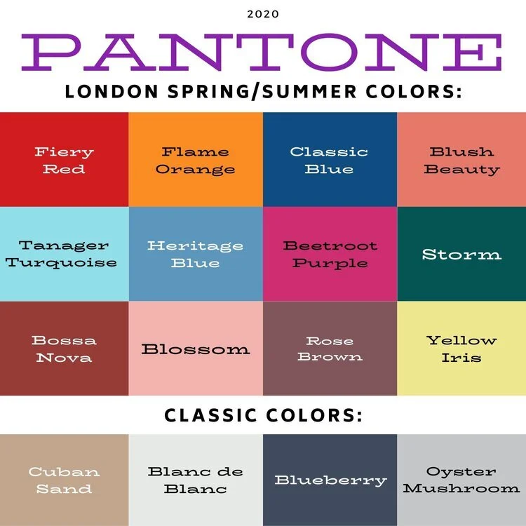
Pantone - Spring/Summer - 2021 - New York Palette: French Blue, Cerulean and Buttercream

Today’s three color combo is the last of the Pantone Spring/Summer New York Palette. I am going to take a week off, as I hope to go visit my mom next week. In due time, I will proceed with the London Palette, but I haven’t even begun to pick out outfits. Breaking my wrist has really thrown a wrench into the works, so bear with me. I got my second Covid shot yesterday, so getting up this morning was grueling. I got the shot in my left arm, figuring it already hurts and I wanted my right arm to remain relatively pain free. I say relatively because there is some pain in my wrist and rib cage on that side, from having to do all the work. This is making me see how much I need to get back to exercising, especially weight lifting and walking since I have osteoporosis. We ladies need to take of them bones, and all the other parts as well. Ha, ha.

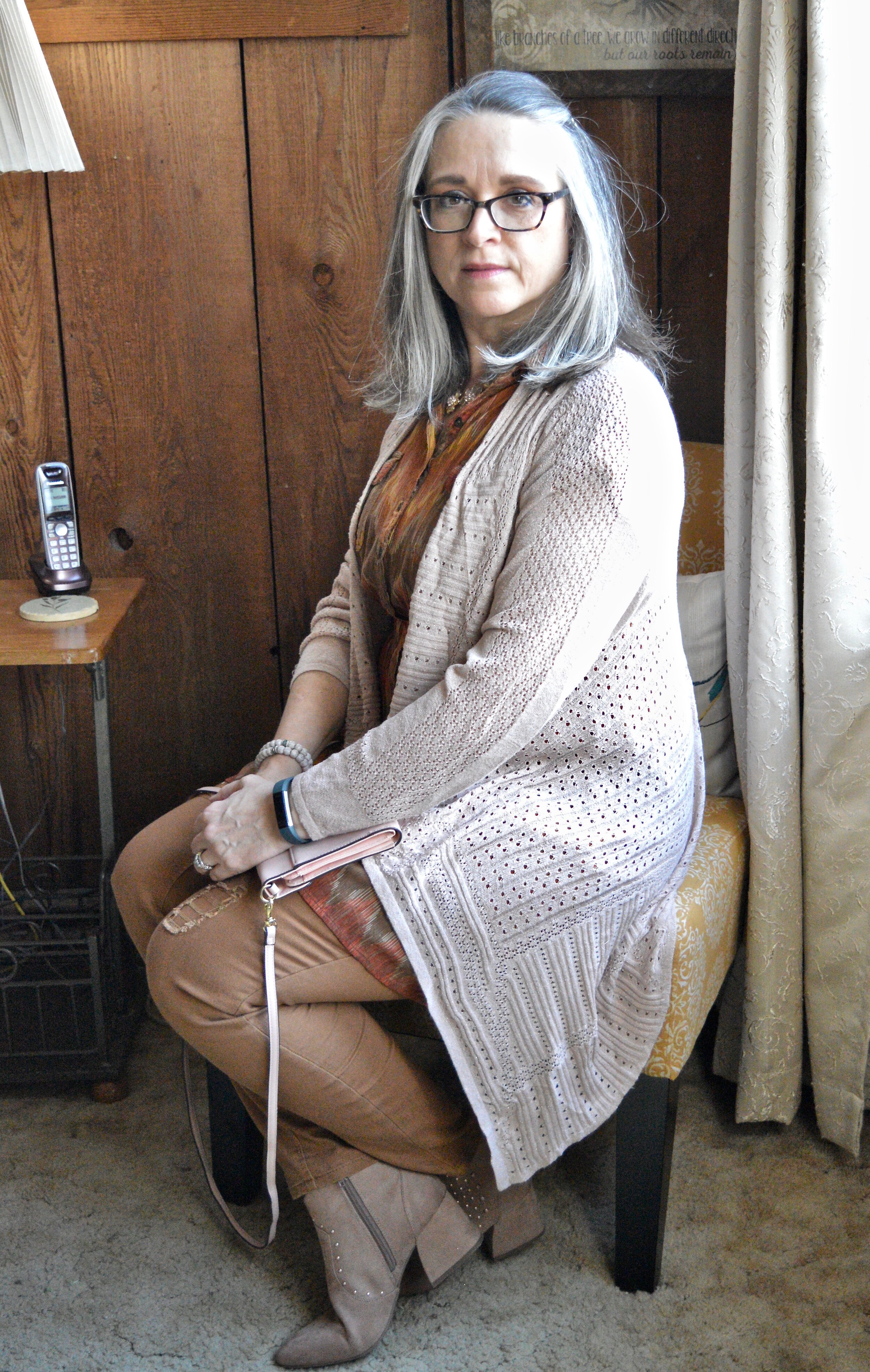
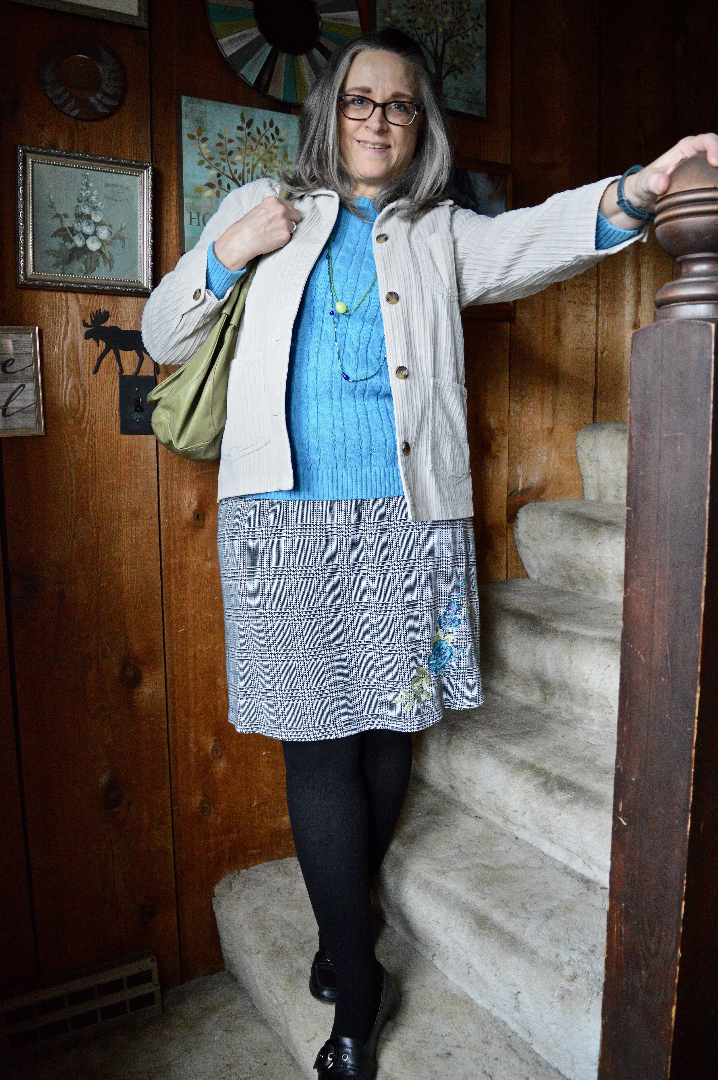
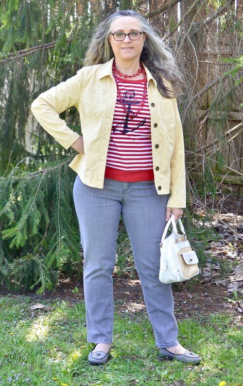
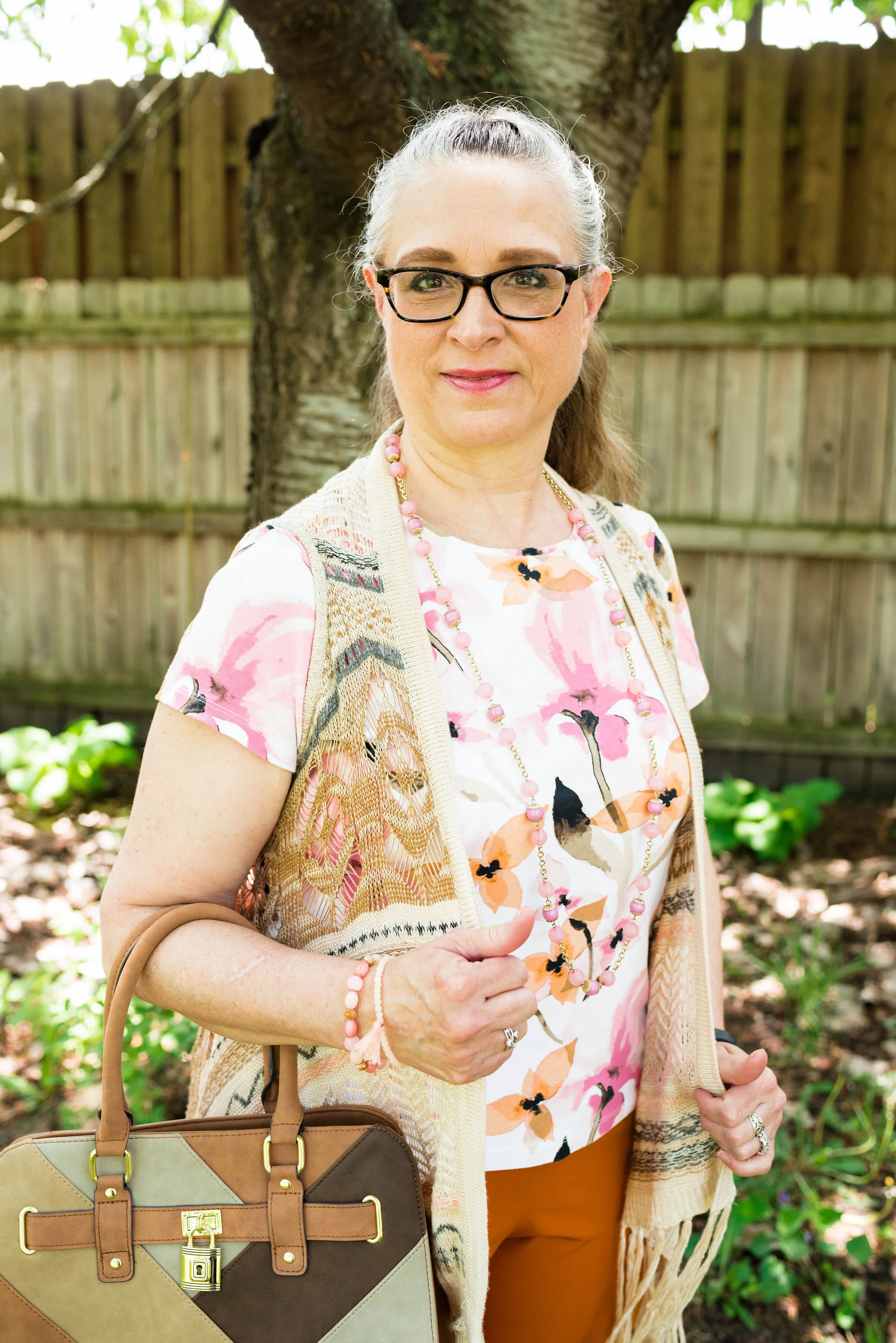
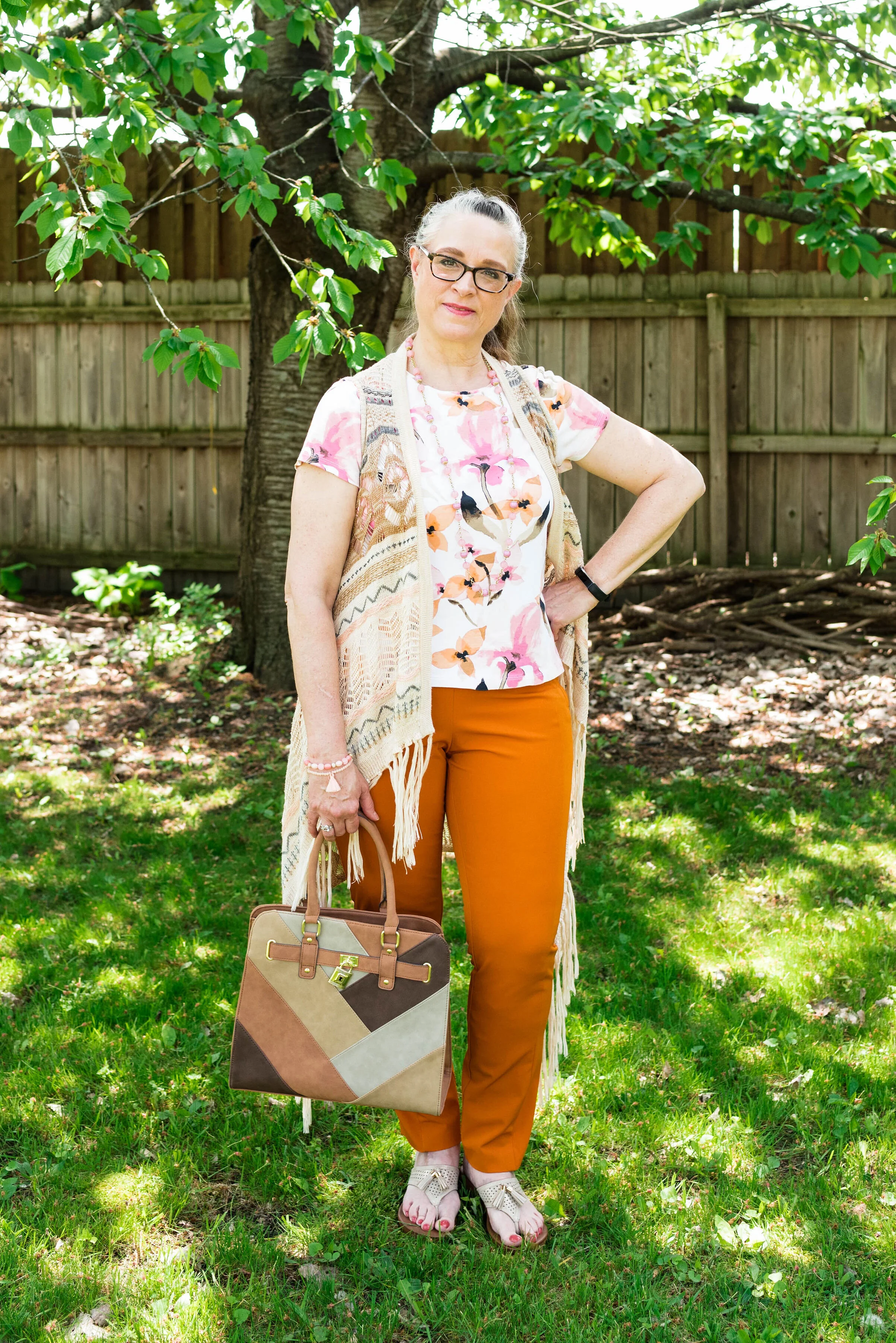
I thought it would be fun to pair these two blues, for a fun, casual summer look. Adding the off white of buttercream gives the outfit that perfect warm weather vibe. I kept my accessories casual to add to the picnic ready style. This would be a great outfit for a Fourth of July get together, just add some red jewelry or a bag.

frenchblue.jpg

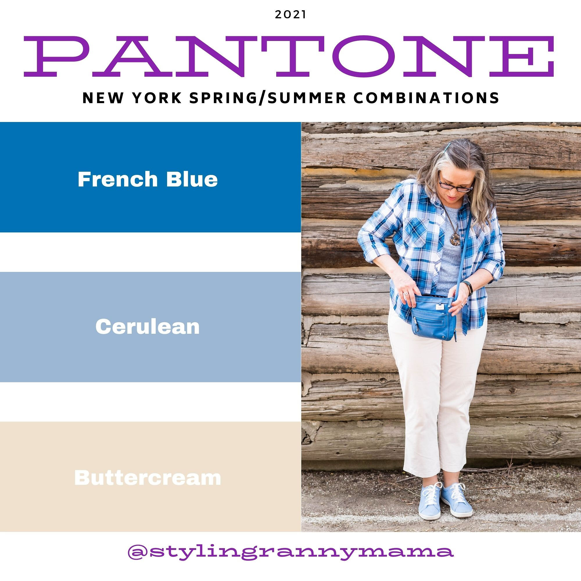
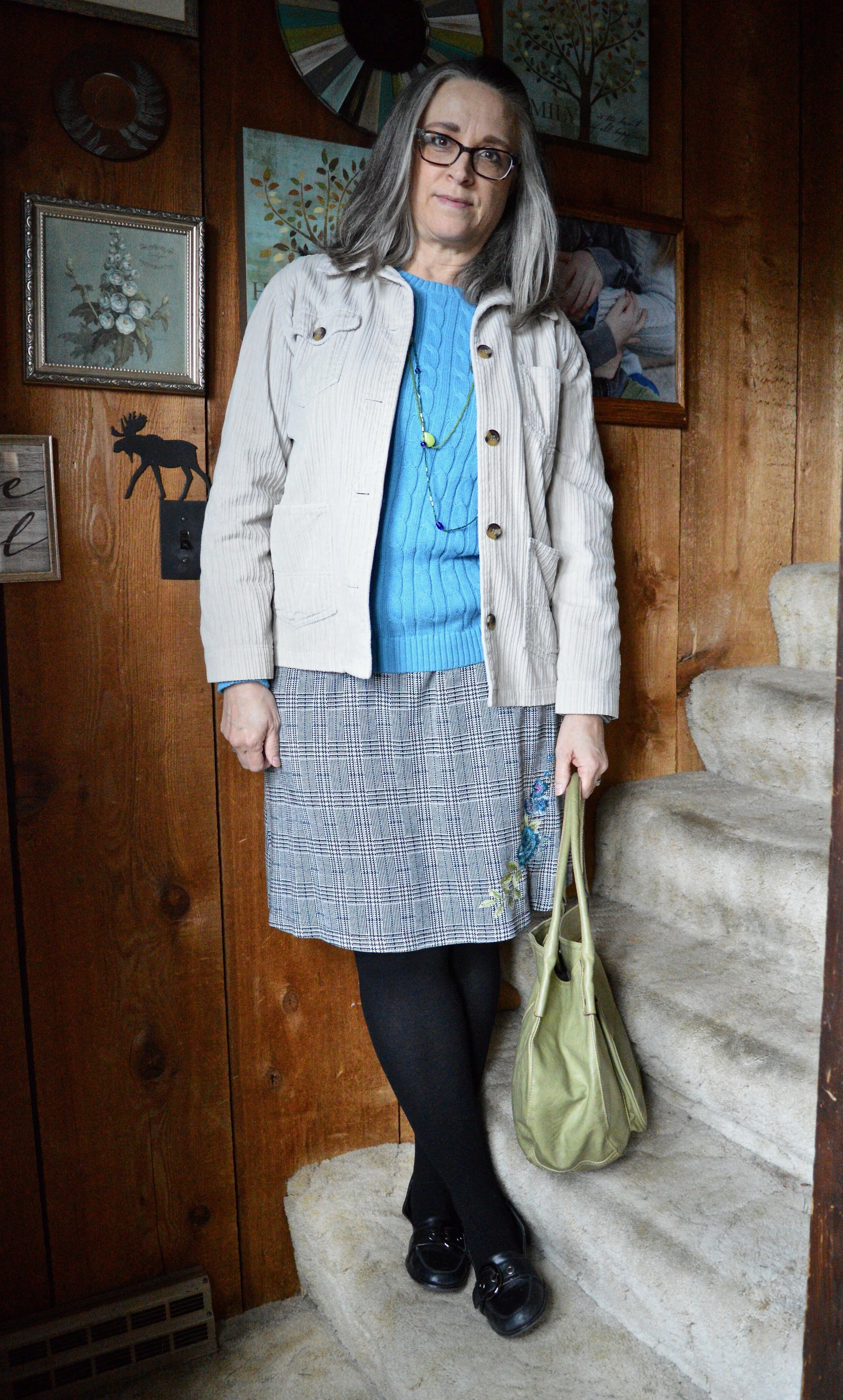
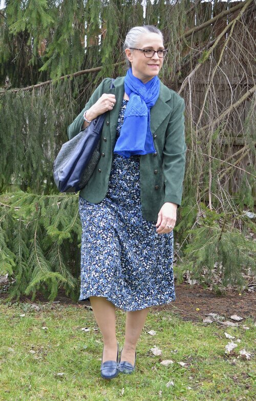
French Blue and Cerulean are two cool colors that make me think of blue skies and water. I found this French blue plaid shirt while thrifting. I really like this medium blue for spring and summer, as opposed to a dark blue like navy. This button down is Faded Glory brand.

frenchbluepantonespringcoloroutfitideas-2.jpg

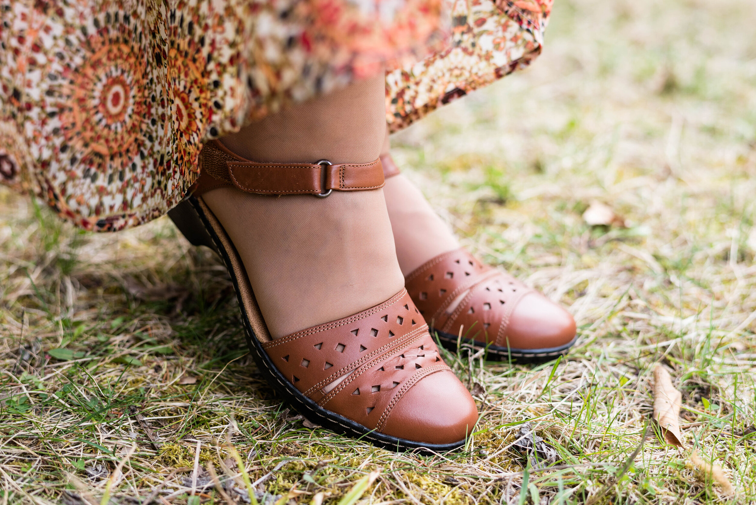
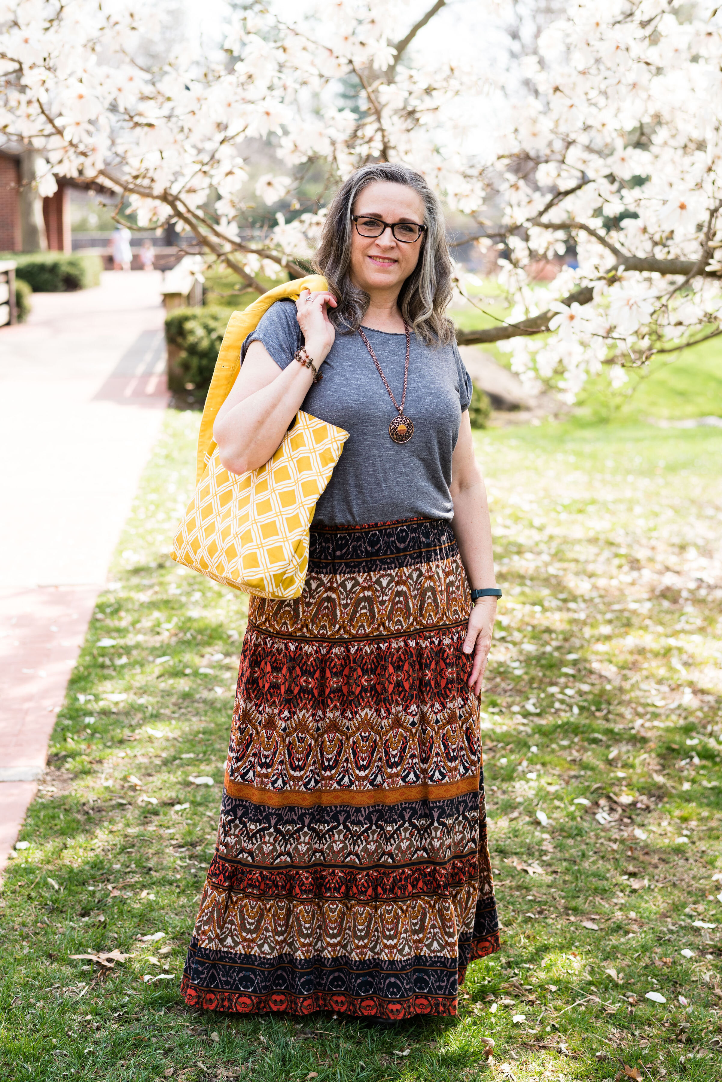
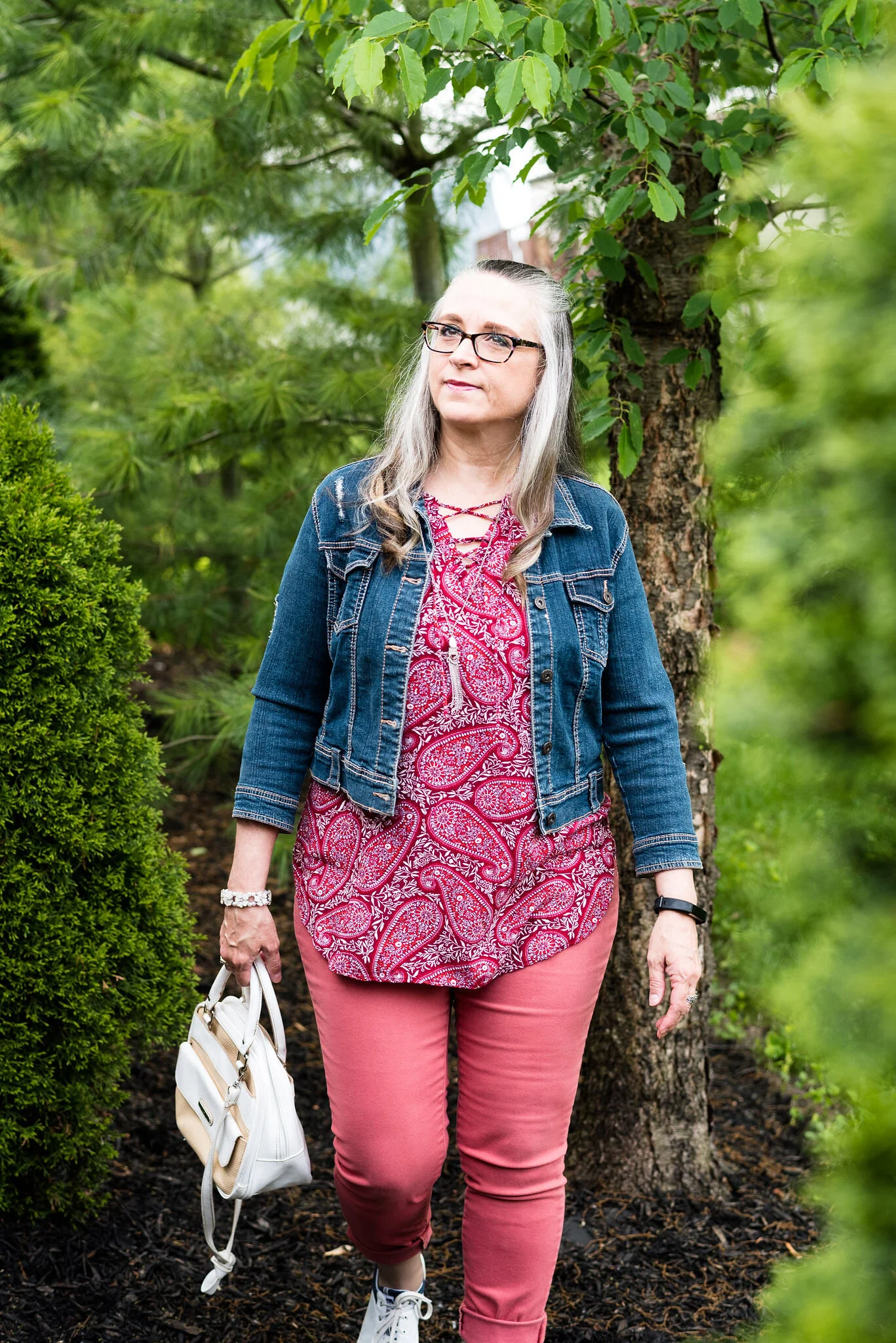
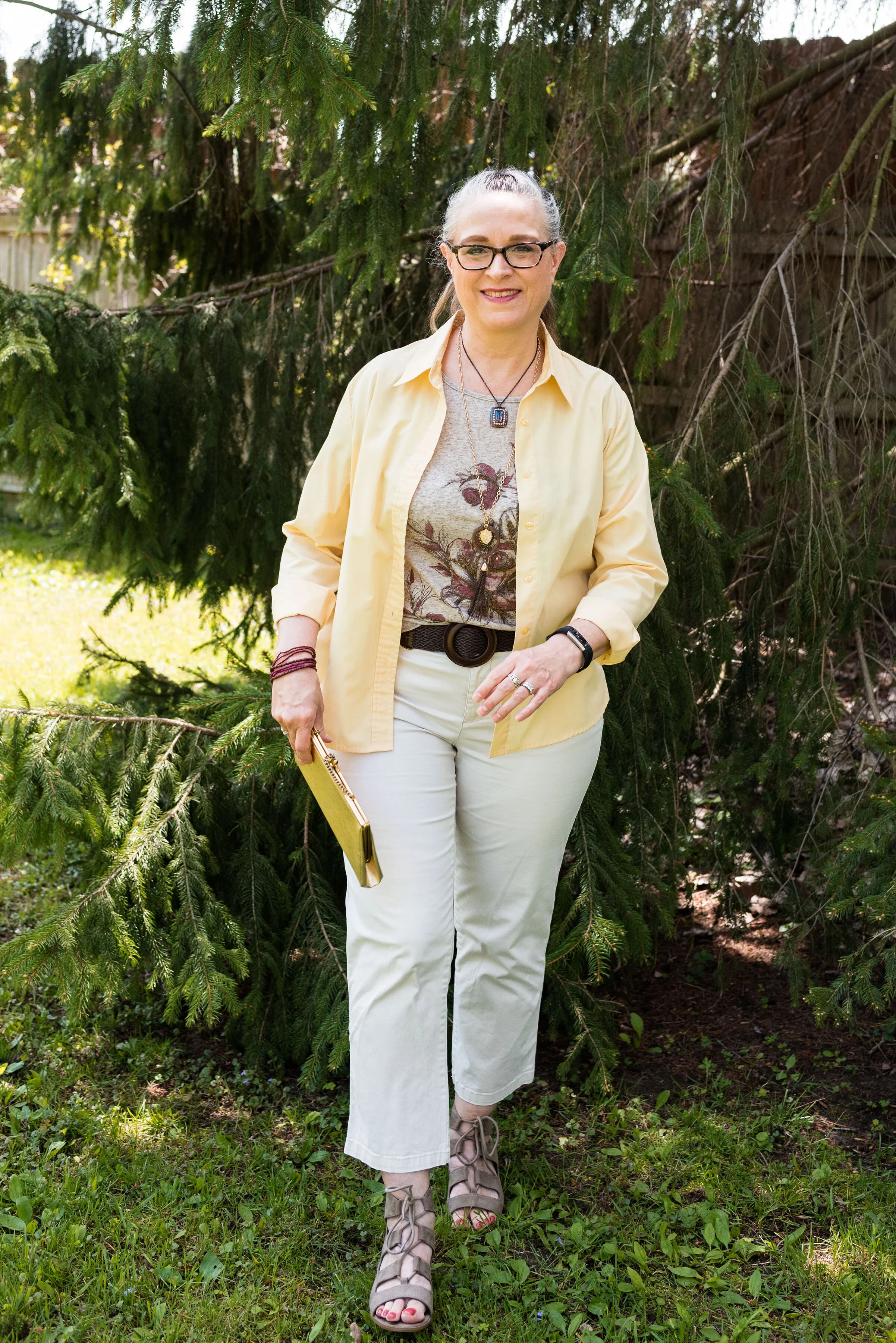
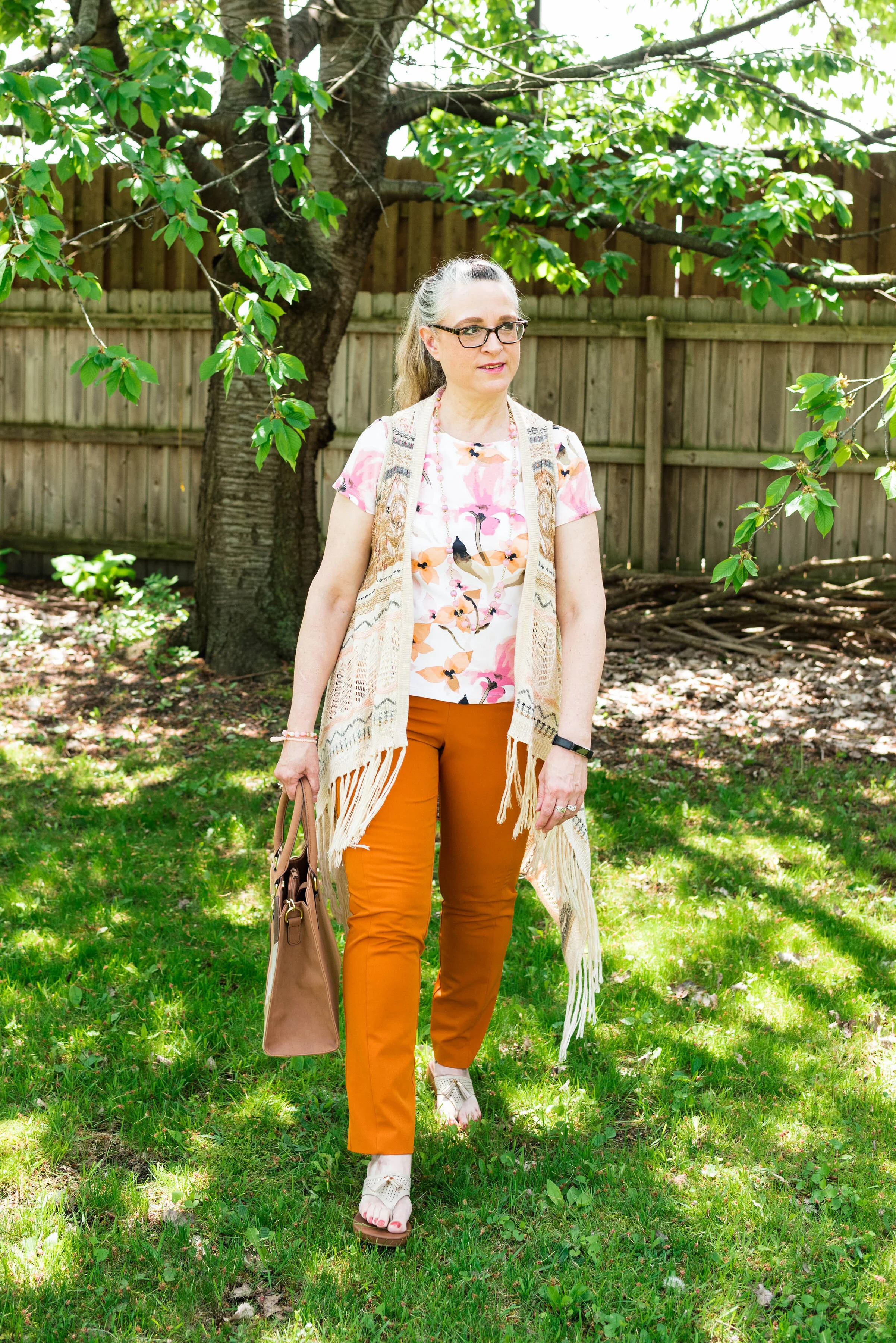
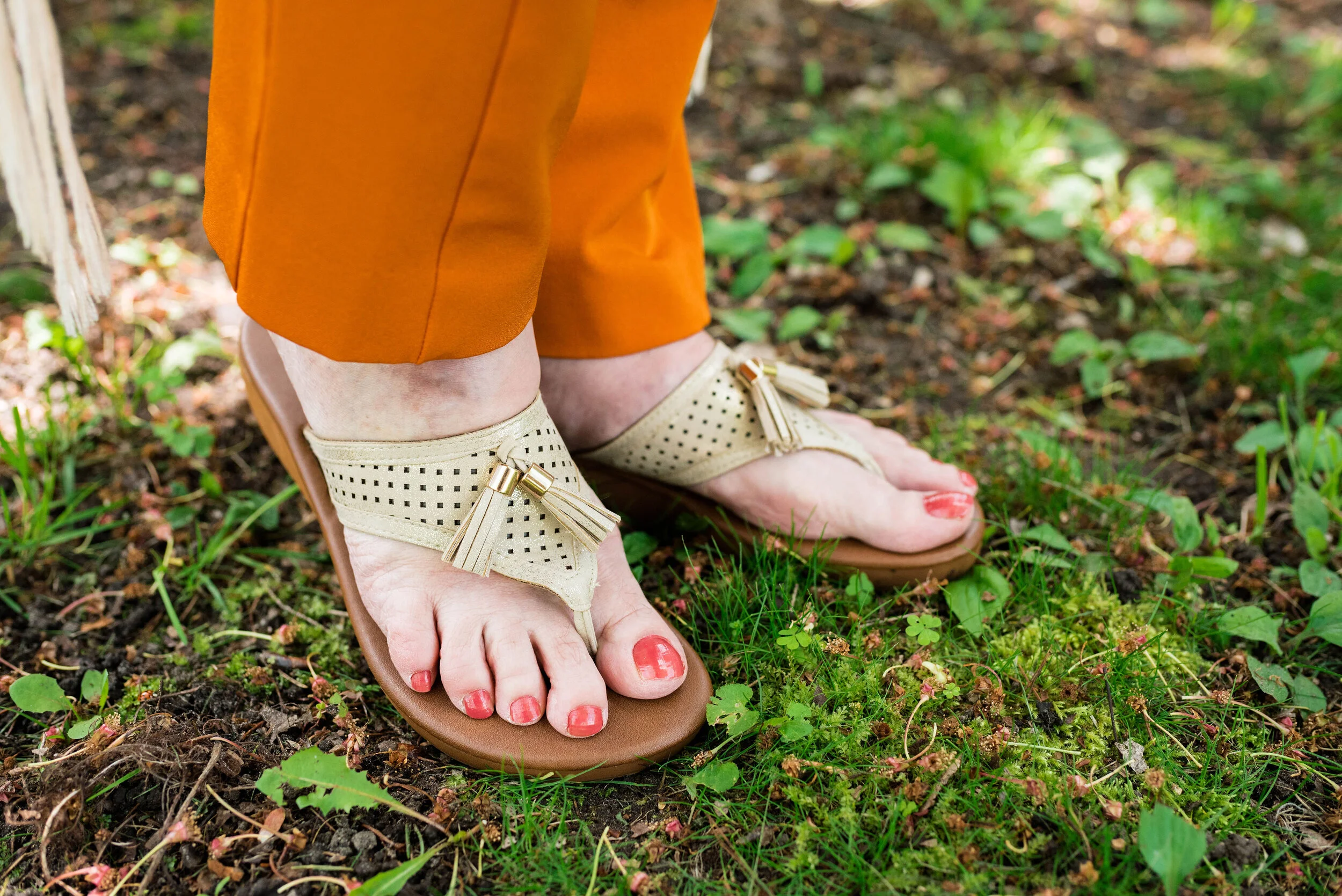
My Buttercream ankle pants have made an appearance on the blog before. These were thrifted St. John’s Bay. You can see these styled for two other Pantone series. This one is styled with a yellow button down and this with my Chevron print dress.

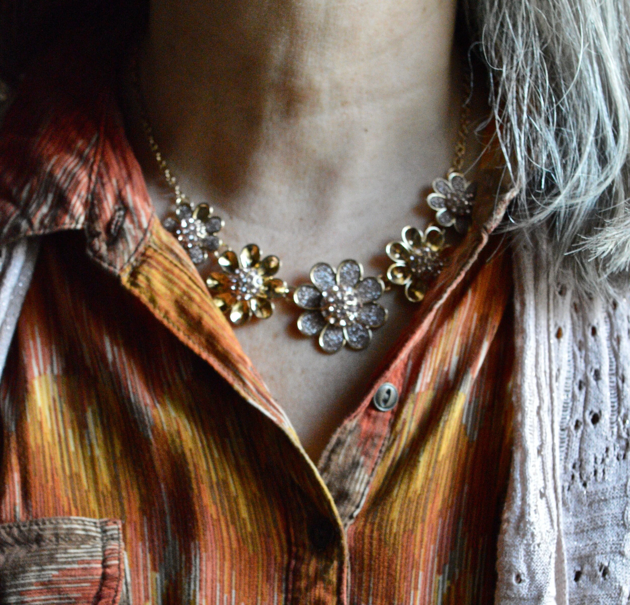
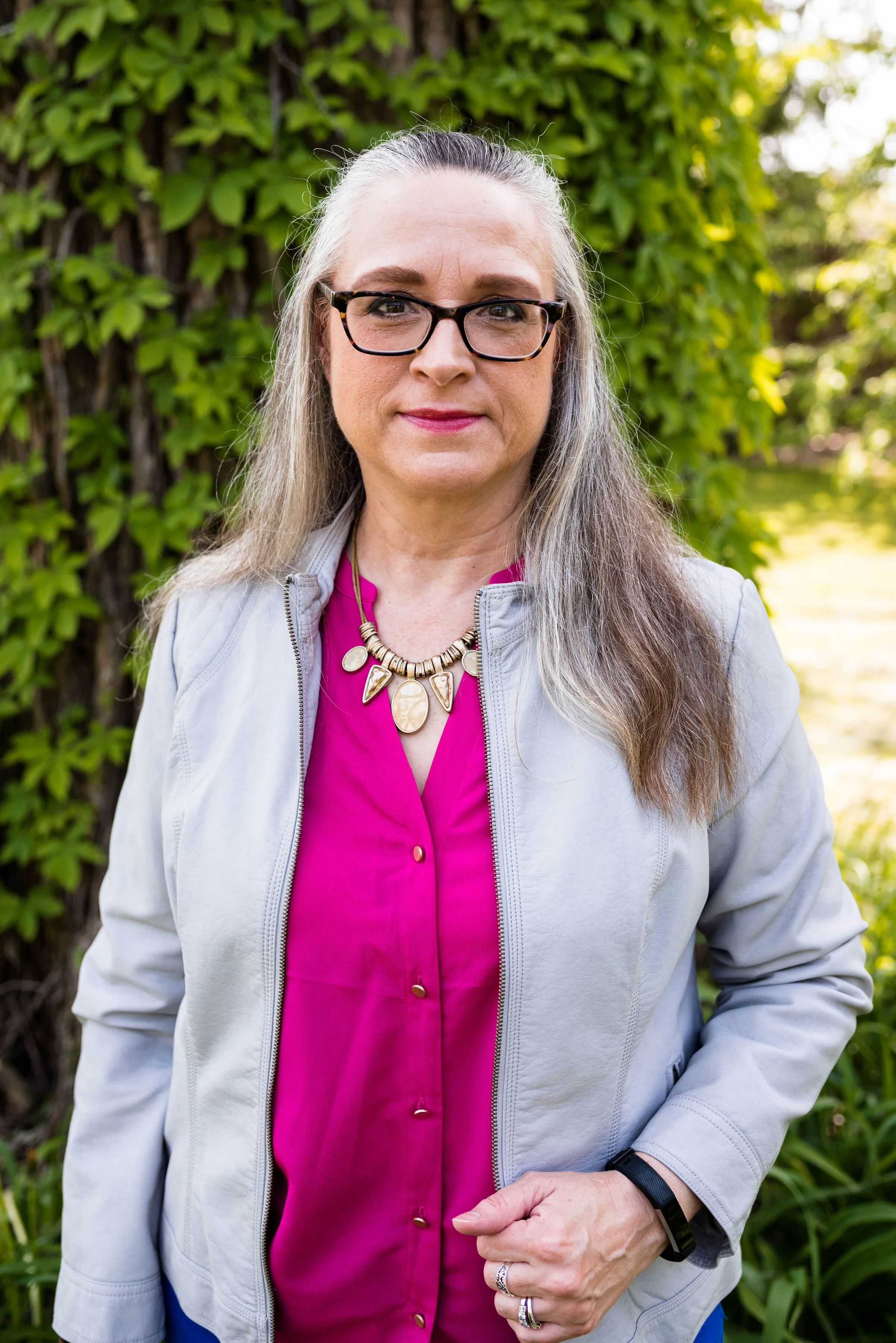
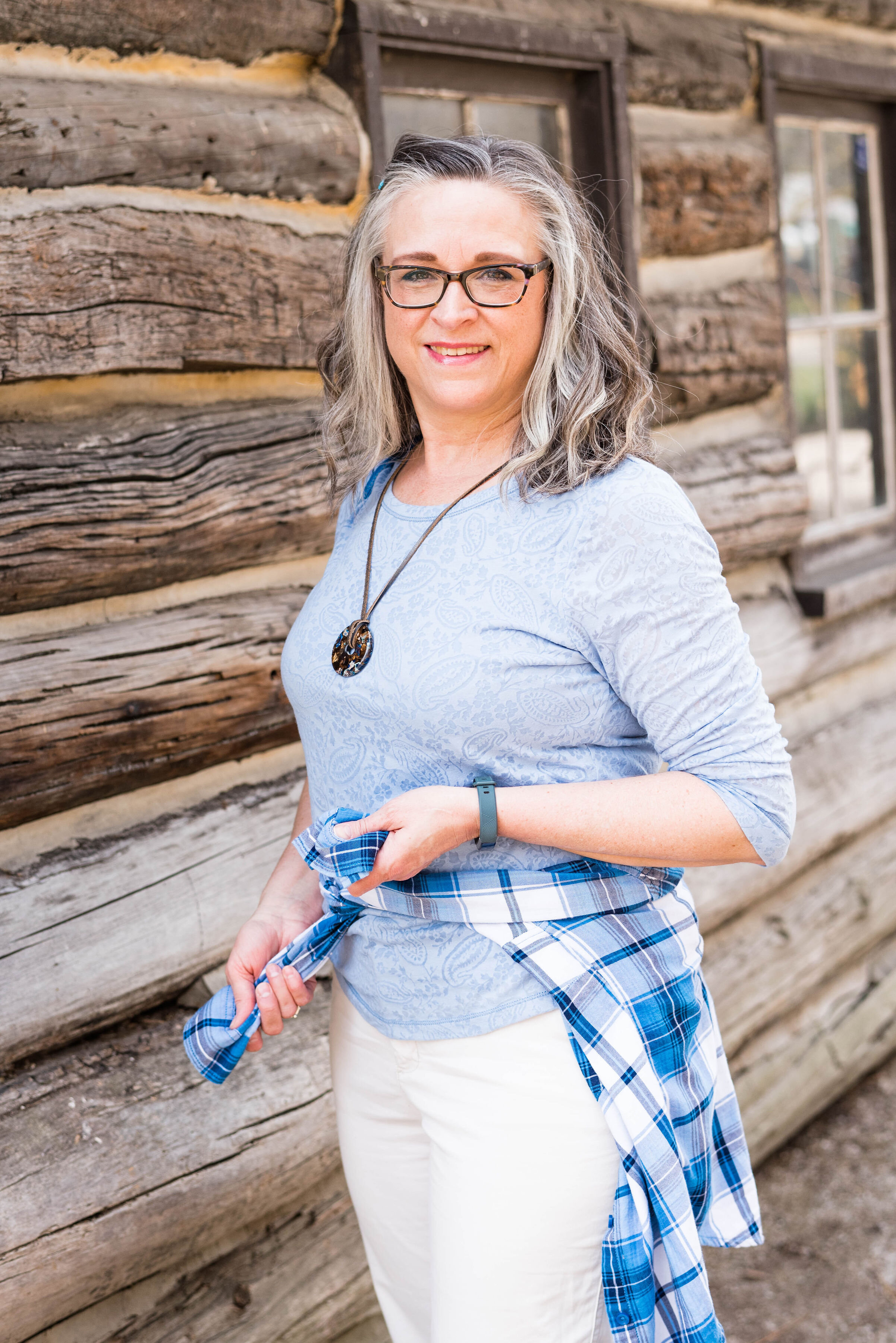
Cerulean is a different light blue. I like the sky blue feel of this color, yet it leans towards a bit more pastel. My top is a thrifted Ralph Lauren piece. I like that it has a lining that is similar t-shirt type material to the outside. It has a fun faux lace texture to it.

frenchbluepantonespringcoloroutfitideas-13.jpg

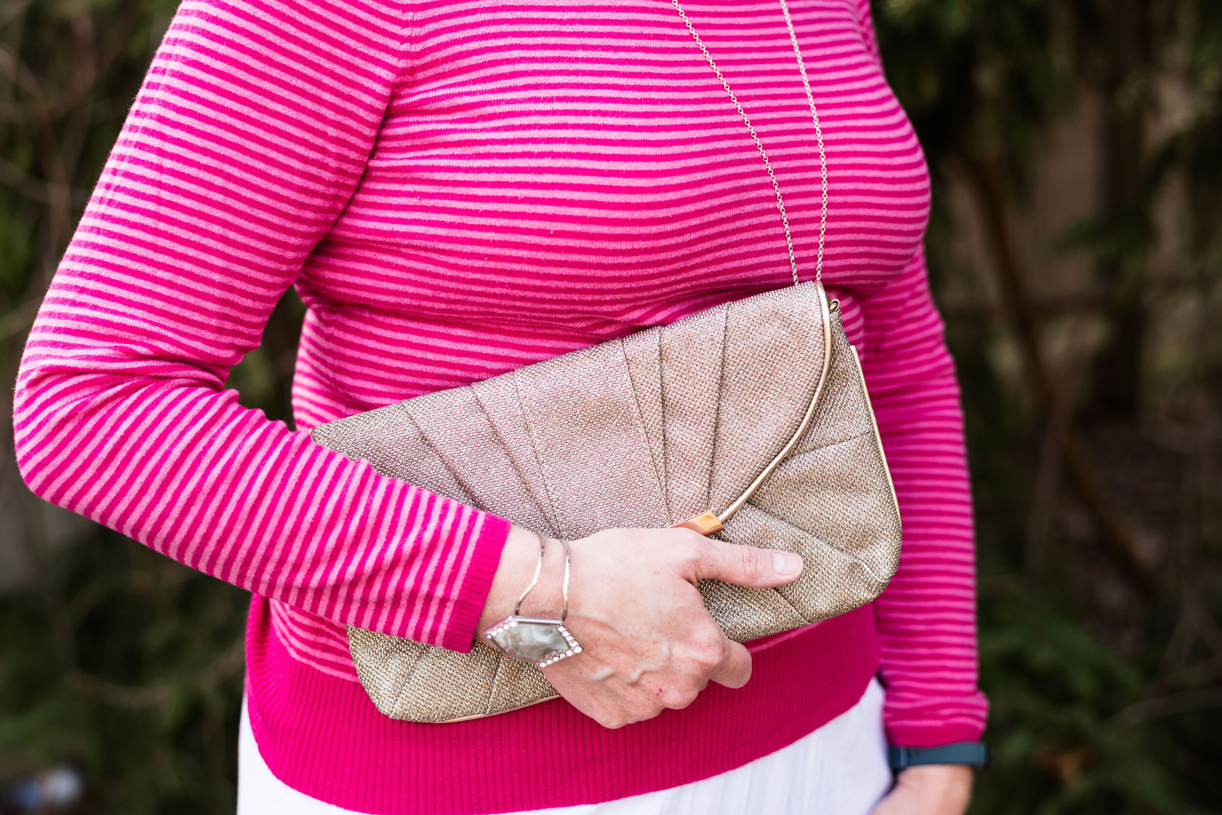
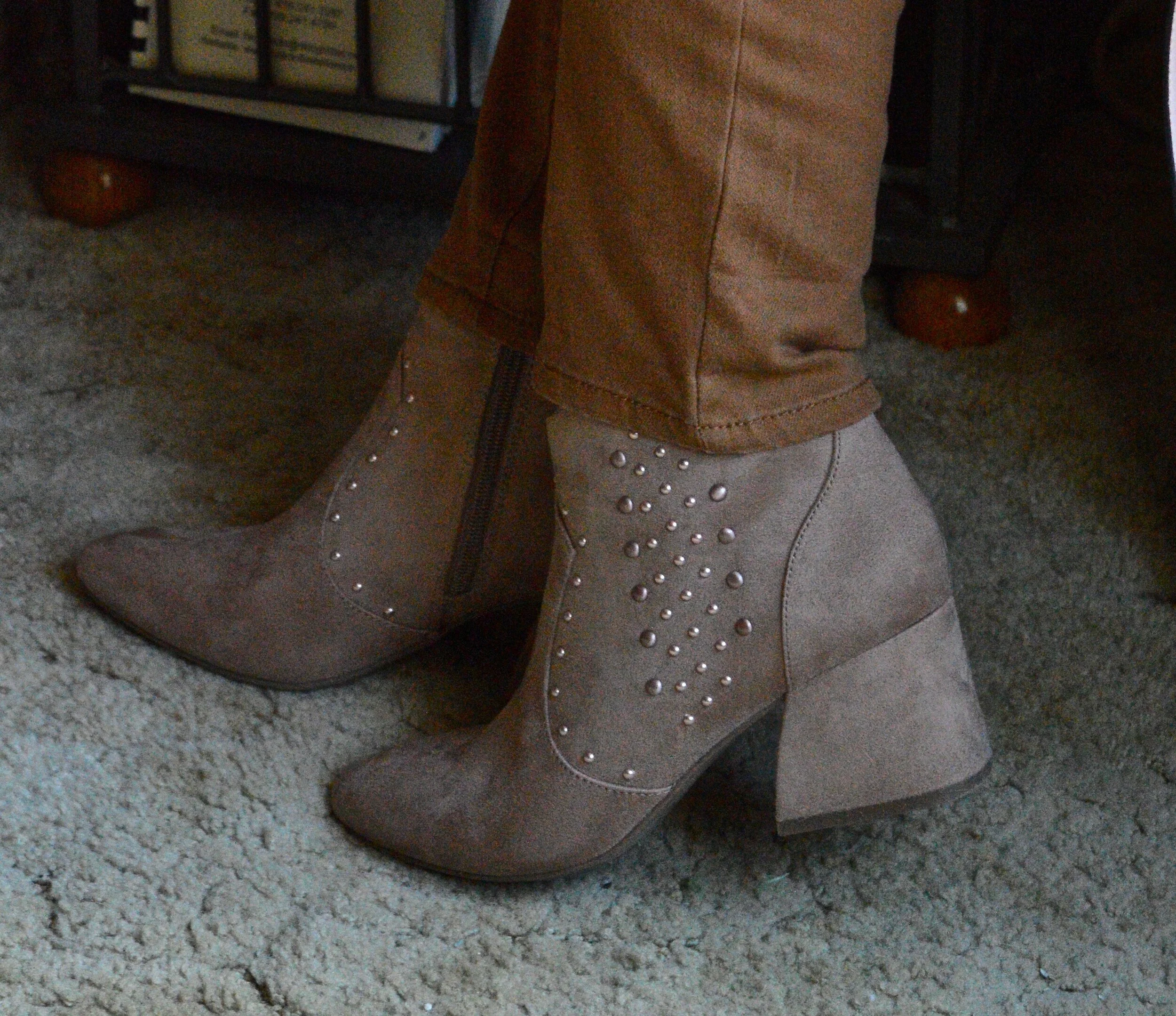
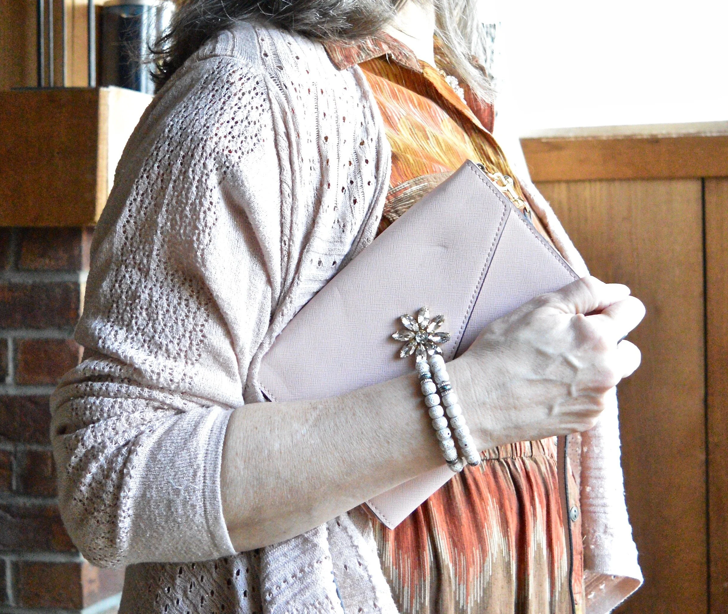
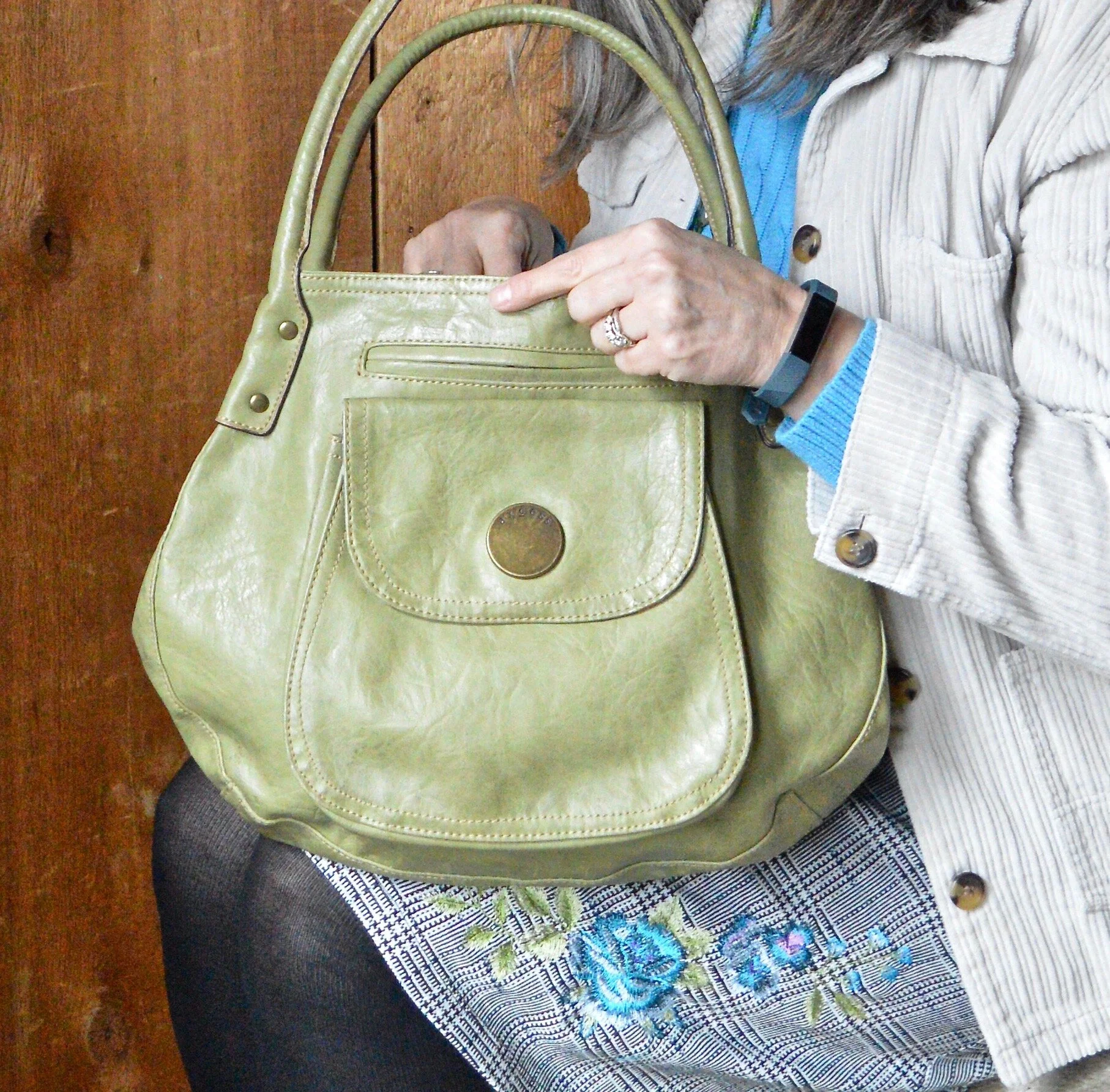
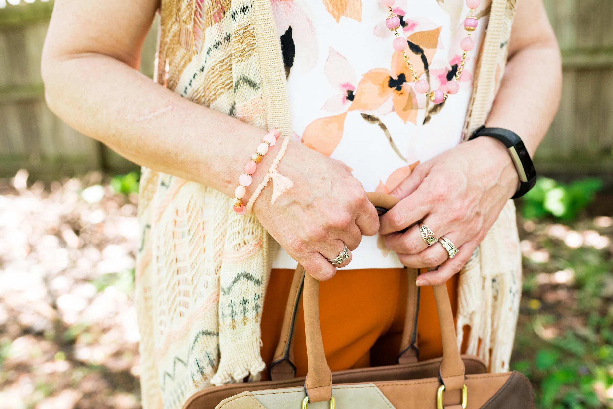
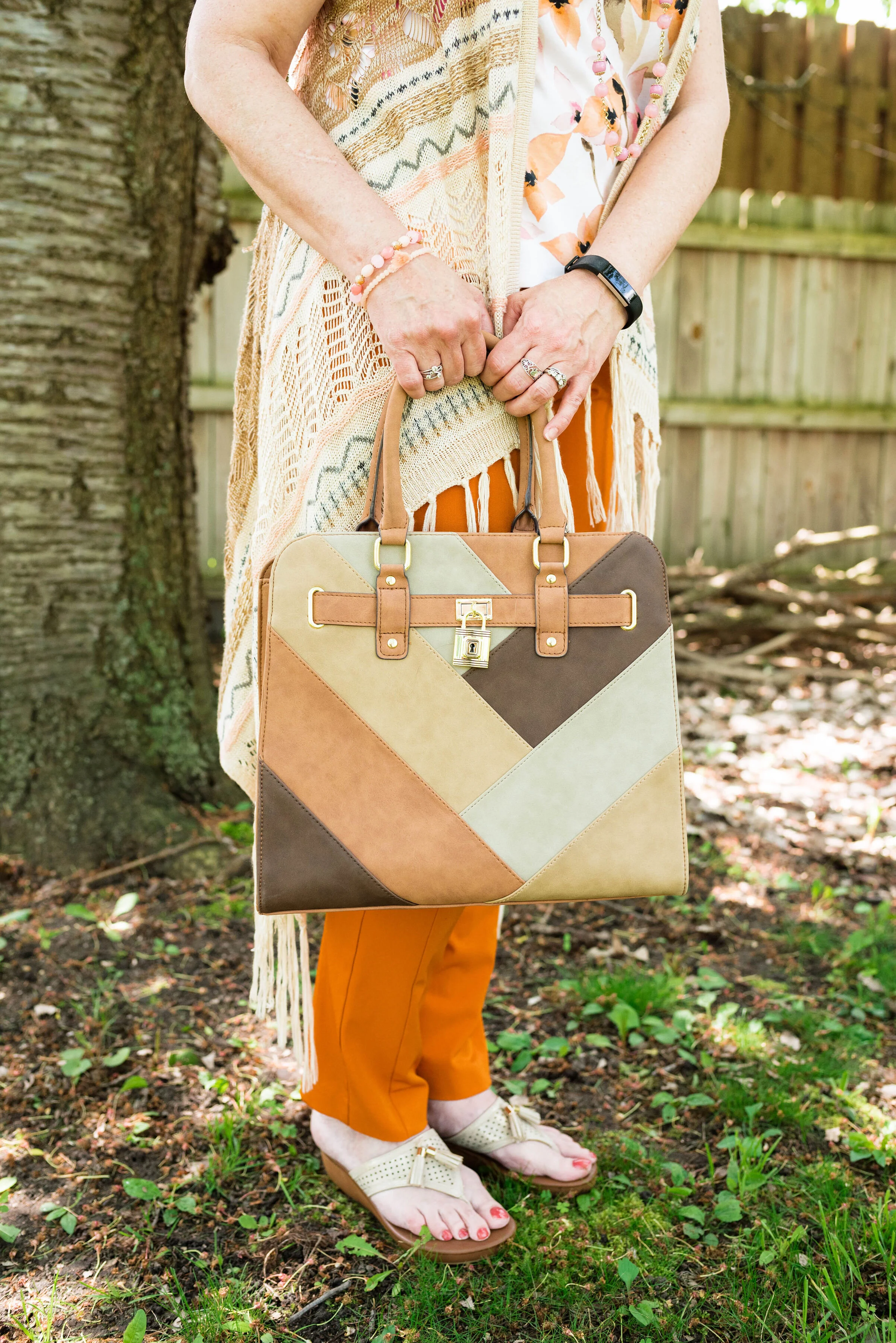
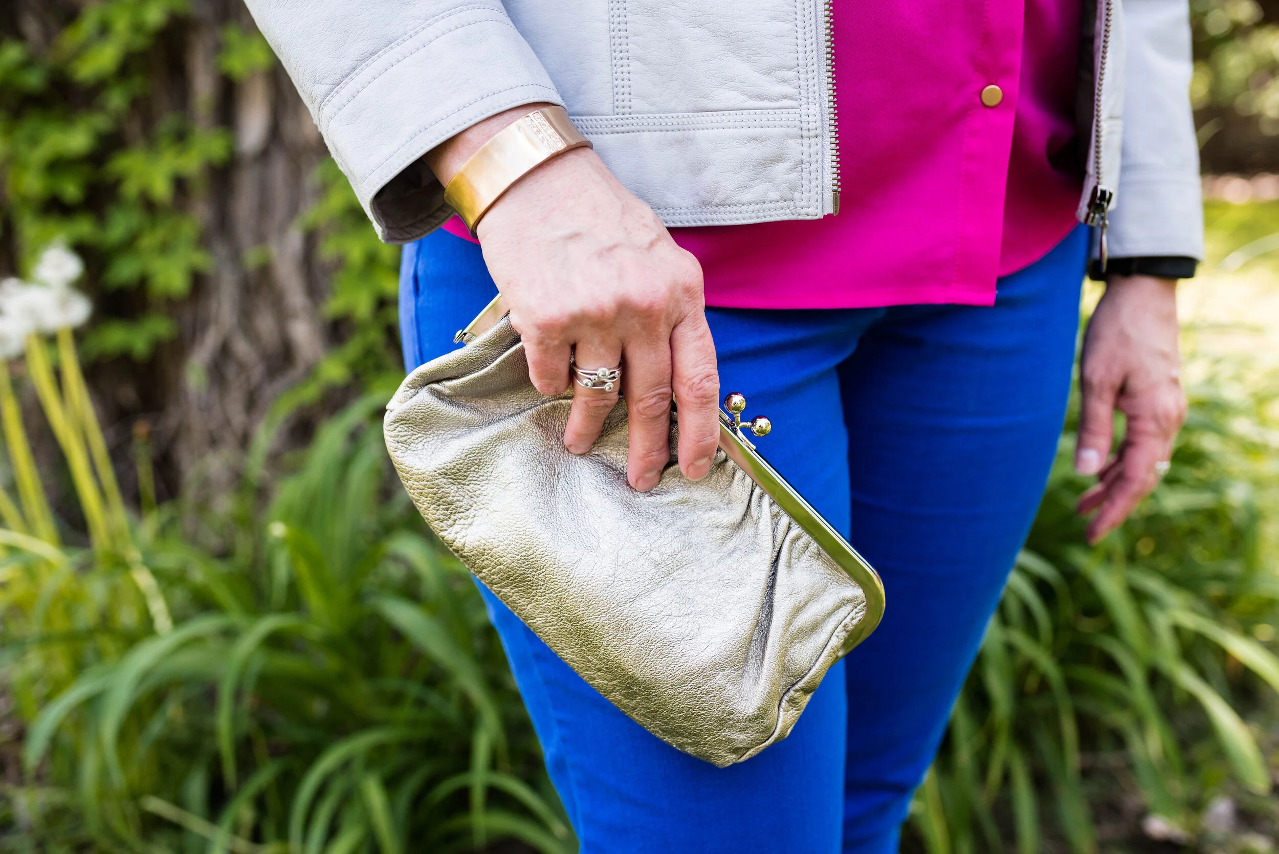
I kept my accessories simple. This thrifted French Blue bag was a recent find and I had to grab it since it matched the color perfectly. This is a nice small bag for carrying just the essentials.

frenchbluepantonespringcoloroutfitideas-7.jpg

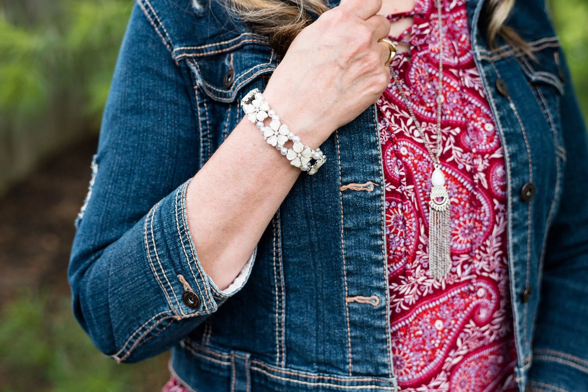
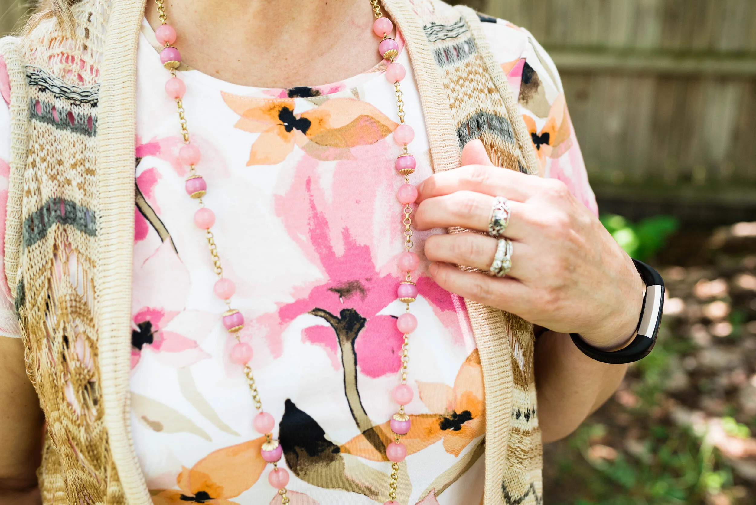
My pendant necklace had little flecks of all the colors. I have been on the search for more of these large beads with the hole in the middle. It is so easy to make a necklace out of them.

frenchbluepantonespringcoloroutfitideas-5.jpg

Lastly, my thrifted Keds finally fit the Pantone color. Cerulean is the right name for these sneakers that are great for warm weather outfits.

frenchbluepantonespringcoloroutfitideas-8.jpg

What do you think of these colors? Do you have these blues in your closet? What about Buttercream? I’d love to hear your thoughts. I’d also love to hear which of these colors you would put together to make an outfit.

frenchbluepantonespringcoloroutfitideas-10.jpg

I hope you have enjoyed this look at the Pantone Spring/Summer 2021 New York Palette colors.

I am including a few shopping links, so be sure to check those out. These are affiliate links. I get a few pennies when you click on a link, so I appreciate all the clicks.

Photo credit and graphic Rebecca Trumbull.

Pantone - Spring/Summer - 2021 - New York Palette: Burnt Coral, Marigold and Desert Mist

Today’s outfit blends three colors that seem to epitomize summer with all of its beauty. The deep orange yellow of Marigold, combined with the rustic feel of Burnt Coral and the soft pastel of Desert Mist makes me think of picnics, outdoor parties and long walks on the beach. While my outfit today is probably too warm for summer temperatures, I works well for that in between time when the weather is still unsure of what it is going to do.

burntcoral.jpg

I ordered this waffle weave dolman sleeve top from Maurices earlier this year. It has elastic on the bottom, so has more of a cropped feel to it, which isn’t always my favorite, but I think this works well with pieces where the top can be worn without the need for tucking or wearing a belt.

burntcoralpantonespringcoloroutfitideas-10.jpg

I wasn’t going to use this Roz & Ali medallion print skirt again, but I was having a hard time finding things in my closet that were going to work with these colors. Besides this is a pretty skirt, so I don’t mind using it again. You can see how I styled this piece for several other Pantone color series. Last fall I styled it with a neon yellow short sleeve sweater, and the fall before that with a purple short sleeve sweater. I like that this skirt works perfectly for spring, summer and fall. The skirt contains all the colors from the graphic, even though you can’t see Marigold as well, you can definitely see the Burnt Coral and Desert Mist.

burntcoralpantonespringcoloroutfitideas-6.jpg

My Desert Mist sweater is a little light compared to the Pantone color, but again, this isn’t about having an exact match, but about giving you options that you can find in your closet. This is a thrifted St. John’s Bay piece. It is always good to have a neutral cardigan or jacket that will work well with many different outfits and colors.

burntcoralpantonespringcoloroutfitideas-8.jpg

For the Marigold color, I just added a few accessories, similar to what I did in last Thursday’s post with Raspberry Sorbet. The necklace and Sophia Caperelli bag are both thrift finds.

burntcoralpantonespringcoloroutfitideas-11.jpg

You were recently introduced to these Clark’s flats. They are perfect for wearing with a skirt, whether long or short.

burntcoralpantonespringcoloroutfitideas-13.jpg

What do you think of these colors? Do you have all of these in your closet? Would you wear them together? I’d love to hear your thoughts, so leave me some love.

burntcoralpantonespringcoloroutfitideas-4.jpg

I’m including a few shopping links. These are affiliate links. All opinions are my own. Here’s a picture, just for your enjoyment. Ha, ha.

burntcoralpantonespringcoloroutfitideas-7.jpg

Have a great evening!

Photo and graphic credit Rebecca Trumbull.

Pantone - Spring/Summer - 2021 - Raspberry Sorbet, Mint and Willow

Today’s Pantone outfit revolves around a tantalizing pink, a refreshing green and another earthy color reminiscent of the weeping willow trees that hug the banks of lakes and streams. Raspberry Sorbet, Mint and Willow combine in an outfit that is both sleek, colorful and casual.

raspberrysorbet.jpg

When I think of the color mint, I am more inclined to think of the light Green Ash color from Tuesday’s post. I guess my rendering of mint is based more on ice cream and Christmas candies than it is the actual plant. The mint plant is a bright, living green, so I think the Pantone color is much truer to the natural source. My Mint green top is a thrifted Falls Creek piece. I wore it for this shoot and then I got rid of it. It has been hanging in my closet for a while and I wasn’t certain, why I didn’t reach for it more often. After putting it on, I just didn’t like how stiff the fabric was. I’m all for structured pieces, but a piece has to move with me for me to want to wear it.

raspberrysorbetpantonecolorsoutfit-4.jpg

My camouflage pants, also Falls Creek, are a recent clearance find from Meijer. They are light weight, so good for summer. Unlike some camo that is more green, these tend towards more brown and gray. The Willow color is in there as you can see in the following picture. Willow was hard color to find. Most of my pieces are more olive green and Willow has more of a brown undertone.

raspberrysorbetpantonecolorsoutfit-10.jpg

Instead of choosing another clothing piece for the Raspberry Sorbet color, I opted to include it in my accessories. My necklace, bracelets, and the Vera Bradley tote were the perfect pop of this bright, saturated pink.

raspberrysorbetpantonecolorsoutfit-6.jpg
raspberrysorbetpantonecolorsoutfit-8.jpg

I went for my silver SO flats to tie in with the silver chains on the necklaces.

raspberrysorbetpantonecolorsoutfit-9.jpg

What do you think of these Pantone colors? Do you have the color Willow in your closet? I love to hear back from you, so leave a comment or two.

raspberrysorbetpantonecolorsoutfit-3.jpg

I’m including a few shopping links for you to peruse. These links are brought to you at no cost, but using them to purchase something gives me a few pennies as a kick back. I appreciate all your support. These are affiliate links. All opinions are my own.

Photo and graphic credit Rebecca Trumbull.

Have a great weekend everyone!

Pantone - Spring/Summer - 2021 - NY Palette - Amethyst Orchid, Green Ash and Inkwell

Today’s combination of Pantone colors from the New York palette is a study in contrasts. The dark, moody blue of Inkwell, which mimics a night sky is a type of color disparity when side by side with the pale pastel of Green Ash. When I pair colors I often go for bold with bold, or light with light, but I wanted to experiment by creating an outfit with an eye catching difference in color. The addition of Amethyst Orchid gives the perfect compliment of medium purple color.

amethystorchid.jpg

Let me start the outfit details by talking about this recently thrifted tee. I love the bold flower on the front and purple has long been a favorite color of mine, so I was glad it was on the palette. This tee is St. John’s Bay brand. The darker inner petals are actually separate pieces of material, which gives the tee added dimension.

To go along with the Amethyst Orchid color in the tee, I also added this recently thrifted scarf. I love the large gingham pattern. It was the perfect accompaniment to the whole look. Another interesting feature of this scarf is the ruching of elastic throughout its length adding texture.

amethystorchidpantonecolorsoutfit-9.jpg

These thrifted, Inkwell pants are a brand called Hydrant. A dark pant like this is great for making our lower halves look longer and slimmer. I really like these, but they are a lint magnate. Wearing them with a fuzzy sweater like this is probably not the best idea. Ha, ha. You can also see I added a wider, olive belt since belts are trending and did my usual front tuck.

My fuzzy Green Ash sweater might be a little light, but it is pretty close to the Pantone color. This was a Christopher and Banks purchase last year. Before I bought this piece I had very little of this color in my wardrobe. I have picked up a few things since then. It is a pretty pastel color to wear, especially in the spring and summer. I really like how well it goes with the Amethyst Orchid color.

amethystorchidpantonecolorsoutfit-6.jpg

I decided to go with white for my shoes and bag. White is definitely a go to in the warmer months. My white Keds will be on repeat. My white shoulder bag is a new thrift find. I have been searching for a different white bag and this one has plenty of room and can also be worn as a cross body bag. This is a brand called Bueno.

amethystorchidpantonecolorsoutfit-10.jpg
amethystorchidpantonecolorsoutfit-12.jpg

What do you think of these colors? Would you wear a light pastel with a dark color like navy or black? I’d love to hear your thoughts. Thanks so much for taking the time to comment.

amethystorchidpantonecolorsoutfit-15.jpg

I’m including a few shopping links. These are affiliate links. All opinions are my own.

Photo and graphic Rebecca Trumbull.

Pantone - Spring/Summer - 2021 - NY Palette - Illuminating, Rust and Ultimate Gray

I wanted to share this outfit with you first, because it contains the two colors that were chosen by the Pantone Color Institute as the colors of the year. Illuminating is a bright, sunny yellow. Pantone describes this yellow as, “Friendly and joyful, an optimistic yellow offering the promise of a sunny day.” Rust is typically a fall color, yet it is an earth tone, thus its inclusion in the spring palette. Ultimate Gray is a classic and comfortable gray that everyone can wear.

illuminating.jpg

I have plenty of yellow in my closet. It is a color that has quickly become a favorite. I love the many different shades of yellow. I have mustard, sunflower, lemon, blonde and pineapple. Look up shades of yellow in your search bar and see all the fun names they give for these lovely pieces of sunshine. Illuminating is not really a different shade, but a different name for a shade that might also be called bumblebee, butter or dandelion.

Since I love the color so much, it was a no brainer that I add this thrifted, bright yellow, denim jacket to my closet. This is a brand called d & co, or denim and company. When I looked it up, it is a brand that is sold at retailers like QVC, Walmart and others. I like the relaxed style of this piece, as well as the 3/4 sleeves. It will be a great topper for cooler summer days.

pantone2021illuminating-7.jpg

We were back at the Toledo Botanical Gardens for pictures and things are starting to bloom over there. This tree was gorgeous and I had no idea what is was because the blooms were so big. It turned out to be a white magnolia. I grew up with a pink magnolia in my parents’ yard. I didn’t even know there were white ones.

You’ve seen my boho skirt on the blog before. I looked at other Rust colored options in my closet, but just wasn’t satisfied with how the outfit looked. Choosing this skirt not only gave me a print, but the perfect blend of classic and bohemian. This skirt is a brand called Notations, but I can’t remember where I got it. Ha, ha. You can see it styled with a green top and a different gray top.

This simple Ultimate Gray tee is from Kohl’s and is SO brand. I got this one and a red one a few years ago. I love that they are light weight, but still provide coverage. The hemline is a straight cut and the length is shorter, so perfect for wearing out. I did the front tuck, just for a more polished look.

pantone2021illuminating-15.jpg

When I was rummaging through my necklaces, I saw this one and thought it would pull in both the rusty oranges in the skirt and the yellow of the jacket and bag. To go with the coppery colors I also put on my thrifted beaded bracelet. My yellow diamond patterned tote was a fun find at a thrift store. Another thrift store find, my ID Required combat boots get plenty of wear.

pantone2021illuminating-11.jpg
pantone2021illuminating-12.jpg
pantonespring2021preview-2.jpg

What do you think of these colors? Would you wear rust in the summer time or do you think it is a color strictly for fall? I’d love to hear your thoughts, so leave me some love in the comments. Your comments keep me motivated to keep providing content to you all.

pantone2021illuminating-1.jpg

I’m providing a few shopping links for you to look over in your spare time. These are affiliate links brought to you at no cost. When you click on a link, I get a few pennies, so I appreciate every click. All opinions are my own.

Photo and graphic Rebecca Trumbull.

Pantone - Spring/Summer - 2021 - New York Palette: Introduction

I am a bit behind on the Pantone colors this year. I had a hard time getting back into the swing of regularly posting, but here I am. While we are a few weeks into spring, the Pantone colors for this season are for spring and summer. I don’t pay attention too much to their time table, because they already have the colors out for the fall/winter season. Who wants to think about fall/winter when we have barely made it into spring? Ha, ha.

Just as a quick review, the Pantone Color Institute is an entity that provides the color trends for both the fashion and interior design industries. If you go to their website you can see all sorts of information from color swatches you can order to educational opportunities. Obviously, these are not the only colors that you see trending on the runways, but Pantone is easily considered a color authority by both design areas.

Every year, Pantone chooses a color of the year. Last year it was Classic Blue. In 2019 it was Living Coral. This year they picked two colors, Illuminating, a sunny yellow and Ultimate Gray, which is a classic medium gray. Typically, the colors of the year are seen on both the New York and the London Palettes. As I have done in the past I will be starting my series with the New York Palette. This year, the palettes are quite dissimilar, which makes it more interesting for me, as I pick out outfits and for you, my lovely subscribers.

Here is the New York Palette.

ClassicColors_(12).jpg

This is a mix of jewel tones and pastels, so if you lean towards one or the other, this palette will make everyone happy. Rust is a different color for summer, but I think it can work well with many of the others colors. Once again there is a selection of classic colors, which to me are helpful if you want to tone down an outfit and just accent with the brighter colors through jewelry and other accessories.

The following are a few photos from our shoot which give you some sneak peeks at how I combined these colors.

pantonespring2021preview-1.jpg
pantonespring2021preview-2.jpg
pantonespring2021preview-3.jpg
pantonespring2021preview-4.jpg
pantonespring2021preview-5.jpg
pantonespring2021preview-6.jpg

I hope you will join me on Thursday as I start the series. Have a great day!

Photo and graphic credit Rebecca Trumbull.

Spring/Summer - 2021 - Lady with a Twist

Today’s final Spring/Summer 2021 Trend is called Lady with a Twist. The idea behind this trend is taking classic feminine workwear pieces and adding casual, athleisure pieces for a blend that I often refer to as dressy casual. This trend could certainly be worn in most work places, but it also could be worn for a day out shopping or a walk in the park. Just make sure you have on your walking shoes.

My outfit is less about going to the office and more about looking fun and comfortable. I would definitely wear this to the coffee shop to work on writing projects or for a day running around with a girlfriend.

sunflowermaxiskirt-4.jpg

Everything in this outfit is thrifted, except the bag, which was a gift from my youngest. I am a lover of all things Edgar Allen Poe. My shoes were also a new purchase from DSW a few years ago.

sunflowermaxiskirt-3.jpg

I am sure, I have a bit of Lucille Ball in me, with all my silly facial expressions and antics. Ha, ha. Anyway, this thrifted skirt was a recent find. It appeared to be a piece that was altered. It must have been a much larger size and was brought in to make it smaller, so it has no brand name on it. It has a bit of a fit and flare silhouette, so is more fitted through the hips and bum, then flares outward towards the knees and ankles. It is lined, so no worries about having to wear a slip. The material is a medium weight and is covered with stitching giving it a textured feel. What really drew me to it, were the yellow sunflowers!

sunflowermaxiskirt-11.jpg

You’ve see this thrifted Paris tee on the blog before. It is such a great summer piece because it keeps me cool and comfy. You can see it worn with another maxi skirt, and olive pants.

sunflowermaxiskirt-9.jpg

This pale yellow zip up hoodie is a nice alternative to a cardigan or more structured blazer or jacket. Another thrift store fine, this is a brand called SB Active.

Since the look was a combination of feminine workwear and althleisure, I didn’t want to over accessorize, but I did add a couple of necklaces for an interesting layered look. I used my Poe tote bag for my purse and donned my Saucony sneakers.

sunflowermaxiskirt-12.jpg
sunflowermaxiskirt-10.jpg
sunflowermaxiskirt-13.jpg

What do you think of the Lady with a Twist trend? You certainly could do this in many different ways. Instead of a maxi skirt, wear a pencil skirt with a fun sweatshirt and platform sneakers. If skirts are not your jam, then wear a pair of joggers with a structured blazer, heels and a clutch. There are a lot of ways to carry this trend off. It is completely up to you.

sunflowermaxiskirt-7.jpg

I am including a few shopping links. These are affiliate links. All opinions are my own.

Photo credit Rebecca Trumbull.

Spring/Summer - 2021 - Spark Joy

This trend is a bit different and I think really open to each individual’s own interpretation. The idea of Spark Joy is color and print combinations that make you feel like you are wearing a party. I actually enjoyed putting this together. You know I love print mixing and this pushed me even further outside of my color and print mixing box. Let’s take a closer look.

sparkjoyspringtrend-3.jpg

I got this Universal Threads, sun print top at Target at the same time I got my pastel colored eyelet shirt (seen last week on the blog). Once again, you can see the puffed sleeves. Usually, I am not a ruffle girl, but once in a while, I find something that doesn’t make me look like a clown and this top was one of those times. I think the gathering around the neck helps and that the ruffles are vertical rather than horizontal. Horizontal patterns on us larger ladies are harder to pull off, and that goes for ruffles as well. In fact, when placed as they are on this top, I think it balances out my wider bottom.

This is another LuLaRoe skirt that I found at a local thrift store. The thing I like about these maxi skirts is that I don’t have to worry about wearing a slip. They are comfortable and easy to wear. The fun patterns are great for print mixing as in this outfit, or you can pick any color in the pattern and match up to it. I know not everyone can wear a maxi skirt and I will include a few shopping links at the end for shorter printed skirts for those of you who prefer a midi or knee length style.

sparkjoyspringtrend-11.jpg

My floral, Erin London, bomber jacket you’ve seen before. It was a purchase from Shop National from their mark down section a few years ago. You can see it here with a floral top.

My accessories were simple since there was already plenty going on in this outfit. I chose another long pendant necklace, this time with some bling and fringe. I also opted for a wide black belt to make more of a definition between my top and the skirt. I added a few bracelets, my thrifted, black, a.n.a. loafer heels and my thrifted bucket bag. My daughter does not like this bag. What do you think? She doesn’t like the shape of it. I told her I would ask for your opinion, so be sure to comment below.

sparkjoyspringtrend-10.jpg
sparkjoyspringtrend-13.jpg
sparkjoyspringtrend-8.jpg

So what do you think of this crazy print mixing outfit? I do not really expect you to go out and wear something like this, but it is truly fun to experiment and push ourselves outside of our normal outfit ideas. Would I wear something like this? Probably not exactly as I have it here. I might swap out the skirt for a solid black skirt or pair of pants, or I might change the top for a solid tee. I might even wear the top and skirt together, but switch out the floral bomber for a solid cardi or light weight jacket. You can still have joy with bright colors and print mixing, but you can also look polished and classy.

sparkjoyspringtrend-2.jpg

I’m including a few shopping links for fun prints. Be sure to check those out. These are affiliate links. When you click on a link, I get a few cents. I appreciate every click. All opinions are my own.

Photo credit Rebecca Trumbull.

I hope you are having a great week.

Spring/Summer Trends - 2021 - Wearing White, Bubblegum Pink and Ballerina Flats

You know how much I love color, so I was excited the Spring Trends for 2021 included a few fun colors. Once again, white is on the scene, and like pastels, seems to now be a year round staple. Winter whites this past winter were very popular and I felt it was an easier color for many to wear than a stark, brilliant white, but even bright white has a place, and this spring and summer it will have its day. In addition to white, this spring/summer season is heralding the addition of bubblegum pink. This bright, deep pink can be worn full on, or sprinkled. Just like ice cream toppings, you can decide if you want to drizzle or drench. Today’s outfit is a simple combination of these two colors. Let me know what you think.

pinkstripedtop-4.jpg

My bright pink striped sweater is a thrift find from a few years ago. This Old Navy brand top is comfortable and light weight, so perfect for these still chilly days of spring. My biggest problem with pullovers right now are my belly flaps, or as they are more commonly known - the spare tire. I don’t really have as much of a bulge in the front, but definitely on my sides. At the suggestion of my daughter, I am discreetly hiding the fact behind my clutch. Ha, ha.

pinkstripedtop-12.jpg

This picture is silly, but I put it in here for several reasons. First, I thought you might enjoy a good laugh. I think this was one of my dance moves: maybe the wave? The second reason has to do with what I did with my pullover top. I often do the front tuck. Doing this helps to hide some of the middle area bulge that many of us are carrying around. I did this as an after thought, so it isn’t as pretty as it could be, but you get the idea. Finally, I wanted you to see this maxi skirt that I have styled before on the blog. This St. John’s Bay skirt from JC Penny is one of my favorite summer pieces, as it is fully lined, has an elastic waist and groovy texture. You can see it styled with a green jacket and an orange striped tee.

I like to give you links to past posts, to show you the versatility of the pieces in your wardrobe and how they can be styled for different seasons and with different pieces. You don’t have to have a clothing fetish like I do to have a full and interesting wardrobe. Having a few key pieces, like a white skirt, whether maxi, midi or mini; a-line, pleated or pencil, will give you lots of options for warm weather looks.

I’ve included a couple of pictures that show you up close the details on the skirt.

pinkstripedtop-10.jpg
pinkstripedtop-11.jpg

Once again, I chose a long, pendant necklace. I also added a silver and gray stone bracelet. To keep my accessories similar I grabbed my silver clutch and my silver SO ballerina flats. As I said last week, low soles are back in style, so grab your flats and your sandals and walk in comfort.

pinkstripedtop-8.jpg
pinkstripedtop-7.jpg
pinkstripedtop-9.jpg

Do you wear white in the summer time? Do you like this bright, bubblegum pink? Let me know your thoughts in the comments below.

pinkstripedtop-1.jpg

I hope you enjoyed this post. I am including a few shopping links for you to look over. These are affiliate links. All opinions are my own.

Photo credit Rebecca Trumbull.

Spring/Summer - 2021 - Eyelet, Luxe Leather, and Long Necklaces

I am continuing my look at Spring/Summer trends today with a focus on eyelet, metallic faux leather, and long necklaces. I have always like eyelet. I think it is a pretty, feminine material that is light weight, making it perfect for the warmer weather. Besides the feminine aspect of eyelet, I also like the textural element that a fabric like this adds to the outfit.

Eyelettopspringtrends-2.jpg

This top is Universal Thread brand. I added a similar colored tank top underneath for warmth. I thought it was appropriate that this top also has puffed sleeves since these are trending as well, as you saw last week. I personally like the puffed sleeve better when it is puffed at the end of the sleeve on a long sleeve top like last week’s. However, when I saw this top at Target, I fell in love with it, and I do like the way it looks. It will be a fun piece for summer with cropped pants and sneakers, or a skirt and flats.

Eyelettopspringtrends-13.jpg

The choice to wear my straight leg high waisted Gloria Vanderbilt jeans was a no brainer. The embroidered flowers on the leg, not only fit in with the fantasy floral trend, but they also went so well with the top. As I have said before, I am not getting rid of my skinny jeans, but I will gladly wear a pair of straight leg jeans on occasion.

Eyelettopspringtrends-12.jpg

You’ve seen this metallic faux leather moto jacket on the blog before. I got it at Nordstrom Rack and is a brand called Coffee Shop NY. It is a tad tight right now, due to my excess pandemic bulge, but I can still wear it open and I think it looks perfect with this outfit. You can see how I styled it with a camo shirt, and with a graphic tee and pin striped shirt combo.

Eyelettopspringtrends-9.jpg

Long necklaces are in this spring, as I mentioned before. I have quite a collection of pendant necklaces, like the one above, but I don’t think the trend is strictly limited to pendants. I think long dainty chains and multiple layers are trending too, so it really is what you want to make of it. I find almost all of my jewelry on clearance racks and at thrift shops. Once in a while I’ll get something brand new from one of my family members as a gift for Christmas, Mother’s day or my birthday, but otherwise I prefer cheap. Ha, ha.

Eyelettopspringtrends-8.jpg

My large pale green tote is making another appearance. I have used this numerous times on the blog and it was a purchase a few years ago from Charming Charlie. Big tote bags are also trending for spring. I think this often comes around again, because people are looking forward to traveling and going to the beach. We will see if Covid allows these simple pleasures in life again.

Eyelettopspringtrends-14.jpg

I figured since I was styling a moto jacket I might as well add my moto boots as well. You’ve also see these on the blog before too. These were a Kohl’s clearance purchase and are Sonoma brand.

What do you think of this outfit? Do you like eyelet? Do you like to wear moto jackets? Wear do you get most of your jewelry from? I’d love to hear your thoughts in the comments below. You are what keeps this blog going. I know I don’t spend time talking about make up or hair products, and other fashion related ideas, but if you would like to see more of that kind of content, just leave a comment and let me know.

I am including a few shopping links. These are affiliate links, which means I get a few pennies if you click on a link. I appreciate all your clicks. All opinions are my own.

Have a great Tuesday!

Photo credit Rebecca Trumbull.

Spring/Summer - 2021 - Puffed Sleeves, Pastels and Pops of Blue

I think most of you who follow me regularly know I love to combine ideas. For example, when I do my Pantone color series, I try to combine several colors at the same time. Part of why I do this is to save time, but it also stretches myself outside the normal, jeans and tees, types of outfits. I wanted to do the same thing with the Spring Trends, and today’s outfit also added the fun literary technique called alliteration. If you don’t already know what that is, it is the combining of words that all start with the same beginning sound. My grandson recently finished up a poetry unit at school. Why they think ten years olds need to know all the poetry terms and examples to go with them is beyond me. My grandson, came away with an unfortunate loathing for poetical form, which makes this writer sad. But I digress!

Today’s outfit revolves around three spring trends that we have seen before. Puffed sleeves keep coming back around, as do pastels. I think pastels are here to stay, as they can be used in so many ways as neutrals. The color blue is always classic, but I really liked the idea of using it as a pop of color in any outfit, so I might try to incorporate this trend into some of my future looks, just for fun.

Spring Trends - 2021 - Puffed sleeves, pastels and pops of blue

I started this outfit with a recently thrifted top by John Paul Richard. I love the pattern and the puff sleeves. We often think of puffed sleeves as being puffy on the top, but on this particular top the puff is on the lower part of the sleeve. I won’t get a ton of wear out of this before the warmer weather hits as it is a heavier weight material, but it is perfect for those in between days. I also love the smocking on the bodice, through the back and upper sleeves. Having it loose through the body is a plus right now too, for my lovely love handles.

Spring trends 2021 - Puffed sleeves, pastels and pops of blue

At first I had the top paired with some jeans that were more of a cognac color, but then I pulled out these blush Christopher & Banks trousers and thought it worked quite well. As you can see there is a light pink in the top, so my matchy mind likes the combination. However, I did like the way the top looked with the other colored pants as well, but I was trying to triple up on my trends. Ha, ha.

Spring trends 2021 - Puffed sleeves, pastels and pops of blue

For my pops of blue, I added a beaded necklace, I got two Christmases ago, a couple of beaded bracelets with a few blue beads and my thrifted blue Nine & Co. bag.

Spring trends 2021 - puffed sleeves, pastels and pops of blue
Spring trends 2021 - Puffed sleeves, pastels and pops of blue
Spring trends 2021 - puffed sleeves, pastels, and pops of blue

The warmer weather always brings out my SO ballerina flats, and this year they are back on trend. However, the colors are more metallics and statement making patterns, but flat soles are in.

Spring trends 2021 - Puffed sleeves, pastels and pops of blue

What do you think of these three trends? Do you like puffed sleeves? Do you like to wear pastels? Do you have any blue accessories that you can boost up your outfits with? I’d love to hear your thoughts, so leave me a comment or two. Your comments help keep me blogging.

Spring trends 2021 - Puffed sleeves, pastels and pops of blue

I’m including a few shopping links. These are affiliate links. All opinions are my own.

Have a great weekend!

Photo credit Rebecca Trumbull.

Spring/Summer - 2021 - Wide Leg Trousers, Fantasy Florals and Yellow Bags

It certainly seems that spring has settled in around here. I am fully aware here in the midwest, the temperatures will continue to fluctuate at least through April, so I am not breaking out the sleeveless tops and crop pants just yet, but sunshine is more present, the skies are that beautiful spring time blue, buds are on the trees and the grass is turning green. It is a wonderful thing to see these changes happening.

My husband and I got away for three nights to our favorite Ohio State Park, Mohican. We love renting a cabin down there and hiking a few of their many trails. It is just far enough away to feel like we went somewhere, yet we did not have to worry about out of state restrictions or quarantines. I see that New York finally lifted their travel advisory, so maybe the pandemic is finally getting under some amount of control. We certainly hope so. Time will tell.

As I said in my previous post, I wanted to take a couple of weeks and show you how I styled a few of the different Spring/Summer trends. Today’s outfit revolves around a pair of wide let trousers and a floral cardigan.

widelegpantlook-5.jpg

These thrifted wide leg trousers are a recent find and are St. John’s Bay brand. I personally am not a huge fan of the wide leg trouser look. Don’t get me wrong, I think they look beautiful on women with longer, thinner legs than mine. I personally prefer a boot cut, straight leg or skinny leg on my particular frame. However, I wanted to show you what a wide leg trouser might look like and this is a pair I will keep. I am going to think about some other ways to style them for future posts.

widelegpantlook-8.jpg

You know I love florals, so I was pleased that florals were again on the spring trend roster. I found this beautiful floral cardigan a while ago. I haven’t actually worn it, but I thought the colors went perfectly with the medium brown trousers. The sweater is a brand called Joseph A. The fabric is a light weight nylon mix and with the 3/4 length sleeves it will be great for summer.

widelegpantlook-12.jpg

Belts are back, ladies, so don’t be shy about showing off your waist lines. Whether you are straight, curvy, oblong or triangular, a belt not only cinches in your waist, but adds a fun detail to your outfit. I have been keeping my eyes open on my thrift store runs, but so far, no luck. I have had this brown belt with the blush embroidery detail, for a number of years. I really like it, but unfortunately it isn’t real leather and is already showing signs of wear.

You can also make out, I am wearing a long yellow pendant necklace. Long chain type necklaces are trending right now too. I have numerous longer necklaces, so now I have even more of a reason to wear them. It would be even better if I was actually going somewhere that I could wear them. Ha, ha.

widelegpantlook-11.jpg

For whatever reason, yellow bags are supposed to be trending this spring and summer. I have a number of yellow purses, so I was happy to have an excuse to get them out. This thrifted messenger style bag is perfect for carrying all the essentials plus a notebook or two. That is just what this writer needs. You never know when inspiration will strike.

You can also see I threw on a few beaded bracelets that I thought went well with the overall look.

widelegpantlook-13.jpg

These low wedge heels are Clarks and I got them a number of years ago. Low heels and flats are trending now too, so get out those ballerina flats. Platform sandals are also trending, so go figure. Ha. ha.

widelegpantlook-3.jpg

What do you think of the wide leg trouser trend? How about florals? Do you own a yellow bag? I’d love to have your feedback, so leave me some love in the comments section below.

I am including a few shopping links. These links are brought to you at no extra cost. I get a few cents if you click on a link and a few cents more if you make a purchase through a link. These are affiliate links. All opinions are my own.

Have a great day!

Photo credit Rebecca Trumbull.

Having Fun with Layers - Light Weight Dress

I wanted to do another light weight dress in my layering series. I know plenty of you wear dresses more often than I do, so I thought it might be a good idea to show you how to take one of your light weight summer dresses and style it now, even thought it is still quite cold. This time, because the length of the dress is much shorter, I wore it over a pair of colored jeans, for extra warmth.

Having fun with layers - light weight dress

You’ve seen me style this thrifted Sonoma dress for a fall Pantone series. It certainly has the right color scheme for fall. I also styled it for a summer kimono series last August. The Chevron print is definitely unique in my wardrobe. I am more into florals, but this particular piece appealed to me because of it’s colors.

These cognac colored distressed jeans are Stitch Star from Meijer and you have seen me style them for another Pantone color series. I also styled them in a Christmas outfit.

Having fun with layers - light weight dress

This thrifted, blush Jennifer Lopez sweater is one of my favorites for the in between weather of spring and fall. I often throw this in the car in the summer too, for when we go into an air conditioned building. I like the weight of it, the fun texture and the asymmetrical cut.

My accessories were pretty simple since the dress is busy enough. My blush SO heeled ankle boots and my blush clutch were perfect choices to go with the blush sweater. My necklace is a floral statement piece that I thought would add a touch of bling. I also added a few blush beaded bracelets.

Having fun with layers - light weight dress

What do you think of this outfit? Would you wear a dress with pants, or over leggings, or do you prefer to have your legs bare? I’d love to know your thoughts.

Having fun with layers - light weight dress

Since spring is on the way, I decided to give you some shopping links for all things blush. Enjoy shopping. These are affiliate links. All opinions are my own.

Have a great weekend everyone!

Having Fun with Layers - Plaid Skirt

I have been trying to get back to more of a regular posting schedule, but I am still struggling, so bear with me for a little while longer. Everything takes time, which is often the thing I am not really good at managing. Just when I am on the cusp of making changes and doing better, something seems to happen to throw me off. Last night I hardly got any sleep due to a sore neck. I have no idea what happened. I didn’t twist it or jerk it, but during the day I got a bad headache and by evening, my neck on one side felt like it was cramping up. Ugg. Now I have a big lump back there. Like many people, I carry my stress in my neck and shoulders. Yes, we carry the weight of the world on our shoulders. Ha. ha. Anyway, thank the Lord for ibuprofen, heating pads and frozen bags of corn and peas!

Having fun with layers - plaid skirt

Today’s outfit revolves around a thrifted plaid skirt. I have styled this Michelle brand skirt on the blog before. You can see how I styled it with a gingham shirt. It is a simple a-line piece with a fair amount of stretch, but still enough structure. The plaid pattern is embellished with an embroidered floral arrangement in the lower front corner of the skirt.

Having fun with layers - plaid skirt

Because I love when things have some continuity I chose to wear a sweater that matches the blue in the flowers. This is a thrifted Croft & Barrow cable knit piece. As you can tell, I like these types of sweaters and have a number of them in various colors.

I have been looking for an excuse to wear this thrifted HSZ Studio wide wale corduroy jacket and this seemed to be the perfect look to combine it with. The lighter color says spring, yet the material is still plenty warm for the chilly days still to come. I almost got rid of this piece, because after I got it I never wore it. The sleeves are a little short and for a time, I thought about cutting off the sleeves and making it into a vest. However, I hung it back in closet and now I am glad I did. I think it will work well, even with the shorter sleeves as then I can have other colors peeking out by my wrists with long sleeve tees, sweaters, or button downs.

Having fun with layers - plaid skirt

Once again I used my heavier sweater tights to keep my legs warm. I chose my thrifted, Nine West, black, buckle loafers instead of boots and my green Axcess bag.

Having fun with layers - plaid skirt

I like the length of this skirt. Do you like your skirts shorter, longer or in between. I’d love to hear your thoughts in the comments section down below. Since so much of this outfit is thrifted, what the best piece you have found thrifting?

Having fun with layers - plaid skirt

I am including a few shopping links for you to look over. These are affiliate links, but are brought to you at no cost. If you click on the link, I get a few cents, but every penny counts.

I hope you are having a great first week of March!

Pantone Spring/Summer 2020 - Recap

I hope you have enjoyed this Pantone color series. Today I just want to show you a recap where you can see all the outfits in one post. Here we go.

New York Palette

Pantone Spring/Summer 2020 - New York Palette

Classic Blue, Chive and Navy Blazer

Faded Denim, Orange Peel and Lark

Sunlight, Flame Scarlet and Ash

Biscay Green, Saffron and Brilliant White

Mosaic Blue, Coral Pink and Brilliant White

Cinnamon Stick, Grape Compote and Navy Blazer

London Palette

Pantone Spring/Summer 2020 London Palette

Classic Blue, Beetroot Purple and Oyster Mushroom

Pantone Spring/Summer - London Palette

Flame Orange, Blossom and Cuban Sand

Pantone Spring/Summer 2020 - London Palette

Yellow Iris, Rose Brown and Cuban Sand

Pantone Spring/Summer 2020 - London Palette

Storm, Fiery Red and Blueberry

Pantone Spring/Summer 2020 - London Palette

Blush Beauty, Bossa Nova and Blanc de Blanc

Pantone Spring/Summer 2020 - London Palette

Tanager Turquoise, Heritage Blue and Blanc de Blanc

Pantone Spring/Summer 2020 - London Palette

Which color palette was your favorite? Which outfit did you like the best? I would love to hear your thoughts. I hope you all have a wonderful weekend. We will be celebrating Father’s Day with our kids on different days, since schedules wouldn’t allow for everyone getting together. God bless each of you with peace and joy.

All graphics and London color palette photos by Rebecca Trumbull.

Pantone Spring/Summer - 2020 - Tanager Turquoise, Heritage Blue and Blanc de Blance

This is our last set of colors for this Pantone Spring/Summer 2020 series. Thursday I will do a recap of all the outfits from both palettes. Today’s blues are perfect for summer. Think tropical waters and blue skies and you have Tanager Turquoise and Heritage Blue. Pairing these two blues with white just seemed to be the right thing to do for a pretty summer outfit.

Pantone Spring/Summer 2020 - Tanager Turquoise, Heritage Blue and Blanc de Blanc

The basis for this outfit turned out to be a short sleeve floral sweater that I found while thrifting before the lockdown ever happened. I have yet to step back into a thrift store. I know many people are getting back out and resuming normal life, but I and my family have chosen to be a little more cautious. My husband and I have aging parents and we haven’t been able to spend any time since last fall visiting with them. Usually we spend the Thanksgiving through New Years holidays traveling to see our parents and other extended family, but this past fall, my job situation changed and I took on a seasonal job that did not allow for travel. Then, of course the pandemic happened. We miss our parents and hope to see them in a few weeks, Lord willing, but COVID is far from over.

Pantone Spring/Summer 2020 - Tanager Turquoise, Heritage Blue and Blanc de Blanc

Anyhow, this pretty sweater is Land’s End brand. It is perfect for these lingering cooler days of spring, before the really hot weather of summer begins, which for us, appears to be happening in just a couple of days. It is a medium weight with a crew neck and banded bottom. It has plenty of stretch so is easy to get on an off, although not like a regular tee shirt. Here are a few Land’s End tee’s to check out: leaf print, tropical, striped with ruffled sleeves, pale pineapple stripe, and here is a cute sleeveless polo as well.

I am also wearing one of my summer pants staples, my Christopher & Banks crop pants. I have used these numerous times on the blog. They are the perfect weight and thickness for summer and they have a banded waistline, so just pull on and off.

Pantone Spring/Summer 2020 - Tanager Turquoise, Heritage Blue and Blanc de Blanc

I added my light blue Croft and Barrow sweater that I have had for a number of years. I thought that this color mimicked the Tanager Turquoise in a softer more pastel shade. Now that I see the pictures, I think the blue flowers in the short sleeve sweater were a closer representation of that rather aqua blue color, with my purse being a closer shade to the Heritage Blue. Here are a few similar cardigans to look at: essential button up, seed stitch and another button up in darker colors.

I kept my accessories fairly simple since the floral sweater is doing all the talking. A few beaded bracelets, a bead and silver necklace that disappears in the sweater, the blue Rosetti cross body bag and my silver SO flats round out the outfit.

Pantone Spring/Summer 2020 - Tanager Turquoise, Heritage Blue and Blanc de Blance
Pantone Spring/Summer 2020 - Tanager Turquoise, Heritage Blue and Blanc de Blanc

What do you think of these colors? Do you like this outfit? Do you have these colors in your closet? I’d love to have your feedback, so be sure to leave me some love in the comments section. Your feedback helps me grown as a blogger and helps my blog as well. Thanks for all you do.

Pantone Spring/Summer 2020 - Tanager Turquoise, Heritage Blue and Blanc de Blanc

I’m including a few other shopping links below. Feel free to peruse. These are affiliate links. All opinions are my own.

Photo and graphic credit Rebecca Trumbull.


Pantone Spring/Summer - 2020 - Blush Beauty, Bossa Nova and Blanc de Blanc

Today’s two bright colors might seem like an unlikely pairing, but then if you have been following me for a while, you know the crazier the color combo the more I want to try it. In some ways these colors combined almost make the outfit seem monochrome. Blush Beauty is a pinkish orange, so we might say it is like salmon or coral. Bossa Nova is a dark red with a little bit of a brown undertone. I added a Classic color Blanc de Blanc which is white by any other name. I know that there are shades of white, but for all intents and purposes, white is white. That’s my story and I’m sticking to it.

Pantone - Spring/Summer 2020 - Blush Beauty, Bossa Nova and Blanc de Blanc

My paisley short sleeve tunic top is a thrifted Old Navy piece. It has a lace up detail that is just for show, but the print is what drew me to it. I have always like paisley. It just makes me think of the 60’s and 70’s and lots of my Dad’s old ties. Ha. ha. Here is a look at the outfit without the jacket so you get a better view of the top.

Pantone Spring/summer 2020 - Blush Beauty, Bossa Nova and Blanc de Blanc

My pants are W63 from dressbarn. I’ve styled these on the blog before. You can see them worn with a coral sweater, a multi print jacket, and with a LuLaRoe perfect tee. One thing I noticed as I looked back at these pictures and the one above, these pants are always wrinkled when I wear them. Part of that may be the material as it sticks to my legs, and part of it may be my chunky legs. Ha, ha.

Pantone Spring/Summer 2020 - Bossa Nova, Blush Beauty and Blanc de Blanc

Here you can see the lace up detail on the top and the thrifted distressed Rue 21 cropped jean jacket. This is another piece that has gotten frequent wear on the blog. See it with a floral midi dress and a maxi dress, a high-waisted skirt, dark wash jeans, and with a leopard print skirt.

Pantone Spring/Summer 2020 - Blush beauty, Bossa Nova, and Blanc de Blanc

I thought the white accessories were a good compliment to go with the white in the top. The Jaclyn Smith bag was thrifted and the Keds were a Kohl’s clearance purchase a year or two ago.

Pantone Spring/Summer 2020 - Blush Beauty, Bossa Nova and Blanc de Blanc
Pantone Spring/Summer 2020 - Blush beauty, bossa nova and blanc de blanc

What do you think of these colors together or even separately? Do you like Bossa Nova or Blush Beauty better? How are your clothes fitting these days? Ha, ha.

Pantone Spring/Summer 2020 - Blush Beauty, Bossa Nova, Blanc de Blanc

I hope you all are doing well and that you have a great weekend. Thank you all so much for following along and especially for your lovely comments. If there is ever anything you’d like to see or have me talk about on the blog, let me know. I have had someone suggest I do a video on how to tie scarves, so maybe I’ll try something like that in the fall.

I’ve included some shopping links to look over, so if you have the time, check those out. You never know when you might need something new. These are affiliate links. All opinions are my own.

Have a wonderful weekend!

Photo and graphic credit Rebecca Trumbull.

Pantone Spring/Summer - 2020 - Yellow Iris, Rose Brown and Cuban Sand

Today I am featuring two colors I was not quite sure what to do with. When I began searching for these colors in my closet I was sure I wasn’t going to be able to find them. Rose brown is an odd color; not exactly brown, but not really pink, it has a purplish feel to it. Yellow Iris was another tough one for me. I don’t have a ton of pastels in my wardrobe. I like jewel tones and earthy colors, so this pale yellow was stumping me. I have a lot of yellow in my wardrobe; bright yellow, mustard yellow, sunflower yellow, and so on, but not a lot of pale yellow. While Sunlight from the New York palette had an almost light beige or tan vibe to it, this Yellow Iris is strictly a pale yellow. This is what I came up with. Let me know what you think.

Pantone - Spring/Summer 2020 - Yellow Iris, Rose Brown and Cuban Sand

I found this floral embellished tee first when looking for these colors. The flowers bear a close resemblance to Rose Brown. This is a thrifted Christopher and Banks tee. The Yellow Iris button up is a thrifted White Stag piece and while not quite as dark as the Pantone color is similar enough. The next pieces I had that were a light yellow were too yellow. Ha, ha.

Pantone - Spring/Summer - 2020 - Yellow Iris, Rose Brown and Cuban Sand

I added this brown woven belt, because it has a bit of that Rose Brown vibe going on as do the two necklaces I chose. They are definitely a darker brown color, but different than a regular brown, and I thought they went well with the tee.

Pantone - Spring/Summer 2020 - Yellow Iris, Rose Brown and Cuban Sand

The gold in the longer necklace made me reach for my gold clutch. You can also see that I added a few simple seed bead bracelets to add a touch more of the Rose Brown color.

Pantone - Spring/Summer 2020 - Yellow Iris, Rose Brown and Cuban Sand

My white crop pants I have styled on the blog before. You can see them styled with a dress in another Pantone shoot here. These are a thrifted St. John’s Bay brand.

Pantone Spring/Summer 2020 - Yellow Iris, Rose Brown and Cuban Sand

I looked up the difference between a caged sandal and a gladiator sandal and discovered that there really is no difference. Many gladiator styles come up higher on the leg, much like a boot and involve some sort of lacing, but both gladiator and caged sandals are basically an open style of sandal with numerous straps coming across the foot. They can be open toe, thong or closed toe in variety. The gladiator style ones I have on are Massini brand. I like that they cover more of my foot than a sandal with only a few straps. They also have a small block heel, which I think makes them a little more dressy.

Pantone Spring/Summer 2020 - Iris Yellow, Rose Brown and Cuban Sand

What do you think of these colors? Are they colors you would wear? Do you have pale yellow, this purply brown in your closet? I’d love to hear your thoughts.

I am leaving you with a few shopping links. These are affiliate links. All opinions are my own.

Photos and graphic Rebecca Trumbull.


Pantone Spring/Summer - 2020 - Flame Orange, Blossom and Cuban Sand

Today’s colors are bright and light and make me think of late night bon fires and light pink peonies. The classic color of Cuban Sand makes me want to take my shoes off and walk on the beach. The combination of these three colors together makes for the perfect summer look, complete with my own version of print mixing and boho vibrations.

Pantone Spring/Summer 2020 - Flame Orange, blossom and cuban sand

This very casual look revolves around my bright orange Worthington pants from JCPenney. I have styled these slimming skinny trousers many times on the blog before. You can see them with a dress, a sheer summery top, a dark green cardigan, and a multi print scarf. They are such a different color from what I normally wear and I like that I have been able to use them for so many different outfits. The fact that they are skinnies makes pairing them with a dress a fun option that I never would have thought of before.

Pantone Spring/Summer 2020 - Flame Orange, blossom and cuban sand

My fringe, asymmetrical, open weave vest has been on the blog before too. You can see it styled with a pair of checked ankle pants. Say What brand is sold by a number of stores including Kohl’s, Target and Macy’s. I am not sure that this brand is as popular any more. Here is a fun shot of me twirling. In the second picture you can see the print at the top of the vest and notice the print mixing.

springpantonecolorfashionstyles-11.jpg
Pantone Spring/Summer 2020 - Flame Orange, Blossom and Cuban Sand

My thrifted, floral Croft and Barrow tee was really the inspiration for the outfit. Seeing as it had the orange and the light pink, I knew I could make this work. I am a sucker for floral anything. It is an easy place to find inspiration for an outfit and you don’t even really have to worry about accessorizing if you don’t want to.

Pantone Spring/Summer - 2020 - Flame Orange, blossom and cuban sand

You can see my Blossom colored necklace in the above pic as well. Another way I wear it is to double it so it looks more like a layered piece closer to my neck. I also chose a few light pink beaded bracelets to go with the necklace and bring more of the blossom color out.

Pantone Spring/Summer 2020 - Flame Orange, blossom and cuban sand

I went for my George bag again from Walmart. While it is not exactly Cuban Sand, the patchwork mix goes well with the tan colors in the top and the vest.

Pantone Spring/Summer 2020 - Flame Orange, Blossom and Cuban Sand

My little thong sandals were a thrift find a few years ago. I don’t wear sandals all that much, but I wanted to give you all a feeling of summer. I would wear them a lot more, but I am very self-conscious about my bunions and my varicose veins. I know, I know! Get over yourself. Ha, ha. I’ll keep trying to push myself out of those boxes that confine me, but on the other hand we should choose to wear what makes us feel good about ourselves. Right?

Pantone Spring/Summer 2020 - Flame Orange, Blossom and Cuban Sand

What do you think of these colors? Do you have these in your closet? Let me know your thoughts in the comments below. I love hearing your ideas.

Pantone Spring/Summer 2020 - Flame Orange, Blossom and Cuban Sand

I am including a few shopping links just for fun. These are affiliate links. All opinions are my own. I hope you all have a wonderful weekend. Thanks for following along on the blog.

Photos and graphic by Rebecca Trumbull.


Pantone Spring/Summer - 2020 - Classic Blue, Beetroot Purple and Oyster Mushroom

I am now starting the Pantone Spring/Summer London color palette. Once again, as you saw in the intro post from last Thursday these colors vary across the spectrum from blues and reds, to greens and purples. I like the variety in the Spring/Summer palette this year. There really are so many ways you could combine and wear these bright colors, so let my combinations be a spring board for your own creative style. Try combining different colors that you already have in your closet, rather than going out and purchasing new pieces. In addition, if you are more of a classic color kind of gal, think of these brighter colors as accent colors for choices in your jewelry, shoes, bags and scarves.

Pantone Spring/Summer 2020 - Classic Blue, Beetroot Purple and Oyster Mushroom

Once again, I am starting the series with the Pantone Color of the Year, which for 2020 is Classic Blue. These Ruby Rd. pants are a bit more like royal blue, but I thought they worked well enough. These pants were from a friend’s closet when she no longer wanted them. I have styled these repeatedly on the blog. You can see them with a blue sweater, a pink sweater, a plaid bomber jacket, and a colorful kimono.

Pantone - Spring/Summer 2020 - Classic Blue, Beetroot Purple and Oyster Mushroom

My Beetroot Purple button up top is a piece I picked up from my daughter who was getting rid of it. It is A New Day brand. I would call this color fuschia, but I am not the one making up the names. Ha, ha. They can call it whatever they want, but basically it is a bright pink.

Pantone Spring/Summer 2020 - Classic Blue, Beetroot Purple and Oyster Mushroom

This light gray, or Oyster Mushroom moto jacket is another thrifted piece and Christopher and Banks brand. I love when I can find brands I already love at a thrift store. Especially older styles and colors that aren’t around any more. This is a simple, no frills jacket, which makes it perfect for this kind of outfit when the color is doing the talking.

Pantone Spring/Summer 2020 - Classic Blue, Beetroot Purple and Oyster Mushroom

I decided to do a mixed metals sort of thing with my accessories. The statement necklace and bracelet take on the gold hue of my shirt buttons, while my clutch and simple gladiator sandals go for more of a silvery look.

Pantone Spring/Summer 2020 - Classic blue, beetroot purple and oyster mushroom
Pantone Spring/Summer - 2020 - Classic blue, beetroot purple and oyster mushroom

What do you think of these colors? Do you think the bright blue and pink is too bold? What would you wear these colors with? Leave me a comment or two below. I love to hear from you.

Pantone Spring/Summer 2020 - Classic Blue, beetroot purple and oyster mushroom

I hope you are enjoying learning more about the Pantone color palettes.

I am including a few shopping links. These are affiliate links which means if you click on a link I get a few cents. I blog for a hobby, but a few cent here and does help to defray the cost of my platform. I appreciate every click and purchase, but even more I appreciate your kind comments on the blog and the emails some of you send me. Thank you.

Photo credit and graphic Rebecca Trumbull.