Color Play: Pantone Spring/Summer 2025 London Palette - Camellia, Windsor Wine and Garden Green
This week’s colors really seem more fall friendly, but it appears the Pantone Color Institute is taking to heart the idea of no more fashion rules. You know the kinds of things I am talking about: wearing white only between Easter and Labor Day, dark colors in the fall and winter, light colors in the spring and summer, and all the “rules” about age appropriate fashion. That last one is one I am personally glad we have more or less thrown out the window, but I still have my own opinions about what is appropriate to wear for any female versus what isn’t. However, I will save that rabbit trail for another day.
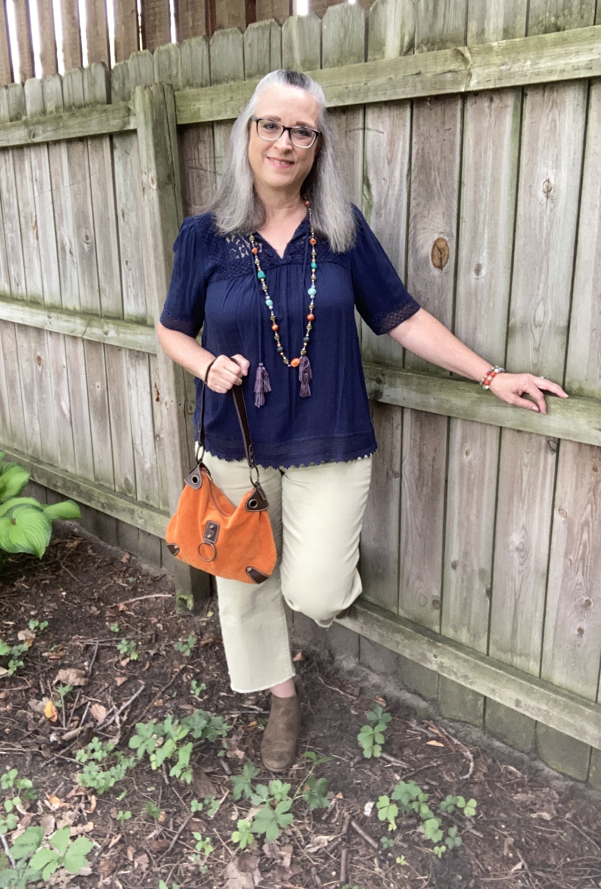
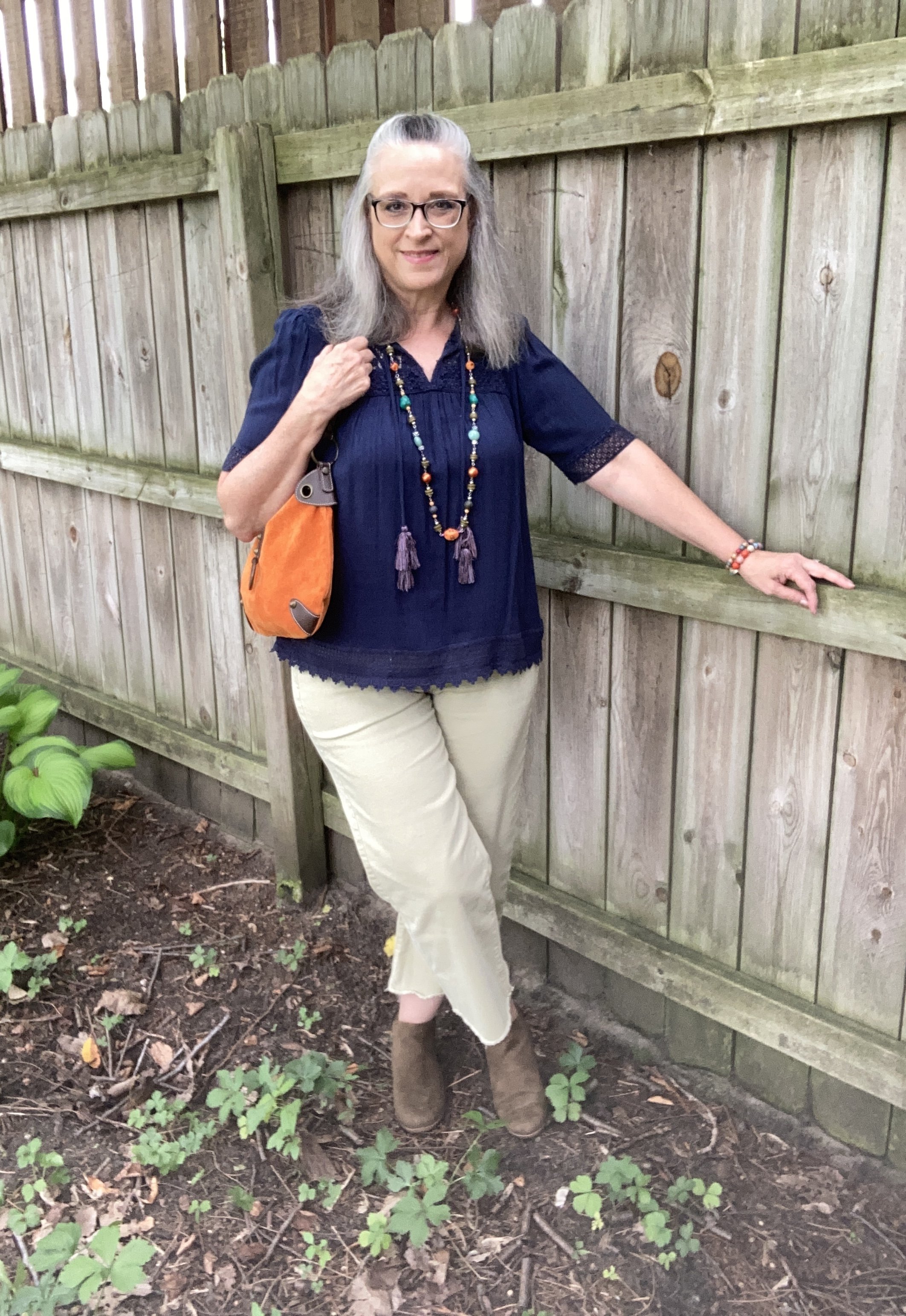
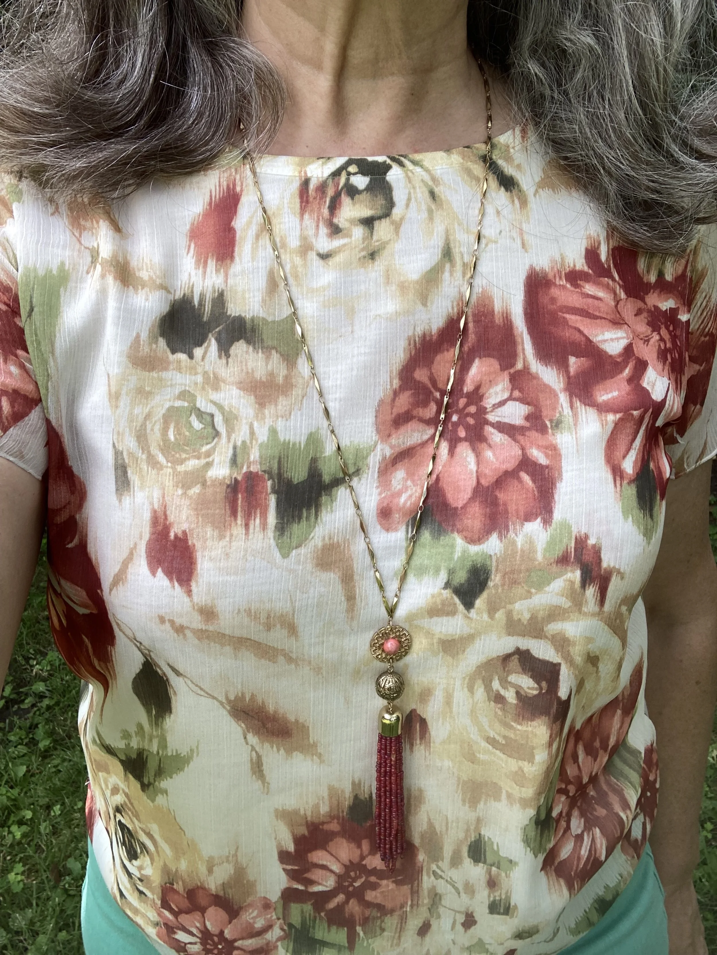
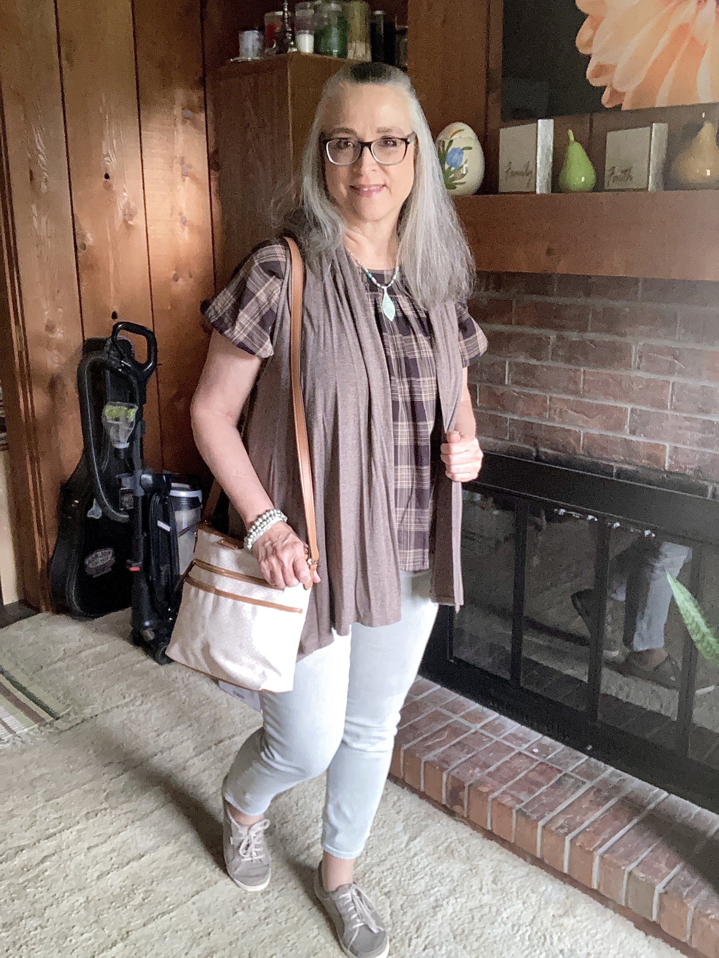
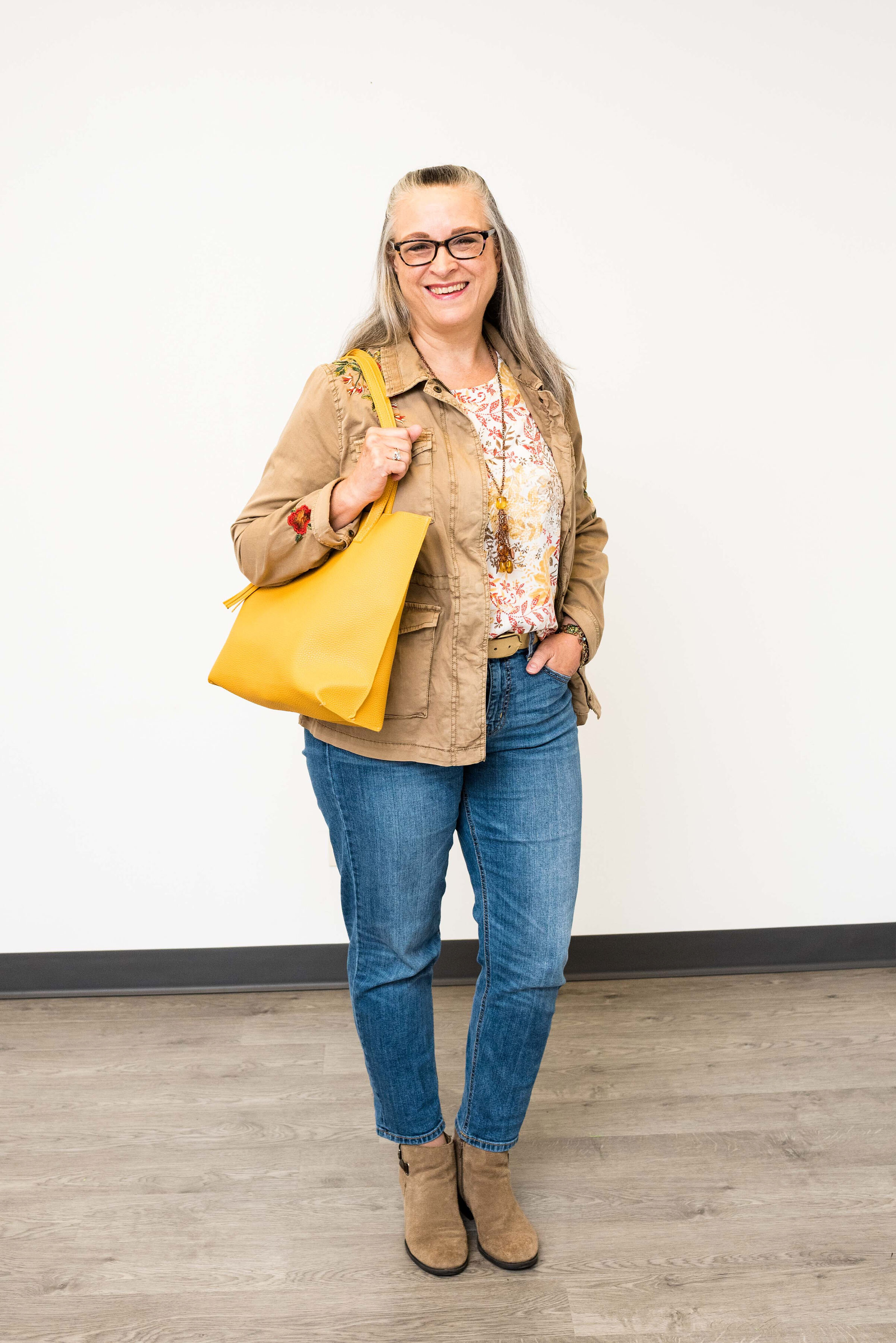
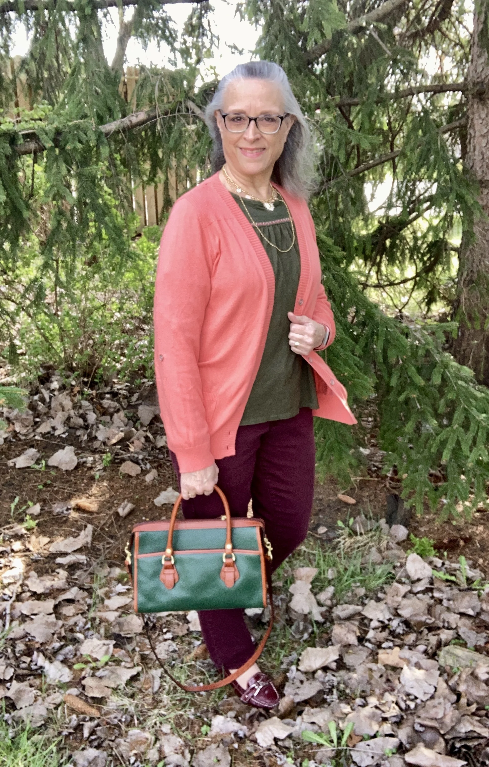
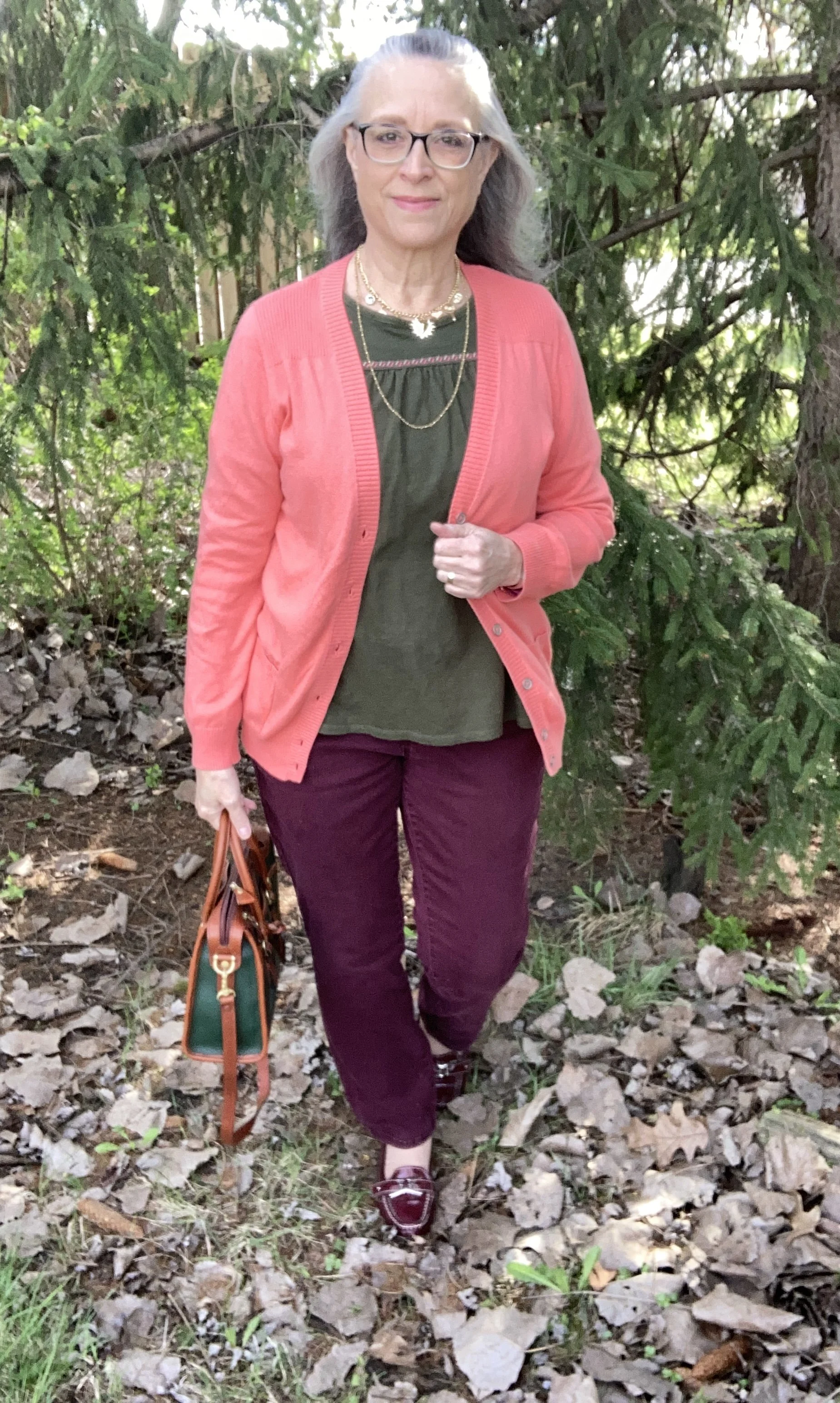
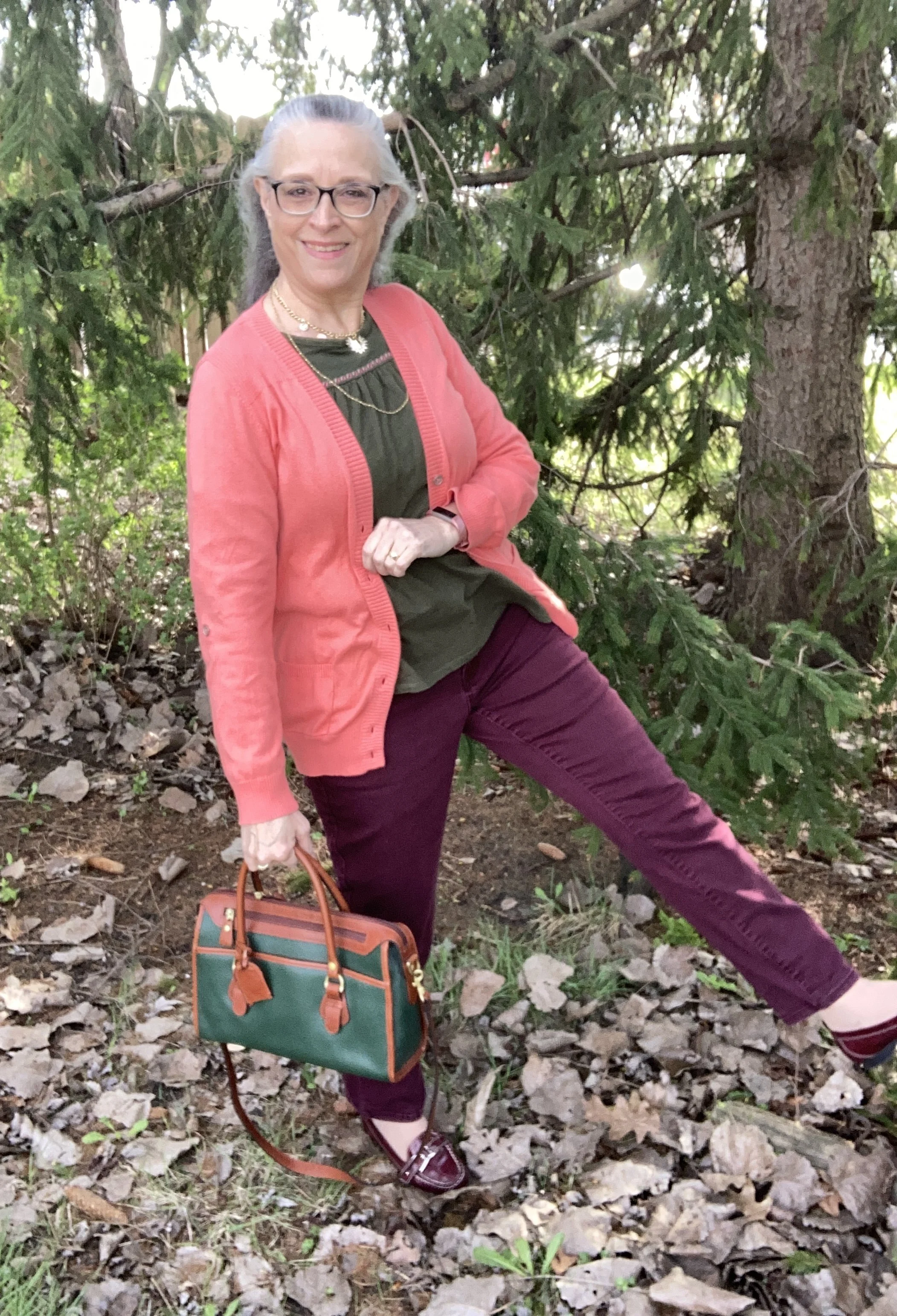
Today’s look revolves around a bright orangey coral, a dark burgundy and a deep green. These colors not only seem to be ready for Autumn, but I thought they would make an interesting combination, thus the reason I put this under my Color Play column. Welcome Camellia, Windsor Wine, and Garden Green from the Classic palette. You can see these colors on my Pinterest board by clicking here.
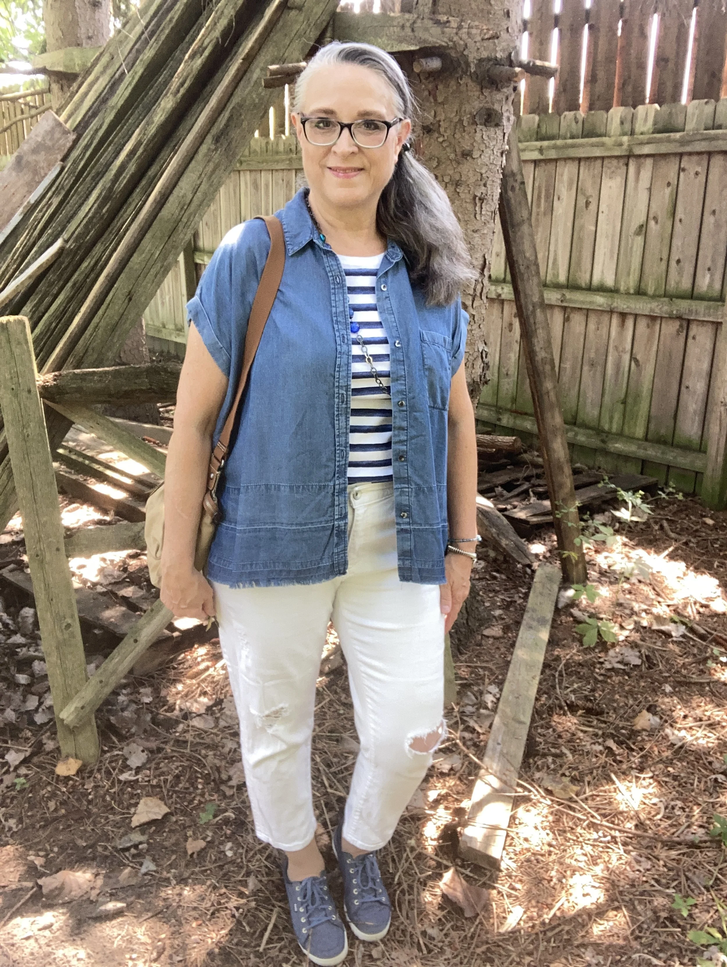
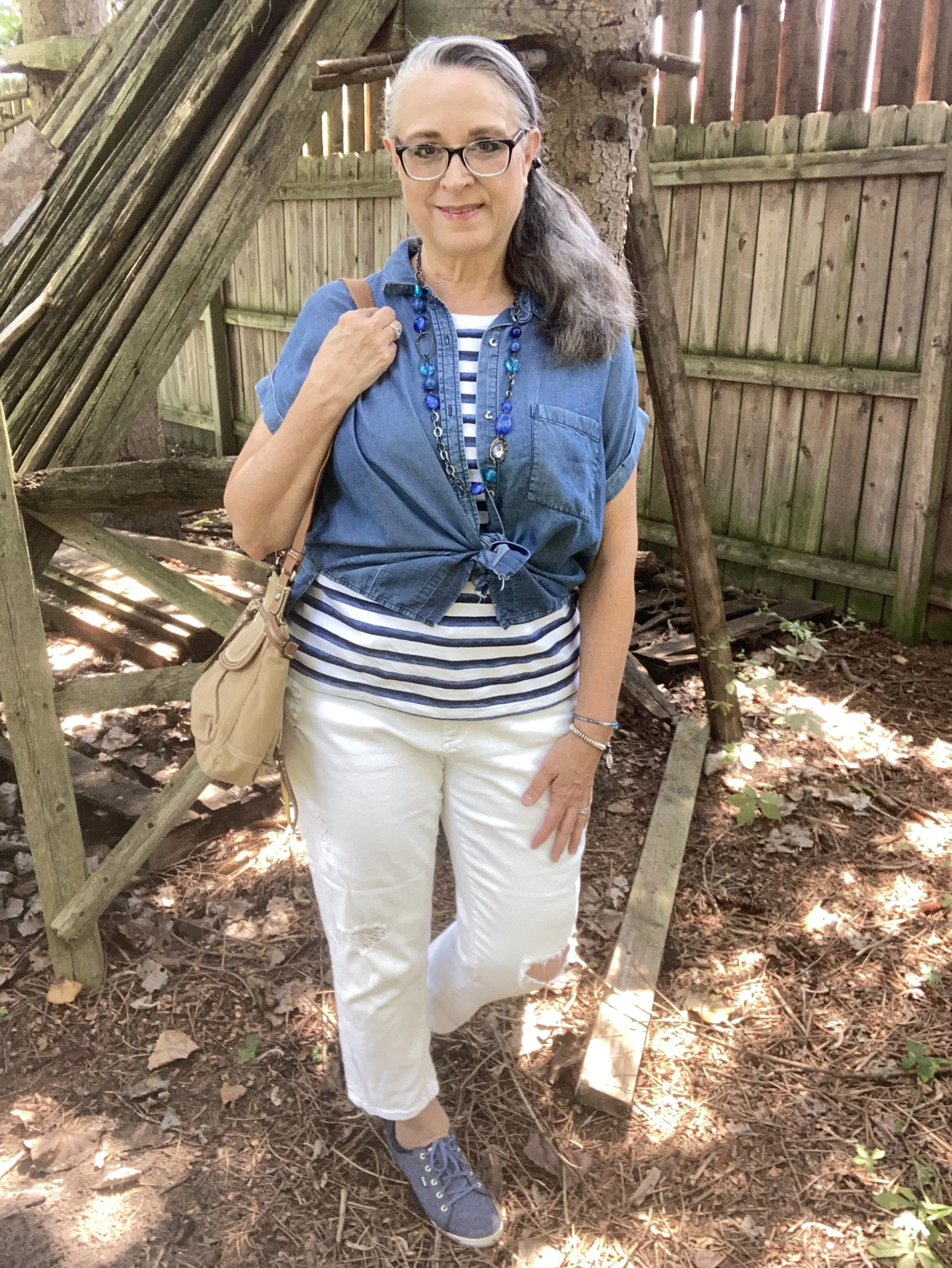
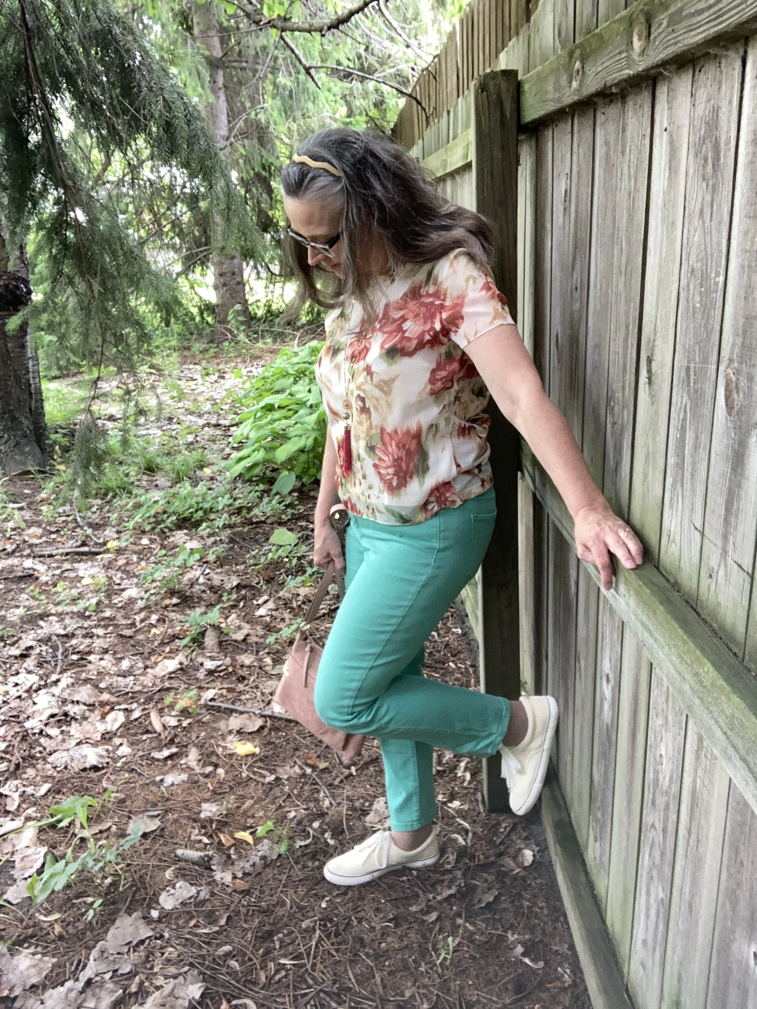
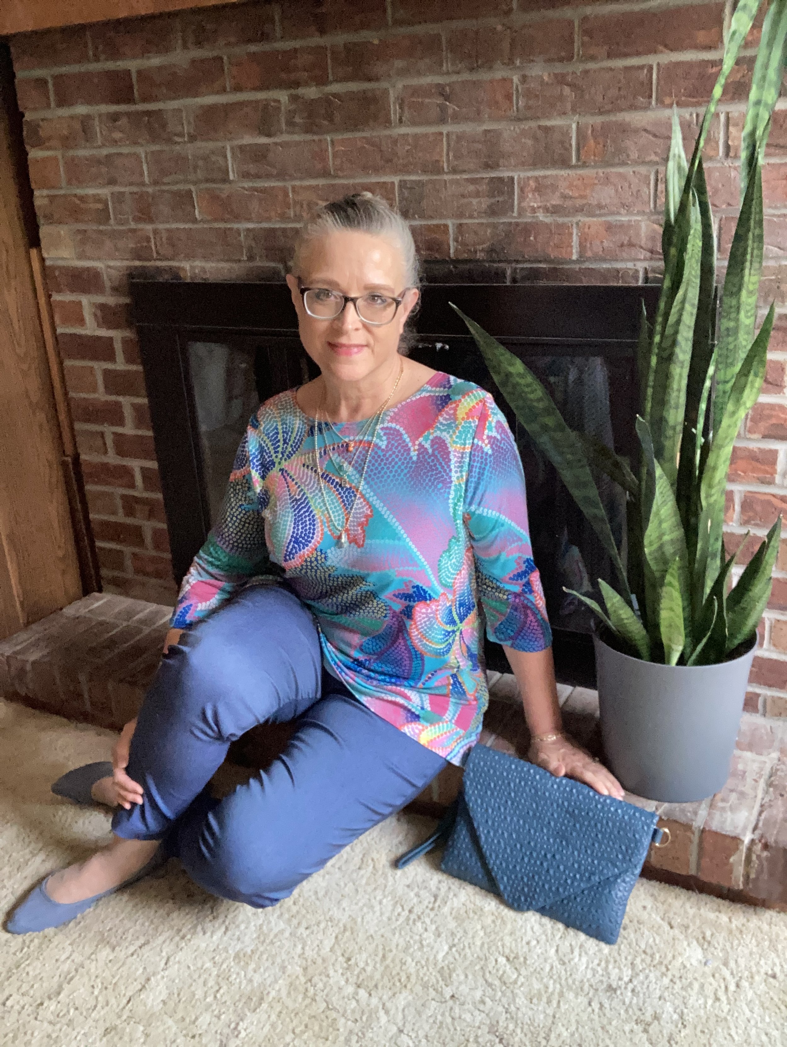
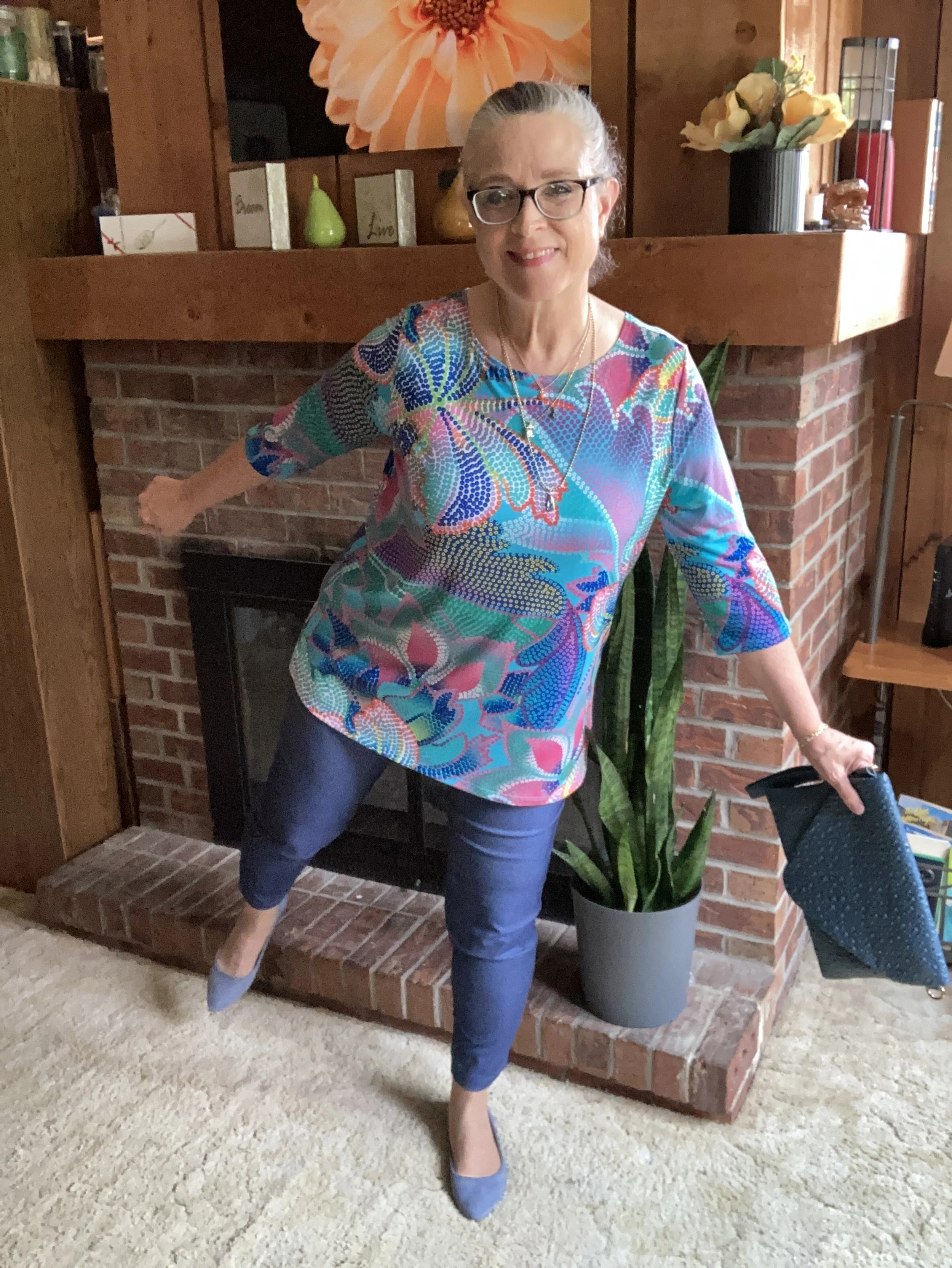
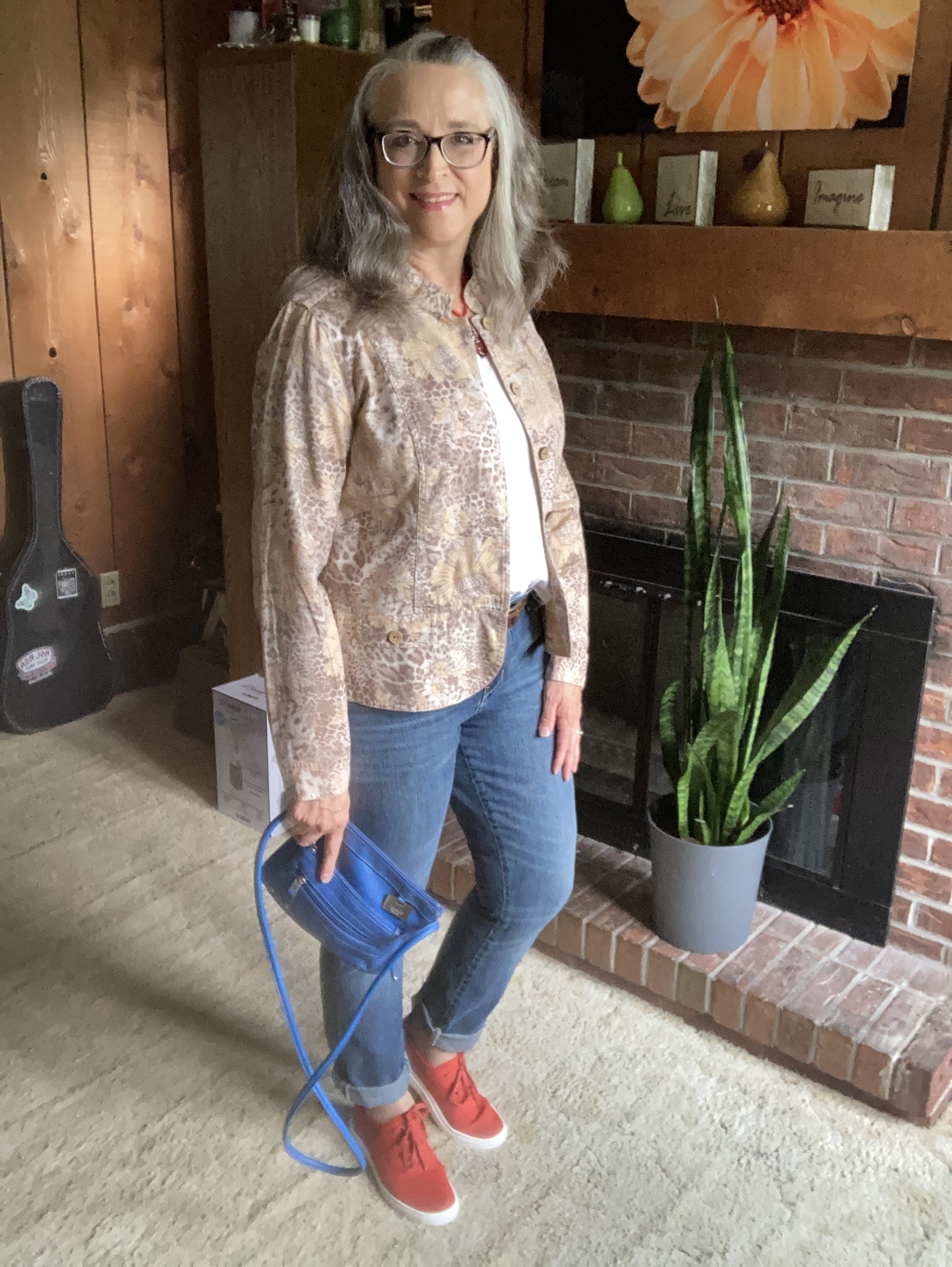
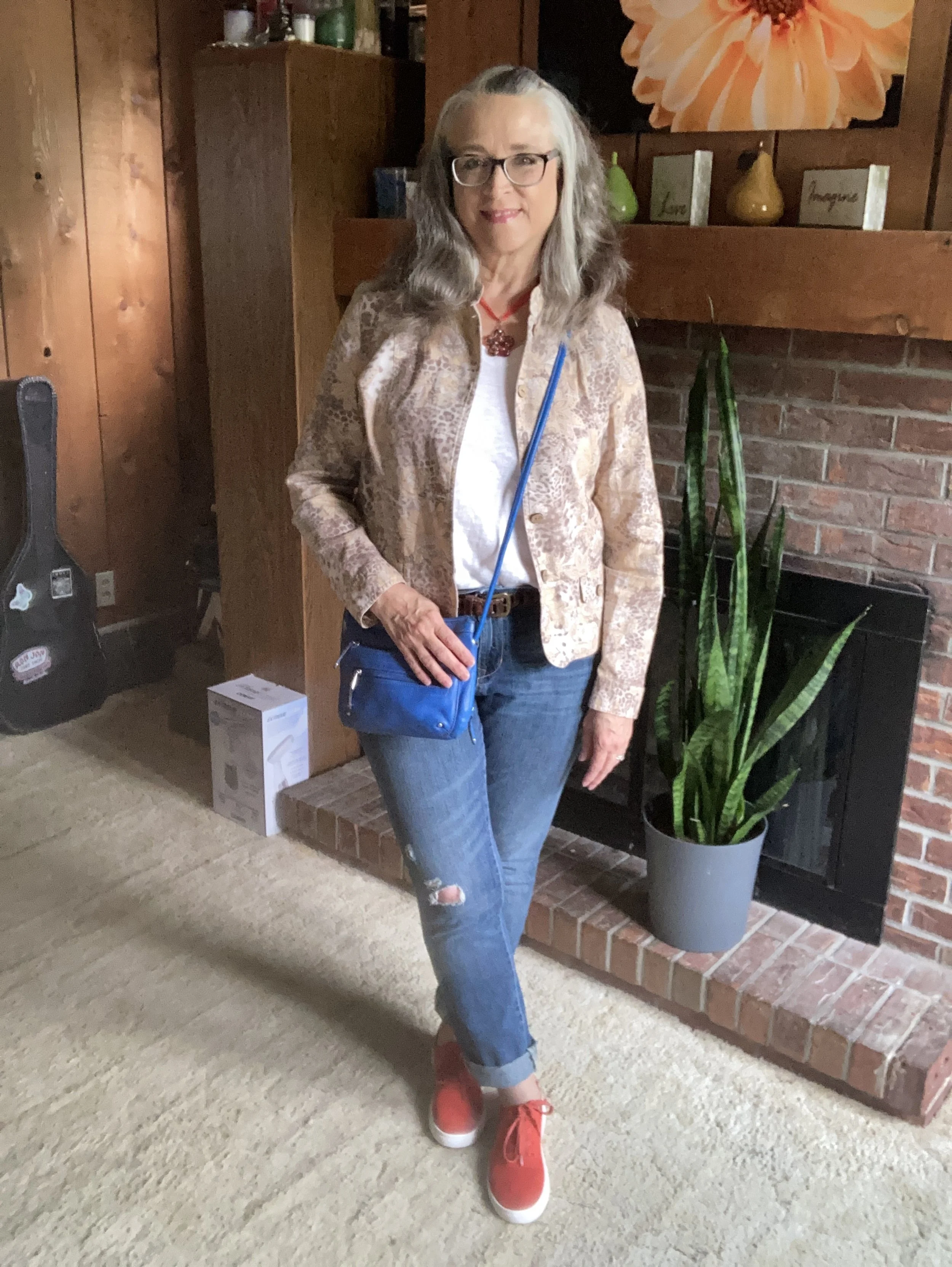
As you can see it was super windy when I took these pictures. The wind also made it chilly. I was intending to do photos for several outfits, but if you saw last week’s post you can see I finally went inside. Ha, ha.
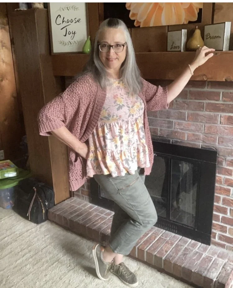
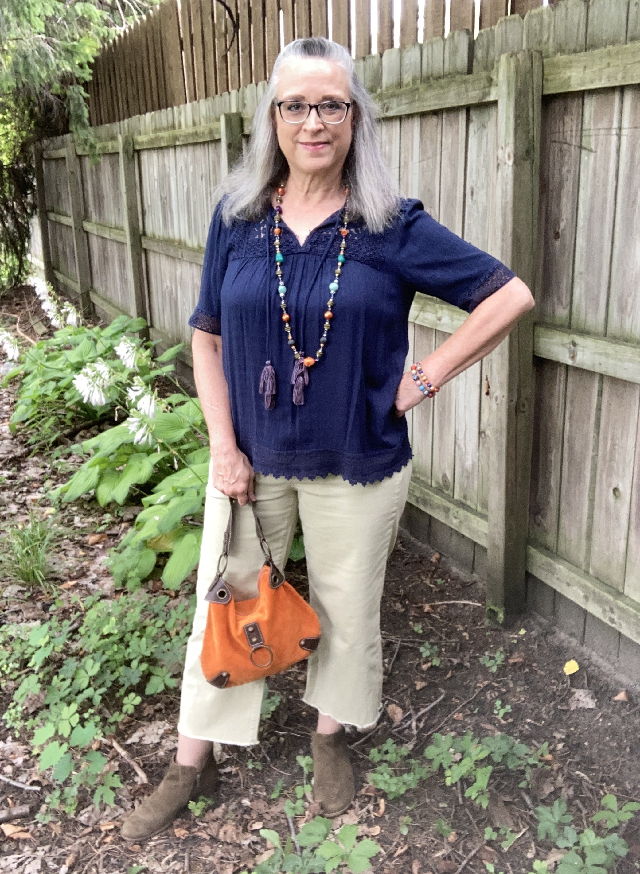
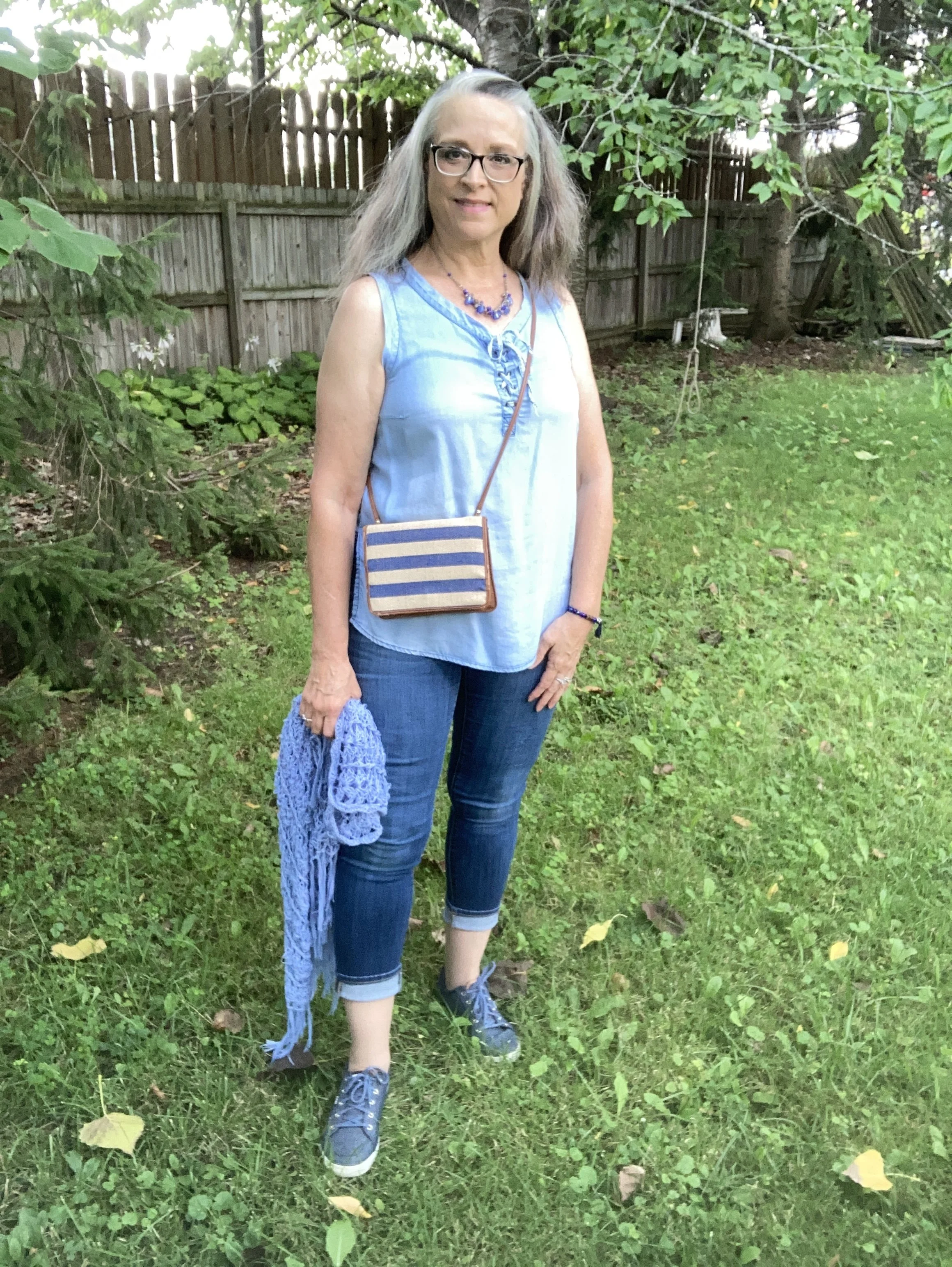
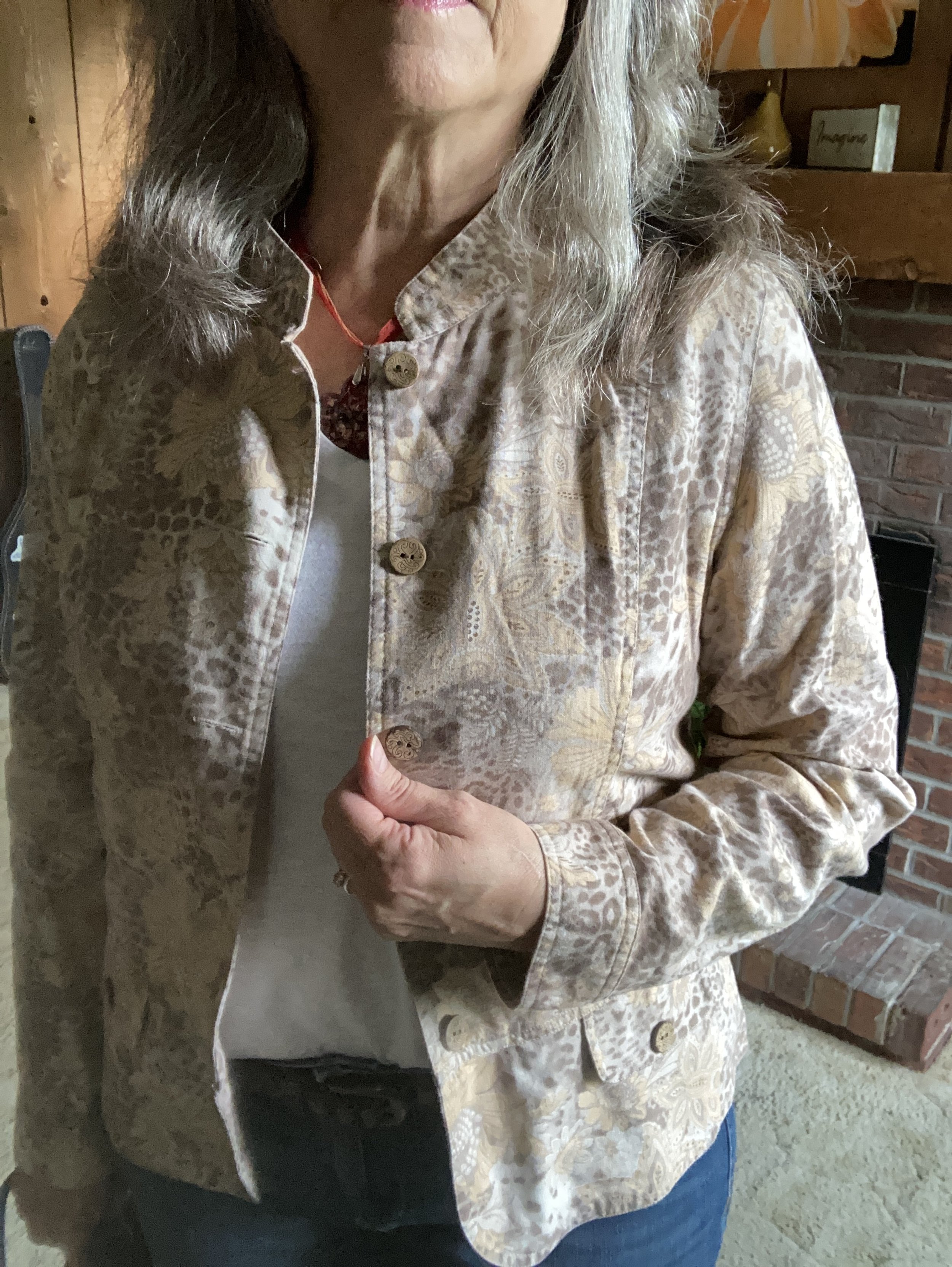
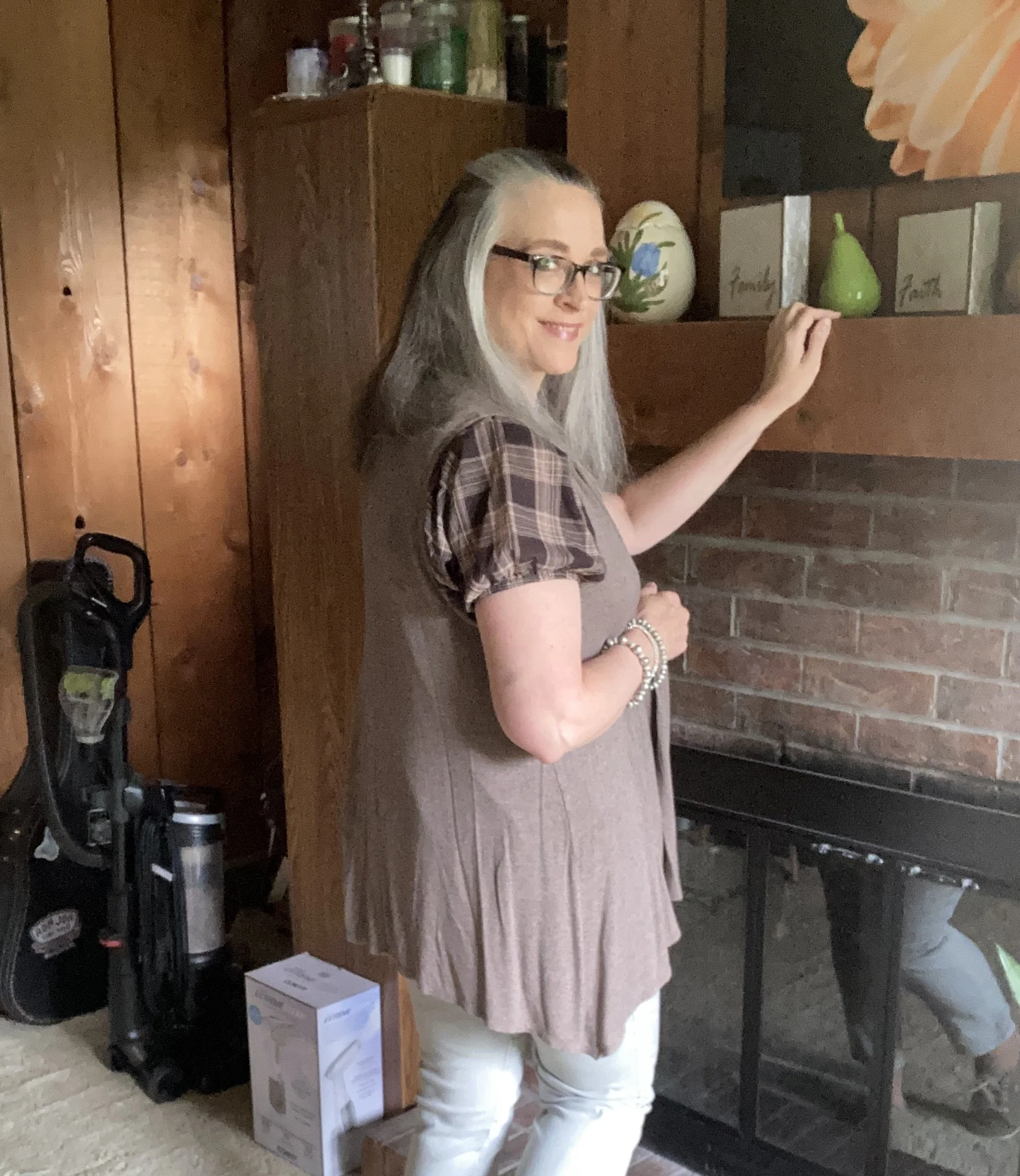
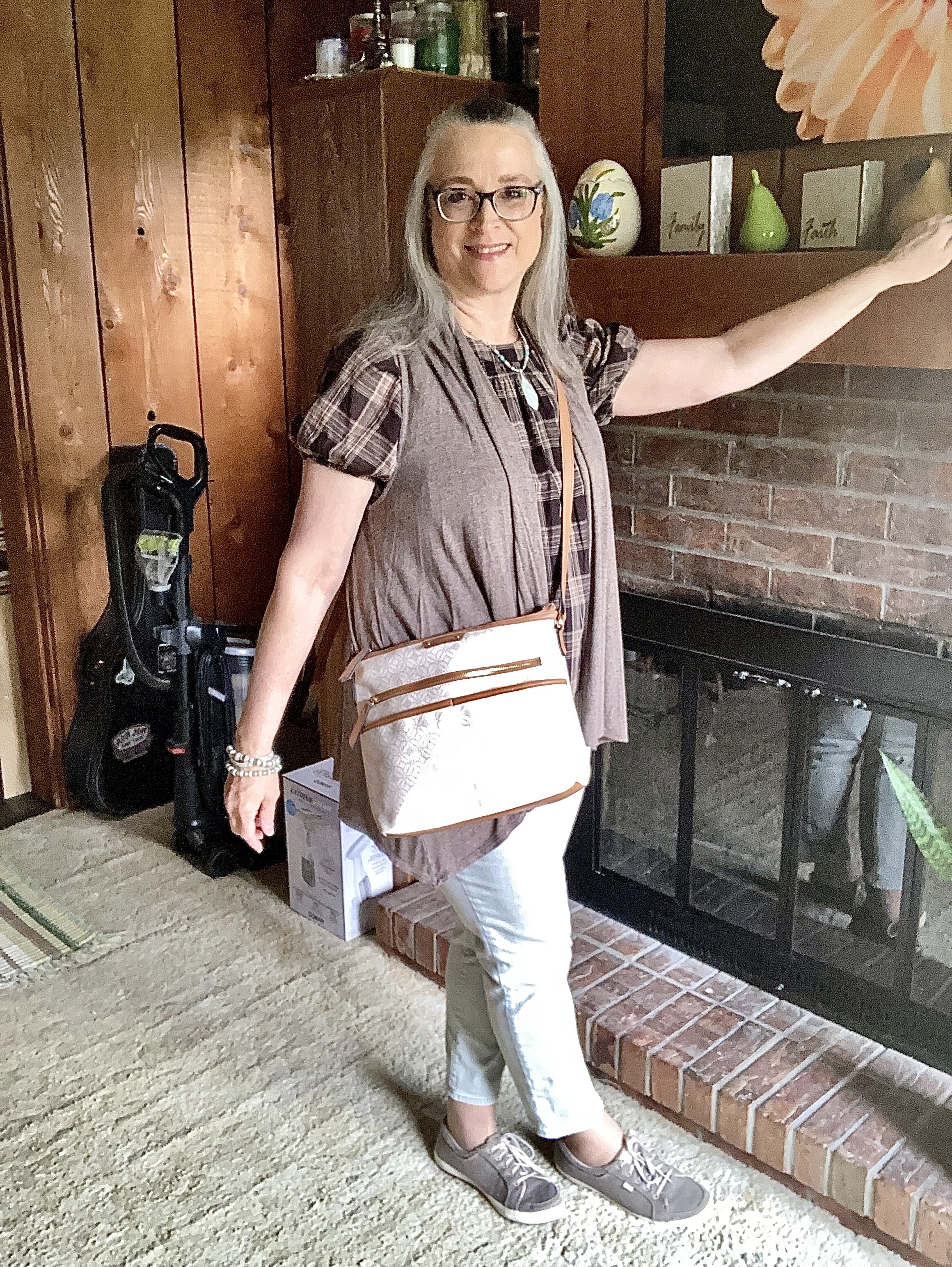
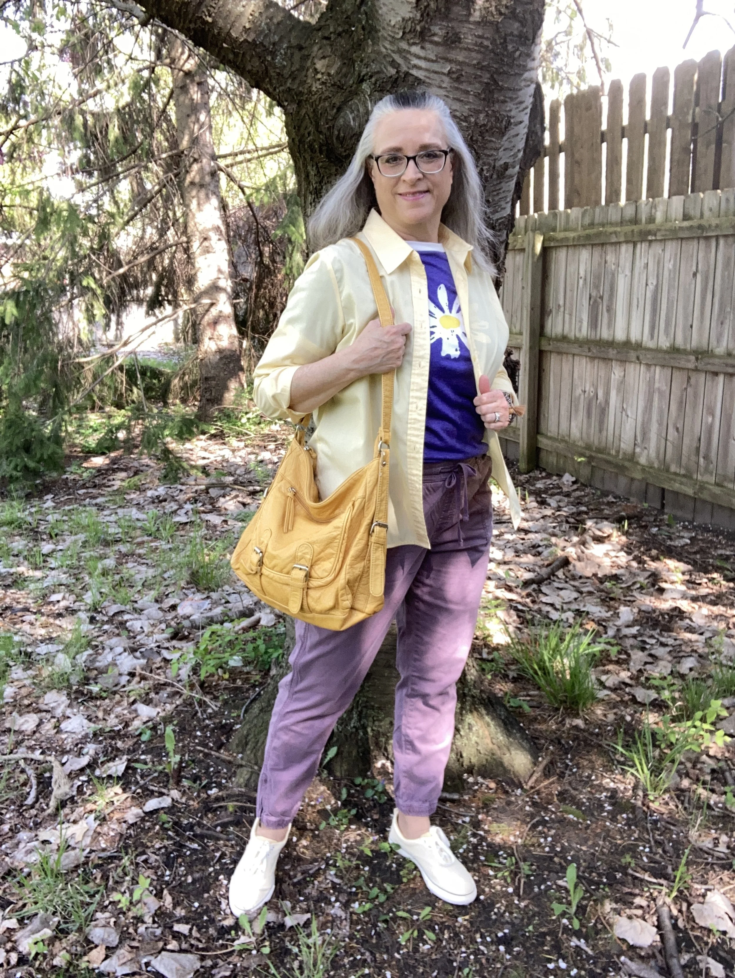
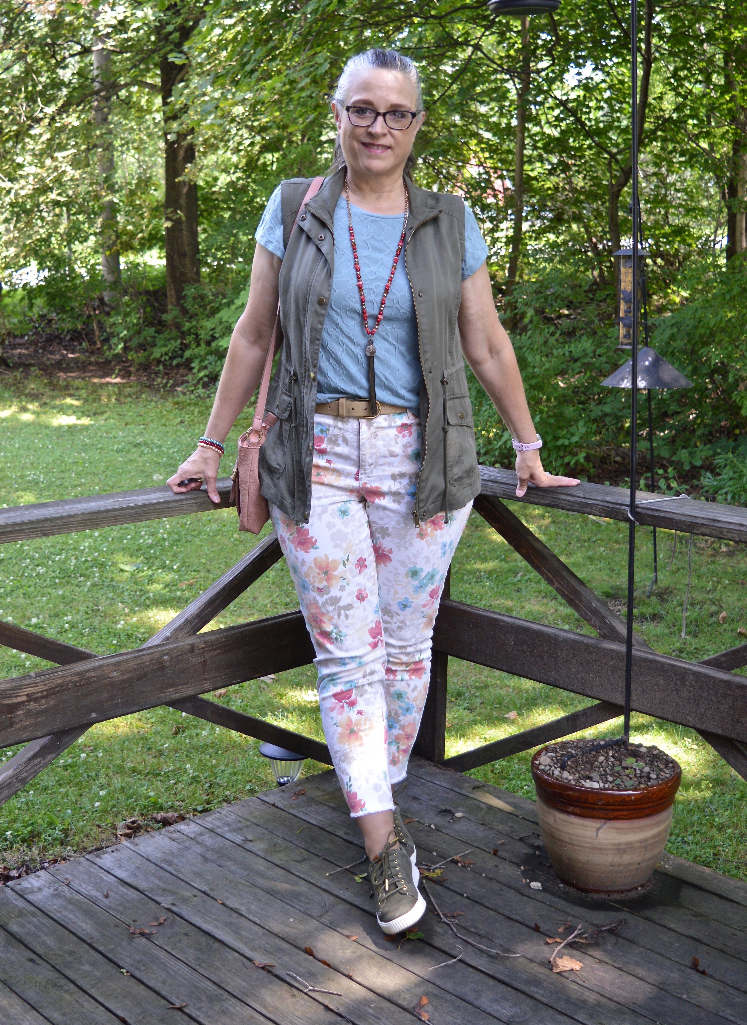
I have had this orangey coral cardigan for several years. It is Sonoma brand and I got it at Kohl’s. It is a great sweater for the warmer weather as it is light weight. It also has the tabs and buttons on the sleeves so you can roll it up to make them shorter if you want. It also has patch pockets on the lower front on both sides.

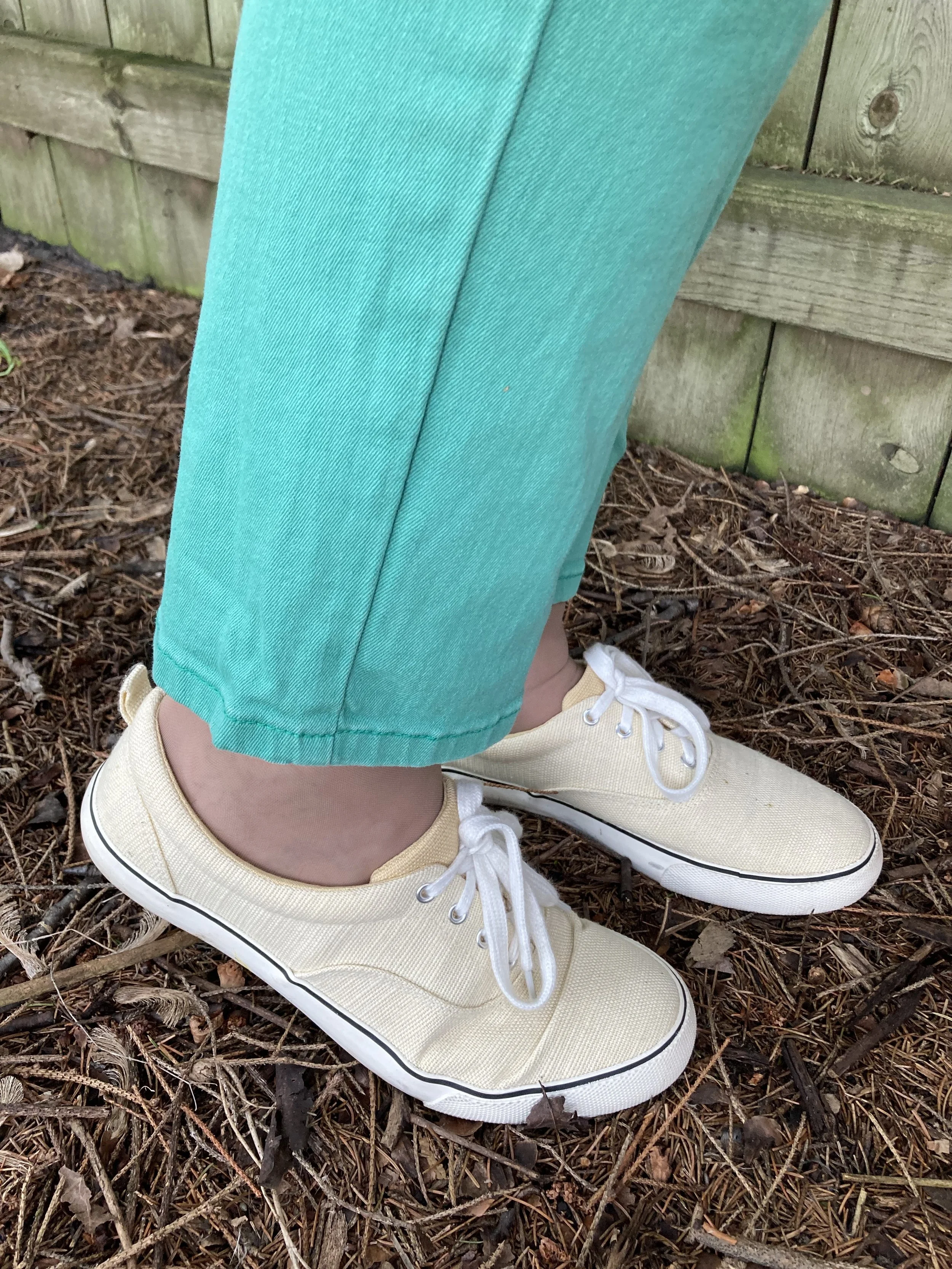
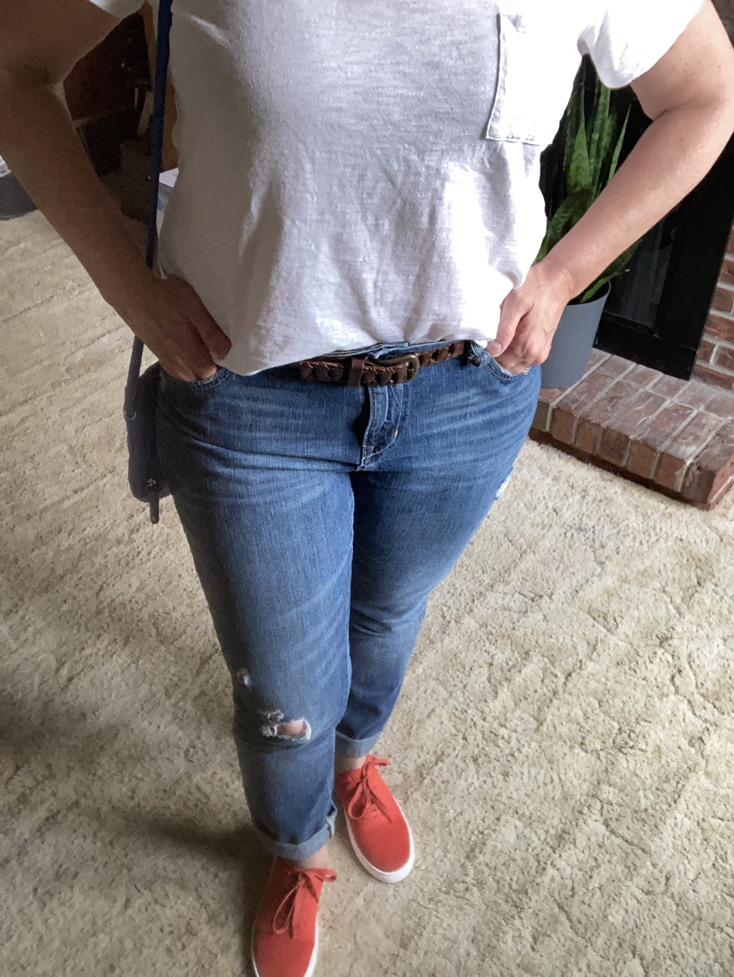
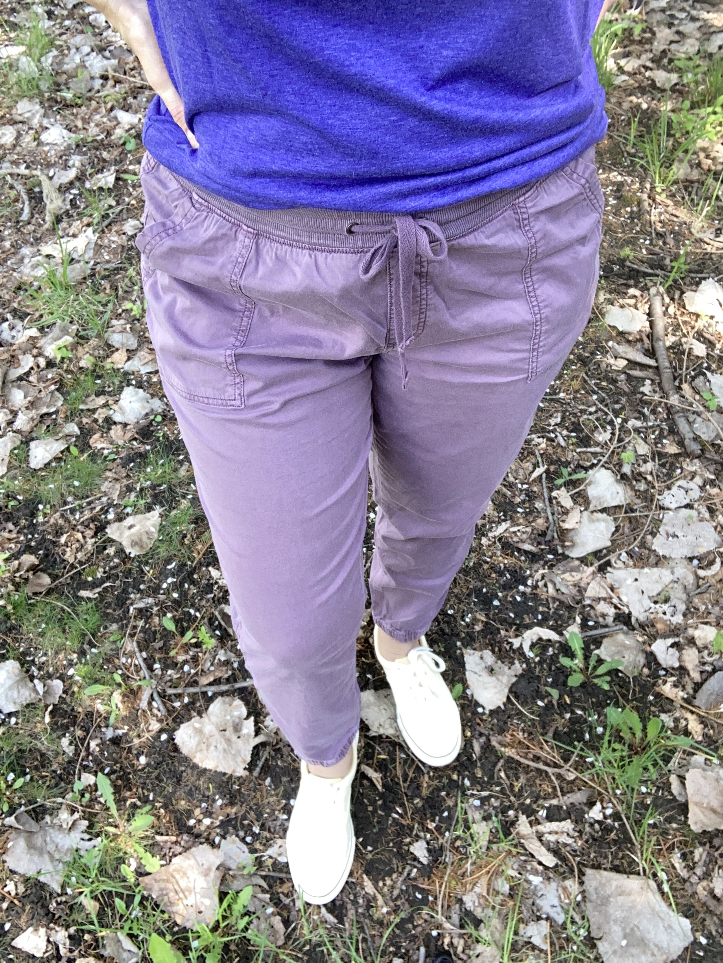
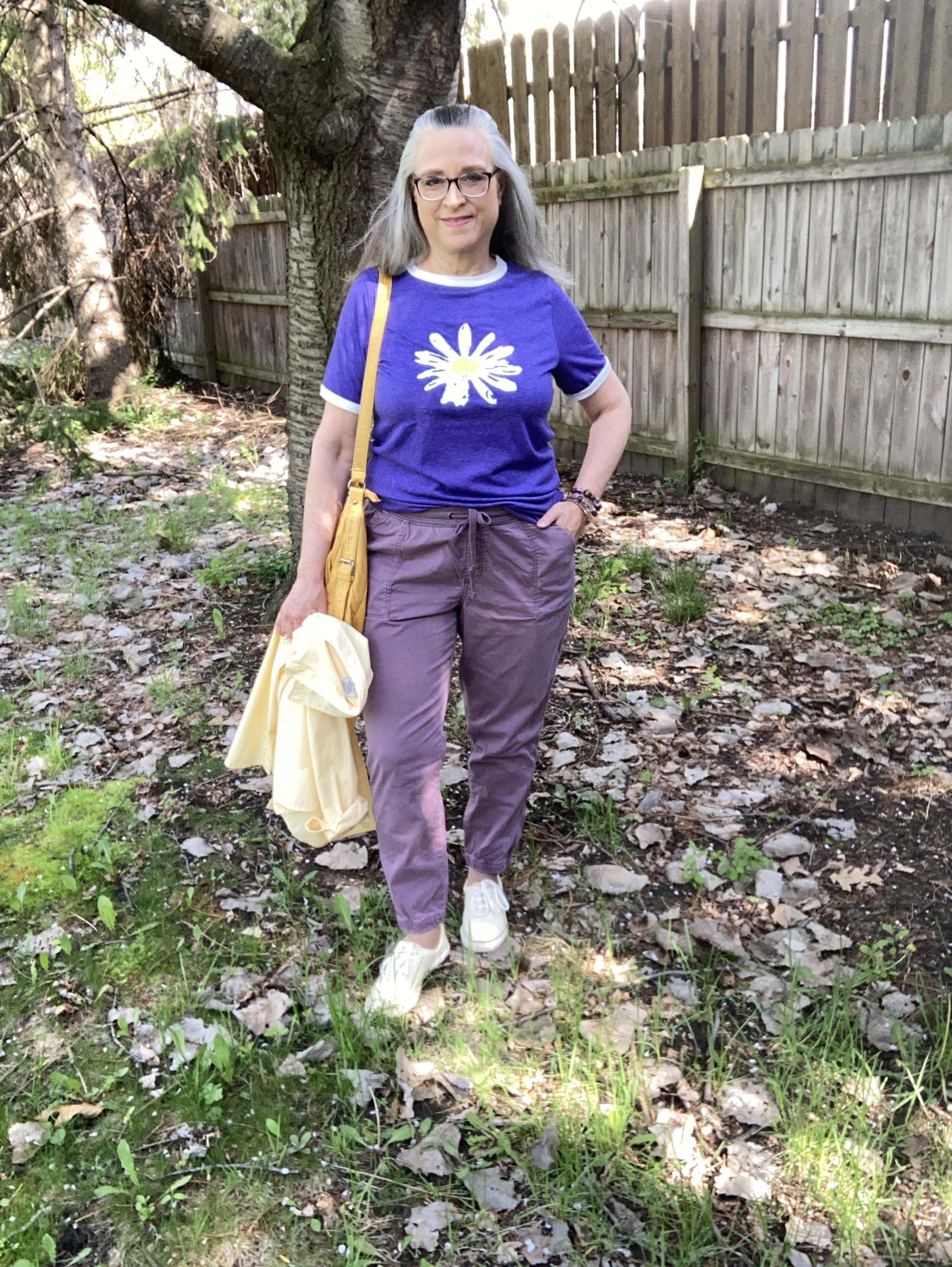
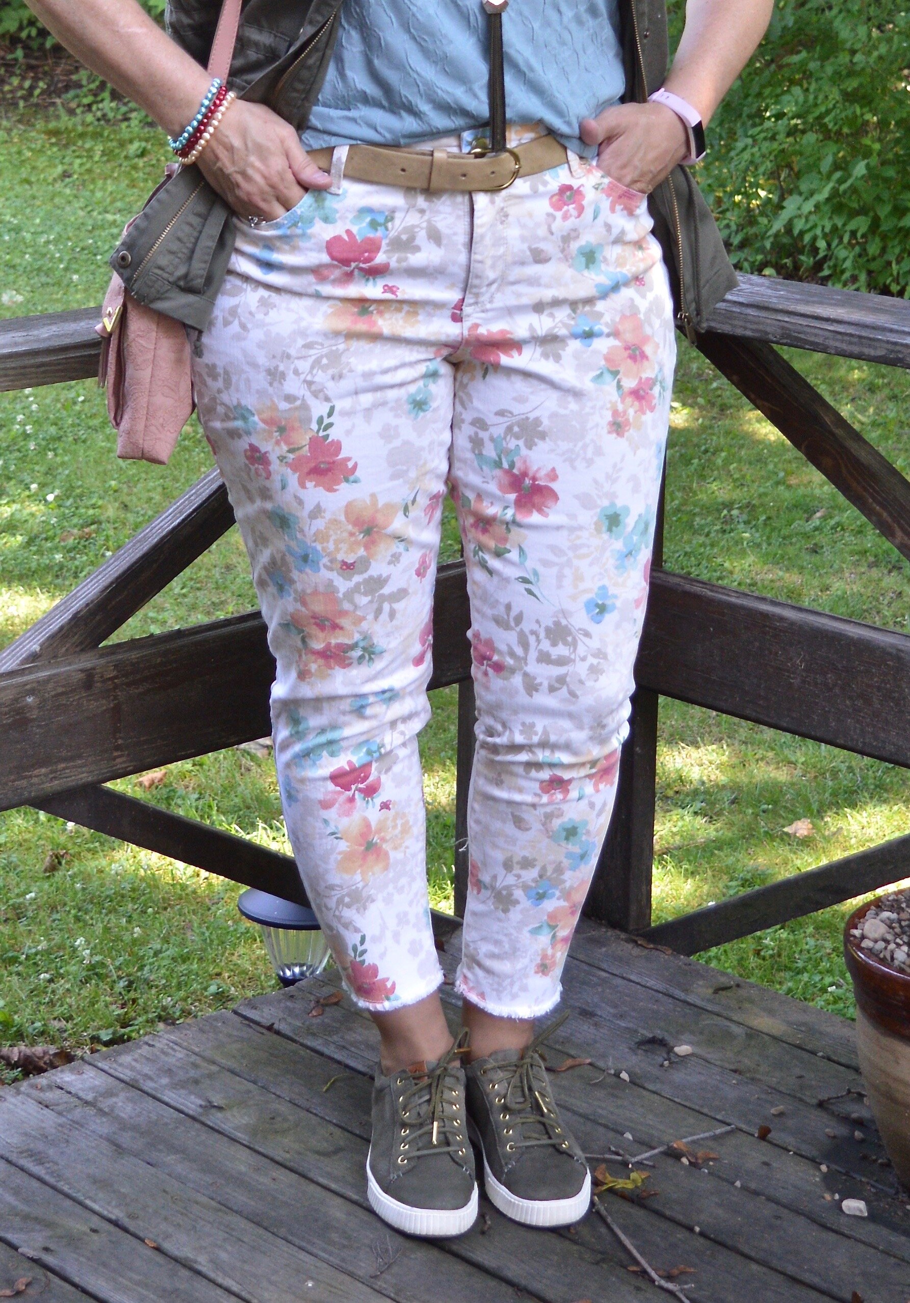
My Windsor Wine colored pants are thrifted Westport brand. I really would like to say I will wear these again this summer, but I have so many other things to wear in the warm weather that I find more appealing to my desired spring and summer color palette, so these will, most likely, be lovingly packed away until fall.
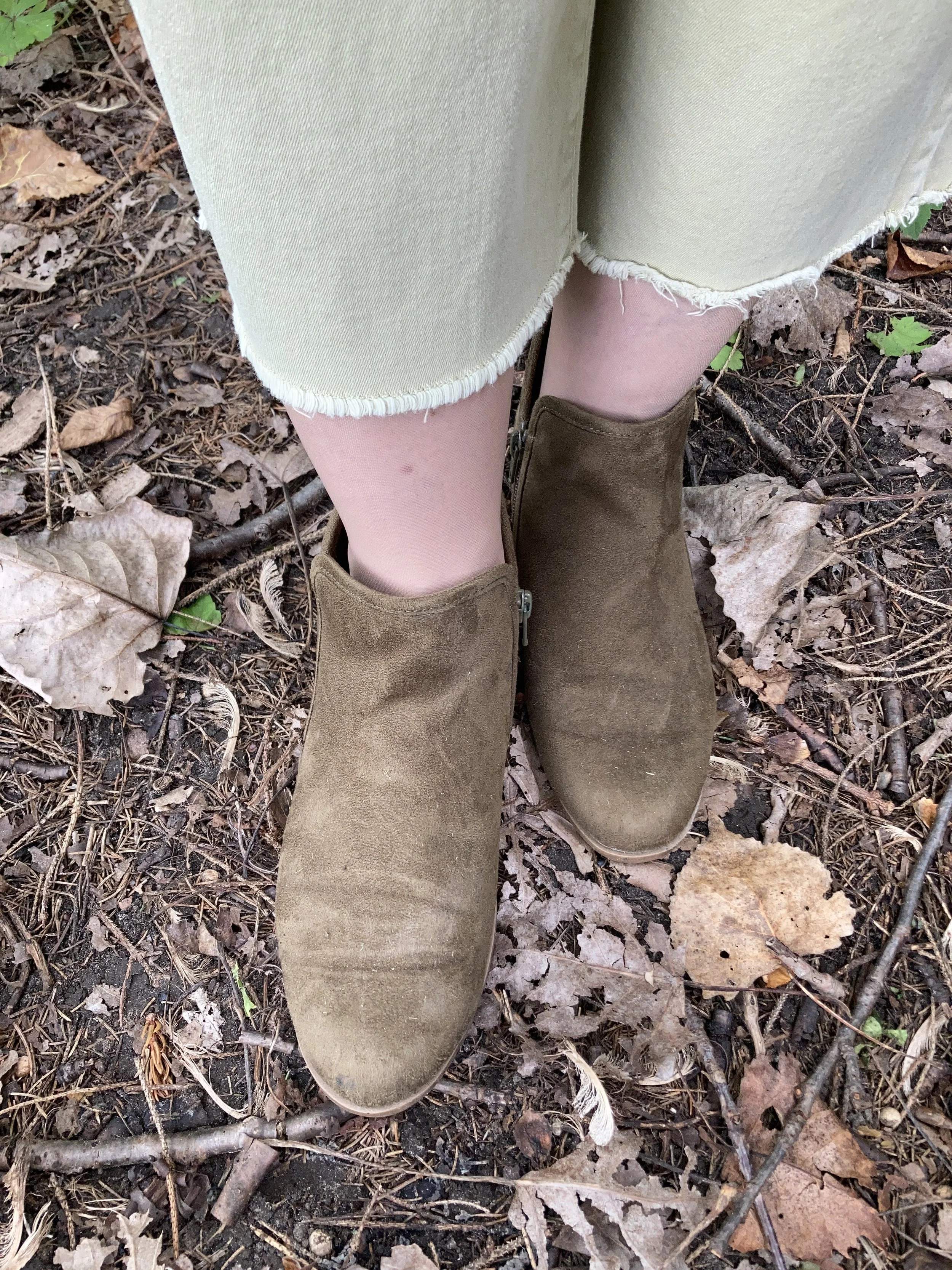
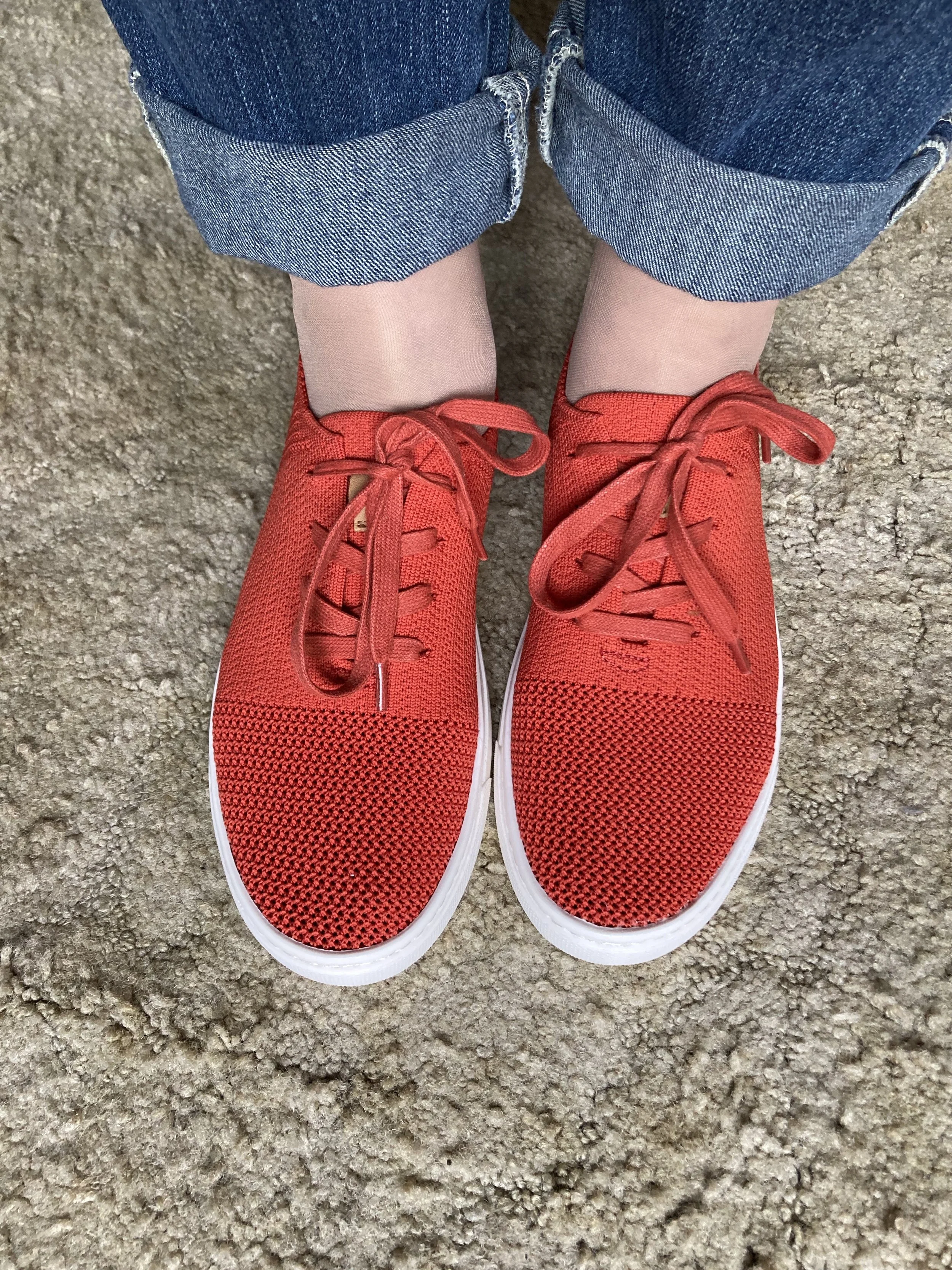
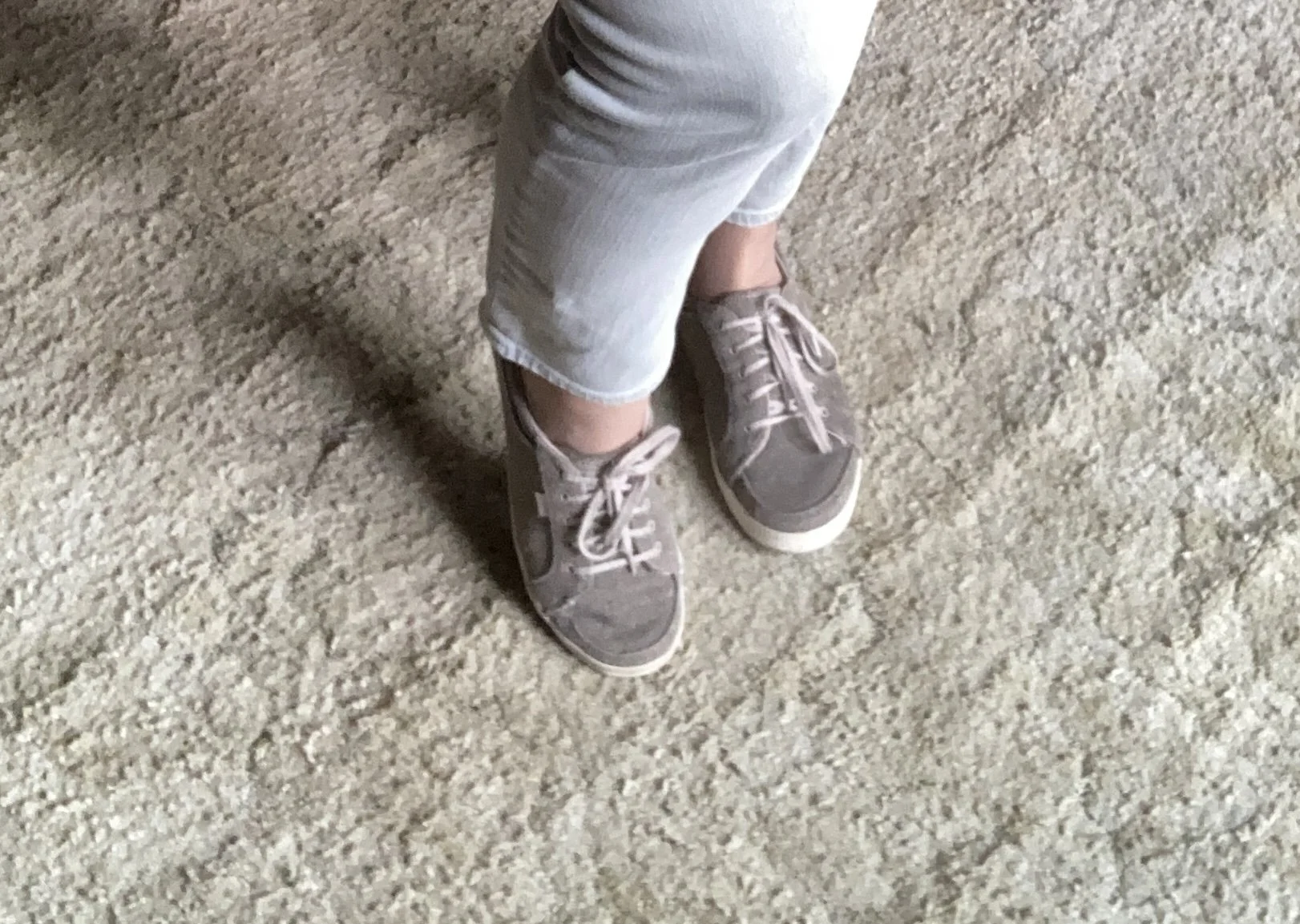
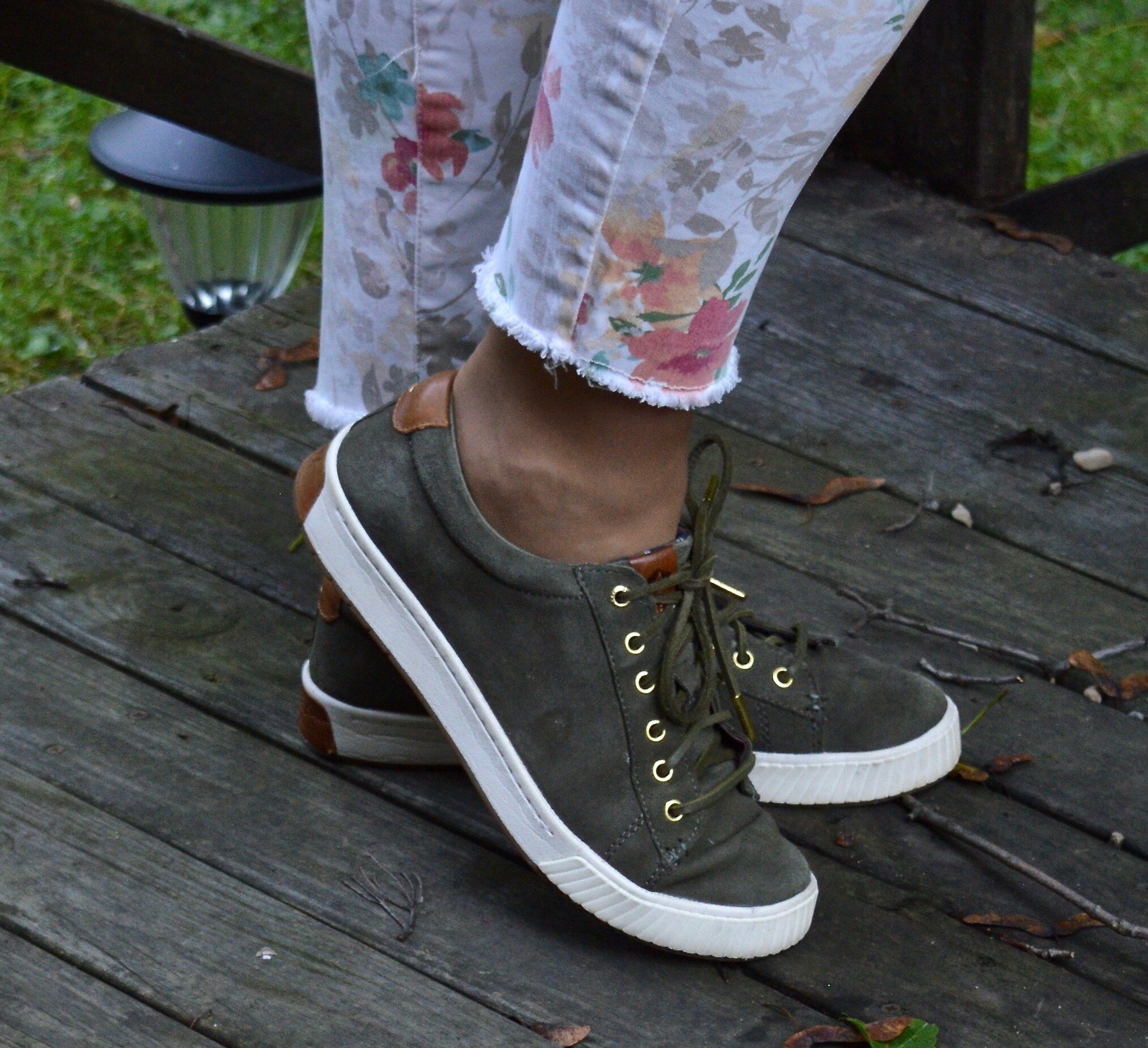
You can also see I pulled out my similarly colored loafers. These are a thrifted pair of Naturalizers, called Natural Soul. I used to wear these to work, back in the day when I was employed. Ha, ha. I like that they are patent leather, but not the typical black.

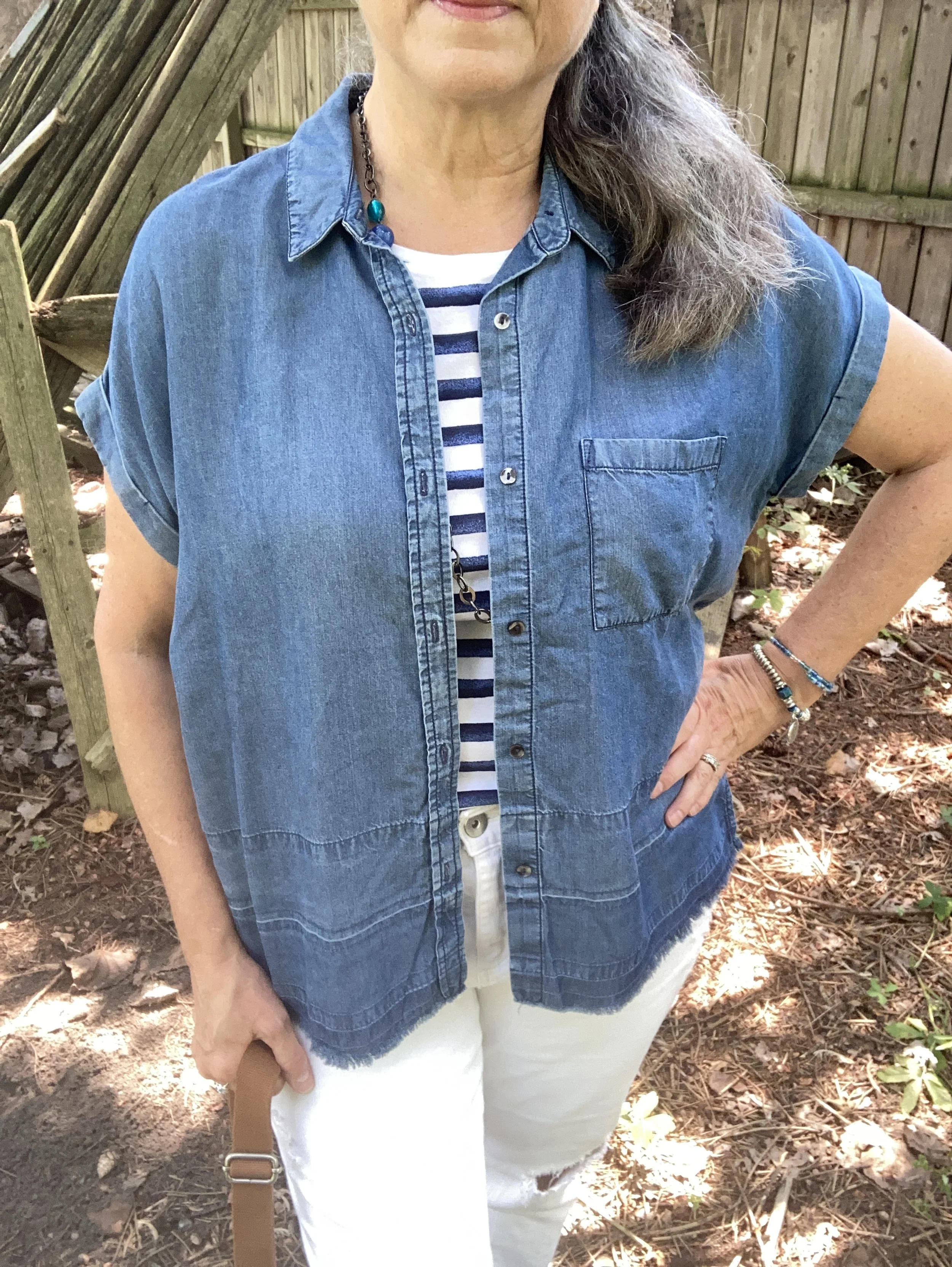
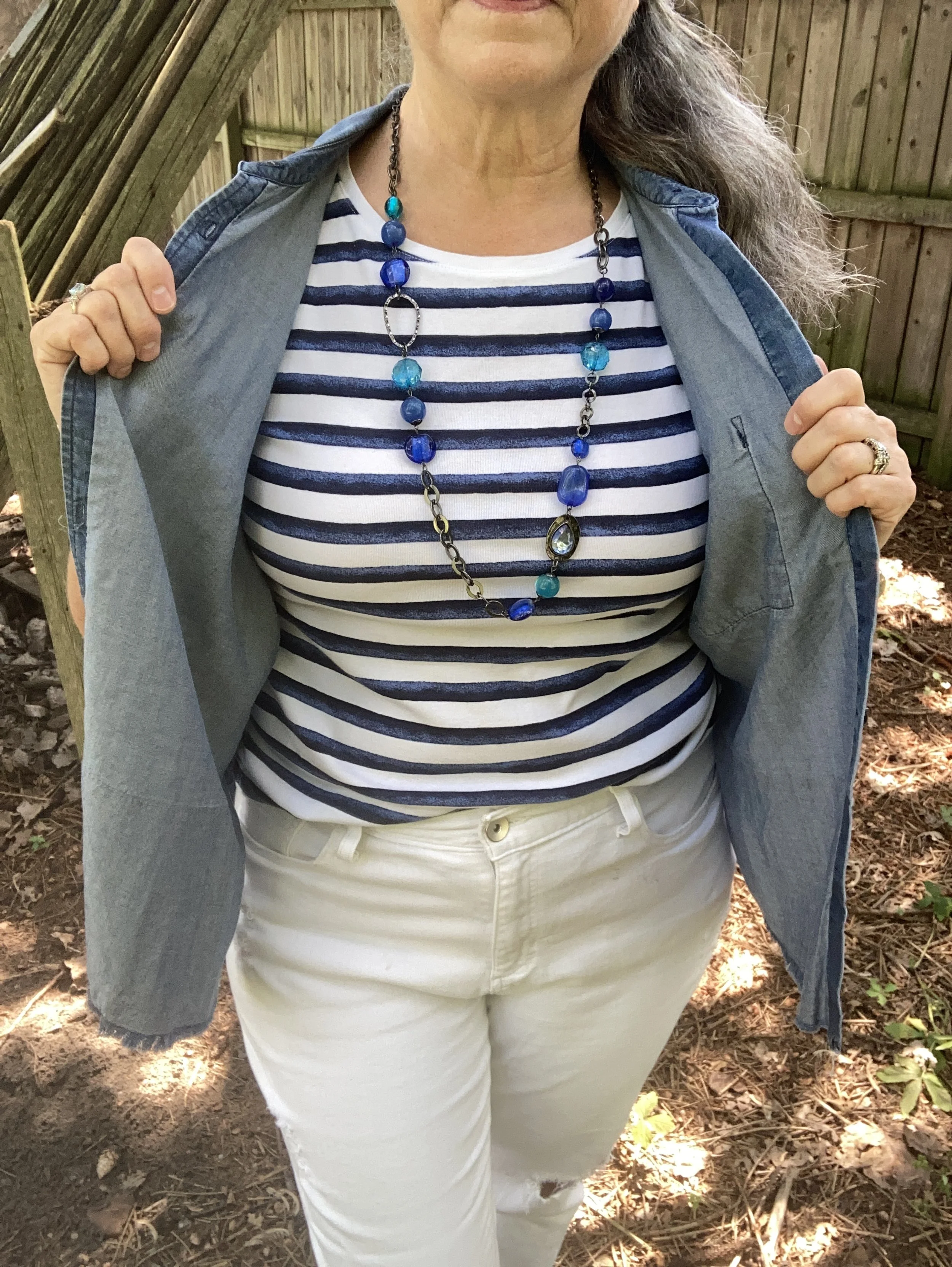
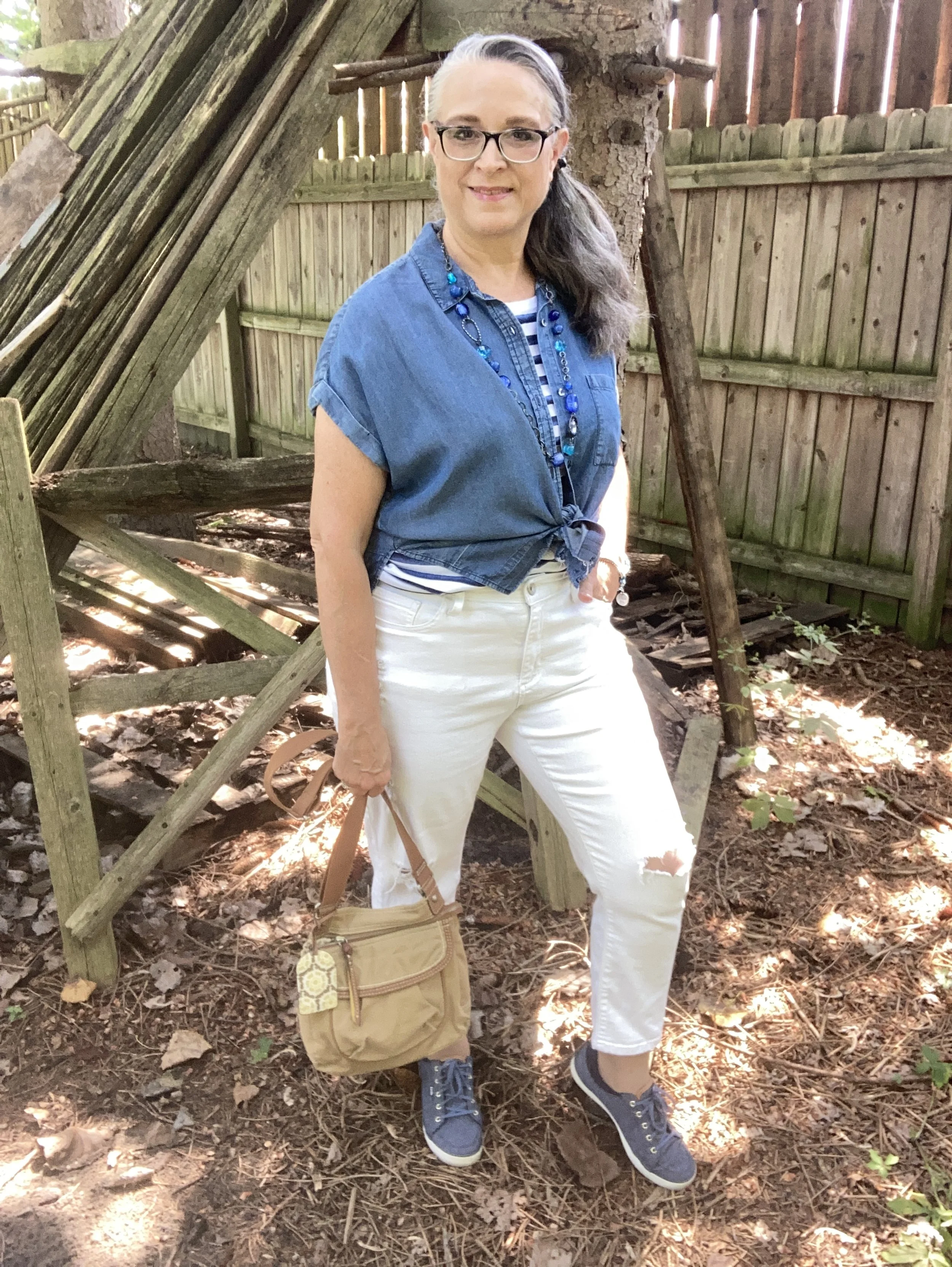
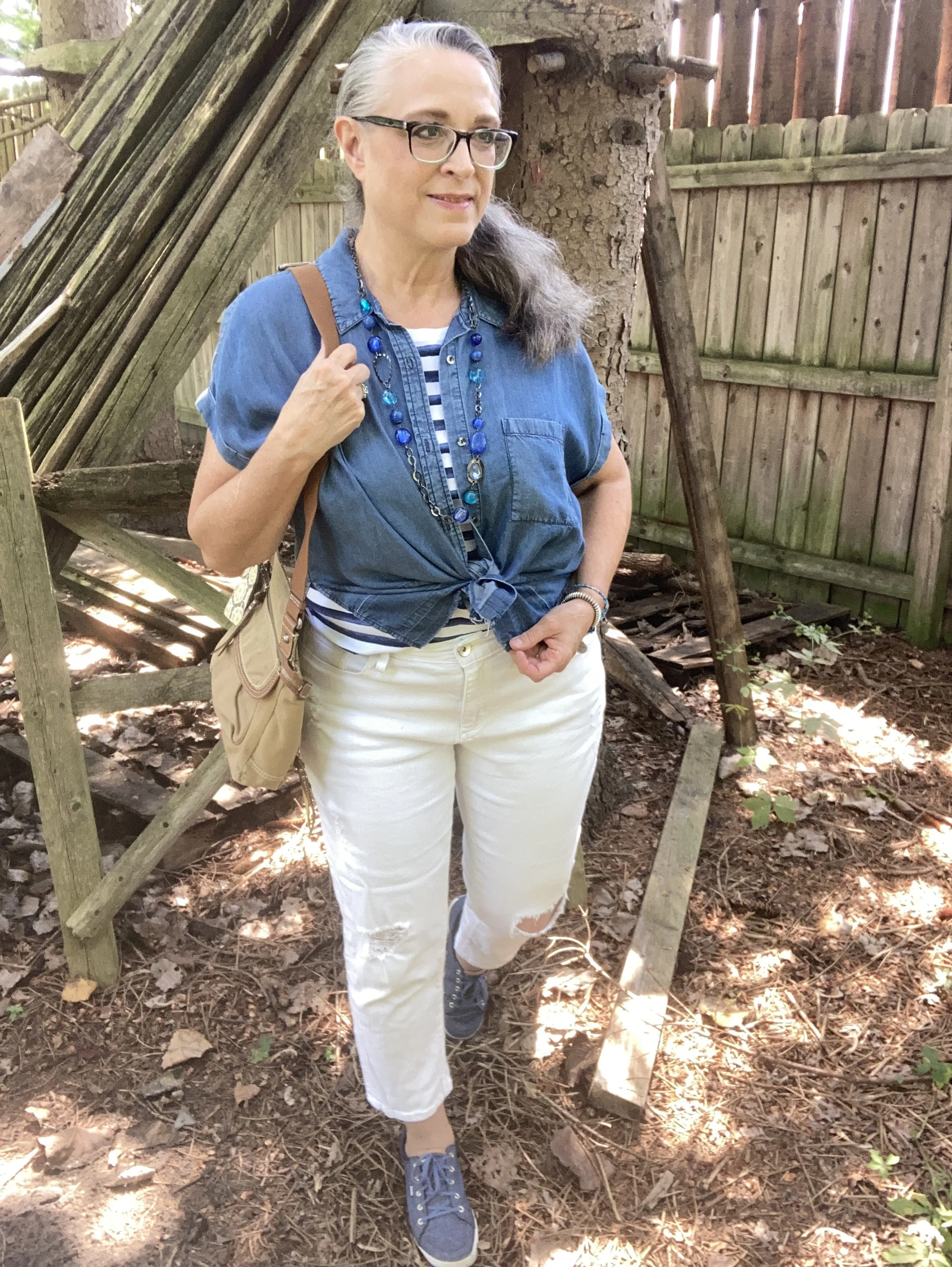
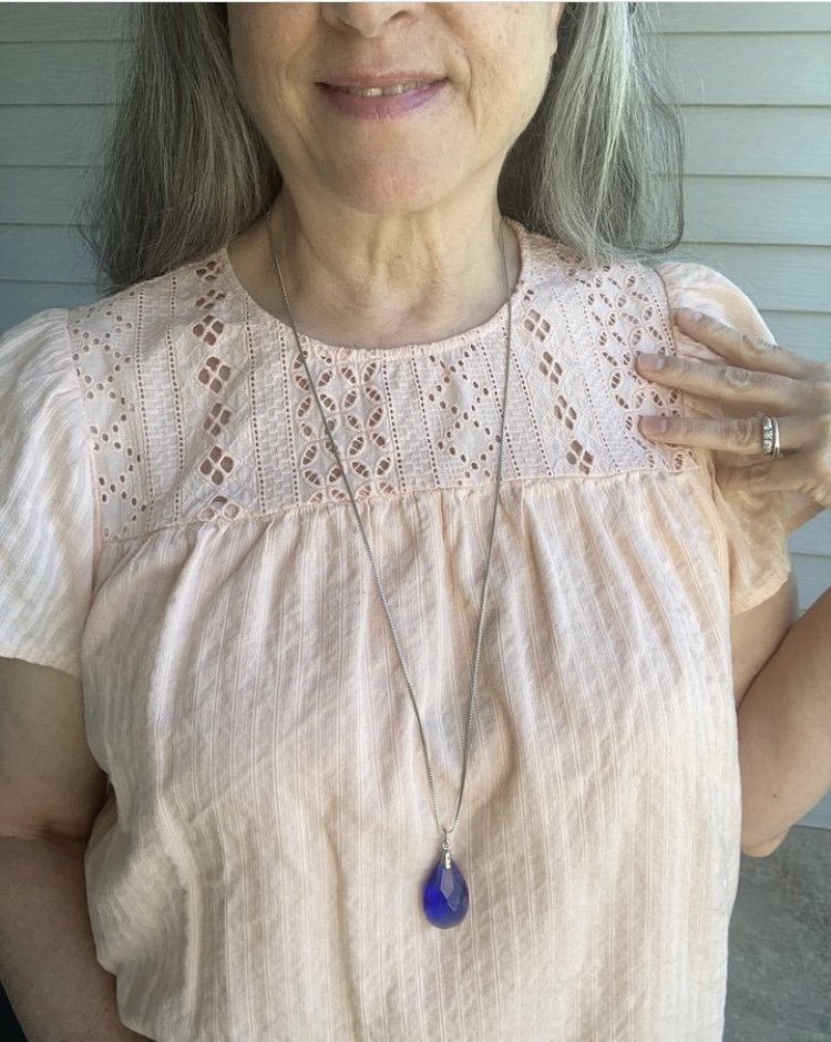
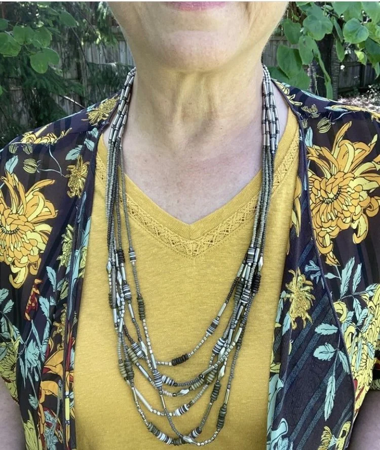
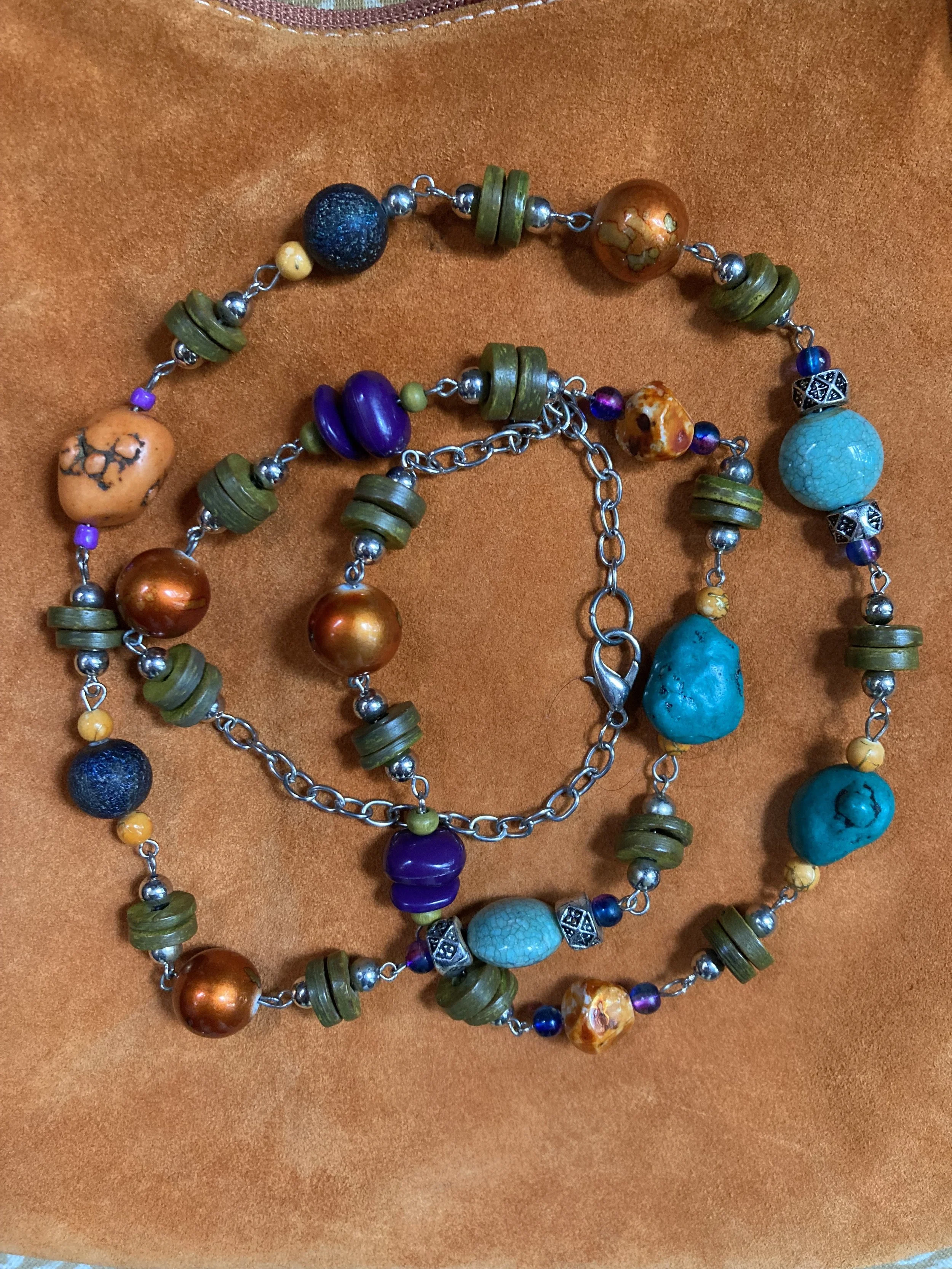
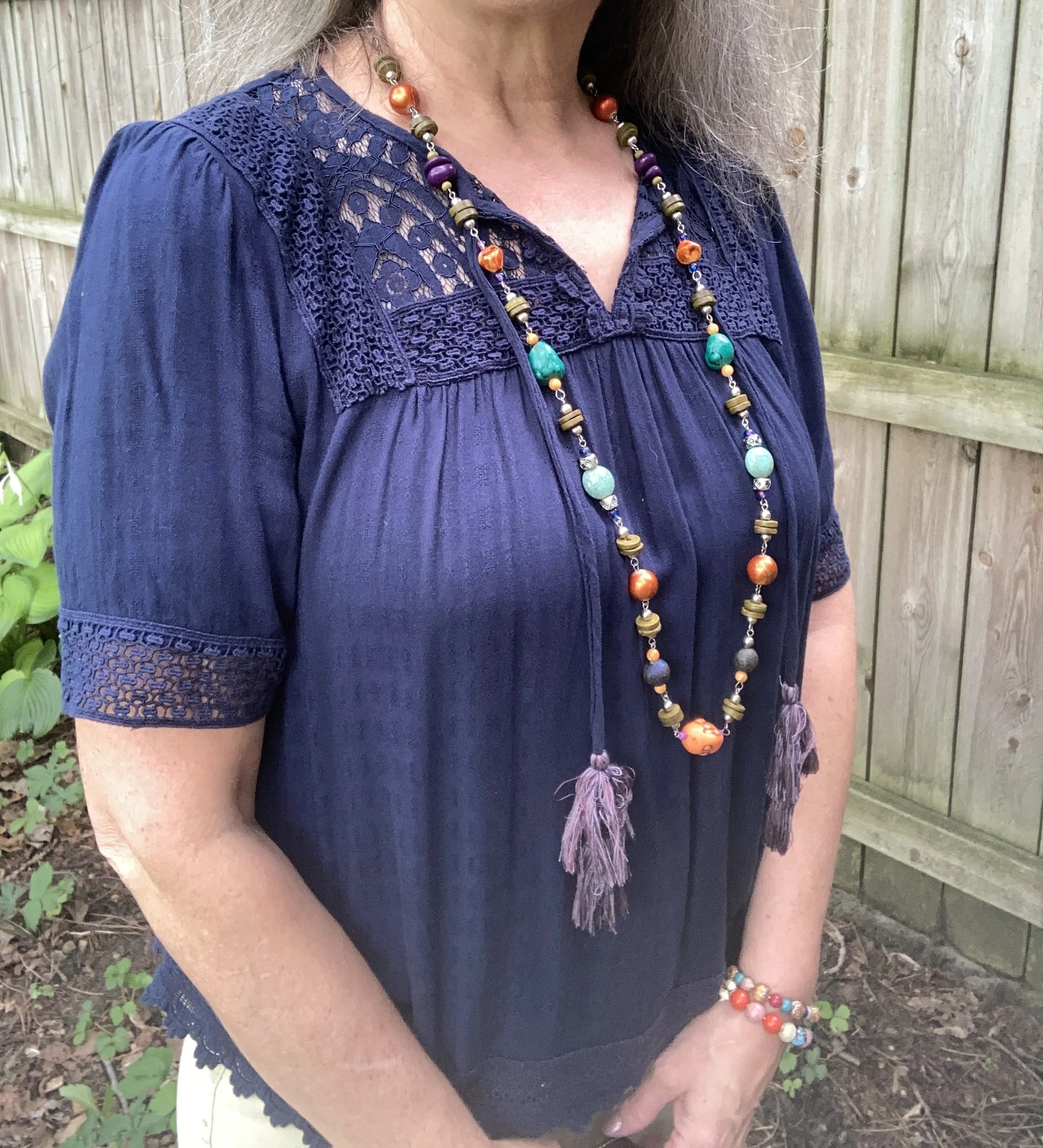
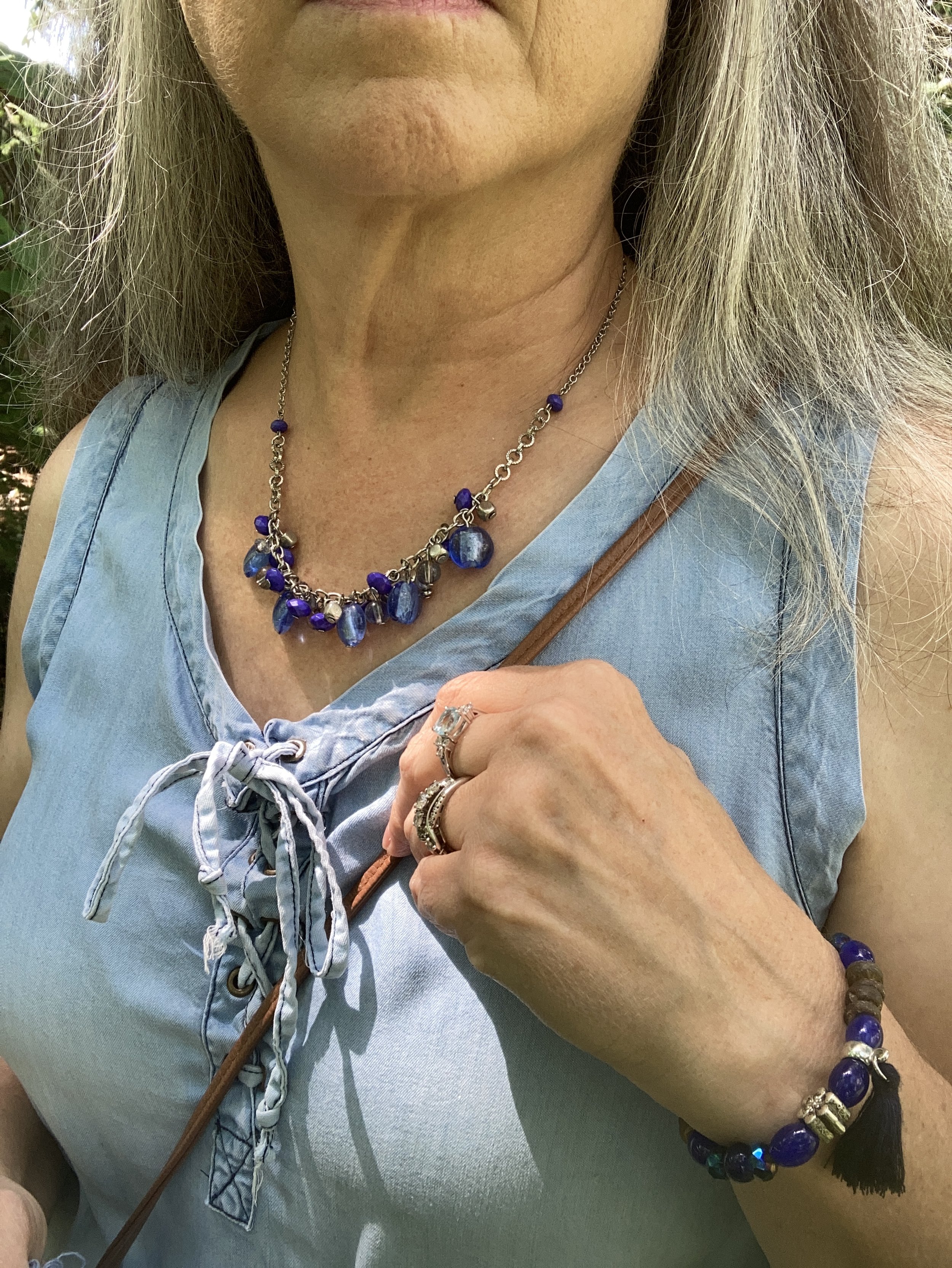
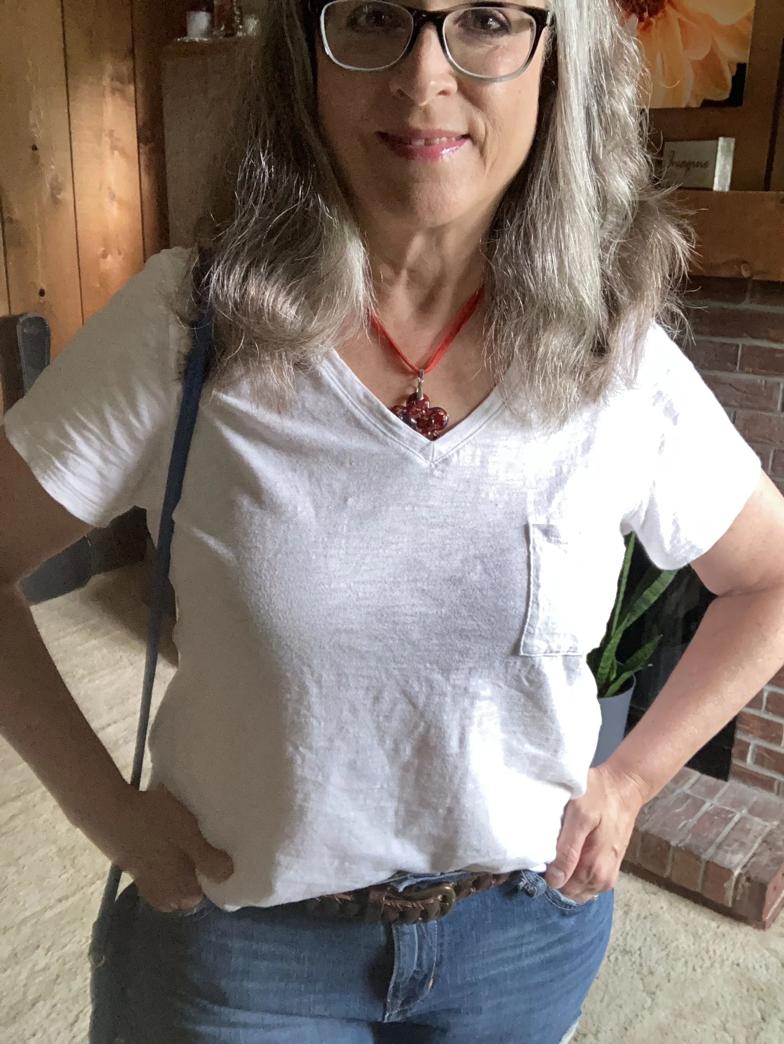
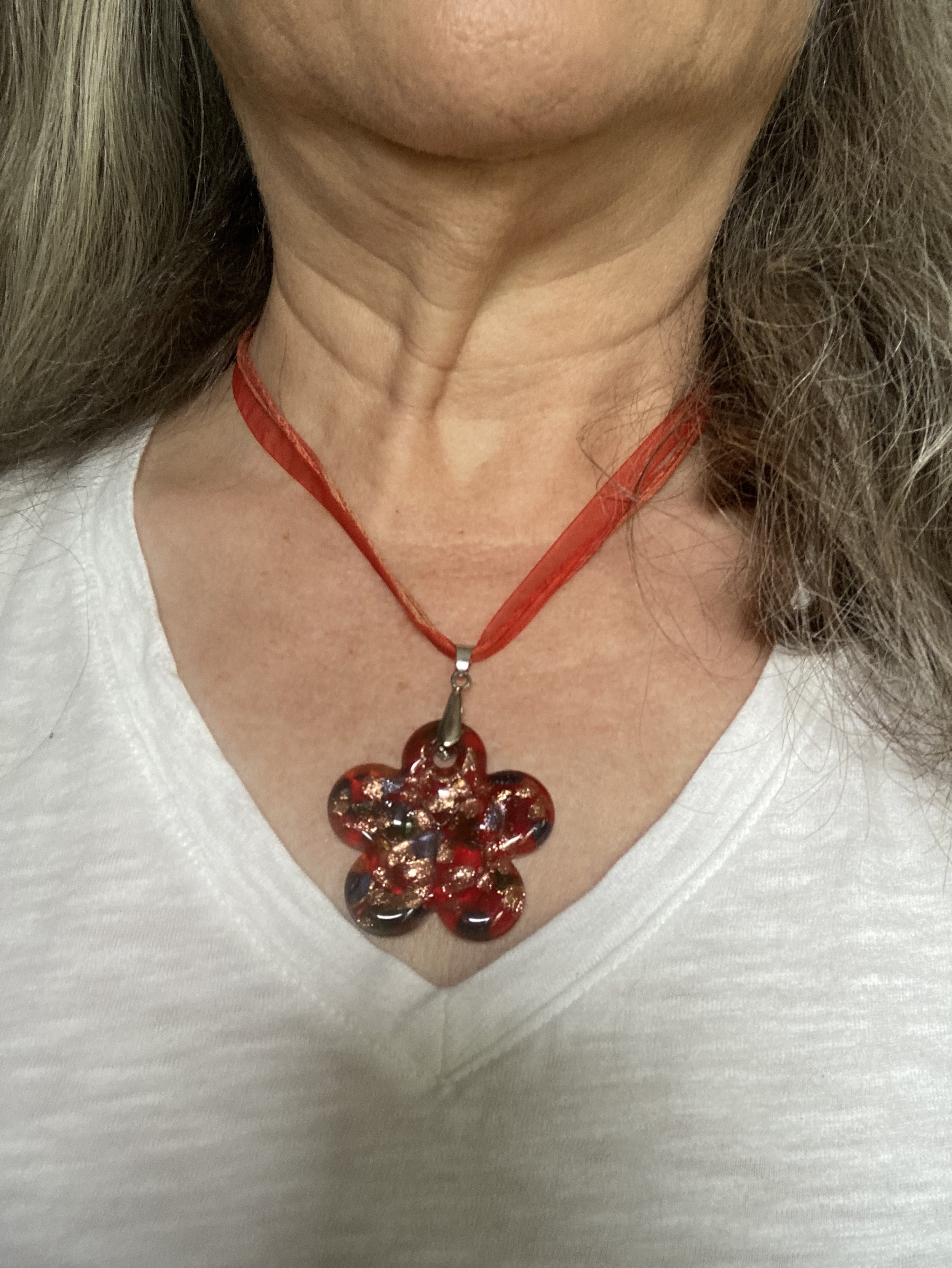
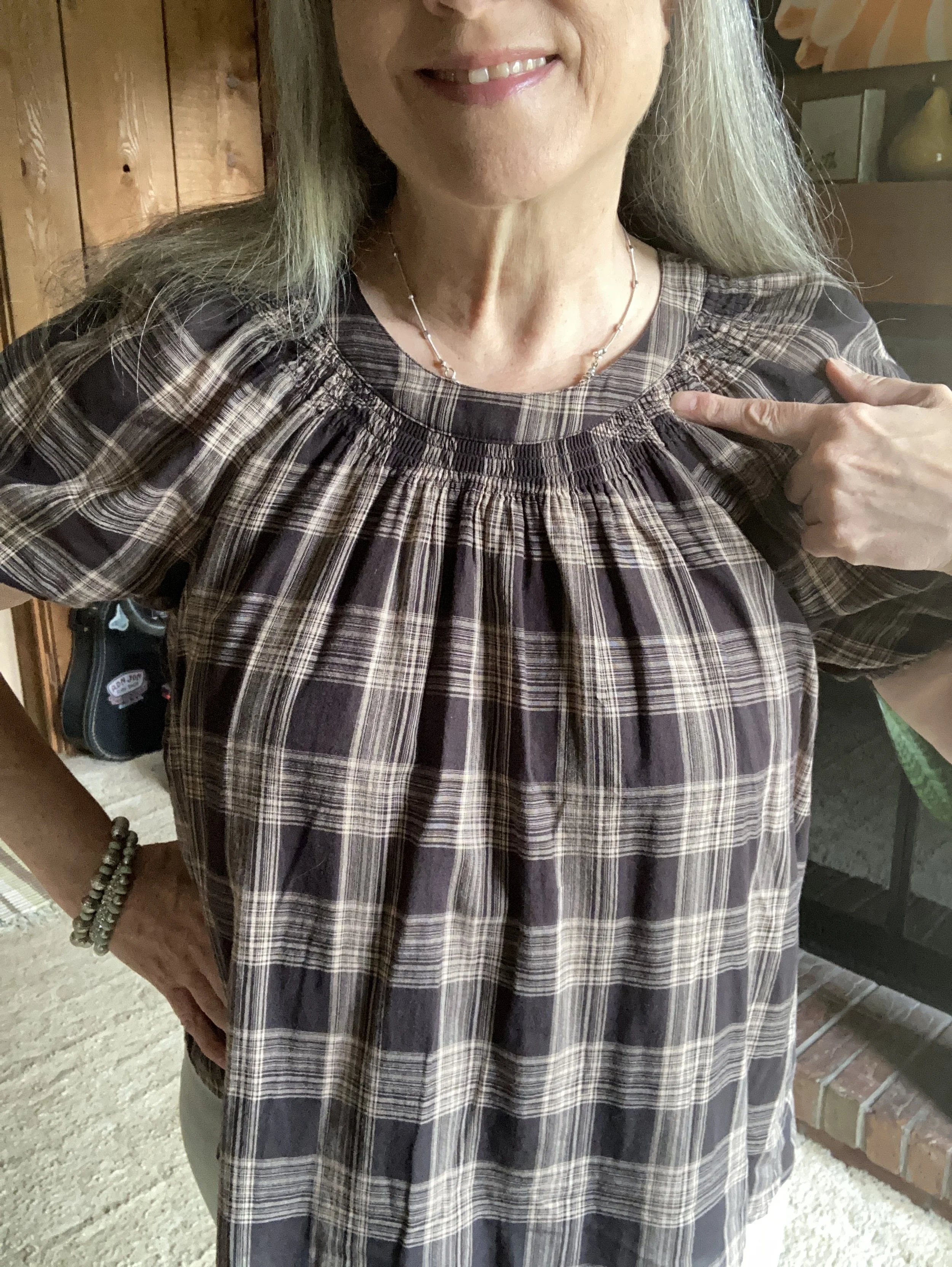
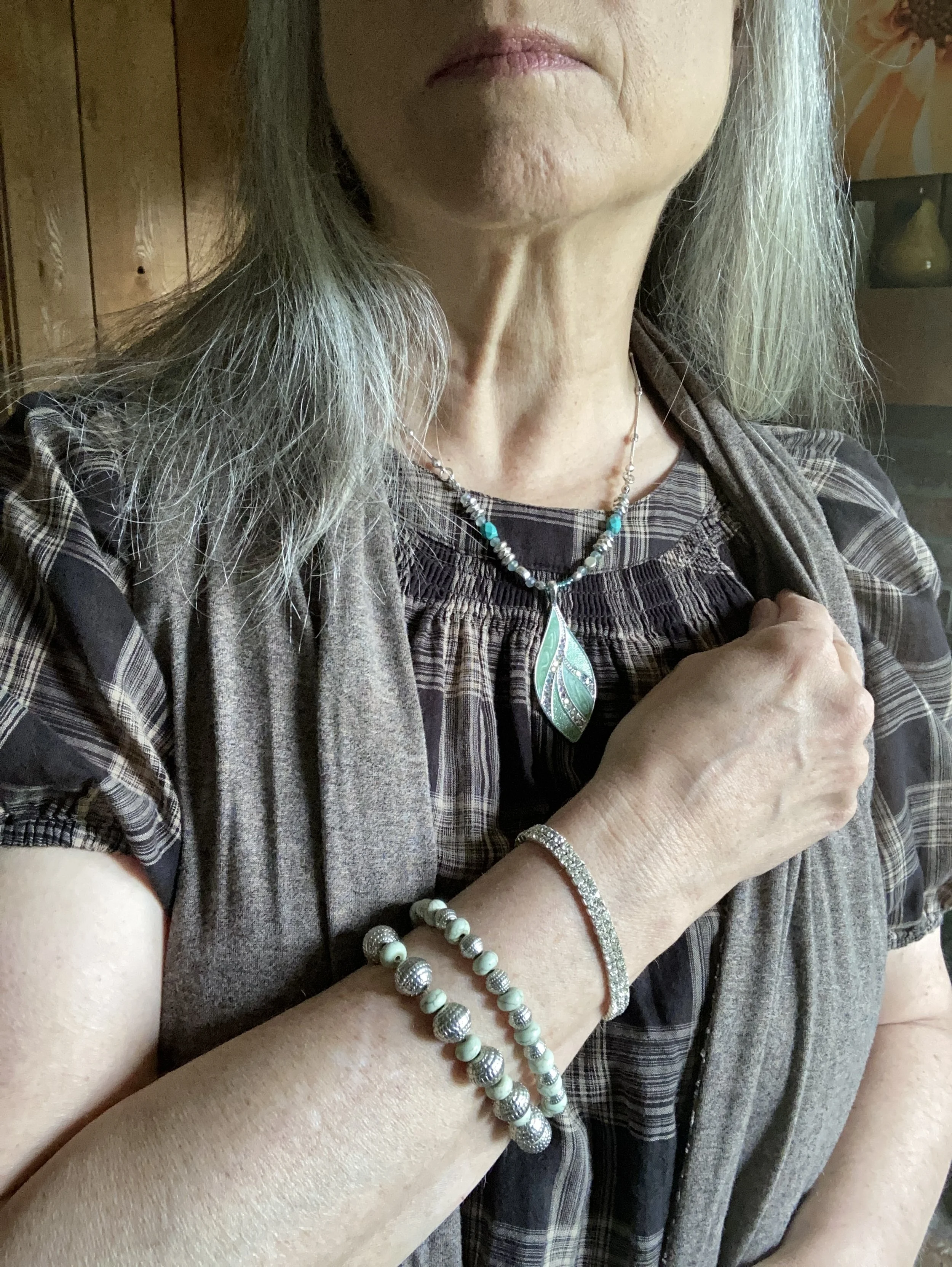
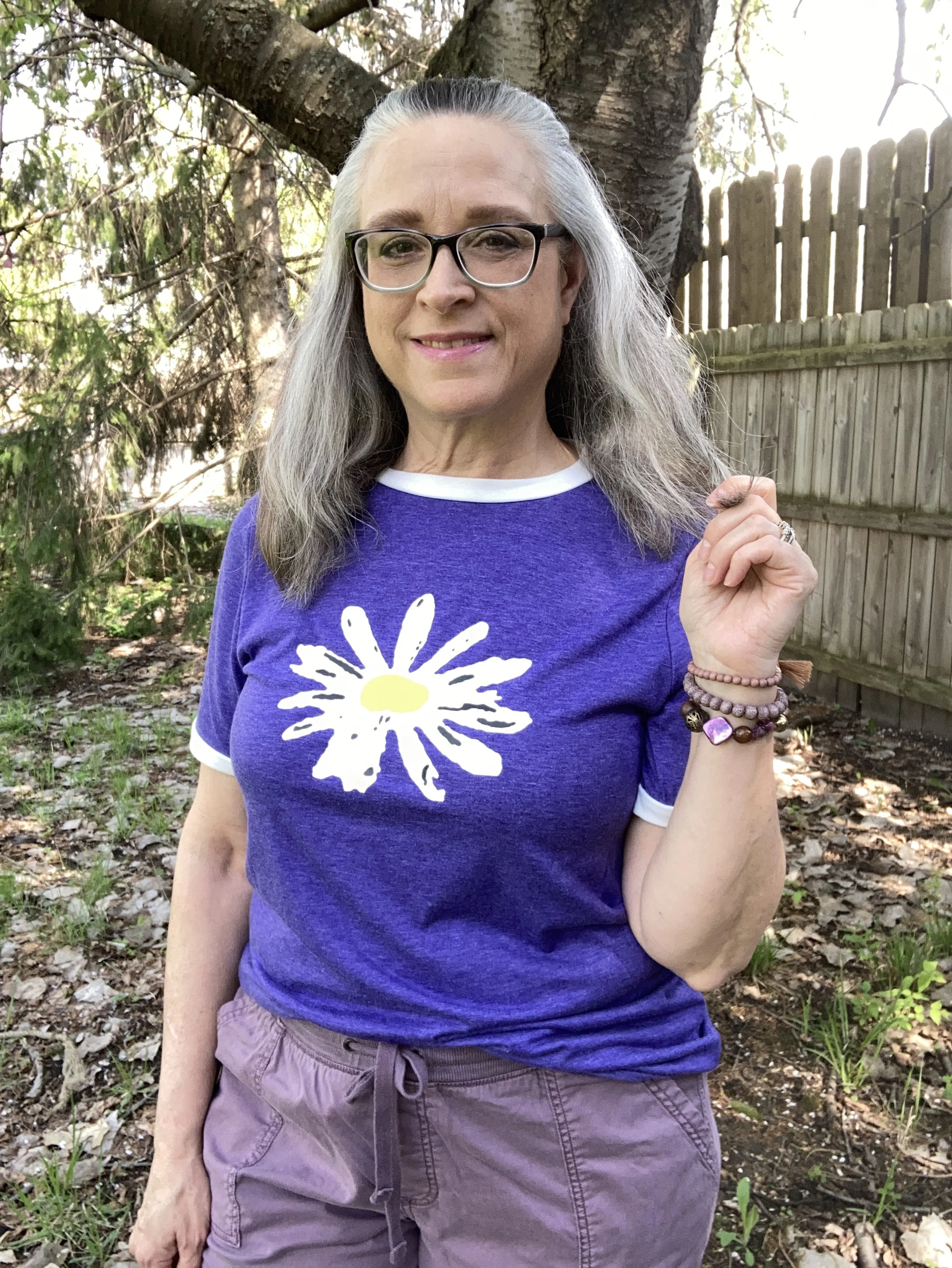
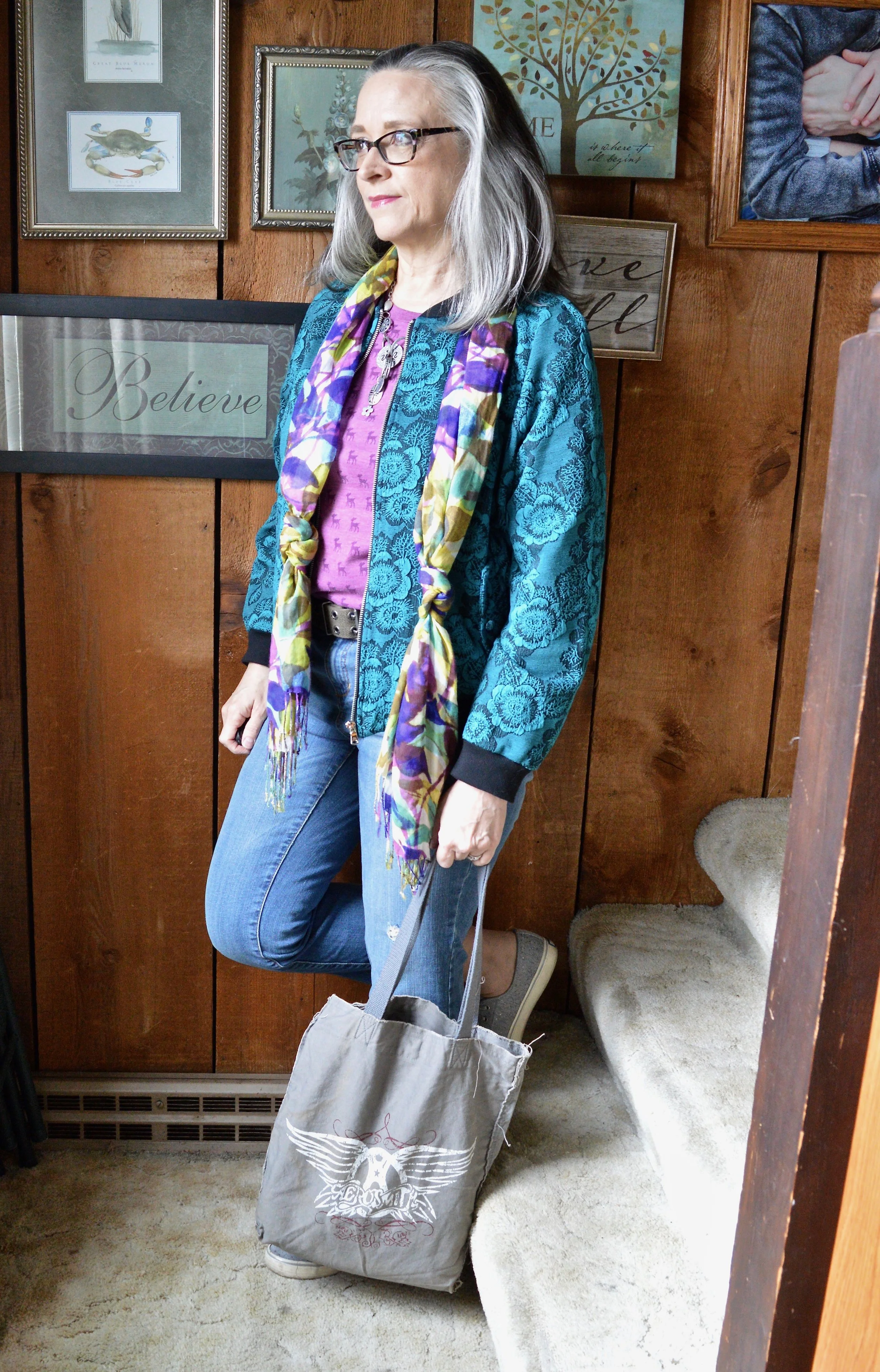
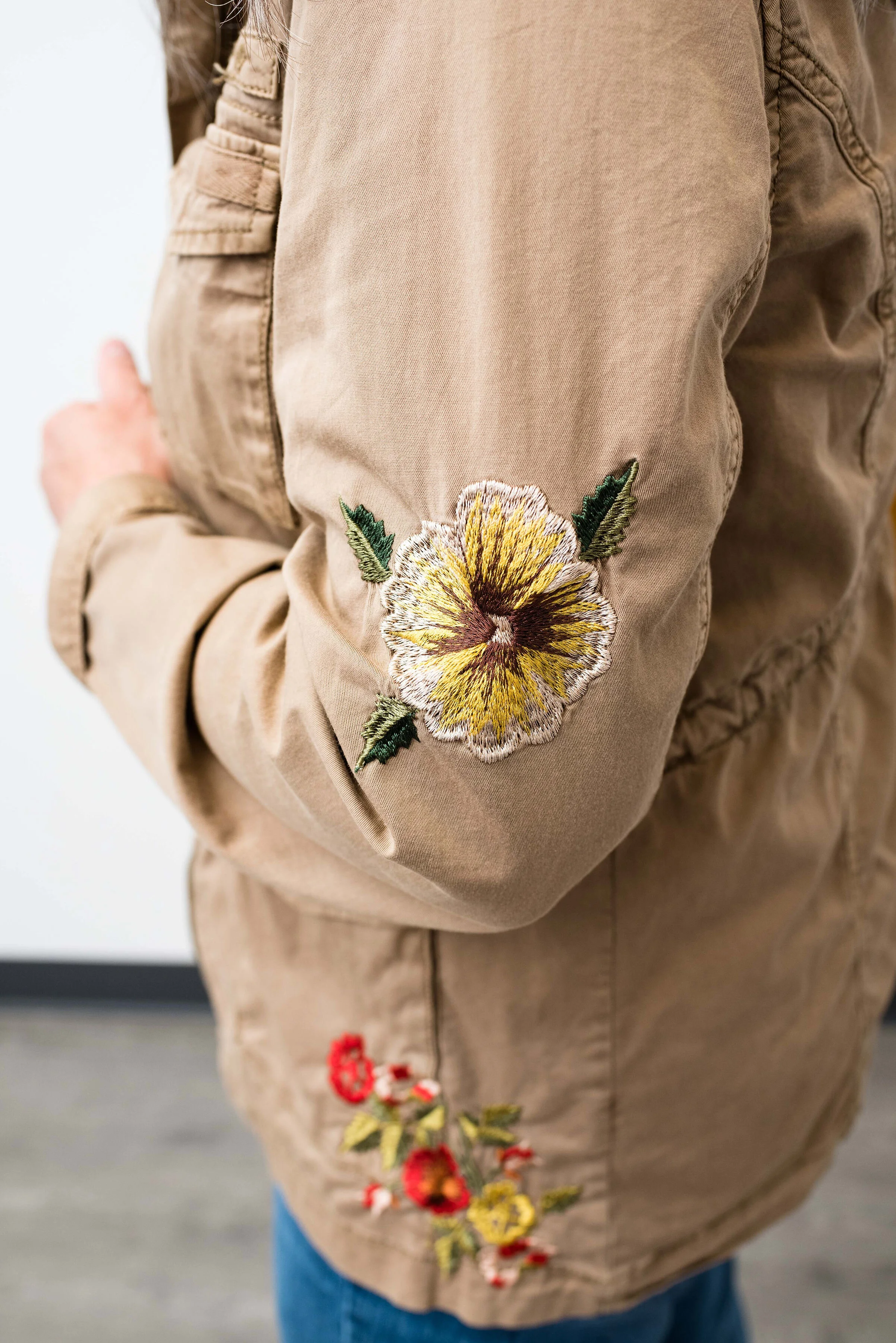
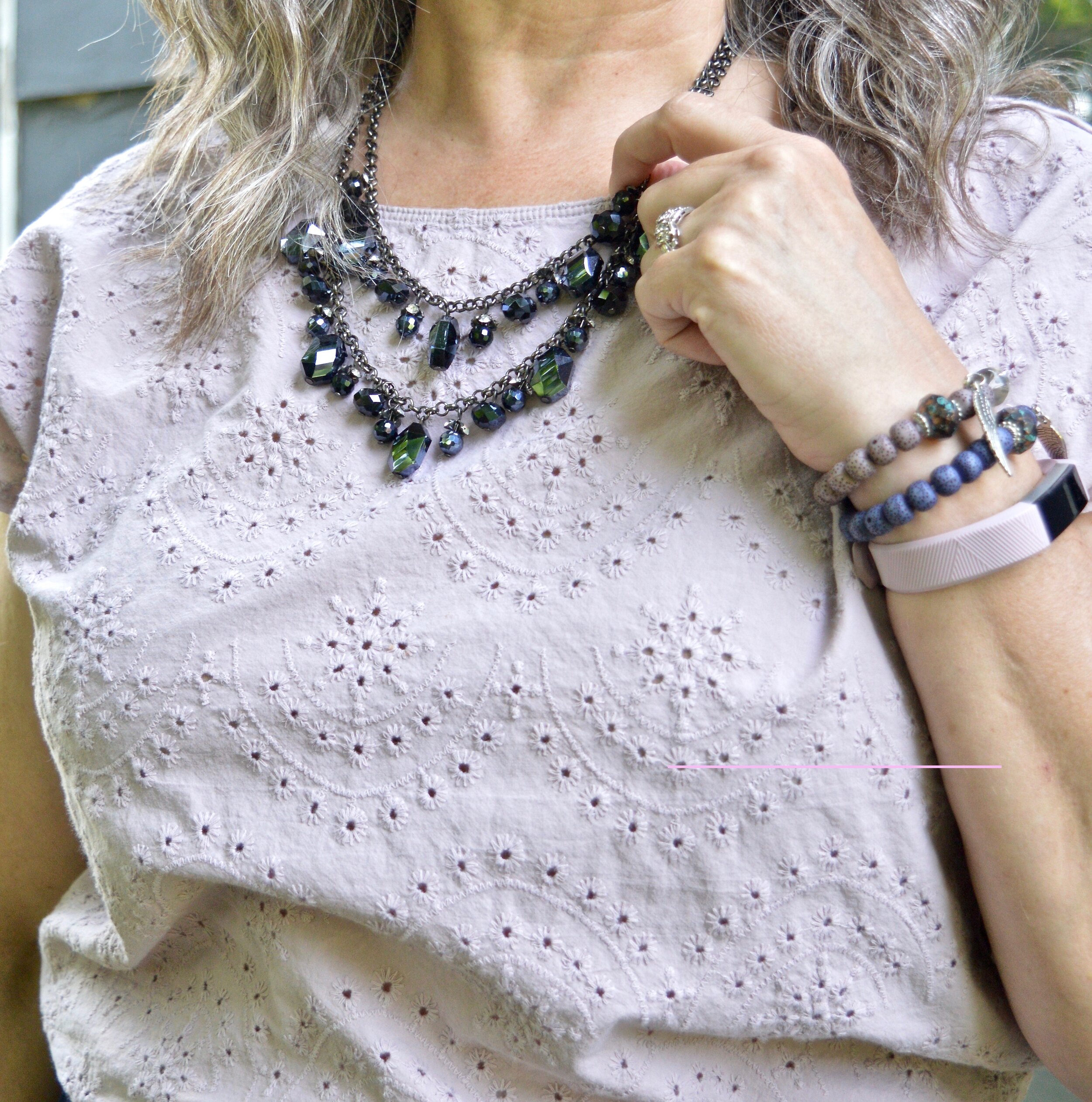
For the Garden Green classic color I chose this St. John’s Bay top that I’ve had for a while. I didn’t get a picture of the sleeves, but they are approximately elbow length bell sleeves. I did want you to see a little bit of the pretty embroidery on the top. You can also see my layered necklaces. The top leans a bit more towards the olive direction, but I felt it worked for the Pantone color.

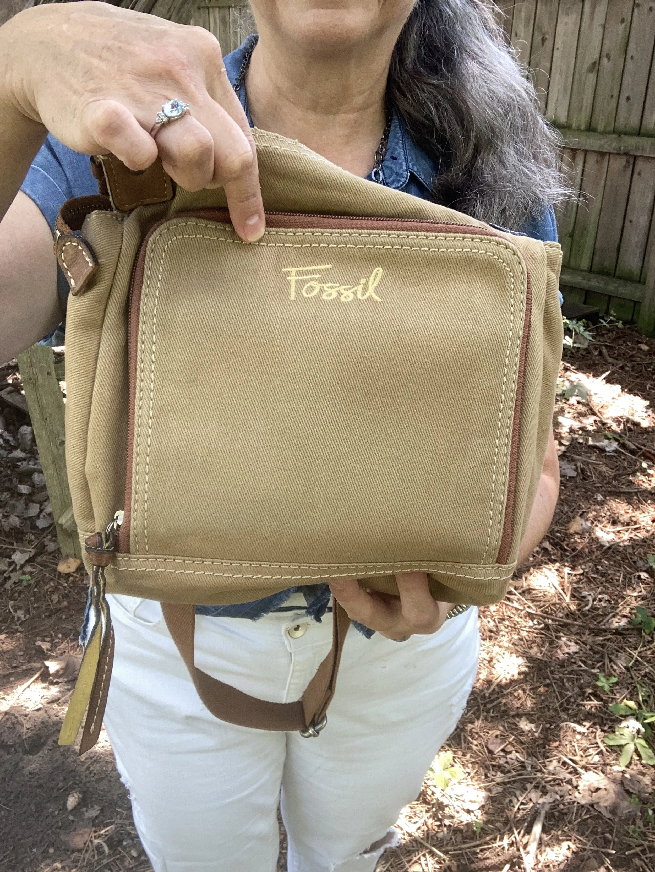
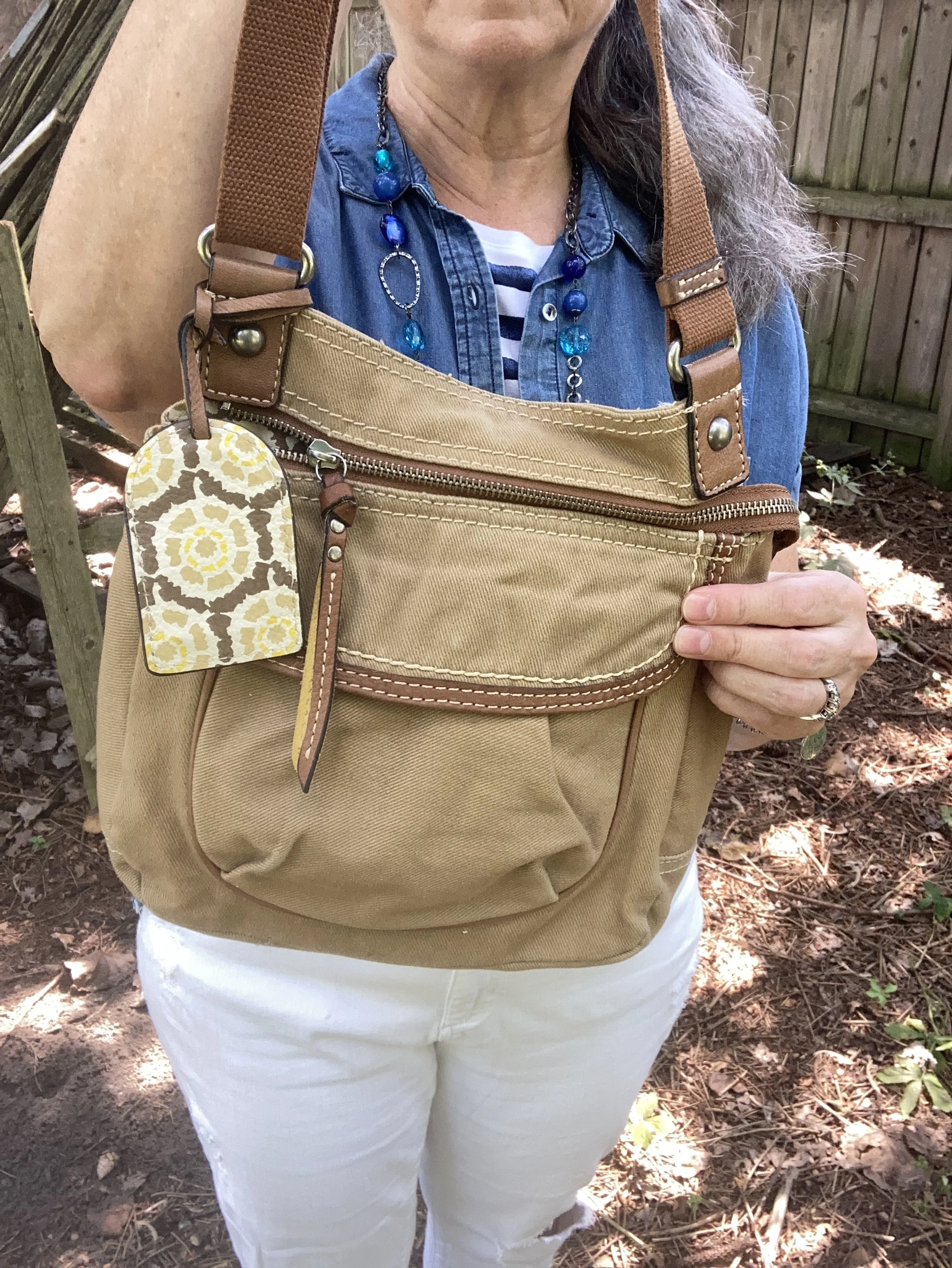
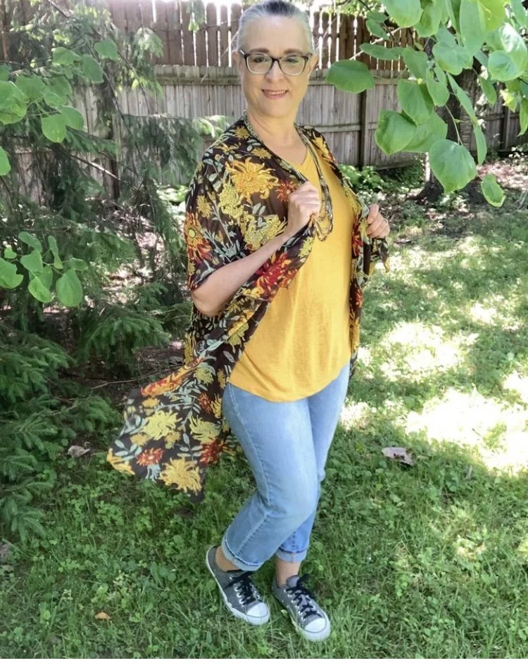
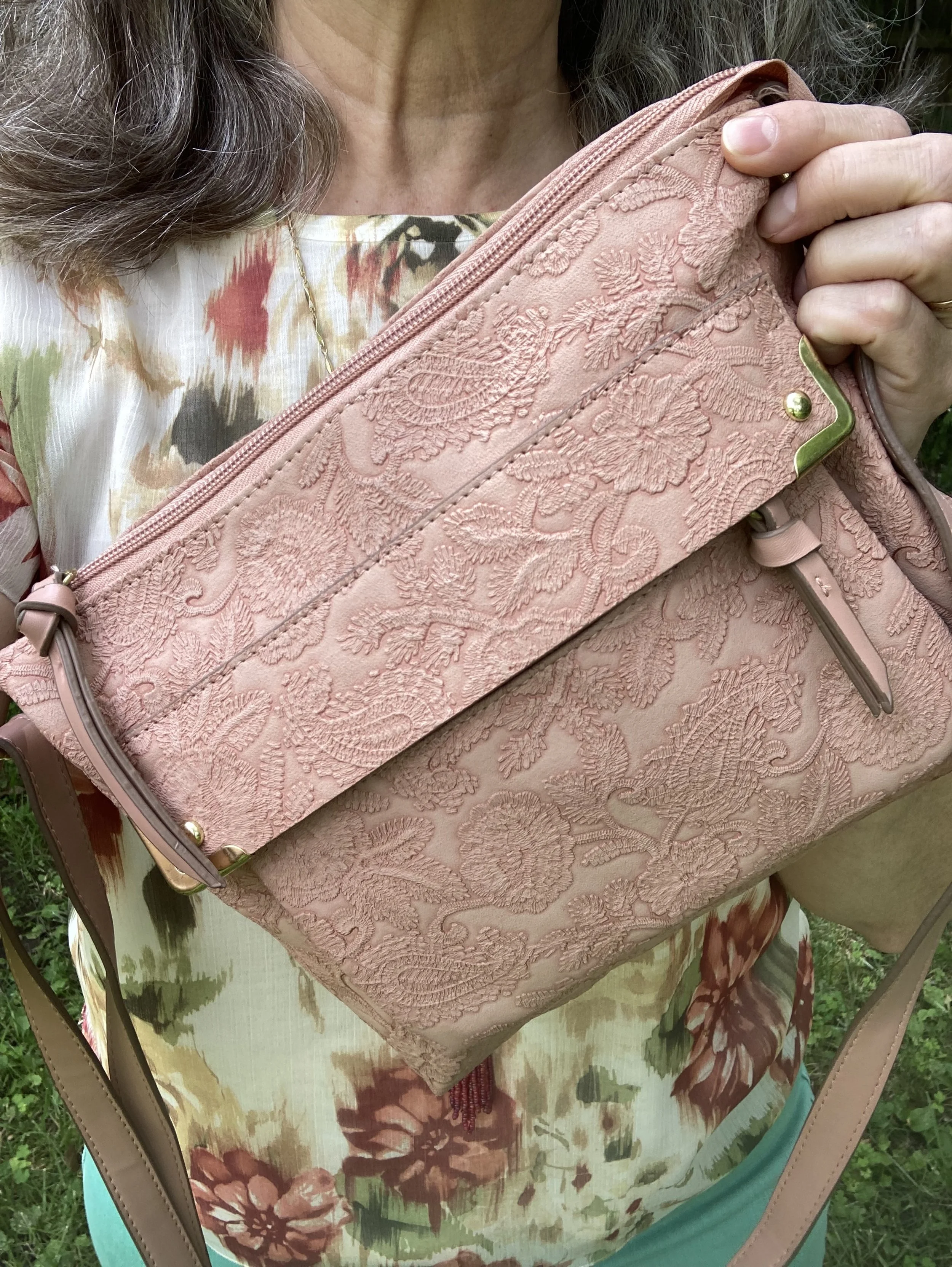
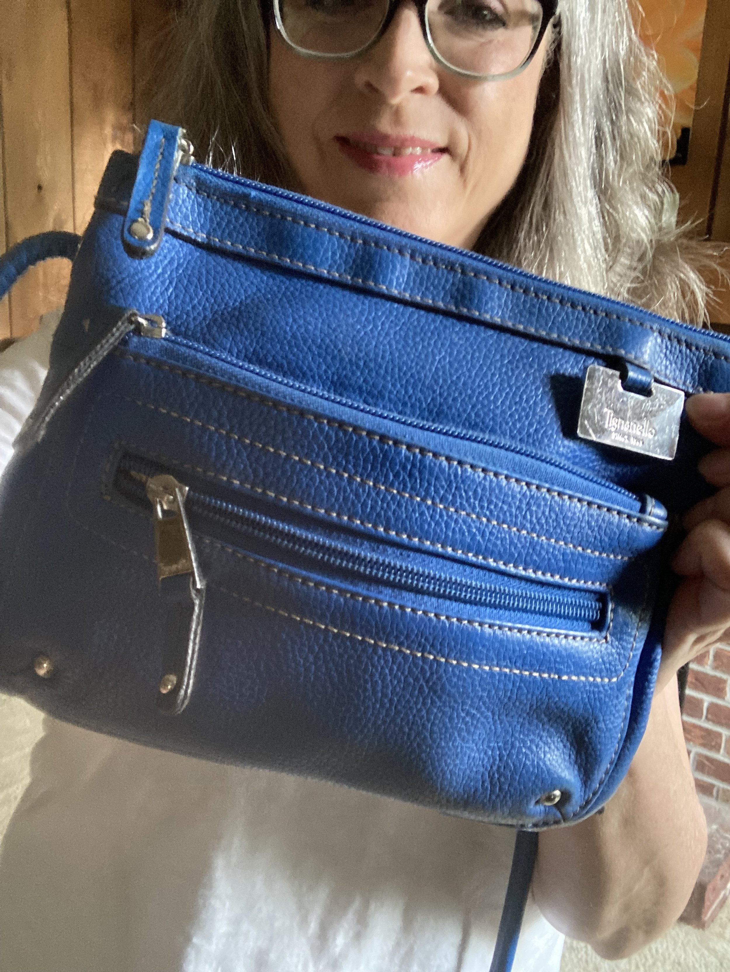
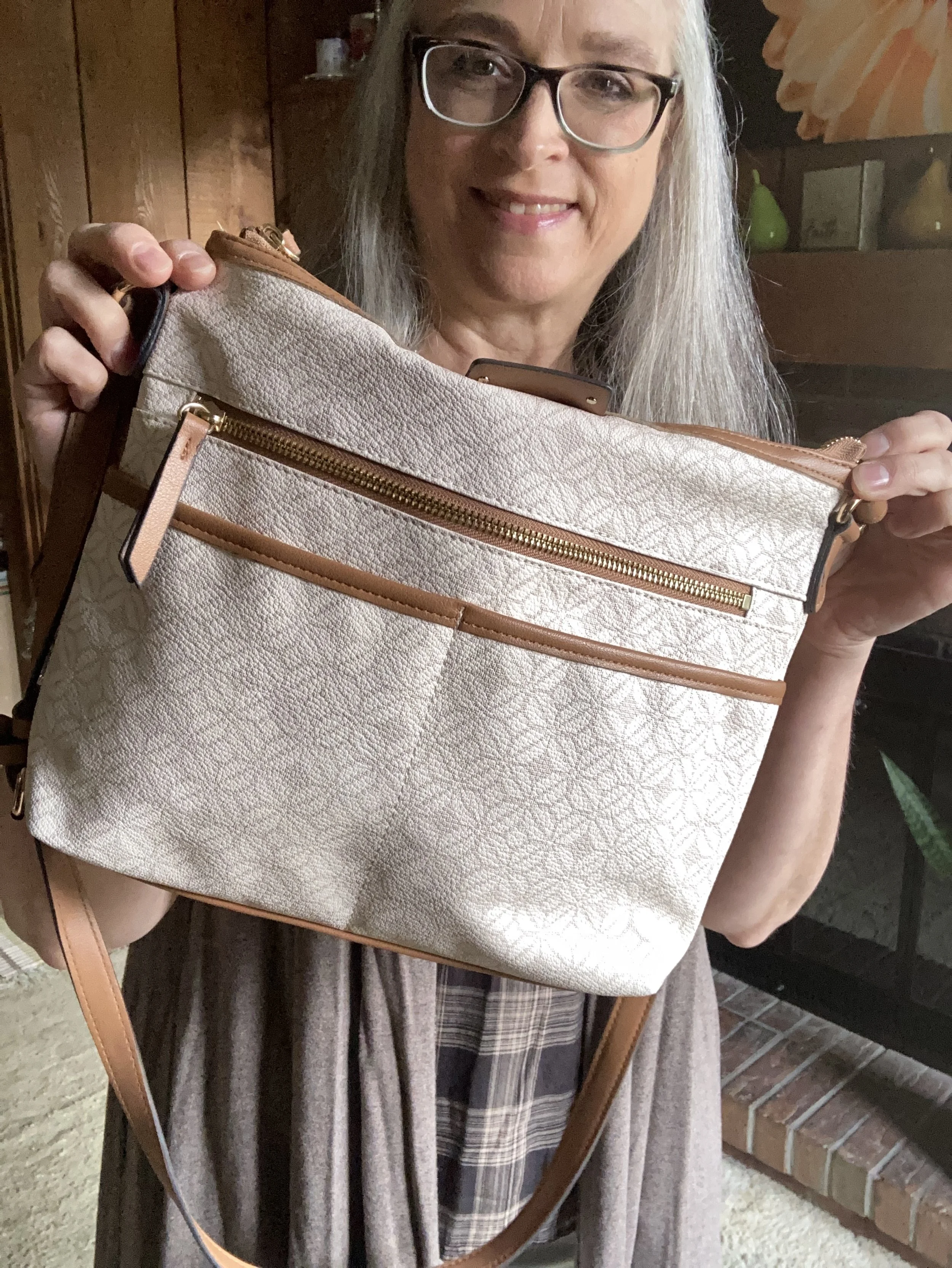
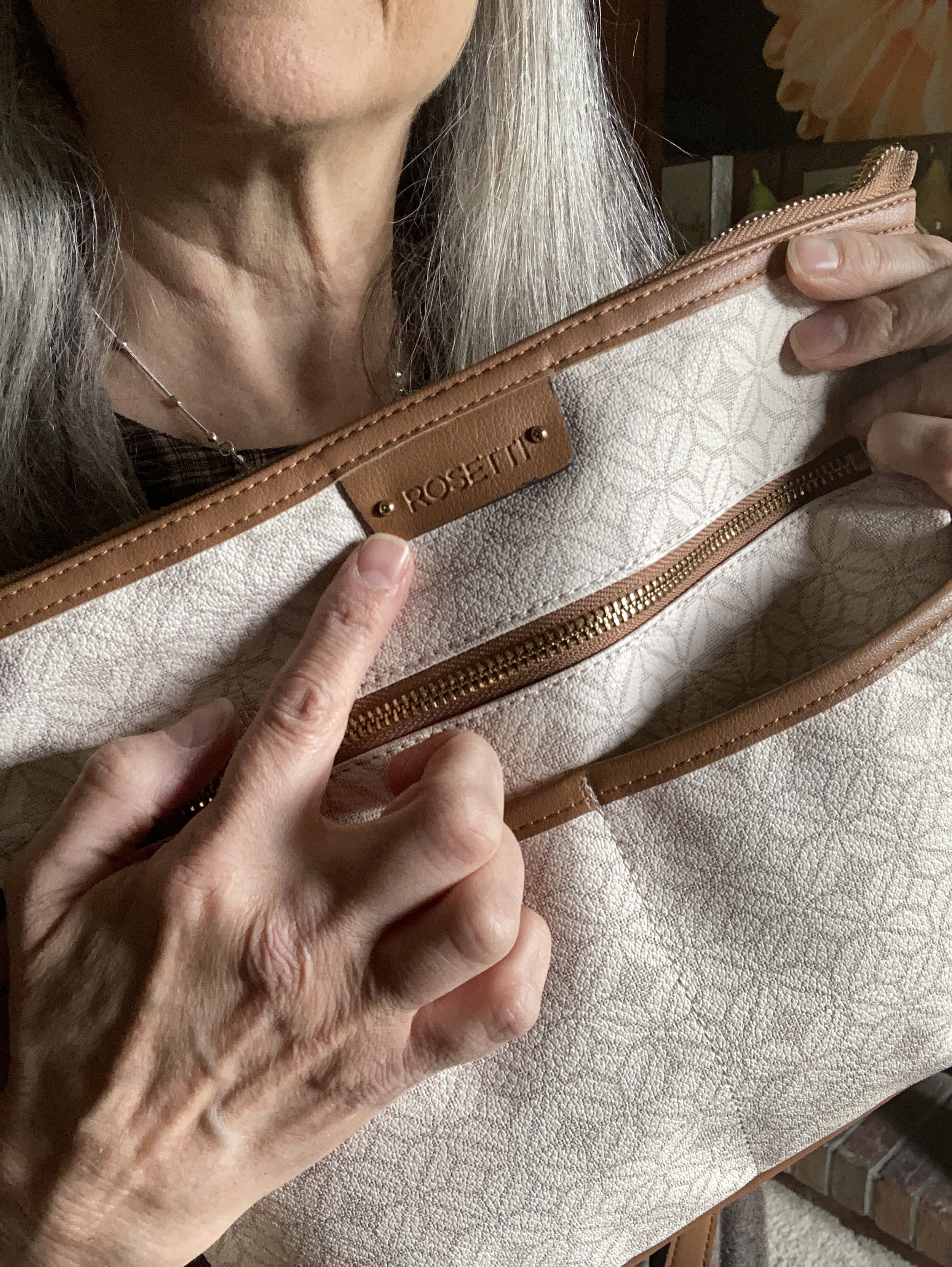
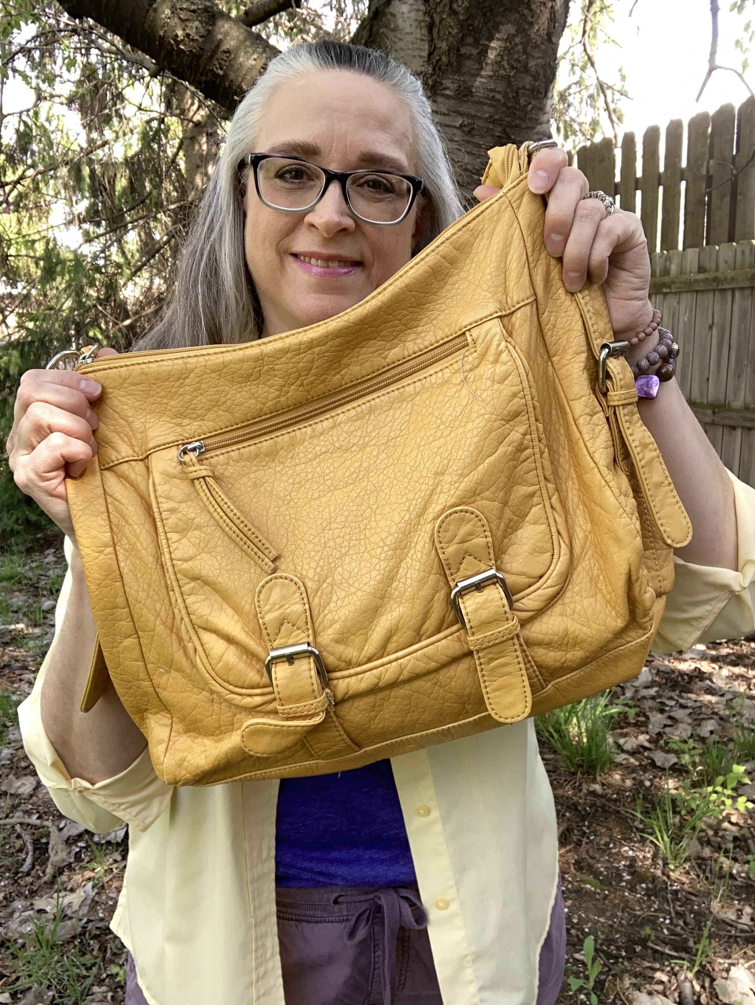
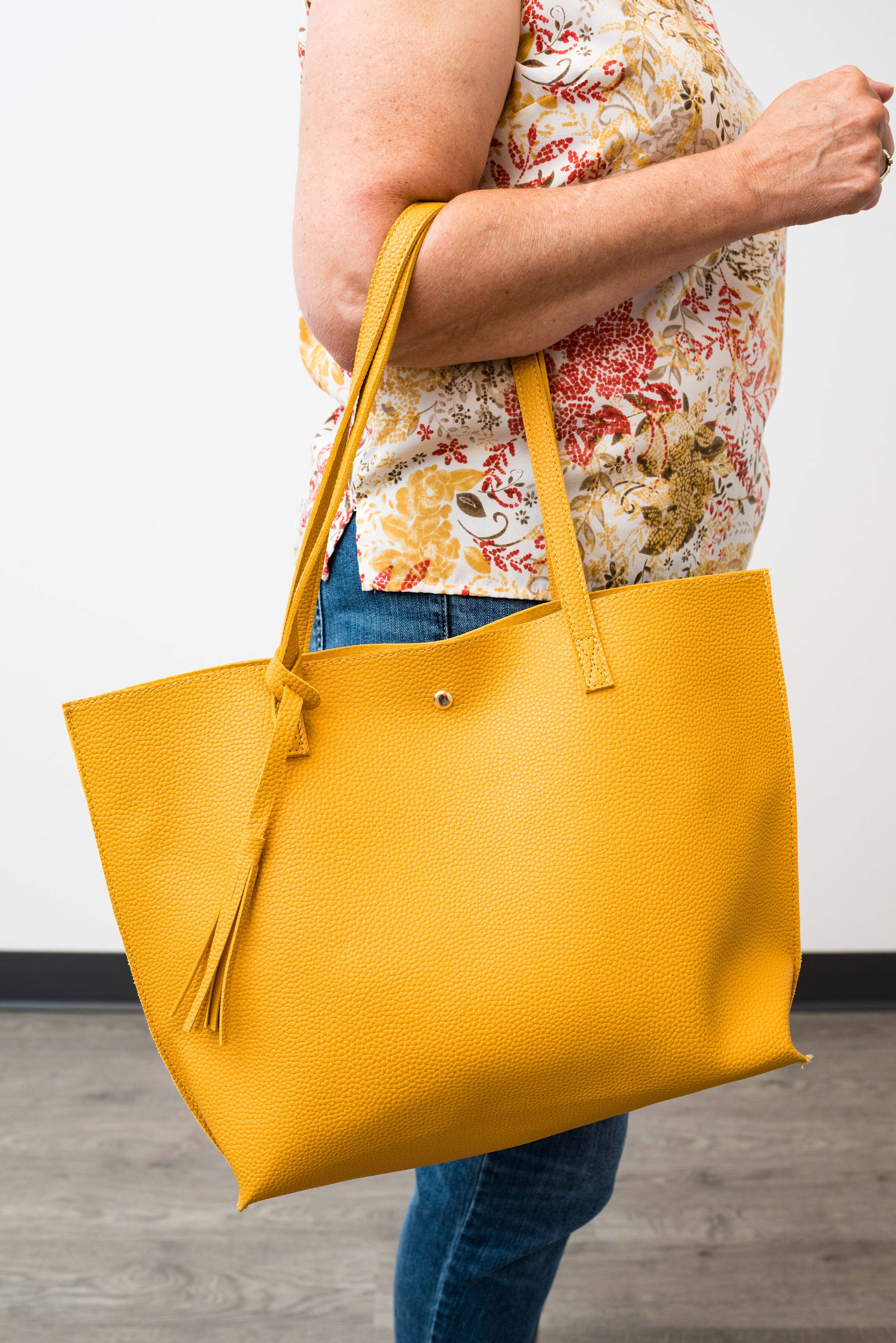
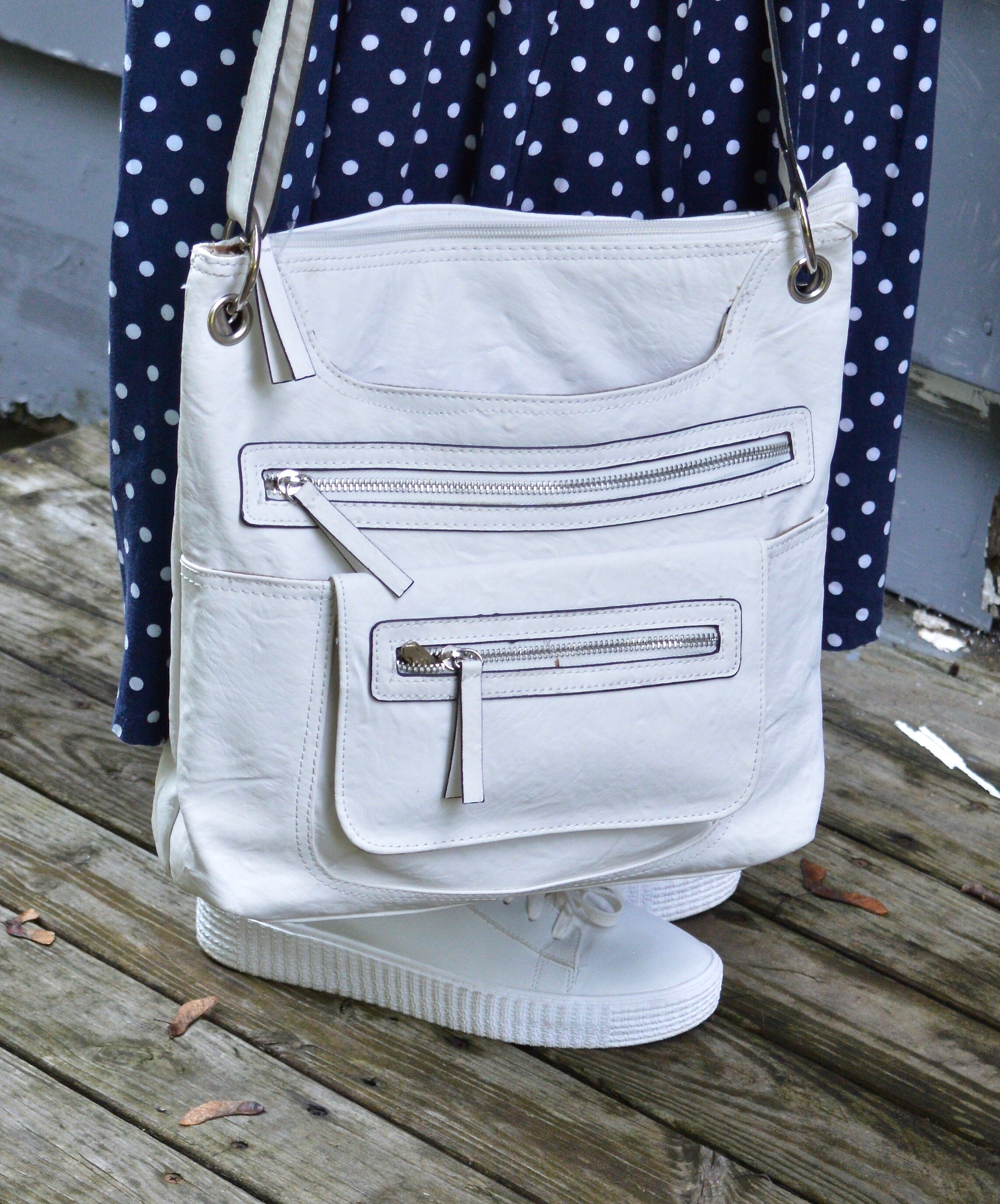
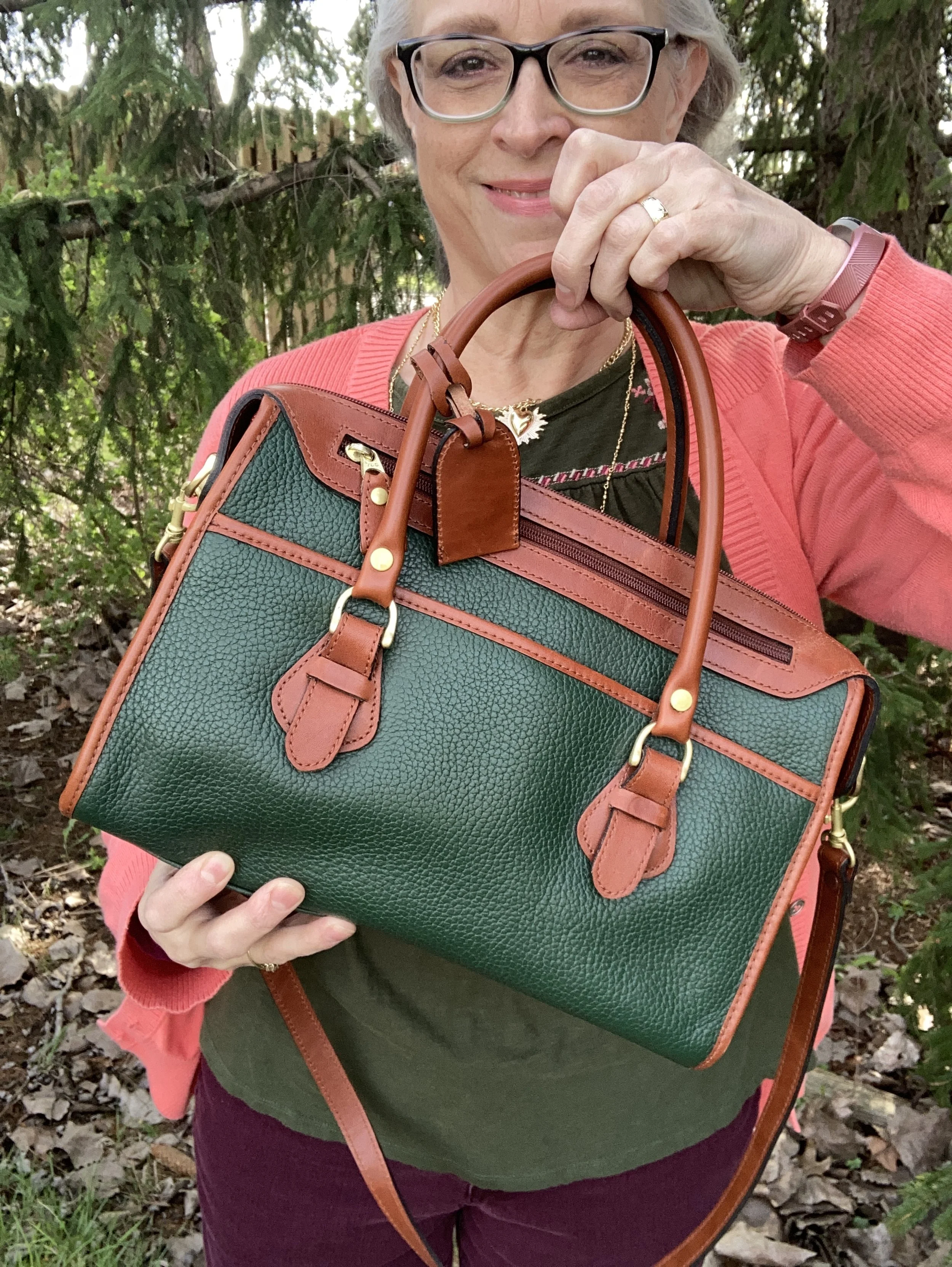
My bag is also green, but compared to the Garden Green it is a bit too bright. This was another thrift find and is Liz Claiborne brand.
What did you think of this color combination? Do you like darker colors all year round, or do you think there is a better time of year to wear them? Let me know by leaving some love in the comments.
I supplied a few shopping links. Please feel free to use these links to buy items for yourself or someone else. If you shop a link through my site then I get a token commission. I appreciate all your support!
Have a great week everyone!