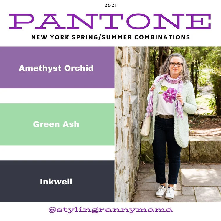
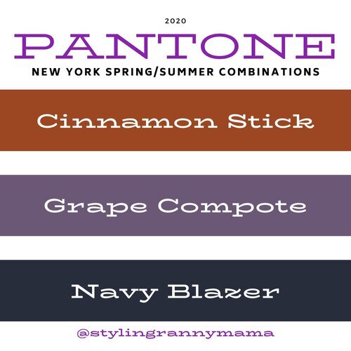
Oh, Olive! Utility Vest - Casual

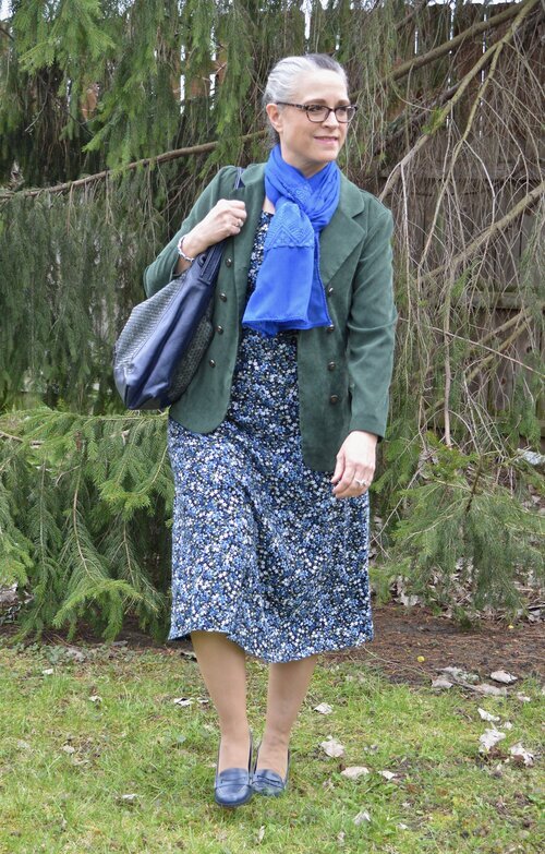
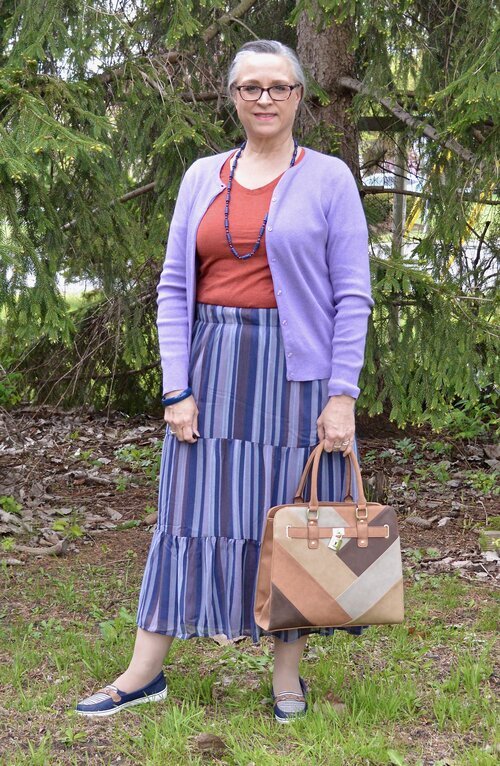
Another olive work horse in my closet is this utility vest. I have a number of vests. My fuzzy and quilted ones are great for fall and winter, while a vest like this, that is lighter weight, is perfect for spring, summer and into fall. I have been focusing on these olive pieces as the perfect neutral add on for a variety of outfits. I have been styling both casual and workwear looks, so that you have more to think about.

DSC_0058.jpg

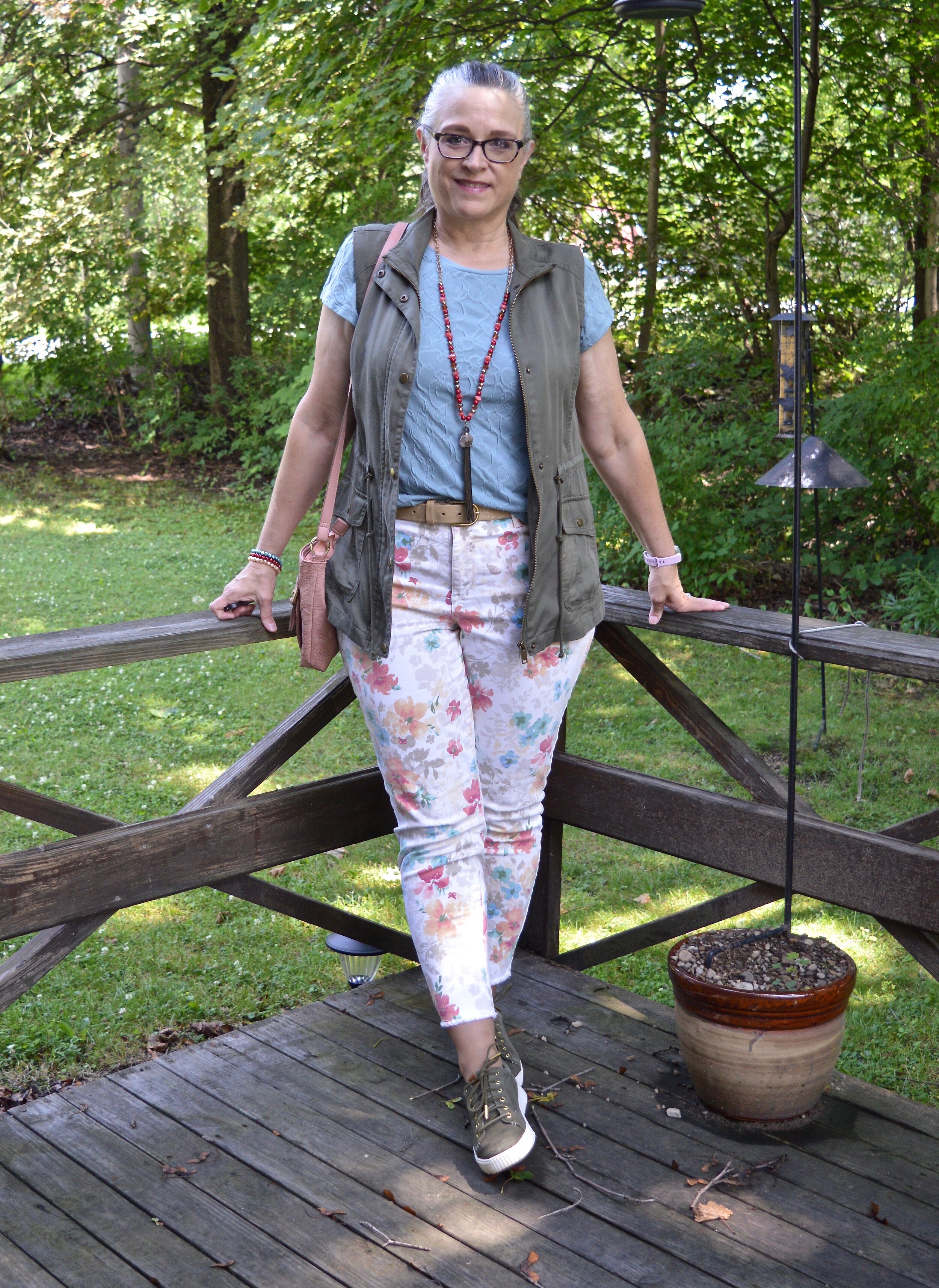
This olive, Mudd brand, vest was a clearance find a few seasons back from Kohl’s. I was paying attention when olive was becoming popular as the new neutral, so I snatched this up. That, and I love vests. They are a great way to add warmth, interest and texture to an outfit. I made my outfit extra colorful, but you could easily tone a look like this down by going for monochrome layers topped by the vest. A black maxi dress, a tan tee and capris or a navy top and denim skirt would look fabulous topped by an olive vest like this. Let me know if you would like to see me style a few monochrome looks with this vest or the jacket from last week.

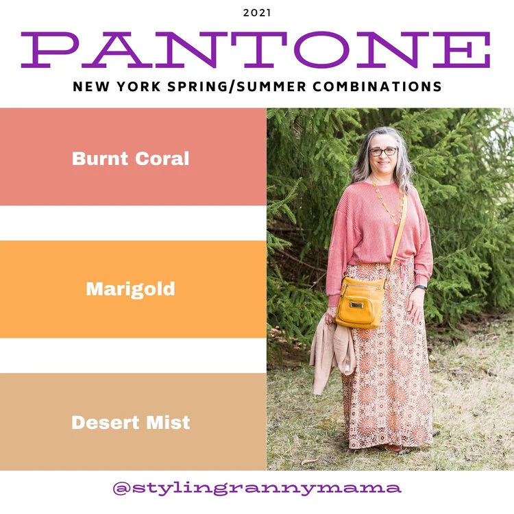
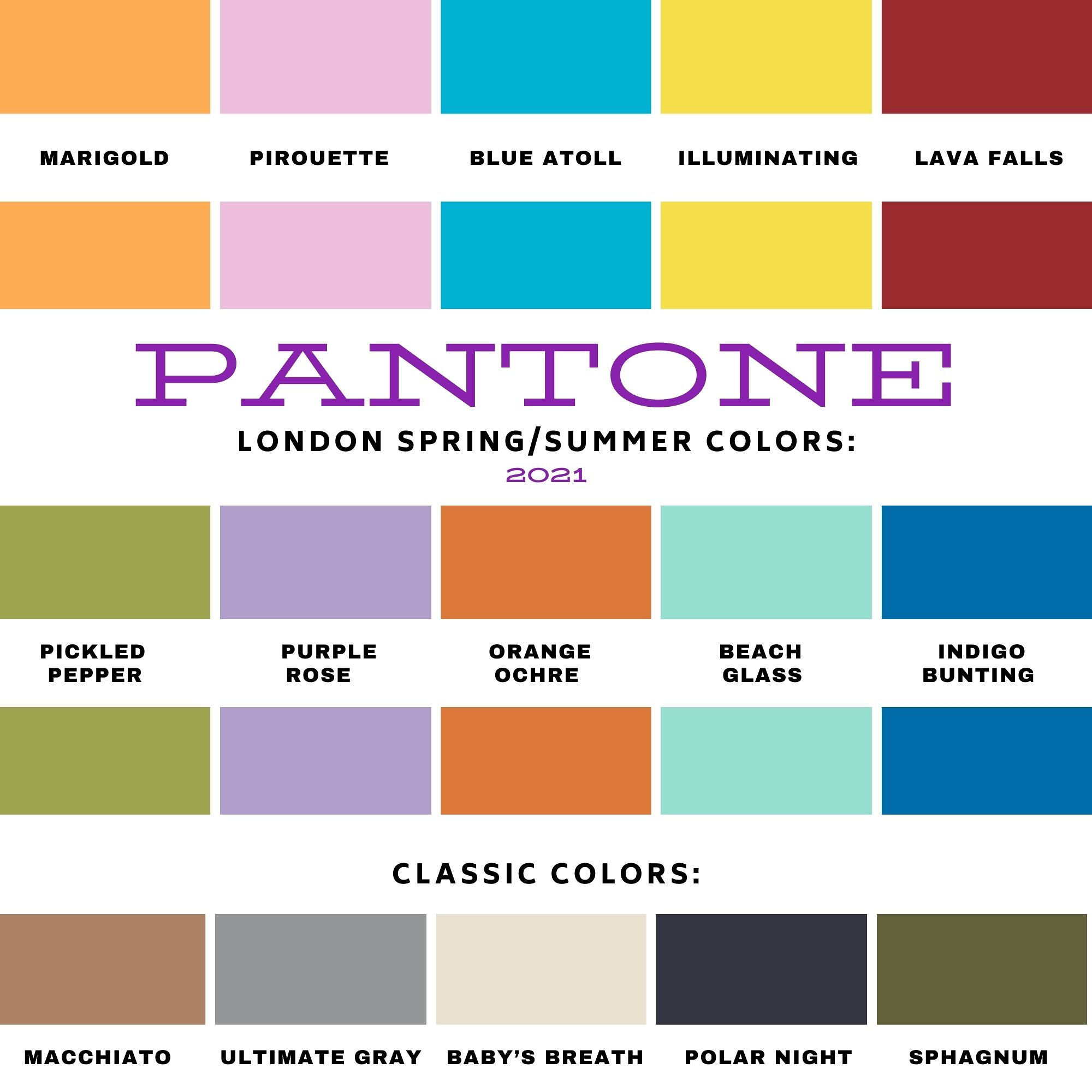
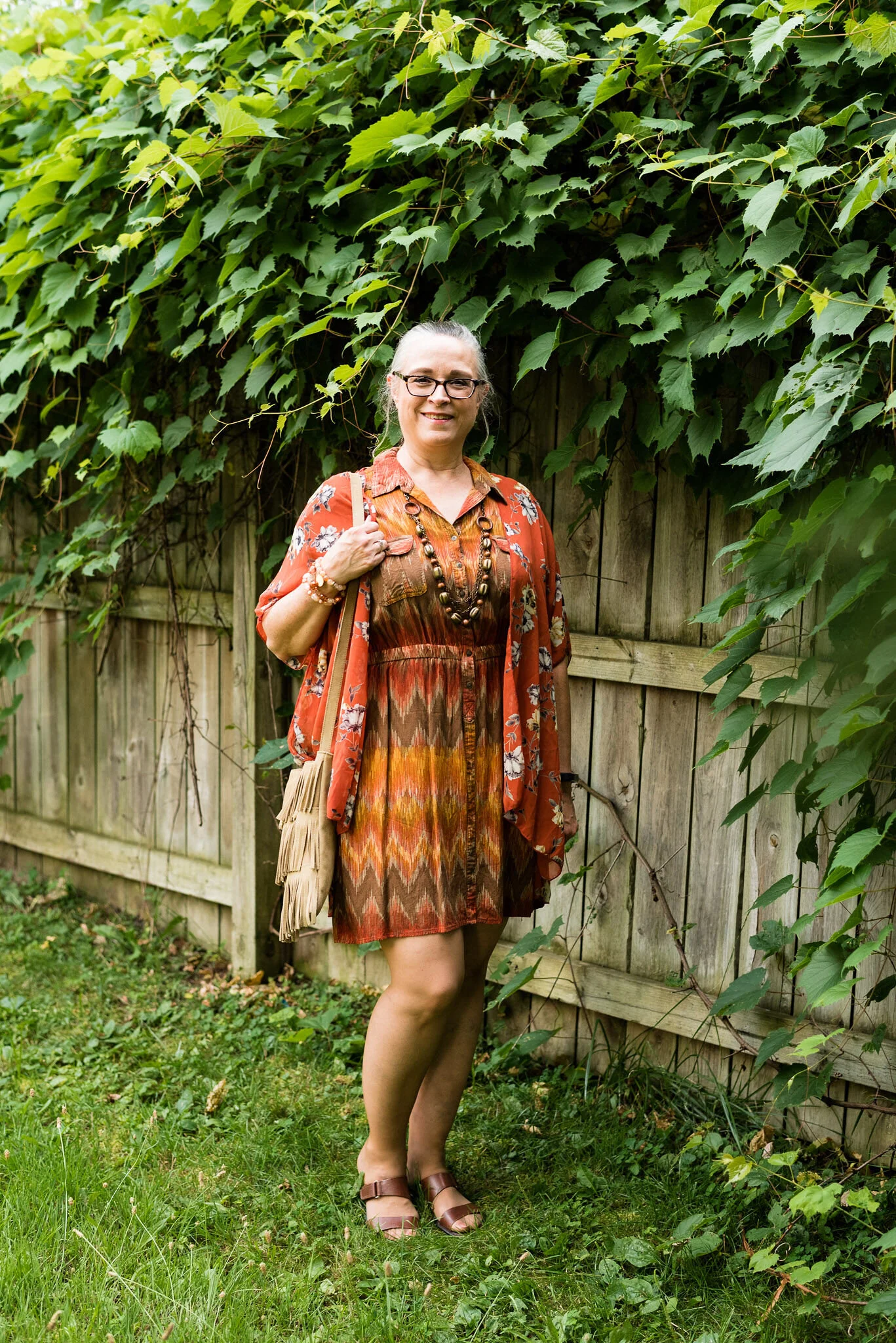
Fall Trend Alert - Florals

Florals are still in. Harper’s Bazaar listed florals in Finding Patterns on their fall list, and WhoWhatWear called theirs Charming Chinz. However, you label it, it seems that florals are holding their own as a print that is here to stay.

DSC_0061.jpg

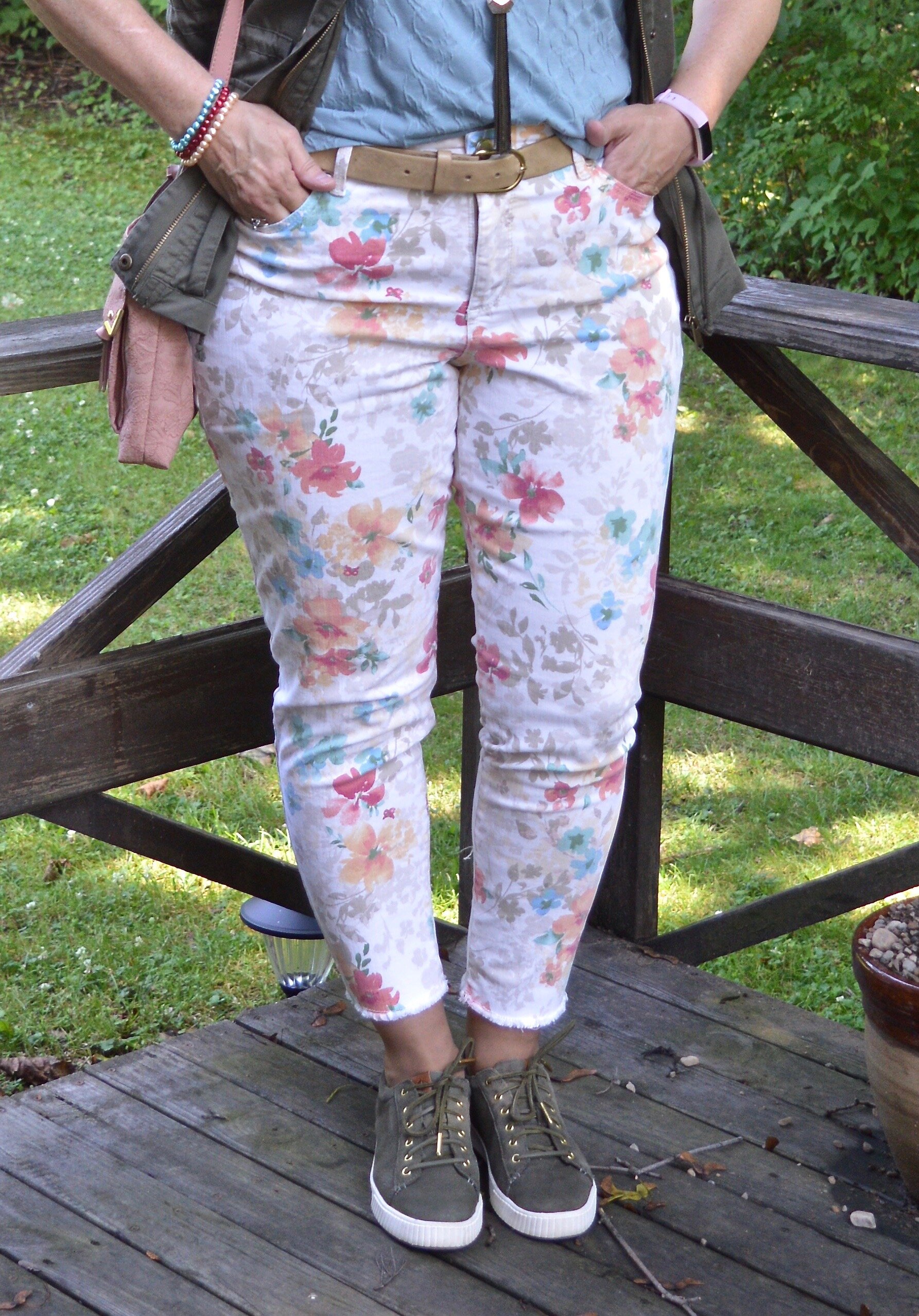
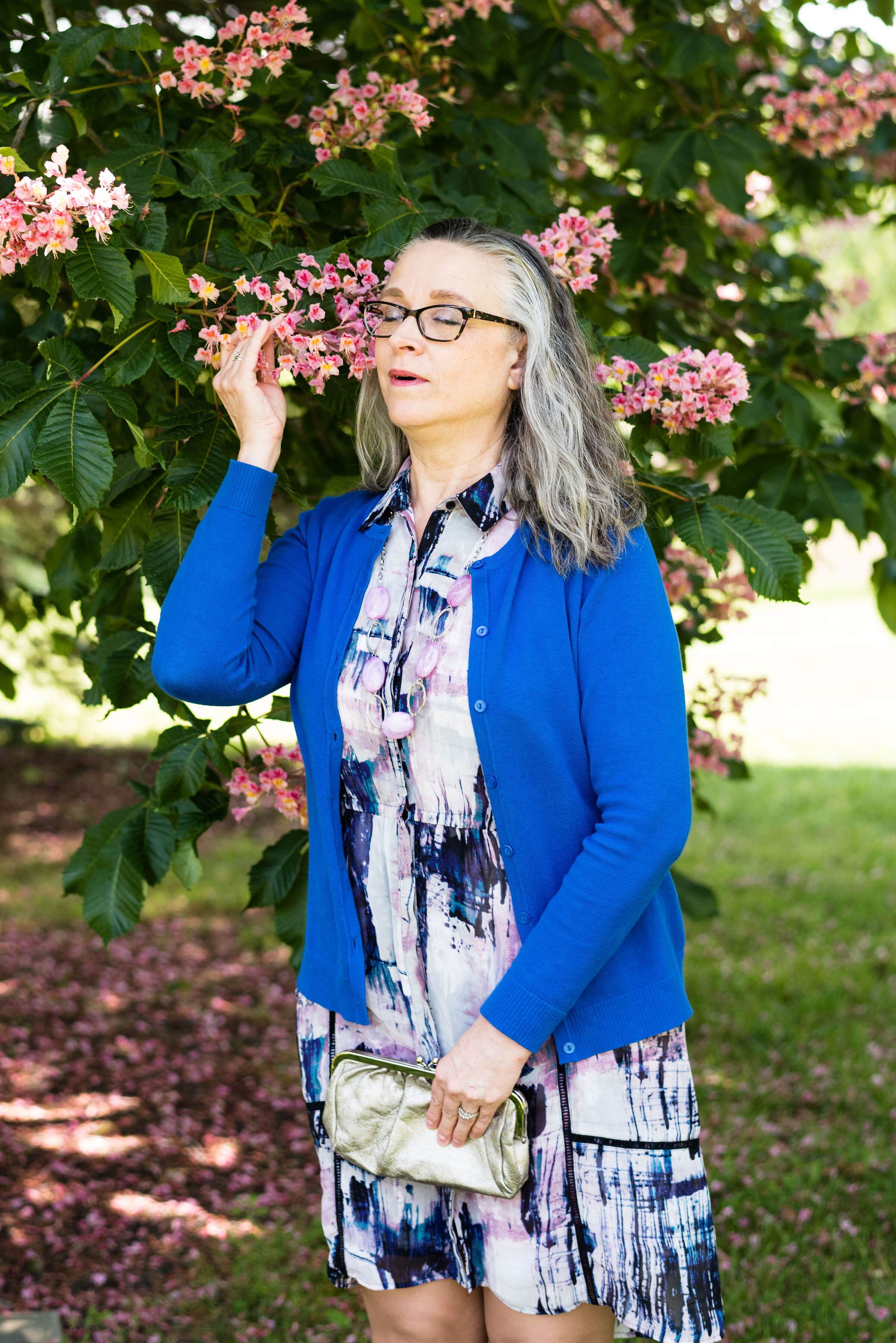
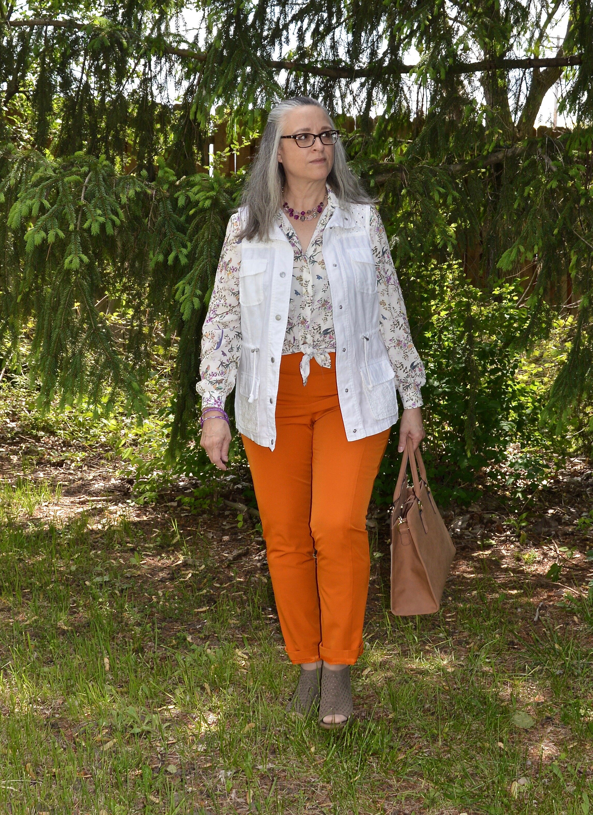
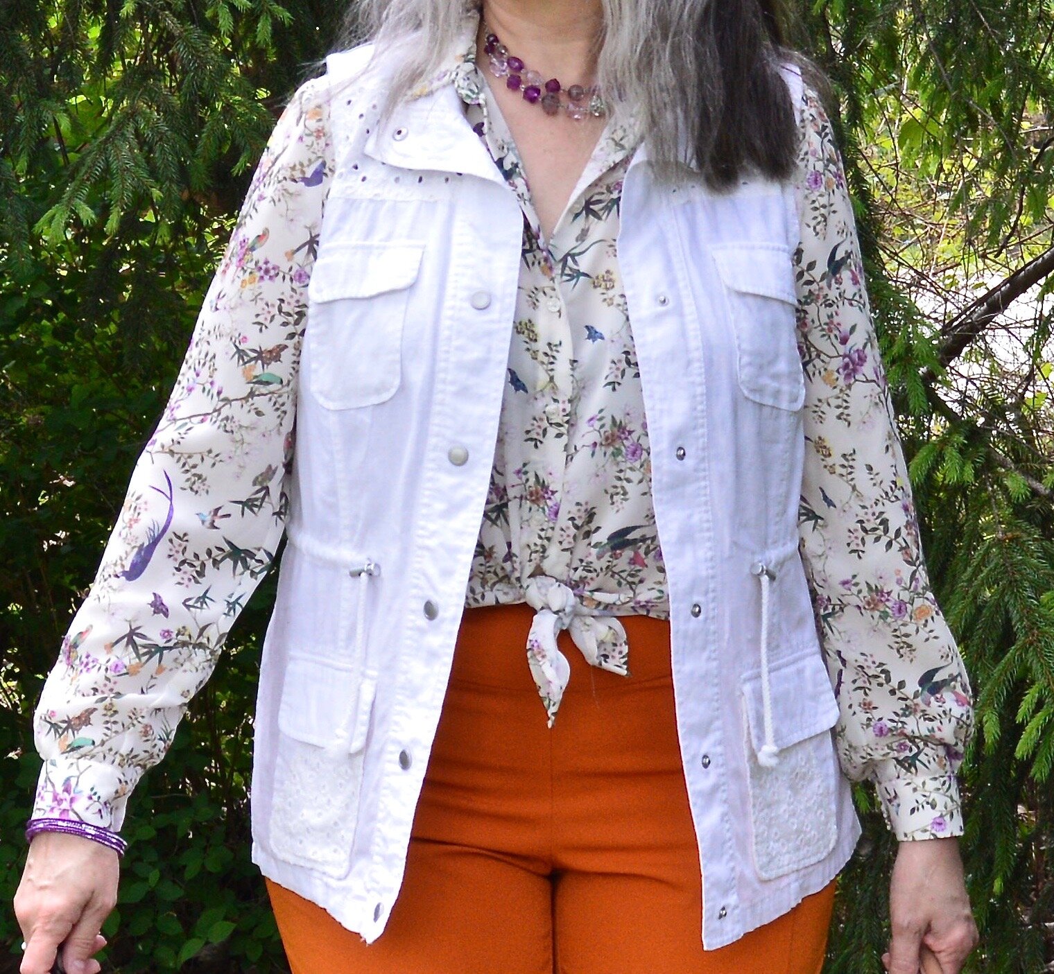
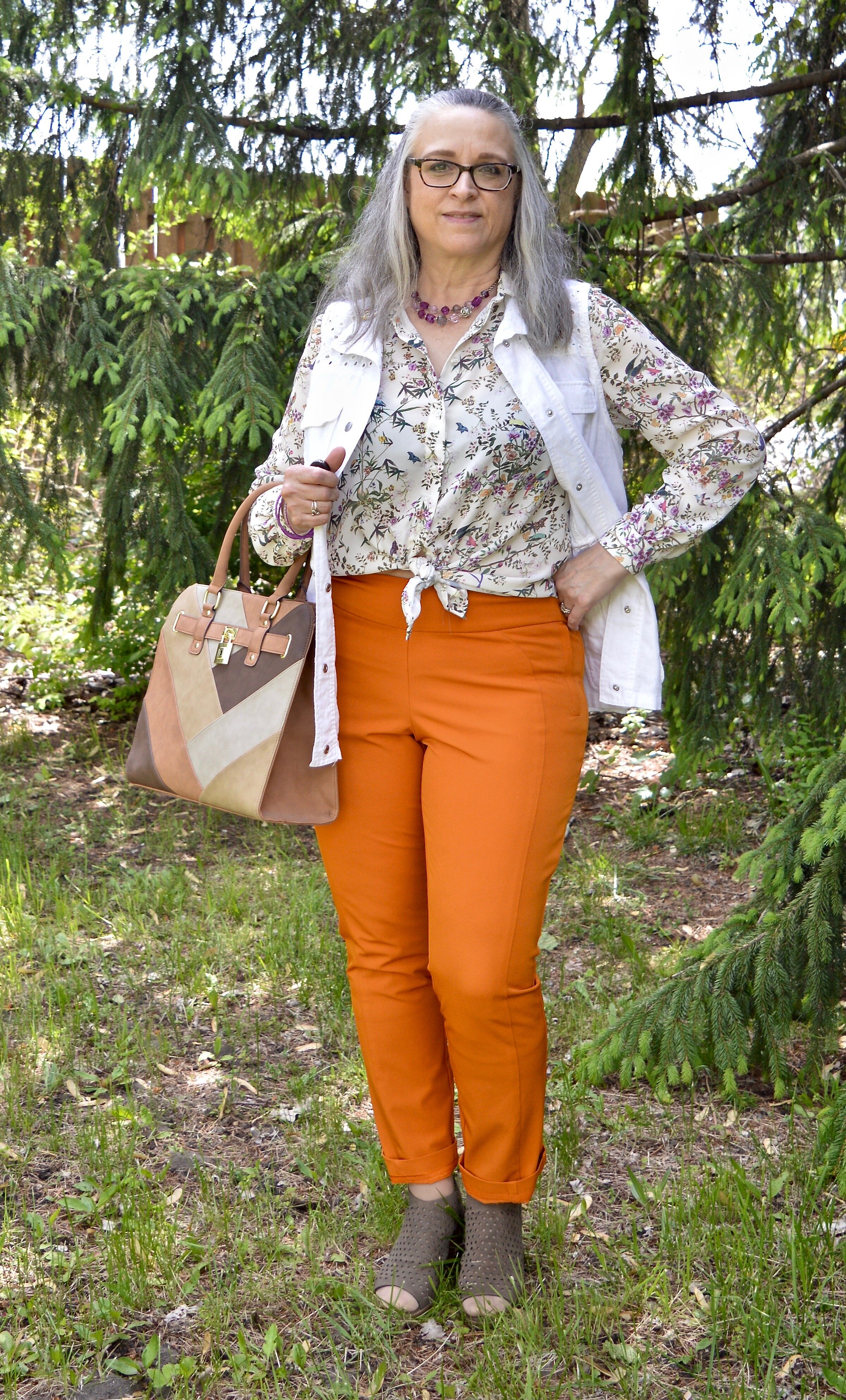
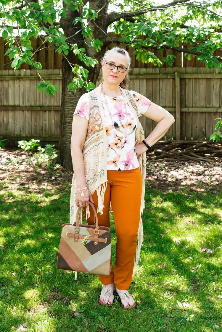
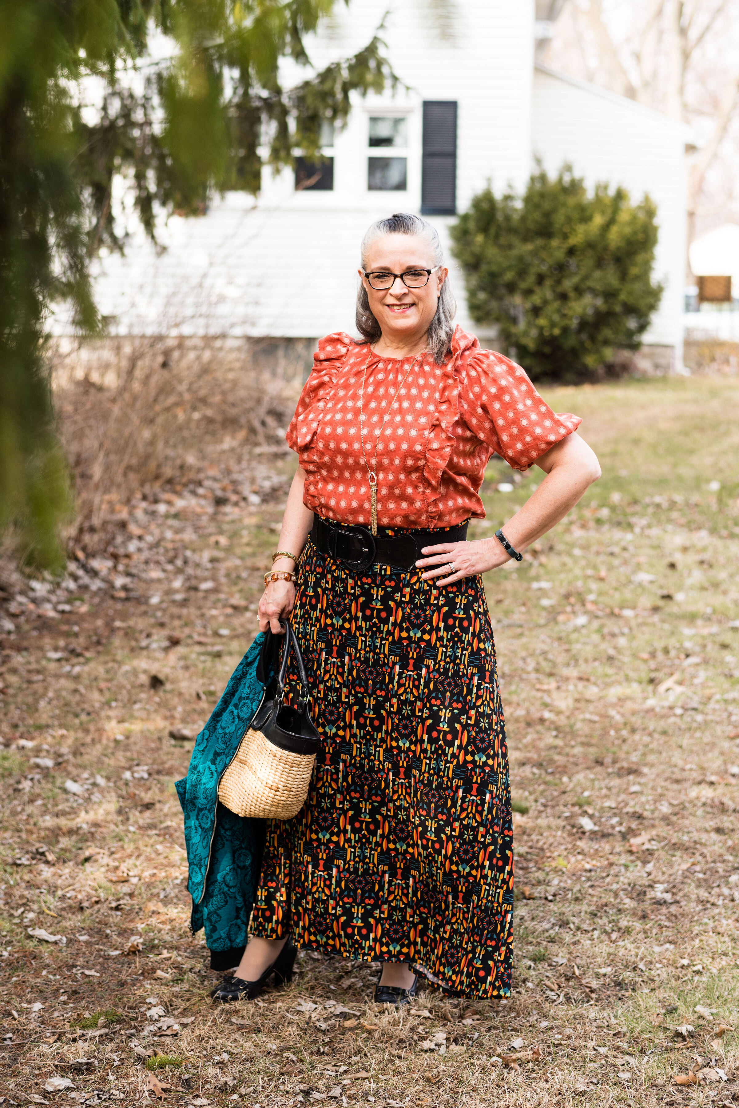
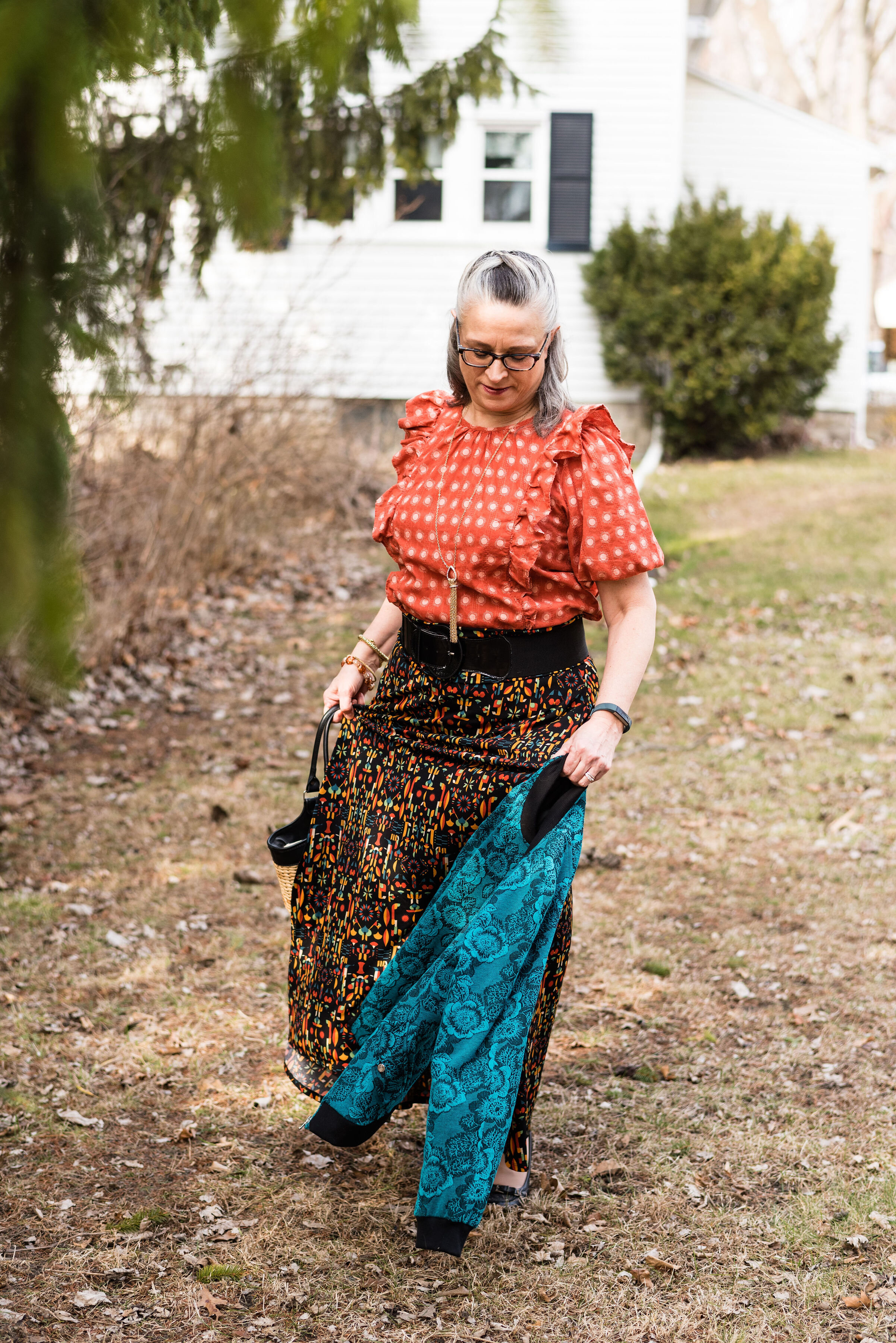
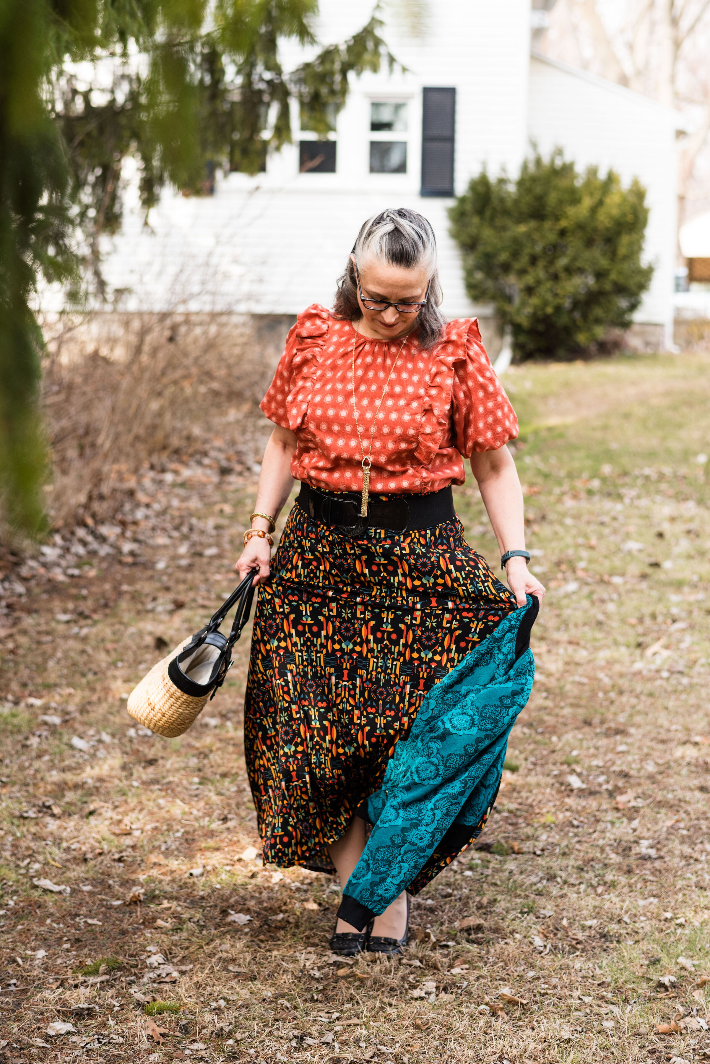
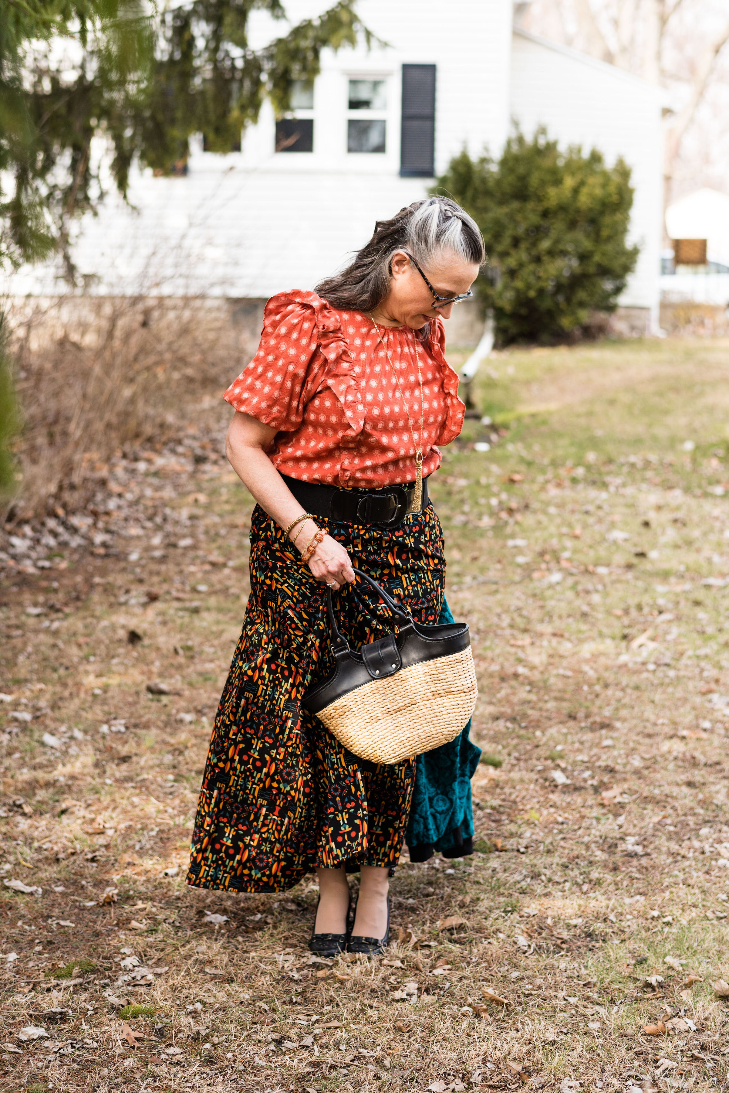
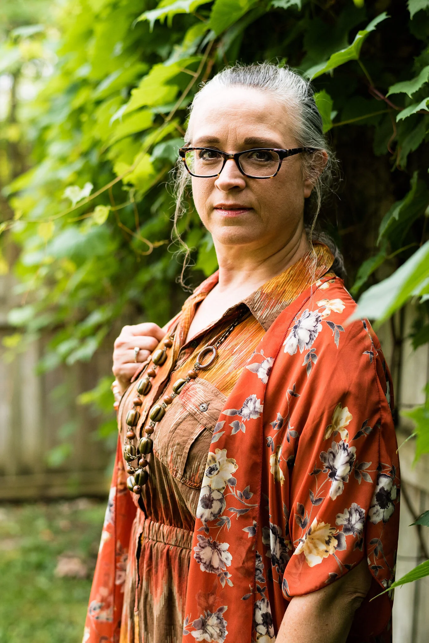
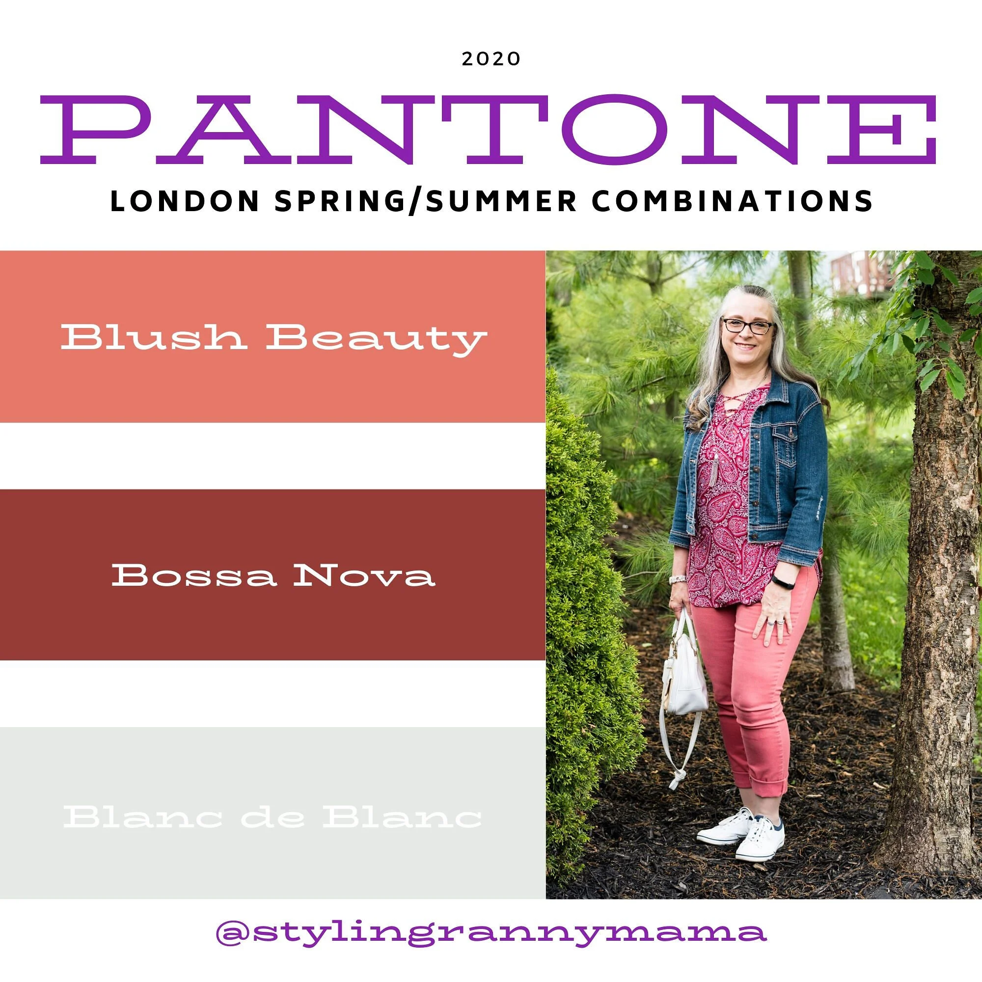
My Bandolino floral jeans are thrifted. They definitely brighten up any summer outfit. I love the floral print and the raw hem on the bottom. It also helps that they have some stretch and are very comfy.

DSC_0068.jpg

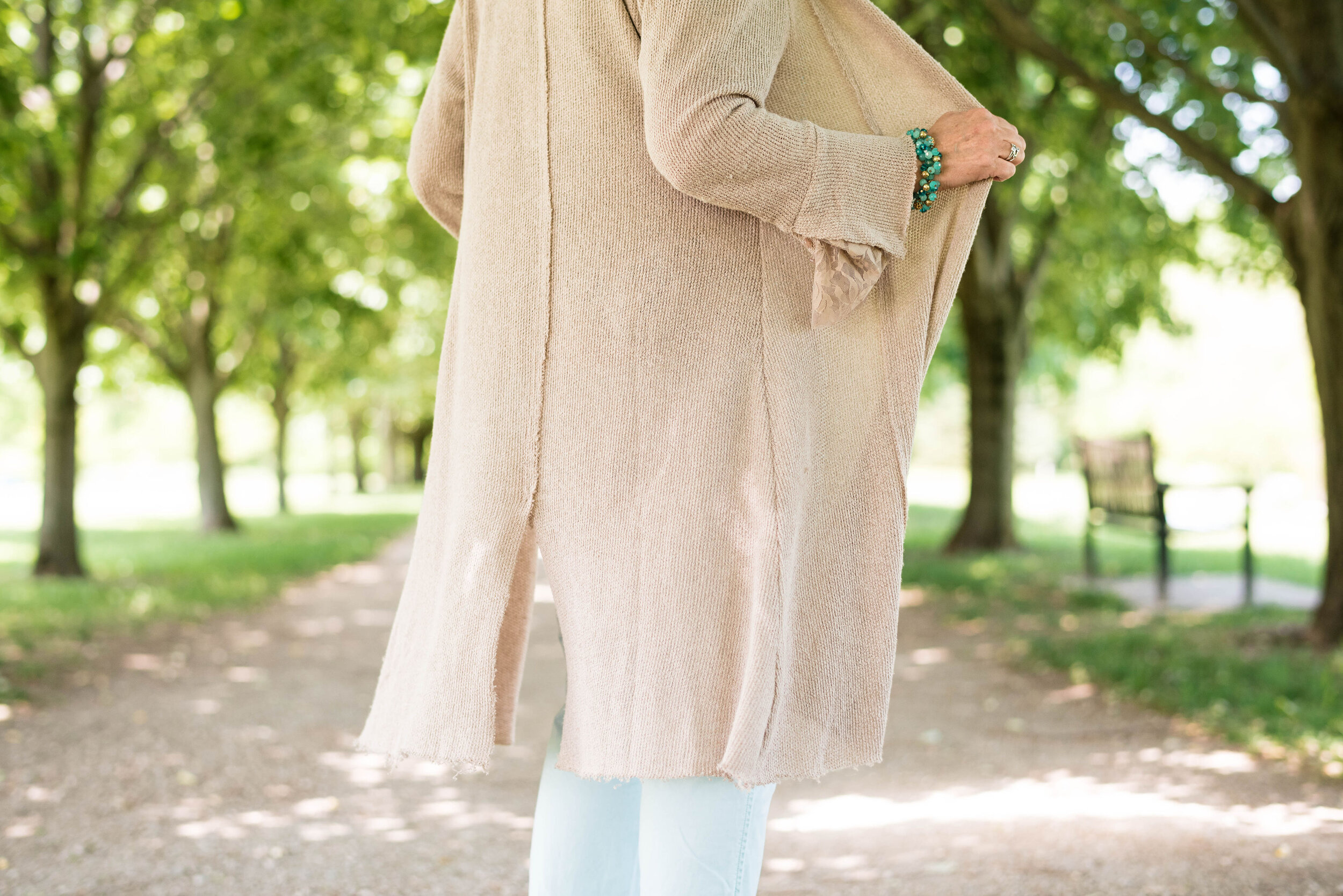
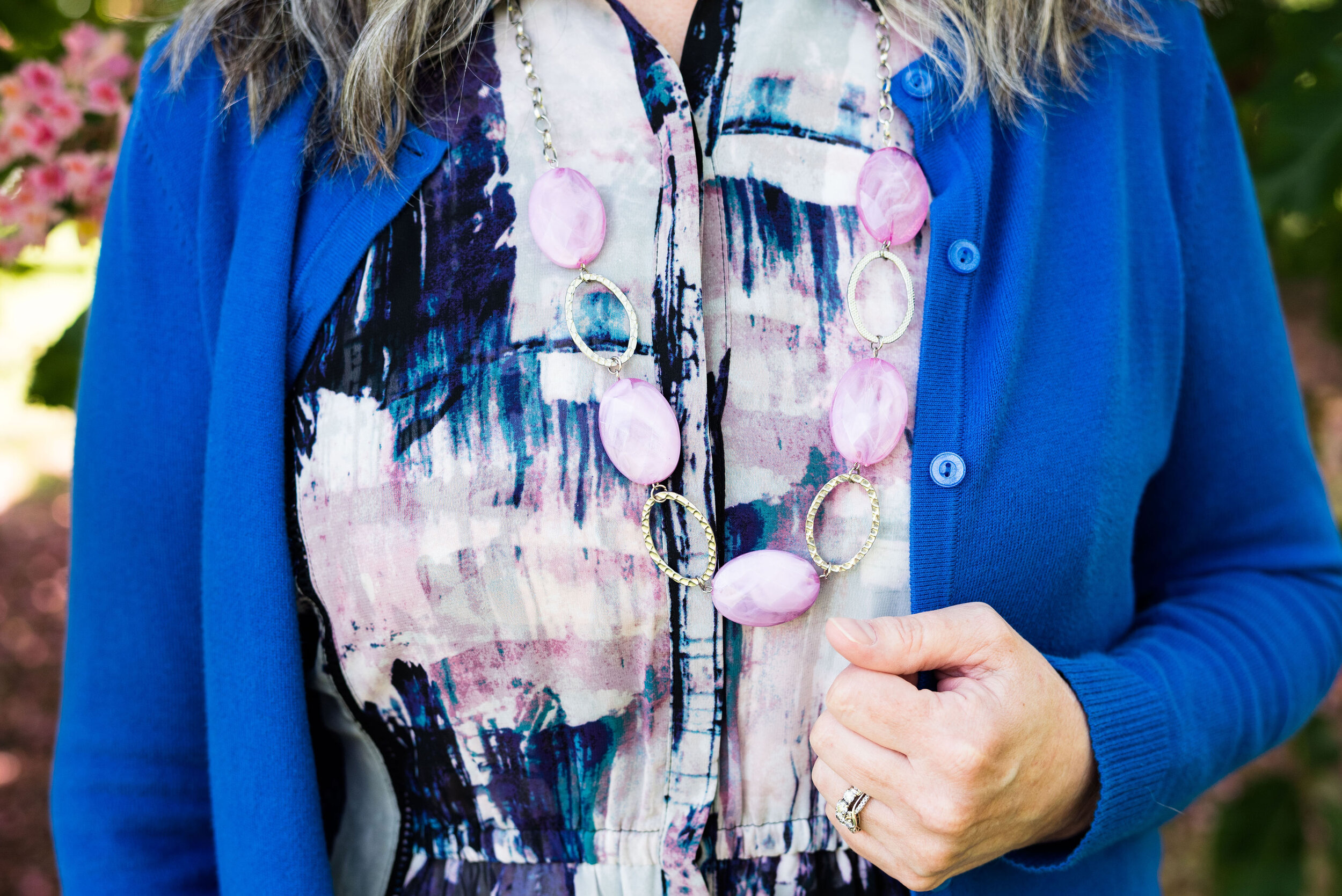
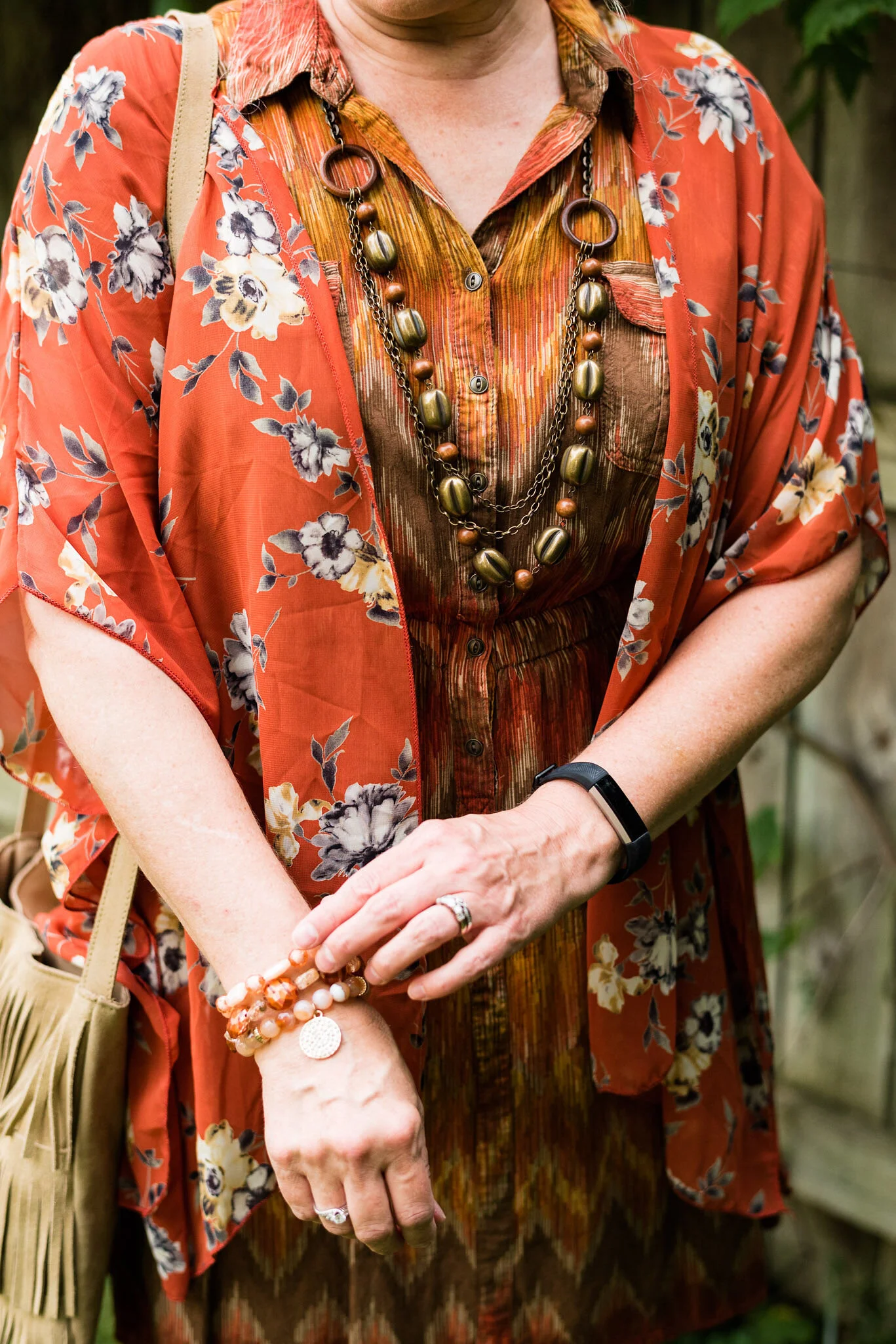
My textured tee is a thrifted Simply Vera, Vera Wang. I love the textured floral print and thought the color and print went perfectly with my pants. You can also see here, I added the long bead and fringe pendant necklace and a few freshwater pearl bracelets in similar colors for an added party vibe. I did the front tuck with the tee and added a gold belt.

DSC_0069.jpg

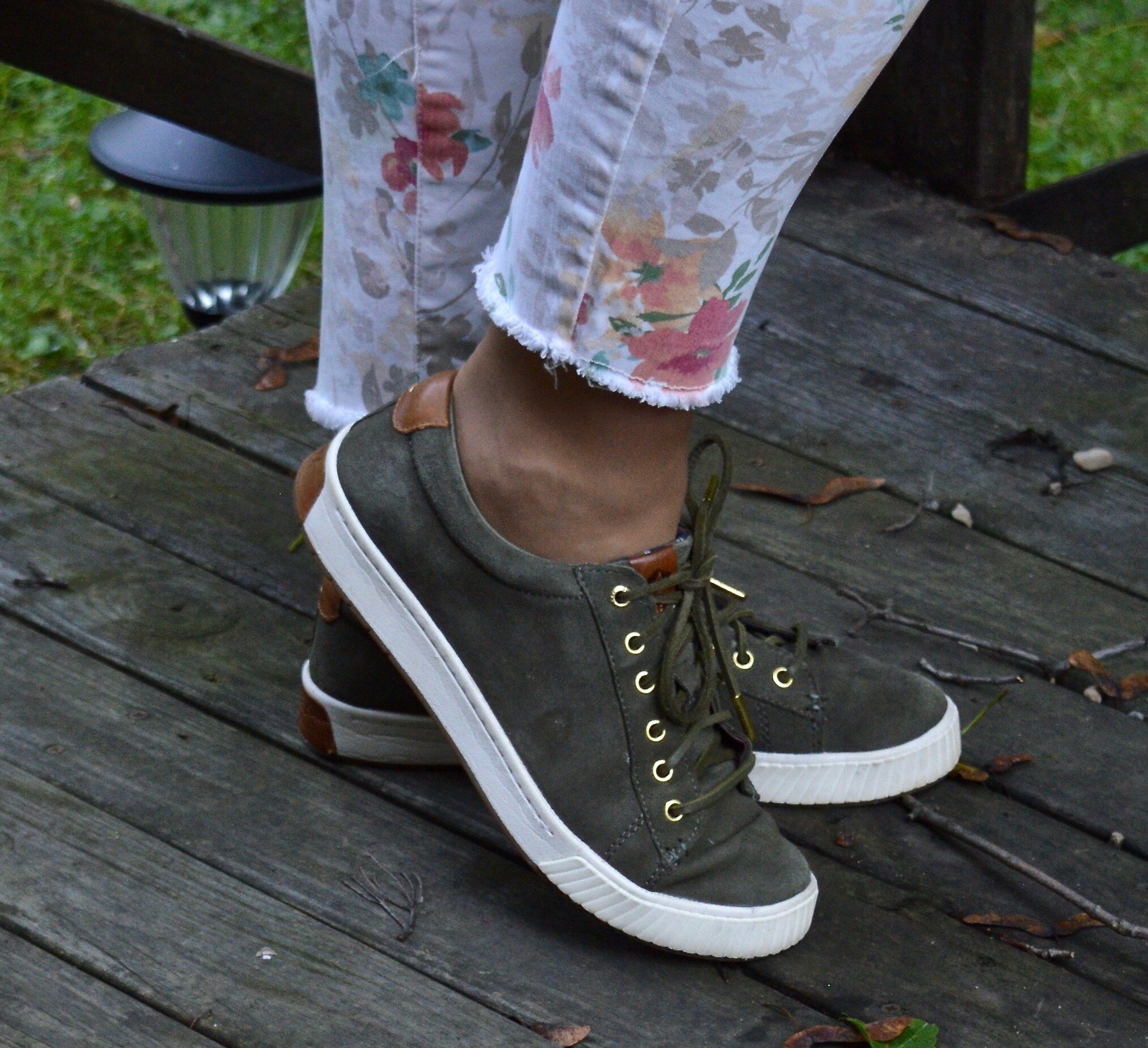
Wearing my olive Sperry’s again. These have become a favorite in my summer show wardrobe. I grabbed these instead of the white Steve Madden’s, because I like how the olive on top and on the bottom made the whole look more unified. You could wear any color with this outfit, like my blue Converse or my tan Keds.

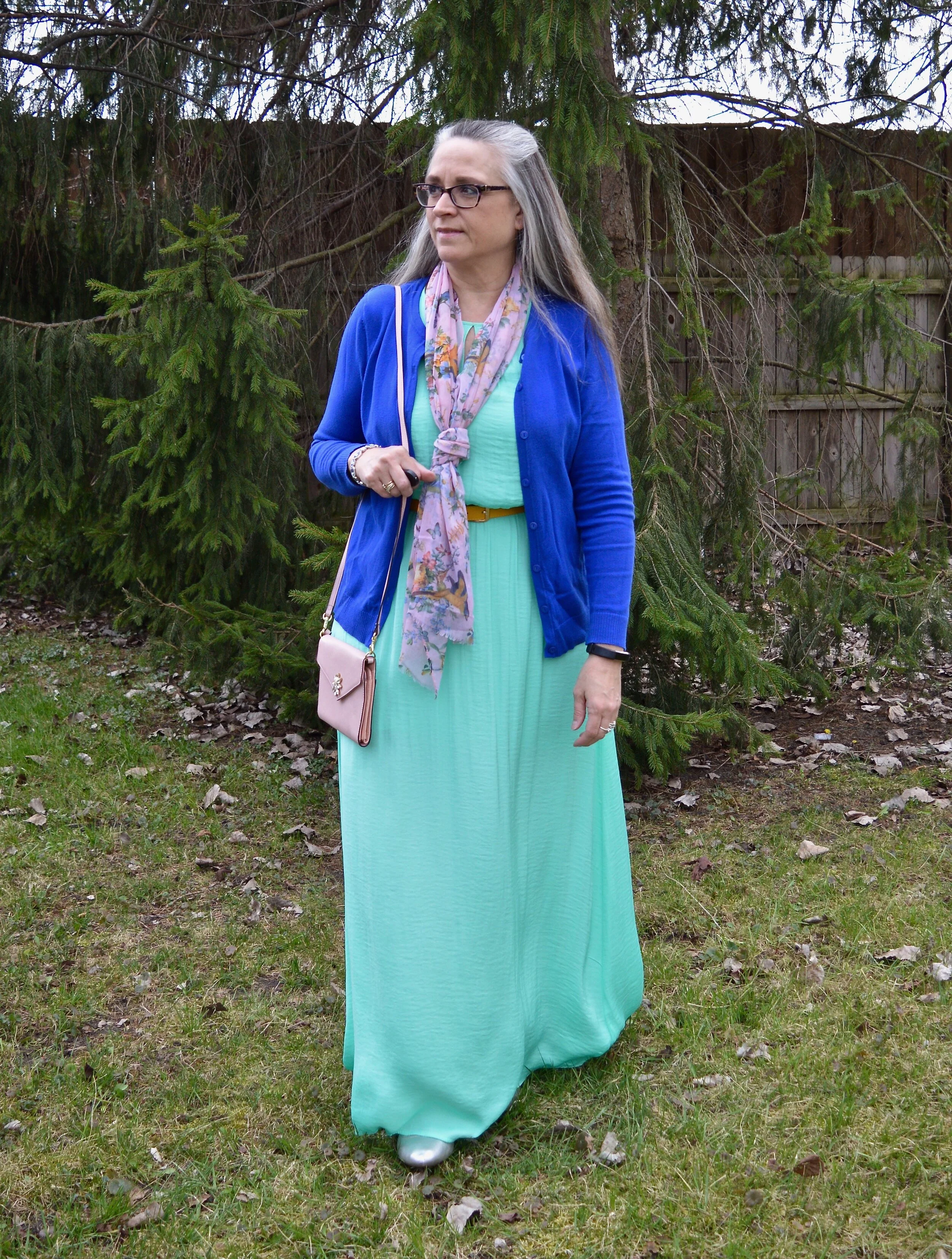
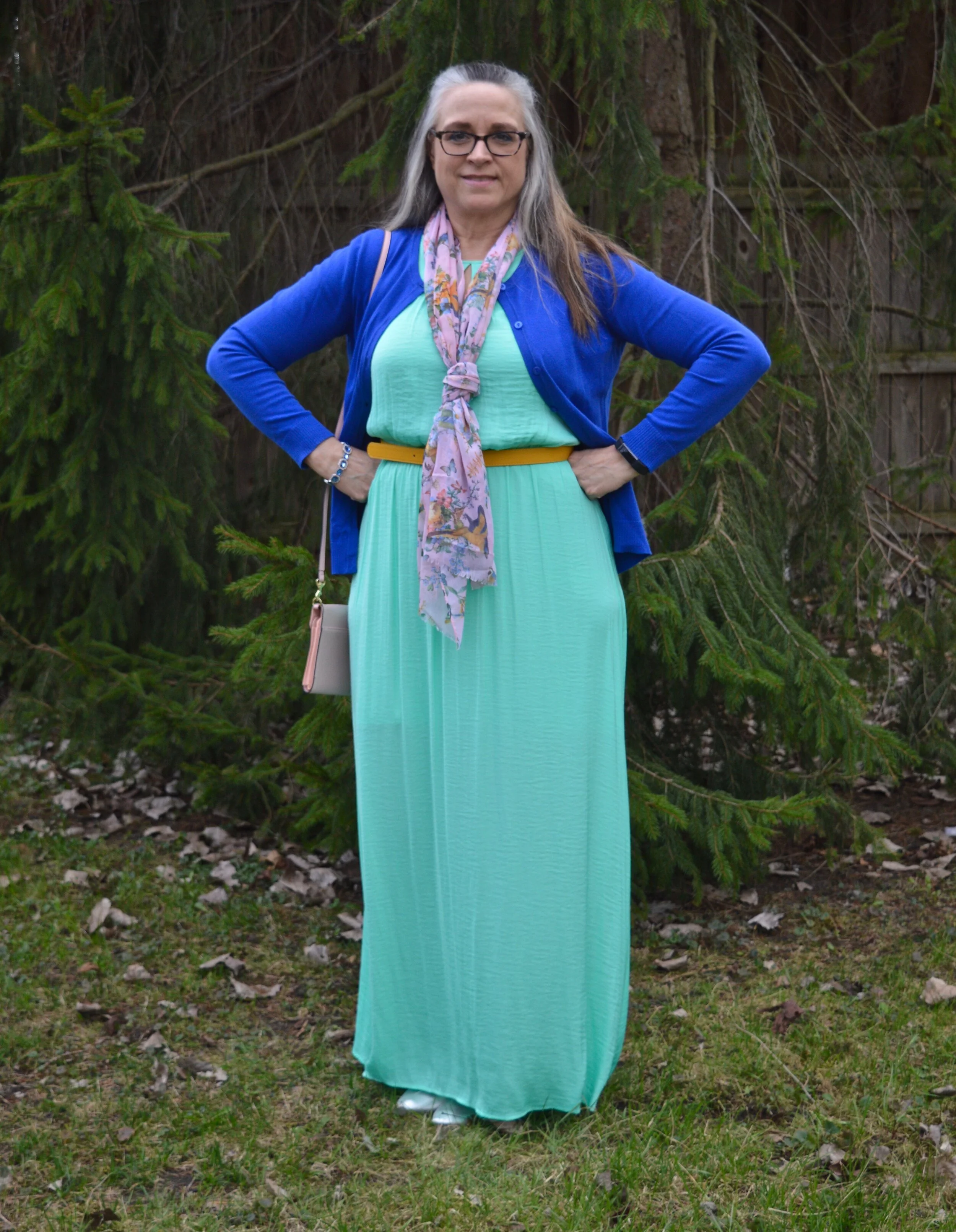
Fall Trend Alert - Blush

Bright colors are definitely in for fall, but so are pastels. It seems any more that you really can wear whatever you want and at least a few things in your closet will be on trend.

DSC_0070.jpg

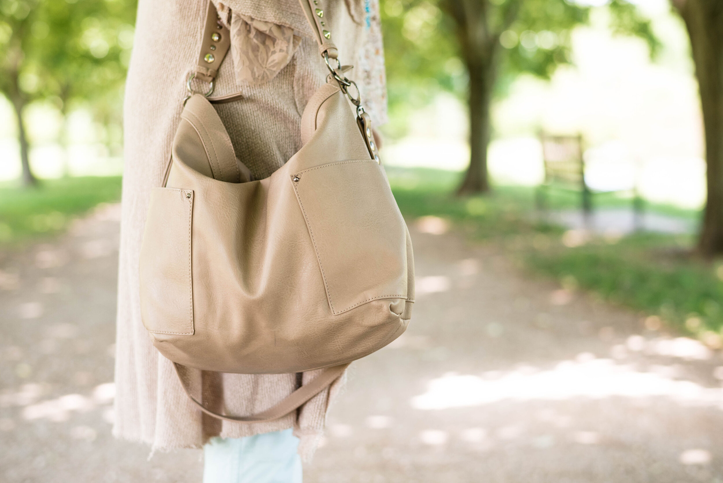
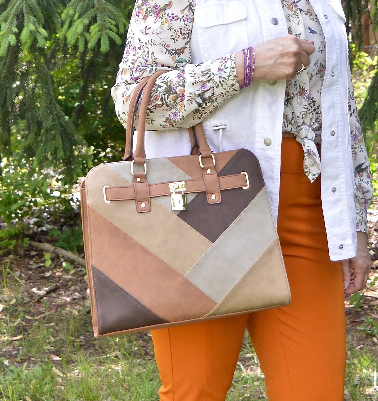
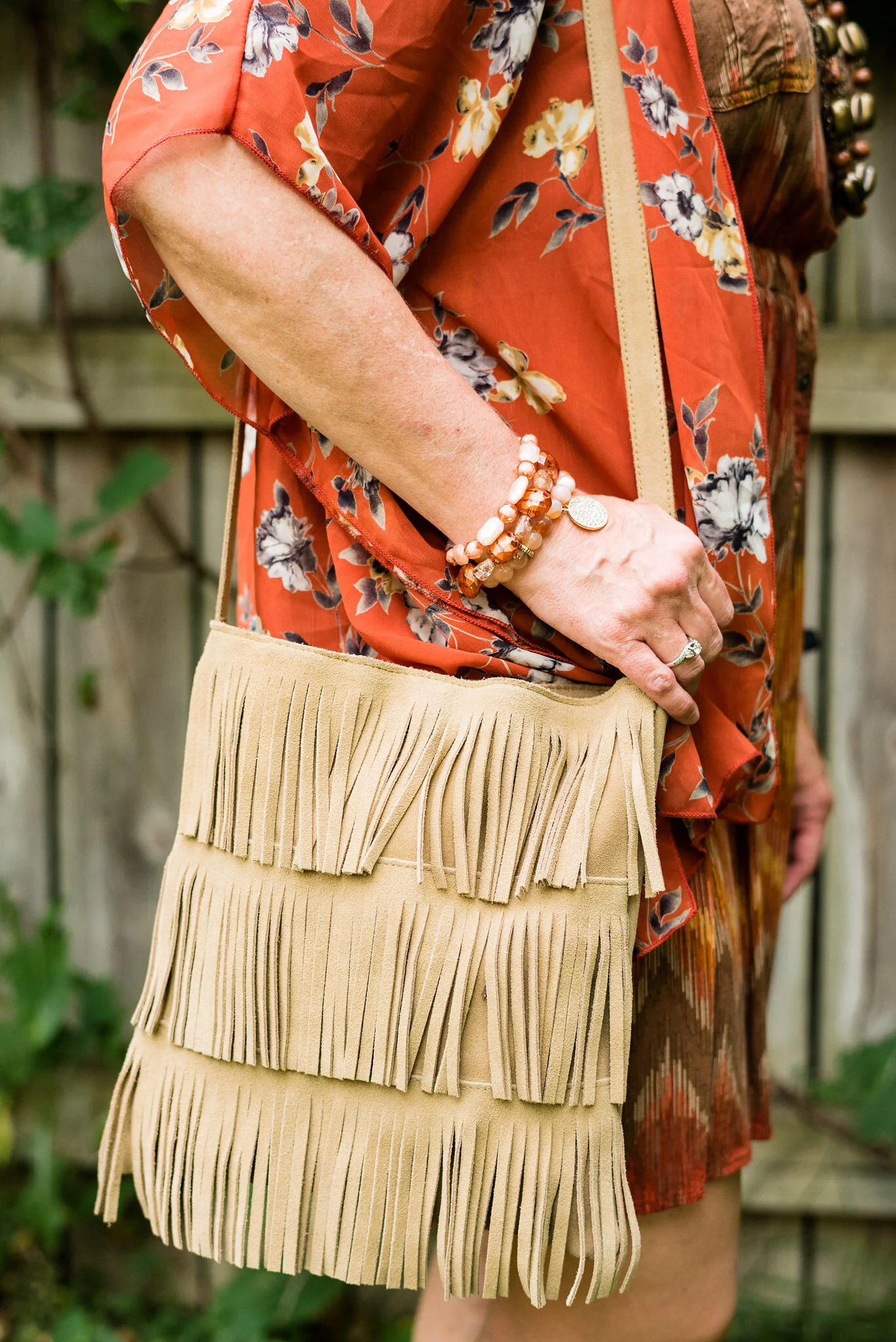
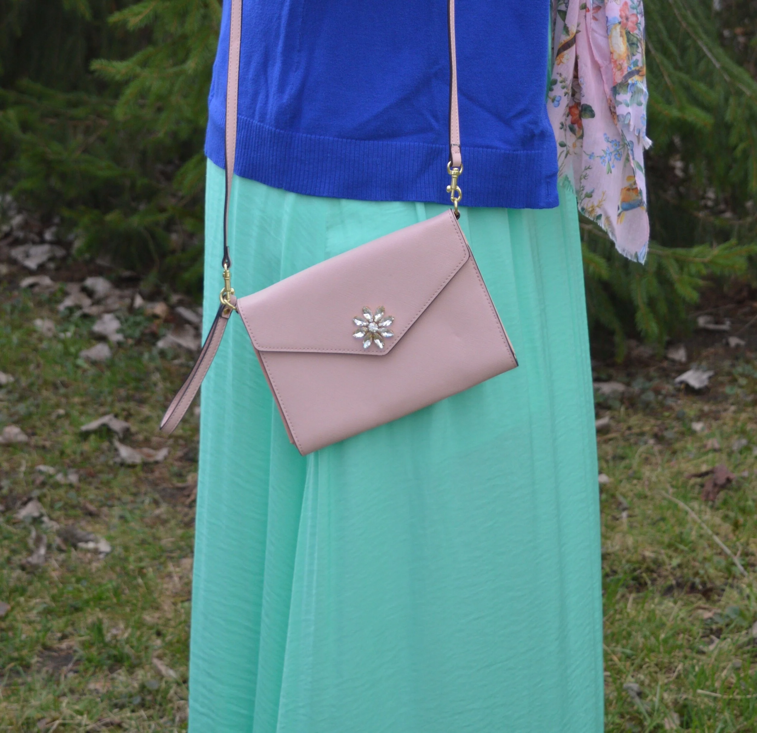
I didn’t plan it this way, but it seems, most of my outfit has some sort of floral theme. It’s funny when it works out that way. This pretty blush bag was a gift from my younger daughter. Both my girls give me wonderful presents and they are very good at knowing my tastes.

DSC_0062.jpg

What do you think of this outfit? Do you like the combination of olive with blue? Do you like florals and will you be wearing them this fall? I’d love to hear you thoughts. I’m sorry that I have gotten a little bit behind in responding to your comments, but I promise, I will respond. I appreciate your input.

I’m including a few shopping links for you to look over. These are affiliate links. All opinions are my own.

Have a great day!

Pantone - Spring/Summer - 2021 - Both Palettes with all the Outfits.

I always think it is fun to do a post featuring all the outfits from my Pantone color series. I really spread these out this year due to scheduling issues, so that’s even more of a reason to look back at all of the outfits. I will also let you know, which ones were my faves.

New York Palette

ClassicColors_(12).jpg
illuminating (1).jpeg
amethystorchid.jpeg
raspberrysorbet.jpeg
burntcoral.jpeg
frenchblue.jpeg

I would have to say, from the New York Palette, my favorite combination is the Amethyst Orchid, Ash Green and Inkwell. I love the contrast of the dark navy blue and the pastel colors. It just makes the outfit pop. I also love the light green with the light purple. It is a very pretty combo for spring and summer. In addition, I really liked the casual vibe of the French Blue, Cerulean and Butter Cream combo. both of these are outfits I would wear. What were your favorite colors? What is your favorite outfit from this series?

London Palette

londonspring2021 (1).jpg
illuminating (1).jpg
pirouette.jpg
purplerose.jpg
pickledpepper.jpg
beachglass.jpg

I really liked this palette over all, because I love all of the colors. My favorite combination was the outfit that I got the most positive feedback on, Beach Glass, Blue Atoll and Macchiato. There is just something so summery and uplifting about these tropical blues and warm brown. I also liked the challenge of combining Purple Rose and Lava Falls. I would have never thought to pair this medium purple with a bold red, but I think it worked. What were your favorite colors from this palette? What is your favorite outfit?

I’d love to hear back from you. Your comments help me to know if the content I am putting out is pertinent to your life. I hope that my outfits and posts are inspiring you to shop your own closet and to think outside the box when it comes to the clothing pieces you wear and how you put them together.

Have a wonderful day!

Pantone - Spring/Summer - 2021 - London Palette - Beach Glass, Blue Atoll and Macchiato

We’ve reached the end of the Pantone - London Palette series with these last three colors which make me think of tropical seas and sandy beaches. Like Tuesday’s post, where I combined two different greens from the palette, today’s post combines two summery blues for a light, airy, warm weather look.

beachglass.jpg

I started figuring this outfit out with my light blue, thrifted Sonoma crop pants. Though they are a bit lighter than the Beach Glass color, I think they still work. I pull these out every spring and summer as a light weight alternative to denim.

beachglasspantoneoutfitideas-1.jpg

My multi-print top is another thrift store find. I just loved the soft colors and print on this popover blouse. It has no tag in it, so I have no idea what the brand was. The print has the light Beach Glass blue, as well as the darker Macchiato.. You’ll see a close up in the next photo.

For the darker Blue Atoll color I decided to add a few pieces of jewelry. I had some long, opera length beads and decided to do some layering with the necklaces. I also added a beaded bracelet, that appears to better match the Beach Glass color.

beachglasspantoneoutfitideas-7.jpg

For the Macchiato color, I played around with several pieces, but everything seemed too yellow. This longer sweater was a recent purchase from Cracker Barrel. While they are a restaurant, they also have what they call an Old Country Store. The store is filled with all sorts of items from old fashioned candy, beautiful home decor, quilts, jewelry, cards, music and clothing. If you click on the link, it will take you to the sweater and it is on sale. Whoo, hoo. If you like it snatch it up. Here are a few photos to show you the details of this pretty piece and the movement. It is a light weight material, so it will be great for spring, summer and fall.

beachglasspantoneoutfitideas-13.jpg
beachglasspantoneoutfitideas-14.jpg
beachglasspantoneoutfitideas-15.jpg
beachglasspantoneoutfitideas-16.jpg
beachglasspantoneoutfitideas-17.jpg
beachglasspantoneoutfitideas-18.jpg

My bag is Madden brand; a clearance find from Kohl’s. My perforated peep toe shoes are Sonoma brand and another Kohl’s purchase from a few years ago.

beachglasspantoneoutfitideas-9.jpg
beachglasspantoneoutfitideas-11.jpg
beachglasspantoneoutfitideas-12.jpg

What do you think of these three colors? I really like how this outfit turned out and think the color combination is great for summer. Do you have these colors in your closet?

beachglasspantoneoutfitideas-6.jpg

I’m including a few other shopping links for you to look over. The Cracker Barrel sweater link is not part of the affiliate program, but I wanted to offer it to you, in case you really like the sweater. The rest of the shopping links are through the affiliate program. Every time you click on a link I get a few pennies, and I appreciate every click.

Have a great weekend!

Graphic and photo credit Rebecca Trumbull.

Pantone - Spring/Summer - 2021 - London Palette - Purple Rose, Lava Falls and Baby's Breath

Today’s colors are a blend of pastel purple, bold red and creamy off white. I have always loved purple, but it really isn’t a color I regularly wear. I easily got on board with Purple Rose which is a medium purple that goes well with many other colors, especially things like brown, olive and navy. Why, then did I decide to pair it with a fierce red like Lava Falls? Because I always like to show you things outside the box. It is not very often, that I think to put purple and red together.

purplerose.jpg

The factor that clinched the deal on putting these colors together, was that my thrifted Old Navy, Lava Falls, paisley popover top had both of these colors in it. How fortuitous was that? Ha, ha. This is a fun, tunic type shirt that has short sleeves, and the interesting details of a shirt tail hem line and a lace up v-neck. I love the paisley print too, which always reminds me of the 70’s.

The Croft and Barrow cardigan is older and I like I said, doesn’t get a lot of regular wear, but i just love the color so I keep it around.

purplerosepantoneoutfitideas-2.jpg

You’ve seen these creamy, Baby’s Breath, thrifted, St. John’s Bay ankle pants on the blog before. I really think this look would have been cuter with a creamy denim pencil skirt or a pair of Bermuda shorts, but I don’t have either of those. I am not as fond of the silhouette, but it is okay, just not great.

purplerosepantoneoutfitideas-7.jpg

I didn’t need to wear a necklace and this long opera length beaded strand is exactly the same color as the top, but sometimes I like the subtle texture and shine of a piece, even if it is a similar color. Wrapping this long strand of beads around my neck makes it look like I have on a choker.

purplerosepantoneoutfitideas-8.jpg

I added a few beaded bracelets with similar reds, although there is plenty going on in the top, so it wasn’t really needed. Often, less is more.

purplerosepantoneoutfitideas-9.jpg

My thrifted Simply Vera, Vera Wang cross body bag is making another appearance. This is a great little bag for the warmer months. The off white color goes perfectly with the Baby’s Breath color of the pants.

purplerosepantoneoutfitideas-10.jpg

These Steve Madden platform sneakers were a new purchase from DSW. I had a coupon and I had been looking at this type of sneaker since last summer. I finally took the plunge. They are not something I would use for walking, but they are cute for a casual day of picnicking or window shopping.

purplerosepantoneoutfitideas-4.jpg

What do you think of these colors? Do you think you would ever combine red with purple? I’d love to hear your thoughts, so leave me some love.

I am including a few shopping links in these colors, so if you have time, give those a look. I hope you have a wonderful weekend!

Graphic and photo credit, Rebecca Trumbull.

Pantone - Spring/Summer - 2021 - London Palette - Pirouette, Indigo Bunting and Polar Night

As always, with the Pantone color series, I find their choice of names for their colors intriguing. Today’s colors center on a pretty purply pink, called Pirouette, which, of course, makes me think of a ballerina. Indigo Bunting is a pretty blue, much like the bird after which it is named. I have had the privilege of seeing an Indigo Bunting flitting through the trees at one of our local metro parks a few years back. They regularly reside in Ohio in the summer time, but like to hang out in abandoned fields, scrubby bush areas and areas with red cedar trees, none of which I have around my house. Polar Night, much like its New York partner Inkwell, is a very dark navy blue.

pirouette.jpg

This fun, multi-print dress is a few years old and was a Kohl’s clearance purchase. I really like many of the pieces by Vera Wang, made specifically for this retailer and called Simply Vera by Vera Wang. These are the pieces that real world women like myself can afford and wear. I have styled this dress, like a tunic for a trip we took to Florida a few years ago. You can see that post here. The dress really contains all three colors, except that its blue borders on being more of a teal.

londonpantonecoloroutfitideapiurouette-8.jpg

I decided to add the bright blue sweater, another Christopher and Banks cardi, as my attempt at the Indigo Bunting. It is a tad bit bluer and maybe brighter, but I think it works well. I would have never thought to pair it with this dress, but I like how it looks.

This is me being silly as I commune with nature. Ha, ha.

londonpantonecoloroutfitideapiurouette-5.jpg

I centered all my accessories around the necklace that is perfectly Pirouette. Since the beads are strung along a silver chain, I went for silver as my accessory color of choice. My thrifted silver clutch and my SO ballerina flats makes the outfit just a little more dressy.

londonpantonecoloroutfitideapiurouette-12.jpg
londonpantonecoloroutfitideapiurouette-14.jpg
londonpantonecoloroutfitideapiurouette-15.jpg

What do you think of these colors? Would you wear them? Do you have any of these colors in your closet? Let me know what you think by leaving me a comment here on the blog or on Facebook.

londonpantonecoloroutfitideapiurouette-9.jpg

Don’t forget, I also post on Instagram and typically you’ll see more of what I wear on a regular basis. Right now my daily looks are very casual, since I am not working, but you’ll definitely get to see more of my clothes, that don’t make it to the blog.

As usual, I am including a few shopping links for these colors. These are affiliate links, but all opinions are my own.

Have a great day!

Graphic and photo credit, Rebecca Trumbull.

Spring Outfit with Orange Pants

Just like I did for the blue pants, I wanted to show you a new outfit with my Worthington orange pants. For this one I focused on a work appropriate look. With many people finally returning to their jobs I thought it would be a good time to feature an outfit that would be perfect for the office, especially as air conditioners come back on.

DSC_0047.jpg

I wish I would have thought to get close up of the details on this thrifted Maurices vest. I snatched it up, because I don’t have any summer weight white vests and I thought the eyelet detail and the texturing on the pockets made this such a unique piece. It has the utility vibe with the patch pockets and drawstring, but is dressier.

You can also see my H&M button down top. I found this one on the clearance rack a few years ago and just loved the botanical print with its flowers, butterflies and birds. I thought tying the front shirt tails made for a more summery look, but one that remains work appropriate. I also like the soft contrast between the stark white of the vest and the more off white of the blouse.

DSC_0020.jpg

I added a double layered purple necklace and a few purple metal bangles to pull out the purple in the top.

DSC_0046.jpg

I opted for more neutral shoes and bag. I thought the outfit had enough color with the bright orange pants and the flora print in the top. The neutral accessories give it not only a summer feel, but a polished and professional look. If I ever go back to an office job, I would definitely wear this. My bag you have seen on the blog before and is from Walmart and George brand. My perforated peep toe sandals are Sonoma brand from Kohl’s.

DSC_0037.jpg
DSC_0040.jpg

I was pleased with how this outfit turned out. What do you think? Would you wear something like this to work? I’d love to hear your thoughts.

DSC_0038.jpg

I’m including a few shopping links for you to enjoy. These are affiliate links. All opinions are my own.

Have a great day, everyone and thanks for following along on the blog.

Why You Should have a Pair of Colored Pants - Orange

I thought I would do one more week on colored pants. This denim wearing diva, never imagined in all my years that I would learn to love brightly colored pants, but I have. I do remember when I was young, being a child of the sixties and seventies, I had a pair of bright red, cuffed bell bottom pants that I loved to wear to school. I am not sure what drew me away from the bright colored bottoms, except maybe that feeling of not wanting to be noticed or seen. I still struggle with that bit, but now I don’t worry so much about what other people are thinking or looking at. That is not my problem. I do try to dress modestly, but I love my bright colors and think they help to make me happy. This week I want to focus on my orange pants.

These orange pants were a clearance purchase at JC Penney about four years ago. They are Worthington brand, have a side zipper and an extra seam towards the front, giving the leg a long, lean line and less bulk around the middle, for a more streamlined look. The waist sits near my natural waist, so a little less of the spare tire problem. Here are past posts from the blog where I used these pants.

Outfit 1 - Orange with Sheer Light Blue Top

Pantone+Spring+2017+-+Island+Paradise.jpeg

I love the summery vibe of this outfit. The light blue, sheer top over the white tank combined with the bright orange pants seems very fitting for dinner under the palm trees at a tropical resort.

Outfit 2 - Orange Pants with a Dress

Spring+Transition+-+floral+dress.jpeg

This is one of my favorite outfits with these pants. It just happened that I found this dress at H&M and that the orange in the dress matched perfectly with the pants. I have no problem with women wearing shorter dresses. I know lots of women who will wear them with bike shorts underneath, so nothing is revealed if they blow up or if they bend over. I personally do not have the legs to wear a shorter dress, so wearing pants with a dress has become something I do more often. It is a fun way to display a short piece without any worry of revealing veiny legs or other leg flaws.

Outfit 3 - Orange with Bright Purple and Gray

Pantone+Fall+2018+-+Russet+Orange,+Ultra+Violet+and+Quiet+Gray.jpeg

Who would have thought to pair bright purple with orange? Well, I did and I think it turned out perfectly. I think the light gray jacket over the top helps to pull this whole look together. The pretty leaf necklace ties the orange pants to the purple top. This is a trick you can do to bring cohesiveness to an outfit that might seem a little outside the color box.

Outfit 4 - Orange with Dark Green

Pantone+-+Autumn_Winter+-+2019+-+Orange+Tiger+and+Eden.jpeg

Once again, you see a color block pattern, but one that is complimented by the printed accessories in the form of a leaf print scarf and a Vera Bradley tote bag. Since this was a more casual look, I added a hem roll to the bottom of the pants. This would be a great outfit to wear for an early fall shopping trip.

Outfit 5 - Orange with Marled Black Vest

Transitional+spring+outfit.jpeg

Vests are a great way to transition from cooler seasons to warmer ones and warmer ones to cooler ones. They keep our cores warm, but our arms from being bound under bulky sweaters or coats. The focal point of this outfit, was not the pants, but the scarf, but I drew on the colors in the scarf to create the complete look.

Outfit 6 - Orange with an Asymmetrical Vest

Pantone+Spring_Summer+2020+-+Flame+Orange,+Blossom+and+Cuban+Sand.jpeg

The solid colored orange pants are the grounding point in this outfit that is filled with busy prints. The floral tee, the open weave asymmetrical vest and the patchwork bag would probably be too much, if the pants were also printed. The bright orange once again announces that summer is just around the corner.

Outfit 7 - Orange with Teal, Gray and Yellow

Pantone+-+Autumn_+Winter+-+2020+-+London+Palette+-+Exuberance,+Ultramarine+Green+and+Sleet.jpeg

Here we are, back to fall. Orange is a no brainer for fall outfits, but we often reach for rust or darker versions of orange. However, I think I have shown that this bright orange is perfect spring through fall. You probably could even dress it up for winter with a chunky fisherman sweater and some suede ankle boots. This particular pair of pants is lighter weight, so if I wore them in the winter, I might put a pair of tights underneath.

So what do you think of orange pants? For all practical purposes I think more women would choose a bright blue pair rather than the orange, but what I wanted to show you is that there are so many different ways to style a bright colored pair of pants and still have a classy outfit that you can wear for a night out with the hubby, a lunch with friends or to a summer picnic. Pick your favorite color and get a pair of bright colored pants now.

I plan on showing you another outfit on Thursday with these same pants that has a more work oriented feel. Be sure to check back then.

I am leaving you with shopping links for a variety of bright colored pants. I hope you find a pair that will be perfect for you. These are affiliate links. All opinions are my own.

Photo credit Rebecca Trumbull.

Why You Should have a Pair of Colored Pants - Bright Blue

I am going to take a temporary hiatus from the Pantone series until my daughter and I can get together for a real photo shoot. I just think the pictures look so much better when she does them. She is the professional after all. In the mean time, I thought I would take the opportunity to talk about a few different clothing pieces that I think are essential to every woman’s wardrobe.

This week I would like to look at colored pants. I know many of us like to wear darker colors on the bottom to draw less attention to that part of our body. We usually have black, navy and perhaps a dark brown. Those who are a bit more bold might venture into the neutral category with tan or beige colored pants. Some will even dare to wear white in the warmer weather. If you are like me, you wear jeans more than anything else, even in the summer time, but I want to encourage you to purchase a pair of pants in a bolder, brighter color.

Today, I want to look back at a few of my outfits from the last few years of blogging. I want to show you why having a pair of bright blue pants is a way to expand your closet and give you additional outfit ideas. I got these pants from shopping a friend’s closet. They are not my favorite pair of pants due to the fit of the waist, so I usually only use them for blog pictures. However, if I ever come across a pair that fits better, I will definitely make the investment, so I can wear them on a more regular basis.

Outfit 1 - Bright blue with light blue.

Chasing+away+the+winter+blues+-+bluer+than+blue.jpeg

If you have been following my blog since the beginning you will probably recognize these outfits. The beauty of a bright blue pair of pants is that they look so classy whether you are dressing them up, like this outfit or dressing them down. I love this combination of bright, bold blue with the lighter pastel blue of the sweater and scarf. The bright blue still makes my lower half look slimmer and doesn’t draw extra attention to that area. See the original post here.

Outfit 2 - Bright blue with a print.

Print+Mixing+-+spring+2019.jpeg

I like having the option of pairing a pretty print top with something other than jeans and these bright blue pants were the perfect compliment to this top and the bomber jacket. Remember, things don’t have to match, though I personally love it when things have some color in common. I think it makes an outfit look more polished and cohesive, but that is just my personal opinion. You can see the original post here.

Outfit 3 - Bright blue with a print kimono.

Pantone+Spring_Summer+-+2019+-+Fiesta+&+Princess+Blue.jpeg

Once again we are pairing the bright blue with a pretty print. An observation I want to make is the color blocking trend. Color block is not one of my favorite ways to style an outfit, but when you do something like this where you take two solid colors and top it with a fun, summer time print, you come up with an outfit that would be perfect for a graduation party, a picnic or a dinner date. Obviously, you could do this with a white, black or navy pair of pants, but doesn’t the bright blue just make this outfit so much more fun? See the original post here.

Outfit 4 - Bright blue with olive.

Pantone+-+Autumn_Winter+-+2019+-+fruit+dove+and+galaxy+blue.jpeg

I am all about olive. I think olive is such a great neutral and it really goes with any other color. I love the cozy vibe of pairing bright blue with the more muted military olive. This is a great combination for fall as the weather is changing, and becoming cooler. The bright blue still gives the outfit a summer feel, but pairing it with olive makes me think of shorter days and crispy leaves. See the original post here.

Outfit 5 - Bright blue with color blocking.

Pantone+Spring_Summer+2020+-+Classic+Blue,+beetroot+purple+and+oyster+mushroom.jpeg

This outfit was an attempt at color blocking. Again, it is not my favorite thing to do, but once again, I think the bright blue pants takes this outfit up a notch. You could definitely do a similar look with navy, black or white, but the bright blue adds a dimension of color and pizzazz to the look that other colors will not. There are occasions that call for black, especially when you want to look more elegant and classic, but for most of us the events we are going to attend are more conducive to a look that is a bit more relaxed and fun. See the original post here.

Outfit 6 - Bright blue with dark blue.

Pantone+Fall_Winter+2020+-+New+York+Palette+-+Classic+Blue,+Ultramarine+Green+and+Blue+Depths.jpeg

The last outfit I want to share pairs my bright blue pants with a navy blazer. I like this combination. Just like the pairing of the bright blue with pastel blue, this look creates a pretty contrast between two completely different blues. This is a great look for the office. The bright blue is not garish or overdone when paired with the navy blazer. The whole look epitomizes polish and professionalism. If I still had an office job, I would definitely wear this look. See the original post here.

Do you have a bright blue pair of pants in your closet? If not, does this post make you think differently about wearing them? I am going to include a few shopping links for bright blue pants, just in case you are now convinced you need a pair. Ha, ha. These are affiliate links. All opinions are my own.

Photo credit Rebecca Trumbull.


Pantone - Spring/Summer - 2021 - NY Palette - Amethyst Orchid, Green Ash and Inkwell

Today’s combination of Pantone colors from the New York palette is a study in contrasts. The dark, moody blue of Inkwell, which mimics a night sky is a type of color disparity when side by side with the pale pastel of Green Ash. When I pair colors I often go for bold with bold, or light with light, but I wanted to experiment by creating an outfit with an eye catching difference in color. The addition of Amethyst Orchid gives the perfect compliment of medium purple color.

amethystorchid.jpg

Let me start the outfit details by talking about this recently thrifted tee. I love the bold flower on the front and purple has long been a favorite color of mine, so I was glad it was on the palette. This tee is St. John’s Bay brand. The darker inner petals are actually separate pieces of material, which gives the tee added dimension.

To go along with the Amethyst Orchid color in the tee, I also added this recently thrifted scarf. I love the large gingham pattern. It was the perfect accompaniment to the whole look. Another interesting feature of this scarf is the ruching of elastic throughout its length adding texture.

amethystorchidpantonecolorsoutfit-9.jpg

These thrifted, Inkwell pants are a brand called Hydrant. A dark pant like this is great for making our lower halves look longer and slimmer. I really like these, but they are a lint magnate. Wearing them with a fuzzy sweater like this is probably not the best idea. Ha, ha. You can also see I added a wider, olive belt since belts are trending and did my usual front tuck.

My fuzzy Green Ash sweater might be a little light, but it is pretty close to the Pantone color. This was a Christopher and Banks purchase last year. Before I bought this piece I had very little of this color in my wardrobe. I have picked up a few things since then. It is a pretty pastel color to wear, especially in the spring and summer. I really like how well it goes with the Amethyst Orchid color.

amethystorchidpantonecolorsoutfit-6.jpg

I decided to go with white for my shoes and bag. White is definitely a go to in the warmer months. My white Keds will be on repeat. My white shoulder bag is a new thrift find. I have been searching for a different white bag and this one has plenty of room and can also be worn as a cross body bag. This is a brand called Bueno.

amethystorchidpantonecolorsoutfit-10.jpg
amethystorchidpantonecolorsoutfit-12.jpg

What do you think of these colors? Would you wear a light pastel with a dark color like navy or black? I’d love to hear your thoughts. Thanks so much for taking the time to comment.

amethystorchidpantonecolorsoutfit-15.jpg

I’m including a few shopping links. These are affiliate links. All opinions are my own.

Photo and graphic Rebecca Trumbull.

Spring/Summer - 2021 - Spark Joy

This trend is a bit different and I think really open to each individual’s own interpretation. The idea of Spark Joy is color and print combinations that make you feel like you are wearing a party. I actually enjoyed putting this together. You know I love print mixing and this pushed me even further outside of my color and print mixing box. Let’s take a closer look.

sparkjoyspringtrend-3.jpg

I got this Universal Threads, sun print top at Target at the same time I got my pastel colored eyelet shirt (seen last week on the blog). Once again, you can see the puffed sleeves. Usually, I am not a ruffle girl, but once in a while, I find something that doesn’t make me look like a clown and this top was one of those times. I think the gathering around the neck helps and that the ruffles are vertical rather than horizontal. Horizontal patterns on us larger ladies are harder to pull off, and that goes for ruffles as well. In fact, when placed as they are on this top, I think it balances out my wider bottom.

This is another LuLaRoe skirt that I found at a local thrift store. The thing I like about these maxi skirts is that I don’t have to worry about wearing a slip. They are comfortable and easy to wear. The fun patterns are great for print mixing as in this outfit, or you can pick any color in the pattern and match up to it. I know not everyone can wear a maxi skirt and I will include a few shopping links at the end for shorter printed skirts for those of you who prefer a midi or knee length style.

sparkjoyspringtrend-11.jpg

My floral, Erin London, bomber jacket you’ve seen before. It was a purchase from Shop National from their mark down section a few years ago. You can see it here with a floral top.

My accessories were simple since there was already plenty going on in this outfit. I chose another long pendant necklace, this time with some bling and fringe. I also opted for a wide black belt to make more of a definition between my top and the skirt. I added a few bracelets, my thrifted, black, a.n.a. loafer heels and my thrifted bucket bag. My daughter does not like this bag. What do you think? She doesn’t like the shape of it. I told her I would ask for your opinion, so be sure to comment below.

sparkjoyspringtrend-10.jpg
sparkjoyspringtrend-13.jpg
sparkjoyspringtrend-8.jpg

So what do you think of this crazy print mixing outfit? I do not really expect you to go out and wear something like this, but it is truly fun to experiment and push ourselves outside of our normal outfit ideas. Would I wear something like this? Probably not exactly as I have it here. I might swap out the skirt for a solid black skirt or pair of pants, or I might change the top for a solid tee. I might even wear the top and skirt together, but switch out the floral bomber for a solid cardi or light weight jacket. You can still have joy with bright colors and print mixing, but you can also look polished and classy.

sparkjoyspringtrend-2.jpg

I’m including a few shopping links for fun prints. Be sure to check those out. These are affiliate links. When you click on a link, I get a few cents. I appreciate every click. All opinions are my own.

Photo credit Rebecca Trumbull.

I hope you are having a great week.

Kickin' It with Kimonos - Orange Floral

Today’s look involves some bold print mixing, but why not? It is fun to think outside the box when it comes to building an outfit and one way to do that is to mix prints. This might not appeal to you, because it is a little busy, but there is something about this I really like. I think it might be that this outfit has a bit of a bohemian vibe. The colors do lean a little bit more towards fall, but seeing as we are now in the month of August, I think it is a great transitional look.

Kickin' it with kimonos - orange floral

This chevron print dress is Sonoma brand. I just loved the colors of this thrifted piece and knew I had to bring it home with me when I found it. You can see how I styled this same piece with a pair of crop pants in one of my previous Pantone series.

Kickin' it with Kimonos - Orange Floral

I am not sure what I was doing with my mouth, be these sorts of pictures have been pretty typical throughout my whole photographic career. Ha, ha.

Kickin' It with Kimonos - Orange floral

I ordered this orange floral ruana from a boutique retailer called Glamour Farms. I used to follow several bloggers who featured a number of their pieces and I thought they were cute. This ruana was on clearance and I loved the color and the pattern. Unfortunately when I got it, the seams they put at the sides to make it more secure and have sleeves, made the piece too small. I just removed a few inches of stitching and now it is perfect.

The above picture also gives you a closer look at the thrifted necklace and my beaded bracelets. I thought this necklace was a very unique blend of brassy metallics and wooden beads.

Kickin' it with kimonos - orange floral

My thinking is, a good boho outfit always should include some fringe, thus this thrifted bag. This is a very simple hand crafted piece, but I just love the fringy layers and it definitely appeals to my inner hippy. You can see this bag with two other boho looks on the blog: medallion print skirt and denim outfit.

Kickin' It with Kimonos - orange flora

I have had these Montego Bay Club sandals for ages. I used to wear them quite a bit, but more recently I haven’t really been wearing sandals as much. I’m glad I thought of these, however, and I think they work just right for this outfit. What do you think?

Kickin' it with kimonos - orange floral

What did you think of this outfit? Would you do a print mix like this? Why or why not? I’d love to hear your thoughts, so be sure to leave me some love in the comments. I appreciate all your insights and ideas.

I’m including a few shopping links. These are affiliate links. Every time you click on a link, I get a few cents. Every penny counts. All opinions are my own.

Photo credit Rebecca Trumbull.


Pantone Spring/Summer 2020 - Recap

I hope you have enjoyed this Pantone color series. Today I just want to show you a recap where you can see all the outfits in one post. Here we go.

New York Palette

Pantone Spring/Summer 2020 - New York Palette

Classic Blue, Chive and Navy Blazer

Faded Denim, Orange Peel and Lark

Sunlight, Flame Scarlet and Ash

Biscay Green, Saffron and Brilliant White

Mosaic Blue, Coral Pink and Brilliant White

Cinnamon Stick, Grape Compote and Navy Blazer

London Palette

Pantone Spring/Summer 2020 London Palette

Classic Blue, Beetroot Purple and Oyster Mushroom

Pantone Spring/Summer - London Palette

Flame Orange, Blossom and Cuban Sand

Pantone Spring/Summer 2020 - London Palette

Yellow Iris, Rose Brown and Cuban Sand

Pantone Spring/Summer 2020 - London Palette

Storm, Fiery Red and Blueberry

Pantone Spring/Summer 2020 - London Palette

Blush Beauty, Bossa Nova and Blanc de Blanc

Pantone Spring/Summer 2020 - London Palette

Tanager Turquoise, Heritage Blue and Blanc de Blanc

Pantone Spring/Summer 2020 - London Palette

Which color palette was your favorite? Which outfit did you like the best? I would love to hear your thoughts. I hope you all have a wonderful weekend. We will be celebrating Father’s Day with our kids on different days, since schedules wouldn’t allow for everyone getting together. God bless each of you with peace and joy.

All graphics and London color palette photos by Rebecca Trumbull.

Styling an Easter Outfit Around a Scarf - Dressy Look

This week I am using a spring scarf around which to build two Easter outfits. On Tuesday I showed you a casual look with blush pants, a polka dot denim shirt, and a utility jacket. That look was something you could wear to your kids’ Easter egg hunt, a spring picnic at the park or even to a more casual church service. Obviously, right now, we are not doing any of those things, but you could also use either one of these outfits for some other event later in the summer when, hopefully, things will be open again.

Today’s look still revolves around the pretty floral print scarf that was a gift from my daughter. It is the perfect piece to draw inspiration from because of all the beautiful colors. However, for this look I wanted to be more dressed up.

This long, silky, Jennifer Lopez dress was a Kohl’s purchase a number of years ago. I have styled this on the blog before with my cropped denim jacket and with a floral bag.

I wanted to add a belt and thought this recent clearance purchase would be a fun pop of color around my waist, and it went with the scarf.

Once again you can see a closer view of the scarf and all its pretty colors. The bright blue cardigan Is from Christopher and Banks.

You’ve seen this little blush clutch on the blog before and I thought it went well with the pink scarf and the dressy vibe of the outfit. I found this on clearance at Meijer, a few seasons ago.

My pretty blue bracelet was a Christmas gift from my hubby. I love the sparkle.

I went with my silver SO flats to go with the silver in the bracelet and on the clutch.

What do you think of this outfit? Would you wear something like this for Easter? What pieces do you have in your closet to build an outfit similar to this? What scarf do you own that you could build an outfit around?

With all that is going on right now to keep us at home, it is kind of fun to go rummaging through your closet for ways to style pieces you already own differently. Try it and find out. You might have several new outfits you didn’t know you had. Think outside the box.

I hope you enjoyed these Easter outfits and I hope and pray you are doing well, both physically and mentally. Hang in there and have a lovely Easter weekend!

I’m including a few shopping links, just for fun. These are affiliate links. All opinions are my own.


Seeing Red - Color Play - Patterned Scarf

Color inspiration can come from so many different places. In this monthly column, I am trying to force myself to look in different places for color. The typical places we look to are our clothes. For instance a pattern on a top or sweater, might be the basis for the rest of your clothing piece choices. Last month I chose a watercolor painting and table center piece as the inspiration for my outfit. I am hoping to inspire you to look in places you never thought of looking for color inspiration.

This month, I decided to inspire you with something probably every one of us has in our closets; a scarf. This particular scarf is full of color and not typically colors we would want to put together into an outfit, but why not? Think outside the box. Most of us use our scarves at accessories, without ever really letting them inspire our whole look. I decided to give it a try, so be sure to let me know what you think.

This scarf is perfect for this month’s Seeing Red theme. It is full of burgundy, red, shades of purple and a yellowy green. Using this as my spring board, I dove into my closet to see what I could find. This is what I came up with.

These bright red Faded Glory pants are a recent thrift find. I like ankle pants as the weather gets warmer and I thought this color would be fun for spring and summer. I used to never wear bright colored pants like this, but I have decided that life is too short to not wear the fun pants. I still reach for my simple blue denim jeans the most, but a bright color once in a while is a good way to stretch ourselves, whether it be on the bottom or the top.

My lavender colored button up shirt is a thrifted Merona piece. The longer yellow sweater was a clearance find at the end of last winter season from Forever 21. I don’t shop there too often, because most juniors sized clothing, does not fit me very well, but with the advent of bigger, roomier fashion, I can find things once in a while that don’t make me look like I’m trying to dress like I am still 21; 39 maybe, but not 21. Ha, ha. The sweater is soft and cozy, the perfect topper for these very chilly winter days.

I know the fashion industry and many bloggers are already talking about spring and the upcoming fashion trends. I understand the need for being ahead of the game and often at this time of year we are yearning for the change of seasons and the warmer days of spring. However, the reality is, it is still, very cold! This morning when I checked the temperature, it registered at 18, but the “feels like” temp was only 9. Um, I’m still going to wear my warm, cozy sweaters, thank you very much. To even think about baring my ankles or talking about shorts and less layers makes me feel cold.

I’ve had this red and gold charm necklace for a long time. It is the perfect piece to add a pop of red color against any top. I love pendant necklaces and I am fortunate enough to have a long enough torso to wear them. I especially like these charm type necklaces with all their different fun charms, beads and dangles.

You’ve seen this cranberry colored bag just recently on the blog (you can see that post here), and I realized it would be a great color match for the berry color in the scarf. This thrifted Libby Edelman bag was brought to my attention by my thrifting bestie back in Buffalo, NY one time when I was back visiting my mom. As much as my hubby prefers that I never bring a purse into the house again, once in a while a girl has to bring it home.

My olive SO ankle boots are making another appearance. These ankle boots are the most comfortable, versatile pieces and are the one purchase I would strongly recommend. It doesn’t have to be the SO brand, but I have found Kohl’s carries SO and Sonoma boots and I have really liked both. They are comfortable, fairly durable and have a great price point, especially if you can get them on sale or on clearance. I’m including shopping links at the bottom of the post, so be sure to check those out. Now is a great time to get boots for next season as many of them are on clearance. The great thing about ankle boots is you can wear them well into the spring with cropped pants, rolled pant hems and even skirts.

Do you have a scarf in your closet that you would love to build an outfit around? Give it a try. It is always fun to challenge your fashion brain to think beyond your norm. Many people might say they don’t want to change the way they do things, but there is something fun and satisfying about doing things differently and having it turn out well. Give it a try and let me know how you did.

For some beautiful scarves check out Nora Minassian at The Jacket Society. She has some beautiful printed pieces like this blue and white multi, ivory, pink and orange, tan and orange, multi-leaf print, and many others. Nora’s scarves are large and can be used as a shawl too, which would also be perfect for an outfit like this.

I love to hear your thoughts and I really wish there was a way to get more people to interact on the blog. The reason I say this, is not just for my benefit, but you all can be an encouragement to each other. After all, isn’t that what this is all about? For those of you who do comment, thanks again. For those who don’t, I would never want you to feel pressured. I know life is crazy busy. I often delete posts from other bloggers, because I just don’t have the time to comment, but I always feel good if I do. I feel like I am reaching out and encouraging a friend I’ve never met.

Thanks again for all your support.

Photo credit Rebecca Trumbull.

The shopping links included are affiliate links. I get a few cents if you click on a link and a little bit more if you purchase something through one of my links. I appreciate every click.

Have a great weekend and I hope the sun is shining where you are.