Fashion Fun: Men's Oversized Button Down

When it comes to thrifting for fashion, I like to think outside the box. I always peruse all the sizes, because so often size is relative. What I mean by that is, it is relative to the brand. A size 12 in one brand might fit you perfectly, but a size 12 in another brand, might be too big or too small. I honestly believe sizing is different than it used to be. If you shop vintage clothing, at all, you will see that most of the pieces are relatively small. Women tended towards being smaller in the waist, hips, and shoulders than we are now. Not sure why, but it does seem to be the case.

I have also started looking in the men’s section of thrift stores for fun pieces like tees and printed button downs. I like the roomier cut of a men’s medium or even large shirt and they often have textures, prints and fabrics that are different than those on the women’s racks. Today, I am going to show you three different outfits using three men’s button downs that I purchased while thrifting.

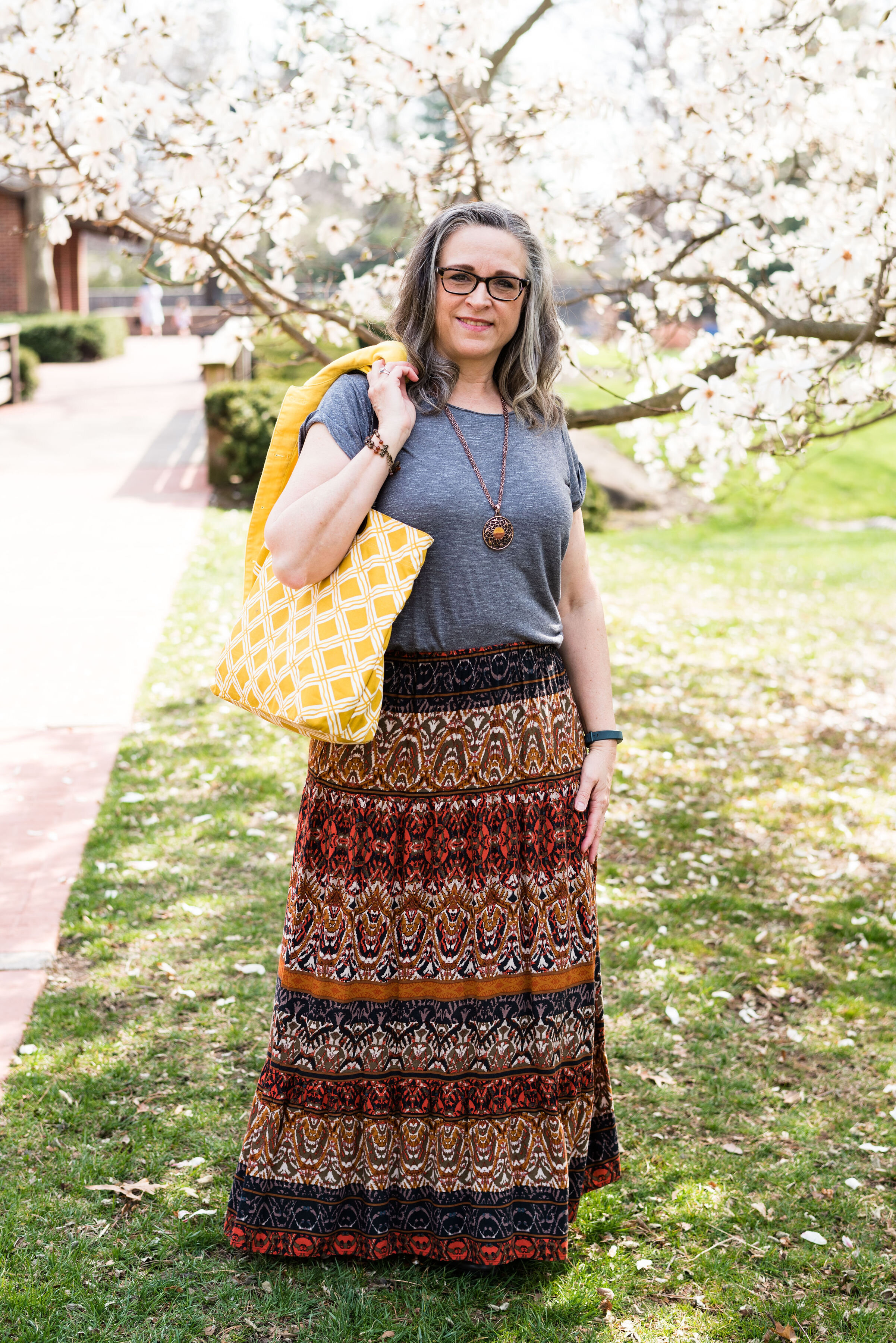
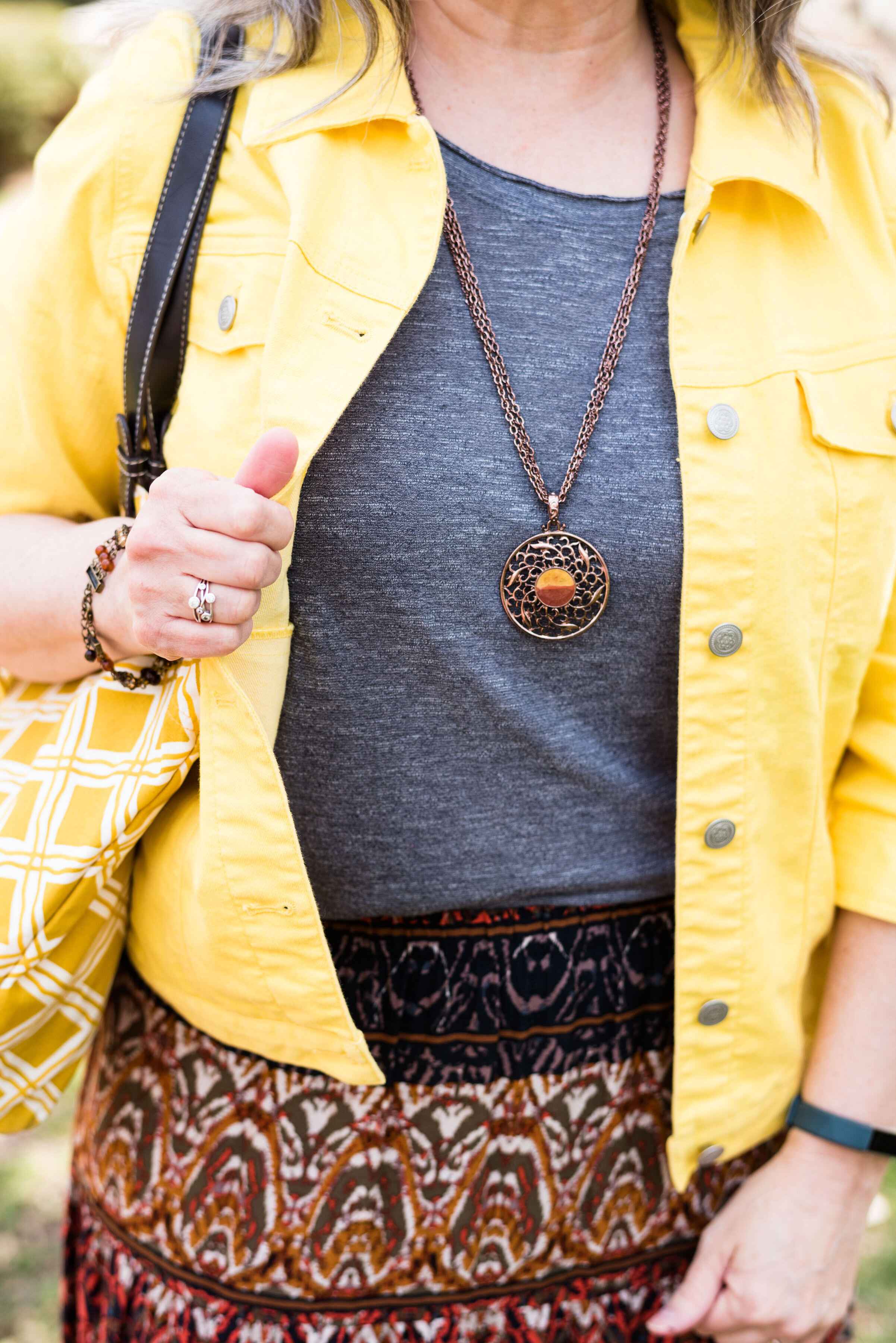
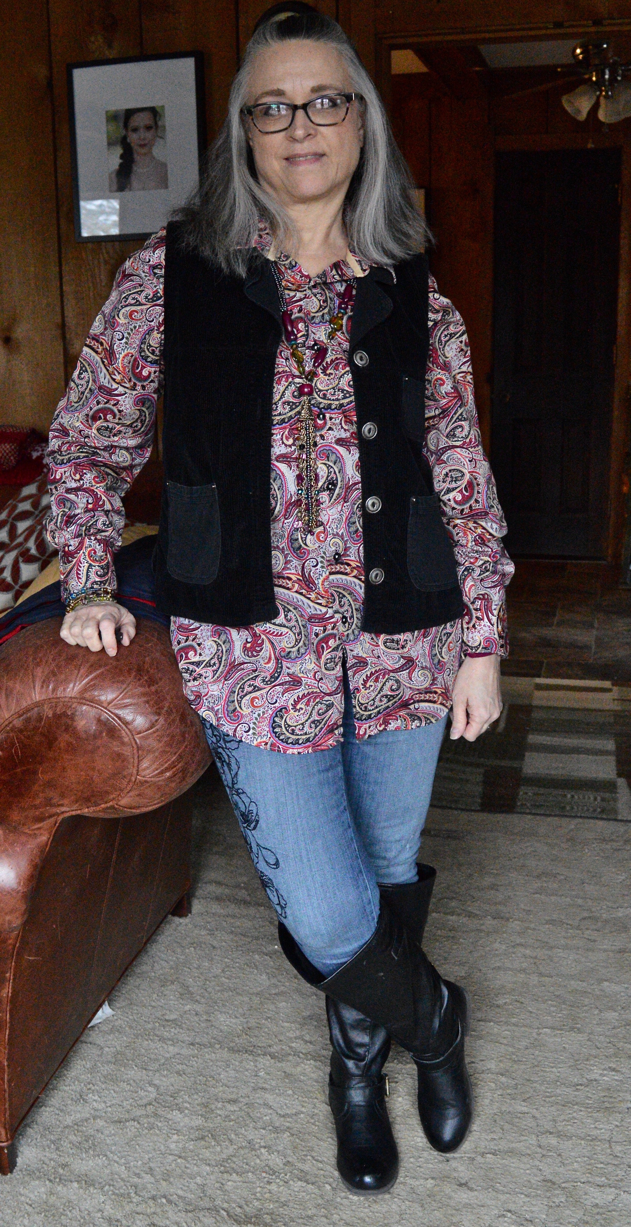
Outfit 1 - Men’s Button Down as a Tunic

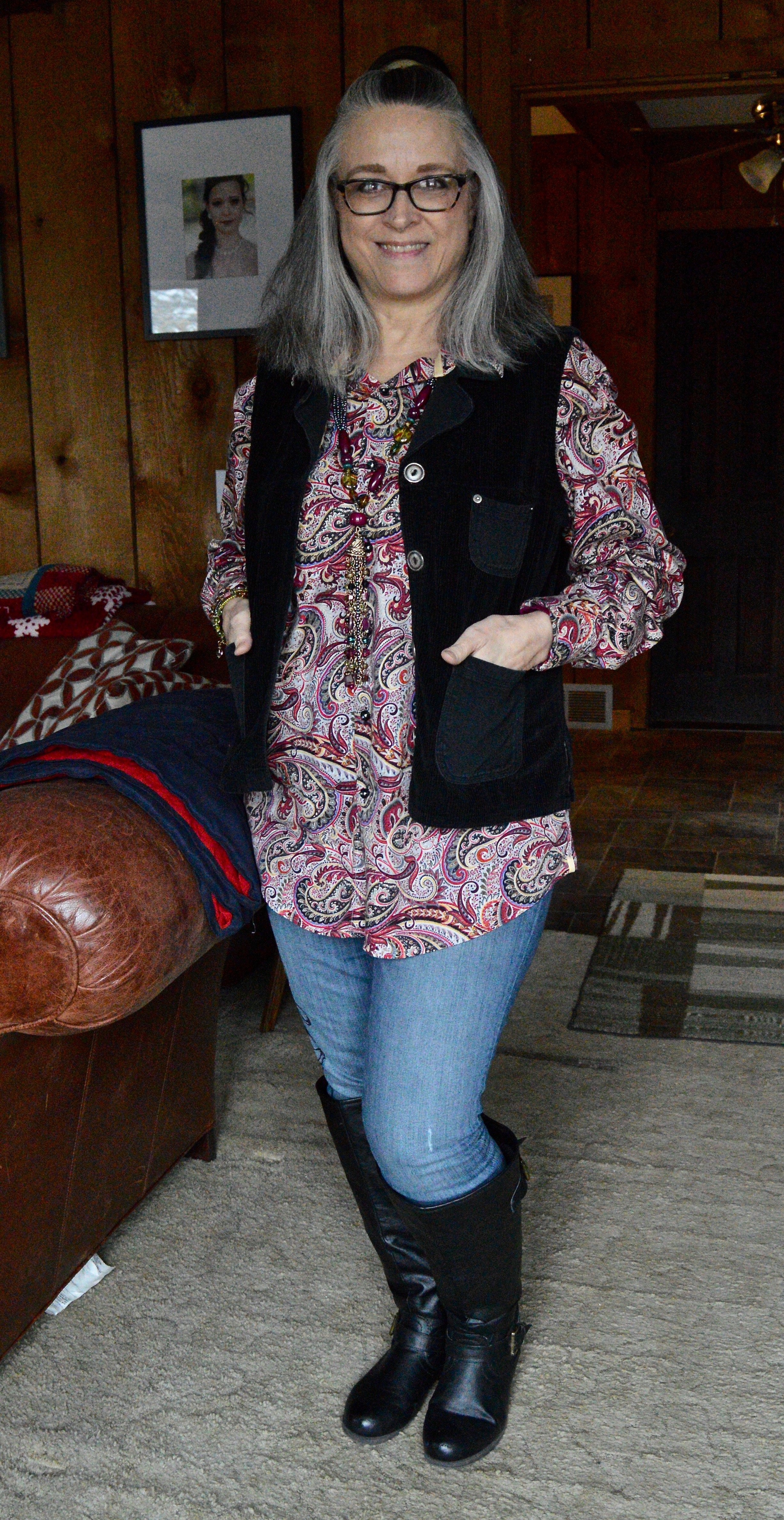
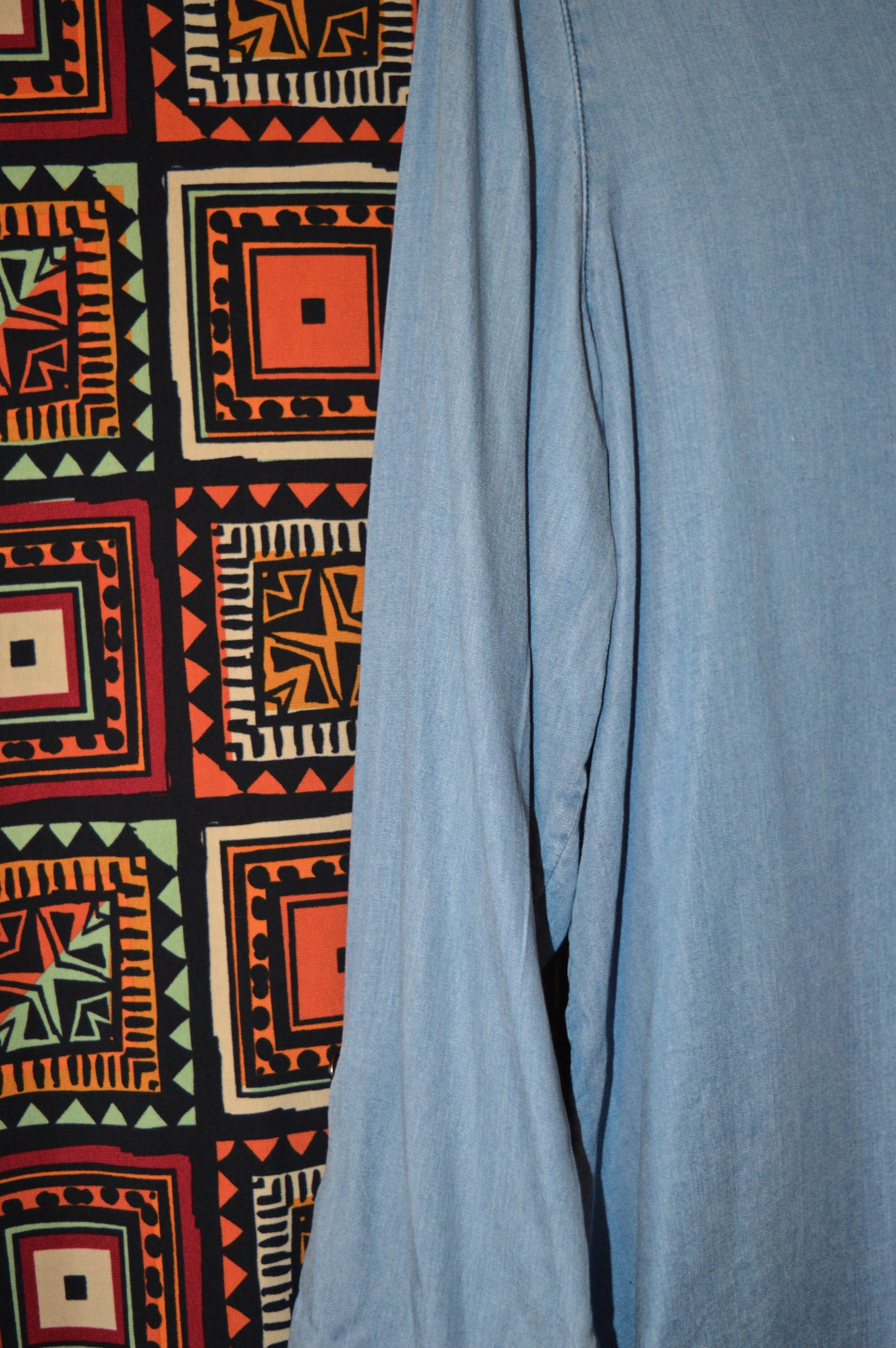
When I saw this paisley madness, I knew I had to have it. This is Visconti brand. If you type the name be sure to type in Visconti clothing. and you’ll see they have them at Dillards. They also have their own website, but I am not here to encourage you to buy a new shirt. This to encourage you to look at the men’s racks if you thrift, or even if you shop clearance. I absolutely love the colors in this piece and it is easily worn all year round as a top or as a “shacket”.

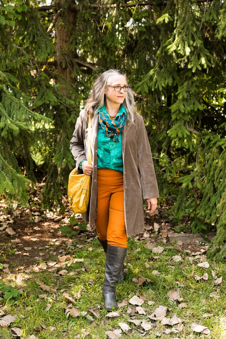
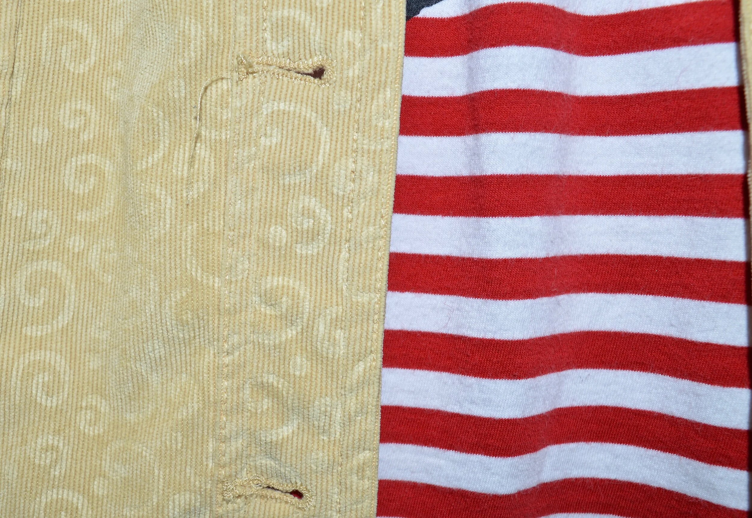
I topped this look with a thrifted, black Nadia brand, corduroy vest. I added my Simply Vera, Vera Wang skinny jeans and my black knee high boots. The black embroidery on these jeans are what sold me. The abstract floral print goes with so many other pieces.

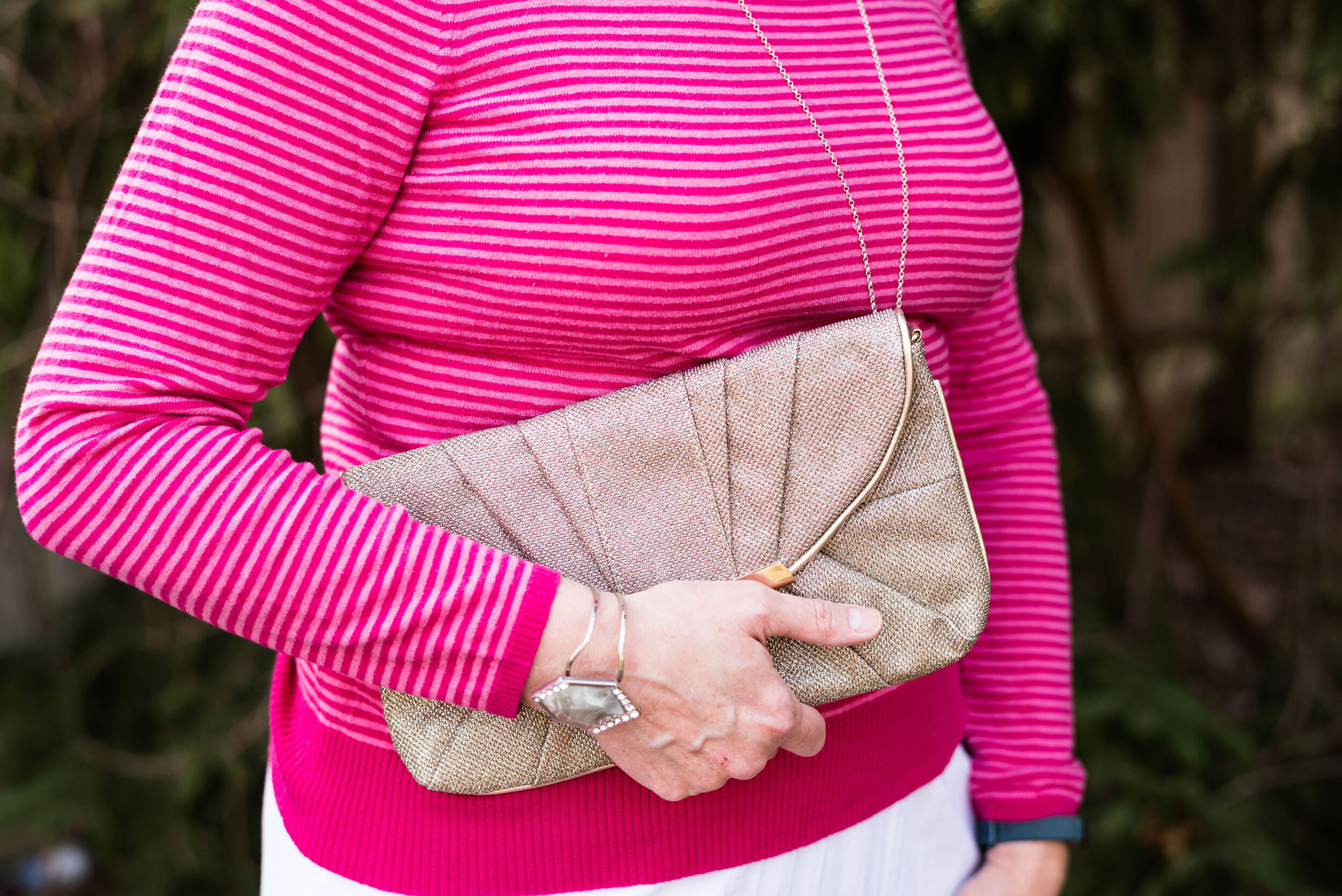
I didn’t really need to add any jewelry since the print is so busy, but I thought it would be fun to add this piece that has a variety of colors and textures. It blends in, yet also stands on its own.

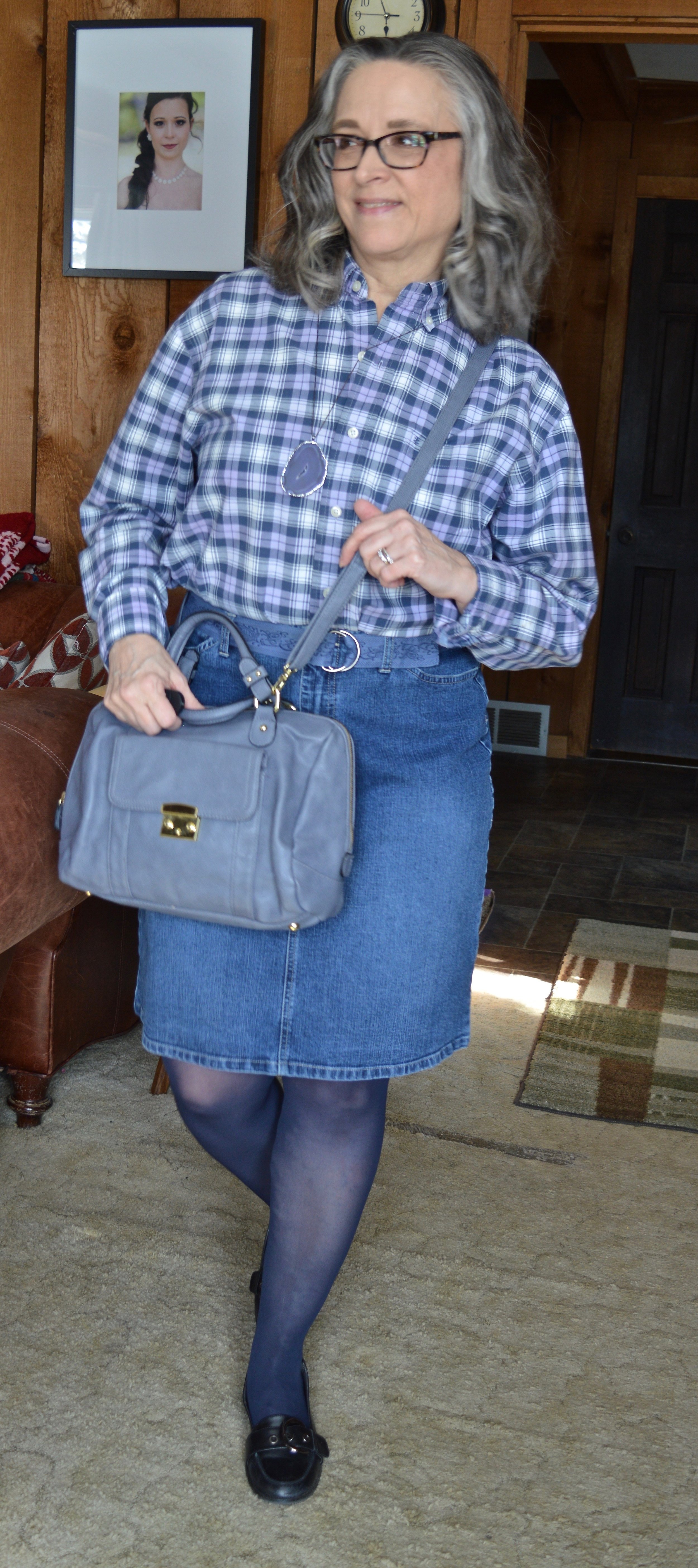
Outfit 2 - Men’s Button Down as a Work Wear Top

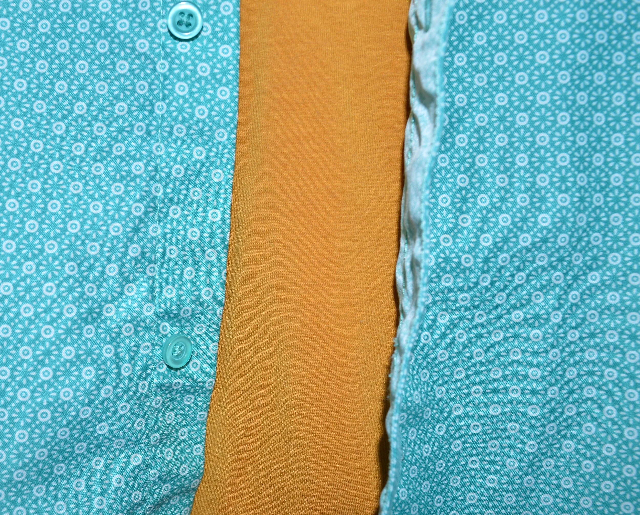
This shirt is Izod brand. This year’s Pantone Color of the Year is called Very Peri. I think it is a very pretty color reminiscent of the Periwinkle flowers, which can come in blue, purple or white. I thought this checked shirt fit the color well. One thing I have to do with most of the men’s shirts I purchase is roll up the sleeves, but rolling up the width of the cuff is just the right amount, so you can hardly tell.

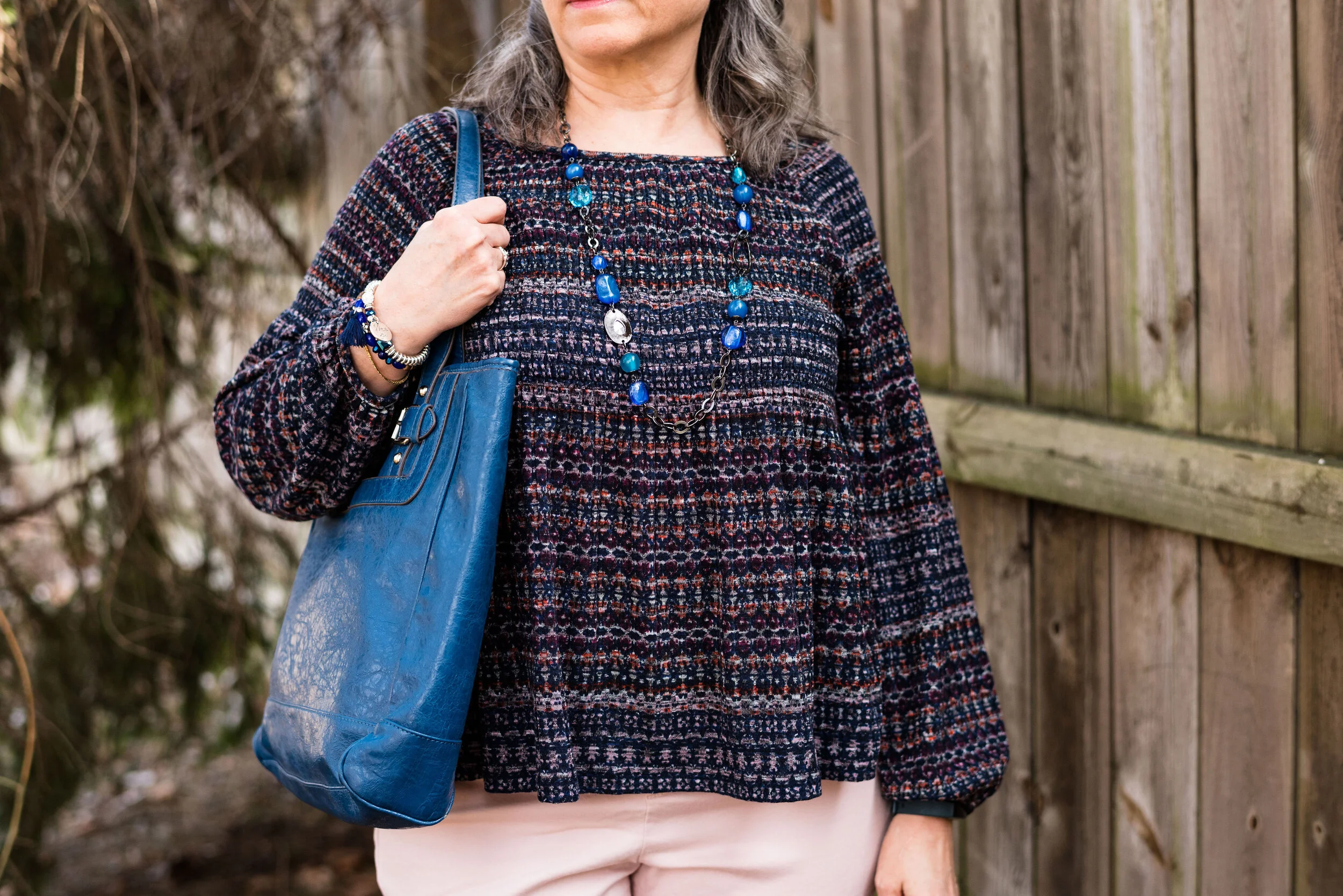
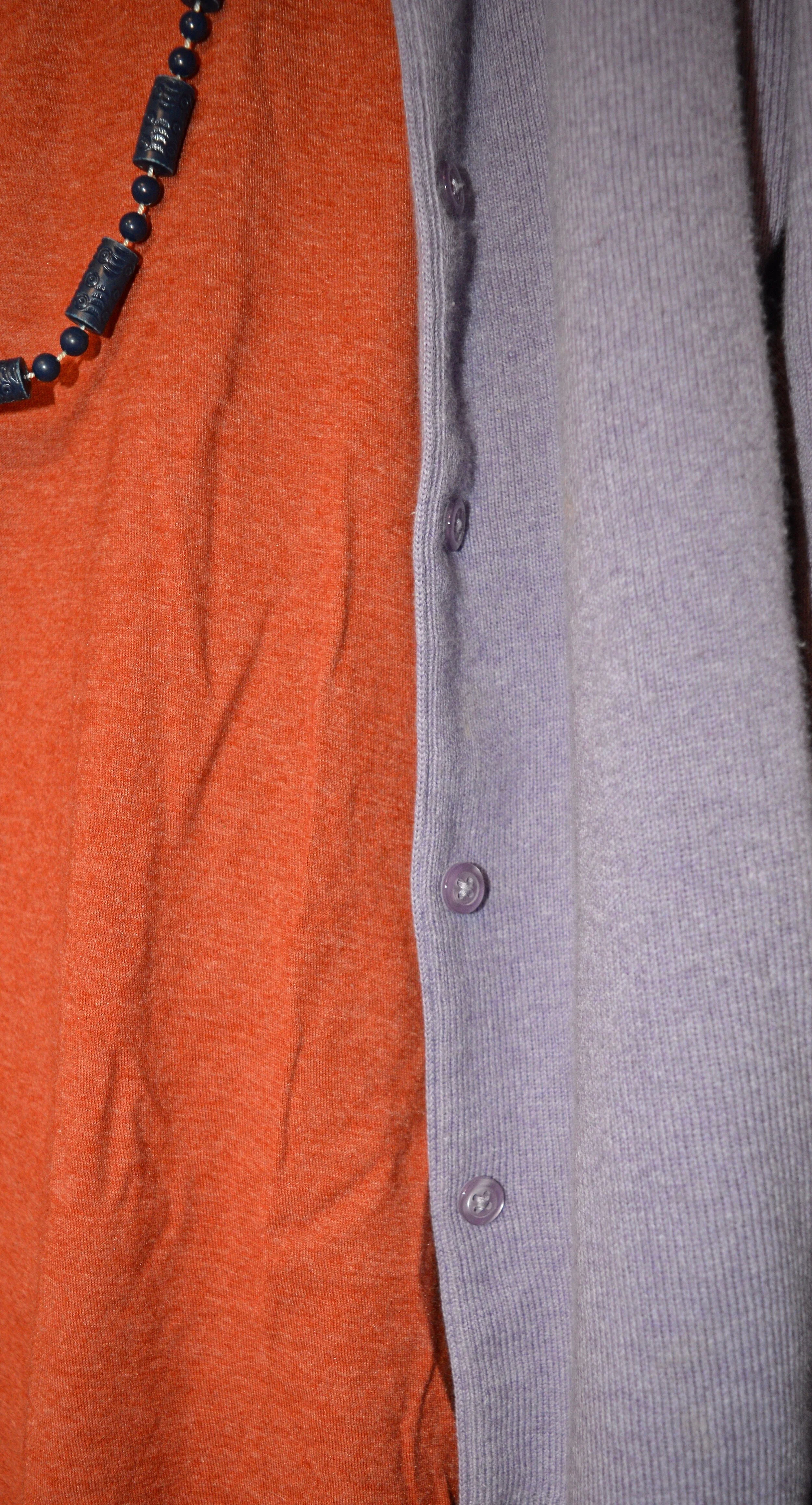
My denim pencil skirt is also thrifted and Gloria Vanderbilt brand. I like the length of this and if I still had a reason to wear a skirt would definitely be wearing this often. I added the navy hose to cover my veiny legs and thought the black, thrifted Nine West loafers gave it a work wear look. I also added the denim blue cloth belt and the dark purple agate pendant necklace. My thrifted, Merona bag, also brings in that Very Peri vibe.

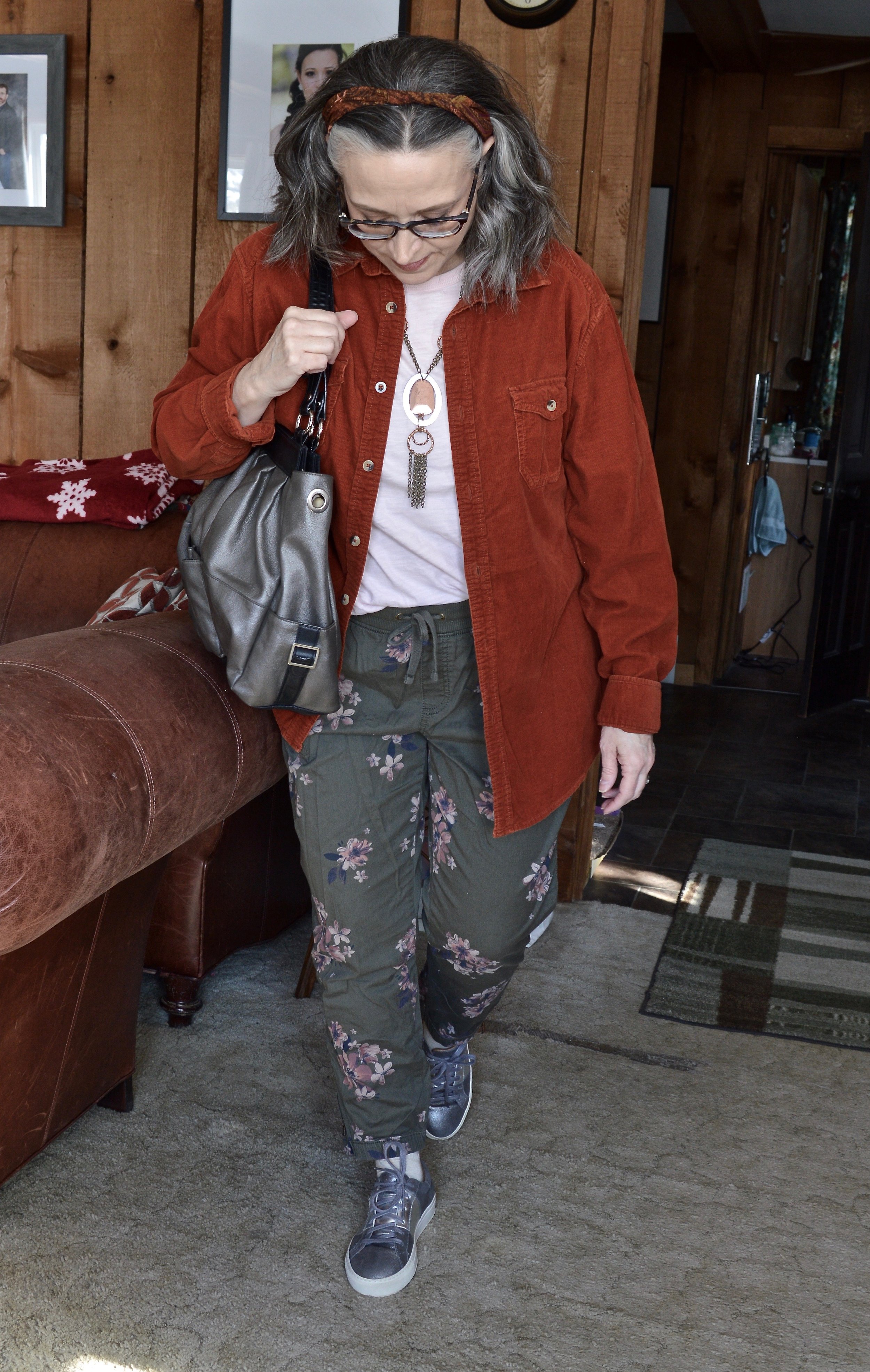
Outfit 3 - Men’s Button Down as a Shacket

I’ve had this thrifted, Ruff Hewn corduroy button down for a few years now. I love the color and typically think of it as a fall piece. It is soft, warm and roomy, so a perfect piece for wearing over lightweight sweaters, sweatshirts or long sleeve tees.

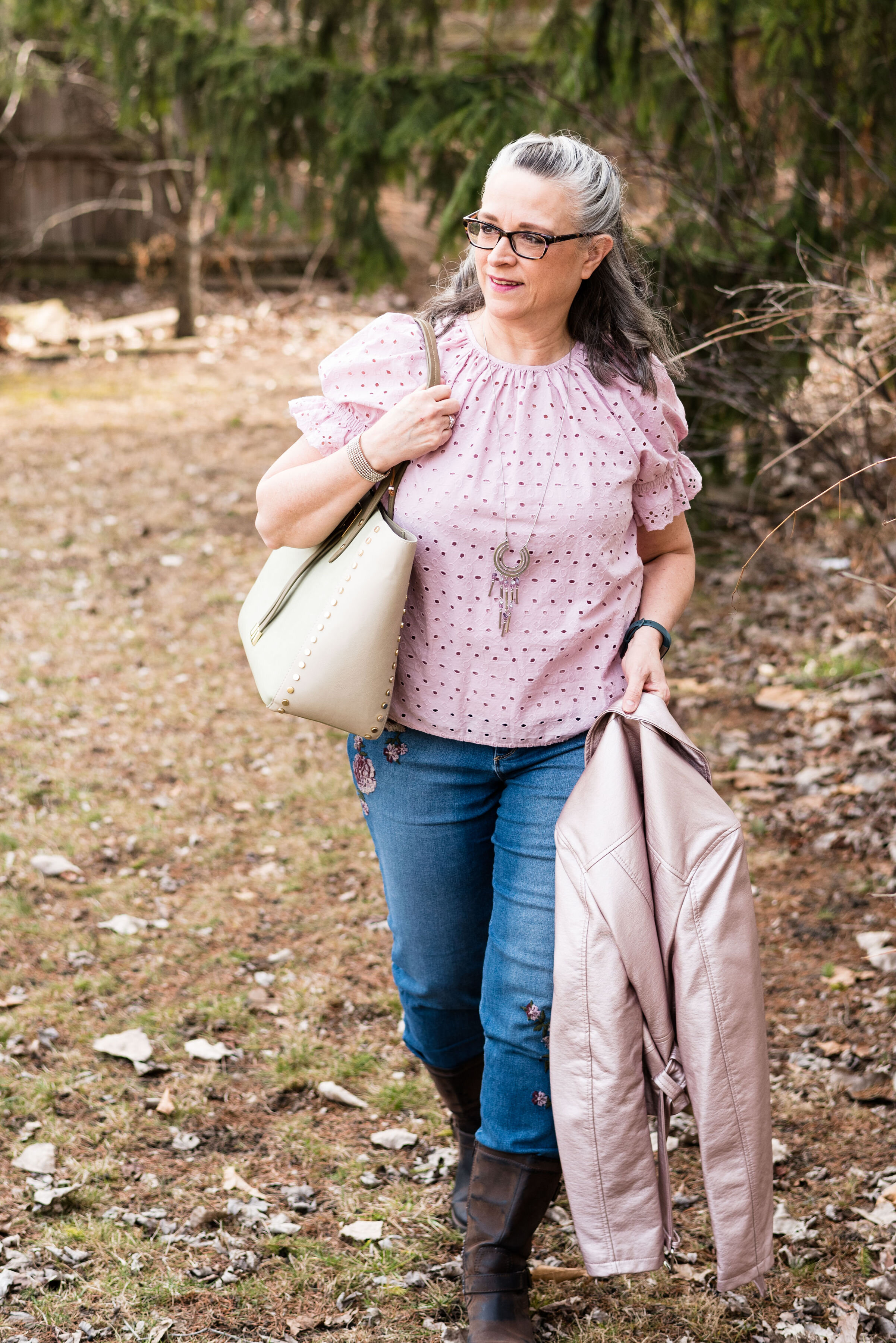
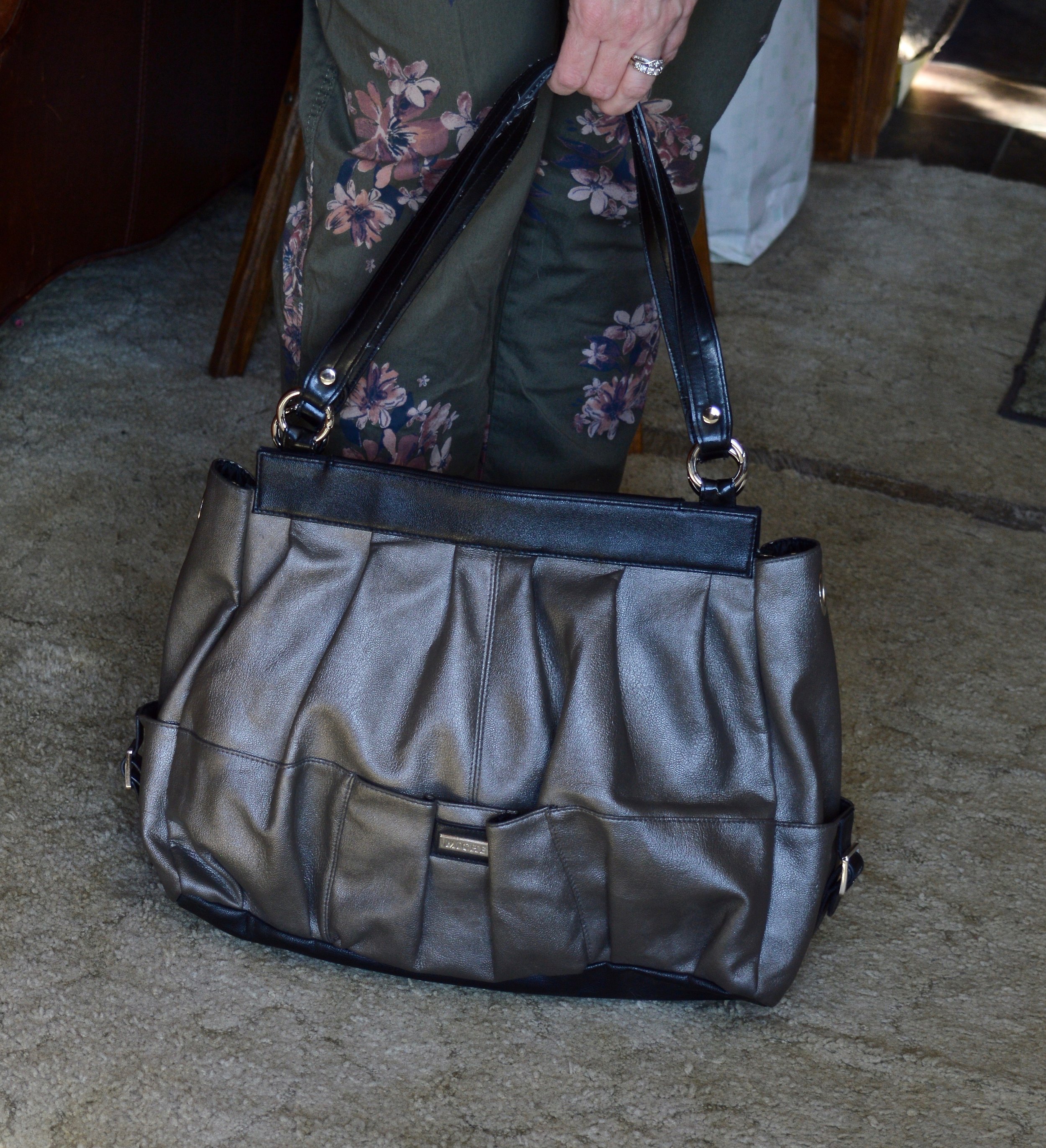
I wanted this outfit to have more of a spring vibe, so I went with my Sonoma floral joggers, and a thrifted light pink Express short sleeve tee. I opted for metallic accessories including my silver Sketcher sneakers, pewter hand-me-over bag, and my silver and copper necklace.

Here are the three outfits side by side.

I hope you enjoyed this look at how to style a men’s oversized button down. It is fun to explore other options in your fashion wardrobe, and you never know when something you try will become your new favorite style. Which outfit was your favorite? Do you wear men’s clothing? How do you like to style a men’s or women’s oversized shirt? I’d love to hear your thoughts, so leave me some love in the comments.

Thanks for stopping by the blog. I have provided a few shopping links for your enjoyment. These are affiliate links. All opinions are my own.

What's Trending for Spring 2022?

Even though I don’t follow trends closely, I still like to do a post for you about what the fashion gurus are saying is trending for the upcoming season. I typically look at websites known for their fashion panache such as: Cosmopolitan, Marie Claire, Vogue, Harper’s Bazaar, and a variety of others. You certainly can do a search under Spring Trends 2022 and you’ll get a list of websites to visit. Just understand these are fashion websites, not sites for real women like you and I. We can go to these and find inspiration, but don’t buy into the craziness that they often call fashion. It is not only impractical, but often times extremely immodest.

With that being said, there are always a few trends I like, and that I am willing to spend time thinking about how to work them into my daily wardrobe. This spring it was tough. To me it seems that fashion, in keeping with the rest of the world, is just getting crazier and more out there. It is definitely getting further and further away from what I think is appropriate for women to wear. If you have followed me for a while, you know I can be quite earthy and real, but I am also a girl who highly values modesty and self-dignity. I will save my deeper thoughts on the subject for a different day.

Here are a few of the trends I found interesting for Spring/Summer 2022:

Gingham

I love that this simple check pattern is back. It is a wonderful print for spring and summer, reminiscent of picnics and warm days at the beach.

Style Tip:

Add a gingham blouse under a pullover, cardigan or vest for a smaller touch of this pretty print.

Crochet

Crochet is something I look for when I thrift. I personally probably wouldn’t wear a crocheted dress or tank top, but I like the top with the crochet trim. Crochet can be a beautiful addition to an outfit in the form of a sweater, shawl, handbag, or trim on a top, skirt or dress.

Style Tip:

For summer, look for open weave crocheted pieces to keep you from getting too warm. If buying a crocheted handbag, look for ones that are fully lined to keep small things like pens and change from slipping through the weave.

Everything White

Once again, white is trending for the warmer weather. Wearing all white is where it’s at, but of course, don’t let that stop you from just wearing a little white here or there. I really liked this idea for the creamy winter whites, so now I need to try it with the brighter whites for spring and summer.

Style Tip

Not everyone likes to wear white near their face, so try adding a printed scarf or a bright pink or red lipstick for a colorful touch.

Black and White

There is just something so classic and chic about the combination of black and white. You all know I am a color girl, but I really like this trend and there are lots of cute styles out there. I already have numerous black and white striped sweaters and tees and I am sure a few other things as well.

Style Tip:

Be sure to shop your closet for trends. It is most likely these have been around before. Otherwise, build the trend yourself by combining black and white pieces. Wear a black skirt with a white tee, or a black cardigan with white pants.

Metallics

I love things that bling, so metallics are always on my radar. This is the type of thing you can do a little or a lot of and it still looks fabulous. Type metallic tops, shoes, bags, jackets and so on in your search bar and you will get all sorts of pieces. Metallics are a great way to take an outfit from okay to spectacular, just by adding a simple bag, pair of shoes or a top.

Style Tip:

Wear a gold or silver metallic blouse with black or navy pieces and you’ll easily get an outfit that can take you from the office to a night out.

Colorful Bags

Who doesn’t love a bright colorful bag for the warmer weather? Purses are one thing I have too many of, so I will be digging through my pile to find my brightest ones for this spring/summer season.

Style Tip:

Try styling a neutral outfit of tans, creams or blush with a bright bag and jewelry. You will look beautiful and confident with just a pop of color.

There are many other spring trends and I will be talking about a few of the others over the next few weeks. I hope you enjoyed this post. Feel free to shop the samples I gave. I try to include pieces that I think are fun and interesting as well as try to keep the price points below $100. These are affiliate links, which means every time you click I get a few pennies. I appreciate each and every click. All opinions are my own.

Have a wonderful Tuesday!

Pantone - Spring/Summer - 2021 - London Palette - Pirouette, Indigo Bunting and Polar Night

As always, with the Pantone color series, I find their choice of names for their colors intriguing. Today’s colors center on a pretty purply pink, called Pirouette, which, of course, makes me think of a ballerina. Indigo Bunting is a pretty blue, much like the bird after which it is named. I have had the privilege of seeing an Indigo Bunting flitting through the trees at one of our local metro parks a few years back. They regularly reside in Ohio in the summer time, but like to hang out in abandoned fields, scrubby bush areas and areas with red cedar trees, none of which I have around my house. Polar Night, much like its New York partner Inkwell, is a very dark navy blue.

pirouette.jpg

This fun, multi-print dress is a few years old and was a Kohl’s clearance purchase. I really like many of the pieces by Vera Wang, made specifically for this retailer and called Simply Vera by Vera Wang. These are the pieces that real world women like myself can afford and wear. I have styled this dress, like a tunic for a trip we took to Florida a few years ago. You can see that post here. The dress really contains all three colors, except that its blue borders on being more of a teal.

londonpantonecoloroutfitideapiurouette-8.jpg

I decided to add the bright blue sweater, another Christopher and Banks cardi, as my attempt at the Indigo Bunting. It is a tad bit bluer and maybe brighter, but I think it works well. I would have never thought to pair it with this dress, but I like how it looks.

This is me being silly as I commune with nature. Ha, ha.

londonpantonecoloroutfitideapiurouette-5.jpg

I centered all my accessories around the necklace that is perfectly Pirouette. Since the beads are strung along a silver chain, I went for silver as my accessory color of choice. My thrifted silver clutch and my SO ballerina flats makes the outfit just a little more dressy.

londonpantonecoloroutfitideapiurouette-12.jpg
londonpantonecoloroutfitideapiurouette-14.jpg
londonpantonecoloroutfitideapiurouette-15.jpg

What do you think of these colors? Would you wear them? Do you have any of these colors in your closet? Let me know what you think by leaving me a comment here on the blog or on Facebook.

londonpantonecoloroutfitideapiurouette-9.jpg

Don’t forget, I also post on Instagram and typically you’ll see more of what I wear on a regular basis. Right now my daily looks are very casual, since I am not working, but you’ll definitely get to see more of my clothes, that don’t make it to the blog.

As usual, I am including a few shopping links for these colors. These are affiliate links, but all opinions are my own.

Have a great day!

Graphic and photo credit, Rebecca Trumbull.

Pantone - Spring/Summer - 2021 - London Palette - Intro

I am finally getting around to sharing the Pantone London Palette with you. It has been hard to get things posted in a timely fashion. Even though I would normally try to get these colors to you, much earlier in the Spring, I figure they are meant for spring and summer, so we are still okay. Today’s post will introduce you to the colors and give you a few little sneak peeks from our recent photo shoot.

londonspring2021.jpg

These are all great colors for spring and summer. The palette is a nice mix of warm and cool colors and there is likely to be a color for everyone. The classic colors, while still showcasing your typical navy, gray and creamy white, also includes a soft light brown and an mossy olive green. I really like the blues included with this palette. They make me think of tropical waters and blue skies.

Enjoy these sneak peeks.

pantonefashionideassummer-1.jpg
pantonefashionideassummer-3.jpg
pantonefashionideassummer-4.jpg
pantonefashionideassummer-5.jpg
pantonefashionideassummer-6.jpg

Be sure to check back on Thursday for the first outfit in this series. I hope you had a lovely Memorial Day weekend.

Photo and graphic credit Rebecca Trumbull.

Why You Should have a Pair of Colored Pants - Orange

I thought I would do one more week on colored pants. This denim wearing diva, never imagined in all my years that I would learn to love brightly colored pants, but I have. I do remember when I was young, being a child of the sixties and seventies, I had a pair of bright red, cuffed bell bottom pants that I loved to wear to school. I am not sure what drew me away from the bright colored bottoms, except maybe that feeling of not wanting to be noticed or seen. I still struggle with that bit, but now I don’t worry so much about what other people are thinking or looking at. That is not my problem. I do try to dress modestly, but I love my bright colors and think they help to make me happy. This week I want to focus on my orange pants.

These orange pants were a clearance purchase at JC Penney about four years ago. They are Worthington brand, have a side zipper and an extra seam towards the front, giving the leg a long, lean line and less bulk around the middle, for a more streamlined look. The waist sits near my natural waist, so a little less of the spare tire problem. Here are past posts from the blog where I used these pants.

Outfit 1 - Orange with Sheer Light Blue Top

Pantone+Spring+2017+-+Island+Paradise.jpeg

I love the summery vibe of this outfit. The light blue, sheer top over the white tank combined with the bright orange pants seems very fitting for dinner under the palm trees at a tropical resort.

Outfit 2 - Orange Pants with a Dress

Spring+Transition+-+floral+dress.jpeg

This is one of my favorite outfits with these pants. It just happened that I found this dress at H&M and that the orange in the dress matched perfectly with the pants. I have no problem with women wearing shorter dresses. I know lots of women who will wear them with bike shorts underneath, so nothing is revealed if they blow up or if they bend over. I personally do not have the legs to wear a shorter dress, so wearing pants with a dress has become something I do more often. It is a fun way to display a short piece without any worry of revealing veiny legs or other leg flaws.

Outfit 3 - Orange with Bright Purple and Gray

Pantone+Fall+2018+-+Russet+Orange,+Ultra+Violet+and+Quiet+Gray.jpeg

Who would have thought to pair bright purple with orange? Well, I did and I think it turned out perfectly. I think the light gray jacket over the top helps to pull this whole look together. The pretty leaf necklace ties the orange pants to the purple top. This is a trick you can do to bring cohesiveness to an outfit that might seem a little outside the color box.

Outfit 4 - Orange with Dark Green

Pantone+-+Autumn_Winter+-+2019+-+Orange+Tiger+and+Eden.jpeg

Once again, you see a color block pattern, but one that is complimented by the printed accessories in the form of a leaf print scarf and a Vera Bradley tote bag. Since this was a more casual look, I added a hem roll to the bottom of the pants. This would be a great outfit to wear for an early fall shopping trip.

Outfit 5 - Orange with Marled Black Vest

Transitional+spring+outfit.jpeg

Vests are a great way to transition from cooler seasons to warmer ones and warmer ones to cooler ones. They keep our cores warm, but our arms from being bound under bulky sweaters or coats. The focal point of this outfit, was not the pants, but the scarf, but I drew on the colors in the scarf to create the complete look.

Outfit 6 - Orange with an Asymmetrical Vest

Pantone+Spring_Summer+2020+-+Flame+Orange,+Blossom+and+Cuban+Sand.jpeg

The solid colored orange pants are the grounding point in this outfit that is filled with busy prints. The floral tee, the open weave asymmetrical vest and the patchwork bag would probably be too much, if the pants were also printed. The bright orange once again announces that summer is just around the corner.

Outfit 7 - Orange with Teal, Gray and Yellow

Pantone+-+Autumn_+Winter+-+2020+-+London+Palette+-+Exuberance,+Ultramarine+Green+and+Sleet.jpeg

Here we are, back to fall. Orange is a no brainer for fall outfits, but we often reach for rust or darker versions of orange. However, I think I have shown that this bright orange is perfect spring through fall. You probably could even dress it up for winter with a chunky fisherman sweater and some suede ankle boots. This particular pair of pants is lighter weight, so if I wore them in the winter, I might put a pair of tights underneath.

So what do you think of orange pants? For all practical purposes I think more women would choose a bright blue pair rather than the orange, but what I wanted to show you is that there are so many different ways to style a bright colored pair of pants and still have a classy outfit that you can wear for a night out with the hubby, a lunch with friends or to a summer picnic. Pick your favorite color and get a pair of bright colored pants now.

I plan on showing you another outfit on Thursday with these same pants that has a more work oriented feel. Be sure to check back then.

I am leaving you with shopping links for a variety of bright colored pants. I hope you find a pair that will be perfect for you. These are affiliate links. All opinions are my own.

Photo credit Rebecca Trumbull.

Spring Outfit with Bright Blue Pants

I thought I would come up with another outfit using my thrifted, bright blue, Ruby Rd. pants, since I was just talking about them on Tuesday. It was a beautiful day, so I managed to snap a few pictures for this post. They are never as good as my daughter’s pictures, but that is okay. This is real life, right? I never want to come across to you all as having it all together. There are so many bloggers and people who post on Instagram and it is easy to feel like we don’t measure up to their fabulous outfits, looks, or homes, but I know reality. It is messy, hard, busy and many times overwhelming. So I am trying to be as real as possible and not so great pictures are my reality, and so is my wide bottom. Ha, ha.

DSC_0005.jpg

I wanted to create a look that was casual with just a touch of sass. My Star Wars tee belonged to my oldest daughter and she didn’t want it any more. I’m all for fun graphic tees and certainly am a Star Wars fan. I am actually a bigger Star Trek fan, but Star Wars is a close second.

DSC_0012.jpg

Funny story about my thrifted silver belt. I chose the silver belt and my silver SO ballerina flats to jazz the look up a little bit, and it went with the silver lettering on the tee. When I went to pull the belt through the first belt loop a ton of the silver flaked off. I had silver dust all over my pants and my rug. Needless to say, I threw the belt in the trash when I was done with the pictures. I was disappointed, as I had great plans for that belt. Oh well, like I said, real life.

DSC_0010.jpg

I’ve styled this thrifted, white, Sanctuary, jean jacket one other time on the blog. You can see how I styled it with a leopard print skirt. This jacket is not truly denim, it is a thicker cotton material, but doesn’t have the same characteristics of denim. However, I really like it and it is a good piece for the warmer weather and something different from the traditional jean jacket.

DSC_0004.jpg

I didn’t take a picture of my little silver clutch, but you have seen it on the blog before. I chose it because it went with the belt and shoes. I do like things to match, but it is okay to not have things match as well. Many of our old fashion rules have gone by the wayside. I always go back to the idea, do what is best for you. If you like things to match, then make them match. If you want to wear purple shoes, carry a red bag and wear a green belt, you go girl! As bloggers, we are only here to give you inspiration, not tell you how you have to dress.

DSC_0015.jpg

I want to know if you have gotten yourself a pair of bright blue pants? Ha, ha. Actually, they are a little hard to find, but if you thrift shop, be sure to check there. Thrift stores will often have loads of brightly colored pants, because they are no longer trending.

I hope you enjoyed this post and one more idea on how to style those bright blue pants.

I’m including a few shopping links just for fun. These are affiliate links brought to you at no added cost. If you click on a link I get a few cents. I appreciate every click. All opinions are my own.

Have a great weekend everyone!

Pantone - Spring/Summer - 2021 - New York Palette: French Blue, Cerulean and Buttercream

Today’s three color combo is the last of the Pantone Spring/Summer New York Palette. I am going to take a week off, as I hope to go visit my mom next week. In due time, I will proceed with the London Palette, but I haven’t even begun to pick out outfits. Breaking my wrist has really thrown a wrench into the works, so bear with me. I got my second Covid shot yesterday, so getting up this morning was grueling. I got the shot in my left arm, figuring it already hurts and I wanted my right arm to remain relatively pain free. I say relatively because there is some pain in my wrist and rib cage on that side, from having to do all the work. This is making me see how much I need to get back to exercising, especially weight lifting and walking since I have osteoporosis. We ladies need to take of them bones, and all the other parts as well. Ha, ha.

I thought it would be fun to pair these two blues, for a fun, casual summer look. Adding the off white of buttercream gives the outfit that perfect warm weather vibe. I kept my accessories casual to add to the picnic ready style. This would be a great outfit for a Fourth of July get together, just add some red jewelry or a bag.

frenchblue.jpg

French Blue and Cerulean are two cool colors that make me think of blue skies and water. I found this French blue plaid shirt while thrifting. I really like this medium blue for spring and summer, as opposed to a dark blue like navy. This button down is Faded Glory brand.

frenchbluepantonespringcoloroutfitideas-2.jpg

My Buttercream ankle pants have made an appearance on the blog before. These were thrifted St. John’s Bay. You can see these styled for two other Pantone series. This one is styled with a yellow button down and this with my Chevron print dress.

Cerulean is a different light blue. I like the sky blue feel of this color, yet it leans towards a bit more pastel. My top is a thrifted Ralph Lauren piece. I like that it has a lining that is similar t-shirt type material to the outside. It has a fun faux lace texture to it.

frenchbluepantonespringcoloroutfitideas-13.jpg

I kept my accessories simple. This thrifted French Blue bag was a recent find and I had to grab it since it matched the color perfectly. This is a nice small bag for carrying just the essentials.

frenchbluepantonespringcoloroutfitideas-7.jpg

My pendant necklace had little flecks of all the colors. I have been on the search for more of these large beads with the hole in the middle. It is so easy to make a necklace out of them.

frenchbluepantonespringcoloroutfitideas-5.jpg

Lastly, my thrifted Keds finally fit the Pantone color. Cerulean is the right name for these sneakers that are great for warm weather outfits.

frenchbluepantonespringcoloroutfitideas-8.jpg

What do you think of these colors? Do you have these blues in your closet? What about Buttercream? I’d love to hear your thoughts. I’d also love to hear which of these colors you would put together to make an outfit.

frenchbluepantonespringcoloroutfitideas-10.jpg

I hope you have enjoyed this look at the Pantone Spring/Summer 2021 New York Palette colors.

I am including a few shopping links, so be sure to check those out. These are affiliate links. I get a few pennies when you click on a link, so I appreciate all the clicks.

Photo credit and graphic Rebecca Trumbull.

Pantone - Spring/Summer - 2021 - New York Palette: Burnt Coral, Marigold and Desert Mist

Today’s outfit blends three colors that seem to epitomize summer with all of its beauty. The deep orange yellow of Marigold, combined with the rustic feel of Burnt Coral and the soft pastel of Desert Mist makes me think of picnics, outdoor parties and long walks on the beach. While my outfit today is probably too warm for summer temperatures, I works well for that in between time when the weather is still unsure of what it is going to do.

burntcoral.jpg

I ordered this waffle weave dolman sleeve top from Maurices earlier this year. It has elastic on the bottom, so has more of a cropped feel to it, which isn’t always my favorite, but I think this works well with pieces where the top can be worn without the need for tucking or wearing a belt.

burntcoralpantonespringcoloroutfitideas-10.jpg

I wasn’t going to use this Roz & Ali medallion print skirt again, but I was having a hard time finding things in my closet that were going to work with these colors. Besides this is a pretty skirt, so I don’t mind using it again. You can see how I styled this piece for several other Pantone color series. Last fall I styled it with a neon yellow short sleeve sweater, and the fall before that with a purple short sleeve sweater. I like that this skirt works perfectly for spring, summer and fall. The skirt contains all the colors from the graphic, even though you can’t see Marigold as well, you can definitely see the Burnt Coral and Desert Mist.

burntcoralpantonespringcoloroutfitideas-6.jpg

My Desert Mist sweater is a little light compared to the Pantone color, but again, this isn’t about having an exact match, but about giving you options that you can find in your closet. This is a thrifted St. John’s Bay piece. It is always good to have a neutral cardigan or jacket that will work well with many different outfits and colors.

burntcoralpantonespringcoloroutfitideas-8.jpg

For the Marigold color, I just added a few accessories, similar to what I did in last Thursday’s post with Raspberry Sorbet. The necklace and Sophia Caperelli bag are both thrift finds.

burntcoralpantonespringcoloroutfitideas-11.jpg

You were recently introduced to these Clark’s flats. They are perfect for wearing with a skirt, whether long or short.

burntcoralpantonespringcoloroutfitideas-13.jpg

What do you think of these colors? Do you have all of these in your closet? Would you wear them together? I’d love to hear your thoughts, so leave me some love.

burntcoralpantonespringcoloroutfitideas-4.jpg

I’m including a few shopping links. These are affiliate links. All opinions are my own. Here’s a picture, just for your enjoyment. Ha, ha.

burntcoralpantonespringcoloroutfitideas-7.jpg

Have a great evening!

Photo and graphic credit Rebecca Trumbull.

Pantone - Spring/Summer - 2021 - NY Palette - Illuminating, Rust and Ultimate Gray

I wanted to share this outfit with you first, because it contains the two colors that were chosen by the Pantone Color Institute as the colors of the year. Illuminating is a bright, sunny yellow. Pantone describes this yellow as, “Friendly and joyful, an optimistic yellow offering the promise of a sunny day.” Rust is typically a fall color, yet it is an earth tone, thus its inclusion in the spring palette. Ultimate Gray is a classic and comfortable gray that everyone can wear.

illuminating.jpg

I have plenty of yellow in my closet. It is a color that has quickly become a favorite. I love the many different shades of yellow. I have mustard, sunflower, lemon, blonde and pineapple. Look up shades of yellow in your search bar and see all the fun names they give for these lovely pieces of sunshine. Illuminating is not really a different shade, but a different name for a shade that might also be called bumblebee, butter or dandelion.

Since I love the color so much, it was a no brainer that I add this thrifted, bright yellow, denim jacket to my closet. This is a brand called d & co, or denim and company. When I looked it up, it is a brand that is sold at retailers like QVC, Walmart and others. I like the relaxed style of this piece, as well as the 3/4 sleeves. It will be a great topper for cooler summer days.

pantone2021illuminating-7.jpg

We were back at the Toledo Botanical Gardens for pictures and things are starting to bloom over there. This tree was gorgeous and I had no idea what is was because the blooms were so big. It turned out to be a white magnolia. I grew up with a pink magnolia in my parents’ yard. I didn’t even know there were white ones.

You’ve seen my boho skirt on the blog before. I looked at other Rust colored options in my closet, but just wasn’t satisfied with how the outfit looked. Choosing this skirt not only gave me a print, but the perfect blend of classic and bohemian. This skirt is a brand called Notations, but I can’t remember where I got it. Ha, ha. You can see it styled with a green top and a different gray top.

This simple Ultimate Gray tee is from Kohl’s and is SO brand. I got this one and a red one a few years ago. I love that they are light weight, but still provide coverage. The hemline is a straight cut and the length is shorter, so perfect for wearing out. I did the front tuck, just for a more polished look.

pantone2021illuminating-15.jpg

When I was rummaging through my necklaces, I saw this one and thought it would pull in both the rusty oranges in the skirt and the yellow of the jacket and bag. To go with the coppery colors I also put on my thrifted beaded bracelet. My yellow diamond patterned tote was a fun find at a thrift store. Another thrift store find, my ID Required combat boots get plenty of wear.

pantone2021illuminating-11.jpg
pantone2021illuminating-12.jpg
pantonespring2021preview-2.jpg

What do you think of these colors? Would you wear rust in the summer time or do you think it is a color strictly for fall? I’d love to hear your thoughts, so leave me some love in the comments. Your comments keep me motivated to keep providing content to you all.

pantone2021illuminating-1.jpg

I’m providing a few shopping links for you to look over in your spare time. These are affiliate links brought to you at no cost. When you click on a link, I get a few pennies, so I appreciate every click. All opinions are my own.

Photo and graphic Rebecca Trumbull.

Pantone - Spring/Summer - 2021 - New York Palette: Introduction

I am a bit behind on the Pantone colors this year. I had a hard time getting back into the swing of regularly posting, but here I am. While we are a few weeks into spring, the Pantone colors for this season are for spring and summer. I don’t pay attention too much to their time table, because they already have the colors out for the fall/winter season. Who wants to think about fall/winter when we have barely made it into spring? Ha, ha.

Just as a quick review, the Pantone Color Institute is an entity that provides the color trends for both the fashion and interior design industries. If you go to their website you can see all sorts of information from color swatches you can order to educational opportunities. Obviously, these are not the only colors that you see trending on the runways, but Pantone is easily considered a color authority by both design areas.

Every year, Pantone chooses a color of the year. Last year it was Classic Blue. In 2019 it was Living Coral. This year they picked two colors, Illuminating, a sunny yellow and Ultimate Gray, which is a classic medium gray. Typically, the colors of the year are seen on both the New York and the London Palettes. As I have done in the past I will be starting my series with the New York Palette. This year, the palettes are quite dissimilar, which makes it more interesting for me, as I pick out outfits and for you, my lovely subscribers.

Here is the New York Palette.

ClassicColors_(12).jpg

This is a mix of jewel tones and pastels, so if you lean towards one or the other, this palette will make everyone happy. Rust is a different color for summer, but I think it can work well with many of the others colors. Once again there is a selection of classic colors, which to me are helpful if you want to tone down an outfit and just accent with the brighter colors through jewelry and other accessories.

The following are a few photos from our shoot which give you some sneak peeks at how I combined these colors.

pantonespring2021preview-1.jpg
pantonespring2021preview-2.jpg
pantonespring2021preview-3.jpg
pantonespring2021preview-4.jpg
pantonespring2021preview-5.jpg
pantonespring2021preview-6.jpg

I hope you will join me on Thursday as I start the series. Have a great day!

Photo and graphic credit Rebecca Trumbull.

Spring/Summer Trends - 2021 - Wearing White, Bubblegum Pink and Ballerina Flats

You know how much I love color, so I was excited the Spring Trends for 2021 included a few fun colors. Once again, white is on the scene, and like pastels, seems to now be a year round staple. Winter whites this past winter were very popular and I felt it was an easier color for many to wear than a stark, brilliant white, but even bright white has a place, and this spring and summer it will have its day. In addition to white, this spring/summer season is heralding the addition of bubblegum pink. This bright, deep pink can be worn full on, or sprinkled. Just like ice cream toppings, you can decide if you want to drizzle or drench. Today’s outfit is a simple combination of these two colors. Let me know what you think.

pinkstripedtop-4.jpg

My bright pink striped sweater is a thrift find from a few years ago. This Old Navy brand top is comfortable and light weight, so perfect for these still chilly days of spring. My biggest problem with pullovers right now are my belly flaps, or as they are more commonly known - the spare tire. I don’t really have as much of a bulge in the front, but definitely on my sides. At the suggestion of my daughter, I am discreetly hiding the fact behind my clutch. Ha, ha.

pinkstripedtop-12.jpg

This picture is silly, but I put it in here for several reasons. First, I thought you might enjoy a good laugh. I think this was one of my dance moves: maybe the wave? The second reason has to do with what I did with my pullover top. I often do the front tuck. Doing this helps to hide some of the middle area bulge that many of us are carrying around. I did this as an after thought, so it isn’t as pretty as it could be, but you get the idea. Finally, I wanted you to see this maxi skirt that I have styled before on the blog. This St. John’s Bay skirt from JC Penny is one of my favorite summer pieces, as it is fully lined, has an elastic waist and groovy texture. You can see it styled with a green jacket and an orange striped tee.

I like to give you links to past posts, to show you the versatility of the pieces in your wardrobe and how they can be styled for different seasons and with different pieces. You don’t have to have a clothing fetish like I do to have a full and interesting wardrobe. Having a few key pieces, like a white skirt, whether maxi, midi or mini; a-line, pleated or pencil, will give you lots of options for warm weather looks.

I’ve included a couple of pictures that show you up close the details on the skirt.

pinkstripedtop-10.jpg
pinkstripedtop-11.jpg

Once again, I chose a long, pendant necklace. I also added a silver and gray stone bracelet. To keep my accessories similar I grabbed my silver clutch and my silver SO ballerina flats. As I said last week, low soles are back in style, so grab your flats and your sandals and walk in comfort.

pinkstripedtop-8.jpg
pinkstripedtop-7.jpg
pinkstripedtop-9.jpg

Do you wear white in the summer time? Do you like this bright, bubblegum pink? Let me know your thoughts in the comments below.

pinkstripedtop-1.jpg

I hope you enjoyed this post. I am including a few shopping links for you to look over. These are affiliate links. All opinions are my own.

Photo credit Rebecca Trumbull.

Spring/Summer - 2021 - Eyelet, Luxe Leather, and Long Necklaces

I am continuing my look at Spring/Summer trends today with a focus on eyelet, metallic faux leather, and long necklaces. I have always like eyelet. I think it is a pretty, feminine material that is light weight, making it perfect for the warmer weather. Besides the feminine aspect of eyelet, I also like the textural element that a fabric like this adds to the outfit.

Eyelettopspringtrends-2.jpg

This top is Universal Thread brand. I added a similar colored tank top underneath for warmth. I thought it was appropriate that this top also has puffed sleeves since these are trending as well, as you saw last week. I personally like the puffed sleeve better when it is puffed at the end of the sleeve on a long sleeve top like last week’s. However, when I saw this top at Target, I fell in love with it, and I do like the way it looks. It will be a fun piece for summer with cropped pants and sneakers, or a skirt and flats.

Eyelettopspringtrends-13.jpg

The choice to wear my straight leg high waisted Gloria Vanderbilt jeans was a no brainer. The embroidered flowers on the leg, not only fit in with the fantasy floral trend, but they also went so well with the top. As I have said before, I am not getting rid of my skinny jeans, but I will gladly wear a pair of straight leg jeans on occasion.

Eyelettopspringtrends-12.jpg

You’ve seen this metallic faux leather moto jacket on the blog before. I got it at Nordstrom Rack and is a brand called Coffee Shop NY. It is a tad tight right now, due to my excess pandemic bulge, but I can still wear it open and I think it looks perfect with this outfit. You can see how I styled it with a camo shirt, and with a graphic tee and pin striped shirt combo.

Eyelettopspringtrends-9.jpg

Long necklaces are in this spring, as I mentioned before. I have quite a collection of pendant necklaces, like the one above, but I don’t think the trend is strictly limited to pendants. I think long dainty chains and multiple layers are trending too, so it really is what you want to make of it. I find almost all of my jewelry on clearance racks and at thrift shops. Once in a while I’ll get something brand new from one of my family members as a gift for Christmas, Mother’s day or my birthday, but otherwise I prefer cheap. Ha, ha.

Eyelettopspringtrends-8.jpg

My large pale green tote is making another appearance. I have used this numerous times on the blog and it was a purchase a few years ago from Charming Charlie. Big tote bags are also trending for spring. I think this often comes around again, because people are looking forward to traveling and going to the beach. We will see if Covid allows these simple pleasures in life again.

Eyelettopspringtrends-14.jpg

I figured since I was styling a moto jacket I might as well add my moto boots as well. You’ve also see these on the blog before too. These were a Kohl’s clearance purchase and are Sonoma brand.

What do you think of this outfit? Do you like eyelet? Do you like to wear moto jackets? Wear do you get most of your jewelry from? I’d love to hear your thoughts in the comments below. You are what keeps this blog going. I know I don’t spend time talking about make up or hair products, and other fashion related ideas, but if you would like to see more of that kind of content, just leave a comment and let me know.

I am including a few shopping links. These are affiliate links, which means I get a few pennies if you click on a link. I appreciate all your clicks. All opinions are my own.

Have a great Tuesday!

Photo credit Rebecca Trumbull.

Spring/Summer - 2021 - Puffed Sleeves, Pastels and Pops of Blue

I think most of you who follow me regularly know I love to combine ideas. For example, when I do my Pantone color series, I try to combine several colors at the same time. Part of why I do this is to save time, but it also stretches myself outside the normal, jeans and tees, types of outfits. I wanted to do the same thing with the Spring Trends, and today’s outfit also added the fun literary technique called alliteration. If you don’t already know what that is, it is the combining of words that all start with the same beginning sound. My grandson recently finished up a poetry unit at school. Why they think ten years olds need to know all the poetry terms and examples to go with them is beyond me. My grandson, came away with an unfortunate loathing for poetical form, which makes this writer sad. But I digress!

Today’s outfit revolves around three spring trends that we have seen before. Puffed sleeves keep coming back around, as do pastels. I think pastels are here to stay, as they can be used in so many ways as neutrals. The color blue is always classic, but I really liked the idea of using it as a pop of color in any outfit, so I might try to incorporate this trend into some of my future looks, just for fun.

Spring Trends - 2021 - Puffed sleeves, pastels and pops of blue

I started this outfit with a recently thrifted top by John Paul Richard. I love the pattern and the puff sleeves. We often think of puffed sleeves as being puffy on the top, but on this particular top the puff is on the lower part of the sleeve. I won’t get a ton of wear out of this before the warmer weather hits as it is a heavier weight material, but it is perfect for those in between days. I also love the smocking on the bodice, through the back and upper sleeves. Having it loose through the body is a plus right now too, for my lovely love handles.

Spring trends 2021 - Puffed sleeves, pastels and pops of blue

At first I had the top paired with some jeans that were more of a cognac color, but then I pulled out these blush Christopher & Banks trousers and thought it worked quite well. As you can see there is a light pink in the top, so my matchy mind likes the combination. However, I did like the way the top looked with the other colored pants as well, but I was trying to triple up on my trends. Ha, ha.

Spring trends 2021 - Puffed sleeves, pastels and pops of blue

For my pops of blue, I added a beaded necklace, I got two Christmases ago, a couple of beaded bracelets with a few blue beads and my thrifted blue Nine & Co. bag.

Spring trends 2021 - puffed sleeves, pastels and pops of blue
Spring trends 2021 - Puffed sleeves, pastels and pops of blue
Spring trends 2021 - puffed sleeves, pastels, and pops of blue

The warmer weather always brings out my SO ballerina flats, and this year they are back on trend. However, the colors are more metallics and statement making patterns, but flat soles are in.

Spring trends 2021 - Puffed sleeves, pastels and pops of blue

What do you think of these three trends? Do you like puffed sleeves? Do you like to wear pastels? Do you have any blue accessories that you can boost up your outfits with? I’d love to hear your thoughts, so leave me a comment or two. Your comments help keep me blogging.

Spring trends 2021 - Puffed sleeves, pastels and pops of blue

I’m including a few shopping links. These are affiliate links. All opinions are my own.

Have a great weekend!

Photo credit Rebecca Trumbull.

Pantone Spring/Summer 2020 - Intro: The New York Palette

Here we are again, looking at the Spring/Summer color palette for 2020. The Pantone Color Institute puts out two color palettes twice a year; the New York palette and the London palette. The palettes for Spring/Summer come out in the fall of the year before. The Fall/Winter palettes comes out around January. They are thinking much further ahead than I am. I am just gearing up to talk about the Spring/Summer palette and the fashion industry already has their color choices and styles made up for the fall and winter. It is very hard to keep up, so I don’t even try. I try to show you the seasonal trends, as those are more time focused. Colors, in my opinion are not restricted by times or seasons, although, I am one to pull out my lighter colors for spring and summer and my darker colors for fall and winter.

This Spring/Summer palette is full of colors that just about anyone can be pleased with. If you are a pastel kind of gal you will love the lighter shades of pale Sunlight, Coral Pink and Faded Denim. If you enjoy bright and bold, you’ll want to reach for Flame Scarlet, Saffron and Orange Peel. Maybe you enjoy tones that are more earthy, then you will like Chive, Classic Blue and Cinnamon Stick. Looking for color inspiration for resort wear, then take a peek at Grape Compote, Mosaic Blue and Biscay Green. In addition the Institute always includes a classic color palette if you prefer the main part of your outfit to be more neutral and conservative. This year those colors include a deep tan, called Lark, and a dark blue called Navy Blazer. Bright White and Ash are also classic options on the New York palette.

A good way to combine these colors is to take a navy blazer, a gray skirt and then add a bright pop of color like Orange Peel or Saffron in a blouse, jewelry or a bag. If you don’t normally like a bold approach to your wardrobe, this is a great way to still stay in your comfort zone, but add color in small bursts.

The way I will be pairing these, as usual is taking two of the colors and adding a pinch of a classic color to keep things from getting to outrageous. Just so you have a teaser as to what is coming up, here are a few pictures of my color combos.

Classic Blue and Chive

Faded Denim and Orange Peel

Sunlight and Flame Scarlet

Saffron and Biscay Green

Coral Pink and Mosaic Blue

Grape Compote and Cinnamon Stick

I’ll talk more about these colors and how I decided to put the outfits together when I post each of these outfits over the next couple of weeks.

Be sure to come back on Thursday to see the first outfit in the Pantone Spring/Summer 2020 New York palette.

Have a great day!

Graphic provided by Rebecca Trumbull.


Transitional Spring Outfit

Since I have the time right now, I thought I would give you a few transitional spring outfits. The day I took these photos, which by the time this is posted will be yesterday it was snowing on and off most of the afternoon. Thankfully it wasn’t sticking. I had a bit of a window, when it was not snowing, where I decided to snap a few pictures of the outfit I was wearing. I thought it would make another good transitional outfit to talk about and feature on the blog.

This is not a complicated outfit. Jeans, a button up chambray shirt, a sweater, shoes, purse and necklace; that’s it. This really is my go to formula. It’s easy, comfortable and casual. It is dressed up enough to run errands, if I had anyplace to go, but simple enough to stay home, sitting on the couch reading or watching Netflix.

This light wash chambray shirt has made a regular appearance on the blog and is one of my favorite transitional weather pieces. I have had this Sonoma button up for many years and it has held its shape and its look after many washings. I use it like you see here as a button up, but I have also used it like a light weight jacket.

It really thrills me that it is trendy to wear denim with denim, since it is rather my first love. For today’s look, instead of a jean jacket, which for me would have been a more springy choice, I opted for my chenille sweater. It just seemed so much cozier considering the cold and snowy weather.

I love the braided, back detailing on this Pink Rose sweater. This was another clearance find, although, to be honest I can’t remember if it was JC Penney or Kohl’s because both of them have had Pink Rose brand clothing. I do have too many clothes and not enough memory.

My old faithful Rock & Republic jeans are a regular rotation in my wardrobe. On Tuesday you saw my darker wash Rock & Republic jeggings, which are very soft and stretchy. This pair is regular denim with little stretch. I rolled them up once, just for a fun, retro look and to show off my ankle boots. You can also see my lighter colored belt. I did the front tuck with the shirt and wore this belt to match the boots.

A simple charm pendant necklace adds a touch of bling and whimsy.

Once again my thrifted, Fossil crossbody bag is making an appearance.

My Sonoma boots are looking a bit dirty. As I said previously it was snowing for a good portion of the afternoon and when I ran outside to take these pictures our yard was a soggy mess. With all the rain we have had the last year or so, it is rare that our yard is completely dry.

What do you like to wear at this time of year, when the weather is somewhat unpredictable? What are your favorite go-to pieces during this stay at home time?

I love to hear your thoughts and opinions, so leave me some love in the comments. I appreciate all of your support, whether comments, taking time to read my blog posts or clicking on affiliate links so I get a few cents. Thanks for everything you do!

I’m including a few shopping links because we are stuck inside and can’t even go thrifting. Ha, ha. You don’t have to buy anything, but sometimes it is fun just to put things in our carts. It makes me feel like I am shopping.

These are affiliate links, all opinions are my own.