Pantone - Autumn/Winter - 2021 - London Palette: First Blush, Ibiza Blue and Ultimate Gray
Due to my longer than usual absence from the blog because of my illness, I am going to bypass the wrap up of the New York Palette and the Intro to the London Palette for the Pantone 2021 color series and jump right into the London Palette, so that I can get this series concluded and get on with new content. I have been trying to give a more daily content on Instagram, which now also shows up on my regular Facebook account, but unfortunately, I have not been posting over on my Granny page. I guess I should start doing that as well. You would think all of these things would just be linked together. A few of the meds I am on are making my brain a bit dopey, so bear with me as I try to get things back into some sort of regular routine.

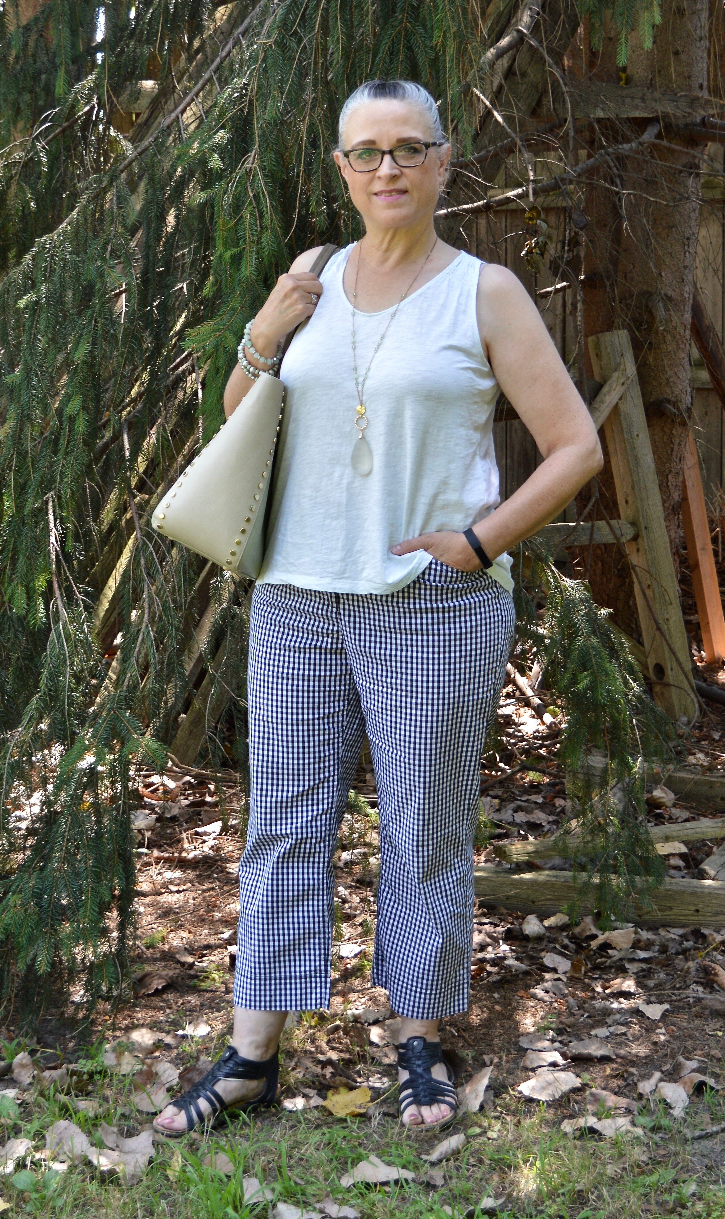
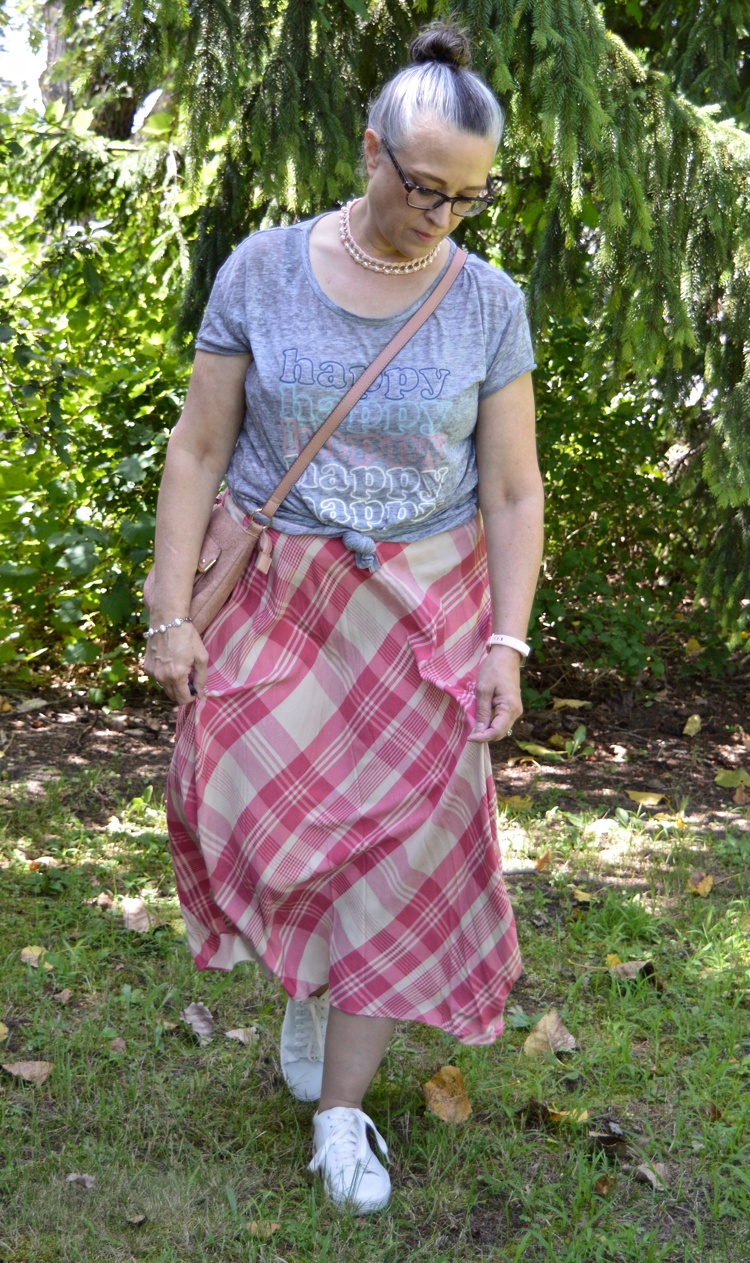
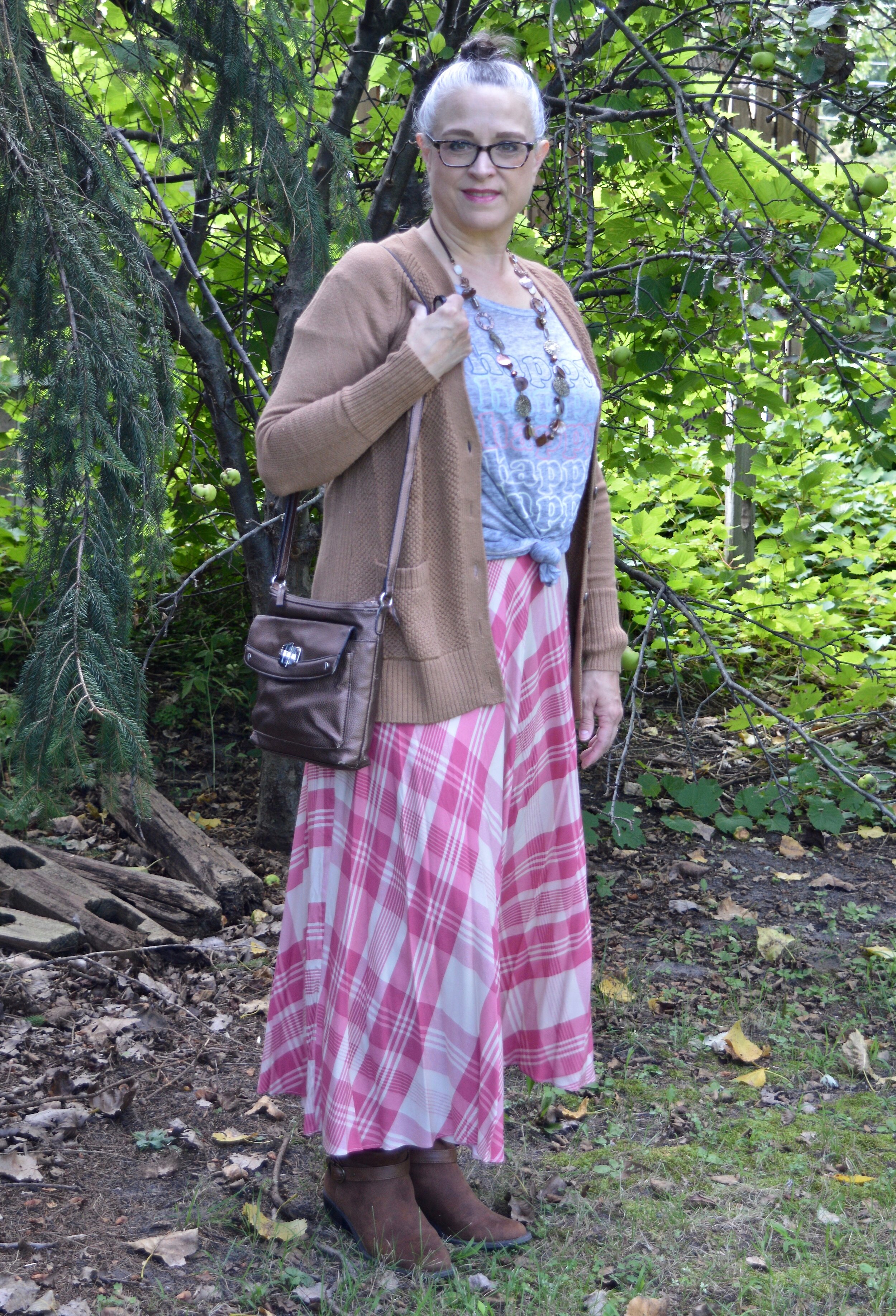
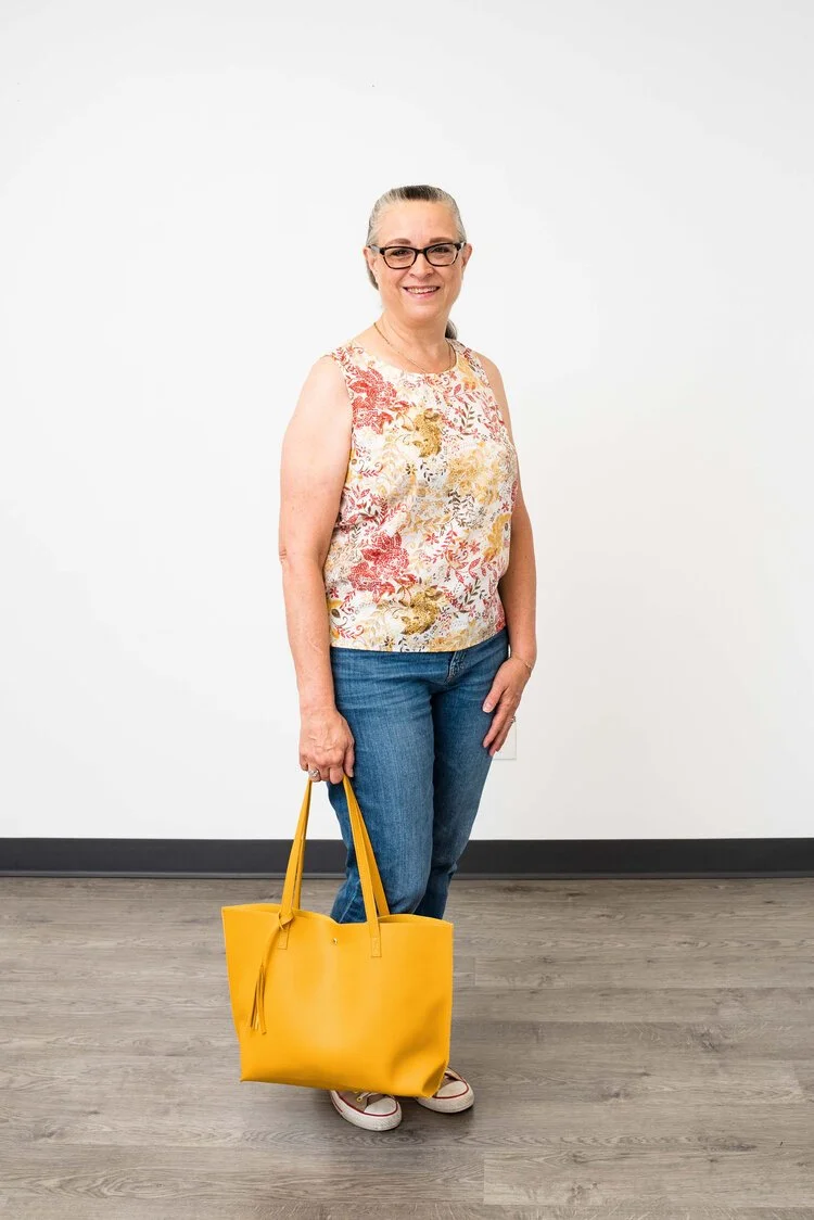
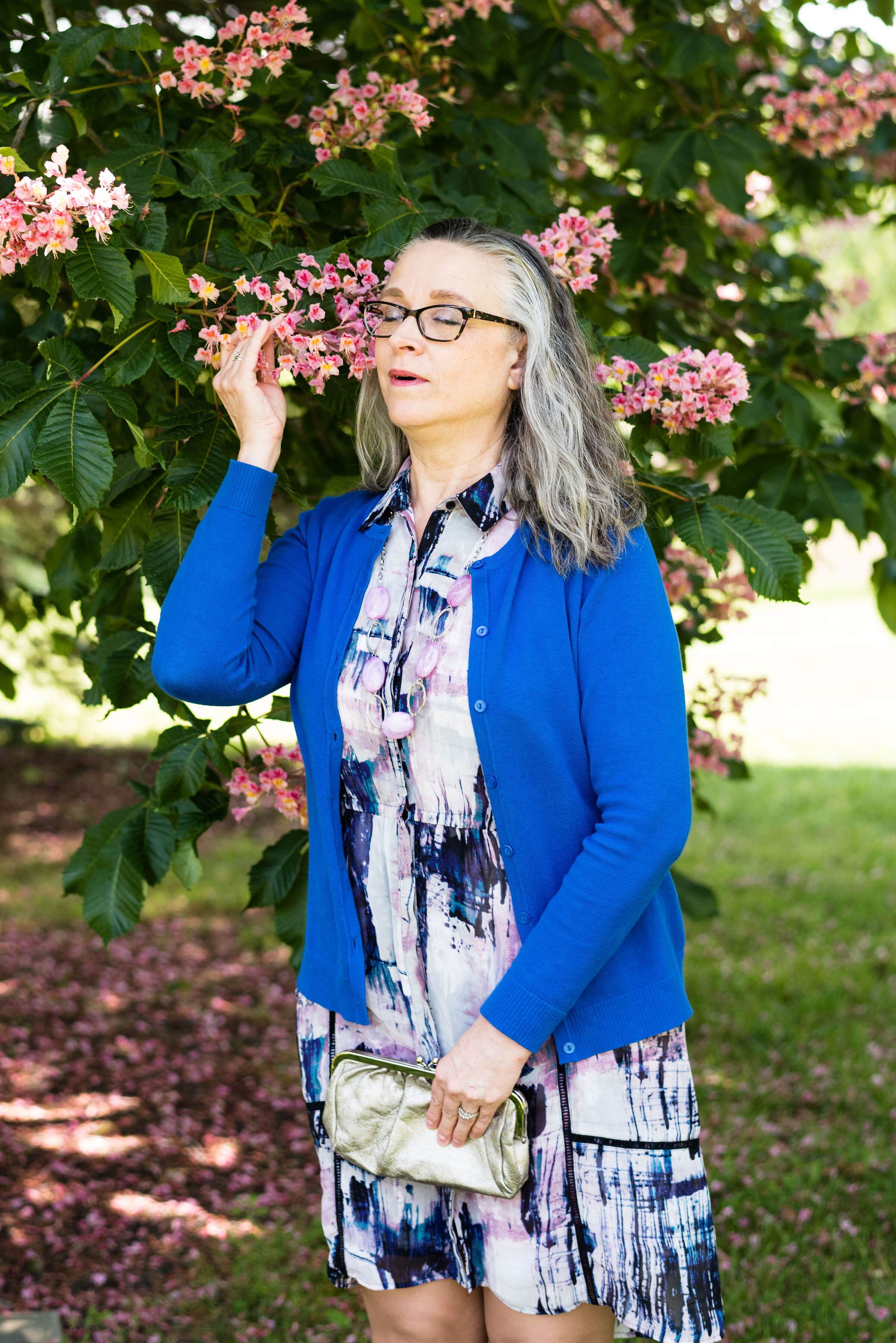
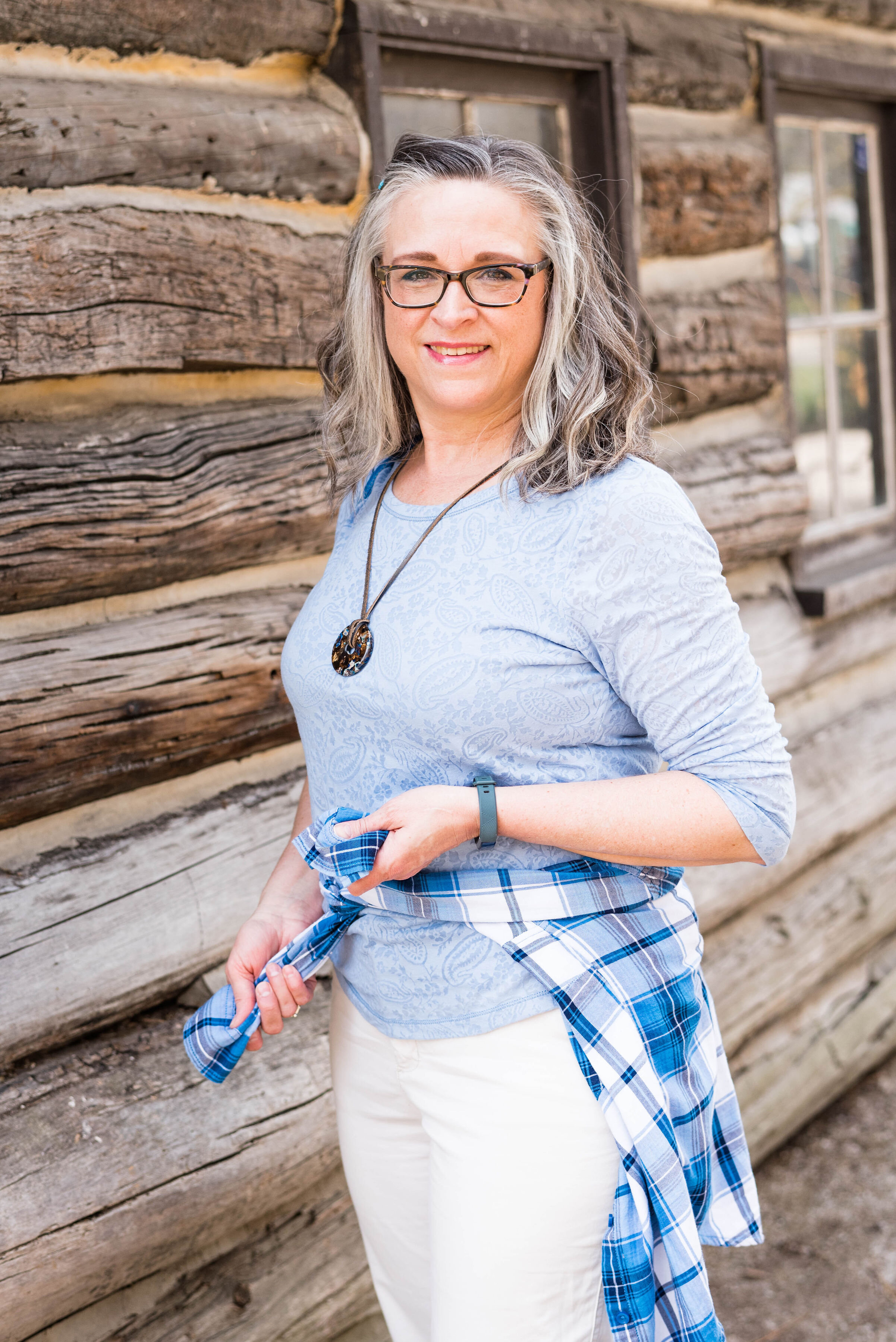
Here we are again, looking at a pastel pink on the fall color palette. I know pastels in fall are no longer taboo, but my brain still looks at this and thinks, “What a great spring outfit!” Maybe I should have paired First Blush with one of colors that seem more Autumnal to me, like Tomato Cream or Downtown Brown, but I liked the combination of blue and pink, so this is what you get.

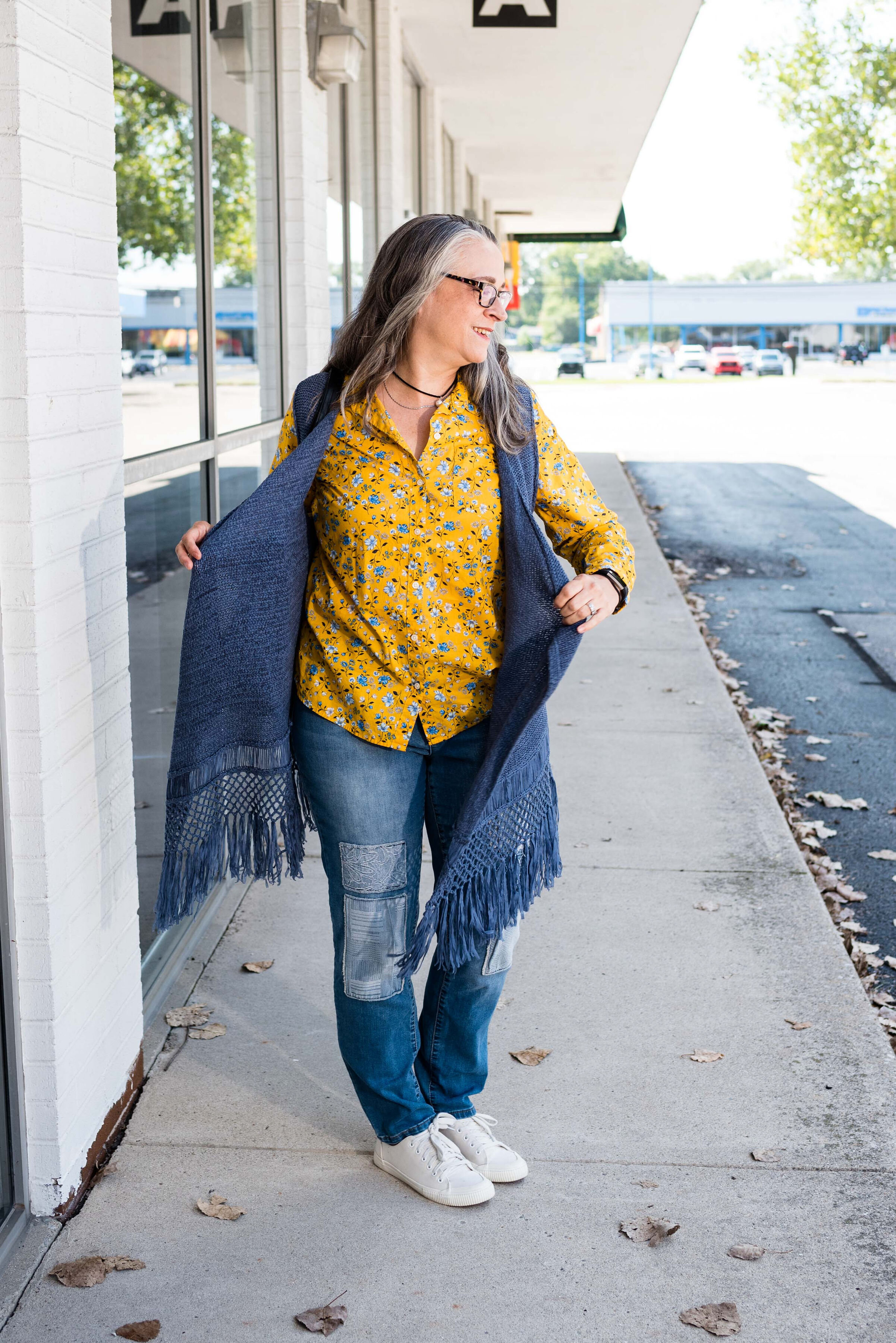
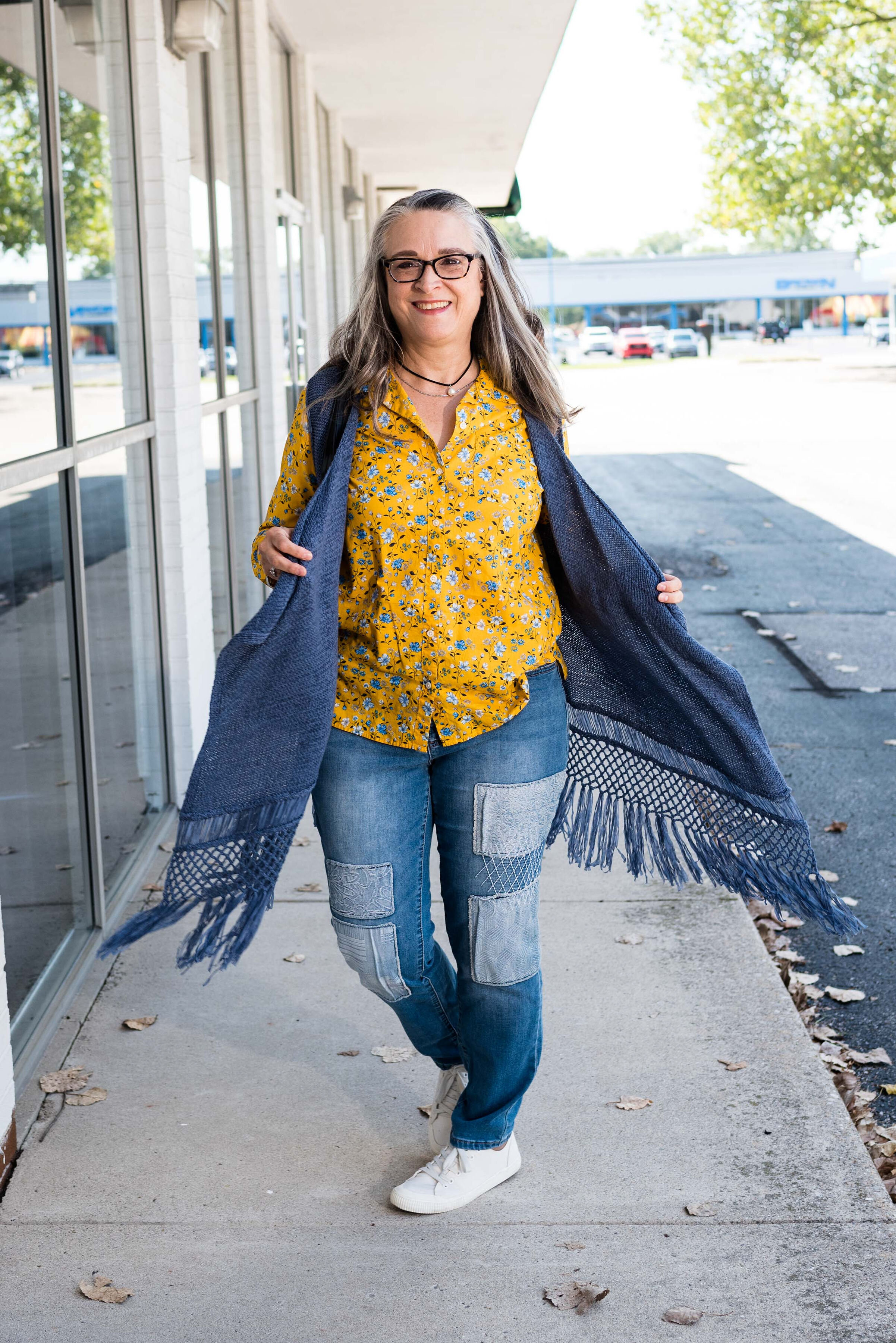
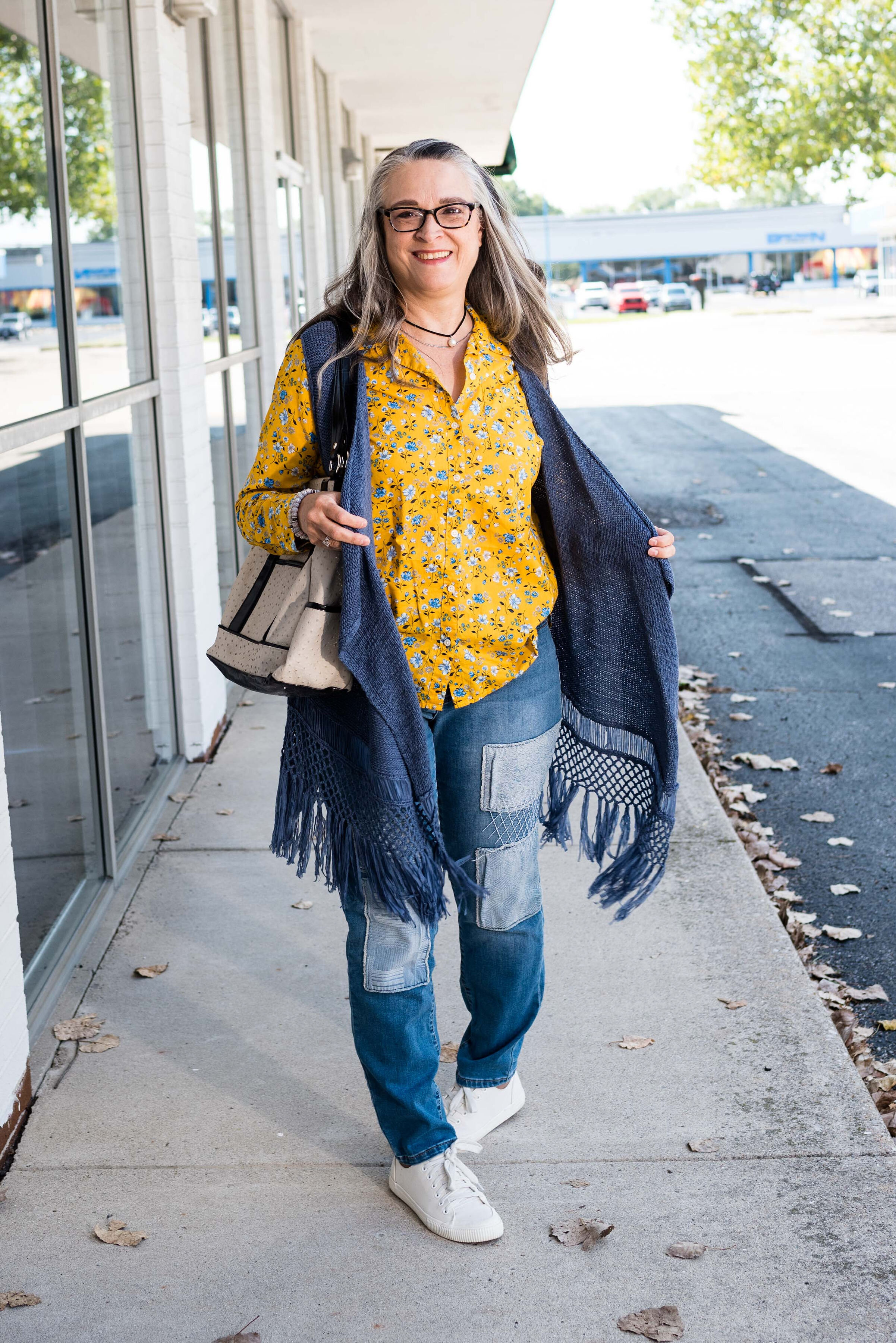
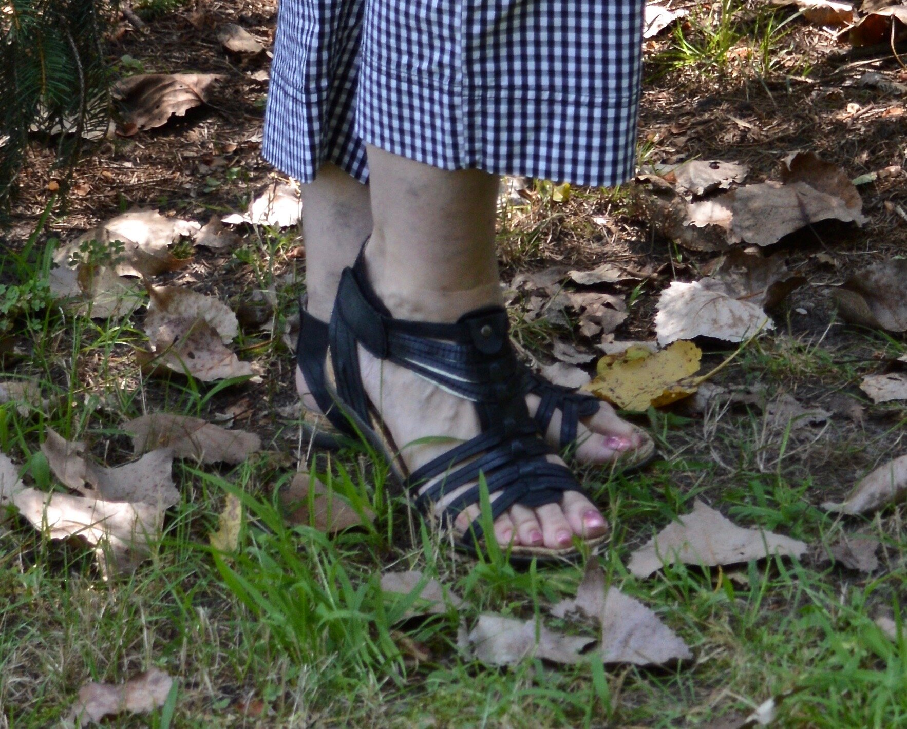
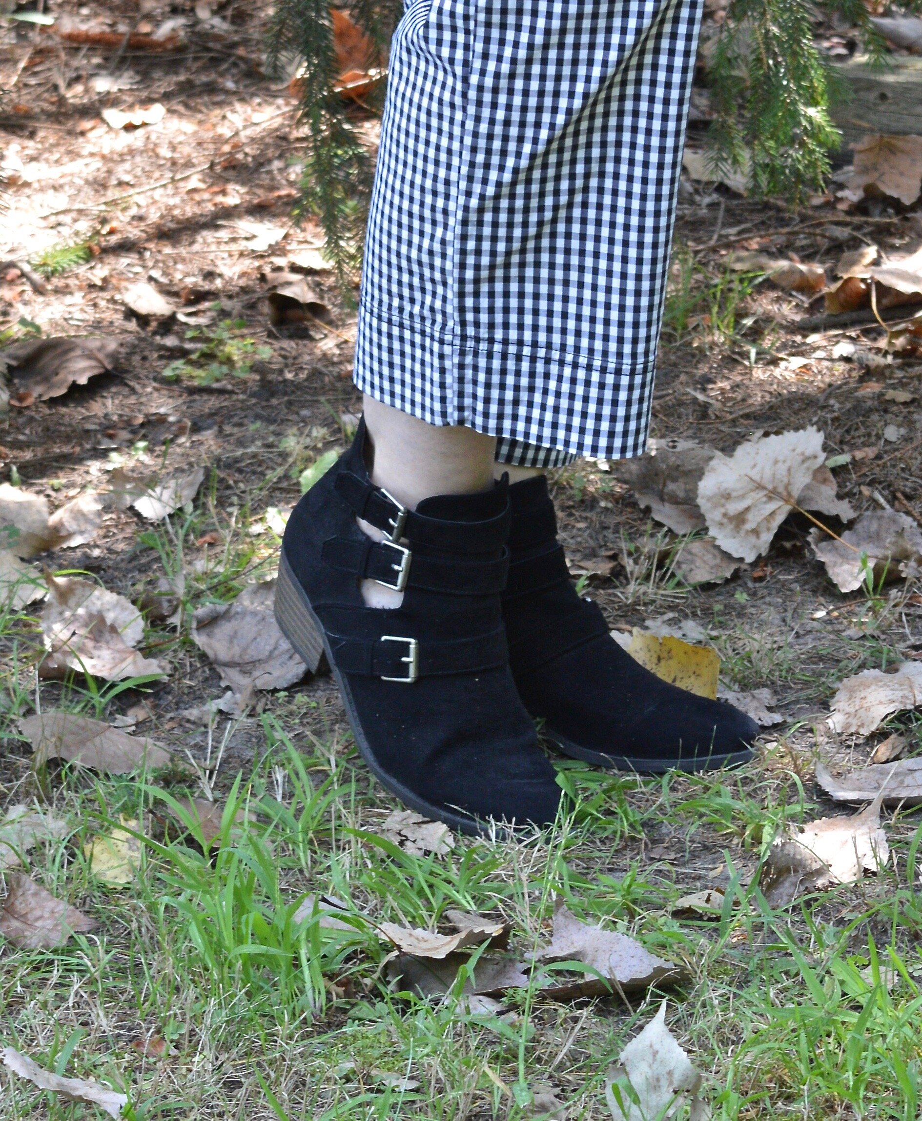
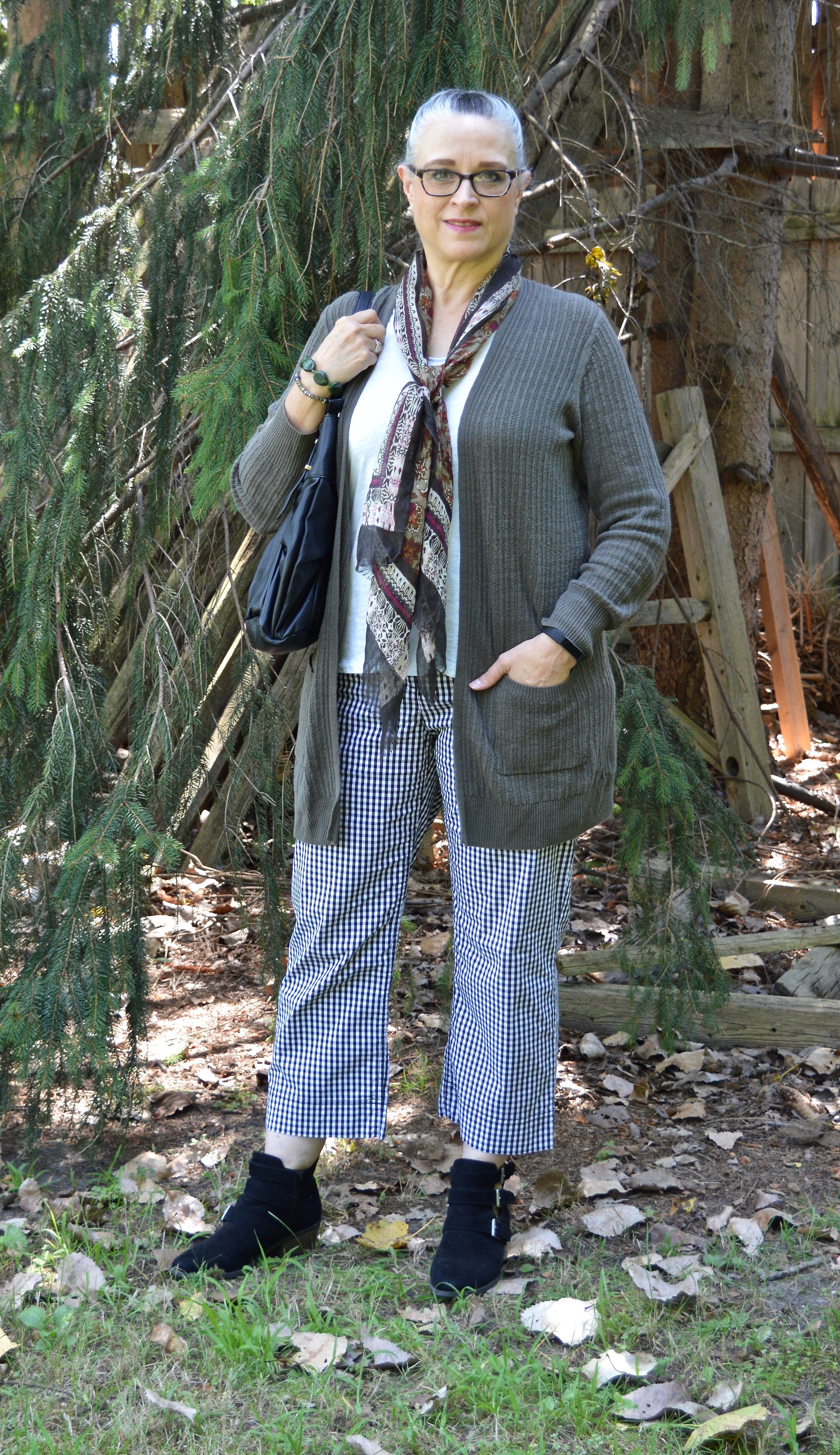
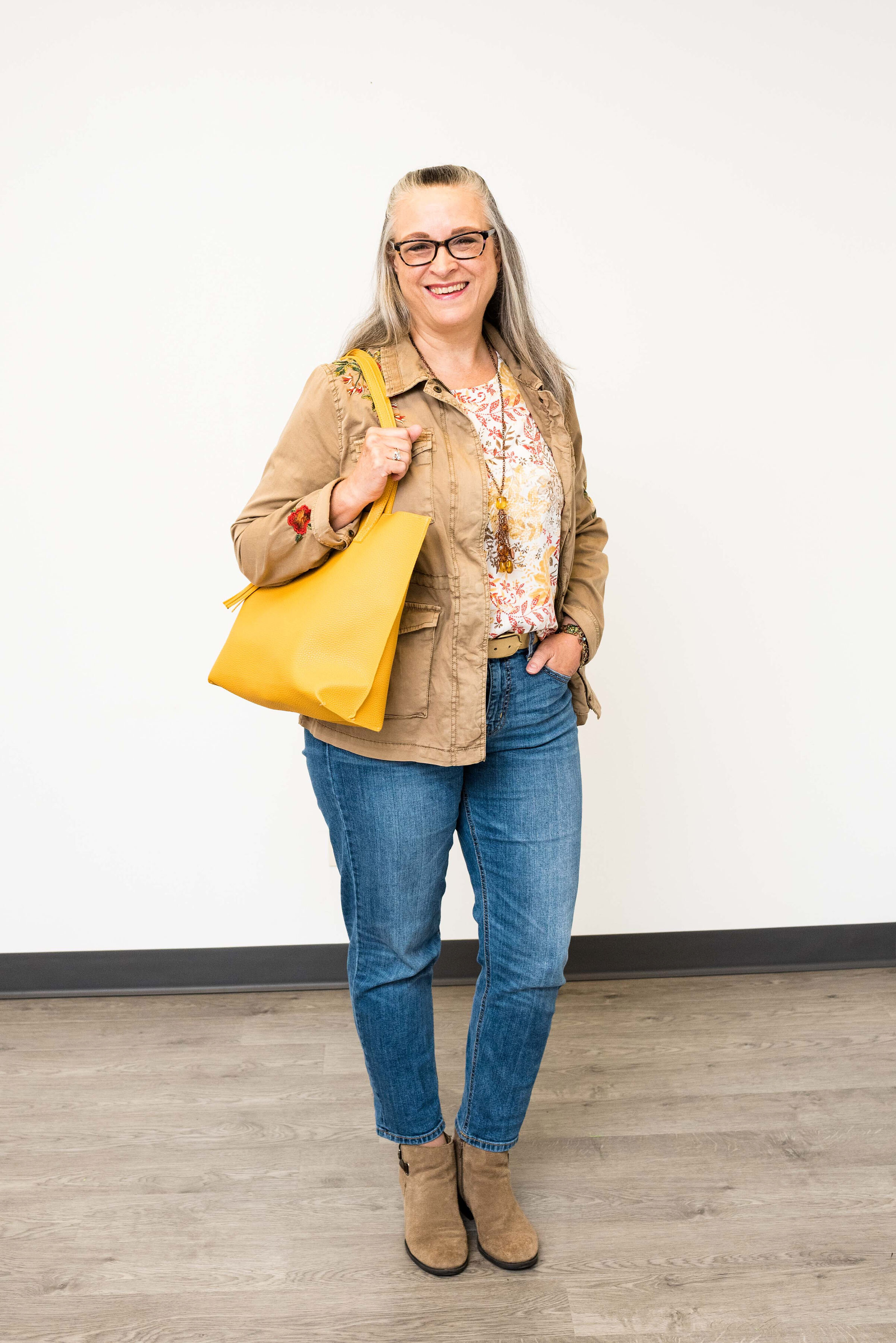
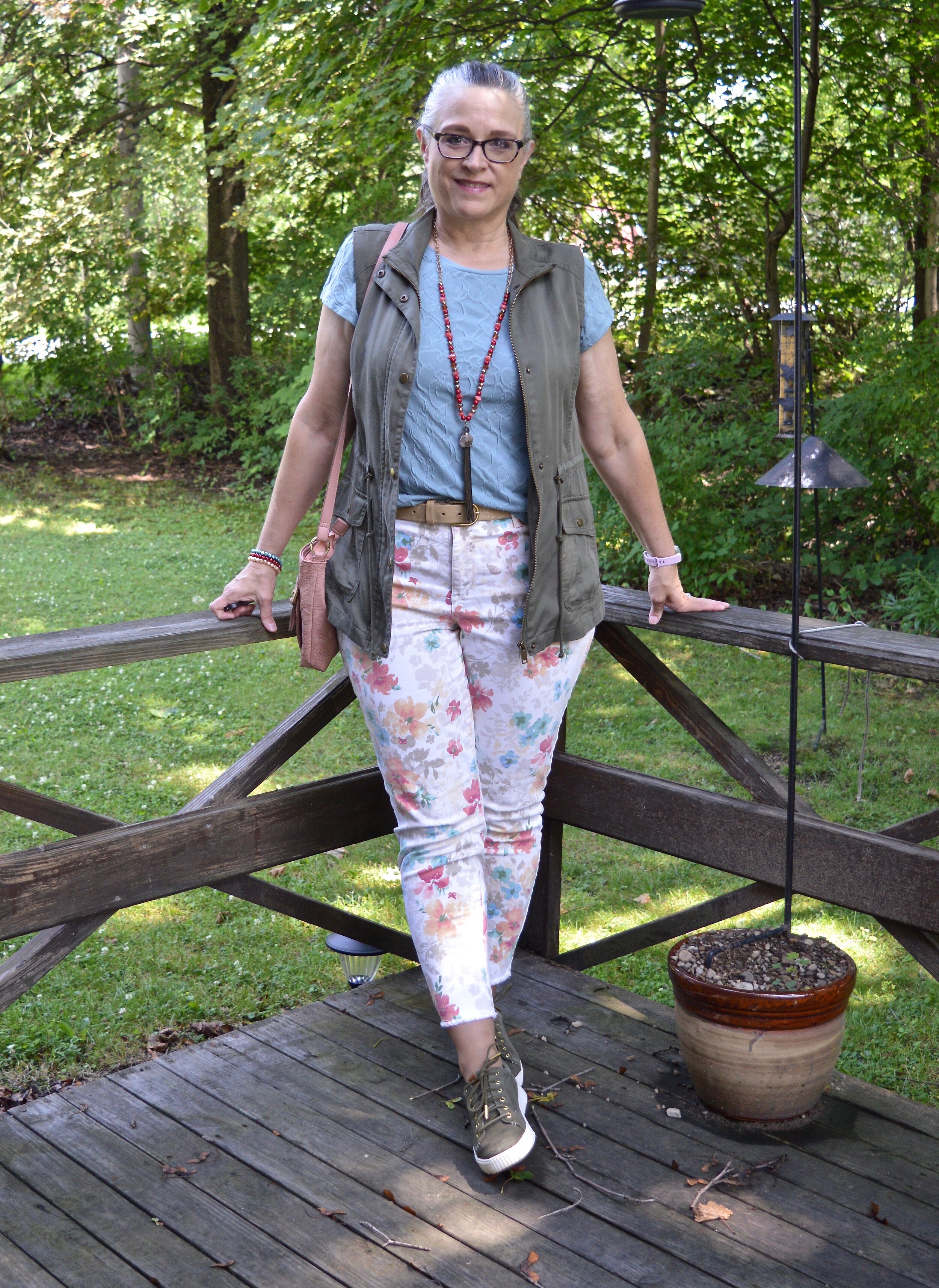
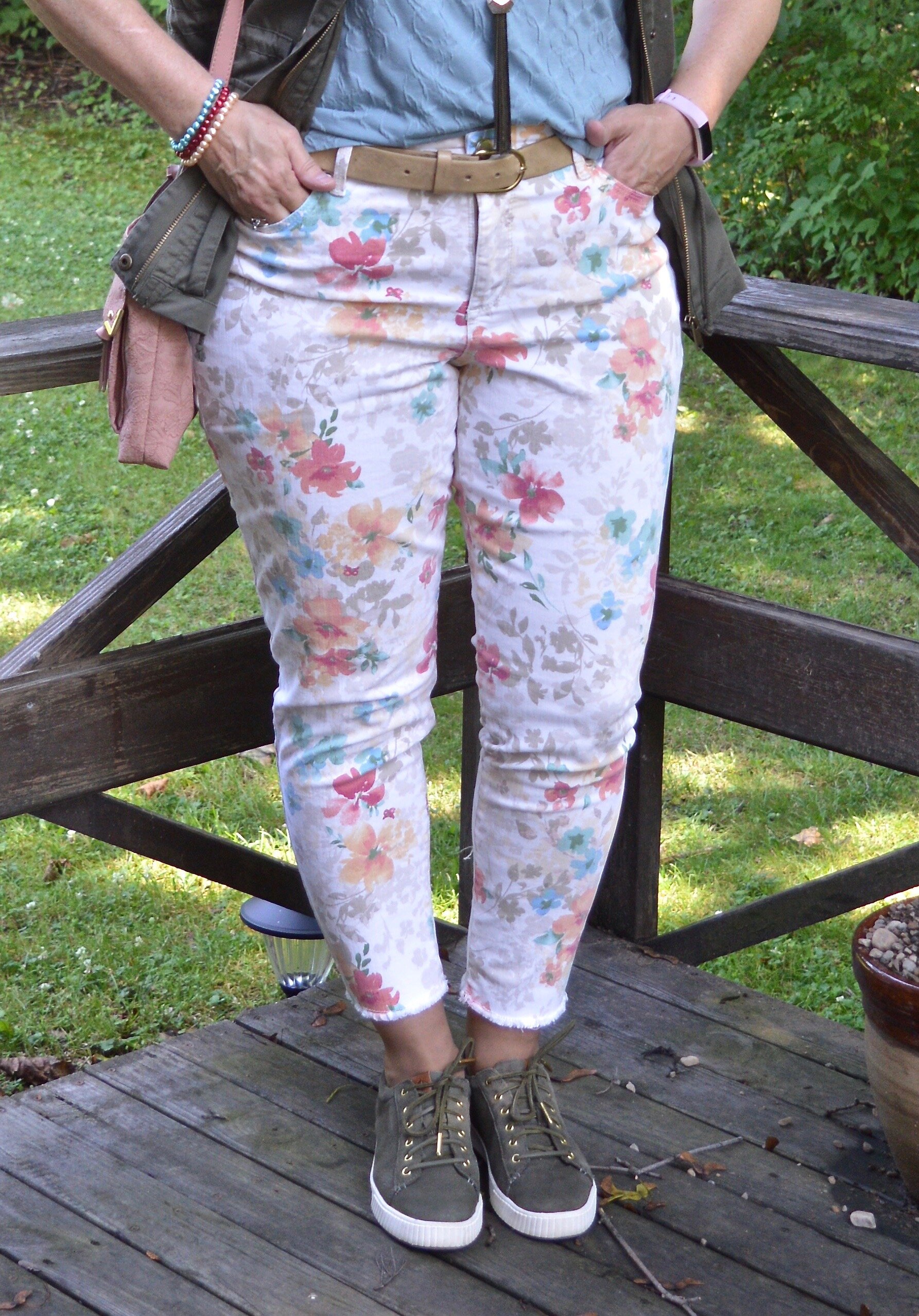
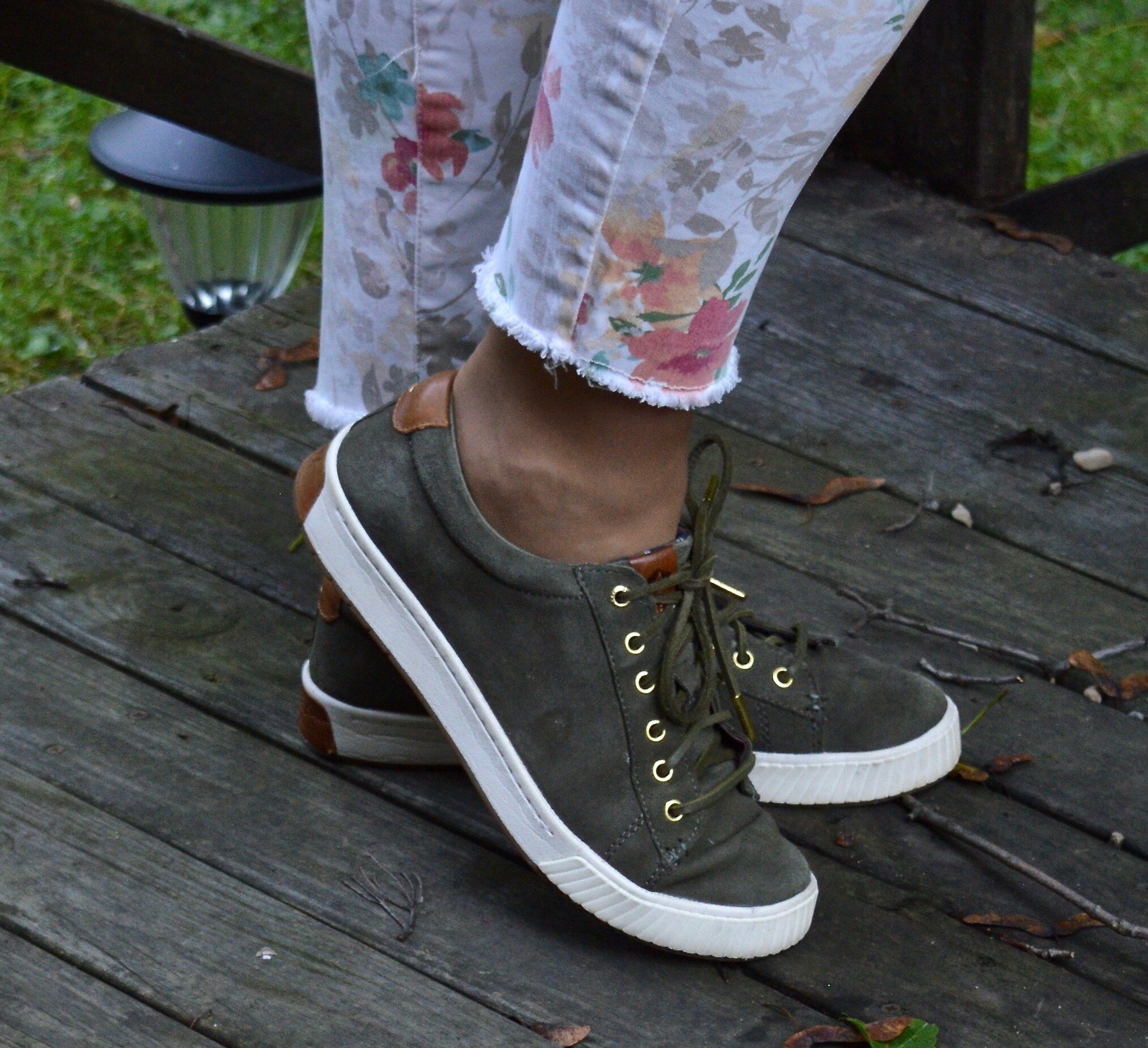
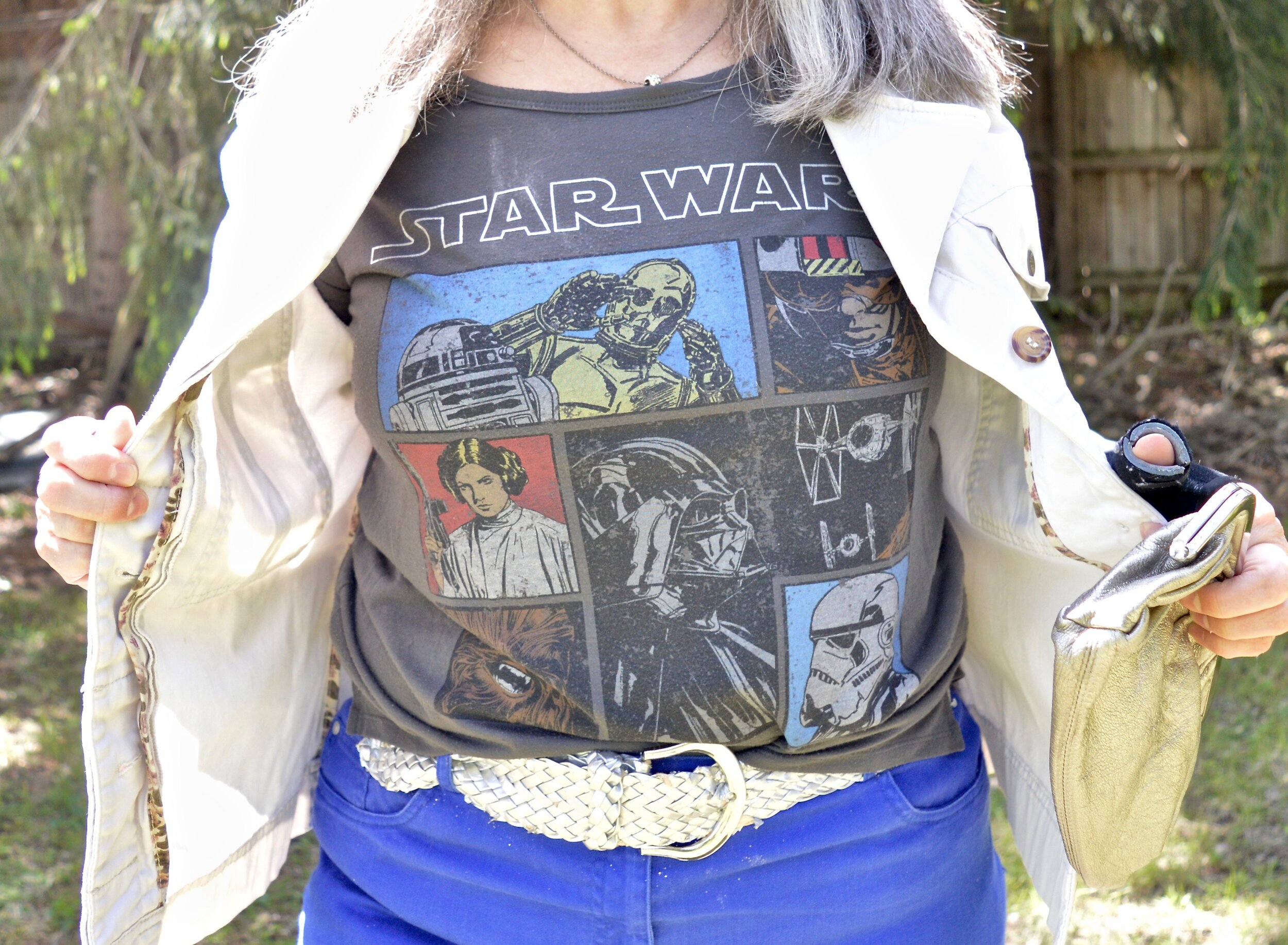
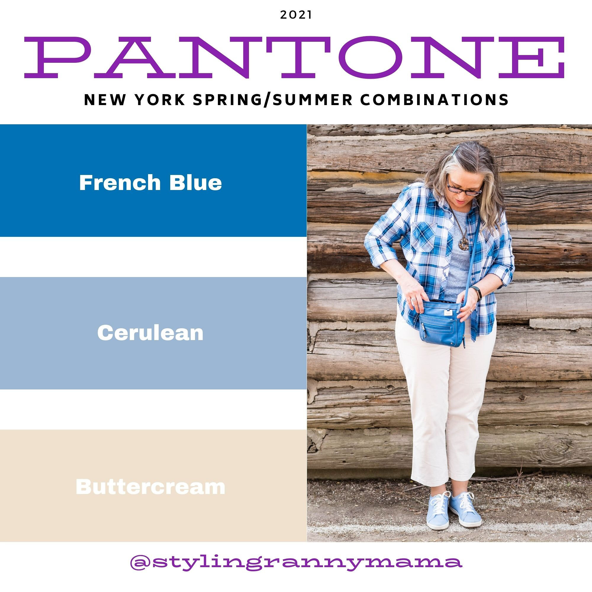
My Ibeza Blue plaid shirt is a thrifted Faded Glory piece. I used this same plaid shirt in the spring for the French Blue color that was on the New York Palette. You can see that post here. You’ve seen these thrifted, distressed Lane Bryant jeans numerous times on the blog as they are one of my faves.

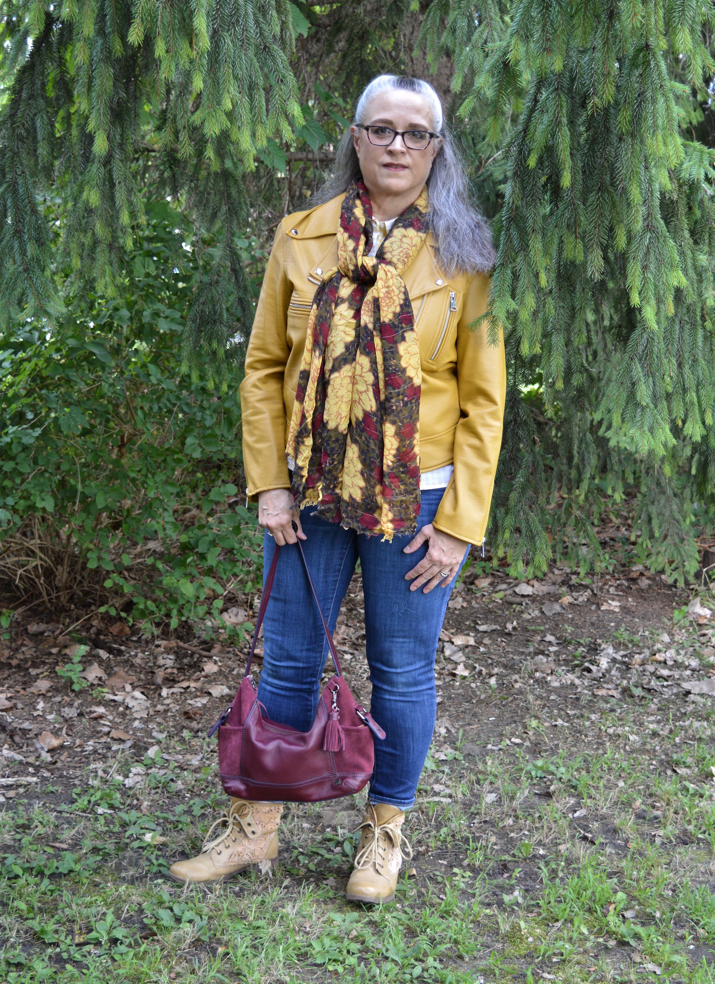
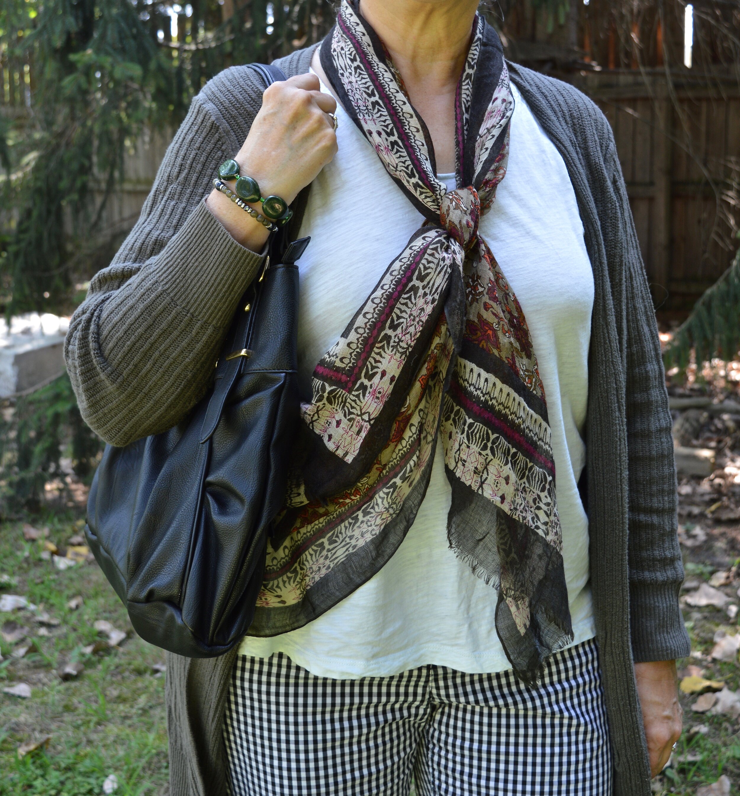
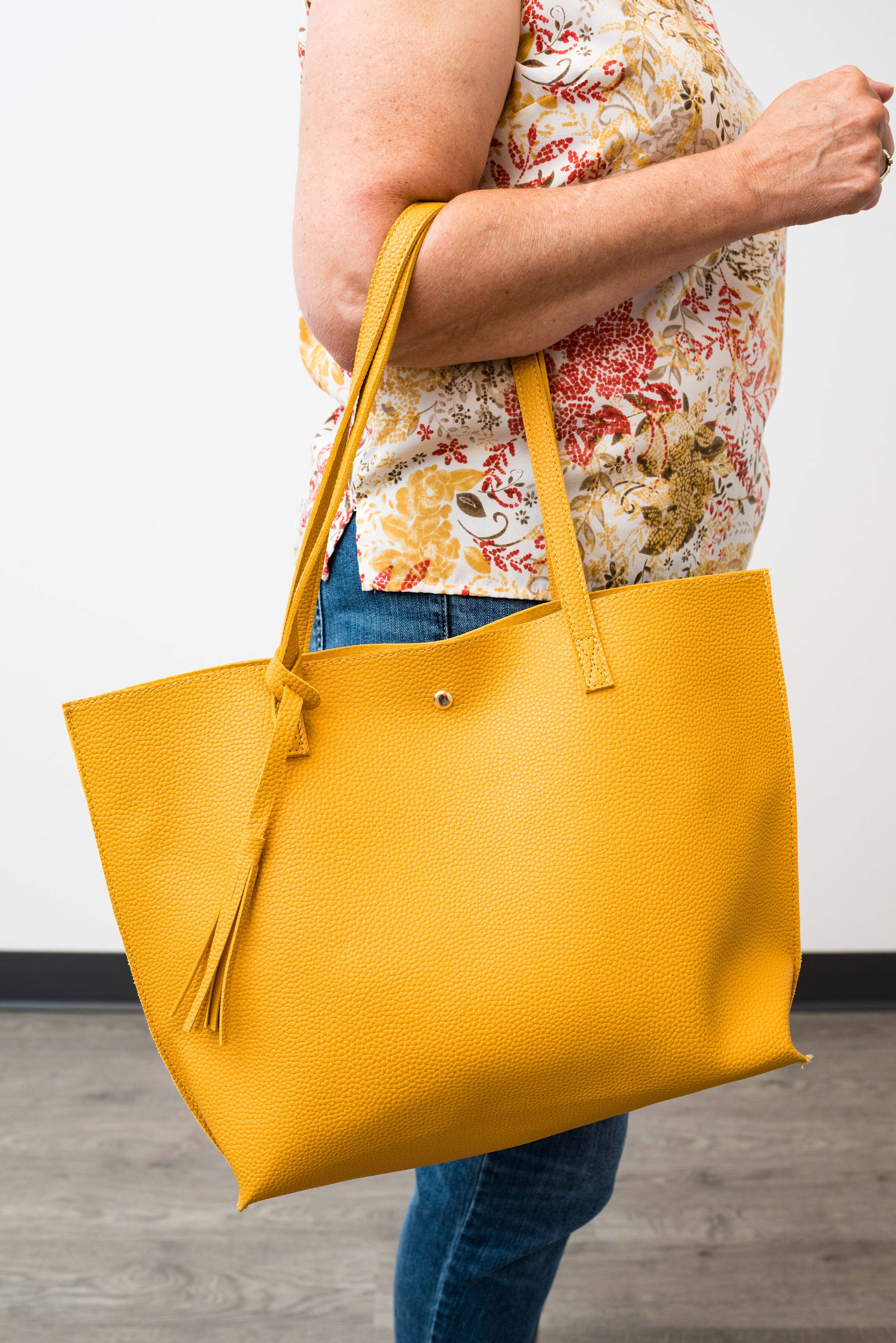
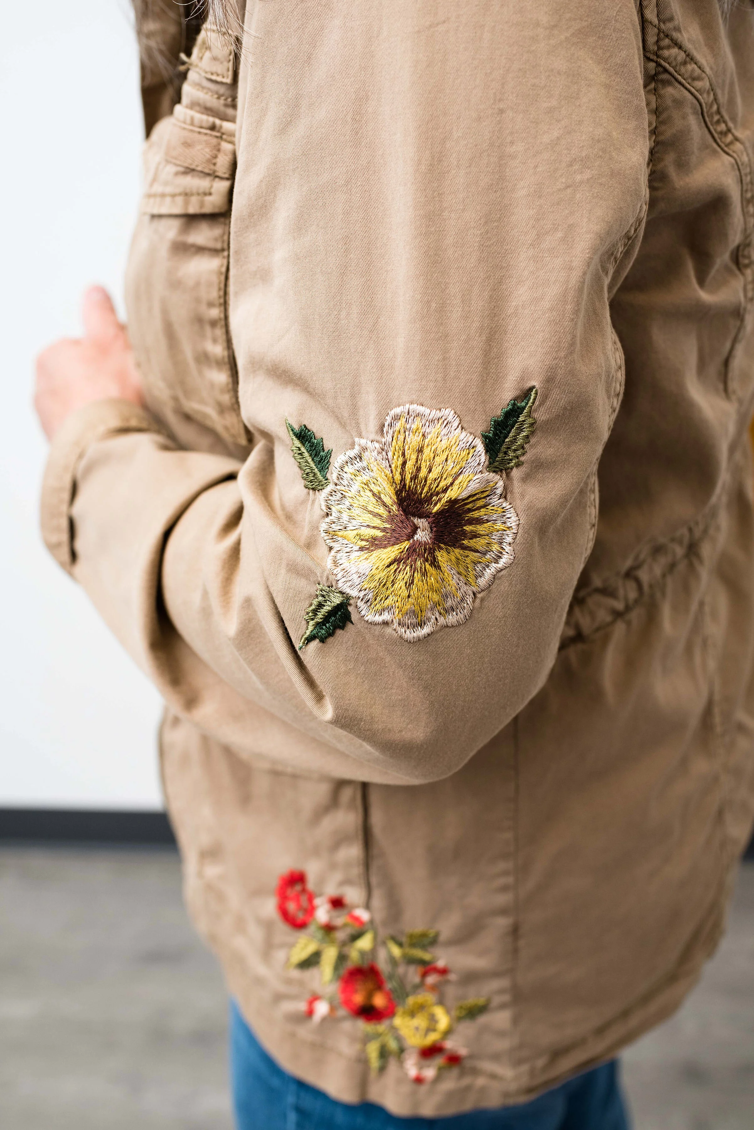
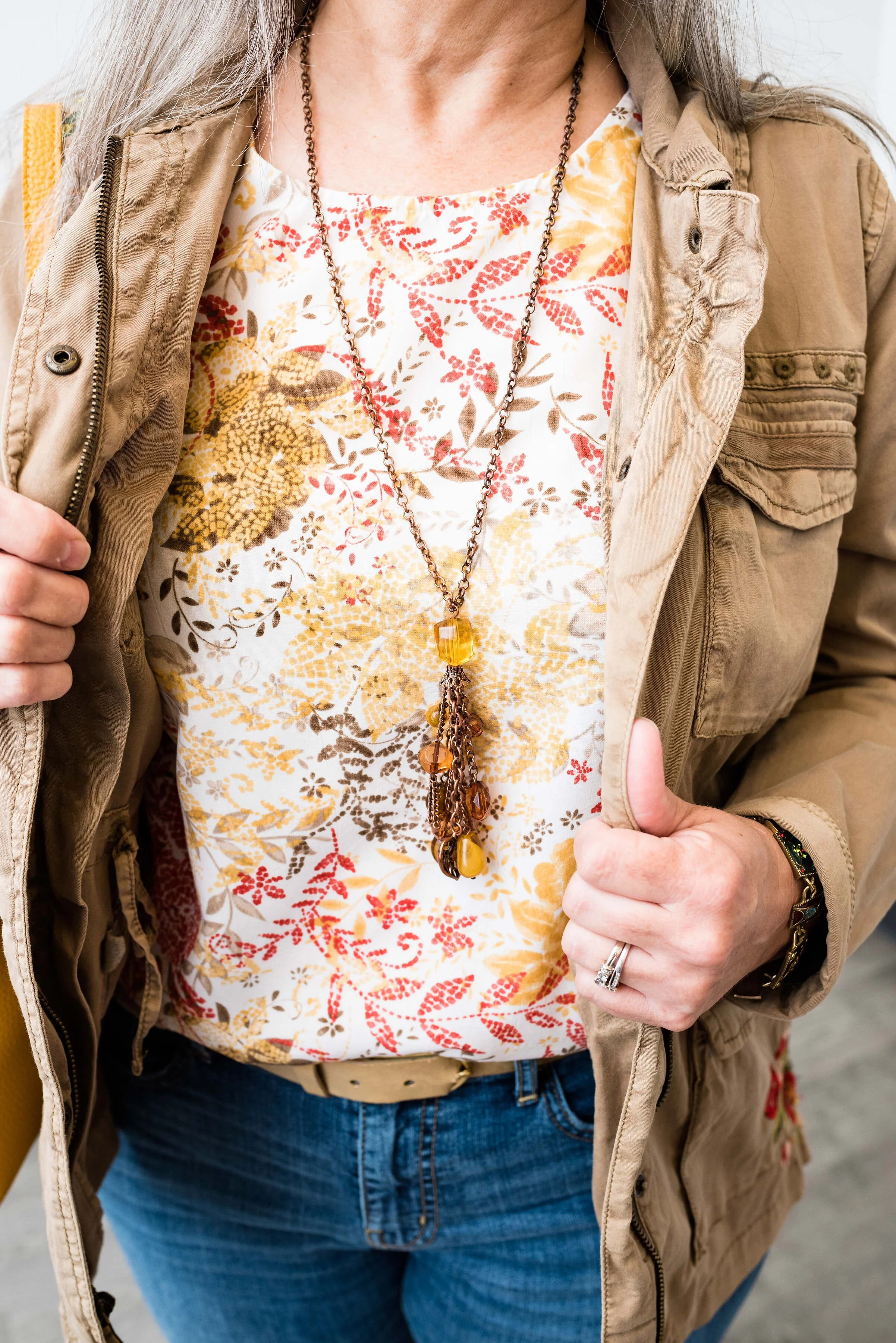
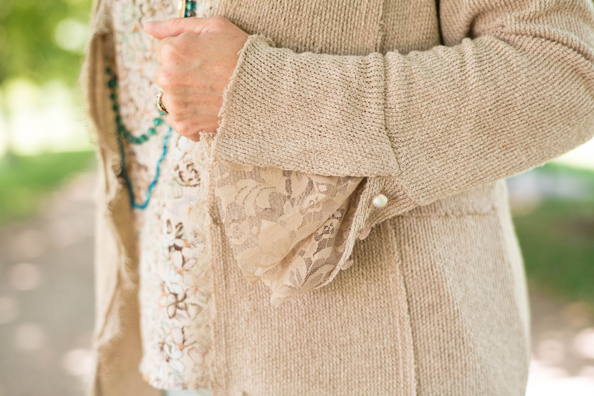
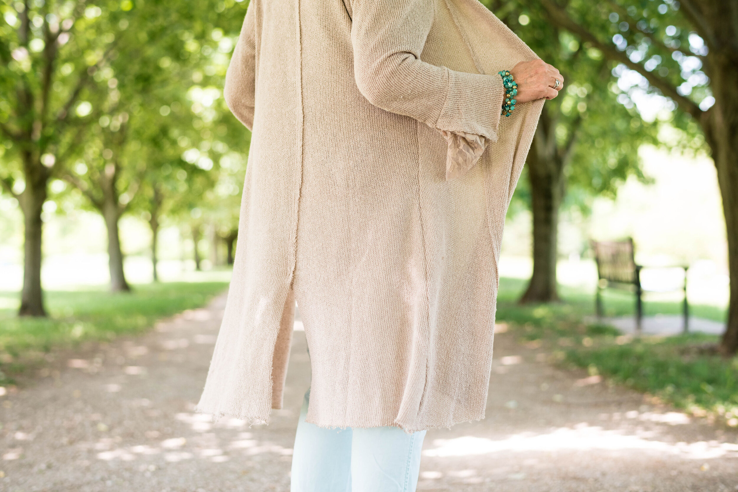
My First Blush jacket is also a repeat from my closet. Originally a Christopher and Banks purchase, this faux leather piece has some knit panels on the sides and under the arms to allow ease of movement and stretch. I added the scarf to bring in a little bit of added interest and additional color, plus with this being a fall outfit, the need for a scarf seemed more likely.
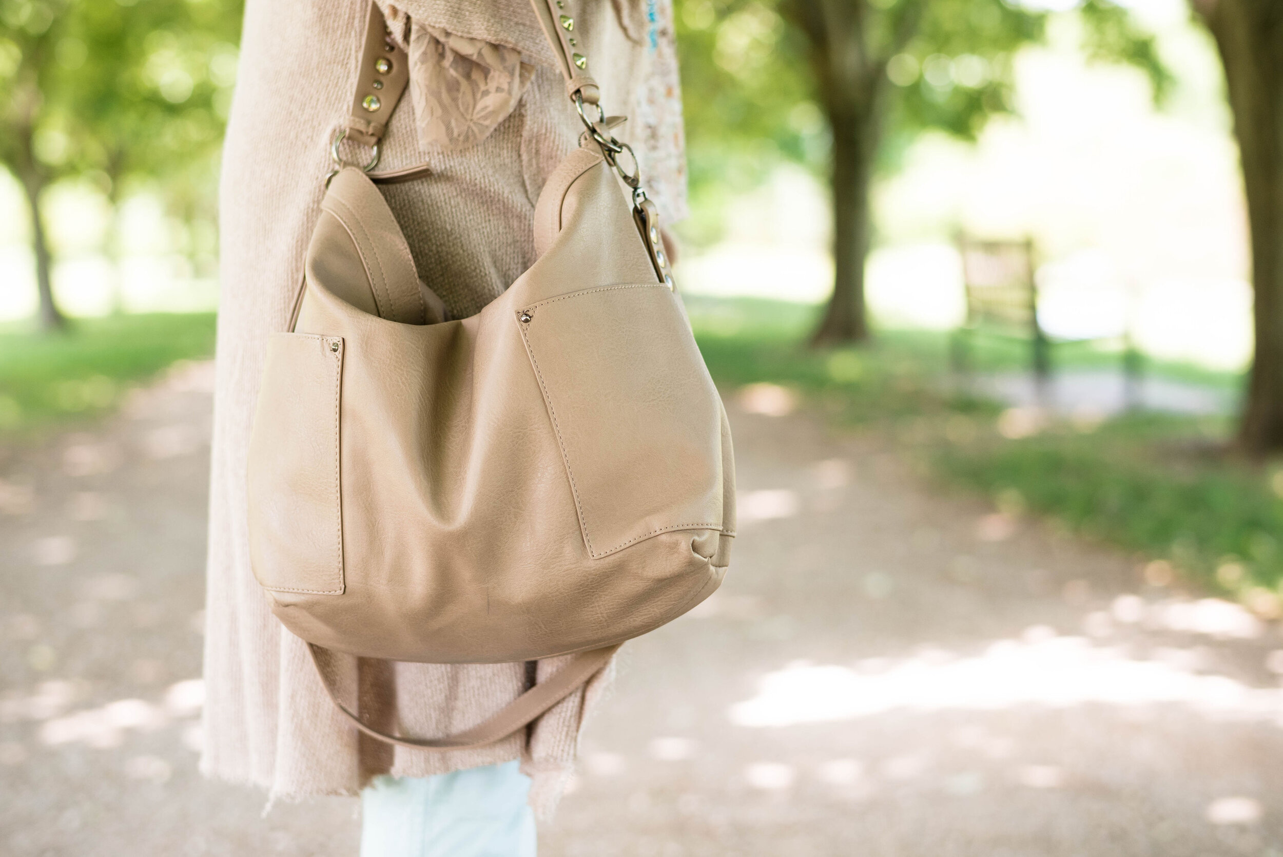
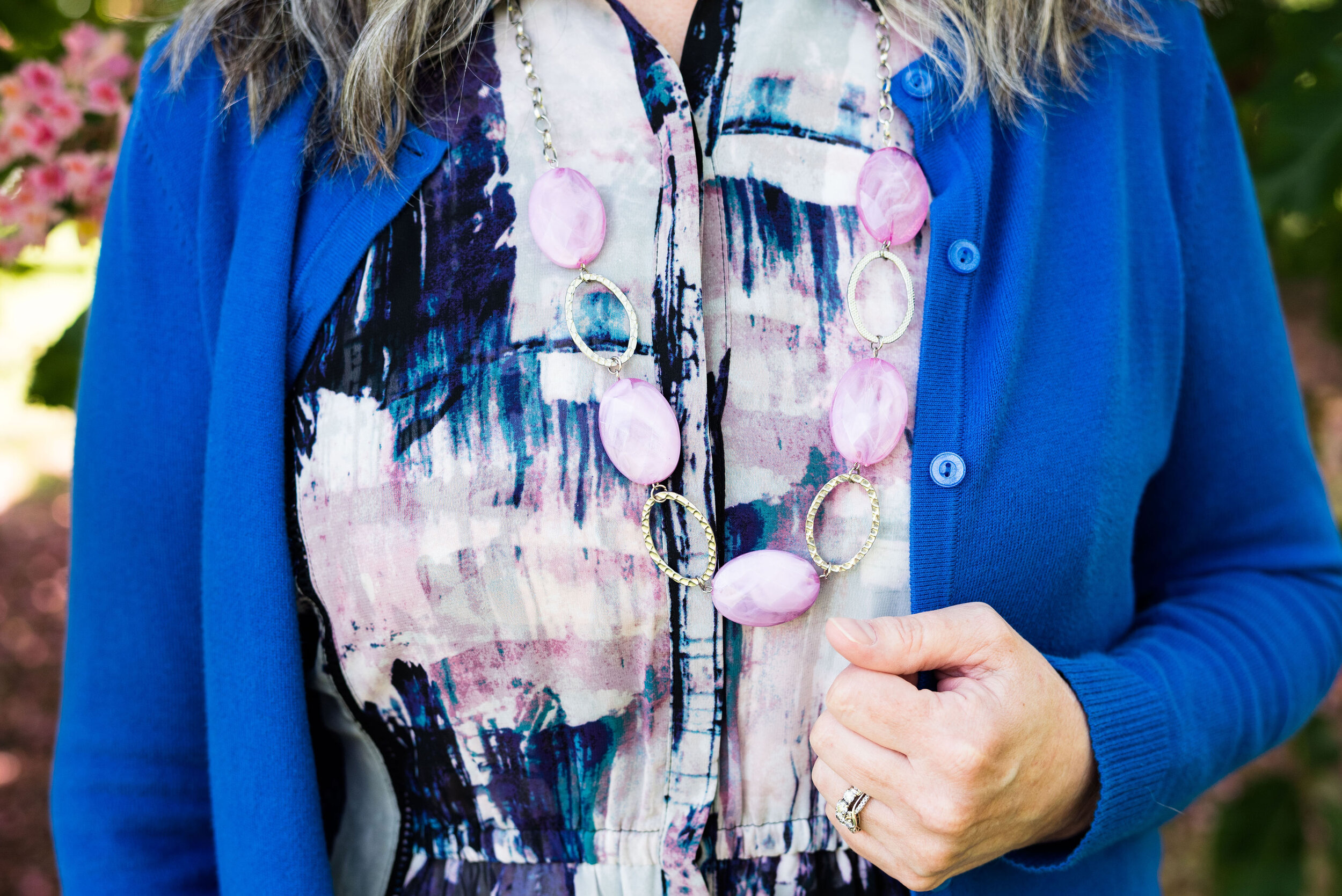
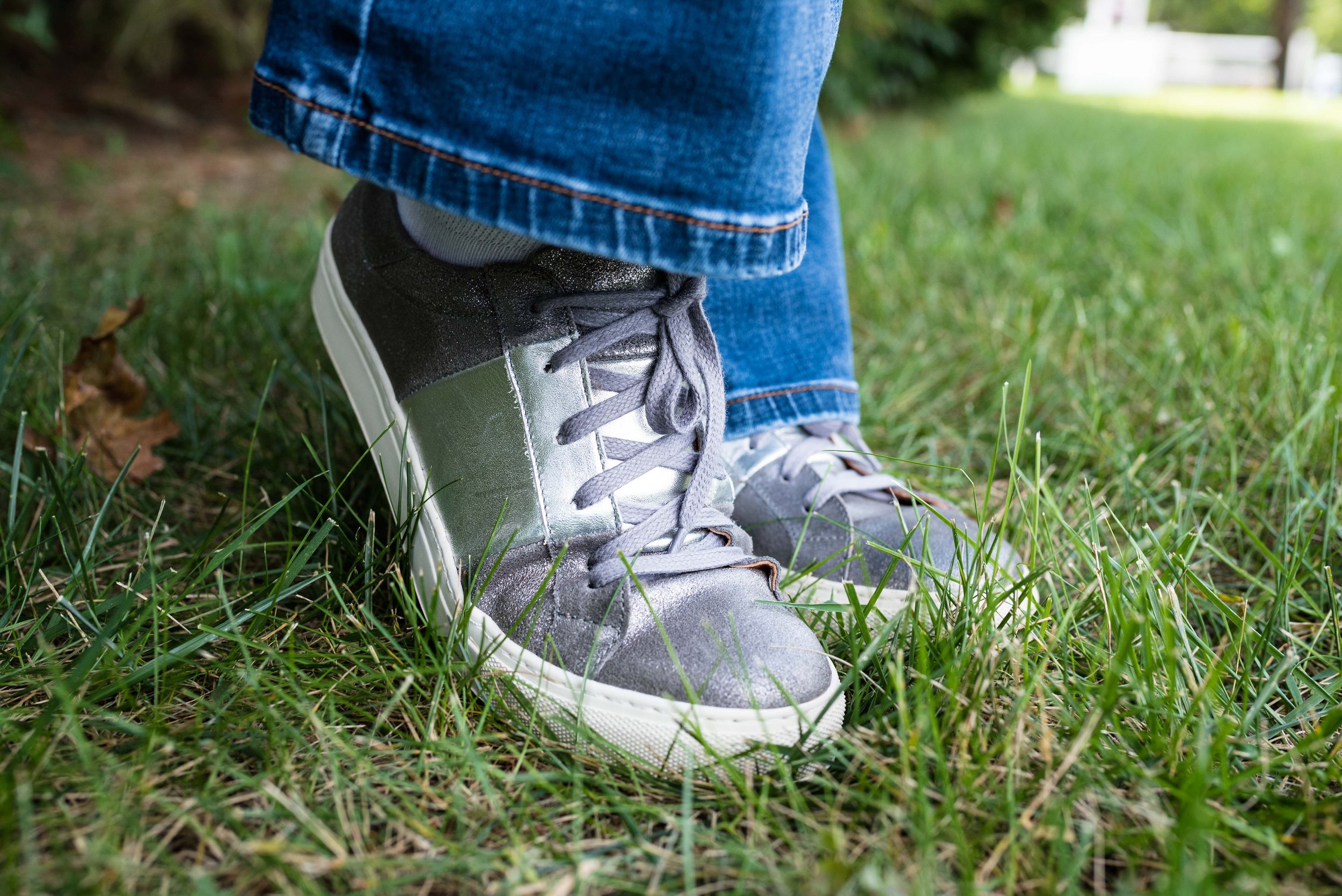
Ultimate Gray, once again makes its appearance on the London Palette, so I used this for my accessories in the metal chain belt, thrifted fold over bag and my silver sneakers. The only thing I did differently was the rose gold pendant. I just liked the way the color popped against the blue plaid.

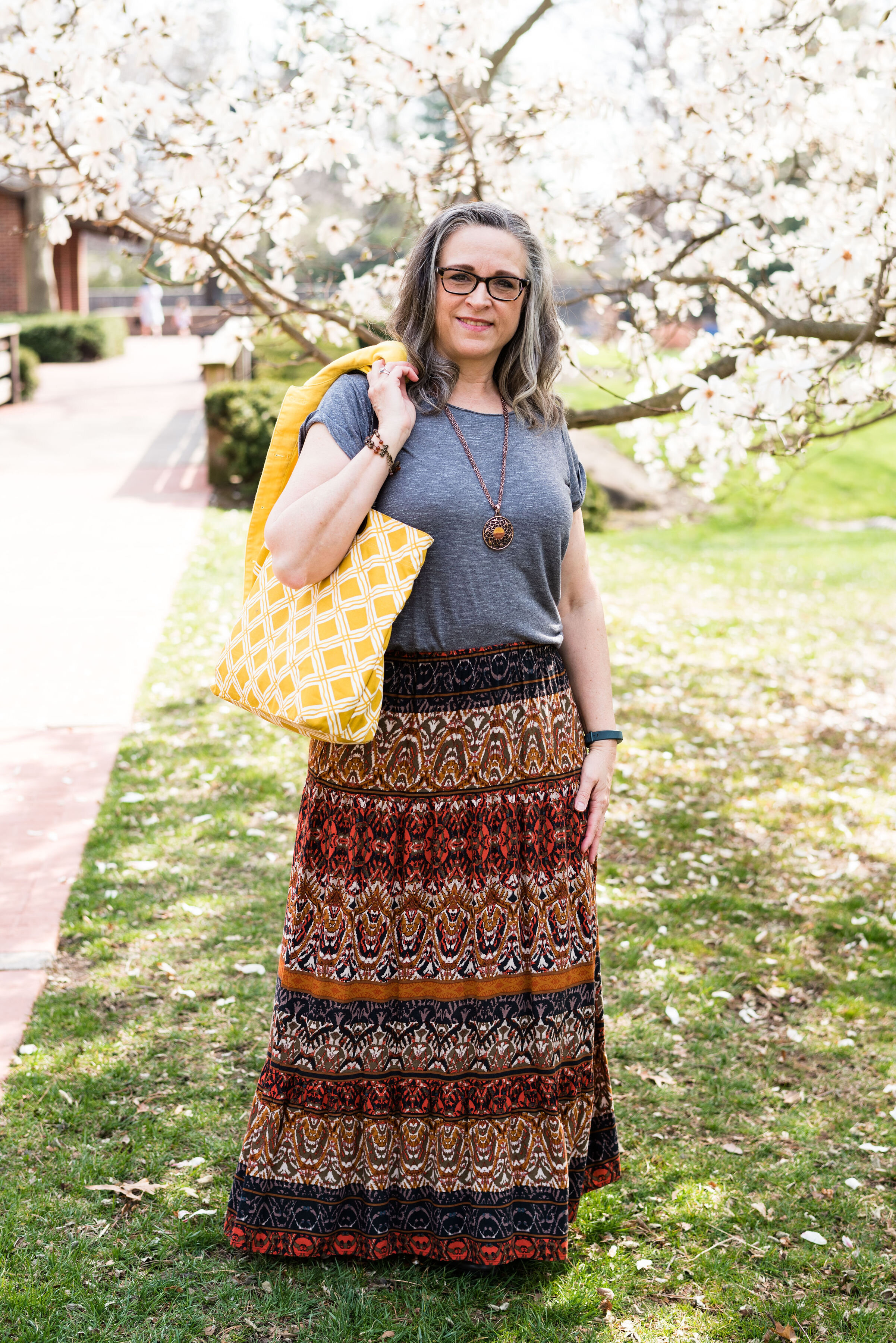
While this look is certainly not what we would typically think of for the holidays, if you are more into pastel colors, this is a great casual look for that Thanksgiving celebration, especially if it involves a bit of shopping afterwards.

I’m including a few shopping links for you to look over. Remember to order soon for Christmas. We have all heard how things are taking longer and some things are back logged so be sure to get your orders in, or even better, don’t deal with that added stress and try to buy local. That is what I am thinking about doing at least for part of my shopping this year.
These are affiliate links. All opinions are my own.
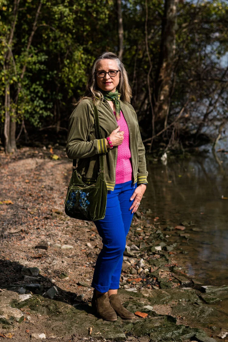
Photo credit Jessica Trumbull with Rebecca Trumbull.