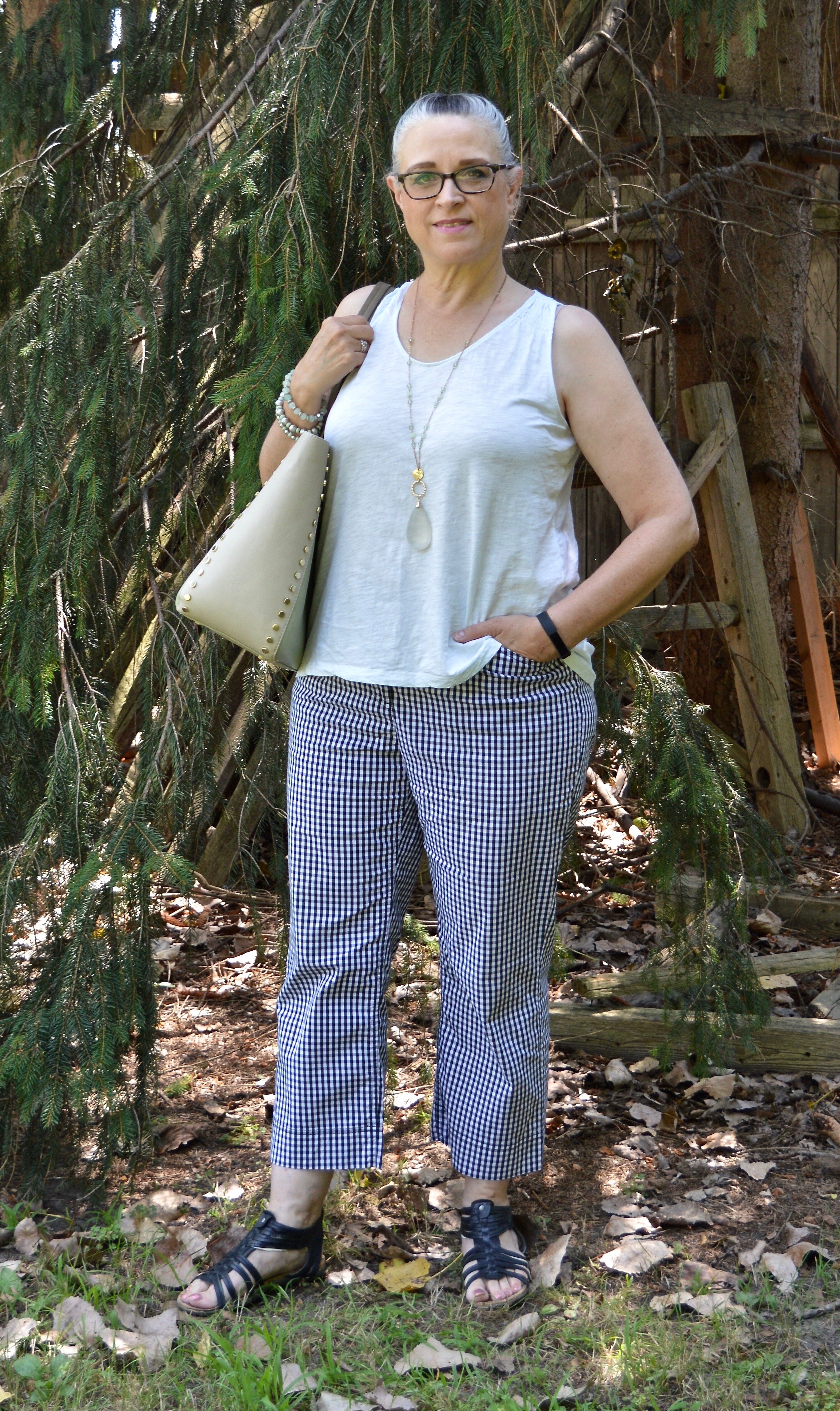
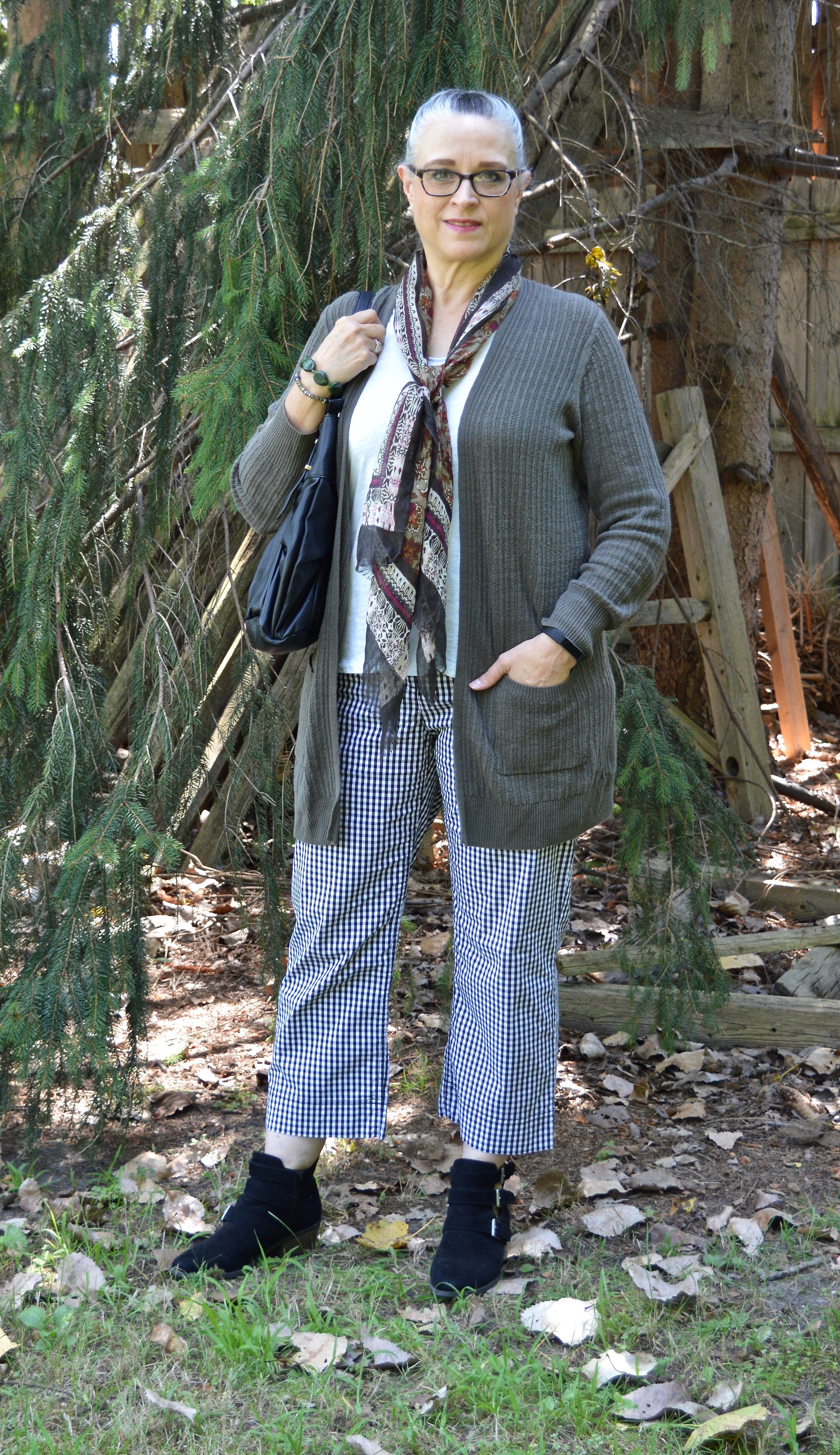
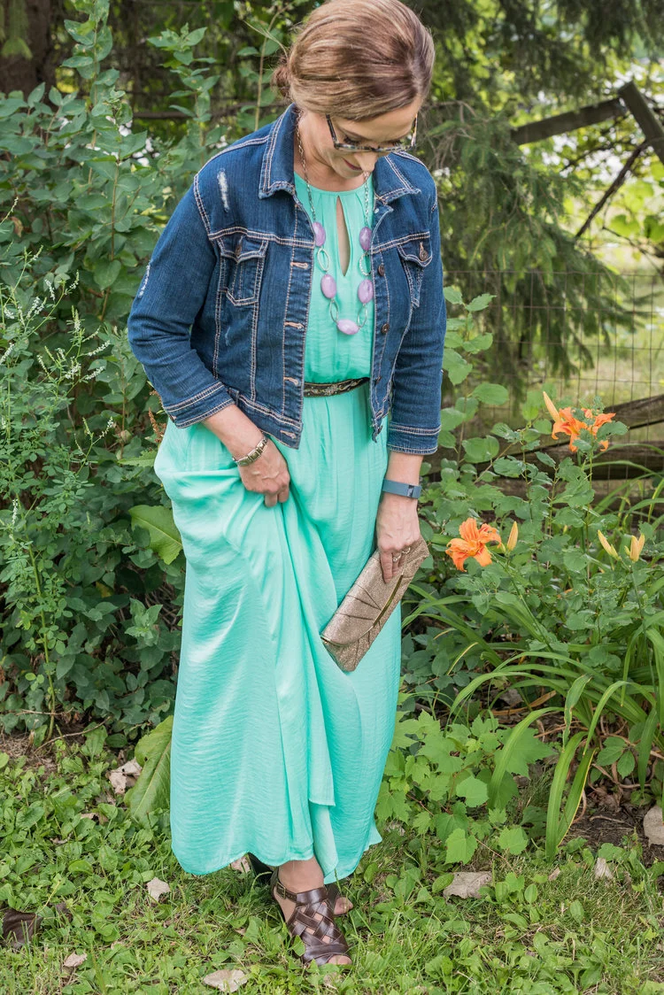
Spring Trend 2022 - Wearing a Dress with Pants

I saw this on one of the websites as I was looking at Spring Trends for this year. This one is a bit more obscure, but I thought it isn’t so far outside our boxes as we might think. The runway models were wearing outfits that included long, oversized shirt dresses with voluminous pants. That is too overwhelming for most of us, especially if we are carrying a bit of extra weight. However, most of you have already done this to a degree, when you wear a longer tunic with leggings. After all, isn’t a tunic just a short dress? Aren’t leggings sort of like pants? I thought I would show you my version of a dress with pants outfit. It is very simple and perfect for these long, cold days of winter.

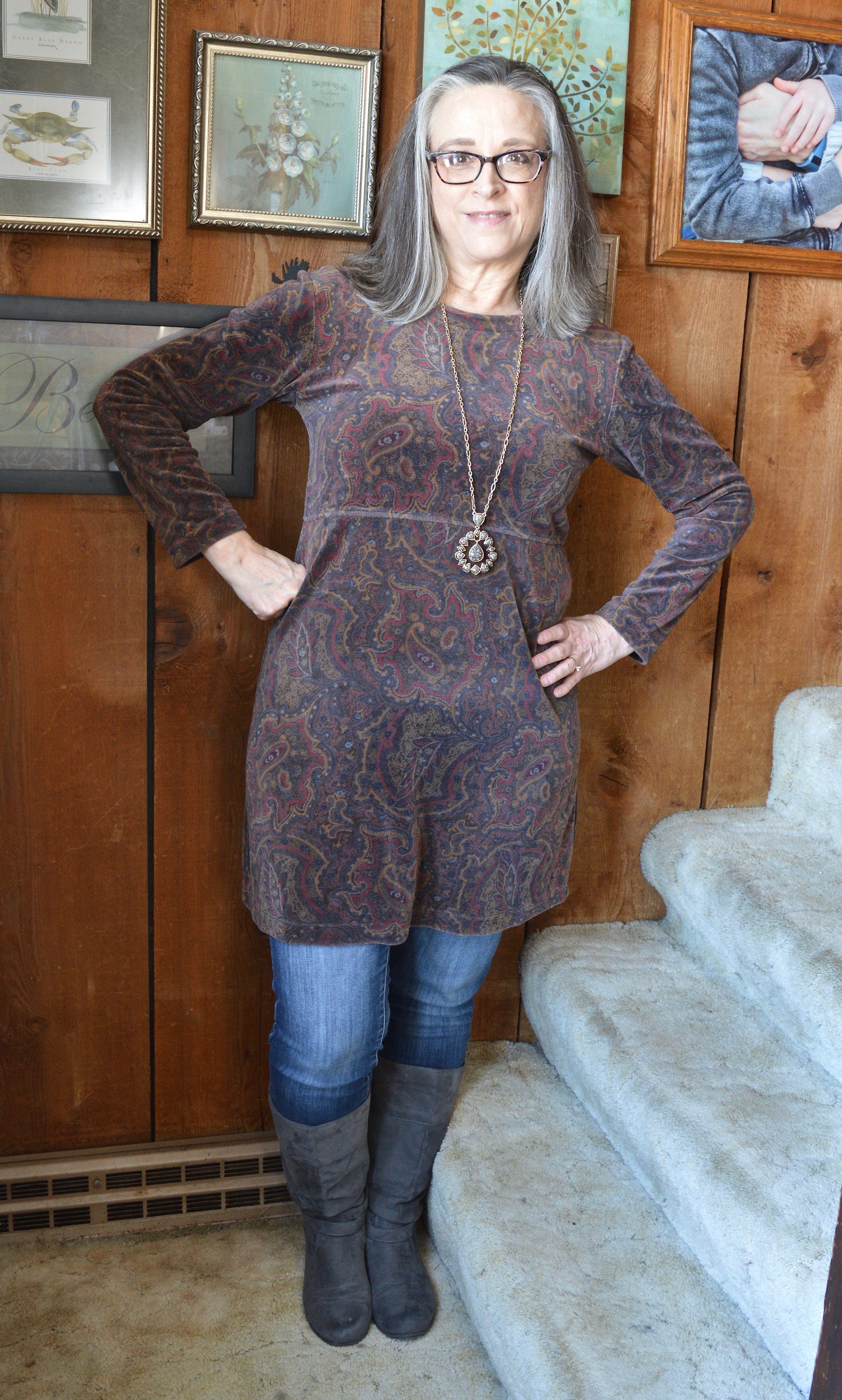
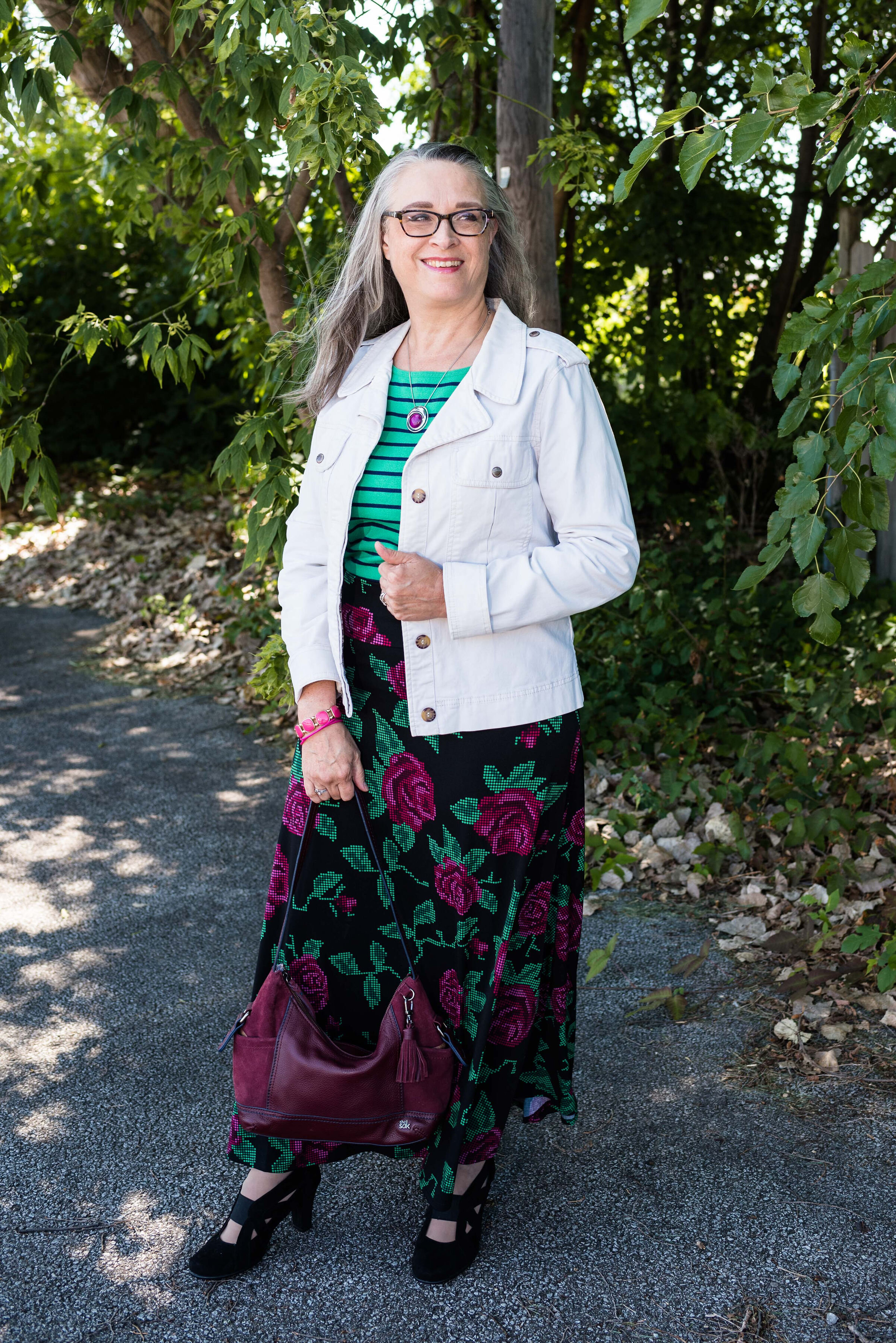
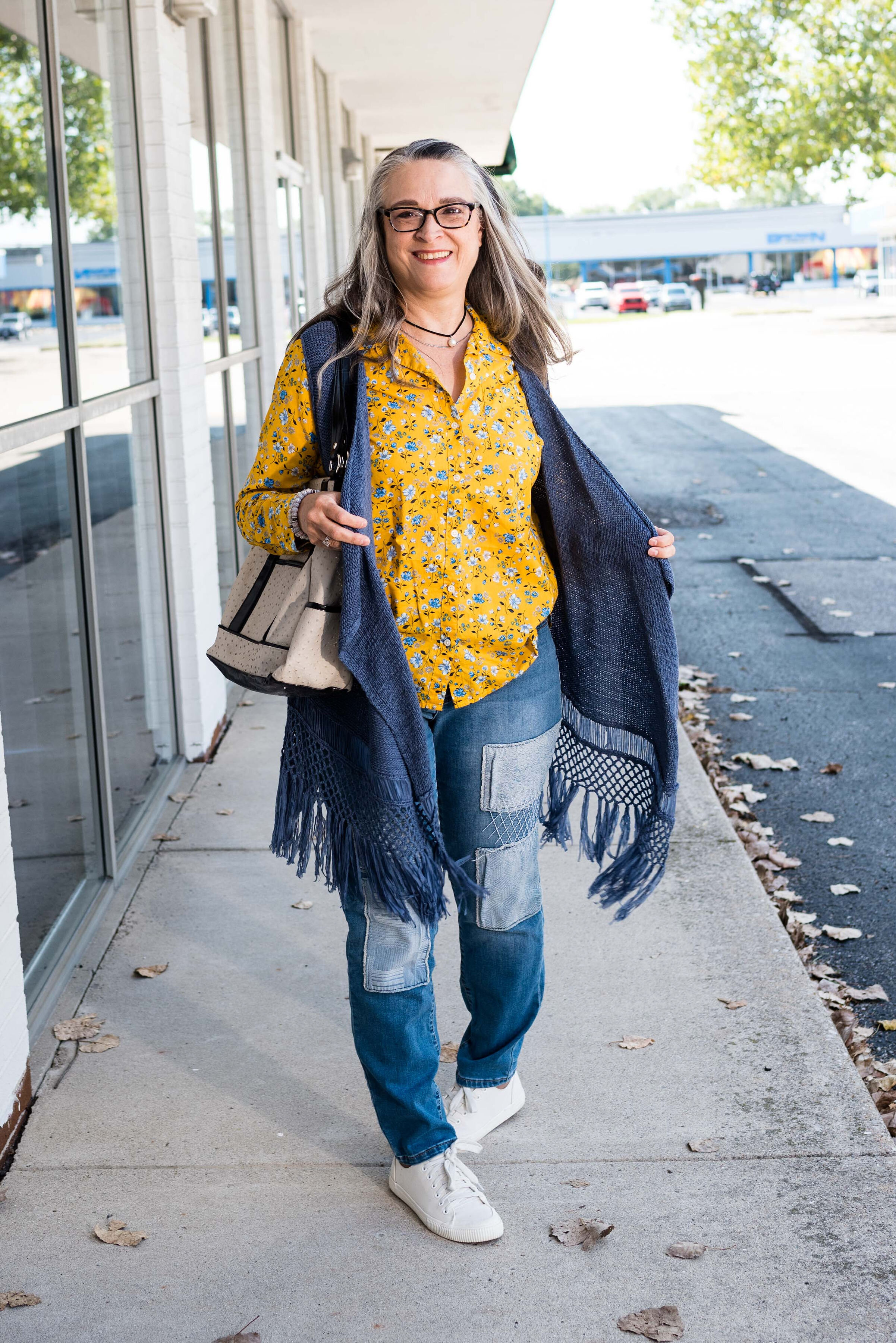
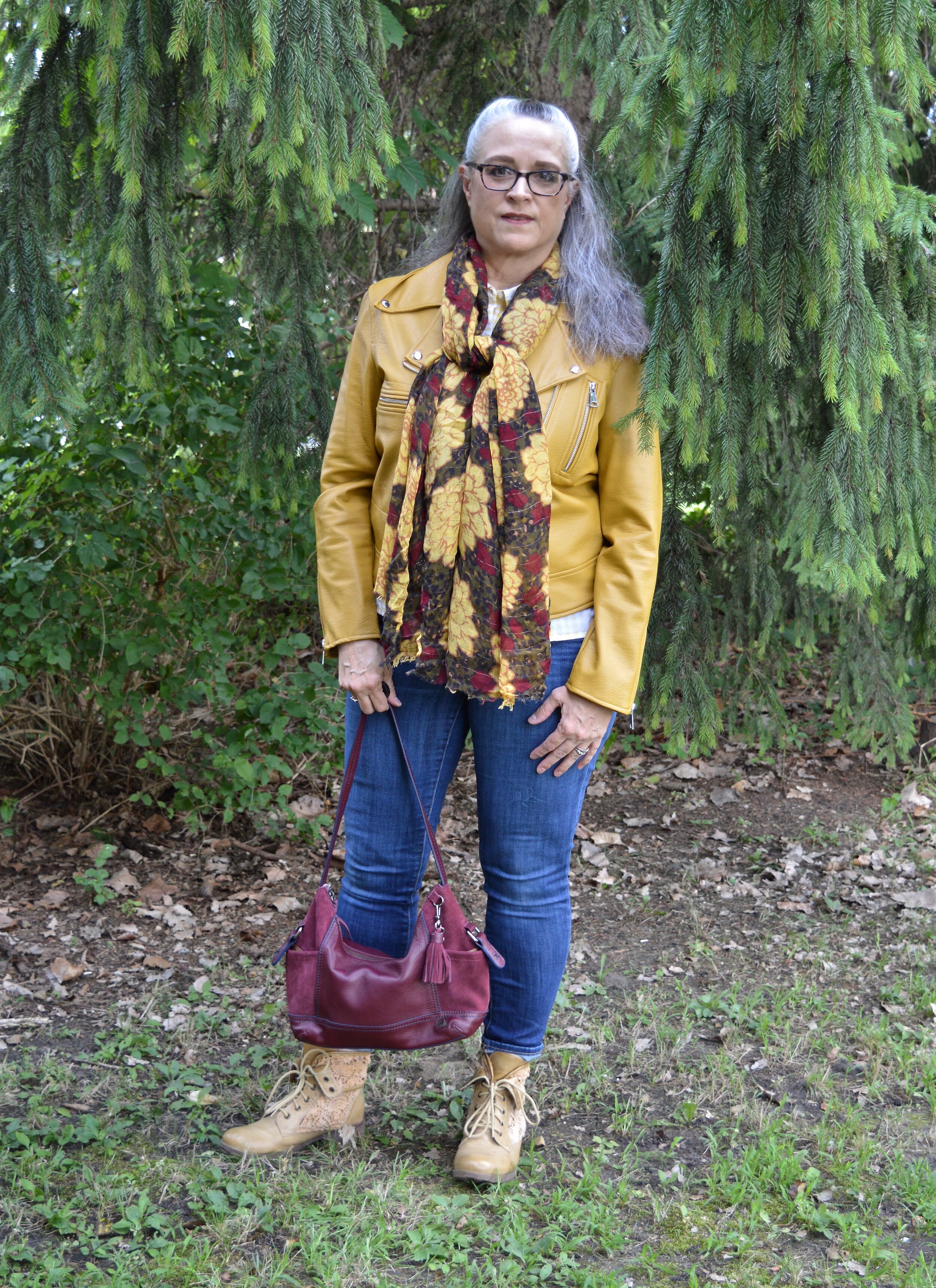
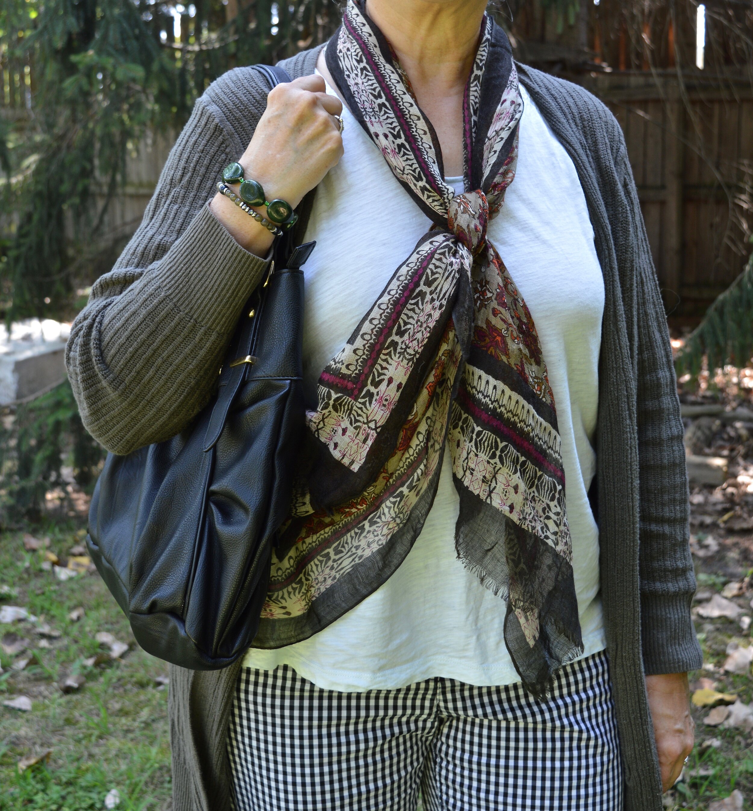
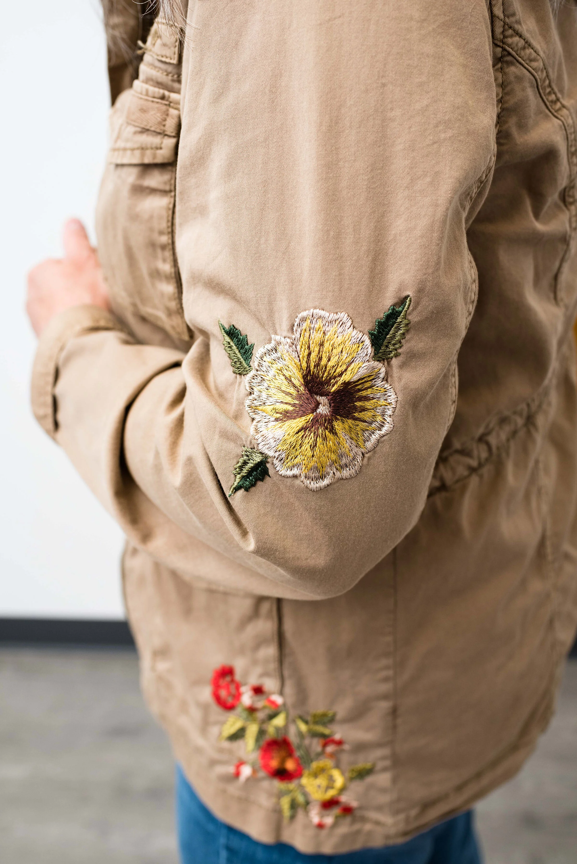
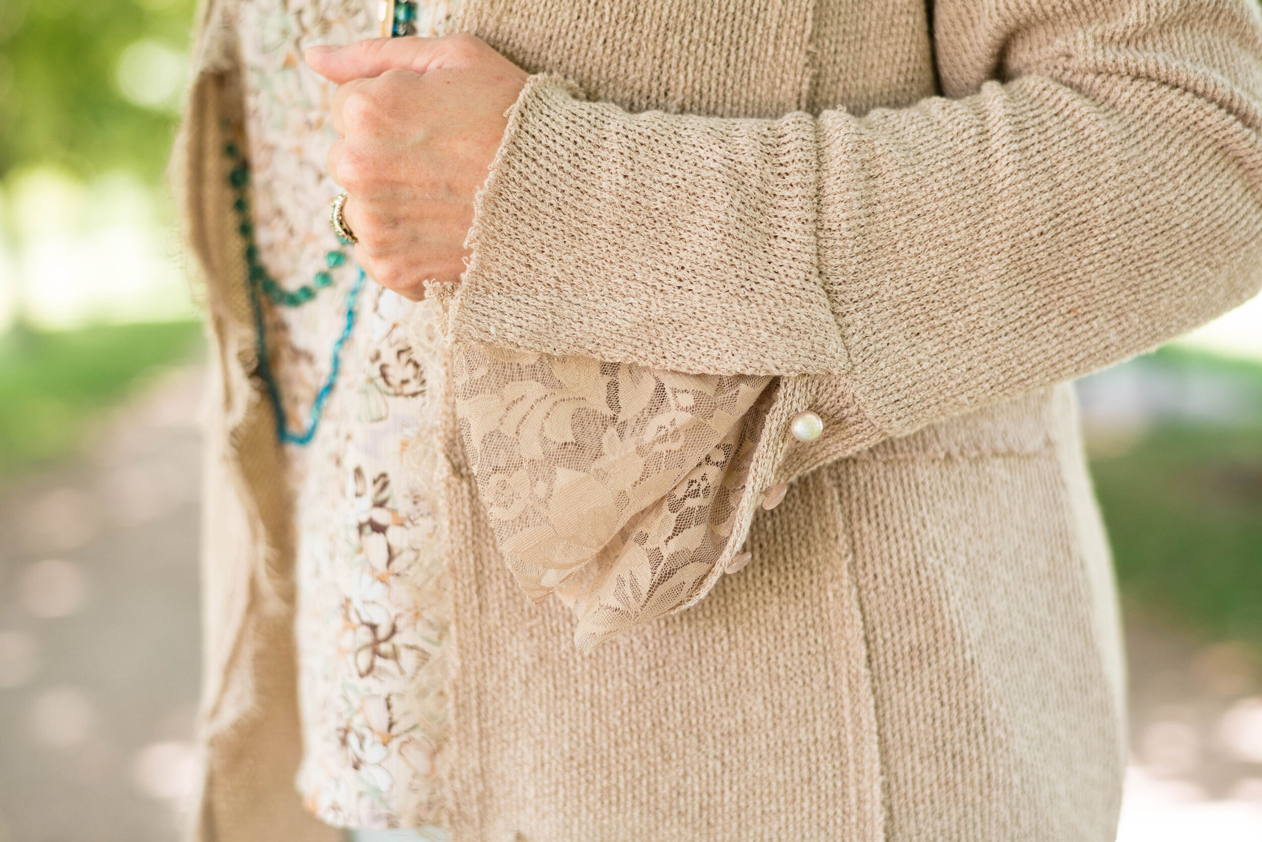
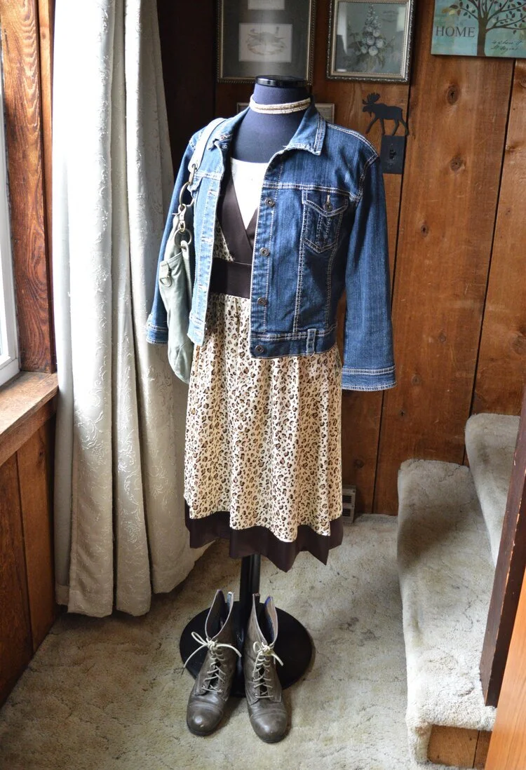
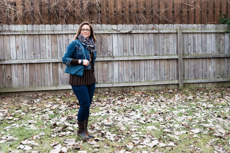
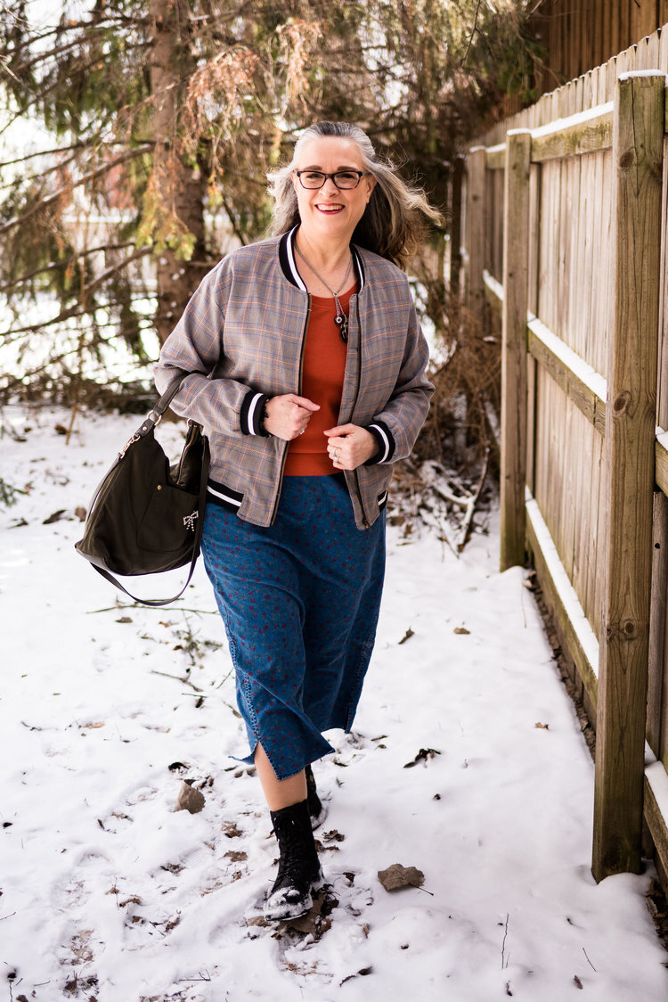
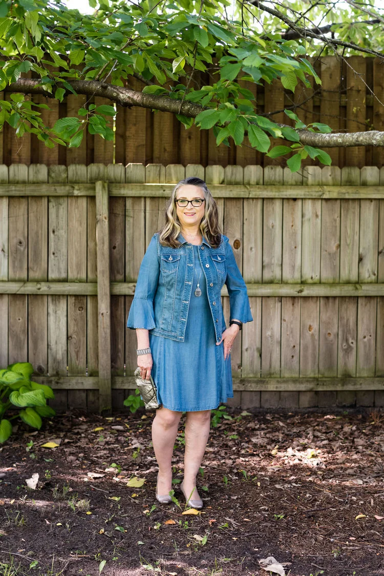
I found this fun, velvet piece thrifting and knew the moment I tried it on it was coming home with me. It is soft, warm and stretchy. I love the 70’s pattern and the empire waist with the slightly flared skirt. If I had the legs for it this would be a fun piece to wear with patent leather go-go boots. Ha, ha. However, I bought it with the idea that it would be fun to use as a tunic over pants, especially jeans.

I don’t know about you, but even though skinny jeans are not supposed to be in any more, I just love wearing them with boots in the winter. It is so much easier to get a pair of skinnies into the shaft of a boot, rather than a straight leg pair.

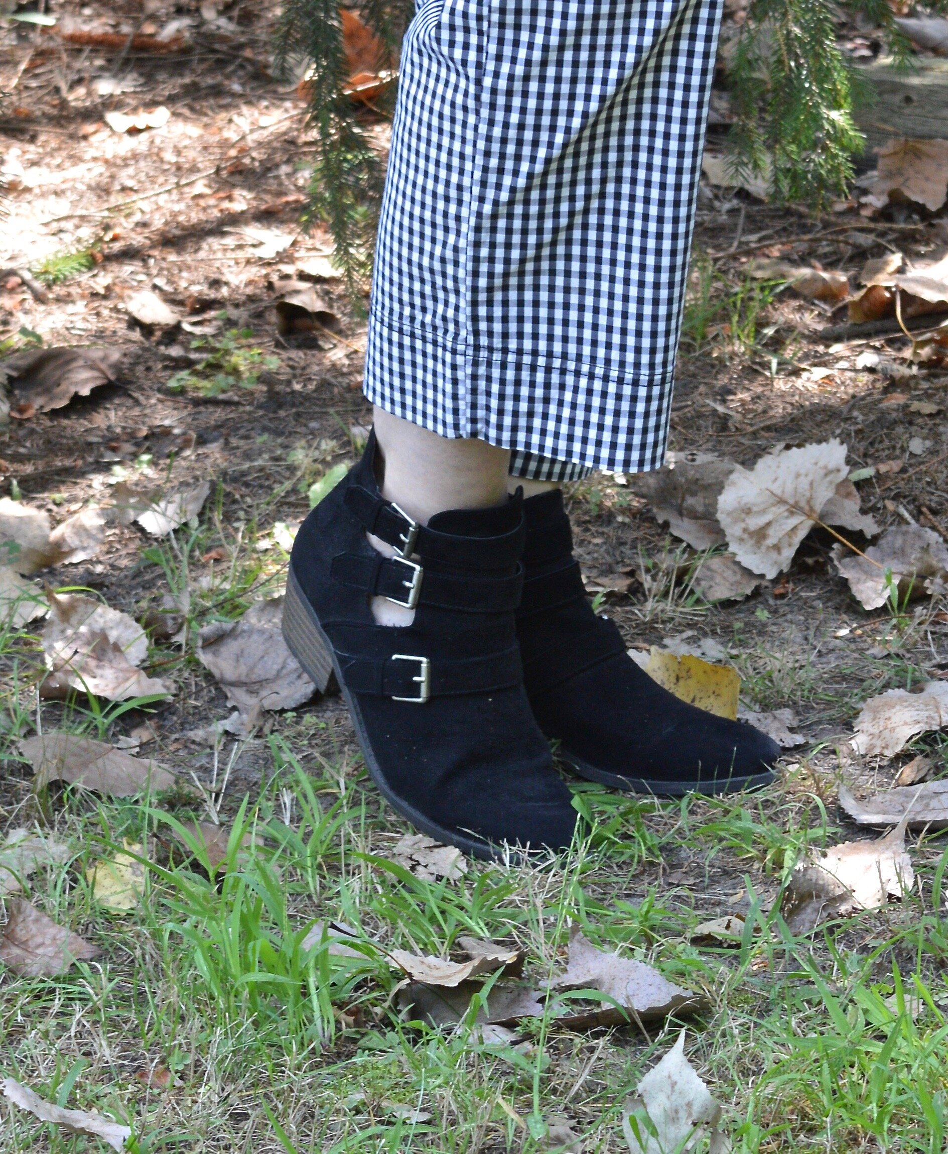
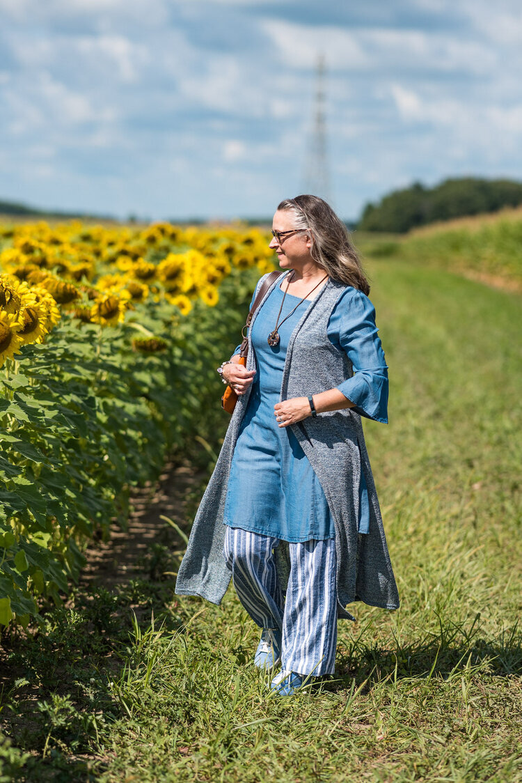
This dress could go over a variety of solid colored pants as well as a few smaller prints like gingham or pinstripes. You certainly wouldn’t have to choose skinny leg pants either. The length and silhouette of this tunic dress would work just as well with a pair of straight, or boot cut jeans.

Style Tip:

Wear a taller heel with straight leg or boot cut jeans for a more upscale look.

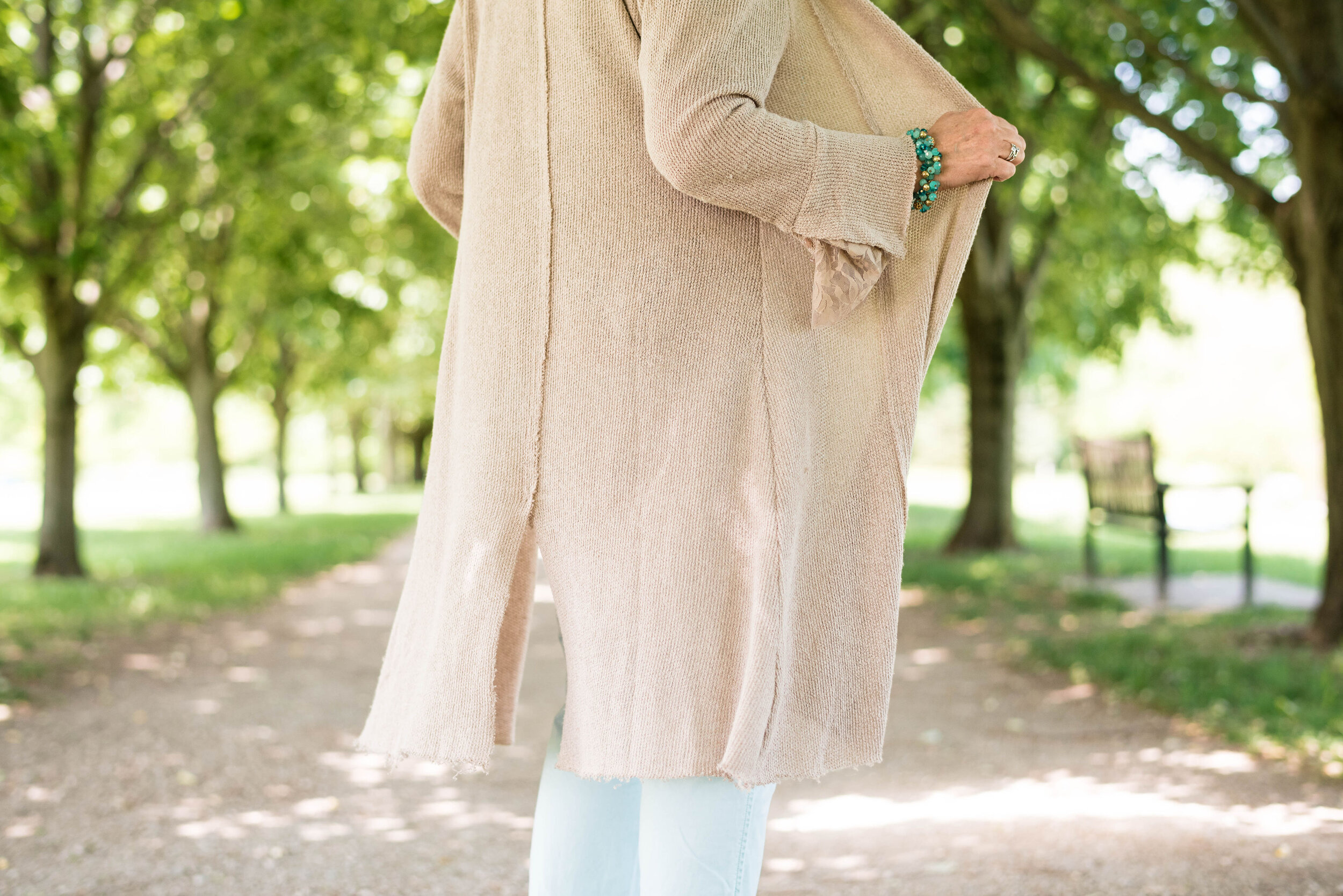
To give the outfit a little more interest, I added a long sweater vest the same length as the dress. I then chose gray suede boots, a long pendant necklace and a red bag to pull in the other colors in the the dress.

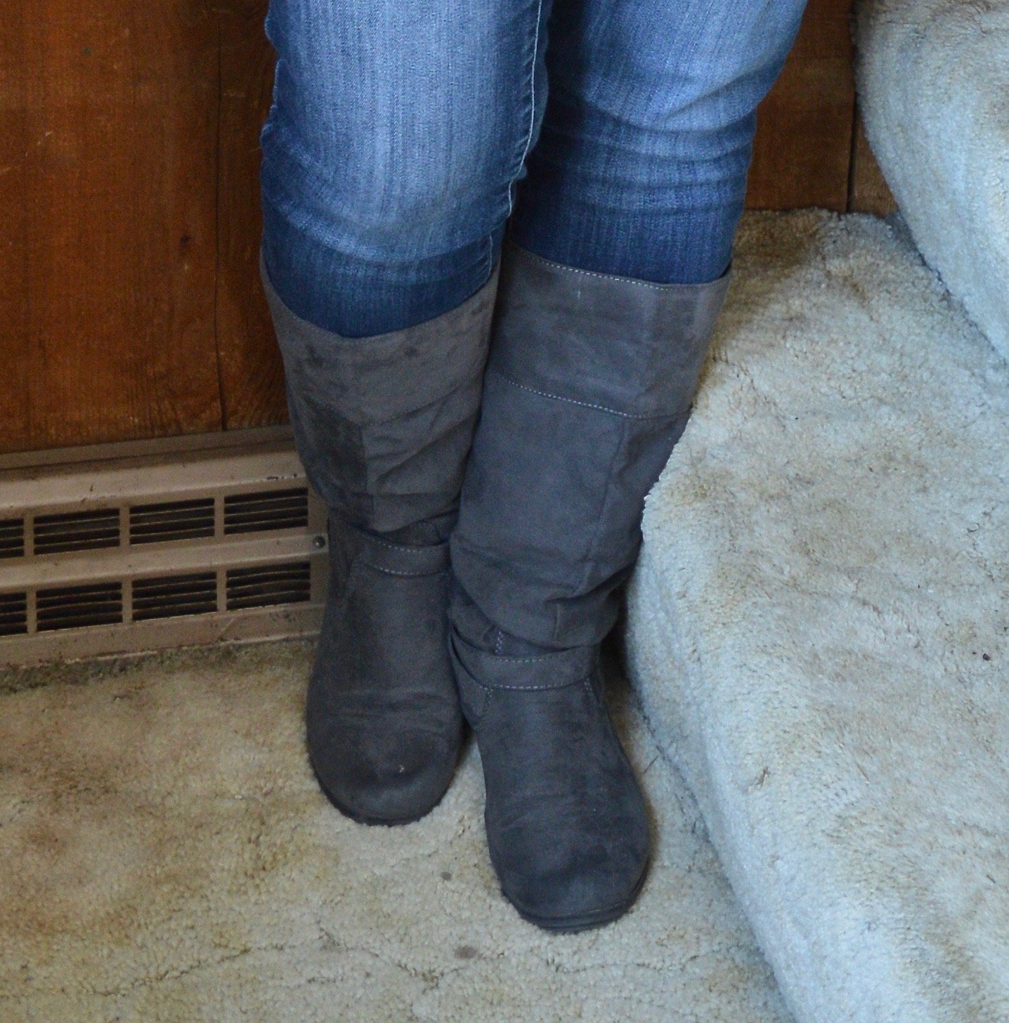
These boots were another thrift find. I usually don’t have as much success with shoes, but these were a great find. While not real suede, I have found that the faux suede boots last pretty well, as compared to the faux leather ones. They just don’t seem to show the wear as quickly.

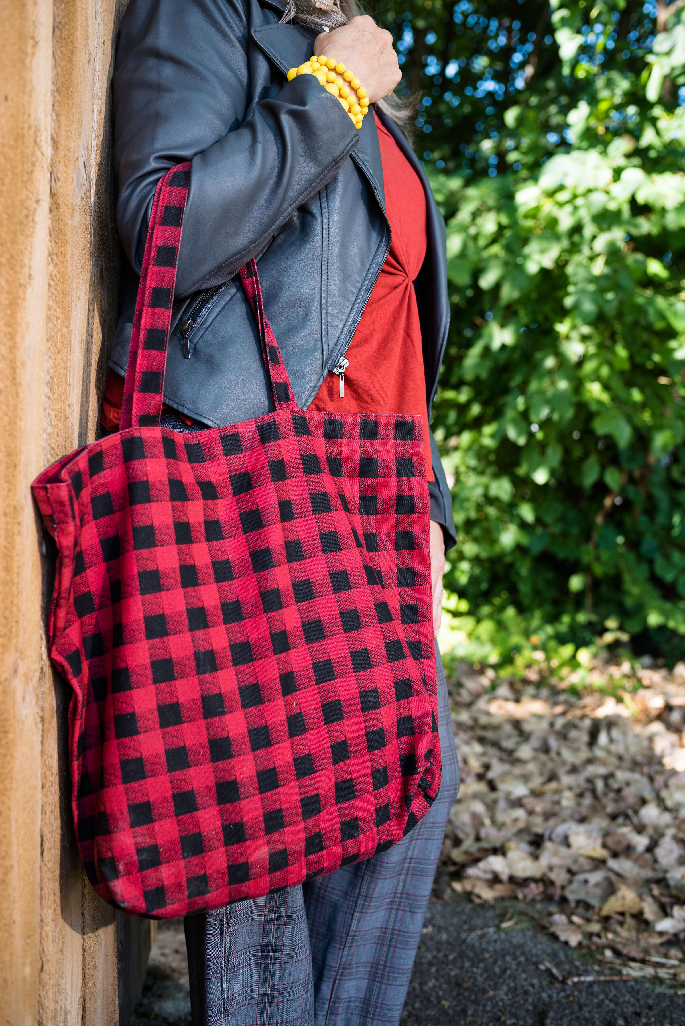
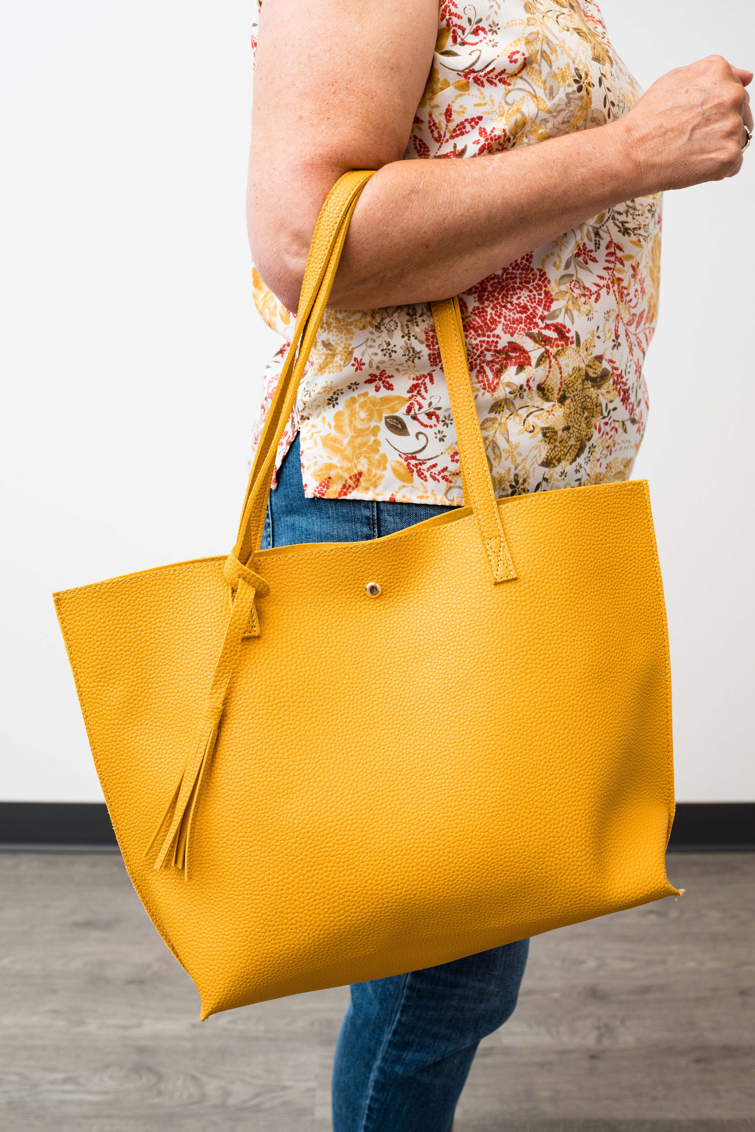
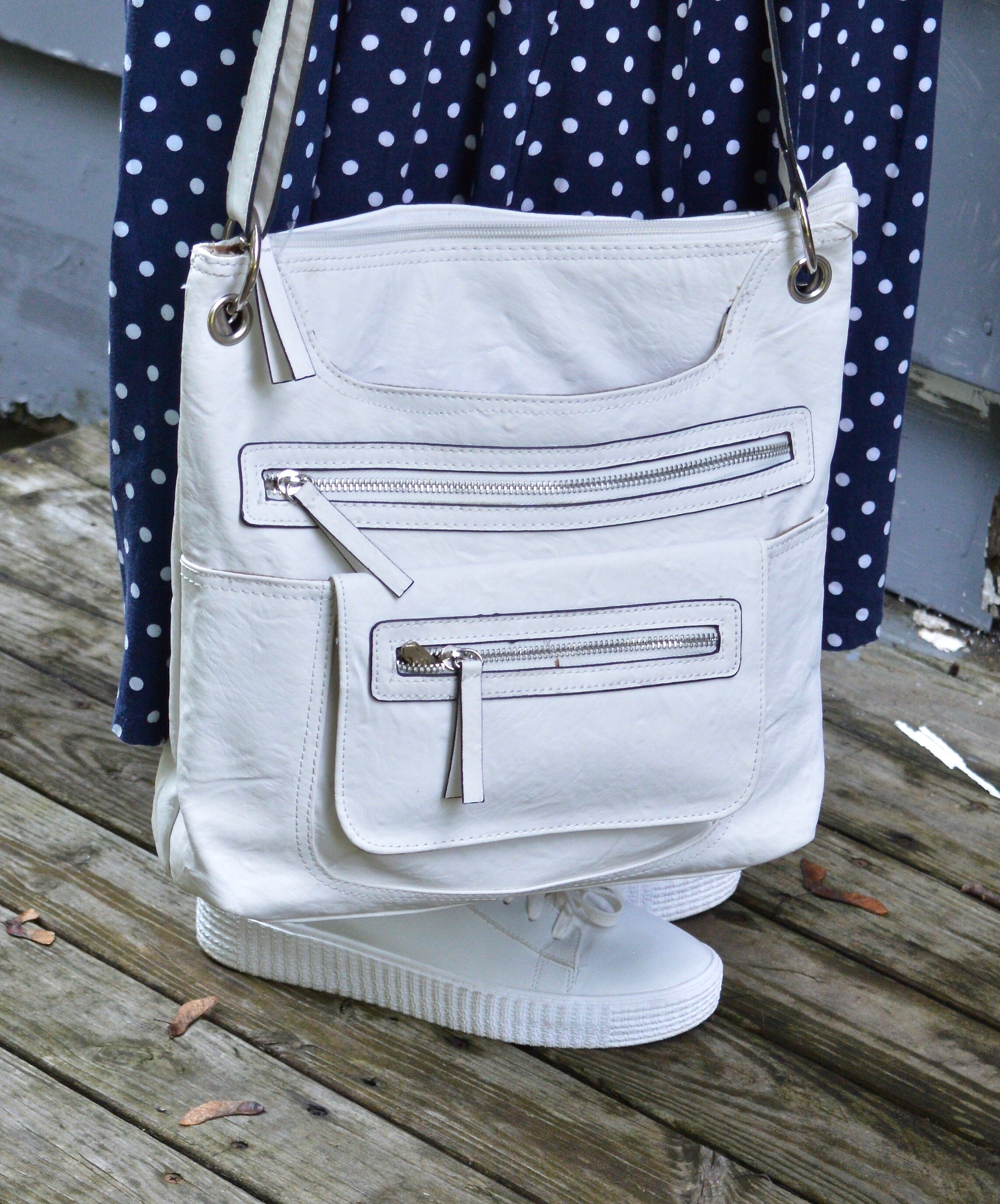
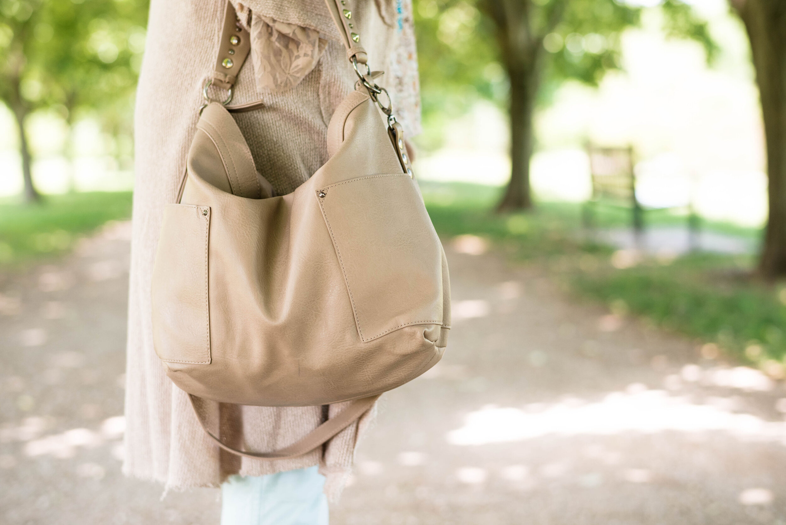
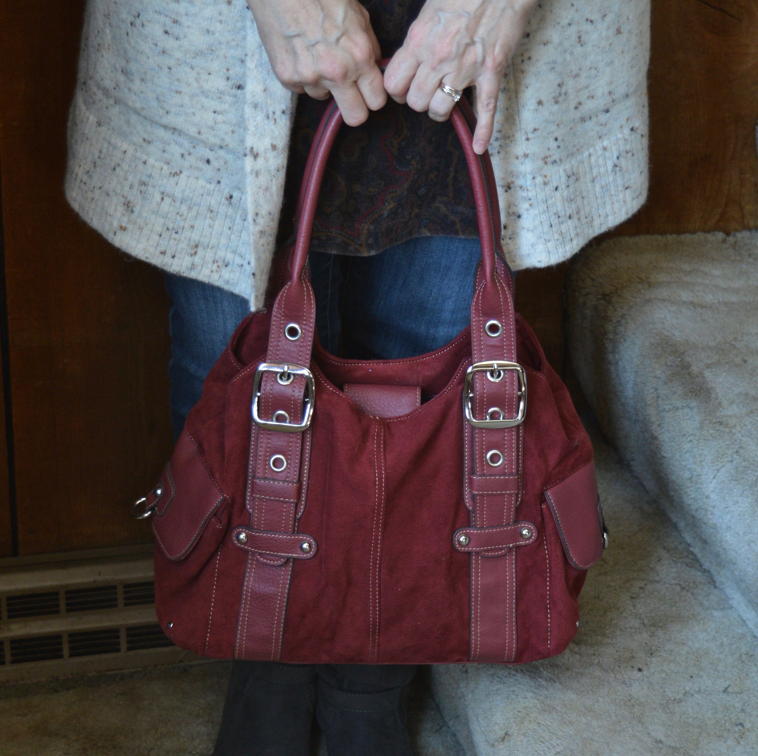
My red bag is also thrifted. I don’t typically carry a satchel like this as I like to use a cross body bag to keep my hands free. But I like to keep a few different options around the house for the blog and so that I have choices. I think I might have a few too many choices. Ha, ha.

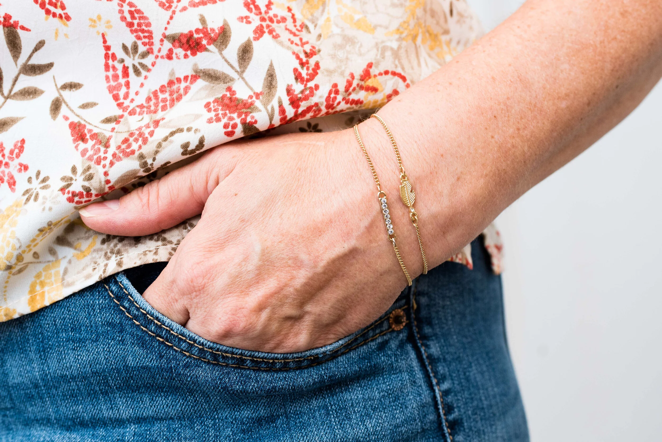
This long pendant necklace was another thrift fine. I find so many amazing jewelry pieces at thrift stores, so if you are a thrifter, be sure to check out the jewelry racks and counter.

It is easy to put together this kind of outfit and when it is cold during these long winter months, wearing a dress with pants isn’t so far outside the box. I hope you enjoyed this post.

I am including a few shopping links for you to look over. These are affiliate links which means I get a few pennies every time you click on a link. I get a few more if you purchase something through one of the links. I appreciate all your clicks and views. Leave me some love in the comments and let me know what you think about this Spring 2022 trend of wearing pants with a dress.

Have a great evening.

Updating Your Wardrobe

The thought that we have to buy new things to update our wardrobes is a misconception. There is nothing wrong with buying a few new things, or purchasing an item in a current color or trend to give our closets a bit of a refresh. However, I believe it is possible to take those older pieces in our closets that we might see as outdated and no longer wearable and turn them into something modern and up to date.

I had a friend contact me over the weekend who told me she was going through her closet getting rid of things that were either worn, no longer fit or that she thought were outdated. She had several pieces she didn’t want to let go of. Before she threw them in the box to donate she sent me a message along with a few pictures. She had a few pieces that were quality brands such as Evan Picone and Pendleton and wondered if there was any way to still make use of them.

Absolutely! (Peggy gave me permission to use the pictures she sent.)

Outdated Suits

While women still do wear suits, especially at a corporate level, there is less of a need when you hit retirement. True, vintage is becoming a big deal among thrifty fashionistas, as seen on blogs or Instagram, but not everyone is a fashion blogger. Most women just want to look nice and not like they just walked off the set of an old time movie (whether it be 1880’s or 1980’s). Most of us want to look like we care and that we put thought and effort into our outfits.

One of the things I love about fashion in today’s world is that anything goes. With so much emphasis on inclusion and being who you want to be and wearing what you want to wear, no matter your age, you can wear whatever you please, just please wear something as opposed to nothing! Ha, ha.

Here are some of the tips I gave Peggy for bringing those pieces up to date.

1 - Wear the blazers with other pieces. Jeans, dress pants, denim skirts, faux leather pencil skirts, or even a tiered maxi skirt can take both blazers from oh so 80’s up to 2022. The gray blazer would look stunning with a burgundy pencil skirt and heels, or try wearing it over a black velvet dress. The plaid blazer would look awesome with jeans and ankle boots, or with a pair of cream colored corduroys. I love things to match, but not too much.

2 - Use the skirts as springboards for updated winter outfits by adding chunky sweaters, and tall knee boots. Another option is to top the skirts with slim fitting cardigans and tees. A white tee, with some chunky jewelry and a navy blazer would make a whole new look for that gray skirt. Top the plaid skirt with a black tee, cream jean jacket and white sneakers for a great work wear option. You’ll be warm, comfortable and stylish.

Outdated Dresses

I had to wonder if a dress could really be outdated, but alas some of the add ons, embellishments and collars do make a dress look less than modern. Again, let me reiterate, big collars, shoulder pads and anything retro or vintage is all the rage for many younger people today. The trick is figuring out how we, as older women, can make it work.

This dress of Peggy’s is a beautiful color, so I can understand why she would not want to part with it. Part of the dated look of it has to do with the overlay piece at the top. If you are a skilled seamstress you could remove the overlay completely if the under part is made of the same material. A seamstress could also figure out how to attach the piece at the bottom and sides so that it looks like the dress was made that way.

If you are not skilled in the area of sewing, then there are other ways to make this pretty dress still wearable. Perhaps the easiest thing to do is add a jean jacket and a pair of trainers or low platform tennis shoes. You could also add a fringy earthy colored jacket and a pair of cowboy boots. This way the pretty embellishment is still visible.

On another occasion you might want to cover the embellishment, so throw on a sweatshirt or sweater. A printed pullover or graphic sweatshirt would cover the less modern top, but still give a shout out to the beautiful color of the skirt.

While hem lines do change according to the fashion world, I don’t really listen. I don’t wear mini skirts. They are just not my jam. I like skirts that hit at the knee or below, either in a tea length (also known as a midi) or a maxi which hits at the ankle. I say this, only to reassure you to not worry about the length of your skirt if you have older pieces.

Coats

I don’t think coats can ever be outdated. Sure the coats from the 1980’s and early 90’s had bigger shoulder pads, but shoulder pads are back. The other thing that I have noticed is the call for our clothing to be in pristine condition just isn’t a thing any more. We wear jeans with holes in them, why worry if our coat or shoes are showing a little wear. Again, this is your wardrobe, you make the decisions.

I think this coat of Peggy’s is perfectly lovely and I adore the creamy, winter white color. If you feel like a coat is no longer serviceable as a nice dress coat, think about wearing it with jeans to run to the store or sweats if you’re picking up coffee at the drive through. No one is going to notice if your coat is looking a little worn, especially if the rest of you is polished and put together.

I wanted to show you my own example with a blazer that I found thrifting a number of years ago. This Pendleton blazer is probably from the 1990’s or early 2000’s which isn’t that long ago. It seemed like the type of jacket that would have gone with a pencil skirt in the same color, probably sold as a suit. I have had it for a long time and don’t wear it very often, not because I don’t like it, but because being at home I typically reach for my flannel and my sweaters more often than a blazer. What I am showing you in this picture is how I took a professional looking piece and turned it into a casual date night look.

Sorry my pictures are so grainy.

The gist of this post is that your clothes can be more than what they were made for. Pieces have so much more versatility if you are just willing and able to think outside the box.

I hope you enjoyed this post. Next Tuesday I want to show you another older piece and how I made it work for me in a fun, updated way. Be sure to check out my Faith Page on Thursday for a new post. I hope you are having a great week.

Pantone - Autumn/Winter - 2021 - London Palette: Green Bee, Downtown Brown, and Olive Branch

Hi everyone! November is zooming along and I am still trying to get back into some sort of rhythm, not only here on the blog, but in life. Anyone who suffers from a long term illness can relate to what I am talking about. Not being able to sleep for such a long period of time and still dealing with unresolved symptoms make it hard to get back to what I would say is a normal routine. However, I know there are people who are struggling with much worse situations and I am thankful that I am able to do as much as I can. In fact, this past weekend, we were able to travel to celebrate my mother-in-law’s 80th birthday with her, so that was good.

Unfortunately, there has also been other difficult things along the way. My son-in-law lost his grandfather this past week and I know that has been a great loss for the whole family. He was a dear man, a wonderful painter and loved his family, so he will be missed. As many of you can relate, it seems as we get older, we see loss happening around us at a more frequent pace. This too is part of life, and for me knowing God is holding me and my loved ones during these times, makes it a little less painful.

Now on to another outfit. As I said last week, while I am wildly behind, I decided to go ahead and show you these Pantone London Palette outfits as possible sources of inspiration for Thanksgiving Day wear. Many of you will be celebrating with friends or family and it is a good reason, to get out of those sweat pants and dress up a little bit, if just for your own mental well being.

You can’t go wrong with a pair of trousers, a pretty top and a fun scarf and bag. Obviously, you can pick your colors, but I chose to combine these earthy tones for a look that is a mix of military meets, moto chic.

My Downtown Brown moto jacket is a thrifted piece that I have styled on the blog before. It is a brand called Celebrity Works. I do like this medium milk chocolate brown. Browns can be tricky to wear, especially when they contain a little too much gray or a little more red, or well, you get the idea. A true brown is hard to find, but I think this brown hits the mark, so thank you Pantone for that one.

You’ve seen my Olive Branch pants numerous times on the blog as well. As I look at them in these pictures, I am thinking I might need to find a replacement pair. These are starting to look worn and really don’t look very flattering. Of course that may have had something to do with my chubby thighs. Ha, ha. These were Gloria Vanderbilt brand and I probably got them at Kohl’s.

For the Green Bee color I chose a thrifted Studio Works popover top that I did the front tuck on, which gave it the blouson effect. I also added the Green Bee paisley print scarf. The thought to add the Dana Buchman floral bag was a last minute addition, but I like how it pulled everything together. A fun floral bag is a great addition to your wardrobe, especially when it can serve multiple season duty. This one works just as well in spring, summer and fall.

I chose my trusty Olive Branch SO ankle boots for my shoes. My ankle boots definitely get used in these cooler fall temps.

What do you think of these colors? Would you wear an outfit like this to your Thanksgiving celebration? I’d love to hear your thoughts, so leave me some love in the comments below.

I am including a few shopping links. These are affiliate links and are brought to you at no extra cost. If you click on a link, I get a few cents. If you purchase something through one of my links I get a few more pennies. I appreciate every penny! All opinions are my own. Please note, I am not familiar with all of the retailers I list in my links, so be sure to read and understand their return policies in case something doesn’t fit or isn’t to your liking.

I hope you enjoyed today’s post. Until next time, have a great day.

Photo credit Jessica Trumbull with Rebecca Trumbull.

Pantone - Autumn/Winter - 2021 - New York Palette: Pale Rosette, Root Beer and Olive Branch

I want to start off with an apology for my lack of consistency with the blog lately. It has been a rough couple of months and I just haven’t had the motivation to post as regularly. It seems every time I want to make more of an effort at getting more disciplined or being more consistent, I get blindsided by something. At the beginning of the summer it was a broken wrist. Mid summer, I came down with this stuff, that still has me coughing. I just have no idea if I will ever be back to “normal”, whatever that was.

There have been some good bits along the way as well. Early summer we were able to take my in-laws on a nice trip up through the Upper Peninsula, down through Michigan and back to our place where they enjoyed visiting family for a few days. I also got to see my mom, two different weeks and spend time with her. That also afforded me the opportunity to see my best girlfriend, and do some thrifting. On September 19th, our second grandson arrived. He is a doll and I am enjoying opportunities here and there to see him, even if I do have to wear a mask. He’s been born into a world of half blue faces, but that is okay, if we can give him a healthier start. He, my daughter and son-in-law are doing well.

Today’s outfit revolve around three colors on the Pantone New York Palette that I thought combined well into a work wear ready fall outfit.

PaleRosette.jpg

I am still trying to get used to seeing pastels during the fall season. This year, they were quite popular and besides this pale pink, also included a pretty lavender. I guess, we like what we like right, so pastels for me might be more of a spring and summer color scheme, while rusts, browns and burgundies are the colors I reach for in the fall. While we still live in a free country, you are in control of what colors you wear when. Ha, ha.

pantonefallcolortrendspalerosette-8.jpg

The Pale Rosette, 3/4 length tee is a thrifted piece, and a brand called Suzanne Betro. It is actually a longer tunic, but I just tucked it in for this outfit. I love the detailing at the bodice.

pantonefallcolortrendspalerosette-6.jpg

You’ve seen my Olive Branch utility vest on the blog before when I did my series on olive pieces. This vest isn’t quite the right shade. Who would have thought there are so many shades of olive? Another clearance find from Kohl’s, I don’t have a ton of Mudd pieces as it typically has more of a junior’s fit, but the few that I have, I really like.

You’ve also seen these brown trousers when I talked about wide leg pants back in the spring. I am not a big fan. I have enough bulk on my bottom. However, I will hang on to this pair, as I like the color, and occasionally it is nice to have a different option when it comes to pants. These were thrifted and are St. John’s Bay brand.

I added the multi-print scarf to add an extra dimension of color and interest to the outfit. I like how it ties the whole look together.

You can also see the fun necklace I scored while thrifting at the local shop around the corner. I have found some great jewelry there. I goes perfectly with the pants.

pantonefallcolortrendspalerosette-9.jpg

Even though this little thrifted, Rosetti bag screams summer, I thought it was a great way to keep this outfit looking modern and updated, yet still in tune with the fall vibes.

My SO snakeskin print boots were a clearance purchase from Kohl’s last season. I haven’t really had the opportunity to wear them very much, so hopefully this season they will be out and about.

pantonefallcolortrendspalerosette-10.jpg

What do you think of these colors? Do you like them combined? Do you like them each separately?

pantonefallcolortrendspalerosette-1.jpg

I’d love to hear your thought, so leave me some love in the comments.

As I usually do, I am adding a few shopping links in things similar to these colors. These are affiliate links. All opinions are my own.

Thanks for following along on the blog. I hope you are having a great week.

Photo credit Jessica Trumbull with Rebecca Trumbull.


Pantone - Autumn/Winter - 2021 - New York Palette: Fuchsia Fedora, Leprechaun, and Coconut Cream

The colors I am showing you today were ones that surprised me a bit for a fall palette. The bright Fuchsia Fedora is not a color that I have very many pieces in, thus why I used it more as an accessory color. Leprechaun was also a different choice. I was thinking there would be a darker, more forest green color, but this bright, cheeky color is what appeared on the palette. However, that is one of the reasons I like doing this color series. It forces me to think outside the box.

FuschiaFedora.jpg

Even though I wasn’t particularly fond of these colors for fall, I actually liked the way this outfit turned out. Even though the light jacket looks nothing like Coconut Cream, these colors and their combinations are just guidelines for us. Not rules…and just for fun….

I loved The Pirates of the Caribbean movie, and that whole idea of rules versus guidelines was amusing as it kept coming up in the movie and was used according who benefited the most. I guess we could take a lesson from that when we look at our closets. The combinations you put together are for your benefit. You get to decide what you like and what you don’t. You make the choice of what colors or prints to put together, and whether you want to buy into the trends or not. I think we can safely say those fashion “rules”, are really more like “guidelines.” My job as a fashion blogger is to give you ideas of how to make these combinations and hopefully inspire you to think outside your own boxes.

pantonefallcolortrendsfuchsiafedora-10.jpg

My LuLaRoe skirt was the perfect choice to build this outfit around. I actually had the thrifted striped tee already pulled out as a match for Leprechaun, and as I started figuring out which colors and pieces to put together, I remembered this skirt. I always have a little celebration party when pieces come together. When I try things on I do a little dance in front of the mirror and say, “This is it!” Ha, ha. The stripes in the tee are actually navy, but with the two prints taking center stage, you can’t really tell the colors are different.

pantonefallcolortrendsfuchsiafedora-3.jpg

My cream jacket by Sanctuary is a thrifted piece you have seen before on the blog. You can see it with a leopard print skirt and with my bright blue pants. It is actually more of a canvas than a denim, but it works much the same as a denim jacket providing light weight coverage for cooler weather and adding a casual touch to a dressier outfit.

pantonefallcolortrendsfuchsiafedora-5.jpg

You can see my Fuchsia Fedora necklace and bracelets. I think I have jewelry in just about every color under the sun, but you know, a girl can never have too many fun accessories! Is that a rule, or a guideline? Ha, ha.

pantonefallcolortrendsfuchsiafedora-8.jpg

My bestie, Stacey, gave me this beautiful, leather the Sak bag last time she came to visit. I thought the berry color went perfectly with the darker berry color in the flowers on the skirt.

pantonefallcolortrendsfuchsiafedora-9.jpg

These beautiful black suede heels never get to go anywhere, so I do like to bring them out and show them off on the blog. These are Aerosoles and I bought them a few years ago at a Clarks shoe outlet. I like that they are comfortable, have a reasonable heel, stay perfectly in place and look classy.

pantonefallcolortrendsfuchsiafedora-2.jpg

What do you think of these colors? Do you like them for fall? Now that I am thinking about it, I might need to revisit the idea of fuchsia as a fall color. I could see it with other fall colors like golden yellow, burgundy and rusty orange. Hmmm. I may have to get a little further outside of my color box.

Let me know what you think. I’m including a few shopping links for things of similar color. These are affiliate links and are brought to you at no extra cost. If you click on a link, I get a few pennies. If you purchase something through my site, I get a few more. I appreciate every click.

Have a great day!

Photo credit Jessica Trumbull with Rebecca Trumbull.

Pantone - Autumn/Winter - 2021 - New York Palette: Mykonos Blue, Spring Lake and Coconut Cream

It seems that every Pantone color palette that comes through the Institute has at least one, if not two blues on it. Blue is a color that everyone can wear, whether you wear dark classic navy, casual comfortable chambray or tropical hues that take you to the beaches of the Caribbean. I have a lot of blue in my closet, but then, I have a lot of every color in my closet. Ha, ha. Blue is great for pairing with many other colors. I pair denim with every color and denim definitely falls in the range of blues. Today’s blues are wearable and most likely already in your wardrobe.

SpringLake.jpg

My colors did not really line up with these blues. Oh well, that is part of the challenge of doing this series. I don’t always get the match spot on, but that is okay. The point is to take things you already have and do something similar. It doesn’t matter if your blues are a perfect match or not. All of these pieces were things I already had.

When I picked out these pieces I really thought the pants and the vest would have matched better to Spring Lake, but now looking at the picture the pants seem to match better with the Mykonos Blue. The vest, which does seem to lean a little bit toward a gray undertone, was too dark to match the Spring Lake color. However, the patches on the pants seem to lean a little more in that direction.

pantonefallcolortrendsspringlake-2.jpg
pantonefallcolortrendsspringlake-20.jpg

The vest is a thrifted Relativity piece. I have styled this on the blog before. You can see it worn with a graphic tee. The jeans which I have styled on the blog before are thrifted and a brand called Est. 1946 Denim. You can see how I wore them with a graphic tee and cozy sweater here. Looking at the above picture, I should have rolled up the cuffs on the jeans.

When you have an asymmetrical vest with fringe, you just have to twirl!

My yellow mini floral print button down is a thrifted Old Navy piece. I decided to leave it completely untucked to add to the ultra casual vibe of this outfit.

pantonefallcolortrendsspringlake-5.jpg

I was trying to go for the Coconut Cream idea in my accessories, but again, things didn’t match up exactly. My bag was a hand-me-over from my daughter. This Miche brand bag actually has interchangeable outer shells, so for this look I used the cream colored one.

pantonefallcolortrendsspringlake-14.jpg
pantonefallcolortrendsspringlake-16.jpg

My sneakers are thrifted Mossimo.

pantonefallcolortrendsspringlake-17.jpg

What do you think of these colors? Do you like to wear blue? What color blue is your favorite?

pantonefallcolortrendsspringlake-8.jpg

Thanks for following along with the blog. I appreciate all of your clicks, likes and comments.

I am including a few shopping links for you to look over. These are affiliate links. All opinions are my own.

Have a great day.

Photo credit Jessica Trumbull with Rebecca Trumbull.

Pantone - Autumn/Winter - 2021 - New York Palette: Illuminating, Fire Whirl and Ultimate Gray

Over the weekend, I became grandmother again. My oldest daughter had a little boy and we are very excited to meet him, as soon as we can. Obviously, with all the restrictions for visitors in the hospital, we were not able to meet him before he came home.

I am going to being this Autumn/Winter series, as I usually do with the New York Palette. It wasn’t until recently that the Pantone entity added the London Palette to its long list of color tools. Today’s outfit revolves around the two Colors of the Year, the sunny yellow, Illuminating and the classic gray, Ultimate Gray.

FireWhirl.jpg

In all honesty I was having a hard time putting the outfits together for this series. I think most of it had to do with being plagued by this stupid sinus stuff and cough for so long. I am finally sleeping in my bed again, but I still have a wheezy, chronic cough. We’ll see how long it takes to get some sort of resolution, or maybe it has moved in permanently, but it is a pain. It is hard to have long conversations and I cannot sing at all, not that I really could before I got this cough, but it was better than now. Oh well, life is just that way sometimes.

The other problem I think I was having, was the weather. It was so hot, I was having a hard time really getting into styling fall outfits. I love fall, and am excited about that change, but it has just been slow to actually feel like the season to wear layers. Here in my area, by Wednesday, the highs are only going to be in the 50’s. That definitely feels like fall.

pantonefallcolortrendsfirewhirl-3.jpg

You can see that I only used Illuminating in very small doses with my yellow beaded necklace and bracelets. The Fire Whirl red tank top is a thrifted Loft piece. It is actually more of an a-line or swing silhouette, so I gathered the shirt underneath in the front, then secured the little “pony tail” with a hair band. The result is to give the top a more fitted look with a fun swirl at the front.

pantonefallcolortrendsfirewhirl-12.jpg

For this outfit, it worked out that Ultimate Gray takes center stage with just a few pops of Fire Whirl and Illuminating. My thrifted, plaid, Sag Harbor trousers are actually petites, so I expect they would be closer to an ankle pant than a crop pant, but I like the way it looks, especially with my darker gray Impo booties.

pantonefallcolortrendsfirewhirl-11.jpg

The next picture shows you a closer look a the Illuminating jewelry and the detailing on the yoke of the top. The gray moto jacket is a no name brand and I am not sure where I got it. I wanted to say it was thrifted, but for some reason, I think I bought it at a store. I really cannot remember. Is that bad? Ha, ha.

pantonefallcolortrendsfirewhirl-8.jpg

My tote bag was going to be a gift for one of my daughter’s one Christmas a few years ago and I ended up keeping it. Many times, I just end up buying too many items, so I have to return stuff, but this was a cheap purchase, I believe from Kohl’s and I really liked it.

pantonefallcolortrendsfirewhirl-9.jpg

Fire Whirl is more the color of my top, but I kind of liked the contrasting shades of red, as well as the two differing plaid patterns. It just gives the outfit a fun vibe.

pantonefallcolortrendsfirewhirl-1.jpg

What do you think of these colors? Would you pair these colors with one another? Do you have these colors in your closet? Let me know your thoughts in the comments below.

I am including a few shopping links for you to look over. These are affiliate links, brought to you at no extra cost. If you click on a link, I get a few cents, if you purchase something through my site, I get a little more. Thank you for all of your support.

Photo credit Jessica Trumbull, with Rebecca Trumbull.

Thinking About Fall - Transitional Style - Button Down Short Sleeve Top

I hope those of you who have subscribed to my blog are content with what I have been posting lately. I have fallen into a rhythm of only posting twice a week, but for now that is the best I can do. Real life is never as pretty as it looks on a blog post or Instagram. Real life is messy and often requires more of our energy and time than we have to give. That being said, I want you to know, I am trying to bring you content that goes along with the seasons and what is going on in the fashion world, as well as to encourage you in your faith. I will probably spend a few more weeks on these transitional looks and then I hope to start that infamous Pantone series. Ha, ha. Stay tuned.

DSC_0028.jpg

Last week, I took myself on a little shopping trip. I went to two stores, Kohl’s and JC Penney. These have long been my go to’s when I am looking for new items. In my town, these two stores are only a few blocks apart, making it even easier to justify stopping at both. As you know by now, I shop the clearance racks and I really found some great pieces, including this yellow and white gingham, St. John’s Bay button down. I actually purchased these in two different prints, the other being a blue, yellow and white mini floral.

The thing I like about these is the light weight cotton material, which is perfect for these hot summer days, and the high-low square hem. You can see that better in the picture below. This makes it easy to wear the top out, like I did in this outfit, or you could tuck it in for a more polished look.

DSC_0033.jpg

To keep my look light and cool, I accessorized with light, neutral colors and added a bracelet as my only piece of jewelry. My bag is from a few summers ago and is Sonoma brand. A woven bag is always a great summer piece. My off white sneakers were thrifted and they are Mossimo brand.

DSC_0034.jpg
DSC_0032.jpg
DSC_0035.jpg

To make the outfit ready for cool weather, I made a few simple adjustments. I added a fun yellow moto jacket that I ordered from Kohl’s last year that was on clearance. This is Elizabeth and James brand. I fell in love with the color and it is a heavy, sturdy piece that can be worn as a jacket, not just a show piece.

DSC_0041.jpg

I love this scarf and I think the colors are perfect for fall. The yellow mums, the burgundy splashes and there is also a little bit of an olive leopard print throughout. I should have straightened it out a bit more, since the ends look a but rumpled. My hair looks crazy too, so no worries. Ha, ha.

DSC_0044.jpg

I swapped out my woven bag for a cute burgundy leather and suede shoulder bag my bestie gave me that she found thrifting. I also added my thrifted Rock & Candy by Zigi ankle boots. These are such a fun boot with the lace overlay. One of the reasons I love to thrift is finding fun, unique pieces like these boots.

DSC_0046.jpg
DSC_0043.jpg

Here are the outfits side by side. What do you think? Did I make a good transition to fall? What would you have done differently? I love to hear your thoughts.

I’m including a few shopping links for you to look over. Moto jackets are a great way to take your clothes from one season to the next. They provide an added layer of warmth in the cooler weather and a lighter layer as the temperatures start to warm up in the spring.

These are affiliate links. When you click on a link I get a few cents. All opinions are my own. I appreciate all your support and all your clicks.

Have a great week.

Thinking About Fall - Transitional Style - Lightweight Crop Pants

I’m going to give you a couple more weeks of Transitional Style and then hopefully I’ll be ready to start the Pantone Series. We decided to forgo pictures this week since the weather was too hot for this post menopausal woman and her very pregnant photographer. Ha ha. Hopefully, next week will be a tad bit more humane for all involved.

Today we are going to look at how to take a pair of lightweight cropped pants from summer into fall. Once again, these changes are so easy and everyone can do them. It is only a matter of swapping out a few things or adding another layer. Other than those little changes the outfit overall stays exactly the same.

DSC_0005.jpg

I found these black and white, gingham cropped pants thrifting. I wanted something a little different than my usual rolled up jeans and I think these work very well. Today was my first attempt at wearing them and I was pleased with this cool, casual look. These are Jones New York Sport brand.

DSC_0004.jpg

My simple light green tank top is a thrifted Loft piece. I decided to wear a few more of my sleeveless pieces this week, since it is going to be so hot all week long. I liked the mix of the pastel green with the black and white print of the pants.

I finished off the look with a long light green pendant necklace, a few beaded stretch bracelets, my green bag from Charming Charlie and my thrifted, black Bare Traps sandals.

DSC_0012.jpg
DSC_0009.jpg
DSC_0008.jpg

In order to make this outfit fall worthy, I added my longer olive Sonoma cardigan. I have had this piece for a number of years now and it it definitely one of those work horses in my cold weather wardrobe.

DSC_0016.jpg

Instead of the necklace I swapped it out for a scarf that is totally speaking the fall vibes. Scarves are great things to find at thrift stores. I also swapped out the lighter beaded bracelets for a couple of darker pieces.

DSC_0022.jpg

It was a no brainer to add my black Natural Reflections ankle boots and a thrifted black Scarleton bag.

DSC_0019.jpg
DSC_0021.jpg

Here are the two outfits side by side. Do you have a pair of light weight pants that you are unsure how to transition to fall? I hope this post helps. Let me know what your thought are, or how you might do something similar to this.

I’m including a few shopping links for you to look over. Every click on a link gives me a few pennies, at no cost to you. These are affiliate links and I appreciate every click.

Have a great Tuesday!

Thinking About Fall - Transitional Style - Tank Top

Before I get into the Pantone color series for Autumn/Winter 2021, I wanted to look at a few options for taking your summer pieces into fall. It seems like common sense to add layers as the weather begins to cool, at least for those of us in the northern part of the country. Even in warmer states, and countries, there are always those rainy days, or cooler evenings where having a layer or two makes a person more comfortable. The question I have to ask myself is why bother transitioning? Why not just change out our summer wardrobes for those fall pieces in deep burgundies and rusty oranges?

I think there are several reasons we need to transition from summer into fall. First of all, even those of us who love fall and enjoy the cooler weather, hate to see summer come to an end. The end of summer means shorter days, and the loss of the freedom and fun we associate with summer. Being able to run around without heavy coats, mittens and scarves is something most of us love being able to do. Summer also means vacations and beach days for many. It is hard to say goodbye to these wonderfully long, lazy days.

Another reason is that transitioning our wardrobes to fall slowly, allows us to extend the life of those summer pieces we love. The tank tops, shorts, light weight dresses and kimonos are still usable as the weather cools if we remember how much fun layering can be. I have already seen many bloggers and Instagram gals showing off these types of outfits.

Today’s focus is on tank tops. This could be a simple ribbed tank, or something like this thrifted Christopher & Banks shell, that is more structured and workwear appropriate. Since I am not working, I am showing you a casual look that can easily be taken from summer into fall with three simple changes.

summerfalltransitionoutfit-7.jpg

My daughter hired an assistant and has started training her behind the camera. They asked if we could do pictures in the studio, to give her some practice, not only with outfit photos, but with indoor shots. I love outdoor photos because there are so many possibilities, but there is something to be said for studio photos, especially when the weather is hot, humid and buggy! We just used the wall as a backdrop, but it you follow Rebecca Trumbull Photography, you know she has all sorts of backdrop colors for headshots and puppy pictures.

This outfit is easy, peasy. A pair of thrifted Merona boyfriend ankle jeans, a tank top, shoes, bag and a little jewelry. Except for the bag and jewelry, everything in this outfit is thrifted.

summerfalltransitionoutfit-2.jpg

I chose this tank top for a few reasons. The first is, I have been trying to use pieces that I haven’t used in a while in my closet. I actually started keeping track of what I have worn. For my hanging pieces, I turn the hangers backwards after I wash and hang them back up. For my tees, I have started turning the ones I used neck line out, rather than fold out. It might seem silly, but it does help to see what I have been wearing and encourages me to choose other pieces.

For this easy summer look, I kept my jewelry light and simple.

summerfalltransitionoutfit-9.jpg
summerfalltransitionoutfit-12.jpg

I wanted to chose a bag that could make the transition to fall, so this bright yellow tote was perfect.

summerfalltransitionoutfit-10.jpg

My sneakers are thrifted Converse. I washed them in the washer, but they need a little TLC to make them look pristine, which I haven’t done yet.

summerfalltransitionoutfit-11.jpg

In order to make an outfit like this ready for the cooler weather and changes that fall bring with it, you only need to do three simple things.

1 - Swap out light, breezy jewelry for jewelry that is bold and chunky.

summerfalltransitionoutfit-26.jpg
summerfalltransitionoutfit-24.jpg

2 - Add a jacket, sweater or other topper.

Utility jackets are often my fall and spring go to’s for light layers. This Sonoma piece with its beautiful embroidered embellishments goes perfectly with the leafy print of the tank. Being that it is tan, rather than a darker olive or brown, also gives me that slow transition into the darker, richer colors of fall.

summerfalltransitionoutfit-21.jpg
summerfalltransitionoutfit-28.jpg

3 - Swap out sneakers for ankle boots.

These are my Sonoma suede heeled booties. They are a regular part of my fall, winter and spring wardrobe.

summerfalltransitionoutfit-23.jpg

Let’s take a look at the outfits side by side.

You can see that in the summer look I rolled the pants up and in the fall look I left them full length. I love ankle pants for this transition time, because they allow me to show off the ankle boots, and they are still not as warm as full length pants.

The other detail I changed was doing the front tuck on the top, to show off the belt and give the outfit a less casual vibe.

summerfalltransitionoutfit-27.jpg

How would you transition a tank top into fall? Do you have tank tops that you love to wear all year round? What do you think of this outfits?

summerfalltransitionoutfit-17.jpg

I’ve included a few shopping links for you to look over. These are affiliate links and are brought to you at no extra cost. If you click on a shopping link, I get a few cents. I appreciate all your clicks and all your comments.

Have a great Wednesday!

Photo credit Rebecca Trumbull.

Oh, Olive! Utility Jacket - Workwear Look

Depending on where you work, you might be able to be in your sweats or pj’s. So many people have been working at home through the Covid pandemic, that people have gotten rid of many of their business style pieces since they really have no need for them. However, many places have opened back up and have called people back into the office. When I was working as an assistant manager at a university bookstore, I could wear my jeans to work, and very often did, but I could also wear skirts or dresses if I chose to do that. Usually, when we talk about workwear style, we are talking about a business or business casual type of outfit consisting of blouses, nice pants, blazers and other similar pieces. We do have a more casual type of style that has moved into the work place in many business realms, allowing their employees to have more flexibility and comfort. I would say today’s look tends towards business casual due to the utility jacket and the tennis shoes, and I would have been perfectly comfortable wearing this to my previous job.

DSC_0030.jpg

As I told you in Tuesday’s post, I am featuring the olive utility jacket as my olive piece. This is St. John’s Bay brand from JCPenney. This jacket is roomy, so I can wear multiple layers underneath if I want to use it in the cooler weather. Right now, it is a great piece for overly air conditioned restaurants, retail spaces and business offices. This piece also has adjustable tabs at the sides to make it more fitted, as well as a double front closure which includes a full zipper and buttons.

DSC_0026.jpg

Fall Trend Alert - Lavender

Certain colors are always trending for each of the major seasons and fall is no exception. Surprisingly, rather than the typical fall hues of orange, brown or yellow, we are seeing pastels like lavender and blush. I’ll cover blush next week, but for today lavender is my color of choice. My thrifted eyelet top is Old Navy brand. I love this light weight piece.

You’ve seen my polka dot skirt on the blog before. Amazingly with my weight gain and redistribution (aka spare tires), I can still get it on. Ha ha. This older thrifted piece is a brand called Outback Red. It is a great piece for any warmer weather season, spring, summer or fall. Not a full length maxi skirt, it is more of a tea length. Another plus, it has pockets.

DSC_0027.jpg

I kept my accessories pretty low key, except my layered necklace is fairly blingy. I added a few bracelets, my white cross body bag again and my Steve Madden sneakers that I got recently at DSW.

DSC_0035.jpg
DSC_0032.jpg
DSC_0031.jpg

Do you like this outfit? What would you wear to the office? Let me know what you think.

DSC_0028.jpg

I hope you enjoyed this look. I’m including a few shopping links. These are affiliate links. All opinions are my own.

Have a great rest of your week!

Oh, Olive! Utility Jacket - Casual

I am back from visiting my mom and ready to get back to posting here on the blog. I wasn’t feeling well, the first couple of days after I got home, but I think most of it was fatigue and allergies. They seem to be beating on everyone this year. While I was at my mom’s I didn’t have internet, but I was able to get some photos taken and was pretty pleased with the result. I hope you will be as well.

I am continuing my look at a few of my different olive pieces and how they can be used with just about any outfit and any color. I do like to think outside the box, at least my box, so I hope you will find some of these outfits inspirational for your own wardrobes. The week before last I showed you a casual and a workwear look using an olive pair of pants. Today and Thursday, I want to take a look at ways to style an olive utility jacket. You can see how I styled this same jacket on the blog before with a striped tee and distressed jeans, another striped tee, and a polka dot chambray top.

Another thing, I decided to add to this little series, is to give you a few peaks at what is trending for fall. I’ll point it out as we go along. Let’s take a look at the olive utility jacket.

DSC_0011.jpg

I have had this olive utility piece for a number of years now. St. John’s Bay brand, I got it at JCPenney. Since then I have accumulated a few other utility jackets in other colors. I like that they are so versatile. In fact, I may have to do a post on that at a future date. Most of my pieces, including this one are lighter weight, so a great topper for spring, summer and fall. While they do tend towards more casual, I will show you on Thursday how to make one look appropriate for work.

What makes a piece utility? I think it has to do with the pockets and the details like drawstrings, snaps and metal zippers. Next week I will be showing you an olive utility vest.

Fall Trend Alert - Denim on Denim

Once again, it seems denim with denim is trending for fall. While I wouldn’t wear this regularly, it does have a casual appeal. Monochrome is always a good way to get a longer, sleeker line. Most of what I saw on the runway were pieces of the same wash. See this post on Fall 2021 trends from Marie Claire. However, there is a sense of personal creativity in putting together pieces with different washes, as I did in this outfit.

DSC_0010.jpg

My chambray top is a thrift find from earlier in the summer. It is a brand called Cremieux. Apparently, Daniel Cremieux started a men’s clothing line in Saint Tropez, on the French Riviera in the mid 70’s. It looks like he designed women’s clothing for a time as well. Both lines were sold at Dillards, but the women’s line is no longer available in the US. The fun things you find when you thrift.

You’ve seen my thrifted, distressed Simply Vera, Vera Wang jeans plenty of times on the blog. They are getting rattier looking as time goes along, but I guess that is the point. Ha, ha. If the holes get to big for my comfort zone, I may make a few patches, which actually could be fun.

DSC_0013.jpg

I decided to add this floral mini print scarf just for a little extra color. I don’t use my scarves much in the heat of the summer. I sweat just sitting still on these humid days. Last night, I was working on this post and I was dripping with sweat. Of course we hadn’t turned our air conditioners on. Sometimes, we have to choose between a little bit of inconvenience and being able to pay the electric bill. My husband always runs colder, so he’s not as hot unless he is doing yard work or something. Today is supposed to be even warmer. I think the air will be on later, so this woman doesn’t get too cranky. Ha, ha.

If you follow my Instagram account, you may have seen that I rearranged my scarves. Just like with all of my clothes, I have way more than I need, but I am trying to make everything more accessible and visible, so it is easier to sort through and find. Do you have a special way of arranging your scarves?

DSC_0014 (1).jpg

My blue Converse are making another appearance. While I still think this brand of sneaker makes me look even more like I have ski feet, I am trying to embrace those long skinny things on the ends of my legs.

The last accessory I have is my white cross body bag. This was another thrift find. I like that it is a little bit larger than many cross body bags, so I can actually fit everything in it, without having to squeeze it in. I am not sure what the brand is, but it was still very clean and unworn, so I snatched it up.

DSC_0015 (1).jpg

Do you own an olive utility jacket? How do you like to wear it? I love hearing from you, so be sure to leave me some love in the comments. I hope your summer is going swimmingly well!

DSC_0019.jpg

I’m including a few shopping links for denim pieces and utility jackets. I hope you’ll look those over. Every time you click on a link, I get a few cents and I appreciate it. All opinions are my own.

Have a great Tuesday!

Oh, Olive! Casual Look

It is old news that olive is the new neutral, but that doesn’t mean everyone knows how to wear it. Olive is not everyone’s perfect color, although, you know me. I think everyone can wear every color, if you find the right shade. Olive is not olive, is not olive. In other words, there are varying shades of olive, just as there are varying shades of red, yellow and every other color. Olives can vary from yellowy browns to almost gray. My husband has numerous types of camo for various types of hunting, but almost all of them have olive in common. However, they are not the exact same shade of green. Knowing this, I decided that a few posts on how to wear olive, might be a good idea for this middle of the summer time. Do you feel like summer is zipping by faster than the Eurostar train running from Britain to France? Before you know it, it will be time for the Autumn/Winter Pantone series.

DSC_0014.jpg

If you follow my Instagram account, you know that I styled this look over there, minus the vest on Monday. We started a style challenge this week called #stretchyourstyle . Using things we already have in our closet we come up with outfits to go along with the daily or weekly theme. We are doing colors this time and yesterday’s was olive and orange. That was all I needed to inspire me for what I wanted to do next on the blog.

DSC_0009.jpg

You’ve seen these Gloria Vanderbilt skinny pants on the blog before. They were a Kohl’s purchase from a few years ago. These are a work horse in my closet and the fact that they are olive was the frosting on the cupcake of fashion. They have a good amount of stretch, but don’t loose their shape. They are casual, but can also be dressed up, which I will show you on Thursday and they make a great neutral color. You can see them styled with a floral bomber jacket, a lightweight graphic sweater, an olive vest and top, a snakeskin jacket, a floral dress, and peachy print top. If you click on the links they will take you to the original posts.

Let’s talk for a minute about what makes a color neutral. The best way to describe it is a color that can go with all other colors. Colors like black, navy, tan, and white have long been considered neutrals. More recently olive has become a favorite neutral, able to be combined, not only with the other neutral colors, but with colors that vary from light to bright and everything in between. I honestly cannot think of a color that I would not pair well with olive.

DSC_0018.jpg

My thrifted pineapple top is Elle brand. To go along with that I put on a gold belt and did the front tuck, so the belt is visible. I also added a simple gold necklace.

The open weave knit vest was a thrift find on our anniversary trip. It is Jordache brand. I just love the pretty detailing on this boho piece.

DSC_0021.jpg

For Mother’s Day my husband gave me a gift card for Nordstrom. I only shop there occasionally, as their prices are a little higher than what I usually feel comfortable spending. However, Nordstrom Rack is a better option as prices are slightly less, and the gift card works for either. I got online and started looking at clearance and sale items, and came across these Sperry olive colored sneakers. I knew they were going in my cart. I have been looking for a pair of olive colored shoes for the warmer weather and these are perfect. They are comfy too, so that is a plus.

DSC_0023.jpg

You’ve seen this pale green tote on the blog before as well. This is from Charming Charlie. I love the metal stud detailing along the sides and the contrasting green hues.

DSC_0015.jpg

Do you have an olive pair of pants? Do you consider olive a neutral? How do you like to wear your olive? I will be showing you a work wear look on Thursday, so be sure to check back for that.

I am including a few shopping links for you to look over. These are affiliate links and are brought to you at no cost. If you click on a link, I get a few cents and those cents do add up after a while, which I really appreciate.

For more outfit fun, be sure to check out my Instagram, where I post almost daily with my typical every day looks.

Have a great day!

Pantone - Spring/Summer - 2021 - London Palette - Beach Glass, Blue Atoll and Macchiato

We’ve reached the end of the Pantone - London Palette series with these last three colors which make me think of tropical seas and sandy beaches. Like Tuesday’s post, where I combined two different greens from the palette, today’s post combines two summery blues for a light, airy, warm weather look.

beachglass.jpg

I started figuring this outfit out with my light blue, thrifted Sonoma crop pants. Though they are a bit lighter than the Beach Glass color, I think they still work. I pull these out every spring and summer as a light weight alternative to denim.

beachglasspantoneoutfitideas-1.jpg

My multi-print top is another thrift store find. I just loved the soft colors and print on this popover blouse. It has no tag in it, so I have no idea what the brand was. The print has the light Beach Glass blue, as well as the darker Macchiato.. You’ll see a close up in the next photo.

For the darker Blue Atoll color I decided to add a few pieces of jewelry. I had some long, opera length beads and decided to do some layering with the necklaces. I also added a beaded bracelet, that appears to better match the Beach Glass color.

beachglasspantoneoutfitideas-7.jpg

For the Macchiato color, I played around with several pieces, but everything seemed too yellow. This longer sweater was a recent purchase from Cracker Barrel. While they are a restaurant, they also have what they call an Old Country Store. The store is filled with all sorts of items from old fashioned candy, beautiful home decor, quilts, jewelry, cards, music and clothing. If you click on the link, it will take you to the sweater and it is on sale. Whoo, hoo. If you like it snatch it up. Here are a few photos to show you the details of this pretty piece and the movement. It is a light weight material, so it will be great for spring, summer and fall.

beachglasspantoneoutfitideas-13.jpg
beachglasspantoneoutfitideas-14.jpg
beachglasspantoneoutfitideas-15.jpg
beachglasspantoneoutfitideas-16.jpg
beachglasspantoneoutfitideas-17.jpg
beachglasspantoneoutfitideas-18.jpg

My bag is Madden brand; a clearance find from Kohl’s. My perforated peep toe shoes are Sonoma brand and another Kohl’s purchase from a few years ago.

beachglasspantoneoutfitideas-9.jpg
beachglasspantoneoutfitideas-11.jpg
beachglasspantoneoutfitideas-12.jpg

What do you think of these three colors? I really like how this outfit turned out and think the color combination is great for summer. Do you have these colors in your closet?

beachglasspantoneoutfitideas-6.jpg

I’m including a few other shopping links for you to look over. The Cracker Barrel sweater link is not part of the affiliate program, but I wanted to offer it to you, in case you really like the sweater. The rest of the shopping links are through the affiliate program. Every time you click on a link I get a few pennies, and I appreciate every click.

Have a great weekend!

Graphic and photo credit Rebecca Trumbull.

Pantone - Spring/Summer - 2021 - London Palette - Pickled Pepper, Orange Ochre and Sphagnum

For today’s outfit I decided to combine the two greens that were on the London Palette. Both Pickled Pepper and Sphagnum are great green shades for summer time. While Pickled Pepper is one of the main palette colors, Sphagnum is one of the palette classic colors. Olive is a great neutral and goes with just about every color out there, so Sphagnum, (which is actually a type of moss), makes for the perfect classic color.

pickledpepper.jpg

My Pickled Pepper popover top is Sonoma from Kohl’s a few years ago. This top is easy to wear, as well as cool for these hot, humid days. I don’t usually prefer to wear sleeves with elastic, but as long as the elastic isn’t cutting off the circulation in my arms I’m okay with it.

pickledpepperpantoneoutfitideas-12.jpg

My Sphagnum utility vest is Mudd brand, and was another clearance purchase from Kohl’s a few seasons ago.

pickledpepperpantoneoutfitideas-4.jpg

These light wash jeans were a recent thrift find. A brand called Ella Moss, this brand is available at stores like Nordstrom, Bloomingdales, Amazon, Dillards, and others. I like the cropped length and the high waist of this pair.

For the Orange Ochre color, I grabbed my thrifted, orange suede bag and a fun pendant choker. It is much easier to include a brighter color, if you do it with accessories.

pickledpepperpantoneoutfitideas-9.jpg
pickledpepperpantoneoutfitideas-7.jpg

I had to show off my new clearance Converse sneakers from DSW. They are very comfy and I love the blue color. They are similar in color to my thrifted Keds, which are showing a bit of wear, so these were a great find.

pickledpepperpantoneoutfitideas-11.jpg

Here are a few silly pictures. I was jumping for joy. Ha, ha.

pickledpepperpantoneoutfitideas-5.jpg
pickledpepperpantoneoutfitideas-6.jpg

What do you think of these colors? Do you like to wear green? Do you have Sphagnum (olive) in your closet? I would love to hear from you. I’m including a few shopping links for you to look over. These are affiliate links. All opinions are my own.

pickledpepperpantoneoutfitideas-3.jpg

Graphic and photo credit Rebecca Trumbull.

Pantone - Spring/Summer - 2021 - London Palette - Purple Rose, Lava Falls and Baby's Breath

Today’s colors are a blend of pastel purple, bold red and creamy off white. I have always loved purple, but it really isn’t a color I regularly wear. I easily got on board with Purple Rose which is a medium purple that goes well with many other colors, especially things like brown, olive and navy. Why, then did I decide to pair it with a fierce red like Lava Falls? Because I always like to show you things outside the box. It is not very often, that I think to put purple and red together.

purplerose.jpg

The factor that clinched the deal on putting these colors together, was that my thrifted Old Navy, Lava Falls, paisley popover top had both of these colors in it. How fortuitous was that? Ha, ha. This is a fun, tunic type shirt that has short sleeves, and the interesting details of a shirt tail hem line and a lace up v-neck. I love the paisley print too, which always reminds me of the 70’s.

The Croft and Barrow cardigan is older and I like I said, doesn’t get a lot of regular wear, but i just love the color so I keep it around.

purplerosepantoneoutfitideas-2.jpg

You’ve seen these creamy, Baby’s Breath, thrifted, St. John’s Bay ankle pants on the blog before. I really think this look would have been cuter with a creamy denim pencil skirt or a pair of Bermuda shorts, but I don’t have either of those. I am not as fond of the silhouette, but it is okay, just not great.

purplerosepantoneoutfitideas-7.jpg

I didn’t need to wear a necklace and this long opera length beaded strand is exactly the same color as the top, but sometimes I like the subtle texture and shine of a piece, even if it is a similar color. Wrapping this long strand of beads around my neck makes it look like I have on a choker.

purplerosepantoneoutfitideas-8.jpg

I added a few beaded bracelets with similar reds, although there is plenty going on in the top, so it wasn’t really needed. Often, less is more.

purplerosepantoneoutfitideas-9.jpg

My thrifted Simply Vera, Vera Wang cross body bag is making another appearance. This is a great little bag for the warmer months. The off white color goes perfectly with the Baby’s Breath color of the pants.

purplerosepantoneoutfitideas-10.jpg

These Steve Madden platform sneakers were a new purchase from DSW. I had a coupon and I had been looking at this type of sneaker since last summer. I finally took the plunge. They are not something I would use for walking, but they are cute for a casual day of picnicking or window shopping.

purplerosepantoneoutfitideas-4.jpg

What do you think of these colors? Do you think you would ever combine red with purple? I’d love to hear your thoughts, so leave me some love.

I am including a few shopping links in these colors, so if you have time, give those a look. I hope you have a wonderful weekend!

Graphic and photo credit, Rebecca Trumbull.

My Favorite Denim Pieces

For the last few week I have been looking back at some older posts, due to scheduling conflicts and my own lack of motivation and energy to bring you a lot of new content. I do apologize for that, but this does offer you a look at different pieces that are worth investing in due to their reusability. Since we as fashion bloggers, thrifters and purchasers of fashion are wanting to be more conscious of how our choices affect the environment we are learning that sustainable fashion is important for the future of our world.

Sustainability at its finest starts even before the actual manufacture of clothing. While more companies are jumping on the sustainability wagon, we must admit there are literally tons of used clothing going into landfills, that could be part of this sustainability loop. Thrift stores are part of this loop and are helping to give new life to second hand pieces. Bloggers, Instagrammers and others are working their accounts to show you new ways to wear the clothes that are already in your closet, or at least encourage you to shop second hand.

This week I decided to focus on the favorite denim pieces in my closet. Denim has always been my go to fabric for every day outfits. Whether you like jeans, denim skirts, or denim jackets, everyone can get onboard with having a few work horse denim pieces in their wardrobe.

Piece 1 - Cropped Denim Jacket

This is one of the first cropped pieces I found that I really liked and still use repetitively. There is something about the silhouette of a cropped denim jacket that to me, makes it a little more versatile. I feel like it dresses up better than a standard jean jacket, but some of that might also be the wash. A darker wash will always look more dressy as opposed to a lighter or more acid washed piece. You can wear a piece like this with a casual dress, a classy maxi dress, leopard print, a longer tunic and jeans, and a pair of utility pants.

Denim+jacket+outfit.jpeg
denim+jacket+outfit (1).jpeg
Piece+perfect+-+cropped+denim+jacket.jpeg
Picture by me.

Picture by me.

Summer+style+-+leopard+print+skirt+-+casual.jpeg
color+crash+course+-+brown+and+navy (1).jpeg
Actual+Amy+-+olive+pants,+graphic+tee+and+cropped+denim+jacket.jpeg

Piece 2 - Denim Skirt

Since jeans are my first choice for most of my causal outfits, I am not going to include them in this post, but I will say, that most of my favorite jeans I have picked up at thrift stores. The ability to try on different styles, silhouettes and brands, many of which I wouldn’t have ever thought to shop, have provided me with several pairs that are on repeat during most of the year. If you are more of a skirt or dress kind of girl, then a denim skirt is a great casual alternative to jeans.

Just so you know, the first skirt is from a few years ago and I got rid of it, because I outgrew it. The last two pieces were just unique, so I picked them up, but my most used piece would be the darker wash pencil skirt in the middle number of photos. If you are looking for a denim skirt, that is the wash and style I would recommend. I recently thrifted a longer light wash one, so we’ll see how that gets styled this summer. Stay tuned.

denim+skirt+outfit.jpeg
denim+skirt+outfit (1).jpeg
Denim+Daze+2.jpeg
Denim+Daze+2 (1).jpeg
Mavis+and+Maureen.jpeg
Photo by me.

Photo by me.

Print+mixing+-+spring+2019 (1).jpeg
Kickin+it+with+kimonos+-+yellow+floral.jpeg

Piece 3 - Denim Vest

Another piece that I really love is a denim vest. So far I only have one and that is my Christopher and Banks piece, but I would like to find a few others including a longer one that ties and a more traditional vest shaped piece. These are things I add to my thrifting list and keep and eye out for. If I never find one, no big deal, but if I do, I’ll grab it.

image-asset (1).jpeg
Pantone+Spring+2017+-+Niagara.jpeg
Holiday+outfit+-+casual+-+skirt.jpeg
Wearing+vests+in+the+summer+-+denim.jpeg
Denim+vest+-+casual.jpeg
Denim+Daze+2.jpeg
Spring+Trends+2020+-+Maxi+Dresses,+Psychedelic+Prints+and+Vests.jpeg

Unique Denim Pieces

Since my love for denim extends to all areas of my wardrobe, I also wanted to include a few unique pieces with their own special embellishments or characteristics.

Embroidery

Any sort of embellishment on denim is fun, but I do love embroidery.

Denim+Daze+2 (1).jpeg
color+play+-+bathroom+tiles.jpeg
Eyelettopspringtrends-2.jpeg

Chambray

While not technically denim, we group this with denim due to its similar washes and uses. Whether it is a button down, a popover or a dress, chambray is a great denim substitute for the warm temperatures of spring and summer.

chambray+shirt.jpeg
denim+with+denim.jpeg
Pantone+Spring_Summer+2020+-+Faded+denim,+Orange+Peel+and+Lark.jpeg
Denim+Daze+2 (2).jpeg
National+Wholesale.jpeg
Chambray+dress+with+pants+and+long+vest.jpeg

I hope you enjoyed this look back at a few of my favorite denim pieces. I am including a few shopping links for you to look over. These are affiliate links. All opinions are my own.

Photo credit where not specified, Rebecca Trumbull.

Why You Should have a Pair of Colored Pants - Bright Blue

I am going to take a temporary hiatus from the Pantone series until my daughter and I can get together for a real photo shoot. I just think the pictures look so much better when she does them. She is the professional after all. In the mean time, I thought I would take the opportunity to talk about a few different clothing pieces that I think are essential to every woman’s wardrobe.

This week I would like to look at colored pants. I know many of us like to wear darker colors on the bottom to draw less attention to that part of our body. We usually have black, navy and perhaps a dark brown. Those who are a bit more bold might venture into the neutral category with tan or beige colored pants. Some will even dare to wear white in the warmer weather. If you are like me, you wear jeans more than anything else, even in the summer time, but I want to encourage you to purchase a pair of pants in a bolder, brighter color.

Today, I want to look back at a few of my outfits from the last few years of blogging. I want to show you why having a pair of bright blue pants is a way to expand your closet and give you additional outfit ideas. I got these pants from shopping a friend’s closet. They are not my favorite pair of pants due to the fit of the waist, so I usually only use them for blog pictures. However, if I ever come across a pair that fits better, I will definitely make the investment, so I can wear them on a more regular basis.

Outfit 1 - Bright blue with light blue.

Chasing+away+the+winter+blues+-+bluer+than+blue.jpeg

If you have been following my blog since the beginning you will probably recognize these outfits. The beauty of a bright blue pair of pants is that they look so classy whether you are dressing them up, like this outfit or dressing them down. I love this combination of bright, bold blue with the lighter pastel blue of the sweater and scarf. The bright blue still makes my lower half look slimmer and doesn’t draw extra attention to that area. See the original post here.

Outfit 2 - Bright blue with a print.

Print+Mixing+-+spring+2019.jpeg

I like having the option of pairing a pretty print top with something other than jeans and these bright blue pants were the perfect compliment to this top and the bomber jacket. Remember, things don’t have to match, though I personally love it when things have some color in common. I think it makes an outfit look more polished and cohesive, but that is just my personal opinion. You can see the original post here.

Outfit 3 - Bright blue with a print kimono.

Pantone+Spring_Summer+-+2019+-+Fiesta+&+Princess+Blue.jpeg

Once again we are pairing the bright blue with a pretty print. An observation I want to make is the color blocking trend. Color block is not one of my favorite ways to style an outfit, but when you do something like this where you take two solid colors and top it with a fun, summer time print, you come up with an outfit that would be perfect for a graduation party, a picnic or a dinner date. Obviously, you could do this with a white, black or navy pair of pants, but doesn’t the bright blue just make this outfit so much more fun? See the original post here.

Outfit 4 - Bright blue with olive.

Pantone+-+Autumn_Winter+-+2019+-+fruit+dove+and+galaxy+blue.jpeg

I am all about olive. I think olive is such a great neutral and it really goes with any other color. I love the cozy vibe of pairing bright blue with the more muted military olive. This is a great combination for fall as the weather is changing, and becoming cooler. The bright blue still gives the outfit a summer feel, but pairing it with olive makes me think of shorter days and crispy leaves. See the original post here.

Outfit 5 - Bright blue with color blocking.

Pantone+Spring_Summer+2020+-+Classic+Blue,+beetroot+purple+and+oyster+mushroom.jpeg

This outfit was an attempt at color blocking. Again, it is not my favorite thing to do, but once again, I think the bright blue pants takes this outfit up a notch. You could definitely do a similar look with navy, black or white, but the bright blue adds a dimension of color and pizzazz to the look that other colors will not. There are occasions that call for black, especially when you want to look more elegant and classic, but for most of us the events we are going to attend are more conducive to a look that is a bit more relaxed and fun. See the original post here.

Outfit 6 - Bright blue with dark blue.

Pantone+Fall_Winter+2020+-+New+York+Palette+-+Classic+Blue,+Ultramarine+Green+and+Blue+Depths.jpeg

The last outfit I want to share pairs my bright blue pants with a navy blazer. I like this combination. Just like the pairing of the bright blue with pastel blue, this look creates a pretty contrast between two completely different blues. This is a great look for the office. The bright blue is not garish or overdone when paired with the navy blazer. The whole look epitomizes polish and professionalism. If I still had an office job, I would definitely wear this look. See the original post here.

Do you have a bright blue pair of pants in your closet? If not, does this post make you think differently about wearing them? I am going to include a few shopping links for bright blue pants, just in case you are now convinced you need a pair. Ha, ha. These are affiliate links. All opinions are my own.

Photo credit Rebecca Trumbull.


Pantone - Spring/Summer - 2021 - New York Palette: French Blue, Cerulean and Buttercream

Today’s three color combo is the last of the Pantone Spring/Summer New York Palette. I am going to take a week off, as I hope to go visit my mom next week. In due time, I will proceed with the London Palette, but I haven’t even begun to pick out outfits. Breaking my wrist has really thrown a wrench into the works, so bear with me. I got my second Covid shot yesterday, so getting up this morning was grueling. I got the shot in my left arm, figuring it already hurts and I wanted my right arm to remain relatively pain free. I say relatively because there is some pain in my wrist and rib cage on that side, from having to do all the work. This is making me see how much I need to get back to exercising, especially weight lifting and walking since I have osteoporosis. We ladies need to take of them bones, and all the other parts as well. Ha, ha.

I thought it would be fun to pair these two blues, for a fun, casual summer look. Adding the off white of buttercream gives the outfit that perfect warm weather vibe. I kept my accessories casual to add to the picnic ready style. This would be a great outfit for a Fourth of July get together, just add some red jewelry or a bag.

frenchblue.jpg

French Blue and Cerulean are two cool colors that make me think of blue skies and water. I found this French blue plaid shirt while thrifting. I really like this medium blue for spring and summer, as opposed to a dark blue like navy. This button down is Faded Glory brand.

frenchbluepantonespringcoloroutfitideas-2.jpg

My Buttercream ankle pants have made an appearance on the blog before. These were thrifted St. John’s Bay. You can see these styled for two other Pantone series. This one is styled with a yellow button down and this with my Chevron print dress.

Cerulean is a different light blue. I like the sky blue feel of this color, yet it leans towards a bit more pastel. My top is a thrifted Ralph Lauren piece. I like that it has a lining that is similar t-shirt type material to the outside. It has a fun faux lace texture to it.

frenchbluepantonespringcoloroutfitideas-13.jpg

I kept my accessories simple. This thrifted French Blue bag was a recent find and I had to grab it since it matched the color perfectly. This is a nice small bag for carrying just the essentials.

frenchbluepantonespringcoloroutfitideas-7.jpg

My pendant necklace had little flecks of all the colors. I have been on the search for more of these large beads with the hole in the middle. It is so easy to make a necklace out of them.

frenchbluepantonespringcoloroutfitideas-5.jpg

Lastly, my thrifted Keds finally fit the Pantone color. Cerulean is the right name for these sneakers that are great for warm weather outfits.

frenchbluepantonespringcoloroutfitideas-8.jpg

What do you think of these colors? Do you have these blues in your closet? What about Buttercream? I’d love to hear your thoughts. I’d also love to hear which of these colors you would put together to make an outfit.

frenchbluepantonespringcoloroutfitideas-10.jpg

I hope you have enjoyed this look at the Pantone Spring/Summer 2021 New York Palette colors.

I am including a few shopping links, so be sure to check those out. These are affiliate links. I get a few pennies when you click on a link, so I appreciate all the clicks.

Photo credit and graphic Rebecca Trumbull.

Pantone - Spring/Summer - 2021 - Raspberry Sorbet, Mint and Willow

Today’s Pantone outfit revolves around a tantalizing pink, a refreshing green and another earthy color reminiscent of the weeping willow trees that hug the banks of lakes and streams. Raspberry Sorbet, Mint and Willow combine in an outfit that is both sleek, colorful and casual.

raspberrysorbet.jpg

When I think of the color mint, I am more inclined to think of the light Green Ash color from Tuesday’s post. I guess my rendering of mint is based more on ice cream and Christmas candies than it is the actual plant. The mint plant is a bright, living green, so I think the Pantone color is much truer to the natural source. My Mint green top is a thrifted Falls Creek piece. I wore it for this shoot and then I got rid of it. It has been hanging in my closet for a while and I wasn’t certain, why I didn’t reach for it more often. After putting it on, I just didn’t like how stiff the fabric was. I’m all for structured pieces, but a piece has to move with me for me to want to wear it.

raspberrysorbetpantonecolorsoutfit-4.jpg

My camouflage pants, also Falls Creek, are a recent clearance find from Meijer. They are light weight, so good for summer. Unlike some camo that is more green, these tend towards more brown and gray. The Willow color is in there as you can see in the following picture. Willow was hard color to find. Most of my pieces are more olive green and Willow has more of a brown undertone.

raspberrysorbetpantonecolorsoutfit-10.jpg

Instead of choosing another clothing piece for the Raspberry Sorbet color, I opted to include it in my accessories. My necklace, bracelets, and the Vera Bradley tote were the perfect pop of this bright, saturated pink.

raspberrysorbetpantonecolorsoutfit-6.jpg
raspberrysorbetpantonecolorsoutfit-8.jpg

I went for my silver SO flats to tie in with the silver chains on the necklaces.

raspberrysorbetpantonecolorsoutfit-9.jpg

What do you think of these Pantone colors? Do you have the color Willow in your closet? I love to hear back from you, so leave a comment or two.

raspberrysorbetpantonecolorsoutfit-3.jpg

I’m including a few shopping links for you to peruse. These links are brought to you at no cost, but using them to purchase something gives me a few pennies as a kick back. I appreciate all your support. These are affiliate links. All opinions are my own.

Photo and graphic credit Rebecca Trumbull.

Have a great weekend everyone!