Pantone Spring/Summer 2022: Glacier Lake, Daffodil and Snow White

Welcome to the New York Palette of the Pantone Spring/Summer 2022 colors. Pantone has changed the way it allows usage of products, so images are no longer free. Now you have to have a subscription to use the color swatches via the internet, so I have had to get creative in putting together my graphics. I am also not using my daughter’s photography services now, as she is very busy with her business and her baby. I am definitely creating new pathways in my brain, but that is good.

If you want to see the actual Pantone colors click on the following link: Spring/Summer 2022 - New York Palette. I try to get my colors as close to the palette colors as possible, but they are not exact. I appreciate the Pantone Institute’s use of color and always enjoy seeing what the colors are for each season.

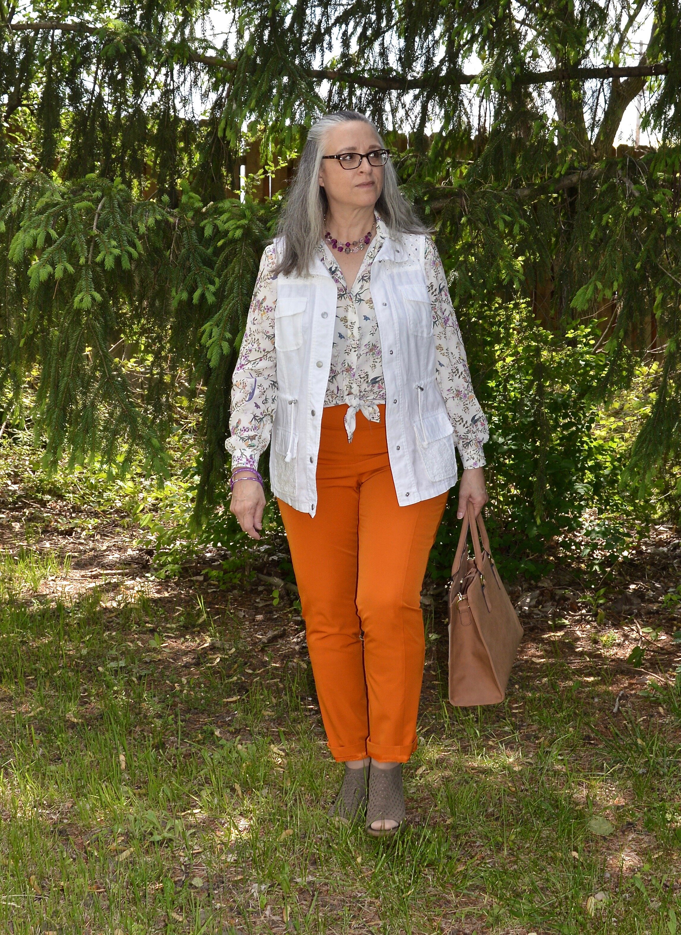
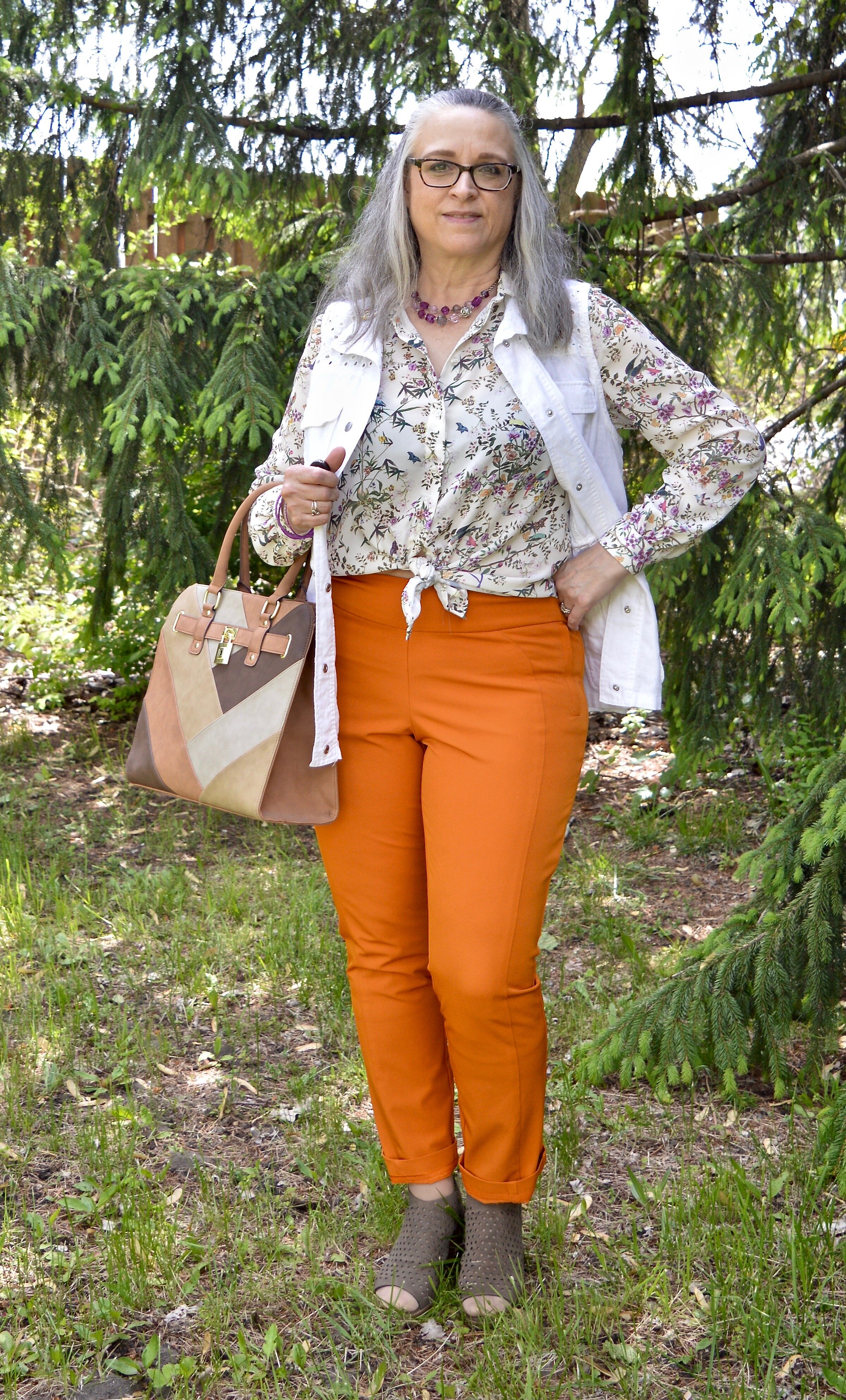
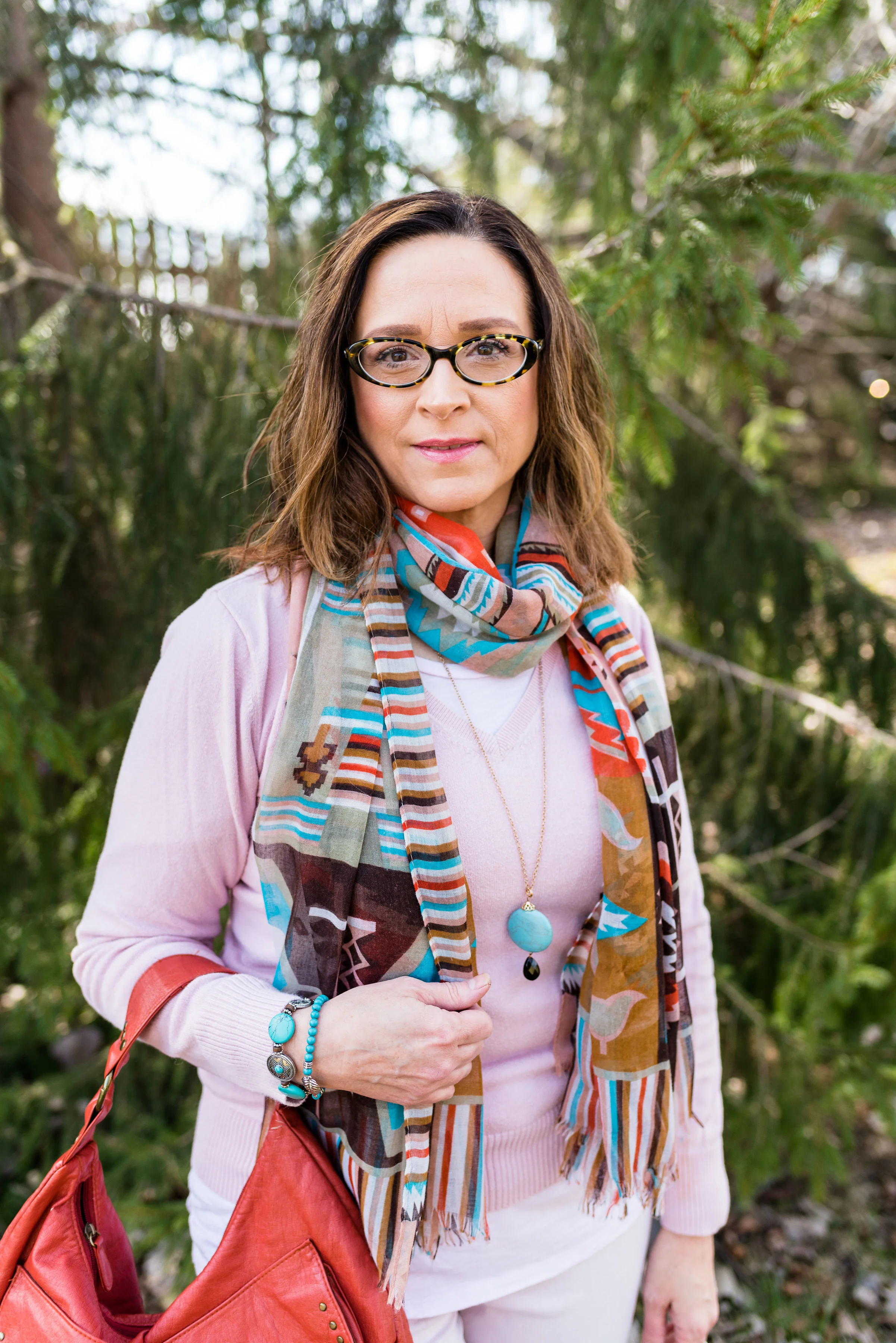
For today’s outfit, I thought the mix of yellow, blue and white perfect for spring and even for the upcoming Easter holidays. This color combo makes me think of the sunny flowers the color is named for, and the many blues of summer including skies, lakes and denim. White is always classic, not only for summer, but every season.

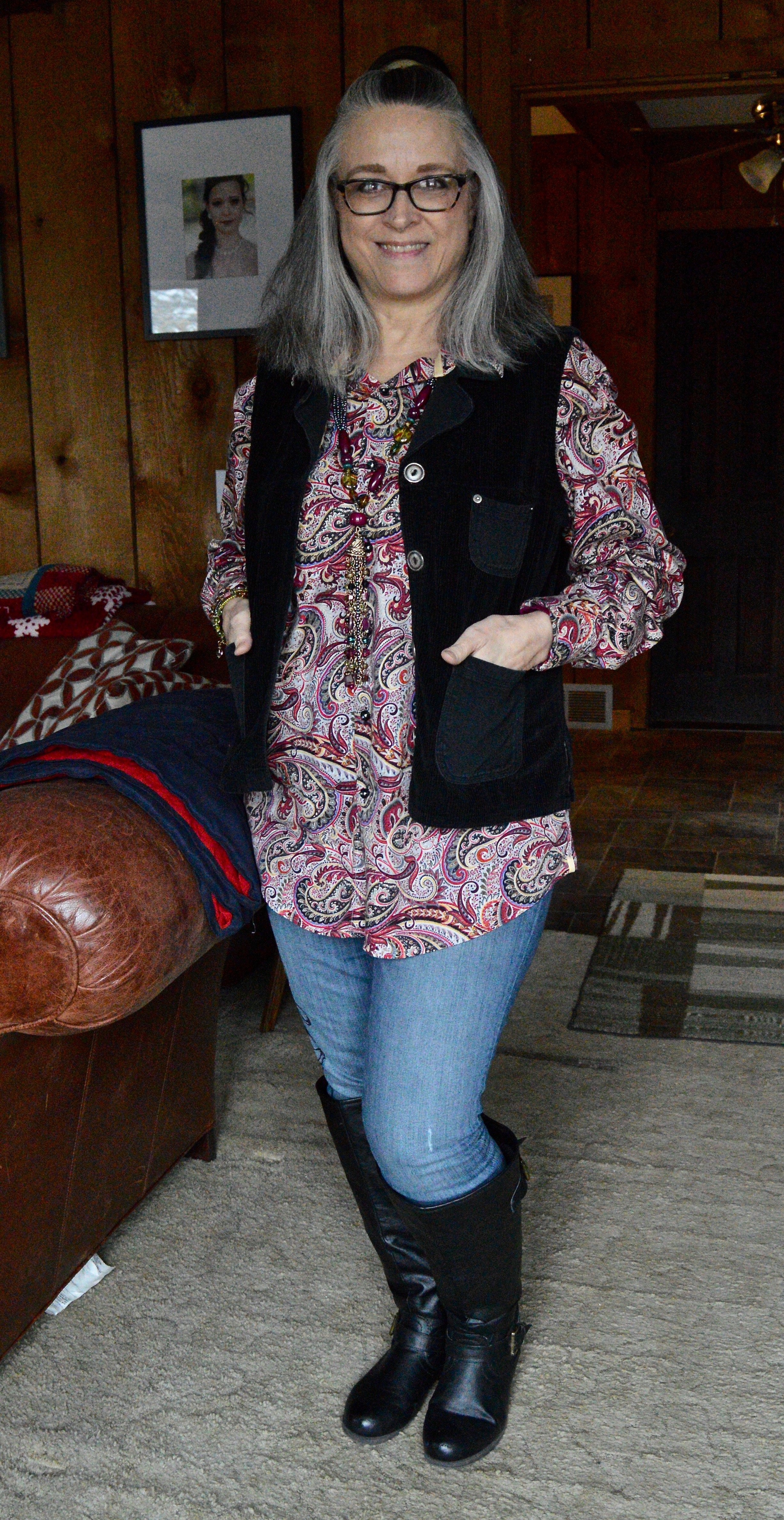
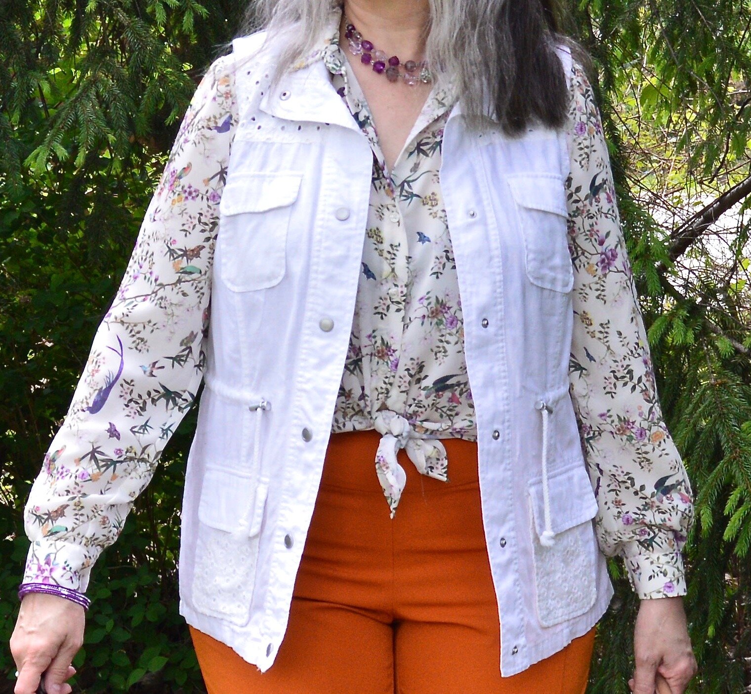
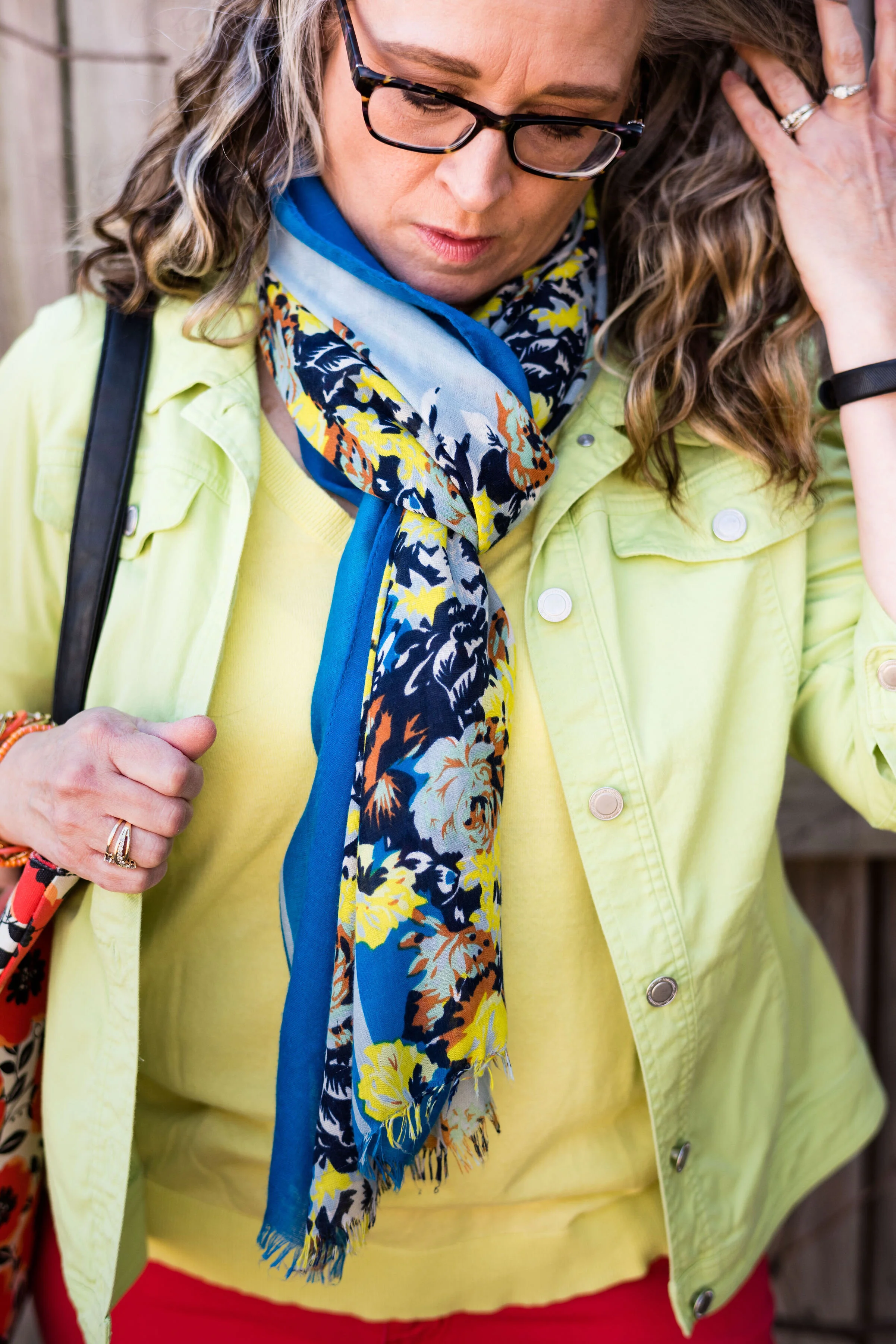
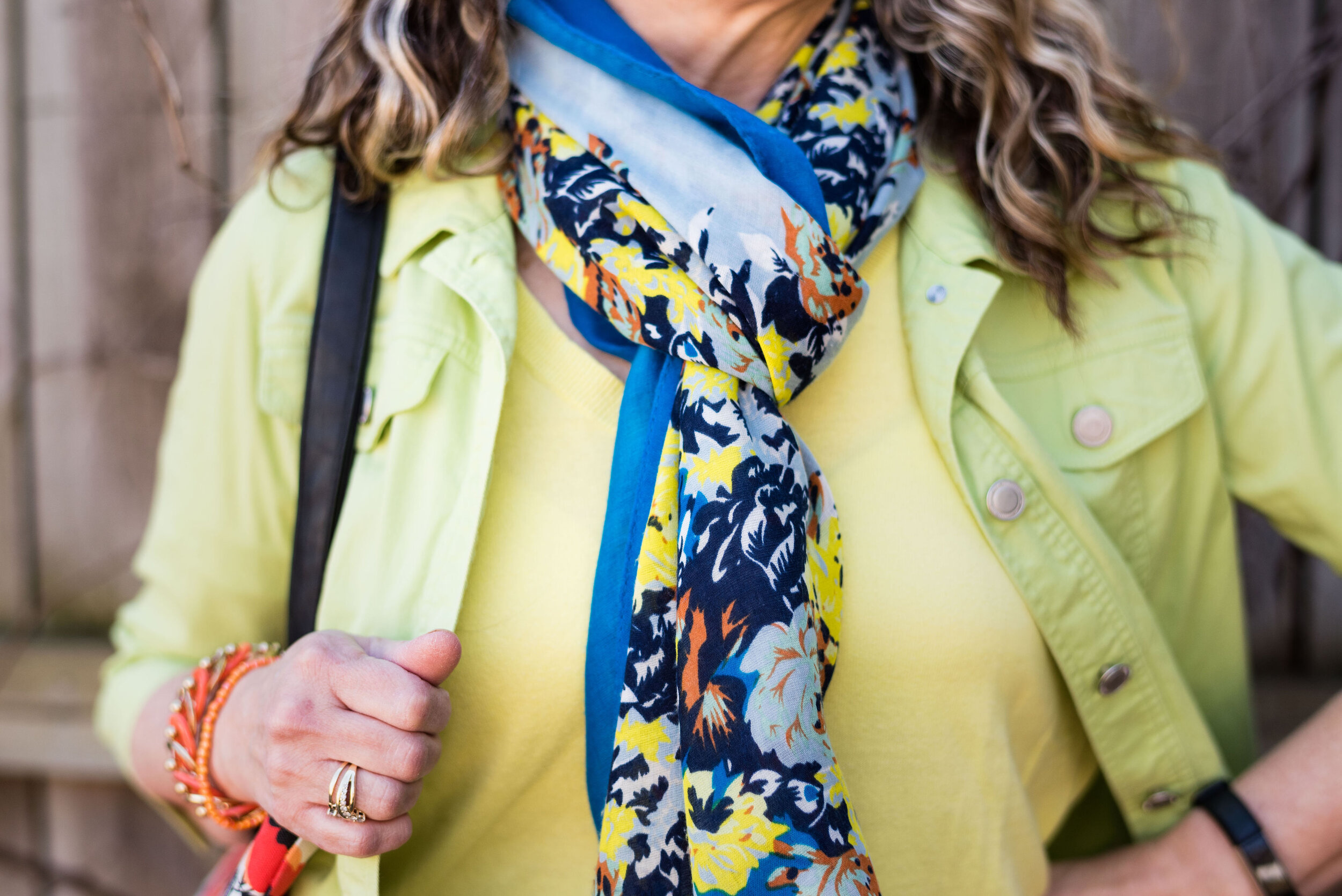
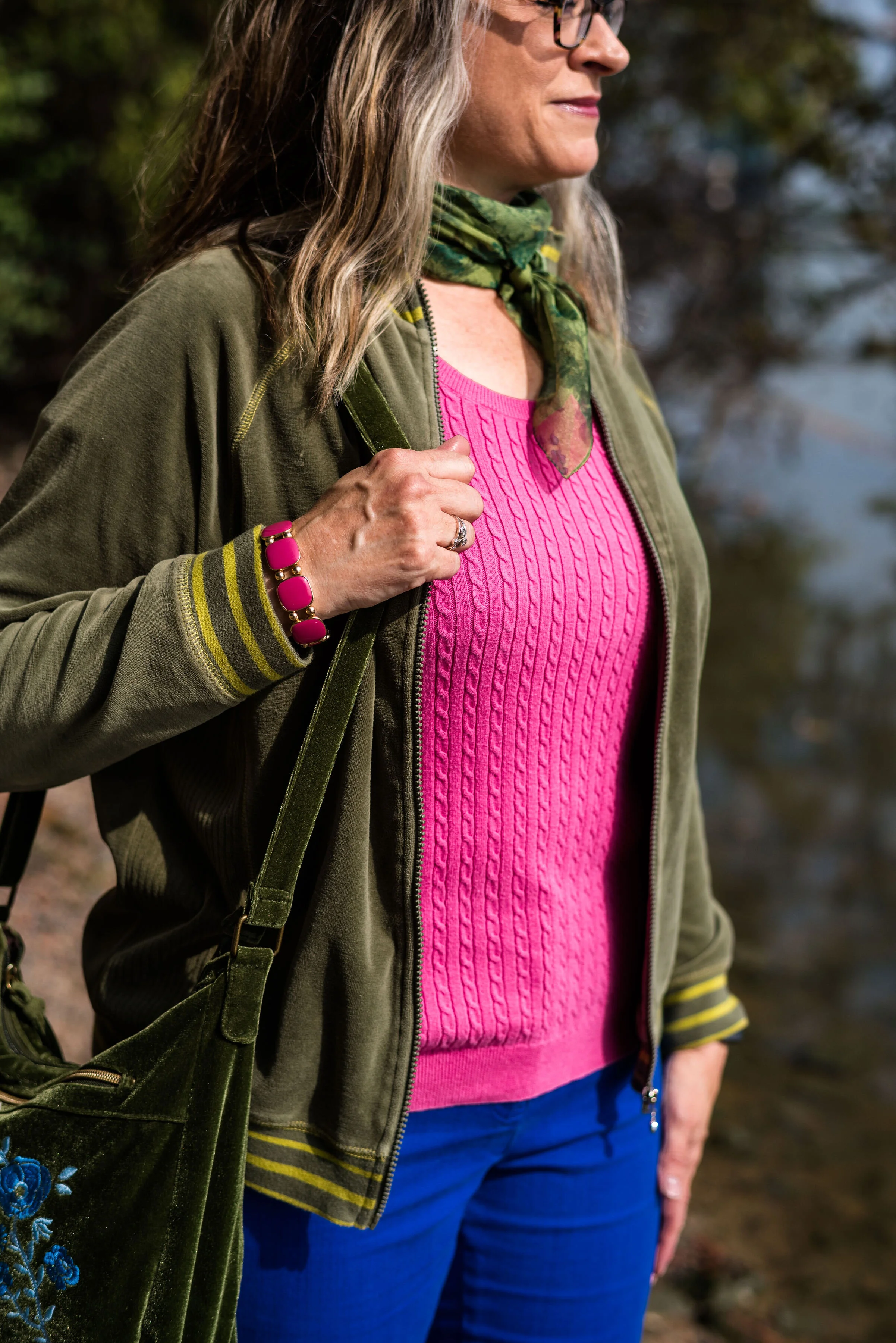
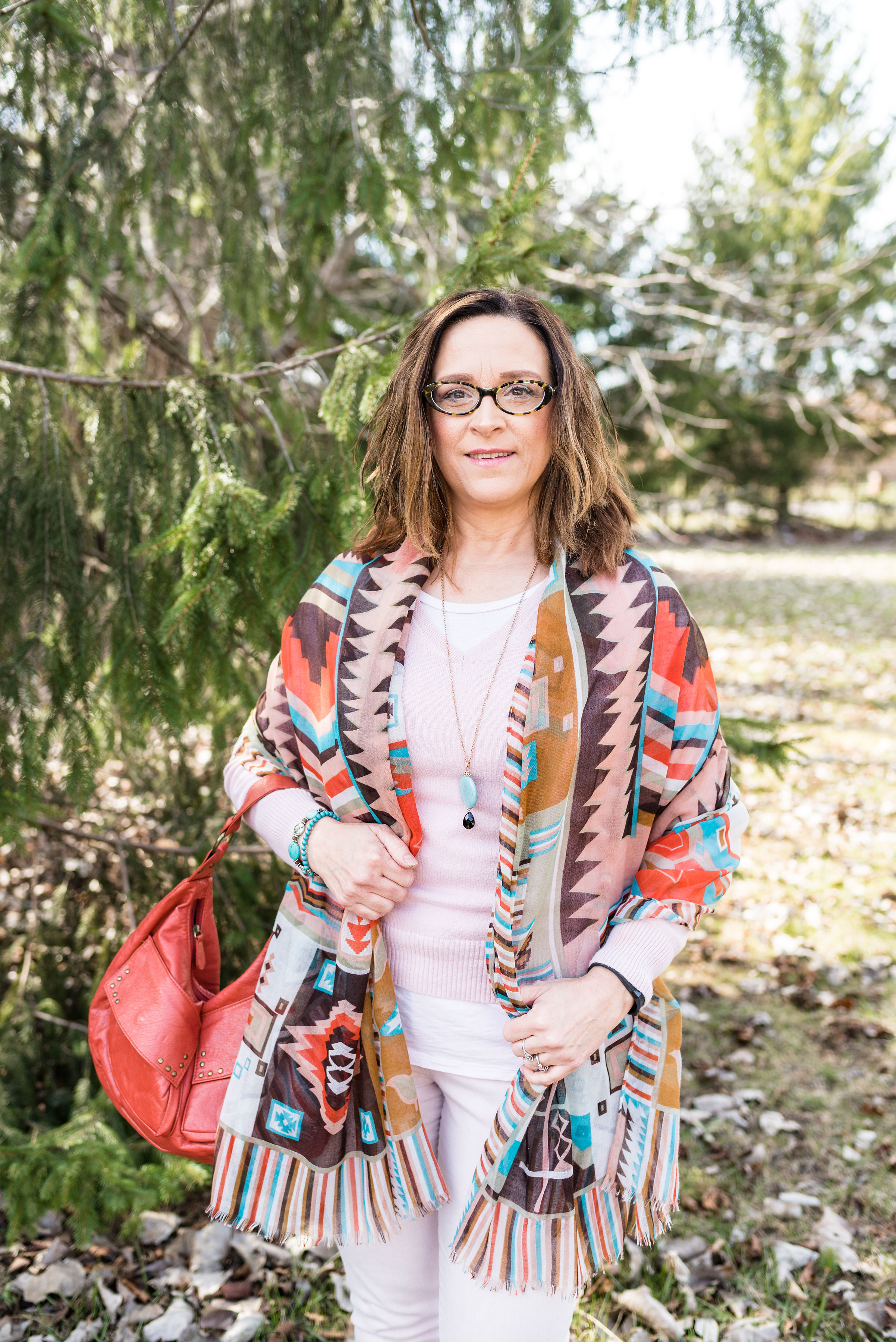
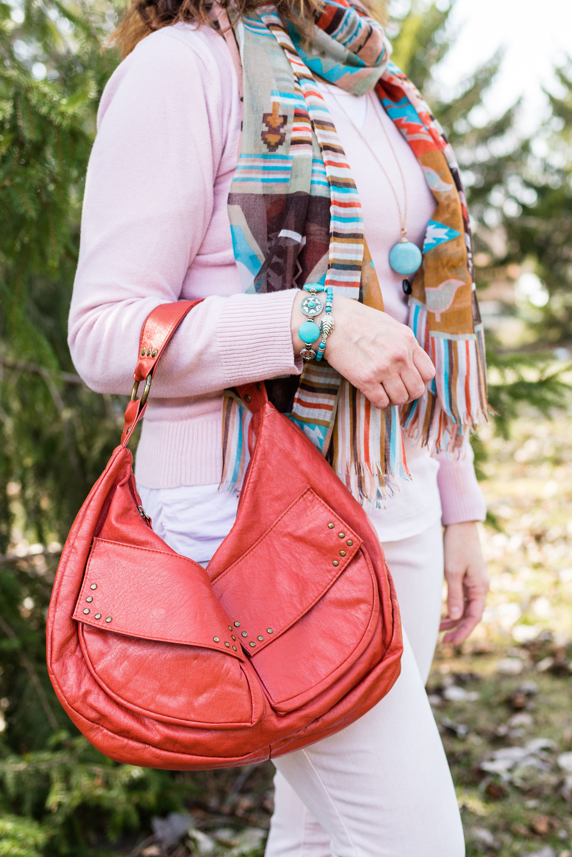
My Glacier Lake vest is a Christopher and Banks piece that I found at a thrift store. It has the utility look with the larger, square pockets, encased drawstring and metal buttons. I love using my utility vests in the spring and fall.

Style Tip: If you want an extra layer but don’t want all the bulk choose a light weight vest. A utility vest or a dressier suit vest will provide extra warmth, but won’t add the bulk of a quilted, or sherpa type piece.

My bright, yellow cable knit pullover is St. John’s Bay piece. I honestly can’t remember if I bought it at JCPenney or if I got it thrifting. Ha, ha. My white Gloria Vanderbilt jeans I have had for a number of years now. They are just the right weight and thickness for no-show issues, and can be dressed up or down.

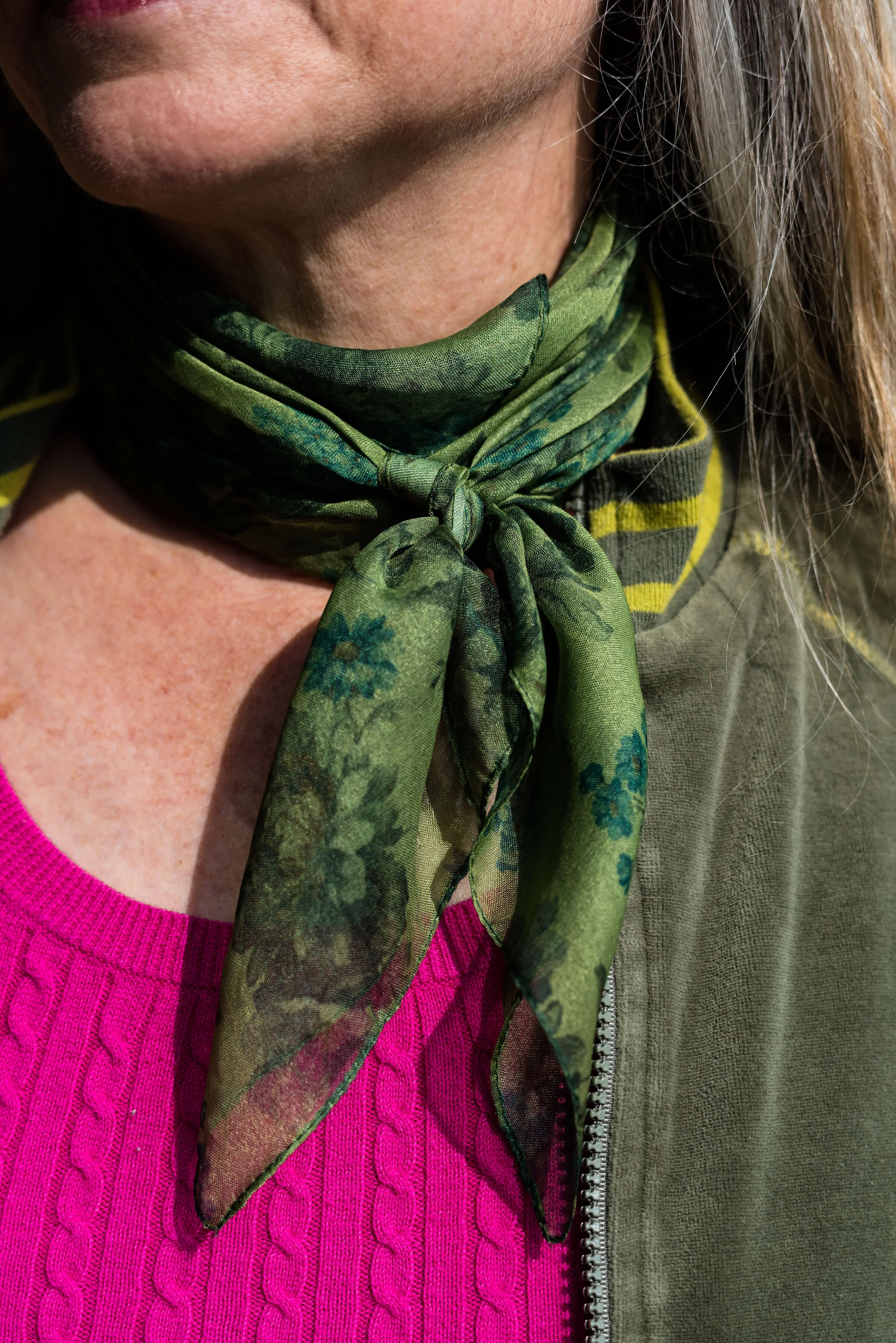
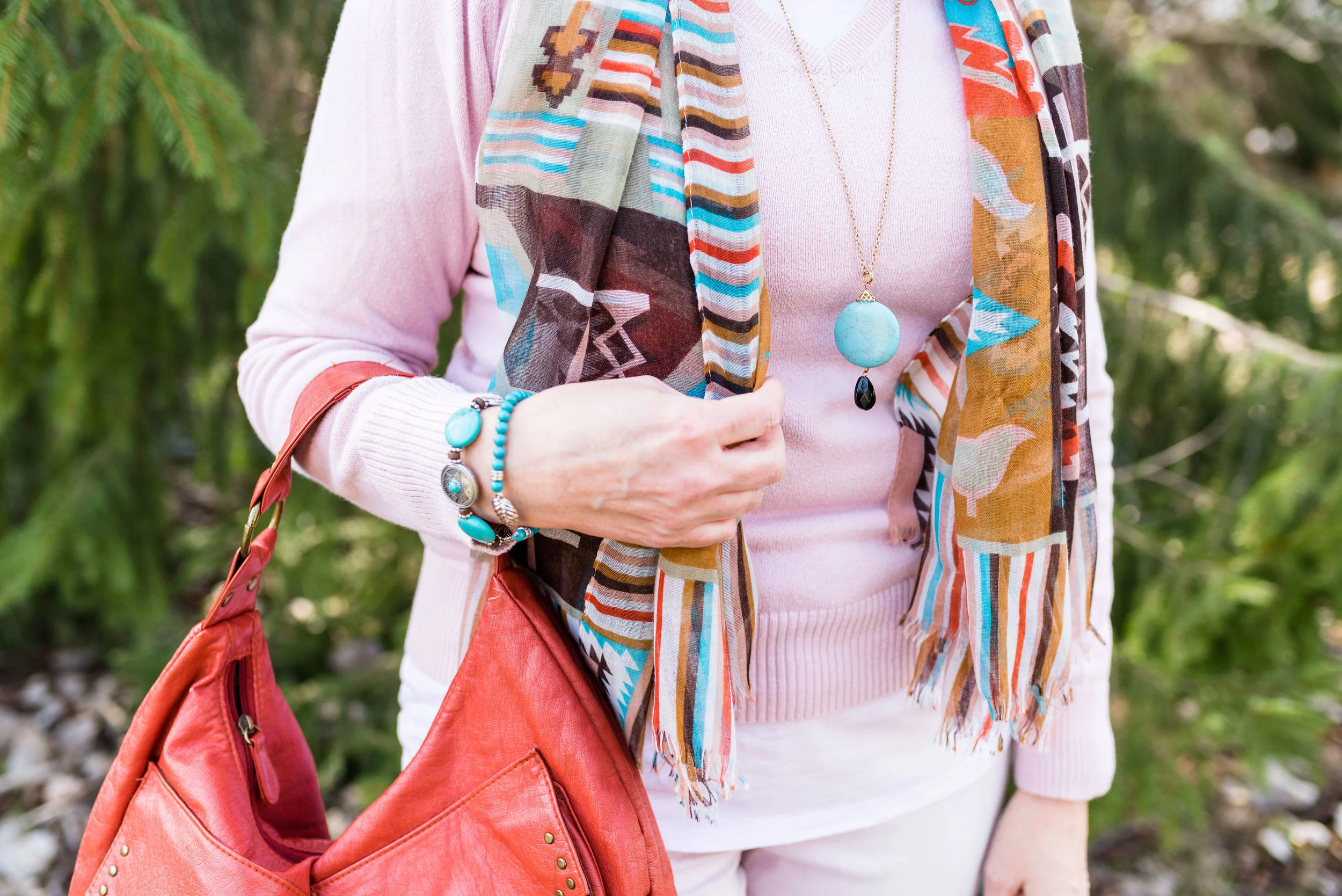
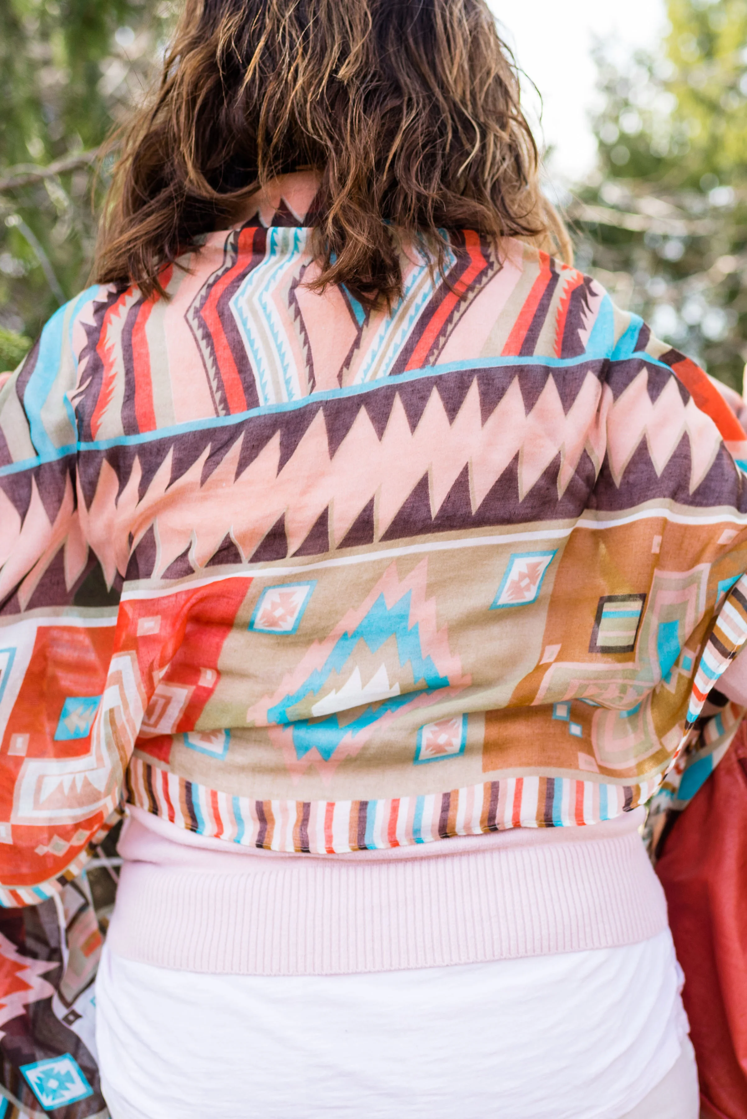
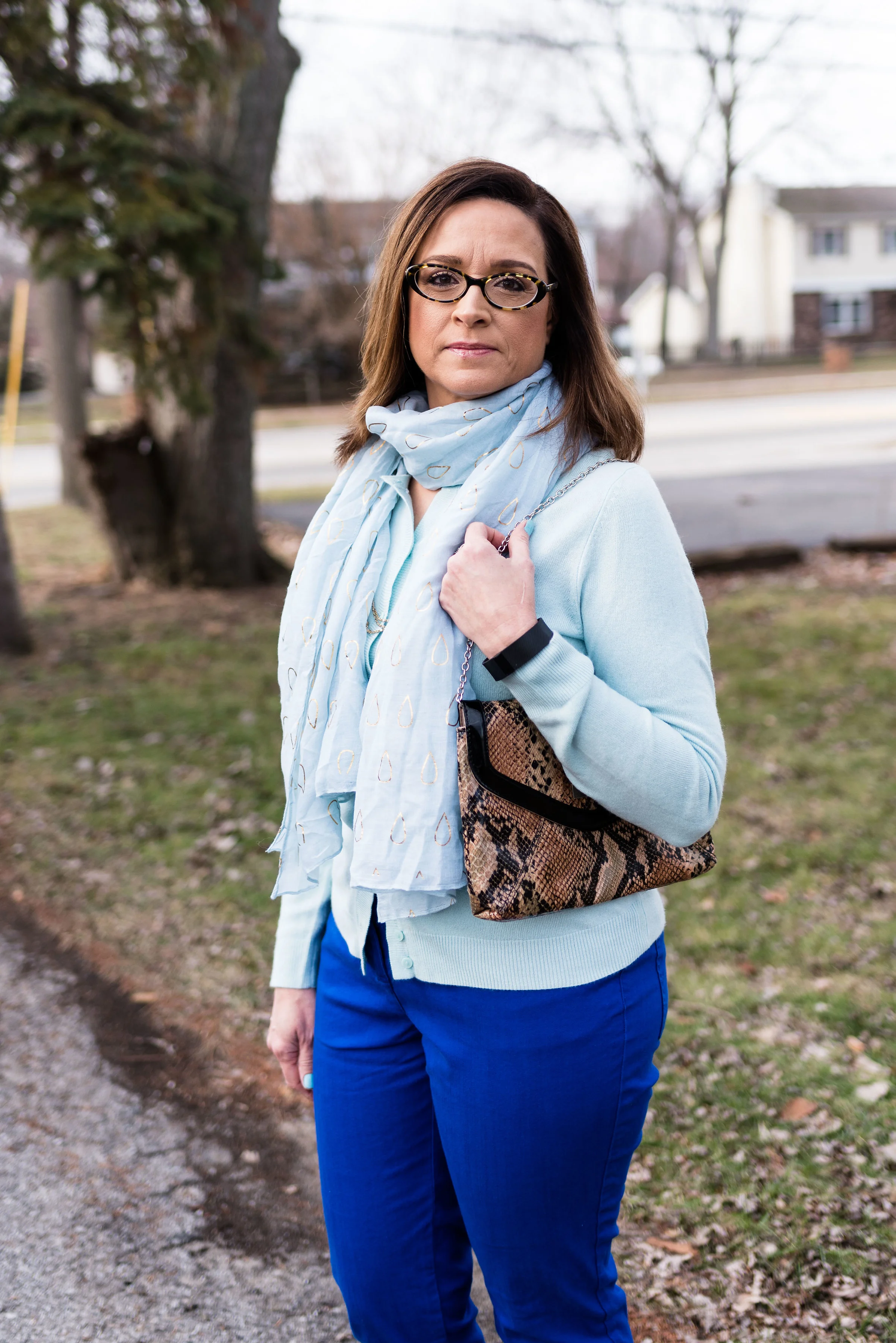
My floral scarf is a piece I recently thrifted. I love scarves. I think they add so much to an outfit.

Style Tip: When styling an outfit with two or three solid colors, add a printed scarf for additional color and interest.

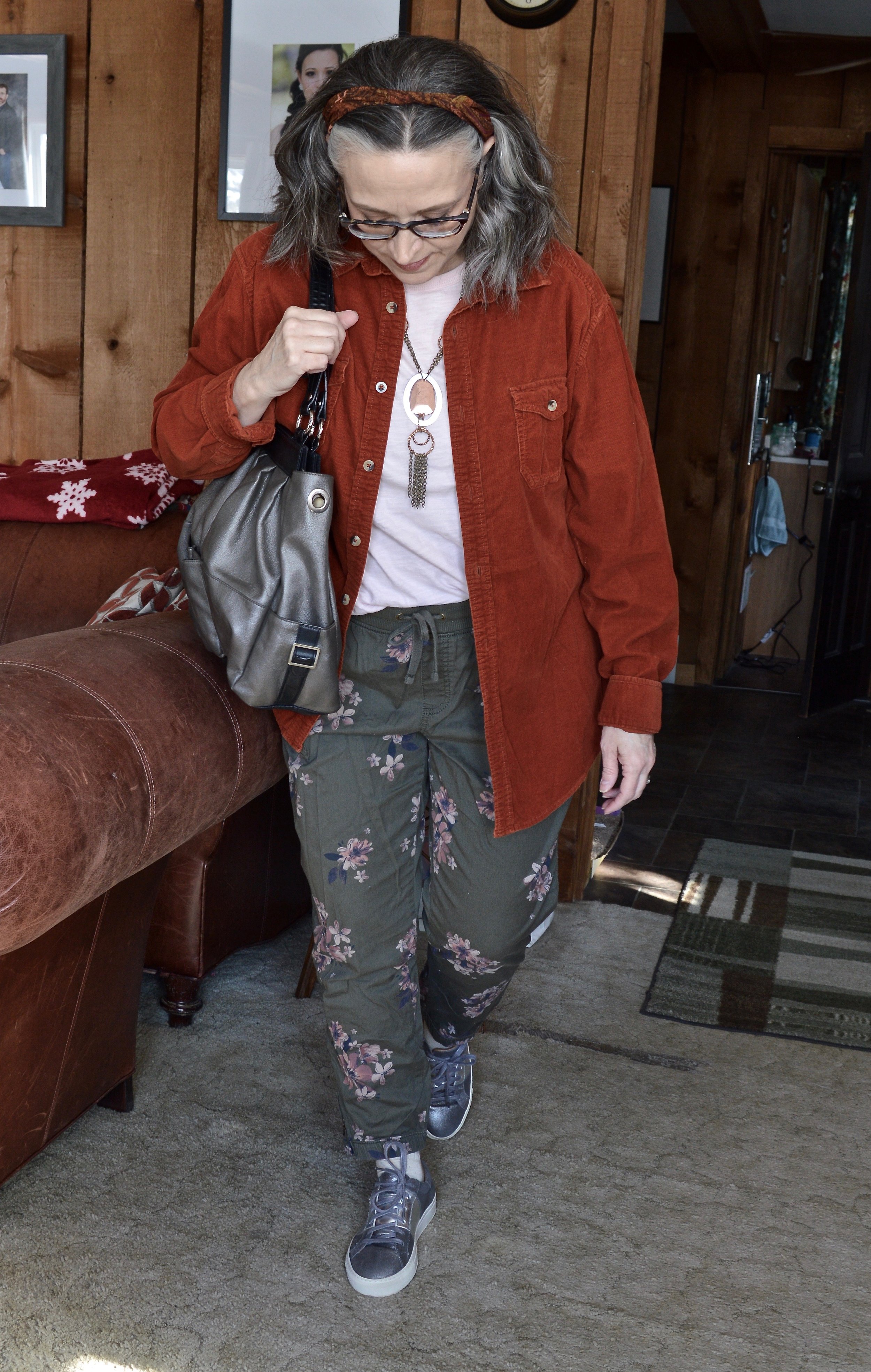
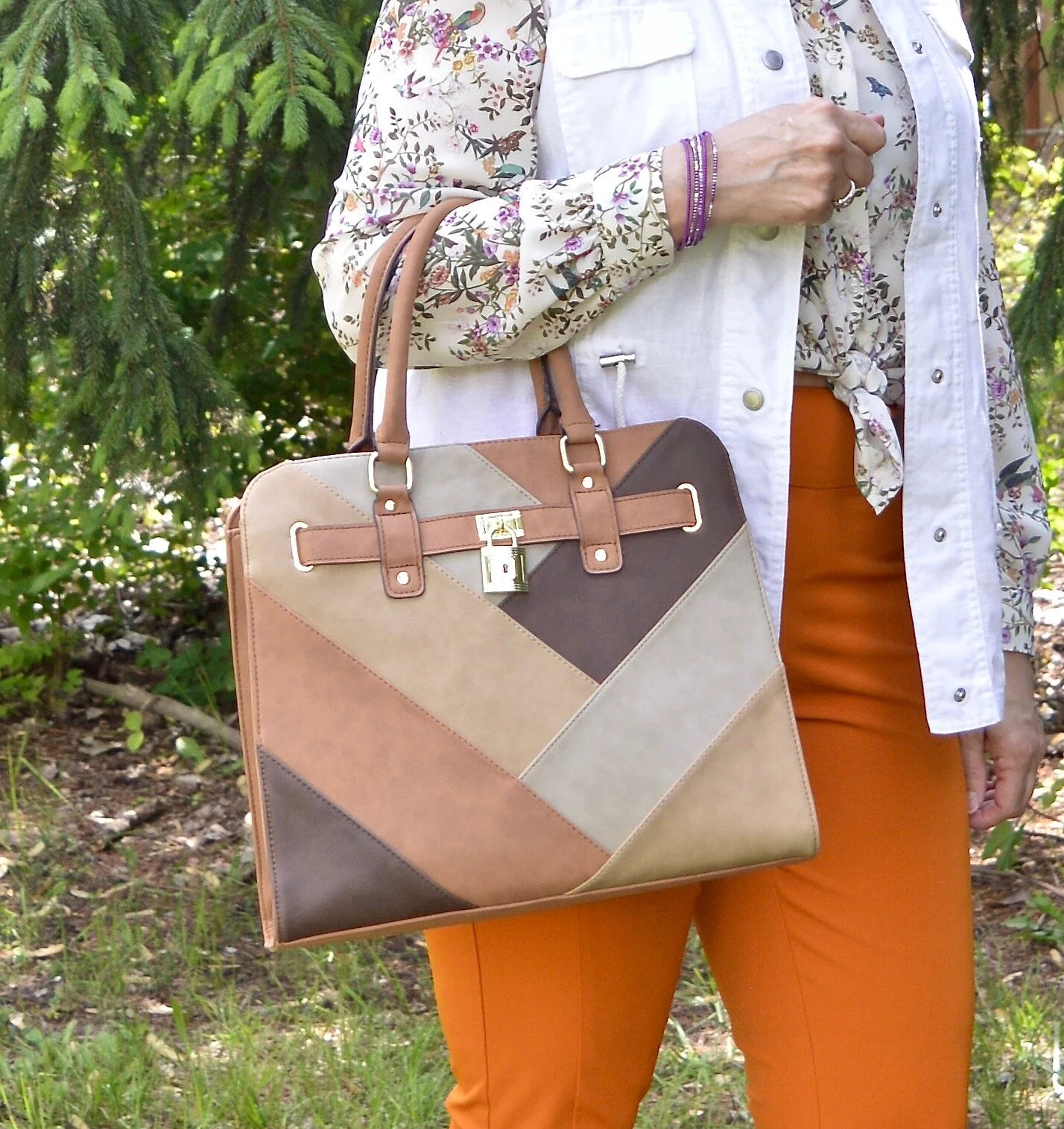
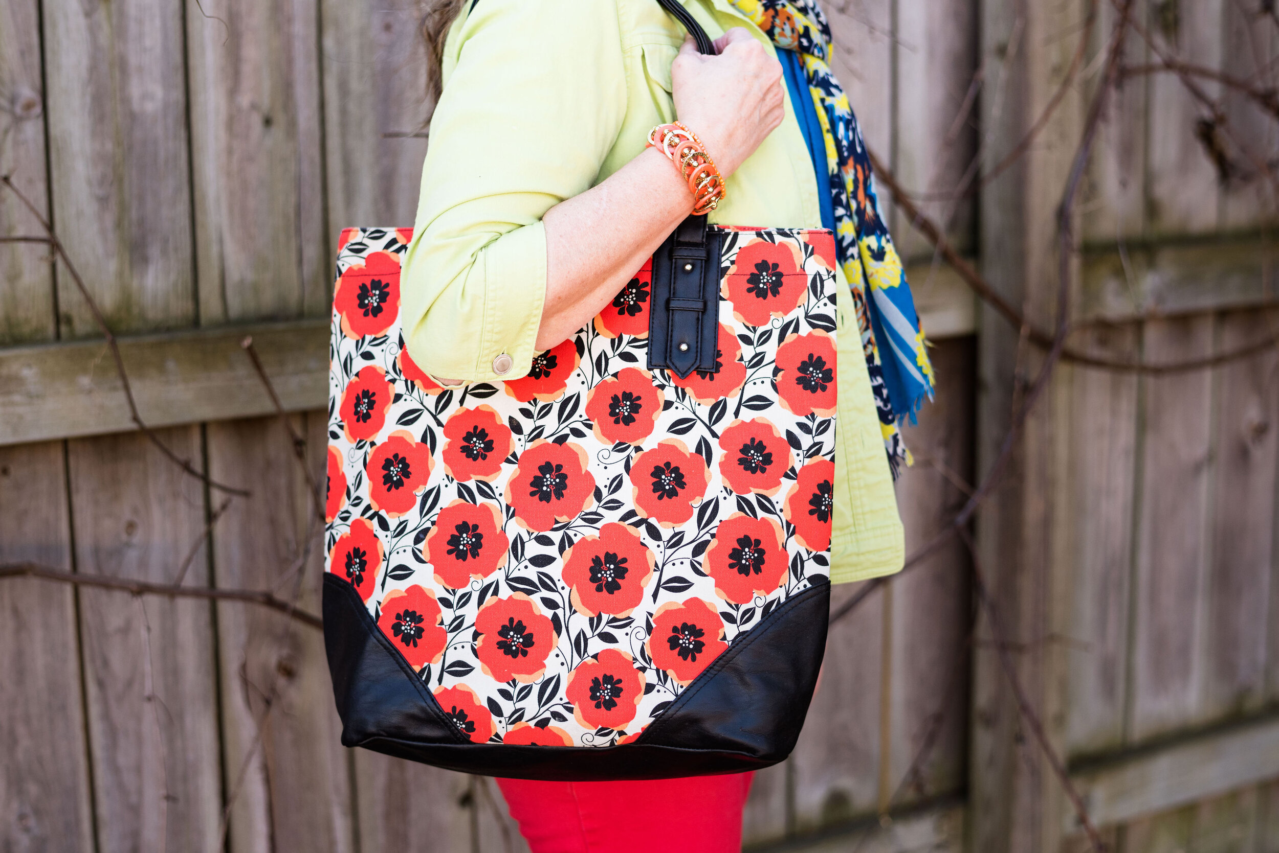
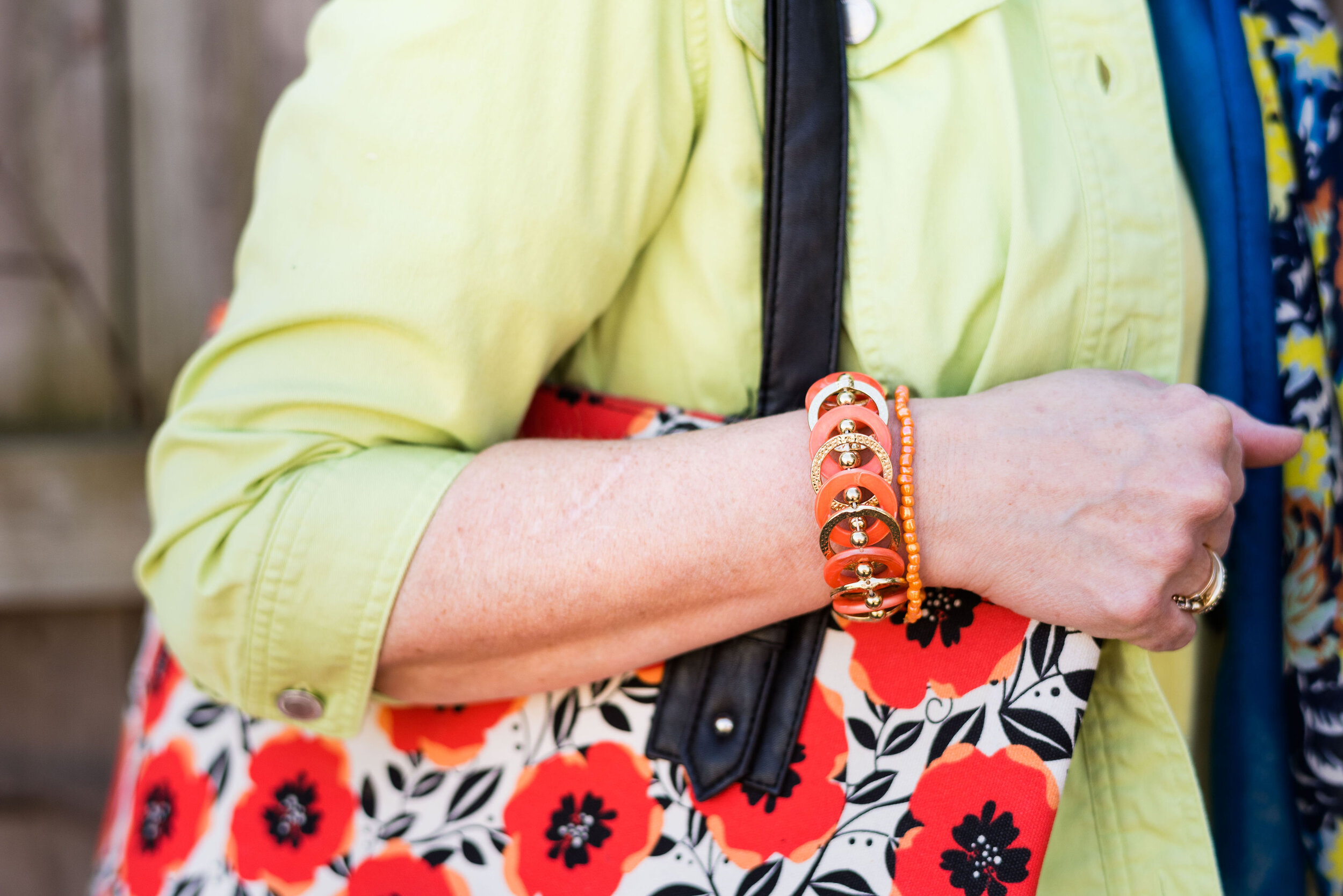
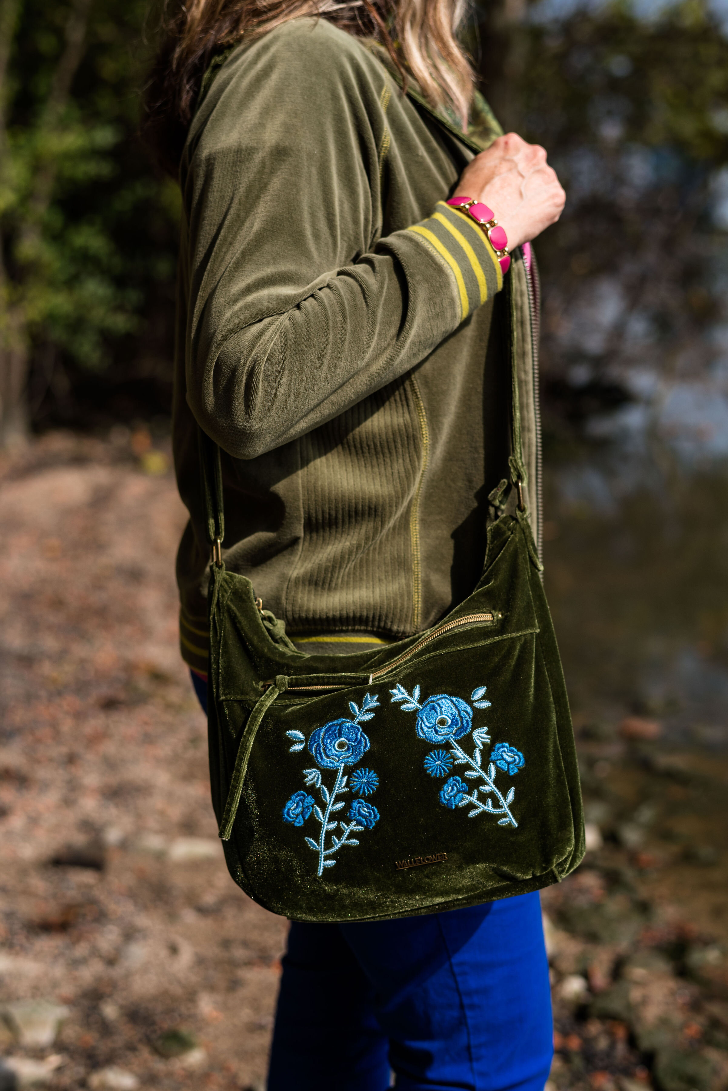
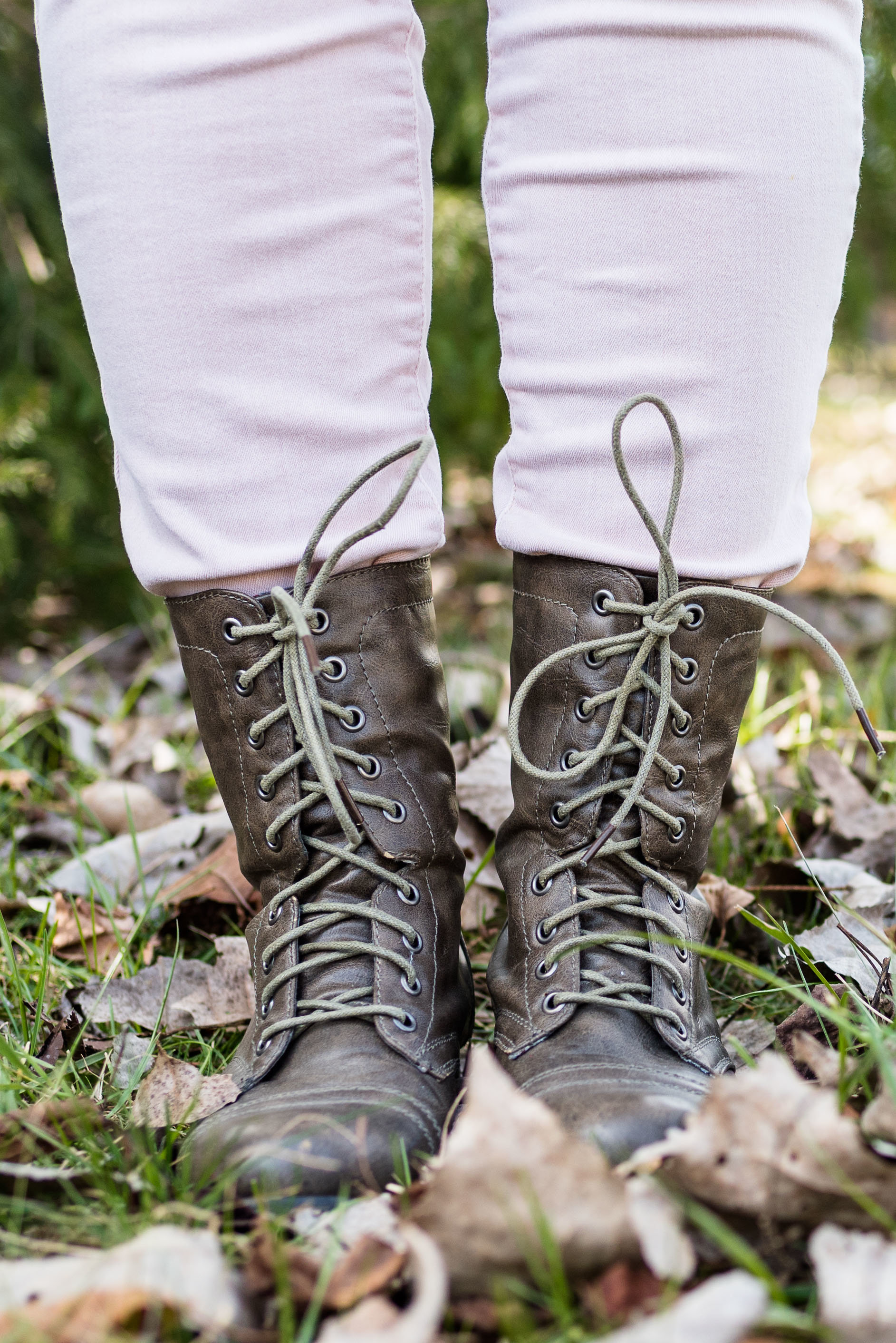
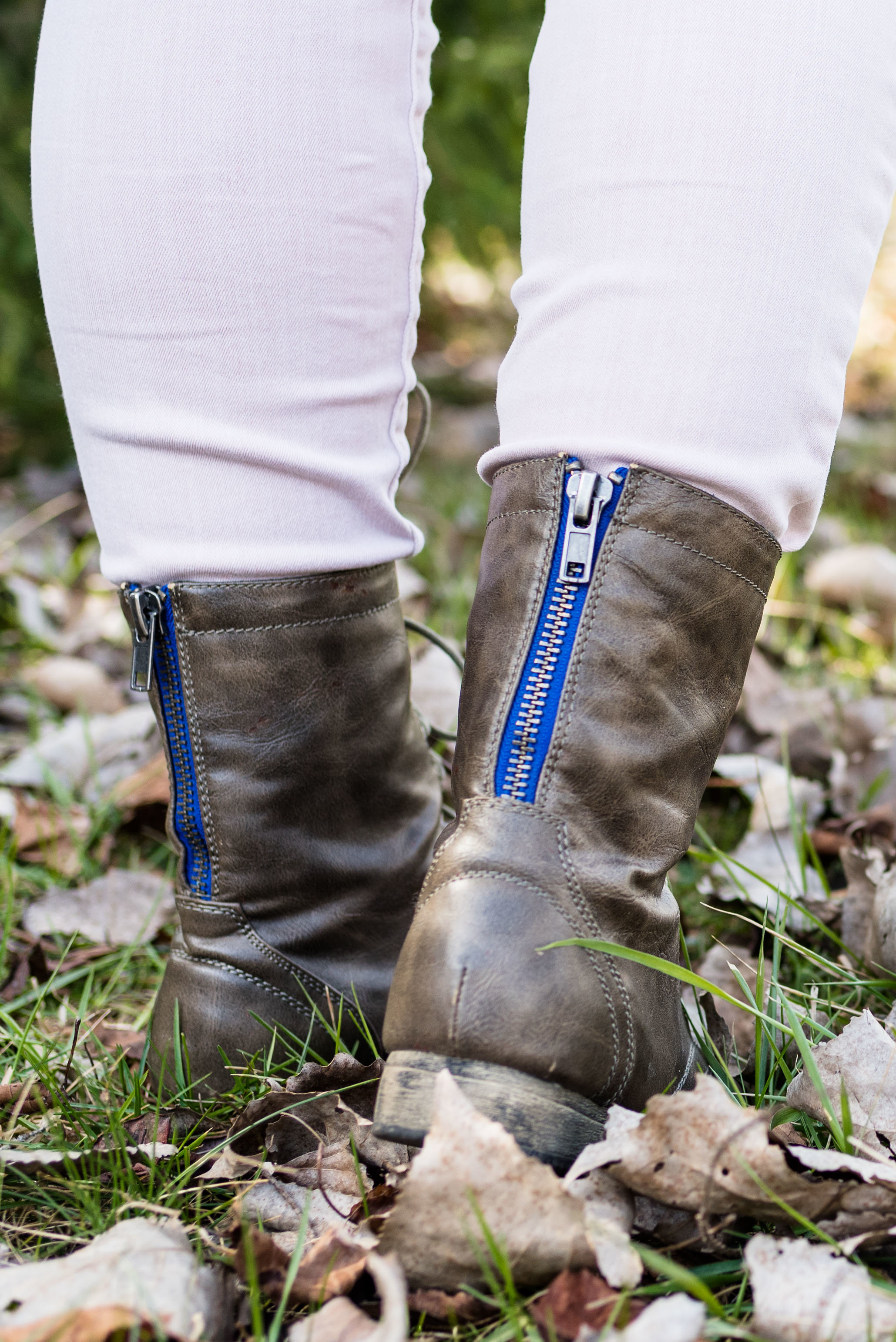
You’ve seen my Merona thrifted bag a few times now on the blog. I thought it was a good choice for this springy look. I also opted to wear my Steve Madden platform sneakers. When it comes to platforms, these are very low, which I like. I really don’t like all the extra bulk of a thicker platform or a really thick lug sole on boots.

What do you think of these colors? Would you wear them together? Do you have these colors in your closet? I’d love to hear your thoughts, so leave me a comment or two. I am including a few shopping links for you to look over. These are affiliate links, which means I get a small commission when you click on a link. All opinions are my own.

Have a great week everyone!

Fashion Fun: Men's Oversized Button Down

When it comes to thrifting for fashion, I like to think outside the box. I always peruse all the sizes, because so often size is relative. What I mean by that is, it is relative to the brand. A size 12 in one brand might fit you perfectly, but a size 12 in another brand, might be too big or too small. I honestly believe sizing is different than it used to be. If you shop vintage clothing, at all, you will see that most of the pieces are relatively small. Women tended towards being smaller in the waist, hips, and shoulders than we are now. Not sure why, but it does seem to be the case.

I have also started looking in the men’s section of thrift stores for fun pieces like tees and printed button downs. I like the roomier cut of a men’s medium or even large shirt and they often have textures, prints and fabrics that are different than those on the women’s racks. Today, I am going to show you three different outfits using three men’s button downs that I purchased while thrifting.

Outfit 1 - Men’s Button Down as a Tunic

When I saw this paisley madness, I knew I had to have it. This is Visconti brand. If you type the name be sure to type in Visconti clothing. and you’ll see they have them at Dillards. They also have their own website, but I am not here to encourage you to buy a new shirt. This to encourage you to look at the men’s racks if you thrift, or even if you shop clearance. I absolutely love the colors in this piece and it is easily worn all year round as a top or as a “shacket”.

I topped this look with a thrifted, black Nadia brand, corduroy vest. I added my Simply Vera, Vera Wang skinny jeans and my black knee high boots. The black embroidery on these jeans are what sold me. The abstract floral print goes with so many other pieces.

I didn’t really need to add any jewelry since the print is so busy, but I thought it would be fun to add this piece that has a variety of colors and textures. It blends in, yet also stands on its own.

Outfit 2 - Men’s Button Down as a Work Wear Top

This shirt is Izod brand. This year’s Pantone Color of the Year is called Very Peri. I think it is a very pretty color reminiscent of the Periwinkle flowers, which can come in blue, purple or white. I thought this checked shirt fit the color well. One thing I have to do with most of the men’s shirts I purchase is roll up the sleeves, but rolling up the width of the cuff is just the right amount, so you can hardly tell.

My denim pencil skirt is also thrifted and Gloria Vanderbilt brand. I like the length of this and if I still had a reason to wear a skirt would definitely be wearing this often. I added the navy hose to cover my veiny legs and thought the black, thrifted Nine West loafers gave it a work wear look. I also added the denim blue cloth belt and the dark purple agate pendant necklace. My thrifted, Merona bag, also brings in that Very Peri vibe.

Outfit 3 - Men’s Button Down as a Shacket

I’ve had this thrifted, Ruff Hewn corduroy button down for a few years now. I love the color and typically think of it as a fall piece. It is soft, warm and roomy, so a perfect piece for wearing over lightweight sweaters, sweatshirts or long sleeve tees.

I wanted this outfit to have more of a spring vibe, so I went with my Sonoma floral joggers, and a thrifted light pink Express short sleeve tee. I opted for metallic accessories including my silver Sketcher sneakers, pewter hand-me-over bag, and my silver and copper necklace.

Here are the three outfits side by side.

I hope you enjoyed this look at how to style a men’s oversized button down. It is fun to explore other options in your fashion wardrobe, and you never know when something you try will become your new favorite style. Which outfit was your favorite? Do you wear men’s clothing? How do you like to style a men’s or women’s oversized shirt? I’d love to hear your thoughts, so leave me some love in the comments.

Thanks for stopping by the blog. I have provided a few shopping links for your enjoyment. These are affiliate links. All opinions are my own.

What's Trending for Spring 2022?

Even though I don’t follow trends closely, I still like to do a post for you about what the fashion gurus are saying is trending for the upcoming season. I typically look at websites known for their fashion panache such as: Cosmopolitan, Marie Claire, Vogue, Harper’s Bazaar, and a variety of others. You certainly can do a search under Spring Trends 2022 and you’ll get a list of websites to visit. Just understand these are fashion websites, not sites for real women like you and I. We can go to these and find inspiration, but don’t buy into the craziness that they often call fashion. It is not only impractical, but often times extremely immodest.

With that being said, there are always a few trends I like, and that I am willing to spend time thinking about how to work them into my daily wardrobe. This spring it was tough. To me it seems that fashion, in keeping with the rest of the world, is just getting crazier and more out there. It is definitely getting further and further away from what I think is appropriate for women to wear. If you have followed me for a while, you know I can be quite earthy and real, but I am also a girl who highly values modesty and self-dignity. I will save my deeper thoughts on the subject for a different day.

Here are a few of the trends I found interesting for Spring/Summer 2022:

Gingham

I love that this simple check pattern is back. It is a wonderful print for spring and summer, reminiscent of picnics and warm days at the beach.

Style Tip:

Add a gingham blouse under a pullover, cardigan or vest for a smaller touch of this pretty print.

Crochet

Crochet is something I look for when I thrift. I personally probably wouldn’t wear a crocheted dress or tank top, but I like the top with the crochet trim. Crochet can be a beautiful addition to an outfit in the form of a sweater, shawl, handbag, or trim on a top, skirt or dress.

Style Tip:

For summer, look for open weave crocheted pieces to keep you from getting too warm. If buying a crocheted handbag, look for ones that are fully lined to keep small things like pens and change from slipping through the weave.

Everything White

Once again, white is trending for the warmer weather. Wearing all white is where it’s at, but of course, don’t let that stop you from just wearing a little white here or there. I really liked this idea for the creamy winter whites, so now I need to try it with the brighter whites for spring and summer.

Style Tip

Not everyone likes to wear white near their face, so try adding a printed scarf or a bright pink or red lipstick for a colorful touch.

Black and White

There is just something so classic and chic about the combination of black and white. You all know I am a color girl, but I really like this trend and there are lots of cute styles out there. I already have numerous black and white striped sweaters and tees and I am sure a few other things as well.

Style Tip:

Be sure to shop your closet for trends. It is most likely these have been around before. Otherwise, build the trend yourself by combining black and white pieces. Wear a black skirt with a white tee, or a black cardigan with white pants.

Metallics

I love things that bling, so metallics are always on my radar. This is the type of thing you can do a little or a lot of and it still looks fabulous. Type metallic tops, shoes, bags, jackets and so on in your search bar and you will get all sorts of pieces. Metallics are a great way to take an outfit from okay to spectacular, just by adding a simple bag, pair of shoes or a top.

Style Tip:

Wear a gold or silver metallic blouse with black or navy pieces and you’ll easily get an outfit that can take you from the office to a night out.

Colorful Bags

Who doesn’t love a bright colorful bag for the warmer weather? Purses are one thing I have too many of, so I will be digging through my pile to find my brightest ones for this spring/summer season.

Style Tip:

Try styling a neutral outfit of tans, creams or blush with a bright bag and jewelry. You will look beautiful and confident with just a pop of color.

There are many other spring trends and I will be talking about a few of the others over the next few weeks. I hope you enjoyed this post. Feel free to shop the samples I gave. I try to include pieces that I think are fun and interesting as well as try to keep the price points below $100. These are affiliate links, which means every time you click I get a few pennies. I appreciate each and every click. All opinions are my own.

Have a wonderful Tuesday!

Oh, Olive! Workwear Look

Tuesday I showed you a casual look with olive pants and today I am showing you a workwear look that might be doable for the office. We are looking at the color olive as a neutral. I know many of us have olive in our wardrobes and are becoming more aware of what a great color it is. Tuesday, I showed you how well it goes with orange and white. Check out today’s outfit, which combines dark florals and black for a sassy look.

DSC_0035.jpg

I found this fabulous dark floral Time and Tru dress while thrifting on one of our trips. I had started really looking over the dress racks at thrift stores recently after seeing Instagram gal, jbowenandcompany using a button up dress like a kimono. It makes a piece like this so much more versatile. When I decided to do this series on olive pieces, I knew this dress as a duster would be a perfect topper for a fun workwear look.

DSC_0027.jpg

Once again, my olive Gloria Vanderbilt skinny pants are the focal piece. This time I paired them with another neutral, black. My black v-neck polo is a sleeveless piece that I found thrifting a few weeks ago. Black and olive has always been a classic combination. Throwing the dark floral piece over the top really makes the outfit pop.

DSC_0037.jpg

You’ve seen these Clark peep toe shoeties on the blog before. They are great shoes, I just really have no place to wear them right now. I know many bloggers and Instagram babes who post outfits they are actually wearing, but some of us have a more laid back approach. I would wear these and this whole outfit if I had an office job, but right now I don’t. Still, it is fun to have choices, and to be able to show you all a few of my fun wardrobe pieces, even if I don’t wear them as often.

DSC_0039.jpg

I thought adding the light blue bag would pull out the light blue in the duster and with the dark florals it still gives the outfit a summer feel. You could have done the same thing with the light pink, yellow, or white. For the same reason I went with the light blue pendant. Just that little extra pop of color adds more interest to the outfit.

DSC_0041.jpg

What do you think of this outfit? Have you ever worn a button up dress as a duster or kimono? It is a great way to extend the use of your dresses. If you are like me, you don’t have too many excuses to wear a dress. I know some ladies wear them all the time, and if my legs were less blemished by veins, I probably would too, but using a dress in this way still gives me an excuse to get more dressed up.

DSC_0031.jpg

I hope you enjoyed this post. I am going to include a few shopping links for you to look over. These are affiliate links. All opinions are my own.

Have a great weekend. I will not be posting next week once again, as I am going to spend the week with my mom while my brother and his family are out of town. I’ll be back the following week. Until then, take care.

Pantone - Spring/Summer - 2021 - London Palette - Purple Rose, Lava Falls and Baby's Breath

Today’s colors are a blend of pastel purple, bold red and creamy off white. I have always loved purple, but it really isn’t a color I regularly wear. I easily got on board with Purple Rose which is a medium purple that goes well with many other colors, especially things like brown, olive and navy. Why, then did I decide to pair it with a fierce red like Lava Falls? Because I always like to show you things outside the box. It is not very often, that I think to put purple and red together.

purplerose.jpg

The factor that clinched the deal on putting these colors together, was that my thrifted Old Navy, Lava Falls, paisley popover top had both of these colors in it. How fortuitous was that? Ha, ha. This is a fun, tunic type shirt that has short sleeves, and the interesting details of a shirt tail hem line and a lace up v-neck. I love the paisley print too, which always reminds me of the 70’s.

The Croft and Barrow cardigan is older and I like I said, doesn’t get a lot of regular wear, but i just love the color so I keep it around.

purplerosepantoneoutfitideas-2.jpg

You’ve seen these creamy, Baby’s Breath, thrifted, St. John’s Bay ankle pants on the blog before. I really think this look would have been cuter with a creamy denim pencil skirt or a pair of Bermuda shorts, but I don’t have either of those. I am not as fond of the silhouette, but it is okay, just not great.

purplerosepantoneoutfitideas-7.jpg

I didn’t need to wear a necklace and this long opera length beaded strand is exactly the same color as the top, but sometimes I like the subtle texture and shine of a piece, even if it is a similar color. Wrapping this long strand of beads around my neck makes it look like I have on a choker.

purplerosepantoneoutfitideas-8.jpg

I added a few beaded bracelets with similar reds, although there is plenty going on in the top, so it wasn’t really needed. Often, less is more.

purplerosepantoneoutfitideas-9.jpg

My thrifted Simply Vera, Vera Wang cross body bag is making another appearance. This is a great little bag for the warmer months. The off white color goes perfectly with the Baby’s Breath color of the pants.

purplerosepantoneoutfitideas-10.jpg

These Steve Madden platform sneakers were a new purchase from DSW. I had a coupon and I had been looking at this type of sneaker since last summer. I finally took the plunge. They are not something I would use for walking, but they are cute for a casual day of picnicking or window shopping.

purplerosepantoneoutfitideas-4.jpg

What do you think of these colors? Do you think you would ever combine red with purple? I’d love to hear your thoughts, so leave me some love.

I am including a few shopping links in these colors, so if you have time, give those a look. I hope you have a wonderful weekend!

Graphic and photo credit, Rebecca Trumbull.

Spring Outfit with Orange Pants

Just like I did for the blue pants, I wanted to show you a new outfit with my Worthington orange pants. For this one I focused on a work appropriate look. With many people finally returning to their jobs I thought it would be a good time to feature an outfit that would be perfect for the office, especially as air conditioners come back on.

DSC_0047.jpg

I wish I would have thought to get close up of the details on this thrifted Maurices vest. I snatched it up, because I don’t have any summer weight white vests and I thought the eyelet detail and the texturing on the pockets made this such a unique piece. It has the utility vibe with the patch pockets and drawstring, but is dressier.

You can also see my H&M button down top. I found this one on the clearance rack a few years ago and just loved the botanical print with its flowers, butterflies and birds. I thought tying the front shirt tails made for a more summery look, but one that remains work appropriate. I also like the soft contrast between the stark white of the vest and the more off white of the blouse.

DSC_0020.jpg

I added a double layered purple necklace and a few purple metal bangles to pull out the purple in the top.

DSC_0046.jpg

I opted for more neutral shoes and bag. I thought the outfit had enough color with the bright orange pants and the flora print in the top. The neutral accessories give it not only a summer feel, but a polished and professional look. If I ever go back to an office job, I would definitely wear this. My bag you have seen on the blog before and is from Walmart and George brand. My perforated peep toe sandals are Sonoma brand from Kohl’s.

DSC_0037.jpg
DSC_0040.jpg

I was pleased with how this outfit turned out. What do you think? Would you wear something like this to work? I’d love to hear your thoughts.

DSC_0038.jpg

I’m including a few shopping links for you to enjoy. These are affiliate links. All opinions are my own.

Have a great day, everyone and thanks for following along on the blog.

Why You Should have a Pair of Colored Pants - Orange

I thought I would do one more week on colored pants. This denim wearing diva, never imagined in all my years that I would learn to love brightly colored pants, but I have. I do remember when I was young, being a child of the sixties and seventies, I had a pair of bright red, cuffed bell bottom pants that I loved to wear to school. I am not sure what drew me away from the bright colored bottoms, except maybe that feeling of not wanting to be noticed or seen. I still struggle with that bit, but now I don’t worry so much about what other people are thinking or looking at. That is not my problem. I do try to dress modestly, but I love my bright colors and think they help to make me happy. This week I want to focus on my orange pants.

These orange pants were a clearance purchase at JC Penney about four years ago. They are Worthington brand, have a side zipper and an extra seam towards the front, giving the leg a long, lean line and less bulk around the middle, for a more streamlined look. The waist sits near my natural waist, so a little less of the spare tire problem. Here are past posts from the blog where I used these pants.

Outfit 1 - Orange with Sheer Light Blue Top

Pantone+Spring+2017+-+Island+Paradise.jpeg

I love the summery vibe of this outfit. The light blue, sheer top over the white tank combined with the bright orange pants seems very fitting for dinner under the palm trees at a tropical resort.

Outfit 2 - Orange Pants with a Dress

Spring+Transition+-+floral+dress.jpeg

This is one of my favorite outfits with these pants. It just happened that I found this dress at H&M and that the orange in the dress matched perfectly with the pants. I have no problem with women wearing shorter dresses. I know lots of women who will wear them with bike shorts underneath, so nothing is revealed if they blow up or if they bend over. I personally do not have the legs to wear a shorter dress, so wearing pants with a dress has become something I do more often. It is a fun way to display a short piece without any worry of revealing veiny legs or other leg flaws.

Outfit 3 - Orange with Bright Purple and Gray

Pantone+Fall+2018+-+Russet+Orange,+Ultra+Violet+and+Quiet+Gray.jpeg

Who would have thought to pair bright purple with orange? Well, I did and I think it turned out perfectly. I think the light gray jacket over the top helps to pull this whole look together. The pretty leaf necklace ties the orange pants to the purple top. This is a trick you can do to bring cohesiveness to an outfit that might seem a little outside the color box.

Outfit 4 - Orange with Dark Green

Pantone+-+Autumn_Winter+-+2019+-+Orange+Tiger+and+Eden.jpeg

Once again, you see a color block pattern, but one that is complimented by the printed accessories in the form of a leaf print scarf and a Vera Bradley tote bag. Since this was a more casual look, I added a hem roll to the bottom of the pants. This would be a great outfit to wear for an early fall shopping trip.

Outfit 5 - Orange with Marled Black Vest

Transitional+spring+outfit.jpeg

Vests are a great way to transition from cooler seasons to warmer ones and warmer ones to cooler ones. They keep our cores warm, but our arms from being bound under bulky sweaters or coats. The focal point of this outfit, was not the pants, but the scarf, but I drew on the colors in the scarf to create the complete look.

Outfit 6 - Orange with an Asymmetrical Vest

Pantone+Spring_Summer+2020+-+Flame+Orange,+Blossom+and+Cuban+Sand.jpeg

The solid colored orange pants are the grounding point in this outfit that is filled with busy prints. The floral tee, the open weave asymmetrical vest and the patchwork bag would probably be too much, if the pants were also printed. The bright orange once again announces that summer is just around the corner.

Outfit 7 - Orange with Teal, Gray and Yellow

Pantone+-+Autumn_+Winter+-+2020+-+London+Palette+-+Exuberance,+Ultramarine+Green+and+Sleet.jpeg

Here we are, back to fall. Orange is a no brainer for fall outfits, but we often reach for rust or darker versions of orange. However, I think I have shown that this bright orange is perfect spring through fall. You probably could even dress it up for winter with a chunky fisherman sweater and some suede ankle boots. This particular pair of pants is lighter weight, so if I wore them in the winter, I might put a pair of tights underneath.

So what do you think of orange pants? For all practical purposes I think more women would choose a bright blue pair rather than the orange, but what I wanted to show you is that there are so many different ways to style a bright colored pair of pants and still have a classy outfit that you can wear for a night out with the hubby, a lunch with friends or to a summer picnic. Pick your favorite color and get a pair of bright colored pants now.

I plan on showing you another outfit on Thursday with these same pants that has a more work oriented feel. Be sure to check back then.

I am leaving you with shopping links for a variety of bright colored pants. I hope you find a pair that will be perfect for you. These are affiliate links. All opinions are my own.

Photo credit Rebecca Trumbull.

Spring Trends 2020 - Color Play - Neon

When playing with color I have found the biggest obstacle to overcome is the fear that something won’t go together; that it might look silly or clownish if I have too many colors boldly blasting their way down the street. Obviously, right now, it really doesn’t matter what we are wearing because most of us aren’t going anywhere. I still like to get up, shower, put on make up, do my hair and at least put on a pair of jeans and a top and sweater or sweatshirt. A few days I have even put on jewelry, just because I could. It really doesn’t matter if anyone else sees us. It comes down to what makes you feel happier and more comfortable during this difficult time.

Since neon is once again trending on the runways this spring and summer, I decided to look to Pinterest for some inspiration. As most of you know, when you want to find something on Pinterest you just go to the website and search. I put in neon outfits and got all sorts of ideas, some of which were definitely way outside my style zone. Since I couldn’t find exactly what I was looking for, I made up my own outfit. This is what I came up with.

This outfit would be perfectly acceptable at most work establishments and certainly helps to brighten up a drab, gloomy day. These bright red thrifted Faded Glory pants made their blog debut a few weeks ago in last months Color Play post.

This pale neon yellow short sleeve v-neck sweater was a Gap thrift find a few years ago. It is a very comfortable piece and I purposely chose the oversized look. As I told you last week, I have been getting into more oversized pieces. They are comfortable and if chosen carefully don’t add the illusion of extra pounds, but actually hide some of the more prominent bulges. Ha, ha.

My pale neon green jacket is a thrifted Christopher and Banks piece. The 3/4 length sleeves make it a great piece for spring and even for summer, when you need a little something extra for overly air conditioned offices and restaurants.

I thought the addition of this scarf was the perfect way to pull the pieces together. You could think of the this outfit as a type of color blocking, where you wear two or three plain colors next to each other. The addition of a printed scarf and bag add a touch of visual interest.

I have had this large tote bag for a long time. I don’t even remember where I got it, although I think it may have been something JC Penney’s carried in their luggage department a number of years ago and they were phasing it out. I believe I got it quite cheap. It is very roomy and easily fits my computer bag, notebooks and other writing necessities. Now that I think about it, I need to switch over to this bag from my buffalo check tote that I am currently using.

I threw on a few neon orange bracelets, just for fun.

Once again, I am featuring loafers, as they are trending right now. These are a thrifted pair of Nine West brand. Kohl’s started carrying Nine West brand clothing and shoes last fall, so I was pleasantly surprised when I pulled these out and realized they were that brand. I’m trendy and didn’t even know it. Ha, ha. I’ll include a few shopping links at the end if you are interested in adding a cute pair of loafers to your shoe collection.

Would you wear an outfit like this? Do you like neon colors? If you want to add neon to your wardrobe, but don’t want to go all out, look for a bright neon scarf, sweater or bag. I’ve provided a few shopping links below for a few fun neon items.

These are affiliate links. All opinions are my own.

Photo credit Rebecca Trumbull.


Seeing Red - Color Play - Patterned Scarf

Color inspiration can come from so many different places. In this monthly column, I am trying to force myself to look in different places for color. The typical places we look to are our clothes. For instance a pattern on a top or sweater, might be the basis for the rest of your clothing piece choices. Last month I chose a watercolor painting and table center piece as the inspiration for my outfit. I am hoping to inspire you to look in places you never thought of looking for color inspiration.

This month, I decided to inspire you with something probably every one of us has in our closets; a scarf. This particular scarf is full of color and not typically colors we would want to put together into an outfit, but why not? Think outside the box. Most of us use our scarves at accessories, without ever really letting them inspire our whole look. I decided to give it a try, so be sure to let me know what you think.

This scarf is perfect for this month’s Seeing Red theme. It is full of burgundy, red, shades of purple and a yellowy green. Using this as my spring board, I dove into my closet to see what I could find. This is what I came up with.

These bright red Faded Glory pants are a recent thrift find. I like ankle pants as the weather gets warmer and I thought this color would be fun for spring and summer. I used to never wear bright colored pants like this, but I have decided that life is too short to not wear the fun pants. I still reach for my simple blue denim jeans the most, but a bright color once in a while is a good way to stretch ourselves, whether it be on the bottom or the top.

My lavender colored button up shirt is a thrifted Merona piece. The longer yellow sweater was a clearance find at the end of last winter season from Forever 21. I don’t shop there too often, because most juniors sized clothing, does not fit me very well, but with the advent of bigger, roomier fashion, I can find things once in a while that don’t make me look like I’m trying to dress like I am still 21; 39 maybe, but not 21. Ha, ha. The sweater is soft and cozy, the perfect topper for these very chilly winter days.

I know the fashion industry and many bloggers are already talking about spring and the upcoming fashion trends. I understand the need for being ahead of the game and often at this time of year we are yearning for the change of seasons and the warmer days of spring. However, the reality is, it is still, very cold! This morning when I checked the temperature, it registered at 18, but the “feels like” temp was only 9. Um, I’m still going to wear my warm, cozy sweaters, thank you very much. To even think about baring my ankles or talking about shorts and less layers makes me feel cold.

I’ve had this red and gold charm necklace for a long time. It is the perfect piece to add a pop of red color against any top. I love pendant necklaces and I am fortunate enough to have a long enough torso to wear them. I especially like these charm type necklaces with all their different fun charms, beads and dangles.

You’ve seen this cranberry colored bag just recently on the blog (you can see that post here), and I realized it would be a great color match for the berry color in the scarf. This thrifted Libby Edelman bag was brought to my attention by my thrifting bestie back in Buffalo, NY one time when I was back visiting my mom. As much as my hubby prefers that I never bring a purse into the house again, once in a while a girl has to bring it home.

My olive SO ankle boots are making another appearance. These ankle boots are the most comfortable, versatile pieces and are the one purchase I would strongly recommend. It doesn’t have to be the SO brand, but I have found Kohl’s carries SO and Sonoma boots and I have really liked both. They are comfortable, fairly durable and have a great price point, especially if you can get them on sale or on clearance. I’m including shopping links at the bottom of the post, so be sure to check those out. Now is a great time to get boots for next season as many of them are on clearance. The great thing about ankle boots is you can wear them well into the spring with cropped pants, rolled pant hems and even skirts.

Do you have a scarf in your closet that you would love to build an outfit around? Give it a try. It is always fun to challenge your fashion brain to think beyond your norm. Many people might say they don’t want to change the way they do things, but there is something fun and satisfying about doing things differently and having it turn out well. Give it a try and let me know how you did.

For some beautiful scarves check out Nora Minassian at The Jacket Society. She has some beautiful printed pieces like this blue and white multi, ivory, pink and orange, tan and orange, multi-leaf print, and many others. Nora’s scarves are large and can be used as a shawl too, which would also be perfect for an outfit like this.

I love to hear your thoughts and I really wish there was a way to get more people to interact on the blog. The reason I say this, is not just for my benefit, but you all can be an encouragement to each other. After all, isn’t that what this is all about? For those of you who do comment, thanks again. For those who don’t, I would never want you to feel pressured. I know life is crazy busy. I often delete posts from other bloggers, because I just don’t have the time to comment, but I always feel good if I do. I feel like I am reaching out and encouraging a friend I’ve never met.

Thanks again for all your support.

Photo credit Rebecca Trumbull.

The shopping links included are affiliate links. I get a few cents if you click on a link and a little bit more if you purchase something through one of my links. I appreciate every click.

Have a great weekend and I hope the sun is shining where you are.

Pantone Autumn/Winter - 2019 - Fruit Dove and Galaxy Blue

These next two colors are described by the Pantone Color Institute as an “extroverted pink” and a “thoughtful blue”. I like that combination of terms, in the same way I like this combination of colors. We often think of extroverted people as popular, charming and talkative, while thoughtful people could be described as people who think more than they talk, or people who are on the look out for ways to help others. I am not an extrovert, but an introvert. I have a hard time in crowds, get tired of too much noise or activity and I need my alone time. Wearing a bright pink like this is my way of standing out in the crowd, without saying very much.

You might think these three colors are more spring like than fall like, but colors transcend all seasons. I do like darker, richer colors for fall and lighter, breezier colors for spring, but that is my personal opinion. What really makes an outfit more season specific are the textures and accessories you incorporate into it.

i’ve worn these bright blue Ruby Rd. pants on the blog before. You can see them with a light blue sweater, a plaid bomber jacket, and a multi-colored kimono. My friend was getting rid of these and I took them, not realizing how much I would actually wear them and used them for the blog. This royal blue color seems to keep coming around again and again.

I have had this thrifted Ralph Lauren pullover sweater for a while. I don’t wear short sleeve sweaters too often, because in the summer it is too hot and in the fall, winter and spring it is too cold. However, for some of these warm fall days, where the temps are still in the 70’s in the day and 50’s at night, a short sleeve sweater is a good option. Can you tell in the picture below I am trying to stand up straight and suck in my rolls? Ha, ha. Well, I am! Just being real!

In addition to the two New York palette colors of Fruit Dove and Galaxy Blue, I wanted to incorporate one of the classic colors. I thought it was interesting that they included this olive green, which they call Guacamole. In the past, the classic color palettes usually contained a dark blue, a gray, some sort of cream or ivory and either a camel or a shade of brown. This was the first year they included a green. At first, I thought that was a rather odd choice, but once I got used to the idea, I realized this green would work with a number of color combinations. I pulled out my velour jacket, knowing it would be a great accompanying piece for this outfit.

Since I pulled in the Guacamole, I decided to go for green accessories. My SO olive booties, the velvet floral bag and the green neck scarf bring a continuity to the outfit and tone down the bright blue and pink.

Believe me when I say, it was too hot to be wearing all of these layers. As soon as we finished at outfit, I was undressing as we walked back to the car. Ha, ha.

What do you think of this outfit? Would you wear these colors? Would you wear these colors together? Are you an introvert or an extrovert? Do you like to wear clothes that attract attention, or do you like to wear pieces that make you disappear? I’d love to hear your opinions and thoughts. Your support keeps my blog going, so leave a comment or two.

I’m leaving you with a few shopping links for pieces in these colors. These are affiliate links. All opinions are my own.

Photos and graphic credit Rebecca Trumbull.


Summer Pieces - Water Color Maxi Skirt

With my photographer on vacation I have to resort to taking pictures myself for a week or two, meaning relearning how to use my camera. Ha, ha. I thought I would talk about a few of the fun summer pieces I have recently acquired. Every seasonal change, I have to go through my wardrobe to purge what I do not wear, what no longer fits or what I realize was one of those, why did I buy this, moments. As I have said before, I love clothes and I love shopping, so you can imagine that I am inundated with clothing. I also, (true confession time), often shop in spurts, somewhat like an addict trying to get my fix. It is sad, really, but for many of us, shopping is a hobby. To keep myself from ending up on the show, Hoarders, I decided that when I buy, I also need to purge. I am in the middle of this process right now and the fun part of it is, I get reminded of all the fun pieces I do have, and it inspires me to put together a few new outfits.

This water color maxi skirt, I found at a Goodwill store along the way, when my hubby and I were on vacation. It is a brand called eci New York. Macy’s does carry a few eci pieces that revolve around bright, bold florals and patterns. I love all the colors, because it provides a myriad of options for putting outfits together. Made of a medium weight polyester, this piece is easy wash and wear with no ironing needed. It has a wider elastic waist which provides comfort, as well as ease of wear.

I first thought of pairing the skirt with a light pink top, but then when I pulled this top from last year out of hibernation, I knew that was it. The yellow, St. John’s Bay top, from JC Penney, has a bit of a boho vibe already so I thought it was the perfect companion for this unique skirt. I love the textured aspect of this top, from the eyelet on the bodice, to the poms along the bodice edge, to the tasseled cords. I also like the flowy sleeves.

When I started veering towards the Bohemian feel, I chose a woven belt that ties, leaving long fringe hanging along the skirt. You could position this belt wherever you wanted, with the fringe in the front, back or off to either side. I chose the left side, since I typically carry my bag on my right side.

I also chose jewelry that I felt epitomized that characteristically gypsy feel, like a multi-layered beaded bracelet with a dollop of fringe and a unique amber pendant choker with an aesthetically pleasing swirl.

My bag, bought many years ago, is the only true macrame piece I own and what says boho more than macrame? Ha, ha. It is small, but I have used this piece over and over as a cross body bad when we travel. It is big enough to hold the essentials, but not so big that it hurts your neck. This probably could use another washing. Bags like this are easy to wash. Be sure to put it in a laundry bag, then throw it in with your lights or towels. It isn’t meant to be a true white, but more of a cream.

For shoes I chose my No Boundaries black, gladiator sandals. These are ankle high gladiators, unlike the ones that go all the way up the calf. I’ve had these for a long time. They are comfy for a flat sandal and easy to pair with so many outfits for summer. I finally painted my toes, so summer must be pretty well here to stay. It is not that warm, but perfect in my opinion. If I owned a pool, I’d be happy with temps in the mid eighties, but as it is, I really like it to be about seventy five with a slight breeze.

Do you like this outfit? Would you wear a skirt like this? What sort of artsy or uniques pieces do you have in your closet? I’d love you hear from you. I don’t mean to be a nag, but I really do like when my followers give me a little feedback. It is good for my blog as well. It helps me to know what you like and what sorts of things you would like to see on the blog. Even if you made a commitment to comment once a month, that would mean a great deal to me. Thank you so much, for all of your support, whether you comment or not! I appreciate you.

I’ve included a few shopping links. These are affiliate links. When You click on a link, I receive a few cents. Every little bit helps. These links are to things I think you might like and that follow along with the outfits I am posting. All opinions are my own.

Have a great Tuesday.


Pantone Fall 2018 - Russet Orange, Ultra Violet and Quiet Gray

This week’s Pantone Fall 2018 colors are a bright pumpkin orange and a deep purple we met last spring, that won Color of the Year. Russet Orange is an easy color on the eye and reminds us of those beautiful Maple trees that boast red, yellow and orange leaves. Ultra Violet might be part of your Halloween decorating. Since the combination of orange and purple has become a less dark and more party friendly Halloween pairing, I thought it would be fun to put these two colors together.

These pants I’ve worn on the blog before, here, here and here. They are Worthington brand from JC Penney. These have a side zipper and sit higher on the waist, so help to create a more smooth silhouette.

My top is an older tee from Christopher & Banks. I love the color of this top. To keep the bright colors from being too overwhelming, I chose the Pantone color Quiet Gray as a topper to polish off the look. This fun piece is from the Kohl’s clearance rack and is a brand called About A Girl. I really like the double breasted look and the feminine detailed ruffles.

I kept my accessories fairly simple. This lovely leaf necklace I found at a shop in Grayling, MI called The Main Branch Gallery. Boasting art work and crafts from local artisans it is a great place to visit if you are ever up that way.

I then finished off the look with my silver clutch and silver SO flats that I recently added to my SO shoe collection from Kohl’s. Here is a link if you are interested in other colors. They are on sale right now for only $21.99, which is a good deal for a fairly comfortable shoe that makes any outfit look a little more dressed up. I normally wear an 8.5 or a 9 and I get these in a 9.

What do you think of these two colors? Would you wear Russet Orange and Ultra Violet together? I’ve included a few shopping links below. These are affiliate links, but all opinions are my own.

Pantone Fall 2107 - The London Palette - Royal Lilac and Golden Olive

This is the final installment in the London series of colors from the Pantone Fall 2017 palette. I love the brightness of these two colors, especially together. For some reason they make me think of fall and of a Bohemian gypsy vibe. Maybe it is a flash back from the bright psychedelic colors of the late 60's and early 70's. Royal Lilac is a purple worthy of a king. Purple is one of my favorite colors and we rarely see it on the runways and magazines of the fashion world. Purples in those realms seem to tend more towards wines, burgundies or maroons.

Once again, let me say that when I look for these colors I try to get as close as possible to the color that is being portrayed in the Pantone palette. My colors do not always match exactly, but the point is to introduce you to the colors on the palette and show you ways to style those colors. Just like Toast and Copper Tan, Golden Olive was a difficult color to find. I had this top in my closet and the actual color seems a bit more green than what appears in the pictures, but not quite like the Golden Olive.

Out of all the color pairings that I did from the London palette, I like this one the best. There is something about the contrast between the purple and the mustardy yellow, that appeals to my inner gypsy. In keeping with that idea, I thought I would accessorize with a brown hobo bag and brown slouchy boots. 

For my jewelry I added a brown lariat choker and a long metal and bead necklace that tied into the purple skirt

One of the other things I like about this outfit is the comfort. The material of the top and the skirt is basically heavy weight tee shirt material, so it moves with me and there is no binding or pinching. This is also a great transitional outfit as the weather cools. The 3/4 length sleeves on the shirt, the maxi length skirt and the boots all provide full coverage for those chilly days ahead. 

What do you think of these two colors? Do you like them? Would you wear them? I hope you will leave me a comment in the comments section below. I appreciate when you do and it helps my blog grow.

This post contains affiliate links. If you click on a shopping link below, I get a few cents. Every lttle bit helps, so thank you for the clicks. Part of why I include the links is to show you real items that are currently available in the colors I post, or at least close. All opinions expressed are my own.

Photo credit Rebecca Trumbull. Make up Rachel Christensen.

Thanks for hanging out on the blog today. Check back on Thursday for another Fall 2017 trend.

Fall 2017 Trends - Mad about Plaid

When I begin my research on the new season trends, I do a goole search. Often I end up looking at sites like Elle and Cosmopolitan to name a few. One has to weed through numerous articles hi-lighting movies stars, and runway styles to find things that are really useful. I try to approach these sites with an open minded attitude, because there are many trends I do no agree with, nor would you ever catch me supporting them on my blog. However, there are plenty of ideas to glean from these fashion authorities.

For the month of September I am going to forgo my Thursday monthly columns to focus on styles that are trending for fall this year. I thought it would be fun to pick a trend then do a post with an outfit centered around each, as well as a few flat lays and possible shopping options. I hope you enjoy this series. Be sure to let me know your thoughts in the comments section at the bottom of each post. 

Today I am looking at plaid. Plaid is back and for a girl who grew up loving flannel shirts, I am glad. Plaid has been around since as far back the 16th century. The word plaid comes from the Scottish Gaelic word plaide which means blanket. My husband is Scottish on his mother's side. It is fun to look at the numerous plaid colors that represent each of the family/clan names from that time period. My hubby's great grandmother was a Robertson. The Robertson plaid is a bright red with navy and just a hint of forest green. This is a tie Mark's Uncle David got for him. It even has a tag that says Robertson.

I found this light weight plaid jacket at one of my favorite thrift stores, Savers. I make regular stops at this store as they have a great selection that is always changing. You can read more on thrifting in my two part series: Thoughts on Thrifting - Part 1 and Thoughts on Thrifting - Part 2

I love the vibrant red of this jacket. Red is trending for fall also, so look at me, I am being doubly trendy. Ha, ha. We'll look at the fall trending colors in a later post. 

To keep it simple and let the jacket do the talking I slipped on a red tee, my Christopher and Banks slimming slip on jeans, then added black beads, black heeled ankle boots and a black and gray bag. You could also draw on the white in the jacket or the red to bring out those colors as well. 

Here are a few other jacket possibilities:

In addition to jackets you can style an outfit with a plaid top. Here is a flat lay I put together to show you a possible outfit starting with a plaid top. This top screams fall for its lovely fall colors, but to keep it from getting to colorful, I went for olive pants, and a black bomber jacket. 

As a last thought I grabbed the Tawny Port clutch. See the Pantone site for a look at this New York fall color. 

Here are a few plaid button ups that are currently available.

The next look revolves around a plaid accessory. In this case it is a pretty scarf. Plaid scarves have always been a viable option for the cooler weather and this year is no exception.

I think this is a fun look for a date night with the hubby or a lunch date with the girls. Keeping the colors of the pants and top similar allows the scarf to be the center of attention.

Here are a few fun options for scarves:

What do you think of plaid? Is is a pattern you like to wear? Even if you don't like it in big quantities, even a little plaid can brighten up an outfit. 

Here are a few other plaid options:

As you can see there are plenty of options for adding plaid to your wardrobe. If you click on the pictures that show you other options it will take you to the site where you can see more details and tell you the prices.

This post contains affiliate links. If you click on a link I'll get a few cents. If you buy something through the link, I get a small commission. All opinions are my own.

i hope you enjoyed this look at plaid. Be sure to check back next week, where I'll look at another fall trend.

Have a great weekend!

Pantone Spring 2017 - Recap

I thought it would be a good idea to review the whole Pantone Spring 2017 line up in one blog post. This gives you a review of what the colors were and what outfits I chose to put together to go with each color. This series gets to be rather long, so I thought a recap would be a fun way to see it all together. 

Primrose Yellow

Pale Dogwood

Hazelnut

Island Paradise

Greenery

Flame

Pink Yarrow

Niagara

Kale

Lapis Blue

For those of you who are not familiar with the Pantone Color Institute, they are basically the color gurus of the fashion and design arena. Twice a year, in the spring and in the fall, Pantone puts out a palette of colors around which fashion designers, graphic designers and architectural entities design fabric, paint, home furnishings and more. You can look at their website by clicking on the link here

My interest in the Pantone palettes began as a way to get ideas about color and how to use it in the outfits I put together. I love color and am very thankful that God designed a world full of colors of every hue imaginable. The reason I do the series is to encourage you, that no matter what the color is, you can somehow wear it, whether it be as a top, bottom, jacket or as an accessory. Never say never to color. 

I hope you enjoy these series that I do. Out of my above outfits which one is your favorite? Which color would you reach for on a regular basis? I'd love to hear your thoughts in the comments section below. If you follow me on Facebook, you can also leave a comment there, but it helps my blog if you do it on the posts as well. 

Check back on Thursday for June's Piece Perfect Column (yes June starts in just a few days)! Also, be sure to look for my next series which starts next week revolving around our marvelous maxi skirts. 

See you then. 

Photo credit Rebecca Trumbull. Make up Rachel Christensen.

Sunday linking up with Rena of It's All Fine. Whatever....Monday linking up with Catherine of Not Dressed as Lamb. Tuesday linking up with Shelbee of Shelbee on the Edge and Jess of Elegantly Dressed and Stylish.  Wednesday linking up with Sara and Hannah of The Perfect Storm.


Awesome Accessories - A Spring Bag

I love purses, just like many of you love shoes or jewelry. I love it all, really! I just have to try to curb my buying for two reasons. I don't have that much money and I don't have that much room. It is a good thing that I live in a small house and that our income is not that of a Hollywood star or NFL player. Ha, ha. 

A fun purse can make an outfit even more interesting. Last summer I did a whole post on styling an outfit around a bag. The idea was inspired by Janeane of Designing From my Closet. You can see my original post here and her original post here. The thought is, if we can plan an outfit around a jacket, a pair of shoes or a scarf, why not plan an outfit around a bag. There are so many colorful, interesting bags out there, so why not make one the focal point of your outfit. 

I would first like to show you the bag, then I'll show you the whole outfit. 

Of all the places to find a bag, I got this cute little clutch on a Barnes and Nobel Bookstore clearance table. In all honesty I think it is supposed to be a case for writing instruments and other school type supplies, although B & N also sells Vera Bradley bags and wallets, so I guess this could have been an actual clutch. My thought is, there is plenty of room for a phone, wallet and a few other necessary items, so it makes a perfect spring bag. It even has a wristlet handle in case you need your hands free. Here is a look at the pretty pink lining.

Obviously, there are plenty of colors to chose from to plan an outfit. I decided to use the green in keeping with the Greenery color from Pantone and add my favorite color purple. 

I took these on Sunday, which was a beautiful day, but the wind was blowing, so my dress got a bit billowy. This is a maxi dress that I have styled before, in my Denim Days series last summer. The top and half of the skirt are lined. The sweater is a simple cardigan and the purple sash which matches perfectly was something I kept from one of my daughter's old pj's or bathrobes. 

Sorry that my toes aren't painted yet! I thought these sandals were the perfect foot wear for this type of outfit. Plus they have a purple tinge to them!

Here you can see the top of the dress without the sweater. I do have to wear a strapless bra with this one, although these days you could wear a natural colored bra with straps and no one would think twice. Or wear a bright colored bra and you'll be trending. I prefer the old fashioned no-bra strap look. 

For my jewelry I threw on this three layered gold necklace with beads that border on purple. The three layers all connect in the back. It is an easy way to provide visual interest to an outfit and with all three strands connecting in the back you don't have to worry about each individual one sliding out of place. 

Here is a quick close up of the sandals. These are your basic thongs, but I slip into them, then zip them up the back. Part of what drew me to them was the bling!

I hope this inspires you to think about that fun bag that is in your closet. You know the one. You loved the colors and how it looked, but now you don't know what to do with it. Plan your outfit around it. What do you think? Let me know in the comments below. I'd love to hear from you.

Have a blessed Easter!

This post contains affiliate links. All opinions are my own.

Thursday linking up with Nicole of High Latitude Style.  Friday linking up with Shelbee of Shelbee on the Edge, Nancy of Nancy's Fashion Style, Jennie of A Pocketful of Polka Dots, JoLynne Shane in the Fashion Friday link up, and Laurie of Vanity and Me. Saturday linking up with Catherine of Not Dressed as Lamb. 

Awesome Accessories - The Statement Necklace

Accessories are the fashion flare on our outfits. An accessory can do more to pull an outfit together and give it a bit of sass than spending a mint on certain labels or brands. I am not against brands. Being a thrift shopper, I have actually found my hands going towards high end labels at my favorite second hand stores, because I have been educated by following other bloggers as to what is a good quality, well made piece. However, I have oodles of clothes that are not high end. After all, when I do shop at regular retail stores I usually find myself back at Kohl's, Penney's or Christopher and Banks. What I have found, however, is that my cheaper selections can actually look more high end by pairing them with great accessories. 

Today I want to take a look at statement necklaces. This will be an ongoing series over the course of several accessory posts to show you what is available in the necklace category and how one statement piece differs from another. There are so many options available, sometimes it is hard to know what piece to wear with what outfit. 

For this post I will be looking at short statement necklaces that are made with beads and metal. 

A statement piece does what it says. It makes a statement. Often the statement is bold, an exclamation of "Look at me! Aren't I pretty?" Statement pieces can also be unique, whether it be the arrangement of the materials involved or the colors. 

The above necklace is more simple, but simplicity can also be a statement. The uniqueness of this piece is found in its shell, stone, metal and wood beads and in the rawhide used to hang it around the neck. 

Sometimes during the heat of the summer I will get a rash wherever I have metal against my skin. I have a nickel allergy, so usually stick to silver or gold, but I love cheap costume jewelry. Having a rawhide chain rather than a metal one, can alleviate some of those issues. 

Isn't this one fun? I love all the silver circles, the way it dangles and the way it shimmers. This piece can be worn with just about any color and really dresses up and outfit. 

Most of these statement necklaces have an adjustable clasp in the back so you can make the necklace a little bit longer or shorter depending on your outfit and your preference. 

I have this necklace in two or three different colors. I know! I have a jewelry fetish, just like some people have purse and/or shoe fetishes. Ha, ha. I just love the way the beads cascade downward, reminiscent of a waterfall. 

I love everything about this one. The color of the beads, the strings of bling, and the chains all give it a more expensive feel. It almost looks like something a princess would wear! Here is a pic from when I wore this for a recent blog post. You can see the whole post here.  

Finally, this last one is just layers of fun. I love the color, the differing sizes of beads and even the way it feels when I run my fingers over it. 

What sorts of short statement necklaces do you have? Do you have just one special piece that you love to wear for special occasions or are you like me and have hooks full? I'd love to hear your thoughts and comments. 

Adding a special statement piece can serve so many functions for your outfit. It can add color, pizzazz and texture. It can draw attention away from problem areas and put the focus on your neck and face. A lovely statement necklace can make you feel and look more confident and vibrant. 

Thanks for hanging out on the blog today. I appreciate all your support. Check back next week for more fashion fun. Have a great weekend. 

Photo credit Rebecca Trumbull.

Shopping for Statements:

Black multi - Venus - $19.00

Sage - Modcloth - $5.99

Blue - Chico's - $34.99

Crystal - Francesca's - $20.98

Light pink - Charming Charlie - $10.00

Linking up with Shelbee of Shelbee on the Edge , Nancy of Nancy's Fashion Style, Laurie of Vanity and Me


Chasing Away the Winter Blues - Week 3

I have been talking about chasing away the winter blues this month. January can be a long, cold and typically overcast month here in the mid west. As I discussed the last few weeks, wearing bright colors and getting out to do something fun can be two "blues" chasers. This week I wanted to take another look at color, but approach it from a more spiritual aspect.

For those of you who follow my Faith page on the blog, you know that I am a Christ follower and what some would term a Bible thumper, not to be confused with Thumper, the rabbit from Bambi fame. I am a supporter of intelligent design, believing that an almighty God crafted us and the world we live on, from nothingness. This being said, I am not here to preach at you or convert you to my way of thinking, but to share with you a fashion idea that makes perfect sense to me. 

Think about the colors in nature. Green grass, red cardinals, purple flowers, yellow sun and blue skies. Since these things were put into place by an intelligent creator for our benefit and pleasure wouldn't it also make sense that color and how we wear it can affect our mood and outlook, as well as affect how other people perceive us.

For this outfit, I was dreaming of blues skies, blue seas and gentle warm breezes. 

Cobalt blue is really in right now, so when I spied these ankle pants in my dresser I joyfully pulled them out! That made me remember my cobalt suede heels. I wore these in this Denim Days post from back in the summer. In keeping with the blue theme, I lightened up the sweater and scarf near my face.

My younger daughter gave me this pretty scarf for Christmas. The button up cardigan was from Kohl's last year. The three strand gold and bling necklace was thrifted.

To add a bit more interest to the outfit, I added the snakeskin clutch. I think it adds a fun contrast to the "same color" theme of the outfit. 

I hope you enjoyed this post on another way to chase away those winter blues. What is your favorite color out in nature? Have you ever tried to incorporate that color into an outfit? How did it make you feel? I'd love to hear your thoughts in the comments section below or leave me a comment on my Facebook page. 

Thanks for following along. Check back on Thursday to see who my Beautiful Blogger is for this month.

Have a great day.

Photo credit Rebecca Trumbull. Make up Rachel Christensen

Shopping Options:

Cobalt ankle pants - JCPenney - $48.00

Cobalt heels - DSW - $39.95

Light blue sweater - Lord & Taylor - $59.95 (cashmere on clearance!)

Light blue scarf - Target - $14.99

Snakeskin bag - Charming Charlie - $22.00

Monday linking up with Catherine of Not Dressed As Lamb, and Shelbee of Shelbee on the Edge. Tuesday linking up with Jess of Elegantly Dressed and Stylish, Thursday linking up with Nicole of High Latitude Style,  Shelbee of Shelbee on the Edge, and Carrie of Curly Crafty Mom. Friday linking up with JoLynne in the Fashion Friday Link Up, Jennie of A Pocketful of Polka Dots, and Nancy of Nancy's Fashion Style.