Fall Trends for 2022
Once again, the season of fall is just around the corner and the fashion world always has its take on what is new and popular for the season. I am a firm believer that there is nothing new under the sun, whether it be a story plot, a difficulty or a fashion trend. Many of these trends you will already have in your closet. This post might introduce you to something new, or it might give you inspiration to dig out a particular piece and give it new life.
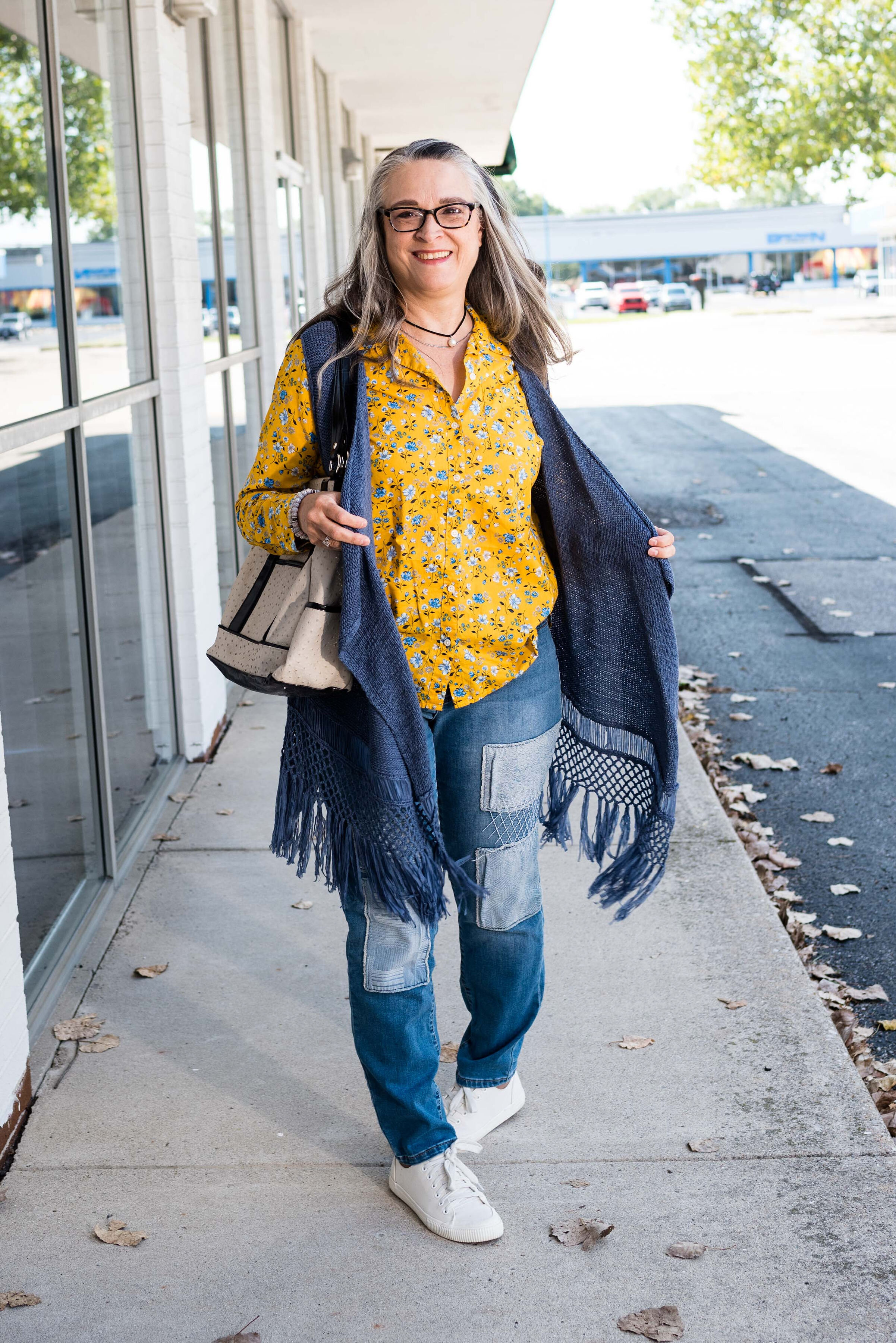
Baggy Jeans
I still love my skinny jeans, but baggy is in and because I love jeans in general I thought I would include this trend. Jeans are no longer just for the working man or woman on a ranch or construction site, now they are spot on for a casual day at home, a work day or even an dressy evening out.
Style Tip: If you want to dress up your jeans think fabrics and accessories. A silky top, heels and few statement pieces of jewelry will take your casual day outfit to night time glam outfit.
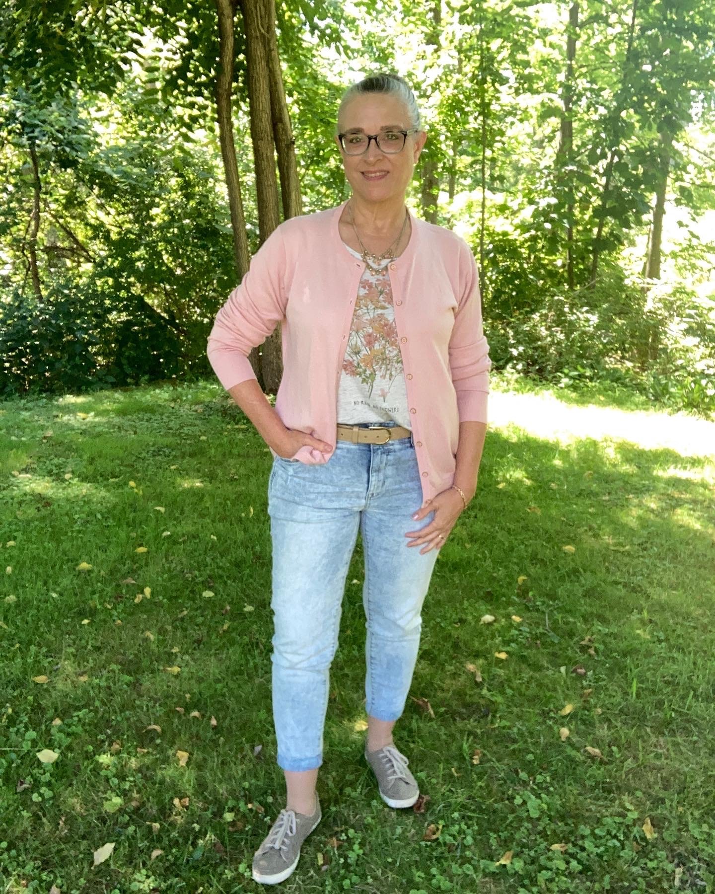
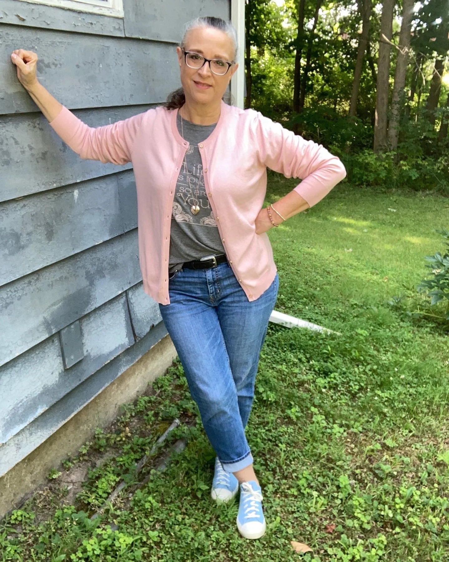
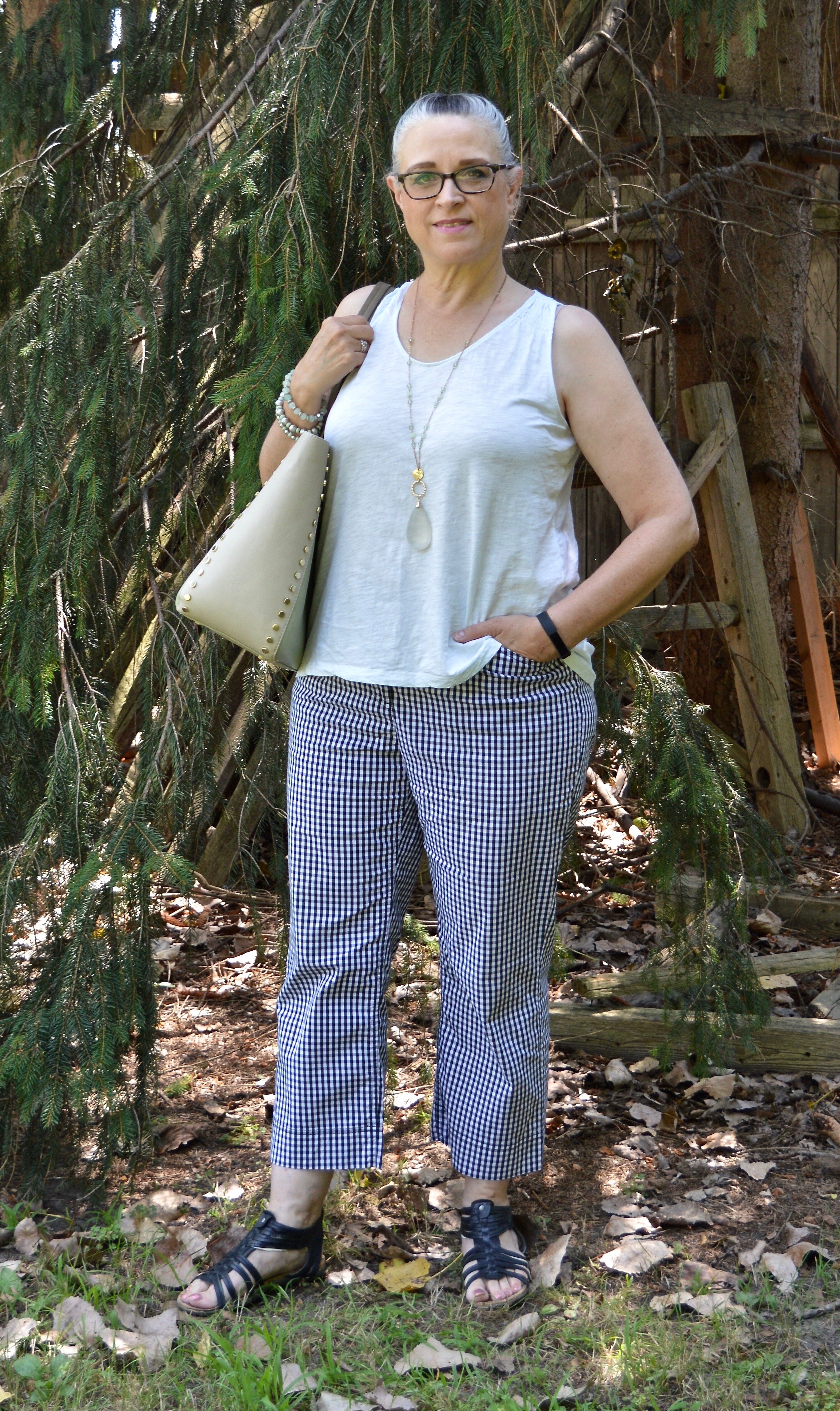
Basic White Tanks
I can get on board with this because just about everyone has a white tank top in their closet. This piece is perfect for late summer and early fall layering. Throw a blazer over your white tank and your ready for work, or add a cozy sweater for a casual lunch date look.
Style Tip: When looking for tank tops that are going to serve as actual tops and not just layering pieces choose fabrics that are a little thicker for less show through. Also, if you want more fitted look for ribbed knits; if you want less cling look for flowy fabrics in an a-line silhouettes.
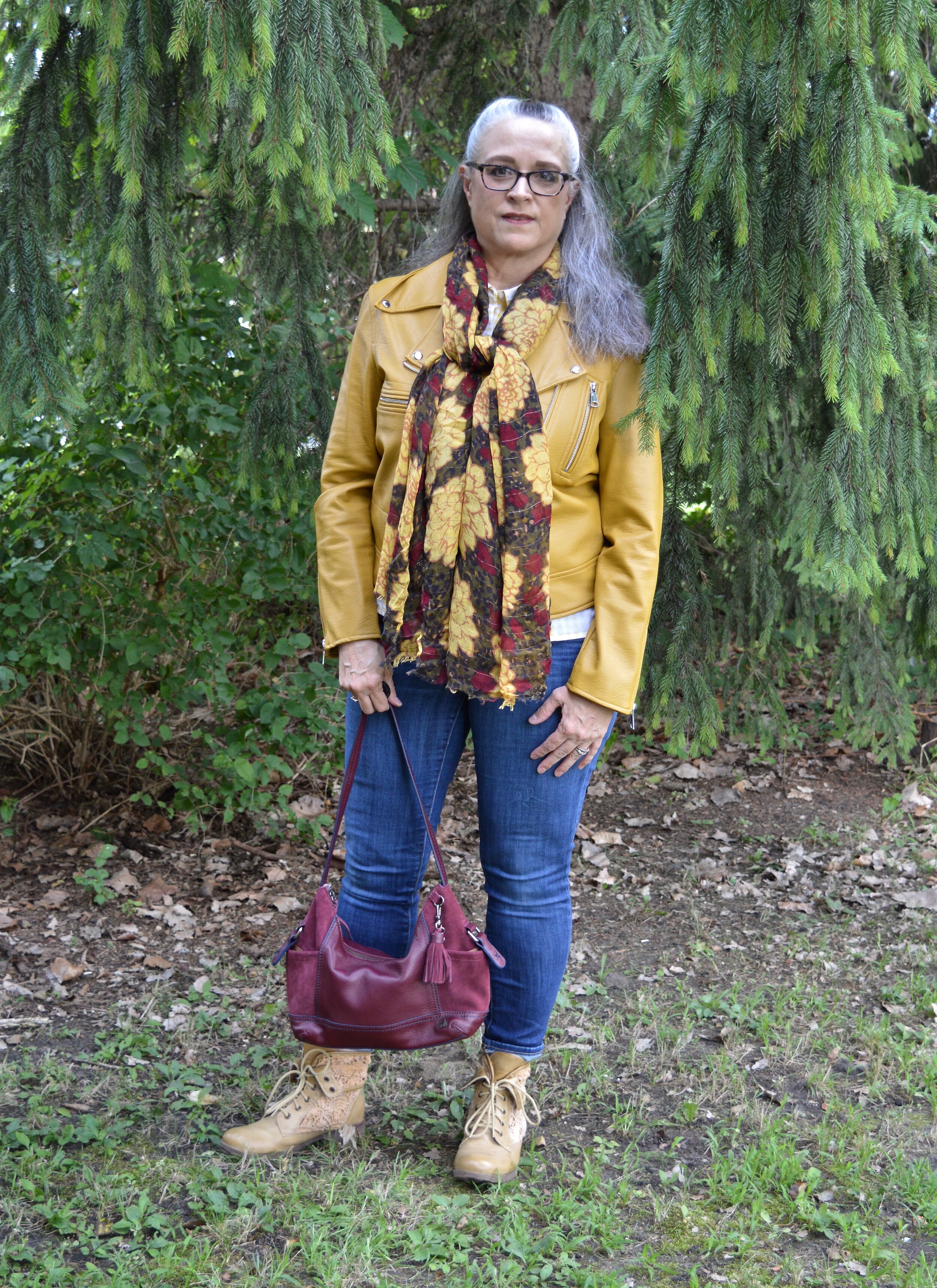
Bomber Jackets
Bomber style jackets are back in force and they don’t just have vintage military vibes. They vary in color, prints and fabrics making them a piece that is accessible to everyone who wants a shorter coat for cool weather days.
Style Tip: Use a lighter weight bomber jacket like a sweater or blazer. Wear it over a blouse for work, or a tee for a casual date night look. Add accessories like metallic or sparkly jewelry, or soft scarves to make this menswear style completely feminine.
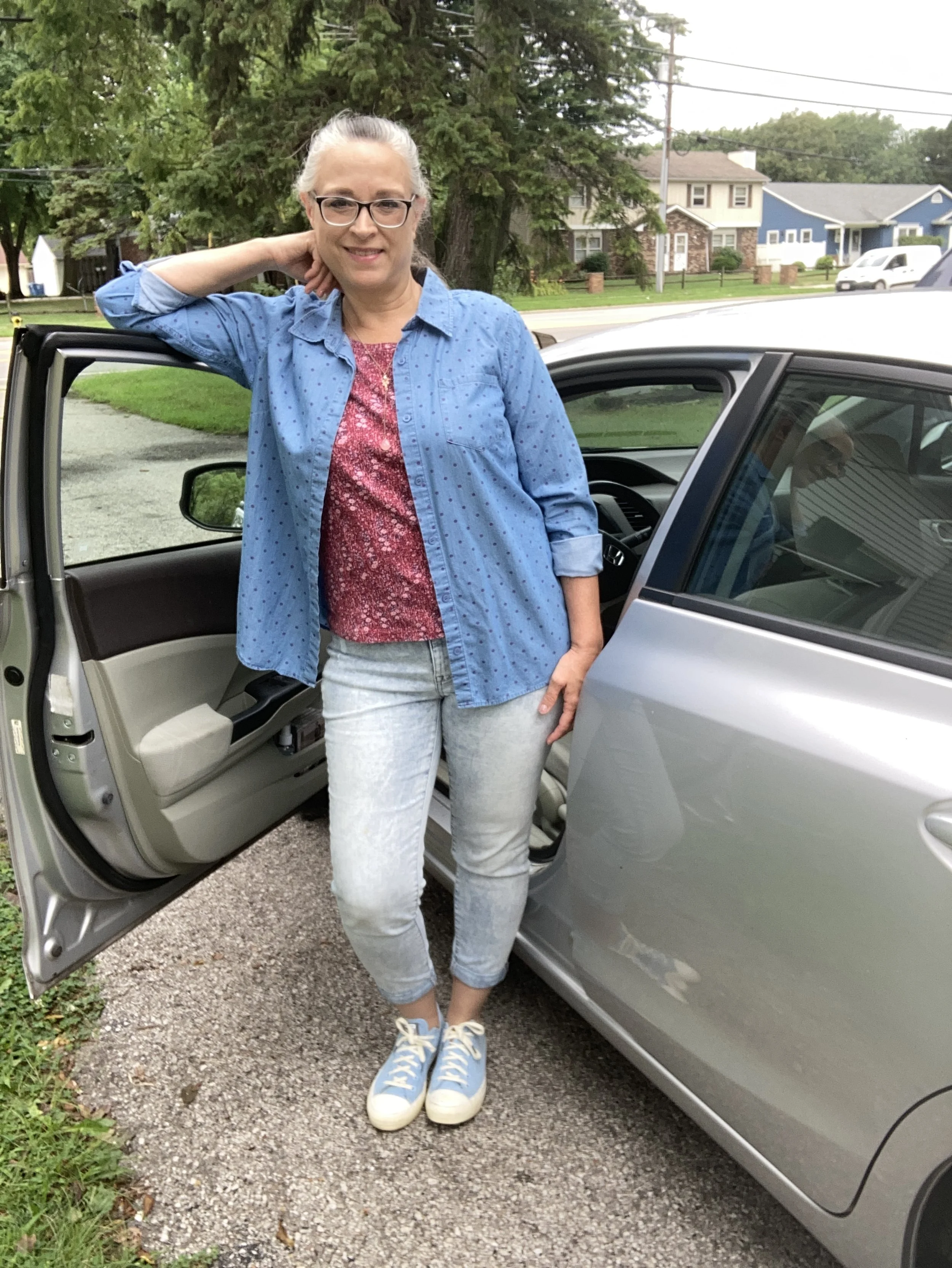
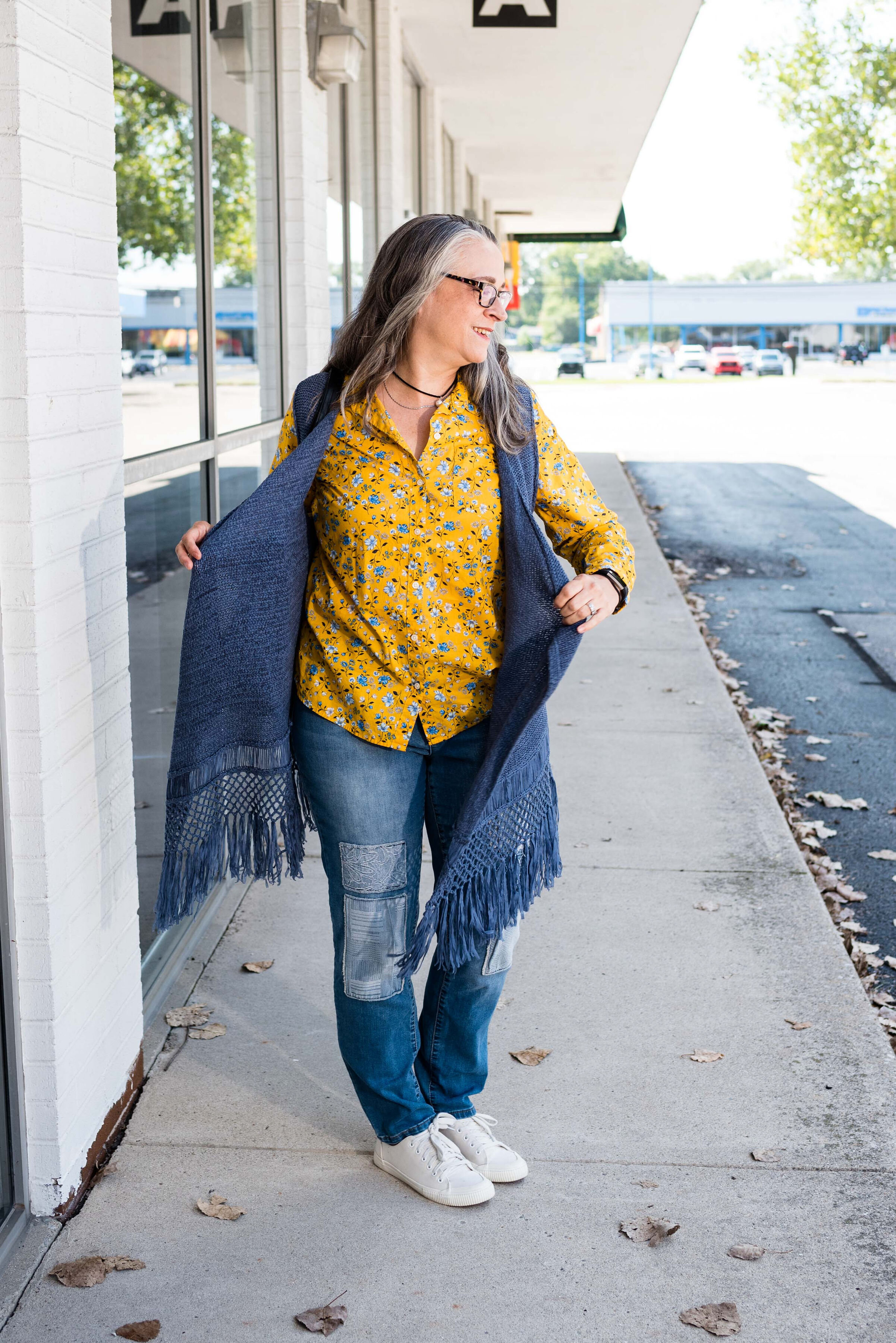
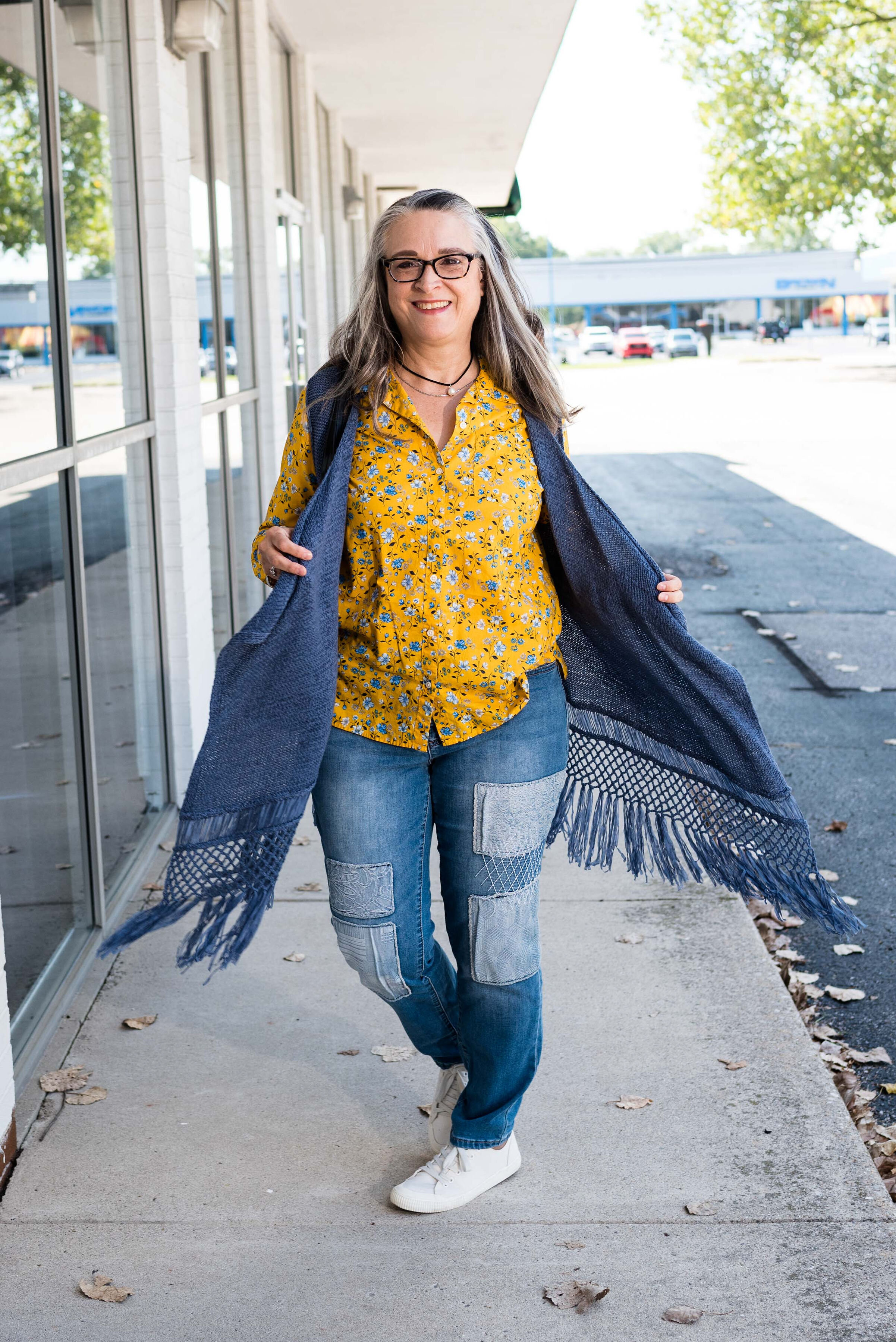
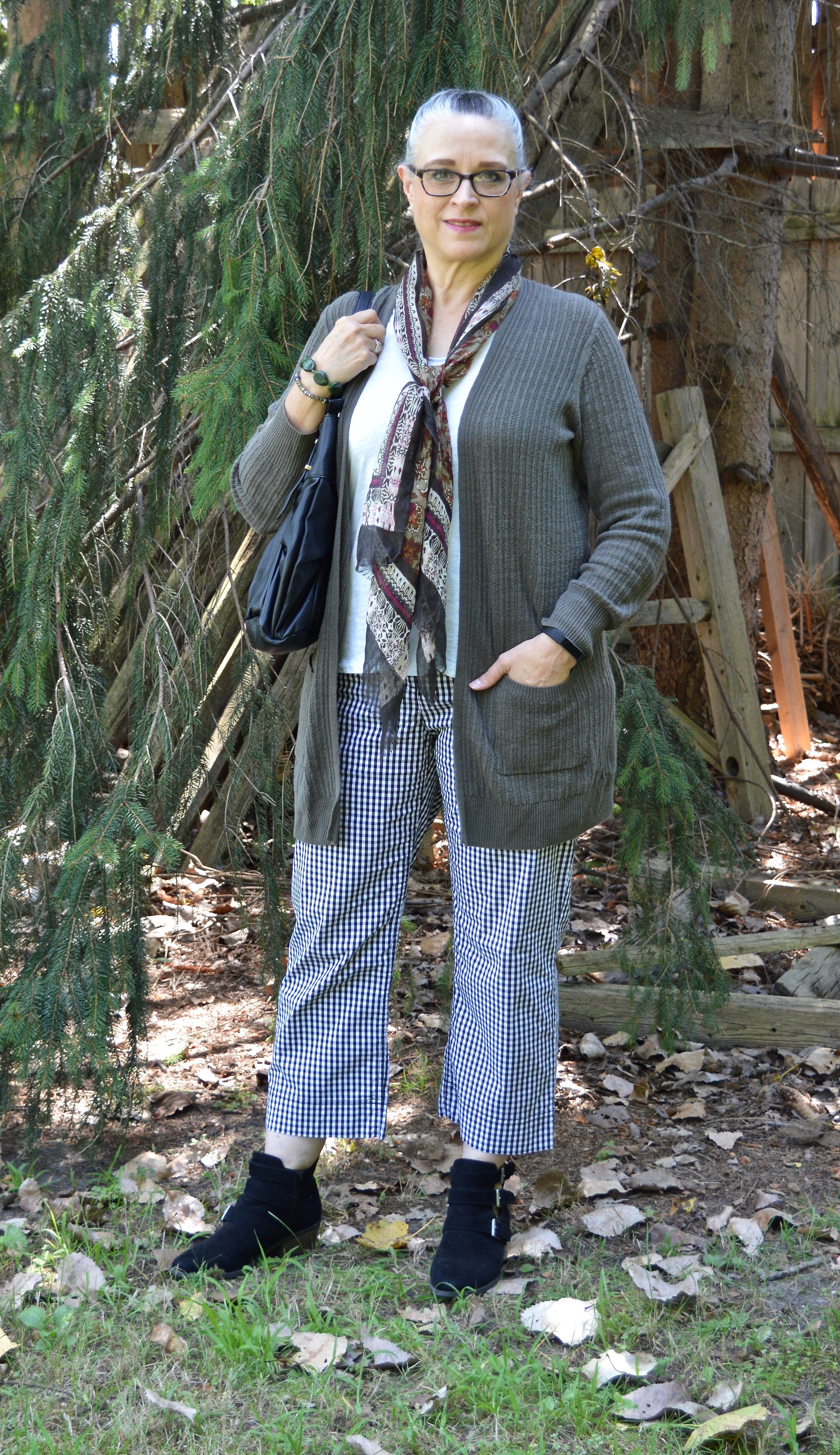
Oversized Button Ups:
Many of you already know, I love oversized button up shirts. I have shown you a few of my own over the last few years. I use them as jackets, under sweaters and vests and as tunics over skinny jeans with boots. Oversized is not for everyone, although I think most every body type can pull off an oversized button up by using it as a layering piece or a tunic, or even a short dress for those of you who are more petite. Don’t be afraid to try this trend, you might find you like it.
Style Tips: If you don’t like all that fabric especially if you are slight of frame, try belting the shirt or tying it at the waist. If you are a thrifter, be sure to shop for oversized button ups in the men’s section. That’s where I have found most of mine.
Cozy Coats:
Nothing beats the colder weather like a soft, cozy coat. Whether you like real or faux fur, real or faux shearling, soft wool blends or suede, a warm coat in a pretty color or with fun details can make a blue winter day seem a little less daunting.
Style Tip: When shopping for a coat, be sure you wear layers that you would normally wear under your jacket, or at least keep that in mind when you trying coats on. Sleeves that feel perfect with your polyester blouse may not be as roomy when you have on a chunky knit sweater. The same is true for being able to button or zip the coat. Think ahead to how you will most often wear the piece and what you will wear underneath.
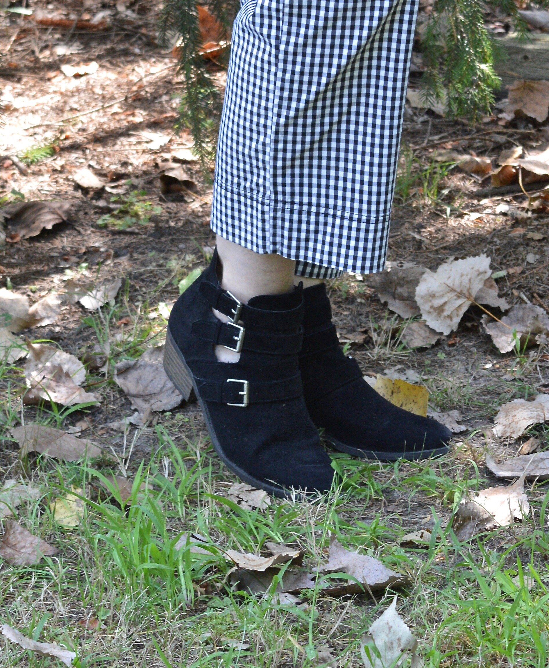
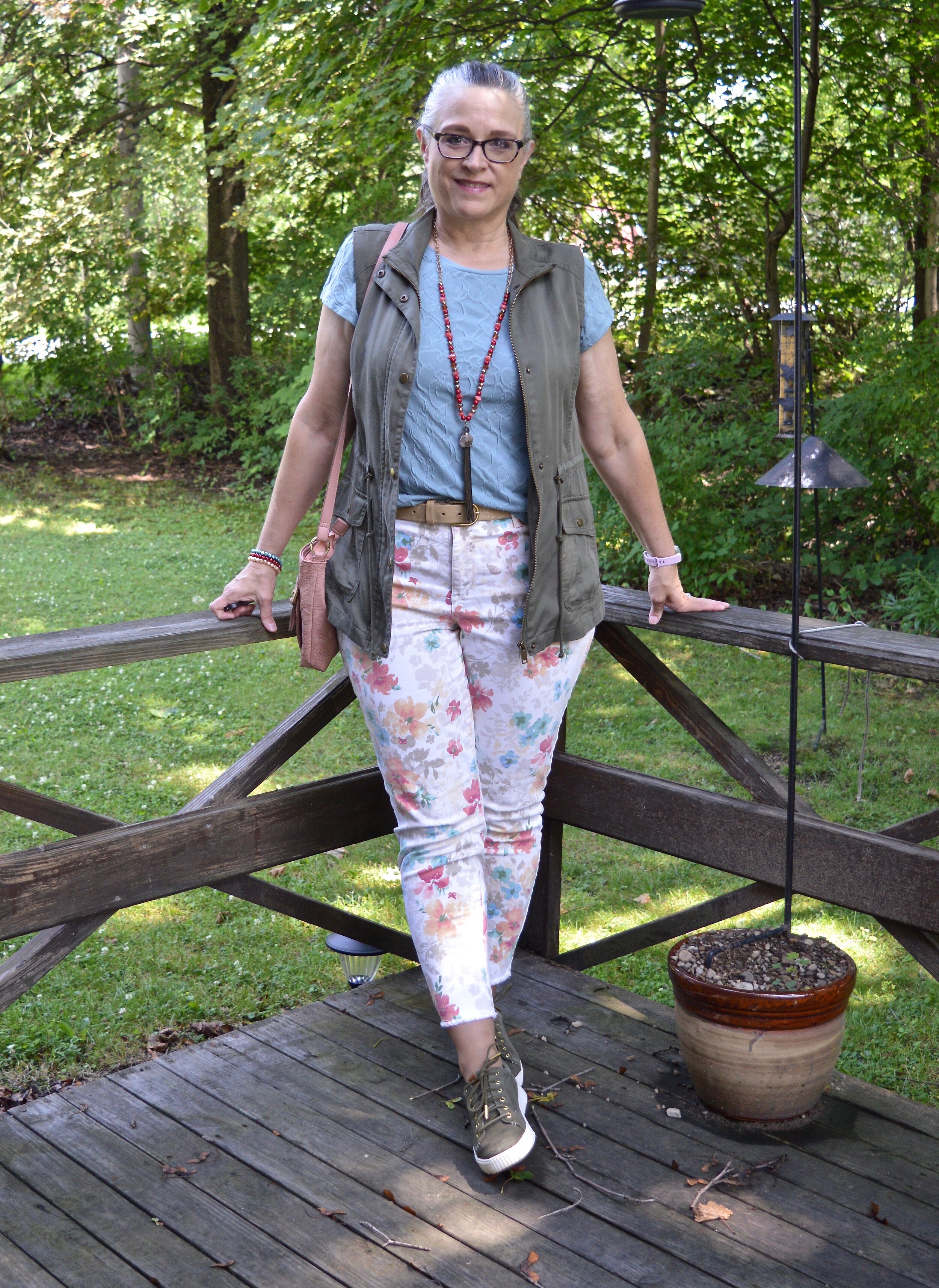
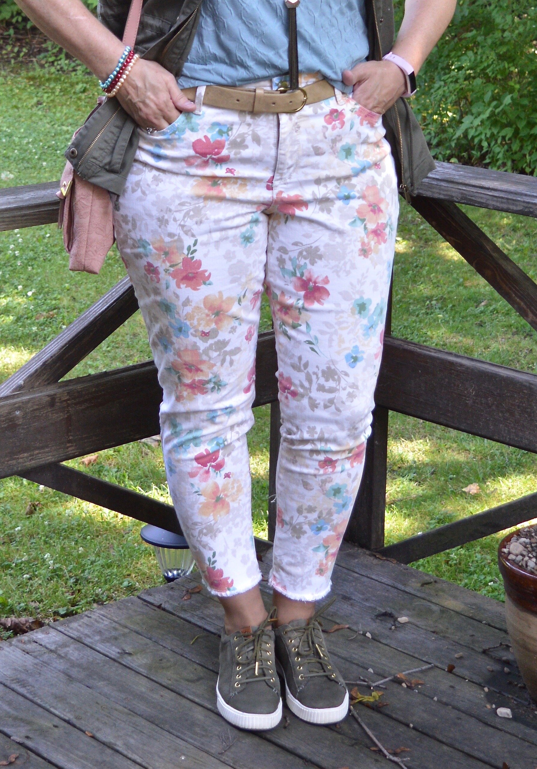
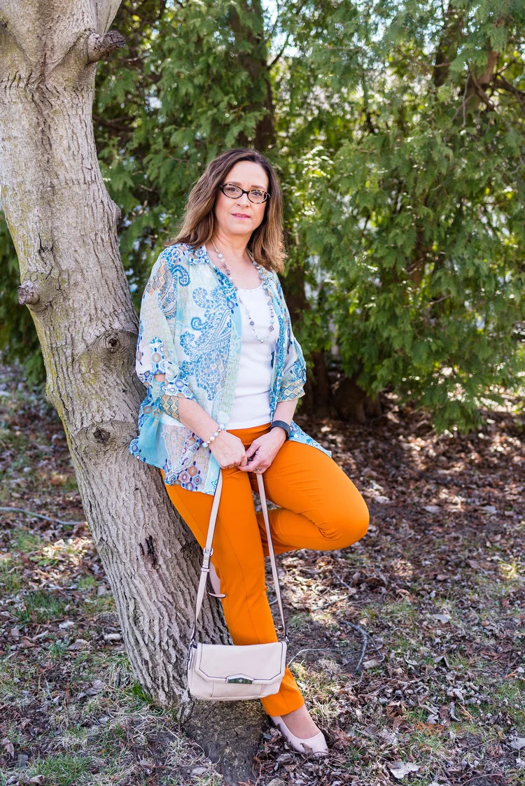
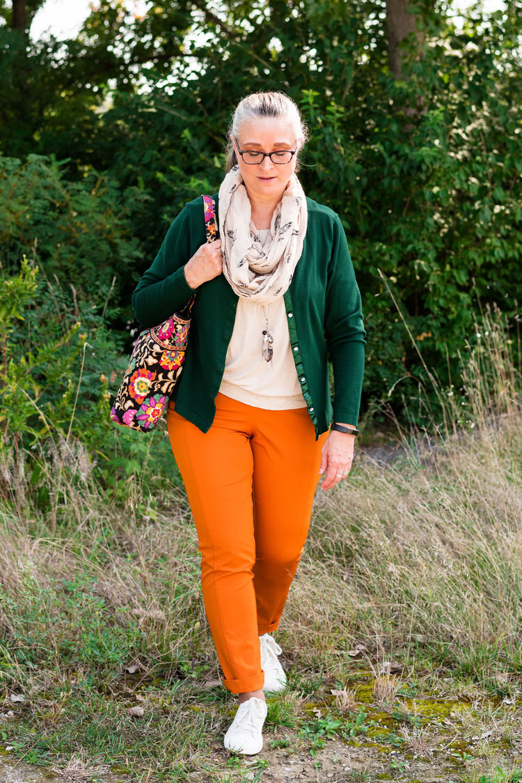
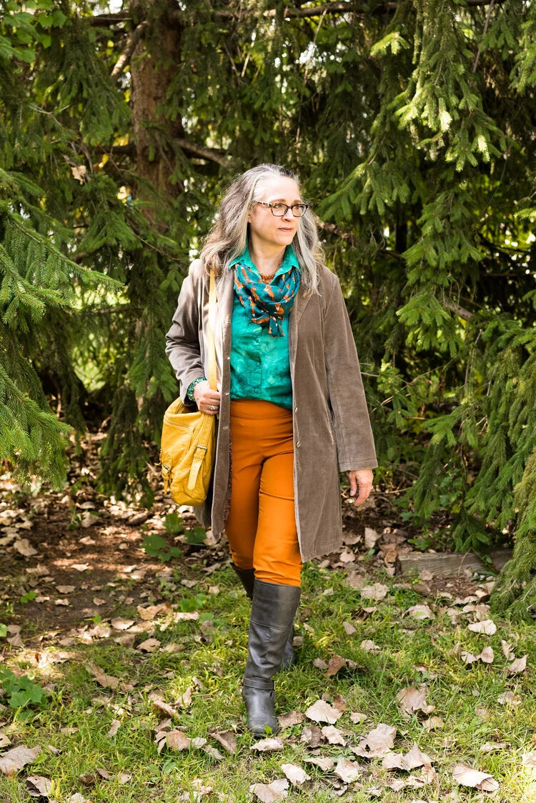
Cargo Pants:
Cargo pants are a great alternative to jeans. I realize not every woman wants pockets on the side of her pants accentuating her thighs, but if you don’t mind those added details, cargos can be another way to a fun casual look. I especially like the jogger styles, because I think they look a little more slimming than the typical canvas or heavy cotton material.
Style Tip: When styling cargo pants try to balance out the extra pockets on your legs with a top with slight shoulder pads or or with pieces that are trim like a fitted tee, or a cropped jacket. Too much material on top begins to make the outfit look less classy and more unkempt.
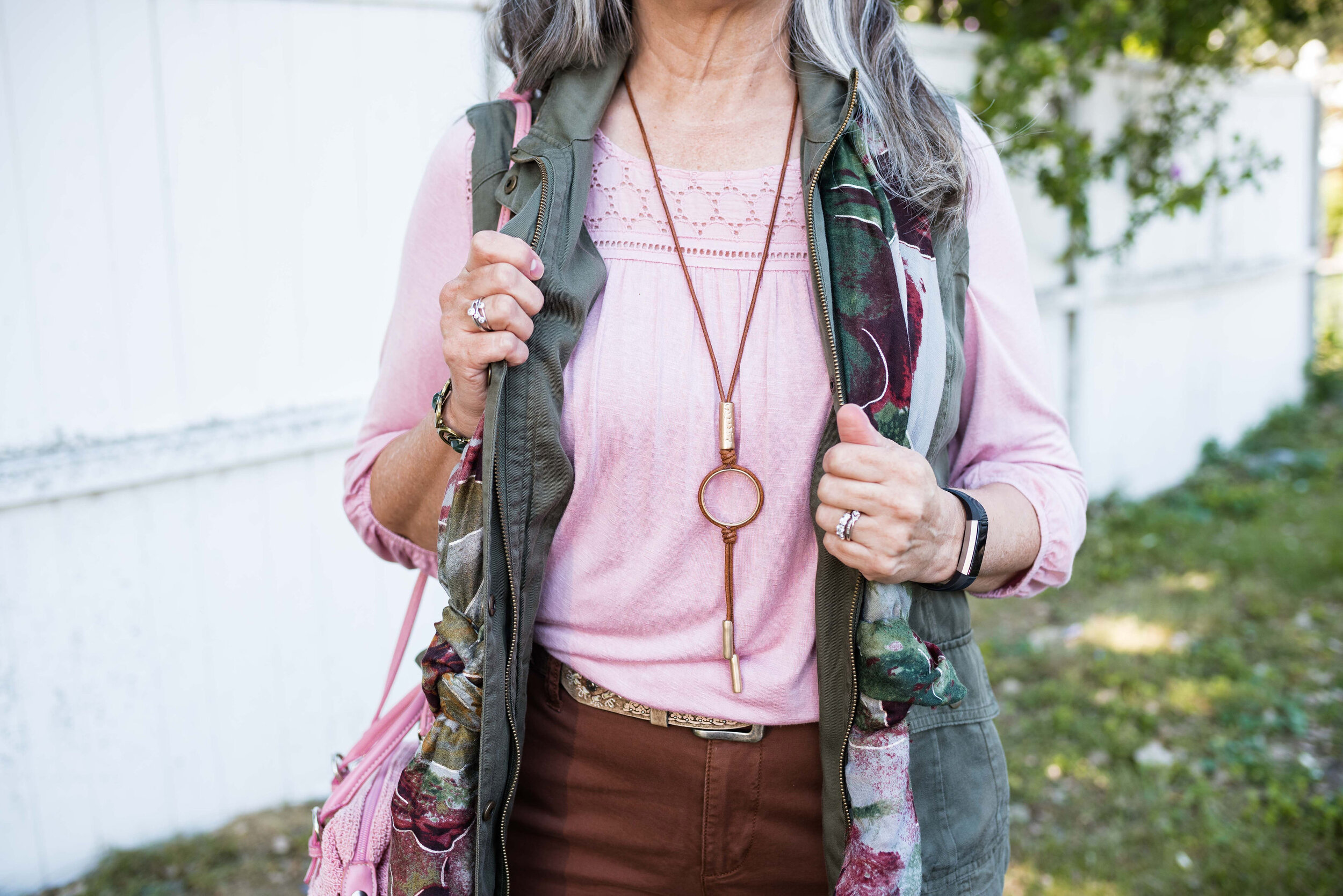
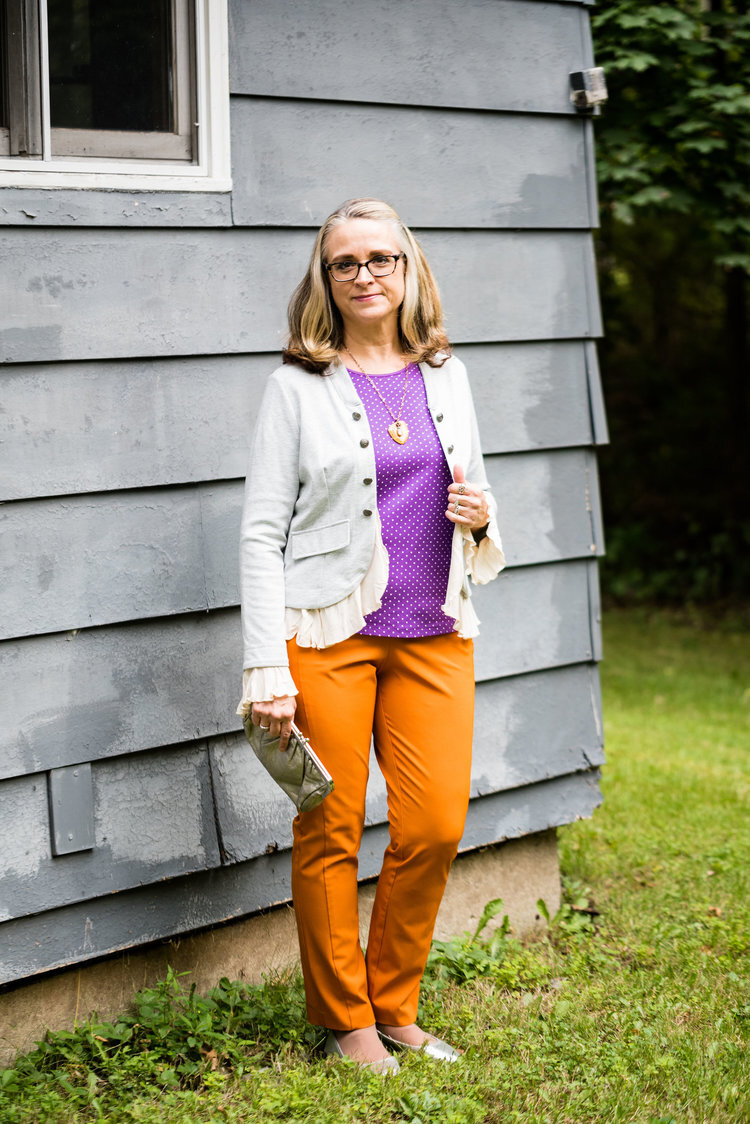
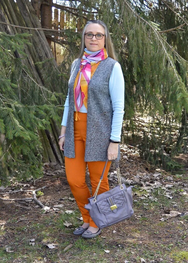
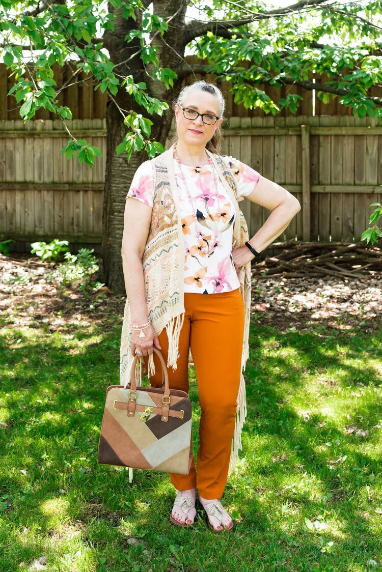
Vests:
Vests, or in the fashion realm, fitted waistcoats are making a comeback, though I don’t know how much retailers are catching on with this one. Even at thrift stores it is hard to find vests, so hopefully you have a few in the dark recesses of your closet that you can pull out and give the light of day. I like vests for three reasons. The first is that the old fashion waistcoat really makes an outfit look polished and professional, whether you are wearing jeans or a pleather pencil skirt. A vest also adds a layer of warmth in the cooler weather. Finally, vests are a great way to draw in the waist and cover the bumps and bulges without wearing a full on corset (and yes, those are trending this fall as well, but I have chosen to leave those to the younger generation).
Style Tip: While vests look wonderful with trim button up shirts or more fitted sweaters try pairing a vest with an oversized button up for a fun artsy boho look. You can also wear a vest under a blazer for added interest and polish.
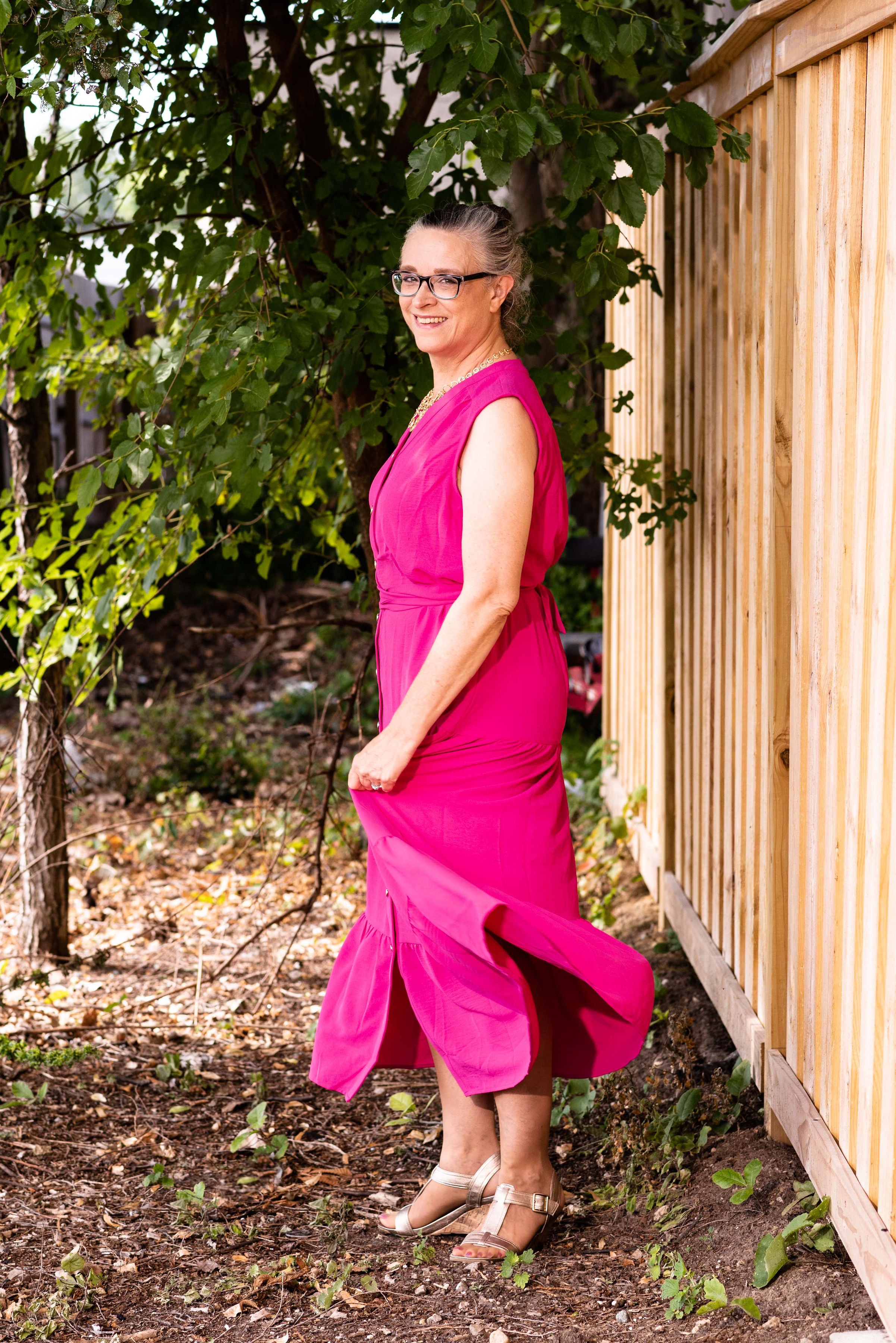
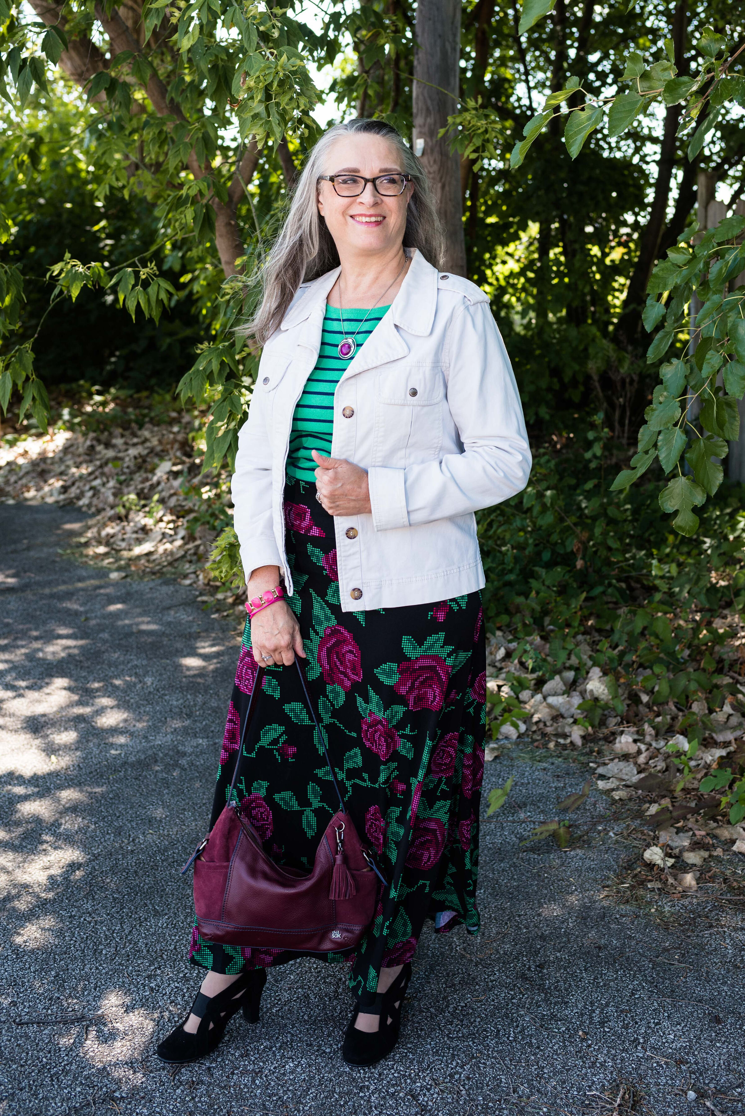
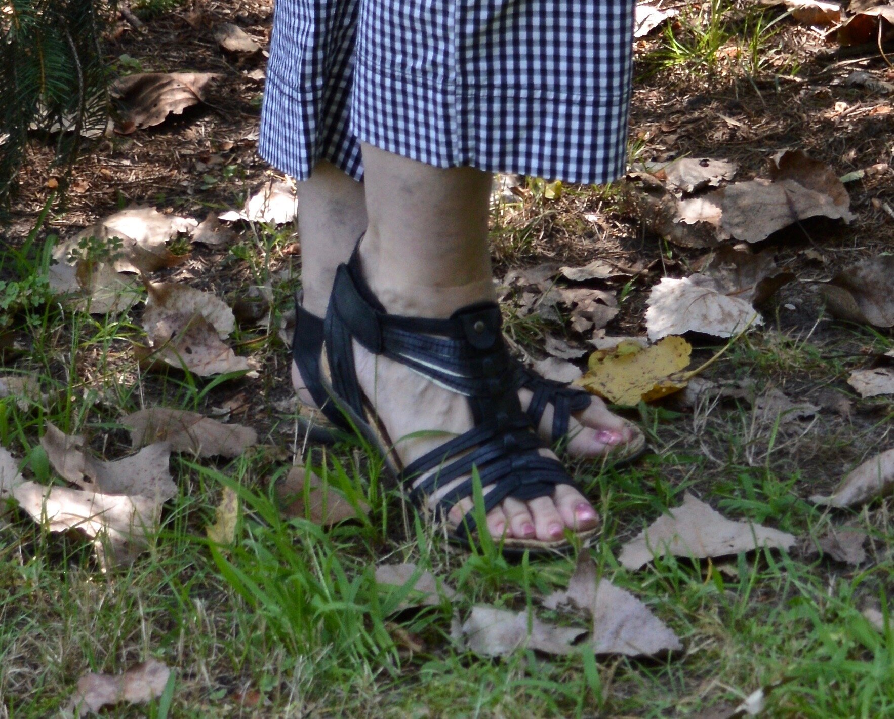
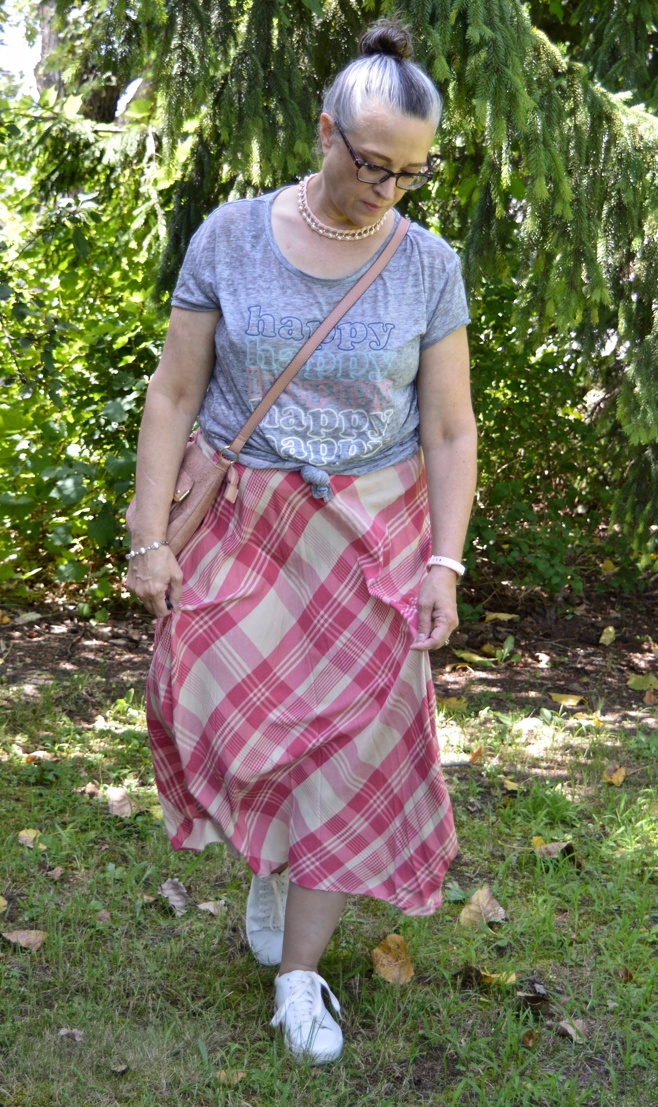
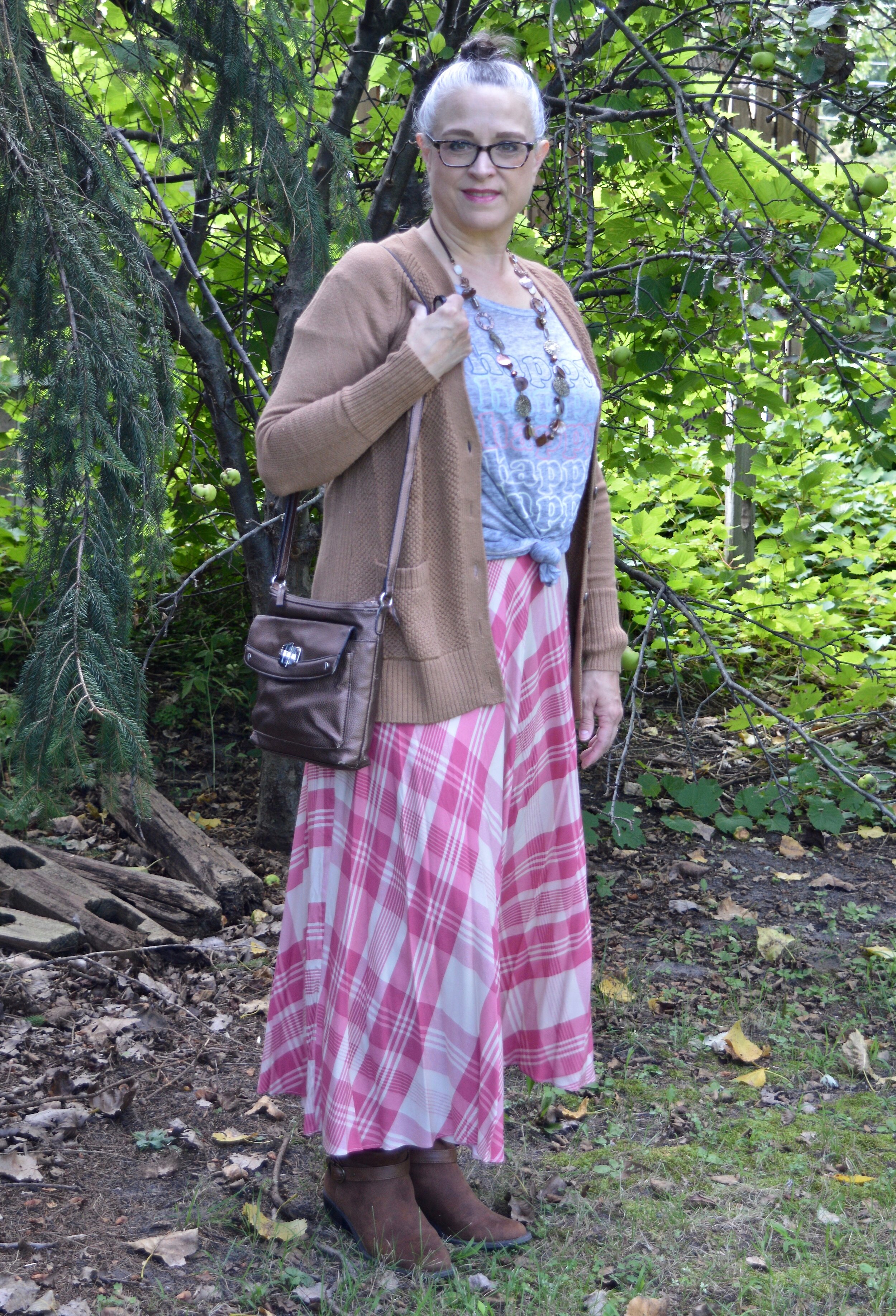
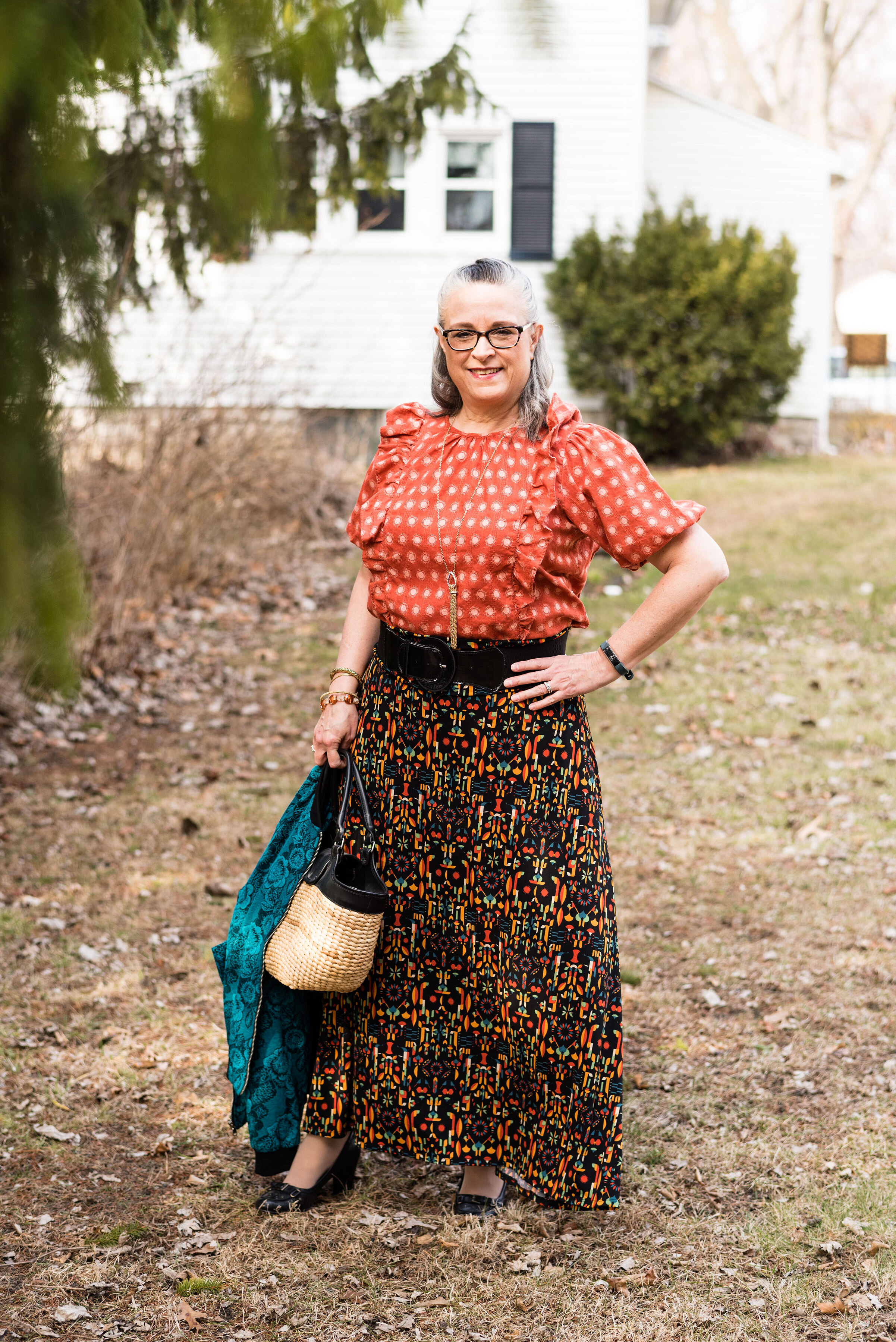
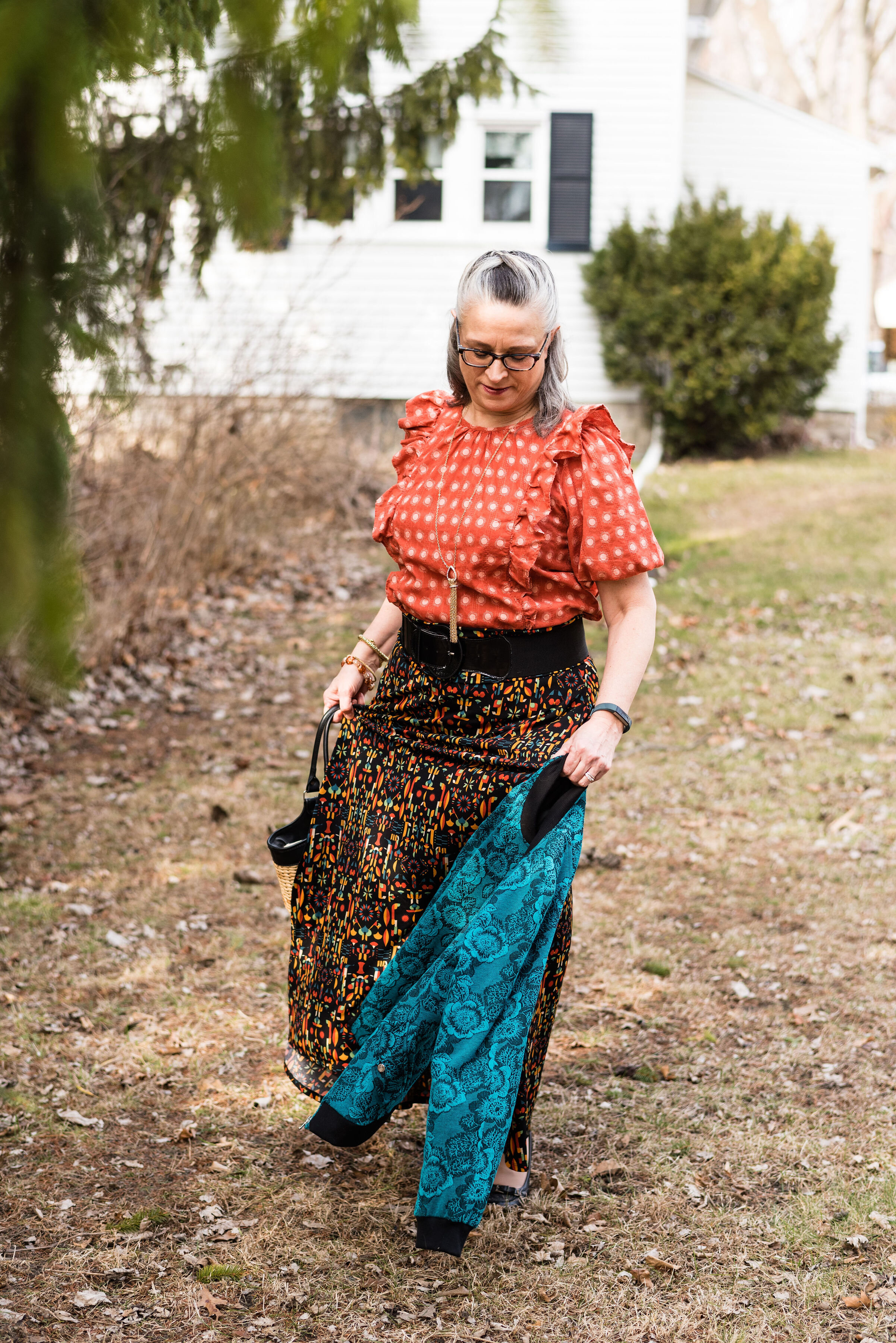
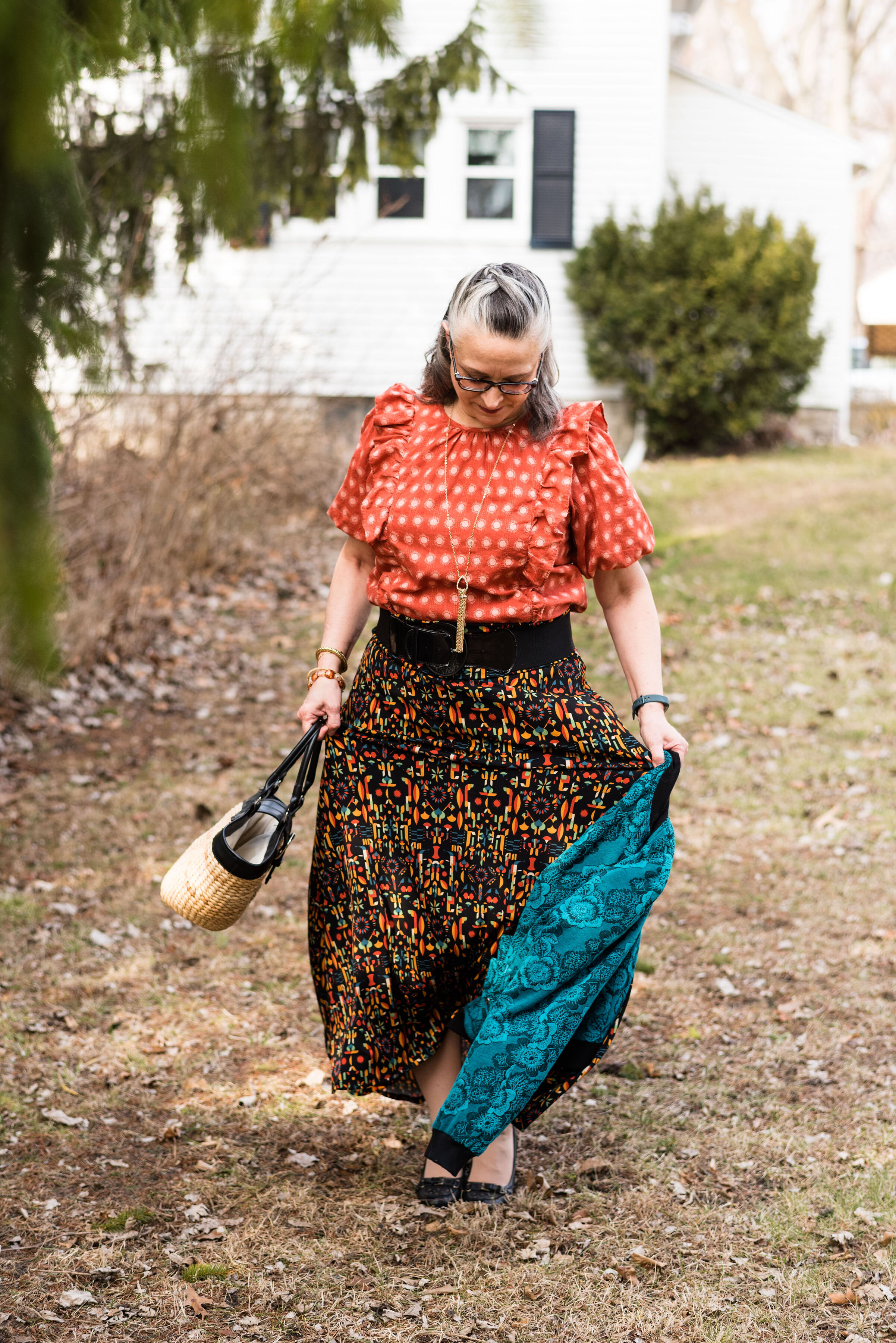
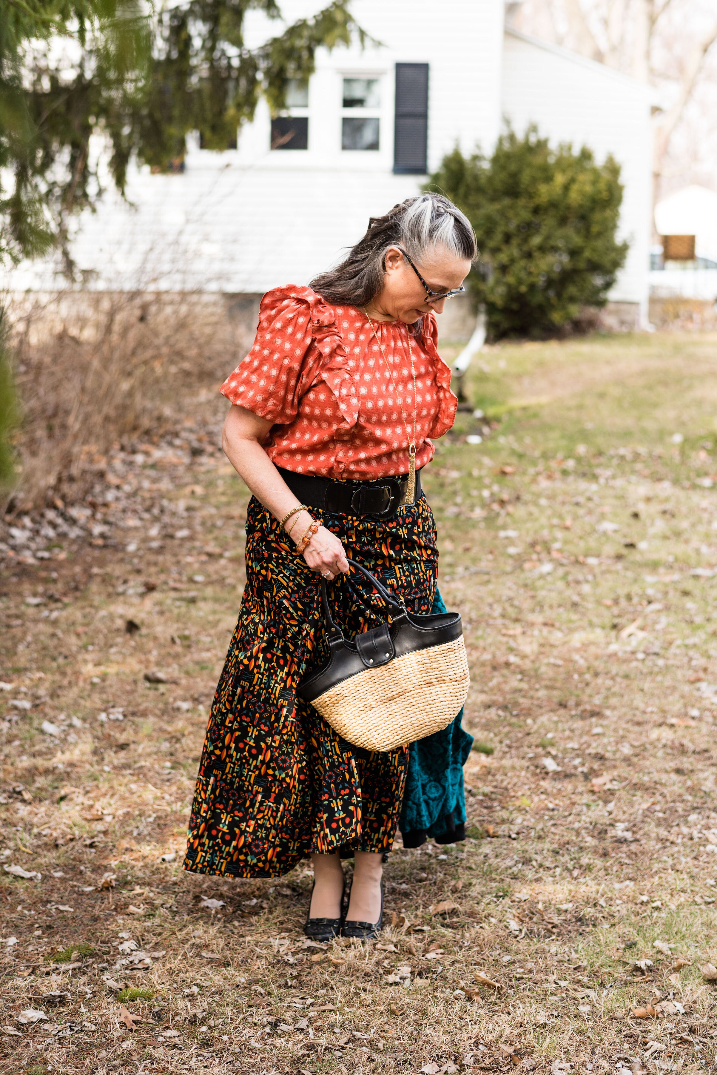
Maxi Skirts (and Dresses):
I’m not including any links for maxi dresses since I just showed you two from Closet52 a few weeks ago. Hem lengths really are an anything goes standard, but for the fall the longer, floor length styles are trending again. When it comes to styles these vary as well. One website talked about the Bohemian influence which would include tiered and prairie silhouettes, while another site said a-line and columns are in.
Style Tip: If you are petite you might struggle with finding a maxi skirt that is not too long. Try shopping for skirts that are tea length on other women. Tea length usually falls between the knee and the ankle which will probably be just about right for ladies that are 5’2” or shorter.
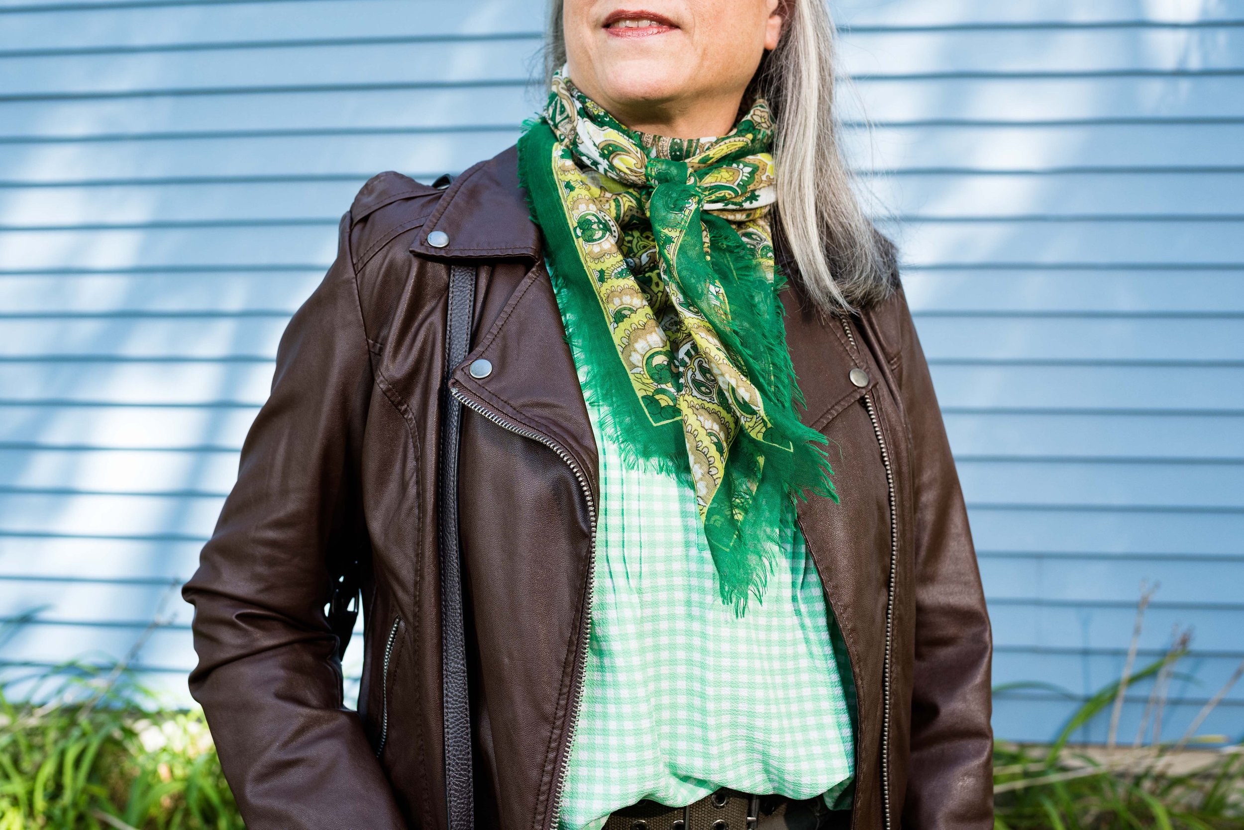
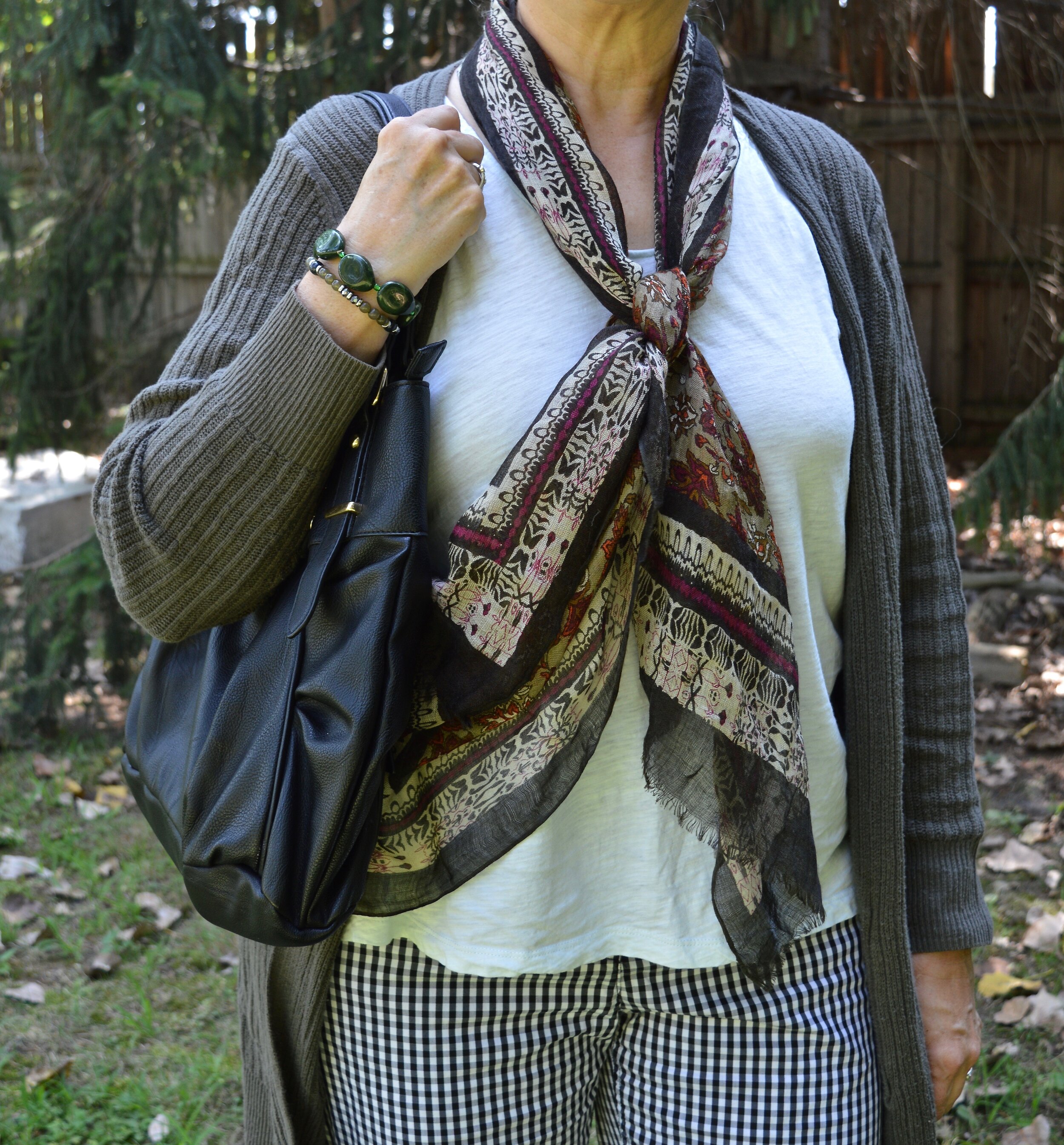
Leather (real or faux) jackets:
I have always loved leather jackets. I own a couple that are actual leather and the rest of my stock are fake. Fake leather today, looks just as good as the real thing, but varies from manufacturer to manufacturer as to how durable and long lasting the materials are. I recently went through my jackets and did put a few in the donate pile, mostly because they are more snug than I want these days. My style has also evolved over the last few years and I am more likely to reach for a utility jacket, a cozy sweater or a blazer when I want a light weight jacket or extra layer indoors. However, I still intend to hang onto a few of my more loved pieces.
Style Tip: When shopping for a real or faux leather jacket be sure to find pieces that are made of flexible, soft materials. The stiffer leather will become stiffer with age, unless regularly worn and tended to, and faux leather that is too cheap or stiff will tear away from the under layer.
Additional Trends worth mentioning:
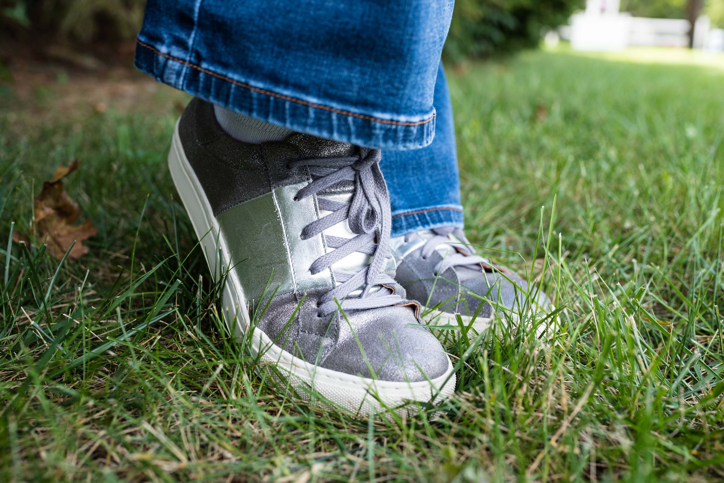
Square Loafers:
Leopard Print:
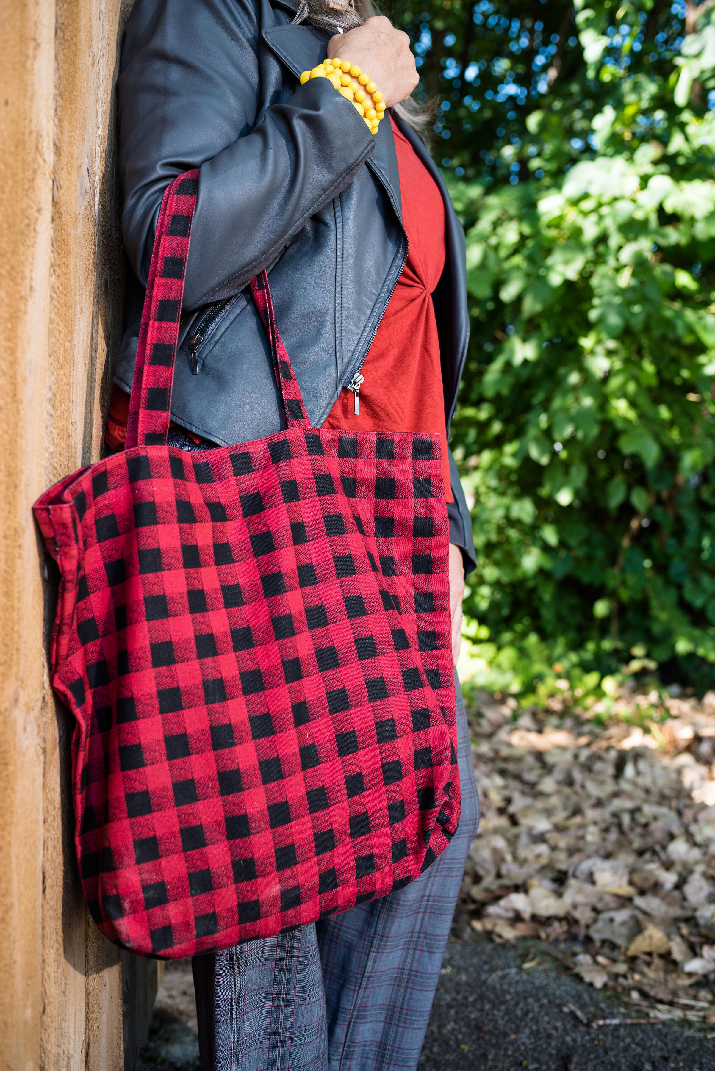
Just a quick word here. Leopard print is always going to be around, so wear it, flaunt it, carry it and wrap yourself up in it. In addition sturdy tote bags are trending and very useful for work or even travel if you don’t want to pack too many suitcases. I also added the faux fur bag, since fur ( and faux fur) accessories are trending as well.
As always there are many more trends I would love to discuss, but these were the ones I felt we all could get on board with. Maybe you don’t like baggy jeans, but you do like square loafers. Maybe you are a fitted vest kind of girl, and absolutely don’t like oversized button ups. I hope you enjoyed hearing more about these fall trends.
All of the items listed are affiliate links. I get a small amount if you click on a link and a little bit more if you purchase through my site. I appreciate every click and even more appreciate your support for the blog. I’d love to hear your thoughts on these trends. How many of these do you have in your closet?
Next week I hope to show you my take on a few of these trends. Until then have a great week!