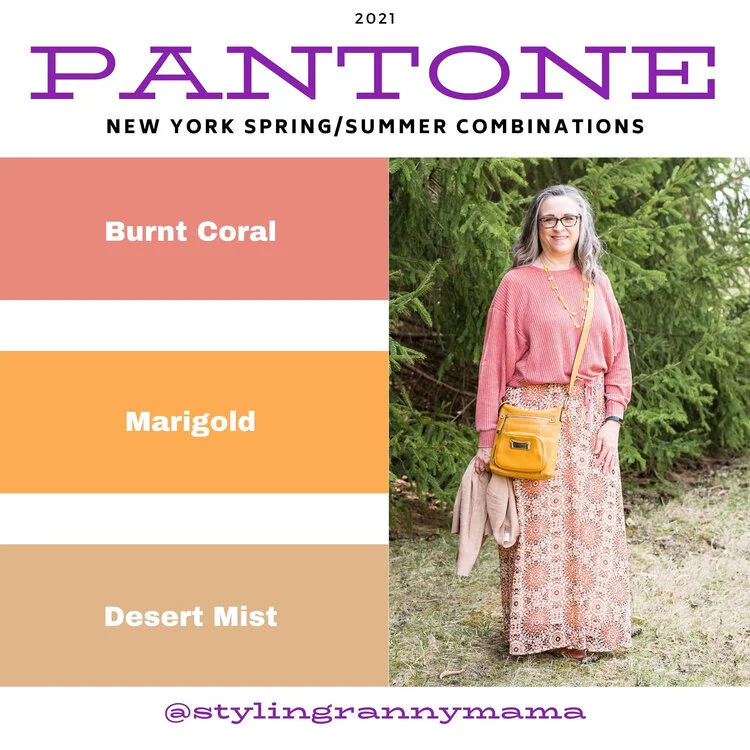
Pantone Autumn/Winter 2022: Orange Tiger, Nosegay, and Autumn Blonde

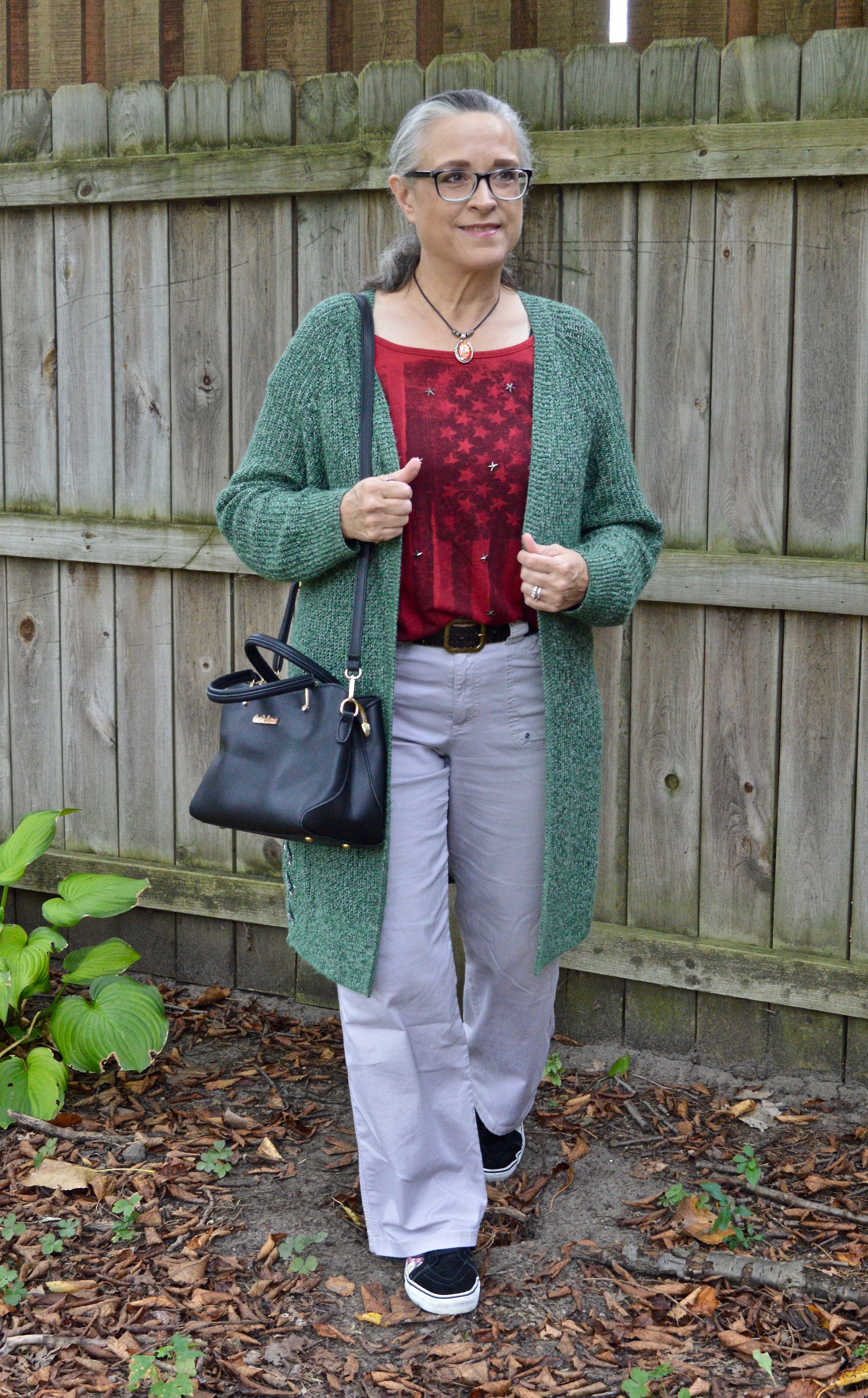
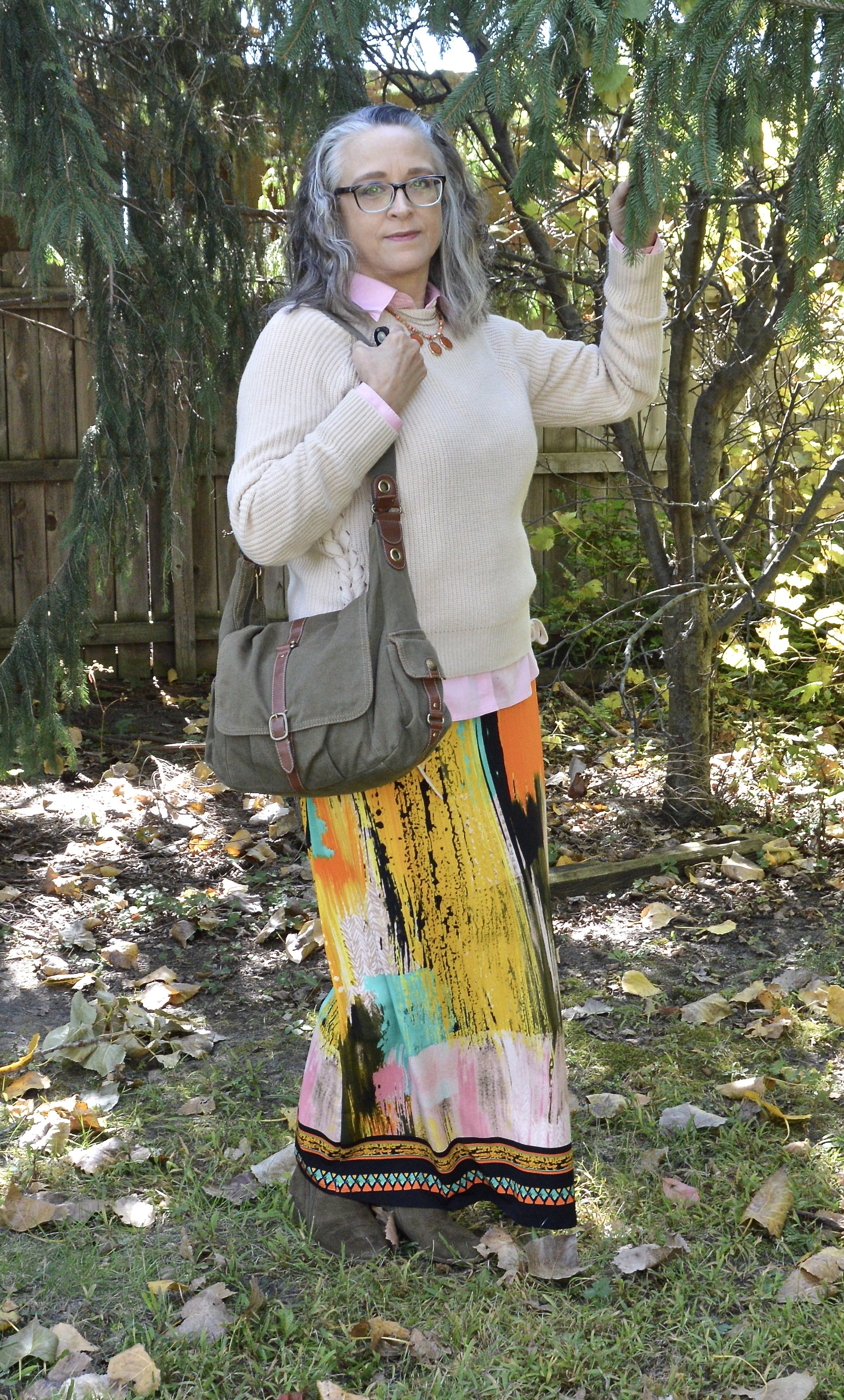
Welcome to another outfit in my Pantone Autumn/Winter 2022 - New York Palette color series. For today’s look I combined the colors Orange Tiger, a lovely fall orange, Nosegay, a rich pastel pink and Autumn Blonde, a neutral classic for a cozy outfit with watercolor brushstrokes and southwest vibes.

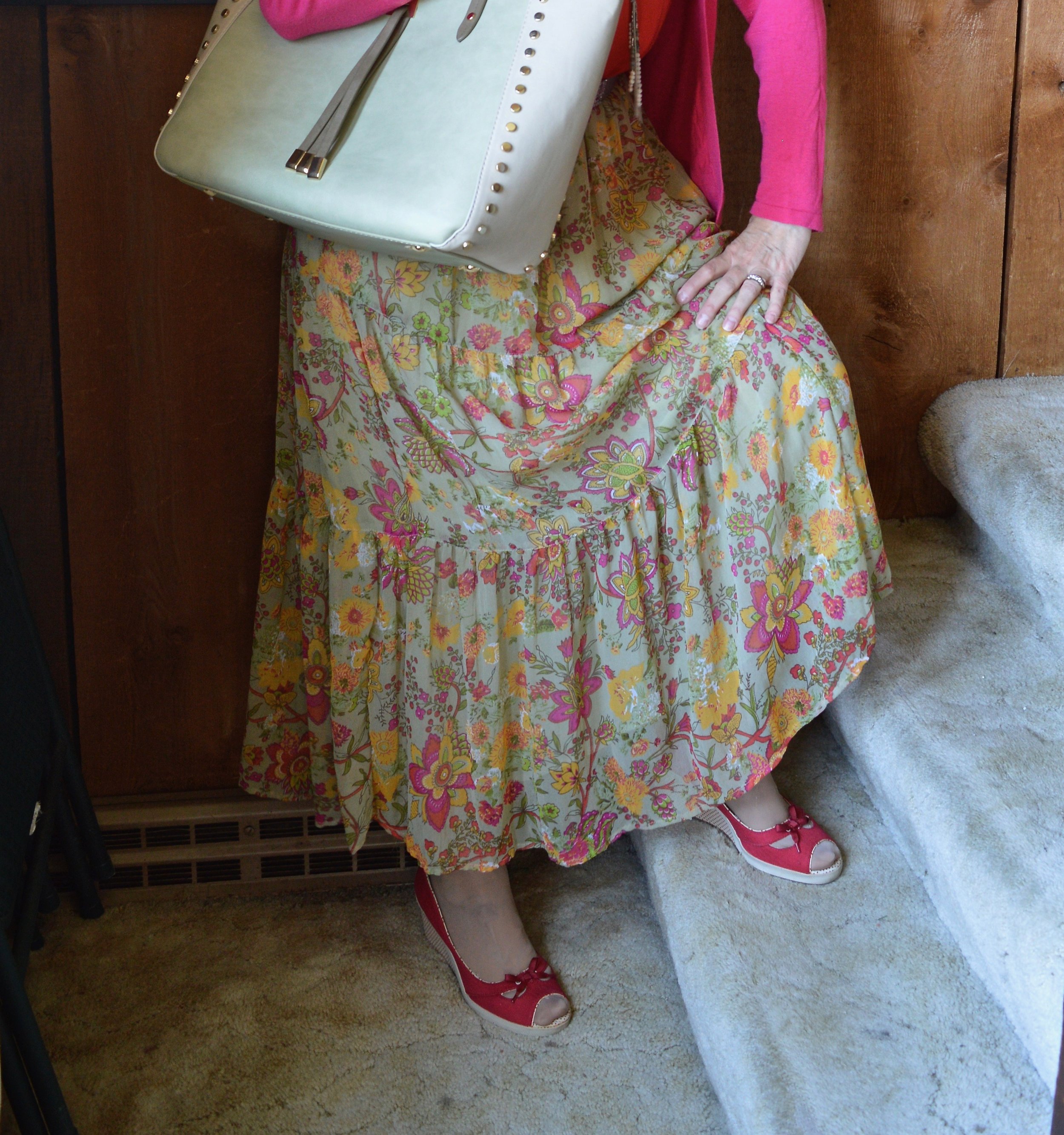
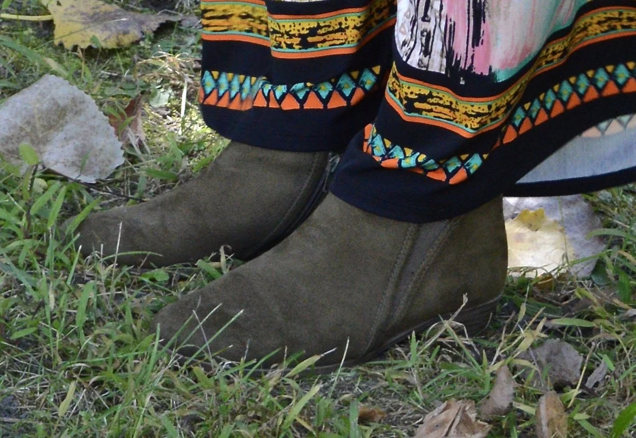
When I decided to pair Nosegay and Tiger Orange I had this watercolor skirt in mind. The colors are mixed together with bold strokes and finished off with the southwest hem along the bottom of the skirt. I found this piece thrifting a few years ago and thought it would be great for spring and summer, but it seems to work for fall as well. It is a brand called ECI NY.

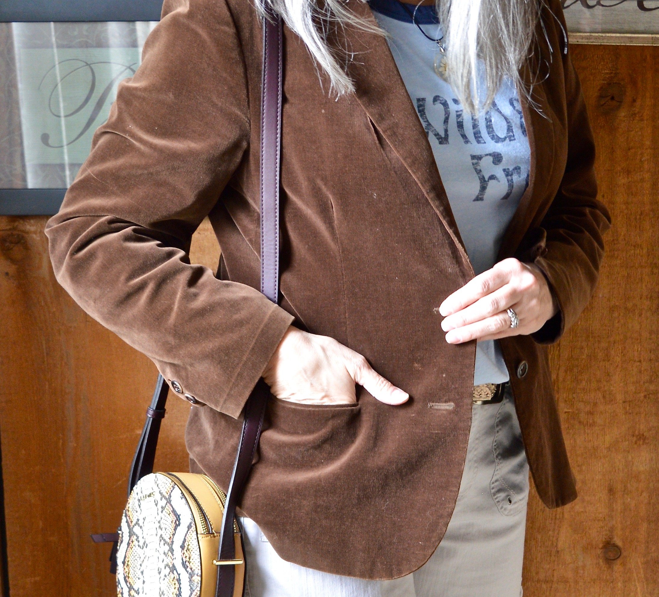
My light Nosegaybutton down is a thrifted Eddie Bauer piece. Originally I was thinking of wearing it over the sweater like a shacket. I ended up putting it under the sweater, but I’m not in love with how this looks.

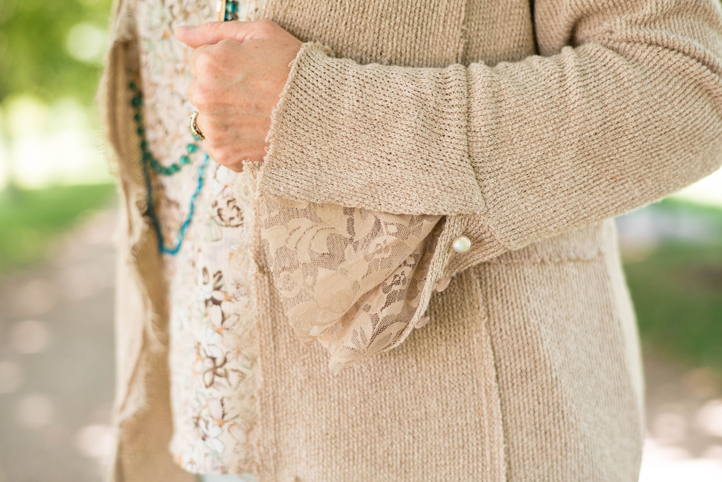
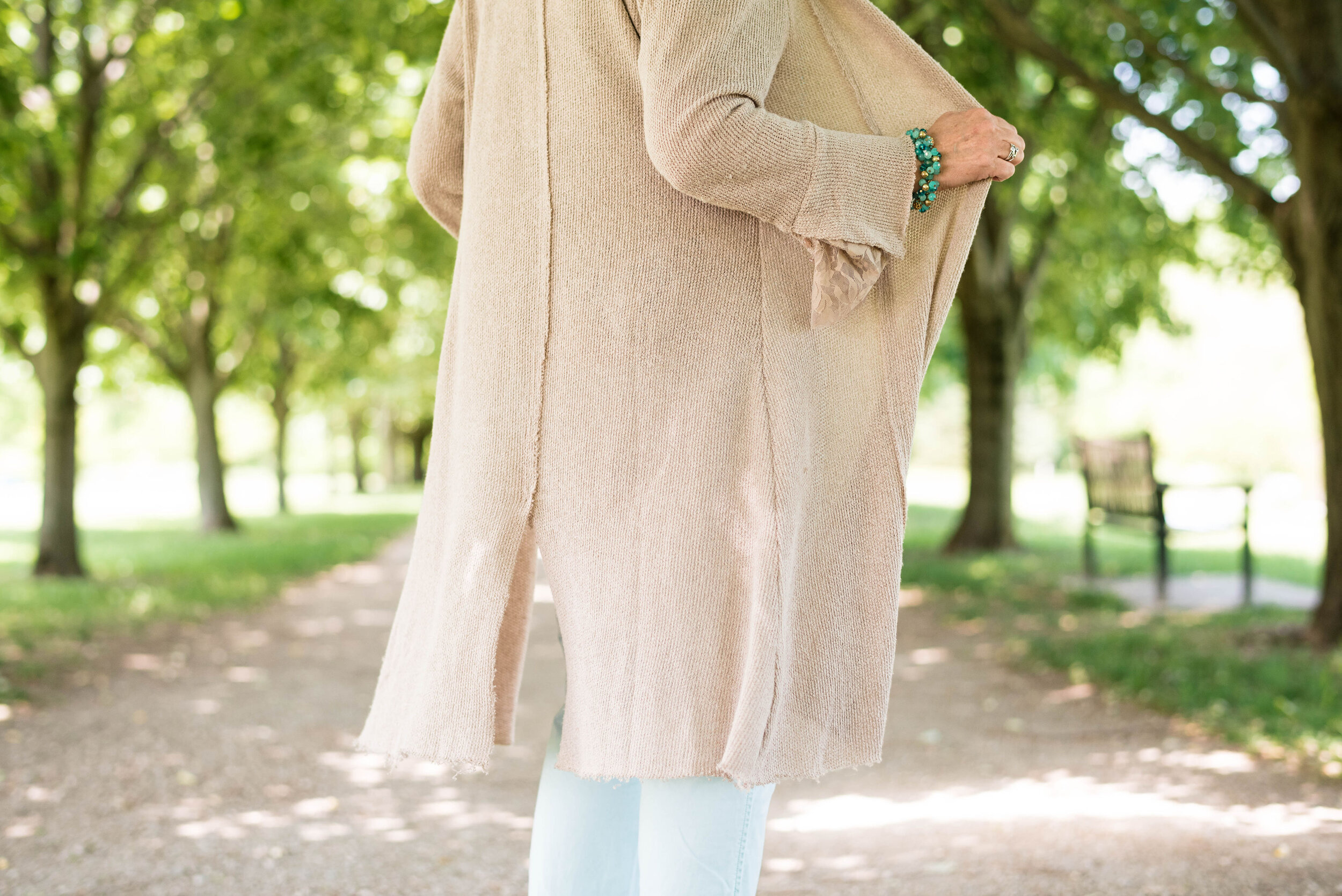
The Autumn Blonde sweater is a recent find and is Forever 21 brand. I really like the ties along the outer seams on the torso.

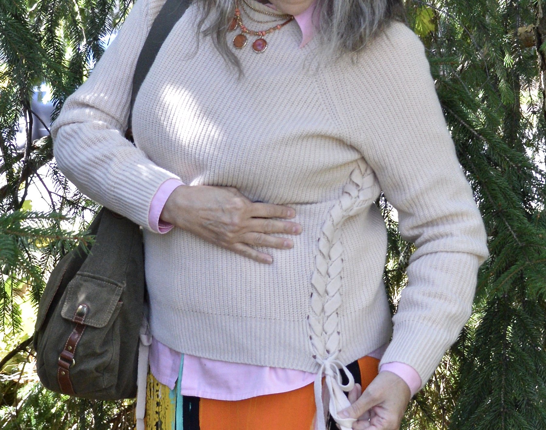
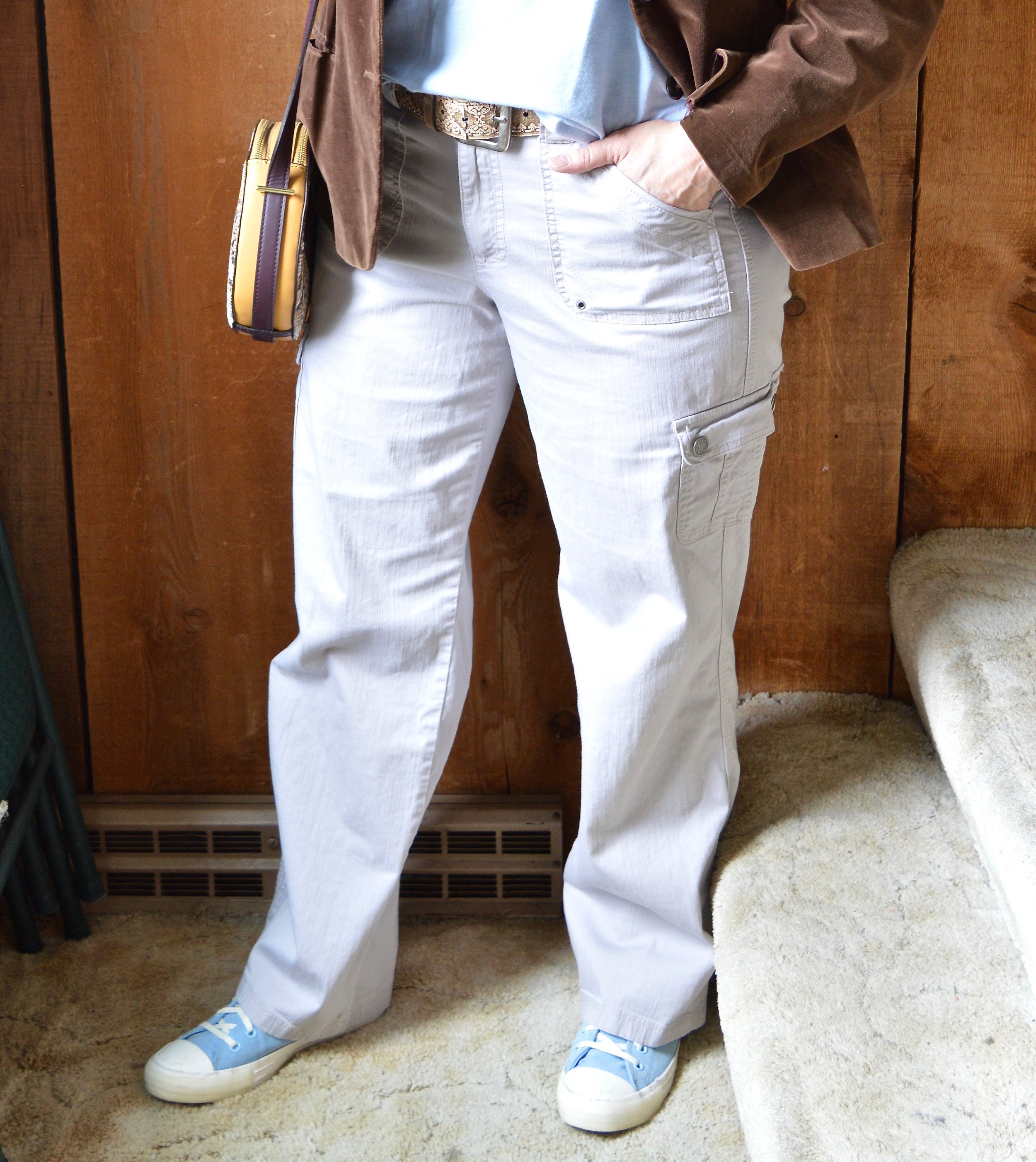
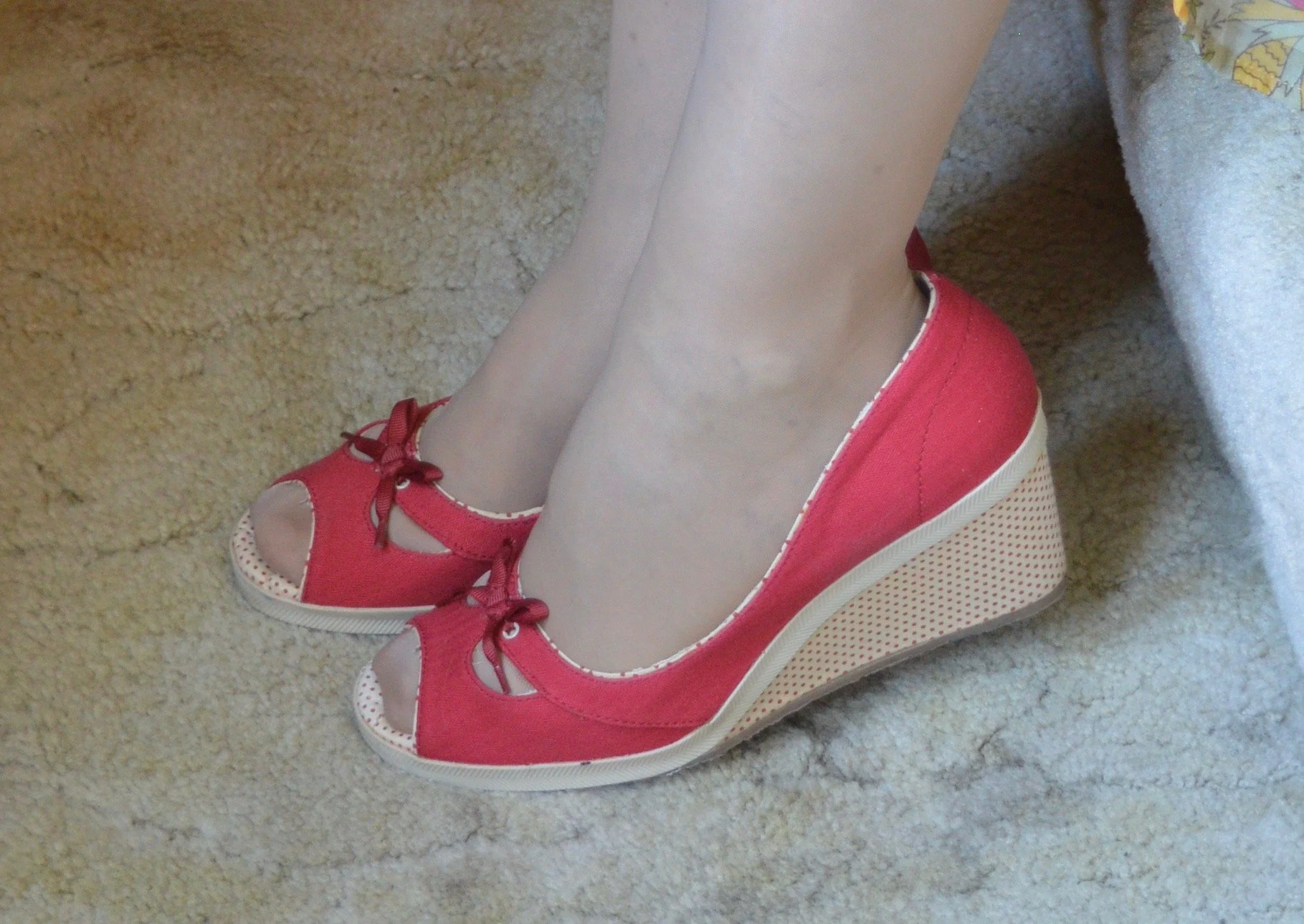
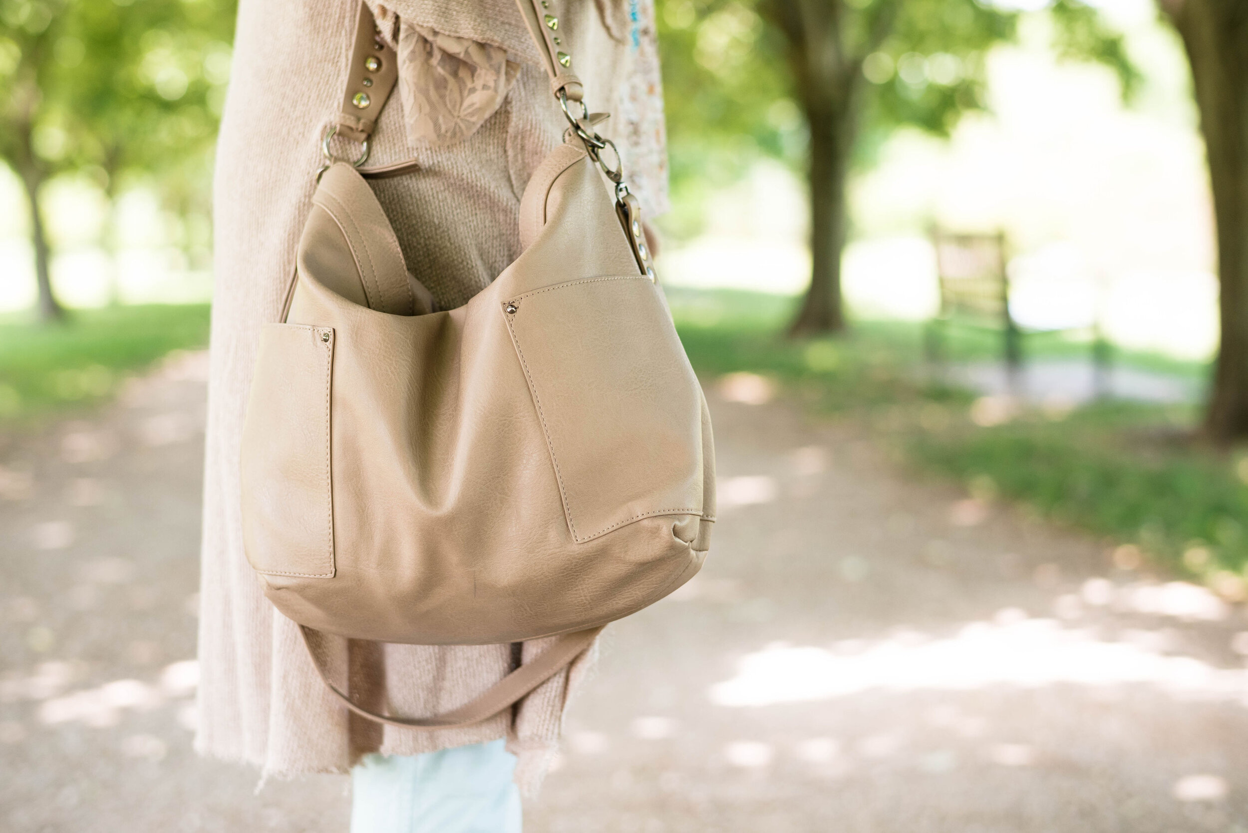
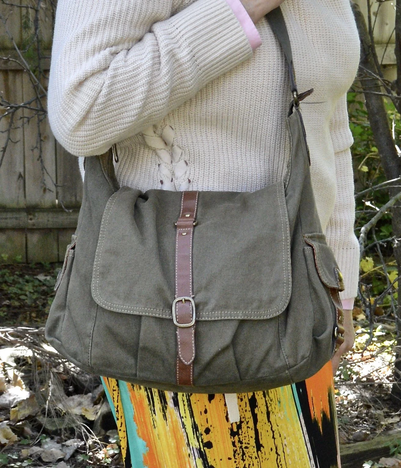
I decided to grab the olive color in the skirt with my bag and booties. The Fossil bag is thrifted, and the SO booties are from a few years ago at Kohl’s.

I am not thrilled with this outfit, but life happens and I wanted to get something thrown together to at least share the Pantone colors with you. Though I love the color pink, it is not one that I use regularly in the fall. I also go more for rusty oranges rather than a bright orange like this one. What are your thoughts? Do you like these colors? How would you wear them?

I’m including a few shopping links for you to look over.

I hope you enjoyed this post. Thank you for all you love, support and feedback. I always appreciate hearing from you!

Have a great week.

Pantone Autumn/Winter 2022: Lava Falls, Amazon and Arctic Wolf

Here we are, once again, looking at another color palette from the Pantone Color Institute. For the next few weeks I will be concentrating on the New York colors. In the past I have tried to give you both palettes, but with changes in life, so too come changes with the blog. For now, I want to bring you the New York palette which was where the institute was founded in 1962. From the Pantone website it looks as though the London palette was added in 2017.

For this look, I wanted to combine the bright red of Lava Falls with the energetic green of Amazon and see if I could come up with an outfit that didn’t look like I was getting ready for a Christmas get together. Let me know in the comments if you think I pulled it off.

My Lava Falls flag tee was a thrift store find this summer. Unfortunately, I didn’t have it washed to wear for Independence Day celebrations. When I was pulling clothes for this series, I saw the tee and thought, why not. Our gratitude for our country and our freedom shouldn't be restricted to one or two days a year, just like Thanksgiving shouldn’t be the only time we dwell on what we have to be thankful for.

This Amazon green sweater was new from Christopher and Banks a few years ago. I love a longer cardigan like this for fall, and an open front cardigan has no buttons or zippers for things like coats or bags to get caught on. Most of the time, I leave my cardigans open anyway to show off the top underneath, so an open front piece is a great choice.

Arctic Wolf is a creamy off white and these thrifted Gloria Vanderbilt pants probably tend towards a little more gray where as the actual Pantone color has more yellow undertones. However, you get the idea and when it comes to the color cream, off white, ivory or whatever title you want to give it, they are all in the white family.

For accessories I went with black to go with the black stripes on the flag. My black bag was an Amazon purchase a few years ago and is Aidebam brand. My sneakers are new to me, a thrifted pair of Vans high tops with a fun floral design.

For jewelry I added a simple choker pendant. I found this at a thrift store and love the pressed flower look of the pendant.

What do you think of these colors? Would you wear them together, or do you think red and green are strictly for Christmas? I’d love to hear your thoughts.

I’m including a few shopping links for items in similar colors. These are affiliate links, which means when you click on a link, I get a few cents. If you purchase something through my site, I get a little bit more. I appreciate each and every click.

I just tested positive for Covid yesterday, after my hubby tested positive on Friday. Our two friends who came for the weekend have also tested positive. I feel so bad, but here we are. I would appreciate good thoughts and prayers, as with my asthmatic condition it puts me in a higher risk category. Thank you everyone!

Have a good week and stay healthy.

Pantone Spring/Summer 2022 - NY Palette: Harbor Blue, Dahlia, and Northern Droplet

These are the last three colors from the Pantone Spring/Summer 2022 New York Palette. Today’s colors are festive and fun, the perfect combination for a summer event. I always love a brighter, richer approach to color anyway, so these are probably two of my faves from this palette. Click here to see the actual Pantone colors.

Harbor Blue is a medium blue green giving it a teal vibe, but with a little less intensity. Dahlia is a beautiful shade of purple that reminds me of spring and summer flowers like Azaleas, Cosmos and Pansies. Northern Droplet is a light shade of gray much like an early morning fog over a mountain lake.

For my outfit today, I ended up using a slightly darker gray rather than a light gray. I don’t own a lot of light gray because it is one of those colors that doesn’t do me justice. It is also what I would term, a non color, meaning it doesn’t really do a whole lot for very many people. Certainly there are women who look wonderful in a light shade of gray, but it seems to me that a medium to dark gray is a better choice for most of us.

As of the posting of these photos it is still cool in the midwest. We have had so many gray and rainy days, I am honestly starting to think we are turning into the new northwest and joining our friends in Seattle. However, I did want to give you an outfit where I at least showed a little bit of skin on my legs, just to give the feeling of oncoming summer and warmer weather.

My Harbor Blue bomber jacket was a clearance purchase from ShopNational a few seasons ago. I love the floral textured pattern. The banding at the neck, sleeves and bottom makes it extra comfy to wear. It is a unique piece that I don’t wear a lot, but one that I will hang on to for its versatility and vibrant color.

My thrifted jeans are a brand called Stylus. This appears to be a discontinued brand that may have once been sold at JC Penney and Walmart. I like that they have a tiny bit of distressing near the pocket and above the knee.

My Bambi tee is a thrifted Sonoma piece. When I first got it I knew the print was of deer, but after closer inspection it is definitely Bambi’s silhouette. You can also see my silver necklace that my bestie gave me back in March when we were in NY visiting my mom. I opted for the olive canvas belt because there is a bit of olive in the scarf.

My beautiful scarf was gifted to me by a dear friend who was clearing out her home in preparation for their move to Tennessee. Every time I wear it, I am reminded of her and her husband who moved to be near their youngest daughter, her husband, and their first baby. I just love all the colors in this scarf and feel like it is the perfect piece for every season.

Style Tip: When you don’t know what outfit to put together, pull out a favorite printed scarf. Take cues from the scarf on putting the ensemble together by choosing pieces with matching or similar colors. It really helps for picking out outfits and I do this often, when I am going away for the weekend.

My Ked’s sparkly sneakers are quite old, and perhaps need another run through the washer. I chose my simple Aerosmith tote (a hand me over from my younger girl) for my bag.

Do you like these colors? Would you wear these colors together? Let me know what you think of this outfit by leaving me a comment.

I’m including a few shopping links for you to look over. These are affiliate links. All opinions are my own. Thank you for all of your support. Have a great weekend!

Pantone Spring/Summer 2022 - NY Palette: Spun Sugar, Coca Mocha, and Perfectly Pale

Today’s Pantone colors are a blend of earthy and pastels. Spun Sugar is a light, airy blue reminiscent of hazy summer skies. Coca Mocha makes me think of a double scoop of chocolate ice cream and Perfectly Pale is the perfect summer alternative to basic white. See the actual Pantone colors here.

I think these colors are a great pairing for spring and summer. We often think of brown as a fall color, just like we think of white as only a summer color. Well, girlfriends, we definitely needing to change our thinking about color, as in all colors work at any time of year. I will forever love my darker browns, oranges, yellows and burgundies in the fall, but that doesn’t mean I won’t occasionally put them on in the heat of summer. God made color and color is good, all year round.

My Sugar Spun tee is a Sonoma piece. I don’t know that I consider myself wild, but I definitely am glad I live in a free country. That is something I never want to take for granted. I am thankful for all who have fought for so many years to keep our country the free nation it is. I have come to have a deep affection for graphic tees, especially those with words on them.

This outfit is all me. The colors work for me and the pieces are all thrift finds except the necklace, bag and sneakers. The Coca Mocha velvet blazer is a brand called SSA, and is definitely showing wear. I need to do some stitching around the cuffs as it has been wanting to come apart. But overall, I think the blazer still has some wear left in it. This is not something I would normally gravitate towards in the summer, but with our weather being so wacky, I think I will keep this available.

Style Tip: Don’t put your blazers away for spring and summer. Think of them as light weight jackets that you can throw on with cropped pants, capris and even shorts. They make any casual outfit look classy and put together.

My pants are Gloria Vanderbilt and a newer thrift purchase. I knew I wanted a few other lighter weight and lighter colored pants for spring, so this utility pair does the trick.

Style Tip: If pure white is not your bag, find light colored bottoms for summer in pale creams, tans and yellows. You’ll get a similar effect to wearing white and won’t have to worry as much about your colored underwear showing through.

Summer for me means less in the accessory department. I can’t wear most scarves as I get too hot and many of my jewelry pieces make me break out in the warmer weather. These warm months are where I turn to pieces with hippie vibes that use cording, or heavyweight string for pendants and bracelets. I am thinking about taking a few of my hubby’s metal detecting finds and turning them into jewelry, so I guess this would be the time.

My daisy necklace was a Christmas gift from my husband. I like the little quirk it has, because that’s me, just a little quirky. Ha. ha. I am also showing off my round Nine West snakeskin print bag, that I got a few seasons ago from Kohl’s on clearance. Last, but not least, I had to use my bright blue Converse again, since they went along with the Spun Sugar color.

What do you think of these colors? Do you like the colors together, or would you put them with other colors? I love hearing your thoughts and ideas. You inspire me too!

I’m including a few shopping links for you to peruse. These are affiliate links. All opinions are my own.

Have a great day!

Pantone Spring/Summer 2022 - NY Palette: Gossamer Pink, Skydiver and Poppy Seed

Hi everyone. It is time for another set of colors from the Pantone Spring/Summer New York Palette. These colors include the pastel Gossamer Pink, the pretty, bright, Skydiver blue, and a charcoal gray called Poppy Seed. I was glad to see a darker gray on the Classic color palette, as that has always appealed to me more than the lighter gray. These are my choices from my closet for each of these colors. To see the actual Pantone New York palette colors, click here.

My blue cardigan is not a perfect match for the Pantone color, but I try to give you ideas for outfits with interesting color combinations, not do a paint by number. I love this light Gossamer Pink with the bright contrast of the Skydiver blue. This would have been another pretty combo for Easter, but any spring activity where you have to dress up a little would welcome these colors. This would be perfect office attire as well.

I have had this Christopher and Banks cardi for a few years. It is a lighter weight sweater that is perfect for the spring, or for summer when you need a little something in the air conditioning. They don’t seem to be carrying this same type of sweater, but you can always check here at Kohl’s for a few solids and prints on a basic button down cardigan.

My pink blouse is Elle brand, and was a clearance purchase from Kohl’s a few seasons ago. It is a sheer material with little sparkles throughout, which are not visible in the picture. It has 3/4 sleeves and ties to make a bow. I also added this pretty spring scarf that one of my daughters gave me a few years ago.

My Poppy Seed gray plaid trousers have been around forever. They are Style & Co. brand. I know Macy’s and a few other retailers sell Style & Co. brand, but I honestly can’t remember if I got these at Macy’s or if I thrifted them. Macy’s isn’t a retailer I have typically frequented, but I have gone a few times with my bestie and might have bought these on one of those trips.

My black belt was a recent thrift find.

My shoes are my Aerosoles black heeled pumps. I like the lower more stocky heel in my older years. My feet are not used to wearing heels at all anymore, so when I do they have to be ultra comfortable. Aerosoles fit the bill in that regard. Check out their website for great looking shoes at reasonable prices.

My bag is a thrifted NY & Co. and can be a tote or fold it over for a smaller clutch option.

Do you have these colors in your closet? How would you were these, with each other, or with other colors? What is your favorite spring color combination? I’d love to hear your thoughts, so leave a comment or two below.

I’m including a few shopping links below. These are affiliate links, which means I get a little money when you click on a link. These are brought to you at no cost and I appreciate all the clicks. All opinions are my own.

Have a super week everyone!

Pantone Spring/Summer 2022 - NY Palette - Innuendo, Poinciana and Basil

Week two in my Pantone Spring/Summer 2022 series and we are looking at the New York Palette. Last week we saw a medium blue, a bright yellow and a crisp white that, put together, made a perfect spring Easter look. This week is another perfect combo for the upcoming Sunday holiday, especially if you are going to church or visiting family.

Innuendo is a bright, hot pink, while Poinciana is a simmering red. Combined with the classic light green color Basil, the look I put together says chic and classy with a splash of watermelon cooler! Let me know what you think.

I don’t often think of pairing pink and red, but for some reason I love how this turned out. The bright pink with the bright red just seems to work. Pairing them with the printed floral skirt led to a bright, colorful spring outfit perfect for Easter Sunday, or even a spring wedding or other event where you need to get more dressed up.

My bright pink open front cardigan was a thrift find and is Old Navy brand. I like to give you the brand names on things because it gives you an idea of the cut and quality of a piece. I don’t shop at Old Navy, but I certainly will grab their brand at a thrift store. This is a lighter weight piece so perfect for the warmer temps…at whatever point those arrive. Ha, ha. Here is one from Kohl’s, Shein, and Chico’s.

My Pop Sugar red smocked blouse was from Kohl’s a few seasons ago. It has ruffle details along the sleeve openings, but is otherwise sleeveless. I love the smocking detail and the shiny fabric. Check out these tops from Shein, Dia & Co, and JC Penney. You can also see in the photo below my long pendant necklace and belt. I have a beaded bracelet on as well that mimics the Basil green color, but it is mostly hidden by my sleeve. Ha, ha.

Style Tip: To get more use out of your clothes, try pairing unexpected colors together. You will not only have new ways to wear different pieces, but you’ll become a trend maker.

My skirt is a thrifted piece and the tag was torn or cut out, so I have no idea who made it, but it is a typical prairie maxi skirt. It is lined, but the lining is very sheer like the skirt, so I still felt a slip was necessary. See these from Kohl’s, Shein, and Dia & Co.

My shoes are a number of years old. I don’t wear heels or wedges much any more, so these have stayed in nice shape. These are Keds brand. I most likely got them at Kohl’s on clearance. The brand doesn’t seem to make this sort of espadrille with the wedge heel anymore, but I’ll give you some other options in my shopping links below.

My bag is also a few years old and was from Charming Charlie. We used to have a store at our mall. Now it is called something else, but still has a similar vibe to it with bags, jewelry and scarves being their main products along with a few clothes. Here are a few green tote bags from Amazon, Banana Republic, ModCloth, and Kohl’s.

What do you think of these colors? Do you think they go well together? Do you have any of these colors in your closet? I love hearing your thoughts, so leave me a comment or two.

I provided direct link shopping links above, due to changes at the affiliate site I was using. I’ve included a few shoe links through the affiliate website. I only receive a few cents when you shop through the affiliate sites. The other direct link sites I bring to you at no cost, but I also don’t make money through them. I just want you to have some shopping options.

Have a great week!

Pantone Spring/Summer 2022: Glacier Lake, Daffodil and Snow White

Welcome to the New York Palette of the Pantone Spring/Summer 2022 colors. Pantone has changed the way it allows usage of products, so images are no longer free. Now you have to have a subscription to use the color swatches via the internet, so I have had to get creative in putting together my graphics. I am also not using my daughter’s photography services now, as she is very busy with her business and her baby. I am definitely creating new pathways in my brain, but that is good.

If you want to see the actual Pantone colors click on the following link: Spring/Summer 2022 - New York Palette. I try to get my colors as close to the palette colors as possible, but they are not exact. I appreciate the Pantone Institute’s use of color and always enjoy seeing what the colors are for each season.

For today’s outfit, I thought the mix of yellow, blue and white perfect for spring and even for the upcoming Easter holidays. This color combo makes me think of the sunny flowers the color is named for, and the many blues of summer including skies, lakes and denim. White is always classic, not only for summer, but every season.

My Glacier Lake vest is a Christopher and Banks piece that I found at a thrift store. It has the utility look with the larger, square pockets, encased drawstring and metal buttons. I love using my utility vests in the spring and fall.

Style Tip: If you want an extra layer but don’t want all the bulk choose a light weight vest. A utility vest or a dressier suit vest will provide extra warmth, but won’t add the bulk of a quilted, or sherpa type piece.

My bright, yellow cable knit pullover is St. John’s Bay piece. I honestly can’t remember if I bought it at JCPenney or if I got it thrifting. Ha, ha. My white Gloria Vanderbilt jeans I have had for a number of years now. They are just the right weight and thickness for no-show issues, and can be dressed up or down.

My floral scarf is a piece I recently thrifted. I love scarves. I think they add so much to an outfit.

Style Tip: When styling an outfit with two or three solid colors, add a printed scarf for additional color and interest.

You’ve seen my Merona thrifted bag a few times now on the blog. I thought it was a good choice for this springy look. I also opted to wear my Steve Madden platform sneakers. When it comes to platforms, these are very low, which I like. I really don’t like all the extra bulk of a thicker platform or a really thick lug sole on boots.

What do you think of these colors? Would you wear them together? Do you have these colors in your closet? I’d love to hear your thoughts, so leave me a comment or two. I am including a few shopping links for you to look over. These are affiliate links, which means I get a small commission when you click on a link. All opinions are my own.

Have a great week everyone!

Pantone - Autumn/Winter - 2021 - London Palette: Green Bee, Downtown Brown, and Olive Branch

Hi everyone! November is zooming along and I am still trying to get back into some sort of rhythm, not only here on the blog, but in life. Anyone who suffers from a long term illness can relate to what I am talking about. Not being able to sleep for such a long period of time and still dealing with unresolved symptoms make it hard to get back to what I would say is a normal routine. However, I know there are people who are struggling with much worse situations and I am thankful that I am able to do as much as I can. In fact, this past weekend, we were able to travel to celebrate my mother-in-law’s 80th birthday with her, so that was good.

Unfortunately, there has also been other difficult things along the way. My son-in-law lost his grandfather this past week and I know that has been a great loss for the whole family. He was a dear man, a wonderful painter and loved his family, so he will be missed. As many of you can relate, it seems as we get older, we see loss happening around us at a more frequent pace. This too is part of life, and for me knowing God is holding me and my loved ones during these times, makes it a little less painful.

Now on to another outfit. As I said last week, while I am wildly behind, I decided to go ahead and show you these Pantone London Palette outfits as possible sources of inspiration for Thanksgiving Day wear. Many of you will be celebrating with friends or family and it is a good reason, to get out of those sweat pants and dress up a little bit, if just for your own mental well being.

You can’t go wrong with a pair of trousers, a pretty top and a fun scarf and bag. Obviously, you can pick your colors, but I chose to combine these earthy tones for a look that is a mix of military meets, moto chic.

My Downtown Brown moto jacket is a thrifted piece that I have styled on the blog before. It is a brand called Celebrity Works. I do like this medium milk chocolate brown. Browns can be tricky to wear, especially when they contain a little too much gray or a little more red, or well, you get the idea. A true brown is hard to find, but I think this brown hits the mark, so thank you Pantone for that one.

You’ve seen my Olive Branch pants numerous times on the blog as well. As I look at them in these pictures, I am thinking I might need to find a replacement pair. These are starting to look worn and really don’t look very flattering. Of course that may have had something to do with my chubby thighs. Ha, ha. These were Gloria Vanderbilt brand and I probably got them at Kohl’s.

For the Green Bee color I chose a thrifted Studio Works popover top that I did the front tuck on, which gave it the blouson effect. I also added the Green Bee paisley print scarf. The thought to add the Dana Buchman floral bag was a last minute addition, but I like how it pulled everything together. A fun floral bag is a great addition to your wardrobe, especially when it can serve multiple season duty. This one works just as well in spring, summer and fall.

I chose my trusty Olive Branch SO ankle boots for my shoes. My ankle boots definitely get used in these cooler fall temps.

What do you think of these colors? Would you wear an outfit like this to your Thanksgiving celebration? I’d love to hear your thoughts, so leave me some love in the comments below.

I am including a few shopping links. These are affiliate links and are brought to you at no extra cost. If you click on a link, I get a few cents. If you purchase something through one of my links I get a few more pennies. I appreciate every penny! All opinions are my own. Please note, I am not familiar with all of the retailers I list in my links, so be sure to read and understand their return policies in case something doesn’t fit or isn’t to your liking.

I hope you enjoyed today’s post. Until next time, have a great day.

Photo credit Jessica Trumbull with Rebecca Trumbull.

Pantone - Autumn/Winter - 2021 - London Palette: First Blush, Ibiza Blue and Ultimate Gray

Due to my longer than usual absence from the blog because of my illness, I am going to bypass the wrap up of the New York Palette and the Intro to the London Palette for the Pantone 2021 color series and jump right into the London Palette, so that I can get this series concluded and get on with new content. I have been trying to give a more daily content on Instagram, which now also shows up on my regular Facebook account, but unfortunately, I have not been posting over on my Granny page. I guess I should start doing that as well. You would think all of these things would just be linked together. A few of the meds I am on are making my brain a bit dopey, so bear with me as I try to get things back into some sort of regular routine.

Here we are again, looking at a pastel pink on the fall color palette. I know pastels in fall are no longer taboo, but my brain still looks at this and thinks, “What a great spring outfit!” Maybe I should have paired First Blush with one of colors that seem more Autumnal to me, like Tomato Cream or Downtown Brown, but I liked the combination of blue and pink, so this is what you get.

My Ibeza Blue plaid shirt is a thrifted Faded Glory piece. I used this same plaid shirt in the spring for the French Blue color that was on the New York Palette. You can see that post here. You’ve seen these thrifted, distressed Lane Bryant jeans numerous times on the blog as they are one of my faves.

My First Blush jacket is also a repeat from my closet. Originally a Christopher and Banks purchase, this faux leather piece has some knit panels on the sides and under the arms to allow ease of movement and stretch. I added the scarf to bring in a little bit of added interest and additional color, plus with this being a fall outfit, the need for a scarf seemed more likely.

Ultimate Gray, once again makes its appearance on the London Palette, so I used this for my accessories in the metal chain belt, thrifted fold over bag and my silver sneakers. The only thing I did differently was the rose gold pendant. I just liked the way the color popped against the blue plaid.

While this look is certainly not what we would typically think of for the holidays, if you are more into pastel colors, this is a great casual look for that Thanksgiving celebration, especially if it involves a bit of shopping afterwards.

I’m including a few shopping links for you to look over. Remember to order soon for Christmas. We have all heard how things are taking longer and some things are back logged so be sure to get your orders in, or even better, don’t deal with that added stress and try to buy local. That is what I am thinking about doing at least for part of my shopping this year.

These are affiliate links. All opinions are my own.

Photo credit Jessica Trumbull with Rebecca Trumbull.

Pantone - Autumn/Winter - 2021 - New York Palette: Adobe, Rhodonite and Olive Branch

Due to my illness, I have neglected this little blog for a few weeks. While we are still trying to get all symptoms under control and actually find diagnoses for said symptoms, I hope to be able to get back to some semblance of regular posting, so please bear with me. To all of you who have been so supportive and loving on Facebook and Instagram, thank you. Your kind words, thoughts and prayers have been so appreciated.

The last two colors on the New York Palette for the Pantone Autumn/Winter series are my favorites. Adobe is certainly what I expect on a fall color palette and Rhodonite is a completely different blue, that I think works fabulously for the fall season. Once again, I am using Olive Branch as my classic color. As I have mentioned before, olive works well with so many other colors, and makes the transition from one season to another, smooth and seamless.

Adobe.jpg

These thrifted Michael Kors jeans might be just a smidge lighter than Adobe, but I think they work quite well. I know the world is saying skinny jeans are not in right now, but I like my skinnies and I will continue to wear them. Sure I will wear other silhouettes as well, but I especially favor skinnies in the cool weather to wear with boots.

pantonefallcolortrendsadobe-1.jpg

The dark blue tunic top, is an older Christopher and Banks piece. After I put the outfit together, I realized the tunic is less like the Rhodonite color, while the bluish purple in the print of the jacket is a closer fit.

pantonefallcolortrendsadobe-10.jpg

My jacket is a thrifted Christopher and Banks piece. It fits similarly to a jean jacket and the print is perfect for bringing on all the fall feels.

pantonefallcolortrendsadobe-11.jpg

My thrifted olive bag is Fossil brand. This is a great piece if you want something you can throw all sorts of things into. Ha, ha. A hobo bag is a good choice for travel, as it easily fits into many different spaces and yet has plenty of room for all the goodies.

You can see in the previous two pictures, I kept my jewelry simple by adding a few olive bracelets and a string of olive beads.

pantonefallcolortrendsadobe-13.jpg

You’ve seen numerous pairs of SO ankle boots on the blog, because I have them in SO many different colors. Ha, ha. See what I did there? These are great little ankle boots for fall and work with jeans, trousers, skirts and even dresses. Apparently, the affiliate program I work with is no longer using Kohl’s as one of their retailers, so here are links to the Kohl’s website for a few different styles of ankle boots. Here is the Averyy, the Chantilly, and the Barb 2. These are not an expensive boot, and that is one of the reasons I like them. They also still look pretty good after a number of seasons, but then, I don’t wear the same pair every day. I am not getting any sort of compensation to recommend these boots, I just really like them.

pantonefallcolortrendsadobe-7.jpg

What do you think of these colors? Do you like this outfit? Let me know your thoughts by leaving me some love in the comments.

I’m including a few shopping links, although it was very hard to find this color in the pants. Anyway, these are affiliate links, brought to you at no extra cost. If you purchase something through one of my links, I get a few cents. You are not charged any extra to make a purchase through my blog.

Photo credit Jessica Trumbull with Rebecca Trumbull.

Pantone - Autumn/Winter - 2021 - New York Palette: Pale Rosette, Root Beer and Olive Branch

I want to start off with an apology for my lack of consistency with the blog lately. It has been a rough couple of months and I just haven’t had the motivation to post as regularly. It seems every time I want to make more of an effort at getting more disciplined or being more consistent, I get blindsided by something. At the beginning of the summer it was a broken wrist. Mid summer, I came down with this stuff, that still has me coughing. I just have no idea if I will ever be back to “normal”, whatever that was.

There have been some good bits along the way as well. Early summer we were able to take my in-laws on a nice trip up through the Upper Peninsula, down through Michigan and back to our place where they enjoyed visiting family for a few days. I also got to see my mom, two different weeks and spend time with her. That also afforded me the opportunity to see my best girlfriend, and do some thrifting. On September 19th, our second grandson arrived. He is a doll and I am enjoying opportunities here and there to see him, even if I do have to wear a mask. He’s been born into a world of half blue faces, but that is okay, if we can give him a healthier start. He, my daughter and son-in-law are doing well.

Today’s outfit revolve around three colors on the Pantone New York Palette that I thought combined well into a work wear ready fall outfit.

PaleRosette.jpg

I am still trying to get used to seeing pastels during the fall season. This year, they were quite popular and besides this pale pink, also included a pretty lavender. I guess, we like what we like right, so pastels for me might be more of a spring and summer color scheme, while rusts, browns and burgundies are the colors I reach for in the fall. While we still live in a free country, you are in control of what colors you wear when. Ha, ha.

pantonefallcolortrendspalerosette-8.jpg

The Pale Rosette, 3/4 length tee is a thrifted piece, and a brand called Suzanne Betro. It is actually a longer tunic, but I just tucked it in for this outfit. I love the detailing at the bodice.

pantonefallcolortrendspalerosette-6.jpg

You’ve seen my Olive Branch utility vest on the blog before when I did my series on olive pieces. This vest isn’t quite the right shade. Who would have thought there are so many shades of olive? Another clearance find from Kohl’s, I don’t have a ton of Mudd pieces as it typically has more of a junior’s fit, but the few that I have, I really like.

You’ve also seen these brown trousers when I talked about wide leg pants back in the spring. I am not a big fan. I have enough bulk on my bottom. However, I will hang on to this pair, as I like the color, and occasionally it is nice to have a different option when it comes to pants. These were thrifted and are St. John’s Bay brand.

I added the multi-print scarf to add an extra dimension of color and interest to the outfit. I like how it ties the whole look together.

You can also see the fun necklace I scored while thrifting at the local shop around the corner. I have found some great jewelry there. I goes perfectly with the pants.

pantonefallcolortrendspalerosette-9.jpg

Even though this little thrifted, Rosetti bag screams summer, I thought it was a great way to keep this outfit looking modern and updated, yet still in tune with the fall vibes.

My SO snakeskin print boots were a clearance purchase from Kohl’s last season. I haven’t really had the opportunity to wear them very much, so hopefully this season they will be out and about.

pantonefallcolortrendspalerosette-10.jpg

What do you think of these colors? Do you like them combined? Do you like them each separately?

pantonefallcolortrendspalerosette-1.jpg

I’d love to hear your thought, so leave me some love in the comments.

As I usually do, I am adding a few shopping links in things similar to these colors. These are affiliate links. All opinions are my own.

Thanks for following along on the blog. I hope you are having a great week.

Photo credit Jessica Trumbull with Rebecca Trumbull.


Pantone - Autumn/Winter - 2021 - New York Palette: Fuchsia Fedora, Leprechaun, and Coconut Cream

The colors I am showing you today were ones that surprised me a bit for a fall palette. The bright Fuchsia Fedora is not a color that I have very many pieces in, thus why I used it more as an accessory color. Leprechaun was also a different choice. I was thinking there would be a darker, more forest green color, but this bright, cheeky color is what appeared on the palette. However, that is one of the reasons I like doing this color series. It forces me to think outside the box.

FuschiaFedora.jpg

Even though I wasn’t particularly fond of these colors for fall, I actually liked the way this outfit turned out. Even though the light jacket looks nothing like Coconut Cream, these colors and their combinations are just guidelines for us. Not rules…and just for fun….

I loved The Pirates of the Caribbean movie, and that whole idea of rules versus guidelines was amusing as it kept coming up in the movie and was used according who benefited the most. I guess we could take a lesson from that when we look at our closets. The combinations you put together are for your benefit. You get to decide what you like and what you don’t. You make the choice of what colors or prints to put together, and whether you want to buy into the trends or not. I think we can safely say those fashion “rules”, are really more like “guidelines.” My job as a fashion blogger is to give you ideas of how to make these combinations and hopefully inspire you to think outside your own boxes.

pantonefallcolortrendsfuchsiafedora-10.jpg

My LuLaRoe skirt was the perfect choice to build this outfit around. I actually had the thrifted striped tee already pulled out as a match for Leprechaun, and as I started figuring out which colors and pieces to put together, I remembered this skirt. I always have a little celebration party when pieces come together. When I try things on I do a little dance in front of the mirror and say, “This is it!” Ha, ha. The stripes in the tee are actually navy, but with the two prints taking center stage, you can’t really tell the colors are different.

pantonefallcolortrendsfuchsiafedora-3.jpg

My cream jacket by Sanctuary is a thrifted piece you have seen before on the blog. You can see it with a leopard print skirt and with my bright blue pants. It is actually more of a canvas than a denim, but it works much the same as a denim jacket providing light weight coverage for cooler weather and adding a casual touch to a dressier outfit.

pantonefallcolortrendsfuchsiafedora-5.jpg

You can see my Fuchsia Fedora necklace and bracelets. I think I have jewelry in just about every color under the sun, but you know, a girl can never have too many fun accessories! Is that a rule, or a guideline? Ha, ha.

pantonefallcolortrendsfuchsiafedora-8.jpg

My bestie, Stacey, gave me this beautiful, leather the Sak bag last time she came to visit. I thought the berry color went perfectly with the darker berry color in the flowers on the skirt.

pantonefallcolortrendsfuchsiafedora-9.jpg

These beautiful black suede heels never get to go anywhere, so I do like to bring them out and show them off on the blog. These are Aerosoles and I bought them a few years ago at a Clarks shoe outlet. I like that they are comfortable, have a reasonable heel, stay perfectly in place and look classy.

pantonefallcolortrendsfuchsiafedora-2.jpg

What do you think of these colors? Do you like them for fall? Now that I am thinking about it, I might need to revisit the idea of fuchsia as a fall color. I could see it with other fall colors like golden yellow, burgundy and rusty orange. Hmmm. I may have to get a little further outside of my color box.

Let me know what you think. I’m including a few shopping links for things of similar color. These are affiliate links and are brought to you at no extra cost. If you click on a link, I get a few pennies. If you purchase something through my site, I get a few more. I appreciate every click.

Have a great day!

Photo credit Jessica Trumbull with Rebecca Trumbull.

Pantone - Autumn/Winter - 2021 - New York Palette: Mykonos Blue, Spring Lake and Coconut Cream

It seems that every Pantone color palette that comes through the Institute has at least one, if not two blues on it. Blue is a color that everyone can wear, whether you wear dark classic navy, casual comfortable chambray or tropical hues that take you to the beaches of the Caribbean. I have a lot of blue in my closet, but then, I have a lot of every color in my closet. Ha, ha. Blue is great for pairing with many other colors. I pair denim with every color and denim definitely falls in the range of blues. Today’s blues are wearable and most likely already in your wardrobe.

SpringLake.jpg

My colors did not really line up with these blues. Oh well, that is part of the challenge of doing this series. I don’t always get the match spot on, but that is okay. The point is to take things you already have and do something similar. It doesn’t matter if your blues are a perfect match or not. All of these pieces were things I already had.

When I picked out these pieces I really thought the pants and the vest would have matched better to Spring Lake, but now looking at the picture the pants seem to match better with the Mykonos Blue. The vest, which does seem to lean a little bit toward a gray undertone, was too dark to match the Spring Lake color. However, the patches on the pants seem to lean a little more in that direction.

pantonefallcolortrendsspringlake-2.jpg
pantonefallcolortrendsspringlake-20.jpg

The vest is a thrifted Relativity piece. I have styled this on the blog before. You can see it worn with a graphic tee. The jeans which I have styled on the blog before are thrifted and a brand called Est. 1946 Denim. You can see how I wore them with a graphic tee and cozy sweater here. Looking at the above picture, I should have rolled up the cuffs on the jeans.

When you have an asymmetrical vest with fringe, you just have to twirl!

My yellow mini floral print button down is a thrifted Old Navy piece. I decided to leave it completely untucked to add to the ultra casual vibe of this outfit.

pantonefallcolortrendsspringlake-5.jpg

I was trying to go for the Coconut Cream idea in my accessories, but again, things didn’t match up exactly. My bag was a hand-me-over from my daughter. This Miche brand bag actually has interchangeable outer shells, so for this look I used the cream colored one.

pantonefallcolortrendsspringlake-14.jpg
pantonefallcolortrendsspringlake-16.jpg

My sneakers are thrifted Mossimo.

pantonefallcolortrendsspringlake-17.jpg

What do you think of these colors? Do you like to wear blue? What color blue is your favorite?

pantonefallcolortrendsspringlake-8.jpg

Thanks for following along with the blog. I appreciate all of your clicks, likes and comments.

I am including a few shopping links for you to look over. These are affiliate links. All opinions are my own.

Have a great day.

Photo credit Jessica Trumbull with Rebecca Trumbull.

Pantone - Autumn/Winter - 2021 - New York Palette: Illuminating, Fire Whirl and Ultimate Gray

Over the weekend, I became grandmother again. My oldest daughter had a little boy and we are very excited to meet him, as soon as we can. Obviously, with all the restrictions for visitors in the hospital, we were not able to meet him before he came home.

I am going to being this Autumn/Winter series, as I usually do with the New York Palette. It wasn’t until recently that the Pantone entity added the London Palette to its long list of color tools. Today’s outfit revolves around the two Colors of the Year, the sunny yellow, Illuminating and the classic gray, Ultimate Gray.

FireWhirl.jpg

In all honesty I was having a hard time putting the outfits together for this series. I think most of it had to do with being plagued by this stupid sinus stuff and cough for so long. I am finally sleeping in my bed again, but I still have a wheezy, chronic cough. We’ll see how long it takes to get some sort of resolution, or maybe it has moved in permanently, but it is a pain. It is hard to have long conversations and I cannot sing at all, not that I really could before I got this cough, but it was better than now. Oh well, life is just that way sometimes.

The other problem I think I was having, was the weather. It was so hot, I was having a hard time really getting into styling fall outfits. I love fall, and am excited about that change, but it has just been slow to actually feel like the season to wear layers. Here in my area, by Wednesday, the highs are only going to be in the 50’s. That definitely feels like fall.

pantonefallcolortrendsfirewhirl-3.jpg

You can see that I only used Illuminating in very small doses with my yellow beaded necklace and bracelets. The Fire Whirl red tank top is a thrifted Loft piece. It is actually more of an a-line or swing silhouette, so I gathered the shirt underneath in the front, then secured the little “pony tail” with a hair band. The result is to give the top a more fitted look with a fun swirl at the front.

pantonefallcolortrendsfirewhirl-12.jpg

For this outfit, it worked out that Ultimate Gray takes center stage with just a few pops of Fire Whirl and Illuminating. My thrifted, plaid, Sag Harbor trousers are actually petites, so I expect they would be closer to an ankle pant than a crop pant, but I like the way it looks, especially with my darker gray Impo booties.

pantonefallcolortrendsfirewhirl-11.jpg

The next picture shows you a closer look a the Illuminating jewelry and the detailing on the yoke of the top. The gray moto jacket is a no name brand and I am not sure where I got it. I wanted to say it was thrifted, but for some reason, I think I bought it at a store. I really cannot remember. Is that bad? Ha, ha.

pantonefallcolortrendsfirewhirl-8.jpg

My tote bag was going to be a gift for one of my daughter’s one Christmas a few years ago and I ended up keeping it. Many times, I just end up buying too many items, so I have to return stuff, but this was a cheap purchase, I believe from Kohl’s and I really liked it.

pantonefallcolortrendsfirewhirl-9.jpg

Fire Whirl is more the color of my top, but I kind of liked the contrasting shades of red, as well as the two differing plaid patterns. It just gives the outfit a fun vibe.

pantonefallcolortrendsfirewhirl-1.jpg

What do you think of these colors? Would you pair these colors with one another? Do you have these colors in your closet? Let me know your thoughts in the comments below.

I am including a few shopping links for you to look over. These are affiliate links, brought to you at no extra cost. If you click on a link, I get a few cents, if you purchase something through my site, I get a little more. Thank you for all of your support.

Photo credit Jessica Trumbull, with Rebecca Trumbull.

Pantone - Autumn/Winter - 2021 - New York Palette: Intro

Here we are again, looking at starting another Pantone series. As we quickly ride out these last few weeks of summer most of us are already thinking about fall. We are anxious even, for our layers, cozy sweaters and boots. We like the idea of putting on a jacket as the evening cools and watching the leaves change from their varied greens to their beautiful reds, oranges and golds.

This autumn the Pantone New York palette contains a variety of colors that are both bright and light with a few that are more what we tend to say are traditional fall shades. In addition to rusty brown and fierce red, we also have a light pastel pink, a soothing green and three very different shades of blue. Illuminating and Ultimate Gray grace both the New York and London palette as they continue their year long stint as colors of the year.

NYGraphic.jpg

I hope you will join me as I begin the series next week. Hopefully I will be able to inspire you with color combinations that are slightly outside the box, but still stylish and fashionable.

Here are a few sneak peaks at what is coming up.

pantonefallcolortrendsfirewhirl-7.jpg
pantonefallcolortrendsspringlake-19.jpg
pantonefallcolortrendsfuchsiafedora-9.jpg
pantonefallcolortrendspalerosette-9.jpg
pantonefallcolortrendsadobe-12.jpg

Have a great week everyone!

Photo credit Jessica Trumbull with Rebecca Trumbull.

Pantone - Spring/Summer - 2021 - Both Palettes with all the Outfits.

I always think it is fun to do a post featuring all the outfits from my Pantone color series. I really spread these out this year due to scheduling issues, so that’s even more of a reason to look back at all of the outfits. I will also let you know, which ones were my faves.

New York Palette

ClassicColors_(12).jpg
illuminating (1).jpeg
amethystorchid.jpeg
raspberrysorbet.jpeg
burntcoral.jpeg
frenchblue.jpeg

I would have to say, from the New York Palette, my favorite combination is the Amethyst Orchid, Ash Green and Inkwell. I love the contrast of the dark navy blue and the pastel colors. It just makes the outfit pop. I also love the light green with the light purple. It is a very pretty combo for spring and summer. In addition, I really liked the casual vibe of the French Blue, Cerulean and Butter Cream combo. both of these are outfits I would wear. What were your favorite colors? What is your favorite outfit from this series?

London Palette

londonspring2021 (1).jpg
illuminating (1).jpg
pirouette.jpg
purplerose.jpg
pickledpepper.jpg
beachglass.jpg

I really liked this palette over all, because I love all of the colors. My favorite combination was the outfit that I got the most positive feedback on, Beach Glass, Blue Atoll and Macchiato. There is just something so summery and uplifting about these tropical blues and warm brown. I also liked the challenge of combining Purple Rose and Lava Falls. I would have never thought to pair this medium purple with a bold red, but I think it worked. What were your favorite colors from this palette? What is your favorite outfit?

I’d love to hear back from you. Your comments help me to know if the content I am putting out is pertinent to your life. I hope that my outfits and posts are inspiring you to shop your own closet and to think outside the box when it comes to the clothing pieces you wear and how you put them together.

Have a wonderful day!

Pantone - Spring/Summer - 2021 - London Palette - Beach Glass, Blue Atoll and Macchiato

We’ve reached the end of the Pantone - London Palette series with these last three colors which make me think of tropical seas and sandy beaches. Like Tuesday’s post, where I combined two different greens from the palette, today’s post combines two summery blues for a light, airy, warm weather look.

beachglass.jpg

I started figuring this outfit out with my light blue, thrifted Sonoma crop pants. Though they are a bit lighter than the Beach Glass color, I think they still work. I pull these out every spring and summer as a light weight alternative to denim.

beachglasspantoneoutfitideas-1.jpg

My multi-print top is another thrift store find. I just loved the soft colors and print on this popover blouse. It has no tag in it, so I have no idea what the brand was. The print has the light Beach Glass blue, as well as the darker Macchiato.. You’ll see a close up in the next photo.

For the darker Blue Atoll color I decided to add a few pieces of jewelry. I had some long, opera length beads and decided to do some layering with the necklaces. I also added a beaded bracelet, that appears to better match the Beach Glass color.

beachglasspantoneoutfitideas-7.jpg

For the Macchiato color, I played around with several pieces, but everything seemed too yellow. This longer sweater was a recent purchase from Cracker Barrel. While they are a restaurant, they also have what they call an Old Country Store. The store is filled with all sorts of items from old fashioned candy, beautiful home decor, quilts, jewelry, cards, music and clothing. If you click on the link, it will take you to the sweater and it is on sale. Whoo, hoo. If you like it snatch it up. Here are a few photos to show you the details of this pretty piece and the movement. It is a light weight material, so it will be great for spring, summer and fall.

beachglasspantoneoutfitideas-13.jpg
beachglasspantoneoutfitideas-14.jpg
beachglasspantoneoutfitideas-15.jpg
beachglasspantoneoutfitideas-16.jpg
beachglasspantoneoutfitideas-17.jpg
beachglasspantoneoutfitideas-18.jpg

My bag is Madden brand; a clearance find from Kohl’s. My perforated peep toe shoes are Sonoma brand and another Kohl’s purchase from a few years ago.

beachglasspantoneoutfitideas-9.jpg
beachglasspantoneoutfitideas-11.jpg
beachglasspantoneoutfitideas-12.jpg

What do you think of these three colors? I really like how this outfit turned out and think the color combination is great for summer. Do you have these colors in your closet?

beachglasspantoneoutfitideas-6.jpg

I’m including a few other shopping links for you to look over. The Cracker Barrel sweater link is not part of the affiliate program, but I wanted to offer it to you, in case you really like the sweater. The rest of the shopping links are through the affiliate program. Every time you click on a link I get a few pennies, and I appreciate every click.

Have a great weekend!

Graphic and photo credit Rebecca Trumbull.

Pantone - Spring/Summer - 2021 - London Palette - Pickled Pepper, Orange Ochre and Sphagnum

For today’s outfit I decided to combine the two greens that were on the London Palette. Both Pickled Pepper and Sphagnum are great green shades for summer time. While Pickled Pepper is one of the main palette colors, Sphagnum is one of the palette classic colors. Olive is a great neutral and goes with just about every color out there, so Sphagnum, (which is actually a type of moss), makes for the perfect classic color.

pickledpepper.jpg

My Pickled Pepper popover top is Sonoma from Kohl’s a few years ago. This top is easy to wear, as well as cool for these hot, humid days. I don’t usually prefer to wear sleeves with elastic, but as long as the elastic isn’t cutting off the circulation in my arms I’m okay with it.

pickledpepperpantoneoutfitideas-12.jpg

My Sphagnum utility vest is Mudd brand, and was another clearance purchase from Kohl’s a few seasons ago.

pickledpepperpantoneoutfitideas-4.jpg

These light wash jeans were a recent thrift find. A brand called Ella Moss, this brand is available at stores like Nordstrom, Bloomingdales, Amazon, Dillards, and others. I like the cropped length and the high waist of this pair.

For the Orange Ochre color, I grabbed my thrifted, orange suede bag and a fun pendant choker. It is much easier to include a brighter color, if you do it with accessories.

pickledpepperpantoneoutfitideas-9.jpg
pickledpepperpantoneoutfitideas-7.jpg

I had to show off my new clearance Converse sneakers from DSW. They are very comfy and I love the blue color. They are similar in color to my thrifted Keds, which are showing a bit of wear, so these were a great find.

pickledpepperpantoneoutfitideas-11.jpg

Here are a few silly pictures. I was jumping for joy. Ha, ha.

pickledpepperpantoneoutfitideas-5.jpg
pickledpepperpantoneoutfitideas-6.jpg

What do you think of these colors? Do you like to wear green? Do you have Sphagnum (olive) in your closet? I would love to hear from you. I’m including a few shopping links for you to look over. These are affiliate links. All opinions are my own.

pickledpepperpantoneoutfitideas-3.jpg

Graphic and photo credit Rebecca Trumbull.

Pantone - Spring/Summer - 2021 - London Palette - Purple Rose, Lava Falls and Baby's Breath

Today’s colors are a blend of pastel purple, bold red and creamy off white. I have always loved purple, but it really isn’t a color I regularly wear. I easily got on board with Purple Rose which is a medium purple that goes well with many other colors, especially things like brown, olive and navy. Why, then did I decide to pair it with a fierce red like Lava Falls? Because I always like to show you things outside the box. It is not very often, that I think to put purple and red together.

purplerose.jpg

The factor that clinched the deal on putting these colors together, was that my thrifted Old Navy, Lava Falls, paisley popover top had both of these colors in it. How fortuitous was that? Ha, ha. This is a fun, tunic type shirt that has short sleeves, and the interesting details of a shirt tail hem line and a lace up v-neck. I love the paisley print too, which always reminds me of the 70’s.

The Croft and Barrow cardigan is older and I like I said, doesn’t get a lot of regular wear, but i just love the color so I keep it around.

purplerosepantoneoutfitideas-2.jpg

You’ve seen these creamy, Baby’s Breath, thrifted, St. John’s Bay ankle pants on the blog before. I really think this look would have been cuter with a creamy denim pencil skirt or a pair of Bermuda shorts, but I don’t have either of those. I am not as fond of the silhouette, but it is okay, just not great.

purplerosepantoneoutfitideas-7.jpg

I didn’t need to wear a necklace and this long opera length beaded strand is exactly the same color as the top, but sometimes I like the subtle texture and shine of a piece, even if it is a similar color. Wrapping this long strand of beads around my neck makes it look like I have on a choker.

purplerosepantoneoutfitideas-8.jpg

I added a few beaded bracelets with similar reds, although there is plenty going on in the top, so it wasn’t really needed. Often, less is more.

purplerosepantoneoutfitideas-9.jpg

My thrifted Simply Vera, Vera Wang cross body bag is making another appearance. This is a great little bag for the warmer months. The off white color goes perfectly with the Baby’s Breath color of the pants.

purplerosepantoneoutfitideas-10.jpg

These Steve Madden platform sneakers were a new purchase from DSW. I had a coupon and I had been looking at this type of sneaker since last summer. I finally took the plunge. They are not something I would use for walking, but they are cute for a casual day of picnicking or window shopping.

purplerosepantoneoutfitideas-4.jpg

What do you think of these colors? Do you think you would ever combine red with purple? I’d love to hear your thoughts, so leave me some love.

I am including a few shopping links in these colors, so if you have time, give those a look. I hope you have a wonderful weekend!

Graphic and photo credit, Rebecca Trumbull.

Pantone - Spring/Summer - 2021 - London Palette - Pirouette, Indigo Bunting and Polar Night

As always, with the Pantone color series, I find their choice of names for their colors intriguing. Today’s colors center on a pretty purply pink, called Pirouette, which, of course, makes me think of a ballerina. Indigo Bunting is a pretty blue, much like the bird after which it is named. I have had the privilege of seeing an Indigo Bunting flitting through the trees at one of our local metro parks a few years back. They regularly reside in Ohio in the summer time, but like to hang out in abandoned fields, scrubby bush areas and areas with red cedar trees, none of which I have around my house. Polar Night, much like its New York partner Inkwell, is a very dark navy blue.

pirouette.jpg

This fun, multi-print dress is a few years old and was a Kohl’s clearance purchase. I really like many of the pieces by Vera Wang, made specifically for this retailer and called Simply Vera by Vera Wang. These are the pieces that real world women like myself can afford and wear. I have styled this dress, like a tunic for a trip we took to Florida a few years ago. You can see that post here. The dress really contains all three colors, except that its blue borders on being more of a teal.

londonpantonecoloroutfitideapiurouette-8.jpg

I decided to add the bright blue sweater, another Christopher and Banks cardi, as my attempt at the Indigo Bunting. It is a tad bit bluer and maybe brighter, but I think it works well. I would have never thought to pair it with this dress, but I like how it looks.

This is me being silly as I commune with nature. Ha, ha.

londonpantonecoloroutfitideapiurouette-5.jpg

I centered all my accessories around the necklace that is perfectly Pirouette. Since the beads are strung along a silver chain, I went for silver as my accessory color of choice. My thrifted silver clutch and my SO ballerina flats makes the outfit just a little more dressy.

londonpantonecoloroutfitideapiurouette-12.jpg
londonpantonecoloroutfitideapiurouette-14.jpg
londonpantonecoloroutfitideapiurouette-15.jpg

What do you think of these colors? Would you wear them? Do you have any of these colors in your closet? Let me know what you think by leaving me a comment here on the blog or on Facebook.

londonpantonecoloroutfitideapiurouette-9.jpg

Don’t forget, I also post on Instagram and typically you’ll see more of what I wear on a regular basis. Right now my daily looks are very casual, since I am not working, but you’ll definitely get to see more of my clothes, that don’t make it to the blog.

As usual, I am including a few shopping links for these colors. These are affiliate links, but all opinions are my own.

Have a great day!

Graphic and photo credit, Rebecca Trumbull.