Updating Your Wardrobe: Part 2 - Old Becoming New

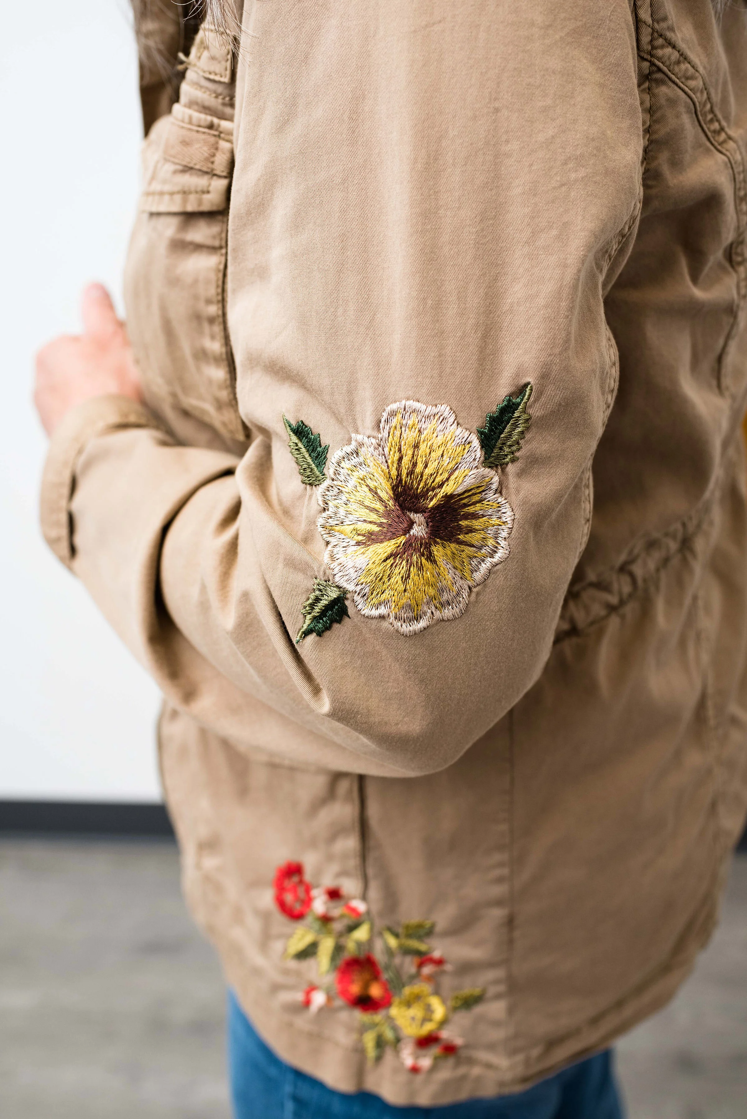
I thought I would take another week to look at ways we can update our wardrobe using older style pieces by showing you my own rendering of a couple of outfits with a recent thrift purchase I made. This two piece set is from Blair. I don’t know about you, but I have often felt that mail order retailers like Blair are old school and really gear their products to women, who like the simplicity of shopping via mail and buying products that are easily mix and match and easy to take care of. Don’t get me wrong, they do have many lovely pieces, like this Fair Isle sweater, this spring jacket, and these cute Skechers sneakers.

What I am going to attempt to show you is how you can use this two piece set three different ways for looks that are up to date and appropriate for work, date night or church.

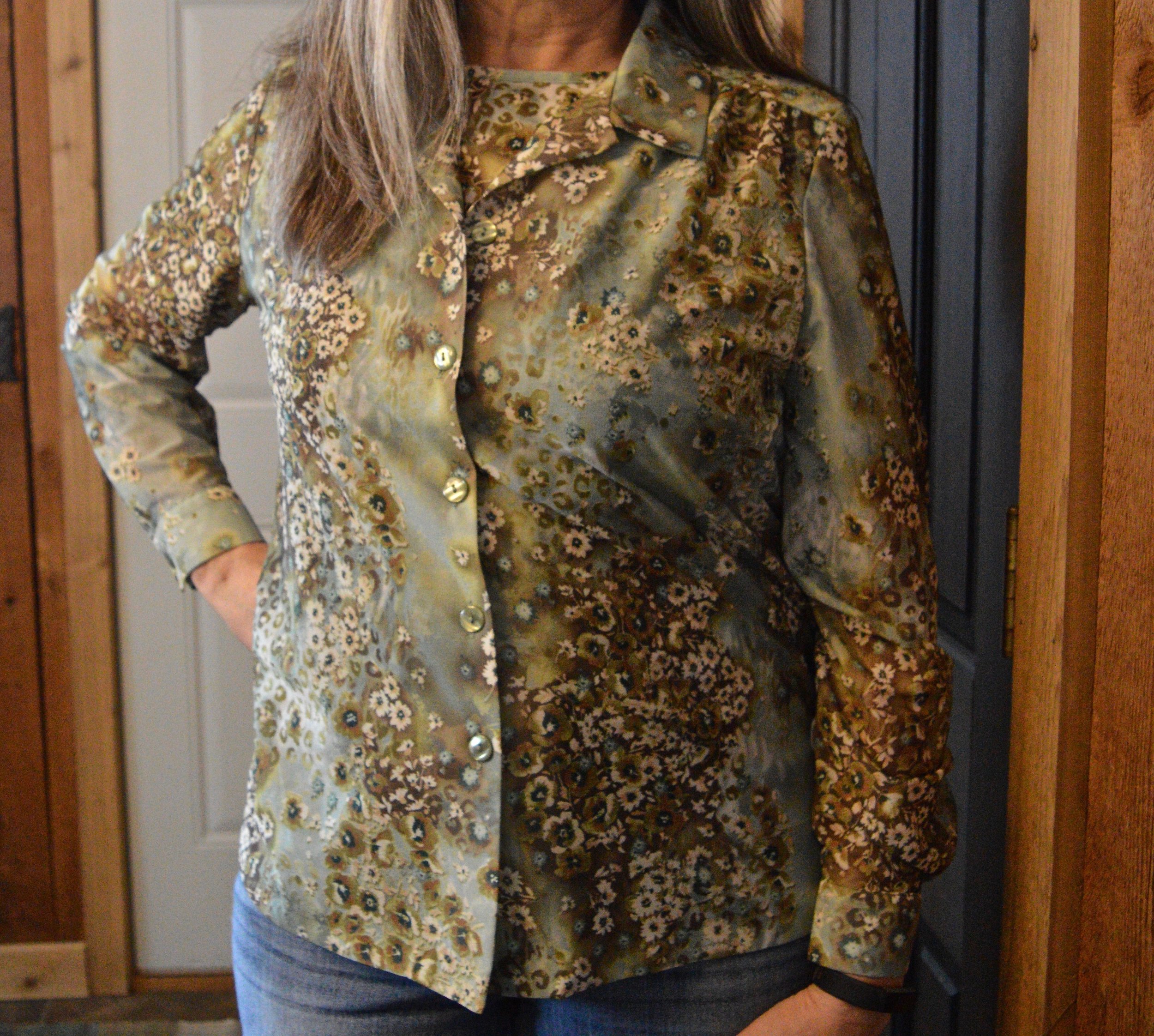
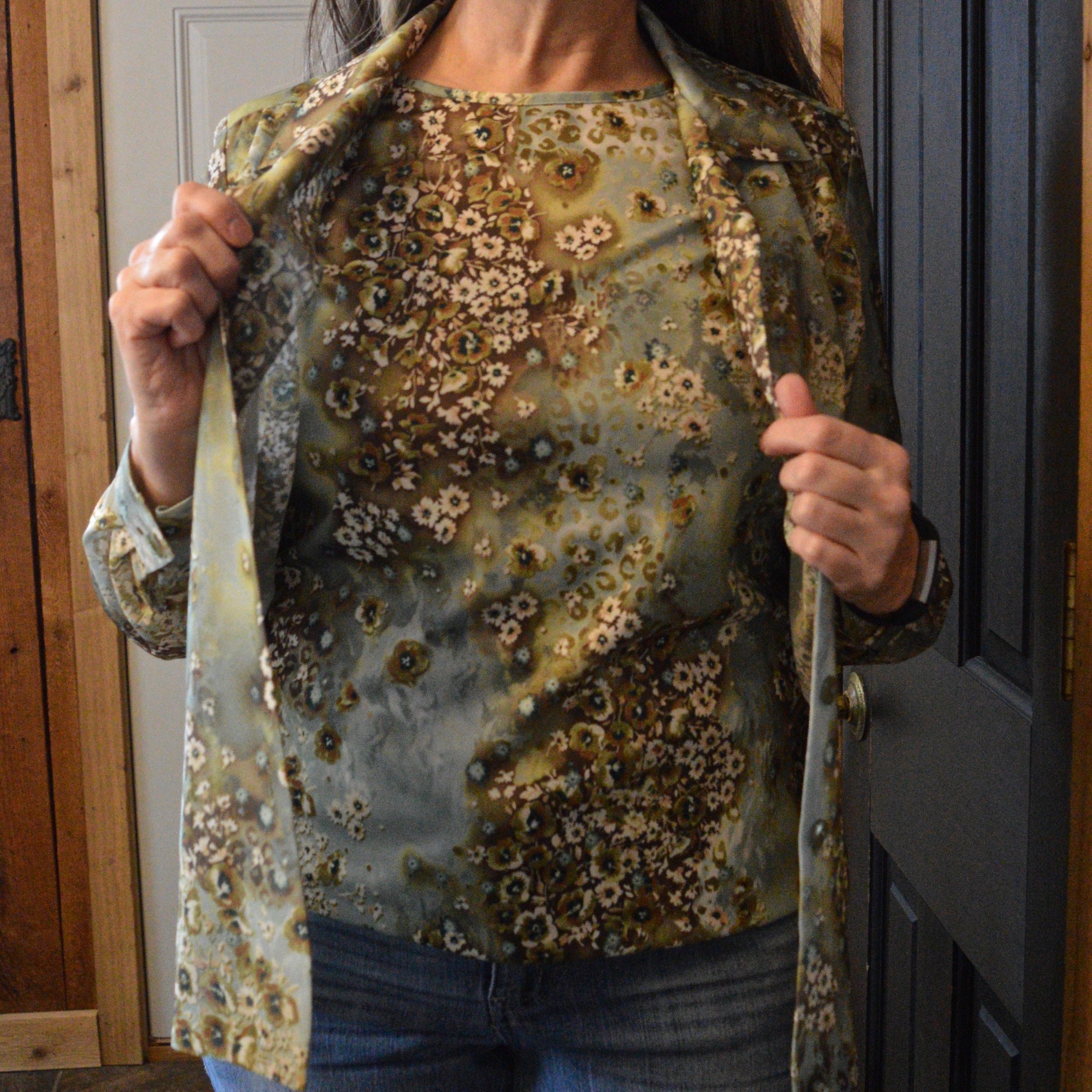
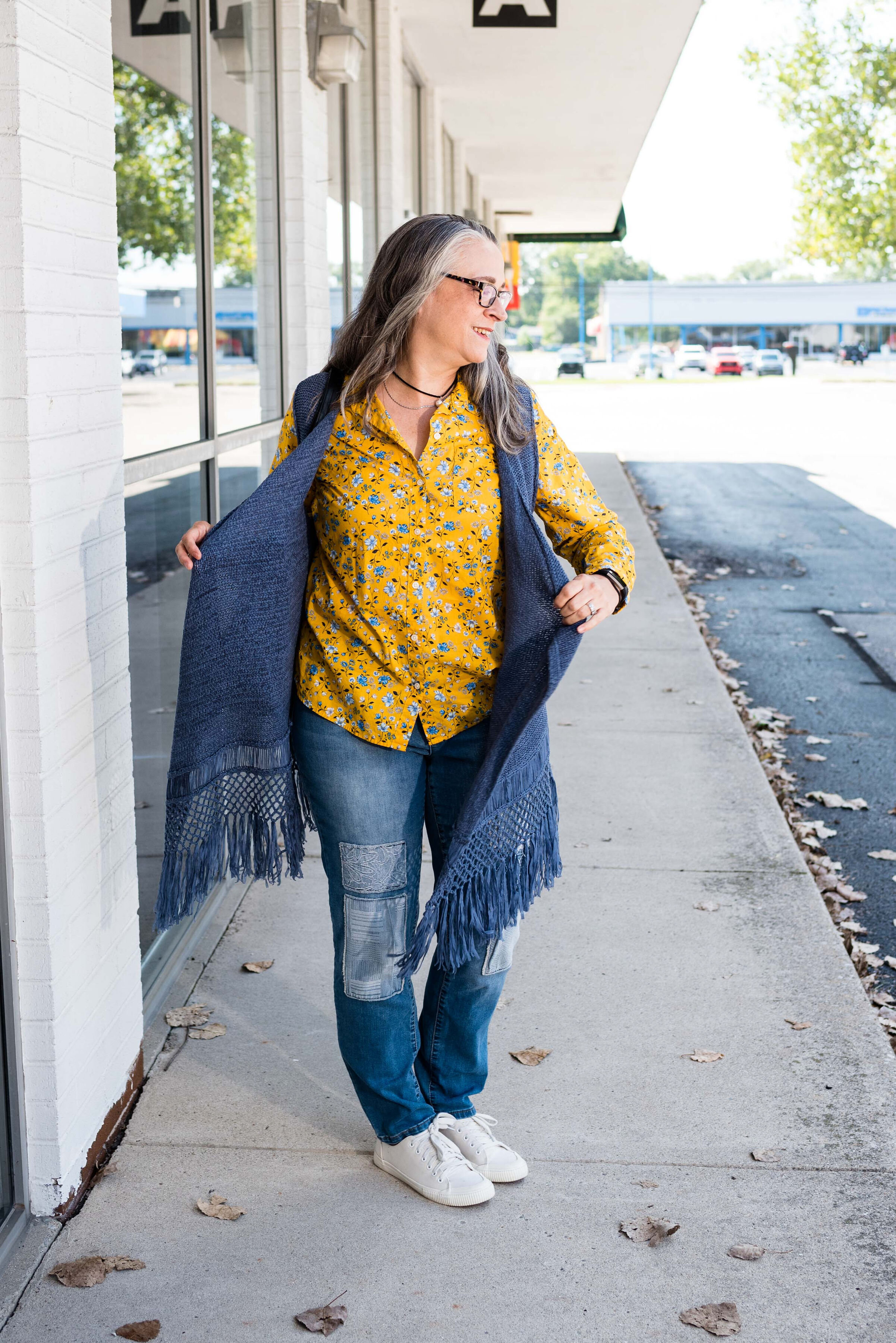
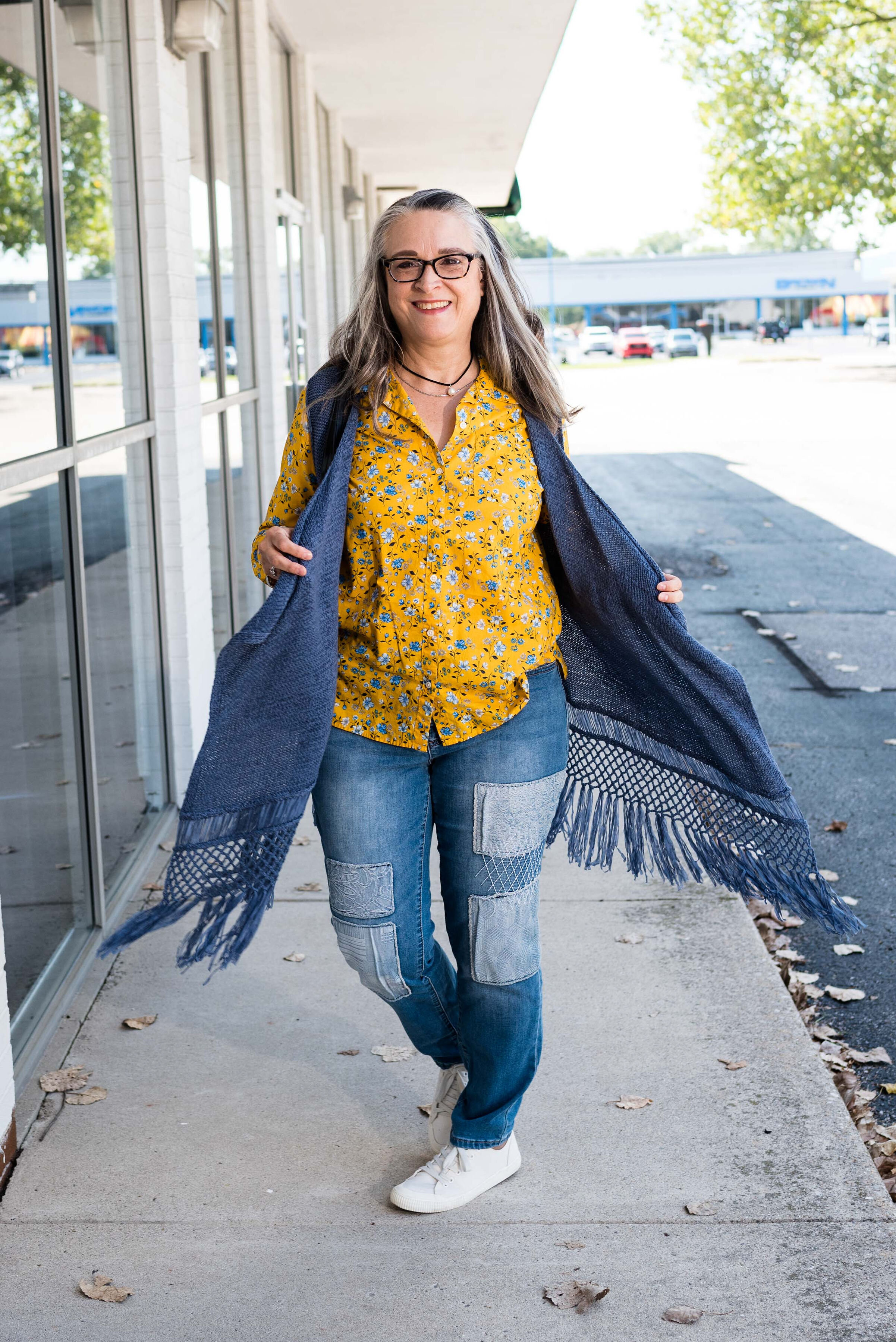
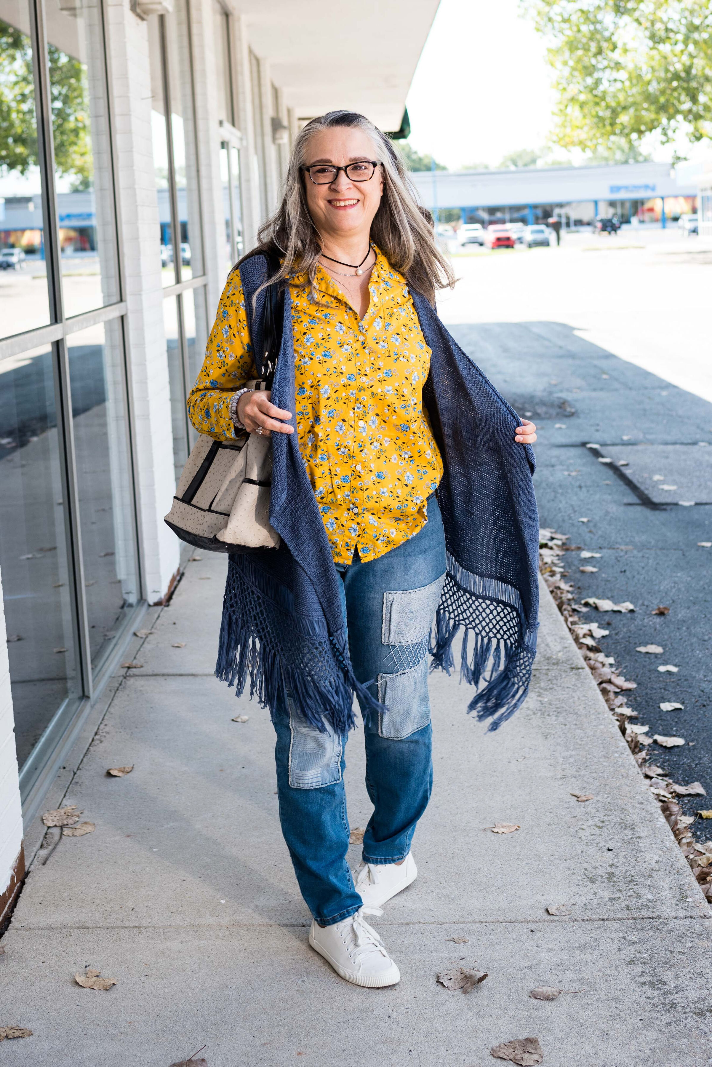
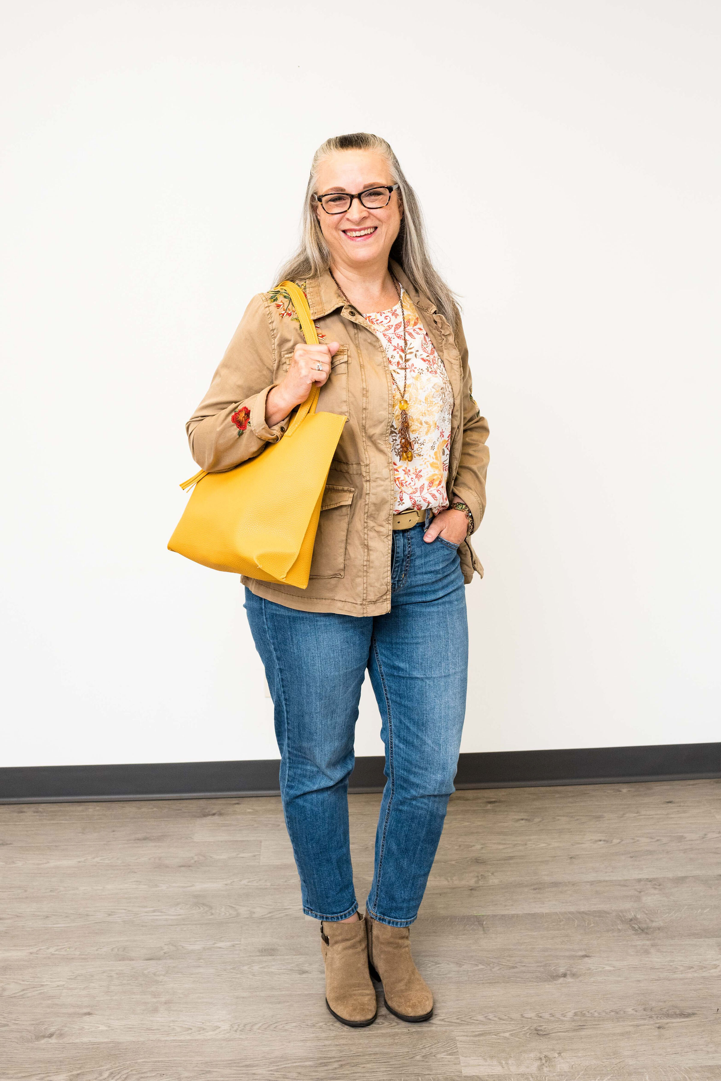
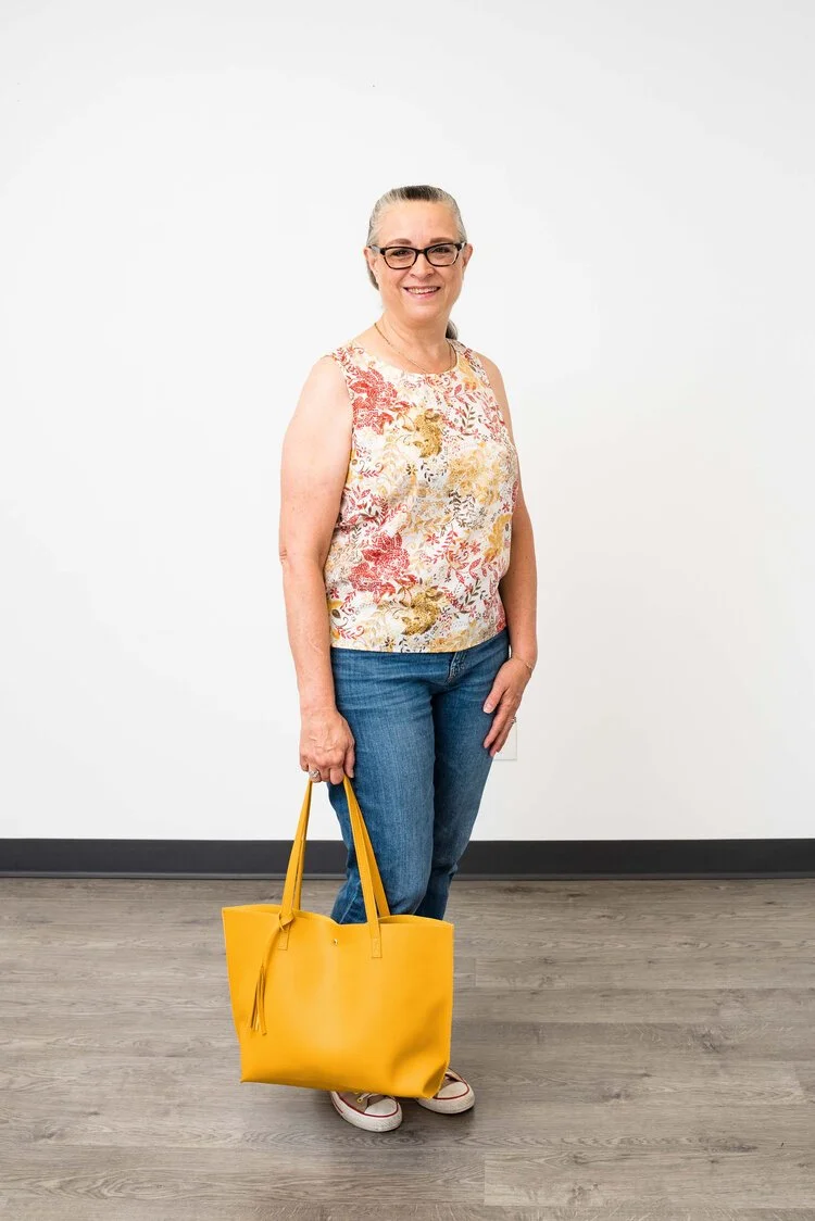
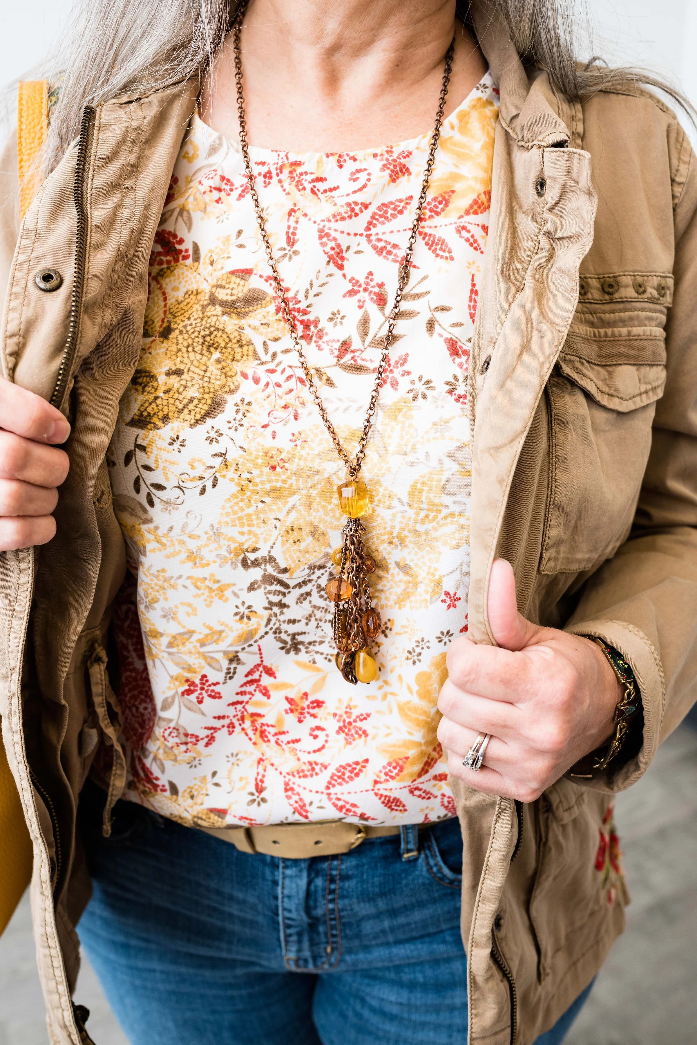
I think the pattern and the colors of this set are lovely. It can be worn all year round, but will be especially pretty in the spring and the fall. The under piece is short sleeve and the over piece is sheer.

Look 1 - Casual

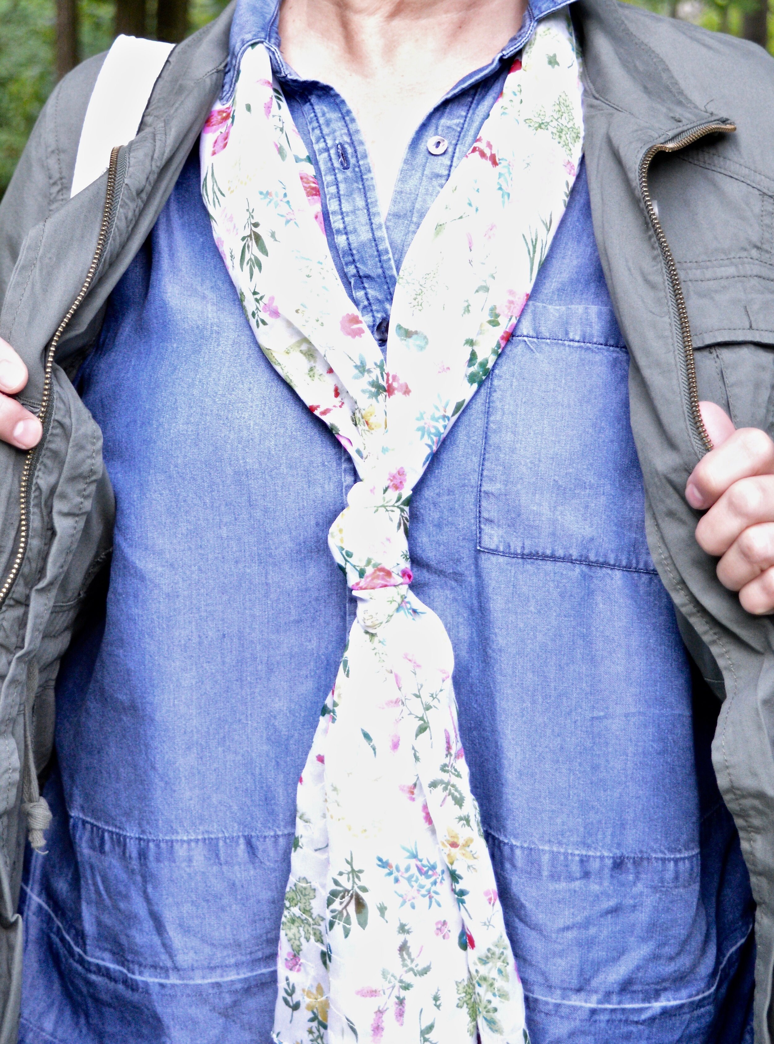
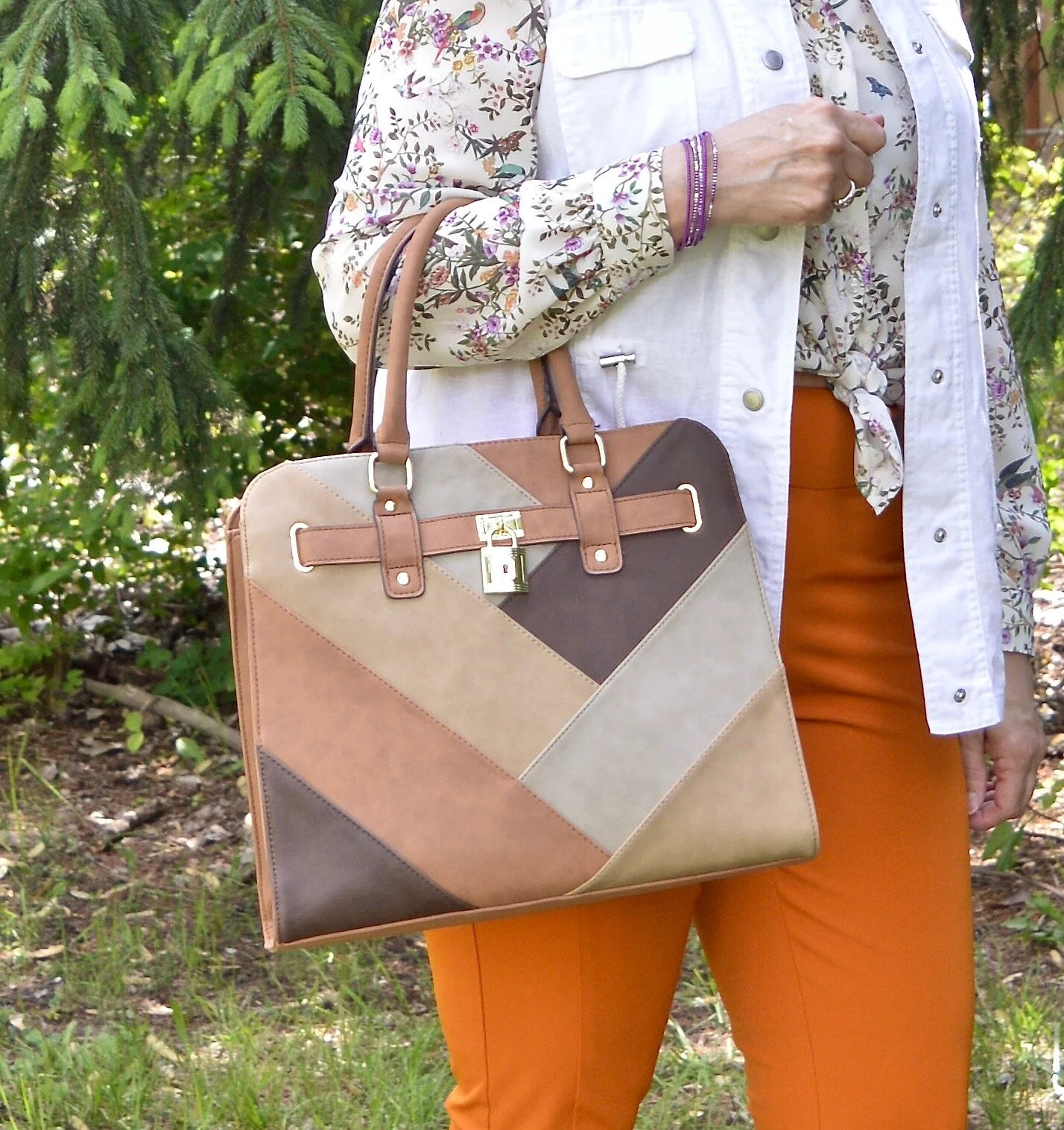
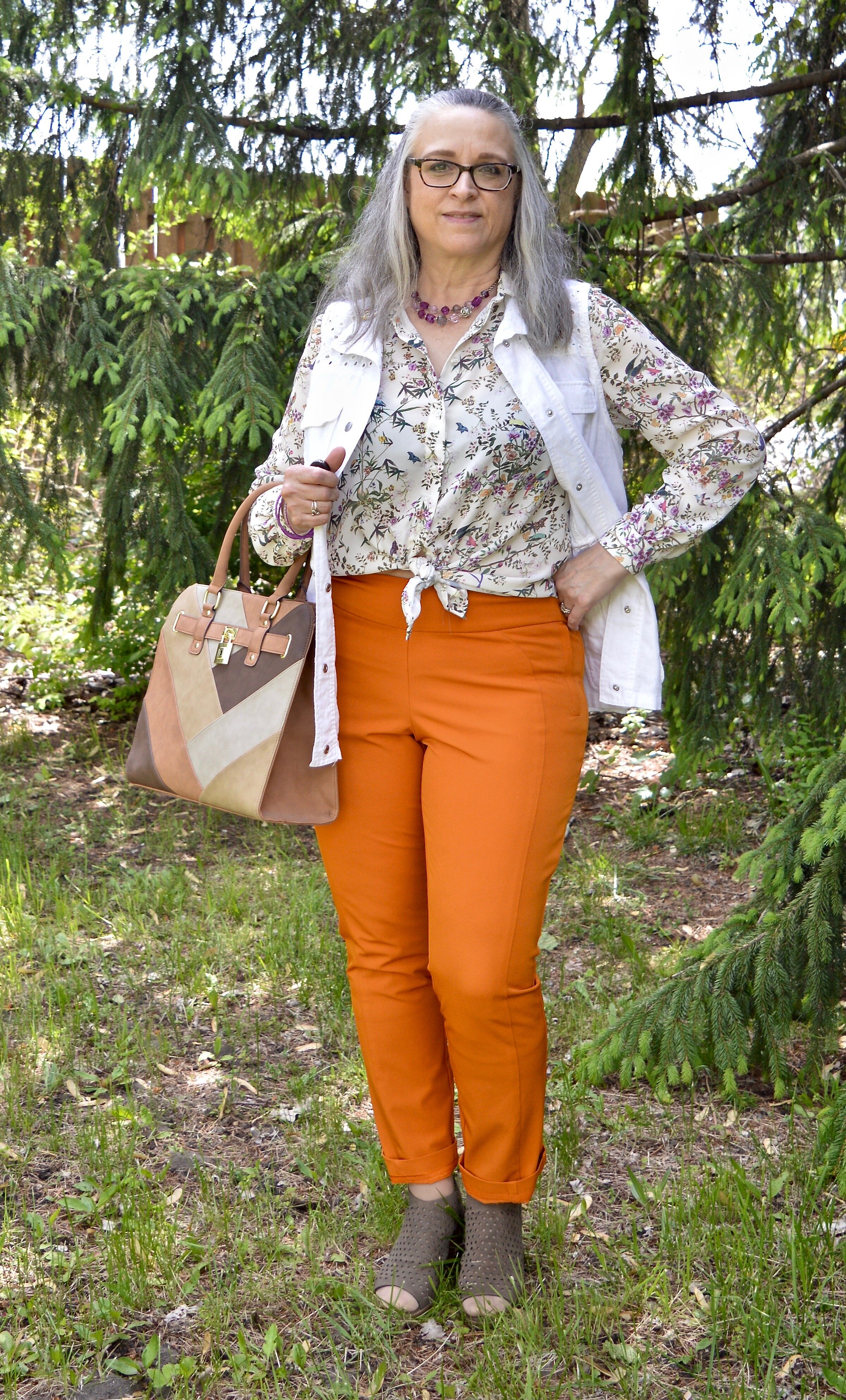
The first way I wanted to style it was casual, since that is pretty much all I wear right now. I decided to wear both pieces together, and added a heavier sweater coat that I recently thrifted as a warm layering piece. I love the winter white of this sweater and the textured waffle weave. It has two silver clasps in the front, but I wore it open so the two piece set could be shown off. I added my old olive combat boots, an olive belt and a dark olive bag. I did the front tuck to show off the belt. This is a great casual look and I would definitely wear it for a date night with my hubby.

Look 2 - Church

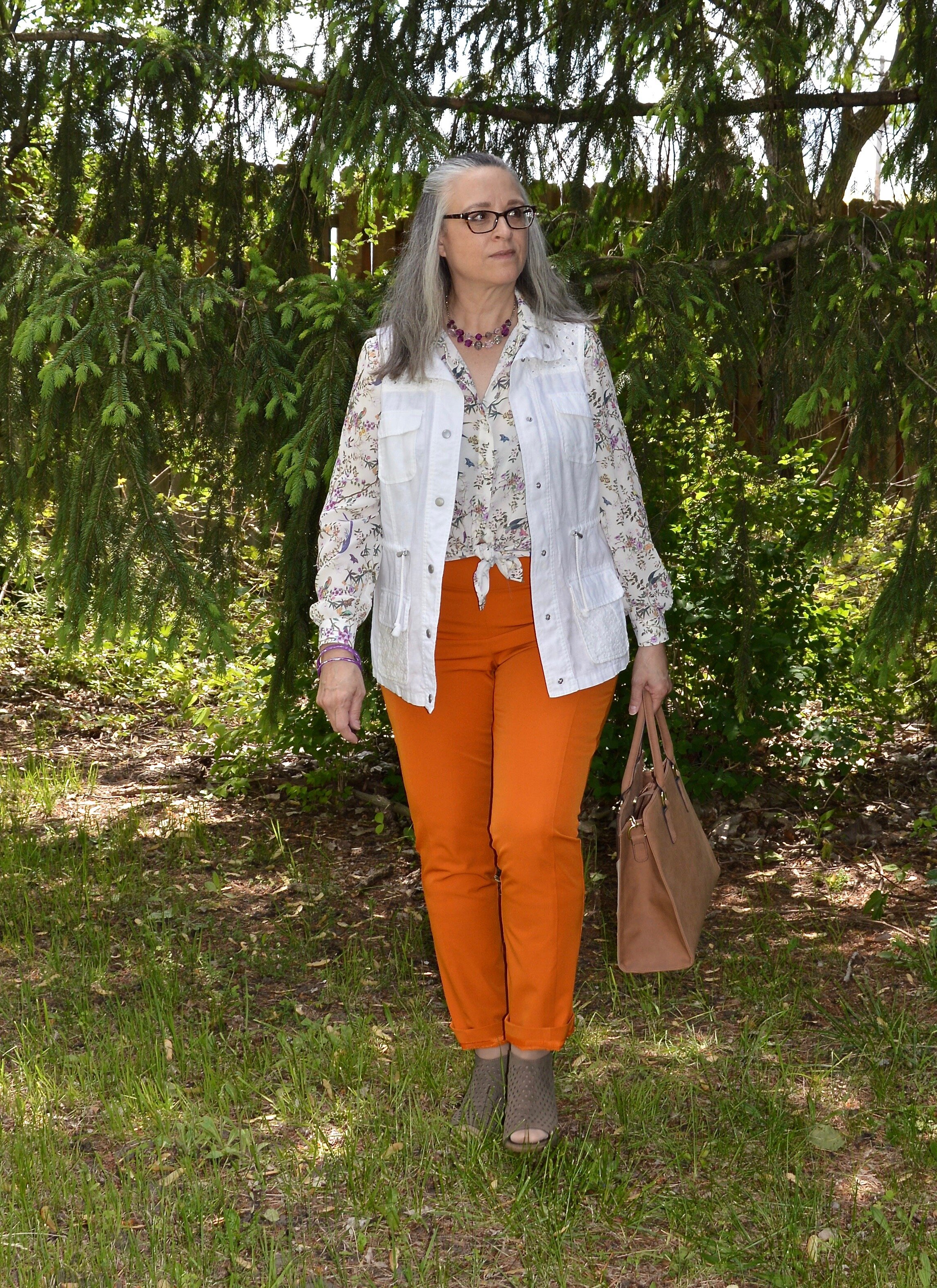
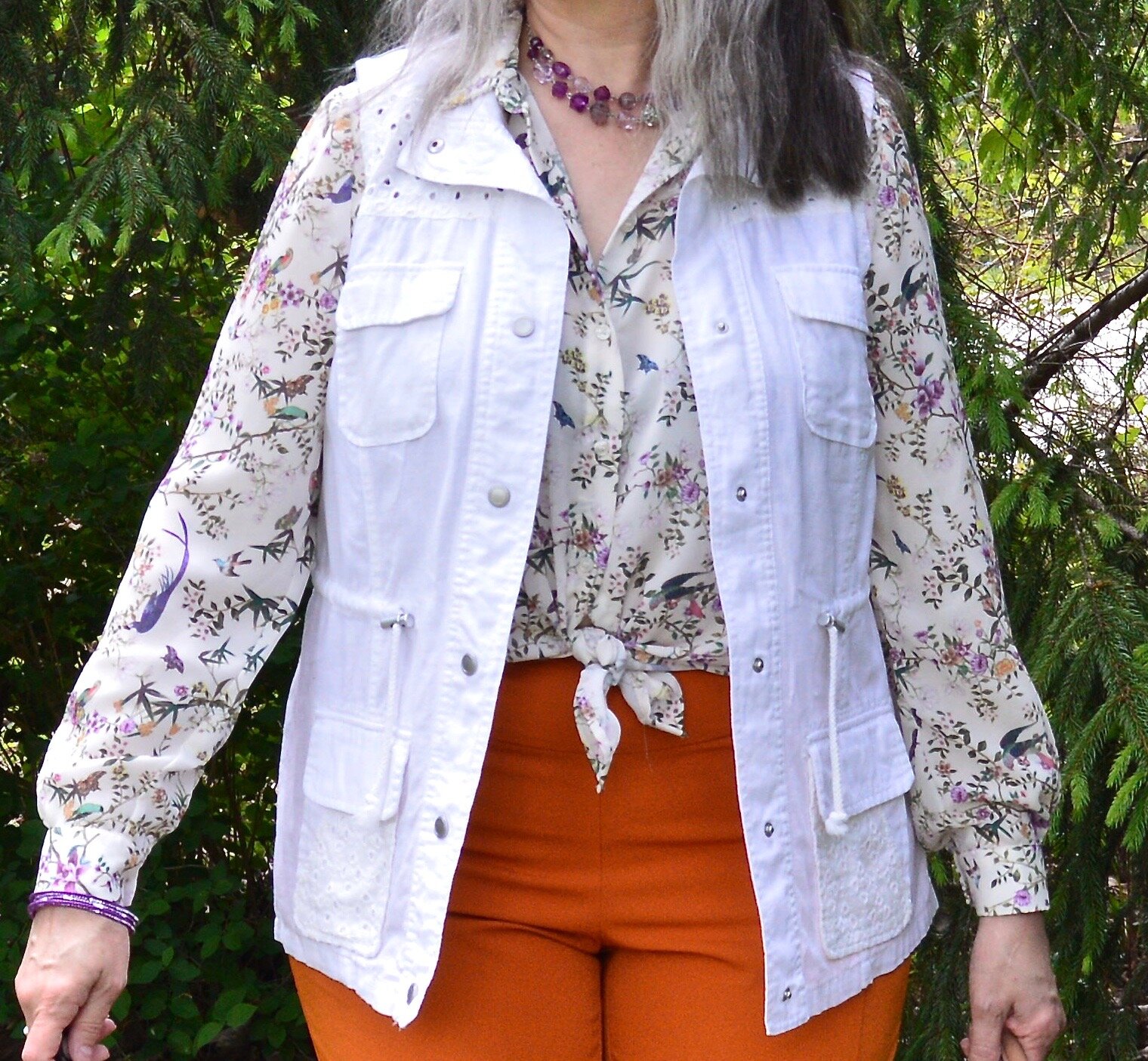
Obviously, this look doesn’t just have to be for church. You could also wear it to work or on a fun day out with your girlfriends. In this look I got rid of the sheer overlay piece and used a Kohl’s moto jacket I purchased last year. The jacket is rather heavy, so would definitely be better as an outerwear piece rather than just a layering piece. Often, I will use jackets as layering pieces in the winter, but this one will be better as a spring or fall jacket when the temps are cool, but not freezing.

The skirt is another thrift find. I like the buckskin look of this piece, and thought it could be styled with lots of other colors. The skirt actually could be hemmed up, if you prefer at the knee or above the knee. With these tall brown boots, which were a hand me over from my older daughter, I almost think having the skirt above the knee would look a little better. I added a gray thrifted bag as a point of contrast.
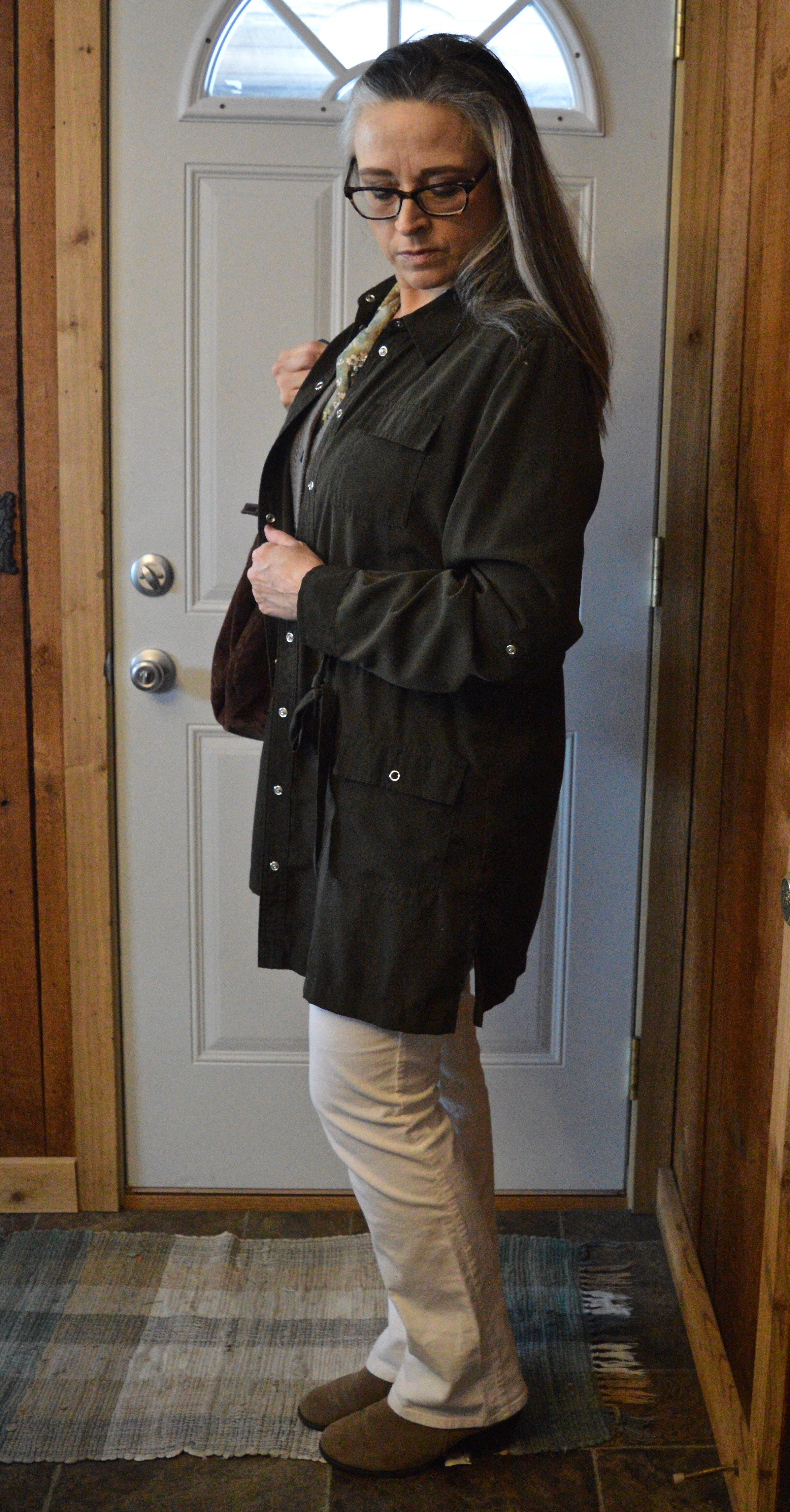
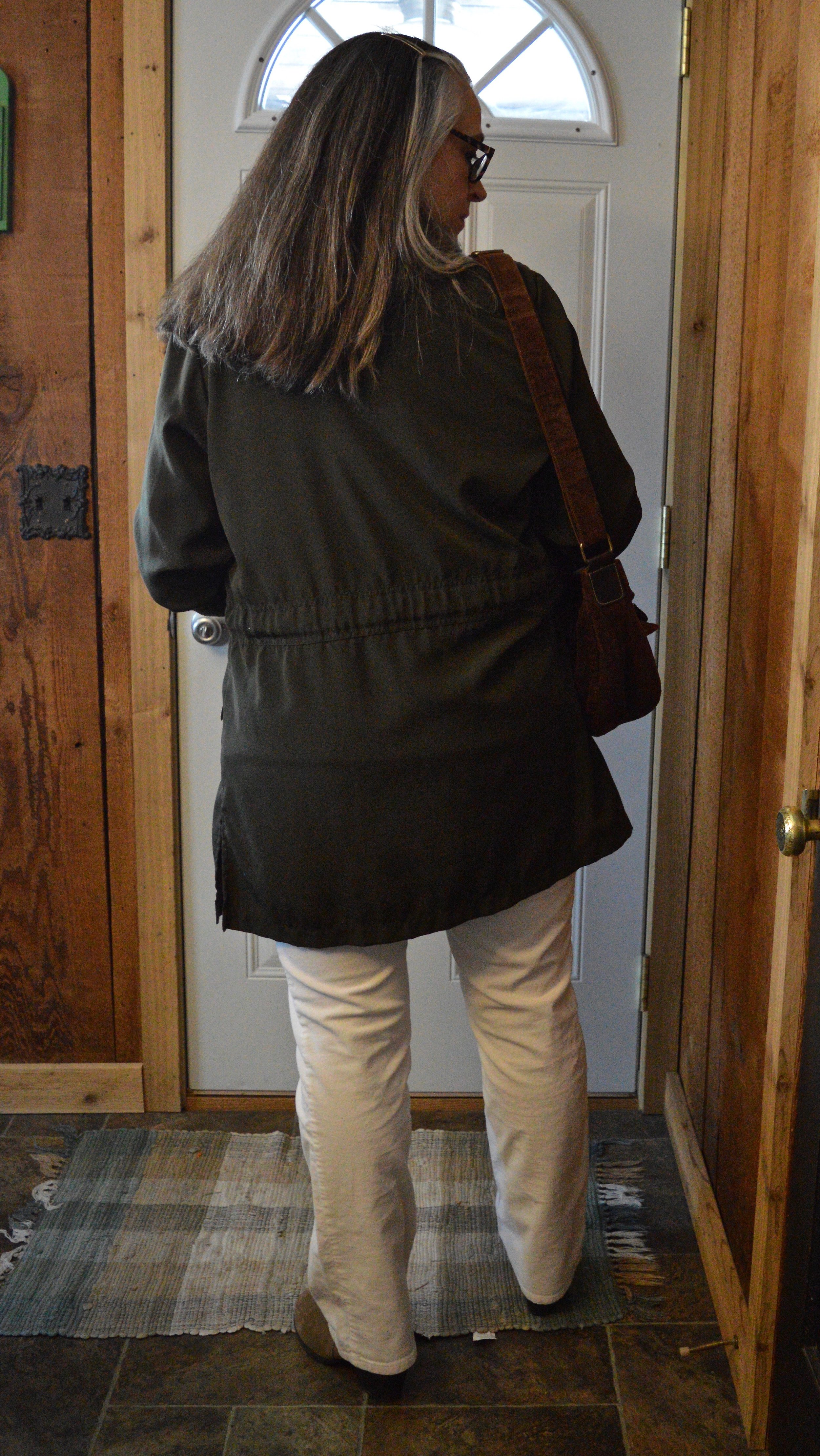
Look 3 - Work

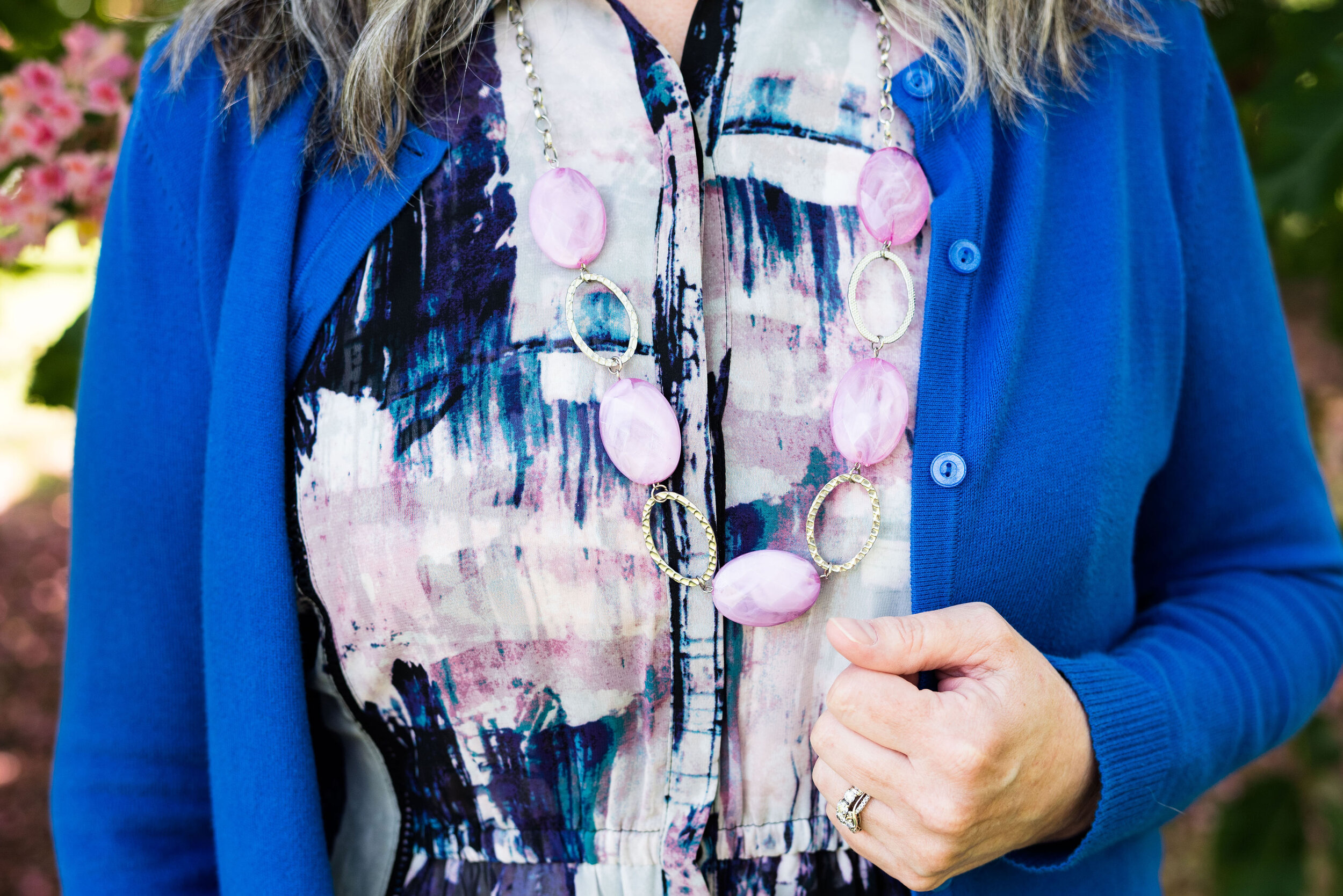
For this last look, I got rid of the short sleeved under piece and donned the long sleeved over piece. I do have a cami on, so I could have worn it like that, but I wanted to add another layer for the cold and more texture. I switched to corduroy winter white pants, heeled suede ankle boots and added another layering piece that could be removed if I got too warm. The office I used to work in was cold in the winter months, so layering was essential. The dark olive jacket is thrifted and is probably a dress. The vest was a Christmas gift two years ago. I went for my dark brown, thrifted corduroy bag as a final touch.

There are so many options when it comes to your clothing. Your closet is a space with unlimited possibilities. Don’t worry about what the media says about what women should or shouldn’t wear at this or that age. Wear what you like, just figure out how to wear it to make yourself feel your best and most confident.

Thanks to everyone who follows along with my blog. I really appreciate it. I hope to bring you more fun content in the weeks and months ahead. If you like to read my Faith posts, be sure to check back Thursday for a new post on what I am learning about the word rejoice! Until then, I hope you are having a great week.

I am including a few shopping links for you to peruse. These are affiliate links, which means I earn a few cents every time you click on a link. I don’t receive compensation for what I do on the blog. I do it for myself, because it stretches my creative boundaries, and I do it for you, because I want to encourage and inspire you.

What is Going on with the Blog?

Hello everyone! It has been a very long few months and I feel that I owe all of you an explanation. From the middle of spring I started experiencing cold like symptoms that at the time I attributed to allergies. I went along, taking my antihistamines every day and using the ones with decongestants when I needed as I began to have congestion and a cough. I muddled through May and June, but by mid July I began to think I had a sinus infection as I was not showing any signs of improvement.

Over the course of the next four and a half months I would have numerous conversations via my online medical app with my primary care doctor. I would also end up in the urgent care on two different occasions, and have two ER visits. I would end up sleeping (and I use that word lightly, because I hardly slept) on the couch since my cough was so incessant I could not lay down. I had three rounds of different antibiotics, two orally and one delivered via my neti pot. I had three rounds of oral steroids, the last which titrated down over the course of a month. I also ended up on two different inhalers and two psych meds to trick my brain into thinking I didn’t have to cough.

The turning point came when I woke up one morning mid October, and took my blood oxygen level (which I had been doing since my daughter gave me a pulse ox meter). A good reading will be in the mid to upper 90’s. Mine was 85. I had been losing my appetite over the last month or so, and that morning I started vomiting. I called my husband on the home phone from my spot on the couch and said, “I think it is time. I need to go to the hospital.” Over the course of those months, I had gotten tested for Covid two different times. I had no fever, ever, but the cough was so bad, I would have been negligent if I didn’t get checked. The test came back negative both times.

We got to the ER at about 7AM and the place was almost deserted; a God thing, since hospital ER’s have been full and overflowing with 7 to 10 hour waits to be seen. As soon as I told them I couldn’t breath, they got me right into a room and did an EKG to make sure I wasn’t having a heart attack. I was attached to oxygen and they started organizing testing and plans for care.

I ended up being admitted to a program with that hospital, called Acute Care at Home. Basically, you go home but the hospital provides all the equipment to monitor your care via on line applications and Blue Tooth connections. I also came home on oxygen, so I had to take an ambulance ride to get home. I never realized how bumpy they are. I stayed admitted to that program for five days. Over the course of that time I was in regular contact with nurses and two different doctors, one who was the hospitalist with the program, and another who was a general practitioner who helped with the in home acute care program. Both of them were completely attentive and proactive about restoring my health. In fact, the hospitalist pulled some strings to get me in with a pulmonologist right away.

The end result of this intensive care was that I started to improve. A week later I was able to sleep in my own bed. My cough was minor and I only needed oxygen for about four days. The combination of care and medication brought me back to a level of health where I could sleep, eat and interact with my family. It was a long four months. I am still struggling with sinus issues, including the loss of smell and taste. I have better days and worse days depending on the weather and the allergens around. I am using a neti pot, a sinus steroid nose spray and an inhaler for the asthma like symptoms. But, I am much improved and feel like life is back to being more normal.

I have been struggling to get back to the blog, but it seems my creative mind has suffered as well. I am sure there are connections to long term illness, depression and seasonal affective disorder that are coming into play. I have been regularly posting on Instagram, so for those of you who have an account you can follow me there. I do hope to get this blog up and running again and plan on working back to at least two posts a week about mid January.

For those of you who are new to my blog, I apologize for not showing up sooner. For those who have been regular subscribers, I want to thank you for continuing to support me. I hope to start giving all of you content on fashion and faith that will not only inspire you, but encourage you. Encouragement is my main goal. We all need to be encouraged!

Thanks again for following along and for all your support and prayers. Look for new content coming soon!

Hugs!

Stylin’ Granny Mama

Pantone - Autumn/Winter - 2021 - London Palette: Green Bee, Downtown Brown, and Olive Branch

Hi everyone! November is zooming along and I am still trying to get back into some sort of rhythm, not only here on the blog, but in life. Anyone who suffers from a long term illness can relate to what I am talking about. Not being able to sleep for such a long period of time and still dealing with unresolved symptoms make it hard to get back to what I would say is a normal routine. However, I know there are people who are struggling with much worse situations and I am thankful that I am able to do as much as I can. In fact, this past weekend, we were able to travel to celebrate my mother-in-law’s 80th birthday with her, so that was good.

Unfortunately, there has also been other difficult things along the way. My son-in-law lost his grandfather this past week and I know that has been a great loss for the whole family. He was a dear man, a wonderful painter and loved his family, so he will be missed. As many of you can relate, it seems as we get older, we see loss happening around us at a more frequent pace. This too is part of life, and for me knowing God is holding me and my loved ones during these times, makes it a little less painful.

Now on to another outfit. As I said last week, while I am wildly behind, I decided to go ahead and show you these Pantone London Palette outfits as possible sources of inspiration for Thanksgiving Day wear. Many of you will be celebrating with friends or family and it is a good reason, to get out of those sweat pants and dress up a little bit, if just for your own mental well being.

You can’t go wrong with a pair of trousers, a pretty top and a fun scarf and bag. Obviously, you can pick your colors, but I chose to combine these earthy tones for a look that is a mix of military meets, moto chic.

My Downtown Brown moto jacket is a thrifted piece that I have styled on the blog before. It is a brand called Celebrity Works. I do like this medium milk chocolate brown. Browns can be tricky to wear, especially when they contain a little too much gray or a little more red, or well, you get the idea. A true brown is hard to find, but I think this brown hits the mark, so thank you Pantone for that one.

You’ve seen my Olive Branch pants numerous times on the blog as well. As I look at them in these pictures, I am thinking I might need to find a replacement pair. These are starting to look worn and really don’t look very flattering. Of course that may have had something to do with my chubby thighs. Ha, ha. These were Gloria Vanderbilt brand and I probably got them at Kohl’s.

For the Green Bee color I chose a thrifted Studio Works popover top that I did the front tuck on, which gave it the blouson effect. I also added the Green Bee paisley print scarf. The thought to add the Dana Buchman floral bag was a last minute addition, but I like how it pulled everything together. A fun floral bag is a great addition to your wardrobe, especially when it can serve multiple season duty. This one works just as well in spring, summer and fall.

I chose my trusty Olive Branch SO ankle boots for my shoes. My ankle boots definitely get used in these cooler fall temps.

What do you think of these colors? Would you wear an outfit like this to your Thanksgiving celebration? I’d love to hear your thoughts, so leave me some love in the comments below.

I am including a few shopping links. These are affiliate links and are brought to you at no extra cost. If you click on a link, I get a few cents. If you purchase something through one of my links I get a few more pennies. I appreciate every penny! All opinions are my own. Please note, I am not familiar with all of the retailers I list in my links, so be sure to read and understand their return policies in case something doesn’t fit or isn’t to your liking.

I hope you enjoyed today’s post. Until next time, have a great day.

Photo credit Jessica Trumbull with Rebecca Trumbull.

Pantone - Autumn/Winter - 2021 - New York Palette: Pale Rosette, Root Beer and Olive Branch

I want to start off with an apology for my lack of consistency with the blog lately. It has been a rough couple of months and I just haven’t had the motivation to post as regularly. It seems every time I want to make more of an effort at getting more disciplined or being more consistent, I get blindsided by something. At the beginning of the summer it was a broken wrist. Mid summer, I came down with this stuff, that still has me coughing. I just have no idea if I will ever be back to “normal”, whatever that was.

There have been some good bits along the way as well. Early summer we were able to take my in-laws on a nice trip up through the Upper Peninsula, down through Michigan and back to our place where they enjoyed visiting family for a few days. I also got to see my mom, two different weeks and spend time with her. That also afforded me the opportunity to see my best girlfriend, and do some thrifting. On September 19th, our second grandson arrived. He is a doll and I am enjoying opportunities here and there to see him, even if I do have to wear a mask. He’s been born into a world of half blue faces, but that is okay, if we can give him a healthier start. He, my daughter and son-in-law are doing well.

Today’s outfit revolve around three colors on the Pantone New York Palette that I thought combined well into a work wear ready fall outfit.

PaleRosette.jpg

I am still trying to get used to seeing pastels during the fall season. This year, they were quite popular and besides this pale pink, also included a pretty lavender. I guess, we like what we like right, so pastels for me might be more of a spring and summer color scheme, while rusts, browns and burgundies are the colors I reach for in the fall. While we still live in a free country, you are in control of what colors you wear when. Ha, ha.

pantonefallcolortrendspalerosette-8.jpg

The Pale Rosette, 3/4 length tee is a thrifted piece, and a brand called Suzanne Betro. It is actually a longer tunic, but I just tucked it in for this outfit. I love the detailing at the bodice.

pantonefallcolortrendspalerosette-6.jpg

You’ve seen my Olive Branch utility vest on the blog before when I did my series on olive pieces. This vest isn’t quite the right shade. Who would have thought there are so many shades of olive? Another clearance find from Kohl’s, I don’t have a ton of Mudd pieces as it typically has more of a junior’s fit, but the few that I have, I really like.

You’ve also seen these brown trousers when I talked about wide leg pants back in the spring. I am not a big fan. I have enough bulk on my bottom. However, I will hang on to this pair, as I like the color, and occasionally it is nice to have a different option when it comes to pants. These were thrifted and are St. John’s Bay brand.

I added the multi-print scarf to add an extra dimension of color and interest to the outfit. I like how it ties the whole look together.

You can also see the fun necklace I scored while thrifting at the local shop around the corner. I have found some great jewelry there. I goes perfectly with the pants.

pantonefallcolortrendspalerosette-9.jpg

Even though this little thrifted, Rosetti bag screams summer, I thought it was a great way to keep this outfit looking modern and updated, yet still in tune with the fall vibes.

My SO snakeskin print boots were a clearance purchase from Kohl’s last season. I haven’t really had the opportunity to wear them very much, so hopefully this season they will be out and about.

pantonefallcolortrendspalerosette-10.jpg

What do you think of these colors? Do you like them combined? Do you like them each separately?

pantonefallcolortrendspalerosette-1.jpg

I’d love to hear your thought, so leave me some love in the comments.

As I usually do, I am adding a few shopping links in things similar to these colors. These are affiliate links. All opinions are my own.

Thanks for following along on the blog. I hope you are having a great week.

Photo credit Jessica Trumbull with Rebecca Trumbull.


Pantone - Autumn/Winter - 2021 - New York Palette: Fuchsia Fedora, Leprechaun, and Coconut Cream

The colors I am showing you today were ones that surprised me a bit for a fall palette. The bright Fuchsia Fedora is not a color that I have very many pieces in, thus why I used it more as an accessory color. Leprechaun was also a different choice. I was thinking there would be a darker, more forest green color, but this bright, cheeky color is what appeared on the palette. However, that is one of the reasons I like doing this color series. It forces me to think outside the box.

FuschiaFedora.jpg

Even though I wasn’t particularly fond of these colors for fall, I actually liked the way this outfit turned out. Even though the light jacket looks nothing like Coconut Cream, these colors and their combinations are just guidelines for us. Not rules…and just for fun….

I loved The Pirates of the Caribbean movie, and that whole idea of rules versus guidelines was amusing as it kept coming up in the movie and was used according who benefited the most. I guess we could take a lesson from that when we look at our closets. The combinations you put together are for your benefit. You get to decide what you like and what you don’t. You make the choice of what colors or prints to put together, and whether you want to buy into the trends or not. I think we can safely say those fashion “rules”, are really more like “guidelines.” My job as a fashion blogger is to give you ideas of how to make these combinations and hopefully inspire you to think outside your own boxes.

pantonefallcolortrendsfuchsiafedora-10.jpg

My LuLaRoe skirt was the perfect choice to build this outfit around. I actually had the thrifted striped tee already pulled out as a match for Leprechaun, and as I started figuring out which colors and pieces to put together, I remembered this skirt. I always have a little celebration party when pieces come together. When I try things on I do a little dance in front of the mirror and say, “This is it!” Ha, ha. The stripes in the tee are actually navy, but with the two prints taking center stage, you can’t really tell the colors are different.

pantonefallcolortrendsfuchsiafedora-3.jpg

My cream jacket by Sanctuary is a thrifted piece you have seen before on the blog. You can see it with a leopard print skirt and with my bright blue pants. It is actually more of a canvas than a denim, but it works much the same as a denim jacket providing light weight coverage for cooler weather and adding a casual touch to a dressier outfit.

pantonefallcolortrendsfuchsiafedora-5.jpg

You can see my Fuchsia Fedora necklace and bracelets. I think I have jewelry in just about every color under the sun, but you know, a girl can never have too many fun accessories! Is that a rule, or a guideline? Ha, ha.

pantonefallcolortrendsfuchsiafedora-8.jpg

My bestie, Stacey, gave me this beautiful, leather the Sak bag last time she came to visit. I thought the berry color went perfectly with the darker berry color in the flowers on the skirt.

pantonefallcolortrendsfuchsiafedora-9.jpg

These beautiful black suede heels never get to go anywhere, so I do like to bring them out and show them off on the blog. These are Aerosoles and I bought them a few years ago at a Clarks shoe outlet. I like that they are comfortable, have a reasonable heel, stay perfectly in place and look classy.

pantonefallcolortrendsfuchsiafedora-2.jpg

What do you think of these colors? Do you like them for fall? Now that I am thinking about it, I might need to revisit the idea of fuchsia as a fall color. I could see it with other fall colors like golden yellow, burgundy and rusty orange. Hmmm. I may have to get a little further outside of my color box.

Let me know what you think. I’m including a few shopping links for things of similar color. These are affiliate links and are brought to you at no extra cost. If you click on a link, I get a few pennies. If you purchase something through my site, I get a few more. I appreciate every click.

Have a great day!

Photo credit Jessica Trumbull with Rebecca Trumbull.

Pantone - Autumn/Winter - 2021 - New York Palette: Mykonos Blue, Spring Lake and Coconut Cream

It seems that every Pantone color palette that comes through the Institute has at least one, if not two blues on it. Blue is a color that everyone can wear, whether you wear dark classic navy, casual comfortable chambray or tropical hues that take you to the beaches of the Caribbean. I have a lot of blue in my closet, but then, I have a lot of every color in my closet. Ha, ha. Blue is great for pairing with many other colors. I pair denim with every color and denim definitely falls in the range of blues. Today’s blues are wearable and most likely already in your wardrobe.

SpringLake.jpg

My colors did not really line up with these blues. Oh well, that is part of the challenge of doing this series. I don’t always get the match spot on, but that is okay. The point is to take things you already have and do something similar. It doesn’t matter if your blues are a perfect match or not. All of these pieces were things I already had.

When I picked out these pieces I really thought the pants and the vest would have matched better to Spring Lake, but now looking at the picture the pants seem to match better with the Mykonos Blue. The vest, which does seem to lean a little bit toward a gray undertone, was too dark to match the Spring Lake color. However, the patches on the pants seem to lean a little more in that direction.

pantonefallcolortrendsspringlake-2.jpg
pantonefallcolortrendsspringlake-20.jpg

The vest is a thrifted Relativity piece. I have styled this on the blog before. You can see it worn with a graphic tee. The jeans which I have styled on the blog before are thrifted and a brand called Est. 1946 Denim. You can see how I wore them with a graphic tee and cozy sweater here. Looking at the above picture, I should have rolled up the cuffs on the jeans.

When you have an asymmetrical vest with fringe, you just have to twirl!

My yellow mini floral print button down is a thrifted Old Navy piece. I decided to leave it completely untucked to add to the ultra casual vibe of this outfit.

pantonefallcolortrendsspringlake-5.jpg

I was trying to go for the Coconut Cream idea in my accessories, but again, things didn’t match up exactly. My bag was a hand-me-over from my daughter. This Miche brand bag actually has interchangeable outer shells, so for this look I used the cream colored one.

pantonefallcolortrendsspringlake-14.jpg
pantonefallcolortrendsspringlake-16.jpg

My sneakers are thrifted Mossimo.

pantonefallcolortrendsspringlake-17.jpg

What do you think of these colors? Do you like to wear blue? What color blue is your favorite?

pantonefallcolortrendsspringlake-8.jpg

Thanks for following along with the blog. I appreciate all of your clicks, likes and comments.

I am including a few shopping links for you to look over. These are affiliate links. All opinions are my own.

Have a great day.

Photo credit Jessica Trumbull with Rebecca Trumbull.

Pantone - Autumn/Winter - 2021 - New York Palette: Illuminating, Fire Whirl and Ultimate Gray

Over the weekend, I became grandmother again. My oldest daughter had a little boy and we are very excited to meet him, as soon as we can. Obviously, with all the restrictions for visitors in the hospital, we were not able to meet him before he came home.

I am going to being this Autumn/Winter series, as I usually do with the New York Palette. It wasn’t until recently that the Pantone entity added the London Palette to its long list of color tools. Today’s outfit revolves around the two Colors of the Year, the sunny yellow, Illuminating and the classic gray, Ultimate Gray.

FireWhirl.jpg

In all honesty I was having a hard time putting the outfits together for this series. I think most of it had to do with being plagued by this stupid sinus stuff and cough for so long. I am finally sleeping in my bed again, but I still have a wheezy, chronic cough. We’ll see how long it takes to get some sort of resolution, or maybe it has moved in permanently, but it is a pain. It is hard to have long conversations and I cannot sing at all, not that I really could before I got this cough, but it was better than now. Oh well, life is just that way sometimes.

The other problem I think I was having, was the weather. It was so hot, I was having a hard time really getting into styling fall outfits. I love fall, and am excited about that change, but it has just been slow to actually feel like the season to wear layers. Here in my area, by Wednesday, the highs are only going to be in the 50’s. That definitely feels like fall.

pantonefallcolortrendsfirewhirl-3.jpg

You can see that I only used Illuminating in very small doses with my yellow beaded necklace and bracelets. The Fire Whirl red tank top is a thrifted Loft piece. It is actually more of an a-line or swing silhouette, so I gathered the shirt underneath in the front, then secured the little “pony tail” with a hair band. The result is to give the top a more fitted look with a fun swirl at the front.

pantonefallcolortrendsfirewhirl-12.jpg

For this outfit, it worked out that Ultimate Gray takes center stage with just a few pops of Fire Whirl and Illuminating. My thrifted, plaid, Sag Harbor trousers are actually petites, so I expect they would be closer to an ankle pant than a crop pant, but I like the way it looks, especially with my darker gray Impo booties.

pantonefallcolortrendsfirewhirl-11.jpg

The next picture shows you a closer look a the Illuminating jewelry and the detailing on the yoke of the top. The gray moto jacket is a no name brand and I am not sure where I got it. I wanted to say it was thrifted, but for some reason, I think I bought it at a store. I really cannot remember. Is that bad? Ha, ha.

pantonefallcolortrendsfirewhirl-8.jpg

My tote bag was going to be a gift for one of my daughter’s one Christmas a few years ago and I ended up keeping it. Many times, I just end up buying too many items, so I have to return stuff, but this was a cheap purchase, I believe from Kohl’s and I really liked it.

pantonefallcolortrendsfirewhirl-9.jpg

Fire Whirl is more the color of my top, but I kind of liked the contrasting shades of red, as well as the two differing plaid patterns. It just gives the outfit a fun vibe.

pantonefallcolortrendsfirewhirl-1.jpg

What do you think of these colors? Would you pair these colors with one another? Do you have these colors in your closet? Let me know your thoughts in the comments below.

I am including a few shopping links for you to look over. These are affiliate links, brought to you at no extra cost. If you click on a link, I get a few cents, if you purchase something through my site, I get a little more. Thank you for all of your support.

Photo credit Jessica Trumbull, with Rebecca Trumbull.

Thinking About Fall - Transitional Style - Tank Top

Before I get into the Pantone color series for Autumn/Winter 2021, I wanted to look at a few options for taking your summer pieces into fall. It seems like common sense to add layers as the weather begins to cool, at least for those of us in the northern part of the country. Even in warmer states, and countries, there are always those rainy days, or cooler evenings where having a layer or two makes a person more comfortable. The question I have to ask myself is why bother transitioning? Why not just change out our summer wardrobes for those fall pieces in deep burgundies and rusty oranges?

I think there are several reasons we need to transition from summer into fall. First of all, even those of us who love fall and enjoy the cooler weather, hate to see summer come to an end. The end of summer means shorter days, and the loss of the freedom and fun we associate with summer. Being able to run around without heavy coats, mittens and scarves is something most of us love being able to do. Summer also means vacations and beach days for many. It is hard to say goodbye to these wonderfully long, lazy days.

Another reason is that transitioning our wardrobes to fall slowly, allows us to extend the life of those summer pieces we love. The tank tops, shorts, light weight dresses and kimonos are still usable as the weather cools if we remember how much fun layering can be. I have already seen many bloggers and Instagram gals showing off these types of outfits.

Today’s focus is on tank tops. This could be a simple ribbed tank, or something like this thrifted Christopher & Banks shell, that is more structured and workwear appropriate. Since I am not working, I am showing you a casual look that can easily be taken from summer into fall with three simple changes.

summerfalltransitionoutfit-7.jpg

My daughter hired an assistant and has started training her behind the camera. They asked if we could do pictures in the studio, to give her some practice, not only with outfit photos, but with indoor shots. I love outdoor photos because there are so many possibilities, but there is something to be said for studio photos, especially when the weather is hot, humid and buggy! We just used the wall as a backdrop, but it you follow Rebecca Trumbull Photography, you know she has all sorts of backdrop colors for headshots and puppy pictures.

This outfit is easy, peasy. A pair of thrifted Merona boyfriend ankle jeans, a tank top, shoes, bag and a little jewelry. Except for the bag and jewelry, everything in this outfit is thrifted.

summerfalltransitionoutfit-2.jpg

I chose this tank top for a few reasons. The first is, I have been trying to use pieces that I haven’t used in a while in my closet. I actually started keeping track of what I have worn. For my hanging pieces, I turn the hangers backwards after I wash and hang them back up. For my tees, I have started turning the ones I used neck line out, rather than fold out. It might seem silly, but it does help to see what I have been wearing and encourages me to choose other pieces.

For this easy summer look, I kept my jewelry light and simple.

summerfalltransitionoutfit-9.jpg
summerfalltransitionoutfit-12.jpg

I wanted to chose a bag that could make the transition to fall, so this bright yellow tote was perfect.

summerfalltransitionoutfit-10.jpg

My sneakers are thrifted Converse. I washed them in the washer, but they need a little TLC to make them look pristine, which I haven’t done yet.

summerfalltransitionoutfit-11.jpg

In order to make an outfit like this ready for the cooler weather and changes that fall bring with it, you only need to do three simple things.

1 - Swap out light, breezy jewelry for jewelry that is bold and chunky.

summerfalltransitionoutfit-26.jpg
summerfalltransitionoutfit-24.jpg

2 - Add a jacket, sweater or other topper.

Utility jackets are often my fall and spring go to’s for light layers. This Sonoma piece with its beautiful embroidered embellishments goes perfectly with the leafy print of the tank. Being that it is tan, rather than a darker olive or brown, also gives me that slow transition into the darker, richer colors of fall.

summerfalltransitionoutfit-21.jpg
summerfalltransitionoutfit-28.jpg

3 - Swap out sneakers for ankle boots.

These are my Sonoma suede heeled booties. They are a regular part of my fall, winter and spring wardrobe.

summerfalltransitionoutfit-23.jpg

Let’s take a look at the outfits side by side.

You can see that in the summer look I rolled the pants up and in the fall look I left them full length. I love ankle pants for this transition time, because they allow me to show off the ankle boots, and they are still not as warm as full length pants.

The other detail I changed was doing the front tuck on the top, to show off the belt and give the outfit a less casual vibe.

summerfalltransitionoutfit-27.jpg

How would you transition a tank top into fall? Do you have tank tops that you love to wear all year round? What do you think of this outfits?

summerfalltransitionoutfit-17.jpg

I’ve included a few shopping links for you to look over. These are affiliate links and are brought to you at no extra cost. If you click on a shopping link, I get a few cents. I appreciate all your clicks and all your comments.

Have a great Wednesday!

Photo credit Rebecca Trumbull.

Oh, Olive! Utility Jacket - Casual

I am back from visiting my mom and ready to get back to posting here on the blog. I wasn’t feeling well, the first couple of days after I got home, but I think most of it was fatigue and allergies. They seem to be beating on everyone this year. While I was at my mom’s I didn’t have internet, but I was able to get some photos taken and was pretty pleased with the result. I hope you will be as well.

I am continuing my look at a few of my different olive pieces and how they can be used with just about any outfit and any color. I do like to think outside the box, at least my box, so I hope you will find some of these outfits inspirational for your own wardrobes. The week before last I showed you a casual and a workwear look using an olive pair of pants. Today and Thursday, I want to take a look at ways to style an olive utility jacket. You can see how I styled this same jacket on the blog before with a striped tee and distressed jeans, another striped tee, and a polka dot chambray top.

Another thing, I decided to add to this little series, is to give you a few peaks at what is trending for fall. I’ll point it out as we go along. Let’s take a look at the olive utility jacket.

DSC_0011.jpg

I have had this olive utility piece for a number of years now. St. John’s Bay brand, I got it at JCPenney. Since then I have accumulated a few other utility jackets in other colors. I like that they are so versatile. In fact, I may have to do a post on that at a future date. Most of my pieces, including this one are lighter weight, so a great topper for spring, summer and fall. While they do tend towards more casual, I will show you on Thursday how to make one look appropriate for work.

What makes a piece utility? I think it has to do with the pockets and the details like drawstrings, snaps and metal zippers. Next week I will be showing you an olive utility vest.

Fall Trend Alert - Denim on Denim

Once again, it seems denim with denim is trending for fall. While I wouldn’t wear this regularly, it does have a casual appeal. Monochrome is always a good way to get a longer, sleeker line. Most of what I saw on the runway were pieces of the same wash. See this post on Fall 2021 trends from Marie Claire. However, there is a sense of personal creativity in putting together pieces with different washes, as I did in this outfit.

DSC_0010.jpg

My chambray top is a thrift find from earlier in the summer. It is a brand called Cremieux. Apparently, Daniel Cremieux started a men’s clothing line in Saint Tropez, on the French Riviera in the mid 70’s. It looks like he designed women’s clothing for a time as well. Both lines were sold at Dillards, but the women’s line is no longer available in the US. The fun things you find when you thrift.

You’ve seen my thrifted, distressed Simply Vera, Vera Wang jeans plenty of times on the blog. They are getting rattier looking as time goes along, but I guess that is the point. Ha, ha. If the holes get to big for my comfort zone, I may make a few patches, which actually could be fun.

DSC_0013.jpg

I decided to add this floral mini print scarf just for a little extra color. I don’t use my scarves much in the heat of the summer. I sweat just sitting still on these humid days. Last night, I was working on this post and I was dripping with sweat. Of course we hadn’t turned our air conditioners on. Sometimes, we have to choose between a little bit of inconvenience and being able to pay the electric bill. My husband always runs colder, so he’s not as hot unless he is doing yard work or something. Today is supposed to be even warmer. I think the air will be on later, so this woman doesn’t get too cranky. Ha, ha.

If you follow my Instagram account, you may have seen that I rearranged my scarves. Just like with all of my clothes, I have way more than I need, but I am trying to make everything more accessible and visible, so it is easier to sort through and find. Do you have a special way of arranging your scarves?

DSC_0014 (1).jpg

My blue Converse are making another appearance. While I still think this brand of sneaker makes me look even more like I have ski feet, I am trying to embrace those long skinny things on the ends of my legs.

The last accessory I have is my white cross body bag. This was another thrift find. I like that it is a little bit larger than many cross body bags, so I can actually fit everything in it, without having to squeeze it in. I am not sure what the brand is, but it was still very clean and unworn, so I snatched it up.

DSC_0015 (1).jpg

Do you own an olive utility jacket? How do you like to wear it? I love hearing from you, so be sure to leave me some love in the comments. I hope your summer is going swimmingly well!

DSC_0019.jpg

I’m including a few shopping links for denim pieces and utility jackets. I hope you’ll look those over. Every time you click on a link, I get a few cents and I appreciate it. All opinions are my own.

Have a great Tuesday!

Pantone - Spring/Summer - 2021 - London Palette - Pickled Pepper, Orange Ochre and Sphagnum

For today’s outfit I decided to combine the two greens that were on the London Palette. Both Pickled Pepper and Sphagnum are great green shades for summer time. While Pickled Pepper is one of the main palette colors, Sphagnum is one of the palette classic colors. Olive is a great neutral and goes with just about every color out there, so Sphagnum, (which is actually a type of moss), makes for the perfect classic color.

pickledpepper.jpg

My Pickled Pepper popover top is Sonoma from Kohl’s a few years ago. This top is easy to wear, as well as cool for these hot, humid days. I don’t usually prefer to wear sleeves with elastic, but as long as the elastic isn’t cutting off the circulation in my arms I’m okay with it.

pickledpepperpantoneoutfitideas-12.jpg

My Sphagnum utility vest is Mudd brand, and was another clearance purchase from Kohl’s a few seasons ago.

pickledpepperpantoneoutfitideas-4.jpg

These light wash jeans were a recent thrift find. A brand called Ella Moss, this brand is available at stores like Nordstrom, Bloomingdales, Amazon, Dillards, and others. I like the cropped length and the high waist of this pair.

For the Orange Ochre color, I grabbed my thrifted, orange suede bag and a fun pendant choker. It is much easier to include a brighter color, if you do it with accessories.

pickledpepperpantoneoutfitideas-9.jpg
pickledpepperpantoneoutfitideas-7.jpg

I had to show off my new clearance Converse sneakers from DSW. They are very comfy and I love the blue color. They are similar in color to my thrifted Keds, which are showing a bit of wear, so these were a great find.

pickledpepperpantoneoutfitideas-11.jpg

Here are a few silly pictures. I was jumping for joy. Ha, ha.

pickledpepperpantoneoutfitideas-5.jpg
pickledpepperpantoneoutfitideas-6.jpg

What do you think of these colors? Do you like to wear green? Do you have Sphagnum (olive) in your closet? I would love to hear from you. I’m including a few shopping links for you to look over. These are affiliate links. All opinions are my own.

pickledpepperpantoneoutfitideas-3.jpg

Graphic and photo credit Rebecca Trumbull.

Pantone - Spring/Summer - 2021 - London Palette - Pirouette, Indigo Bunting and Polar Night

As always, with the Pantone color series, I find their choice of names for their colors intriguing. Today’s colors center on a pretty purply pink, called Pirouette, which, of course, makes me think of a ballerina. Indigo Bunting is a pretty blue, much like the bird after which it is named. I have had the privilege of seeing an Indigo Bunting flitting through the trees at one of our local metro parks a few years back. They regularly reside in Ohio in the summer time, but like to hang out in abandoned fields, scrubby bush areas and areas with red cedar trees, none of which I have around my house. Polar Night, much like its New York partner Inkwell, is a very dark navy blue.

pirouette.jpg

This fun, multi-print dress is a few years old and was a Kohl’s clearance purchase. I really like many of the pieces by Vera Wang, made specifically for this retailer and called Simply Vera by Vera Wang. These are the pieces that real world women like myself can afford and wear. I have styled this dress, like a tunic for a trip we took to Florida a few years ago. You can see that post here. The dress really contains all three colors, except that its blue borders on being more of a teal.

londonpantonecoloroutfitideapiurouette-8.jpg

I decided to add the bright blue sweater, another Christopher and Banks cardi, as my attempt at the Indigo Bunting. It is a tad bit bluer and maybe brighter, but I think it works well. I would have never thought to pair it with this dress, but I like how it looks.

This is me being silly as I commune with nature. Ha, ha.

londonpantonecoloroutfitideapiurouette-5.jpg

I centered all my accessories around the necklace that is perfectly Pirouette. Since the beads are strung along a silver chain, I went for silver as my accessory color of choice. My thrifted silver clutch and my SO ballerina flats makes the outfit just a little more dressy.

londonpantonecoloroutfitideapiurouette-12.jpg
londonpantonecoloroutfitideapiurouette-14.jpg
londonpantonecoloroutfitideapiurouette-15.jpg

What do you think of these colors? Would you wear them? Do you have any of these colors in your closet? Let me know what you think by leaving me a comment here on the blog or on Facebook.

londonpantonecoloroutfitideapiurouette-9.jpg

Don’t forget, I also post on Instagram and typically you’ll see more of what I wear on a regular basis. Right now my daily looks are very casual, since I am not working, but you’ll definitely get to see more of my clothes, that don’t make it to the blog.

As usual, I am including a few shopping links for these colors. These are affiliate links, but all opinions are my own.

Have a great day!

Graphic and photo credit, Rebecca Trumbull.

Pantone - Spring/Summer - 2021 - London Palette - Intro

I am finally getting around to sharing the Pantone London Palette with you. It has been hard to get things posted in a timely fashion. Even though I would normally try to get these colors to you, much earlier in the Spring, I figure they are meant for spring and summer, so we are still okay. Today’s post will introduce you to the colors and give you a few little sneak peeks from our recent photo shoot.

londonspring2021.jpg

These are all great colors for spring and summer. The palette is a nice mix of warm and cool colors and there is likely to be a color for everyone. The classic colors, while still showcasing your typical navy, gray and creamy white, also includes a soft light brown and an mossy olive green. I really like the blues included with this palette. They make me think of tropical waters and blue skies.

Enjoy these sneak peeks.

pantonefashionideassummer-1.jpg
pantonefashionideassummer-3.jpg
pantonefashionideassummer-4.jpg
pantonefashionideassummer-5.jpg
pantonefashionideassummer-6.jpg

Be sure to check back on Thursday for the first outfit in this series. I hope you had a lovely Memorial Day weekend.

Photo and graphic credit Rebecca Trumbull.

Spring Outfit with Orange Pants

Just like I did for the blue pants, I wanted to show you a new outfit with my Worthington orange pants. For this one I focused on a work appropriate look. With many people finally returning to their jobs I thought it would be a good time to feature an outfit that would be perfect for the office, especially as air conditioners come back on.

DSC_0047.jpg

I wish I would have thought to get close up of the details on this thrifted Maurices vest. I snatched it up, because I don’t have any summer weight white vests and I thought the eyelet detail and the texturing on the pockets made this such a unique piece. It has the utility vibe with the patch pockets and drawstring, but is dressier.

You can also see my H&M button down top. I found this one on the clearance rack a few years ago and just loved the botanical print with its flowers, butterflies and birds. I thought tying the front shirt tails made for a more summery look, but one that remains work appropriate. I also like the soft contrast between the stark white of the vest and the more off white of the blouse.

DSC_0020.jpg

I added a double layered purple necklace and a few purple metal bangles to pull out the purple in the top.

DSC_0046.jpg

I opted for more neutral shoes and bag. I thought the outfit had enough color with the bright orange pants and the flora print in the top. The neutral accessories give it not only a summer feel, but a polished and professional look. If I ever go back to an office job, I would definitely wear this. My bag you have seen on the blog before and is from Walmart and George brand. My perforated peep toe sandals are Sonoma brand from Kohl’s.

DSC_0037.jpg
DSC_0040.jpg

I was pleased with how this outfit turned out. What do you think? Would you wear something like this to work? I’d love to hear your thoughts.

DSC_0038.jpg

I’m including a few shopping links for you to enjoy. These are affiliate links. All opinions are my own.

Have a great day, everyone and thanks for following along on the blog.

Why You Should have a Pair of Colored Pants - Orange

I thought I would do one more week on colored pants. This denim wearing diva, never imagined in all my years that I would learn to love brightly colored pants, but I have. I do remember when I was young, being a child of the sixties and seventies, I had a pair of bright red, cuffed bell bottom pants that I loved to wear to school. I am not sure what drew me away from the bright colored bottoms, except maybe that feeling of not wanting to be noticed or seen. I still struggle with that bit, but now I don’t worry so much about what other people are thinking or looking at. That is not my problem. I do try to dress modestly, but I love my bright colors and think they help to make me happy. This week I want to focus on my orange pants.

These orange pants were a clearance purchase at JC Penney about four years ago. They are Worthington brand, have a side zipper and an extra seam towards the front, giving the leg a long, lean line and less bulk around the middle, for a more streamlined look. The waist sits near my natural waist, so a little less of the spare tire problem. Here are past posts from the blog where I used these pants.

Outfit 1 - Orange with Sheer Light Blue Top

Pantone+Spring+2017+-+Island+Paradise.jpeg

I love the summery vibe of this outfit. The light blue, sheer top over the white tank combined with the bright orange pants seems very fitting for dinner under the palm trees at a tropical resort.

Outfit 2 - Orange Pants with a Dress

Spring+Transition+-+floral+dress.jpeg

This is one of my favorite outfits with these pants. It just happened that I found this dress at H&M and that the orange in the dress matched perfectly with the pants. I have no problem with women wearing shorter dresses. I know lots of women who will wear them with bike shorts underneath, so nothing is revealed if they blow up or if they bend over. I personally do not have the legs to wear a shorter dress, so wearing pants with a dress has become something I do more often. It is a fun way to display a short piece without any worry of revealing veiny legs or other leg flaws.

Outfit 3 - Orange with Bright Purple and Gray

Pantone+Fall+2018+-+Russet+Orange,+Ultra+Violet+and+Quiet+Gray.jpeg

Who would have thought to pair bright purple with orange? Well, I did and I think it turned out perfectly. I think the light gray jacket over the top helps to pull this whole look together. The pretty leaf necklace ties the orange pants to the purple top. This is a trick you can do to bring cohesiveness to an outfit that might seem a little outside the color box.

Outfit 4 - Orange with Dark Green

Pantone+-+Autumn_Winter+-+2019+-+Orange+Tiger+and+Eden.jpeg

Once again, you see a color block pattern, but one that is complimented by the printed accessories in the form of a leaf print scarf and a Vera Bradley tote bag. Since this was a more casual look, I added a hem roll to the bottom of the pants. This would be a great outfit to wear for an early fall shopping trip.

Outfit 5 - Orange with Marled Black Vest

Transitional+spring+outfit.jpeg

Vests are a great way to transition from cooler seasons to warmer ones and warmer ones to cooler ones. They keep our cores warm, but our arms from being bound under bulky sweaters or coats. The focal point of this outfit, was not the pants, but the scarf, but I drew on the colors in the scarf to create the complete look.

Outfit 6 - Orange with an Asymmetrical Vest

Pantone+Spring_Summer+2020+-+Flame+Orange,+Blossom+and+Cuban+Sand.jpeg

The solid colored orange pants are the grounding point in this outfit that is filled with busy prints. The floral tee, the open weave asymmetrical vest and the patchwork bag would probably be too much, if the pants were also printed. The bright orange once again announces that summer is just around the corner.

Outfit 7 - Orange with Teal, Gray and Yellow

Pantone+-+Autumn_+Winter+-+2020+-+London+Palette+-+Exuberance,+Ultramarine+Green+and+Sleet.jpeg

Here we are, back to fall. Orange is a no brainer for fall outfits, but we often reach for rust or darker versions of orange. However, I think I have shown that this bright orange is perfect spring through fall. You probably could even dress it up for winter with a chunky fisherman sweater and some suede ankle boots. This particular pair of pants is lighter weight, so if I wore them in the winter, I might put a pair of tights underneath.

So what do you think of orange pants? For all practical purposes I think more women would choose a bright blue pair rather than the orange, but what I wanted to show you is that there are so many different ways to style a bright colored pair of pants and still have a classy outfit that you can wear for a night out with the hubby, a lunch with friends or to a summer picnic. Pick your favorite color and get a pair of bright colored pants now.

I plan on showing you another outfit on Thursday with these same pants that has a more work oriented feel. Be sure to check back then.

I am leaving you with shopping links for a variety of bright colored pants. I hope you find a pair that will be perfect for you. These are affiliate links. All opinions are my own.

Photo credit Rebecca Trumbull.

Pantone - Spring/Summer - 2021 - New York Palette: French Blue, Cerulean and Buttercream

Today’s three color combo is the last of the Pantone Spring/Summer New York Palette. I am going to take a week off, as I hope to go visit my mom next week. In due time, I will proceed with the London Palette, but I haven’t even begun to pick out outfits. Breaking my wrist has really thrown a wrench into the works, so bear with me. I got my second Covid shot yesterday, so getting up this morning was grueling. I got the shot in my left arm, figuring it already hurts and I wanted my right arm to remain relatively pain free. I say relatively because there is some pain in my wrist and rib cage on that side, from having to do all the work. This is making me see how much I need to get back to exercising, especially weight lifting and walking since I have osteoporosis. We ladies need to take of them bones, and all the other parts as well. Ha, ha.

I thought it would be fun to pair these two blues, for a fun, casual summer look. Adding the off white of buttercream gives the outfit that perfect warm weather vibe. I kept my accessories casual to add to the picnic ready style. This would be a great outfit for a Fourth of July get together, just add some red jewelry or a bag.

frenchblue.jpg

French Blue and Cerulean are two cool colors that make me think of blue skies and water. I found this French blue plaid shirt while thrifting. I really like this medium blue for spring and summer, as opposed to a dark blue like navy. This button down is Faded Glory brand.

frenchbluepantonespringcoloroutfitideas-2.jpg

My Buttercream ankle pants have made an appearance on the blog before. These were thrifted St. John’s Bay. You can see these styled for two other Pantone series. This one is styled with a yellow button down and this with my Chevron print dress.

Cerulean is a different light blue. I like the sky blue feel of this color, yet it leans towards a bit more pastel. My top is a thrifted Ralph Lauren piece. I like that it has a lining that is similar t-shirt type material to the outside. It has a fun faux lace texture to it.

frenchbluepantonespringcoloroutfitideas-13.jpg

I kept my accessories simple. This thrifted French Blue bag was a recent find and I had to grab it since it matched the color perfectly. This is a nice small bag for carrying just the essentials.

frenchbluepantonespringcoloroutfitideas-7.jpg

My pendant necklace had little flecks of all the colors. I have been on the search for more of these large beads with the hole in the middle. It is so easy to make a necklace out of them.

frenchbluepantonespringcoloroutfitideas-5.jpg

Lastly, my thrifted Keds finally fit the Pantone color. Cerulean is the right name for these sneakers that are great for warm weather outfits.

frenchbluepantonespringcoloroutfitideas-8.jpg

What do you think of these colors? Do you have these blues in your closet? What about Buttercream? I’d love to hear your thoughts. I’d also love to hear which of these colors you would put together to make an outfit.

frenchbluepantonespringcoloroutfitideas-10.jpg

I hope you have enjoyed this look at the Pantone Spring/Summer 2021 New York Palette colors.

I am including a few shopping links, so be sure to check those out. These are affiliate links. I get a few pennies when you click on a link, so I appreciate all the clicks.

Photo credit and graphic Rebecca Trumbull.

Pantone - Spring/Summer - 2021 - New York Palette: Burnt Coral, Marigold and Desert Mist

Today’s outfit blends three colors that seem to epitomize summer with all of its beauty. The deep orange yellow of Marigold, combined with the rustic feel of Burnt Coral and the soft pastel of Desert Mist makes me think of picnics, outdoor parties and long walks on the beach. While my outfit today is probably too warm for summer temperatures, I works well for that in between time when the weather is still unsure of what it is going to do.

burntcoral.jpg

I ordered this waffle weave dolman sleeve top from Maurices earlier this year. It has elastic on the bottom, so has more of a cropped feel to it, which isn’t always my favorite, but I think this works well with pieces where the top can be worn without the need for tucking or wearing a belt.

burntcoralpantonespringcoloroutfitideas-10.jpg

I wasn’t going to use this Roz & Ali medallion print skirt again, but I was having a hard time finding things in my closet that were going to work with these colors. Besides this is a pretty skirt, so I don’t mind using it again. You can see how I styled this piece for several other Pantone color series. Last fall I styled it with a neon yellow short sleeve sweater, and the fall before that with a purple short sleeve sweater. I like that this skirt works perfectly for spring, summer and fall. The skirt contains all the colors from the graphic, even though you can’t see Marigold as well, you can definitely see the Burnt Coral and Desert Mist.

burntcoralpantonespringcoloroutfitideas-6.jpg

My Desert Mist sweater is a little light compared to the Pantone color, but again, this isn’t about having an exact match, but about giving you options that you can find in your closet. This is a thrifted St. John’s Bay piece. It is always good to have a neutral cardigan or jacket that will work well with many different outfits and colors.

burntcoralpantonespringcoloroutfitideas-8.jpg

For the Marigold color, I just added a few accessories, similar to what I did in last Thursday’s post with Raspberry Sorbet. The necklace and Sophia Caperelli bag are both thrift finds.

burntcoralpantonespringcoloroutfitideas-11.jpg

You were recently introduced to these Clark’s flats. They are perfect for wearing with a skirt, whether long or short.

burntcoralpantonespringcoloroutfitideas-13.jpg

What do you think of these colors? Do you have all of these in your closet? Would you wear them together? I’d love to hear your thoughts, so leave me some love.

burntcoralpantonespringcoloroutfitideas-4.jpg

I’m including a few shopping links. These are affiliate links. All opinions are my own. Here’s a picture, just for your enjoyment. Ha, ha.

burntcoralpantonespringcoloroutfitideas-7.jpg

Have a great evening!

Photo and graphic credit Rebecca Trumbull.

Pantone - Spring/Summer - 2021 - Raspberry Sorbet, Mint and Willow

Today’s Pantone outfit revolves around a tantalizing pink, a refreshing green and another earthy color reminiscent of the weeping willow trees that hug the banks of lakes and streams. Raspberry Sorbet, Mint and Willow combine in an outfit that is both sleek, colorful and casual.

raspberrysorbet.jpg

When I think of the color mint, I am more inclined to think of the light Green Ash color from Tuesday’s post. I guess my rendering of mint is based more on ice cream and Christmas candies than it is the actual plant. The mint plant is a bright, living green, so I think the Pantone color is much truer to the natural source. My Mint green top is a thrifted Falls Creek piece. I wore it for this shoot and then I got rid of it. It has been hanging in my closet for a while and I wasn’t certain, why I didn’t reach for it more often. After putting it on, I just didn’t like how stiff the fabric was. I’m all for structured pieces, but a piece has to move with me for me to want to wear it.

raspberrysorbetpantonecolorsoutfit-4.jpg

My camouflage pants, also Falls Creek, are a recent clearance find from Meijer. They are light weight, so good for summer. Unlike some camo that is more green, these tend towards more brown and gray. The Willow color is in there as you can see in the following picture. Willow was hard color to find. Most of my pieces are more olive green and Willow has more of a brown undertone.

raspberrysorbetpantonecolorsoutfit-10.jpg

Instead of choosing another clothing piece for the Raspberry Sorbet color, I opted to include it in my accessories. My necklace, bracelets, and the Vera Bradley tote were the perfect pop of this bright, saturated pink.

raspberrysorbetpantonecolorsoutfit-6.jpg
raspberrysorbetpantonecolorsoutfit-8.jpg

I went for my silver SO flats to tie in with the silver chains on the necklaces.

raspberrysorbetpantonecolorsoutfit-9.jpg

What do you think of these Pantone colors? Do you have the color Willow in your closet? I love to hear back from you, so leave a comment or two.

raspberrysorbetpantonecolorsoutfit-3.jpg

I’m including a few shopping links for you to peruse. These links are brought to you at no cost, but using them to purchase something gives me a few pennies as a kick back. I appreciate all your support. These are affiliate links. All opinions are my own.

Photo and graphic credit Rebecca Trumbull.

Have a great weekend everyone!

Pantone - Spring/Summer - 2021 - NY Palette - Illuminating, Rust and Ultimate Gray

I wanted to share this outfit with you first, because it contains the two colors that were chosen by the Pantone Color Institute as the colors of the year. Illuminating is a bright, sunny yellow. Pantone describes this yellow as, “Friendly and joyful, an optimistic yellow offering the promise of a sunny day.” Rust is typically a fall color, yet it is an earth tone, thus its inclusion in the spring palette. Ultimate Gray is a classic and comfortable gray that everyone can wear.

illuminating.jpg

I have plenty of yellow in my closet. It is a color that has quickly become a favorite. I love the many different shades of yellow. I have mustard, sunflower, lemon, blonde and pineapple. Look up shades of yellow in your search bar and see all the fun names they give for these lovely pieces of sunshine. Illuminating is not really a different shade, but a different name for a shade that might also be called bumblebee, butter or dandelion.

Since I love the color so much, it was a no brainer that I add this thrifted, bright yellow, denim jacket to my closet. This is a brand called d & co, or denim and company. When I looked it up, it is a brand that is sold at retailers like QVC, Walmart and others. I like the relaxed style of this piece, as well as the 3/4 sleeves. It will be a great topper for cooler summer days.

pantone2021illuminating-7.jpg

We were back at the Toledo Botanical Gardens for pictures and things are starting to bloom over there. This tree was gorgeous and I had no idea what is was because the blooms were so big. It turned out to be a white magnolia. I grew up with a pink magnolia in my parents’ yard. I didn’t even know there were white ones.

You’ve seen my boho skirt on the blog before. I looked at other Rust colored options in my closet, but just wasn’t satisfied with how the outfit looked. Choosing this skirt not only gave me a print, but the perfect blend of classic and bohemian. This skirt is a brand called Notations, but I can’t remember where I got it. Ha, ha. You can see it styled with a green top and a different gray top.

This simple Ultimate Gray tee is from Kohl’s and is SO brand. I got this one and a red one a few years ago. I love that they are light weight, but still provide coverage. The hemline is a straight cut and the length is shorter, so perfect for wearing out. I did the front tuck, just for a more polished look.

pantone2021illuminating-15.jpg

When I was rummaging through my necklaces, I saw this one and thought it would pull in both the rusty oranges in the skirt and the yellow of the jacket and bag. To go with the coppery colors I also put on my thrifted beaded bracelet. My yellow diamond patterned tote was a fun find at a thrift store. Another thrift store find, my ID Required combat boots get plenty of wear.

pantone2021illuminating-11.jpg
pantone2021illuminating-12.jpg
pantonespring2021preview-2.jpg

What do you think of these colors? Would you wear rust in the summer time or do you think it is a color strictly for fall? I’d love to hear your thoughts, so leave me some love in the comments. Your comments keep me motivated to keep providing content to you all.

pantone2021illuminating-1.jpg

I’m providing a few shopping links for you to look over in your spare time. These are affiliate links brought to you at no cost. When you click on a link, I get a few pennies, so I appreciate every click. All opinions are my own.

Photo and graphic Rebecca Trumbull.

Spring/Summer Trends - 2021 - Wearing White, Bubblegum Pink and Ballerina Flats

You know how much I love color, so I was excited the Spring Trends for 2021 included a few fun colors. Once again, white is on the scene, and like pastels, seems to now be a year round staple. Winter whites this past winter were very popular and I felt it was an easier color for many to wear than a stark, brilliant white, but even bright white has a place, and this spring and summer it will have its day. In addition to white, this spring/summer season is heralding the addition of bubblegum pink. This bright, deep pink can be worn full on, or sprinkled. Just like ice cream toppings, you can decide if you want to drizzle or drench. Today’s outfit is a simple combination of these two colors. Let me know what you think.

pinkstripedtop-4.jpg

My bright pink striped sweater is a thrift find from a few years ago. This Old Navy brand top is comfortable and light weight, so perfect for these still chilly days of spring. My biggest problem with pullovers right now are my belly flaps, or as they are more commonly known - the spare tire. I don’t really have as much of a bulge in the front, but definitely on my sides. At the suggestion of my daughter, I am discreetly hiding the fact behind my clutch. Ha, ha.

pinkstripedtop-12.jpg

This picture is silly, but I put it in here for several reasons. First, I thought you might enjoy a good laugh. I think this was one of my dance moves: maybe the wave? The second reason has to do with what I did with my pullover top. I often do the front tuck. Doing this helps to hide some of the middle area bulge that many of us are carrying around. I did this as an after thought, so it isn’t as pretty as it could be, but you get the idea. Finally, I wanted you to see this maxi skirt that I have styled before on the blog. This St. John’s Bay skirt from JC Penny is one of my favorite summer pieces, as it is fully lined, has an elastic waist and groovy texture. You can see it styled with a green jacket and an orange striped tee.

I like to give you links to past posts, to show you the versatility of the pieces in your wardrobe and how they can be styled for different seasons and with different pieces. You don’t have to have a clothing fetish like I do to have a full and interesting wardrobe. Having a few key pieces, like a white skirt, whether maxi, midi or mini; a-line, pleated or pencil, will give you lots of options for warm weather looks.

I’ve included a couple of pictures that show you up close the details on the skirt.

pinkstripedtop-10.jpg
pinkstripedtop-11.jpg

Once again, I chose a long, pendant necklace. I also added a silver and gray stone bracelet. To keep my accessories similar I grabbed my silver clutch and my silver SO ballerina flats. As I said last week, low soles are back in style, so grab your flats and your sandals and walk in comfort.

pinkstripedtop-8.jpg
pinkstripedtop-7.jpg
pinkstripedtop-9.jpg

Do you wear white in the summer time? Do you like this bright, bubblegum pink? Let me know your thoughts in the comments below.

pinkstripedtop-1.jpg

I hope you enjoyed this post. I am including a few shopping links for you to look over. These are affiliate links. All opinions are my own.

Photo credit Rebecca Trumbull.

Spring/Summer Trends - 2021

I am actually a little behind as far as being on the trend wagon, but I figure since spring hasn’t officially sprung yet, that I am right on schedule. Ha ha. I am going to do a few weeks on spring trends and then I will start my Pantone color series. It is always fun to head into summer thinking about new color combinations, so while I might be behind schedule, at least I am heading in the right direction. Let’s take a look at what is trending for this spring and summer. Remember, there are hundreds of trends that fashion entities put out and I just pick a few that I think you will find interesting. If you are interested in seeing more trends just type Spring Trends 2021 into your search bar and you will see all sorts of articles from fashion gurus like: Vogue, Cosmopolitan, WhoWhatWear, Marie Claire and more. I usually peruse as many of these sites as I can find, making a complete list, then I go through and choose the ones I like and that I can pull off with things from my own closet.

Red bud tree blossoms

Statement Trousers

Pants have gone wide for spring and summer so be prepared for palazzo pants, wide crops and other statement pieces made of all types of fabrics from slinky knits and flowy chiffons, to more structured linens and unique denims.

Fantasy Florals

Florals are once again making a scene in the fashion world. From small prints to big and bold, you can find floral prints on everything from dresses, which I’ve shown here, to tops, bottoms, sweaters, bags, and shoes. I’m glad that florals are here to stay and that they are multi-generational

Belts

Belts are making their own statement this spring, so showing off your waist is essential whether it be by wearing a crop top or like me, by doing the front tuck. Another way to show off your belt acumen is by wearing a wider belt over a longer top, tunic or dress, to cinch in your waistline. Making a few investments in good quality leather belts is on my list of things to look for at thrift stores.

Eyelet

Texture is in for the warmer weather. We know texture plays a big part in our outfits in the winter with fur, chenille, velvet and others keeping us cozy. For summer the textures are just as noticeable with trims including feathers, fringe and string. Fabrics like eyelet, lace and netting are again popular providing extra interest for many outfits. I chose to focus on eyelet, because it is the more modest of the popular choices. Don’t get me started on what was being worn, or more truthfully said, what was not being worn on the fashion run ways!

Puffed Sleeves

One thing that is definitely true of this spring is size matters (pardon my vulgarity), but when it comes to sleeves, shoulder pads, bags and shoes, bigger is better. I have never been a huge fan of oversized shoulder pads, and platform shoes, while cute, are not something I would regularly wear, so I chose puffed sleeves for my oversized novelty.

Luxe Leather

Just like last spring, leather is still shaking up the fashion world. Leather (or faux leather for those of us with much stricter budget or looking for animal friendly options) is not just for jackets. You can find leather pants, tops, skirts and the usual leather pieces like shoes and bags. Wearable leather is much more wearer friendly these days with light weight and softer pieces. Leather also runs the color gambit, so look for leather in metallics and pastels.

Pastels

Pastels are here to stay and seem to be wearable in every season, but especially as we look forward to the brighter, warmer days of spring and summer. These lighter colors can be worn as statement pieces on their own, or you can incorporate them into your wardrobe in small doses with a bag, shoes or other accessories.

Bright Pink

This bright pink will get more air time when I do my Pantone series in a few weeks, but for now be aware, this bright, sometimes bubble gum pink is getting some attention. While blush has made its place as a new neutral in fashion, this bright pink is making a place of its own.

Wearing White

Wearing white after Memorial Day is a given, but that particular fashion “rule” has been disbanded by most people. White is a year round color, just like black or navy, or olive or blush. However, I am much more likely to wear white in the summer in the form of crop pants, skirts or shoes. If you have been wanting to get out your whites and give them a ride, go for it.

Pops of Blue

I thought this was an interesting trend that anyone could easily add to their wardrobe. The idea is to put together whatever outfit you are going to wear, then add a pop of blue. Whether you are dressed to go to work, or for a day running errands, you can easily uplift your outfit and your mindset with just a small pop of blue.

I hope you have enjoyed looking at a few of the Spring/Summer 2021 trends. I’ll be discussing a few others as I get into my outfits and possibly even into the Pantone series. If any of the pieces above look interesting, just click on the link for more details. These are affiliate links, brought to you at no additional cost. All opinions are my own.

I hope you are having a good week.